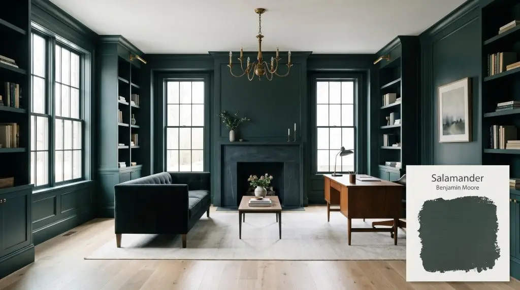
Salamander 2050-10
Benjamin MooreBenjamin Moore Salamander (2050-10) is a dramatic, chameleon-like dark green. Blending deep black, blue, and green undertones, this sophisticated hue shifts dynamically depending on the lighting, offering a moody, luxurious atmosphere for both interior accents and exterior facades.
Paint Technical Profile
| Color ID / SKU | 2050-10 |
| HEX Code | #2F3E3E |
| Light Reflectance (LRV) | 5.72 |
| Use | Interior, Exterior |
| Best Exposures | South, West, or well-lit spaces |
| Best For | Accent walls, kitchen cabinetry, moody bedrooms, libraries, exteriors |
Benjamin Moore Salamander 2050-10: The Architectural Dark Green That Redefines Shadows
True black paint can sometimes flatten a room, turning walls into a void rather than a boundary. Benjamin Moore Salamander 2050-10 offers a far more sophisticated alternative, behaving like a living shadow that responds directly to its environment. This intense, blackened green is a moody architectural finish designed to manipulate the perceived scale and atmosphere of your home.
Undertones & LRV of Benjamin Moore Salamander
Is this paint warm or cool? This is the first question homeowners ask when staring at such an intense swatch. The verdict is decidedly cool, but its organic base keeps it from feeling sterile.
To understand how it behaves on your walls, we have to look closely at its color structure:
With an LRV light reflectance value of 5.72, this shade absorbs an immense amount of light. It requires strategic illumination to prevent it from reading as a flat, uninteresting black. You must intentionally light the walls to highlight the rich green pigment hidden in the shadows.
Lighting Effects & The Chameleon Factor
This specific pigment combination creates a chameleon-like color shift throughout the day. The direction of your windows and the temperature of your bulbs will completely alter how the paint presents itself.
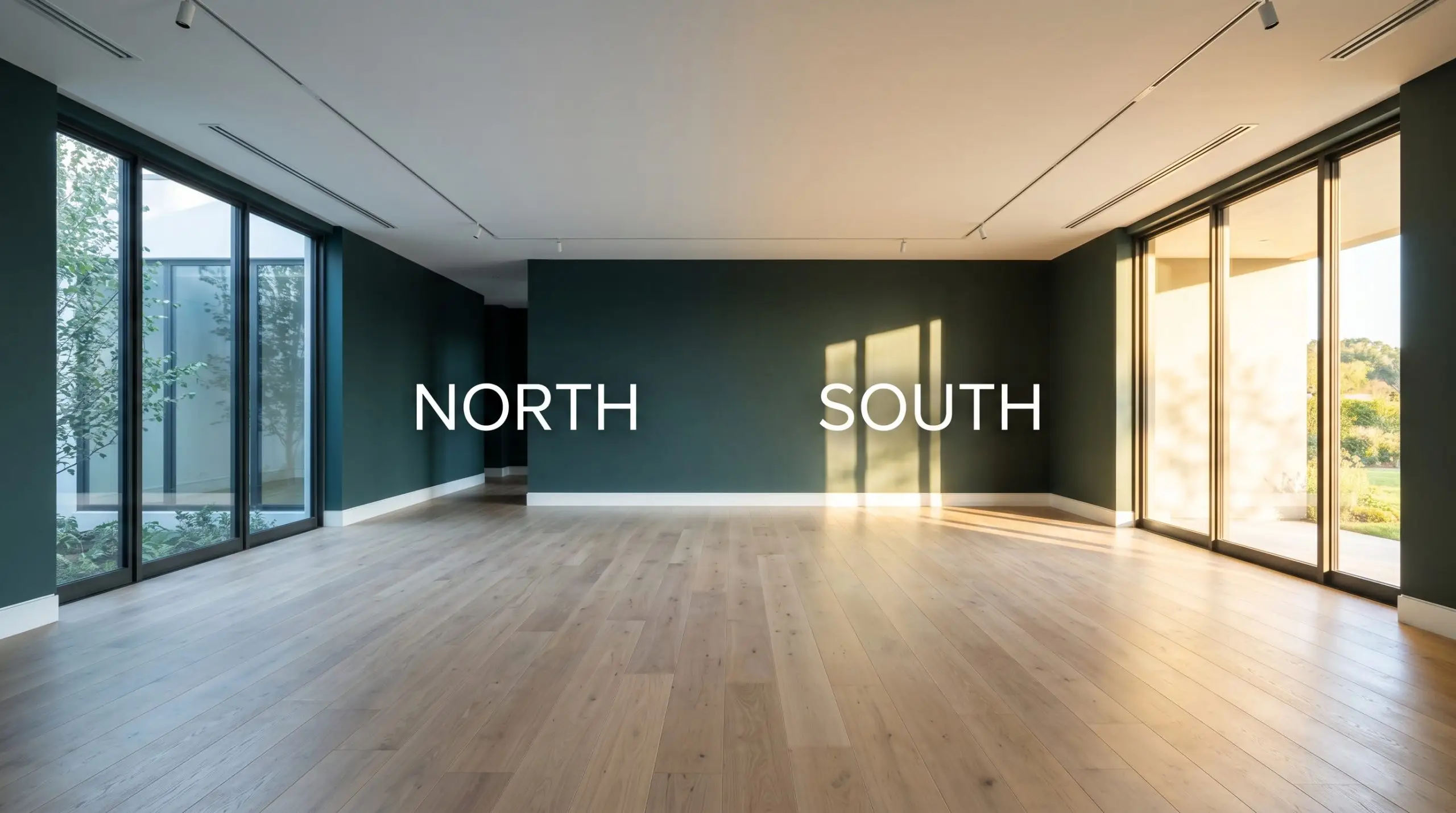
Always test this color with the exact temperature of lightbulbs you plan to use in the final room. Swapping a standard 2700K bulb for a 4000K LED will instantly change your walls from an earthy forest tone to a crisp, tailored teal.
Hackrea Pro-Tip (The Bulb Test)
Architectural Applications & Placements
Moving from color theory to practical execution requires a thoughtful approach to materials and placement. Because this shade carries so much visual weight, it acts as a phenomenal backdrop for layered textures and contrasting finishes.
Kitchen Cabinetry & Islands
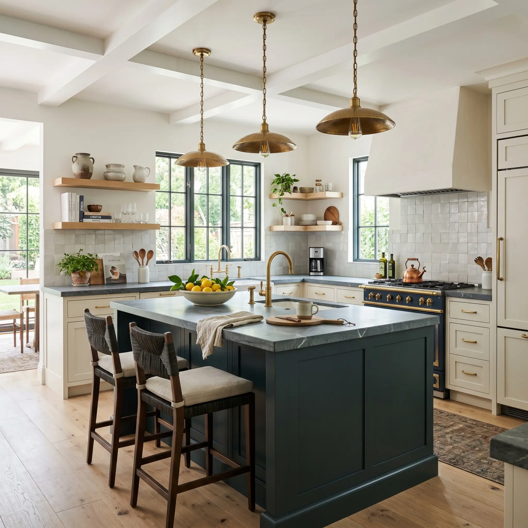
Using this blackened green on lower cabinets or a central island immediately establishes a custom, high-end aesthetic. It works beautifully as a bespoke cabinetry finish when paired with everyday materials like honed soapstone counters or standard white oak floating shelves. Pair it with unlacquered brass hardware to bring a necessary flash of warmth and reflection to the dark surface. For a transitional look, apply it to classic shaker profiles, or use it on sleek, flat-panel slab doors for a highly contemporary edge.
Moody Studies and Home Libraries
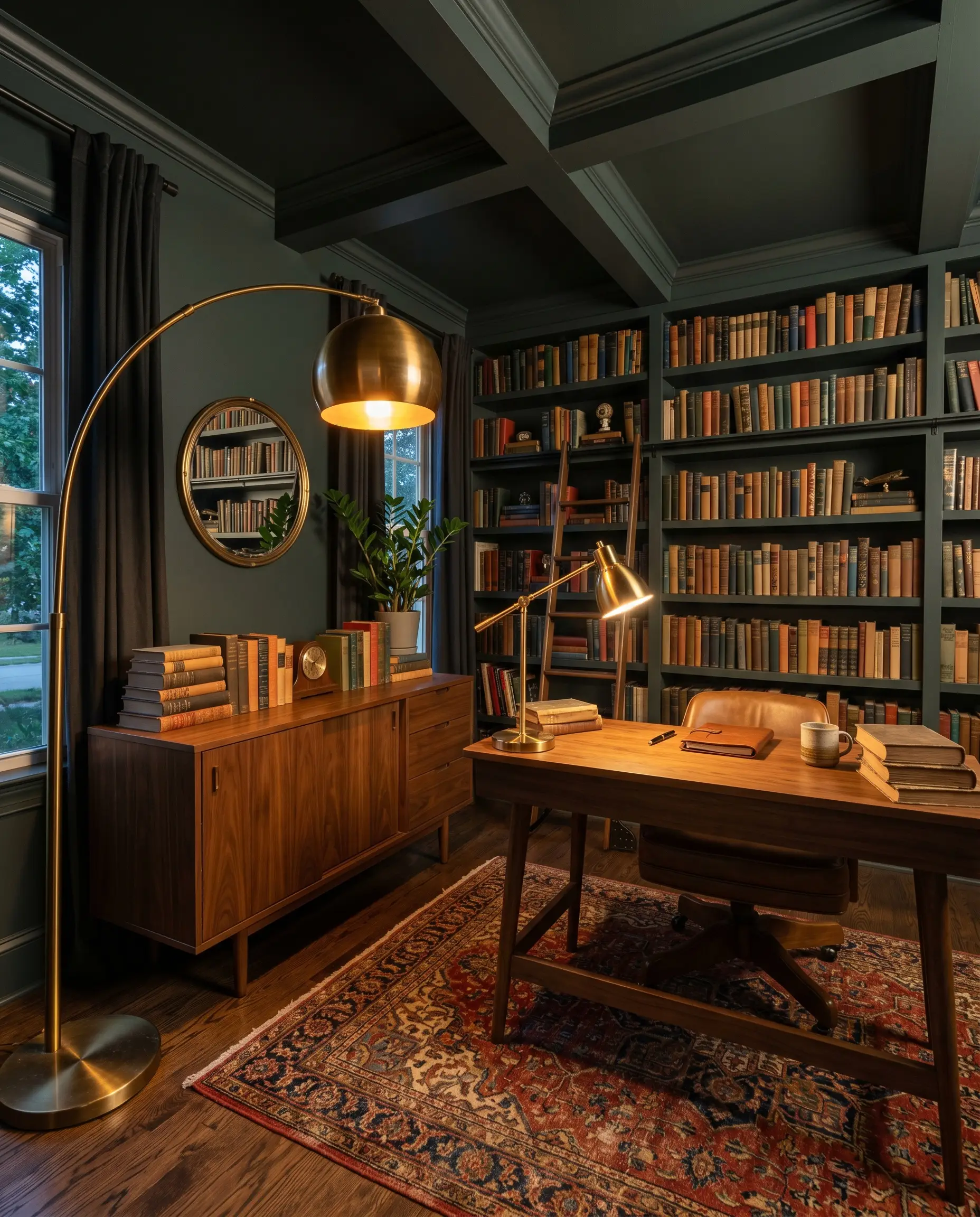
A dedicated workspace or reading room is the ideal environment to embrace a saturated dark teal. Wrapping the entire room—including the ceiling and baseboards—eliminates harsh visual breaks and creates a seamless, enveloping atmosphere for a remote worker needing focus. Contrast the dark walls with a mid-century walnut credenza, a vintage Persian rug, and an oversized brass floor lamp.
If you are wrapping an entire room in a matte or eggshell finish, paint the built-in bookcases in a semi-gloss sheen of the exact same color. The subtle shift in light reflection creates instant, high-end architectural interest without requiring a second paint color.
Hackrea Design Secret (The Gloss Contrast)
Powder Rooms
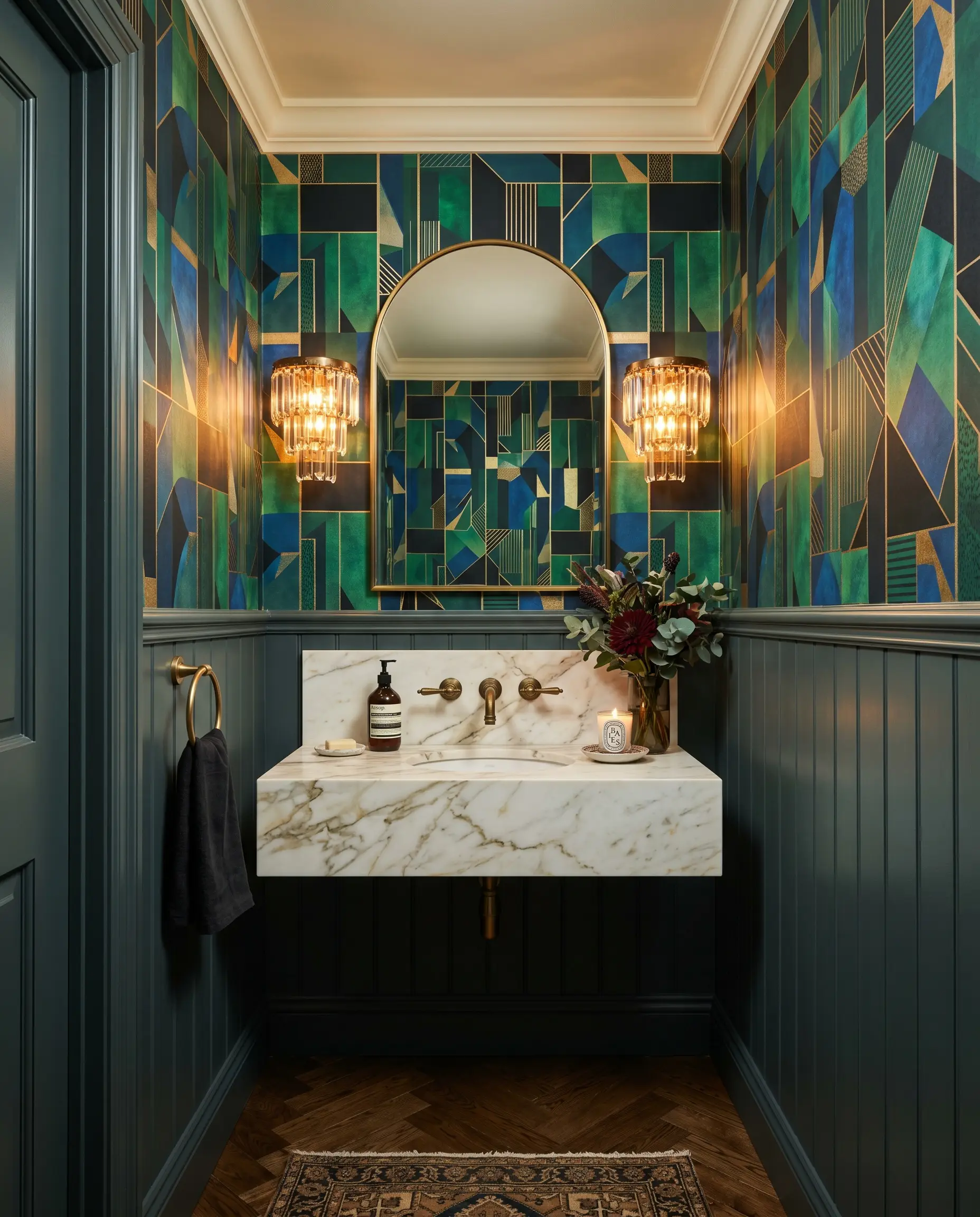
Small, windowless spaces are perfect candidates for the jewel-box effect. Instead of fighting the lack of natural light with bright white paint, lean entirely into the shadows. Pair the dark green wainscoting with a bold, abstract geometric wallpaper or a metallic grasscloth above the chair rail. Always install layered sconce lighting near the mirror to ensure the room remains functional and glamorous rather than dim.
Exterior Siding & Front Doors
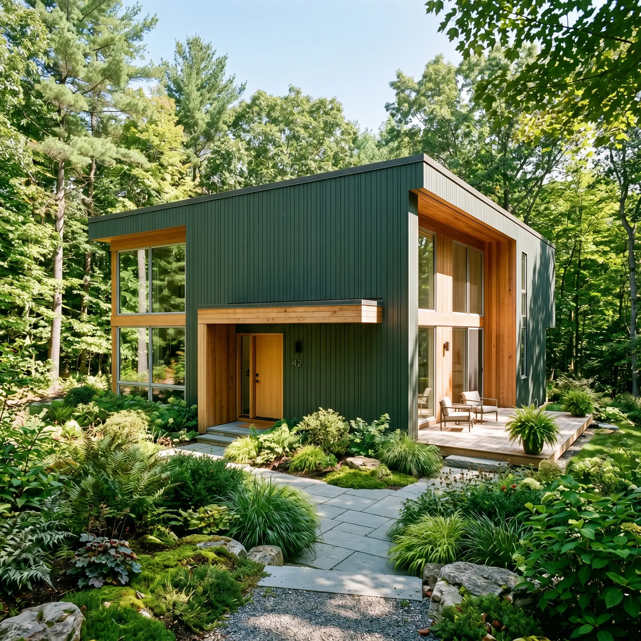
Taking this color outside completely changes its behavior due to the sheer volume of ambient light absorption. In direct, full sunlight, the black undertones soften significantly, revealing a much truer, organic green. This makes it an exceptional choice for modern biophilic design, helping suburban facades or contemporary woodland homes blend seamlessly with their natural surroundings.
Bedroom Accent Walls & Wraps
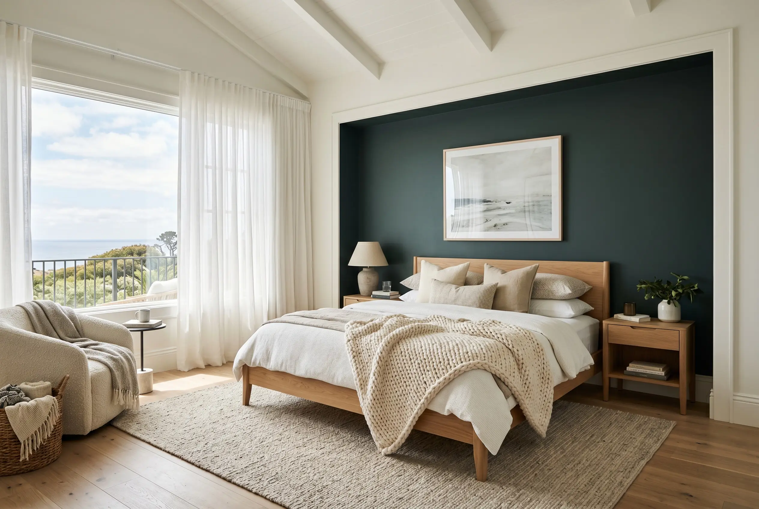
In a bedroom, this shade provides a stabilizing backdrop behind a light-toned platform bed or a slipcovered linen headboard. If an entire dark room feels too intense for your morning routine, use it strategically on the headboard wall. Frame the dark wall with high-contrast trim in a crisp white to maintain a tailored, intentional boundary. Soften the overall aesthetic with sheer cotton drapery and a chunky knit throw to balance the intensity of the pigment.
Coordinating Colors & Material Pairings for Salamander
Because this intense shade absorbs so much light, it demands surrounding elements that actively push back and establish their own presence. Soft, tonal bleeds will turn muddy against this pigment, whereas crisp, intentional boundaries allow the dark green to hold its structural shape. You must surround this color with materials that either reflect light or offer a distinct textural contrast.
Tailoring the Trim and Baseboards
When framing this rich pigment, your trim selection completely dictates the final architectural mood. Sherwin-Williams High Reflective White SW 7757 provides a brilliant, icy boundary that sharpens the green and gives the room a highly tailored, modern edge. If you prefer a softer transition, Farrow & Ball School House White No. 291 acts as a warm, creamy border that gently transitions into the dark walls for a seamless, atmospheric glow.
Tactile Elements and Hardware Integration
The Harmonizing Color Palette
Curated Aesthetic Concepts
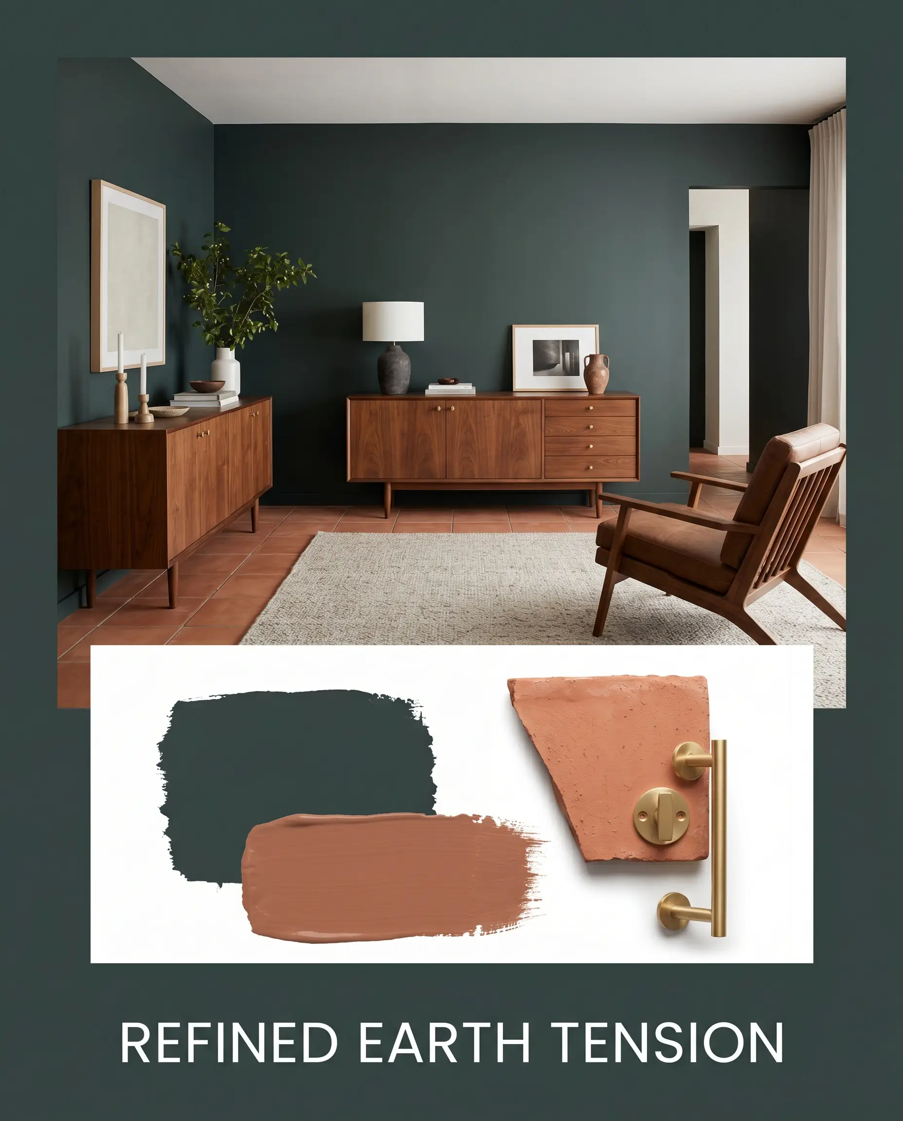
Refined Earth Tension This styling concept relies on the friction between sophisticated dark walls and raw, earthy textures. By pairing the intense green backdrop with raw terracotta flooring and accents of Sherwin-Williams Cavern Clay, the room radiates a grounded, organic energy. Introduce mid-century walnut furniture and unlacquered brass hardware to elevate the rustic elements into a truly curated experience.
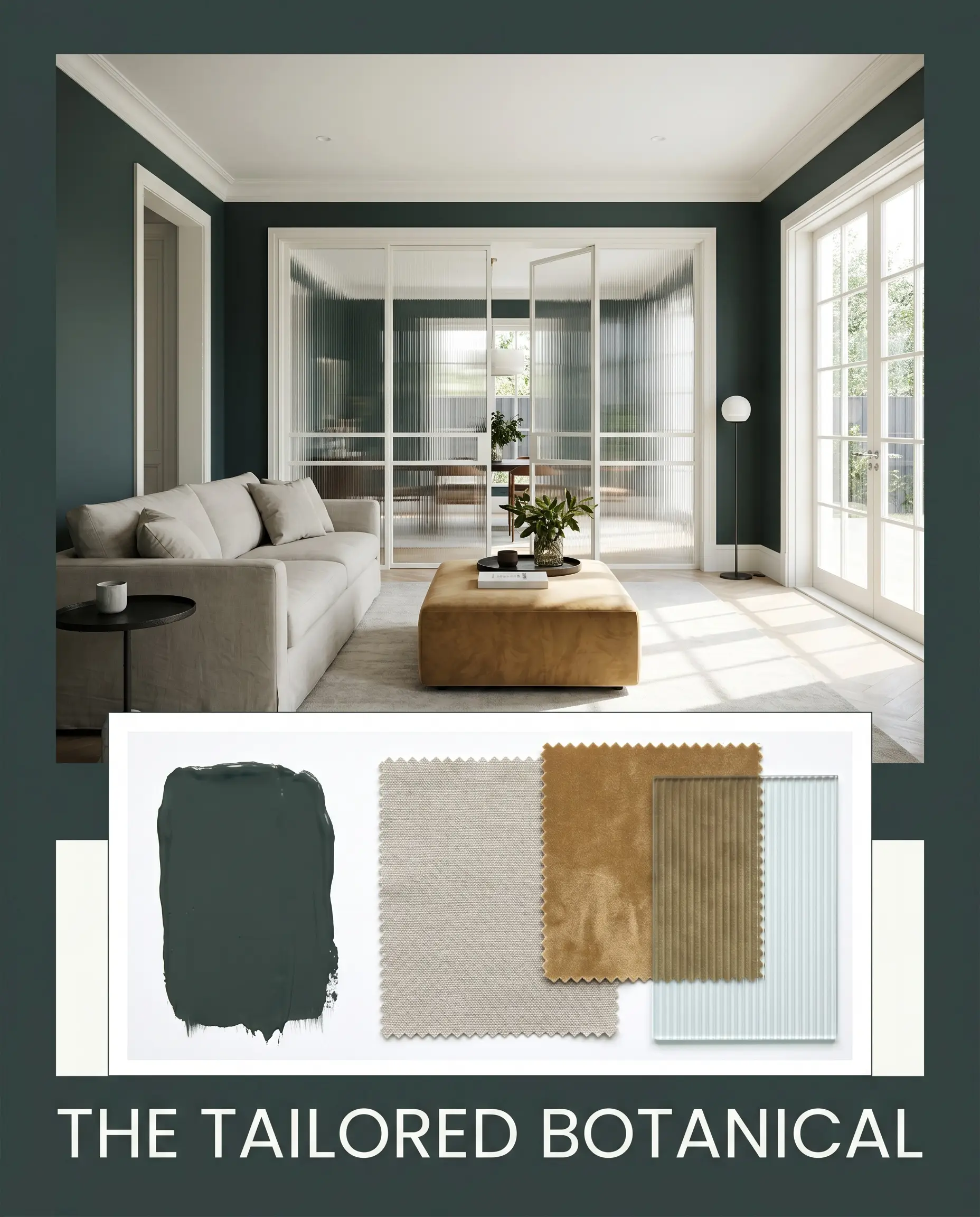
The Tailored Botanical This aesthetic leans into the crisp, modern potential of the blackened green by framing it with brilliant white trim and expansive fluted glass doors. A slipcovered sofa in a soft, Revere Pewter-toned washed linen softens the architectural rigidity. Finish the space with a pop of India Yellow through a crushed velvet ottoman or abstract art to bring a sophisticated, energetic flash to the shadows.
Benjamin Moore Salamander vs. The Competition
While this specific BM 2050-10 shade is incredibly versatile, certain architectural exposures or lighting constraints might require a different foundational undertone. If your room lacks natural light and the paint begins to read as a flat black, you may need to pivot to a color with a more pronounced hue.
Benjamin Moore Salamander vs. Sherwin-Williams Dark Night SW 6237
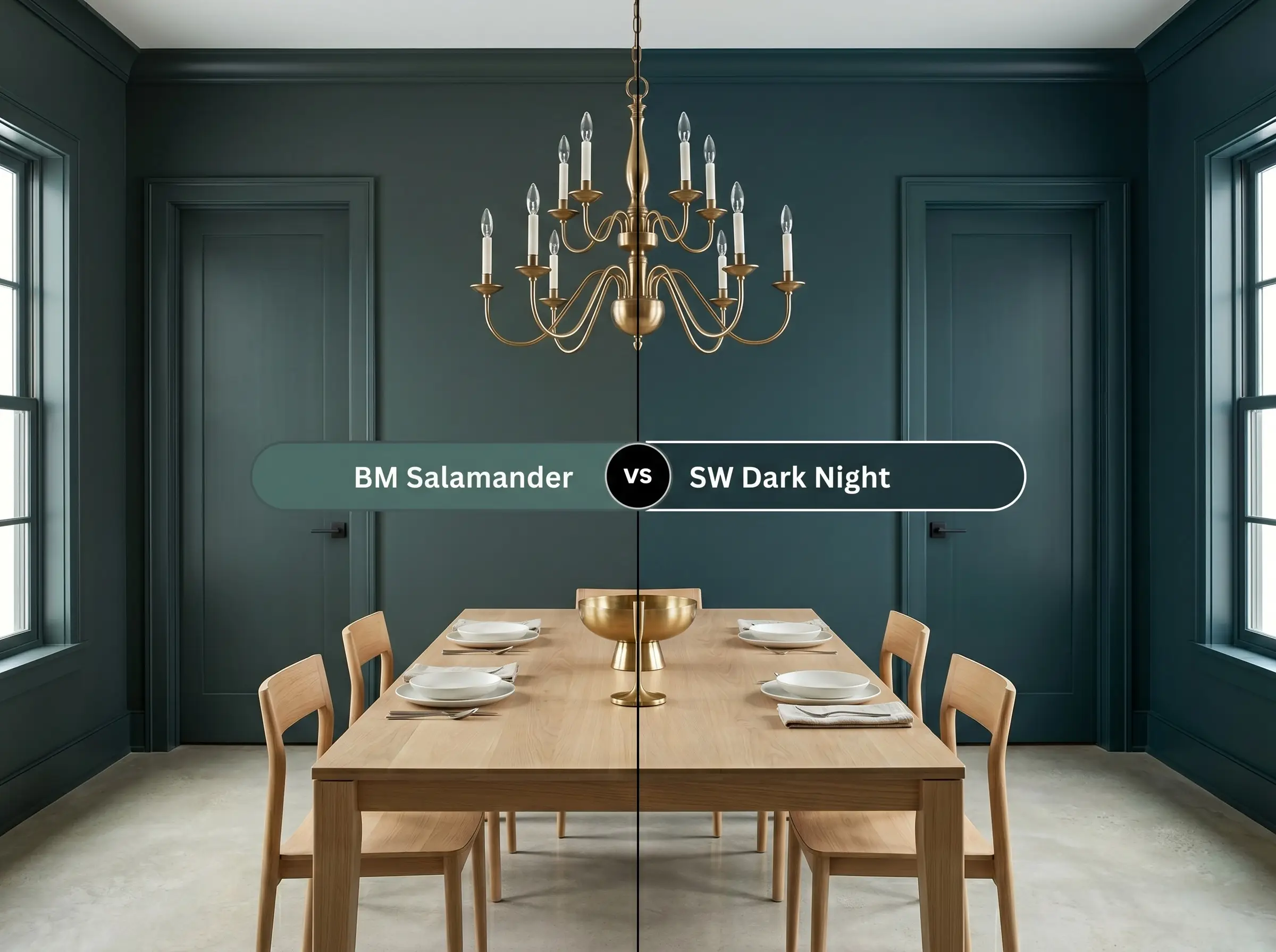
If you want the drama of a dark color but fear the walls looking completely black at night, Sherwin-Williams Dark Night SW 6237 is often the better candidate. Dark Night holds onto a much stronger, saturated teal base, ensuring the blue-green pigment remains visible even in low light. Conversely, choose the Benjamin Moore option when you specifically want that mysterious, off-black neutrality to stabilize vibrant furnishings.
Benjamin Moore Salamander vs. Farrow & Ball Studio Green No. 93
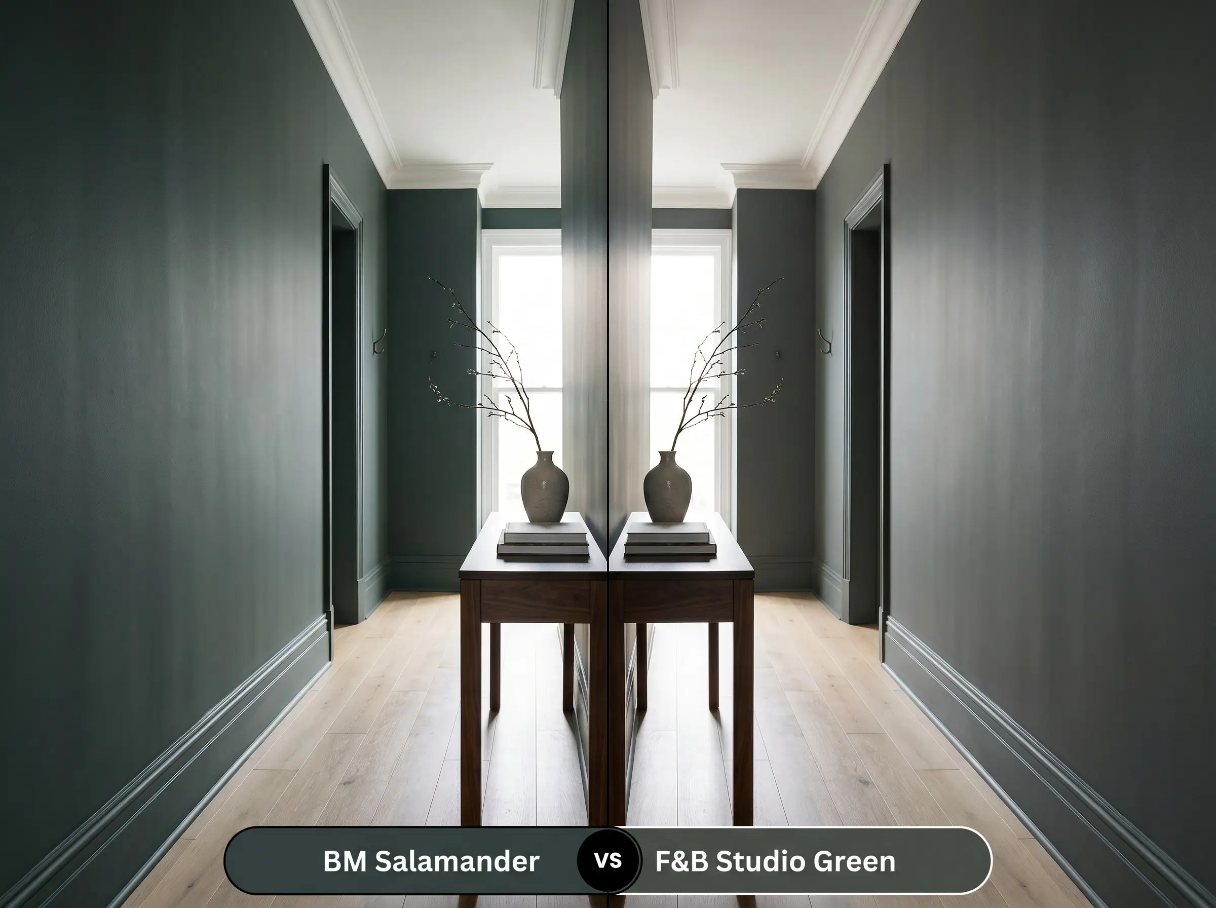
This comparison comes down to the fundamental temperature of the room. Farrow & Ball Studio Green No. 93 is built on a much warmer, browner base, making it feel like a historic, aged bronze-green. If your space features cool northern light or crisp white oak floors, the Farrow & Ball shade will provide necessary warmth, while Salamander will emphasize a cooler, more contemporary edge.
Alternative Shades and Brand Equivalents
Sometimes the foundational vibe of a color is perfect, but the literal light reflectance or specific undertone needs a slight adjustment for your particular hallway or exterior.
Benjamin Moore Alternatives
Cross-Brand Matches
Professional Application Strategies
Translating this rich, dark pigment from a tiny swatch to an entire room requires a flawless execution strategy. Dark paints are notoriously unforgiving of surface imperfections and lazy roller techniques.
Selecting the Right Finish
Priming and Coverage Expectations
You cannot achieve the true depth of this color over a stark white wall without a massive struggle. You must use a deep gray tinted primer to establish a dark foundation before the first coat of green ever touches the drywall. This crucial step prevents the white from glowing through and significantly reduces the total number of coats required.
Even with a tinted primer, expect to apply two generous coats to achieve a professional, opaque finish. Dark pigments are highly susceptible to “flashing,” which occurs when uneven roller pressure leaves visible, shiny streaks across the wall.
To avoid flashing with dark paints, always maintain a “wet edge” by rolling from top to bottom in continuous strokes, and never go back over partially dried sections.
Hackrea Pro-Tip (The Wet Edge Rule)
Frequently Asked Questions
Because of its incredibly low light reflectance, this dark pigment will absorb significant heat and UV radiation, which can accelerate fading on textured stucco. If you live in a high-sun climate, you must use a premium exterior paint formulated specifically for UV resistance to maintain its original depth.
Painting a ceiling this dark actually blurs the boundary lines of the room, often making the ceiling feel like an endless night sky rather than a low lid. It works beautifully to establish an intimate, enveloping atmosphere, provided you have adequate layered lighting at the floor and eye levels.
Instead of feeling cramped, a windowless room wrapped in this shade transforms into a sophisticated, glamorous retreat. The dark green eliminates the visual boundaries of the small space, creating a calming, jewel-box effect that feels intentional and highly curated.
The prominent cool blue and green undertones in this paint will actively enhance and pull forward the red and orange tones in the wood through natural color wheel contrast. If your floors are highly saturated, this pairing will create a vibrant, high-energy dynamic that you must balance with neutral rugs.
The Final Verdict on Benjamin Moore Salamander
Benjamin Moore Salamander 2050-10 is the ultimate tool for homeowners who want to introduce dramatic, architectural depth without resorting to the starkness of true black. Its brilliant cool-toned, black-green structure makes it perfectly suited for enveloping studies, custom kitchen cabinetry, and striking modern facades. This color thrives in spaces designed for intentional contrast, serving as a sophisticated backdrop for warm metals, rich woods, and layered textiles.
While this deep green is incredibly versatile, it struggles significantly when placed directly against large expanses of orange-toned or heavily yellowed woods, such as outdated honey oak cabinets or floors. The cool, blackened blue undertones in the paint will actively highlight the orange in the wood, creating an unintentional contrast that feels dated rather than curated. If your home features these specific warm wood tones, you must either bridge the visual gap with a large, neutral rug or pivot to a much warmer, olive-based dark green to maintain a cohesive, elegant flow.
Clash Warning (The Warm Wood Conflict)