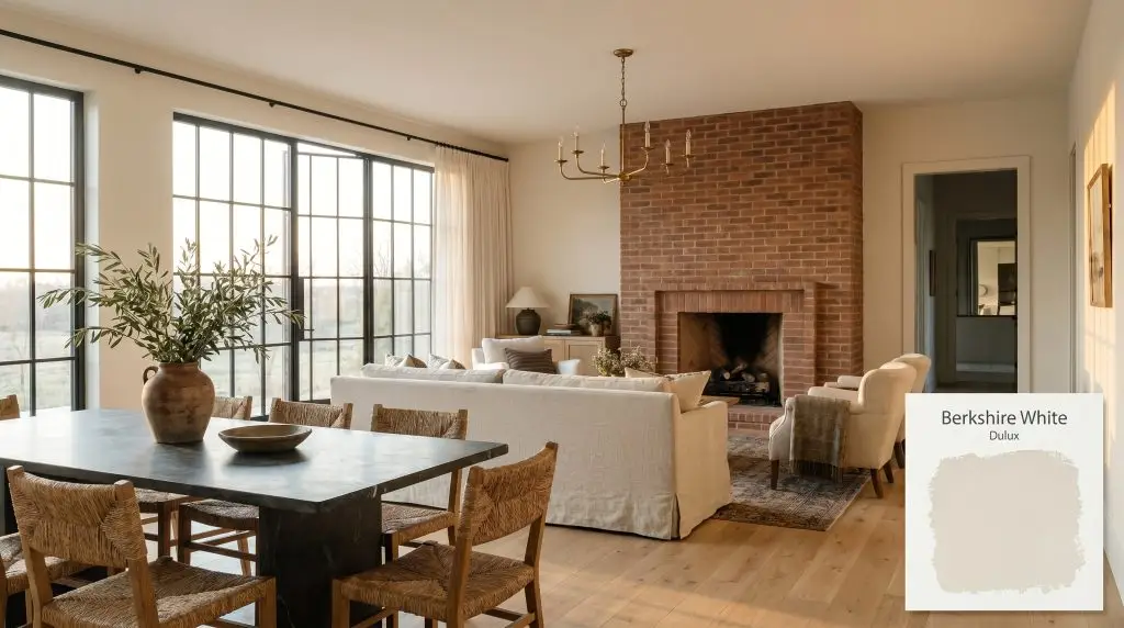
Berkshire White SW1E8
DuluxDulux Berkshire White is a bright, creamy warm white with a Light Reflectance Value (LRV) of 87. Featuring a gentle yellow undertone, it brings a soft, inviting warmth to both interiors and exteriors, making it perfect for spaces that need a cozy, timeless lift.
Paint Technical Profile
| Color ID / SKU | SW1E8 |
| HEX Code | #f3eedf |
| Light Reflectance (LRV) | 87 |
| Use | Interior, Exterior |
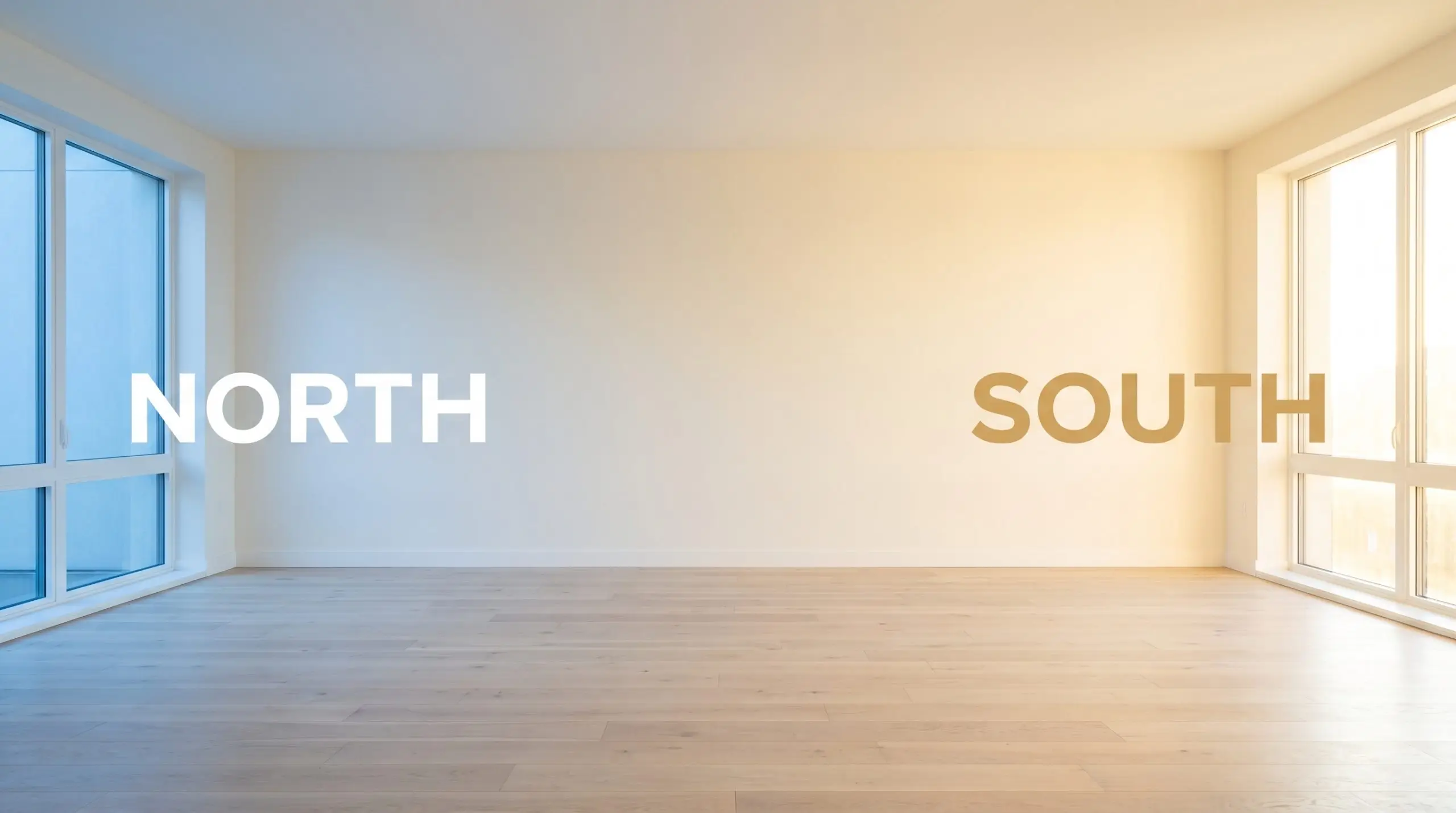
| Best Exposures | North-Facing, East-Facing |
| Best For | Heritage kitchens, cozy living rooms, weatherboard exteriors |
Dulux Berkshire White: The Architectural Secret to Glowing, Soft Interiors
Finding the right warm white paint often feels like walking a tightrope. Lean too cool, and your living room suddenly feels like a sterile waiting area; lean too warm, and you are suddenly staring at walls that look undeniably, aggressively yellow.
This is exactly where Dulux Berkshire White steps in to solve the problem. It brings a gentle, luminous energy to a room while maintaining enough restraint to serve as a sophisticated architectural finish.
If you want a creamy neutral that makes your home feel instantly inviting, sunlit, and beautifully curated, this specific shade deserves a spot at the top of your testing list. Let’s break down exactly how this color behaves on the wall and how you can use it to elevate your home.
Undertones & LRV of Dulux Berkshire White
If you are wondering whether Dulux Berkshire White is warm or cool, the answer is a definitive, beautiful warm. This specific chromatic profile is built to radiate a soft, sunny glow, making it a fantastic solution for rooms that feel a bit too rigid or unwelcoming.
To truly understand how this paint will look in your home, we have to look past the initial swatch and examine the underlying color structure.
When we talk about how bright a paint will be, we look at its Light Reflectance Value. Berkshire White has a light reflectance value of 87, placing it firmly in the upper tier of bright, high LRV white paints.
This means it absorbs very little incoming light, bouncing the vast majority of it back into your room to create a beautifully expansive feeling. However, because of that sturdy cream base, it never washes out into a blinding, clinical starkness.
Lighting Effects & The Chameleon Factor
Paint is a living, breathing architectural material that responds directly to the environment around it. Because Dulux SW1E8 has such a high reflectivity paired with a nuanced undertone, you will watch it shift and adapt as the sun moves across your house throughout the day.
If you want to maintain the beautiful, soft creaminess of this paint in the evening, you must strictly control your artificial lighting. Never use bulbs cooler than 3000K. Anything higher will strip away the gentle yellow undertone, leaving you with a flat, uninspired white that fights against the paint’s natural DNA.
Hackrea Pro-Tip (The Bulb Rule)
Popular Architectural Applications
While it is incredibly easy to relegate a warm cream strictly to historic or heritage color schemes, doing so leaves so much design potential on the table. This paint possesses a beautiful fluidity, allowing it to transition seamlessly from classic, layered spaces right into sleek, modern environments.
The secret to making it work lies entirely in the materials and textures you pair it with. Here is how this versatile shade is currently being utilized in beautifully curated homes.
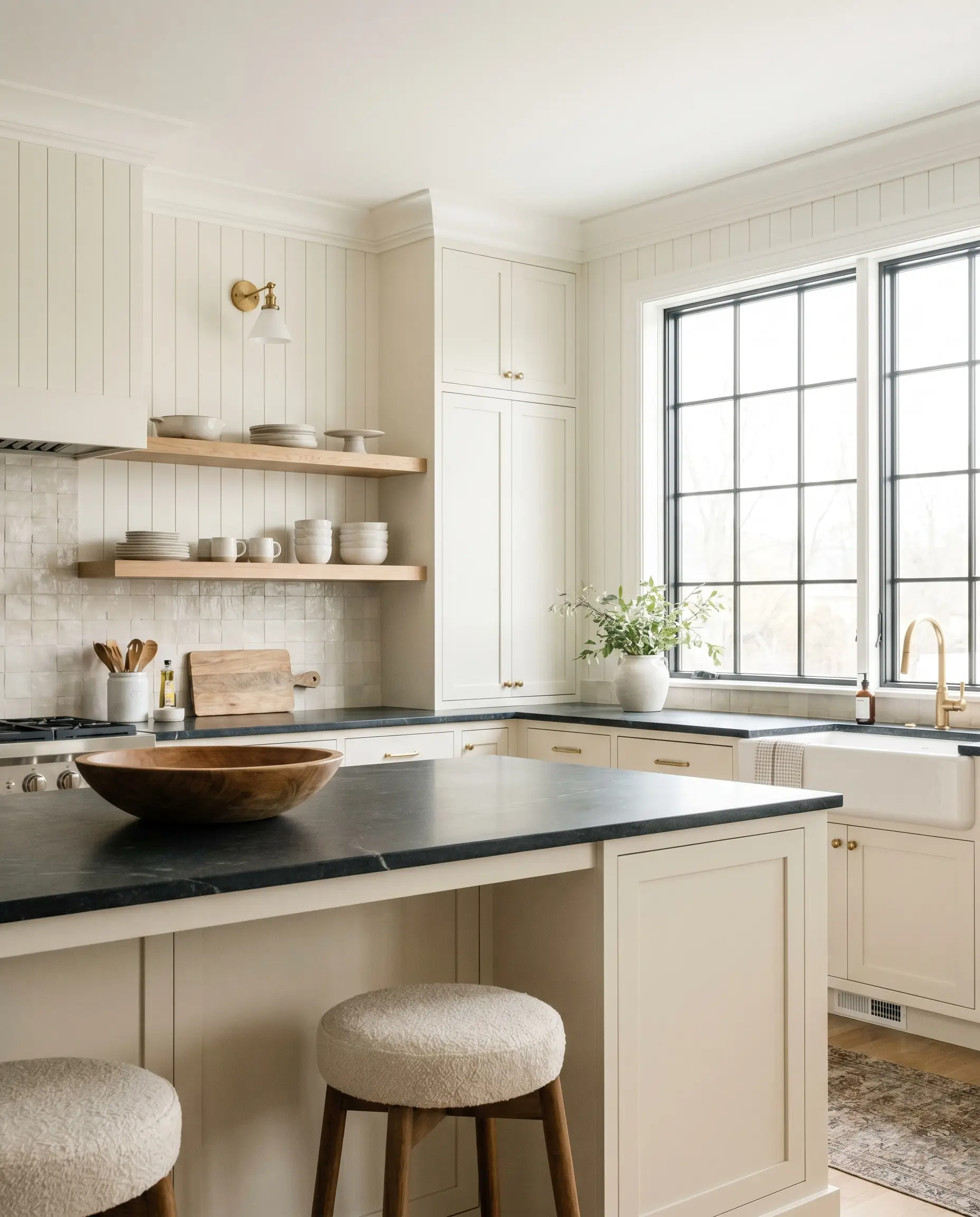
Elevated, Organic Kitchens
Kitchens are inherently full of hard, cold surfaces like stone, stainless steel, and glass. Coating your standard shaker cabinetry or beadboard walls in this warm white paint instantly softens the room, making the kitchen feel like a lived-in gathering space rather than a commercial prep zone.
To push the design into an Organic Modern aesthetic, pair the creamy cabinets with raw white oak floating shelves and unlacquered brass hardware. The brass will naturally echo the subtle yellow undertone, while the wood introduces an earthy, tactile element.
If you are working with a more accessible kitchen update, let the paint do the heavy lifting on the walls, and invest in a single, show-stopping backsplash—like a heavily textured zellige tile or a slab of honed soapstone—to instantly elevate the entire room.
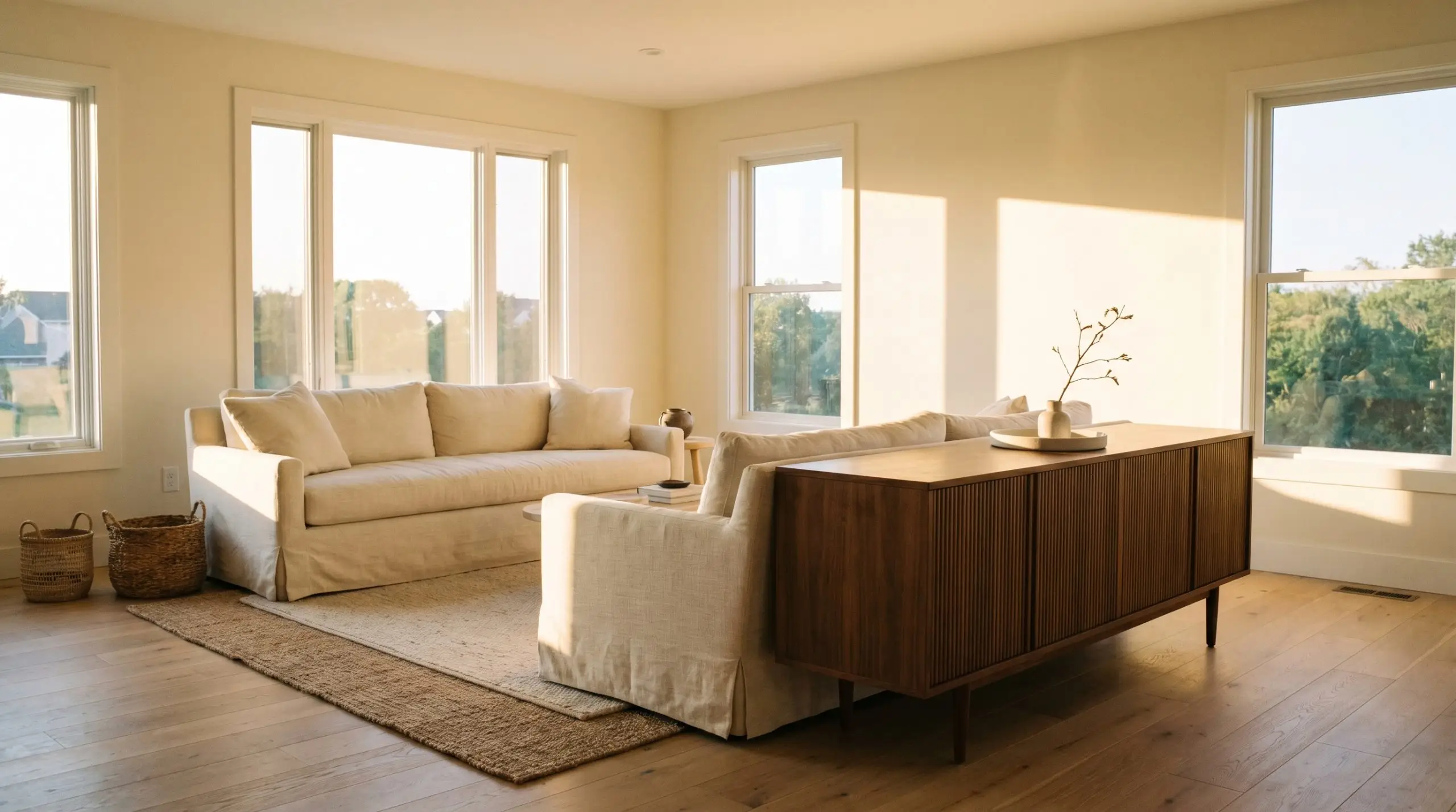
Sunlit, Textural Living Rooms
In a living room, this shade excels at creating a serene, enveloping atmosphere that practically begs you to sit down and relax. It serves as the perfect foundational layer for a Soft Minimalism or Californian Casual aesthetic, where the focus is entirely on texture rather than loud color.
To maximize the visual interest, surround the creamy walls with varied, tactile fabrics. Think slipcovered slub linen sofas, a chunky bouclé accent chair, and layered jute rugs across the floor.
Because the paint reflects so much light, it easily supports darker, more intense accent pieces. Introduce a mid-century reeded walnut credenza or a blackened steel coffee table to give the room structure and prevent the soft walls from feeling visually formless.
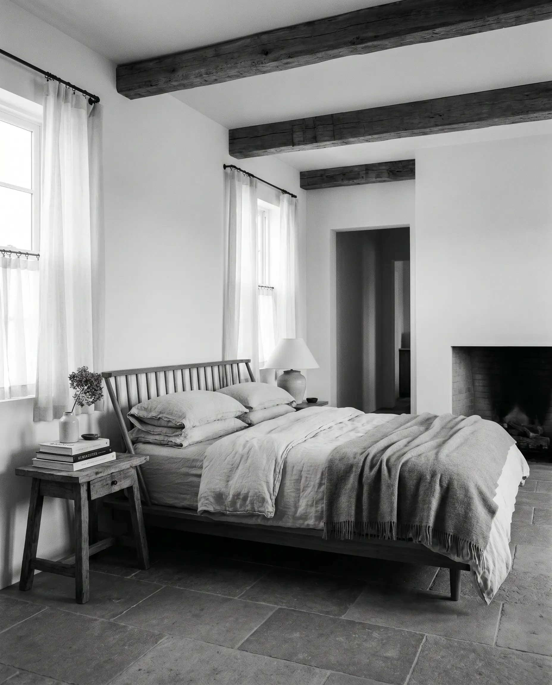
Combating Gloom in North-Facing Bedrooms
Bedrooms that only receive chilly, north-facing light often suffer from a permanent, shadowy gray cast. Applying this specific cream is one of the most effective ways to artificially inject sunshine into a room that naturally lacks it.
The cool incoming light will tone down the yellow base, leaving you with a perfectly balanced, crisp white that still feels inherently soft. Lean into a soothing, Wabi-Sabi inspired retreat by pairing the walls with stonewashed cotton bedding, a low-profile spindle bed, and sheer linen cafe curtains that softly filter the morning light.
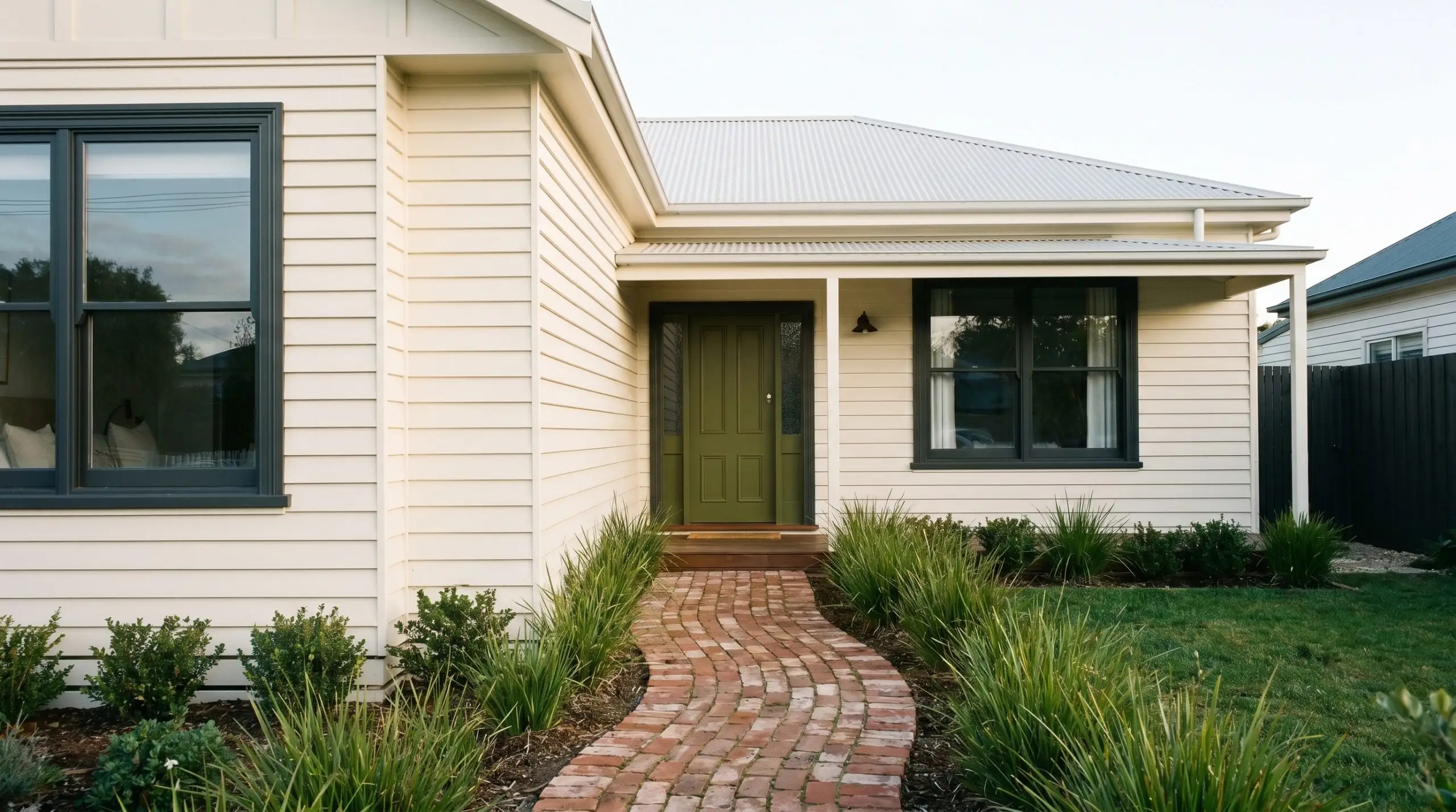
Weatherboard & Rendered Exteriors
Taking a high LRV paint outside requires a bit of strategic planning, but the results can be stunning. On traditional weatherboard or smooth rendered facades, this shade provides a fresh, clean look that feels deeply rooted in its surroundings rather than glaringly artificial.
Direct, unshielded sunlight is incredibly powerful and will strip away subtle undertones. If your home’s facade faces harsh southern or western sun all day, this paint will read significantly brighter and whiter than it does on an interior swatch, losing much of its cream base. Always test a large sample on the brightest side of your house before committing.
Clash Warning (The Exterior Washout)
To secure the design and keep the bright facade from floating away, you must introduce high-contrast architectural elements. Pair the creamy siding with a muddy terracotta brick pathway, deep charcoal window sashes, or a rich, olive green front door to establish a beautiful, striking balance.
Designing with Dulux Berkshire White: Pairings & Palettes
Because this soft cream relies on its subtle yellow warmth to fill a room, it behaves beautifully when pushed against crisp boundaries or allowed to bleed into rich, earthy tones. The pigment responds eagerly to its surroundings, meaning your material choices will entirely dictate whether the walls read as a traditional neutral or a glowing, modern foundation.
Flawless Trim & Ceiling Combinations
To keep the walls from looking muddy, you need a trim color that provides a sharp, clean break. Pairing this finish with an un-tinted, ultra-pure option like Dulux Vivid White SW1G1 forces the cream body to step forward.
Alternatively, Benjamin Moore Chantilly Lace OC-65 offers a similarly stark boundary. Using a stark white on your baseboards ensures the gentle yellow warmth remains intentional rather than looking like aged enamel.
Tactile Finishes & Hardware Selections
The Complementary Paint Palette
Curated Aesthetic Mood Boards
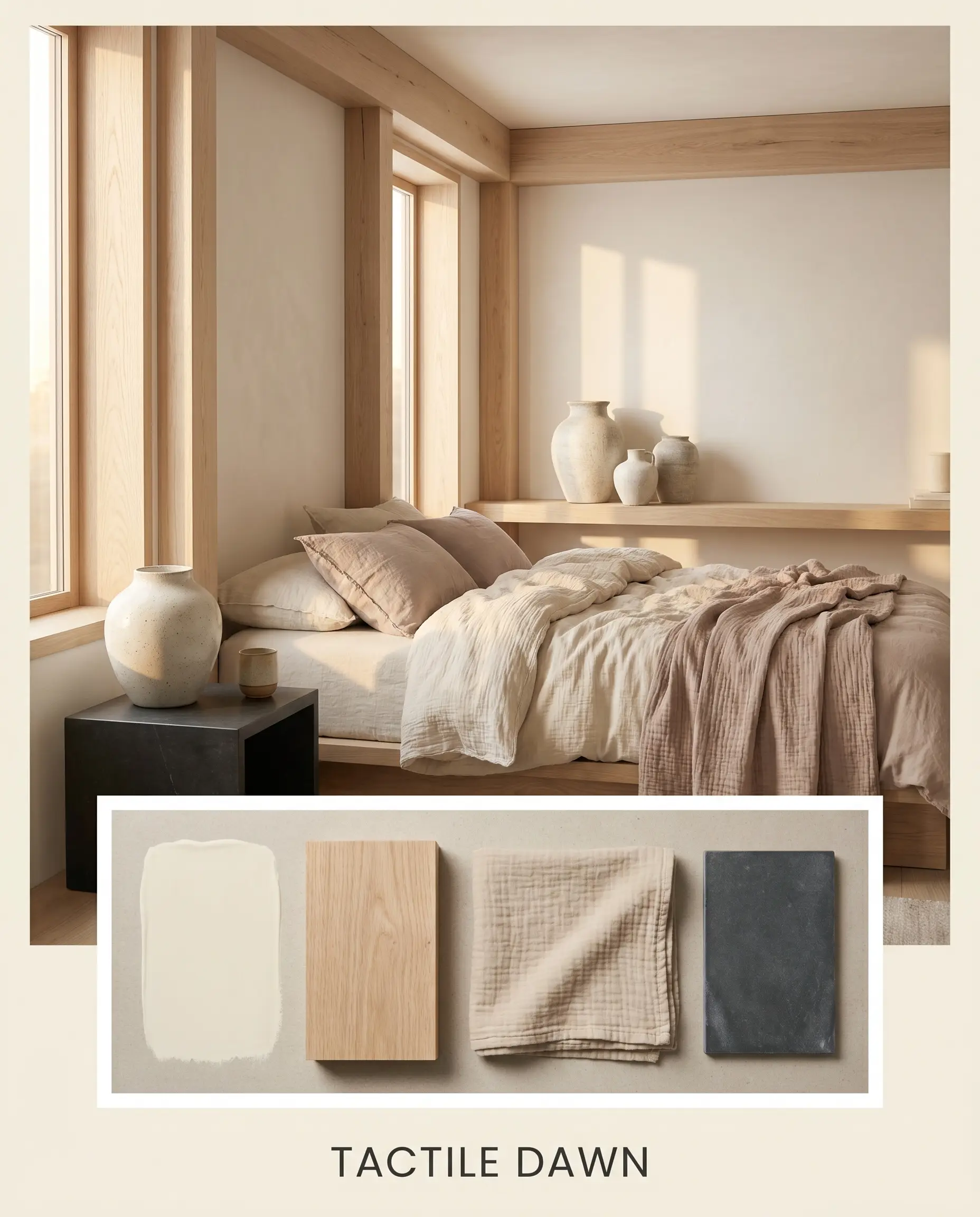
Tactile Dawn This palette is entirely about capturing the serene, quiet energy of early morning light. The walls provide a glowing foundation that bleeds seamlessly into raw white oak architectural elements and layered, stonewashed cotton textiles. To keep the soft tones from feeling formless, a sleek honed soapstone surface and a few oversized ceramic vessels introduce just enough visual weight to center the room.
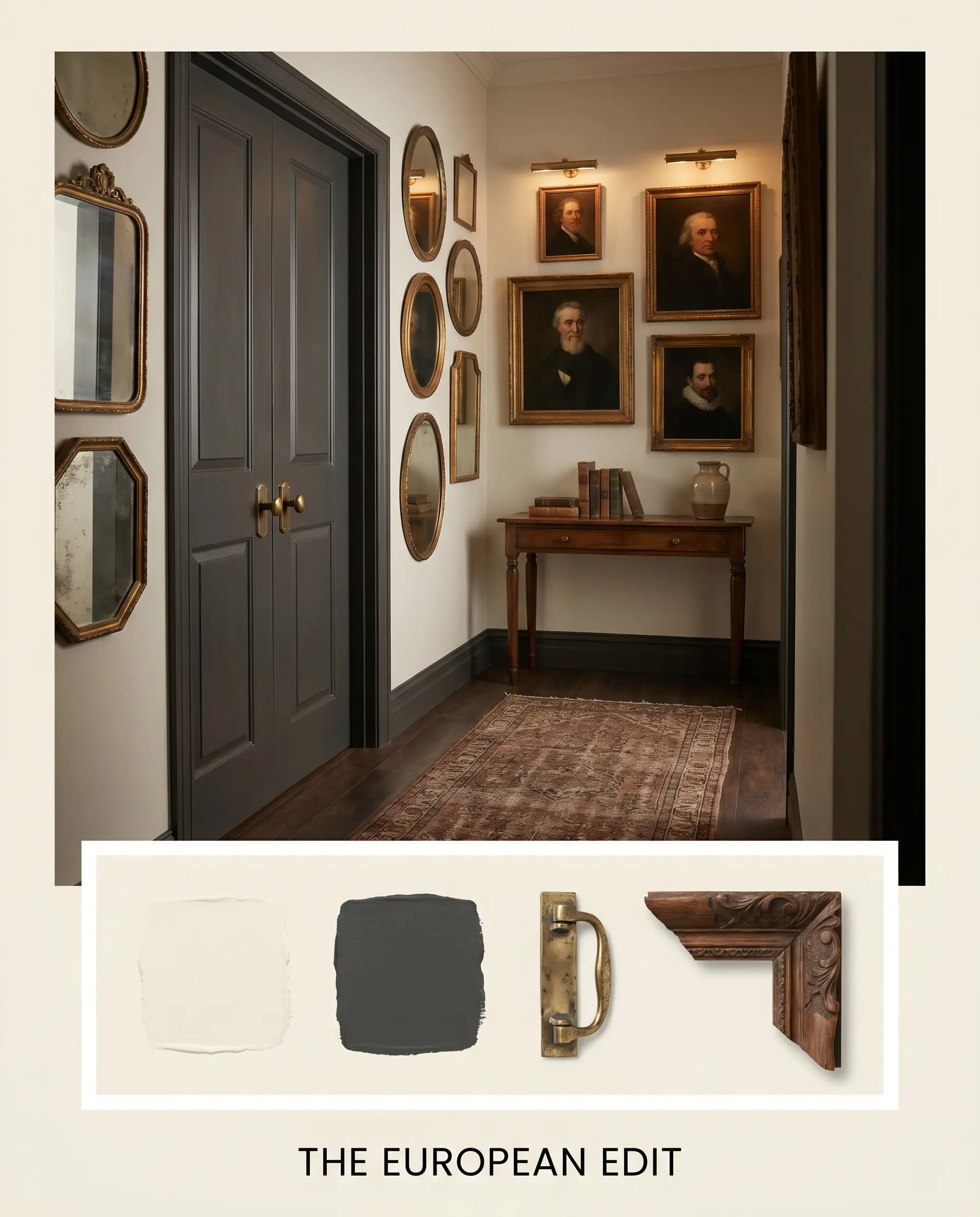
The European Edit Designed for the homeowner who loves a collected, slightly moody atmosphere, this scheme relies on intentional contrast. The creamy walls act as a gallery backdrop for asymmetrical mirror clusters and vintage oil portraits. Unlacquered brass picture lights highlight the art, while interior doors painted in the intense charcoal of Dulux Domino SG6G8 provide a sharp, tailored edge to the surrounding softness.
Head-to-Head: Dulux Berkshire White vs. Top Rivals
Sometimes a paint looks perfect on a swatch, but your specific lighting conditions or exterior exposures demand a slight pivot. If your room receives harsh, direct sunlight or lacks natural windows entirely, you may need to adjust your strategy. Below is a breakdown of how this shade compares to its closest competitors so you can make a confident final choice.
Dulux Berkshire White vs. Dulux Natural White SW1F4
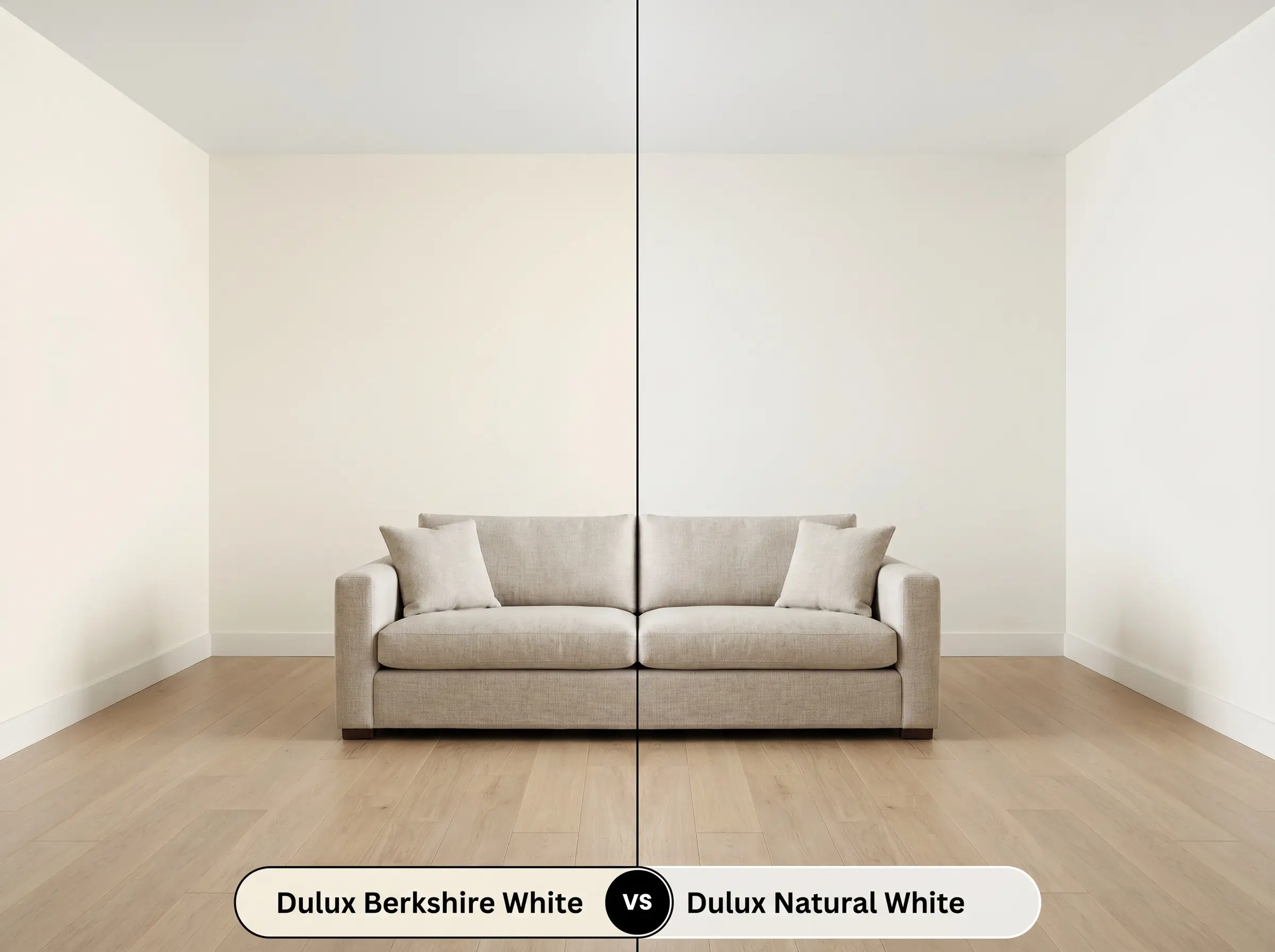
If you are worried that your room will look too yellow, Dulux Natural White SW1F4 is often the safer alternative. While both are considered warm, Natural White has a slightly cooler, more balanced base that strips away the distinct yellow-peach nuance. Choose Natural White if your room is flooded with warm southern light, as it will hold its shape better without turning overly creamy.
Dulux Berkshire White vs. Dulux Antique White U.S.A. SW1H7
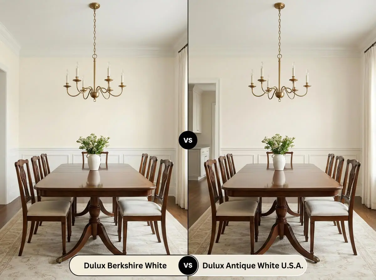
This comparison comes down to how traditional you want the space to feel. Dulux Antique White U.S.A. SW1H7 leans significantly further into a classic, historical cream, carrying a more pronounced yellow undertone. If you are aiming for a sleek, modern aesthetic, Berkshire White remains the better option because its higher light reflectance keeps the color feeling fresh rather than aged.
Dulux Berkshire White vs. Benjamin Moore White Dove OC-17
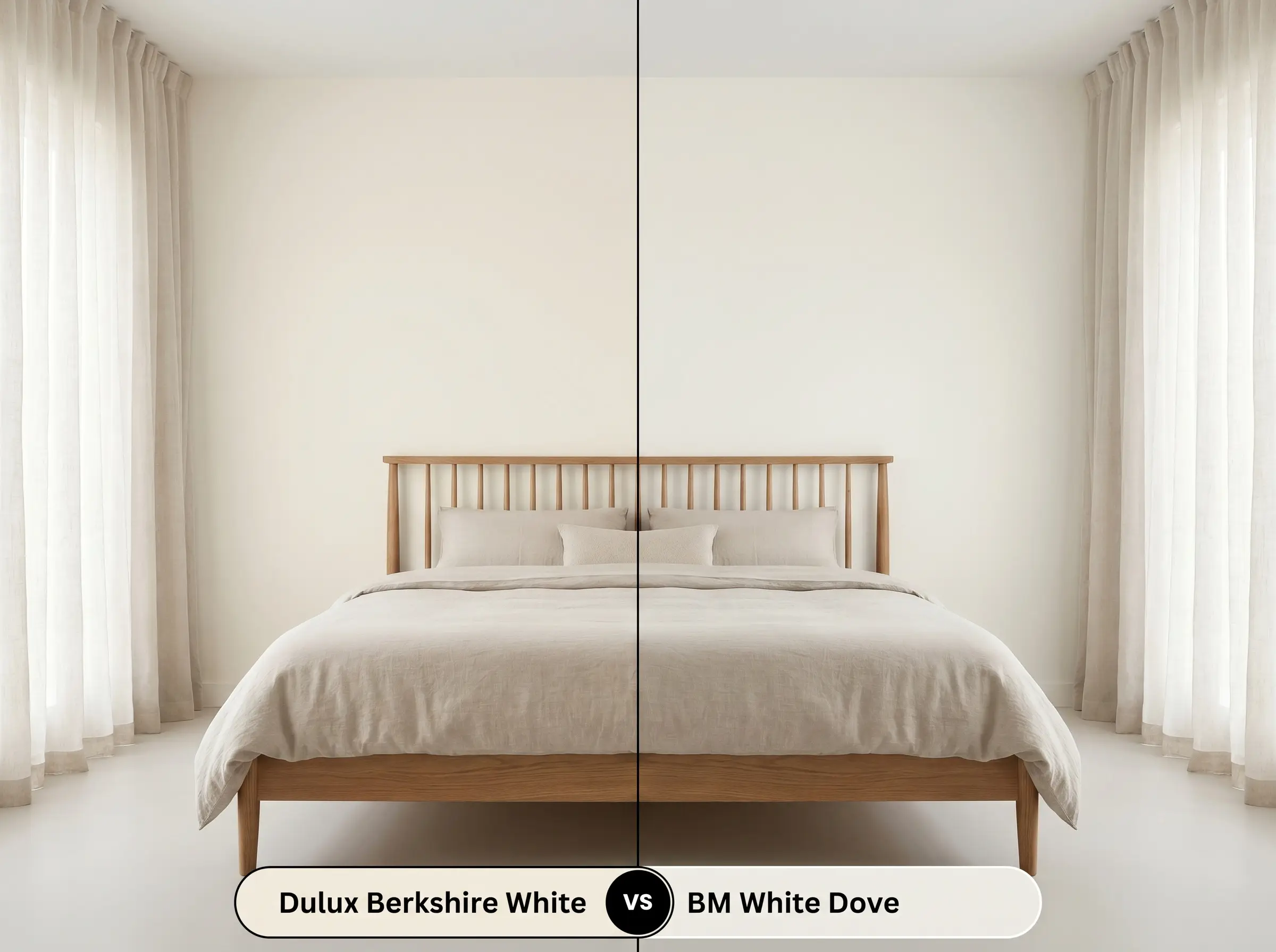
Benjamin Moore White Dove OC-17 is a legendary off-white, but it behaves very differently on the wall due to a subtle gray-green base. That green nuance mutes the warmth, making White Dove feel slightly more shadowed and subdued. If you want walls that actively radiate sunshine, stick with the Dulux option; if you need a color that quietly recedes into the background, White Dove is the winner.
Alternative Creams & Brand Matches
Finding the exact right shade often requires testing a few subtle variations to see how they react to your floors and lighting. If this specific color is just slightly off the mark for your project, consider these closely related alternatives.
Similar Colors
Cross-Brand Equivalents
Executing Dulux SW1E8 on the Wall
Moving from the planning phase to the actual painting requires an understanding of how this specific pigment performs in reality. Choosing the wrong finish or skipping the prep work can completely ruin the beautiful, soft glow you are trying to achieve.
Because this color is so bright and relies on a delicate yellow undertone, it is highly susceptible to “bleed-through.” If you are painting over a dark blue or green wall, you must use a high-quality, pure white blocking primer first. Skipping this step will cause the old dark color to mix visually with the yellow base, resulting in a sickly, greenish cast on your final wall.
Hackrea Design Secret (The Primer Strategy)
When it comes to coverage, expect to roll two full coats for a professional, opaque finish. Be incredibly mindful of “flashing”—which looks like uneven, shiny streaks—when painting large, sunlit walls. To avoid this, always maintain a wet edge with your roller and avoid going back over semi-dry sections of paint.
Frequently Asked Questions
Because of its high LRV, this color actually performs beautifully as a brilliant, clean white outside, but you will indeed lose most of its creaminess. Direct sunlight strips away the subtle yellow nuances, rendering it much starker on an exterior facade than it appears on an interior swatch.
Low-E glass frequently casts a subtle green or blue tint into a room, which actively fights against warm undertones. This cool, filtered light can neutralize the gentle yellow and peach base, occasionally making the paint look slightly flat or unexpectedly dingy during the afternoon.
The cream base of this paint effortlessly bridges warm and cool hard finishes, making it an ideal unifier for mixed-material rooms. It possesses enough yellow to complement the rustic terracotta, while its high brightness prevents it from looking dirty next to the crisp veining of the marble.
Without natural light to balance it, the paint’s behavior is dictated entirely by your light bulbs. If you use crisp 4000K daylight bulbs, the yellow cast is flattened into a sterile white; if you use warm 2700K to 3000K bulbs, the hallway will glow with a rich, traditional creaminess.
Final Verdict & Expert Warnings
Dulux Berkshire White is the ultimate architectural solution for homeowners who want a luminous, sunlit interior without crossing the line into overt yellow. It excels at softening hard, modern lines and bringing a gentle, welcoming energy to north-facing rooms that naturally lack warmth. Whether you are executing a minimalist, texture-driven living space or updating standard kitchen cabinetry, this paint provides a glowing, sophisticated foundation that elevates everyday materials.
However, this beautiful warmth comes with strict relational boundaries. You must avoid pairing this specific shade with stark, icy blue furnishings or cool, gray-toned luxury vinyl flooring. When forced to interact with expansive, cool-toned gray surfaces, the delicate peach and yellow nuances within the paint will instantly curdle, making your freshly painted walls look aged, dirty, and entirely unintentional. Stick to earthy textures, warm woods, and rich, saturated accent colors to ensure this brilliant cream remains the stunning focal point it was designed to be.
Closest Cross-Brand Equivalents
The absolute closest scientific color matches for Berkshire White across top paint brands.