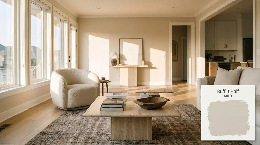
Buff It Half S11B1H
DuluxDulux Buff It Half is a soft, welcoming warm neutral with a delicate beige color structure. Boasting an LRV of 73, it strikes the perfect balance between a bright off-white and a substantial earthy tint, making it highly versatile for both sunlit interiors and textured exterior finishes.
Paint Technical Profile
| Color ID / SKU | S11B1H |
| HEX Code | #e3dacc |
| Light Reflectance (LRV) | 73 |
| Use | Interior, Exterior |
| Best Exposures | South-Facing, East-Facing |
| Best For | Living Rooms, Bedrooms, Exterior Render, Kitchen Cabinetry |
Dulux Buff It Half: The Sophisticated Beige That Transforms Everyday Architecture
Finding a neutral that feels genuinely inviting without slipping into outdated yellow territory is a constant challenge for homeowners. Dulux Buff It Half steps into this gap as a beautifully balanced beige, offering the perfect middle ground between crisp modern whites and rich, earthy tones. This specific tint acts as a highly versatile architectural finish, laying a soft, sophisticated foundation that easily bridges the gap between high-end curatorial taste and relaxed, everyday living.
Decoding the Undertones & LRV of Dulux Buff It Half
Is Dulux Buff It Half warm or cool? This highly sought-after shade is undeniably a warm neutral, bringing a gentle, inviting temperature to any room or facade. Its underlying color structure relies on a sophisticated earthy beige cast that keeps the warmth refined rather than overtly sunny.
With a light reflectance value of 73, this paint sits in the ideal sweet spot for well-lit residential spaces. It reflects plenty of ambient lighting to keep a room feeling open, yet holds enough pigment to provide a substantial, velvety contrast against stark white trim.
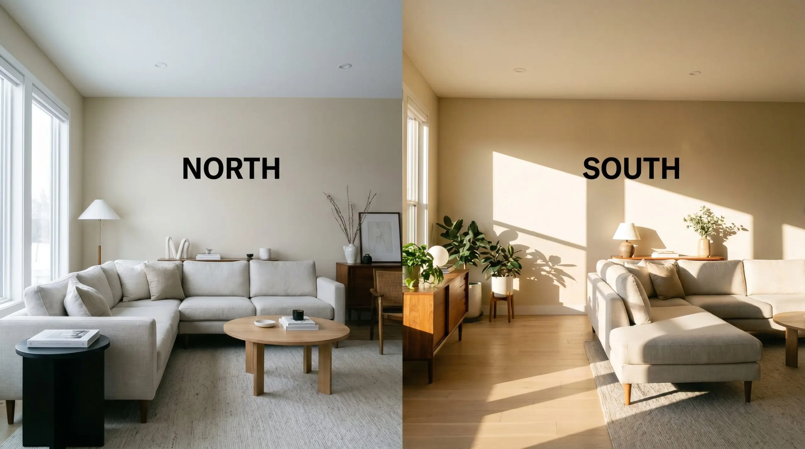
Lighting Effects & The Chameleon Factor
Because of its nuanced chromatic profile, this beige shifts its personality depending on the direction and temperature of the light hitting the wall.
Where to Apply Dulux Buff It Half in Your Home
The true value of this specific tint lies in its remarkable adaptability across completely different functional zones. By manipulating the surrounding materials and lighting, you can pull this shade in entirely different stylistic directions.
Elevating the Living Room
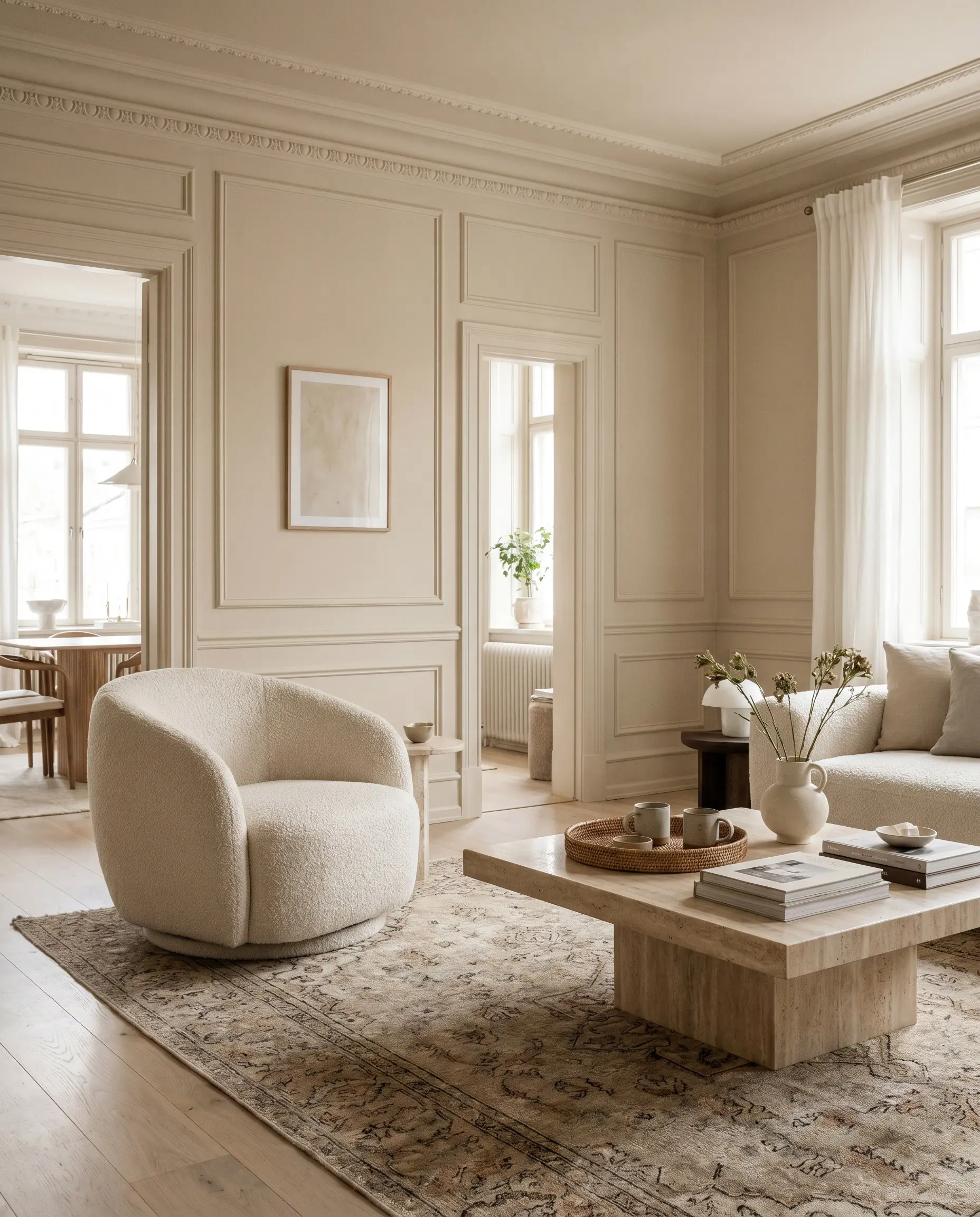
This warm neutral excels in main gathering spaces, offering a stabilizing backdrop for both Soft Minimalism and Transitional aesthetics. Consider pairing the walls with substantial textures like a boucle swivel chair, a travertine plinth coffee table, and layered vintage rugs to enhance the earthy beige cast. If your space features architectural details like picture molding or deep window casings, wrapping the entire room—trim included—in this single shade creates a highly curated, seamless envelope.
When color-drenching a living room in a mid-tone beige, always vary your sheen. Use an eggshell finish on the walls and a satin or semi-gloss on the trim to create subtle, light-catching definition without breaking the monochromatic flow.
Hackrea Pro-Tip (The Finish Line)
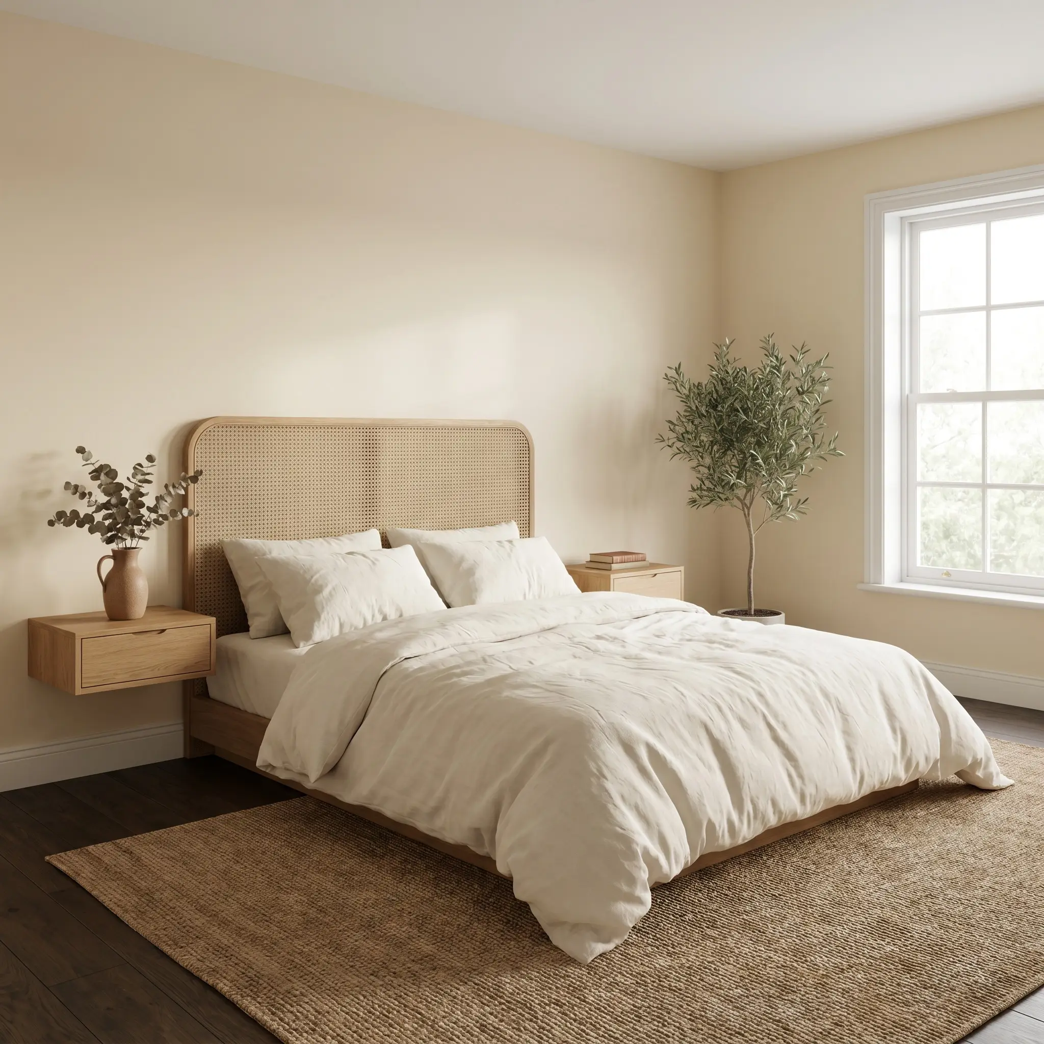
Designing a Restful Bedroom Retreat
In a bedroom, this color acts as a visual palate cleanser, setting a calm, restorative mood. Lean into a California Casual or Wabi-Sabi vibe by introducing washed linen bedding, a woven cane headboard, and floating oak nightstands. The paint’s subtle taupe undertones pair beautifully with organic, unpolished elements, making the room feel like a custom boutique hotel suite.
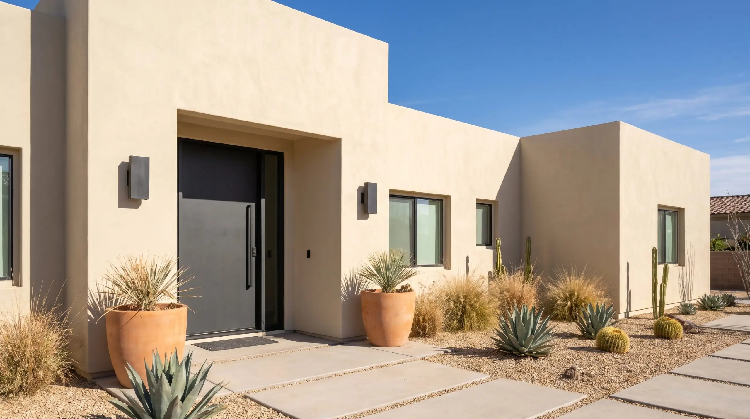
Exterior Render & Cladding
Taking this hue outside is a brilliant strategy for updating a tired facade without reverting to a sterile white. On exterior render, the intense natural sunlight will wash out some of the pigment, making it read as a crisp, luminous off-white with a hint of sandy warmth. Balance this soft exterior with matte black steel sconces, terracotta planters, and a contrasting charcoal front door for a striking Modern Mediterranean or Desert Modern aesthetic.
Be incredibly careful if your home is surrounded by densely tinted green foliage or large expanses of red brick paving. The intense reflective glare from these elements can bounce onto the light beige render, pulling out unwanted pink or greenish shadows.
Clash Warning (Exterior Glare)
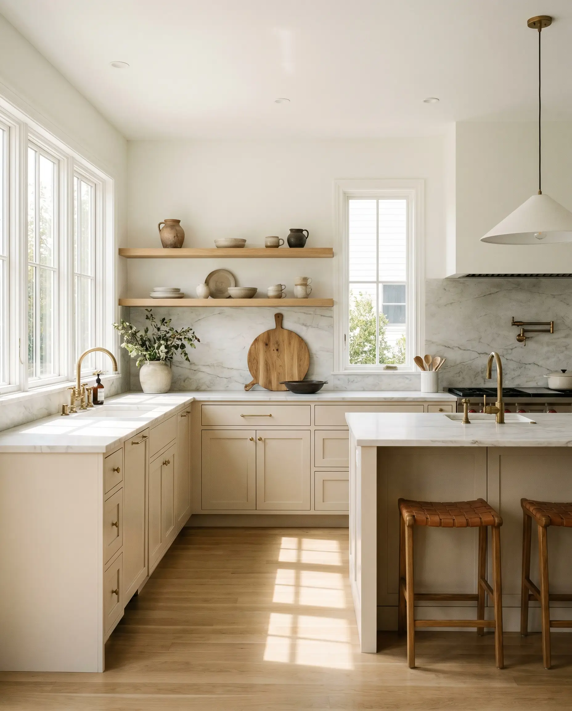
Custom Kitchen Cabinetry
Using this shade on kitchen cabinets offers a sophisticated alternative to the ubiquitous all-white kitchen. It brings a gentle, organic warmth to the heart of the home, especially when executed in an Organic Modern style. Pair the painted cabinetry with honed marble countertops, warm white oak floating shelves, and unlacquered brass hardware to create a rich, tactile environment that feels both high-end and highly functional.
Best Pairings for Dulux Buff It Half
The relational behavior of this beige is incredibly forgiving, allowing it to bridge the gap between crisp architectural boundaries and soft, tonal layering. It requires intentional material choices to either pull out its crisp modern edge or enhance its cozy, organic warmth.
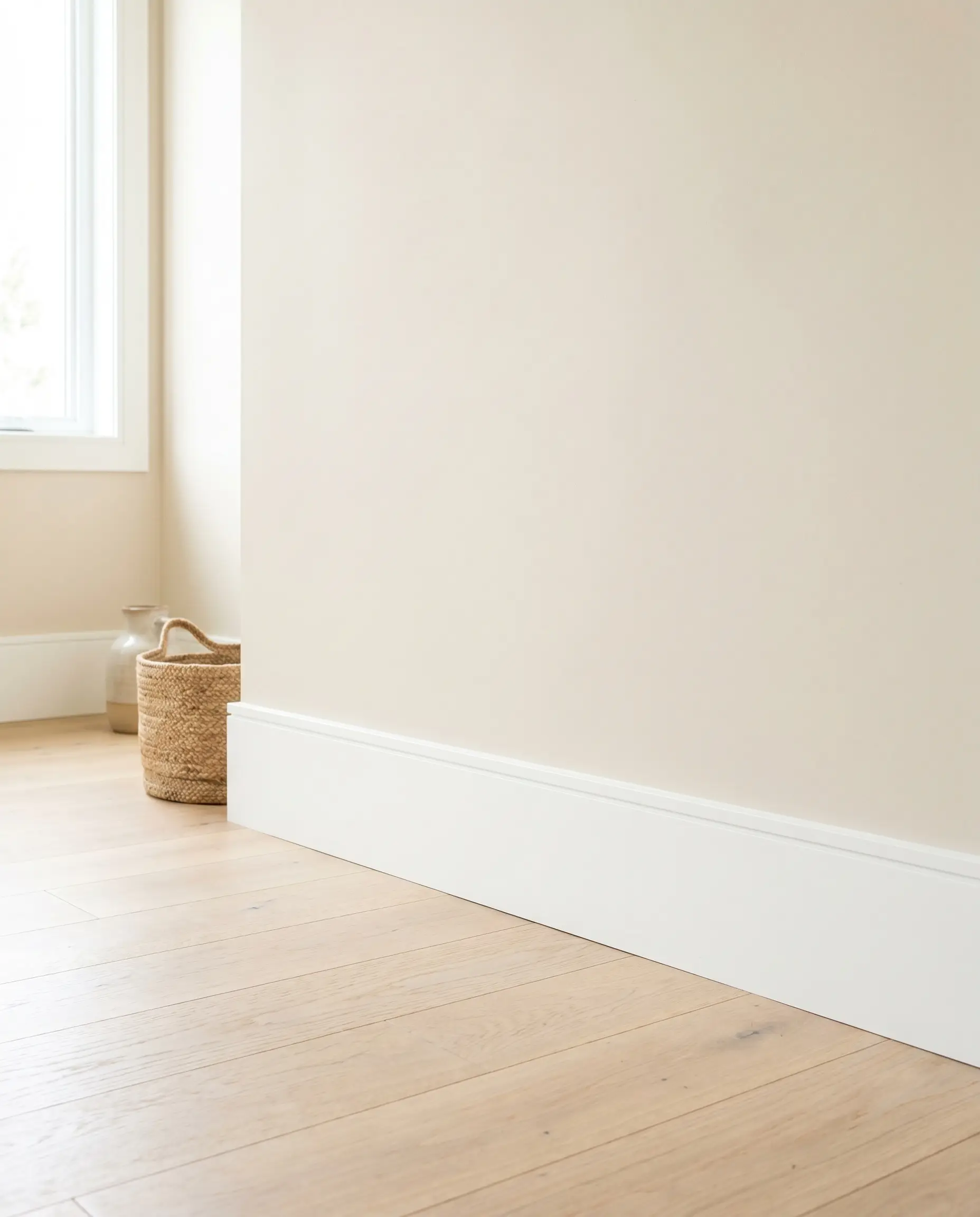
Trim & Baseboards
To establish a clean, tailored boundary that highlights the wall color, you need a high-reflectance white with minimal undertones. Dulux Vivid White SW1G1 provides a striking, crisp contrast that modernizes the beige, making the architecture feel sharp and intentional. For a slightly softer transition that still reads as a true white, Benjamin Moore Chantilly Lace OC-65 or Sherwin-Williams High Reflective White SW 7757 will beautifully frame the room without introducing clashing yellow or blue tones.
Hardware, Wood & Material Pairings
This paint’s foundational color structure thrives when placed next to highly tactile, organic elements.
Coordinating Colors
Designer Mood Boards
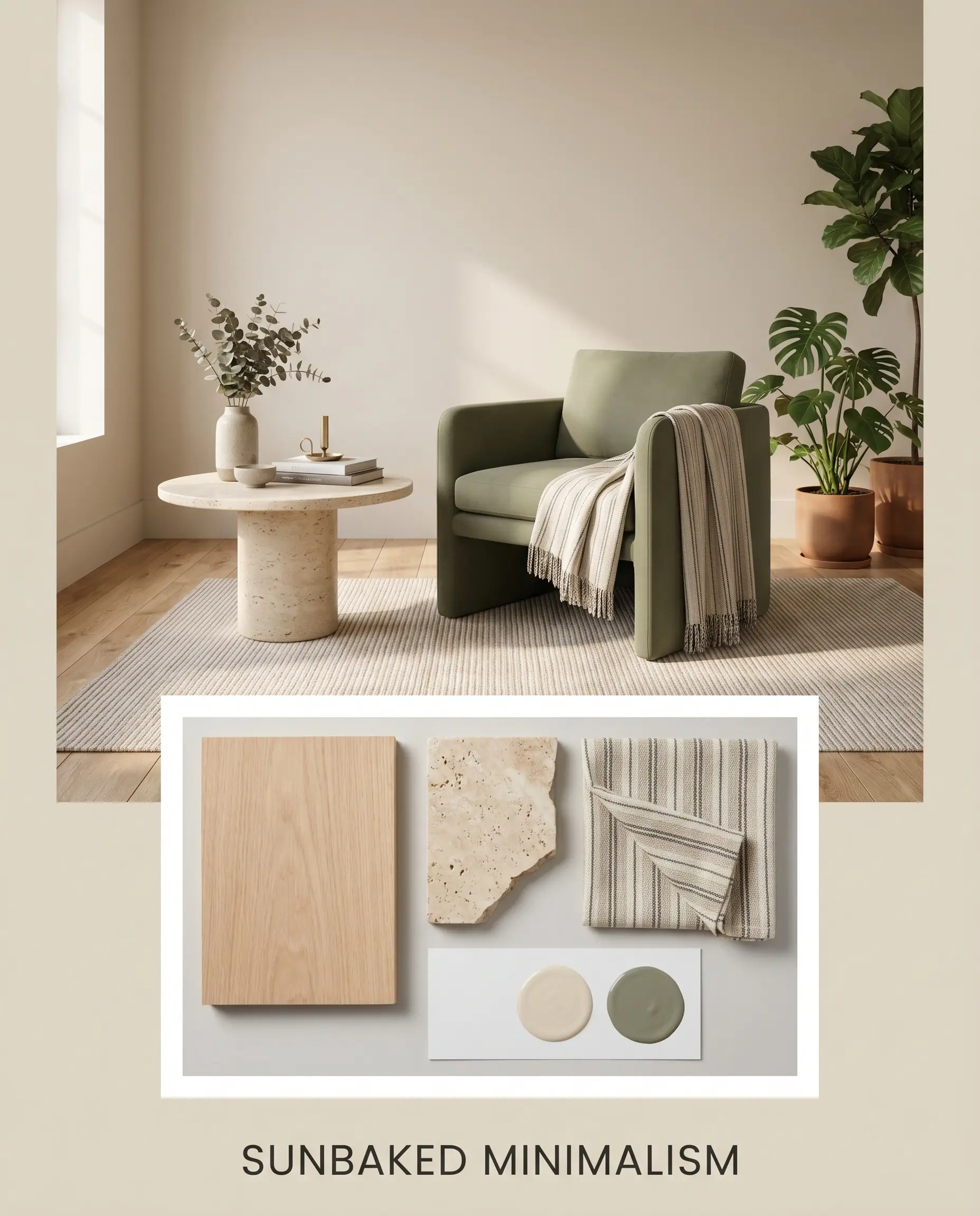
Sunbaked Minimalism This palette relies on the tension between sleek, modern silhouettes and raw, organic textures. By pairing the primary beige with accents of Farrow & Ball Treron and expansive white oak, the vibe becomes instantly calming and rooted. Layer in elements of honed travertine, matte black ceramic styling objects, and subtle pinstripe textiles to maintain a clean, uncluttered energy that feels effortlessly sophisticated.
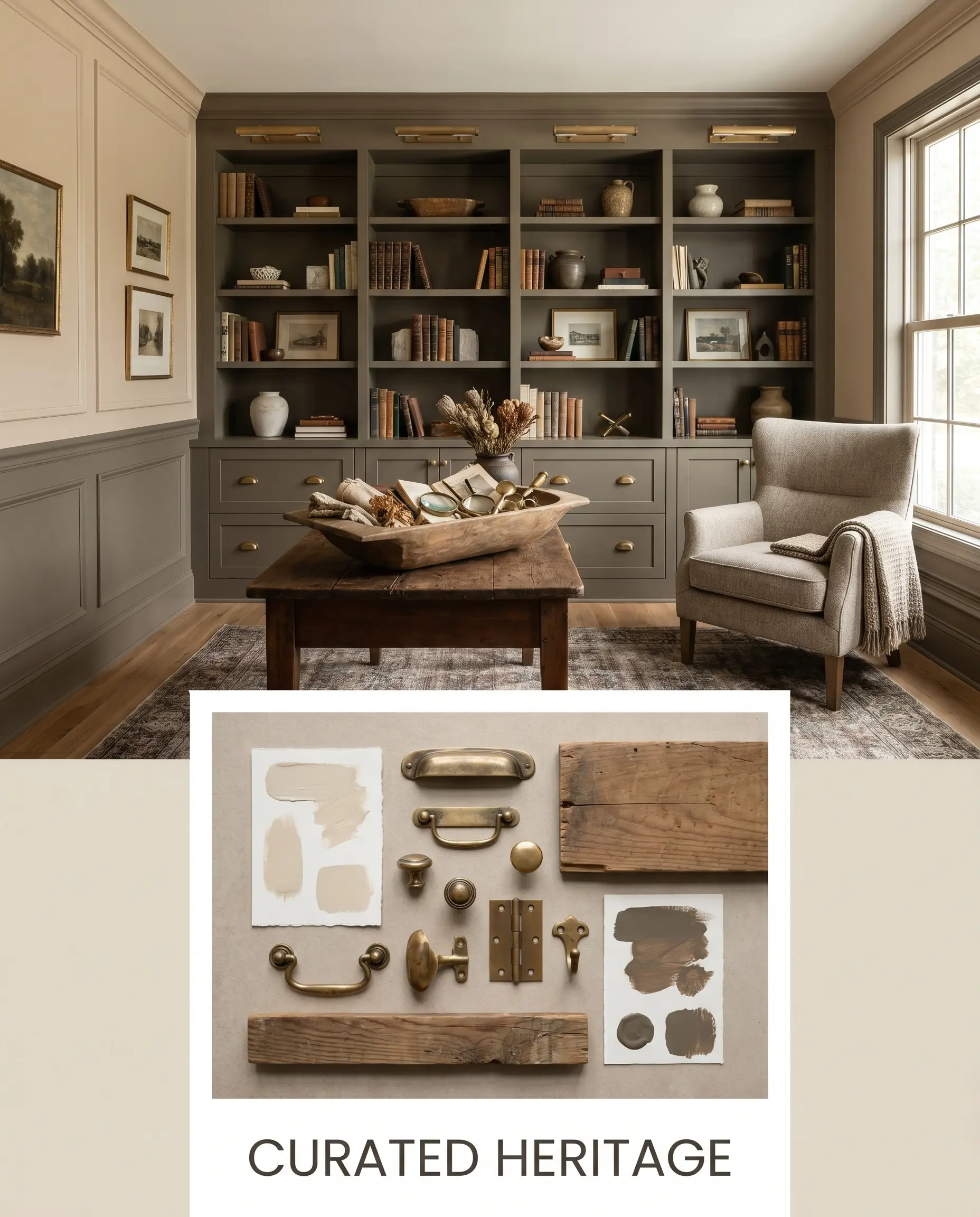
Curated Heritage For a richer, more transitional atmosphere, this combination leans into the paint’s historical roots while updating it for modern living. Introduce Dulux Bronze Fig on architectural features like wainscoting or built-in bookcases, paired with unlacquered brass hardware and vintage dough bowls. The resulting mood is warm, collected, and highly intentional, offering a premium aesthetic that feels fresh and inviting.
Head-to-Head Paint Comparisons
Choosing the right neutral often comes down to analyzing the specific lighting conditions and architectural style of your home against a rival shade. If your current space lacks natural light or features competing hard finishes, you may need to pivot.
Dulux Buff It Half S11B1H vs. Dulux Hog Bristle Half S14D1H
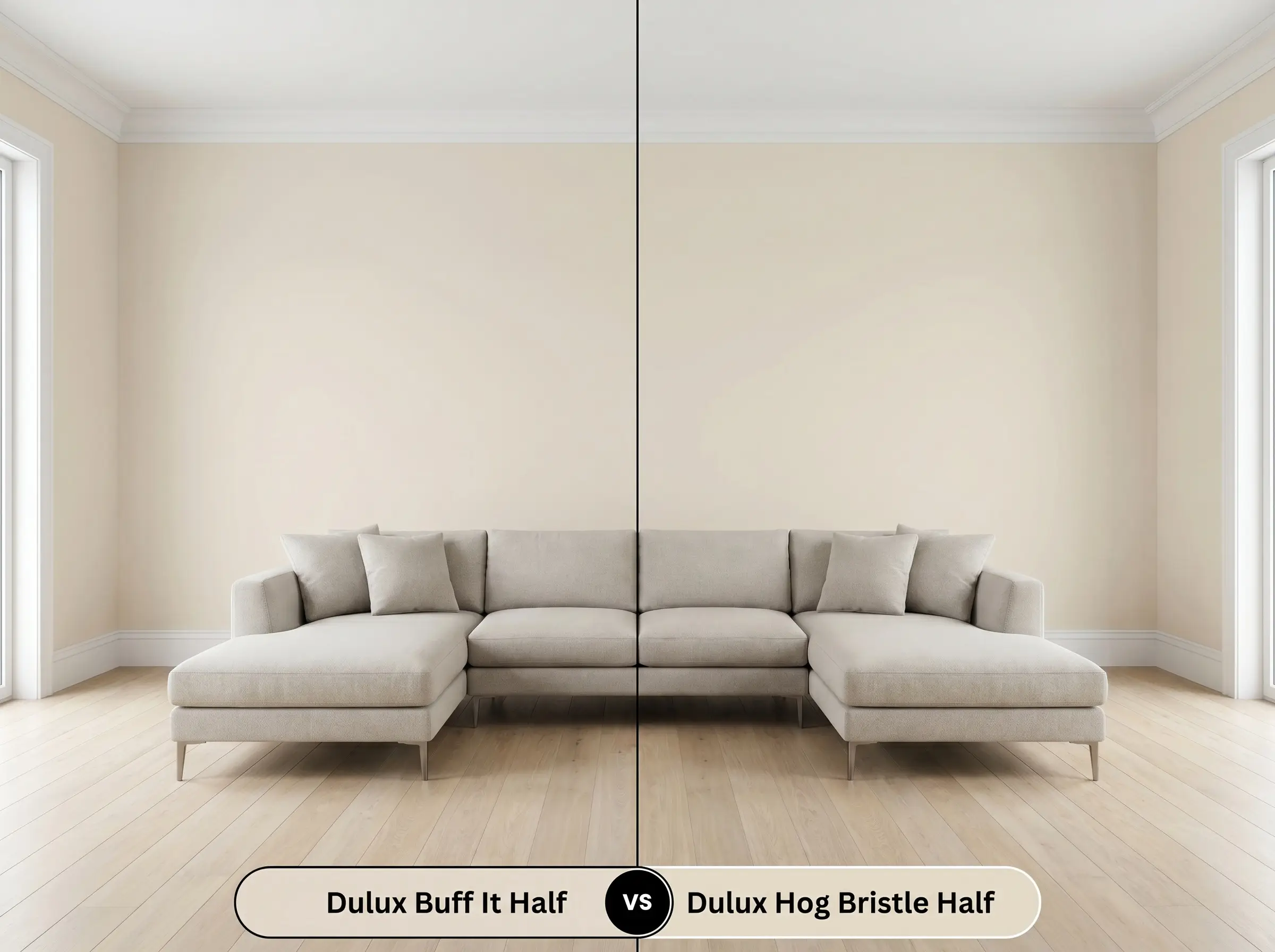
If you are comparing these two iconic shades, the decision hinges entirely on the underlying temperature. Hog Bristle Half carries a much more pronounced yellow-ochre undertone, making it noticeably warmer and slightly more traditional on the wall. If your room receives cool northern light and you want to avoid any yellow flashing, Buff It Half S11B1H is the safer, more muted choice.
Dulux Buff It Half S11B1H vs. Dulux Natural White SW1F4
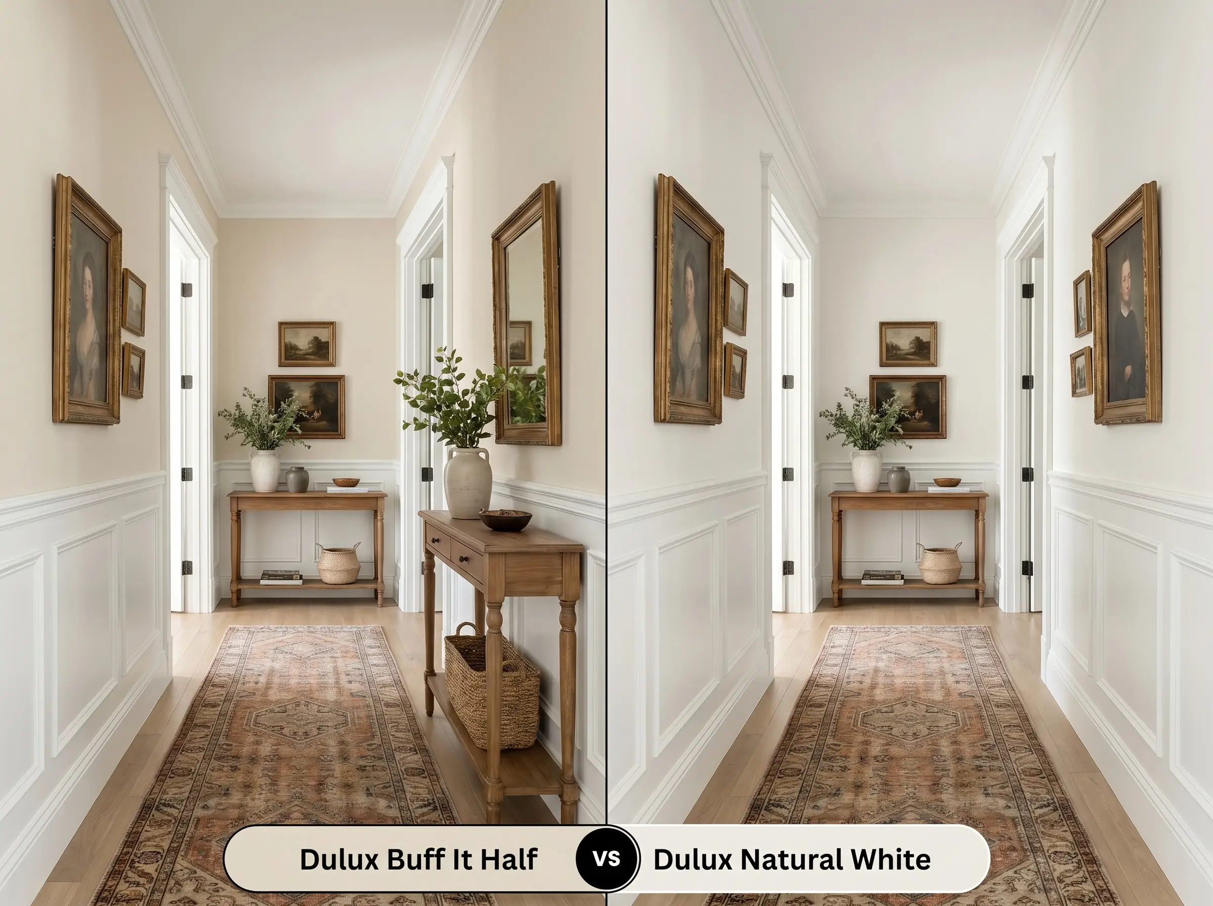
This comparison is a classic battle of depth versus brightness. Natural White is a bright, warm white that reflects significantly more light, perfect for illuminating dark hallways or compact spaces. If you want a definitive color presence that contrasts sharply against white trim rather than just a subtle glow, you must step down to the richer pigment profile of Buff It Half.
Dulux Buff It Half S11B1H vs. Benjamin Moore Edgecomb Gray HC-173
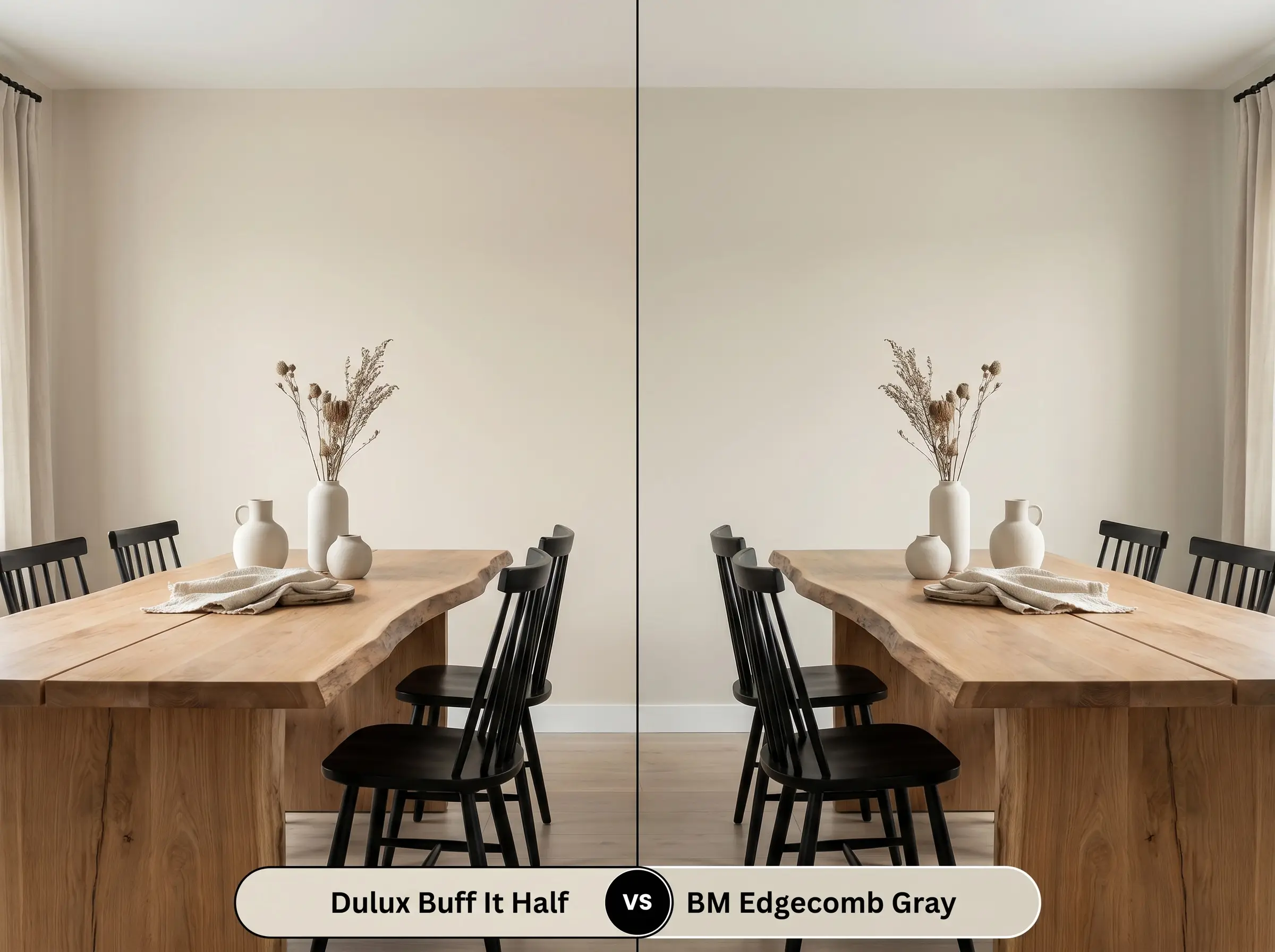
These two shades operate in a very similar visual space, acting as highly versatile greiges. However, Edgecomb Gray leans slightly more into its gray undertones, giving it a cooler, more modern edge in certain lighting. If you prefer a truly sandy, earthy beige cast, the Dulux option will provide that essential warmth without feeling chilly on overcast days.
Exploring Similar Colors & Cross-Brand Matches
Sometimes a color is almost perfect, but you need a slight adjustment in depth or you require an alternative brand due to local availability.
Same-Brand Alternatives
Cross-Brand Matches
Application Tips for a Flawless Finish
Translating a beautiful color from a swatch to your walls requires an understanding of how sheens and application methods manipulate the final aesthetic.
The Dynamic Sheen Guide
Primer & Coverage Strategy
Because this is a mid-toned neutral, a standard high-quality white or lightly tinted primer is perfectly sufficient to create a blank canvas. Do not skip the primer if you are painting over a dark, saturated color, as the old hue will alter the subtle undertones of your new beige. Expect to apply two full, even coats for a professional, opaque finish.
When rolling broad expanses of a solid beige, always maintain a wet edge and avoid excessive back-rolling. If the paint begins to dry and you roll over it, you risk “flashing”—visible, uneven streaks that catch the light and ruin the seamless architectural finish.
Hackrea Design Secret (Avoiding Flashing)
Frequently Asked Questions
Because of how light hits the surface, this color will appear slightly darker and more shadowed on heavily textured render. On smooth weatherboards, the color will read lighter, crisper, and more uniform in direct sunlight.
The subtle red-green balance in this paint actually harmonizes quite well with warm timbers, acting as a stabilizing neutral backdrop. However, the intense red of Jarrah can sometimes reflect onto the walls, pulling out unwanted pinkish tones in the beige, so testing with a large swatch is essential.
Applying this mid-toned beige to the ceiling is an excellent strategy for creating a cozier, more intimate atmosphere. It gently pulls the ceiling down visually, especially when paired with lighter walls, without making the space feel enclosed.
Under crisp 4000K daylight bulbs, the cozy, sandy warmth of the beige is significantly flattened. The color will read as a much sharper, cooler, and more modern neutral, which works beautifully alongside crisp white tiles and polished nickel hardware.
Final Verdict: Is Dulux Buff It Half Right for You?
Dulux Buff It Half is the ultimate foundational neutral for homeowners who want to inject genuine, earthy warmth into their architecture without committing to a dense, traditional tan. It performs exceptionally well in everyday living spaces, seamlessly elevating Organic Modern, Transitional, and Soft Minimalist design styles. This paint is perfect for those seeking a sophisticated, highly adaptable backdrop that makes standard materials feel instantly more curated and expensive.
However, this shade is not universally foolproof, particularly if your home is dominated by stark, cool-toned gray hard finishes like cool Carrara marble or icy gray luxury vinyl plank flooring. When placed directly against these chilly, blue-based grays, the warm beige structure of the paint will immediately look muddy and dated, creating a disjointed, uncomfortable energy in the room. If your architecture is locked into a cool-toned palette, you must pivot to a crisper, more gray-leaning neutral to maintain a cohesive, high-end aesthetic.
Closest Cross-Brand Equivalents
The absolute closest scientific color matches for Buff It Half across top paint brands.