Cotton Knit PPU7-11
BehrBehr Cotton Knit (PPU7-11) is a light, warm-leaning greige and off-white with an LRV of 74. While Behr describes it as a 'cool beige,' it often reads as a soft, creamy taupe-beige without strong yellow undertones, making it a highly versatile neutral for walls and trim.
| Temperature | Warm |
|---|---|
| Primary Undertone | Creamy beige |
| Hidden Undertones | Subtle gray and blanched white |
| Best Exposures | North-facing or South-facing |
| Best For | Living rooms, hallways, kitchen cabinets, trims, coastal-inspired spaces, bathrooms |
Hackrea Review
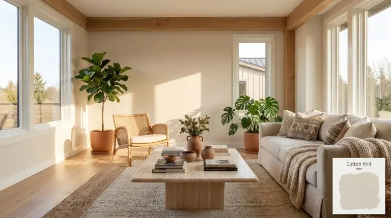
Cotton Knit is an unsung hero in the Behr lineup. It beautifully bridges the gap between beige, cream, and gray, offering a sophisticated, muted backdrop that avoids the dreaded yellow or pink flash. It is an excellent choice for a modern boho or coastal aesthetic.Architectural Applications for Behr Cotton Knit
Modern Boho Living Rooms
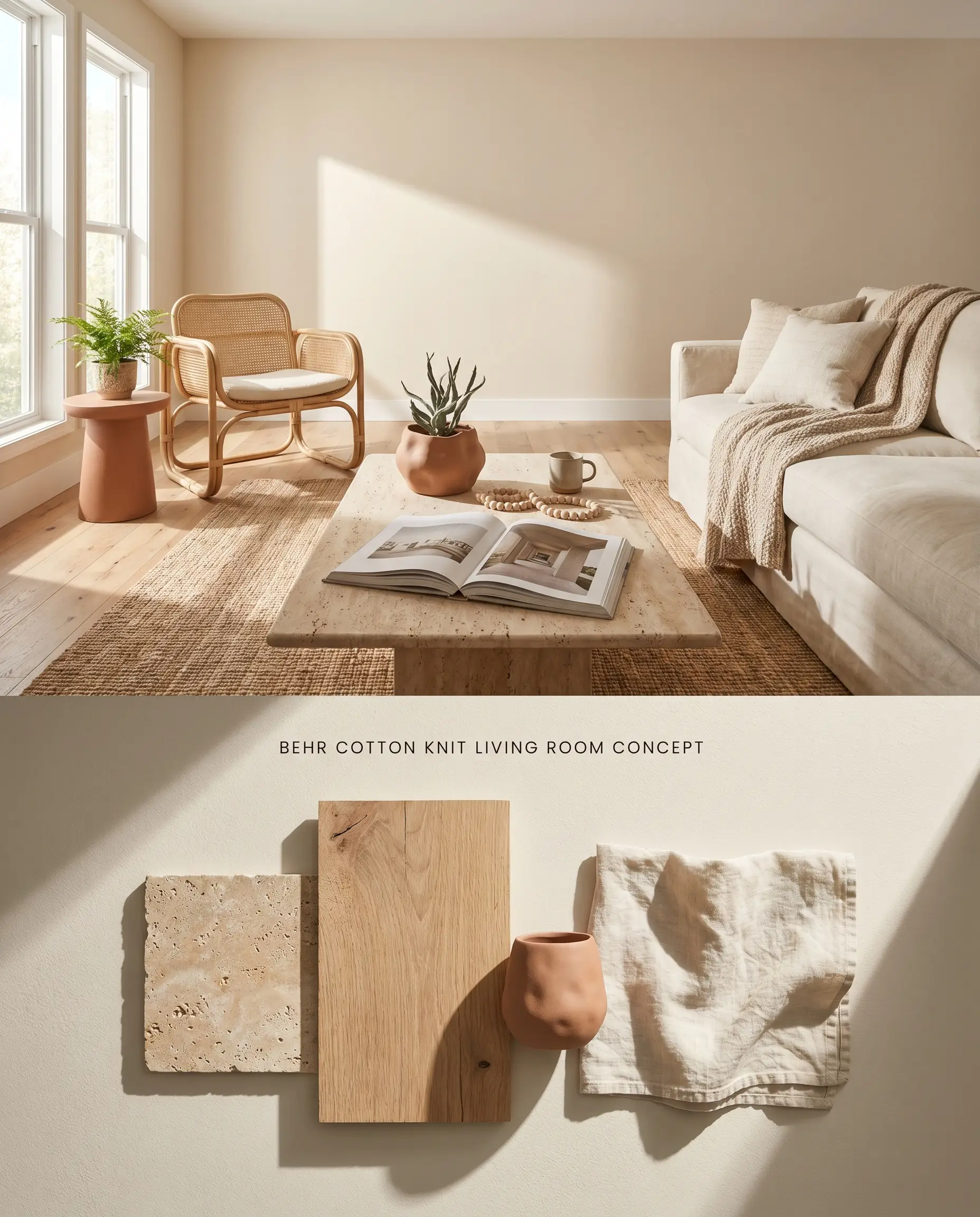
The warm off-white base of Cotton Knit grounds the varied textures of rattan and washed linen without leaning stark. Its subtle blanched white undertone interacts with natural fibers, absorbing ambient light to create a soft, muted glow. This hue acts as a stabilizing backdrop that prevents organic, eclectic layering from reading as visually chaotic.
Coastal-Inspired Bedrooms
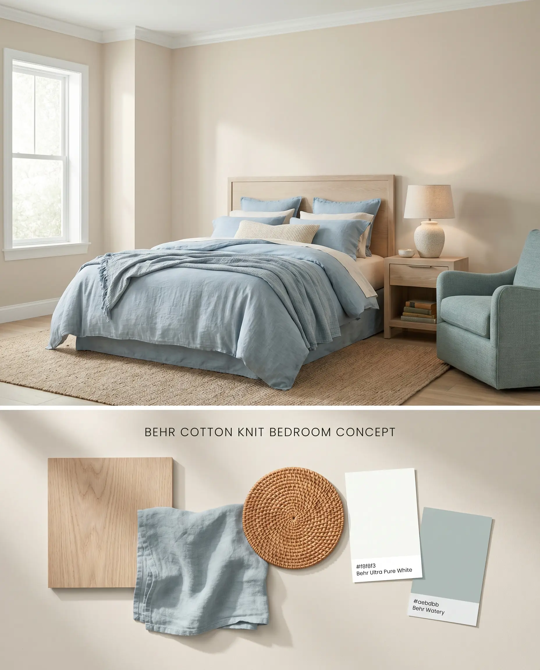
In a coastal grandmother aesthetic, the transition from crisp whites to a smoky beige provides necessary visual weight against light textiles. The LRV 74 reflects morning light efficiently, keeping the room airy while introducing enough pigment to contrast cleanly against bleached oak furniture. The subtle grayish-cool cast emerges softly alongside washed blues, anchoring the room’s temperature.
Kitchen Cabinets and Trim
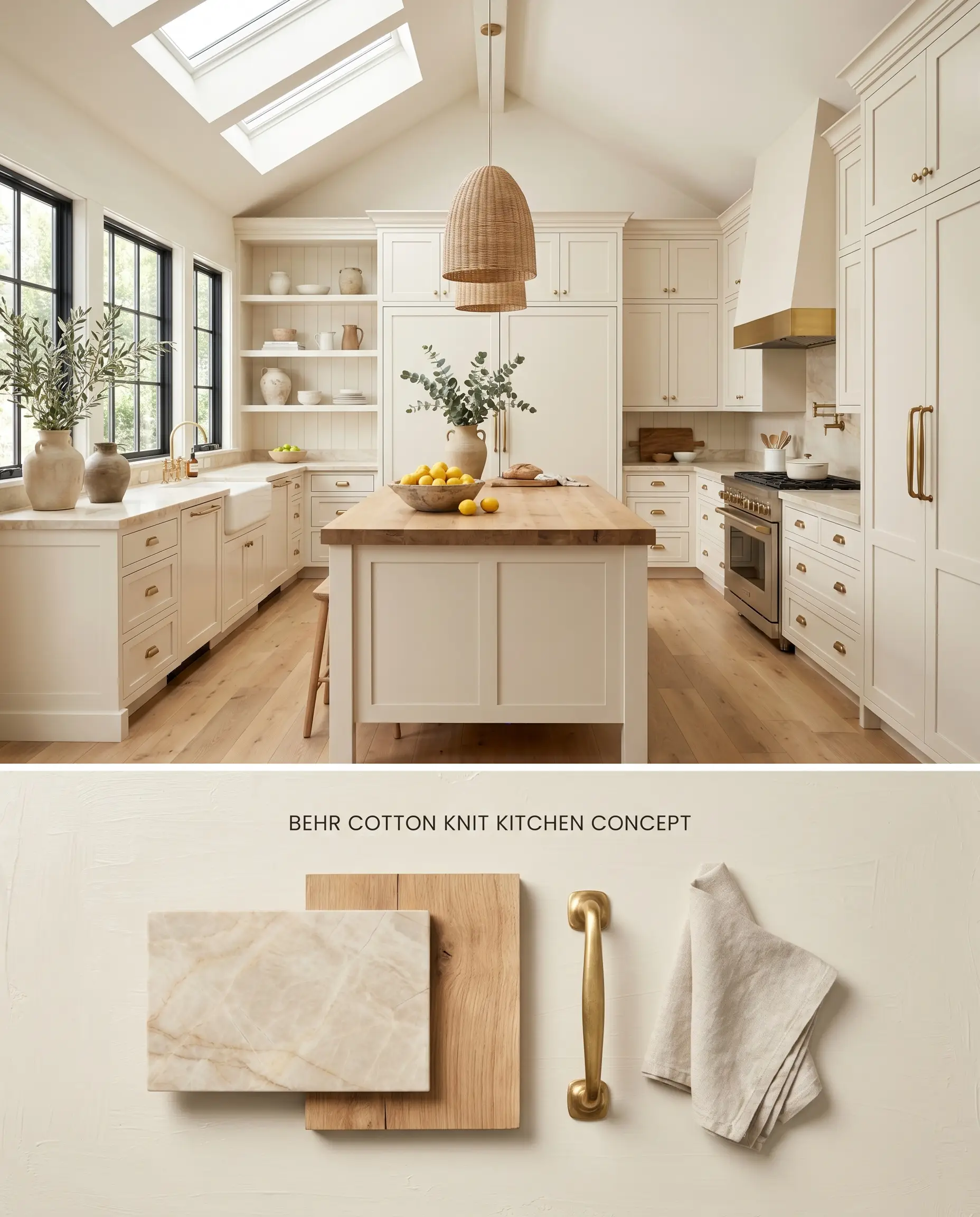
Applying Cotton Knit PPU7-11 to millwork softens the hard, utilitarian lines of contemporary kitchen layouts. The greige tone bridges the gap between polished stone countertops and natural wood islands, preventing the cabinetry from reading as sterile. Because this is a light hue, coverage over dark or patched substrates requires a tinted primer to ensure the final coat achieves a uniform architectural finish.
Sun-Drenched Hallways and Bathrooms
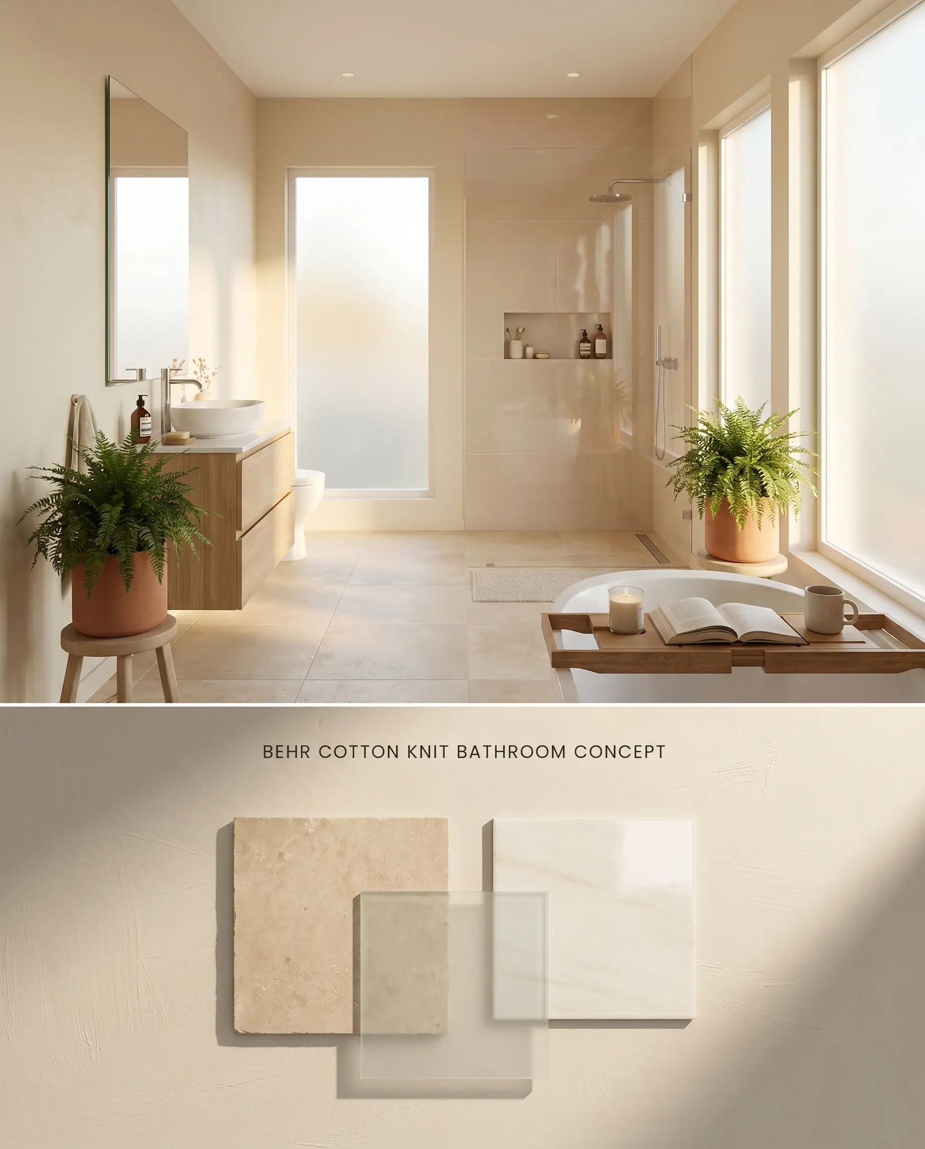
Cotton Knit strictly requires natural light to maintain its crispness; in windowless spaces, the tone collapses into a flat taupe and loses its structural integrity. When placed in well-lit, sun-drenched corridors, the high LRV bounces light effectively without turning neon. The resulting warmth balances the cold, reflective surfaces of porcelain tiles and glass vanity mirrors.
Warm Exterior Siding
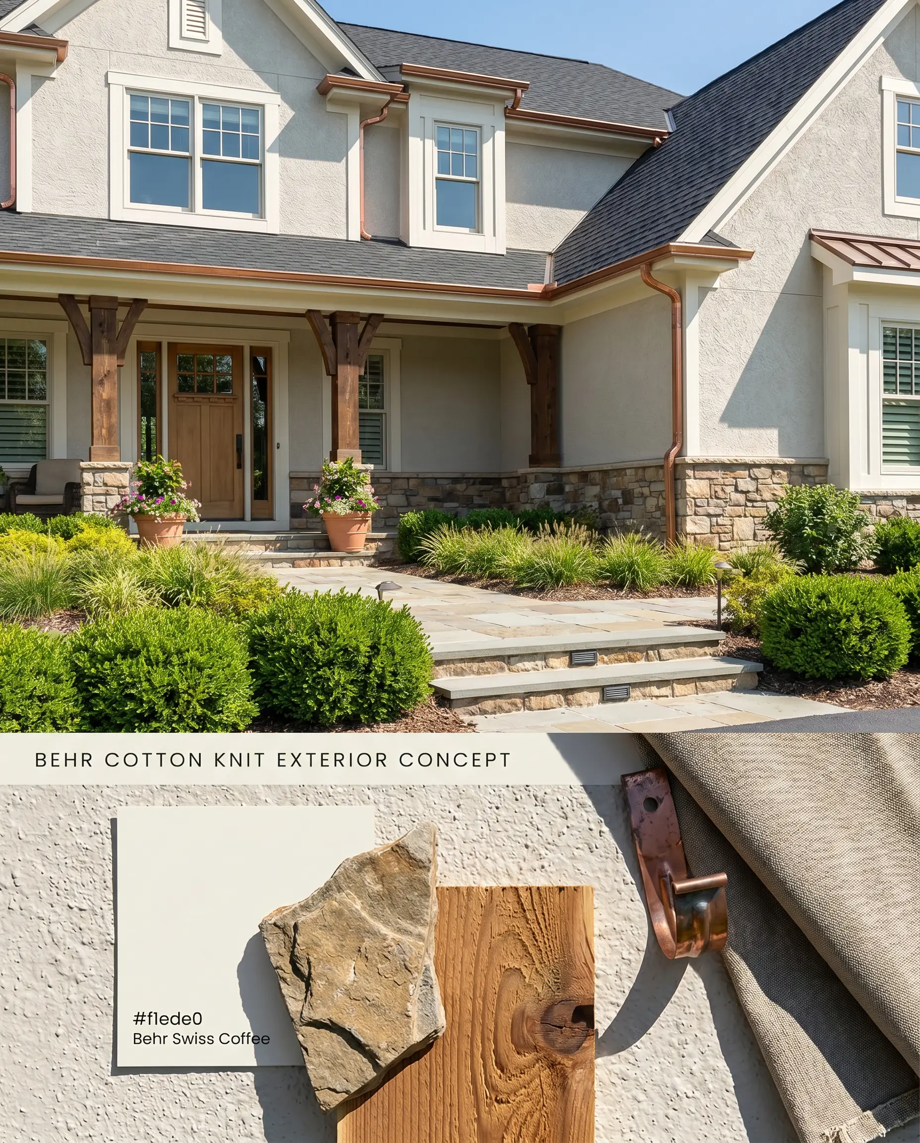
Direct exterior sunlight washes out subtle undertones, shifting Cotton Knit from a nuanced greige into a bright, creamy off-white. The shade contrasts smoothly against dark architectural roofing materials and natural stone facades, softening the rigid geometry of modern exteriors. The pigment holds enough depth to prevent the facade from blinding the eye during peak daylight hours.
You can apply wallpapers, paints, etc. on walls and see how they look in various interiors.

Head-to-Head Comparative Color Theory
Behr Cotton Knit PPU7-11 vs. Sherwin-Williams White Duck SW 7010
Sherwin-Williams White Duck SW 7010 shares the exact same light reflectance value (LRV 74) as Cotton Knit but carries a slightly more pronounced yellow-beige undertone. In south-facing rooms, White Duck amplifies into a creamy, almost buttery hue, whereas Cotton Knit retains its smoky beige profile due to its grayish-cool cast. Specify Cotton Knit when pairing with organic, muted textures like raw oak, and reserve White Duck for traditional spaces requiring a distinctly warm, creamy envelopment.
Behr Cotton Knit PPU7-11 vs. Benjamin Moore Pale Oak OC-20
Benjamin Moore Pale Oak OC-20 (LRV 68.64) is noticeably deeper and leans firmly into a warm gray, whereas Cotton Knit functions more as a true warm off-white. Pale Oak provides stronger contrast against crisp white trim but can feel shadowed in rooms with limited natural light. Utilize Cotton Knit in spaces requiring a higher bounce effect and an airier transition, shifting to Pale Oak when architectural molding demands a sharper, more defined tonal contrast.
Behr Cotton Knit PPU7-11 vs. Behr Swiss Coffee 12
Behr Swiss Coffee 12 (LRV 84) acts as a bright off-white with subtle green-yellow undertones, reflecting significantly more light than Cotton Knit. Cotton Knit’s lower LRV and grayish-cool cast give it more body and wall presence, preventing it from washing out in intense, direct sunlight. Deploy Swiss Coffee for ceilings or ultra-bright modern interiors, and select Cotton Knit when the walls require enough pigment to ground light furnishings without appearing stark.
Technical Specifications & Application FAQs
South-facing light amplifies its creamy warmth, but its subtle grayish-cool cast prevents it from shifting into a yellow or fleshy tone. It maintains a balanced, smoky beige profile even under intense, warm sunlight.
Pairing this hue with stark, cool whites forces its color structure to look muddy and overly warm by contrast. It is best paired with warmer off-whites or used as the primary wall color with a crisp white trim.
The warm off-white base harmonizes seamlessly with honey oak and warm woods, absorbing the ambient warmth without clashing. It bridges the gap between the flooring and ceiling, creating a cohesive, organic envelope.
Yes, in environments lacking natural light, this paint loses its crispness and collapses into a flat, traditional taupe or beige. It requires adequate sunlight to activate its nuanced blanched white undertone.
Similar Paint Colors
Same Brand
Cross-Brand Equivalents