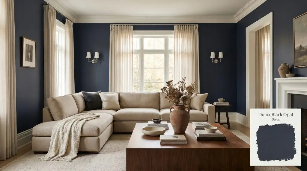
Dulux Black Opal is a deeply saturated, cool-toned blue-black with distinct violet and indigo undertones. With an LRV of 5, it acts as a dramatic, light-absorbing anchor, shifting between a velvety charcoal-navy and a rich, bruised plum depending on the lighting.
Will Black Opal clash with your room?
Paint Technical Profile
| Color ID / SKU | 66BB 06/077 |
| HEX Code | #2C3241 |
| Light Reflectance (LRV) | 5 |
| Use | Interior, Exterior |
| Best Exposures | South, West |
| Best For | Accent walls, cabinetry, dramatic small spaces, media rooms |
Dulux Black Opal: Sculpting Infinite Shadow with a Violet-Laced Navy
There is a profound difference between a room painted dark and a room that feels intentionally wrapped in shadow. Dulux Black Opal operates entirely in the latter category, absorbing harsh glare to create an atmosphere of quiet, curated intensity. This is not just another standard dark blue; it is a meticulously layered pigment that changes its temperature the moment the sun dips behind the clouds.
By manipulating how light bounces off your walls, this velvety blue-black pushes boundaries outward, making tight spaces feel deceptively expansive. We are going to break down exactly how its hidden indigo undertones respond to your specific lighting, and how to pair it with the right tactile finishes to craft a deeply personal, high-end environment.
The Core Foundation: Undertones & LRV of Dulux Black Opal
If you are wondering whether this dramatic hue leans warm or cool, the answer is decisively cool. However, because it carries distinct violet and indigo micro-undertones, it possesses a hidden warmth that prevents it from feeling like a sterile, icy charcoal.
Sitting at an LRV of 5, this light-absorbing paint functions as a visual void rather than a standard flat surface. Instead of feeling heavy or oppressive, this extremely low light reflectance actually blurs the hard corners of a room, creating a seamless backdrop that allows your lighter furnishings to pop brilliantly.
The Chameleon Factor: How Light Alters Black Opal
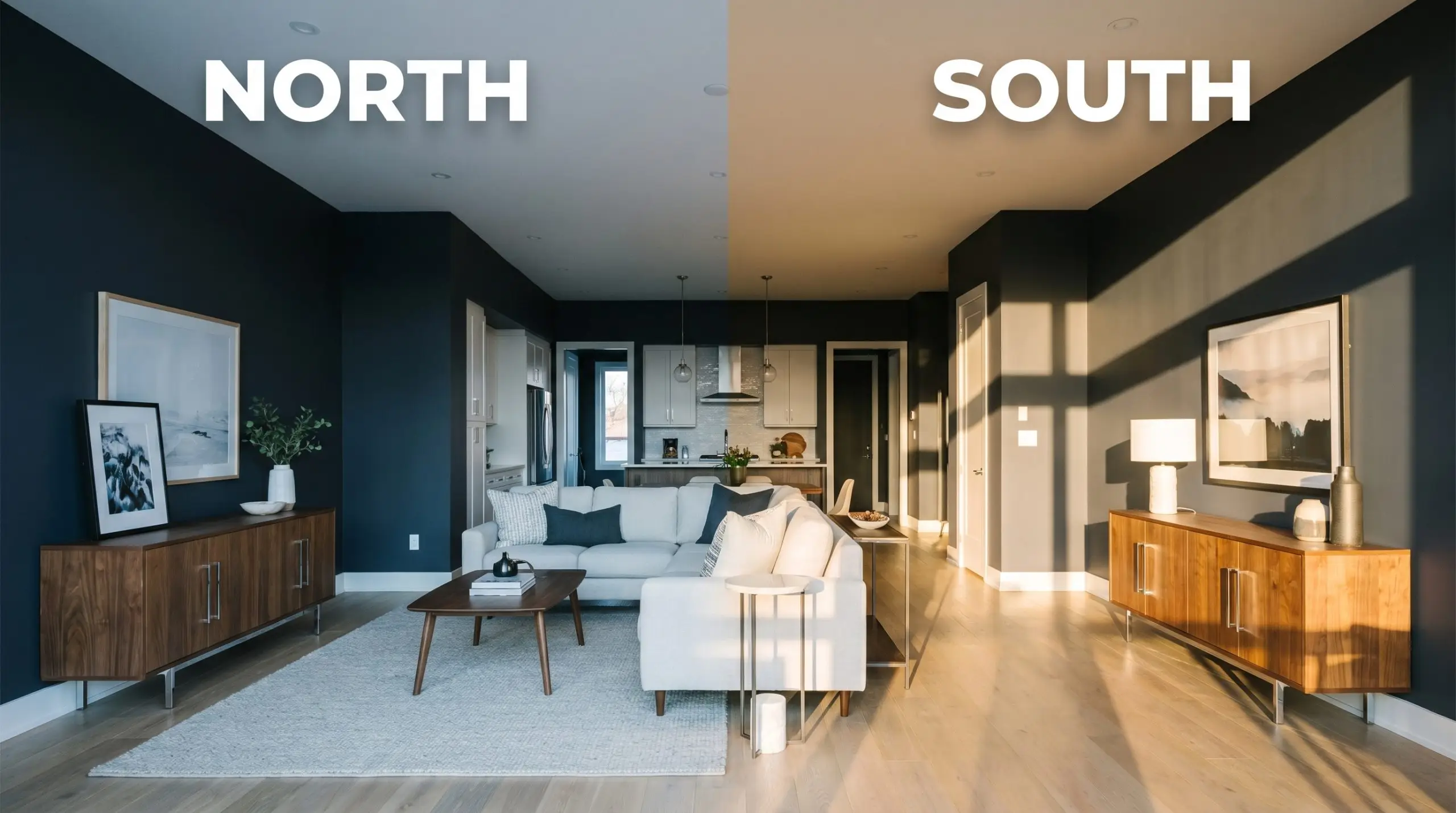
Deep, jewel-toned darks are notoriously sensitive to their environment, and this shade is a true color shifting chameleon. If you do not test this paint in your specific lighting conditions, you might accidentally strip away the beautiful violet notes that make it so special. Relying on my expertise, the biggest risk with this color is placing it in a dimly lit, north-facing room with cool LED bulbs, where it will completely lose its rich complexity and read as a flat, lifeless black.
Everyday Architecture: Styling Dulux Black Opal
This rich pigment brings a heavy, grounding weight to standard residential layouts, softening harsh architectural lines while providing a dramatic backdrop. Rather than demanding a specific decor style, it acts as a versatile anchor that easily shifts from moody transitional to sleek modernism depending on your styling choices.
Washrooms & Half Baths
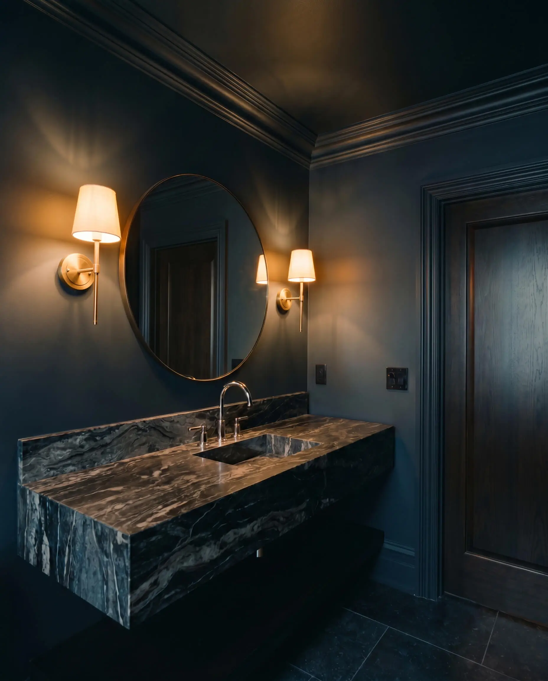
Instead of fighting the lack of natural light in a tiny space, lean into it. Coating the walls, trim, and ceiling in this dramatic powder room color blurs the boundaries of the room, making standard drywall feel incredibly custom. When exploring dark moody powder room ideas, pair this deep hue with polished nickel fixtures and a heavily veined marble vanity to bounce just enough light around the room.
Will Black Opal work with your specific lighting, floor, or furniture?
Immersive Entertainment Spaces
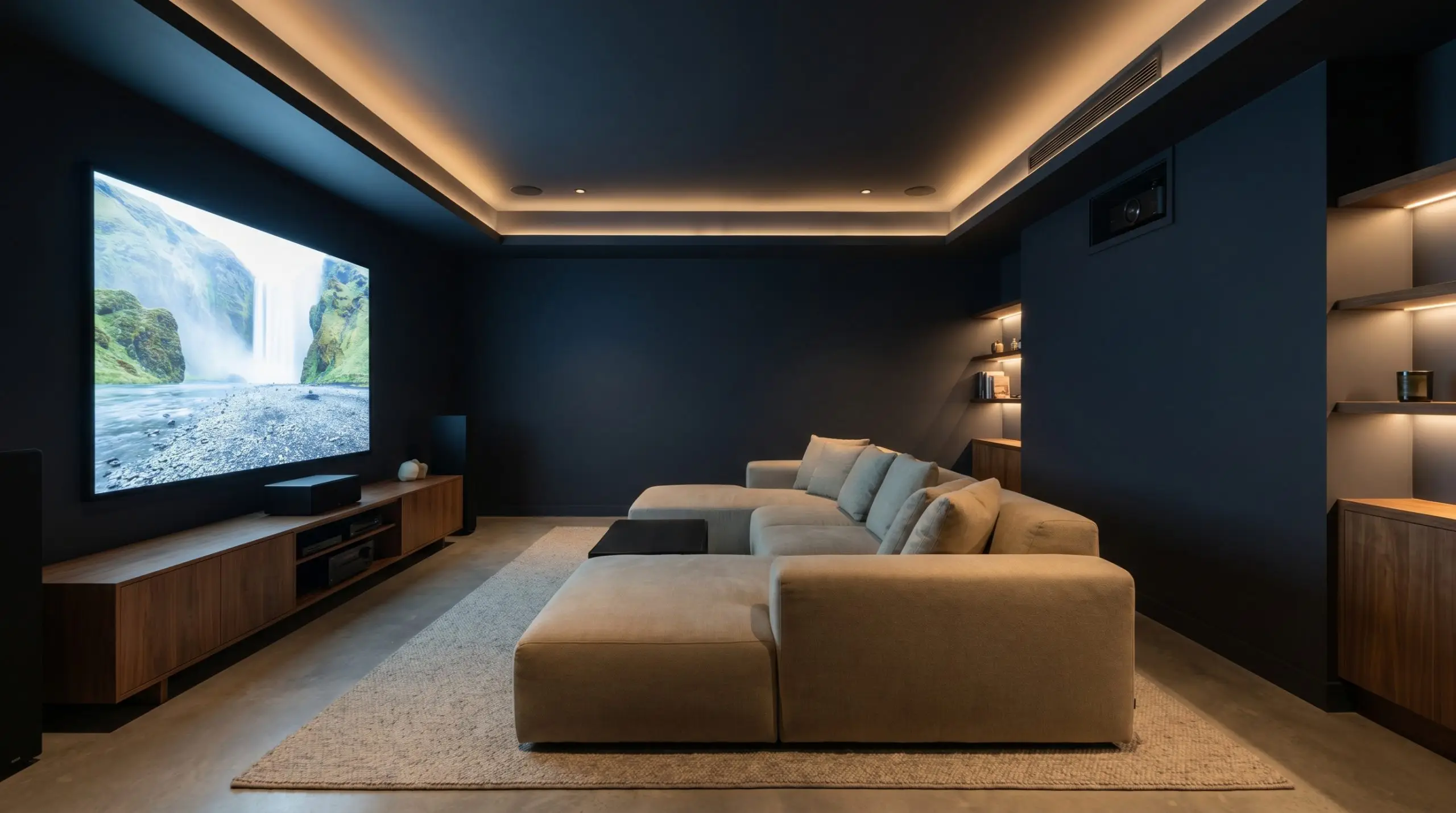
For media rooms or home theaters, you want a color that absorbs the glare of the screen without feeling like a commercial cinema. This velvety shade eliminates distracting reflections while adding a layer of rich, enveloping comfort. Ground the room with a plush, low-profile sectional and textured linen blackout curtains to keep the acoustic energy soft and inviting.
Formal Dining & Millwork
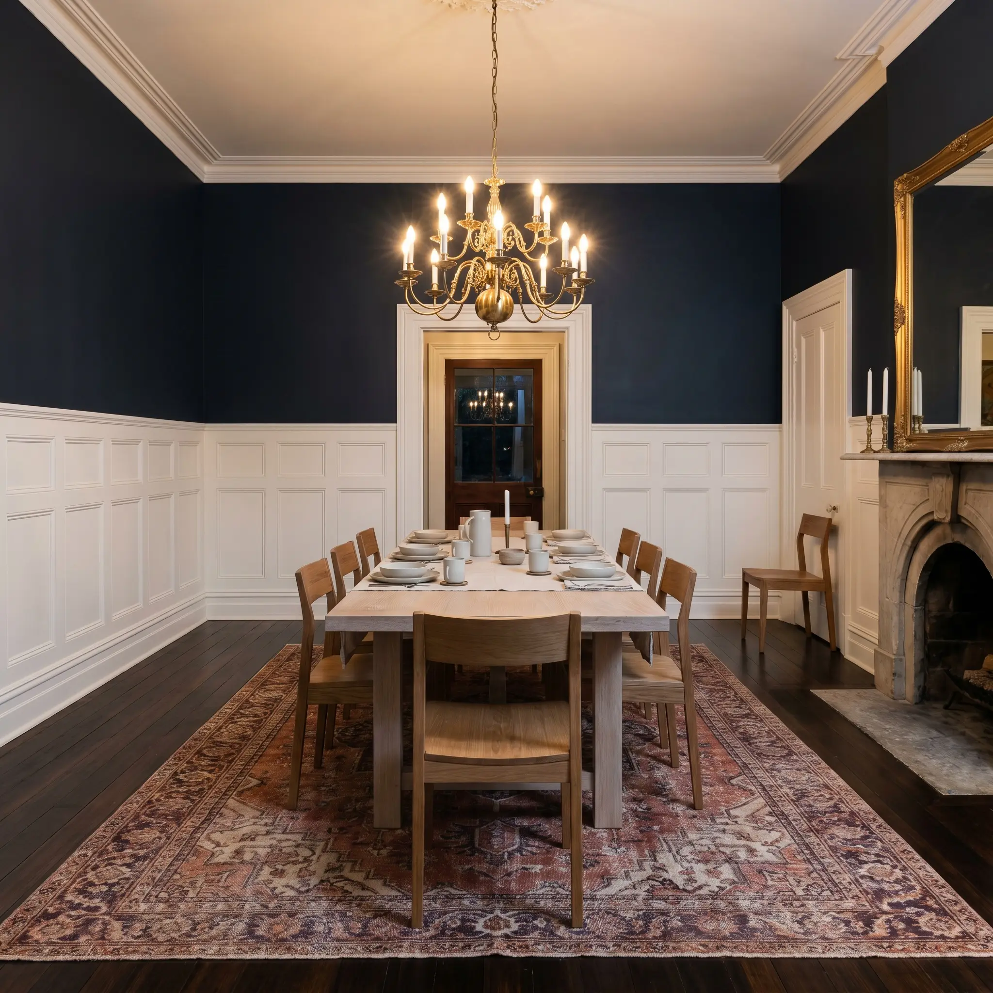
Applying this deep indigo above crisp white wainscoting contrast creates a striking, tailored aesthetic for dining areas. The sharp horizontal divide grounds the room, allowing the upper walls to recede into the shadows during evening dinner parties. Introduce a vintage Persian rug with faded terracotta and plum threads to pull the hidden violet out of the paint.
Will Black Opal work with your specific lighting, floor, or furniture?
Culinary Anchors & Cabinetry
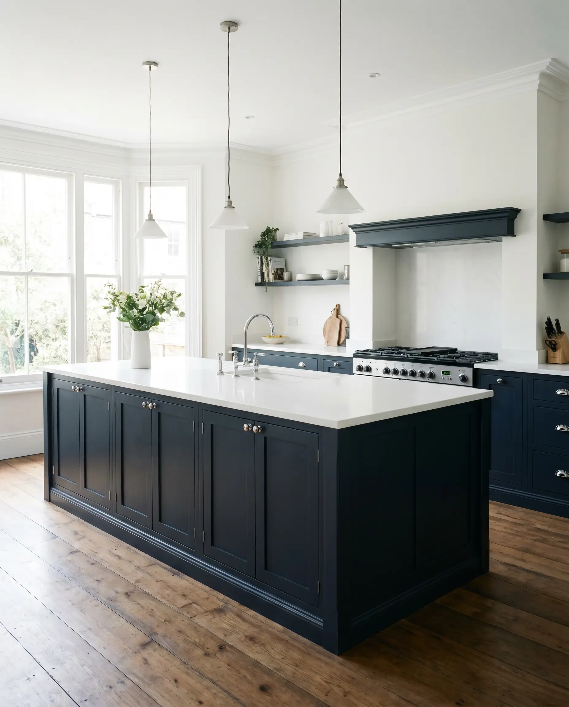
If you are hesitant to commit to dark walls, using this as a bespoke cabinetry color on a kitchen island is a brilliant compromise. It provides massive visual weight to the center of the kitchen, especially when paired with basic shaker profiles and a stark white quartz countertop. The deep base hides scuffs effortlessly while making stock cabinetry feel intentionally crafted.
Restful Retreats
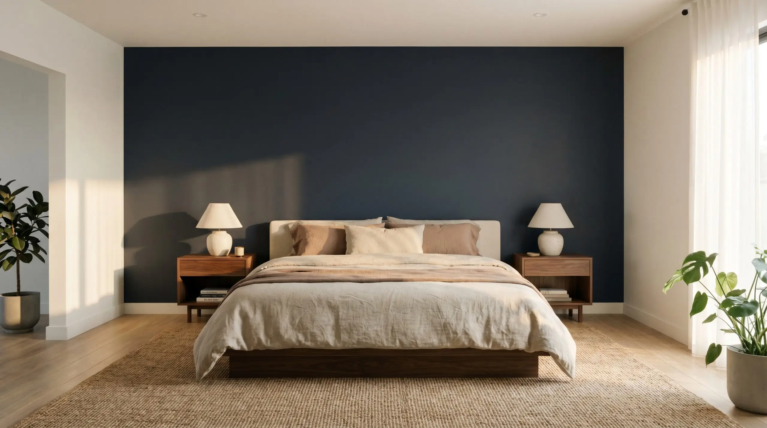
In a bedroom, a dark accent wall behind the headboard acts as a visual anchor that promotes deep relaxation. The indigo notes feel inherently soothing, especially when layered with soft, washed linen bedding in muted oat or clay tones. Keep the surrounding walls a soft, warm white to maintain a balanced, breathable atmosphere.
Breaking the Mold: Unique Ideas for This Violet Navy
Moving past standard wall applications, this deeply saturated hue inspires incredibly custom, unexpected architectural moments. By leveraging its light-absorbing qualities, you can manipulate how the eye travels through your home, turning easily overlooked features into stunning focal points.
Framing the View (Window Mullions)
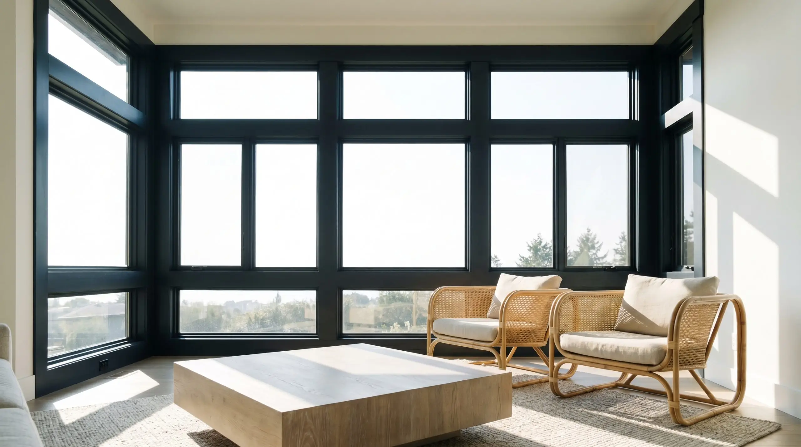
Instead of defaulting to white or standard black, painting your interior window frames and mullions in this dark navy creates a stunning, high-contrast border for your exterior views. The subtle violet undertone softens the transition between the bright outdoor sunlight and the interior shadows. This technique works exceptionally well in living rooms with large, unobstructed glass, turning the landscape outside into framed art.
Painting standard wooden window sashes in this deep, cool-toned hue mimics the expensive look of custom steel-framed windows at a fraction of the cost, elevating basic builder-grade windows instantly.
Hackrea Pro-Tip (The Illusion of Steel)
The Monochromatic Attic Canopy
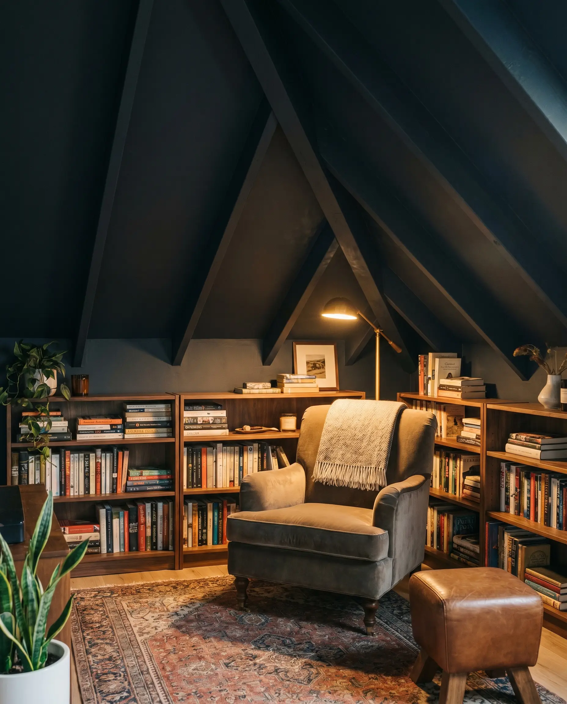
Sloped ceilings in finished attics often feel awkward or visually heavy when painted white to match the walls. By wrapping the entire sloped ceiling and knee walls in this velvety hue, you eliminate the harsh angles and create a cozy, tent-like canopy. Add a few low-wattage amber reading lamps to pull out the plum undertones, crafting a perfect, secluded reading nook.
Grounding the Utility Zone (Mudroom Built-Ins)
Will Black Opal work with your specific lighting, floor, or furniture?
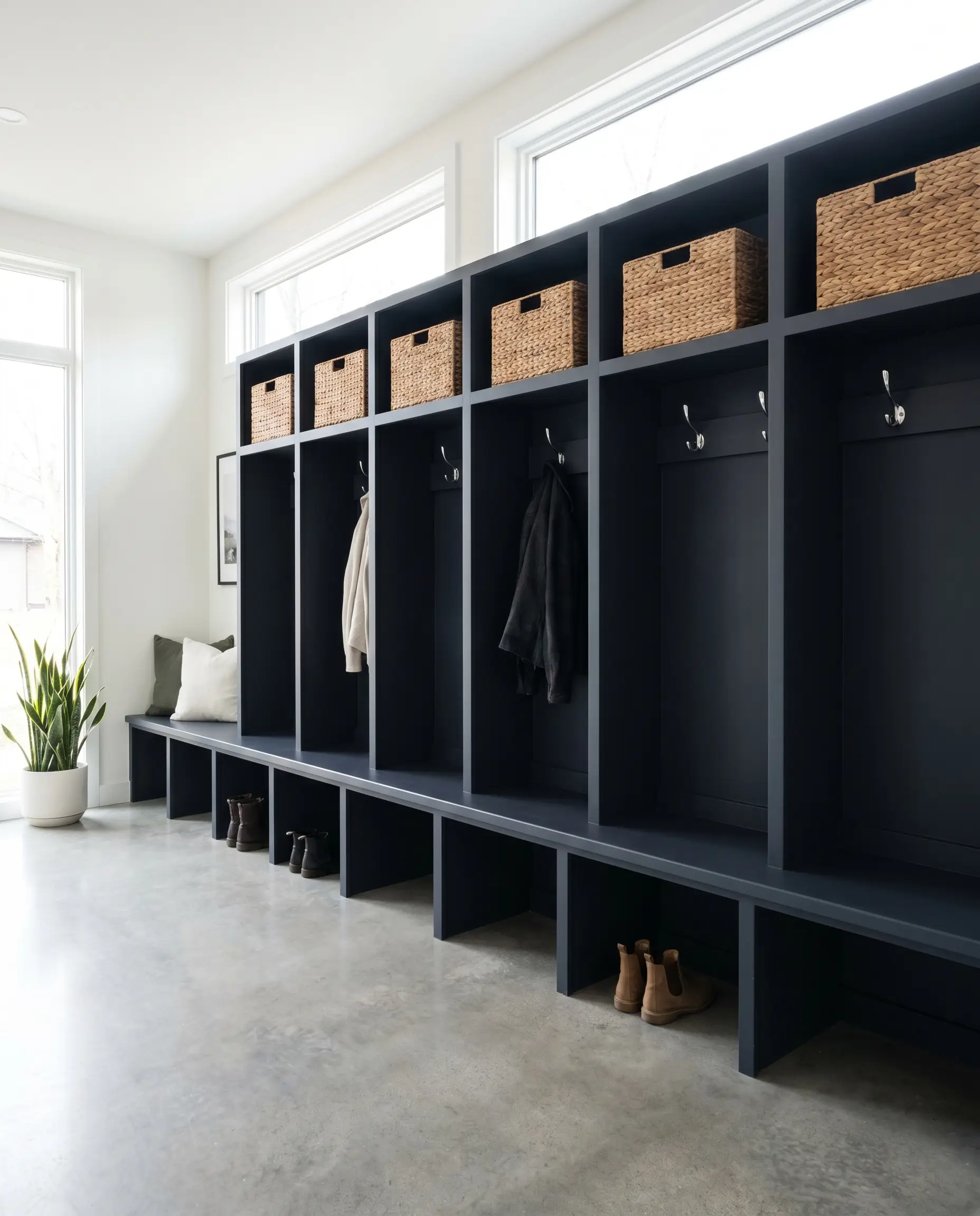
Transform standard MDF mudroom lockers into what looks like high-end custom millwork by drenching them in this rich pigment. The low light reflectance hides everyday dirt and scuffs brilliantly, while the indigo notes add a layer of unexpected sophistication to a purely functional space. Pair it with woven rattan storage baskets to introduce a much-needed organic texture against the dark paint.
Material Alchemy: Best Pairings for Deep Indigo
The true success of this deep blue-black lies in how it interacts with the textures and finishes placed directly against it. It thrives on high contrast, requiring either brilliant, reflective surfaces to bounce light, or rich, organic textures to ground its intensity.
Crisp Boundaries: Trim & Baseboards
To keep this dark color from feeling muddy, you need a razor-sharp, highly reflective boundary that defines the architecture.
Tactile Contrast: Hardware & Metals
The Tonal Palette: Coordinating Colors
Curated Mood Boards
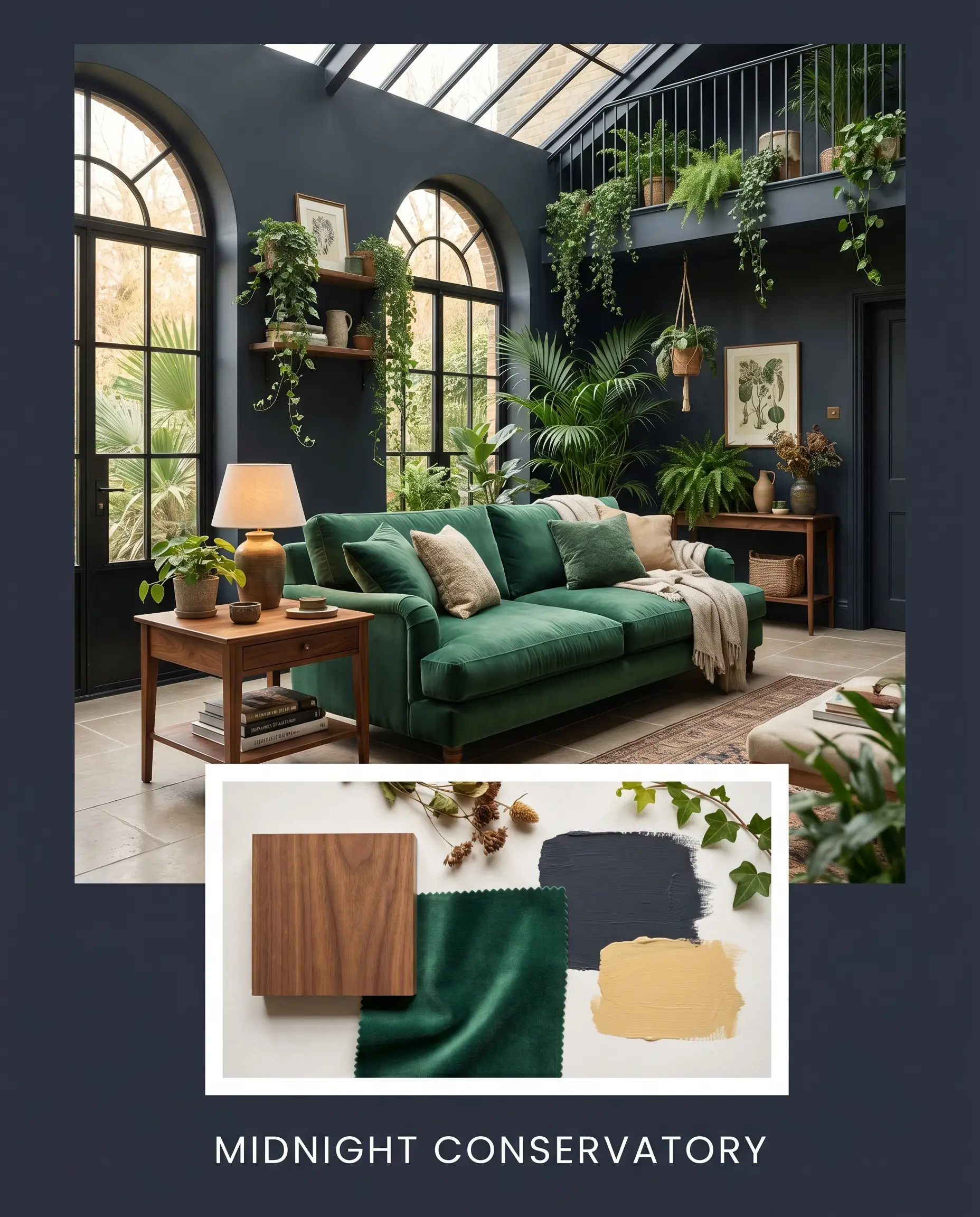
Midnight Conservatory This palette leans heavily into a lush, organic energy by pairing the deep indigo walls with the earthy warmth of Benjamin Moore Dijon 193. Layer in oiled walnut side tables, a plush emerald velvet sofa, and trailing indoor ivy to create a space that feels deeply rooted and vibrant. The mustard tones energize the room, ensuring the dark backdrop feels alive rather than somber.
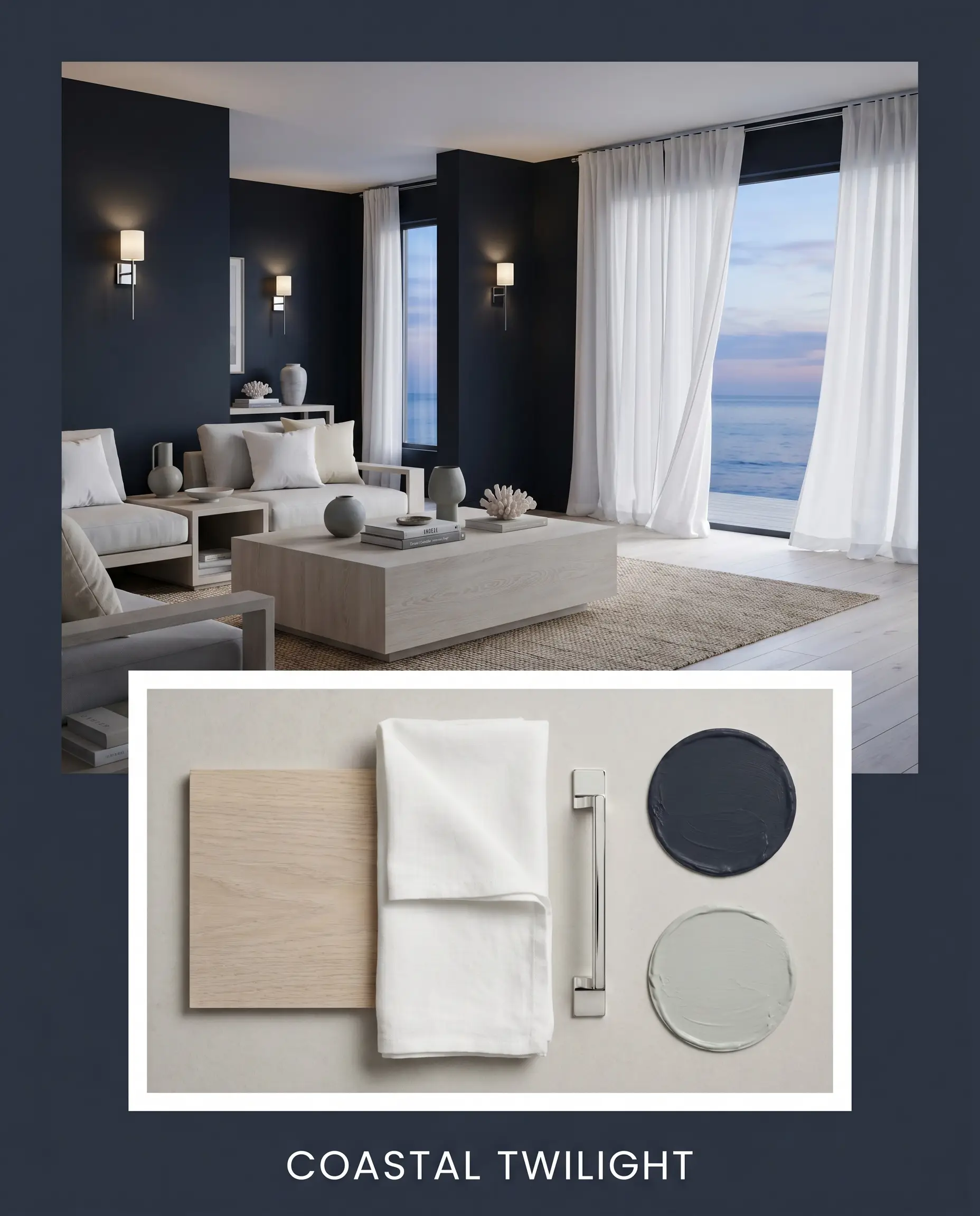
Coastal Twilight Focusing on a serene, tailored atmosphere, this combination uses Sherwin-Williams Silver Strand SW 7057 as the primary bridging color. Introduce polished chrome wall sconces, crisp white linen drapery, and a bleached oak coffee table to bounce natural light around the space. The result is a crisp, breathable environment that feels effortlessly sophisticated and calm.
Will Black Opal work with your specific lighting, floor, or furniture?
Head-to-Head Comparisons
Deciding between deep, moody blues often comes down to analyzing how their specific undertones react to your home’s unique exposure. If your room lacks natural light, a rival paint might hold its color better than our featured shade.
Dulux Black Opal vs. Farrow & Ball Hague Blue No. 30
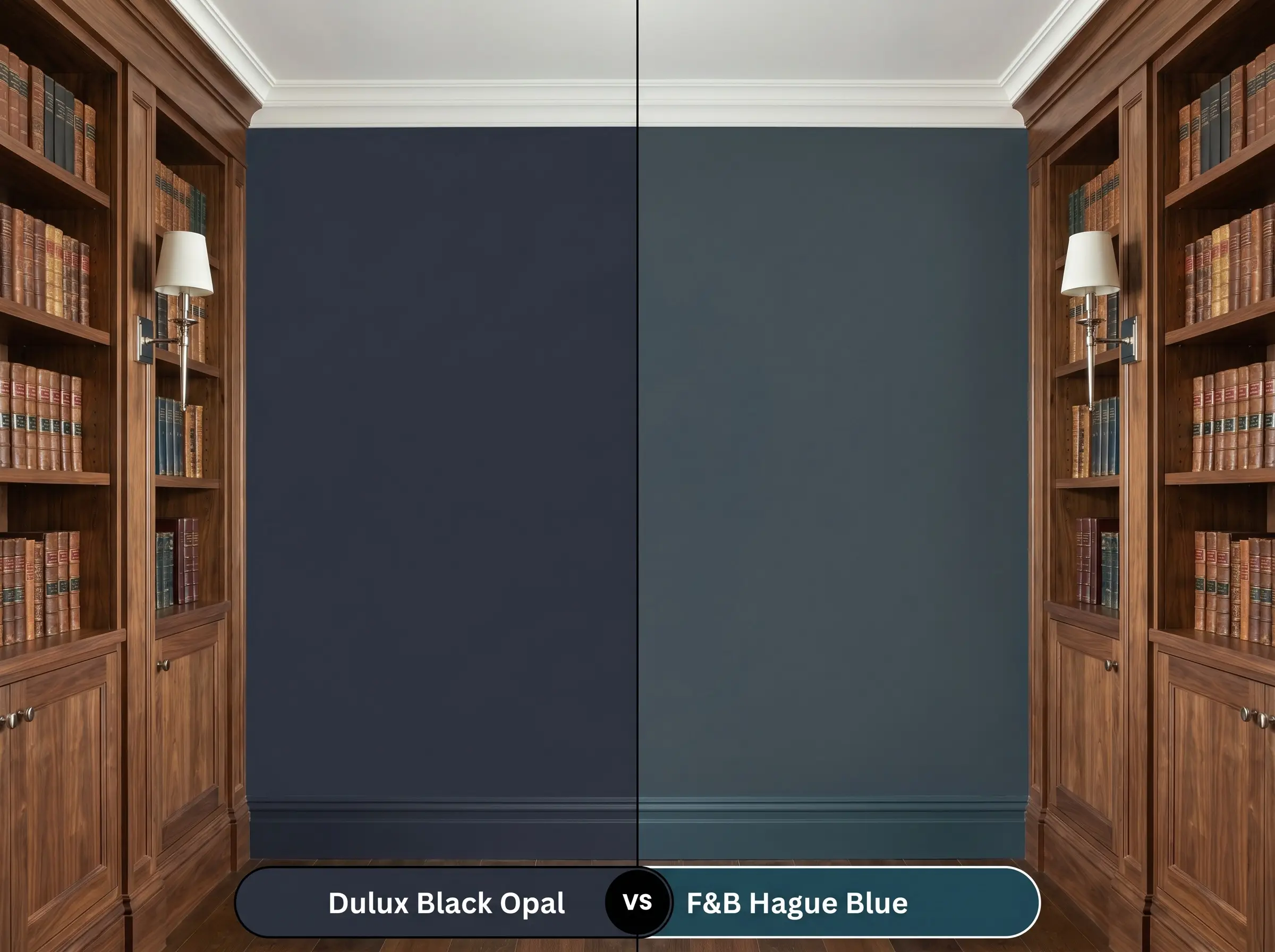
Hague Blue carries a distinct, strong green undertone, giving it a slightly warmer, more teal-leaning appearance on the wall. In contrast, the Dulux option is firmly rooted in violet and indigo, making it feel cooler and closer to a true black. If your room faces west and receives warm afternoon sun, Hague Blue will lean heavily into its green notes, while the violet-laced navy will neutralize that warmth for a more balanced, inky finish.
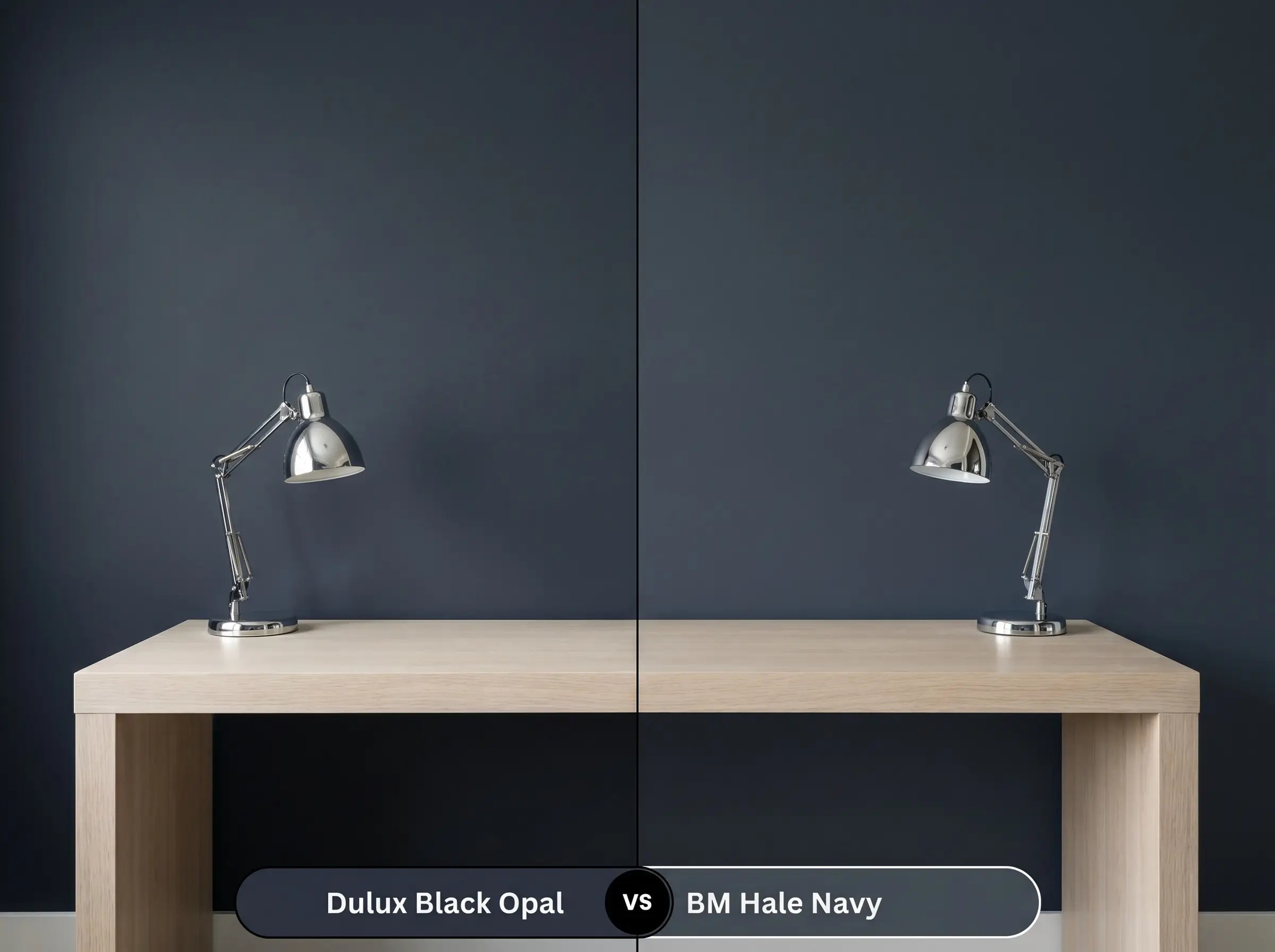
Dulux Black Opal vs. Benjamin Moore Hale Navy HC-154
Will Black Opal work with your specific lighting, floor, or furniture?
Hale Navy is a legendary, highly adaptable transitional blue with a healthy dose of gray, making it slightly softer and more muted. Our featured Dulux color is significantly darker and more saturated, absorbing far more light with its LRV of 5. If you want a classic, reliable navy that feels familiar, Hale Navy is the safer bet; if you want unapologetic drama and a near-black depth, stick with the Dulux formulation.
Finding the Perfect Match: Similar Colors & Brand Equivalents
Whether you are trying to match an existing palette of the best navy blue paint colors or need to switch manufacturers for local availability, there are several excellent alternatives that capture a similar moody essence.
Staying Within the Brand
Crossing the Aisle
The Practical Finish: DIY Advice for Dark Paint
Transitioning this intense pigment from the can to your walls requires strict attention to detail, as dark colors are notoriously unforgiving of sloppy preparation.
Selecting the Right Sheen
Priming for Deep Pigments
You cannot apply a color this dark over standard white drywall without a tinted primer. Ask your paint counter for a deep gray primer base; this ensures the rich indigo notes develop fully without requiring four expensive coats of topcoat.
Dark paints are incredibly prone to “flashing”—uneven streaks where the roller overlapped. To avoid this, keep a wet edge while rolling, work in small sections, and never go back over semi-dry paint.
Hackrea Design Secret (The Flashing Risk)
Achieving Flawless Coverage
Even with a tinted gray primer, expect to apply a minimum of two generous coats to achieve complete opacity. When touching up scuffs later, do not use a brush, as the texture difference will be glaringly obvious against the smooth roller finish; always use a mini foam roller for repairs.
Frequently Asked Questions
Because green foliage reflects cool light into a room, it can actually suppress the violet undertones in this paint, making it read closer to a flat, inky charcoal or true navy rather than a vibrant purple.
Like most dark blues with complex undertones, it is slightly more susceptible to UV fading than a pure carbon black. If applying it to exterior trim that receives direct southern exposure, using a premium exterior paint with high UV resistance is mandatory to prevent the indigo notes from chalking.
Absolutely. Because of its extremely low LRV of 5, painting low basement ceilings and exposed ductwork in a dead flat finish absorbs the light, blurring the visual boundary and tricking the eye into perceiving endless height.
Dark matte paints scuff easily, leaving white, chalky marks. For a high-traffic hallway, you must step up to an eggshell or satin finish, which provides a wipeable surface that resists friction while still maintaining the color’s depth.
The Final Verdict on Dulux Black Opal
Dulux Black Opal 66BB 06/077 is an uncompromising, highly sophisticated pigment designed for homeowners who want to completely redefine the boundaries of their space. It excels brilliantly in intimate zones like powder rooms, moody dining spaces, and custom cabinetry, offering a velvety, light-absorbing depth that standard navies simply cannot achieve. This color is perfect for those who appreciate the subtle, bruising shift of violet and indigo as the sun moves across the sky.
However, you must tread carefully when integrating this hue into a home heavily saturated with warm, yellow-toned finishes. Pairing this cool, violet-laced navy directly against honey oak flooring, brassy yellow fixtures, or stark beige upholstery will instantly force the paint to look bruised and unnatural, while making the wood tones appear dated and overly orange. To ensure this deep pigment feels intentional and high-end, always surround it with crisp whites, cool-toned stones, or rich, ashy woods that respect its sophisticated temperature.
Room Compatibility & Clashes Diagnoses
Hackrea's reports evaluating the compatibility of Black Opal in real rooms.West-Facing Attic Bedroom
"The paint's deep midnight undertones create an engaging starry-sky concept against the warm honey flooring, but its ultra-low reflectance will noticeably compress the room's sloped ceiling without adjusted lighting."
Closest Cross-Brand Equivalents
The absolute closest scientific color matches for Black Opal across top paint brands.