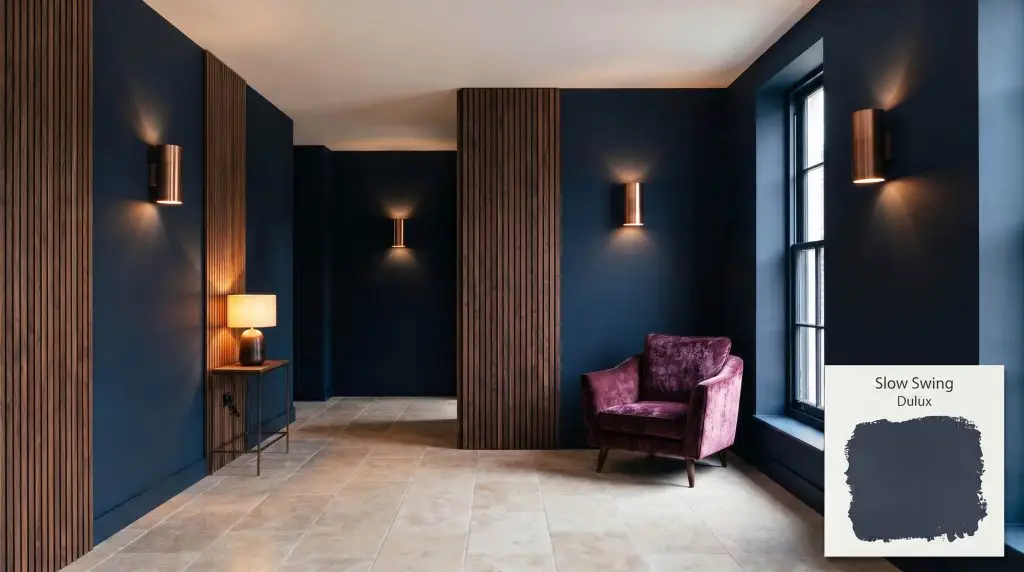
Slow Swing 66BB 06/077
DuluxDulux Slow Swing is a rich, deep indigo-blue with an LRV of 3.2. As part of the 2026 Rhythm of Blues collection, this velvety, grounding shade is perfect for creating meditative, enveloping spaces like bedrooms and studies.
Paint Technical Profile
| Color ID / SKU | 66BB 06/077 |
| HEX Code | #2C3241 |
| Light Reflectance (LRV) | 3.2 |
| Use | Interior, Exterior |
| Best Exposures | South-Facing, West-Facing |
| Best For | Bedrooms, Home Theaters, Cabinetry, Studies |
Dulux Slow Swing: Shaping Shadows and Light with Deep Indigo
Celebrating a paint’s cultural significance often feels abstract until you brush it onto a physical wall. As the newly crowned Dulux color of the year 2026, this specific shade transforms ordinary drywall into a rich, tactile experience. It completely redefines how a room holds shadow and light.
Sourced from the highly curated Rhythm of Blues collection, this deep indigo-blue acts as a heavy, grounding anchor for any home. It delivers a velvety finish that wraps a space in quiet sophistication.
Dulux Slow Swing: Undertones & LRV
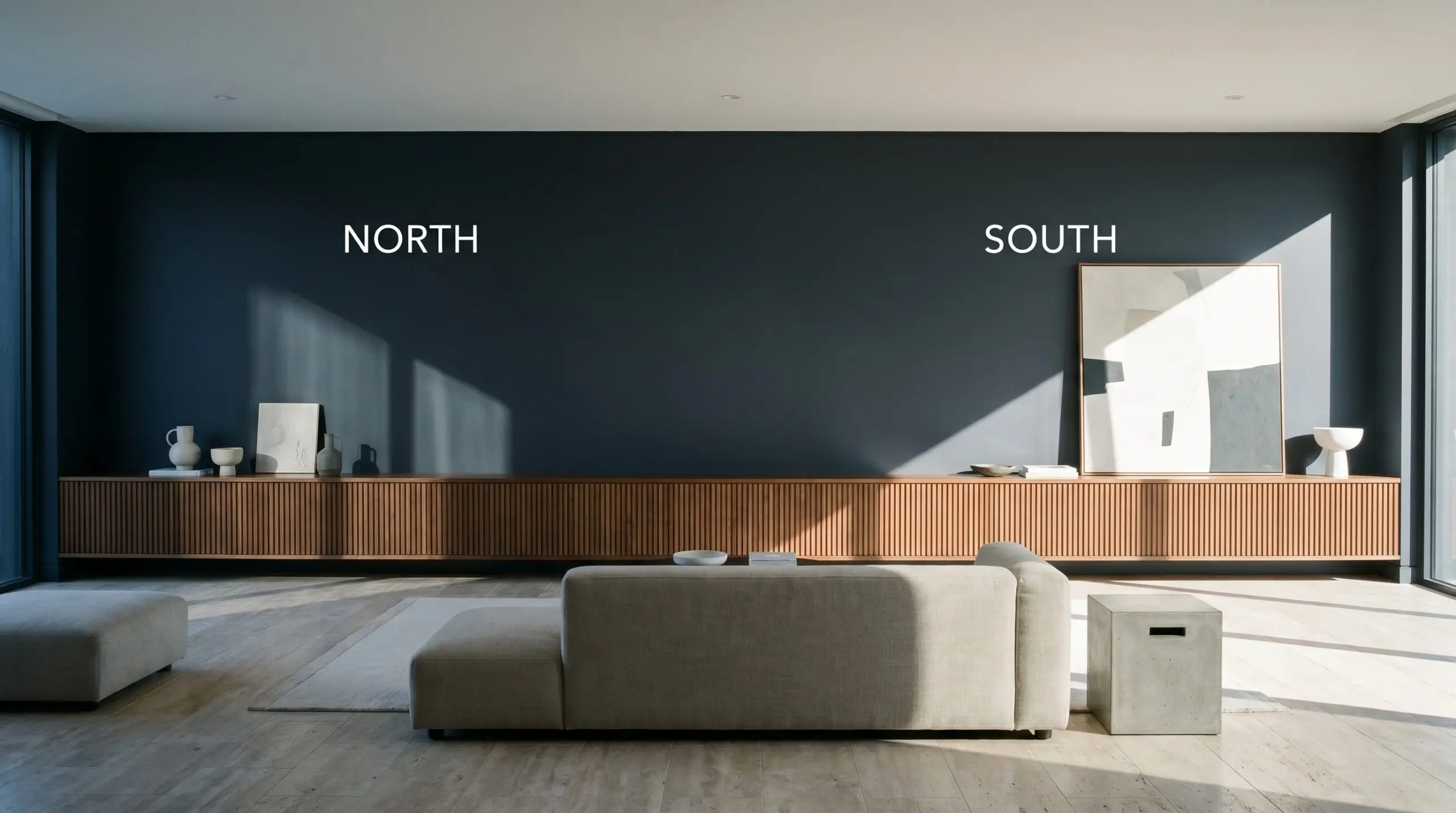
Is this paint warm or cool? Dulux Slow Swing is definitively cool, though it avoids the icy chill of a pure primary blue. To use this color effectively, you must understand how its internal structure manipulates the energy of your home.
At an LRV of 3.2, this pigment operates as a light-absorbing void rather than a reflective surface. It excels at creating moody interiors by pulling the walls inward, establishing a deeply enveloping atmosphere.
Lighting Shifts & The Chameleon Factor
Because this color absorbs so much light, its aesthetic success relies entirely on the environment around it. Without adequate lighting variation, this rich pigment can read flat and heavy, losing its nuanced green edge entirely.
When using a color with an LRV this low, always layer your lighting. Rely on wall sconces and warm table lamps to wash the paint in soft pools of light, preventing the room from feeling like a black hole at night.
Hackrea Pro-Tip (The Illumination Strategy)
Popular Applications for This Deep Indigo
This color brings a quiet, confident energy to residential architecture. It commands attention without shouting, allowing you to build spaces that feel intentionally designed and highly curated.
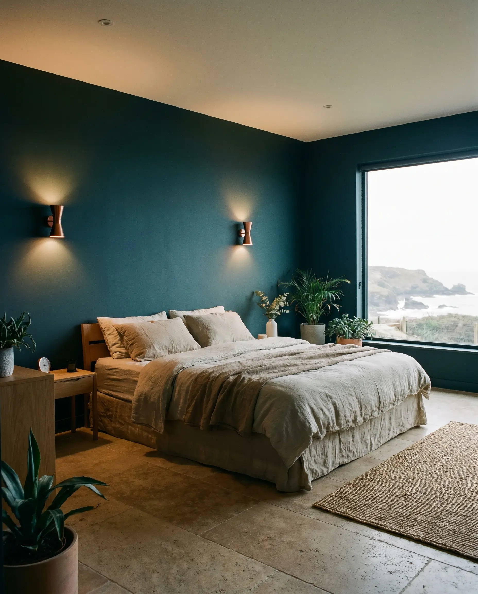
Bedrooms
In personal spaces, the meditative qualities of this indigo shine brilliantly. It softens the harsh edges of a room, creating a restful retreat that feels separated from the chaos of the rest of the house. Pair it with soft, organic bedding to balance the heavy visual weight of the walls.
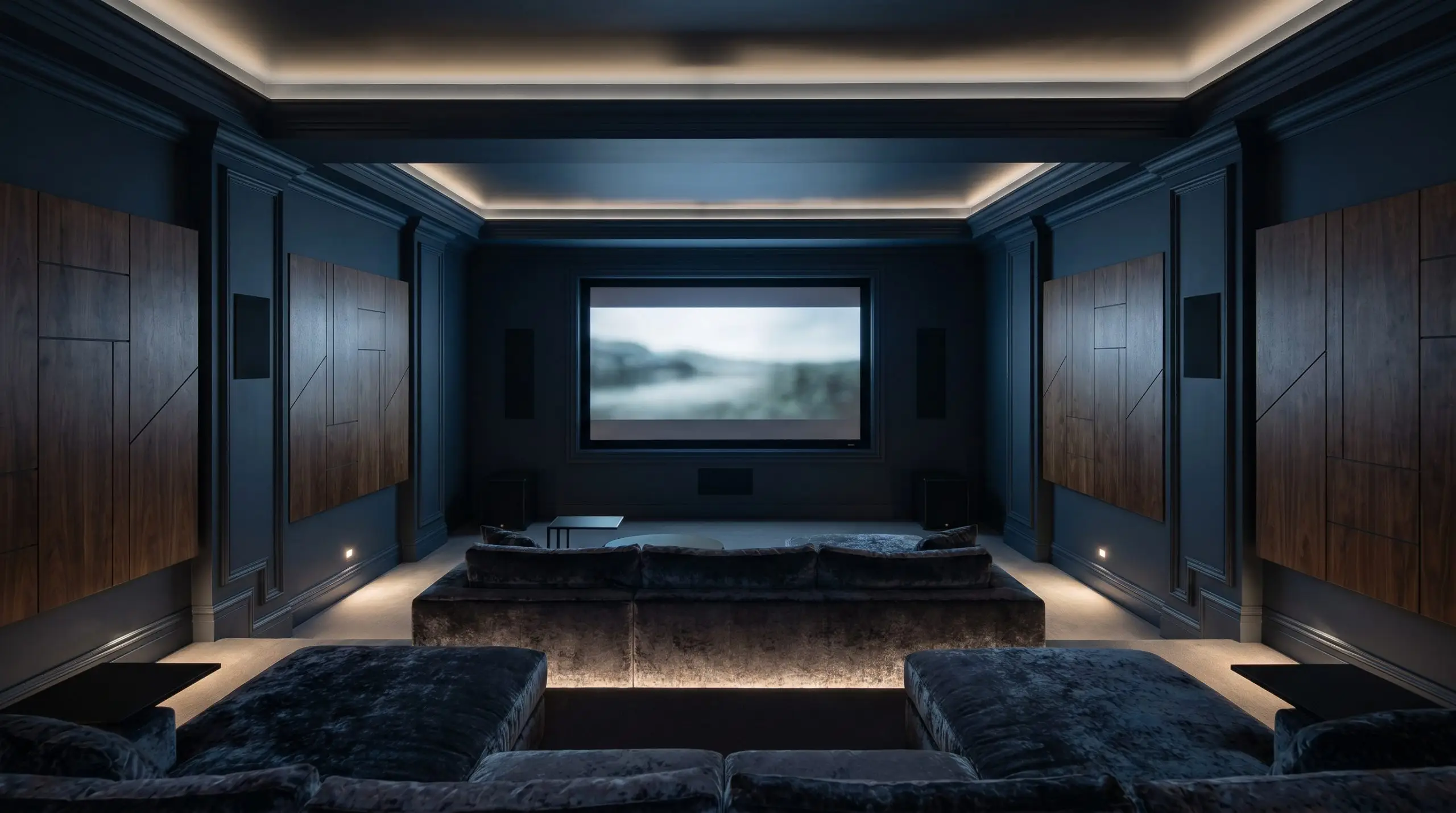
Home Theaters & Media Rooms
This is where the pigment’s light absorption becomes a functional asset. By completely color drenching the space—painting the walls, trim, and ceiling—you eliminate visual distractions and screen glare. It is one of the most effective home theater paint colors for mimicking a true cinematic experience.
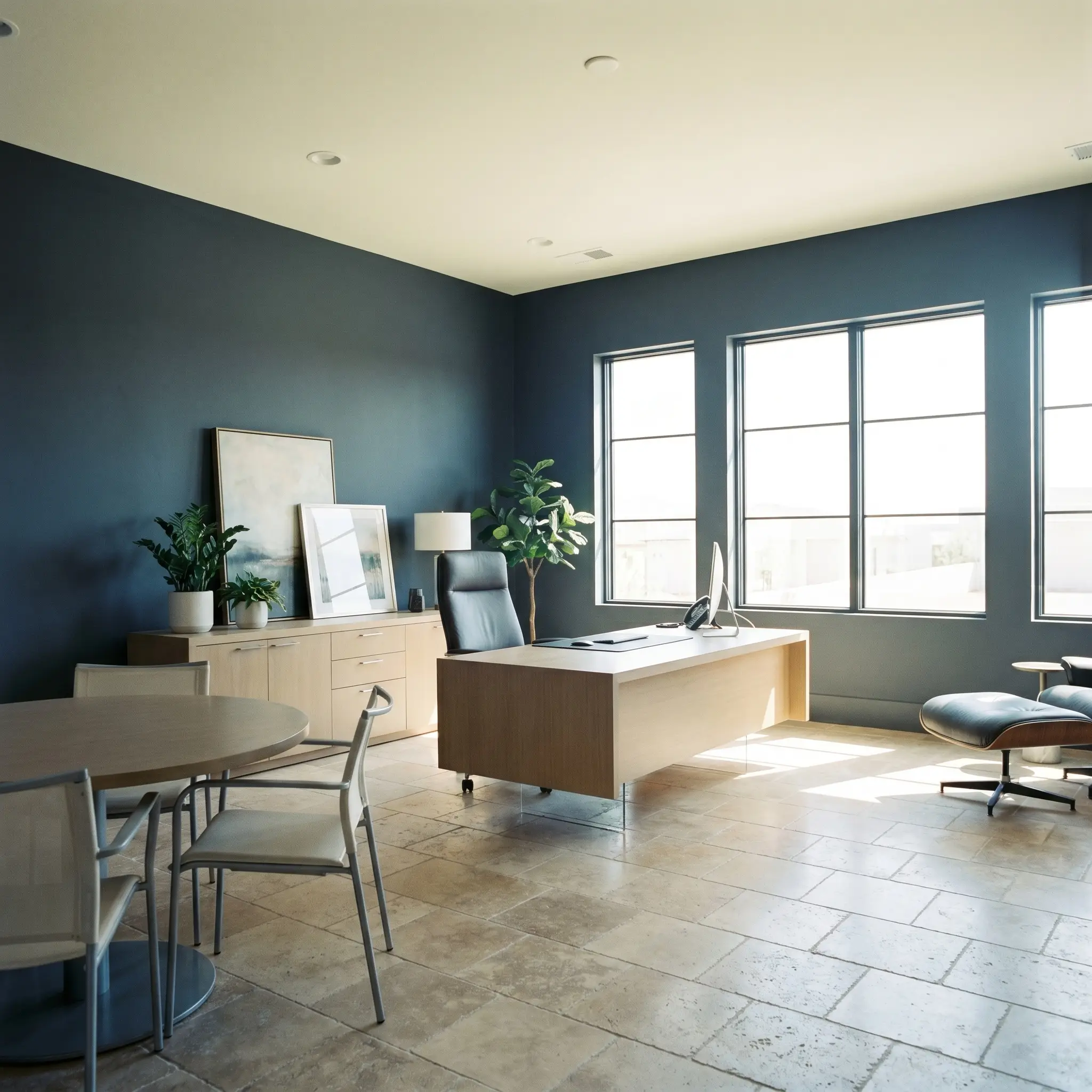
Executive Studies & Home Offices
When applied to four walls, this rich shade establishes immediate authority and focus. It provides a stunning backdrop for video calls and grounds lightweight, modern desk furniture. Keep the ceiling bright if the room lacks natural windows, ensuring the space remains productive rather than sleepy.
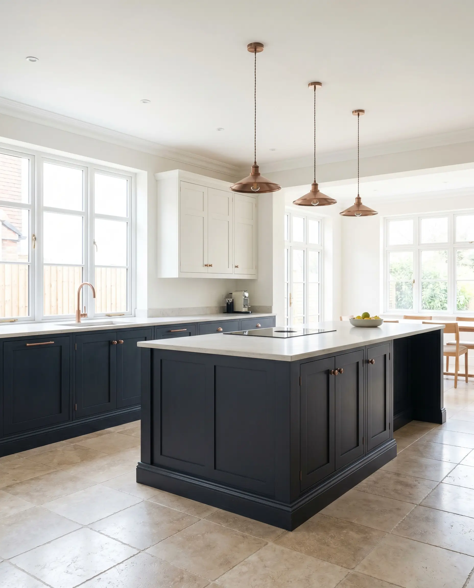
Kitchen Cabinetry & Islands
Using this color on lower cabinets or a central island grounds a kitchen beautifully. It pairs flawlessly with stark white upper cabinets, creating a tailored, tuxedo-like aesthetic. The deep tone also expertly hides everyday scuffs on high-traffic baseboards.
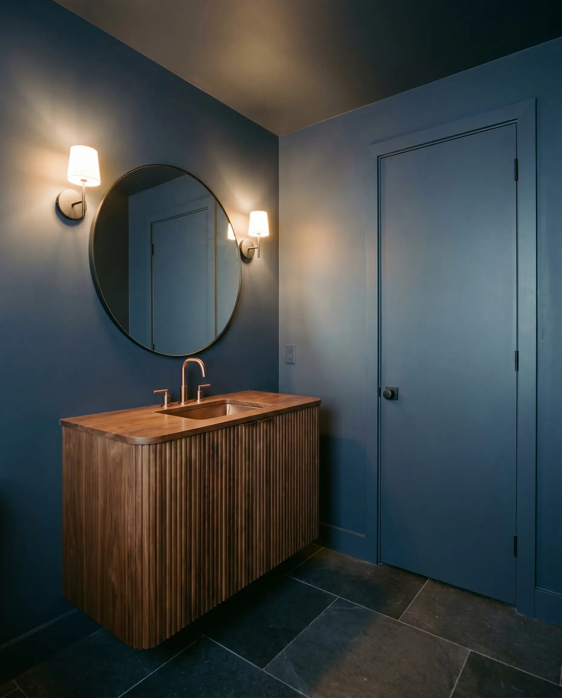
Powder Rooms
Small, windowless spaces are the perfect canvas for dark colors. Instead of fighting the lack of light, lean into it by wrapping the entire powder room in this velvety hue. It creates a jewel-box effect that feels incredibly premium for guests.
Creative Expressions with Dulux Slow Swing
Moving beyond basic four-wall applications allows this pigment to inspire highly custom, out-of-the-box thinking.
The Monochromatic Wainscoting Wrap
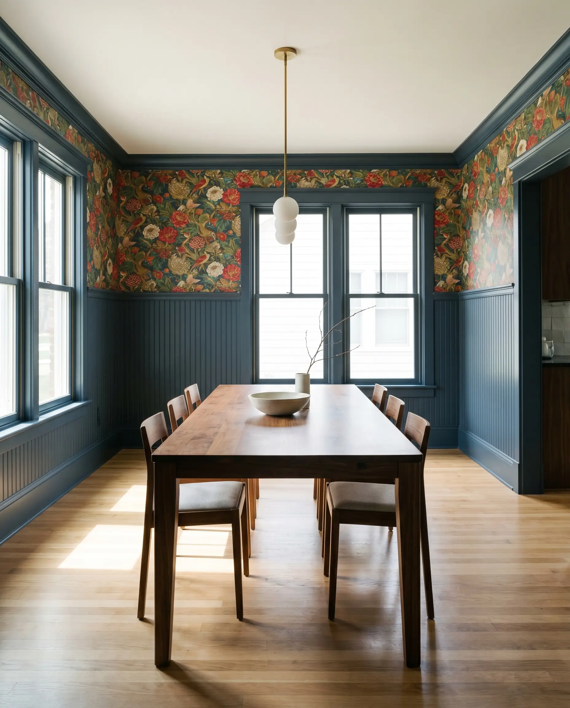
Apply this deep blue exclusively to lower wall paneling or beadboard in a dining space, painting the trim to match perfectly. This grounds the lower half of the room with heavy architectural weight while allowing you to use a vibrant, heavily patterned wallpaper above the chair rail.
The High-Contrast Fireplace Surround
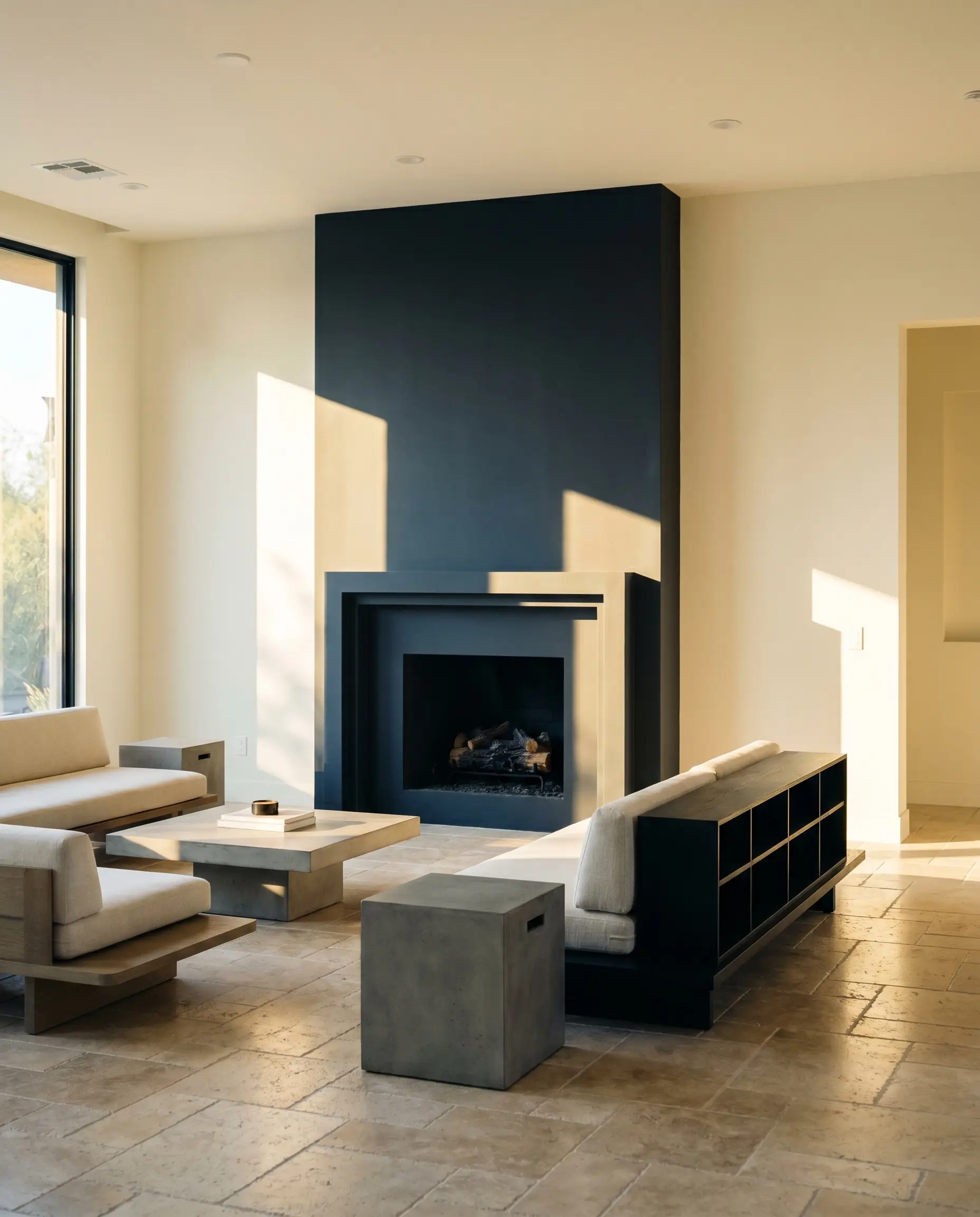
If your living room features a dated brick or basic MDF fireplace surround, this color completely modernizes the focal point. When hit by harsh afternoon window glare, the cyan nuances come alive, turning a standard architectural feature into a stunning, custom-built anchor.
The Saturated Ceiling Canopy
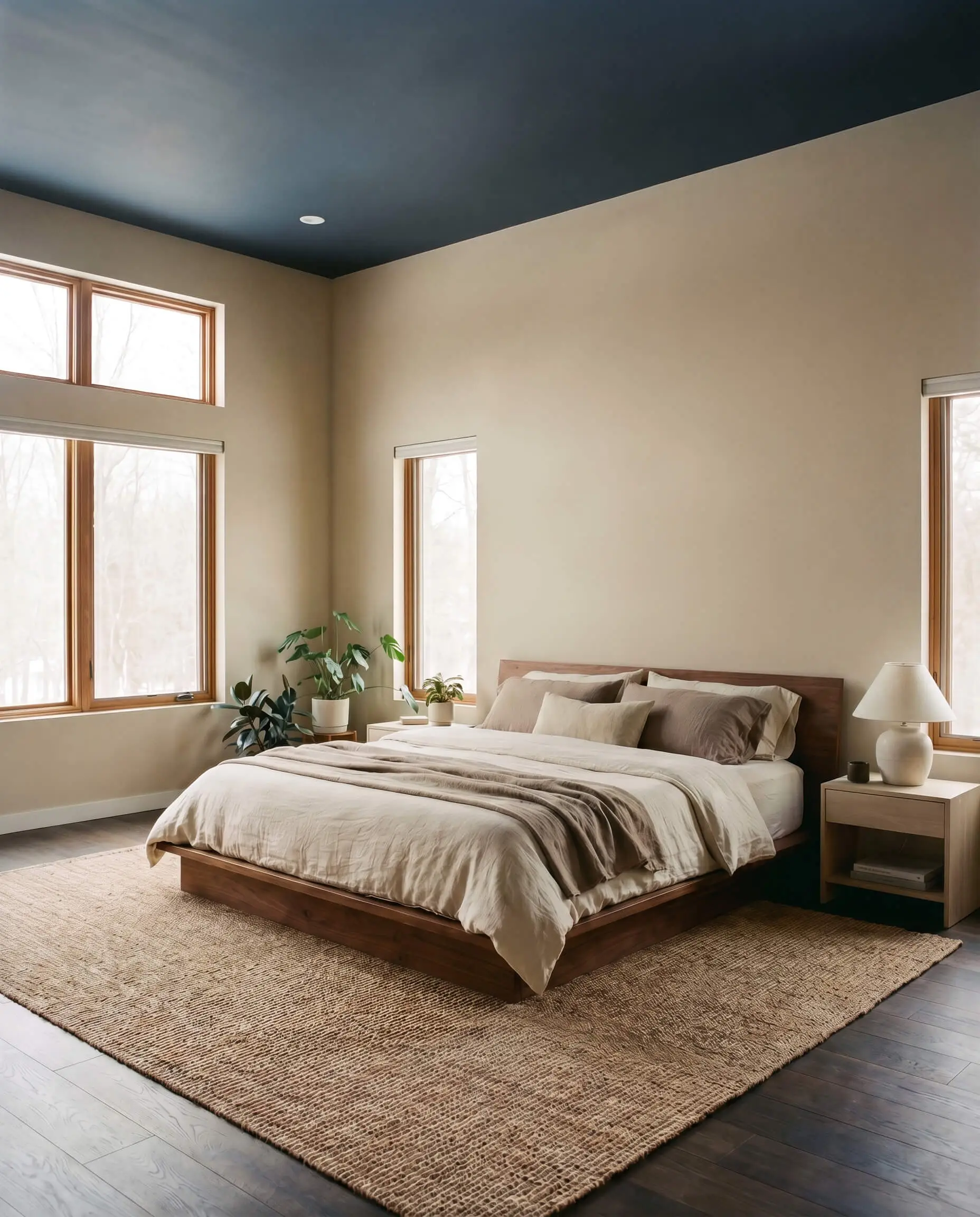
In a bedroom with tall, undefined ceilings, paint the “fifth wall” in this rich indigo while keeping the walls a soft, warm neutral. This visually lowers the ceiling, inducing a feeling of deep rest and making a sprawling room feel intimately proportioned.
Material Pairings & Coordinating Colors
This color requires intentional styling to hold its shape. It thrives when placed next to contrasting textures that either bounce light to lift its heavy profile or provide organic warmth to soften its cool core.
Trim & Baseboards
Hardware, Wood & Material Pairings
Coordinating Colors
Designer Mood Boards
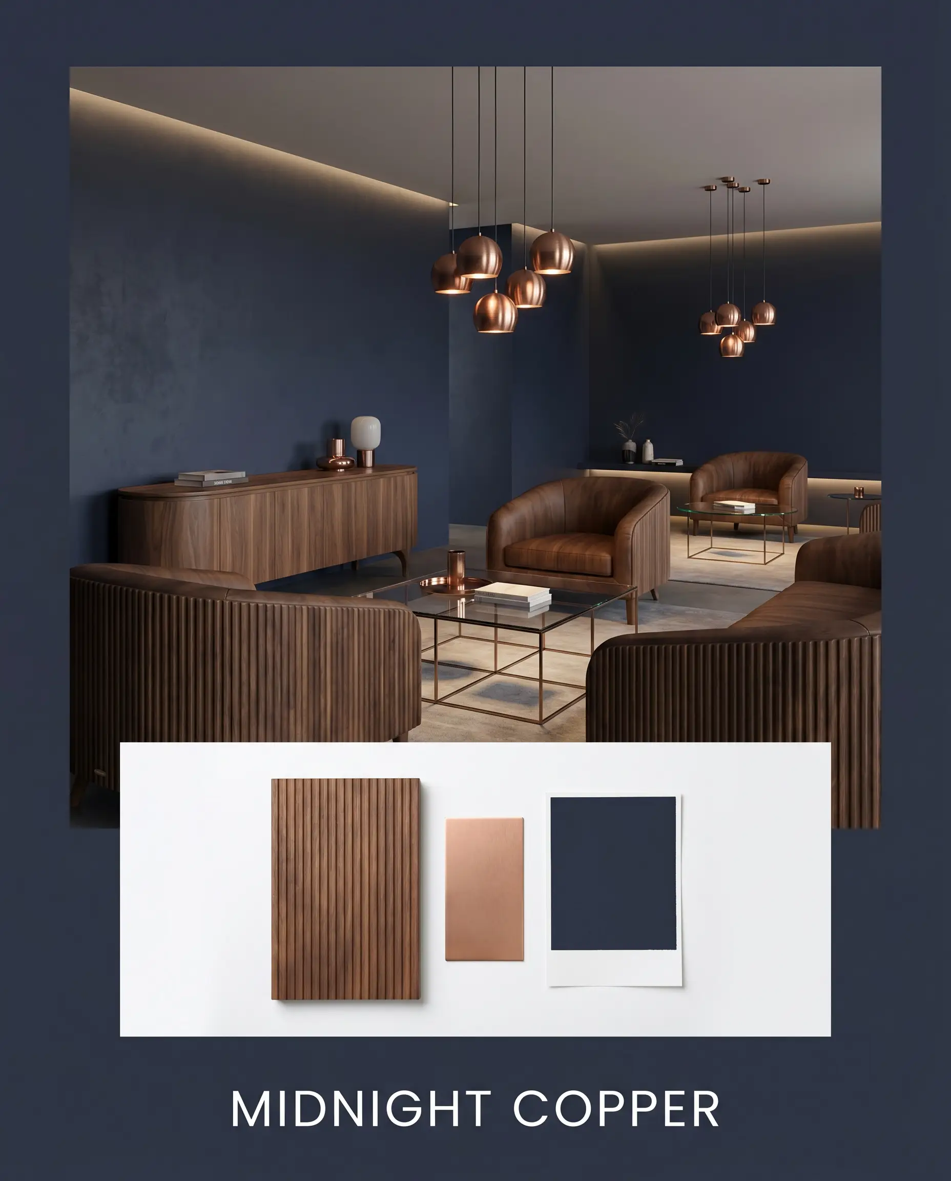
Midnight Copper This palette thrives on high-contrast, premium energy. Anchor the space with the deep indigo walls, and introduce heavy fluted walnut furniture to establish warmth. Punctuate the darkness with brushed copper lighting fixtures and sleek, minimalist silhouettes to create a deeply sophisticated, modern lounge vibe.
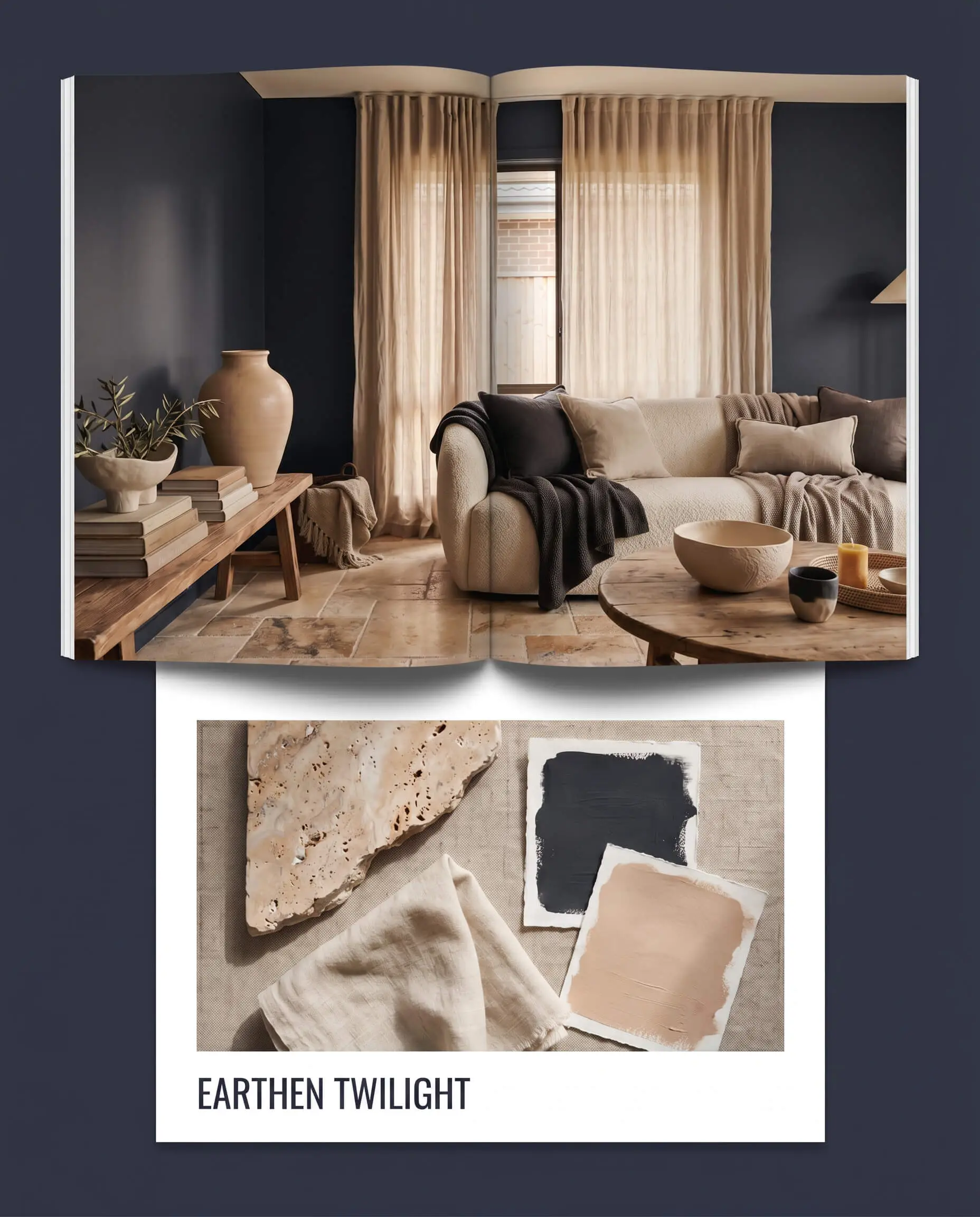
Earthen Twilight This combination focuses on organic, grounded serenity. Pair the velvety blue paint with tumbled travertine floors and soft, textural linen drapery. Introduce accents of Farrow & Ball Setting Plaster to soften the overall mood, resulting in a space that feels incredibly restful, earthy, and beautifully curated.
Head-to-Head Comparisons
When deciding between dark blues, the final choice always comes down to how the specific undertones react to your home’s unique lighting.
Dulux Slow Swing 66BB 06/077 vs. Benjamin Moore Hale Navy HC-154
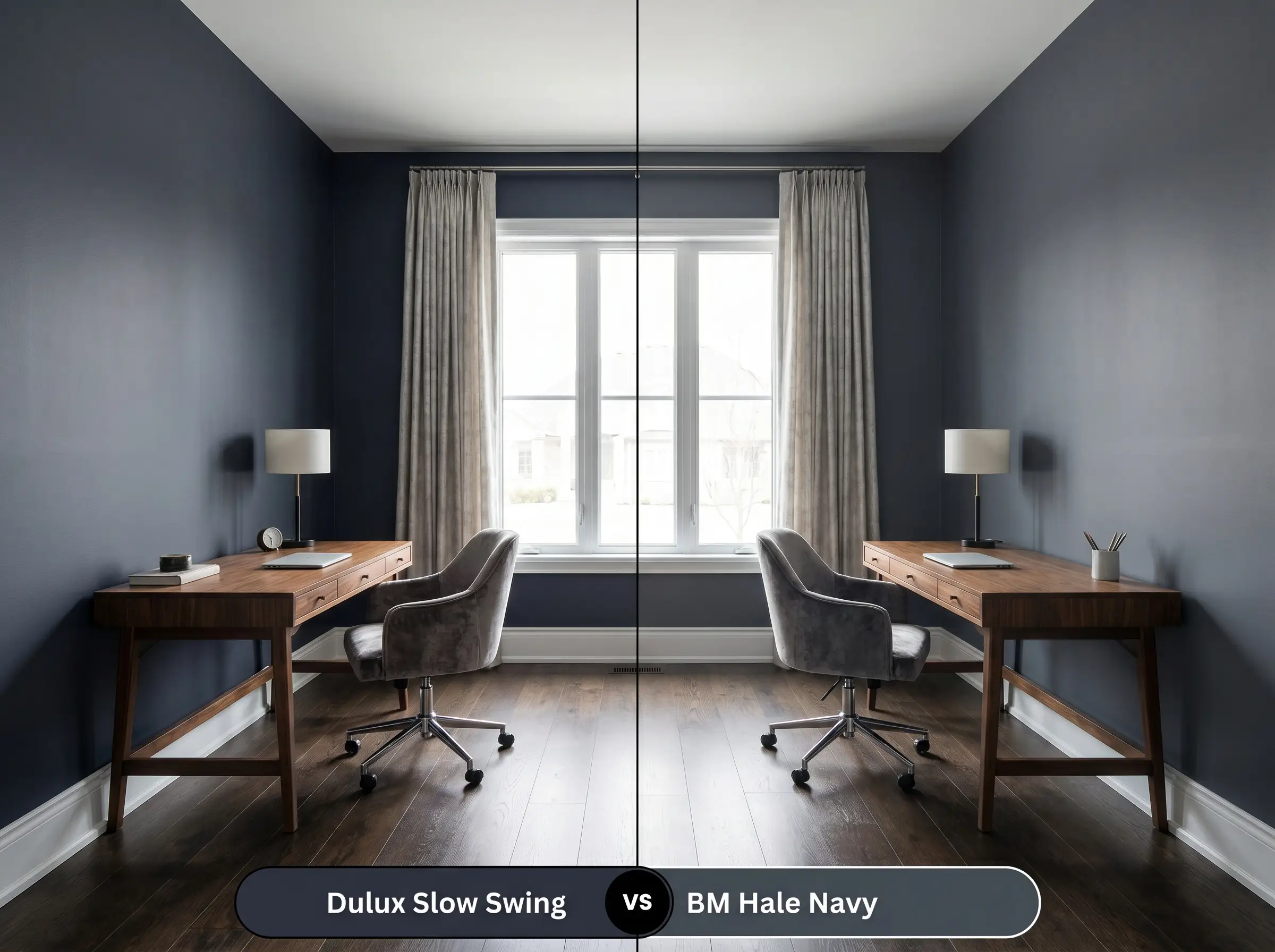
Hale Navy is a legendary, traditional charcoal-navy that leans heavily into gray, making it incredibly safe and muted. If you want a strictly classic, nautical feel, Hale Navy is the standard. However, if you want a color with more life and a modern edge, the cyan tones in the Dulux option provide a much richer, more complex finish.
Dulux Slow Swing 66BB 06/077 vs. Farrow & Ball Hague Blue No.30
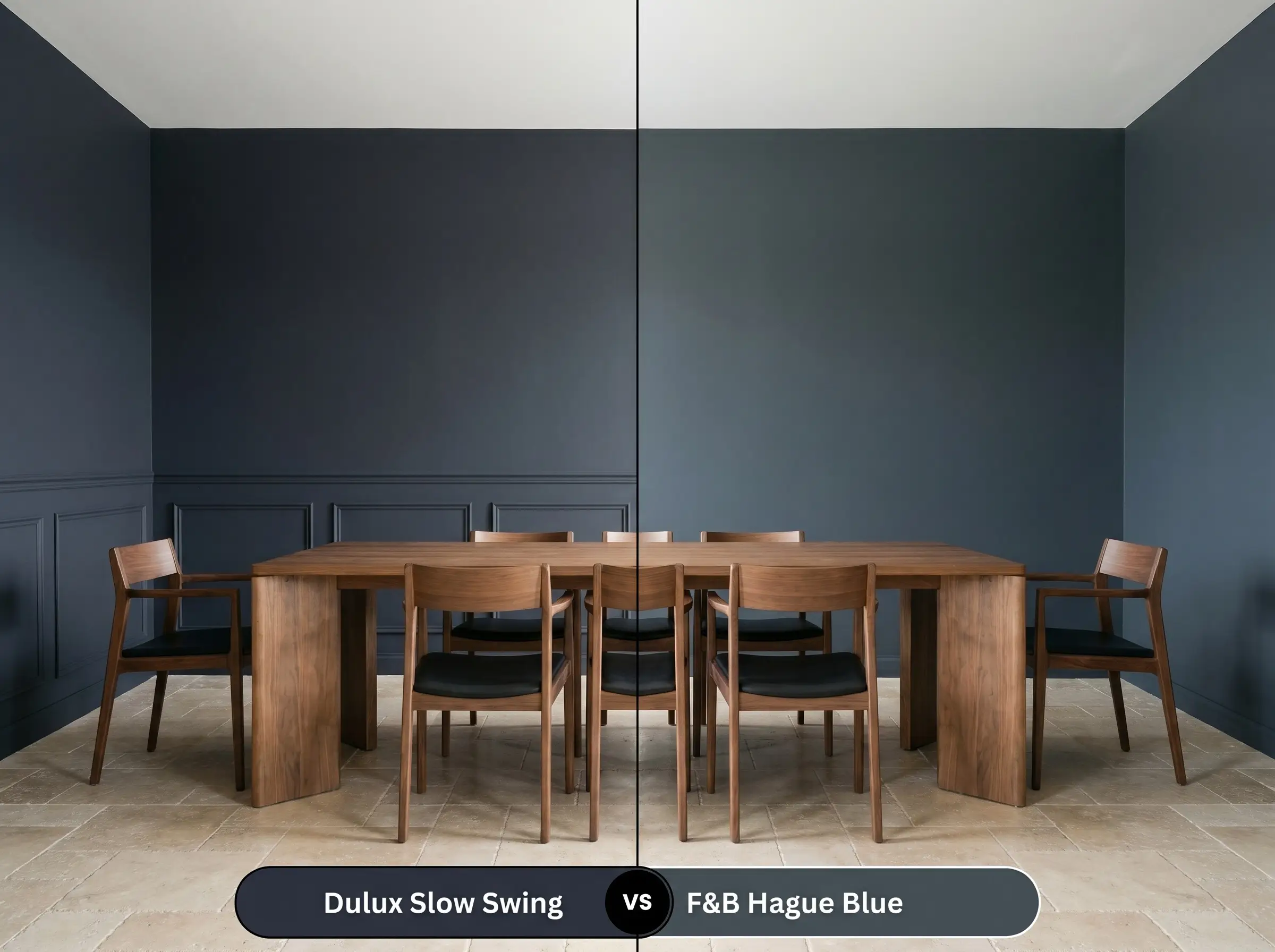
Hague Blue is famous for its aggressive, highly visible green undertones, often reading as a dark teal in bright light. If you fear a color pulling too green on your walls, Slow Swing is the safer choice. It retains a much stronger, more dominant blue core while only hinting at cyan in direct sun.
Alternative Shades & Brand Equivalents
If the specific LRV or undertone profile of this paint isn’t quite right for your lighting, several excellent alternatives exist across the market.
Similar Colors
Cross-Brand Matches
Practical Application & Finishing Advice
Transitioning this color from a swatch to a full wall requires strict attention to detail. Dark pigments are notoriously unforgiving during the application process.
The Dynamic Sheen Guide
Primer Strategy
You cannot skip primer with a color this dark. A high-quality, deeply tinted gray primer is absolutely mandatory to achieve the true depth of the indigo. Applying this paint over a standard white primer will result in a streaky, uneven finish that lacks richness.
Coverage & Success Tips
Expect to apply a minimum of two generous coats, even with premium paint lines. Be highly aware of “flashing”—visible, shiny roller marks that occur when you touch up a dark wall after it has dried. To avoid this frustrating DIY pitfall, always maintain a wet edge while rolling and never go back over semi-dry sections.
Frequently Asked Questions
Because its core leans slightly toward cyan and green rather than red, it actively resists flashing purple. However, heavily weathered cedar can sometimes pull unexpected tones, so testing a large swatch on the brightest side of the exterior is crucial.
By painting the walls, ceiling, and trim in this single dark shade, you erase the visual boundaries of the room. This technique actually makes a windowless space feel endless and deeply cinematic, rather than small or restrictive.
Yes, but it requires strategic contrast. If you paint a low ceiling in this dark indigo, you must keep the surrounding walls crisp and bright (like Chantilly Lace) and ensure your artificial lighting is layered to push the ceiling visually upward.
A satin or soft semi-gloss finish is mandatory for high-touch dark cabinets. Flat or matte finishes in this depth will instantly show chalky fingerprints and oil marks that are nearly impossible to wipe clean without burnishing the paint.
Final Verdict & Clash Warnings for Dulux Slow Swing
Dulux Slow Swing is a masterful, sophisticated paint designed for homeowners who want to introduce heavy architectural weight and deep, enveloping moods into their spaces. It is absolutely perfect for dedicated media rooms, grounding kitchen islands, or creating deeply restful bedroom retreats. Its subtle cyan edge keeps it feeling modern and alive, separating it from the dusty, traditional navies of the past.
However, because of that specific green-blue undertone, you must be highly cautious with your existing fixed elements. This paint clashes noticeably with bright, yellow-toned oak floors or overly orange cherry wood cabinetry, which will violently pull the blue out of balance and make the wood look dated. Similarly, avoid pairing it with highly polished, cheap yellow brass hardware; the extreme contrast feels jarring rather than curated. Stick to earthen stones, rich walnuts, and muted metals to let this beautiful indigo truly shine.
Closest Cross-Brand Equivalents
The absolute closest scientific color matches for Slow Swing across top paint brands.