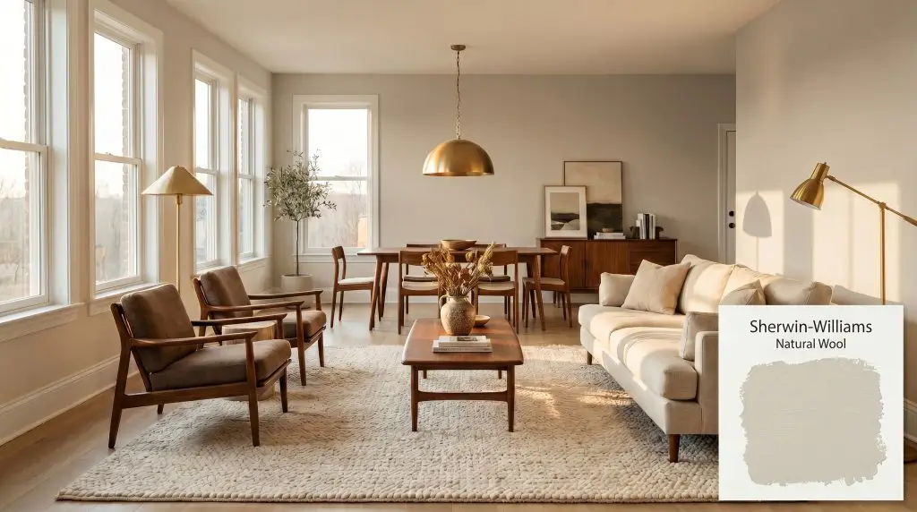
Natural Wool SW 9508
Sherwin-WilliamsSherwin-Williams Natural Wool (SW 9508) is a warm, mid-tone beige paint color with a subtle khaki and yellow-green undertone. With an LRV of 59.43, it provides a cozy, earthy backdrop that adapts beautifully to shifting light without washing out.
Paint Technical Profile
| Color ID / SKU | SW 9508 |
| HEX Code | #D7C9AE |
| Light Reflectance (LRV) | 59.43 |
| Use | Interior, Exterior |
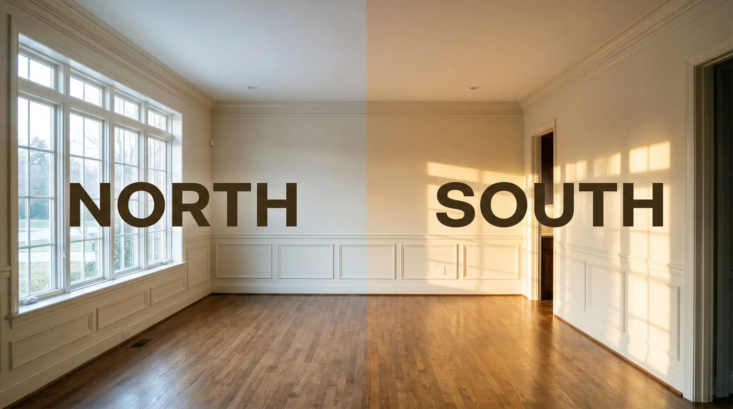
| Best Exposures | North, West, East |
| Best For | Living Rooms, Kitchen Cabinets, Entryways, Bedrooms |
Sherwin-Williams Natural Wool: Grounding Sunlit Spaces with Earthy Warmth
Walking into a room wrapped in Sherwin-Williams Natural Wool (SW 9508) feels like pulling on your favorite heavy-knit sweater on a brisk autumn morning. It instantly softens the sharp, rigid lines of modern drywall and brings a deeply rooted, organic texture to otherwise flat architecture. This is not just another flat neutral designed to fade into the background.
Instead, this specific pigment acts as a grounding force, capturing shifting sunlight and turning stark, undefined layouts into highly intentional, enveloping environments. It brings a quiet, confident energy that bridges the gap between structured traditionalism and relaxed, earthy modernism.
Sherwin-Williams Natural Wool: Undertones & LRV
If you are wondering whether this color leans warm or cool, the answer is decisively warm. However, this is a highly complex warm beige that refuses to read as a simple, flat tan on your walls.
To truly understand how this color behaves, we have to look at its specific hue angle and the hidden notes beneath its surface. Its structure is built on a very delicate balance:
Sitting at a Light Reflectance Value of 59.43, this mid-tone neutral strikes a brilliant balance on the walls. It provides excellent ambient light absorption, meaning it won’t wash out or look chalky when hit with direct sunlight. At the same time, it bounces just enough illumination around the room to keep hallways and closed-off living areas from feeling heavy or intensely shadowed.
Managing Ambient Light & The Chameleon Factor
The biggest risk when using this muted earth tone comes from heavily shaded, tree-covered environments. If you place this paint in a dark room facing a dense row of evergreens, the shadows will pull that khaki note entirely forward, potentially making the walls feel a bit muddy or overly green. You must test this color against your specific natural light to see how its color temperature shifts throughout the day.
Here is exactly how the light will manipulate the pigment:
Everyday Architecture & Room Applications
This earthy neutral brings a beautifully cohesive, lived-in energy to residential spaces. Rather than dictating a single design style, its underlying warmth adapts to the materials you place around it.
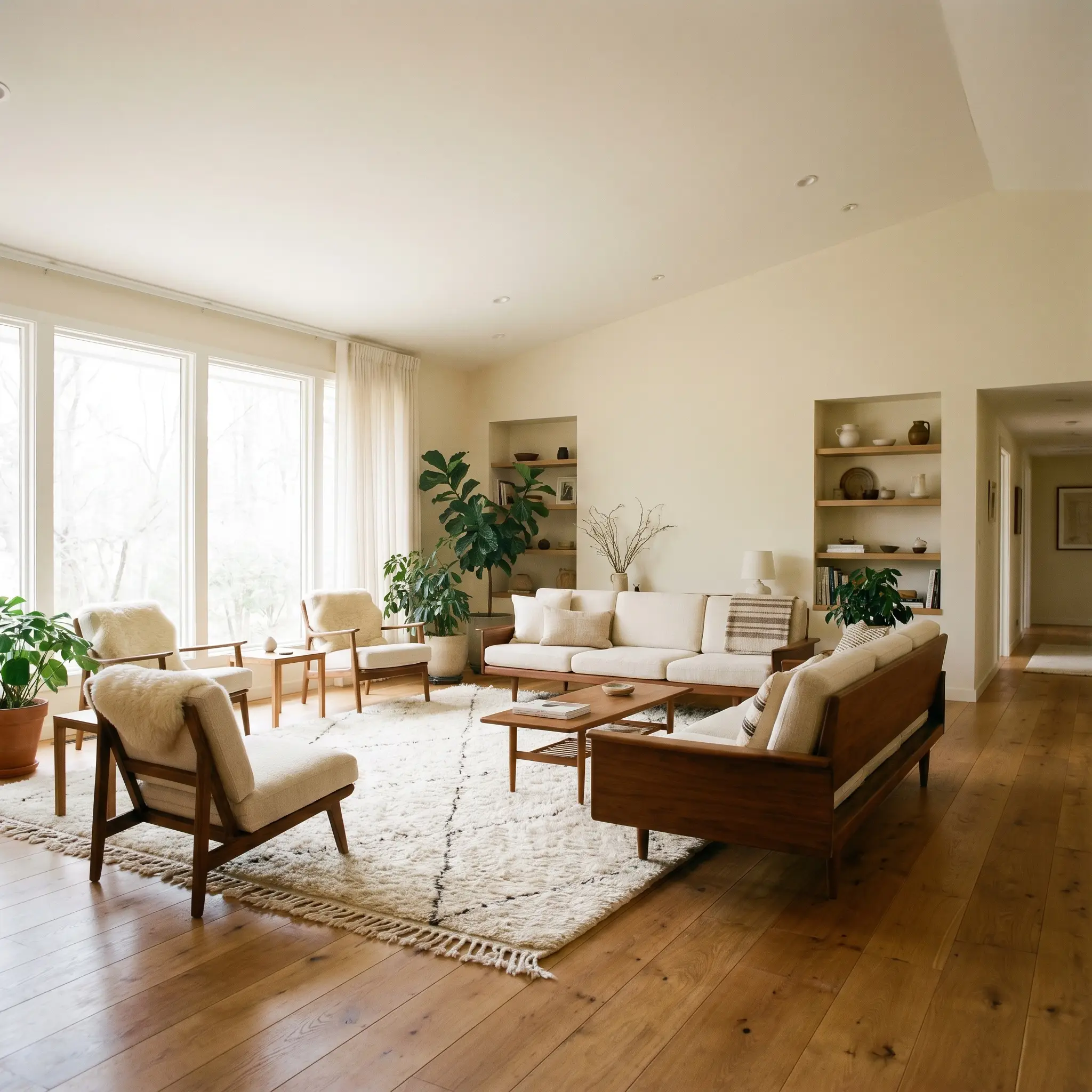
Living Rooms
In sprawling, open-concept living areas, this mid-tone acts as a visual anchor. It adds heavy architectural weight to basic drywall, making large, undefined rooms feel instantly more intimate and curated. Pair it with low-profile, mid-century walnut furniture and heavily textured rugs to lean into a relaxed, organic modern aesthetic.
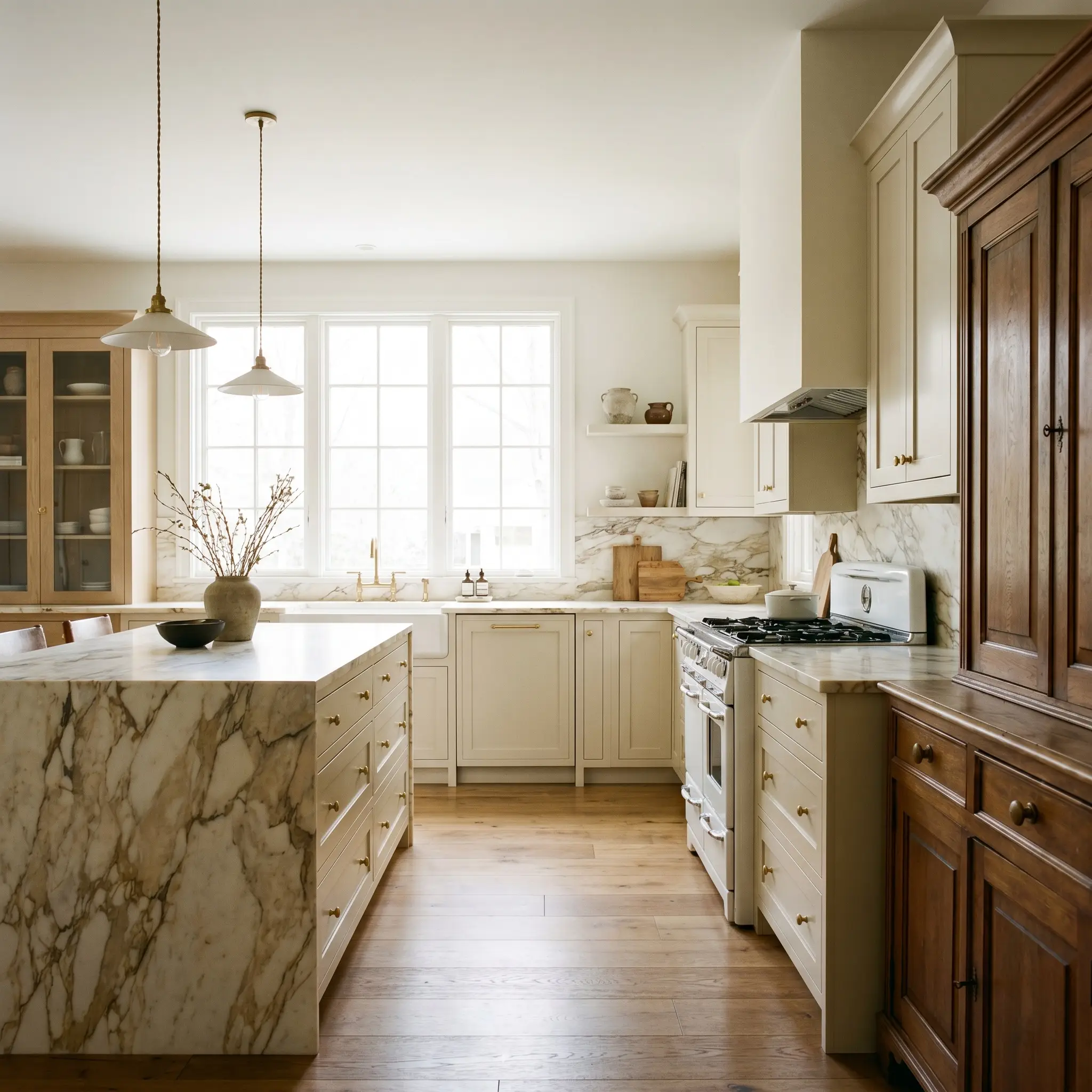
Kitchen Cabinets
This is a brilliant alternative to stark white cabinetry, especially in transitional kitchens. Painting stock cabinets in this rich tone immediately gives them a custom, hand-crafted feel. It pairs flawlessly with heavily veined marble countertops and unlacquered hardware, grounding the kitchen with a sense of historic permanence.
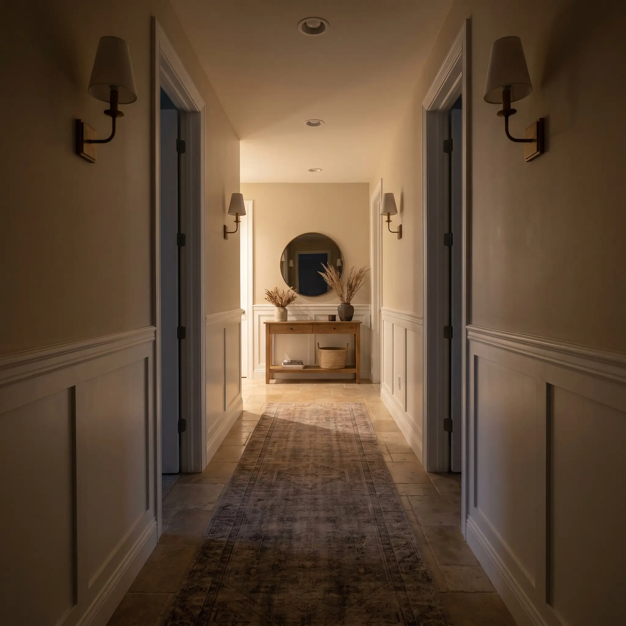
Entryways & Hallways
Light-starved residential corridors often look dingy when painted in pure white. This complex beige solves that problem by embracing the shadows, turning a narrow transit space into a warm, welcoming threshold. Always use a slightly higher sheen on the trim in these spaces to bounce whatever ambient light is available.
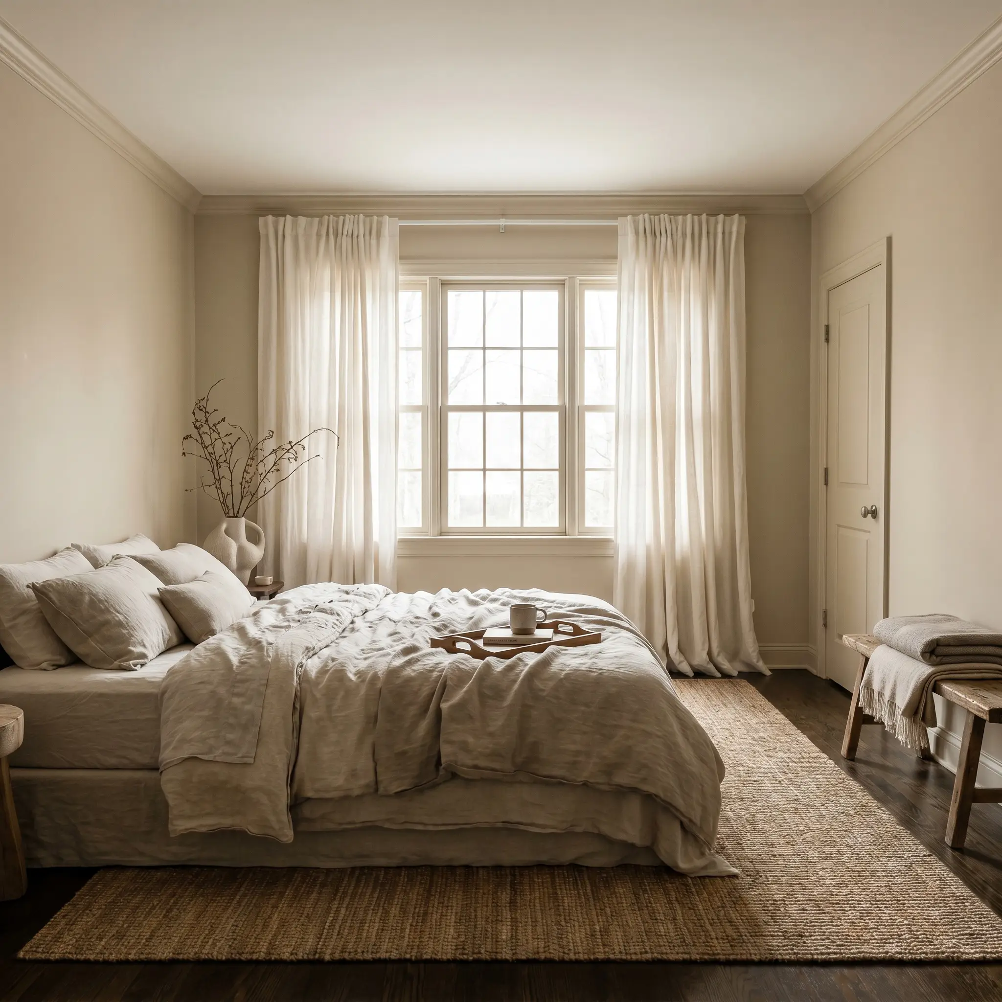
Bedrooms
For a deeply restful environment, this color wraps the walls in quiet warmth. It serves as the perfect backdrop for layered, tonal bedding and soft linen window treatments. The subtle green notes prevent the room from feeling too energetic, promoting a serene, restorative atmosphere.
When using a mid-tone neutral in a bedroom, paint the baseboards, doors, and window casings in the exact same color. This tonal wrapping blurs the room’s hard edges and makes standard ceiling heights feel significantly taller.
Hackrea Design Secret
Creative Ideas for SW 9508
This pigment’s unique structure inspires highly intentional, custom design moments beyond standard four-wall applications.
Wrapping Sloped Ceilings for Deep Rest
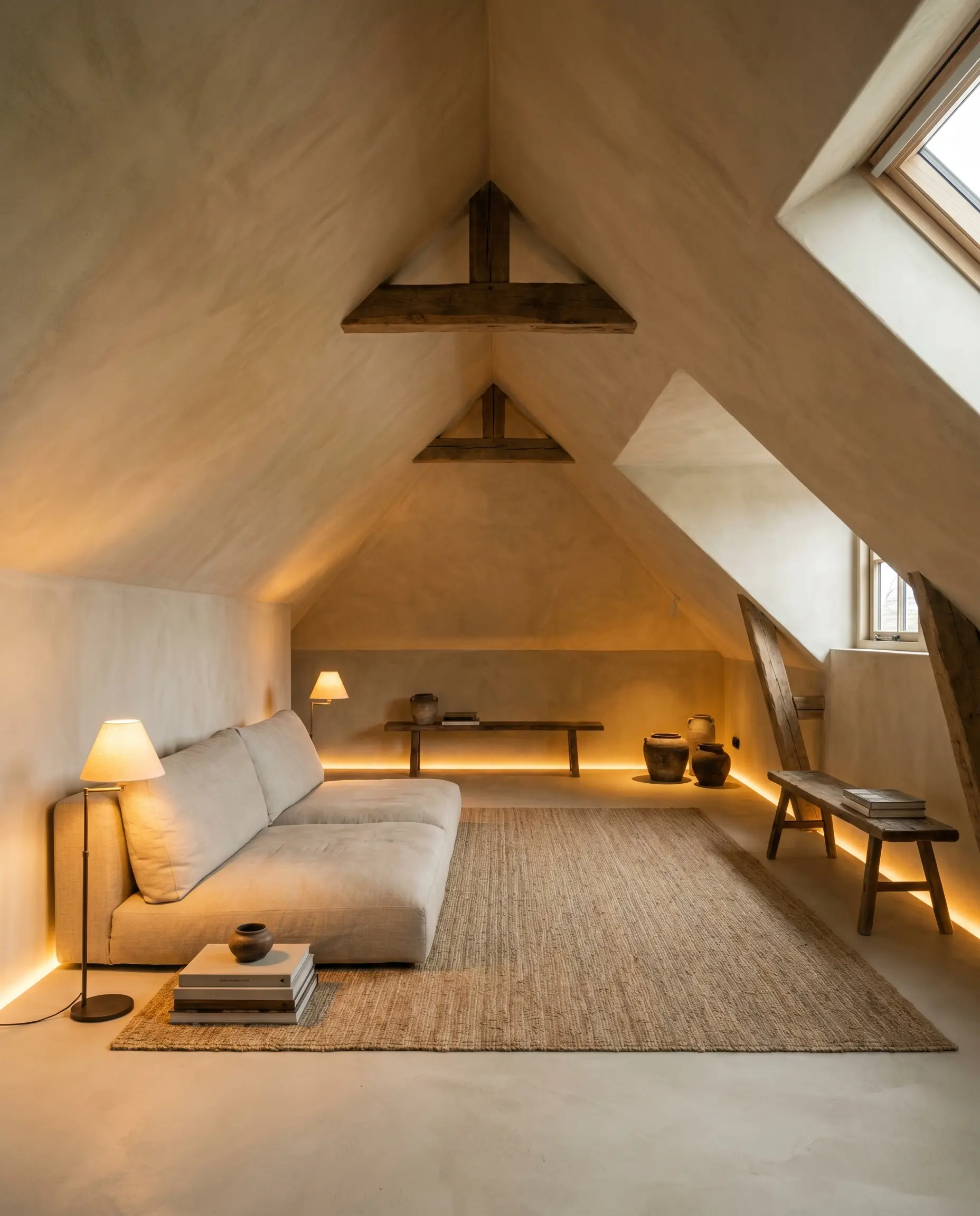
In finished attics or bonus rooms with awkward, sloped rooflines, stark white ceilings can highlight the structural oddities. By wrapping the entire room—walls and sloped ceilings—in this earthy tone, you erase the harsh geometric transitions. Paired with low-level amber lamp lighting and a minimalist, Wabi-Sabi design approach, the room transforms into a deeply insulated, calming retreat.
Grounding Light-Flooded Sunrooms
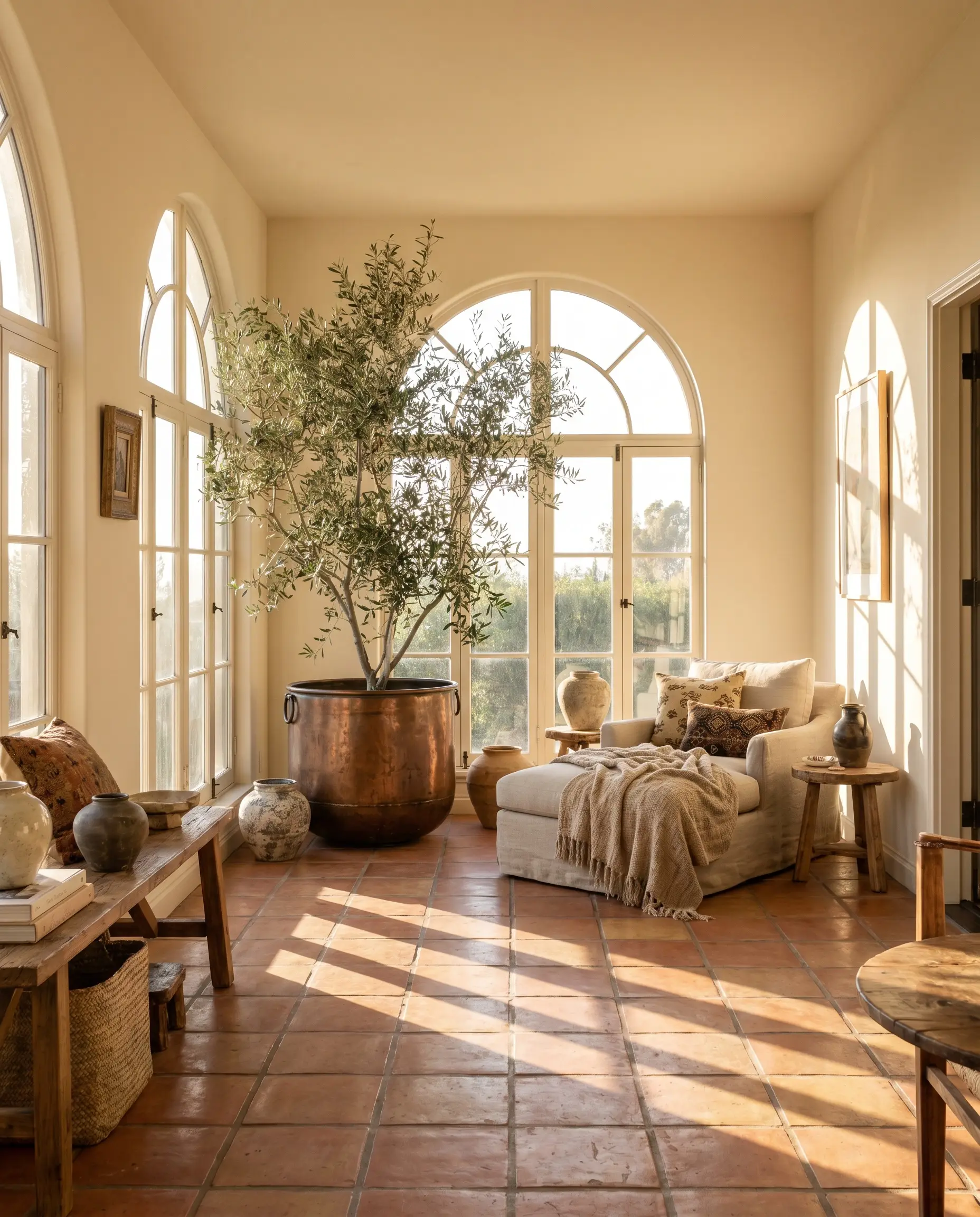
Rooms with massive western exposures often suffer from harsh afternoon glare that washes out lighter paints. The moderate chroma and light-absorbing qualities of this beige act as a visual sponge, softening the intense sunlight. Introduce heavily textured terracotta floor tiles and oversized indoor olive trees to create a stunning, Mediterranean-inspired lounge.
Transforming Utilitarian Walk-in Closets
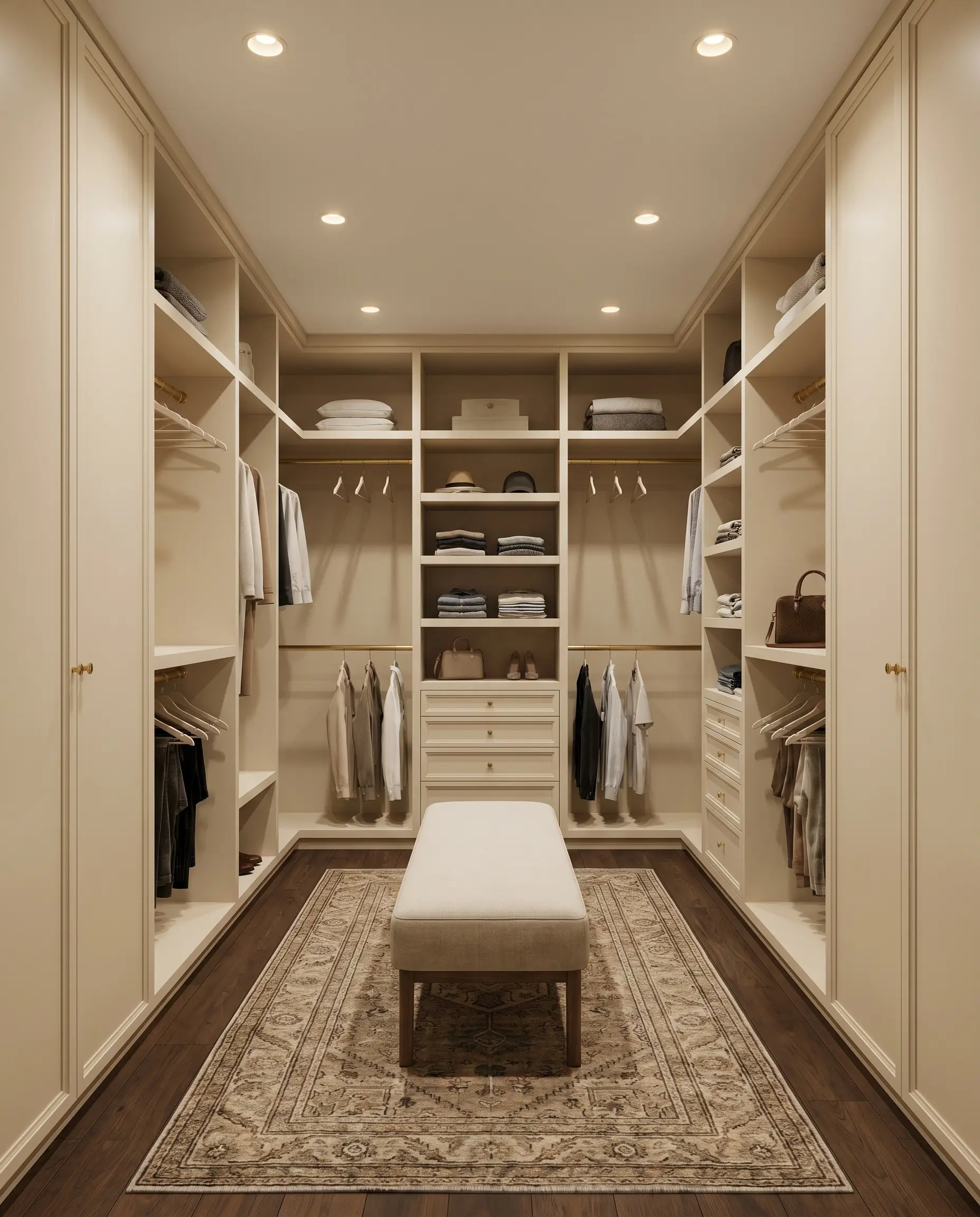
Windowless storage spaces often feel sterile under artificial light. Applying this rich khaki-leaning tone to custom MDF shelving instantly mimics the look of high-end, custom-milled cabinetry. Pair it with polished brass closet rods and a vintage wool runner to make a daily routine feel like a premium boutique experience.
Material Pairings & Coordinating Palettes
The secret to styling this specific beige is balancing its earthy weight with contrasting textures and crisp boundaries.
Architectural Trim & Baseboards
The architectural trim you choose will entirely dictate how crisp or soft the room feels.
Hardware, Wood & Material Pairings
To elevate this color, mix everyday textures with highly intentional, curatorial accents.
Coordinating Colors
Designer Mood Boards
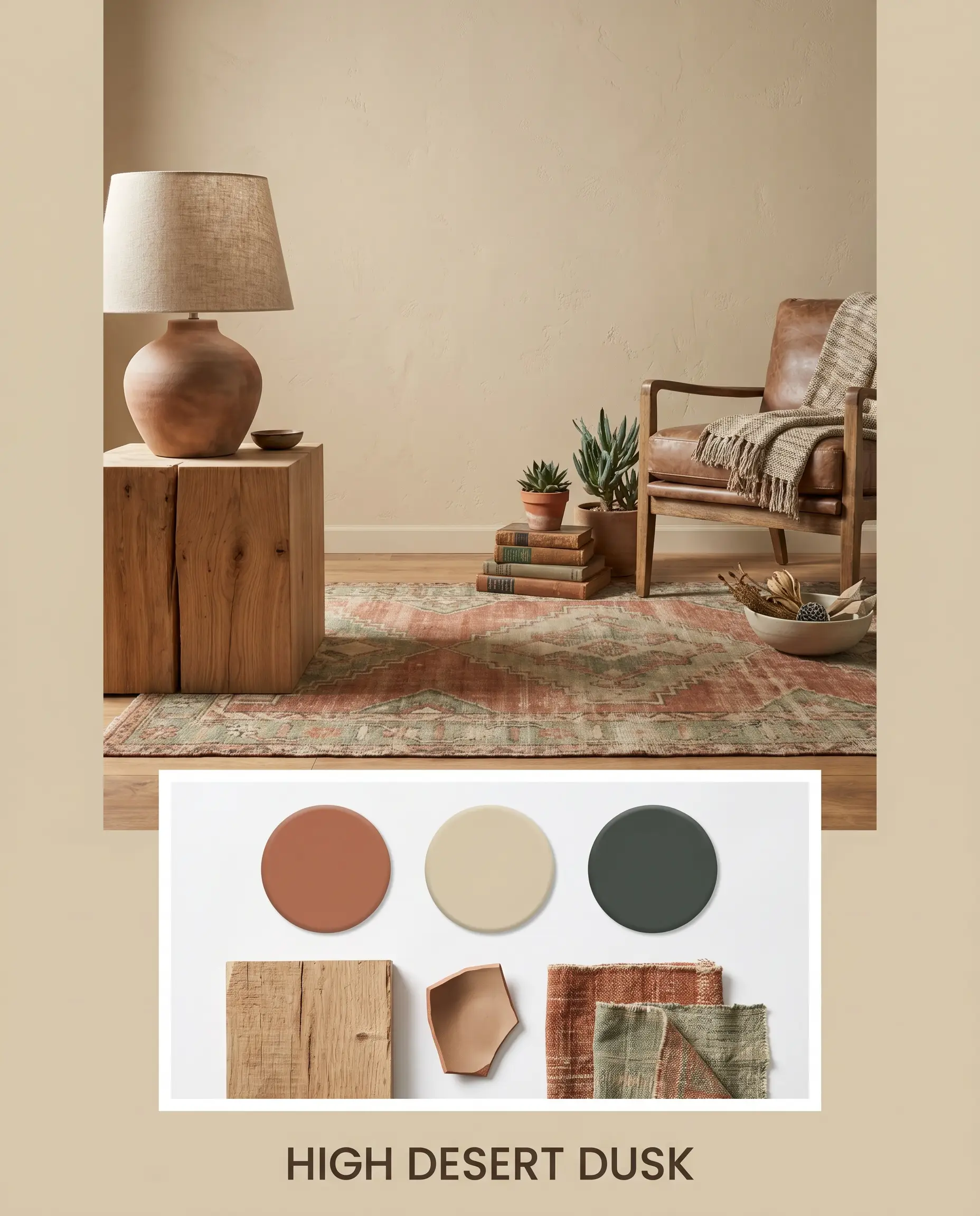
High Desert Dusk This palette leans into the rugged, sun-faded beauty of the American Southwest. The warm beige walls serve as the canvas for heavily textured, tonal styling. Think raw, unfinished oak side tables, matte ceramic table lamps, and a vintage distressed rug featuring muted rust and sage tones.
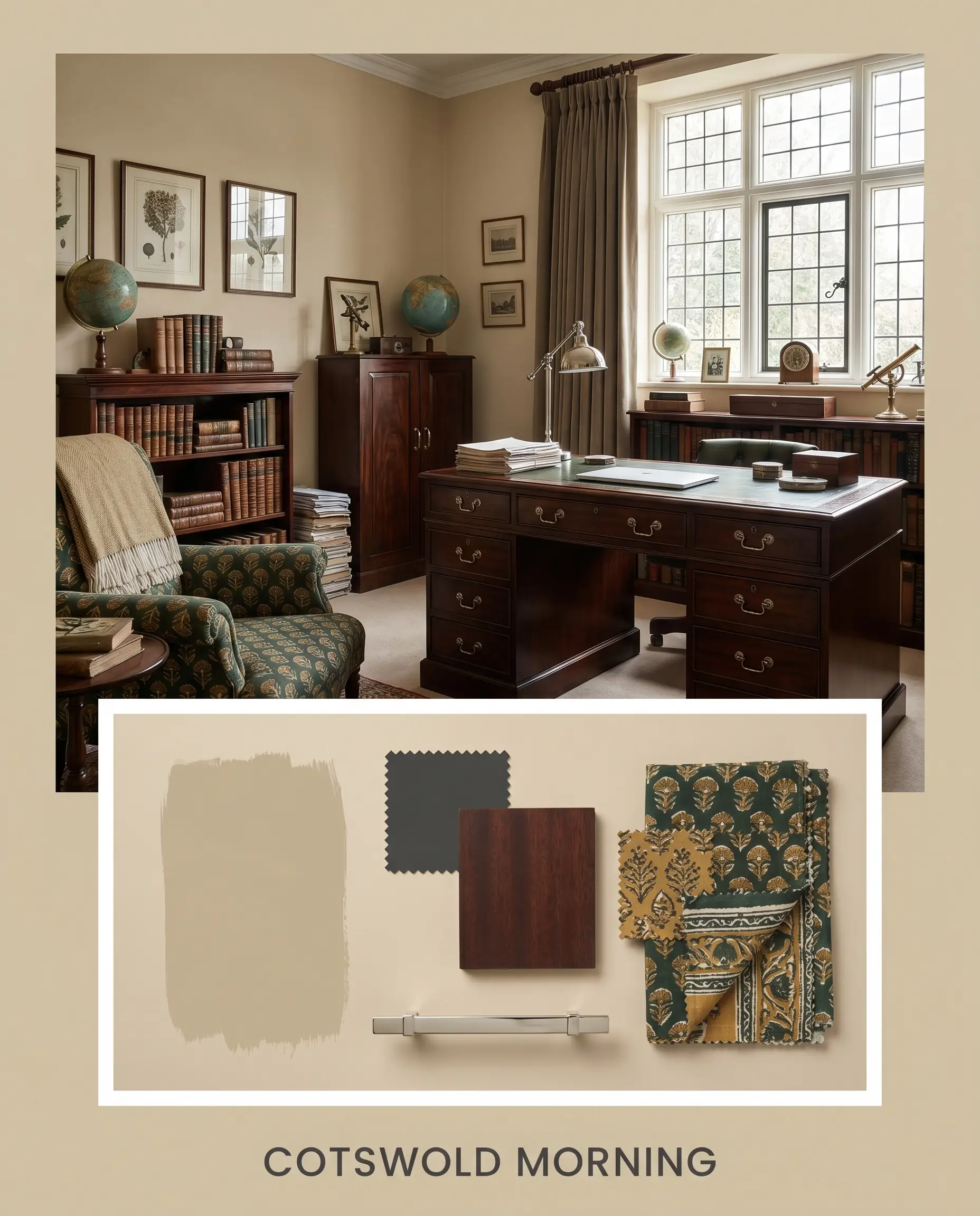
Cotswold Morning A deeply traditional, layered approach that highlights the color’s historic charm. The khaki notes are drawn out by pairing the paint with rich, dark mahogany antiques and polished nickel hardware. Introduce heavily patterned, block-printed textiles in deep greens and mustard yellows to complete the tailored, collected atmosphere.
Head-to-Head Neutral Comparisons
When choosing the perfect mid-tone, understanding the subtle differences in light reflection and temperature is critical.
Sherwin-Williams Natural Wool vs. Sherwin-Williams Natural Linen
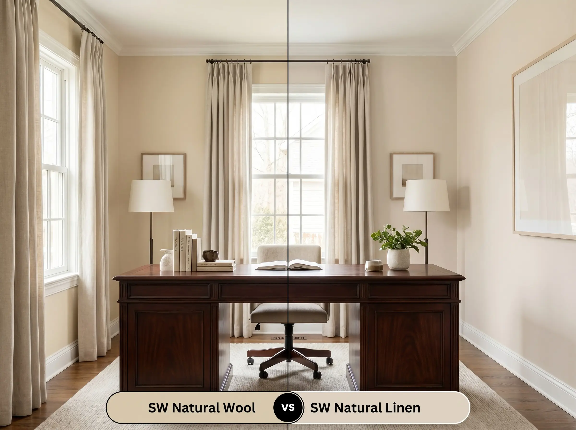
If your room lacks natural light, Natural Linen is often the safer choice. It has a higher LRV and significantly less green in its base, making it a cleaner, more straightforward neutral. Natural Wool requires more natural sunlight to truly show off its complex, earthy depth without feeling heavy.
Sherwin-Williams Natural Wool vs. Sherwin-Williams Lamb’s Wool
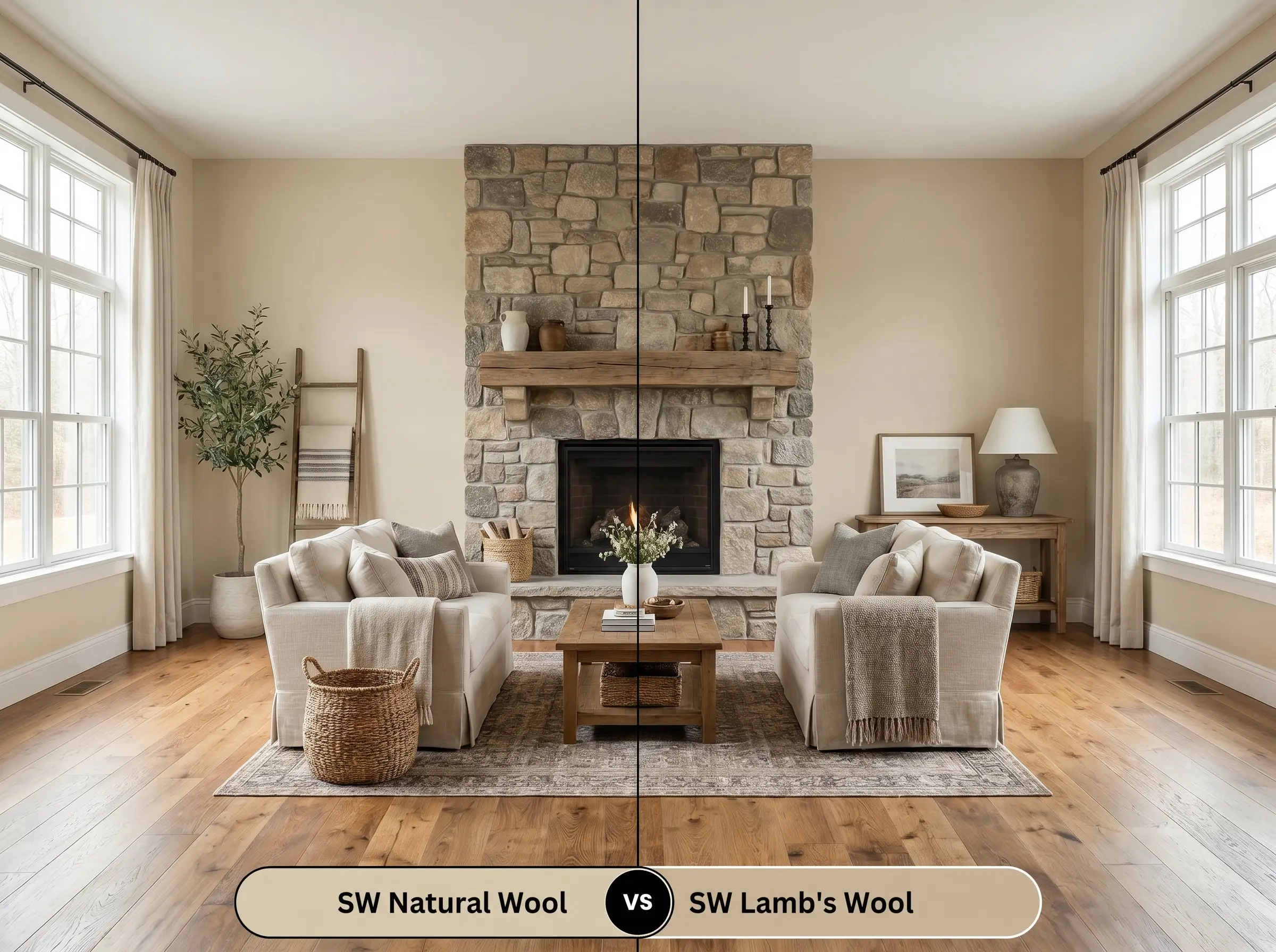
Lamb’s Wool carries a much more pronounced gray influence, placing it firmly in the “greige” category. If you are trying to coordinate with cool-toned stone fireplaces or gray-washed floors, Lamb’s Wool will bridge that gap better. Natural Wool is strictly for homeowners who want to fully embrace traditional, golden warmth.
Sherwin-Williams Natural Wool vs. Benjamin Moore Pale Oak
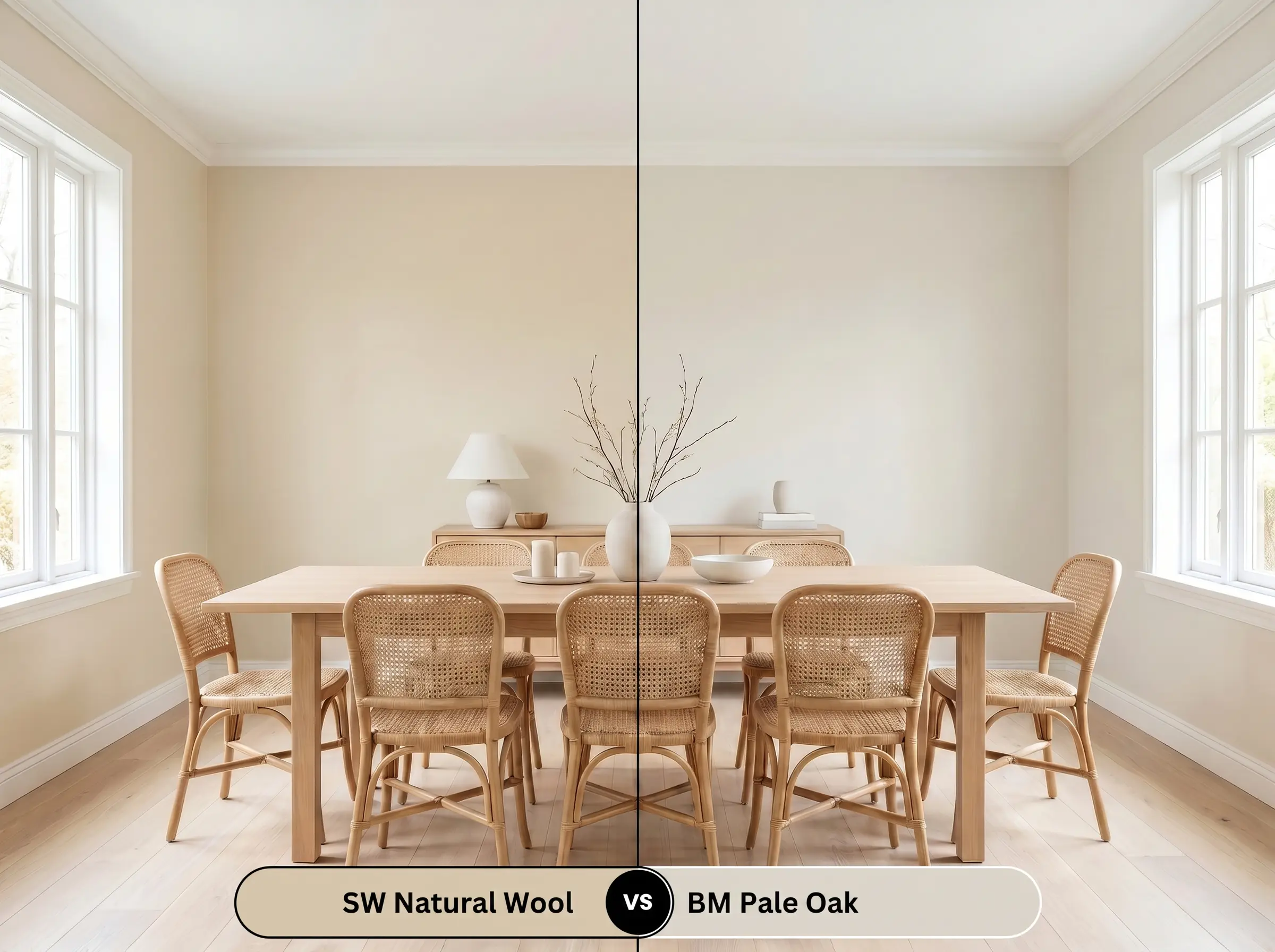
Pale Oak is significantly lighter and carries a distinct pink/taupe undertone. If you are decorating a crisp, airy, Scandinavian-inspired space, Pale Oak provides that delicate, breezy feel. Natural Wool is much heavier, darker, and better suited for grounding large spaces or creating cozy, enveloping environments.
Alternative Formulations for Natural Wool
Sometimes a room’s lighting demands a slight pivot to achieve the exact same aesthetic goal.
Similar Colors from Sherwin-Williams
Cross-Brand Equivalents
Execution & Surface Applications
Translating this color from a swatch to a finished wall requires strategic planning, especially regarding finish and coverage.
The Dynamic Sheen Guide
Primer Strategy
Because this is a mid-tone color with complex yellow-green pigments, a high-quality white primer is essential if you are painting over dark walls. If you are applying this over raw wood or MDF custom shelving, use a dedicated stain-blocking primer to prevent wood tannins from bleeding through and altering the final beige tone.
Coverage & Success Tips
This depth of pigment typically requires two full coats for true color accuracy. Be highly aware of your roller technique. Mid-tone beiges are prone to “flashing”—where uneven roller pressure creates visible, shiny streaks when the light hits the wall. Maintain a wet edge while painting, and avoid going back over semi-dry patches to ensure a flawlessly smooth, professional finish.
Frequently Asked Questions
Because of its mid-range LRV, it performs exceptionally well on bright exteriors. The intense UV sunlight will wash out the subtle green notes, leaving behind a beautiful, warm Mediterranean sand color that won’t blind you with glare.
Yes, its subtle green-khaki undertones act as a natural complement to red brick. Instead of fighting the red glare, the green micro-nuance gently neutralizes the harshness, creating a beautifully balanced, earthy aesthetic.
It actually creates a stunning contrast. The green-leaning khaki notes in the paint sit opposite the red tones of the cherry wood on the color wheel, allowing both the rich wood grain and the wall color to stand out beautifully without muddying each other.
The Final Verdict on Natural Wool
Sherwin-Williams Natural Wool is an incredibly sophisticated, grounding neutral designed for homeowners who want to inject authentic, earthy warmth into their architecture. It excels in large, open-concept living spaces, transitional kitchens, and light-filled rooms where its complex khaki and yellow-green undertones can shift beautifully throughout the day. It is the perfect foundational color for organic modern, traditional, and textural, nature-inspired design styles.
However, this paint requires careful consideration regarding what you place next to it. If your home is filled with cool, blue-gray luxury vinyl plank flooring or stark, icy-white marble countertops, the golden-khaki notes in this paint will aggressively clash, making the walls look sickly and the floors look artificially cold. It also struggles under harsh, bright white LED lighting (4000K and above), which strips away its cozy charm and exposes a sharp, unappealing green shadow. Pair it instead with warm woods, unlacquered metals, and soft, natural textiles to let its true architectural beauty shine.
Closest Cross-Brand Equivalents
The absolute closest scientific color matches for Natural Wool across top paint brands.