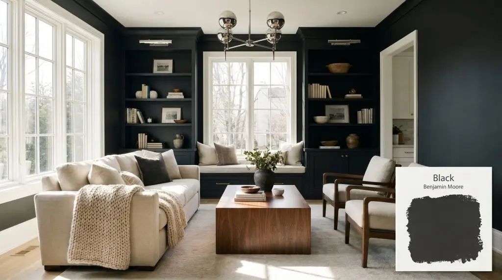
Black 2132-10 / HC-190
Benjamin MooreBenjamin Moore Black (2132-10 / HC-190) is a deeply saturated, classic true black with an LRV of 4.56. Because its RGB values are nearly identical, it acts as a stark, anchoring neutral with only the faintest microscopic blue undertone, keeping it crisp rather than muddy in cool lighting.
Paint Technical Profile
| Color ID / SKU | 2132-10 / HC-190 |
| HEX Code | #313132 |
| Light Reflectance (LRV) | 4.56 |
| Use | Interior, Exterior |
| Best Exposures | South-Facing, Well-Lit Rooms |
| Best For | Doors, Trim, Cabinetry, Accent Walls, Exteriors |
Benjamin Moore Black 2132-10: Crafting Infinite Depth and Architectural Drama
There is a distinct power in embracing a true, void-like shade to completely redefine the boundaries of a standard room. When you take a color with an exceptionally low light reflectance value and wrap it around everyday architectural features, the walls seemingly recede to create an illusion of expansive depth. Benjamin Moore Black 2132-10 is the ultimate tool for elevating standard spaces into highly curated environments.
By applying this stark neutral to basic builder-grade trim or interior doors, you instantly trick the eye into perceiving a much higher level of custom craftsmanship. It provides a sophisticated backbone for the “High/Low Mix,” allowing you to blend accessible furnishings with one or two premium focal points seamlessly.
Whether you are grounding a bright, airy loft or adding gravity to a suburban living room, this deep hue delivers uncompromising elegance. It is incredibly forgiving when paired with the right lighting, adapting gracefully to a wide variety of design aesthetics.
Decoding Benjamin Moore Black: Undertones & LRV
When deciding if a dark hue is right for your home, the most common question is whether it leans warm or cool. Benjamin Moore Black 2132-10 leans definitively cool, acting as a crisp, tailored foundation rather than a muddy or heavily browned charcoal.
With an LRV of 4.56, this shade absorbs a massive amount of light rather than bouncing it around the room. This incredible color absorption means it commands attention, physically altering the perceived boundaries of your architecture. Instead of reflecting ambient light, it anchors the space, requiring strategic styling to balance its visual weight.
Lighting Effects & The Chameleon Factor
The biggest risk with this specific depth is applying it in a windowless room with strictly warm, dim bulbs, which can flatten its crispness and make the space feel heavy rather than intentionally moody. Because it absorbs so much light, you must be deliberate about your fixtures and natural exposures to keep the color feeling alive.
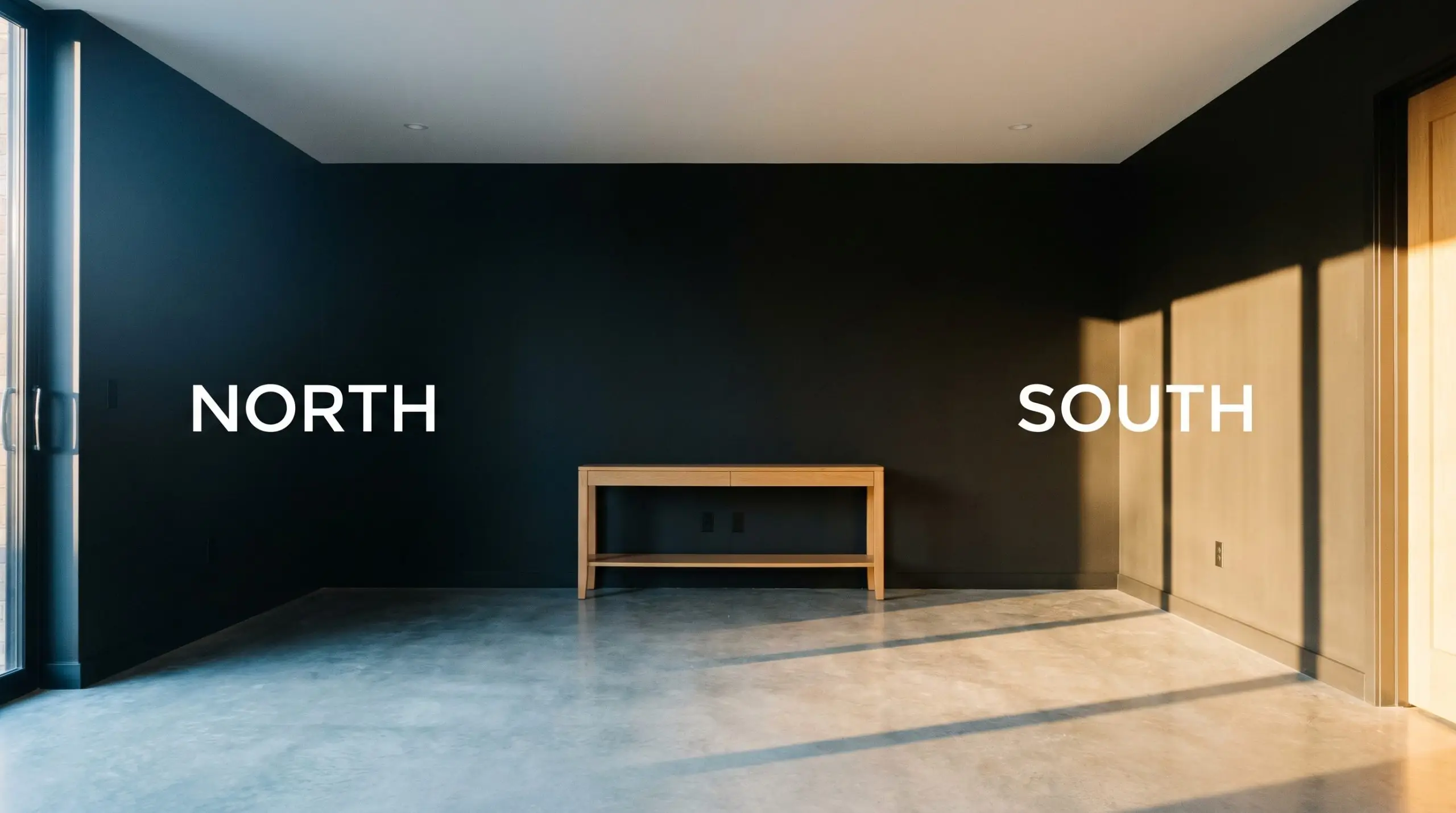
When using this shade in a room with limited natural light, layer your artificial lighting. Combine a central overhead fixture with strategically placed wall sconces to wash the dark walls with light, highlighting the paint’s rich finish rather than leaving it in shadow.
Hackrea Pro-Tip (Lighting)
Where to Apply Benjamin Moore Black HC-190
This dark hue demands intention, bringing a cohesive, grounding energy to any home it touches. It acts as a visual anchor, allowing lighter elements in the room to take center stage while providing a sophisticated, grounding perimeter.
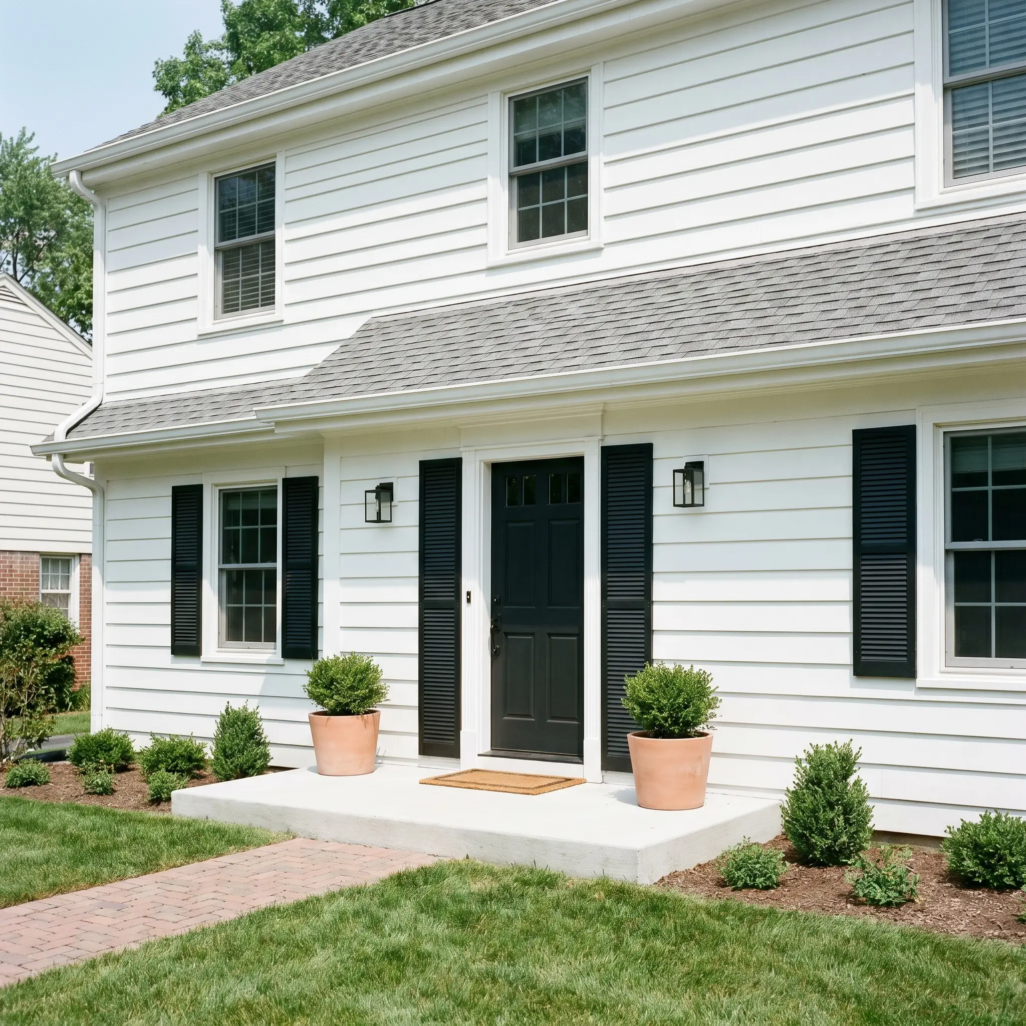
Exteriors
On an exterior facade, this shade is a brilliant way to add immediate curb appeal to a standard suburban home. It works exceptionally well on front doors and exterior shutters, providing a crisp, tailored contrast against classic white siding or classic red brick. Always be mindful of direct sun exposure, as deep colors absorb heat, meaning you will want to ensure your door is properly prepped to handle temperature fluctuations.
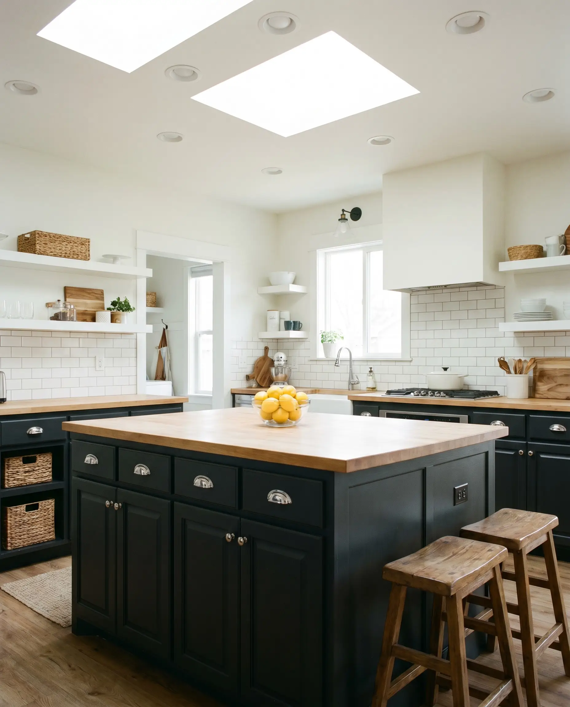
Kitchens
Using this deep neutral on lower cabinetry or a central island is a fantastic way to anchor a kitchen without making the entire room feel cave-like. It pairs beautifully with standard subway tile and butcher block counters, yet it instantly elevates the space to feel like a custom culinary studio. For a Modern Farmhouse aesthetic, pair it with polished chrome cup pulls; for a sleek Industrial vibe, let it stand alone with integrated, handle-less doors.
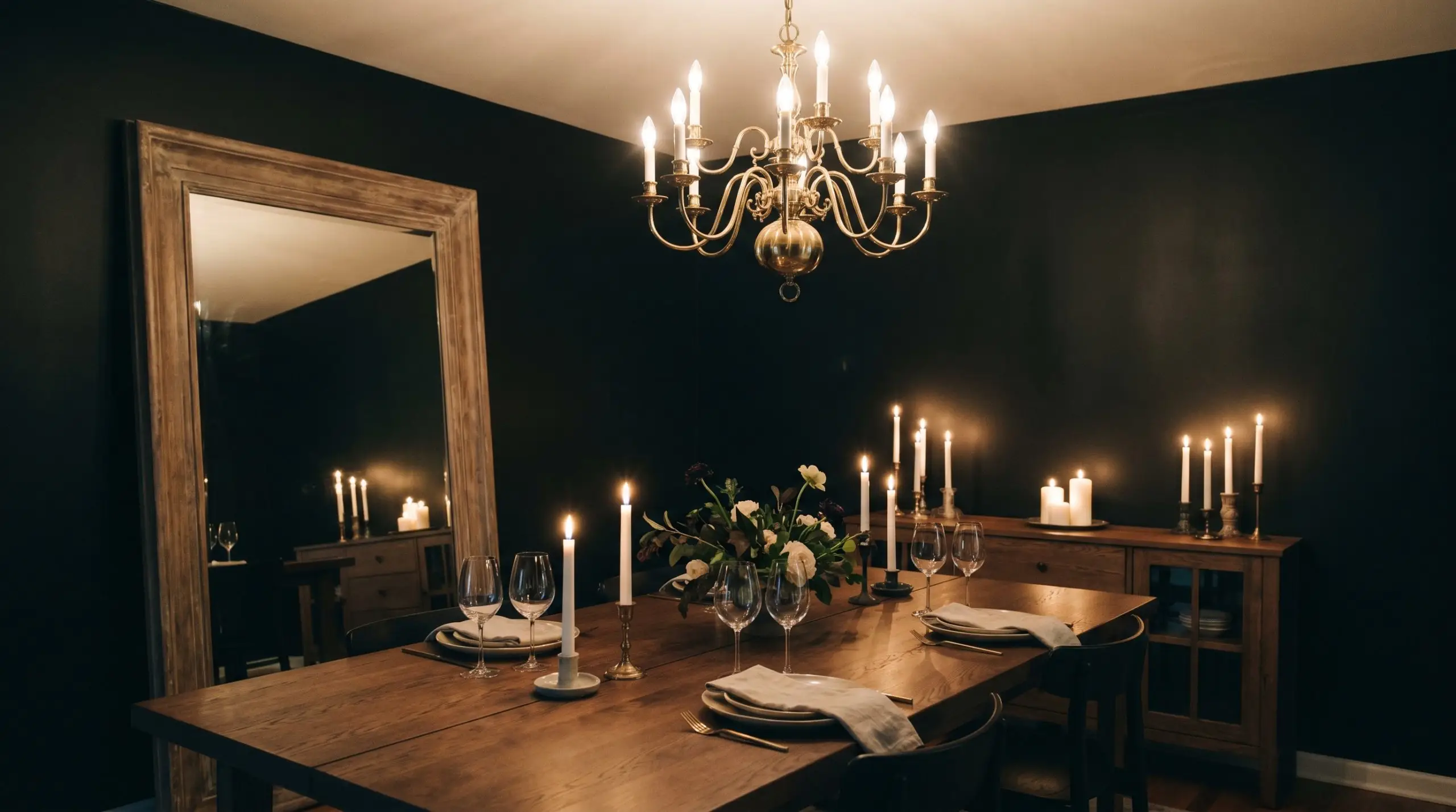
Dining Rooms
Wrapping a dining room entirely in this shade creates a deeply intimate, atmospheric environment perfect for evening gatherings. It blurs the corners of the room, making the space feel endless by candlelight. To keep the room from feeling too enclosed, balance the dark walls with a highly reflective centerpiece, such as a large mirror or a polished metallic chandelier.
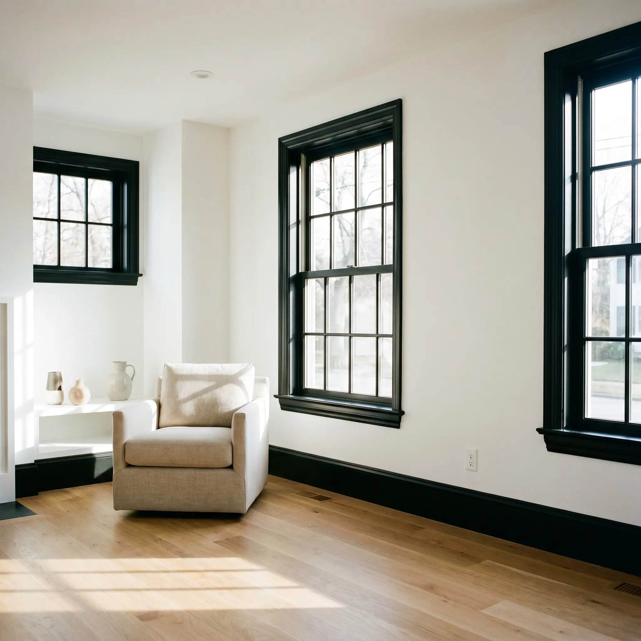
Millwork & Trim
Painting interior trim, window sashes, and baseboards in this shade is a high-impact, practical update that frames your windows like artwork. This technique works wonders in Classic Colonial homes where you want to modernize the historical architecture without removing the original details. It draws the eye outward to the view beyond the glass, making standard windows feel significantly larger.
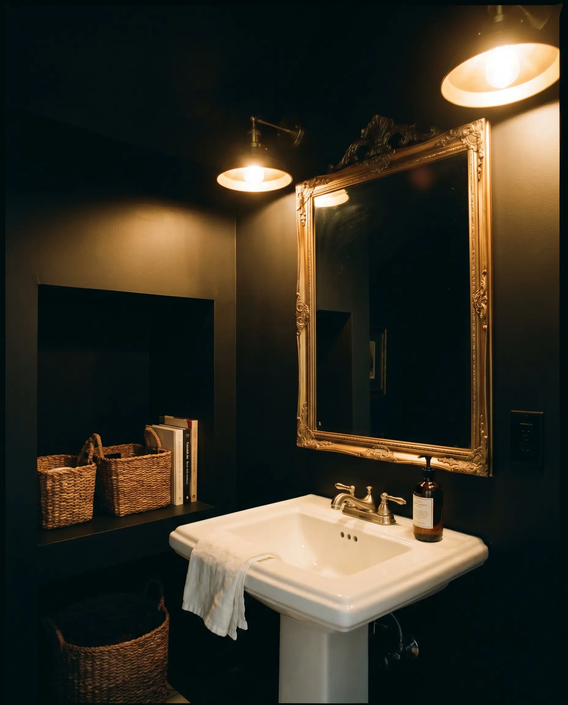
Bathrooms
Powder rooms are the perfect environment to experiment with total color saturation. Because these are transitional spaces, wrapping the walls and ceiling in this pure black creates a jewelry-box effect. Pair it with a standard white pedestal sink and an oversized brass mirror to create a luxurious, boutique-hotel vibe using incredibly accessible ingredients.
Creative Ways to Use This Stark Neutral
Stepping beyond standard walls and doors opens up a world of creative potential. This color is a powerful tool for strategic, high-impact transformations that make a home feel entirely bespoke.
The Dramatic Staircase Tread
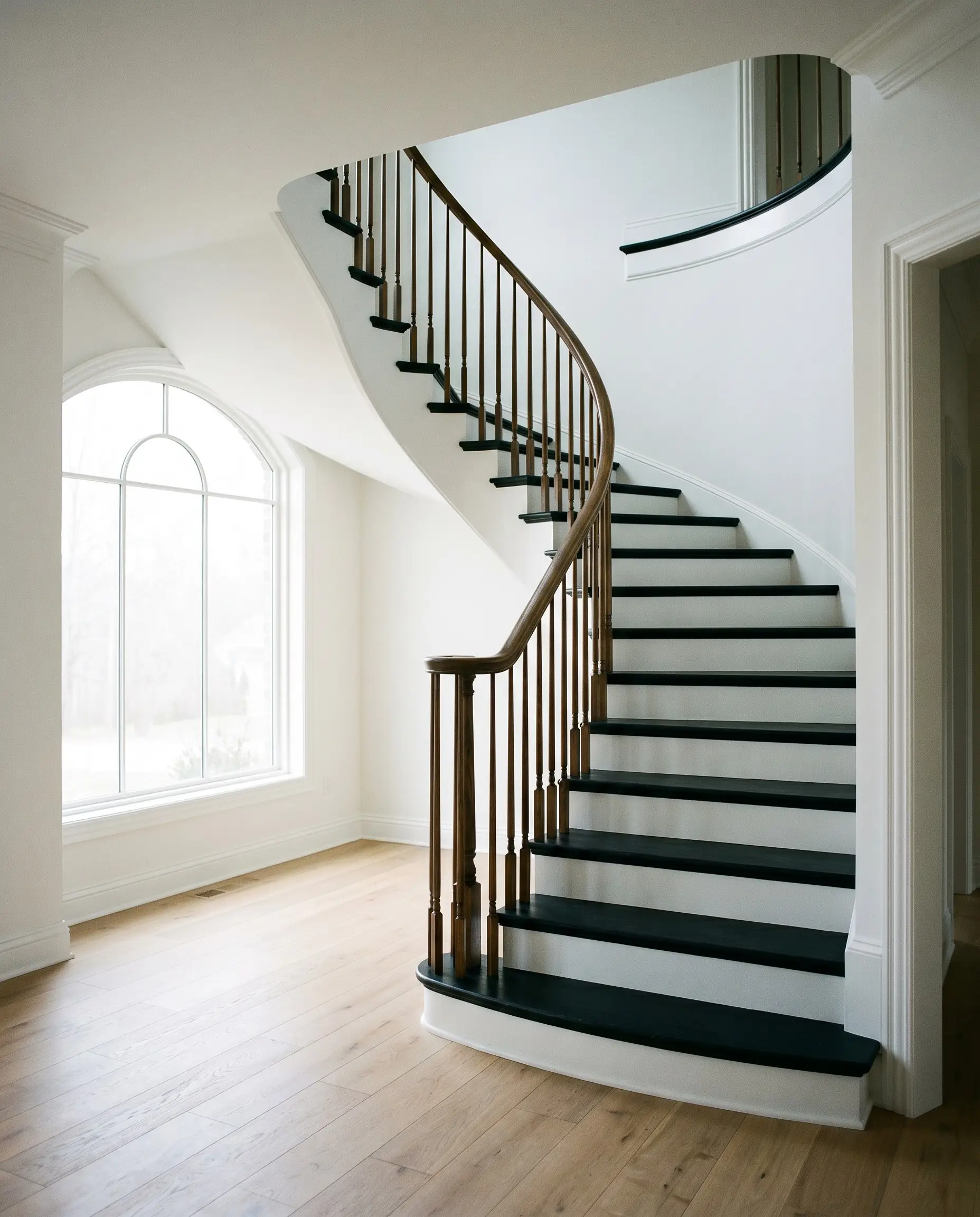
Transform a tired, builder-grade staircase by painting the treads in this deep hue while leaving the risers a crisp white. This creates a striking, tailored runner effect that draws the eye upward. It completely modernizes a traditional entryway and hides everyday scuffs beautifully, especially when finished with a durable, high-traffic topcoat.
A Moody Home Office Built-In
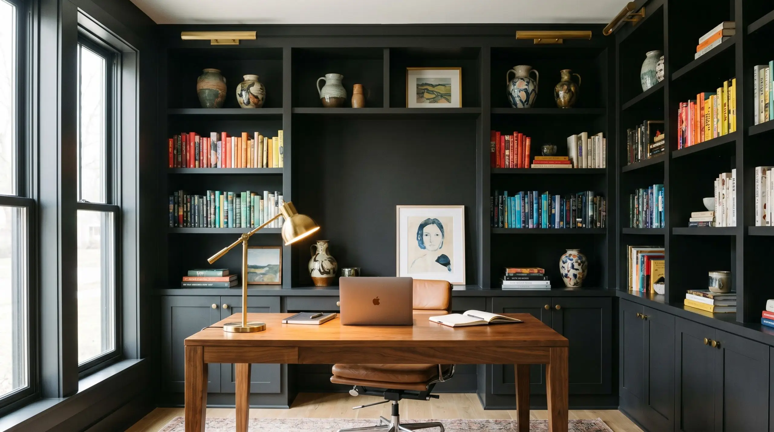
Take standard, inexpensive shelving units and paint them floor-to-ceiling in this shade to create the illusion of custom library built-ins. The dark background makes colorful book spines, standard ceramic vases, and framed art pop vividly. It brings a sense of quiet focus to a home office, anchoring the room without requiring a massive structural renovation.
The Layered Fireplace Surround
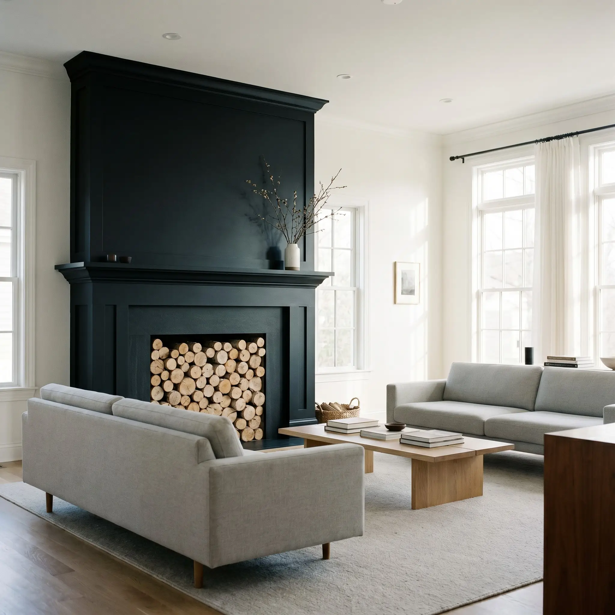
Update a dated, red-brick fireplace by painting the entire surround and mantel in this stark neutral. The dark color modernizes the texture of the brick, giving it the sleek appearance of carved slate or basalt. It instantly turns an outdated architectural feature into a stunning, contemporary focal point that anchors the living room’s seating arrangement.
Hardware, Material Pairings & Coordinating Colors
The secret to styling this deep shade is managing the visual dialogue between light absorption and texture. It requires thoughtful material pairings to either bounce light back into the room or lean into its velvety depth.
Trim & Baseboards
Hardware, Wood & Textures
Coordinating Colors
Designer Mood Boards
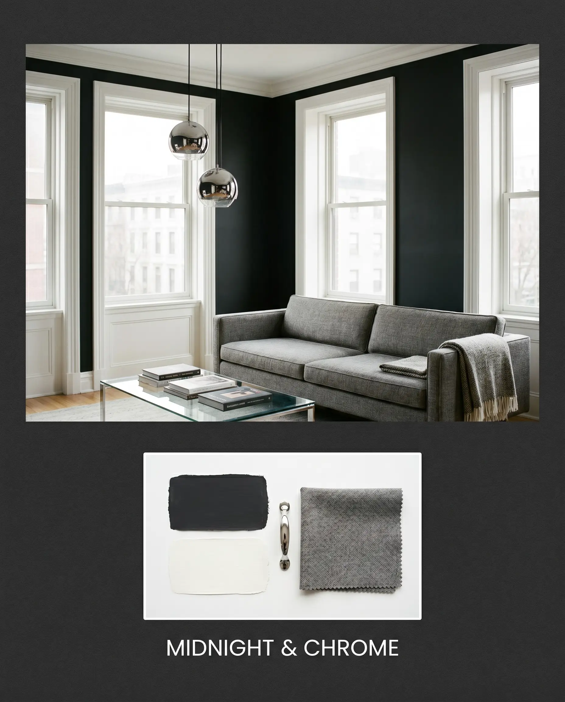
Midnight & Chrome
This combination is all about sleek, modern tension. By pairing the deep walls with Polished Chrome fixtures and crisp Benjamin Moore Chantilly Lace OC-65 trim, the room feels incredibly sharp. Add a standard glass-topped coffee table and a tailored gray sofa to complete a look that feels effortlessly urban and refined.
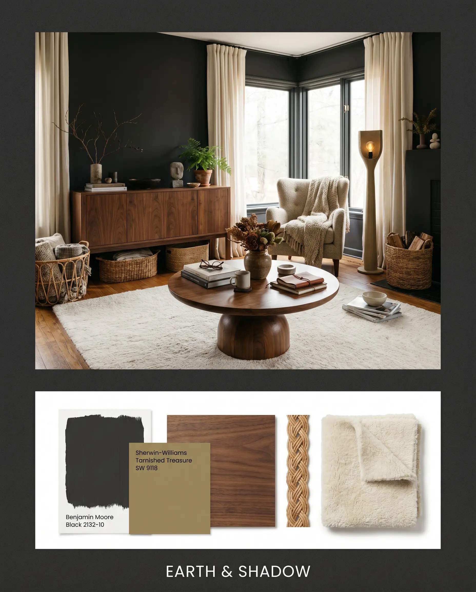
Earth & Shadow
Leaning into organic warmth, this palette softens the stark walls with Rich Walnut Veneers and the earthy tones of Sherwin-Williams Tarnished Treasure SW 9118. Style the space with woven rattan baskets and a plush, cream-colored rug to create a grounded, highly textured environment that feels both cozy and curated.
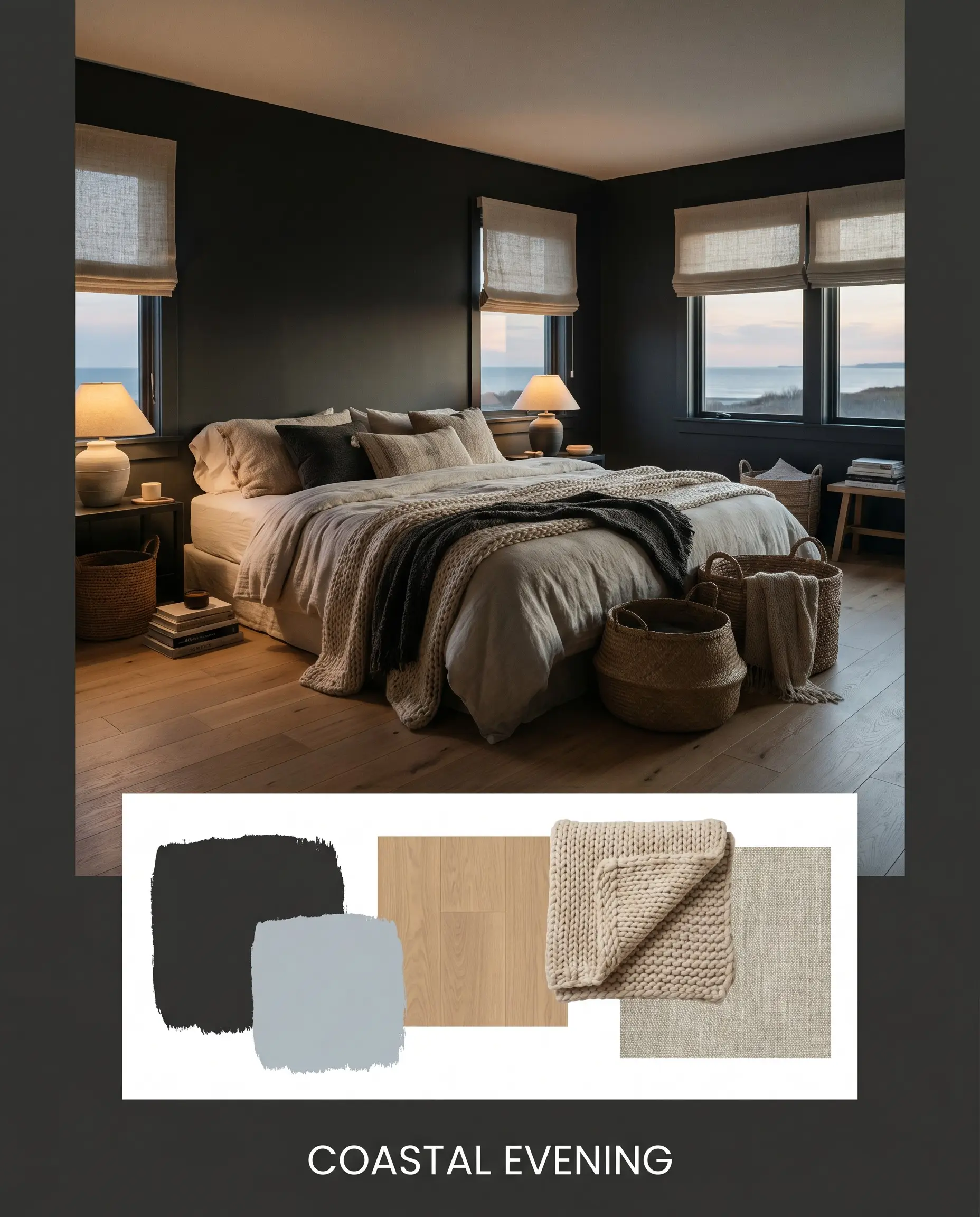
Coastal Evening
This palette proves that dark colors can feel breezy. By pairing the black with Farrow & Ball Parma Gray 27 and draping the furniture in Chunky Wool Knits, the room takes on the relaxed energy of a twilight beach. Incorporate light oak flooring and simple linen shades to keep the overall atmosphere light and breathable.
Comparing Benjamin Moore Black 2132-10
Choosing the right dark shade often comes down to understanding how it behaves under specific lighting conditions. If your room lacks natural light or features heavily warm-toned fixed elements, a rival paint might offer a more cohesive solution.
Benjamin Moore Black 2132-10 vs. Sherwin-Williams Tricorn Black SW 6258
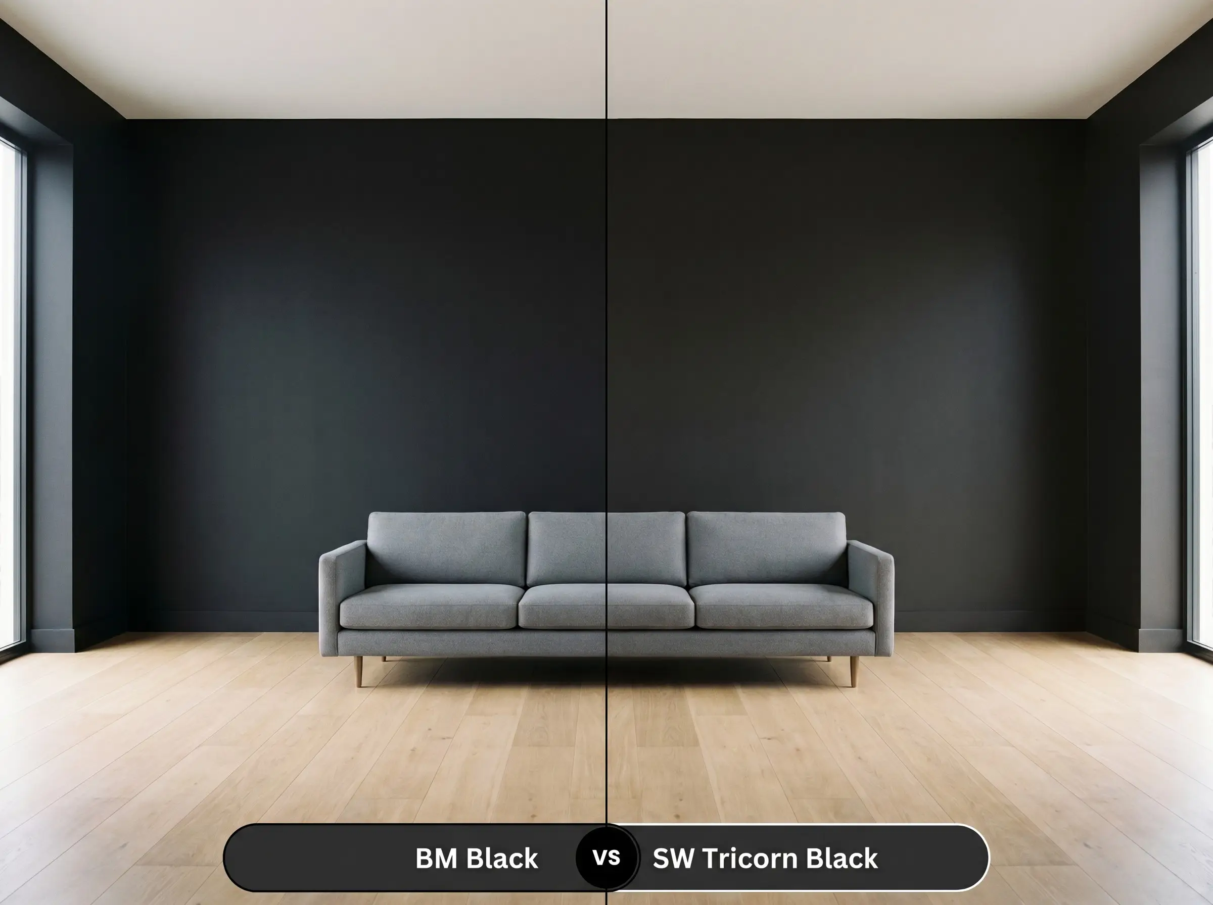
Sherwin-Williams Tricorn Black is celebrated for being an incredibly true, dead-center neutral with almost zero discernible undertones. If you are worried about the microscopic blue drop in 2132-10 pulling too cool in a north-facing room, Tricorn Black provides a safer, strictly neutral alternative that plays perfectly with any adjacent color.
Benjamin Moore Black 2132-10 vs. Benjamin Moore Onyx 2133-10
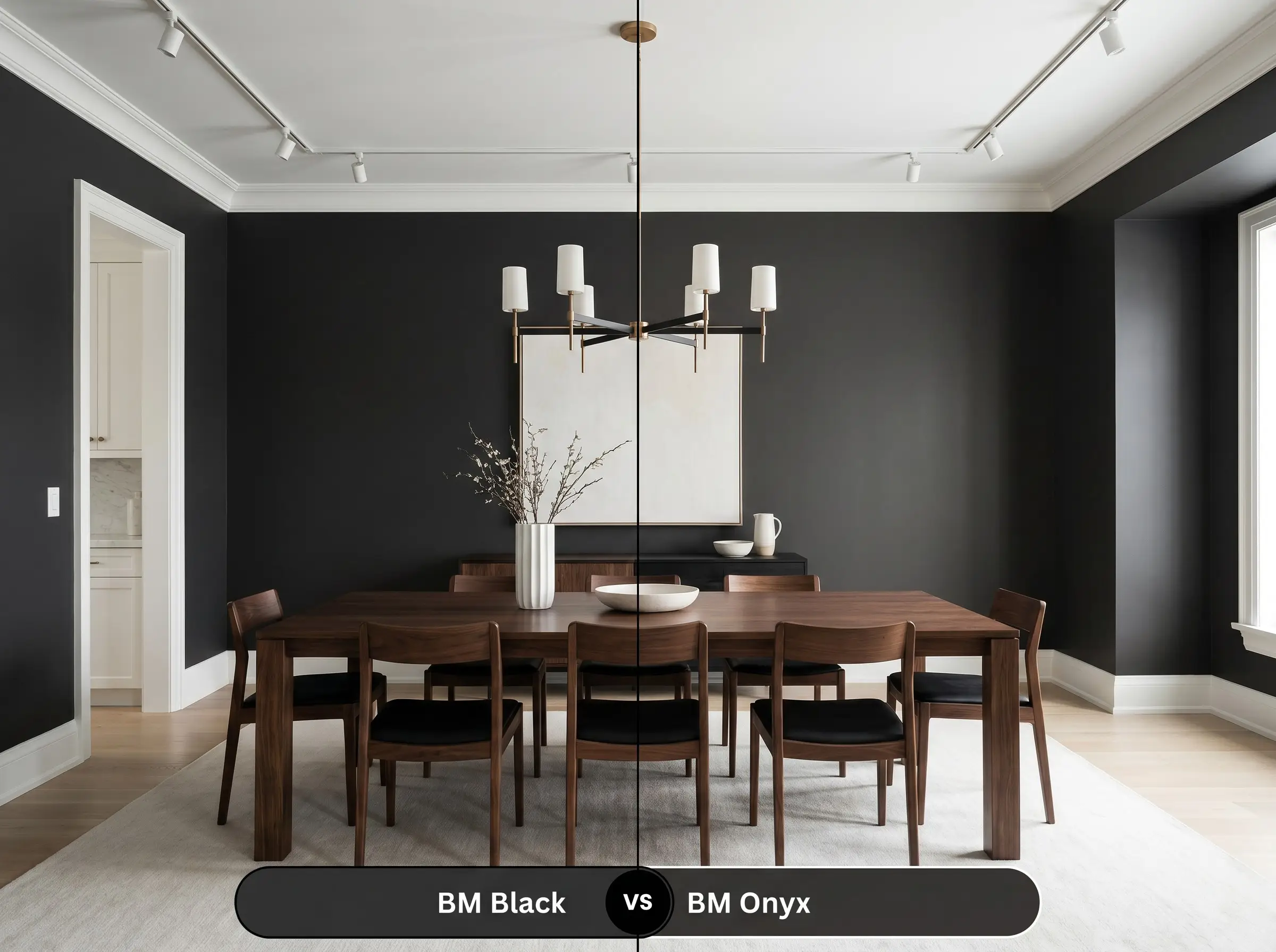
Benjamin Moore Onyx carries a much warmer, almost brown-leaning undertone compared to the crisp coolness of 2132-10. If your space features extensive warm cherry floors or Tuscan-style stonework, Onyx will bridge the gap beautifully, whereas the cooler 2132-10 might feel slightly disconnected or harsh against those warm elements.
Benjamin Moore Black 2132-10 vs. Farrow & Ball Pitch Black 256
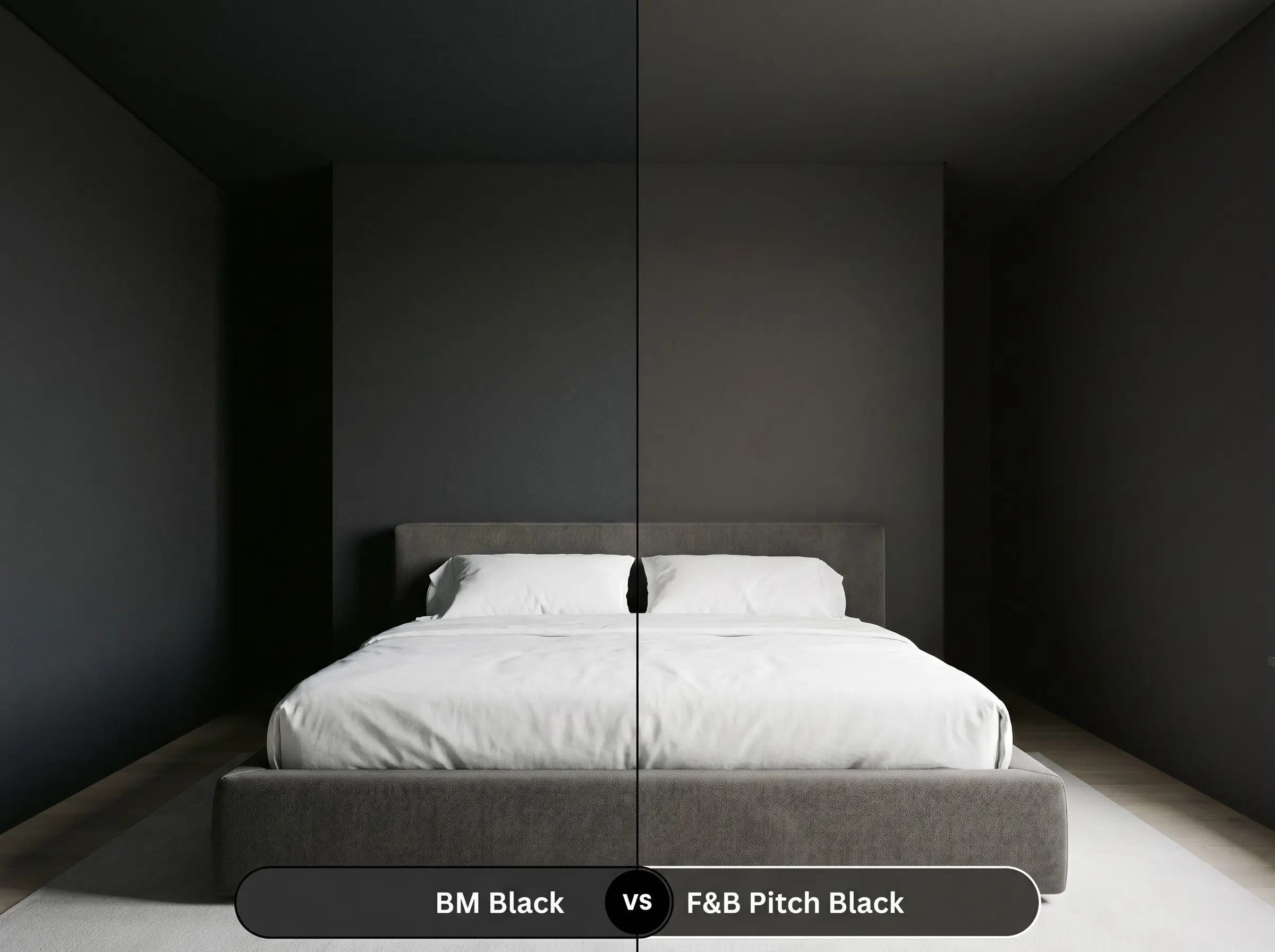
Farrow & Ball Pitch Black is famously stark and flat, designed to look completely unyielding. While 2132-10 is incredibly dark, its Gennex Color Technology allows it to retain a subtle, rich depth on the wall. If you want a purely graphic, almost two-dimensional look, Pitch Black is the choice; if you want a dark wall that still feels like a breathable architectural surface, stick with Benjamin Moore.
Similar Colors & Cross-Brand Matches
If you love the general depth of this color but need a slight shift in undertone or are shopping across different manufacturers, these alternatives provide excellent starting points.
Similar Colors
Cross-Brand Equivalents
Practical Application & DIY Advice
Executing a dark color requires precision. The depth that makes this shade so beautiful also means that application errors will be highly visible if not handled correctly.
The Dynamic Sheen Guide
When rolling a color this dark, always maintain a “wet edge” and roll continuously from ceiling to floor in one motion. Stopping in the middle of the wall can cause “flashing”—visible, uneven streaks where the paint dried at different rates.
Hackrea Pro-Tip (Application)
Primer Strategy
You cannot simply paint a dark hue over a light wall and expect true depth. You must use a high-quality primer tinted to a deep gray. A tinted primer reduces the number of topcoats required and ensures the final color achieves its true, intended richness without looking streaky or washed out.
Coverage & Success Tips
Even with a tinted primer, expect to apply at least two full coats of Benjamin Moore Black HC-190 to achieve a professional, opaque finish. Take your time with painter’s tape. Dark colors highlight sloppy cut-in lines instantly, so investing in premium tape and removing it while the paint is still slightly tacky will guarantee crisp, tailored edges.
Frequently Asked Questions
Because it utilizes Gennex Color Technology, it retains a rich, velvety depth even in a matte finish. However, a matte finish on such a dark color will show oily fingerprints easily, so it is best reserved for low-traffic walls rather than hallways.
All incredibly dark colors are susceptible to UV fading over time. Because of its microscopic blue drop, as it fades under harsh sun, it may begin to look slightly softer and more charcoal-leaning rather than turning brown. Using a premium exterior paint with UV protectants is essential.
Spraying an exposed basement ceiling in this shade is a highly effective, practical trick. Because it absorbs so much light, the ductwork and joists visually recede into the shadows, creating an industrial, finished look that actually makes the ceiling feel higher.
It can create a challenging visual tension. The cool blue hint in the paint can sometimes emphasize the red-orange tones in the cherry wood, making the floors look aggressively bright. You will need to introduce bridging elements, like a neutral rug, to harmonize the two.
Final Verdict & Expert Warnings
Benjamin Moore Black 2132-10 is a masterful, sophisticated anchor for any home. It is perfect for the homeowner who wants to create intentional, high-contrast architecture, whether that means grounding a sleek, modern kitchen island or wrapping a dining room in moody elegance. Its microscopic blue undertone ensures it remains crisp and tailored, never muddy, making it a reliable foundation for mixing accessible decor with premium statement pieces.
However, this stark neutral requires thoughtful styling to succeed. If your home features heavily yellow-toned beige carpets, dated Tuscan-style travertine with strong orange veining, or un-bridged red-toned wood trims, this crisp black will severely clash. The cool undertone of the paint will fight against those muddy, warm elements, making the paint feel harsh and the surrounding materials look instantly dated. To use this color successfully alongside warm fixed elements, you must introduce layered textiles and transitional coordinating colors to bridge the gap and maintain a cohesive, curated aesthetic.
Closest Cross-Brand Equivalents
The absolute closest scientific color matches for Black across top paint brands.