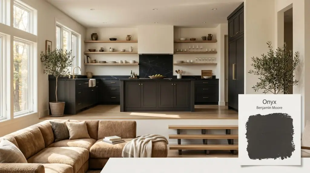
Onyx 2133-10
Benjamin MooreBenjamin Moore Onyx (2133-10) is a luxurious, warm black paint color with an LRV of 4.99. Unlike stark, industrial blacks, Onyx features a microscopic hint of warmth, making it an incredibly grounded, neutral charcoal-black perfect for dramatic interiors and striking exteriors.
Paint Technical Profile
| Color ID / SKU | 2133-10 |
| HEX Code | #353434 |
| Light Reflectance (LRV) | 4.99 |
| Use | Interior, Exterior |
| Best Exposures | South-Facing, North-Facing |
| Best For | Accent walls, exterior siding, interior doors, kitchen cabinets, dramatic powder rooms. |
Benjamin Moore Onyx: The Architectural Power of a Saturated Black
When you strip away ambient light from a room, the physical boundaries of the space begin to blur. Benjamin Moore Onyx 2133-10 acts as an architectural eraser, absorbing illumination to create a profound sense of infinite depth. This is not a flat, lifeless void that shrinks your walls.
It is a highly calibrated, saturated black that manipulates the visual weight of your cabinetry, trim, and exterior facades.
We rely on this specific charcoal spectrum to build spaces that feel instantly intimate, relentlessly chic, and fundamentally secure. By understanding how its hidden pigments react to your environment, you can use this color to completely redefine the scale of your home.
Benjamin Moore Onyx: Undertones & LRV
Is this paint warm or cool? Onyx is definitively a warm-leaning neutral. While many dark paints veer into icy, blue-tinged territory, this specific formula relies on a microscopic red-brown cast to maintain its earthy base.
This faint nuance prevents the finish from feeling stark or sterile. Instead, it establishes a soft, stabilizing foundation that plays beautifully alongside natural materials and varied light sources.
The Anatomy of the Color:
At an extraordinarily low LRV of 4.99, this architectural finish absorbs over 95% of the light that hits it. It will not bounce illumination around your room. Instead, it creates dramatic enclosure and graphic contrast, instantly pulling the eye toward your lighter furnishings, textiles, and architectural features.
Lighting Effects and The Chameleon Factor
Because of its incredibly low light reflectance and subtle warm undertones, this black behaves entirely differently depending on the direction and temperature of your light source.
How the Color Shifts:
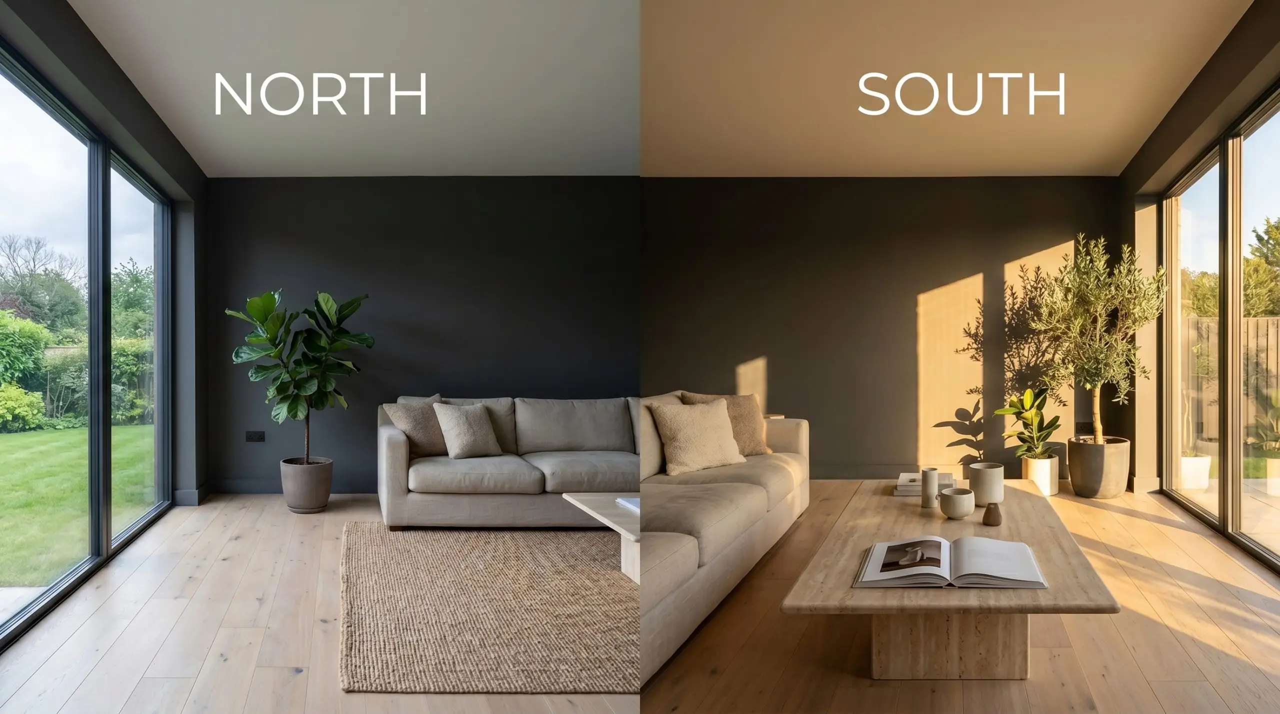
When applying this color to exterior siding, direct midday sun will aggressively lighten its appearance. Expect it to read as a soft, earthy charcoal rather than a pitch-black void on your facade.
Hackrea Pro-Tip (Exterior Washout)
Strategic Architectural Applications
Applying a color with an LRV of 4.99 requires absolute intentionality. Rather than randomly painting a single accent wall, you must use this velvety depth as a structural tool to define your home’s layout and control its energy. Here is how we execute this shade across varied functional spaces.
Securing the Kitchen with Dark Cabinetry
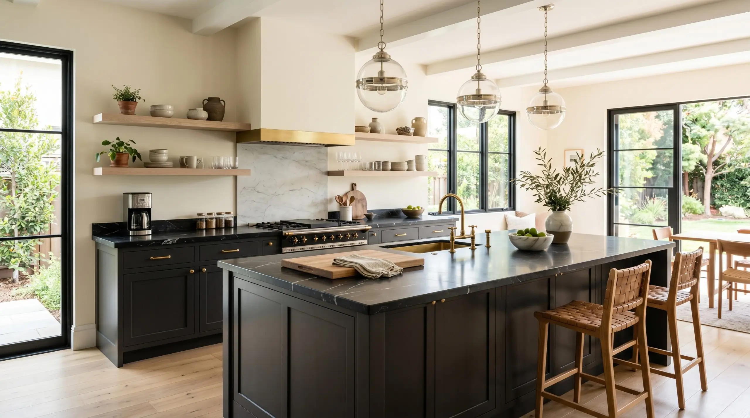
Instead of defaulting to standard white, use BM 2133-10 on lower cabinets or a massive central island to establish a stabilizing visual weight in the room. This approach centers the kitchen, giving the eye a place to rest amidst the chaos of daily family life.
Pair this dark foundation with bleached white oak open shelving and honed Nero Marquina marble countertops for a premium tactile collision.
Unlacquered brass hardware and polished nickel pendant lights will pop brilliantly against the warm-leaning black. The resulting aesthetic feels both highly curated and effortlessly lived-in.
The Immersive Powder Room Wrap
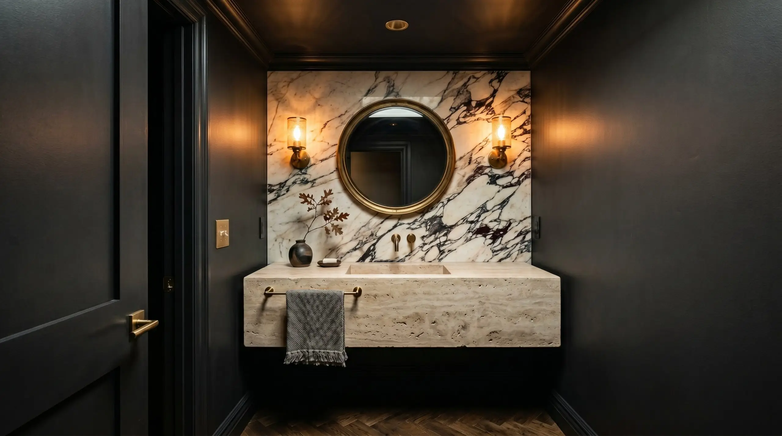
Small, windowless spaces are the perfect canvas for a full color-drenching technique. By painting the walls, trim, and ceiling in this saturated black, you erase the cramped physical boundaries of the room, creating a stunning jewel-box effect.
Because the corners of the room disappear into shadow, the space actually feels larger and infinitely more luxurious.
To prevent the room from feeling heavy, introduce organic textures. A floating travertine vanity, a dramatically veined marble backsplash, and warm 2700K brass sconces will glow beautifully against the dark backdrop.
Modernizing Exterior Facades
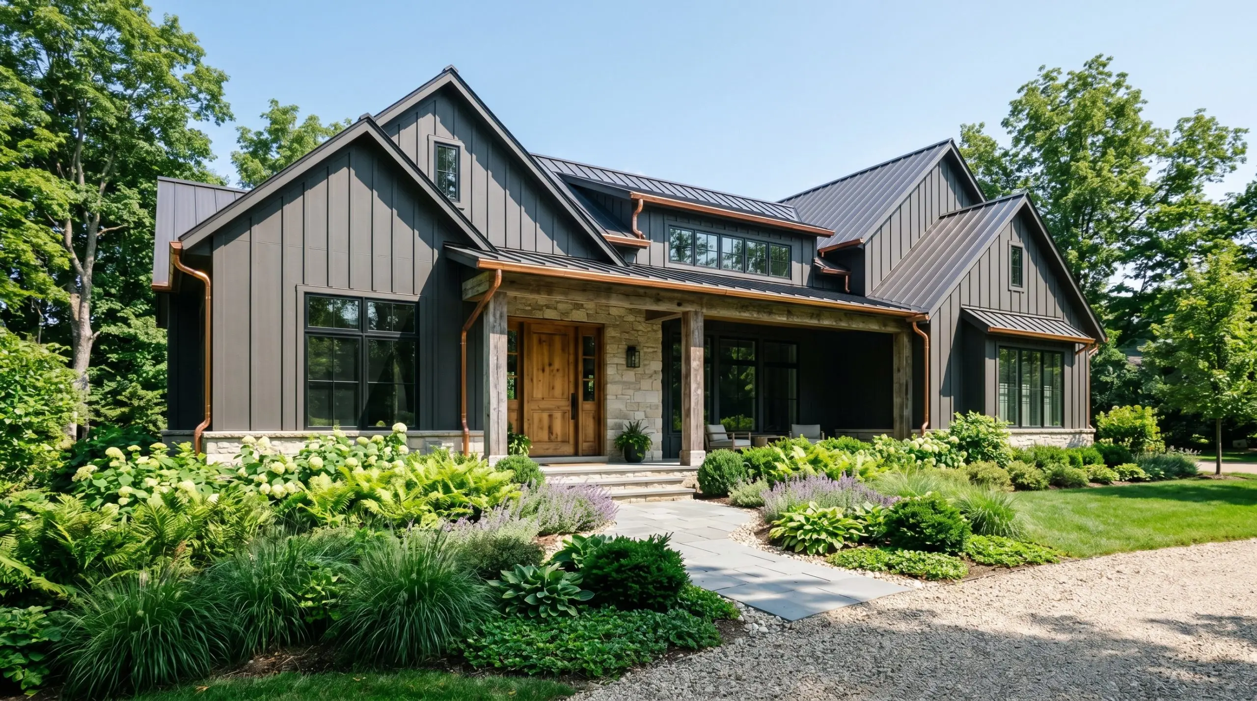
This shade is a brilliant choice for modernizing traditional exteriors or grounding contemporary builds. Whether used as a primary siding color or applied strictly to architectural trim, the direct sunlight will soften the paint into a beautiful, earthy charcoal.
Pair the dark facade with copper gutters, reclaimed wood columns, and lush, layered green landscaping to create a striking street presence.
Dark exteriors absorb intense heat. If you live in a scorching climate and are painting your entire facade, ensure your siding material is explicitly rated for low-LRV paints to prevent structural warping over time.
Hackrea Pro-Tip (Temperature Control)
High-Contrast Interior Doors and Sashes
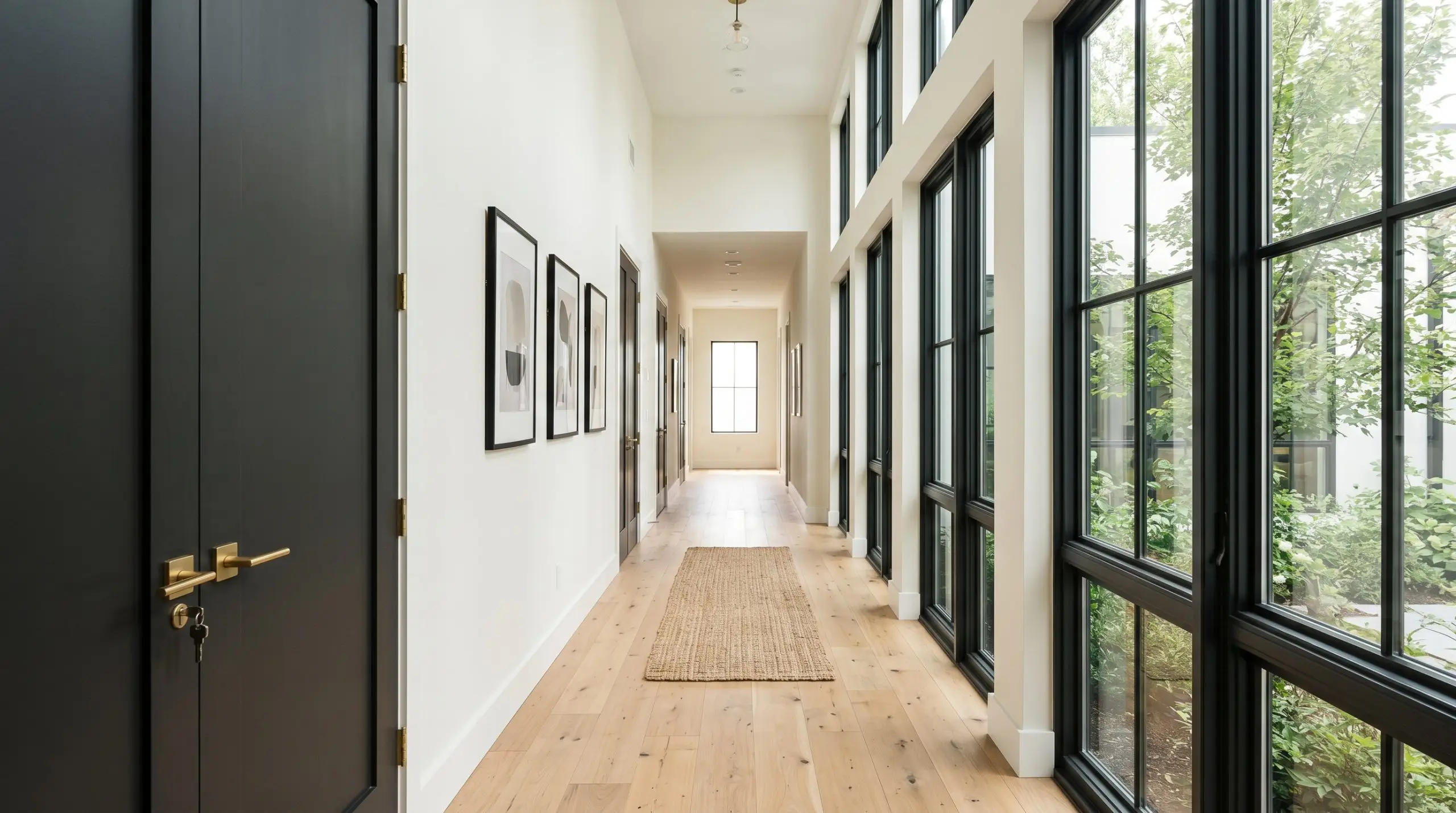
If you want to elevate standard interior architecture without a massive renovation, apply Onyx to your interior doors and window mullions. Painting the window sashes black acts like a picture frame, drawing the eye directly through the glass and out into your landscape.
When applied to interior doors, it instantly upgrades builder-grade materials into custom-looking architectural features.
This high-contrast application looks exceptionally sharp when set against creamy off-white walls. Finish the look with matte brass or blackened steel door hardware for a tailored, gallery-like aesthetic.
Sensory Enclosure in Media Rooms
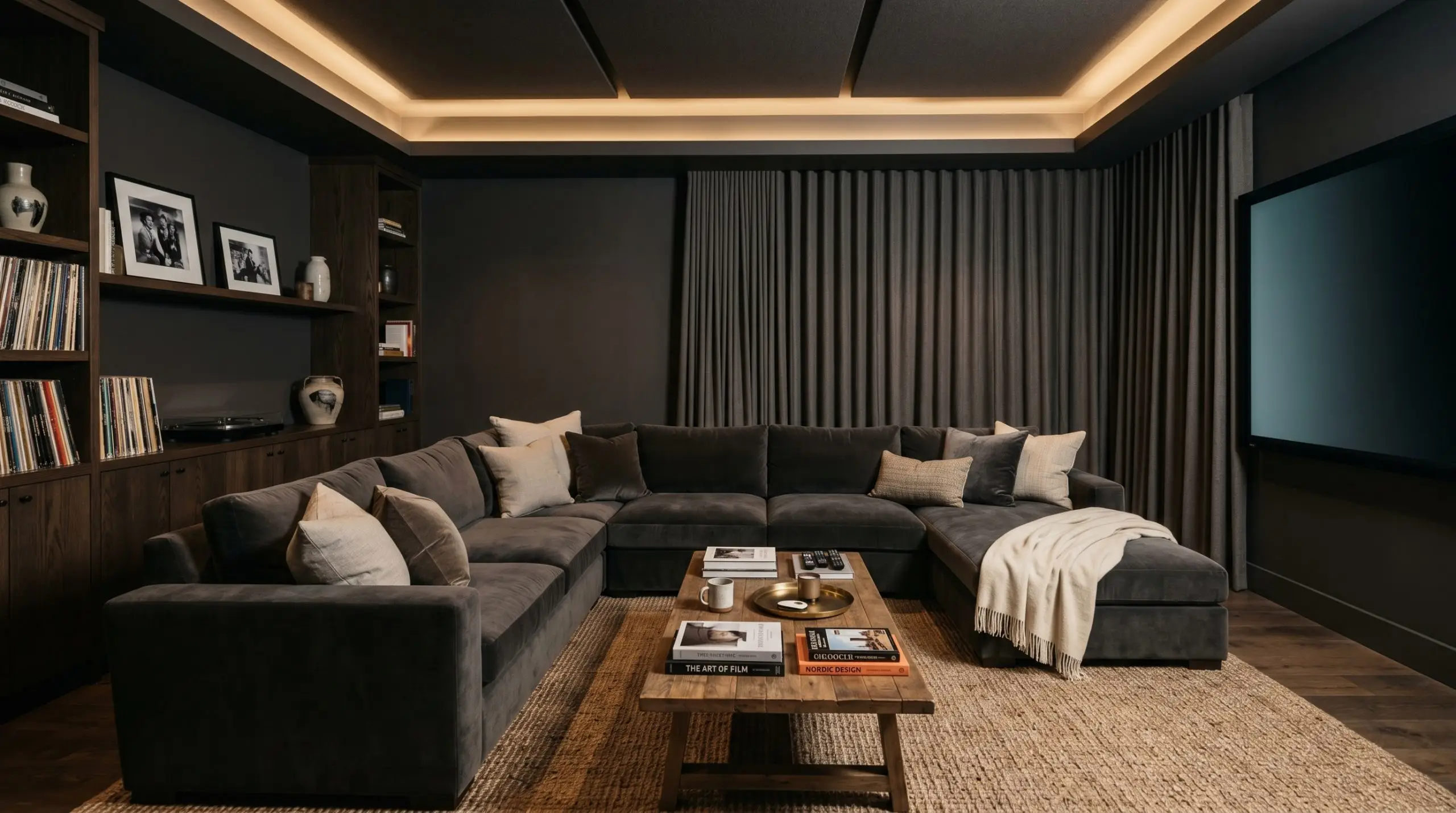
In spaces dedicated to screen viewing or deep relaxation, this paint provides the ultimate sensory enclosure. The low light reflectance naturally absorbs glare from televisions and projectors, keeping the focus entirely on the screen.
To ensure the room feels plush rather than cavernous, you must introduce heavy, tactile textiles.
Layer the space with worsted wool drapery, a sprawling mohair sectional, and a textured jute rug. Opting for a matte or eggshell finish on the walls will maximize the velvety depth and minimize any unwanted light bounce.
Curating the Palette & Material Interplay
When integrating a shade this profoundly dark, its success relies entirely on how its edges meet the surrounding environment. This specific pigment demands intentional relationships, thriving when it can either form a razor-sharp graphic boundary against crisp tones or bleed softly into warm, tactile textures.
Defining the Architectural Boundaries
The trim color you choose will dictate the entire energy of the room. When pairing this saturated black with molding and baseboards, you are actively deciding between high-contrast modernism and a softer, more atmospheric transition.
Tactile Finishes & Hardware Selections
To prevent a deeply saturated wall from feeling flat, you must introduce materials that actively converse with the paint’s light-absorbing qualities. We anchor this palette with grounded, everyday textures while elevating the final aesthetic with one distinct, premium metallic finish.
The Coordinating Color Strategy
Designer Mood Boards
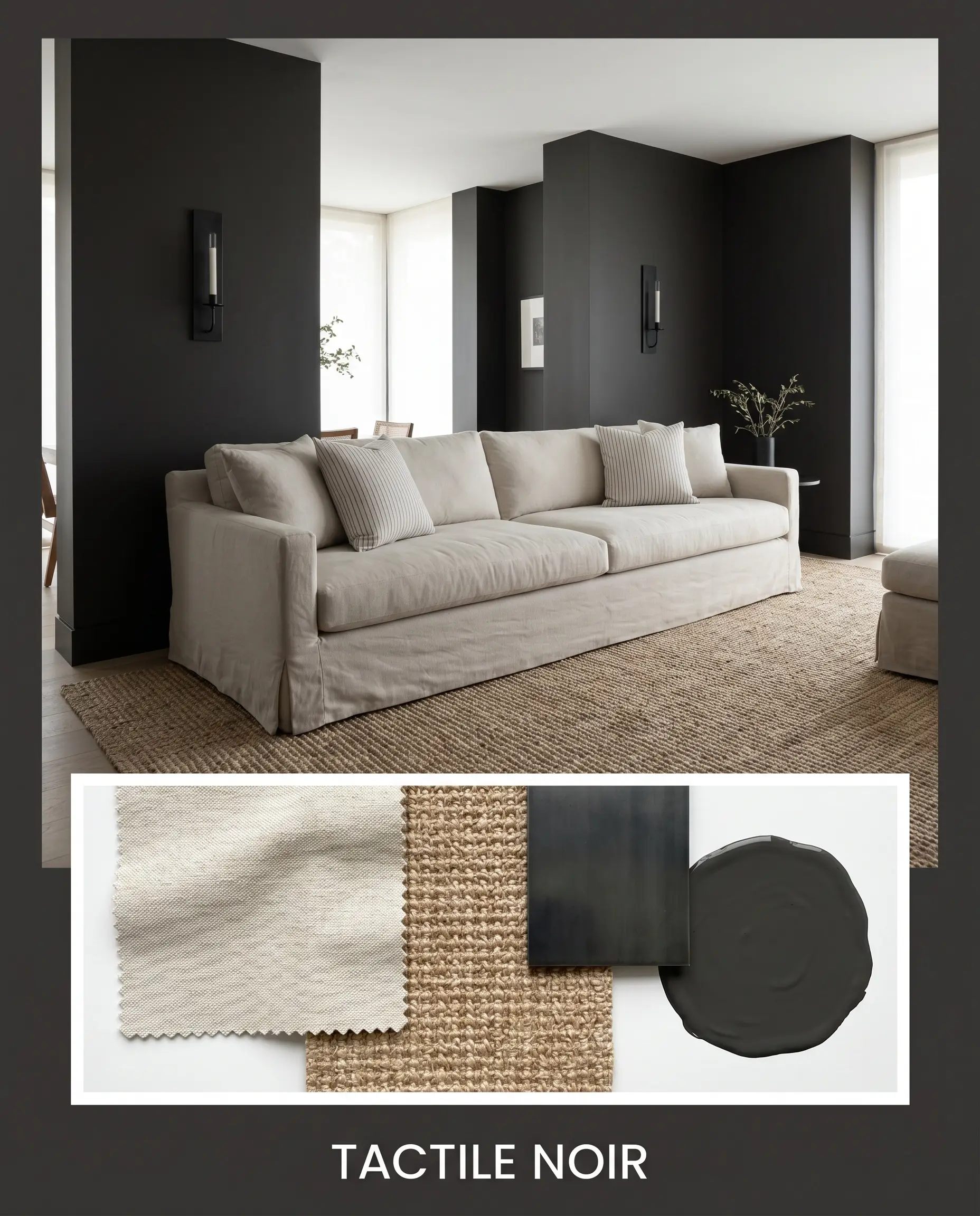
Tactile Noir This aesthetic relies on the friction between sleek modernism and deeply comforting textures. The saturated black foundation is softened by expansive, slipcovered sofas draped in tumbled cotton and grounded by a textured sisal rug. To keep the energy dynamic, we introduce minimalist blackened steel sconces and subtle pinstripe throw pillows. The resulting vibe is relentlessly chic yet profoundly relaxing, proving that dark spaces can still feel airy and approachable.
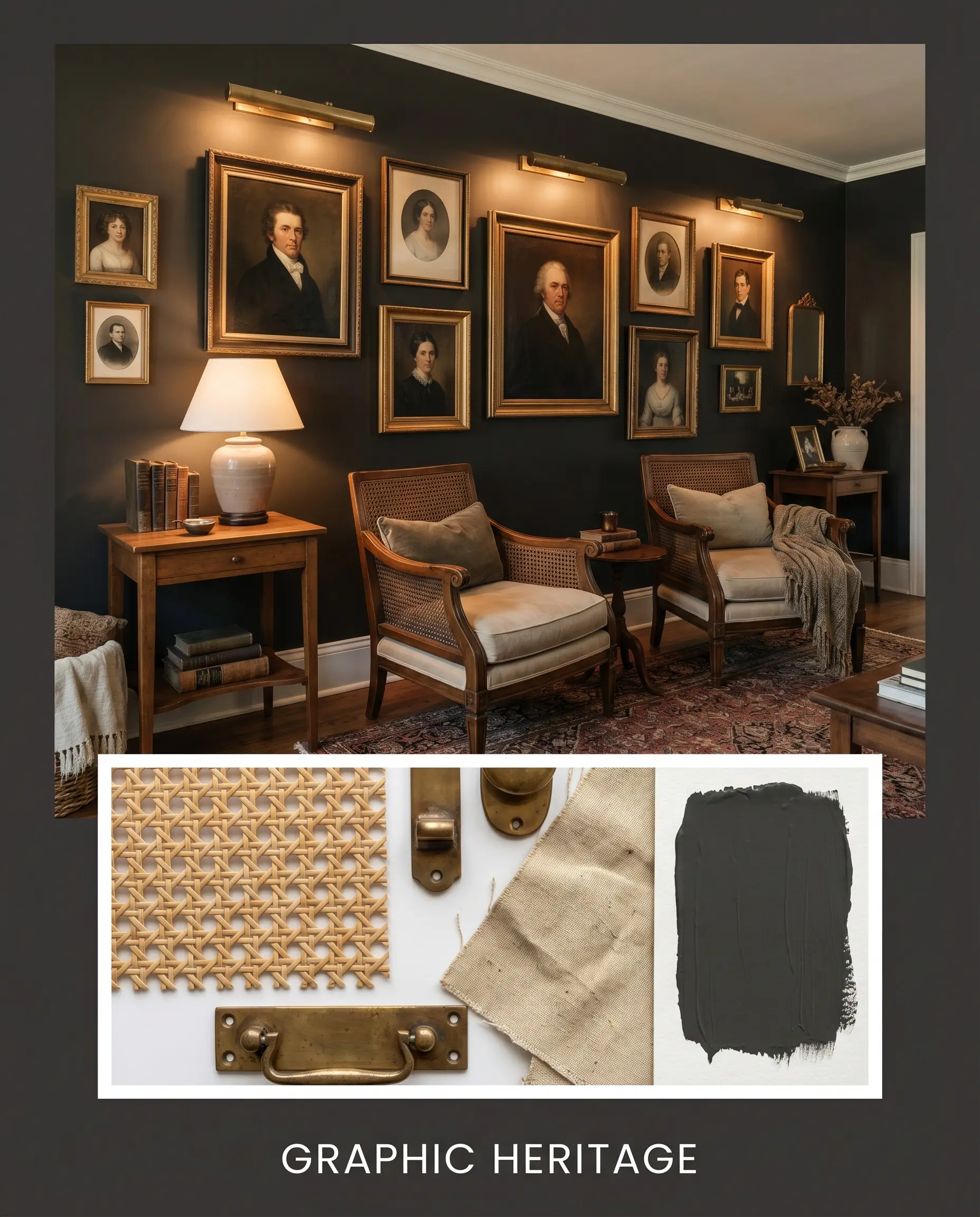
Graphic Heritage Rooted in classic design principles, this palette uses high-contrast blocking to command attention. The walls are deeply saturated, acting as a dramatic canvas for an asymmetrical gallery wall filled with vintage portraits and stacked art books. The secret to this look is the introduction of unlacquered brass picture lights and hardware, which gleam brilliantly against the dark backdrop. Paired with cane-back armchairs, the mood feels historically rich, curated, and highly intentional.
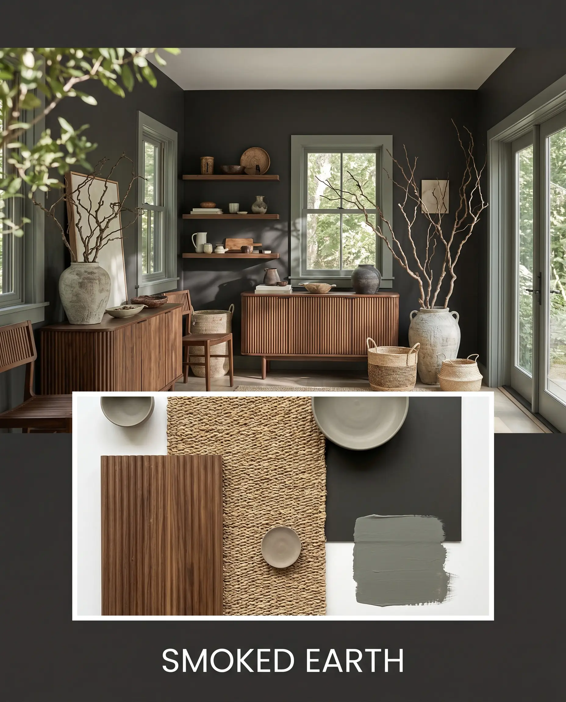
Smoked Earth Leaning fully into the paint’s warm undertones, this direction champions an organic, nature-inspired atmosphere. Fluted walnut furnishings and floating shelves bring essential wood tones into the space, harmonizing with accents of Sherwin-Williams Retreat. We style this look with oversized branches in ceramic vessels and tactile woven baskets. It is an incredibly grounding, earthy aesthetic that feels like a quiet retreat from the outside world.
Benjamin Moore Onyx vs. Rival Dark Tones
There are moments in the design process when a specific lighting condition or architectural style exposes a paint’s limitations. If your room receives entirely cool, northern light, or if you require a starkly pure black without any earthy undertones, this particular shade might not be the right fit. Here is how it measures up against its closest competitors.
Benjamin Moore Onyx vs. Sherwin-Williams Tricorn Black
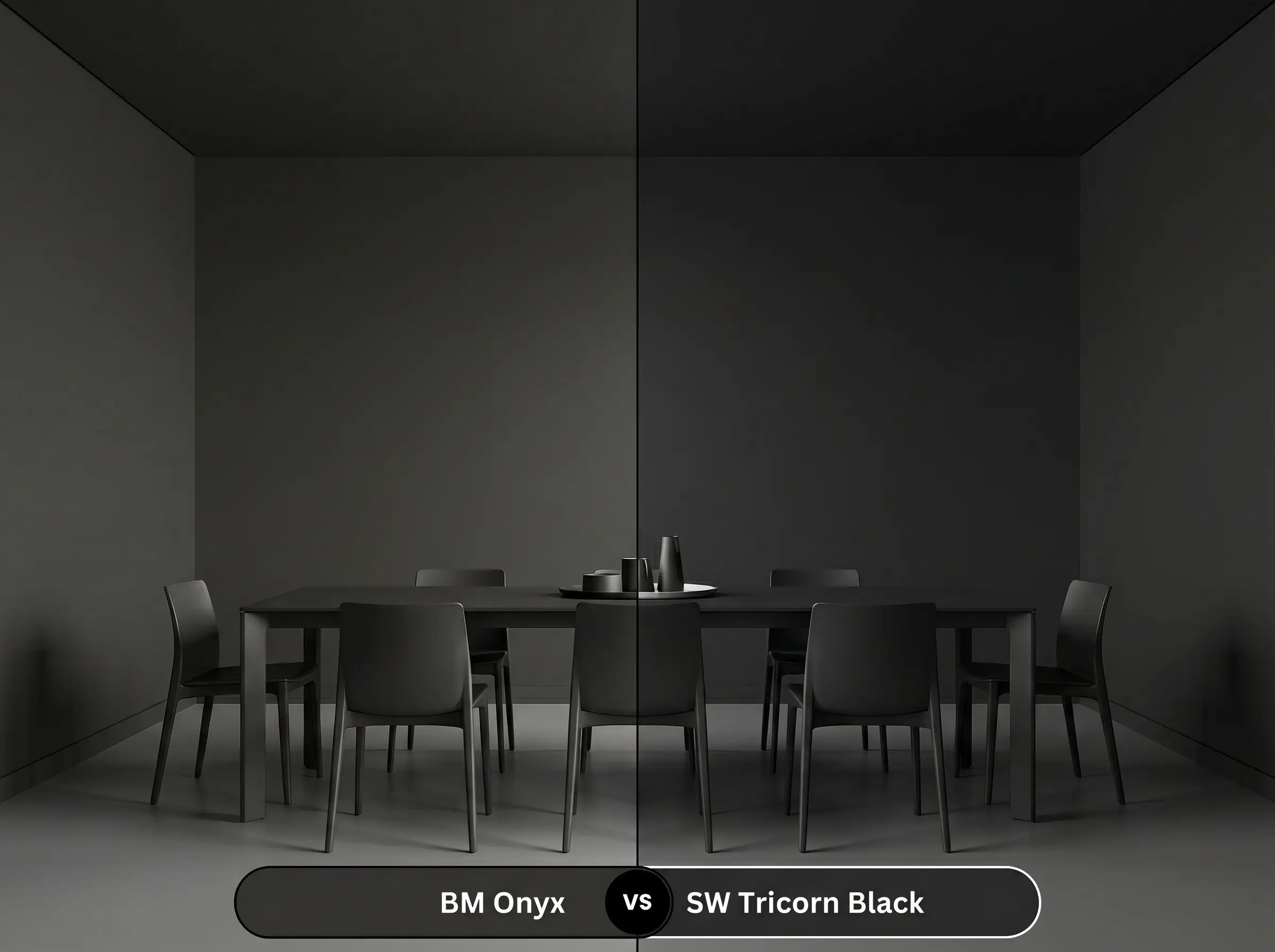
This is the ultimate battle of the undertones. Sherwin-Williams Tricorn Black is widely considered a true, neutral black, lacking any discernible color bias.
If you are designing a stark, ultra-modern space and need a pure, graphic void, Tricorn Black is the superior choice. However, if you want your dark walls to feel approachable, intimate, and slightly softer around the edges, the faint red-brown warmth of Onyx makes it much easier to live with on a daily basis.
Benjamin Moore Onyx vs. Benjamin Moore Wrought Iron
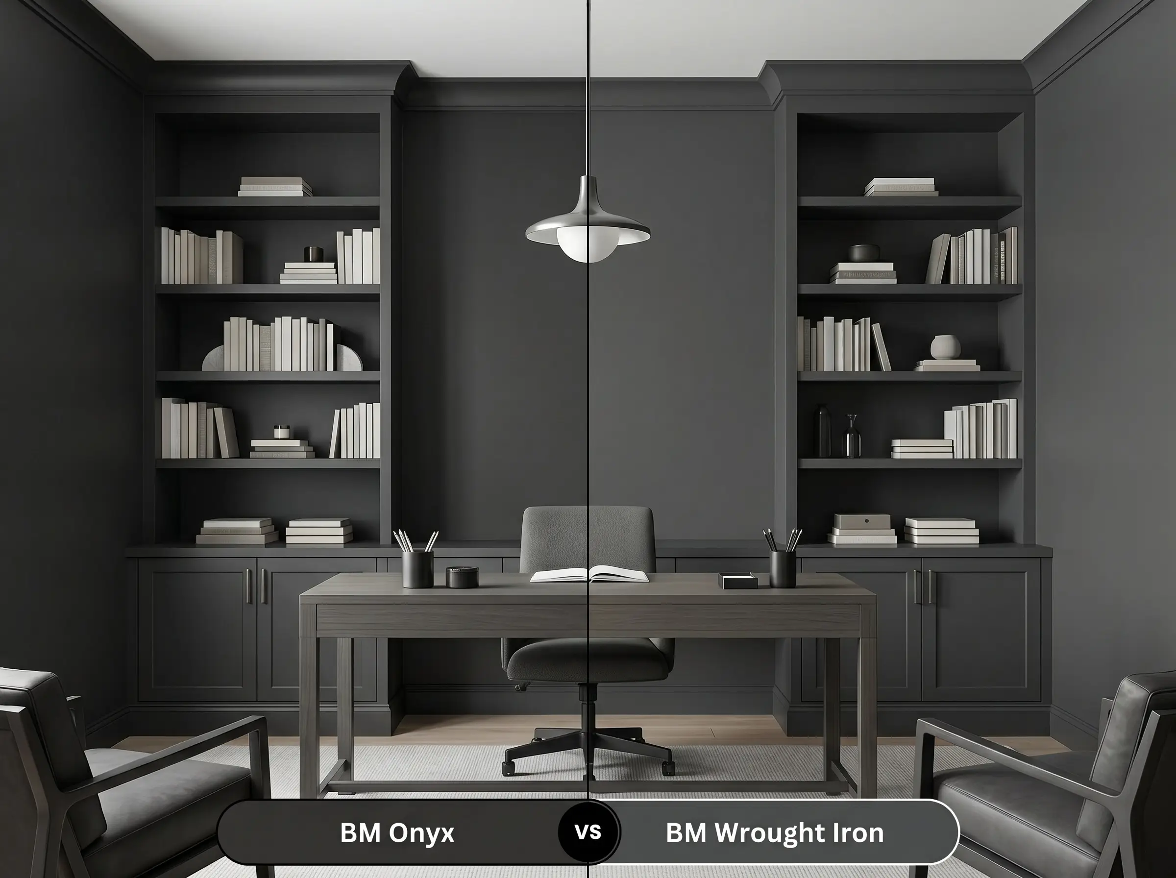
While both belong to the charcoal family, their structural DNA is completely different. Wrought Iron sits at a slightly higher LRV of 6.16 and carries a distinct, moody blue-gray undertone.
If Onyx feels too intense or reads too brown in your southern-facing room, Wrought Iron provides a softer, more atmospheric alternative. Choose Wrought Iron when you want a dark gray that shifts beautifully with the daylight, but stick with Onyx if you need a truly saturated, definitive black.
Benjamin Moore Onyx vs. Farrow & Ball Pitch Black
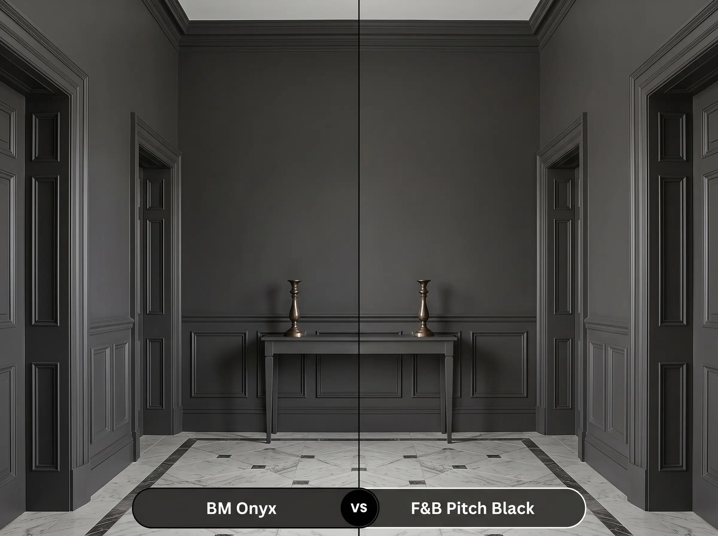
Farrow & Ball’s Pitch Black is an incredibly pure, uncompromising pigment. It lacks the earthy softness found in the Benjamin Moore formula, delivering a more intense, formal depth.
If you are working with a historic property and require the specific, chalky depth of Farrow & Ball’s estate emulsion, Pitch Black is stunning. However, for everyday homes that rely on the High/Low mix, Onyx offers a nearly identical level of drama with a touch more warmth and significantly easier accessibility.
Alternative Pathways & Exact Color Matches
Sometimes a color is nearly perfect, but the specific lighting in your home demands a microscopic adjustment. Whether you need a shade that leans slightly cooler or you simply need to color-match across different manufacturing brands, these are the most reliable alternatives.
Same-Brand Alternatives
Cross-Brand Matches
Mastering the Application & Finish Strategy
Transitioning from color theory to the physical reality of a paint roller requires a shift in strategy. Dark paints are notoriously unforgiving during the application process, meaning your choice of sheen and primer will completely dictate the success or failure of the final aesthetic.
The Dynamic Sheen Guide
Dark colors like this are highly susceptible to “flashing”—visible, shiny roller marks caused by uneven drying or touching up a spot after the wall has cured. To achieve a flawless finish, you must maintain a “wet edge” while rolling and never go back over a partially dry section. If a wall needs a touch-up later, you will likely need to repaint the entire wall corner-to-corner.
Hackrea Design Secret (The Flashing Risk)
Primer Strategy and Coverage Expectations
You cannot simply paint a saturated black over a light wall and expect perfection. You must ask your paint retailer for a deeply tinted, dark gray primer.
Using a standard white primer will force you to apply three or four coats of the expensive topcoat just to hide the streaks. With a properly tinted base layer, this profound color will achieve full, beautiful opacity in exactly two careful coats.
Frequently Asked Questions
Because it features a subtle red-brown undertone, direct midday sun will definitely coax out its warmth. It will not look like a stark, true black outside; instead, it reads as a deeply sophisticated, earthy charcoal.
In spaces lacking natural light, Tricorn Black maintains its pure, neutral void-like quality. Onyx, under warm artificial lighting, will feel slightly softer and more intimate due to its underlying earthy base.
Applying a low-LRV color to a ceiling acts as an architectural eraser, blurring the hard boundary where the wall meets the roof. When paired with dark walls, this technique makes the ceiling recede into shadow, effectively tricking the eye into perceiving infinite height.
To prevent doors from looking dull or showing greasy fingerprints, a Satin finish is your best choice. It provides a subtle, elegant glow that highlights the door’s paneling while remaining highly durable and easy to wipe clean.
The Final Verdict on Benjamin Moore Onyx
Benjamin Moore Onyx 2133-10 is an incredibly powerful architectural tool designed for homeowners who understand that dark paint is meant to create atmosphere, not just contrast. Its absolute best application is as a structural anchor—whether wrapped completely around a windowless powder room to create a jewel-box sanctuary, or applied to lower kitchen cabinetry to ground a bustling family space. It is perfect for those who want the dramatic impact of a saturated black, but desperately need the subtle, red-brown warmth that keeps the room feeling human, tactile, and deeply inviting.
However, this foundational warmth is exactly why this paint requires careful curation. If you pair this color with stark, icy-white marble, cool-toned gray luxury vinyl flooring, or blue-tinged LED lighting, the space will immediately feel disjointed. The cool surroundings will fight against the paint’s earthy DNA, causing the black to look muddy, dull, and entirely out of place. To succeed with this shade, you must commit to warm, organic textures and creamy transitional tones that celebrate its soft, velvety depth rather than fighting it.