Deep Creek 1477
Benjamin MooreBenjamin Moore Deep Creek 1477 is a rich, dark greige paint color characterized by its warm brown-gray base and subtle olive undertones. With an LRV of 14.71, this chalky, grounding neutral is highly popular for striking exteriors, sophisticated kitchen cabinets, and moody accent walls.
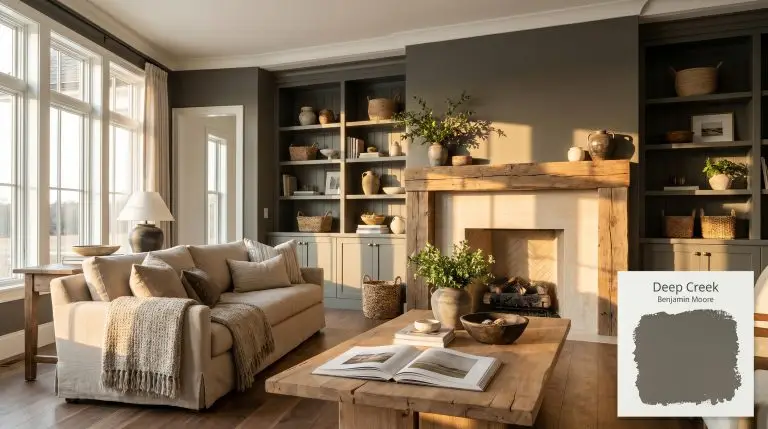
Benjamin Moore Deep Creek: A Grounding Anchor for High-Contrast Architecture
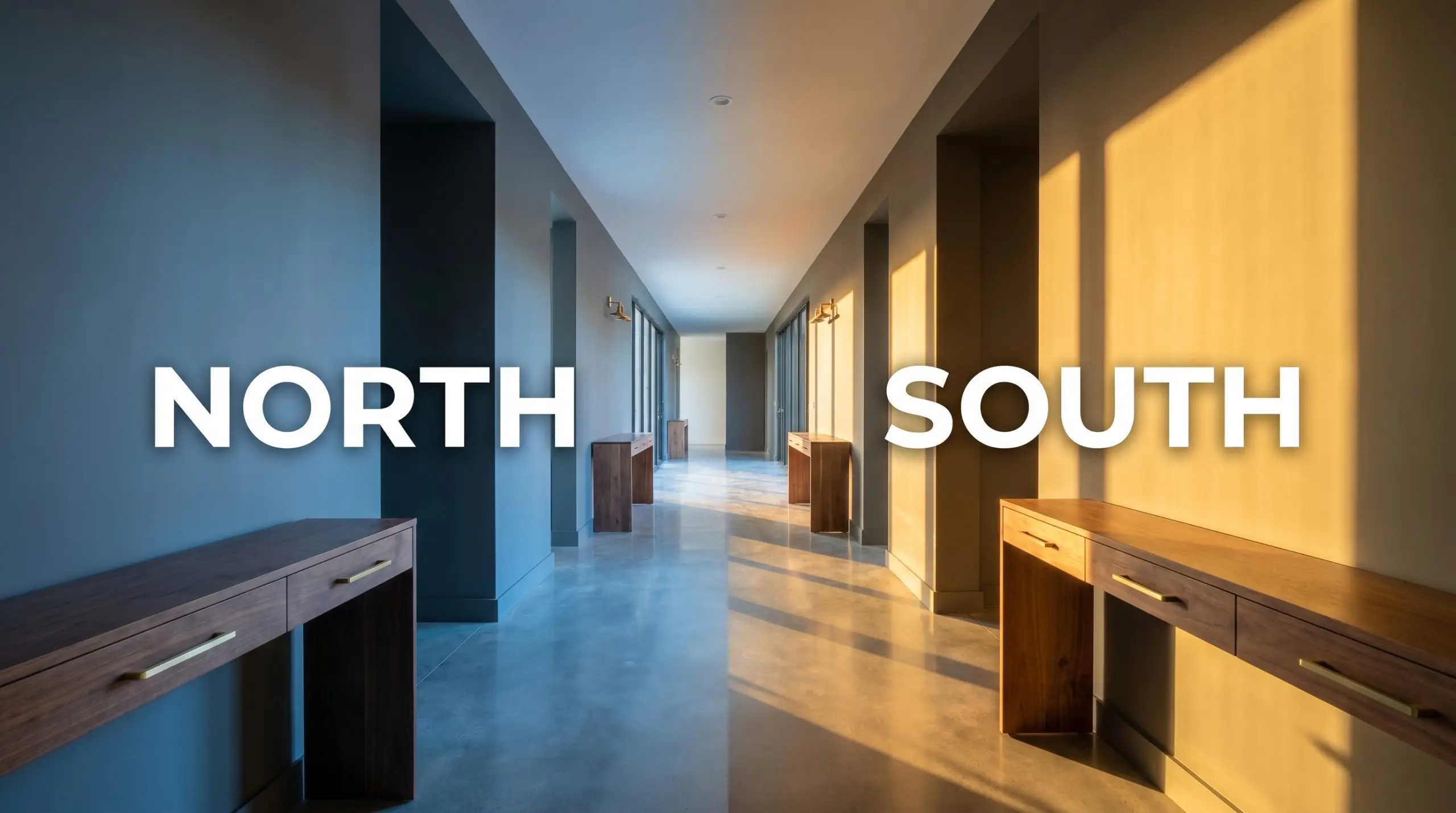
| Best Exposures | North, South |
|---|---|
| Best For | Exteriors, Kitchen Cabinets, Accent Walls, Home Offices |
Deep Creek 1477 sits right at the intersection of a shadowy forest canopy and a sophisticated urban facade. When you are dealing with a color this dense, it acts less like a standard wall paint and more like an architectural shadow that wraps a room in immediate comfort.
Its rich, earthy depth completely transforms standard builder-grade architecture into something inherently custom. Whether you are grounding a bright, airy living room or brushing it across exterior siding, this complex shade bridges the gap between rugged nature and polished curation.
Benjamin Moore Deep Creek: Undertones & LRV
Deep Creek is a definitively warm paint color, but it carries a fascinating complexity that keeps it from reading as a simple, heavy brown.
Sitting at a Light Reflectance Value of 14.71, this shade absorbs a massive amount of light. It carries significant visual weight, meaning it will immediately anchor any space and requires thoughtful lighting strategies to prevent it from feeling like a cave.
You can apply wallpapers, paints, etc. on walls and see how they look in various interiors.

Environmental Shifts & The Chameleon Factor
Because of its high chroma and layered pigments, this dark greige shifts dramatically throughout the day. The biggest risk with a color this dense is a total visual collapse in poorly lit, north-facing rooms where the earthy warmth disappears entirely. Always test large swatches on multiple walls to see how your specific lighting pulls its shifting characteristics forward.
Popular Spaces for Benjamin Moore Deep Creek
This warm neutral demands attention, requiring you to treat it as a foundational layer rather than an afterthought. It brings a cohesive, grounding energy to a home, effortlessly transitioning from rugged exteriors to refined interior millwork.
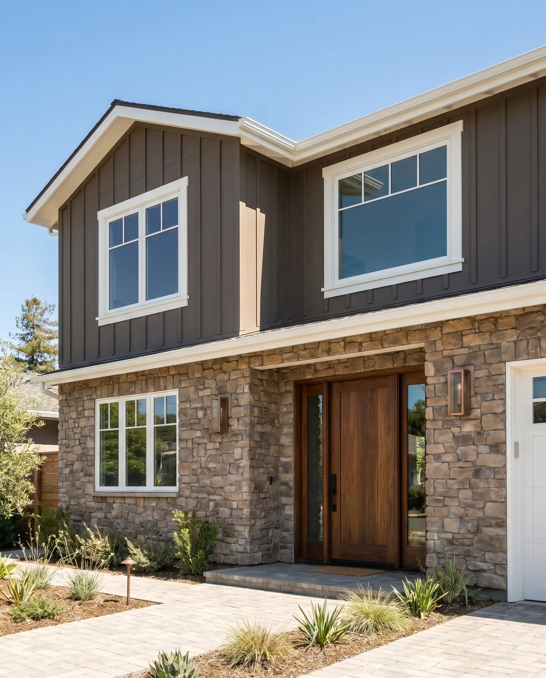
Exteriors
This shade is a powerhouse for timeless exterior paint colors, aligning perfectly with current exterior paint trends. It beautifully complements the popular brick&batten aesthetic, allowing natural stone work and crisp white trim to pop against its earthy depth.
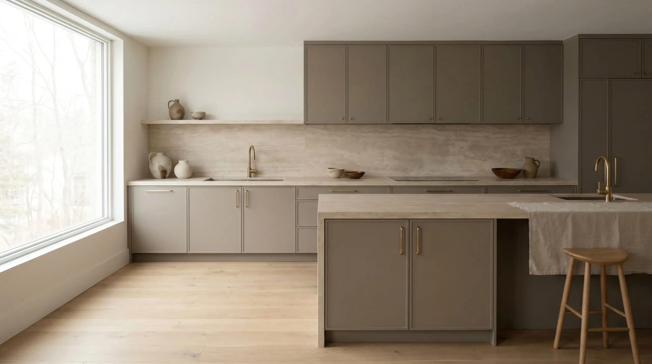
Kitchens
If you are painting kitchen cabinets dark greige, this tone offers a stunning alternative to stark black or predictable navy. It grounds a sleek, minimalist culinary space when paired with flat-panel doors, yet feels right at home in a heavily layered, rustic farmhouse kitchen.
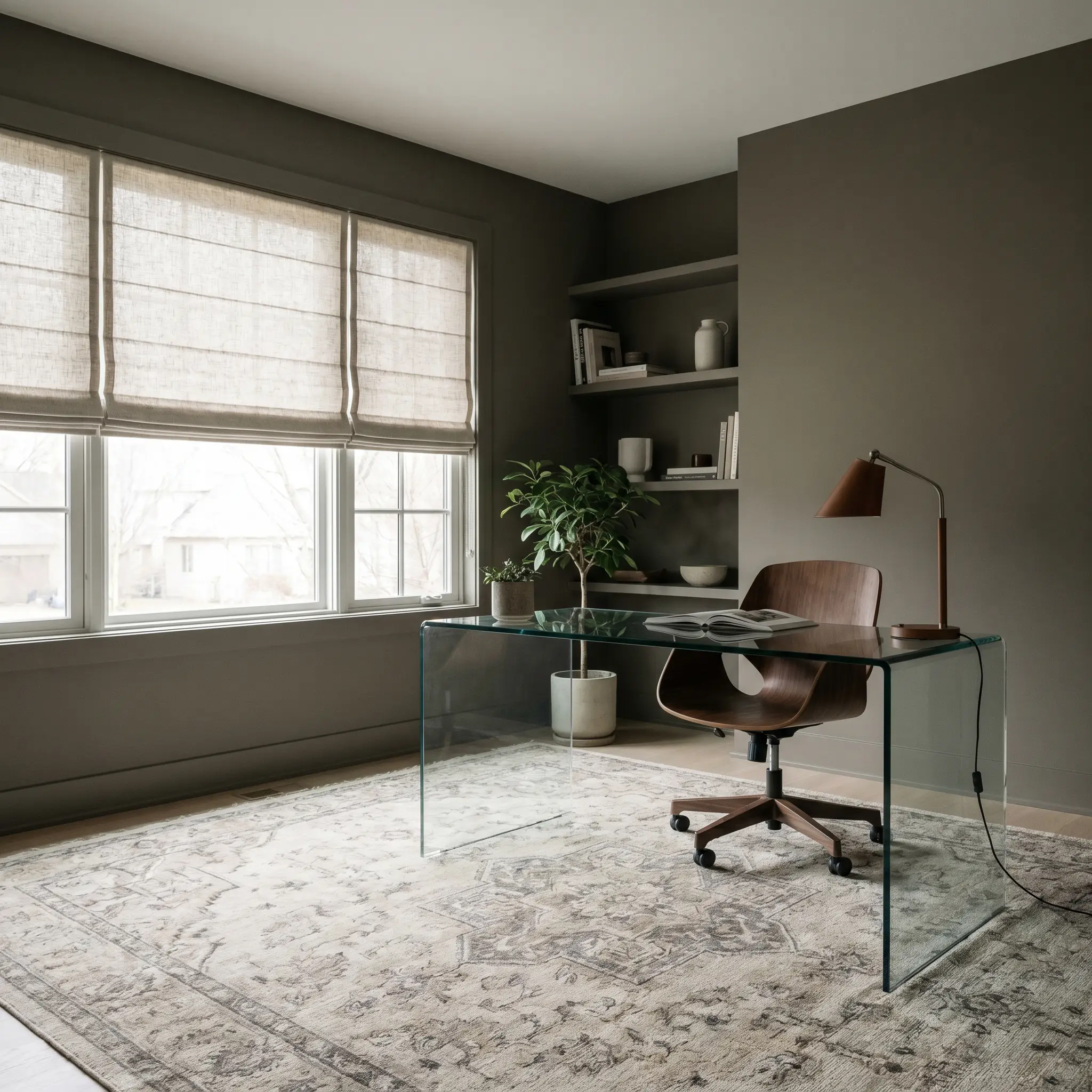
Home Offices
Wrapping a study in this dense hue creates an environment of focused, quiet sophistication. The rich pigment absorbs distracting glares from computer screens, providing a handsome backdrop for both modern glass desks and heavy, vintage mahogany furniture.
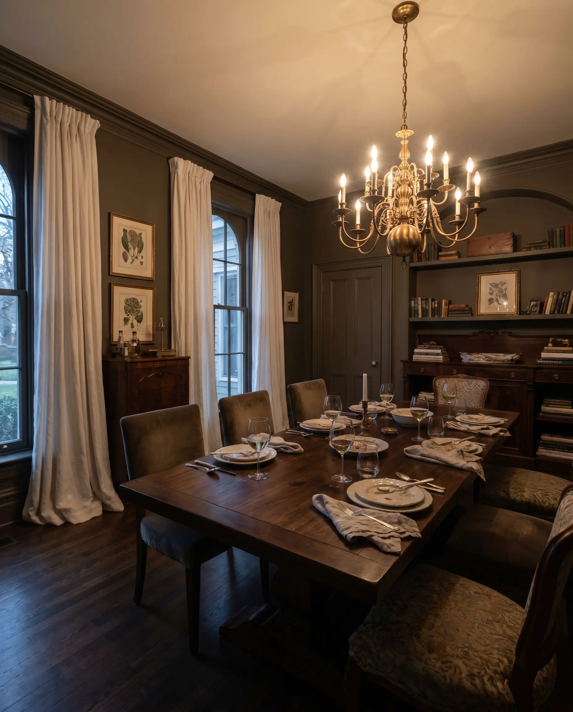
Dining Rooms
In a dining space, this color sets a deeply conversational mood, especially under the warm glow of an evening chandelier. You can lean into a moody, Victorian-inspired aesthetic with heavy drapery, or keep it fresh and transitional by pairing it with crisp wainscoting.
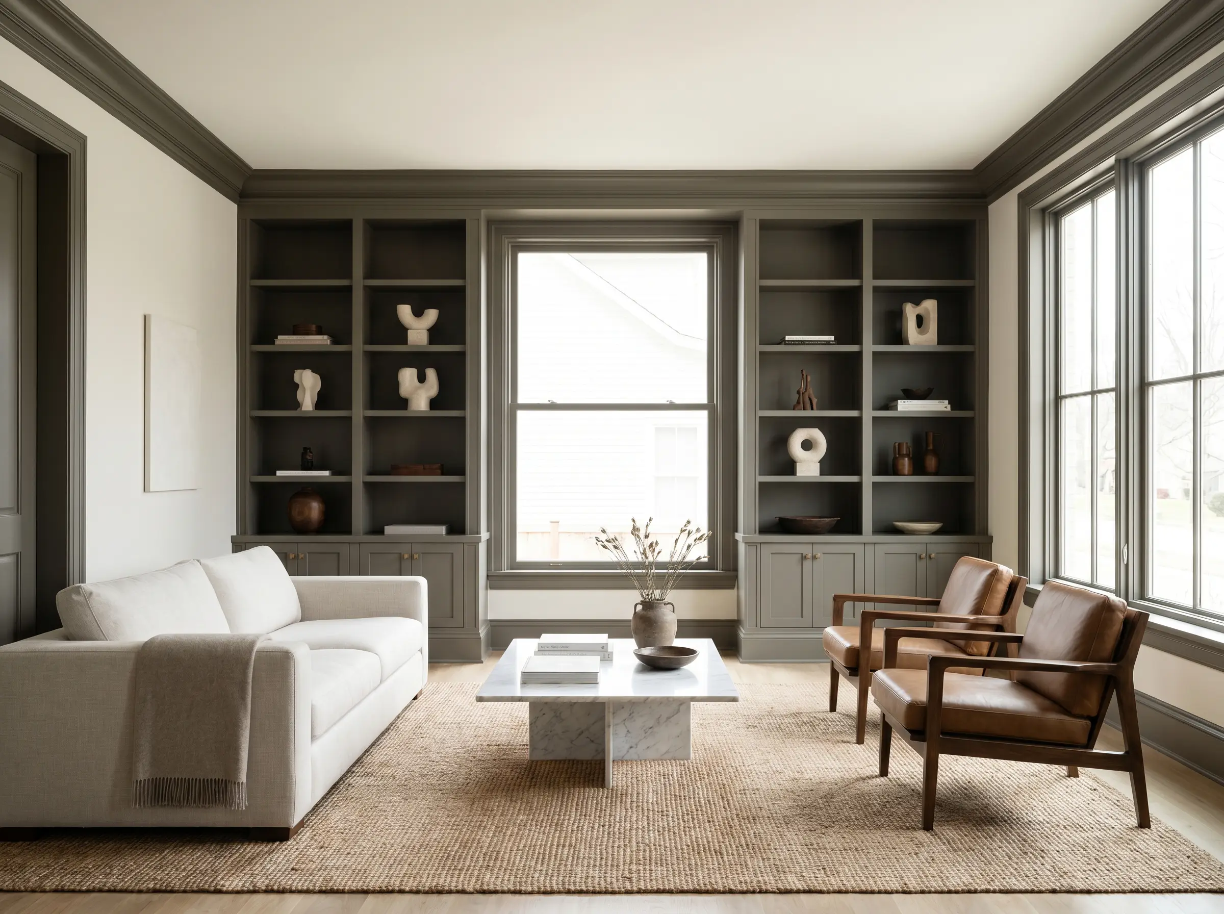
Millwork & Trim
Applying this shade to built-in bookshelves, crown molding, or wainscoting instantly modernizes standard architectural details. It creates a striking, tailored boundary when used as a trim color against creamy, off-white walls.
Creative Ways to Use Deep Creek 1477
Beyond standard wall applications, this dense pigment is a brilliant tool for highly curated, unexpected design moments.
The Color-Drenched Mudroom
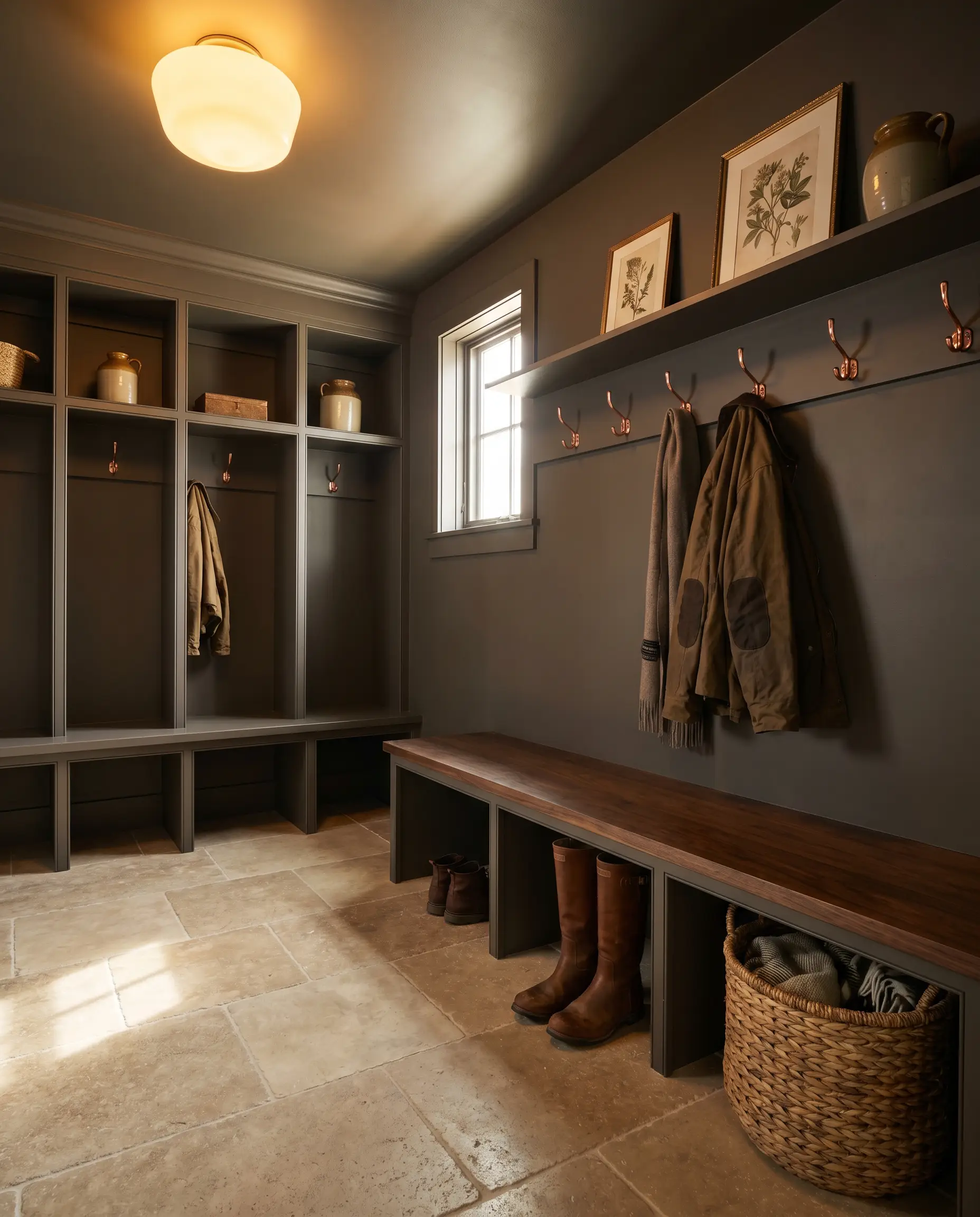
Transform a chaotic drop zone by painting the entire space—walls, ceiling, and built-in cubbies—in this single, rich shade. The enveloping color hides everyday scuffs effortlessly while elevating a purely functional room into a striking, jewel-box transition space.
A Modern Rustic Fireplace Surround
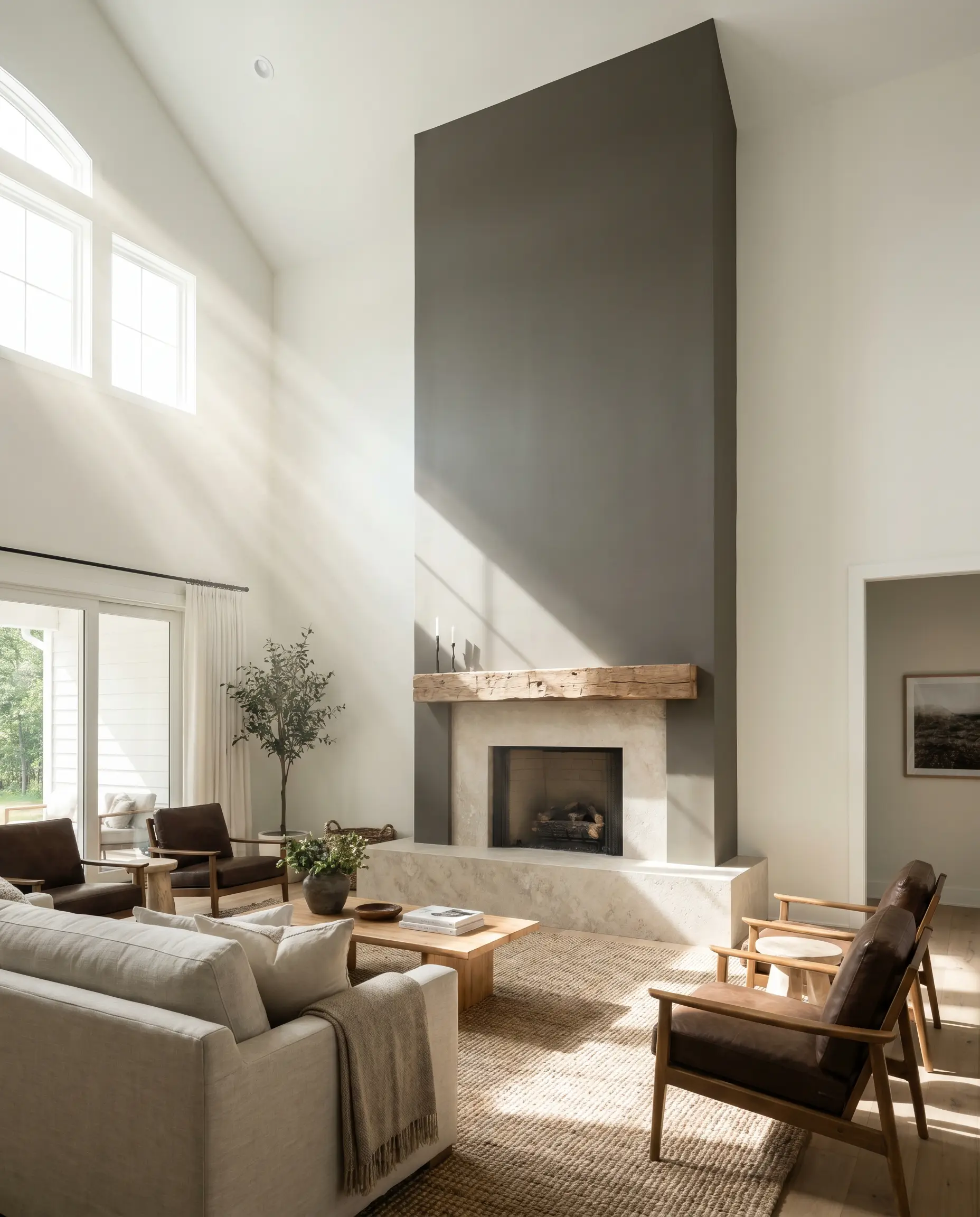
Instead of traditional stone, wrap a floor-to-ceiling fireplace bump-out in this earthy tone using a flat finish. It creates a towering, textural focal point that anchors a high vaulted ceiling, especially when paired with a reclaimed timber mantle.
An Atmospheric Powder Bath
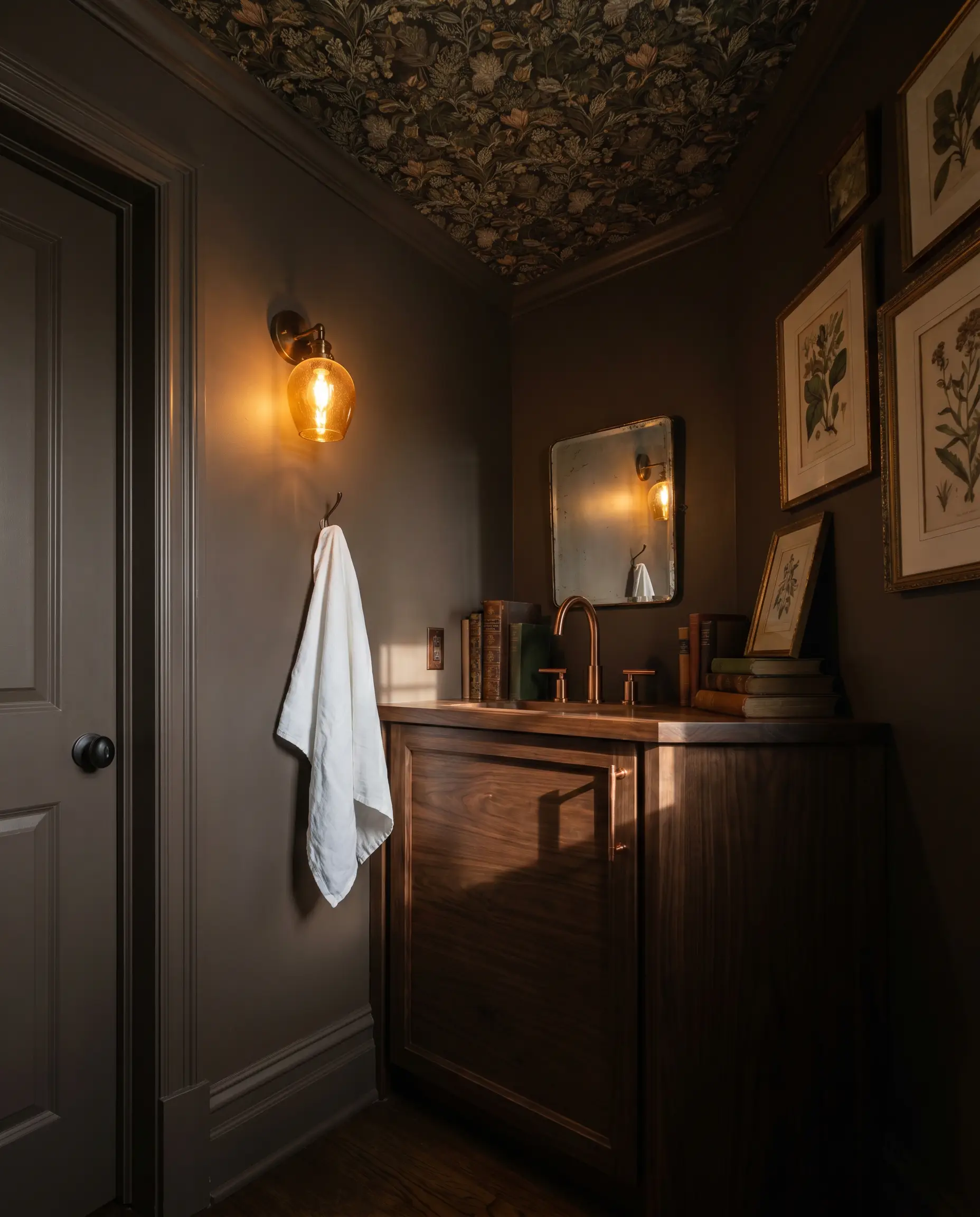
Lean into the shadow by using this color in a small, windowless guest bathroom. Paired with a heavily patterned botanical wallpaper on the ceiling and a glowing amber glass sconce, it turns a cramped layout into a deliberate, luxurious retreat.
When using a dark color in a tiny room, paint the baseboards and door casings the exact same shade. This erases the visual boundaries of the room, making the walls feel like they recede endlessly.
Hackrea Pro-Tip (Small Spaces)
Coordinating Colors & Material Pairings
To make this heavy neutral feel intentional, it requires surrounding elements that either provide crisp, high-contrast relief or lean into its earthy warmth.
Trim & Baseboards
A crisp, tailored boundary is essential to keep this dark shade from feeling muddy.
Hardware & Material Pairings
Coordinating Colors
Designer Mood Boards
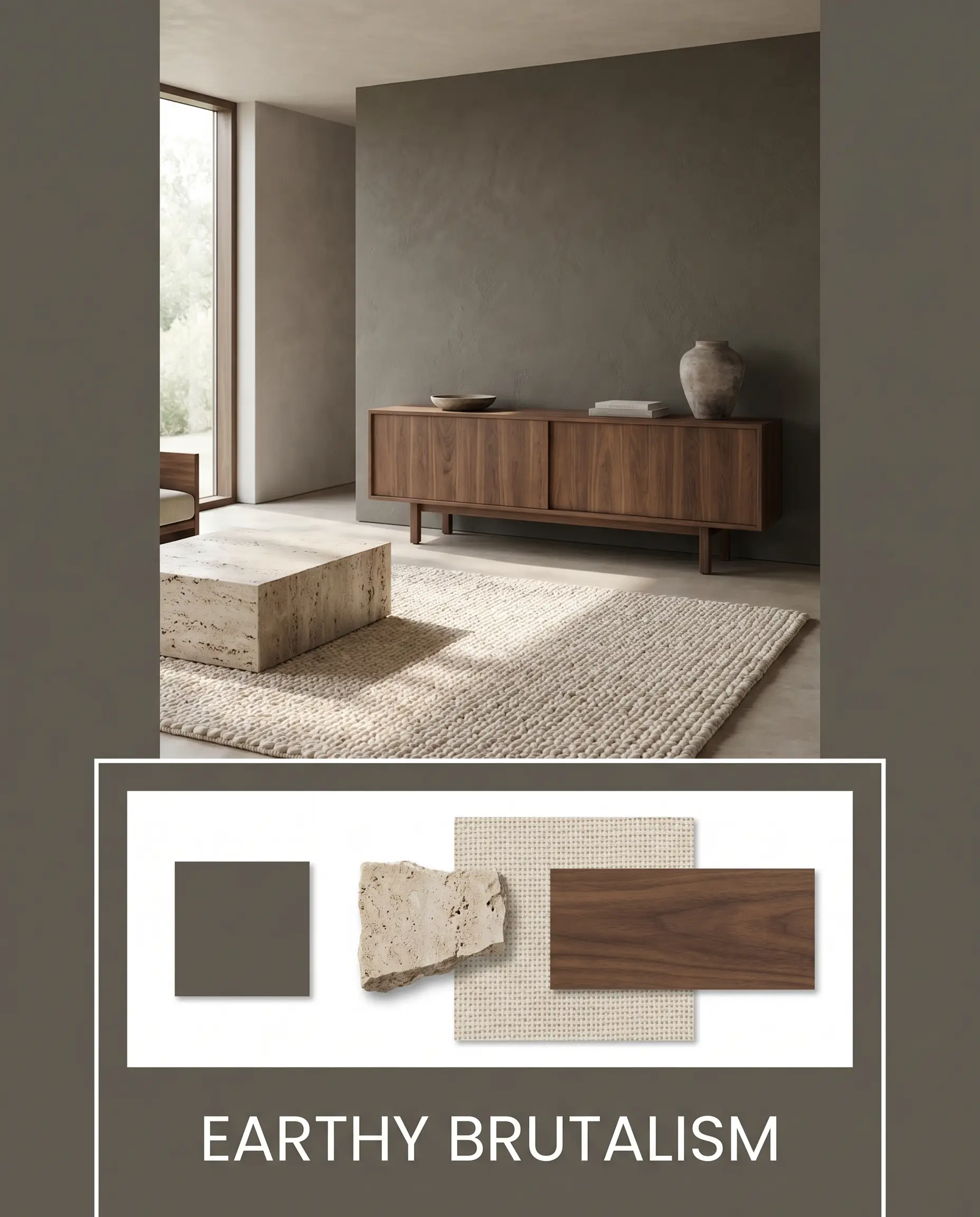
Earthy Brutalism: Imagine the architectural weight of BM 1477 paired with a sleek, low-profile walnut credenza and raw, matte travertine accents. The addition of a chunky, unbleached cotton rug softens the sharp angles, creating a space that feels both highly structured and deeply grounded.
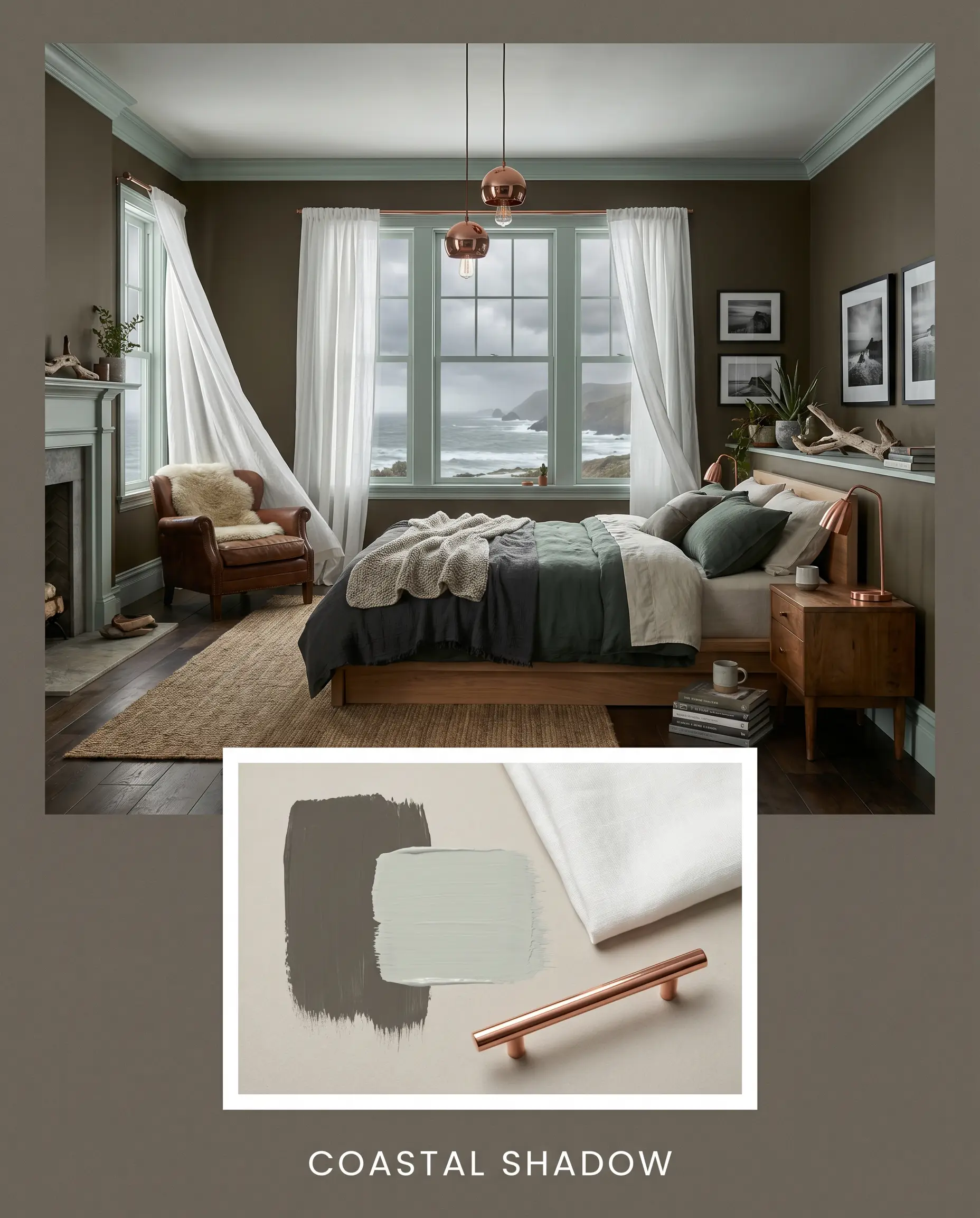
Coastal Shadow: This palette combines the airy relief of SW Sea Salt with the rich, anchoring depth of the dark greige. Crisp white linen curtains billowing against the dark walls, alongside polished copper light fixtures, evoke the moody, shifting atmosphere of a stormy shoreline.
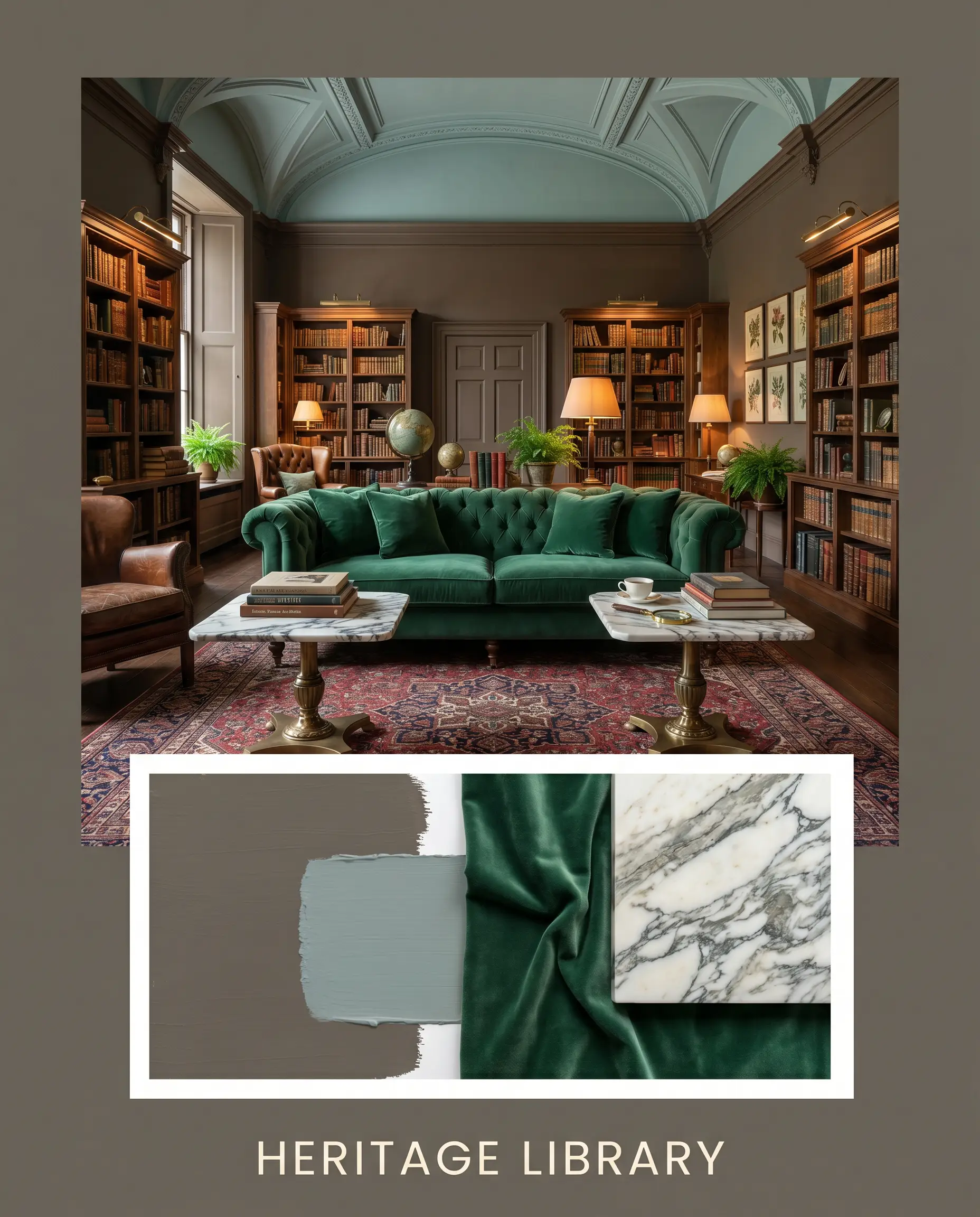
Heritage Library: Envision the walls drenched in this dark, chalky hue, contrasted by the quiet elegance of Farrow & Ball Oval Room Blue on the ceiling. A tufted, emerald velvet sofa and heavily veined marble side tables complete a look that feels endlessly curated and steeped in history.
Head-to-Head Paint Comparisons
Choosing the right dark neutral often comes down to evaluating how it behaves under specific lighting conditions compared to its closest rivals.
Benjamin Moore Deep Creek 1477 vs. Sherwin-Williams Urbane Bronze SW 7048
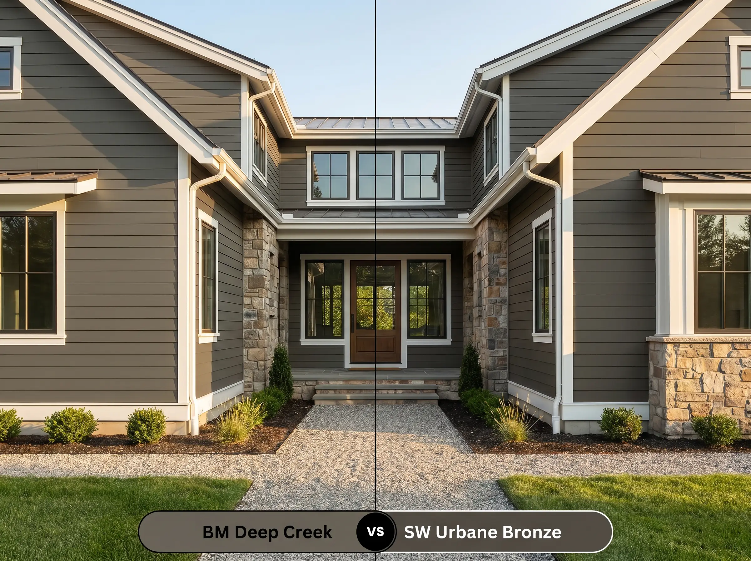
Urbane Bronze pushes much further into charcoal territory, heavily subduing its brown base compared to BM 1477. If your room receives intense, warm afternoon sun, Urbane Bronze will maintain its steely composure, whereas the BM option will amplify its golden-olive warmth.
Benjamin Moore Deep Creek 1477 vs. Sherwin-Williams Anonymous SW 7046
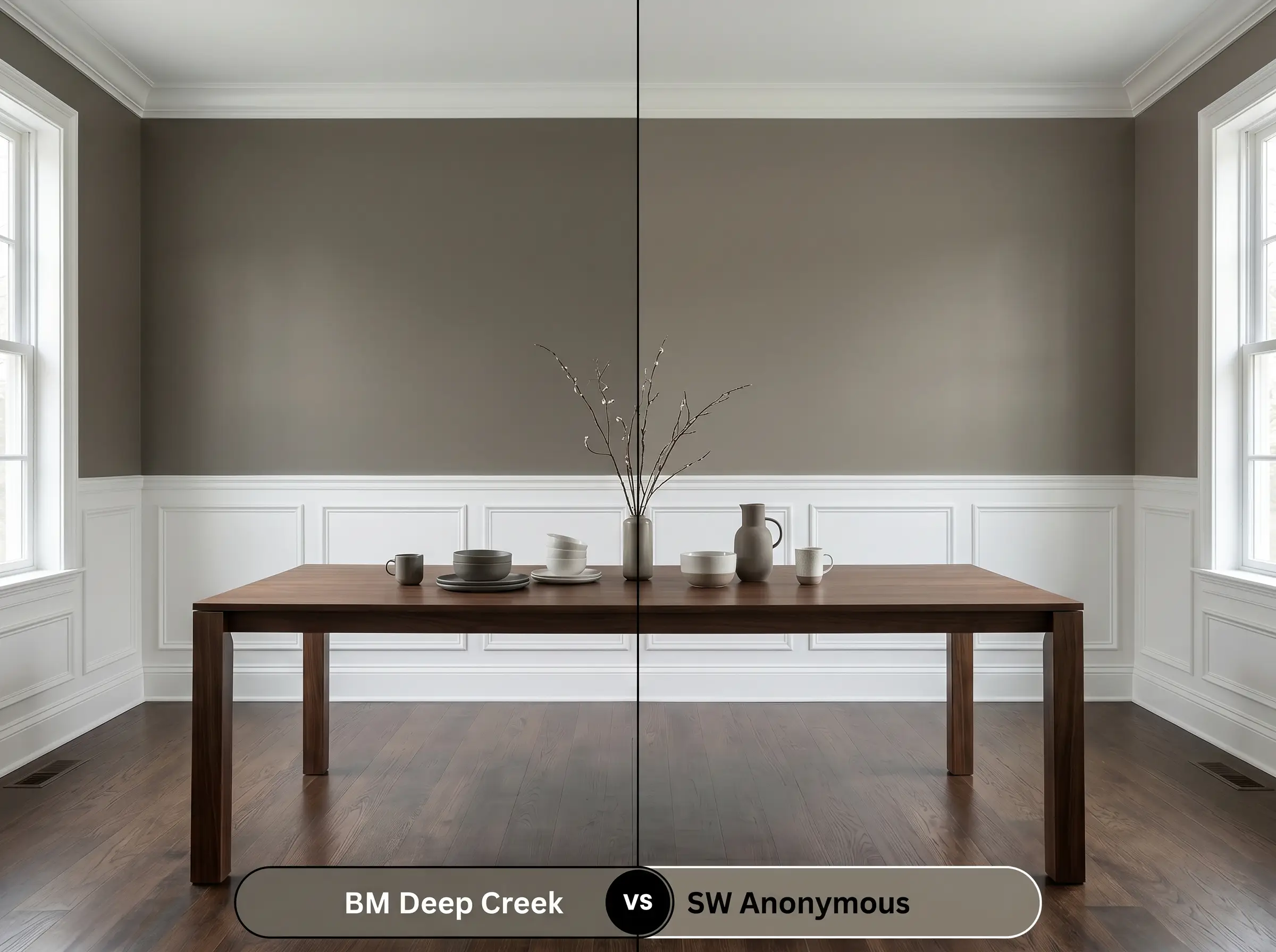
Anonymous is significantly lighter and reads more like a true, mid-tone greige. If you are worried about the room feeling too heavy or cavernous, Anonymous offers a safer, more versatile backdrop, while 1477 delivers far more dramatic architectural impact.
Benjamin Moore Deep Creek 1477 vs. Benjamin Moore Dark Olive 2140-30
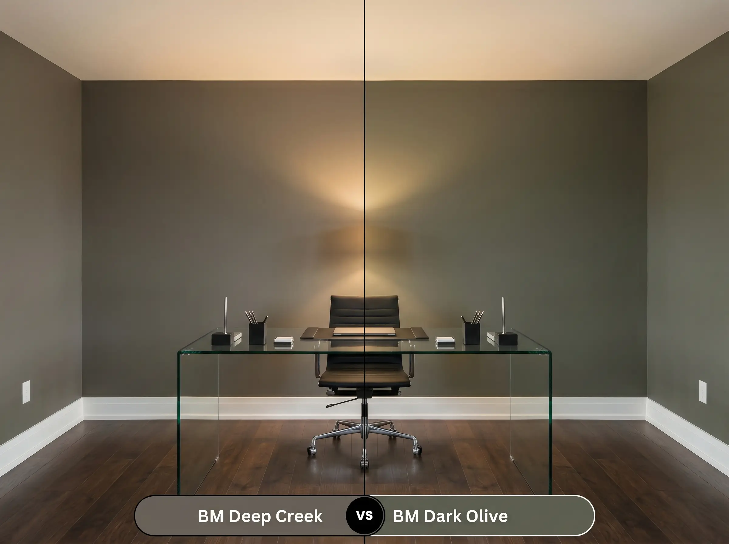
Dark Olive boldly embraces its green identity, leaving the brown-gray realm entirely. If you want a definitively botanical, lush atmosphere, choose Dark Olive; if you prefer a subtle, earthy shadow that merely hints at green, stick with the greige.
Similar Colors & Brand Equivalents
If the specific depth or undertone of this shade isn’t quite aligning with your home’s architecture, there are several beautiful alternatives to consider.
Same-Brand Alternatives
Cross-Brand Matches
Practical Application & DIY Advice
Translating a premium color from a tiny paint chip to a massive exterior facade or a full room requires strategic planning and the right materials.
The Dynamic Sheen Guide
Primer Strategy
Because of its low light reflectance and high chroma, this shade absolutely requires a high-quality, tinted gray primer. Using a standard white primer will force you to apply three or four coats to achieve true, opaque depth, and the final color may still look uneven.
Coverage & Success Tips
Formulated within the Benjamin Moore Classics collection and utilizing Gennex Color Technology, this paint offers excellent fade resistance, which is crucial for exterior applications.
Dark, matte finishes are notorious for “flashing”—visible, shiny roller marks caused by uneven drying. To avoid this, always maintain a wet edge while rolling, and never go back to touch up a spot that has already started to dry.
Hackrea Design Secret (Application)
Frequently Asked Questions
Because of its earthy warmth, it performs beautifully in direct southern exposure, glowing with a rich, inviting brown-gray tone. Formulated with premium colorants, it resists fading well, though the intense sunlight will make the subtle olive notes much more apparent.
Yes, provided you lean into a moody, cinematic aesthetic. Wrapping the ceiling in this dark shade helps the physical boundaries of the room recede, creating a cozy, enveloping environment perfect for viewing screens.
Not at all; in fact, the subtle green notes act as a complementary counterbalance to the red in the brick. This dynamic interplay makes it a highly sophisticated choice for exterior trim or siding alongside traditional masonry.
Cooler 4000K lighting strips away the cozy warmth of the brown base, pushing the paint toward a flatter, more industrial olive-charcoal. If you want to preserve its rich, earthy feel in a kitchen, stick to warmer 2700K or 3000K bulbs.
Final Verdict & Expert Warnings
Benjamin Moore Deep Creek 1477 is an incredibly sophisticated architectural tool, perfect for homeowners looking to anchor their spaces with an earthy, unapologetic richness. It excels on highly textured exterior facades, grounding modern-rustic cabinetry, and enveloping cozy, low-light studies where its shifting olive-brown nature can be fully appreciated.
However, this color requires careful curation to avoid a heavy, muddy aesthetic. You must be extremely cautious when pairing it with cherry or red-toned mahogany flooring, as the fiery red-orange wood tones will harshly conflict with the subtle olive-green hidden within the paint. Similarly, avoid surrounding it with stark, cool-toned gray carpets or icy blue-white LED lighting, which will instantly strip away its organic warmth and leave the finish looking bruised, flat, and entirely uninviting.