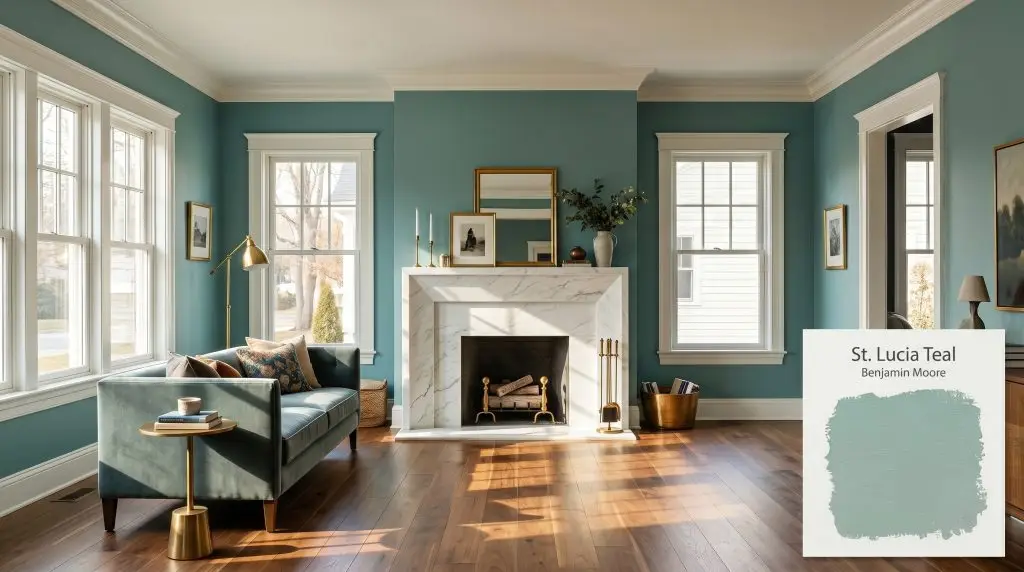
St. Lucia Teal 683
Benjamin MooreBenjamin Moore St. Lucia Teal (683) is a muted, medium-light blue-green with cool slate undertones. With an LRV of 43.79, it acts as a tranquil, gray-leaning teal that shifts beautifully between soft aqua in bright light and a deeper, moody slate in shadowed spaces.
Paint Technical Profile
| Color ID / SKU | 683 |
| HEX Code | #94B8AF |
| Light Reflectance (LRV) | 43.79 |
| Use | Interior, Exterior |
| Best Exposures | South-facing, West-facing |
| Best For | Bedrooms, Bathrooms, Cabinetry, Accent Walls |
Benjamin Moore St. Lucia Teal: Grounding Light-Starved Architecture
A sprawling, undefined open-concept floor plan often lacks a distinct emotional core. Benjamin Moore St. Lucia Teal 683 acts as an architectural anchor, carving out intimate zones within vast, drywall-heavy layouts.
This specific pigment softens the stark rigidity of contemporary builds while respecting the layered history of older renovations. It brings a calculated weight to the walls, transforming flat, uninspired rooms into deeply enveloping environments.
By manipulating how shadows pool in corners, this complex hue forces a room to feel intentional, curated, and effortlessly mature.
The Pigment Profile of Benjamin Moore St. Lucia Teal
When evaluating this medium blue-green, the absolute first question homeowners ask is whether it leans warm or cool. St. Lucia Teal 683 is decidedly cool, but its structural complexity prevents it from ever feeling icy or clinical.
Sitting at a light reflectance value of 43.79, this gray-leaning aqua absorbs a moderate amount of light. It occupies that perfect middle ground where it delivers impactful contrast against bright trim without shrinking the perceived boundaries of your hallways or gathering spaces.
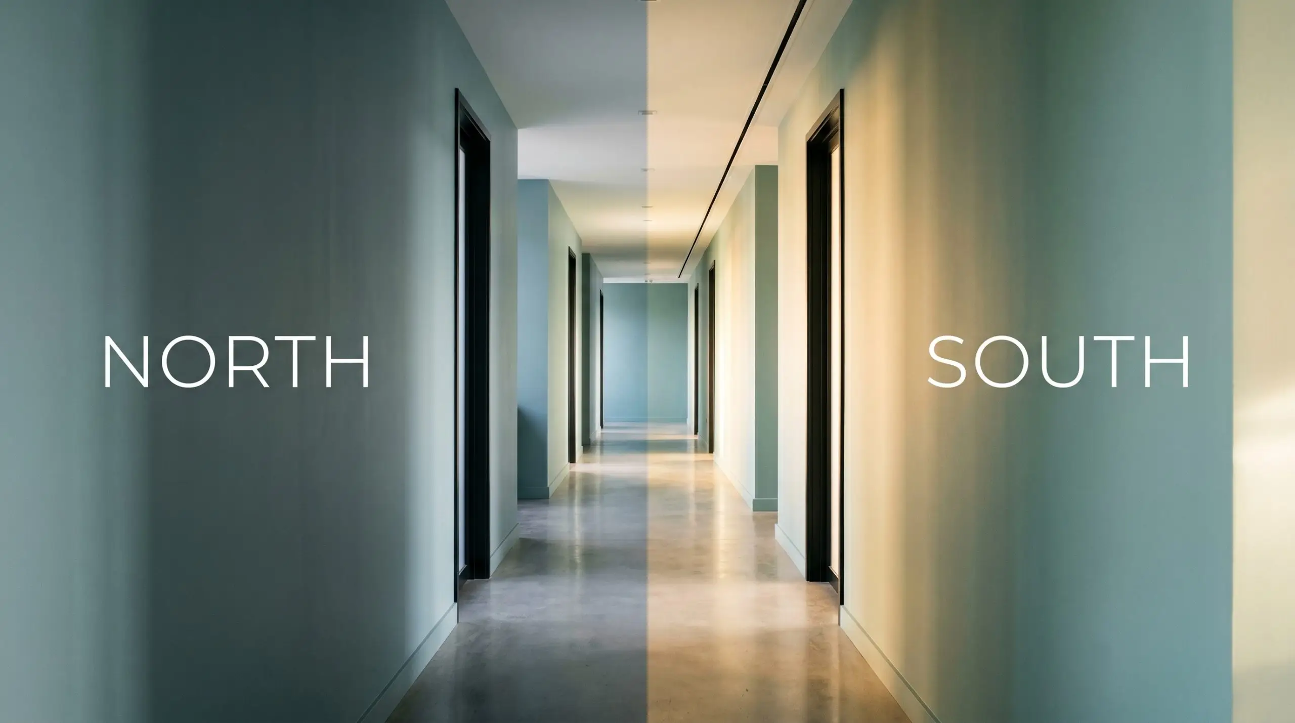
Manipulating Shadows & Sunlight
Because of its nuanced slate foundation, this color shifts dramatically depending on the sun’s trajectory. The greatest risk here is flattening the color saturation in poorly lit, artificially illuminated basements, where it can lose its vibrancy and read as a dull concrete gray. Always test swatches against your specific window exposures to see how the hue stretches throughout the afternoon.
Everyday Applications for St. Lucia Teal 683
This specific pigment introduces a quiet, confident energy to typical residential layouts. Rather than dictating a single aesthetic, the muted teal adapts seamlessly to the surrounding materials, offering a versatile backdrop for everything from sleek minimalism to layered, transitional styling.
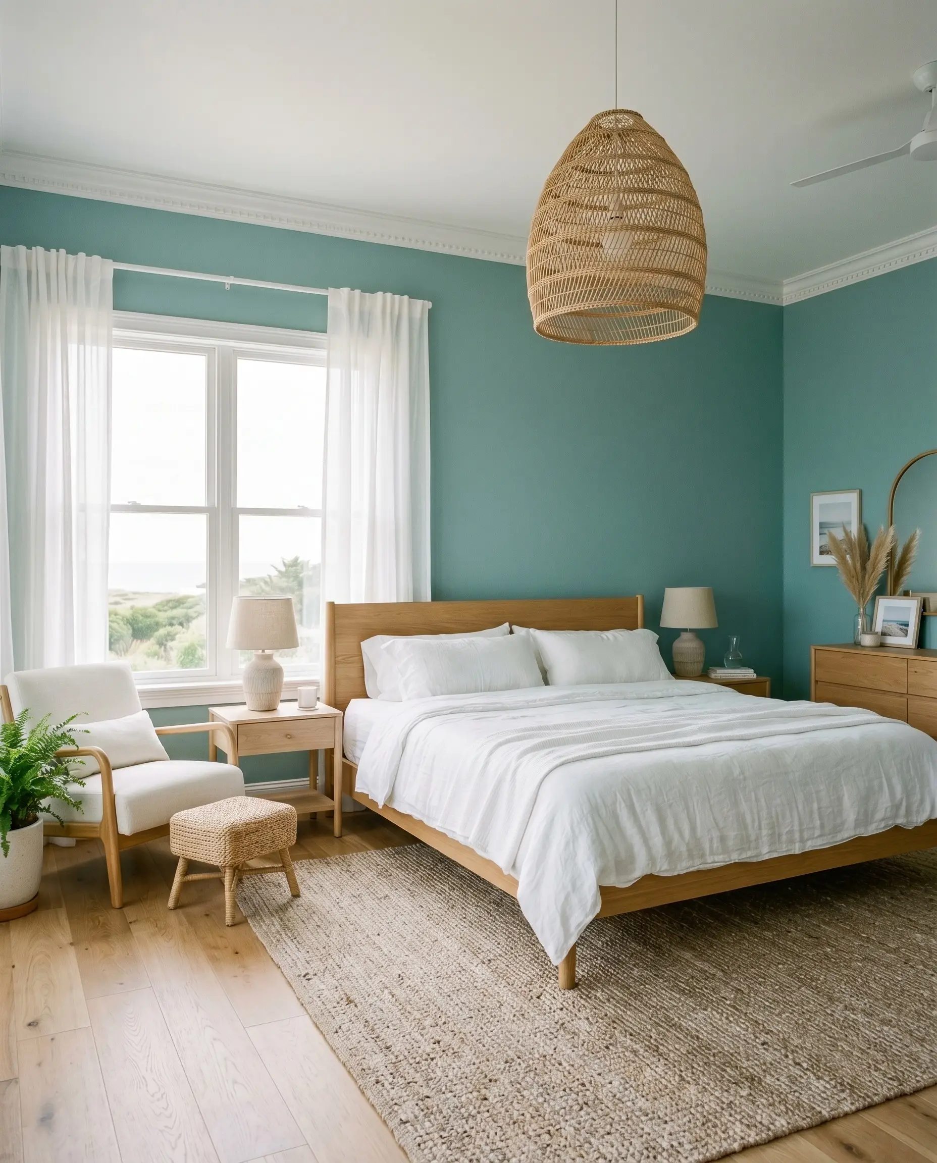
Primary Bedrooms
Apply this shade from baseboards to crown molding to craft a deeply restful retreat. It pairs beautifully with crisp white linens and natural rattan pendants for a breezy coastal aesthetic. Alternatively, it can be pushed into a moody, Parisian-inspired direction when paired with velvet drapery and aged brass sconces.
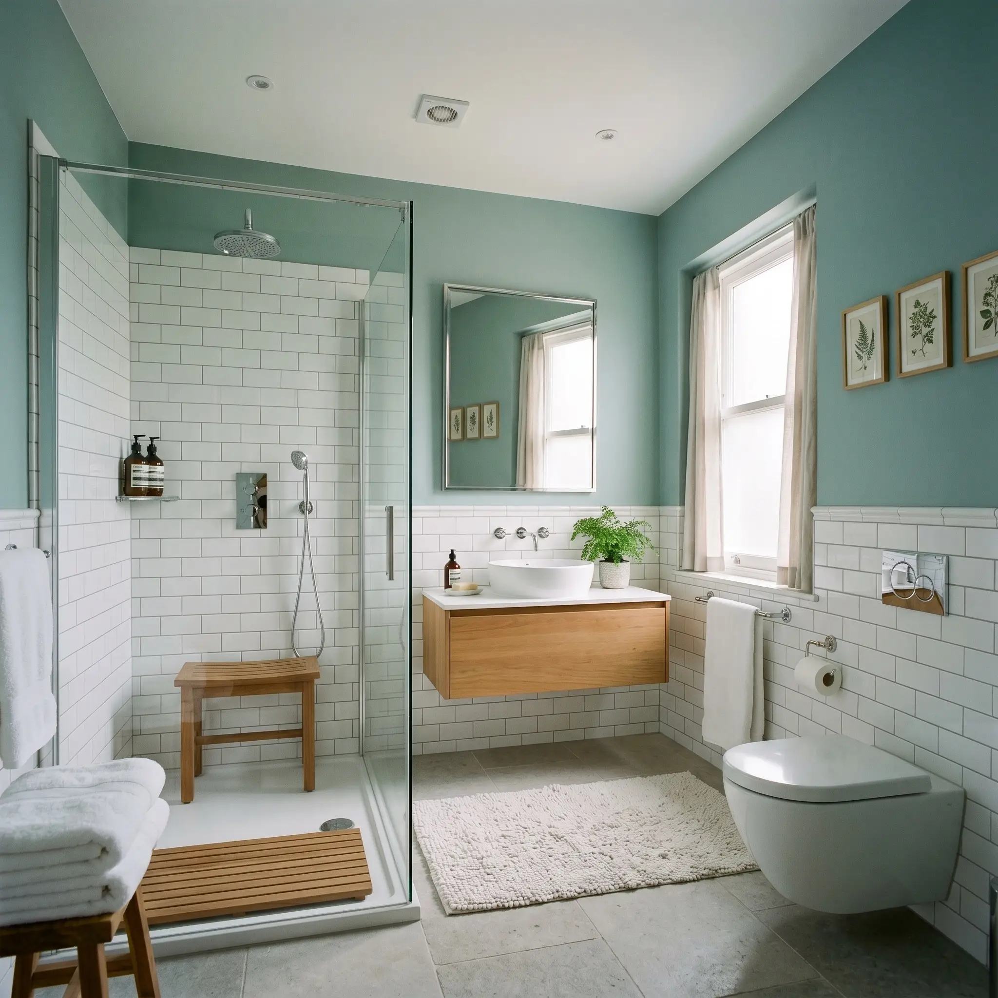
Bathrooms & Washrooms
The gray-leaning aqua naturally fosters a restorative, spa-like atmosphere. It softens the harsh, reflective surfaces of subway tile and polished chrome. This brings a necessary dose of organic softness to utility spaces that otherwise feel cold.
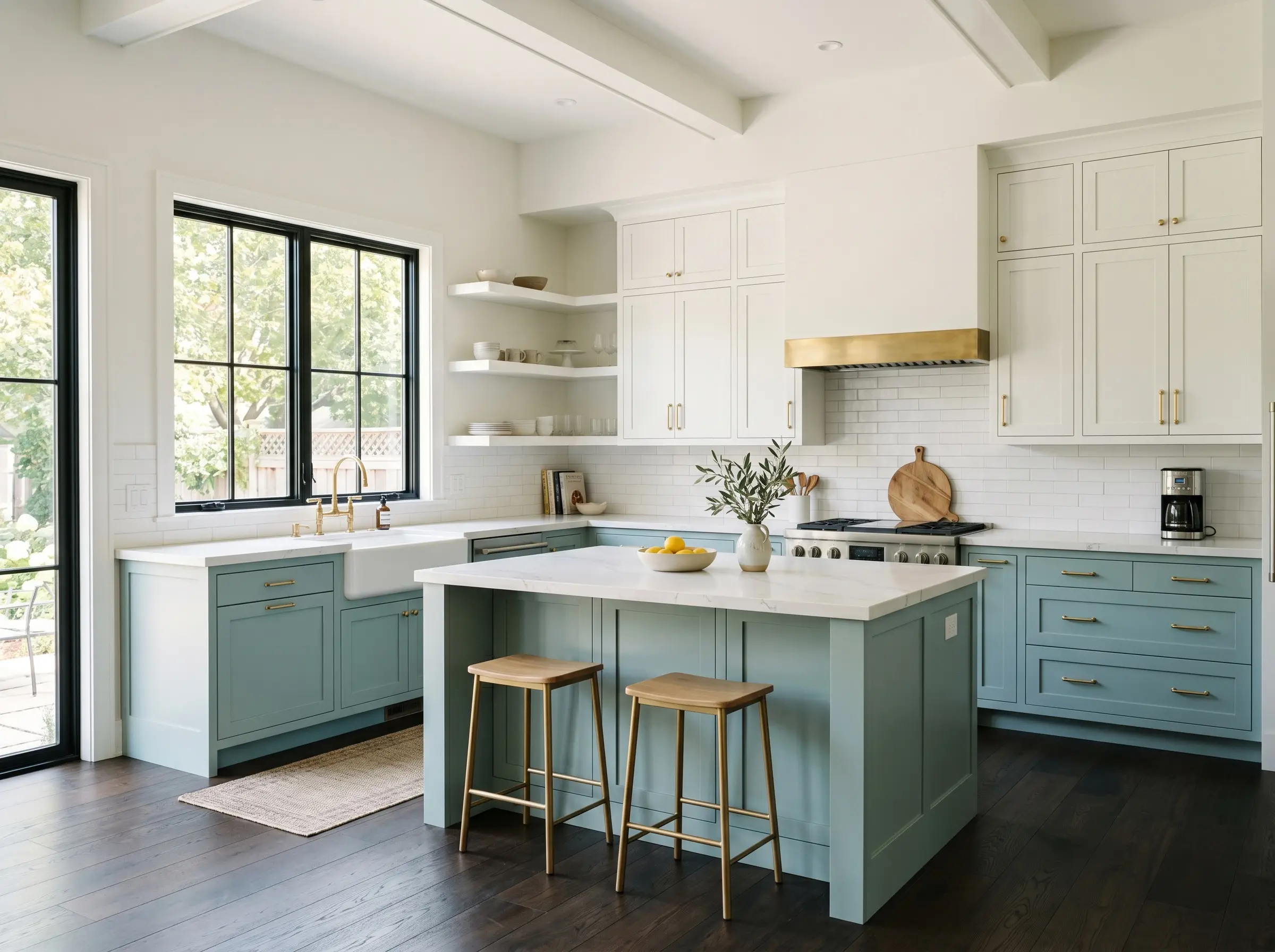
Kitchens & Cabinetry
Utilizing this color as a cabinetry finish on a central island or lower runs grounds a stark white kitchen. It bridges the visual gap between light upper cabinets and dark hardwood floors. The effect is especially striking when styled with unlacquered brass hardware that warms up the cool color temperature.
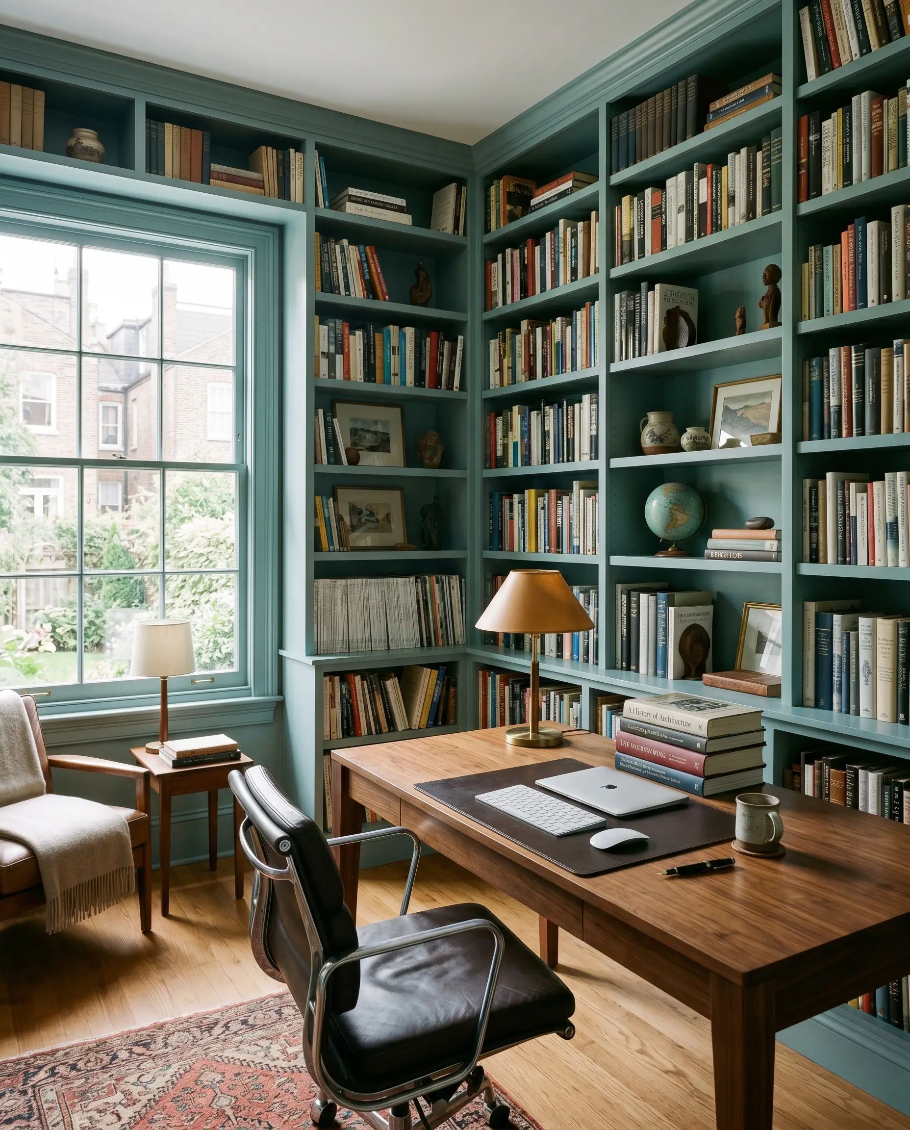
Home Offices
The slate nuances promote focus and visual calm, making it an ideal wrap-around color for a study. It serves as an elegant backdrop for built-in bookshelves. The cool walls contrast brilliantly against the warm tones of walnut or cherry wood desks.
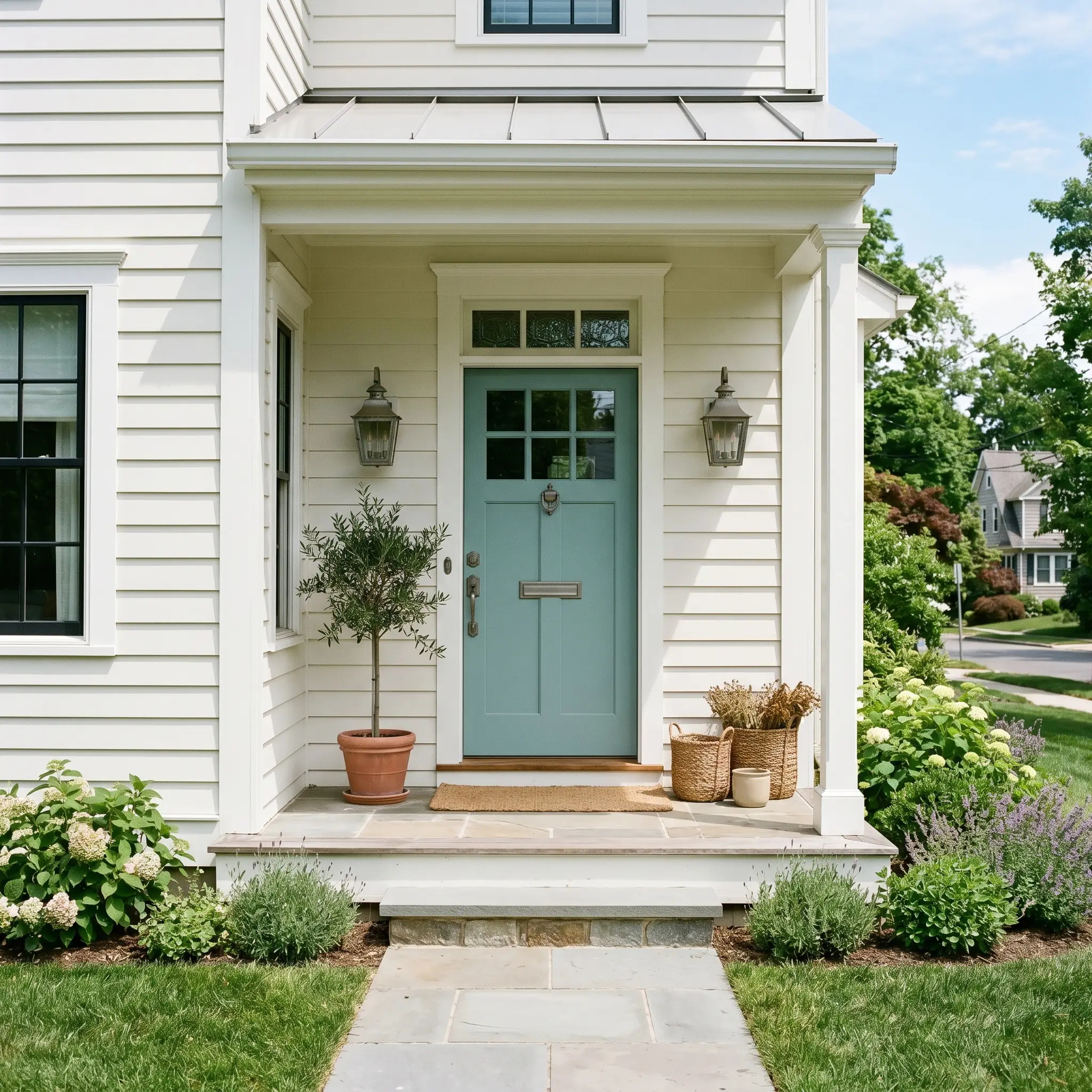
Exteriors & Entryways
On a front door, this mid-tone strikes a perfect balance against white or light gray siding. It offers a welcoming pop of color that feels intentional and mature. It easily avoids the overly bright, primary hues often seen on mid-century facades.
Highly Curated Architectural Moments
This complex pigment invites highly custom, tactile applications that redefine how a home feels. By leveraging its unique light-absorbing qualities, you can engineer striking focal points that feel entirely bespoke.
The Wrapped Window Alcove
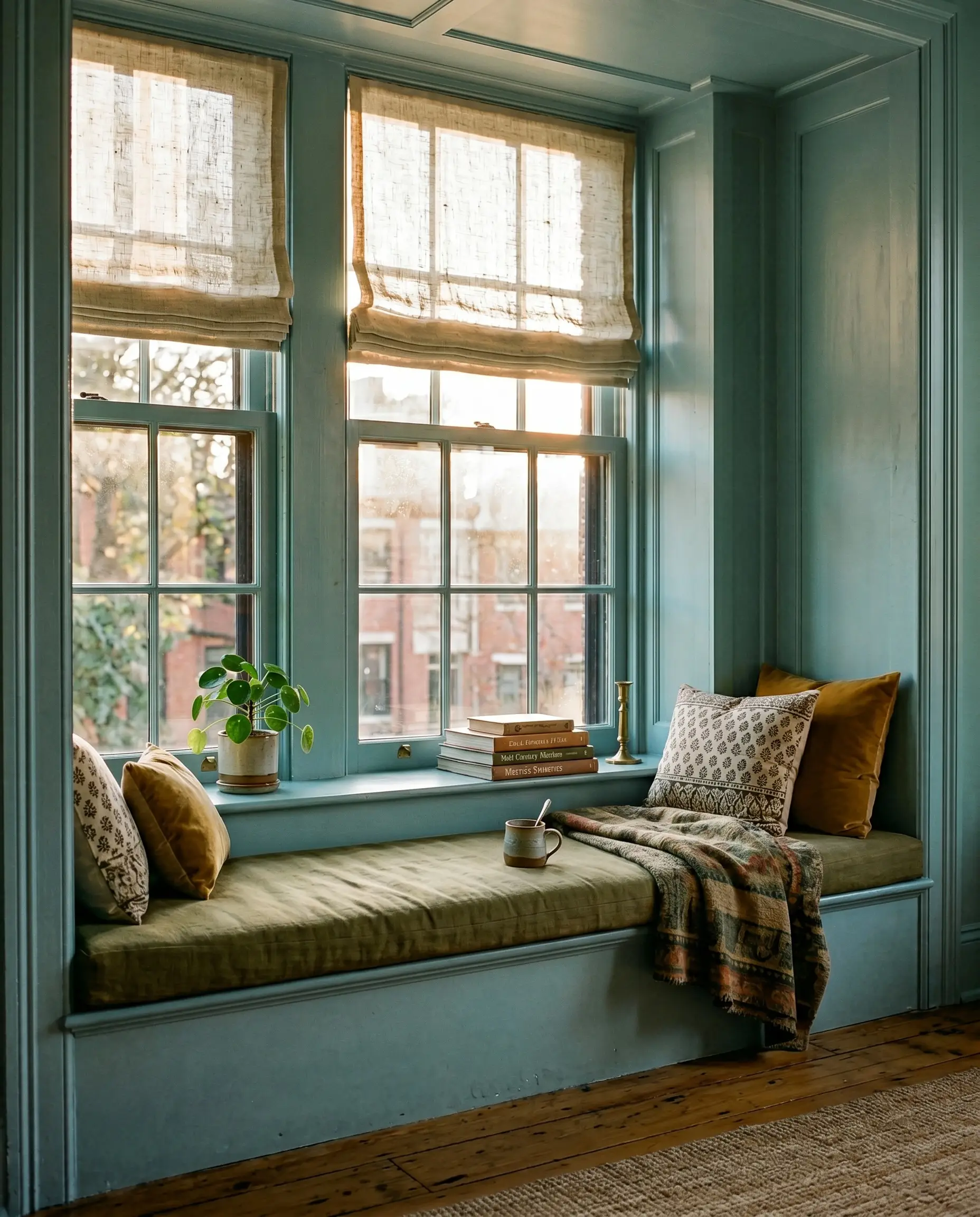
In rooms that suffer from harsh, blinding western glare, painting the deep window returns, mullions, and surrounding alcove in this muted teal acts as a visual sunglass lens. The slate foundation absorbs the aggressive afternoon light, softening the transition between the bright exterior and the interior shadows. Pair this application with heavy, slubby linen Roman shades to enhance the tactile friction.
The Utilitarian Mudroom Ceiling
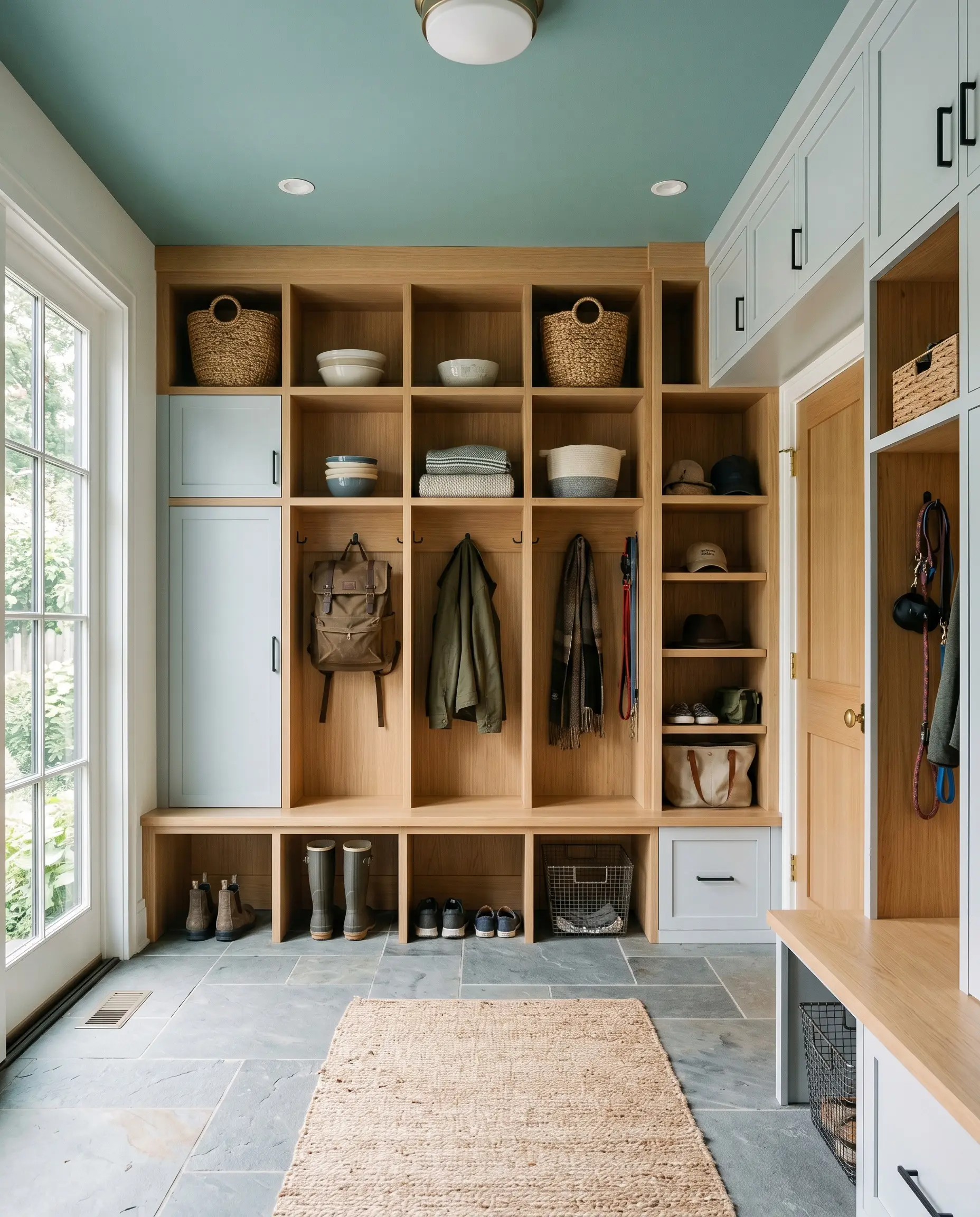
Drop this color onto the ceiling of a busy, high-traffic mudroom to instantly lower the perceived height and create a sense of calm containment. It draws the eye upward, away from the daily clutter of shoes and coats. When the walls are kept a crisp, clean white, this unexpected ceiling treatment feels highly intentional and architectural.
Restoring Salvaged Wainscoting
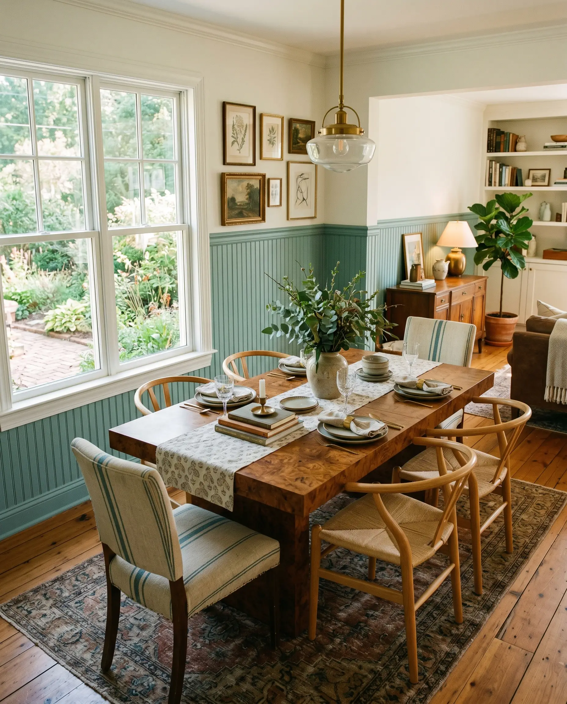
Apply this shade to heavily detailed, salvaged beadboard or wainscoting in a dining space to modernize its traditional profile. The medium blue-green settles into the grooves, highlighting the craftsmanship while stripping away any stuffy, antiquated energy. Contrast the cool woodwork with a warm burl wood dining table to create a dynamic, high-end tension.
Material Pairings & Coordinating Palettes
To make this color feel truly integrated, you must surround it with materials that either challenge its coolness or harmonize with its gray foundation.
Trim & Baseboards
Hardware, Wood & Material Pairings
Coordinating Colors
Designer Mood Boards
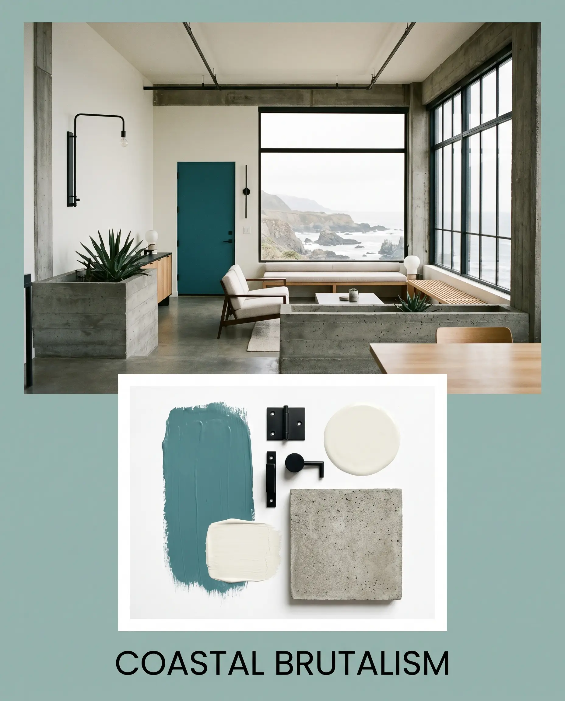
Coastal Brutalism: Blends Benjamin Moore Swiss Coffee OC-45 on the surrounding walls with Matte Black Metal fixtures and heavy, raw concrete planters. The teal acts as the singular organic softness against the rigid, industrial silhouettes.
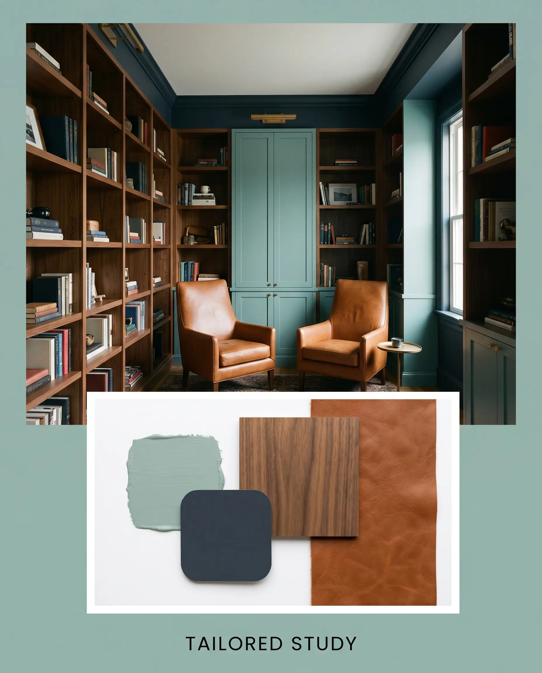
Tailored Study: Pairs the deep contrast of Sherwin-Williams Naval SW 6244 with Warm Walnut shelving and a cognac leather reading chair. The resulting atmosphere is deeply intellectual, moody, and steeped in quiet luxury.
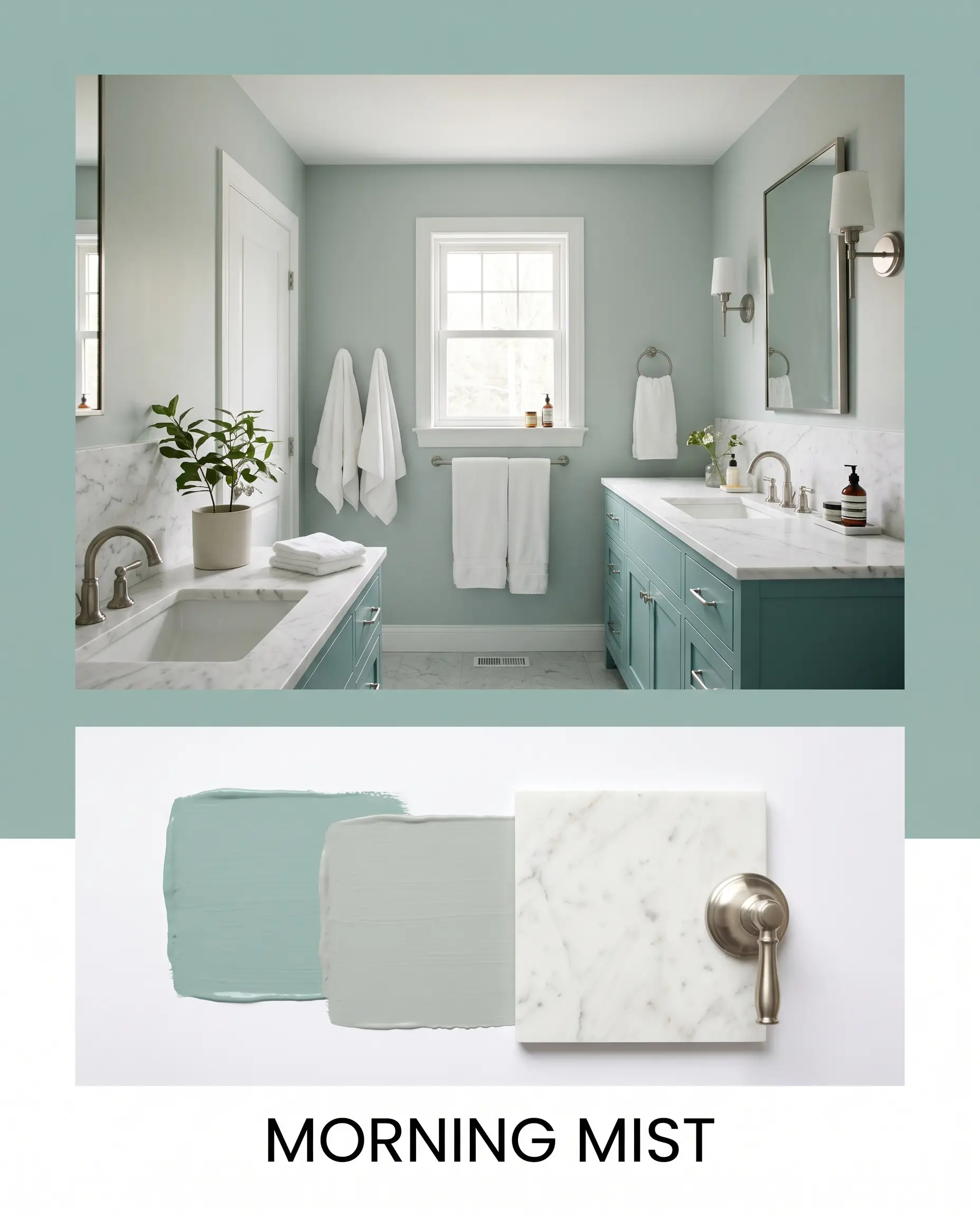
Morning Mist: Utilizes Benjamin Moore Beach Glass 1564 alongside Honed Calacatta Marble and brushed nickel hardware. This combination feels incredibly fresh, light, and restorative, perfect for spaces dedicated to morning routines.
Deciding Between Rivals
When finalizing a palette, understanding how similar shades react under identical lighting conditions is crucial to avoiding a costly misstep.
Benjamin Moore St. Lucia Teal 683 vs. Benjamin Moore Wythe Blue HC-143
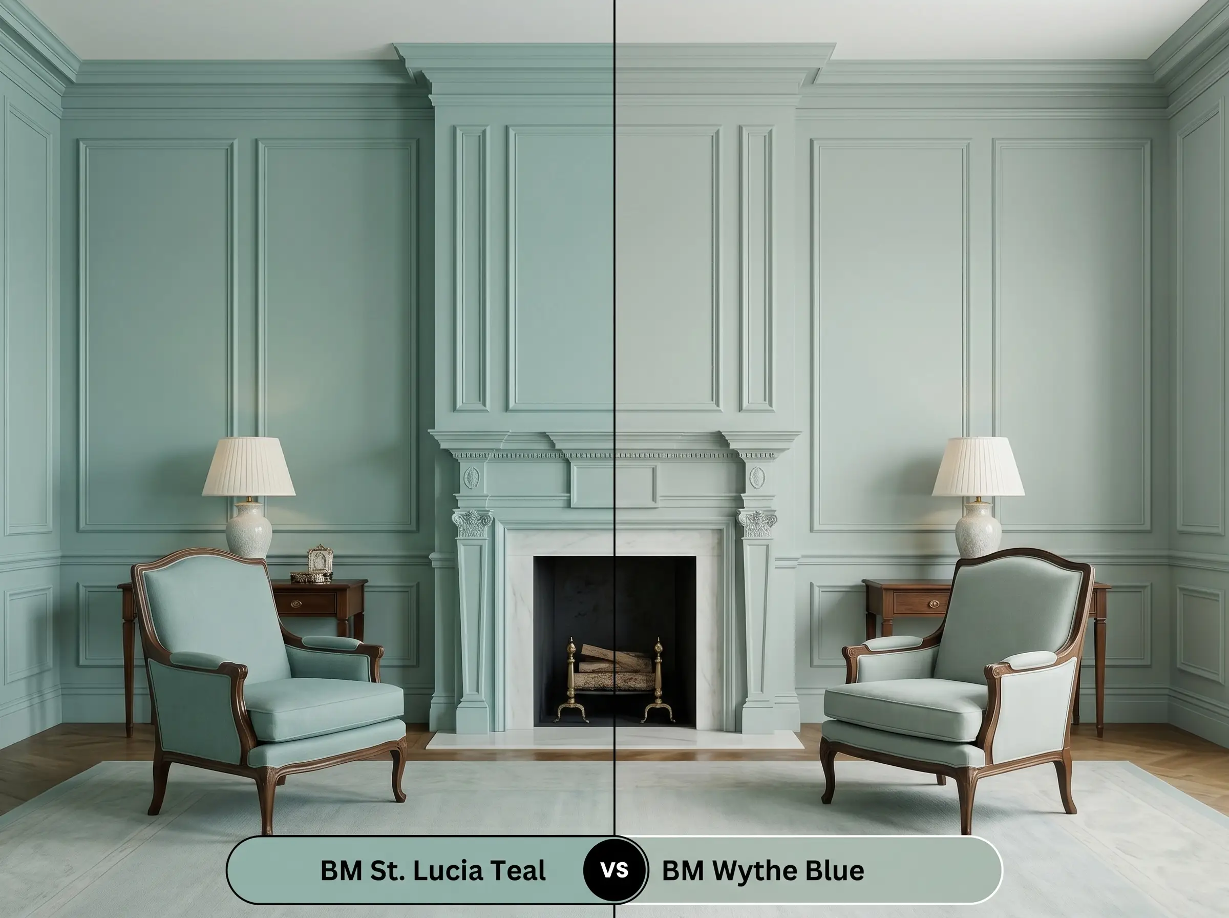
Wythe Blue carries a slightly higher light reflectance and leans noticeably greener, making it feel more historically rooted and traditional. If your room lacks natural light and you fear St. Lucia Teal will read too heavy or gray, Wythe Blue offers a slightly more buoyant, vibrant alternative.
Benjamin Moore St. Lucia Teal 683 vs. Benjamin Moore Aegean Teal 2136-40
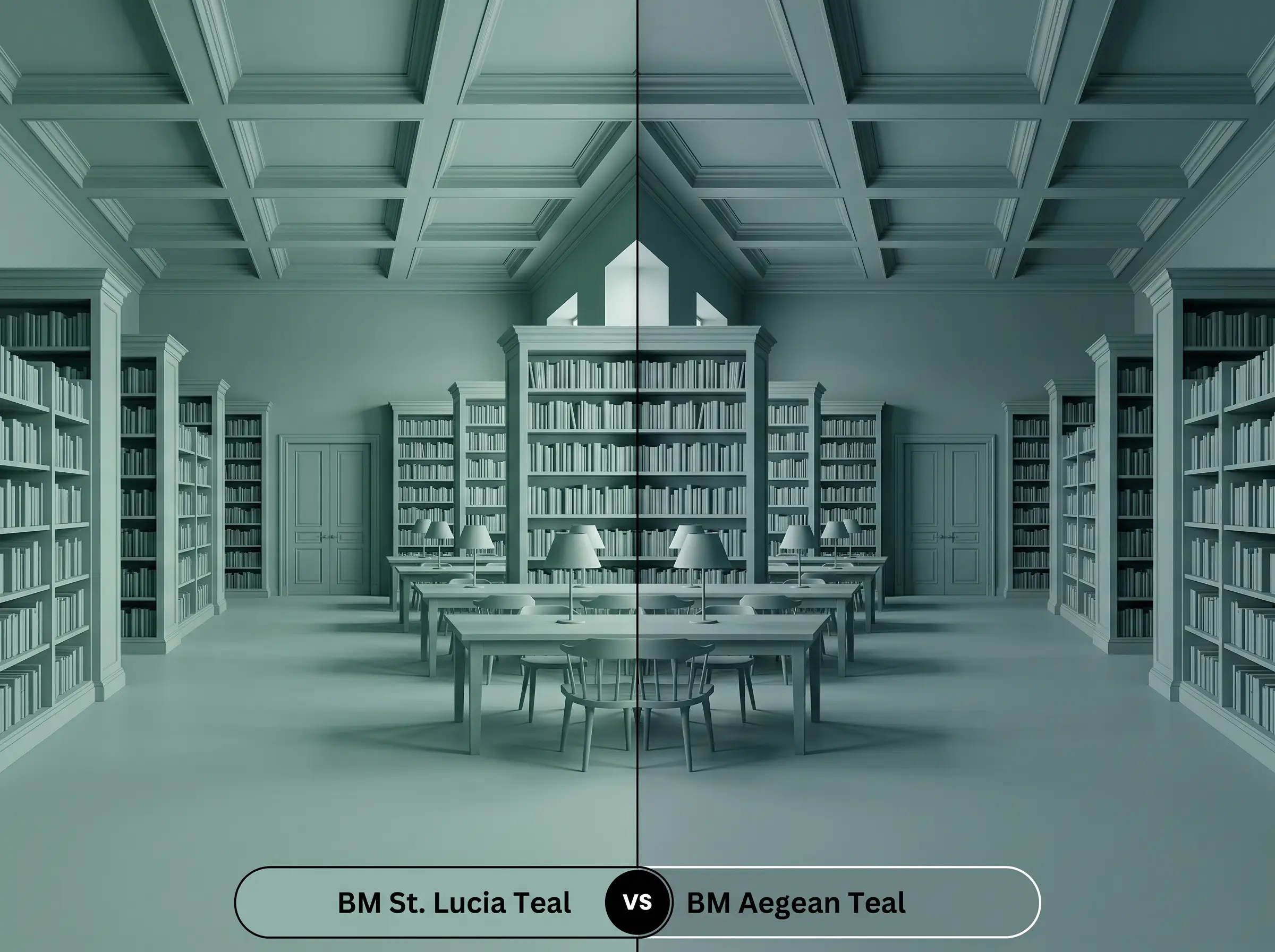
Aegean Teal is significantly deeper and earthier, carrying a stronger dose of brown in its base. If you are designing a highly intimate, enveloping space like a library, Aegean Teal provides maximum drama, whereas St. Lucia Teal remains slightly more versatile for everyday, open-concept living.
Exploring Brand Equivalents & Alternatives
Depending on your local supplier or the specific architectural needs of your home, you may need a shade that shifts just slightly in depth or saturation.
Similar Colors
Cross-Brand Matches
Practical Application for St. Lucia Teal
Translating a beautiful swatch into a flawless architectural finish requires strategic decisions regarding sheen and surface preparation.
The Dynamic Sheen Guide
Primer Strategy
Because this color relies heavily on its slate foundation to achieve its depth, a high-quality white primer is usually sufficient over light walls. However, if you are painting over raw wood cabinetry or a dark, existing color, use a primer tinted with a touch of gray to ensure the teal achieves full opacity without fighting the underlying hue.
Coverage & Success Tips
Expect to apply two full coats to achieve the true, rich depth of the swatch.
When rolling this specific mid-tone, maintain a strict “wet edge” to avoid flashing. If you let sections dry unevenly before overlapping your roller, the gray nuances will dry at different rates, leaving visible, textured streaks down the center of your wall.
Hackrea Pro-Tip (Application Warning)
Frequently Asked Questions
Without natural light to pull the green forward, the cool LED or fluorescent lighting typical in windowless bathrooms will heavily emphasize the blue-gray undertones. To keep the color balanced and spa-like, ensure you use warm 2700K to 3000K bulbs to manually inject warmth back into the space.
Because it sits comfortably in the mid-tone range, it resists the severe UV fading that plagues ultra-dark, forest greens. However, direct exterior sunlight will wash out some of its nuance, making it appear slightly lighter and more vibrant than it does on an interior swatch.
While it shares a similar blue-green DNA, its heavy slate foundation makes it slightly too dark and muted for a traditional, airy haint blue ceiling. It works beautifully as a porch ceiling color, but it will create a moodier, more enclosed atmosphere rather than mimicking a bright, open sky.
The aggressive red and orange tones in traditional brick push the cool slate undertones into overdrive, causing the paint to look significantly bluer and cooler by contrast. This creates a highly dynamic, complementary tension that works well for exterior trim or front doors.
The Final Verdict & Material Warnings
Benjamin Moore St. Lucia Teal 683 is a profoundly versatile tool for homeowners seeking to introduce sophisticated color without overwhelming their architecture. It excels in spaces meant for restoration and focus, bringing a quiet, tailored elegance to bedrooms, studies, and custom cabinetry.
However, this color will aggressively clash with heavy, red-toned woods like glossy mahogany or orange-leaning pine floors, as the cool slate foundation forcefully rejects those fiery undertones, creating a visually chaotic and muddy room. Furthermore, pairing this muted shade with stark, primary accent colors—like bright cherry red or sunny yellow decor—will instantly cheapen its complex profile, making the sophisticated gray nuances look dingy rather than deliberate.