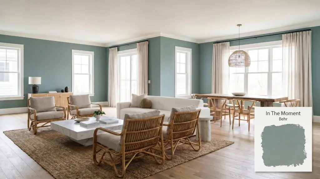
In The Moment T18-15
BehrBehr In The Moment (T18-15) is a restorative, muted blue-green paint color with a distinct gray undertone. With an LRV of 30, it acts as a grounding, tranquil neutral that shifts beautifully between soft sage and dusty teal depending on the room's lighting.
Paint Technical Profile
| Color ID / SKU | T18-15 |
| HEX Code | #859893 |
| Light Reflectance (LRV) | 30 |
| Use | Interior, Exterior |
| Best Exposures | South, West |
| Best For | Bedrooms, Bathrooms, Cabinetry, Exterior Accents |
Behr In The Moment: Anchoring Light-Washed Homes With Restorative Depth
Walking into a sprawling, undefined open-concept layout often feels chaotic, as the sheer volume of white drywall offers the eye nowhere to rest. You need a foundational color that immediately grounds the architecture without plunging the space into darkness.
Behr In The Moment (T18-15) delivers exactly this kind of structural calm. This tranquil blue-green acts as a visual anchor, softening the harsh, rigid lines of modern construction while injecting a deep, organic warmth into the room.
Rather than commanding all the attention, this muted teal recedes beautifully, allowing your everyday furnishings and natural materials to take center stage. It wraps a room in a quiet confidence, instantly turning an undefined floor plan into a curated, intentional home.
Behr In The Moment: Undertones & LRV
When evaluating the temperature of T18-15, the immediate question is whether it leans warm or cool. This shade is undeniably cool, but it is heavily grounded by a neutral gray anchor that prevents it from ever feeling icy or stark.
To understand how this restorative neutral behaves on your walls, we have to look at its core pigment structure:
With a light reflectance value 30, this paint absorbs roughly 70% of the light it receives. This medium-dark depth means it provides striking, sophisticated contrast against crisp white trim. However, it requires adequate natural or artificial lighting to maintain its vibrant character and avoid feeling heavy in highly shadowed corners.
Lighting Effects & The Chameleon Factor of T18-15
If you apply this color in a cramped, windowless hallway with poor lighting, it will lose its vibrant life and collapse into a flat, shadowy slate. This paint thrives on illumination, shifting its personality dramatically as the sun moves across your home.
Because it straddles the line between three distinct hues, In The Moment requires careful testing in your specific environment. If you are searching for the best blue-green paint colors, you must anticipate how your home’s exposure will pull these undertones forward.
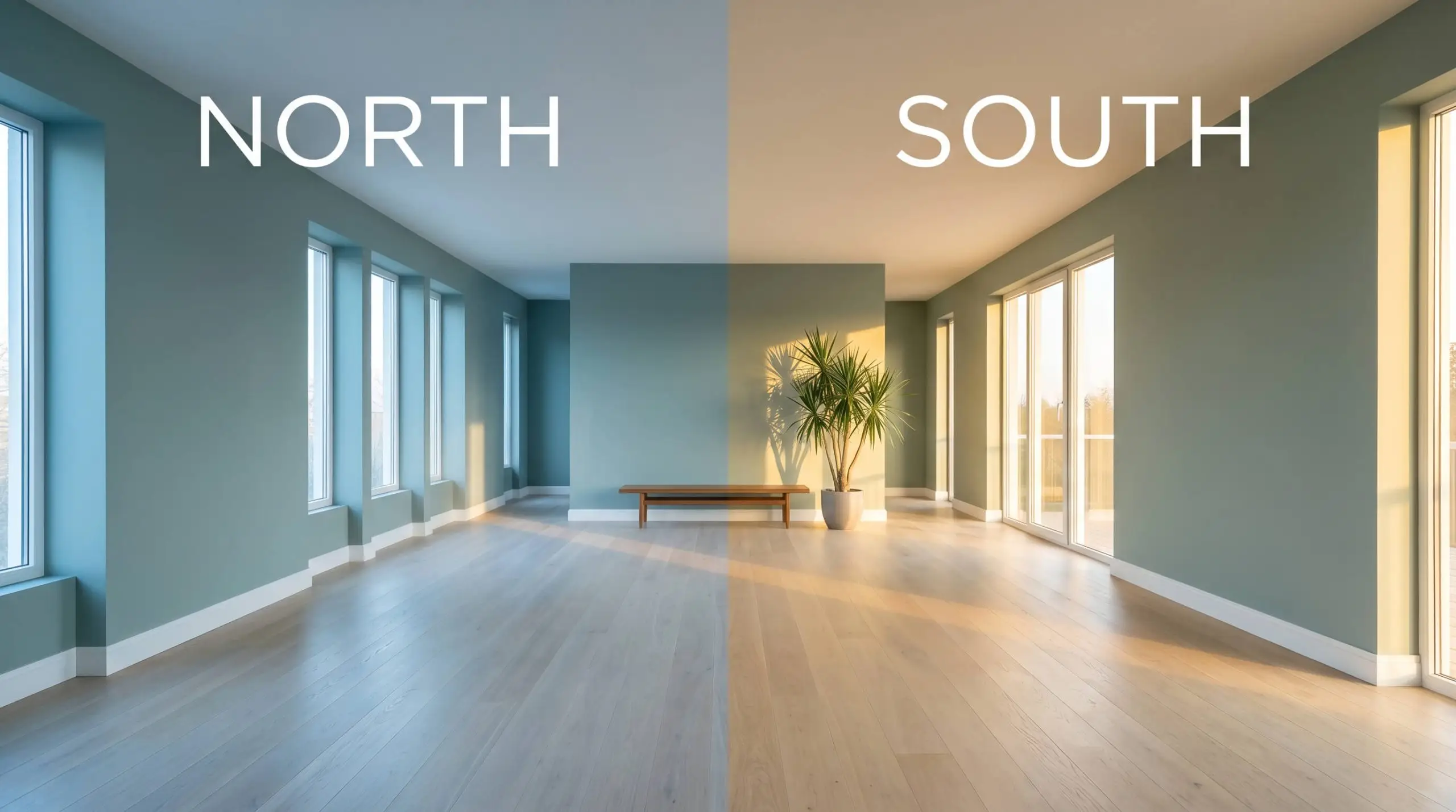
If you are using this shade in a room with heavy northern exposure, rely on warm metallic fixtures like aged brass to bounce warmth back into the slate-heavy shadows.
Hackrea Pro-Tip (The Illumination Strategy)
Everyday Room Applications
This color brings a quiet, cohesive energy to residential architecture, turning standard drywall into a rich, tactile canvas. It naturally softens the sharp edges of utilitarian spaces and adds heavy architectural weight to otherwise plain rooms.
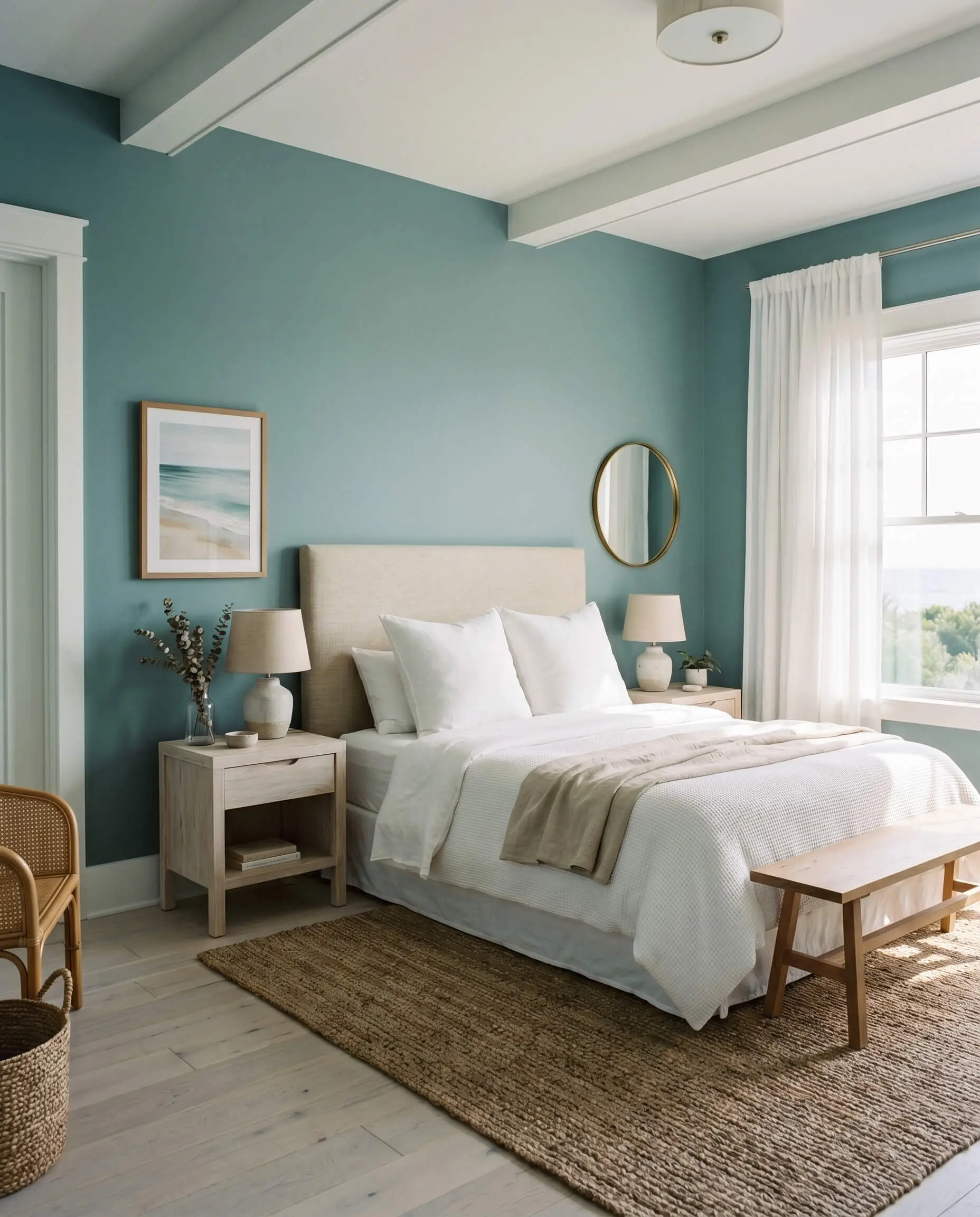
Bedrooms
To create true sanctuary spaces, use this shade as an enveloping wrap across all four walls. It pairs beautifully with flat-pack linen headboards and simple woven rugs, elevating everyday materials into a highly intentional retreat. For those exploring coastal modern bedroom ideas, this color serves as the perfect backdrop for whitewashed oak nightstands and crisp white bedding.
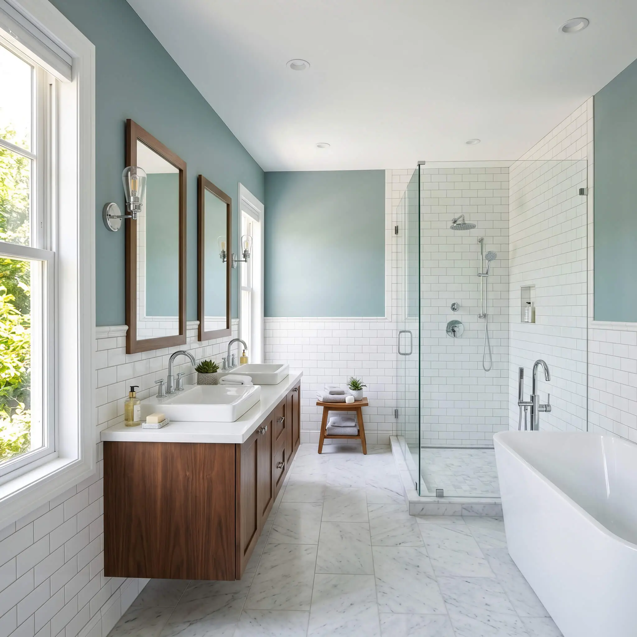
Bathrooms
In a bathroom, this slate-infused teal instantly mimics the serene atmosphere of a high-end spa. Apply it above standard white subway tile wainscoting to create a striking visual boundary. It beautifully complements polished chrome plumbing fixtures, allowing the cool undertones to feel refreshing rather than chilly.
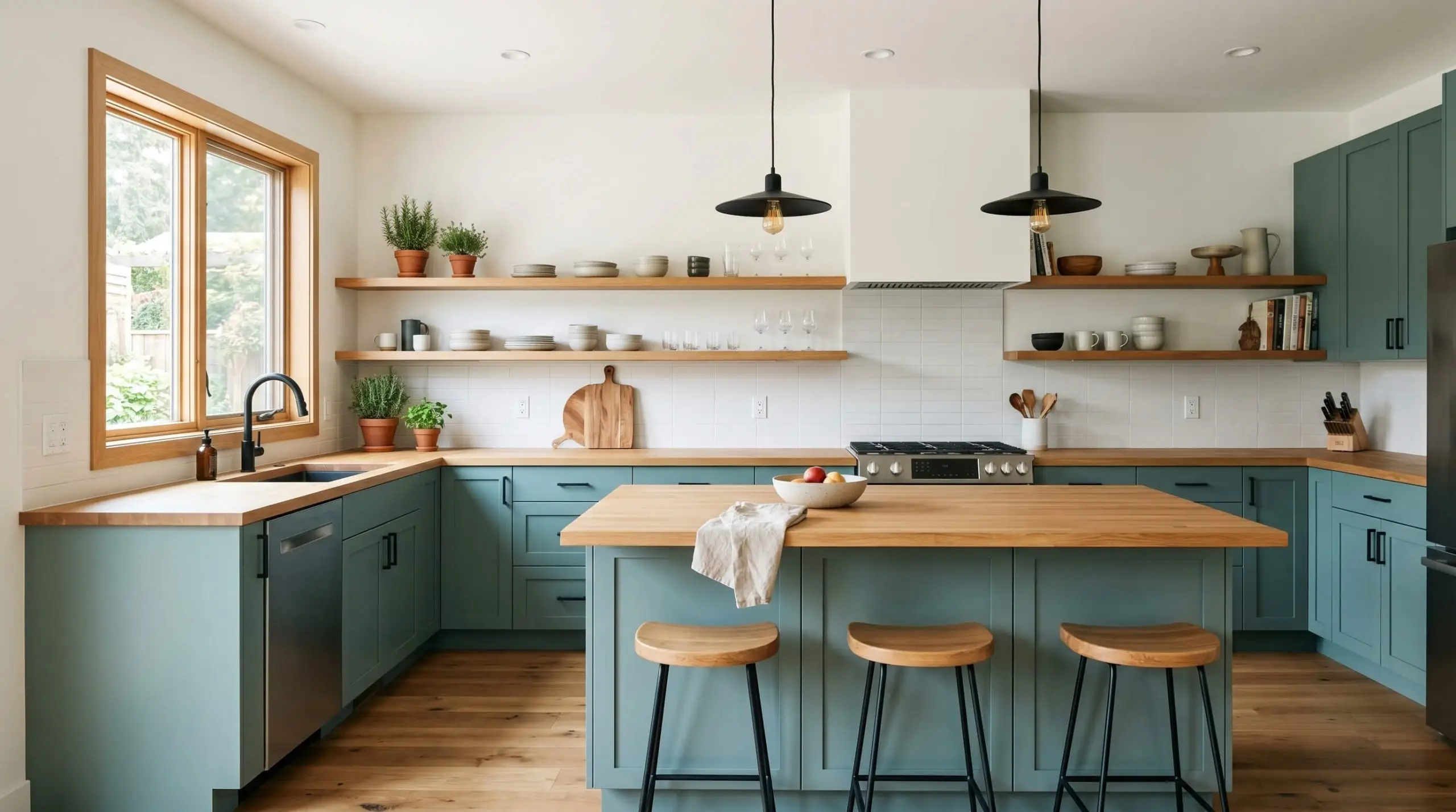
Kitchens
Using this deep hue on lower kitchen cabinetry or a central island is a brilliant way to ground a predominantly white kitchen. It transforms stock MDF cabinets into a premium focal point. Pair it with standard butcher block counters for an earthy, rustic vibe, or contrast it with bright quartz for a sharper, modern edge.
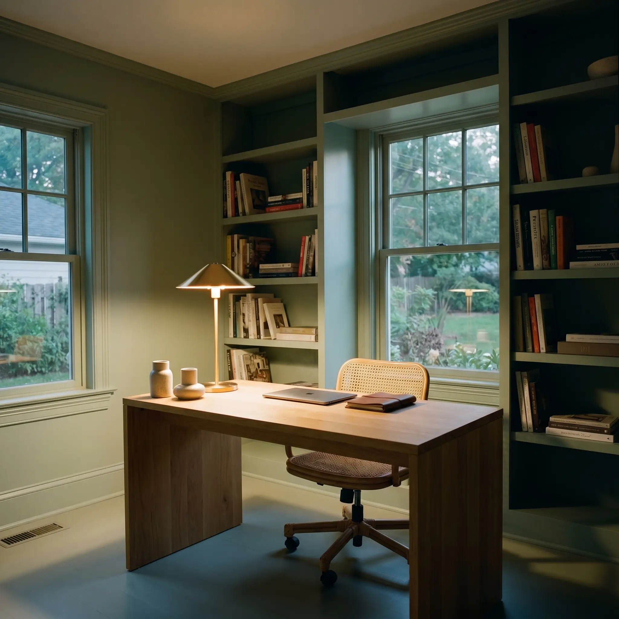
Home Offices
A workspace requires focus, and this gray-green undertone provides exactly that by reducing visual fatigue. Paint the built-in bookshelves and the trim in the exact same finish to create an immersive, distraction-free zone. The medium-dark depth absorbs the harsh glare of computer screens, making the room feel incredibly grounded.
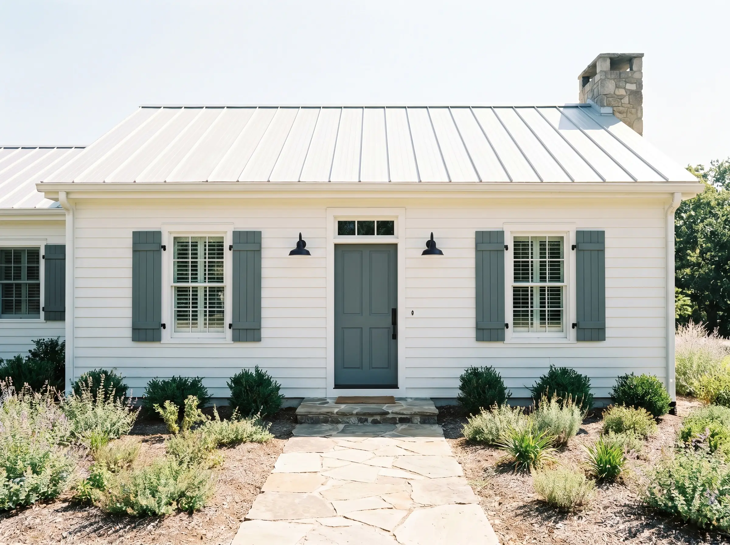
Exteriors
On a home’s facade, this color shines on front doors and window shutters. Because exterior sunlight washes out paint colors significantly, the heavy gray anchor prevents the teal from looking overly bright or neon against the neighborhood landscape. Ensure you use an exterior-grade finish with strong color fade protection to maintain its rich depth against harsh UV rays.
Creative Ways to Use Behr In The Moment
When you look past standard wall applications, this specific pigment inspires highly custom, out-of-the-box thinking. Its unique ability to shift between sage and slate makes it a brilliant tool for clever, high-impact transformations.
The Sun-Drenched Slatted Partition
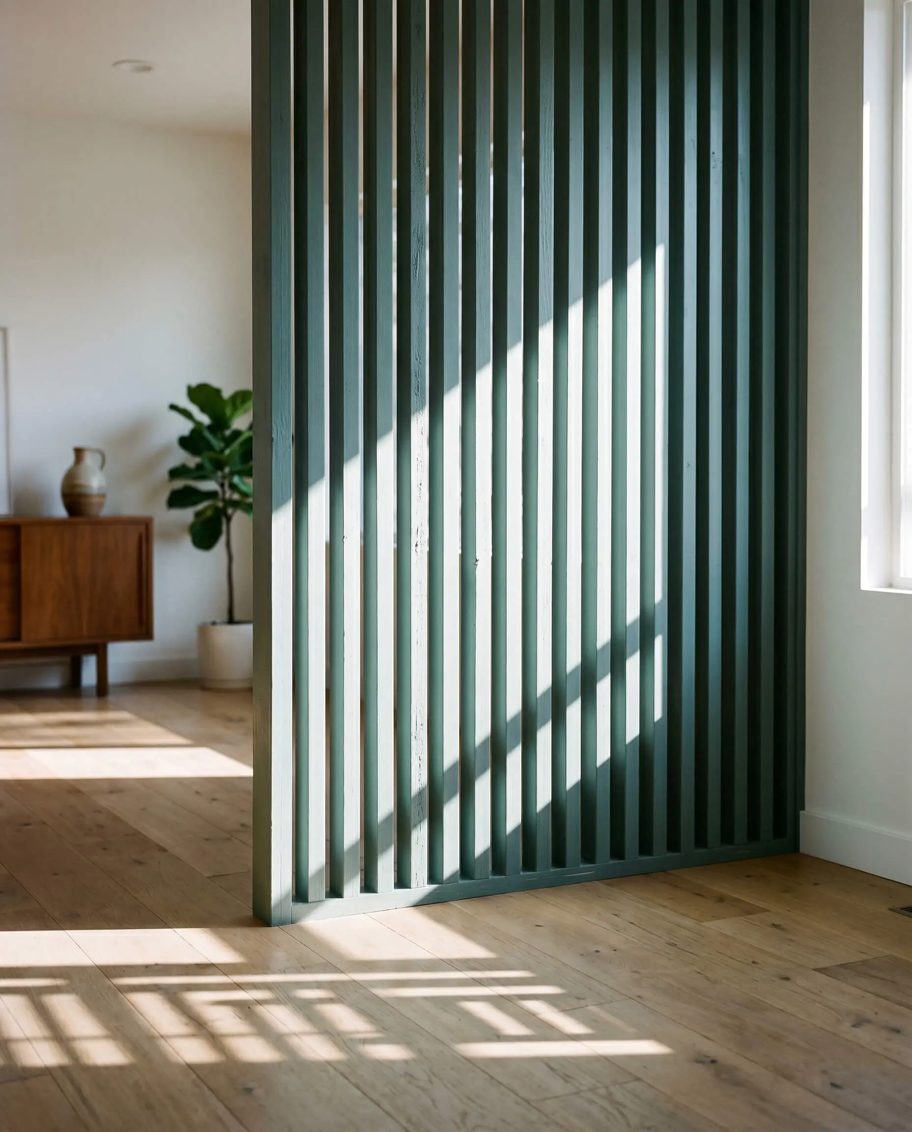
For mid-century enthusiasts dealing with harsh western glare, apply this shade to a custom slatted wood room divider. As the intense afternoon sun hits the wood, the green undertones ignite, glowing warmly while the gaps cast deep, slate-colored shadows. This turns a simple piece of pine millwork into a stunning, architectural light filter.
The Windowless Utility Oasis
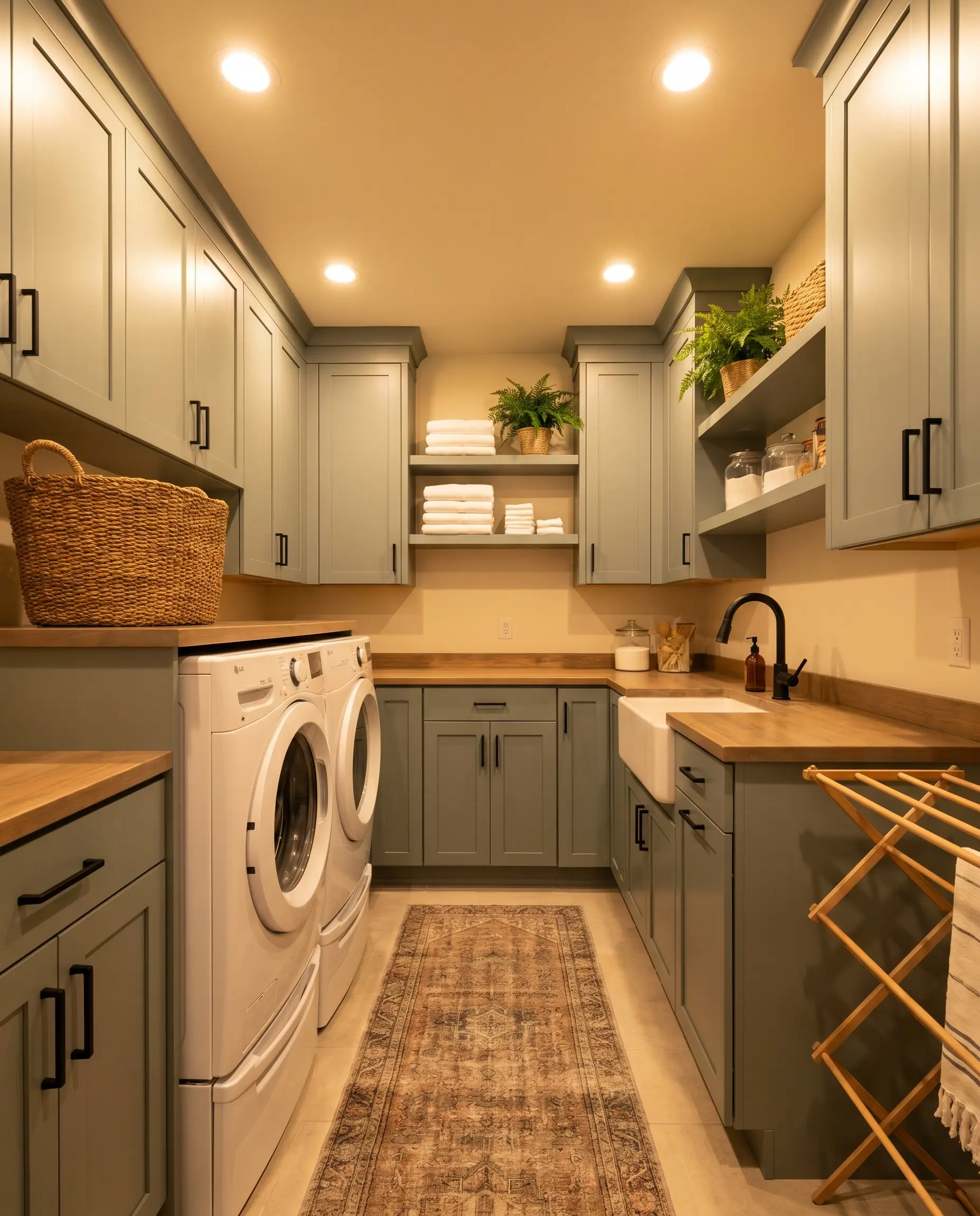
Laundry rooms are often starved for natural light and filled with sterile, white appliances. By painting standard utility cabinets in T18-15 and relying on warm 3000K overhead LEDs, you force the cozy gray-green notes to the surface. This strategy transforms a purely functional, chore-heavy zone into an inviting, biophilic design moment.
The Brass-Accented Beadboard Canopy
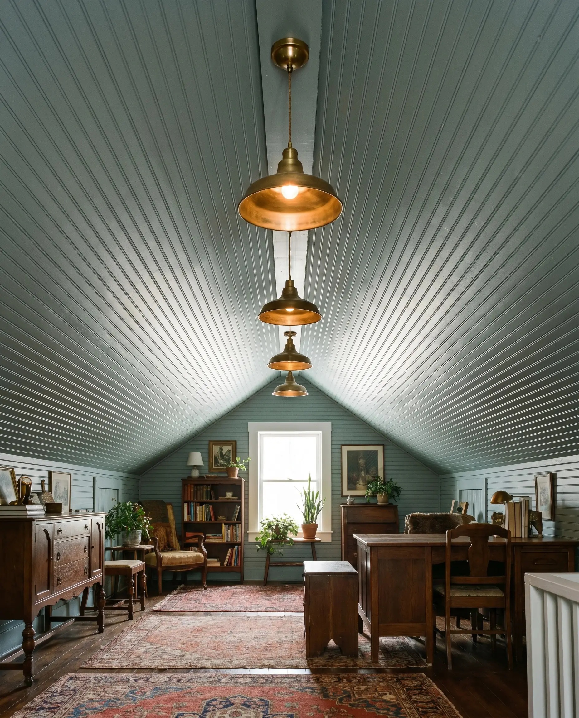
In historic cottages or older homes with sloped attic ceilings, wrap the entire ceiling in beadboard painted in this muted teal. Pair it with unlacquered brass pendant lighting. The metallic sheen bounces ambient light against the medium-dark ceiling, creating an incredibly intimate, enveloping canopy that feels both nostalgic and fresh.
Hardware, Wood & Paint Pairings
The secret to integrating this paint successfully lies in how it dialogues with the surrounding textures and finishes. T18-15 needs intentional contrast; it requires either crisp, luminous boundaries to hold its shape or rich, earthy materials to pull out its organic warmth.
Trim & Baseboards
To keep the blue-green feeling intentional and clean, pair it with bright, highly reflective whites.
Hardware, Wood & Material Pairings
Coordinating Colors
Designer Mood Boards
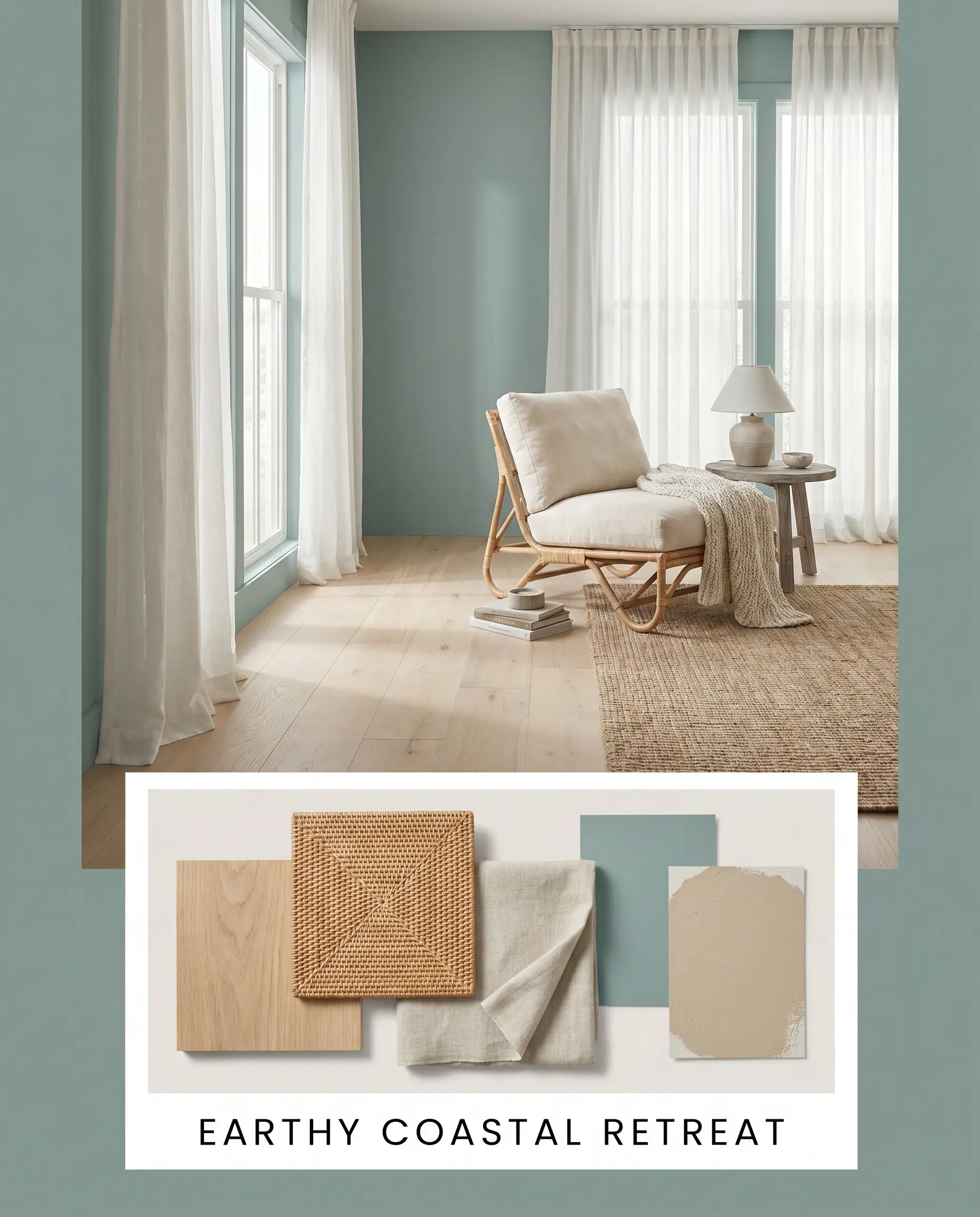
Earthy Coastal Retreat This palette harnesses the organic, breezy side of the paint. By layering the wall color with Sherwin-Williams Accessible Beige SW 7036 and expansive white oak flooring, the energy becomes incredibly serene. Styling with woven rattan lounge chairs and soft, textured linen drapery enhances the relaxed, tactile nature of the space.
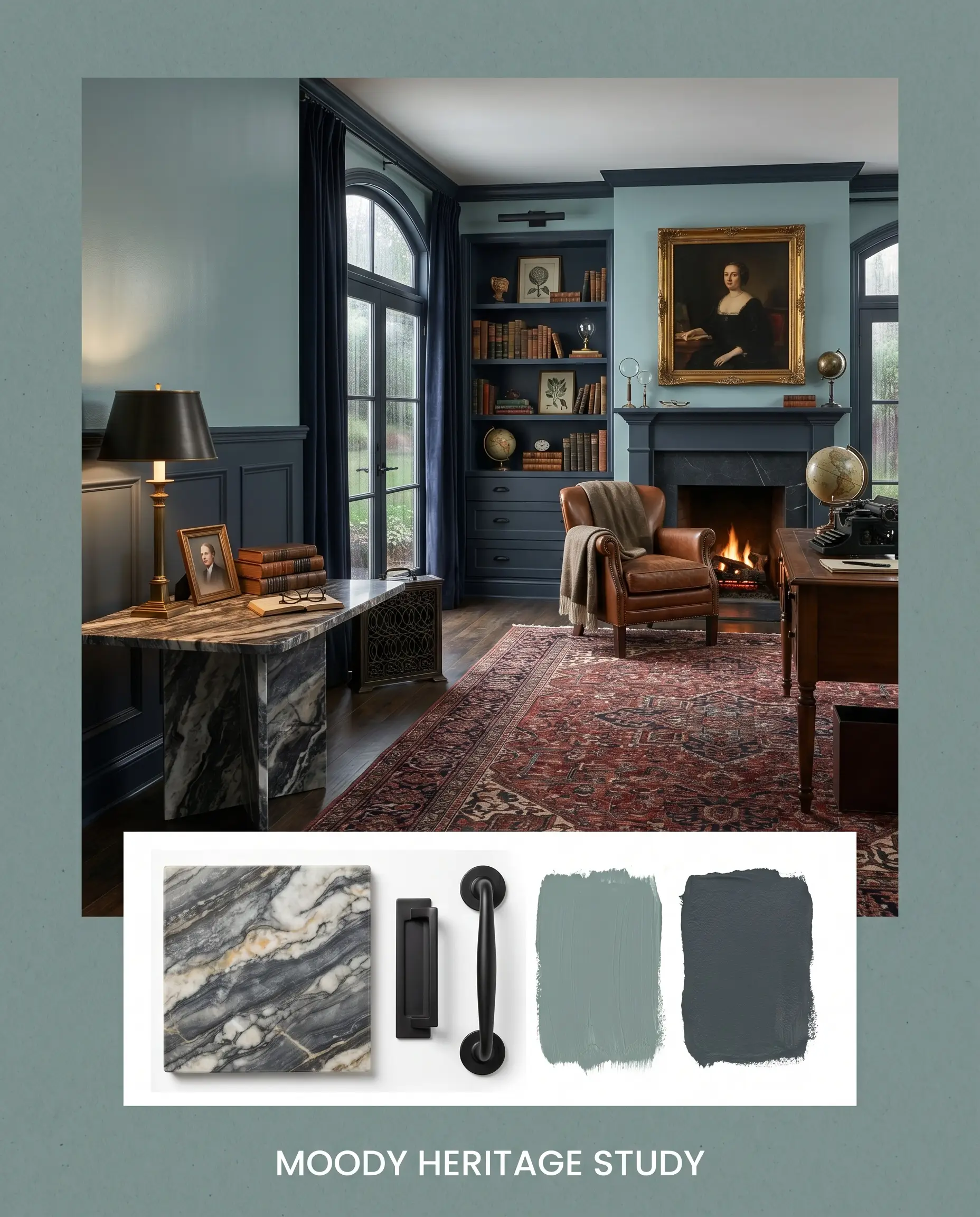
Moody Heritage Study Focusing on the darker, slate-heavy characteristics, this combination feels intellectual and grounded. Pairing the muted teal with Benjamin Moore Hale Navy HC-154 creates a deep, enveloping shadow play. Add matte black hardware and a vintage, heavily veined marble side table to complete the sophisticated, historical atmosphere.
Behr In The Moment Comparisons
Sometimes a specific lighting condition or architectural style requires a slight pivot in your color strategy. Here is how this shade stacks up against its closest rivals when deciding on the perfect tonal balance.
Behr In The Moment T18-15 vs. Benjamin Moore Aegean Teal 2136-40
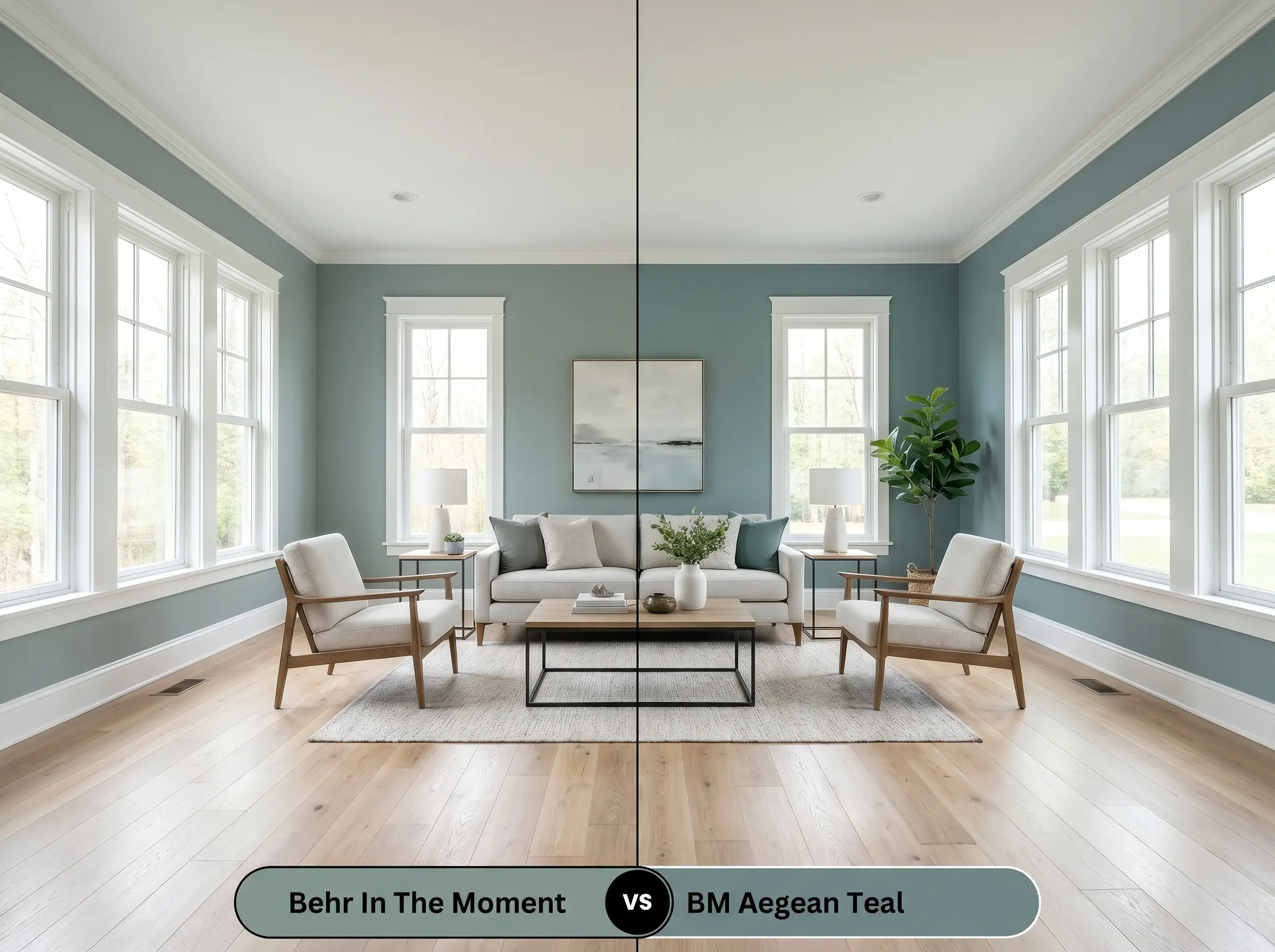
Aegean Teal is noticeably deeper and leans much heavier into its blue and brown undertones. If your room receives abundant, blinding southern light, Aegean Teal holds its weight better without washing out. However, if you want a softer, more restorative green presence, the Behr option is the clear winner.
Behr In The Moment T18-15 vs. Sherwin-Williams Sea Salt SW 6204
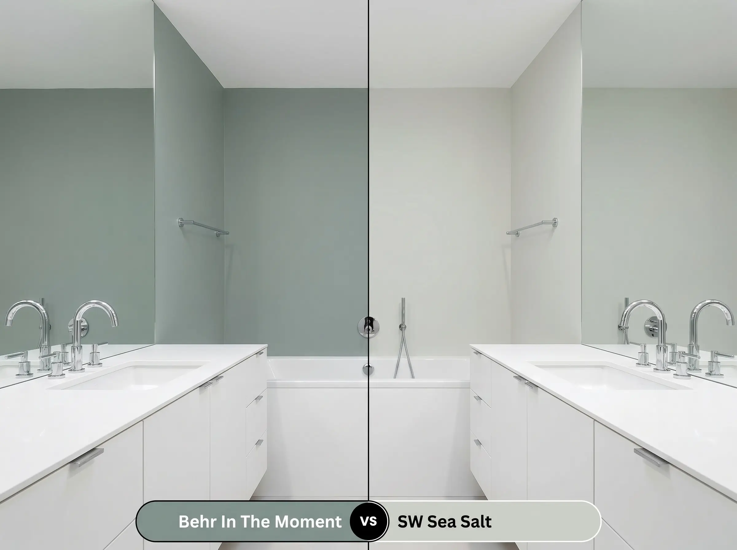
Sea Salt has a significantly higher light reflectance value, making it much paler and more airy. If you are painting a dark, cramped bathroom and need the walls to bounce light, Sea Salt is the safer choice. If you want dramatic contrast against white cabinetry and a richer, more enveloping mood, stick with T18-15.
Behr In The Moment T18-15 vs. Behr Rainy Afternoon N430-4
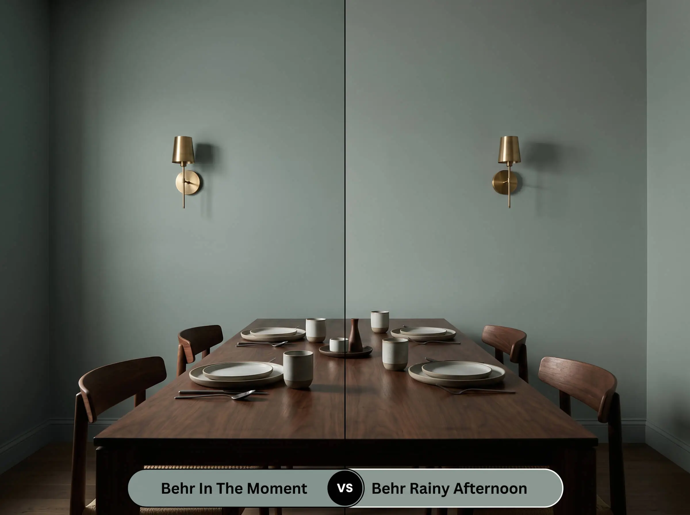
Rainy Afternoon is a much darker, moodier slate-green. If you are designing a cinematic, low-light dining room and want the walls to feel almost black-green in the shadows, Rainy Afternoon delivers. In The Moment provides a much more versatile, everyday livability for main living areas.
Similar Tones & Brand Equivalents
If you love the general profile of this color but need a slight adjustment in depth or brand availability, these alternatives offer excellent pathways.
Same-Brand Alternatives
Cross-Brand Matches
Application & DIY Guidance for T18-15
Transitioning from design theory to the practical reality of rolling this paint onto your drywall requires a strategic approach. The medium-dark depth of this pigment demands attention to detail during application.
The Dynamic Sheen Guide
Primer Strategy
Because of its specific light-absorbing qualities, applying this color over fresh drywall or heavily patched areas requires a high-quality primer. If you are painting over a stark white or a very pale yellow, a standard white primer is sufficient. However, if you are transitioning from a dark red or deep brown wall, using a primer tinted to a cool gray will significantly reduce the number of topcoats needed to achieve true color accuracy.
Coverage & Success Tips
Expect to apply two full coats to achieve the rich, opaque finish this color is known for. Be incredibly mindful of “flashing”—which occurs when uneven roller pressure or painting over partially dried sections leaves visible, shiny streaks. To avoid this, always maintain a wet edge as you roll from ceiling to floor, and resist the urge to touch up small spots until the entire wall is completely dry.
Frequently Asked Questions
Not at all. The heavy slate-gray undertone acts as an anchor, ensuring that in low light conditions, the color actually deepens into a moody, muted slate rather than turning bright or minty.
Because a wooded lot filters sunlight and casts green reflections, the gray undertone is highly beneficial. It prevents the exterior paint from blending too much into the foliage, maintaining a sophisticated, structured appearance on your facade.
Absolutely. The flat, earthy nature of this blue-green works wonderfully on ceilings, drawing the eye upward and creating a cozy, nature-inspired canopy, though it will visually lower the ceiling height slightly due to its light-absorbing qualities.
The cool blue-green pigments sit opposite red on the color wheel, meaning they will highly contrast with cherry wood. This interaction will make the cherry floors look even redder and the paint look even cooler and more blue.
Final Verdict & Expert Warnings
Behr In The Moment (T18-15) is an incredibly reliable, hard-working color for homeowners who want to introduce rich personality without overwhelming their architecture. Its absolute best application is in spaces that require a calming, restorative energy—such as bedrooms, spa-inspired bathrooms, and grounded home offices. It effortlessly supports coastal modern aesthetics, transitional homes, and earthy, nature-inspired interiors. By perfectly balancing blue, green, and gray, it provides a sophisticated backdrop that feels both historic and entirely current.
However, you must be highly cautious when introducing this paint into homes dominated by warm, high-intensity finishes. If your space features heavily orange-toned oak cabinets, fiery terracotta tile, or bright yellow-beige carpets, this cool, slate-driven teal will aggressively clash. The stark difference in color temperature will force the paint to look cold and detached, while making your warm finishes appear overly harsh and outdated. Always ensure your foundational hard finishes lean neutral, crisp white, or naturally muted before committing to this beautifully complex hue.
Closest Cross-Brand Equivalents
The absolute closest scientific color matches for In The Moment across top paint brands.