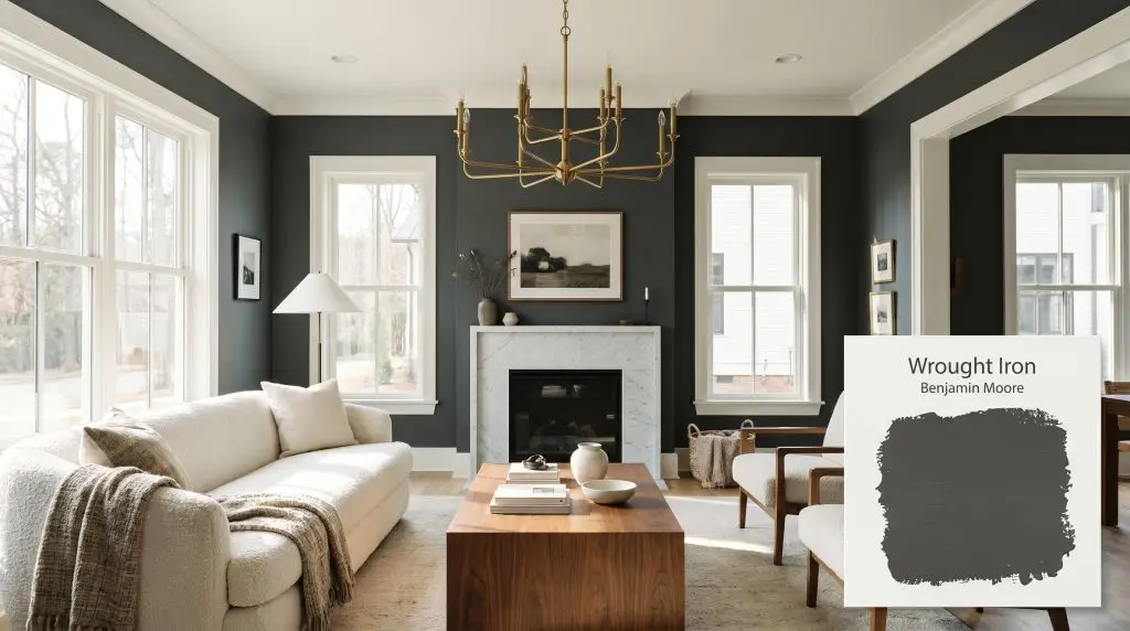
Wrought Iron 2124-10
Benjamin MooreBenjamin Moore Wrought Iron (2124-10) is a deeply saturated, soft charcoal black with an LRV of 6.16. Because of its subtle cool blue undertones, it acts as a moody, transitional dark neutral that avoids the harsh, flat starkness of a pure, absolute black.
Paint Technical Profile
| Color ID / SKU | 2124-10 |
| HEX Code | #494A4B |
| Light Reflectance (LRV) | 6.16 |
| Use | Interior, Exterior |
| Best Exposures | South-Facing, North-Facing |
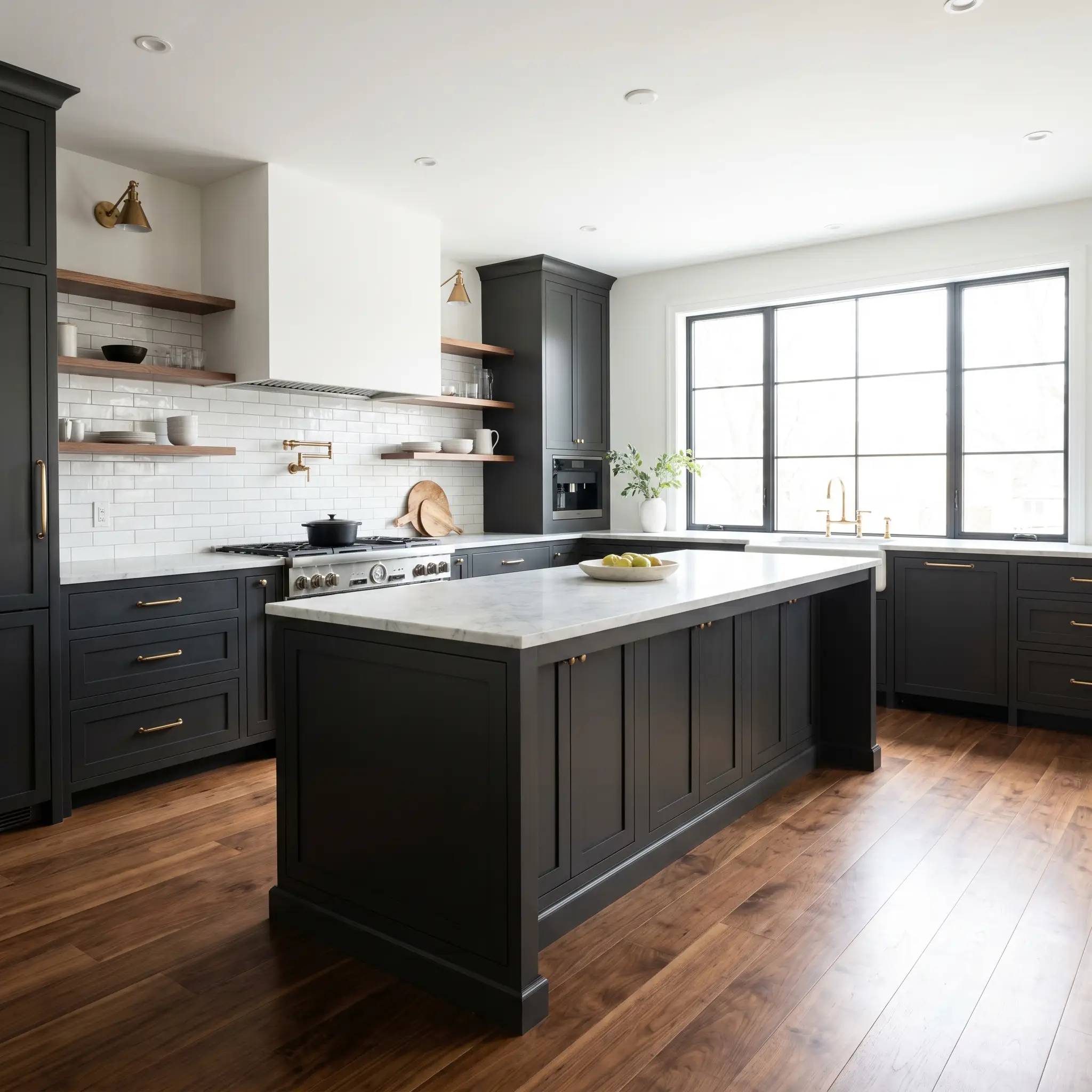
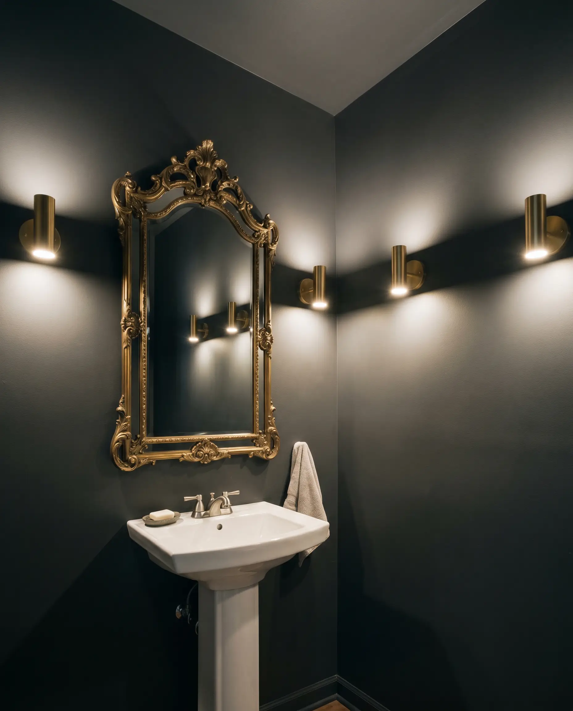
| Best For | Kitchen Cabinets, Accent Walls, Exterior Trim, Front Doors, Powder Rooms |
Benjamin Moore Wrought Iron: A Sophisticated Backdrop for High-Contrast Interiors
When you want to anchor a bright, airy living room without resorting to a harsh, cold jet black, you need a color with hidden depth. Using a deeply saturated shade to ground everyday furnishings is one of the most transformative tricks in modern design. It instantly elevates standard sofas and basic architectural layouts, giving the entire room a curated, custom-built energy.
Benjamin Moore Wrought Iron (2124-10) is the perfect candidate for this high-impact strategy. This moody charcoal bridges the gap between a stark void and a washed-out gray, offering incredible versatility. It acts as a stunning chameleon, shifting its personality based entirely on the light and materials you place around it.
Whether you are updating a suburban kitchen or wrapping a cozy media room in shadow, this shade from the Color Preview Collection brings instant sophistication. Let’s break down exactly how this color behaves and how to style it flawlessly.
Undertones & LRV of Benjamin Moore Wrought Iron
Is this popular soft black warm or cool? Benjamin Moore Wrought Iron firmly establishes itself as a cool-leaning neutral. It relies on a highly specific foundational structure to maintain its elegance without ever feeling icy or sterile.
Understanding its Light Reflectance Value is crucial for your design planning. With an LRV 6.16, this shade absorbs a tremendous amount of light, providing profound architectural contrast against lighter walls. However, unlike a pure 0.0 black, it retains just enough reflectance to let those hidden blue notes breathe. If you are interested in mastering deep room palettes, this specific level of light absorption is your best friend.
Lighting Effects & The Chameleon Factor
The biggest risk when using Wrought Iron 2124-10 is ignoring your room’s natural exposure. If you bathe this color in warm, late-afternoon sunlight and surround it with heavy, yellow-toned oak floors, the hidden navy undertones will clash, creating a muddy, indistinct brownish-gray. You must always test this shade on multiple walls to see how your specific lighting pulls its undertones forward.
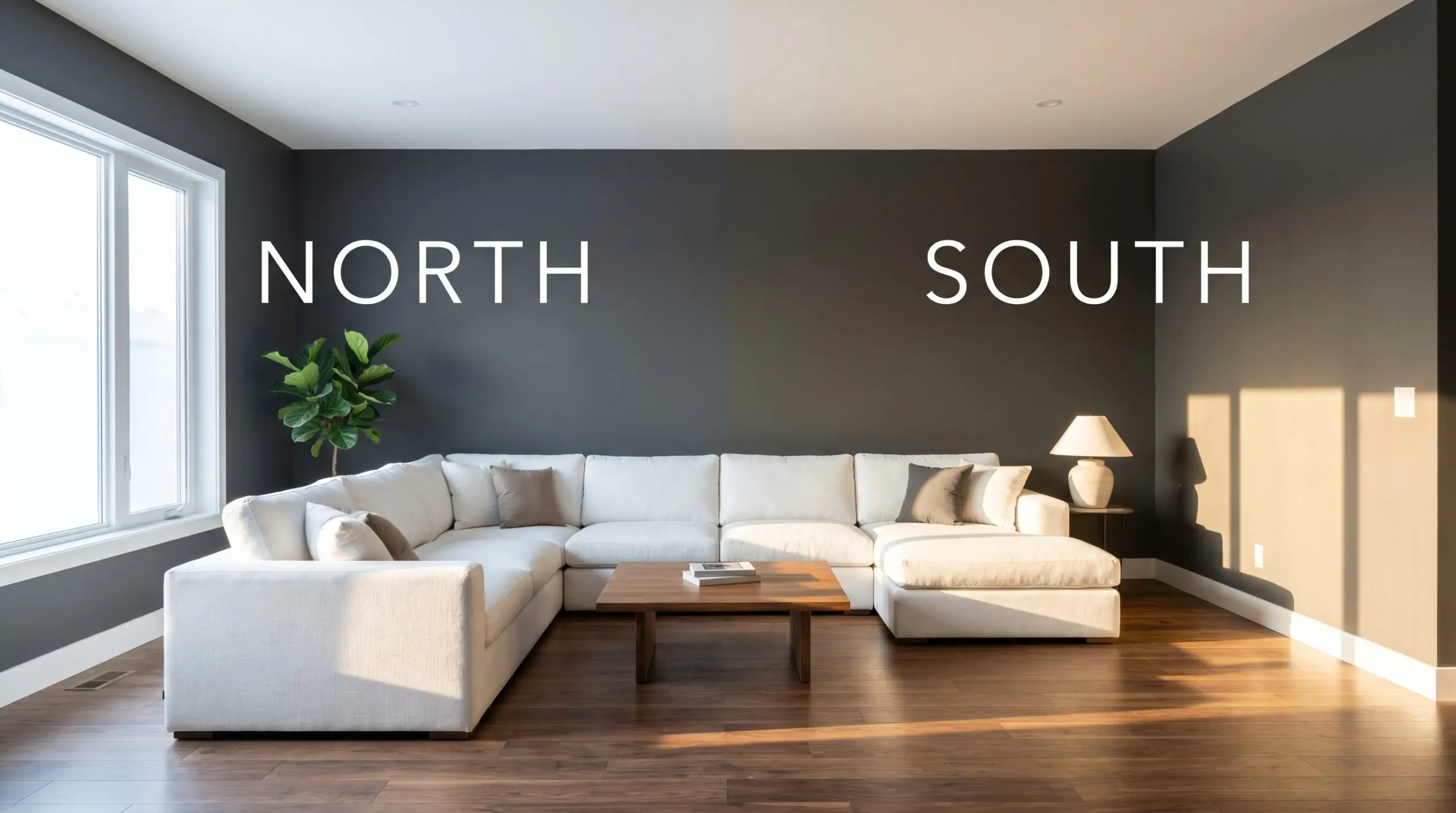
Always view your painted swatches at night under your everyday lamps. A color that looks perfectly crisp during the day can suddenly feel heavy and dull if your room relies on very warm, low-wattage ambient lighting.
Hackrea Pro-Tip (Lighting)
Popular Room Applications
This shade demands attention, but it also provides a deeply cohesive energy that wraps a space in quiet confidence. It thrives when used to create intentional boundaries or to envelop a room completely.
Kitchens
Using this deep charcoal on lower cabinetry or a central island immediately grounds the room. It provides a stunning backdrop for standard white subway tile, allowing you to elevate the entire kitchen by simply adding premium unlacquered brass hardware. The dark base hides everyday scuffs while making your countertops visually pop.
Bathrooms
Small, windowless spaces are the perfect canvas for dark, enveloping colors. Wrapping a half-bath entirely in this shade creates an intimate, shadowy atmosphere that feels incredibly high-end. Pair it with a simple pedestal sink and an oversized, ornate vintage mirror to bounce light around the room.
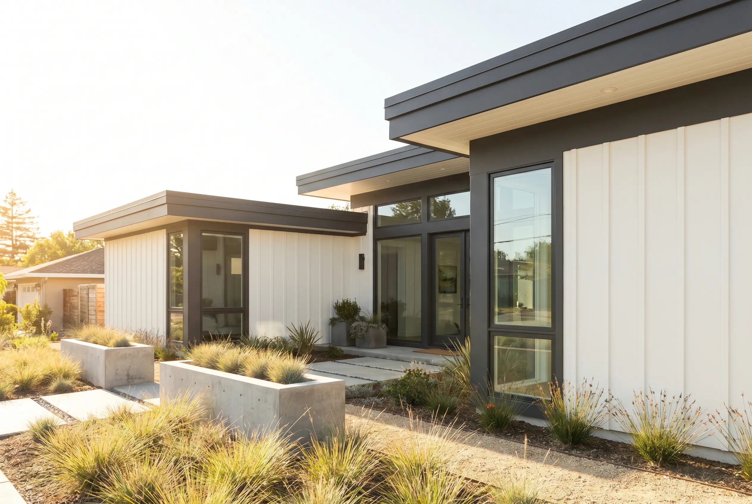
Exteriors
On the outside of a home, direct sunlight washes out dark colors significantly, making this shade look much softer than it does indoors. It is brilliant for defining exterior fascia or updating a tired front door. Just remember that dark exterior paints absorb heat, so ensure your surface material is rated for deep hues.
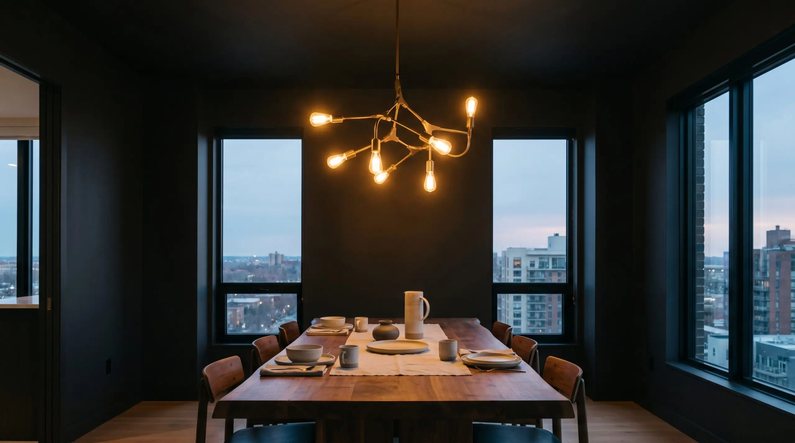
Entertainment Spaces
For home theaters or dining rooms, this paint is a brilliant tool for manipulating the room’s boundaries. Painting the walls and ceiling in a matte finish blurs the hard corners of the room, allowing the television or a striking dining chandelier to become the sole focal point. It sets a beautifully dramatic, cinematic mood.
Creative Ways to Use This Moody Charcoal
Stepping away from standard walls and trim opens up a world of highly curated design opportunities.
The Fluted Entryway Console
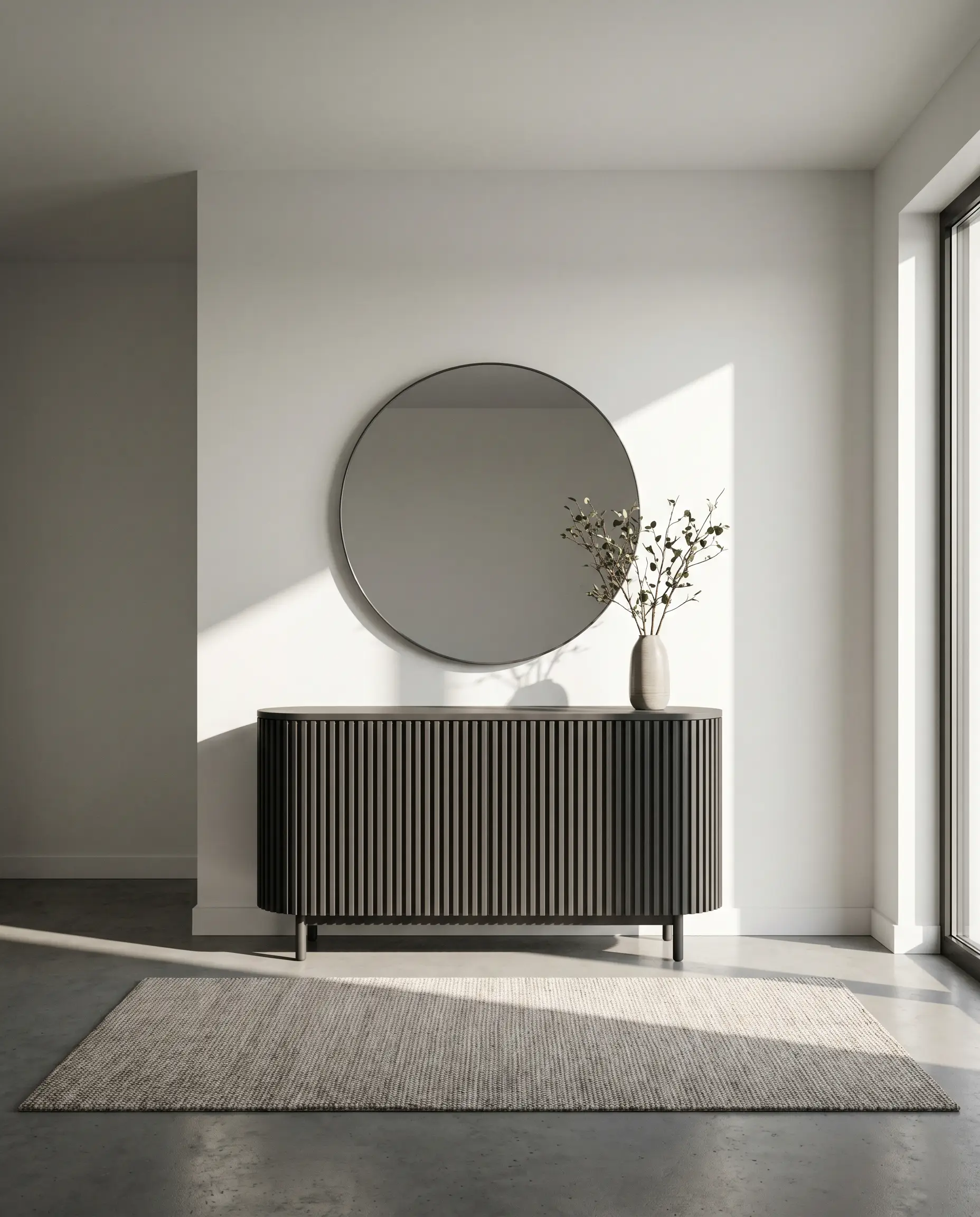
Transform a basic, thrifted entryway table by wrapping it in fluted wood trim and painting the entire piece in this rich charcoal. The deep color settles beautifully into the vertical grooves, creating intense, rhythmic shadows. This simple weekend project turns a standard piece of furniture into a premium, architectural focal point that anchors your foyer.
The Color-Blocked Transition
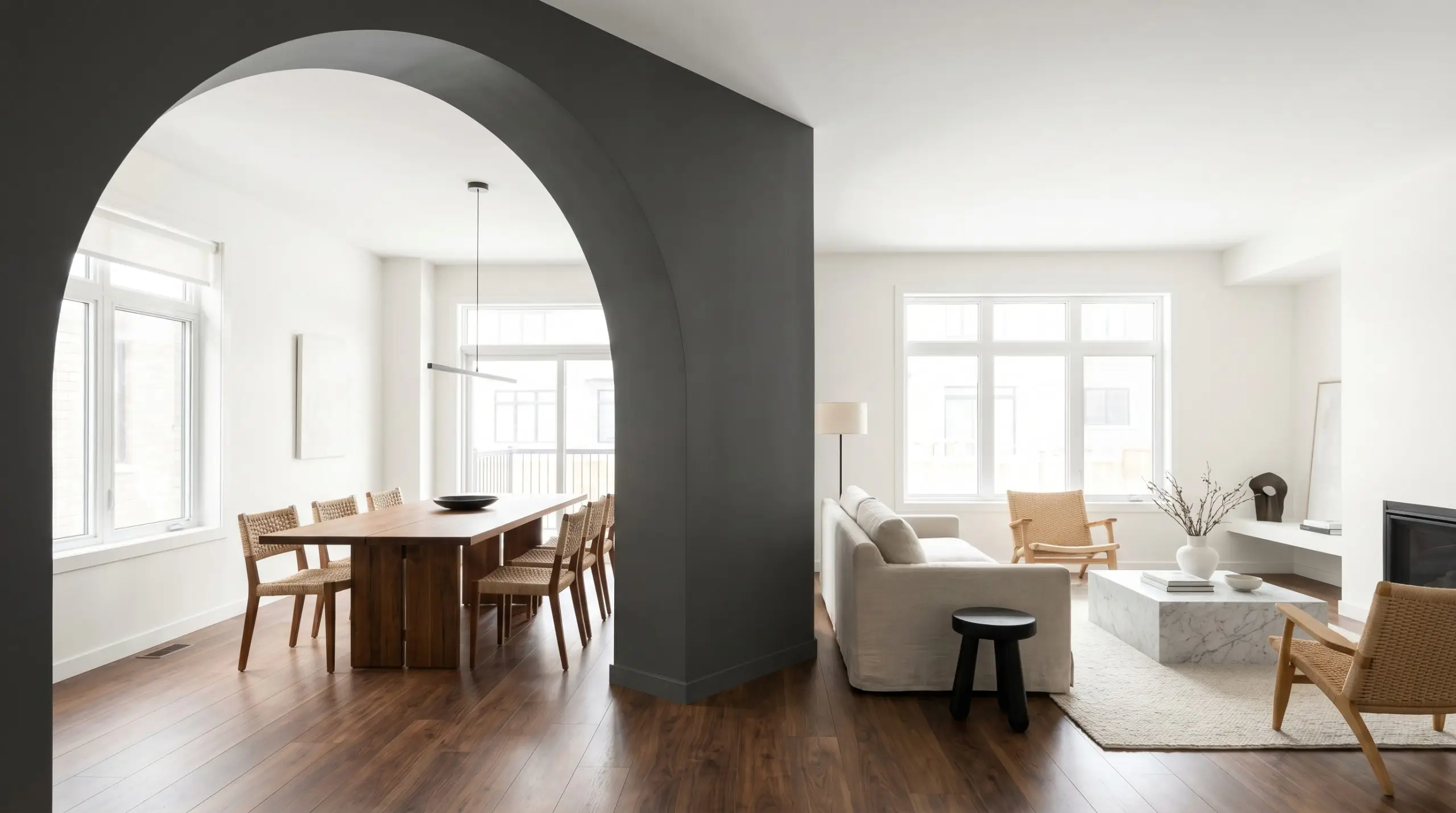
In open-concept layouts, transitional spaces often lack definition and purpose. Paint a bold, floor-to-ceiling archway using this soft black to physically separate a living room from a dining area. The dark boundary frames the adjacent room like a photograph, creating a highly intentional sense of flow without needing to build actual walls.
The Boutique Guest Retreat
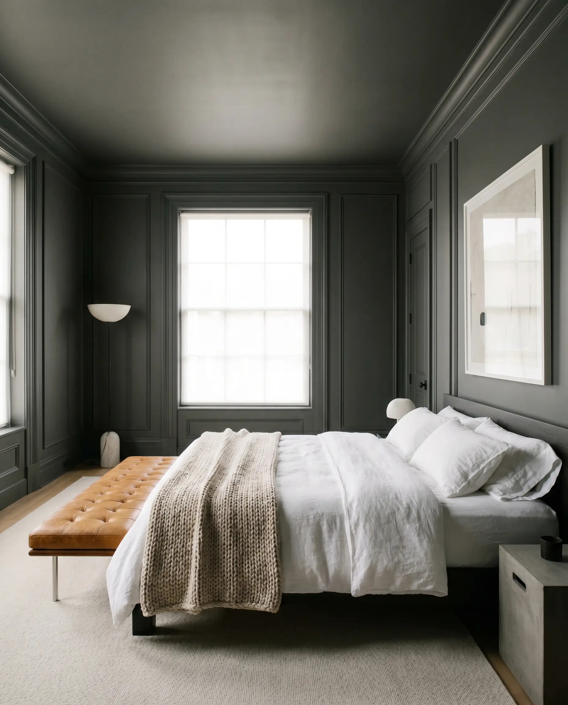
Give a standard spare bedroom the feel of a luxury hotel by installing simple picture-frame molding and painting the entire room—trim, doors, and all—in this deep hue. The monochromatic application makes the standard molding look expensive and custom-built. Layer in crisp white hotel bedding and a warm leather bench to complete the upscale, welcoming vibe.
Coordinating Colors & Best Pairings
This paint thrives on high-impact visual dialogue. It needs crisp, intentional boundaries to feel modern, or deeply saturated, tonal partners to feel enveloping and rich.
Trim & Baseboards
Hardware, Wood & Material Pairings
Coordinating Colors
Designer Mood Boards
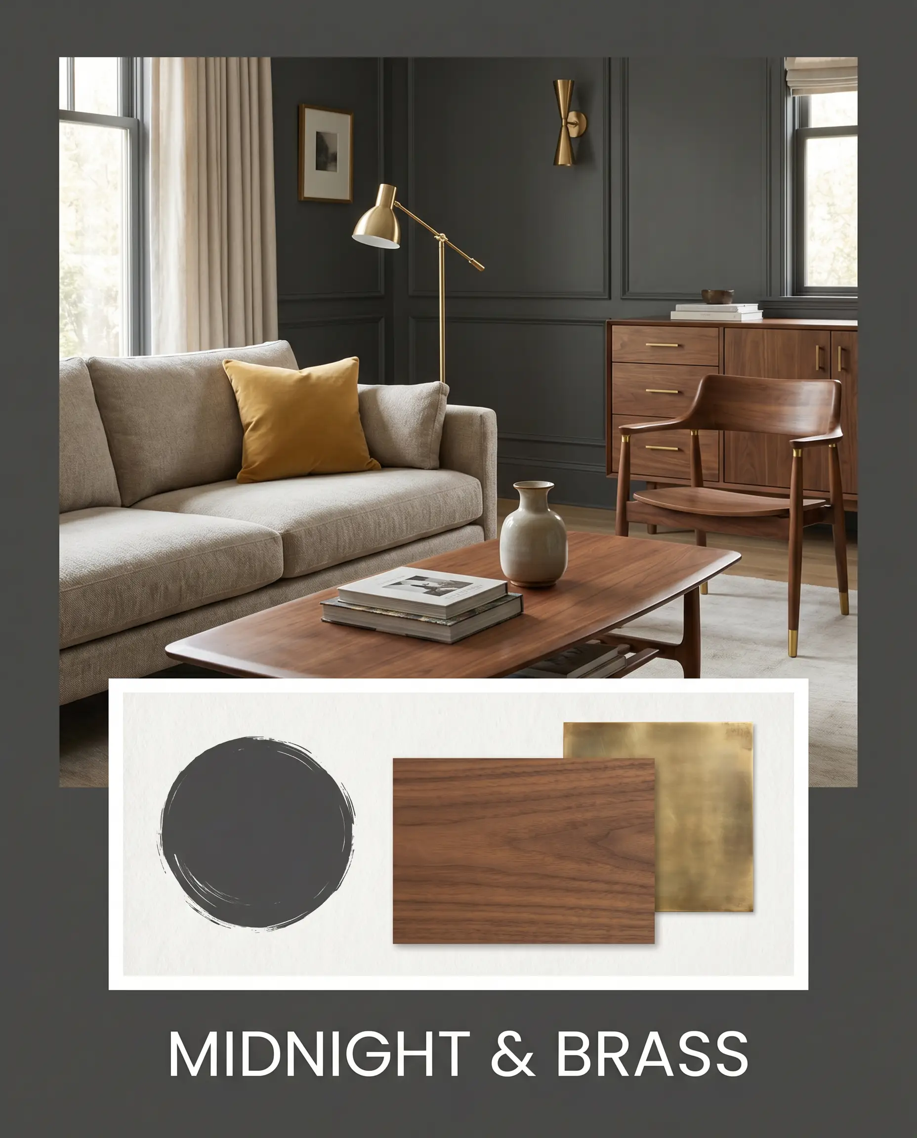
Midnight & Brass: This palette is defined by quiet luxury and striking metallic accents. The deep charcoal walls provide an endless backdrop for the gleaming unlacquered brass hardware and the rich, organic warmth of walnut furniture. A touch of Farrow & Ball India Yellow on a velvet accent pillow adds just enough vibrant energy to keep the mood from feeling too serious.
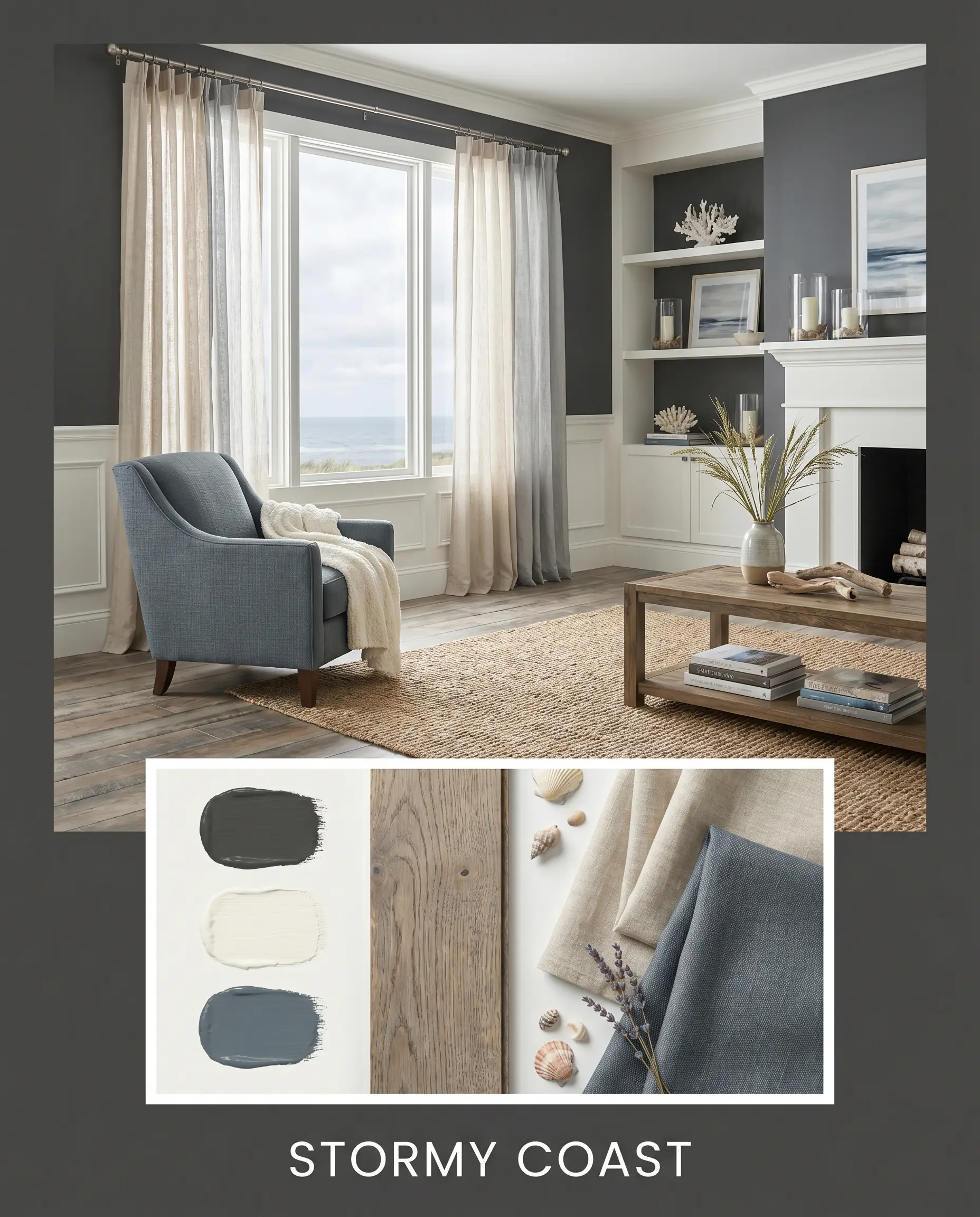
Stormy Coast: A beautifully layered, atmospheric approach that leans heavily into the paint’s hidden blue notes. By pairing the charcoal with Sherwin-Williams Smoky Blue and expansive stretches of Benjamin Moore White Dove, the room feels like an overcast day at the beach. Soft linen window treatments and weathered oak flooring complete this grounded, serene aesthetic.
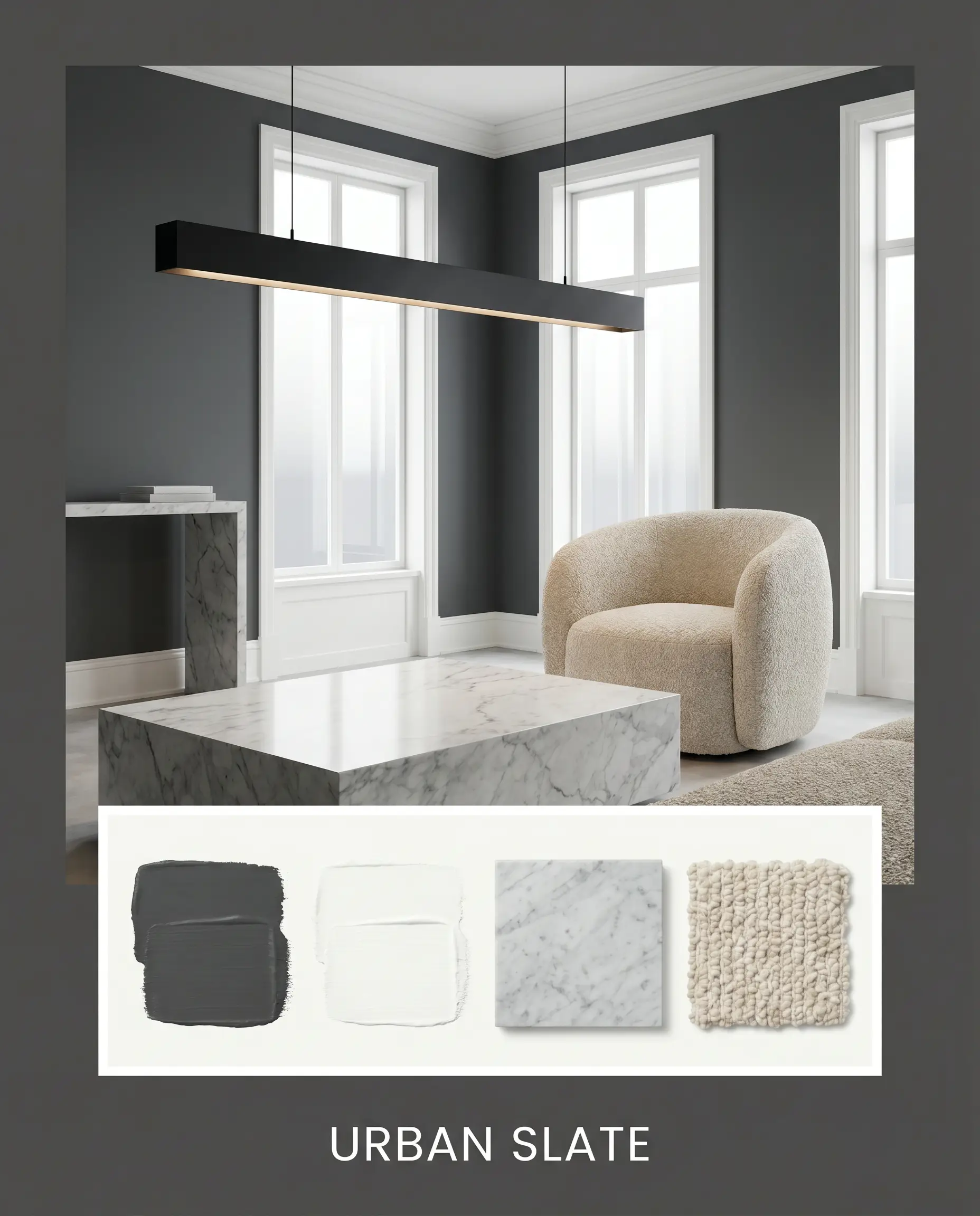
Urban Slate: Designed for sleek, high-contrast environments, this palette pairs the dark paint with ultra-crisp white trim and honed Carrara marble. The visual dialogue here is sharp, tailored, and highly intentional. Adding a matte black linear pendant light and a nubby bouclé accent chair softens the hard architectural edges just enough to make the space inviting.
Head-to-Head Comparisons
Sometimes, the subtle shifts in undertone and light reflectance dictate that a rival paint is the better choice for your specific architecture.
Benjamin Moore Wrought Iron vs. Benjamin Moore Cheating Heart 1617
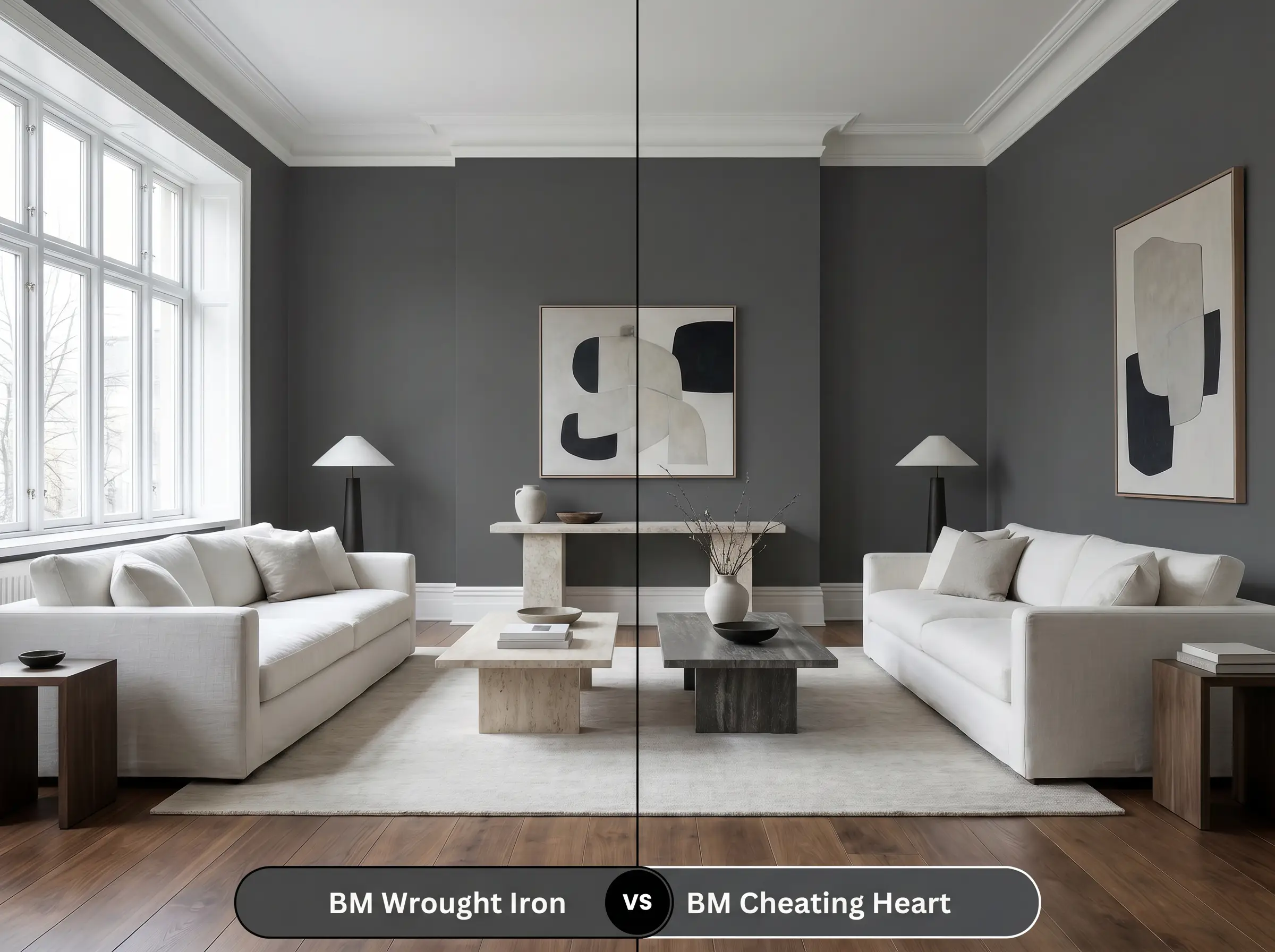
If your room gets flooded with cool northern light, Wrought Iron might pull too much blue for your liking. Cheating Heart 1617 is slightly warmer and lacks that distinct navy flash, making it a safer choice if you want a true, deep charcoal that won’t unexpectedly shift toward slate in the shadows.
Benjamin Moore Wrought Iron vs. Sherwin-Williams Iron Ore SW 7069
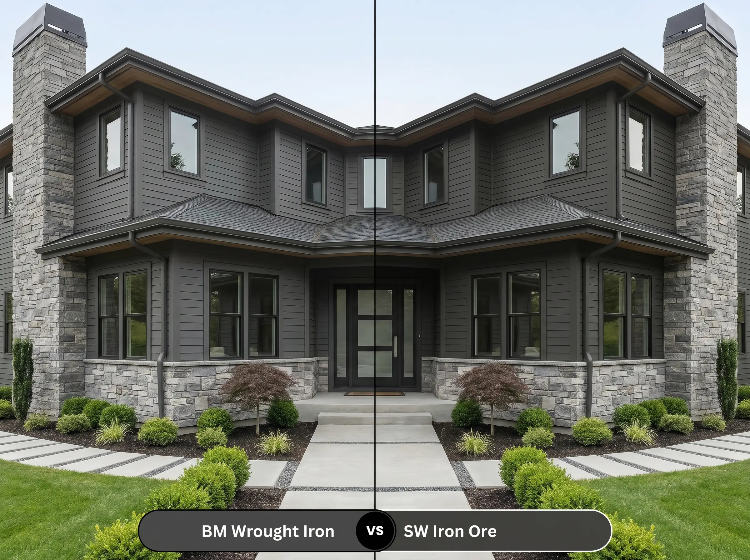
Iron Ore SW 7069 is slightly lighter and leans a bit greener in its undertone base compared to Wrought Iron’s blue. If you are pairing the paint with earthy, olive-toned textiles or warm, natural stone exteriors, Iron Ore will harmonize better with the organic greens, whereas Wrought Iron provides a crisper, more modern edge.
Benjamin Moore Wrought Iron vs. Benjamin Moore Kendall Charcoal HC-166
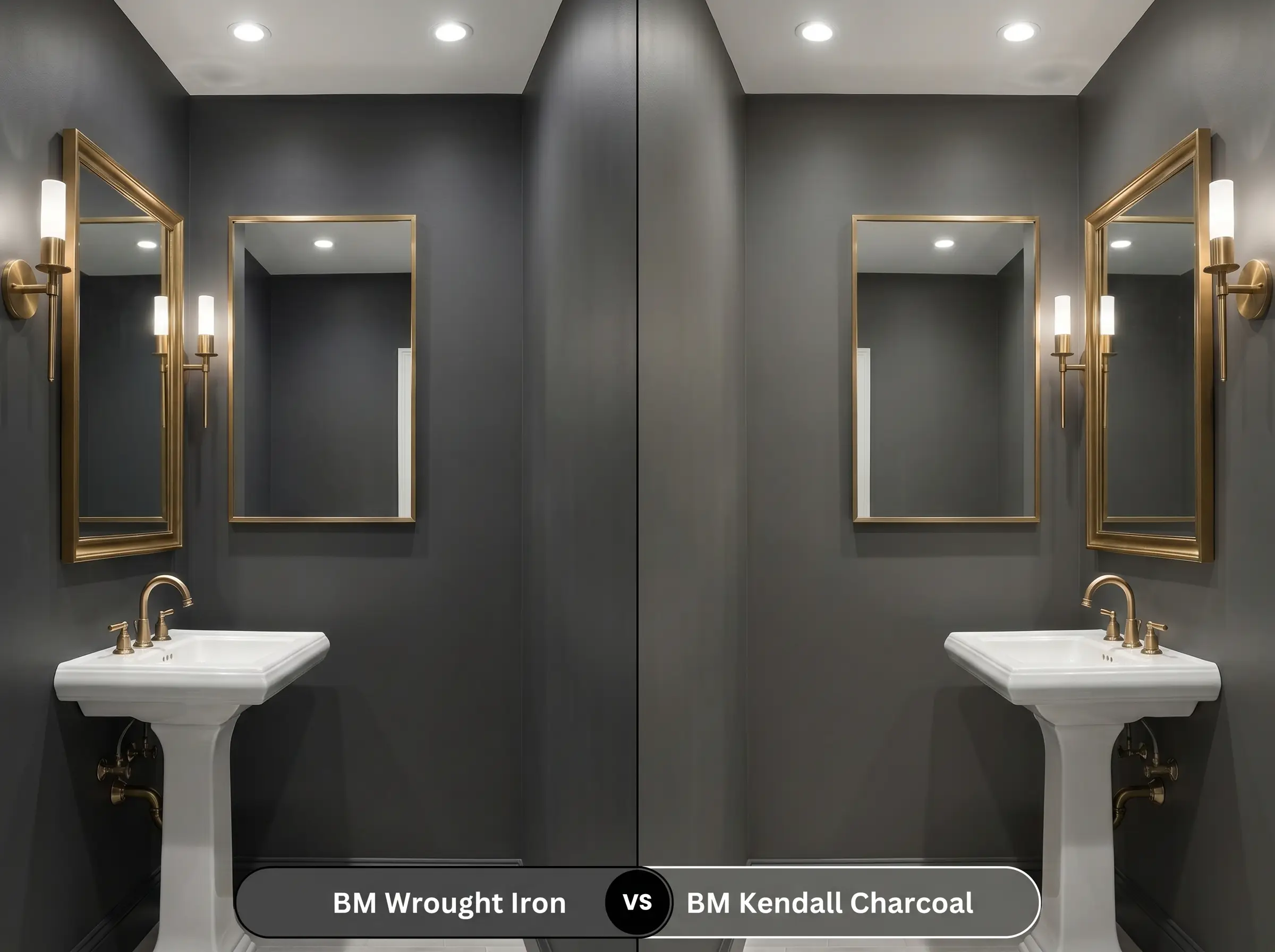
Kendall Charcoal HC-166 is significantly lighter and much warmer, sitting firmly in the mid-tone gray category. If Wrought Iron feels too heavy or intimidating for a fully enclosed, windowless room, Kendall Charcoal provides a similar moody elegance but bounces considerably more light around the space.
Similar Colors & Brand Equivalents
If you need a slight adjustment in depth, or if you are shopping at a different retailer, these alternatives offer a similar atmospheric vibe.
Same-Brand Alternatives
Cross-Brand Matches
Practical Application & DIY Advice
Executing a dark paint color requires strategy; the physical application is just as important as the color theory behind it.
The Dynamic Sheen Guide
Primer Strategy
You cannot skip primer when applying a color this deep, especially if you are painting over a light wall. You must use a high-quality primer tinted to a deep gray. A tinted primer reduces the number of expensive topcoats required and ensures the final charcoal color achieves its true, saturated depth.
Coverage & Success Tips
Even with a tinted primer, expect to apply at least two full coats of this shade for a truly professional, opaque finish. Dark paints with a matte finish are notoriously prone to “flashing”—visible, uneven roller marks that catch the light. To avoid this, maintain a wet edge while rolling, work in small sections, and avoid the temptation to touch up partially dried spots.
Never try to stretch your paint by rolling it on too thin. Dark colors highlight poor technique, and a thin, streaky application will completely ruin the premium, enveloping aesthetic you are trying to achieve.
Clash Warning (Application)
Frequently Asked Questions
Because textured stucco creates deep, physical shadows that trap light, the blue undertones are often minimized outdoors. The direct exterior sunlight washes the color out slightly, making it read as a beautifully soft, dusty charcoal rather than a stark navy.
It provides a much softer, more forgiving aesthetic than a harsh black lacquer. The slight blue undertone and higher LRV allow the cabinetry to feel grounded and sophisticated without turning your kitchen into a heavy, light-absorbing void.
Absolutely. Painting a ceiling in this deep shade creates an illusion of the ceiling receding into the shadows, which actually blurs the hard architectural boundaries. It makes a cavernous room feel incredibly intimate and intentionally cozy.
Under standard 3000K LEDs, the color will hold its charcoal identity nicely, balancing between warm and cool. However, because it absorbs so much light, the hallway will feel quite dark, so you must rely on bright, crisp white trim or reflective mirrors to keep the space from feeling claustrophobic.
Final Verdict & Expert Warnings
Benjamin Moore Wrought Iron is a brilliant, highly adaptable foundation for anyone looking to bring sophisticated, high-contrast energy into their home. It is perfect for the design enthusiast who wants the grounding power of black but demands the nuance and depth of a tailored charcoal. Whether you are anchoring a bright, transitional living room or wrapping a powder room in dramatic shadows, this shade delivers an undeniably premium aesthetic.
However, this deeply saturated color is not for every environment. You must be incredibly careful when pairing this cool-leaning charcoal with heavy, yellow-toned finishes, such as dated Tuscan travertine, golden oak cabinetry, or orange-leaning cherry floors. The hidden navy undertones in the paint will violently reject those warm, muddy yellows, making the paint look bruised and the wood look remarkably dated. If your home is filled with these specific earthy, warm-toned fixed elements, you are much better off choosing a warmer, brown-based black to maintain visual harmony.
Closest Cross-Brand Equivalents
The absolute closest scientific color matches for Wrought Iron across top paint brands.