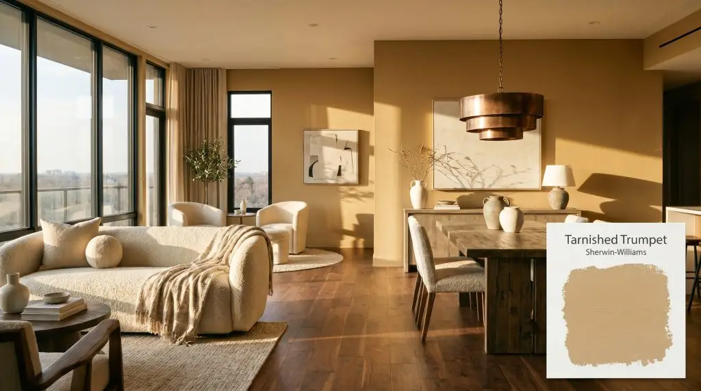
Tarnished Trumpet SW 9026
Sherwin-WilliamsSherwin-Williams Tarnished Trumpet (SW 9026) is a warm, muted golden-yellow with distinct bronze and earthy undertones. Boasting an LRV of 47, this rich metallic-inspired hue absorbs light beautifully, creating a sophisticated, enveloping atmosphere perfect for dining rooms and dramatic accents.
Paint Technical Profile
| Color ID / SKU | SW 9026 |
| HEX Code | #D5B176 |
| Light Reflectance (LRV) | 47 |
| Use | Interior, Exterior |
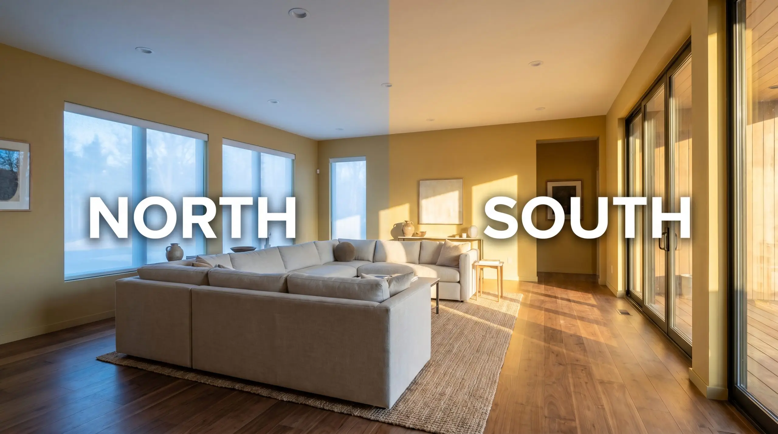
| Best Exposures | South, West |
| Best For | Dining Rooms, Libraries, Cabinetry, Accent Walls |
Sherwin-Williams Tarnished Trumpet: An Earthy Anchor for Layered Interiors
There is a distinct magic in finding a mid-tone color that feels historically rich yet effortlessly adaptable to modern living. Sherwin-Williams Tarnished Trumpet (SW 9026) captures exactly this balance, anchoring rooms with a grounded, lived-in warmth.
By blending the sophisticated depth of a muted gold with earthy, hidden nuances, this shade acts as the perfect canvas for mixing high-end vintage textiles with everyday modern seating. It is a chameleon that elevates standard architectural features, instantly making a basic room feel intentionally curated and wonderfully inviting.
Undertones & LRV of Tarnished Trumpet
When analyzing its core color temperature, SW 9026 is unmistakably warm. It leans heavily into a golden-bronze hue, providing a rich, enveloping energy without tipping into aggressive primary yellow.
Sitting at a light reflectance value of 47, this shade commands genuine visual weight. It absorbs slightly more light than it bounces back, meaning it grounds a space beautifully but relies on thoughtful styling to avoid feeling dense.
Lighting Effects & The Chameleon Factor
Because of its heavy green-yellow base, placing this paint in a dimly lit, north-facing room with dark floors can quickly turn the walls a murky, uninviting olive-brown. To prevent this muted gold from turning muddy, you must understand how it reacts to environmental shifts. The way natural and artificial light hits the surface completely rewrites its perceived color saturation.
Elevating Everyday Spaces with SW 9026
This earthy golden-bronze hue brings a deeply comforting, enveloping energy to any layout. It demands intentionality, thriving in spaces where its rich depth can interact with tactile materials and layered lighting.
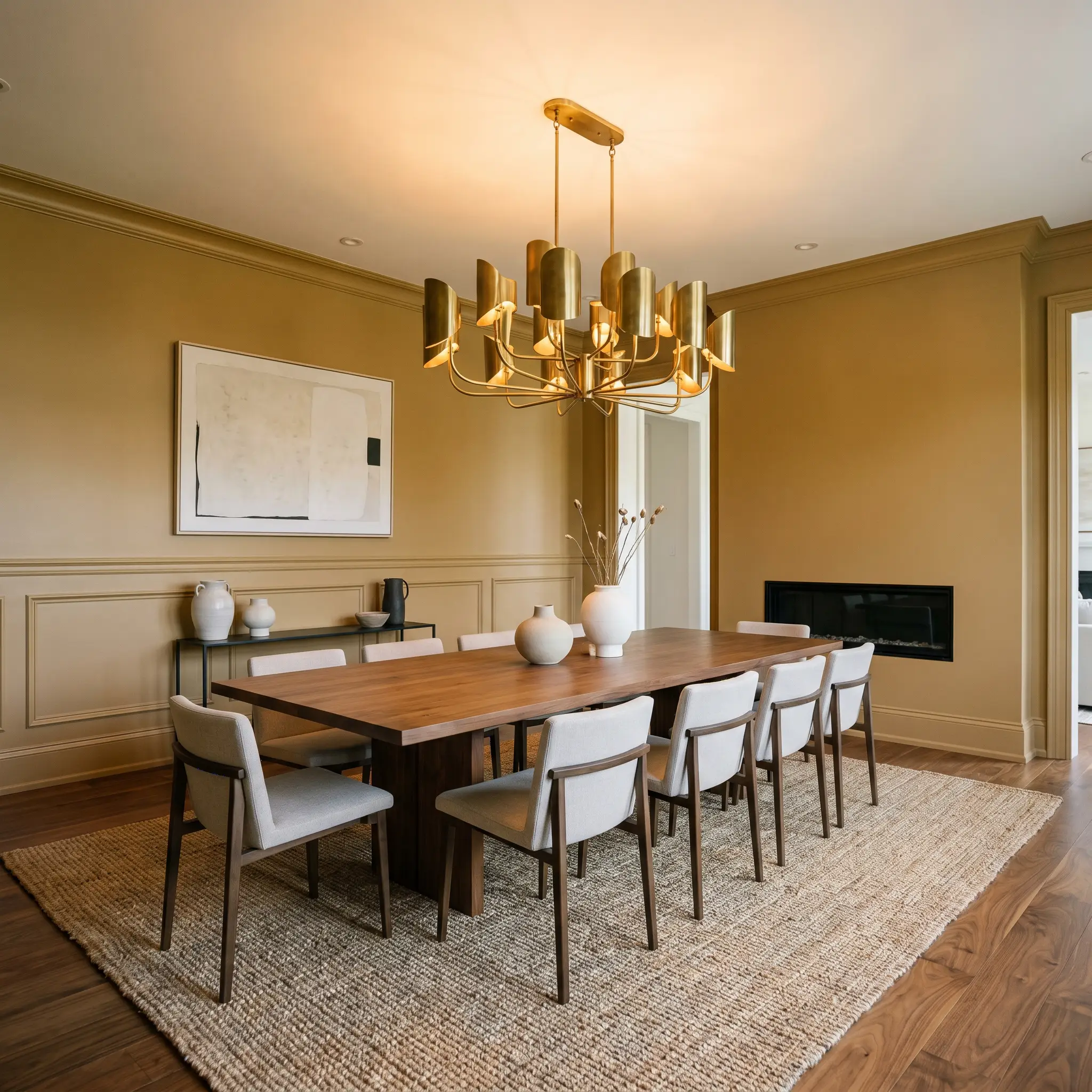
Formal Dining Rooms
This rich shade excels here by creating a sophisticated, intimate atmosphere that encourages lingering conversations, making it one of the best mid-tone colors for formal dining rooms. Pair it with an oversized jute rug to soften the formality, while letting a statement chandelier bounce warm light off the walls. It bridges the gap between traditional wainscoting and sleek, contemporary dining chairs with absolute ease.
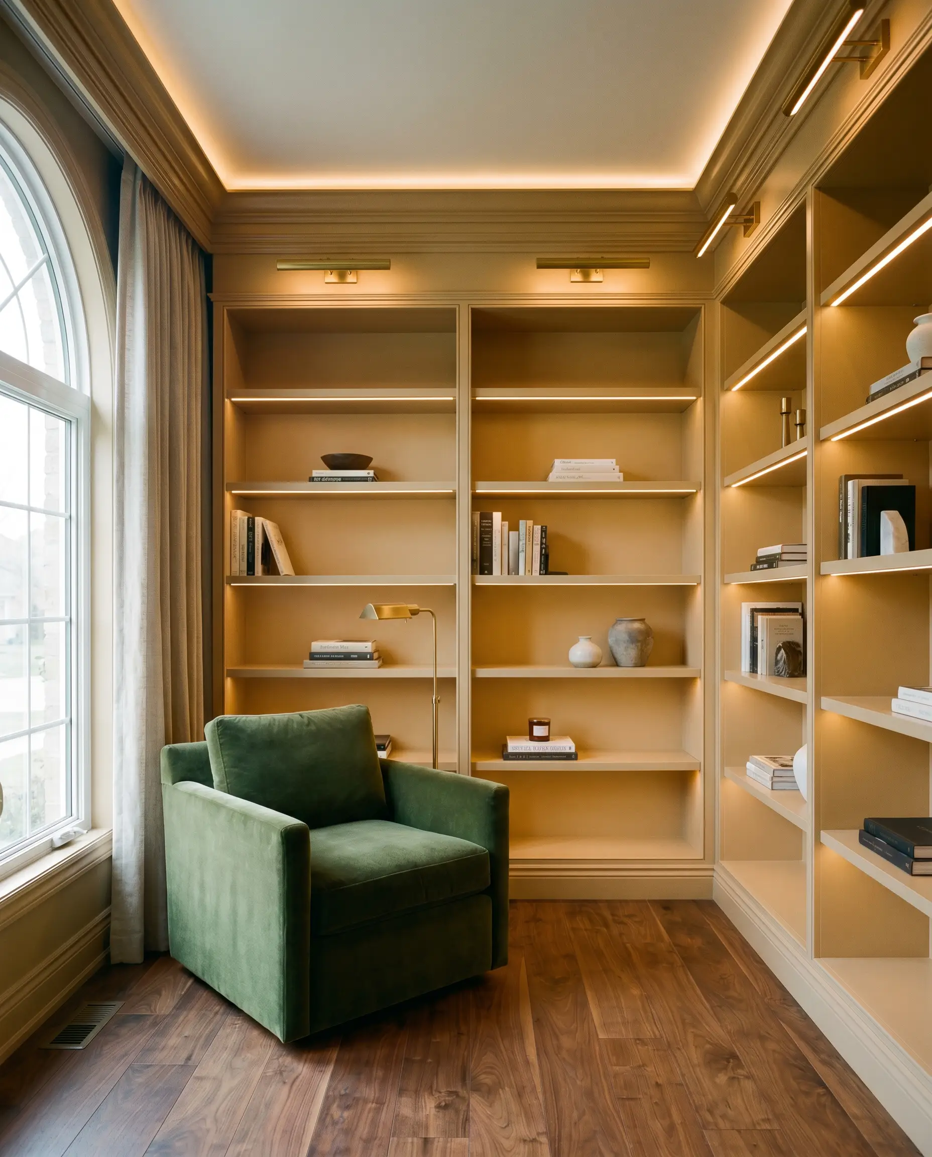
Home Libraries & Studies
Wrap the room in this shade to foster a focused, quiet energy. The earthy undertones beautifully complement standard built-in shelving, especially when styled with varied book spines and budget-friendly ceramic accents. Introduce a plush, velvet reading chair to contrast the structured architectural accents of the room.
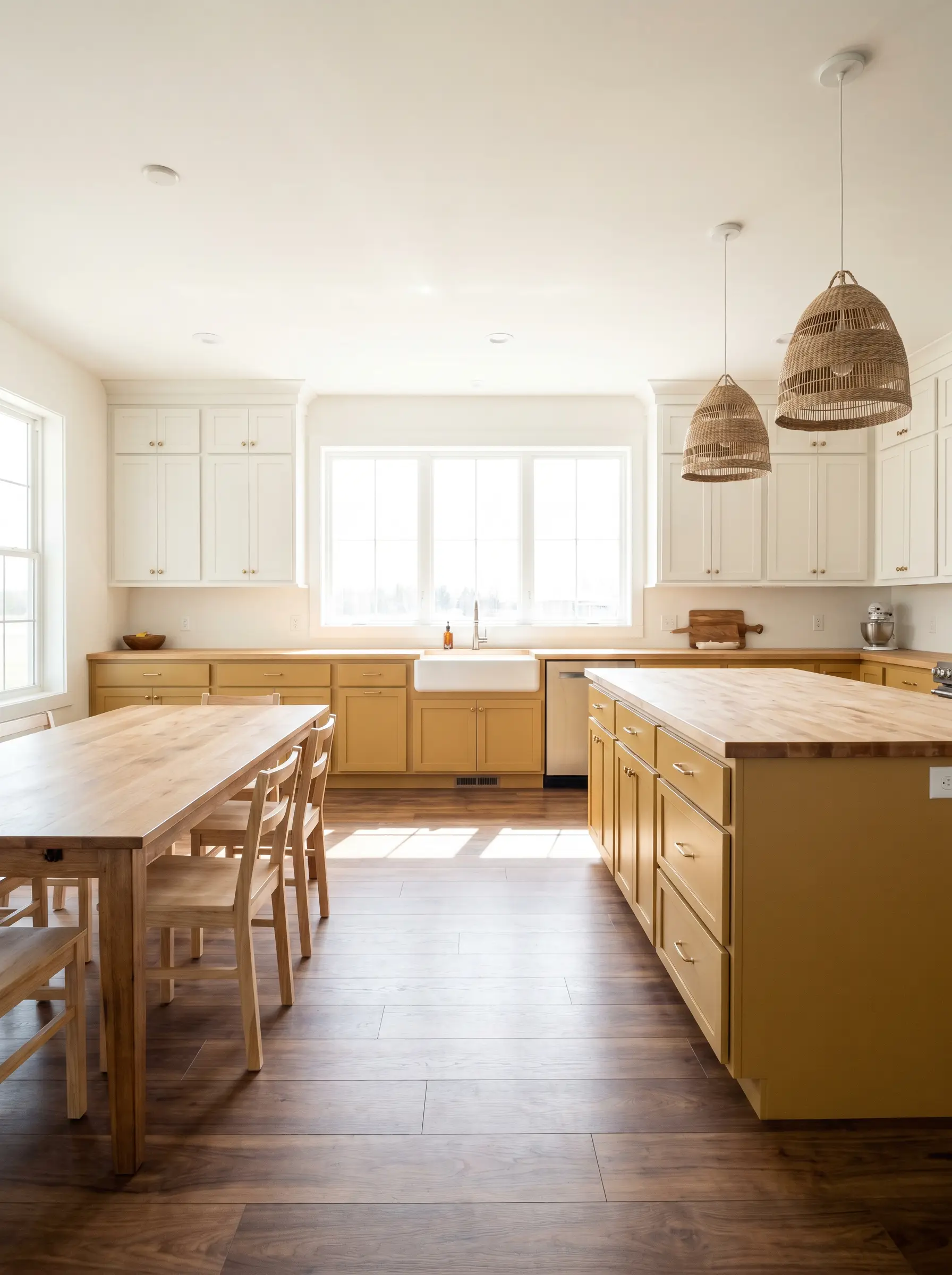
Kitchen Cabinetry
Using this color on lower cabinets or an island injects incredible warmth into an otherwise sterile, utilitarian space. It grounds crisp white upper cabinets and partners effortlessly with everyday butcher block counters. To elevate the look, swap standard knobs for burnished antique brass pulls that echo the paint’s hidden metallic nuances.
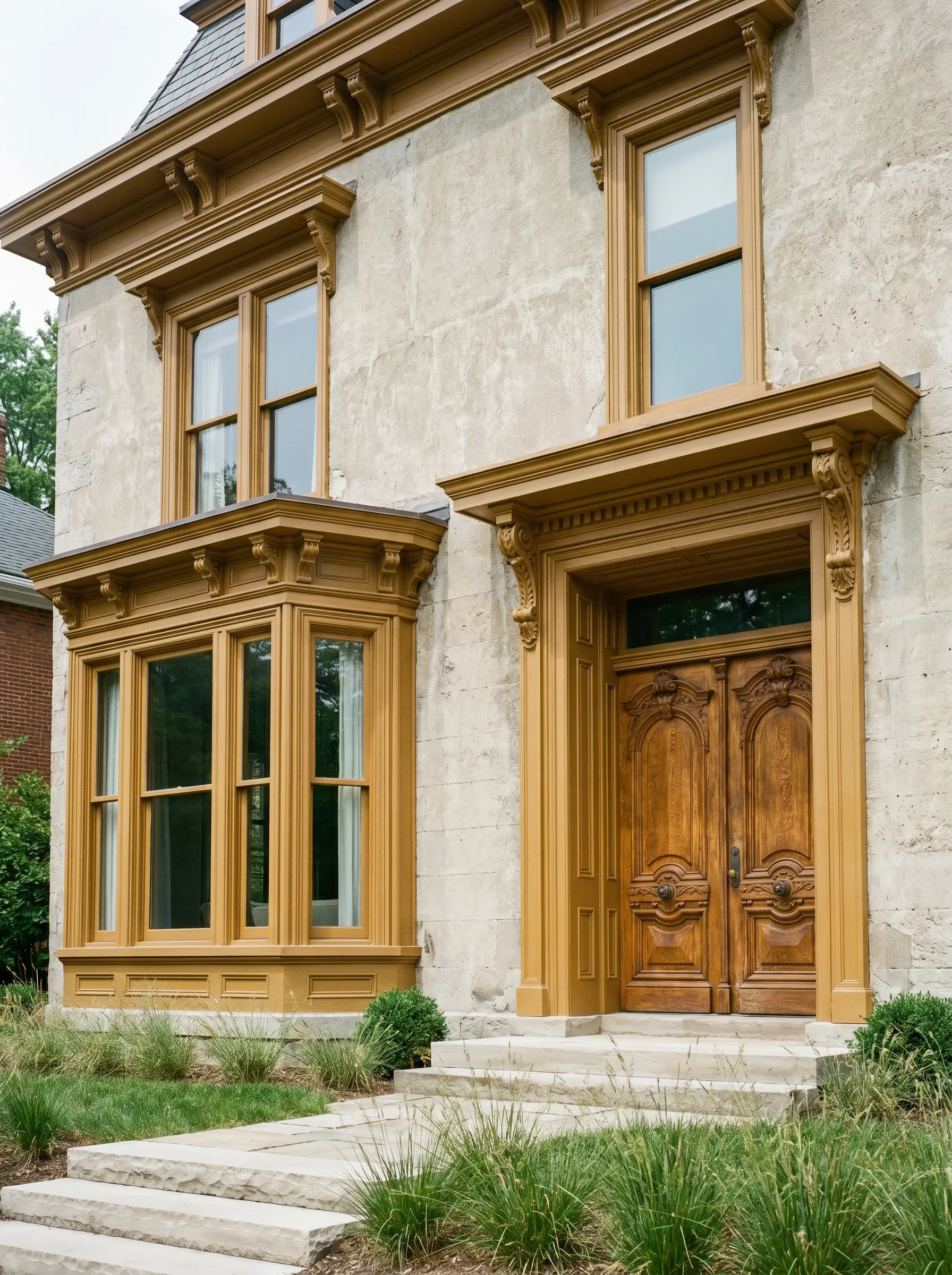
Historic Home Exteriors
On classic facades, this paint acts as a brilliant, historically resonant accent. It highlights intricate trim or front doors without feeling overwhelmingly bright under direct sunlight. If you are exploring understanding paint undertones in historic architecture, you will find this shade honors traditional craftsmanship while feeling entirely updated.
Unique Design Ideas & Creative Applications
Beyond standard walls, this versatile shade is a powerful tool for highly specific, transformative projects. Let its rich, tarnished quality guide your creativity.
The Color-Drenched Mudroom
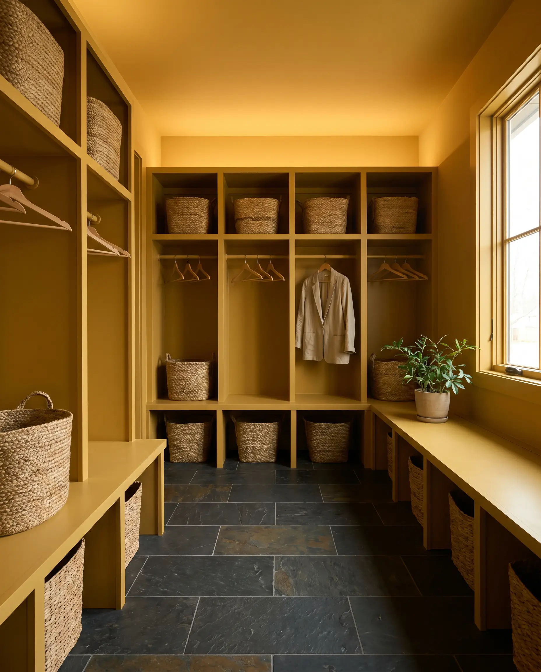
Transform a standard, high-traffic entryway by painting the walls, ceiling, and built-in cubbies entirely in Sherwin-Williams Tarnished Trumpet. This seamless application creates a jewel-box effect that immediately warms you upon entering the house. Pair it with durable slate floor tiles and woven baskets to emphasize its earthy, grounded nature.
Upcycled Mid-Century Credenzas
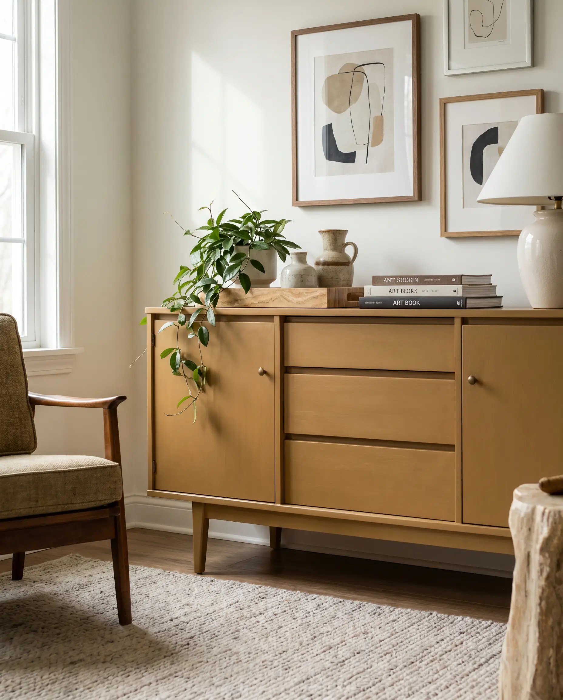
Breathe new life into a thrifted wooden sideboard by applying this muted gold in a smooth, satin finish. The color feels deeply authentic to 1960s design palettes, instantly elevating a budget furniture find into a bespoke focal point. Style the top with a simple marble tray and trailing greenery to balance the warmth.
A Moody Speakeasy Nook
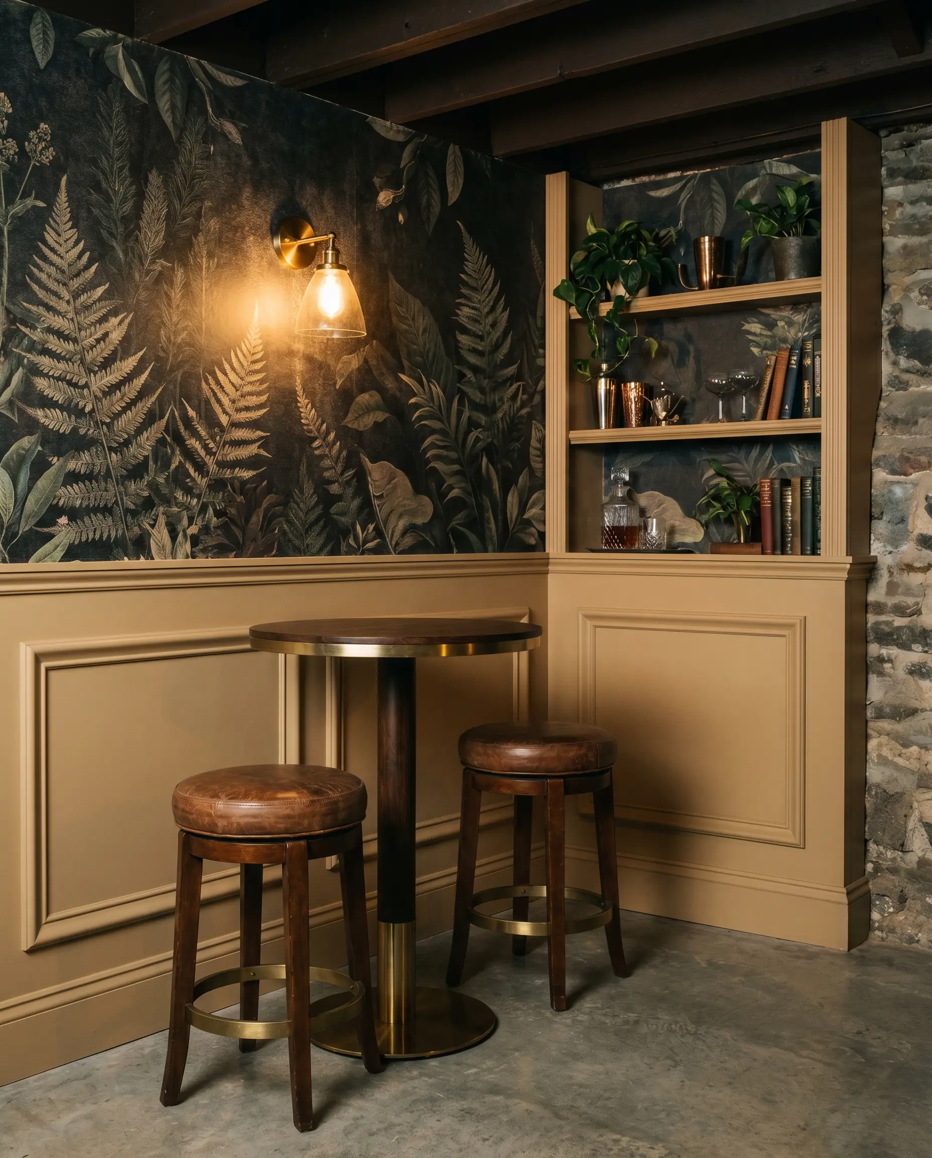
Carve out an underutilized basement corner or alcove by layering this deep shade alongside dark, textured wallpaper. The ambient lighting from a single, low-wattage wall sconce will pull out the rich brass undertones, creating an intimate, lounge-like atmosphere. Add a small bistro table and a pair of leather stools to complete the high-end hospitality vibe.
Coordinating Colors & Best Pairings for Tarnished Trumpet
To master decorating with warm gold and brass tones, you must surround this paint with elements that either crisply contrast its depth or softly enhance its earthy glow.
Trim & Baseboards
Hardware, Wood & Material Pairings
Coordinating Colors
Designer Mood Boards
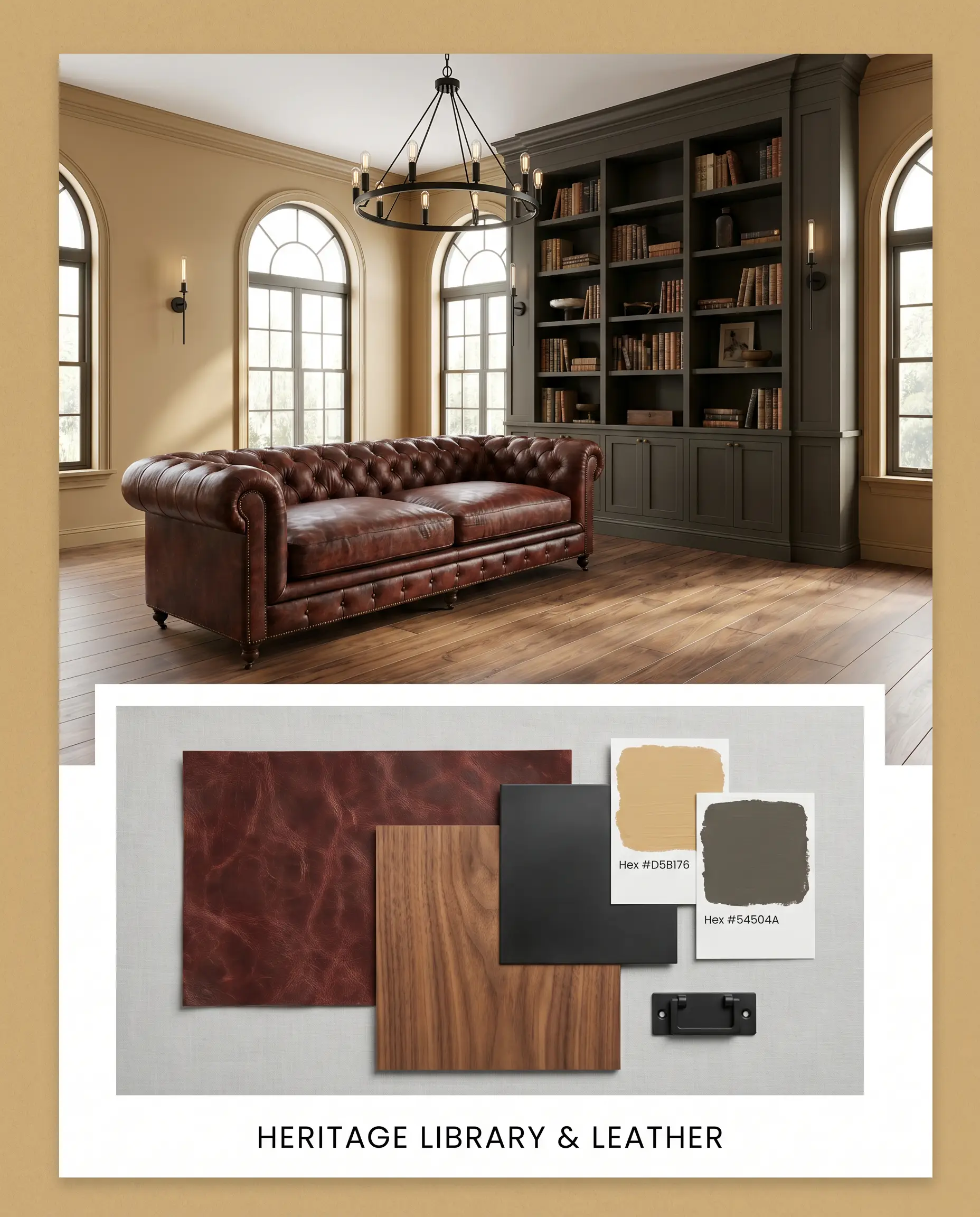
Heritage Library & Leather: Blending the deep, grounding presence of SW Urbane Bronze with warm walnut veneer, this palette feels incredibly collected. Add a distressed oxblood leather sofa and matte black iron lighting to balance the rich, golden-bronze hue of the walls.
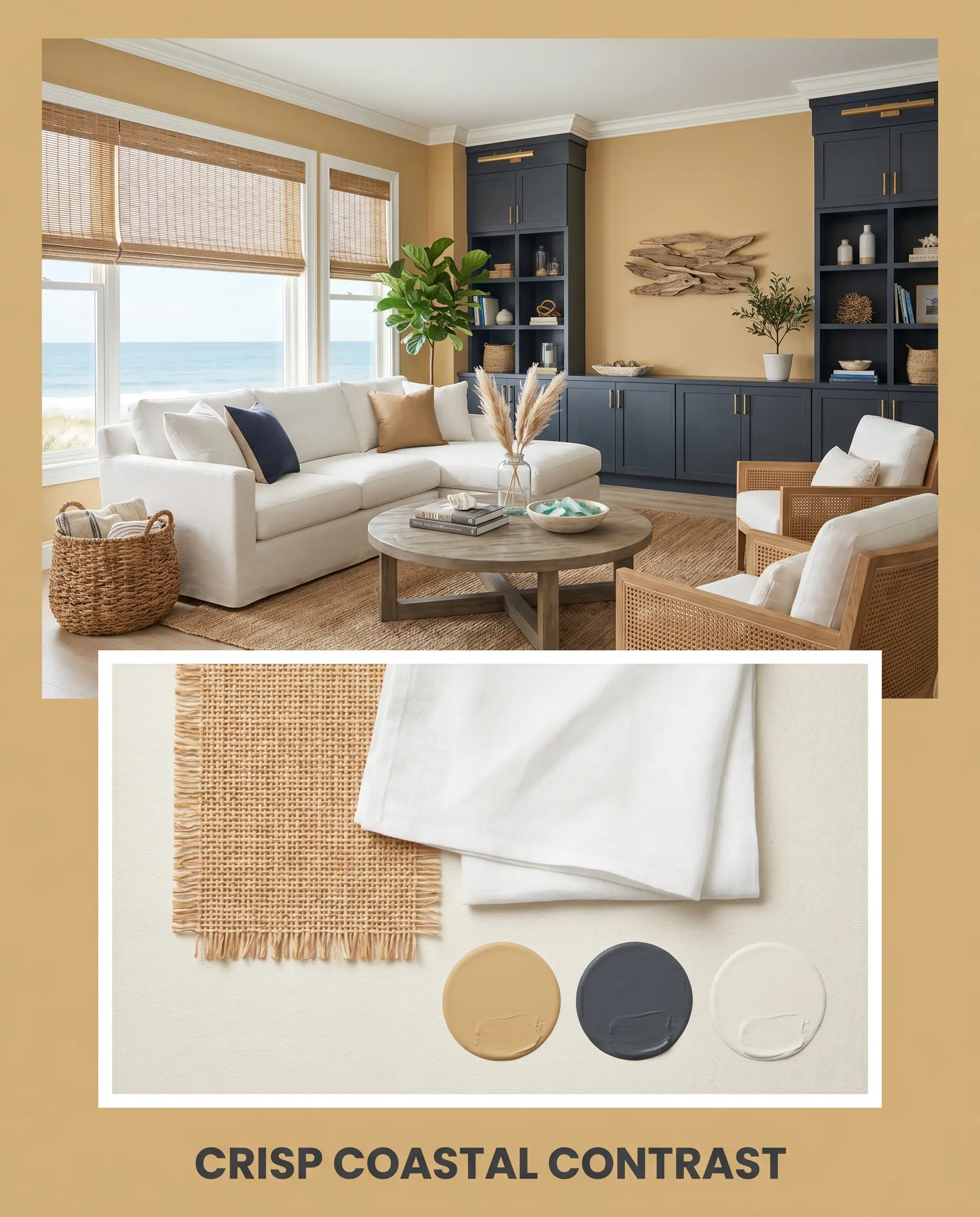
Crisp Coastal Contrast: This bright, tailored look relies on the sharp interplay between Benjamin Moore Hale Navy and soft White Dove trim. Introduce woven rattan shades and crisp linen upholstery to keep the earthy golden tones feeling fresh and lifted.
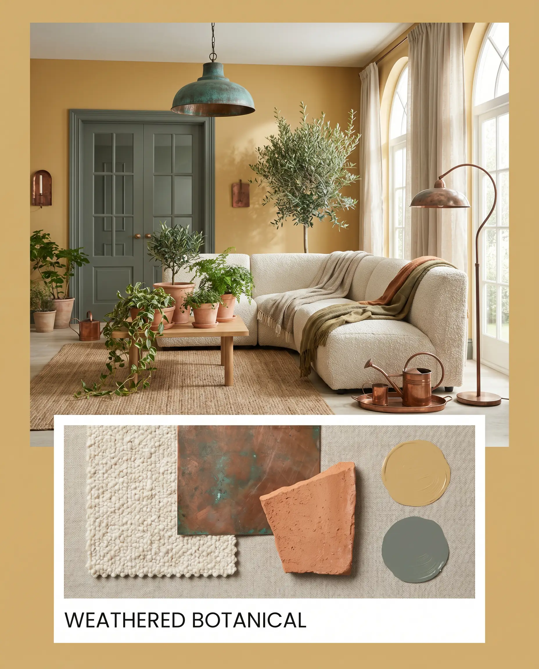
Weathered Botanical: A deeply organic, tonal arrangement featuring the muted elegance of Farrow & Ball Green Smoke. Pair these earthy walls with nubby bouclé textiles, aged copper accents, and raw terracotta planters to create a relaxed, nature-inspired retreat.
Head-to-Head Comparisons
Deciding on the perfect earthy gold often comes down to the specific lighting exposure of your room. If your space lacks natural light or has conflicting fixed finishes, a subtle pivot to a rival shade might save your design.
Sherwin-Williams Tarnished Trumpet vs. Sherwin-Williams Camelback SW 6122
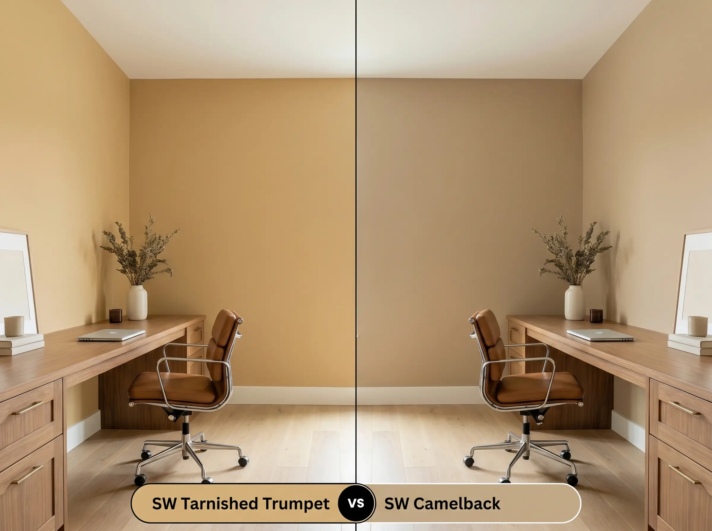
Camelback is significantly more muted and leans heavily into a tan-brown base, making it a safer, quieter neutral. If you want a pronounced, golden-bronze statement, stick with Tarnished Trumpet; if you need a subtle, earthy backdrop that easily recedes, Camelback is the better choice.
Sherwin-Williams Tarnished Trumpet vs. Sherwin-Williams Rookwood Antique Gold SW 2814
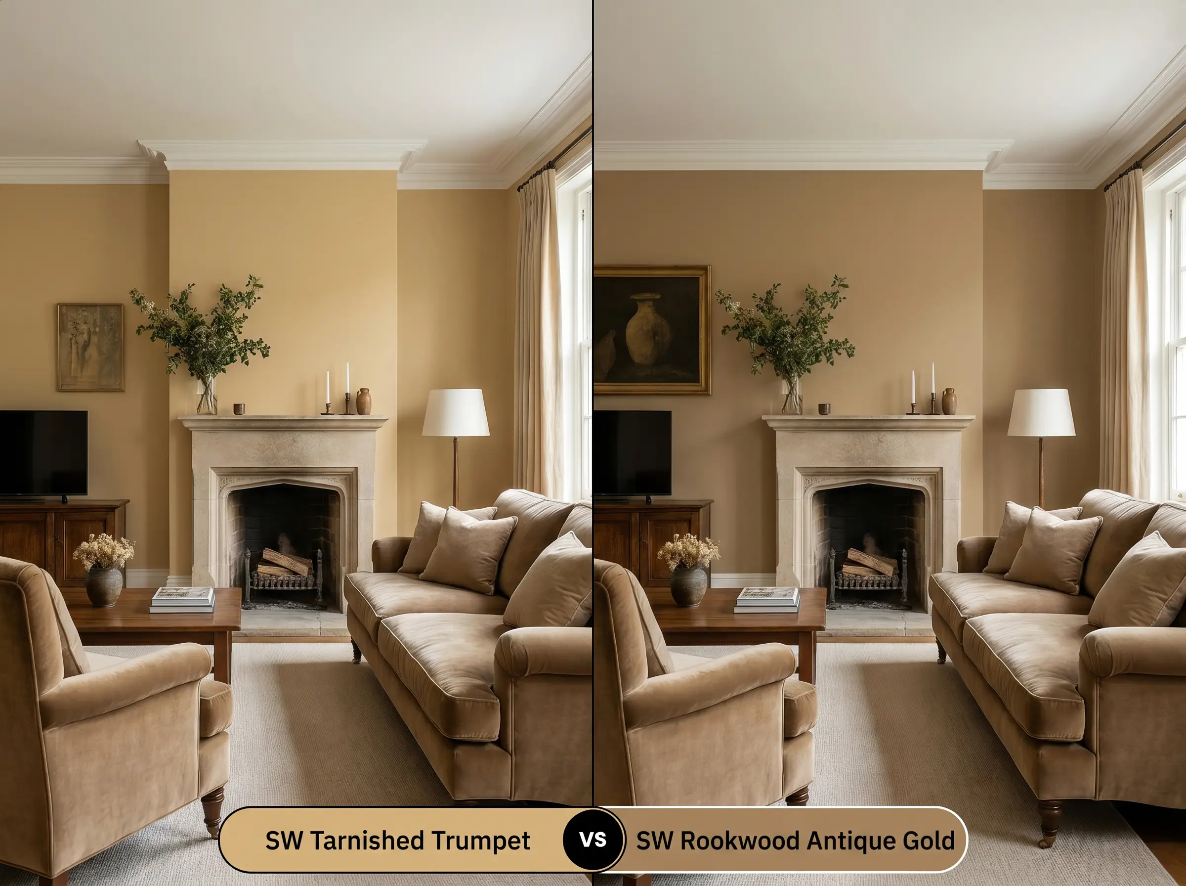
Rookwood Antique Gold carries a noticeably greener, more historic olive presence. If your room receives intense, warm southern light that might make SW 9026 feel too yellow, Rookwood’s heavier green base will counteract that sun beautifully.
Sherwin-Williams Tarnished Trumpet vs. Benjamin Moore Bryant Gold HC-7
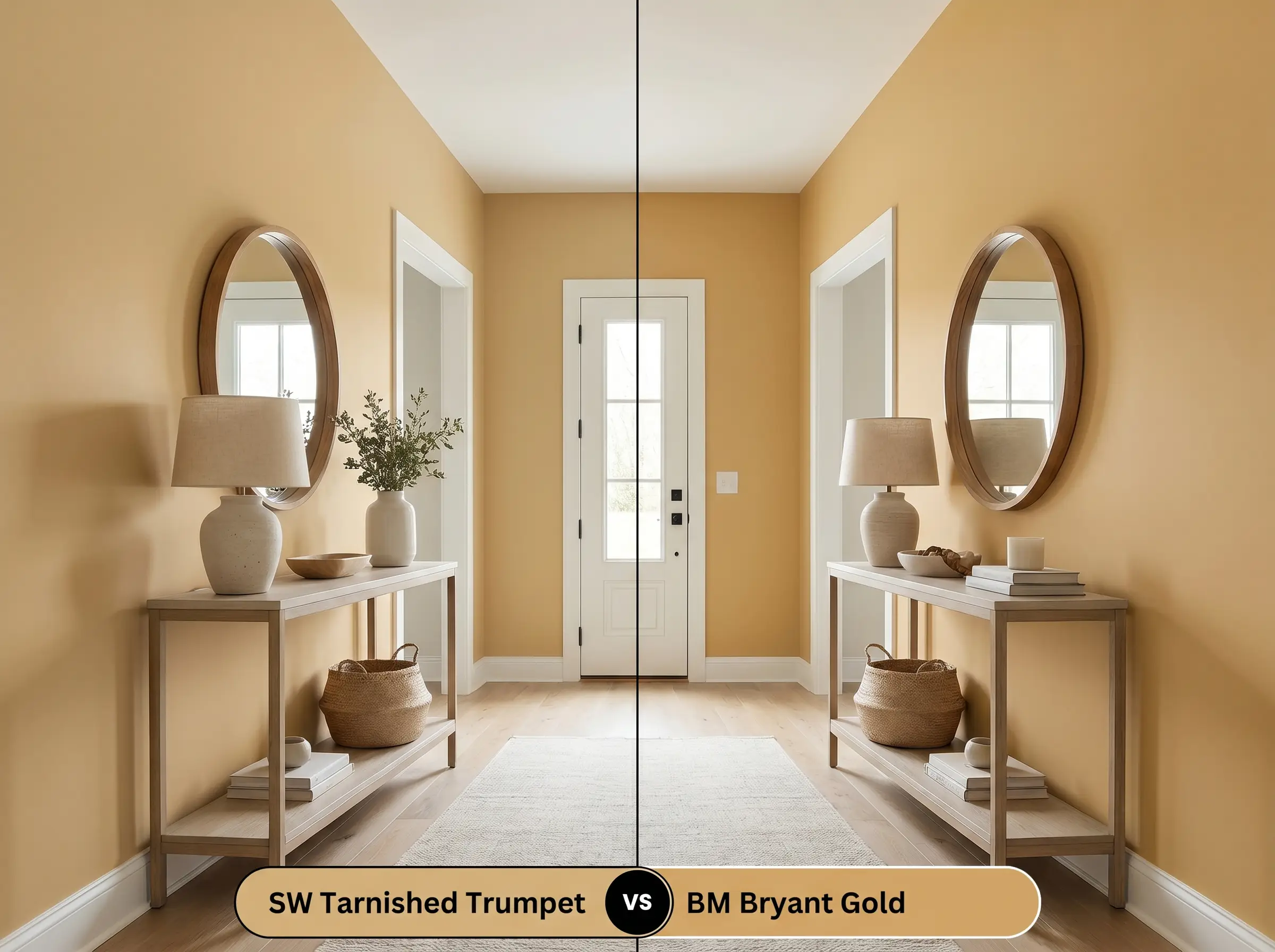
Bryant Gold is notably brighter and possesses a clearer, more traditional yellow hue. If you are aiming for a cheerful, uplifting space, the Benjamin Moore option excels, whereas Tarnished Trumpet provides a moodier, tarnished depth better suited for evening spaces.
Similar Colors & Brand Equivalents
Whether you need a slight adjustment in depth or are shopping across different manufacturers, these close alternatives offer similar earthy warmth.
Same-Brand Alternatives
Cross-Brand Matches
Practical Application & DIY Advice
Executing a flawless finish requires more than just picking the right swatch. You must respect the physical properties of the paint to ensure it cures beautifully on your walls or exterior.
The Dynamic Sheen Guide
Primer Strategy
Because this shade relies on a complex mix of yellow and green colorants, applying it over a stark white or heavily patched wall can lead to a patchy appearance. Always use a high-quality, lightly tinted gray primer to give the earthy undertones a solid, neutral base to build upon.
Coverage & Success Tips
Expect to roll at least two generous coats to achieve the true, rich depth of this mid-tone. Take care to maintain a wet edge while rolling. This specific depth of gold is prone to visible flashing if you overlap dry sections, which will ruin the smooth, curated look of the room.
When cutting in around trim with a heavily saturated color like this, finish one entire wall before moving to the next. Letting the cut-in edges dry before rolling the main field will almost certainly leave a visible “picture frame” effect.
Hackrea Pro-Tip (The Cut-In Secret)
Frequently Asked Questions
The heavy texture of stucco creates thousands of tiny micro-shadows that will visually darken the paint. Because its light reflectance value is already right in the middle, expect it to read slightly browner and more muted outdoors than it does on a smooth interior wall.
Rather than clashing, the earthy green and bronze nuances actually help neutralize the aggressive pinkish-orange tones found in standard red oak. This pairing creates a surprisingly balanced, cohesive foundation for the rest of your decor.
Modern low-E glass often casts a faint blue or green tint into the room. This cool wash will suppress the warm yellow base of the paint, amplifying its hidden olive and khaki notes, so always test a large swatch directly across from your windows.
Absolutely, provided you lean into the moodiness. Painting the ceiling in this rich shade creates an intimate, jewel-box atmosphere, especially when illuminated by warm, brassy wall sconces that bounce light off the golden ceiling.
Final Verdict & Expert Warnings
Sherwin-Williams Tarnished Trumpet is an exceptional, historically grounded anchor for homeowners who want to inject sophisticated, earthy warmth into their spaces. It thrives in rooms that embrace layered textures, moody ambient lighting, and high-contrast material pairings. This paint is the perfect chameleon for elevating standard living rooms or architectural accents with a curated, lived-in elegance.
However, this specific color demands careful curation when it comes to fixed cool-toned elements. You must avoid pairing it with stark, icy gray luxury vinyl plank flooring or cool Carrara marble countertops, as the harsh, blue-toned grays will instantly make the golden-bronze walls look sickly and jaundiced. Similarly, extensive use of polished chrome hardware will aggressively fight the earthy warmth, creating a disjointed, chaotic energy that completely undermines the premium aesthetic you are trying to achieve.
Expert Warning (Cool-Toned Clash)
Closest Cross-Brand Equivalents
The absolute closest scientific color matches for Tarnished Trumpet across top paint brands.