Vert de Terre 234
Farrow & BallFarrow & Ball's Vert de Terre No. 234 is a delicate, earthy grey-green with subtle yellow undertones. It acts as a sophisticated, muted neutral that brings a grounded, natural tranquility to both interior and exterior spaces.
Farrow & Ball Vert de Terre: A Grounding Canopy for Transitional Spaces
| Best Exposures | South, West, East |
|---|---|
| Best For | Historic Exteriors, Shaker Cabinetry, Primary Bedrooms, Mudrooms |
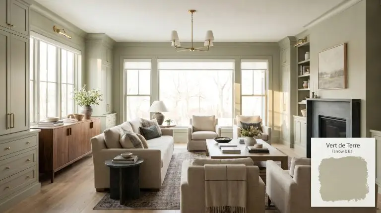
Finding a shade that softens rigid modern architecture without feeling overly pastoral is a constant design challenge. Farrow & Ball Vert de Terre 234 achieves this exact balance, utilizing its precise mid-tone weight to wrap a room in quiet sophistication. This botanical neutral acts as a brilliant transitional layer, grounding airy rooms while injecting life into shadow-heavy corners.
Its innate flexibility makes it an incredible tool for elevating everyday millwork or anchoring an expansive open-concept floor plan. Whether you are aiming for a crisp, tailored aesthetic or a relaxed, layered environment, this earthy grey-green adapts beautifully to your curatorial vision.
Undertones & LRV of Vert de Terre
When homeowners ask if this historic shade leans warm or cool, the answer lies in its beautifully complex, warm neutral-green composition.
With a light reflectance value of 48, this pigment sits right in the middle of the spectrum. It absorbs just enough natural light to maintain its rich presence on the wall, preventing it from washing out while remaining buoyant enough to avoid feeling heavy.
You can apply wallpapers, paints, etc. on walls and see how they look in various interiors.

The Chameleon Factor: Light & Exposure
The biggest risk with this specific color is placing it in a heavily shaded, north-facing room where its golden warmth is entirely neutralized, leaving you with a flat, chilly cement tone. Because of its complex historical pigment, this shade shifts dramatically depending on the sun’s trajectory. You must evaluate how the architectural exposure in your specific home pulls at its underlying DNA before committing.
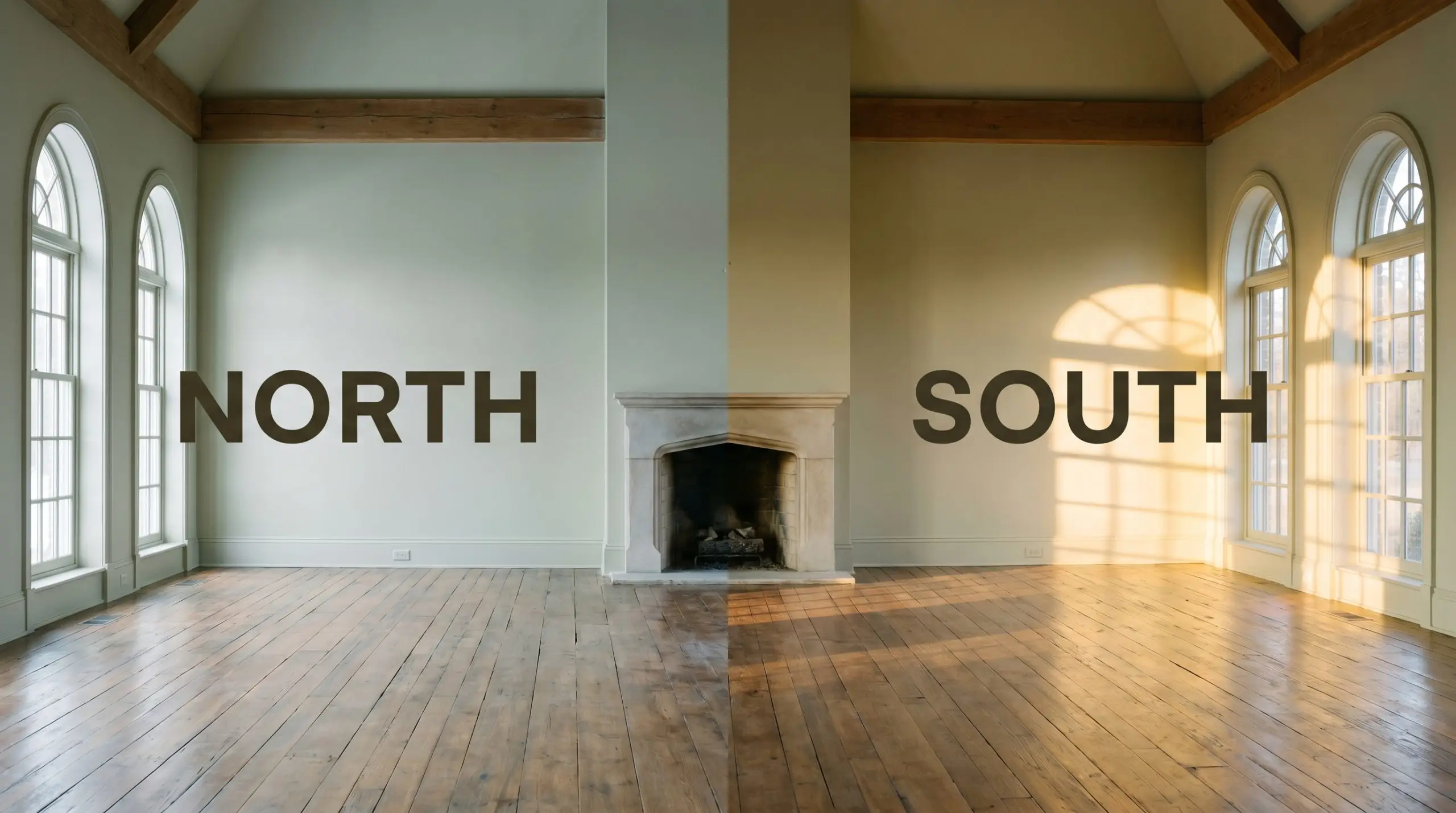
Always paint your swatches on large, movable boards rather than directly on the wall. This allows you to track how the green shifts from a crisp morning tone to a warm, shadowed shade as the sun moves across the room.
Hackrea Pro-Tip (Testing the Shift)
Everyday Applications for Farrow & Ball No. 234
This specific depth of color demands architectural participation, thriving when it has molding, cabinetry, or distinctive textures to interact with. It brings a cohesive, restorative energy to a home, effortlessly transitioning between highly tailored environments and relaxed, lived-in spaces.
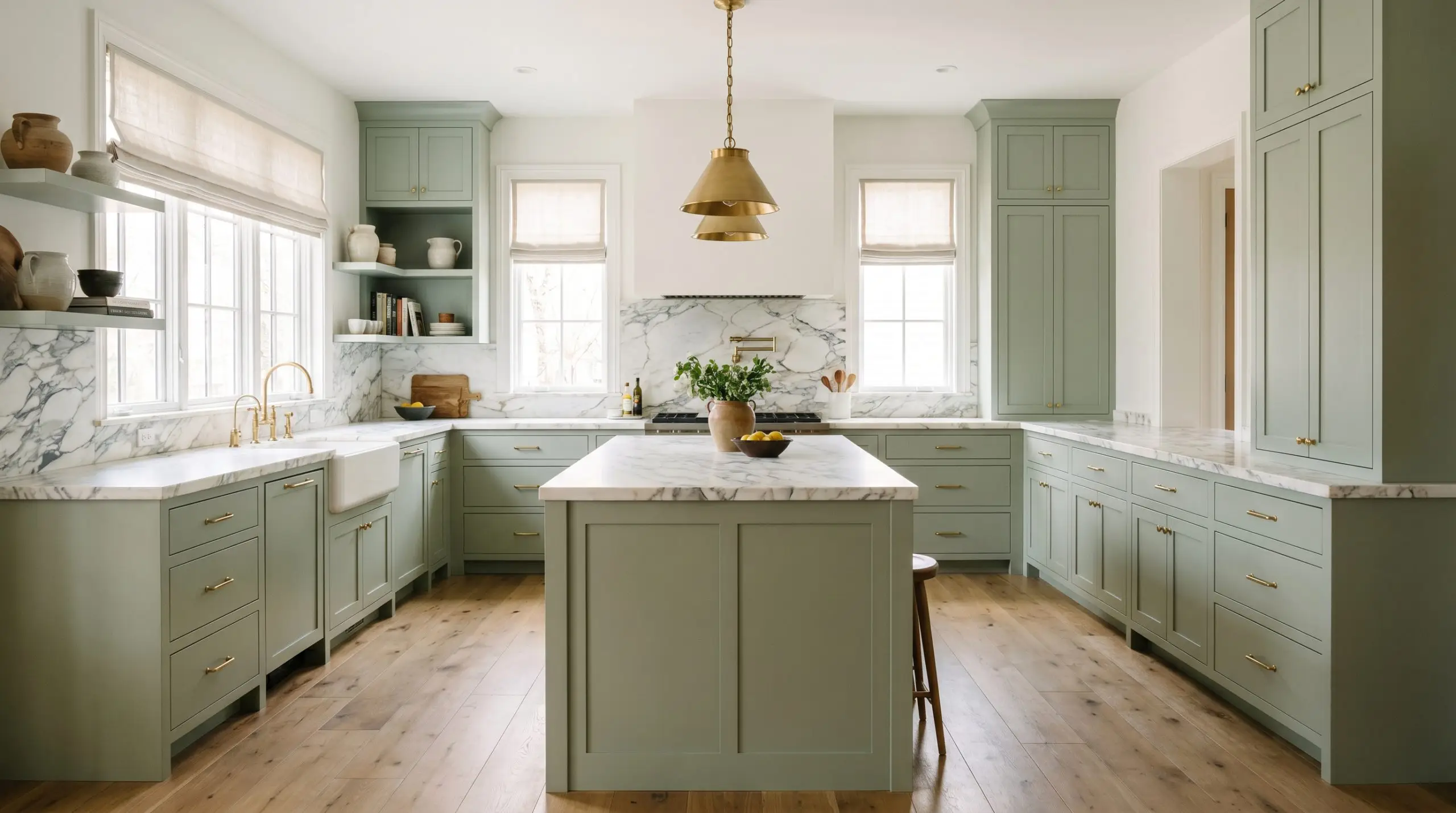
Kitchens
This pigment is a brilliant choice for grounding Shaker-style cabinetry, especially when paired with heavily veined marble countertops. If you are exploring sage green kitchens, this shade provides enough depth to anchor a large island while remaining soft enough for upper cabinets. It beautifully bridges the gap between sleek modern fixtures and rustic, wide-plank oak flooring.
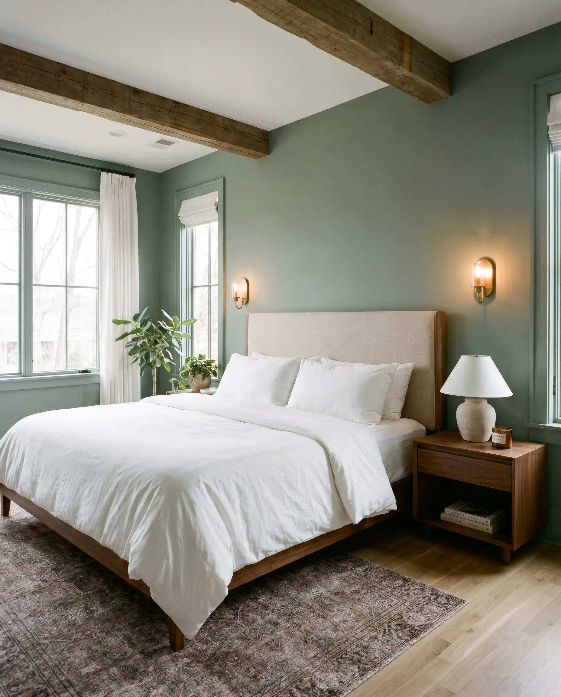
Primary Bedrooms
In a sleeping space, this tone creates an immediate sense of calm and restoration. It serves as a stunning backdrop for crisp white bedding, upholstered linen headboards, and soft, ambient wall sconces. You can easily push the room toward a traditional English cottage feel with floral textiles or keep it incredibly sleek with low-profile, minimalist furniture.
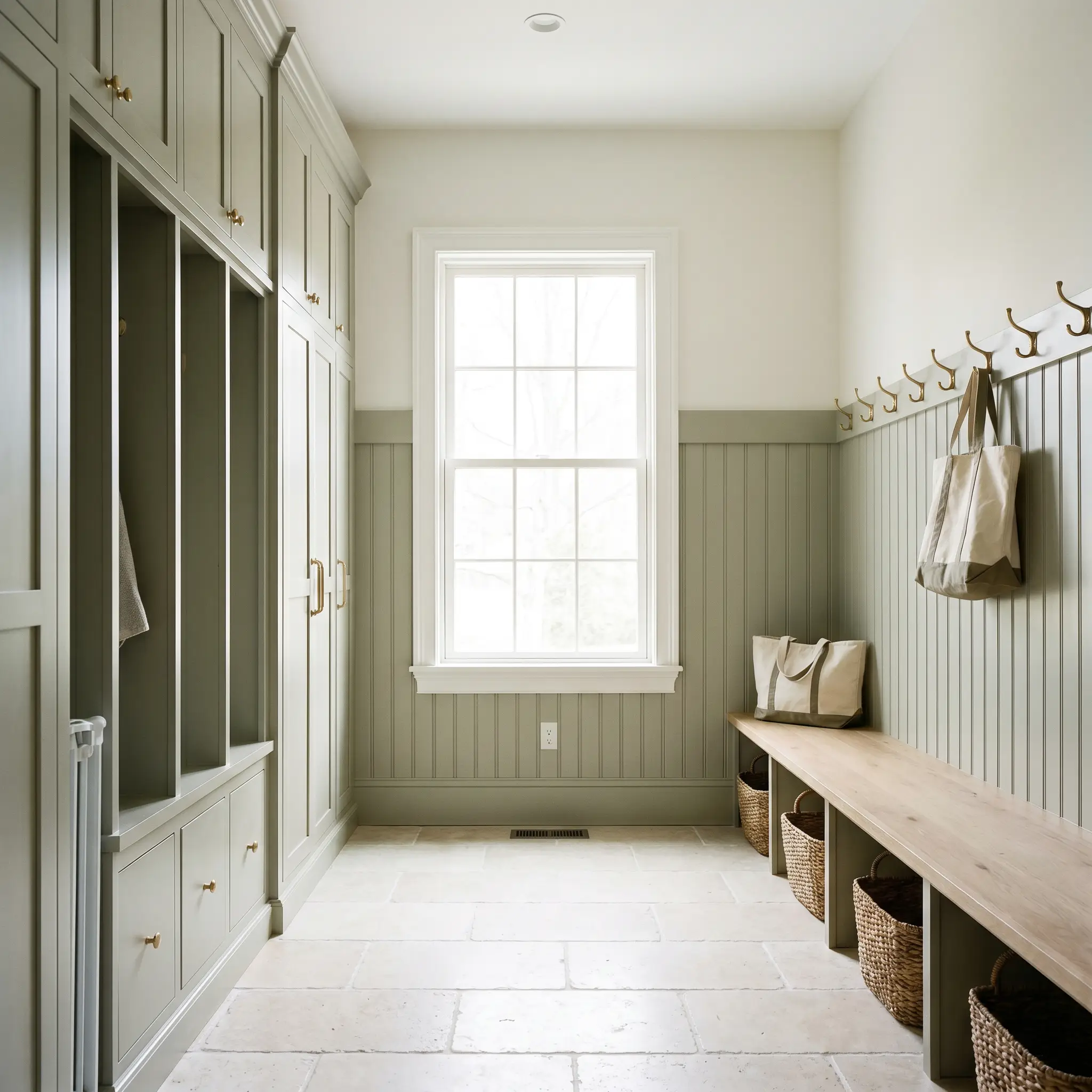
Mudrooms & Utility Spaces
Utility areas benefit immensely from a color that hides everyday scuffs while elevating the mundane. Wrapping built-in lockers and beadboard in this rich hue transforms a basic drop-zone into a highly curated architectural moment. It pairs exceptionally well with durable, natural stone floor tiles like tumbled limestone or dark slate.
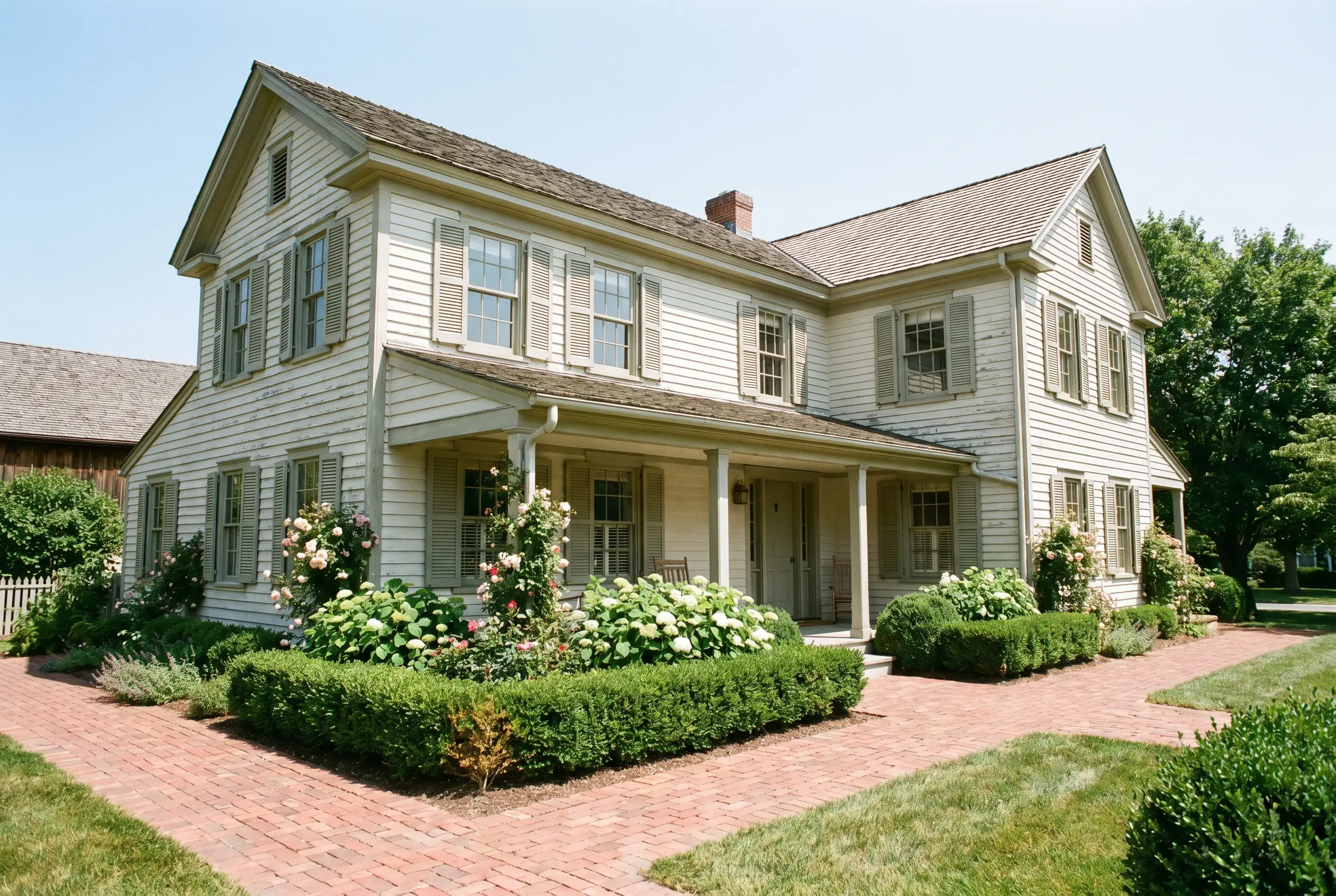
Exteriors & Facades
On an exterior, direct sunlight will significantly wash out the color, making it appear much lighter and softer than it does indoors. It is a stunning choice for historic home exteriors, particularly on traditional wood siding or as a defining accent on window sashes and trim.
Unique Design Ideas & Inspiration
Beyond standard four-wall applications, this resilient green invites deeply creative, immersive curations.
The Enveloped Library
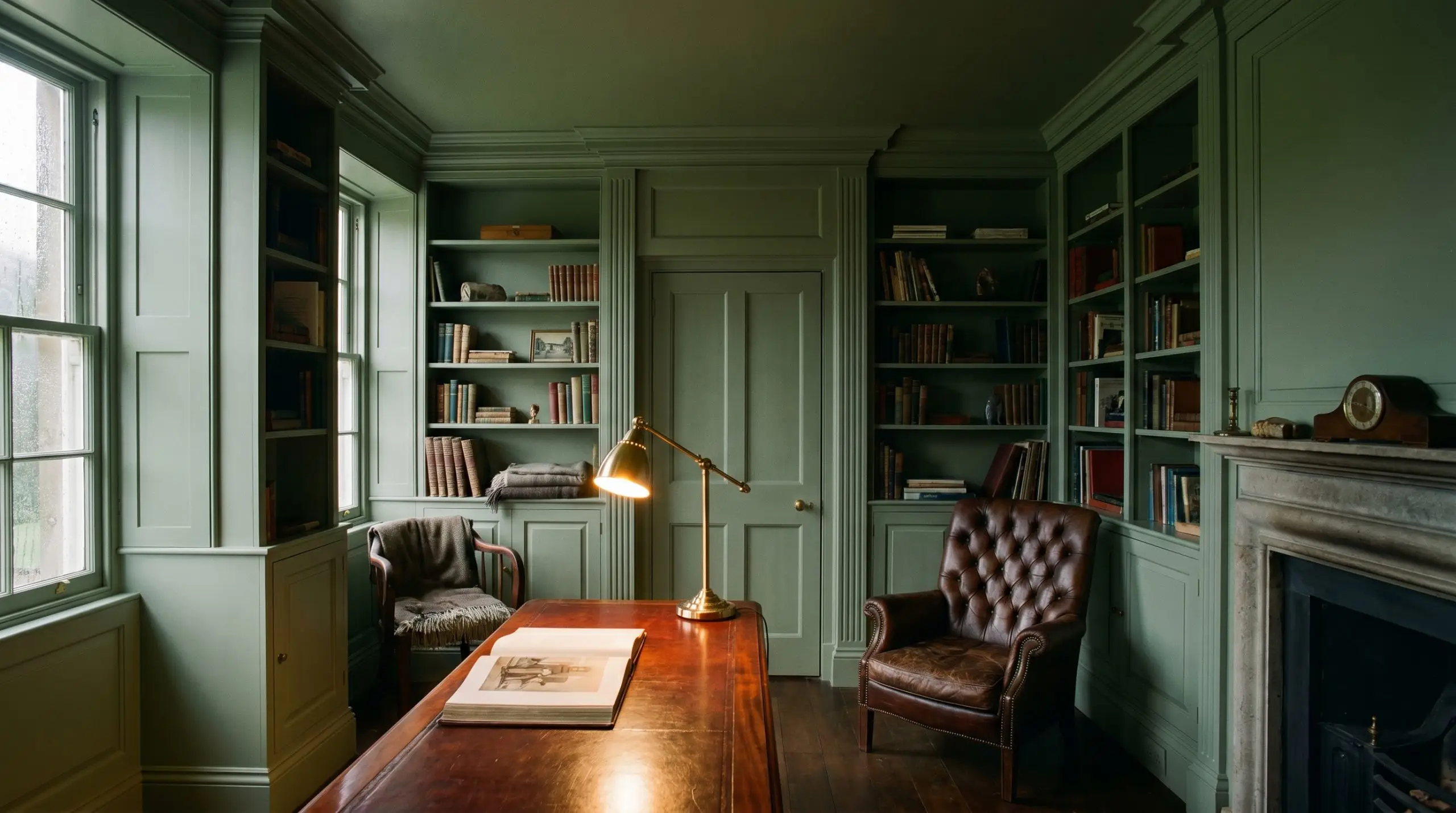
Taking this color across the baseboards, walls, bookshelves, and ceiling creates a brilliantly moody, continuous wrap. This color drenching technique eliminates visual boundaries, making a small study feel both expansive and incredibly intimate. Pair it with a tufted leather reading chair and polished mahogany accents for a truly premium retreat.
A Two-Tone Staircase Runner
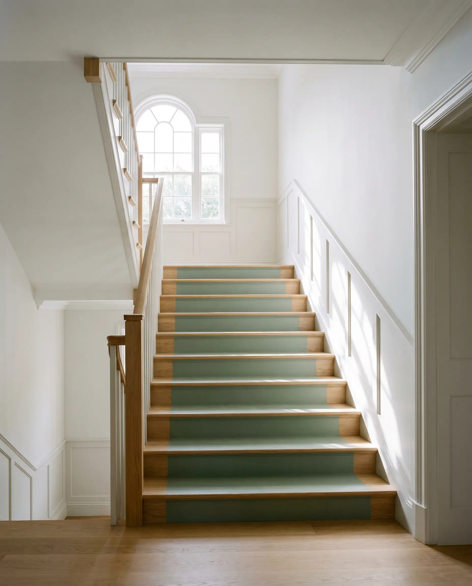
Instead of a traditional wool runner, painting the center of a wooden staircase in this grounding green offers a striking architectural detail. The crisp contrast between the painted treads and the natural wood edges draws the eye upward, highlighting the home’s verticality. This application requires a highly durable floor enamel to withstand daily foot traffic while maintaining its rich finish.
The Country Estate Powder Room
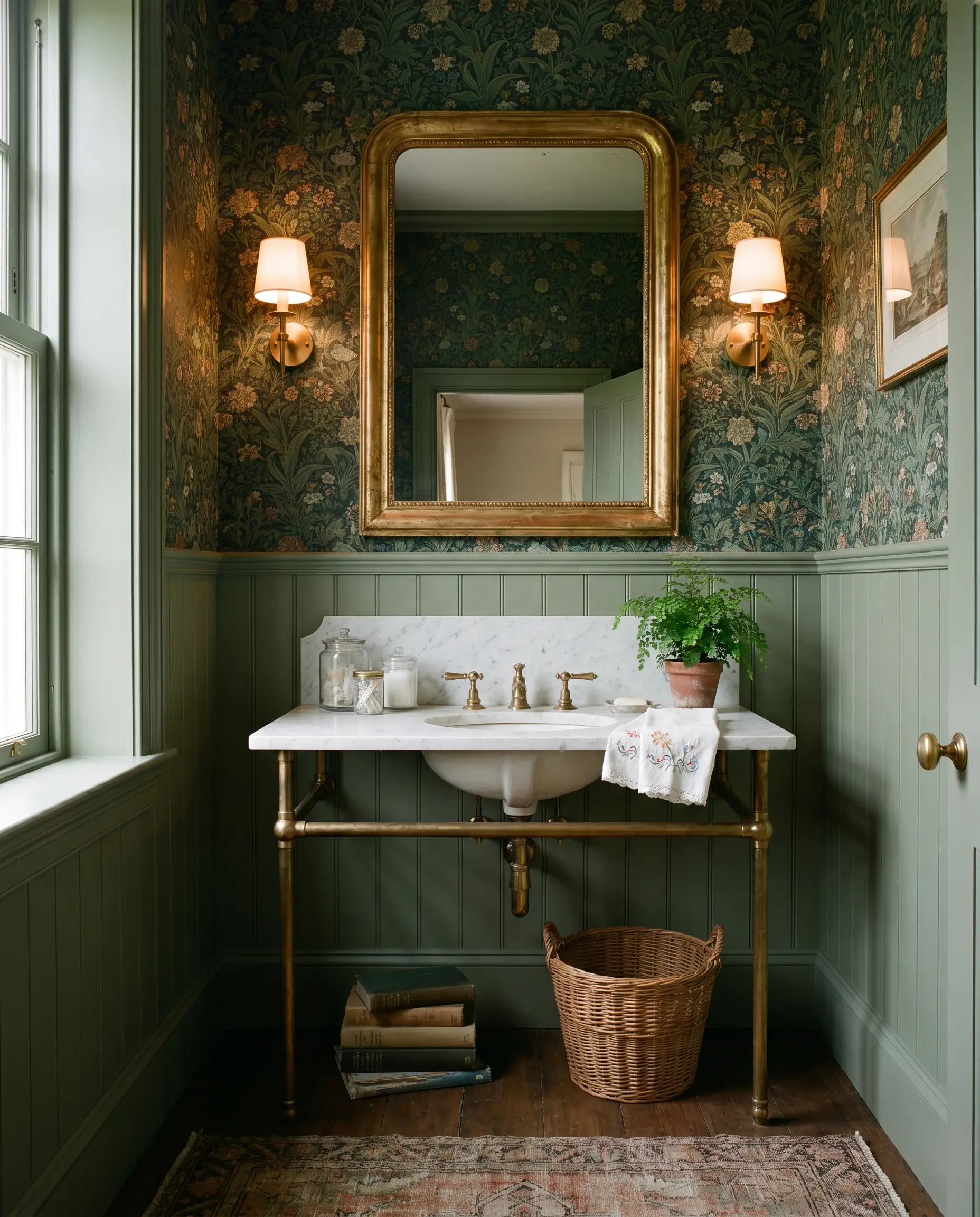
Powder rooms are the perfect venue for high-impact design choices. Pairing this earthy tone with a heavily patterned, botanical wallpaper above a classic wainscoting installation creates a jewel-box effect. Finish the space with an unlacquered brass widespread faucet and a vintage gilt mirror for an uncompromisingly elegant aesthetic.
Coordinating Colors & Best Pairings
This shade thrives on intentional contrast, requiring either crisp, luminous borders to define its edges or rich, saturated companions to deepen its mood.
Trim & Baseboards
Selecting the right border is crucial for defining the wall color’s final temperature.
Hardware, Wood & Material Pairings
To elevate this shade, focus on layering high-quality, tactile finishes that interact beautifully with its organic base.
Coordinating Colors
Building a cohesive palette requires secondary shades that either highlight the green’s warmth or provide a dramatic, moody contrast.
Designer Mood Boards
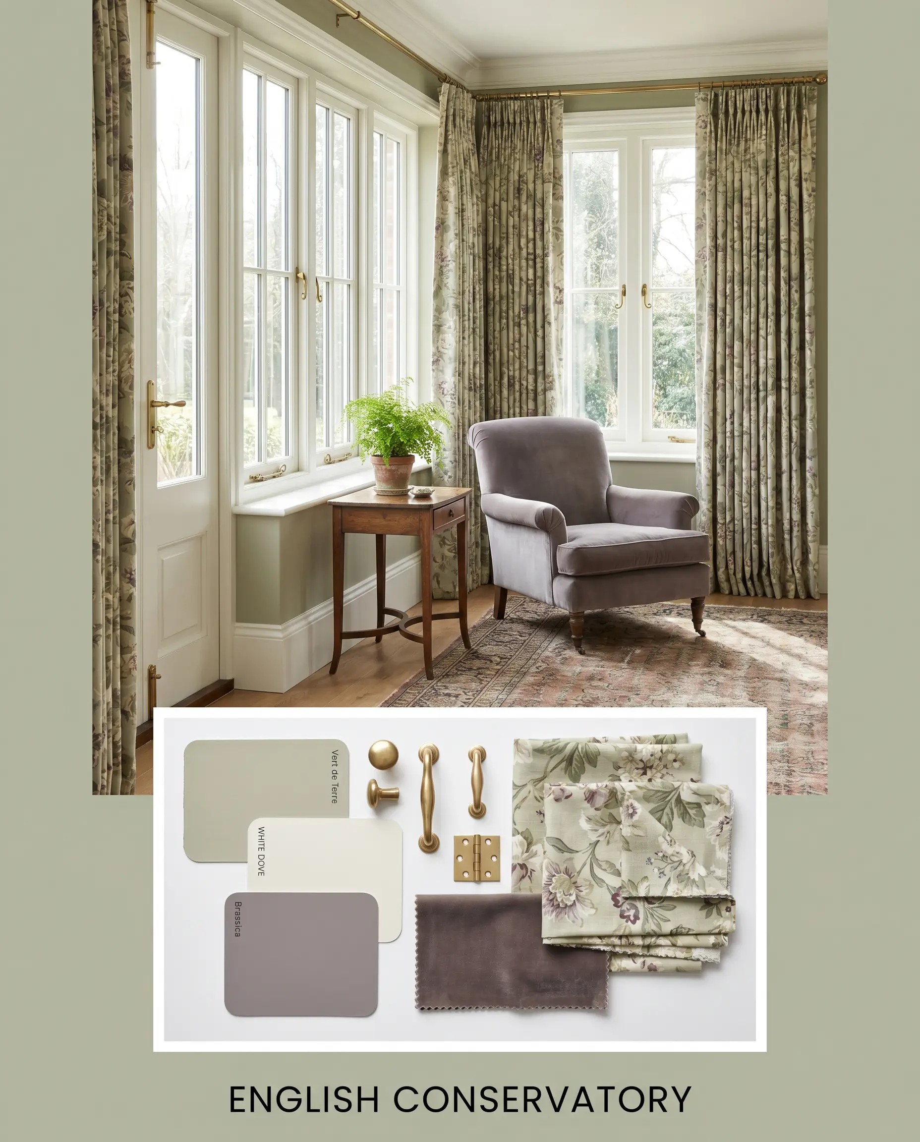
English Conservatory
This palette leans heavily into traditional elegance, utilizing the crisp contrast of Benjamin Moore White Dove OC-17 on the trim. Weave in unlacquered brass hardware, heavily pleated floral drapery, and touches of Farrow & Ball Brassica 271 for a refined, garden-inspired atmosphere. The resulting energy is highly curated, quiet, and deeply restorative.
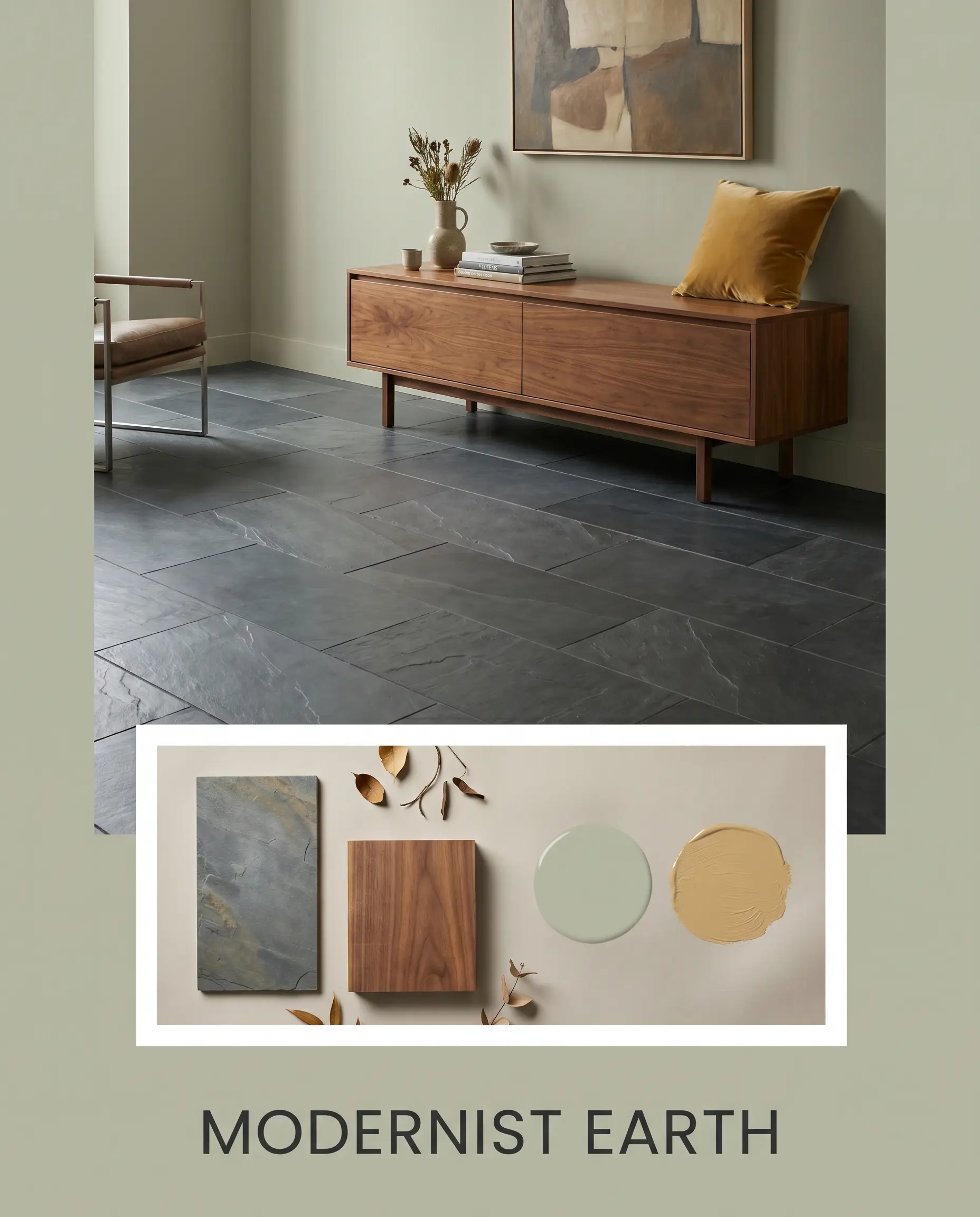
Modernist Earth
For a sharper, more contemporary edge, ground the space with large-format honed slate flooring and warm walnut credenzas. Introduce accents of Sherwin-Williams Tarnished Trumpet SW 9026 through velvet throw pillows or a bold area rug. This combination creates a grounded, highly tailored environment that feels both sleek and inviting.
Vert de Terre vs. Rival Greens
Sometimes your home’s specific lighting or architectural style demands a slight pivot. If this green loses its depth or pulls too cool in your environment, evaluating its closest rivals will reveal the perfect alternative.
Farrow & Ball Vert de Terre vs. Farrow & Ball French Gray 18
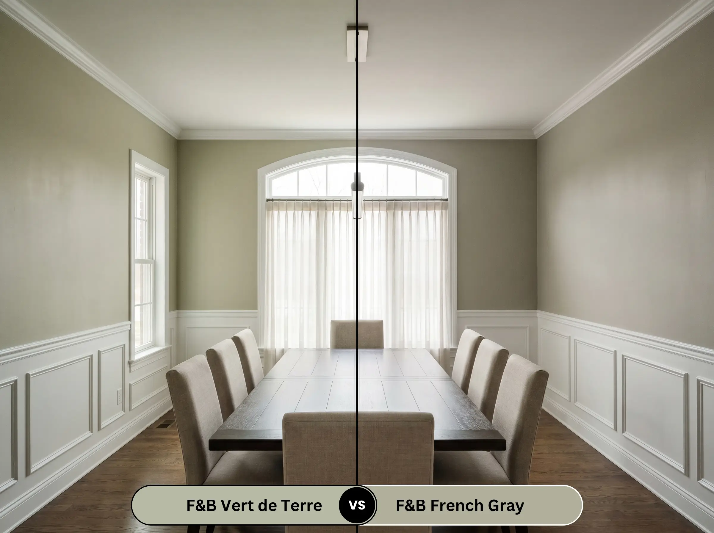
If your room receives heavy, warm southern light, Farrow & Ball French Gray 18 will lean much further into its gray-blue roots, offering a cooler, more relaxed profile. Vert de Terre maintains its botanical, earthy structure in that same light, making it the better choice if you want a definitive green.
Farrow & Ball Vert de Terre vs. Benjamin Moore October Mist 1495
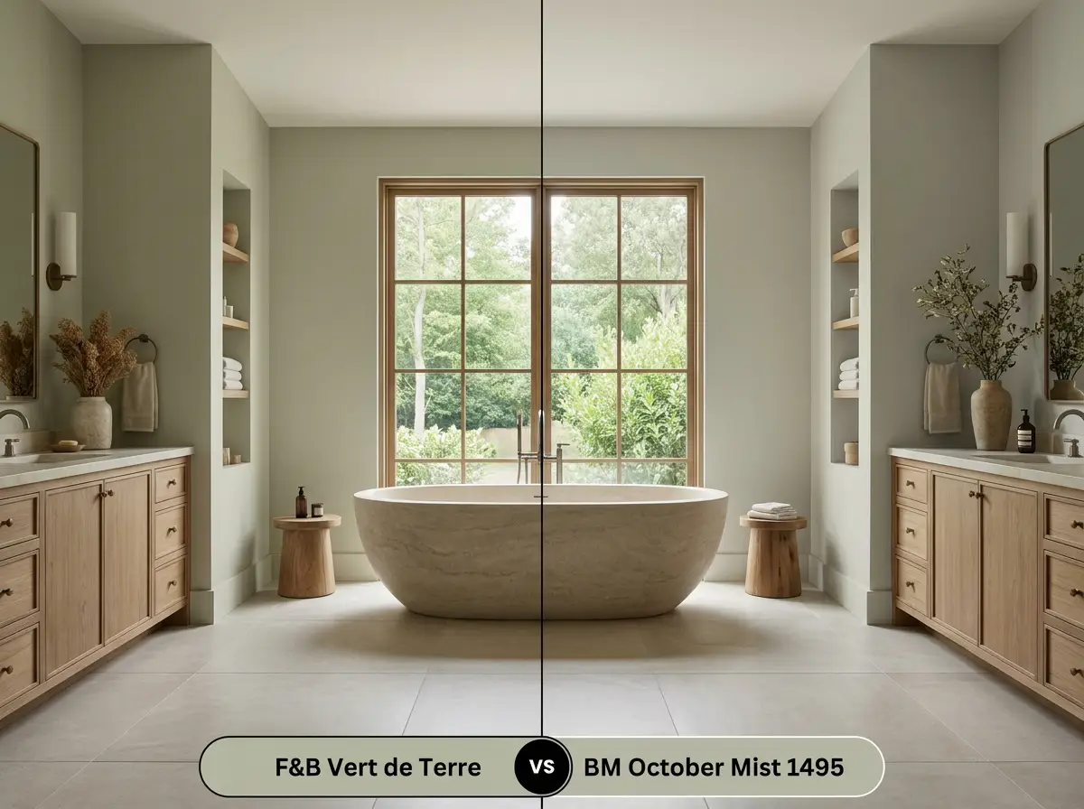
Benjamin Moore October Mist 1495 is slightly lighter and carries a more pronounced silver-sage quality. If you are working with a very dark room, October Mist offers a touch more illumination, whereas the Farrow & Ball option provides a richer, more historical depth.
Farrow & Ball Vert de Terre vs. Sherwin-Williams Sea Salt SW 6204
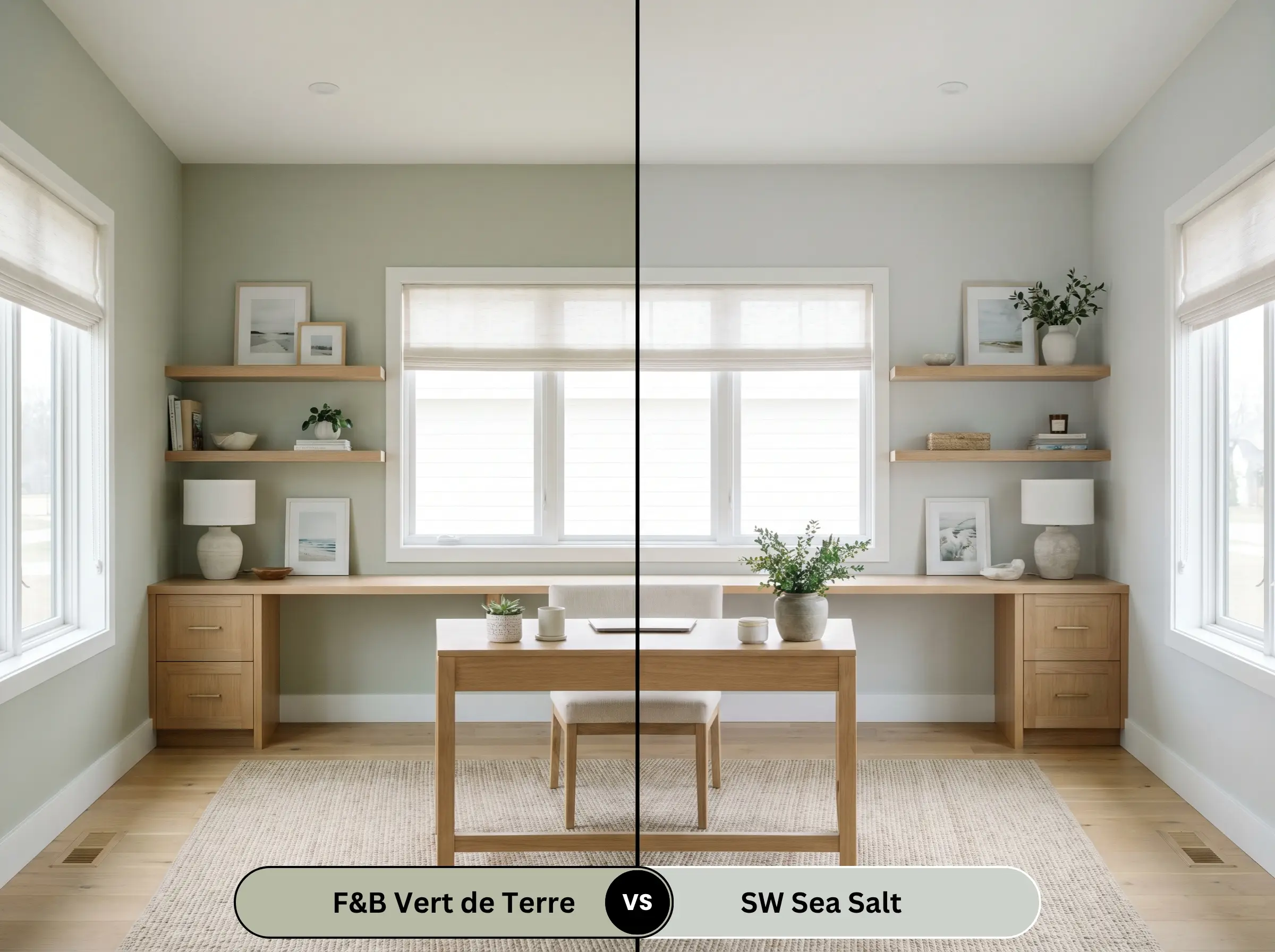
Sherwin-Williams Sea Salt SW 6204 is significantly lighter and heavily influenced by blue undertones, creating a breezy, coastal atmosphere. Choose the Farrow & Ball shade if you need a grounded, earthy anchor, and pivot to Sea Salt if you want a highly reflective, airy environment.
Brand Equivalents & Similar Shades
If you need just a fraction more lightness for a dim corridor or prefer to explore options across different manufacturers, these alternatives offer excellent flexibility.
Next-Step Alternatives
Staying within the same manufacturer allows you to effortlessly tweak the depth while maintaining a similar aesthetic.
Cross-Brand Matches
If you need to source your paint from a different supplier, these options offer highly comparable visual profiles.
Practical Application & DIY Advice
Translating this sophisticated hue from the tin to your walls requires a strategic approach to finish and preparation.
The Dynamic Sheen Guide
Selecting the correct finish is just as vital as choosing the color itself.
Primer Strategy
To achieve the true depth of this mid-tone, you must use a mid-tones primer and undercoat. Applying this color directly over a stark white wall or a dark existing paint without the proper tinted base will result in a patchy, uneven finish.
Never skip the brand-recommended undercoat when working with highly pigmented historical colors. A tinted mid-tone primer is the secret to unlocking the rich, velvety depth that premium paints are known for.
Hackrea Design Secret (The Foundation)
Coverage & Success Tips
This specific pigment typically requires two generous coats over a properly primed surface to achieve complete opacity. Be highly mindful of your roller technique, as cutting in edges too far ahead of your rolling can cause “flashing,” leaving visible, overlapping bands of color. Work in small sections and maintain a wet edge to ensure a flawless, premium result.
Frequently Asked Questions
Because of its moderate light reflectance, this shade will absolutely lean into its cooler, gray foundation without natural sunlight to activate its golden base. To prevent the hallway from feeling like a concrete tunnel, you must introduce warm 3000K artificial lighting to artificially pull those earthy tones forward.
Direct, unfiltered sunlight washes out mid-tone greens, making them appear significantly lighter and more subdued on an exterior facade. It performs beautifully on classic brick or stucco, but you should sample it on the brightest side of your home to ensure you are comfortable with how soft it becomes at high noon.
Wrapping a low-ceilinged room entirely in this shade is a brilliant way to blur the hard lines of the room, making the ceiling recede visually. The key to success here is relying on layered, ambient lighting—like wall sconces and table lamps—rather than harsh overhead recessed lights, which will flatten the color.
The ultra-matte nature of the emulsion finish absorbs light, making the color appear slightly softer, chalkier, and more muted. In contrast, the subtle sheen of the eggshell finish bounces more light, which can make the green feel just a fraction crisper and more saturated on cabinetry or trim.
Final Verdict & Expert Warnings for Vert de Terre
Farrow & Ball Vert de Terre 234 is an incredibly versatile, grounding anchor perfect for homeowners who want to bridge the gap between historical warmth and tailored, modern design. Its absolute best application is in spaces featuring prominent millwork, shaker cabinetry, or expansive trim, where its complex earthy pigment can interact with architectural shadows.
This paint is not for those who are committed to stark palettes heavily reliant on icy grays, brilliant blue-whites, or polished chrome fixtures. When paired with sterile white flooring or highly reflective cool metals, the paint’s golden warmth clashes sharply, making the green look muddy. Instead, lean into its organic nature by surrounding it with rich woods, living metals, and deeply saturated accent colors.
Expert Warning (The Clash Risk)