Sudbury Yellow 51
Farrow & BallSudbury Yellow by Farrow & Ball is a warm, traditional mid-yellow with distinct earthy ochre and subtle brown undertones. With an LRV of 49.89, it acts as a grounded, muted gold that warms up shaded spaces and glows richly in direct sunlight.
Paint Technical Profile
| Color ID / SKU | 51 |
| HEX Code | #d7b576 |
| Light Reflectance (LRV) | 49.89 |
| Use | Interior, Exterior |
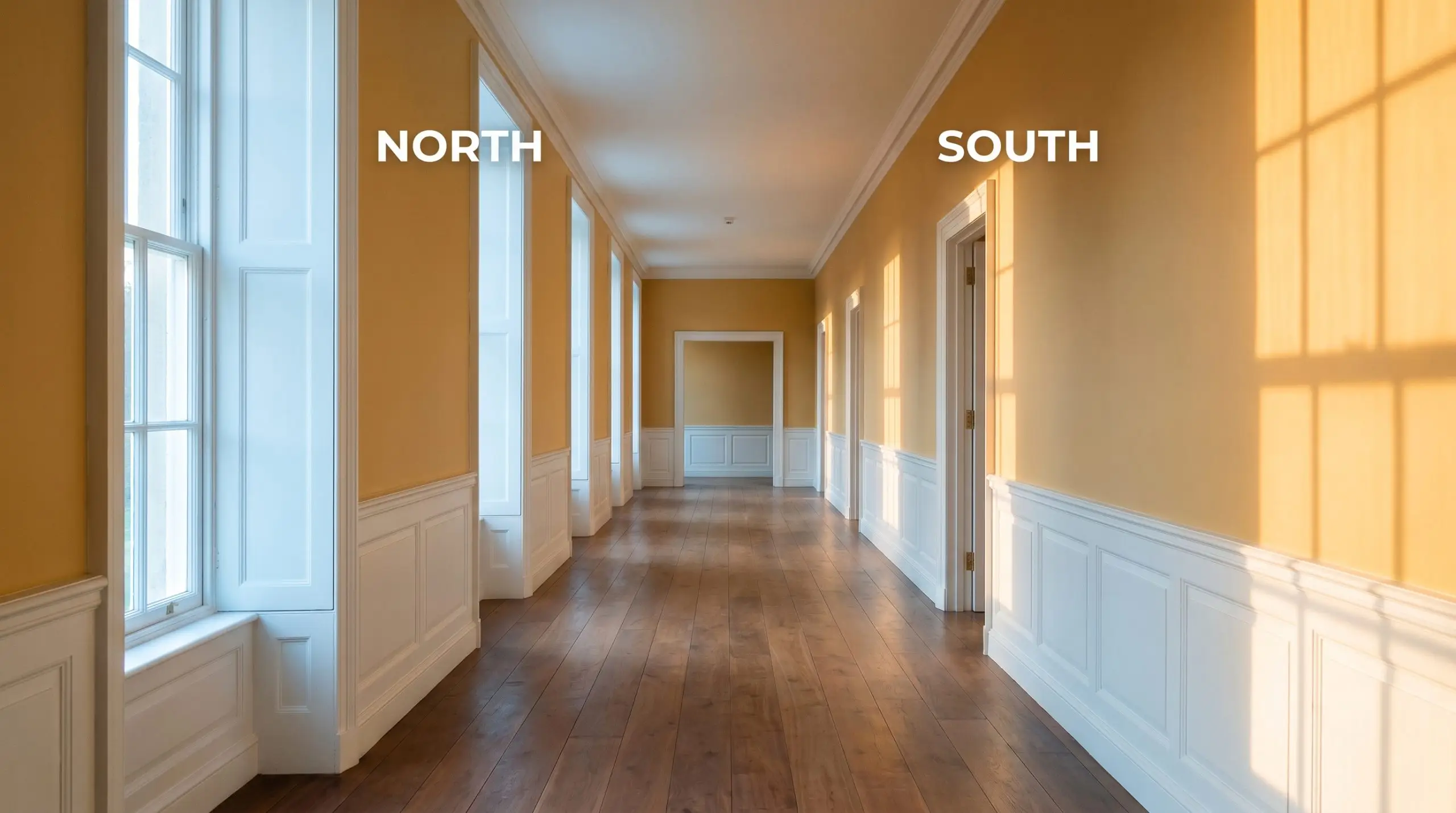
| Best Exposures | North, South, West |
| Best For | Dining Rooms, Libraries, Cabinetry, Historic Interiors |
Farrow & Ball Sudbury Yellow: A Grounding, Muted Gold for Layered Architecture
There is a distinct difference between a primary yellow that energizes a room and a historic mid-yellow that visually anchors it. Farrow & Ball Sudbury Yellow 51 acts as the latter, bringing a profound sense of gravity and warmth to expansive, echoing spaces.
When you apply a color with this specific depth to a grand foyer or a sprawling living area, it immediately pulls the walls inward, creating a cocooning, intimate atmosphere without feeling dark. This warm earthy yellow is a brilliant architectural tool, wrapping stark rooms in a rich, tactile glow.
Sudbury Yellow Undertones & LRV
If you are wondering whether this shade reads warm or cool on the wall, it is undeniably warm. However, it completely avoids the sharp, acidic bite of modern yellows, relying instead on a deeply rooted, earthy foundation. Originally developed by the renowned colorist John Fowler for the grand staircases of Sudbury Hall, this paint carries a complex, historic profile.
Clocking in with a light reflectance value of 49.89, this shade sits perfectly in the mid-tone range. It absorbs just over half the light it receives, giving it the necessary weight to cast beautiful, dramatic shadows across traditional millwork or textured plaster.
Lighting Shifts & The Chameleon Factor
Because of that heavy brown influence, placing this color in a dim, windowless corridor without robust artificial lighting will cause it to flatten into a muddy, lifeless tan. This muted gold is highly reactive to its environment, heavily shifting its personality depending on the temperature of your bulbs and the direction of your windows.
If you do not test this shade in your specific lighting conditions, you risk losing its signature glow.
Expert Warning (Testing Conditions)
Immersive Room Applications
The inherent weight of this historic color demands to be paired with intentional architecture and thoughtful styling. Whether you are aiming for a relaxed Mediterranean villa aesthetic or a deeply tailored English manor vibe, this shade adapts brilliantly to its surroundings.
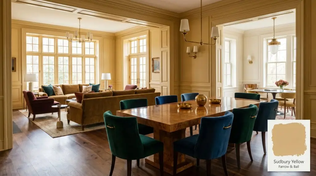
Dining Rooms
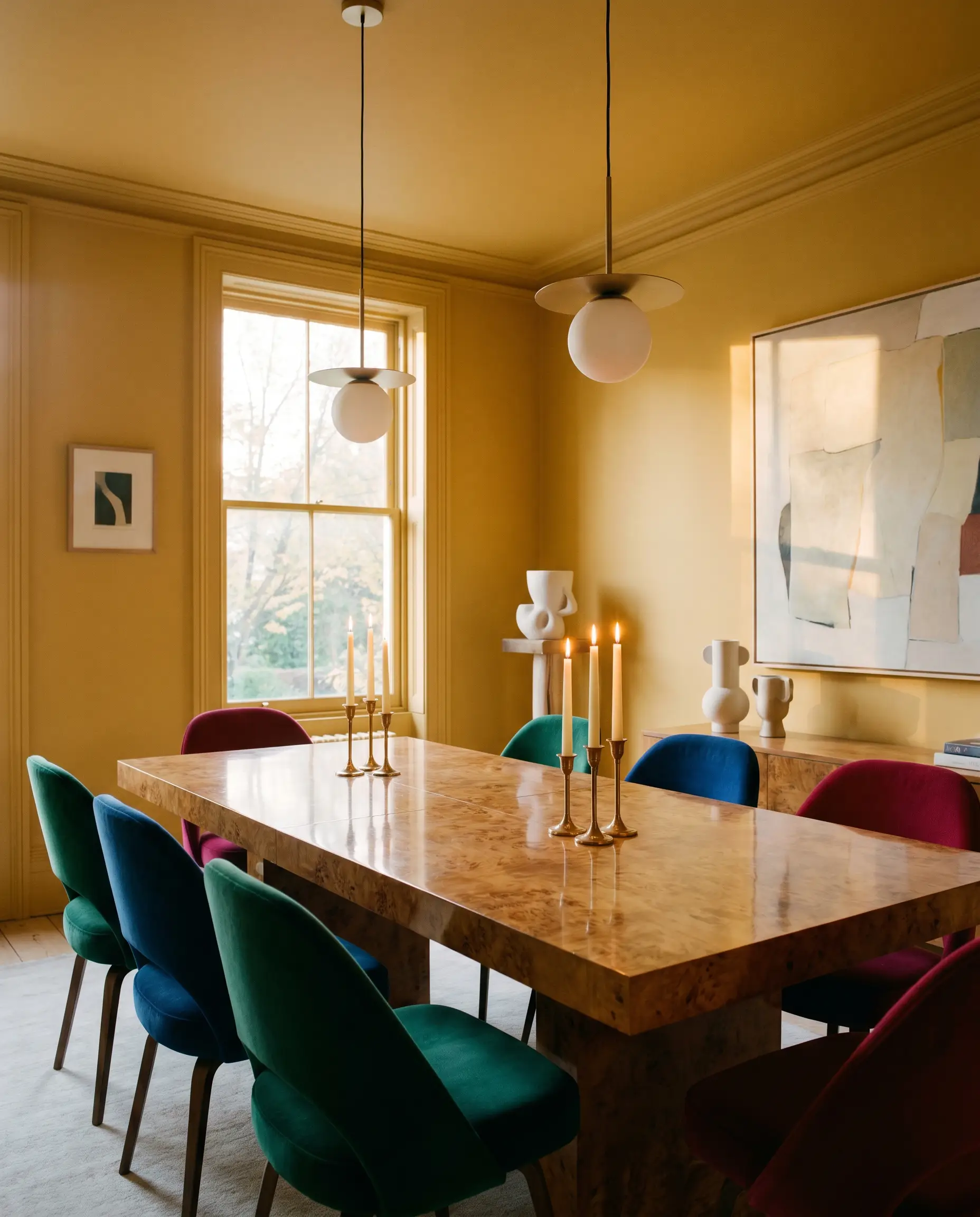
This is where a muted gold truly shines, especially when color-drenched across the walls, ceiling, and trim. It provides a stunning, luminous backdrop for hosting, particularly when illuminated by flickering candlelight or dimmed chandeliers. To push a more contemporary, eclectic style, pair the golden walls with a sleek, highly polished burl wood dining table and deeply saturated, jewel-toned velvet seating.
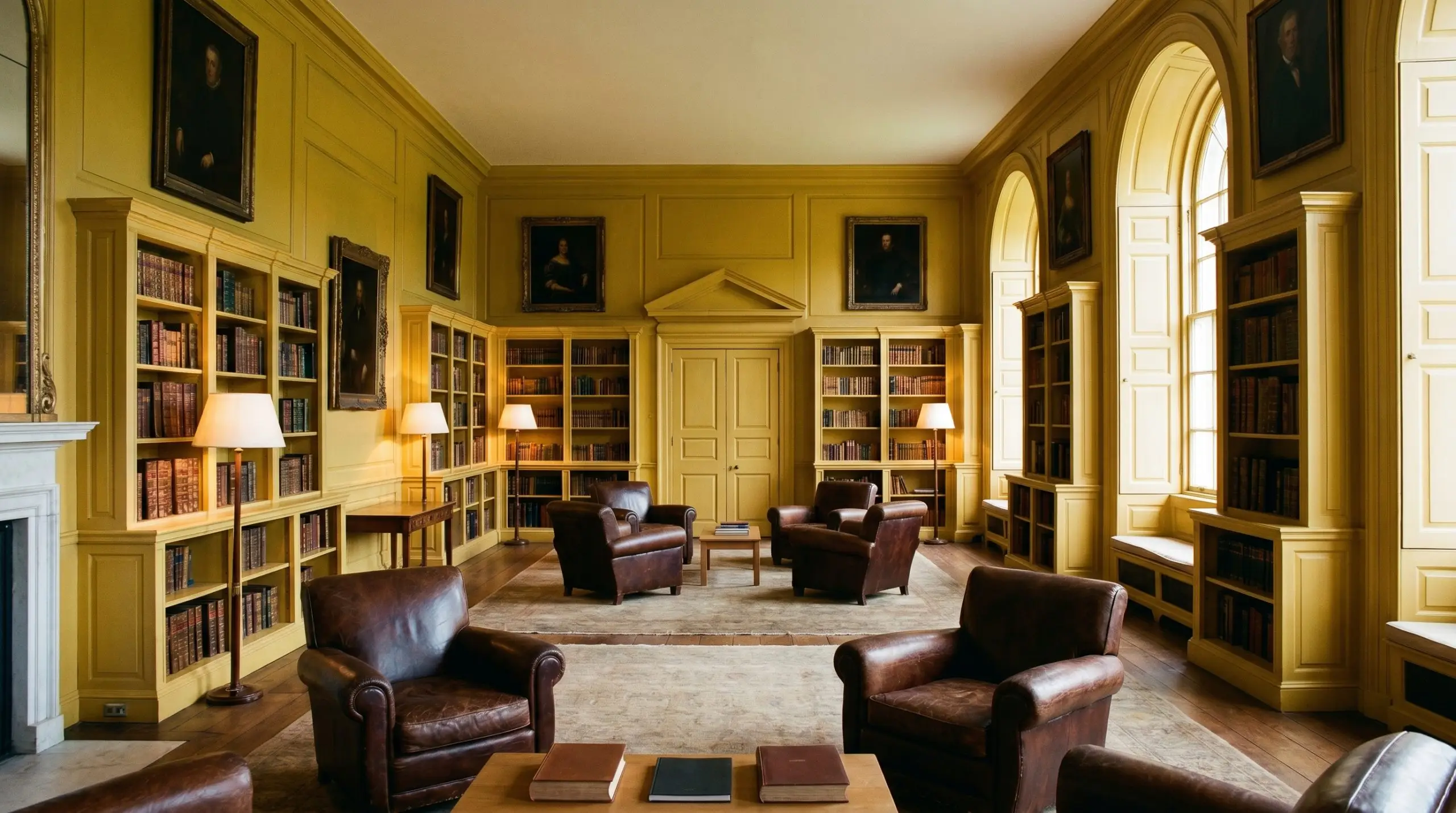
Libraries & Studies
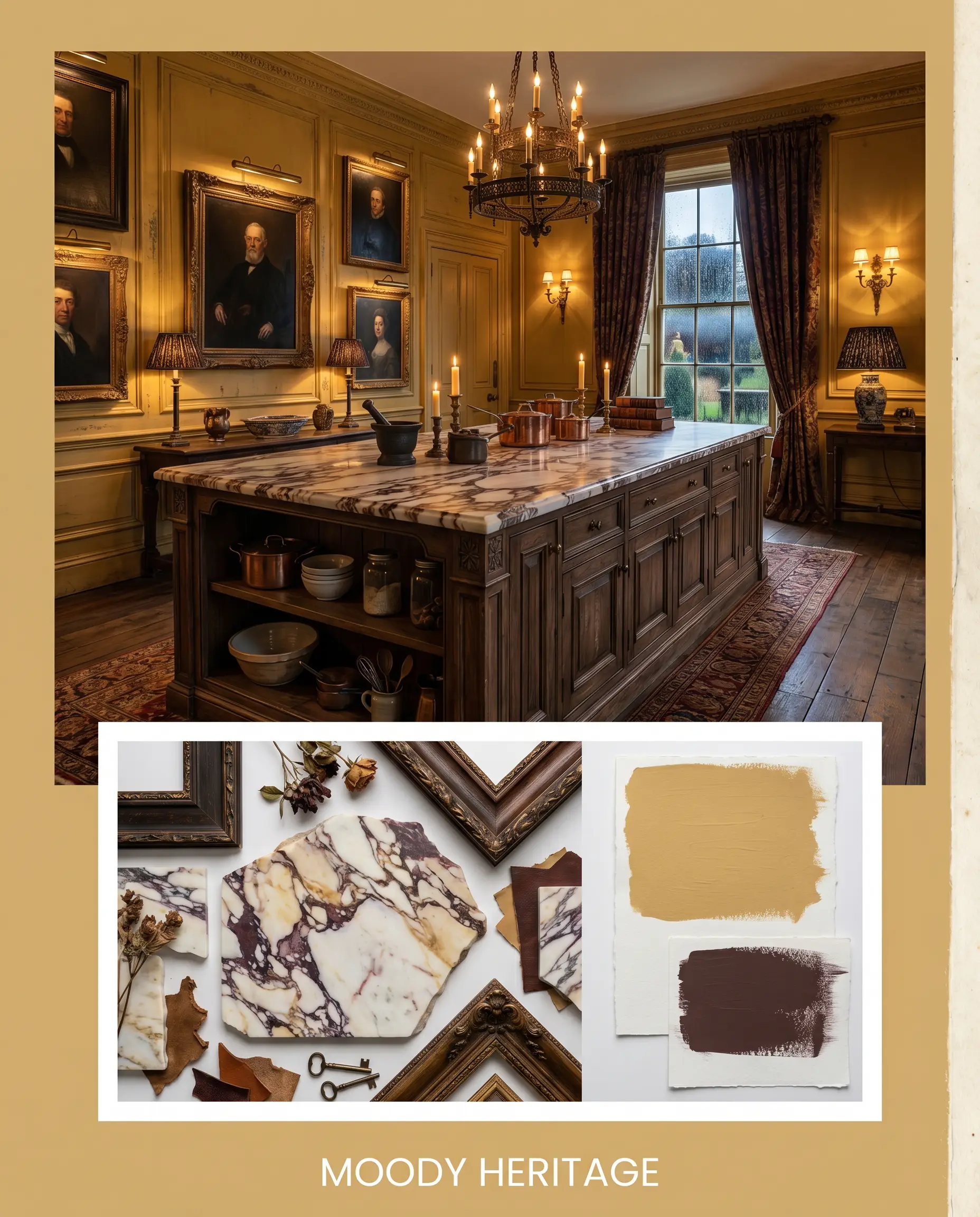
In spaces meant for quiet reflection, the heavy ochre undertones create a sense of distinguished permanence. Wrap the built-in bookshelves and paneling in this shade to instantly age the room in the best way possible. It grounds heavier, traditional architecture beautifully, especially when styled with richly worn leather club chairs and dark, moody oil paintings.
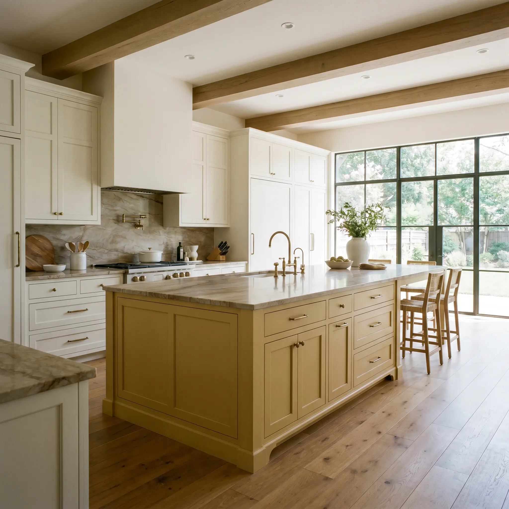
Kitchens
Using this rich pigment on cabinetry instantly elevates a standard culinary space into something that feels highly custom and gathered over time. It anchors a relaxed, rustic farmhouse aesthetic when paired with raw, reclaimed timber beams and handmade terracotta floor tiles. Alternatively, use it on a massive central island against creamy perimeter cabinets to inject a burst of earthy warmth into an otherwise neutral layout.
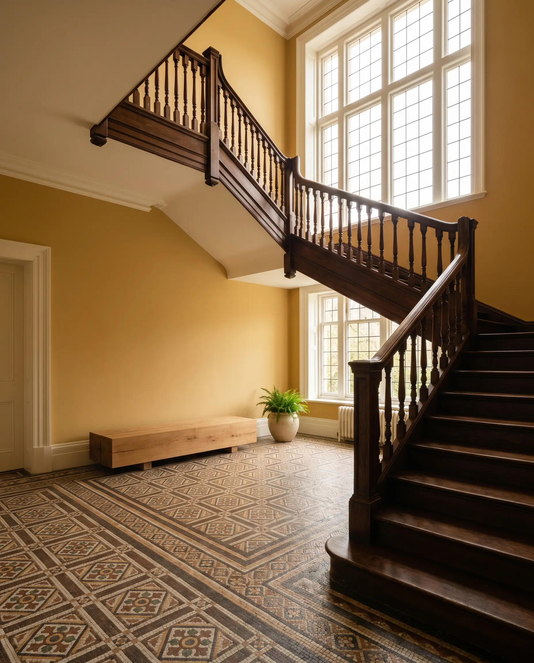
Entryways & Staircases
A mid-tone yellow is incredibly welcoming, making it an ideal candidate for transitional spaces that greet guests. It carries enough visual weight to hold its own against heavy, dark wood staircase banisters or intricate mosaic tile floors.
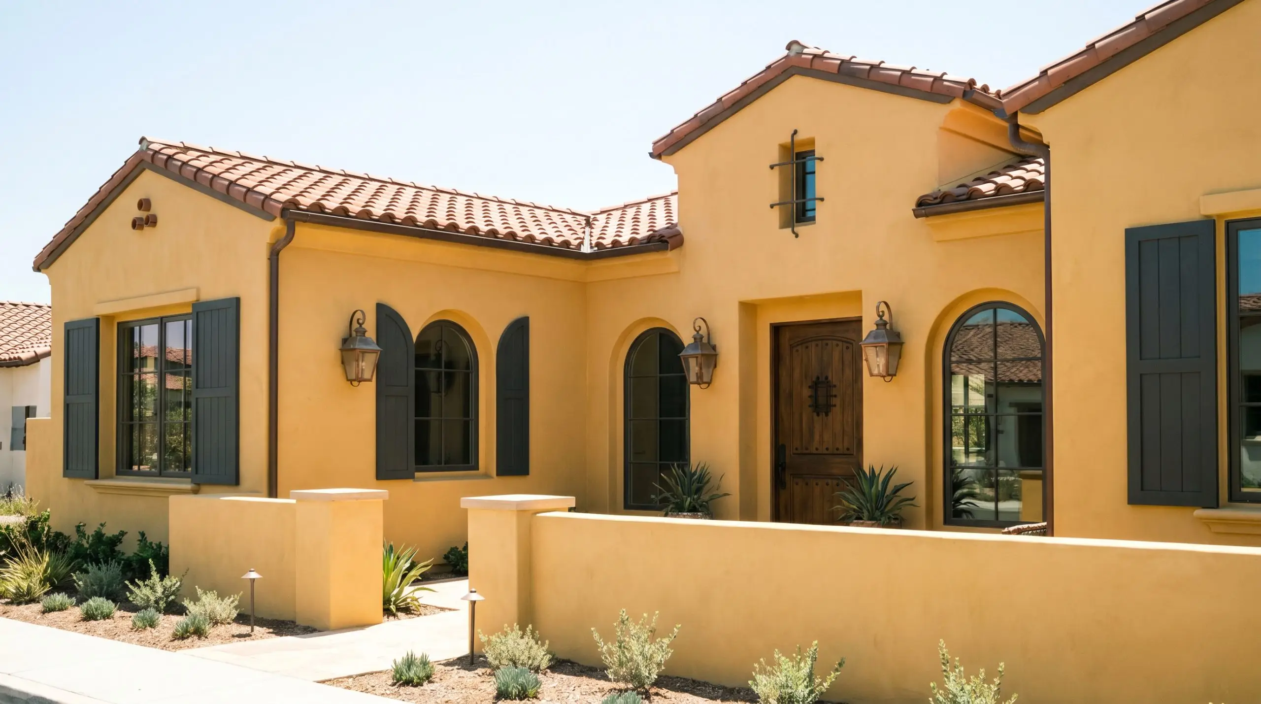
Exteriors
On an exterior, natural sunlight will significantly wash out the depth of any paint. Here, the brown undertones act as a vital anchor, ensuring the facade reads as a sophisticated, sun-baked stucco rather than a chaotic primary yellow. It feels particularly at home on traditional architecture or Spanish-revival homes, especially when paired with dark charcoal shutters and weathered copper lanterns.
Creative Ways to Use Sudbury Yellow
Beyond standard wall applications, a pigment with this much character is perfect for highly curated, unexpected design moments.
The Color-Blocked Archway
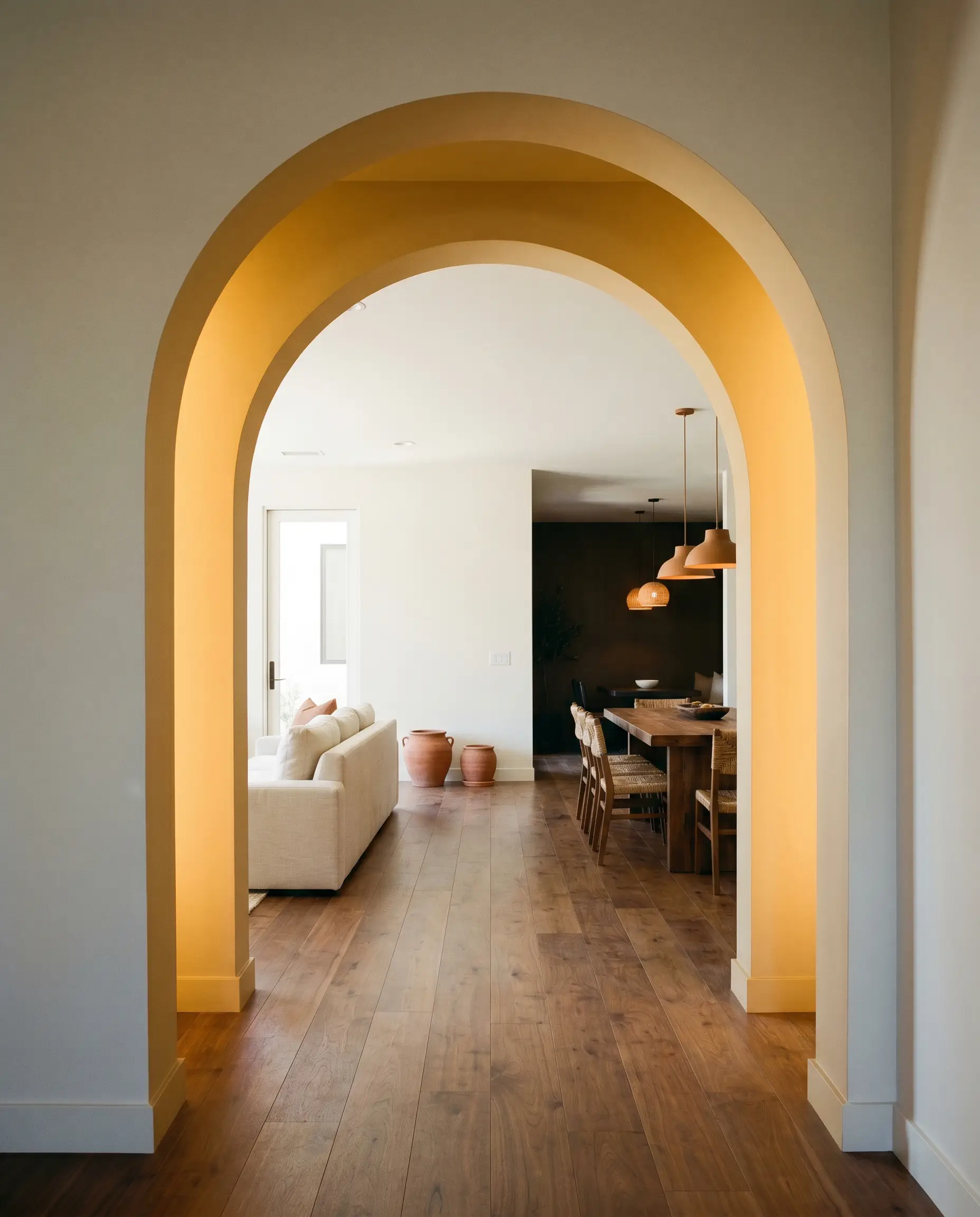
Use this shade to paint the interior threshold of a deep architectural archway between a bright, neutral living space and a darker dining area. The golden transition acts as a glowing portal, drawing the eye forward and adding a layer of sophisticated architectural interest without committing to a fully painted room.
The Maximalist Powder Room
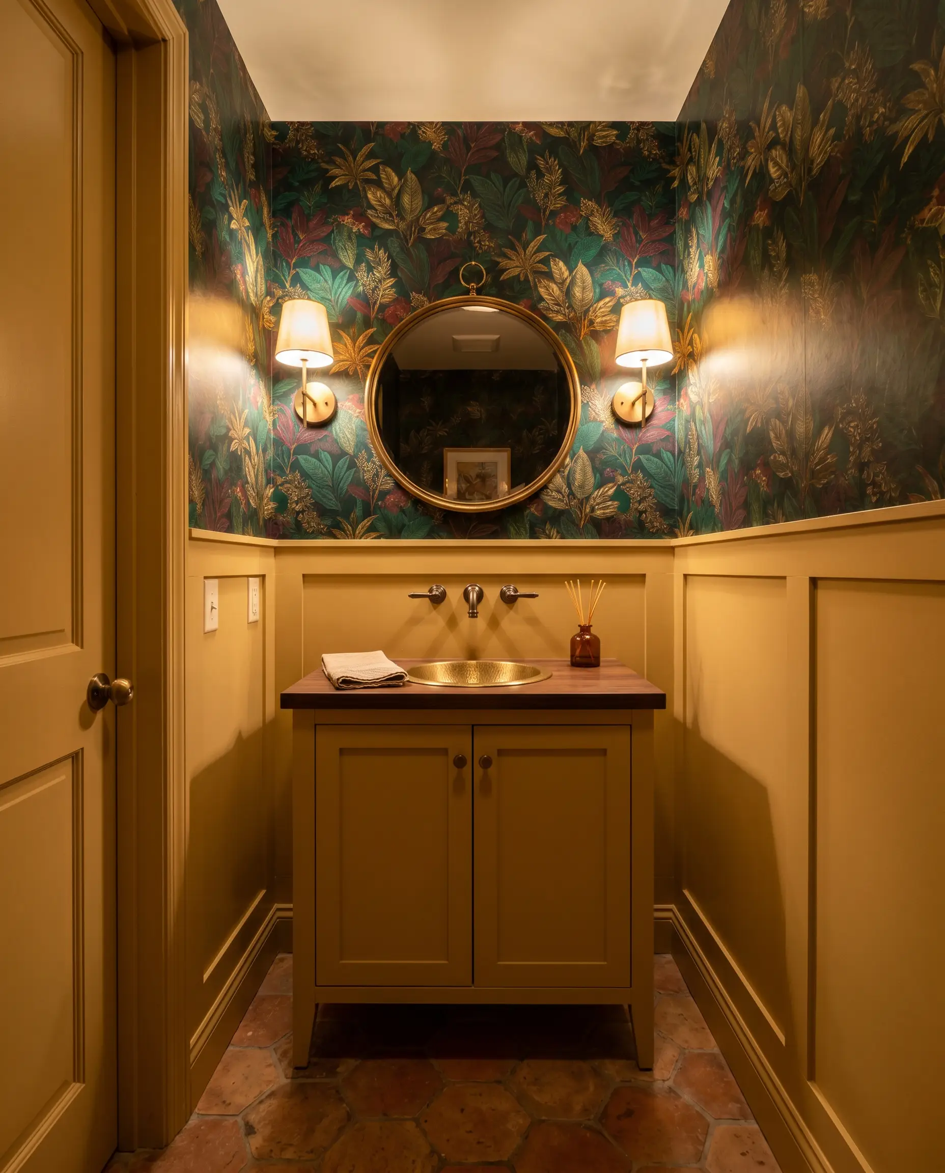
Small, enclosed spaces are perfect laboratories for high-impact design. Pair this earthy yellow on the lower wainscoting with a heavily patterned, botanical wallpaper featuring deep greens and rich burgundies on the upper half. The ochre base of the paint will ground the chaotic beauty of the wallpaper, creating a jewel-box effect that feels incredibly intentional.
Upcycled Antique Casework
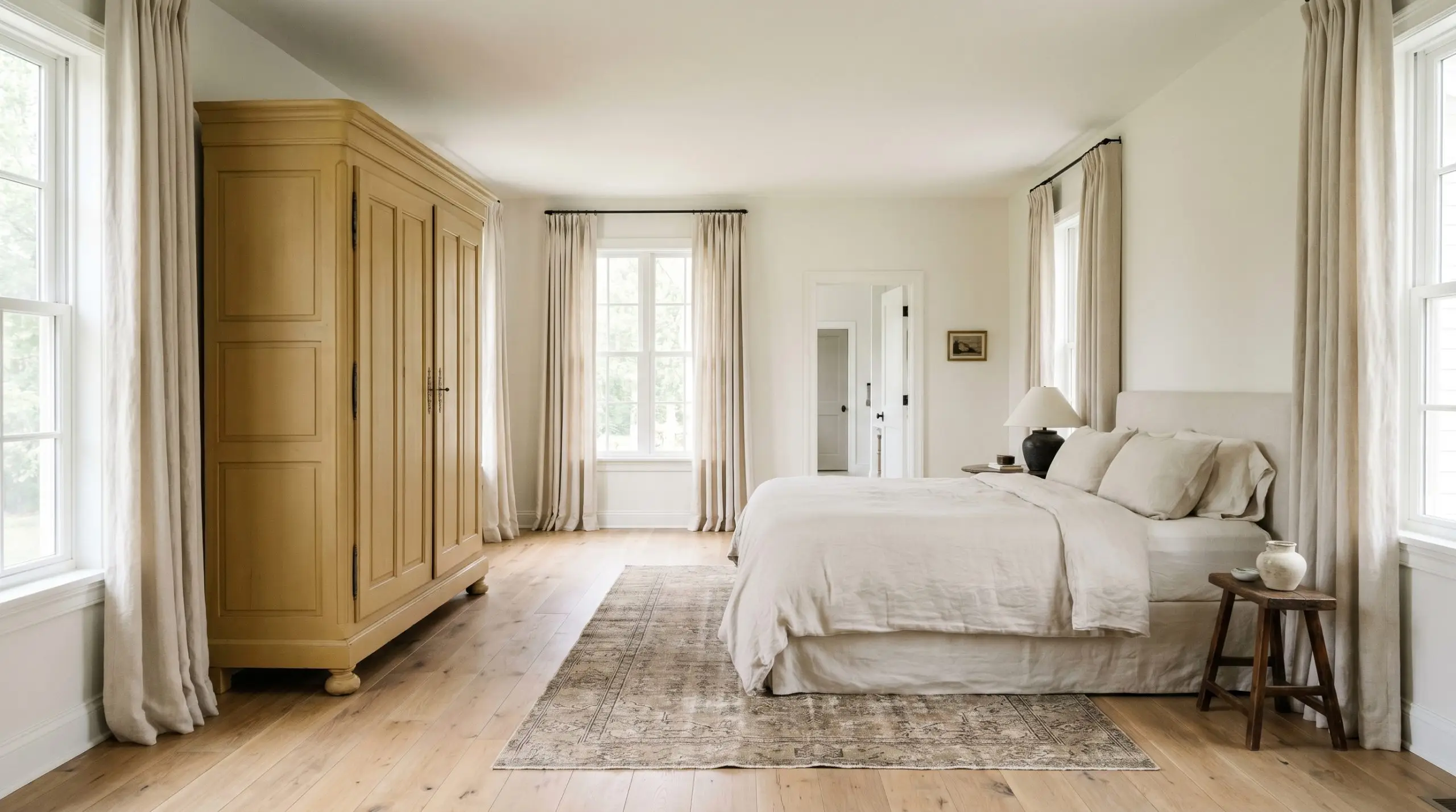
Transform a heavy, outdated wooden armoire or a vintage linen press by coating it entirely in this historic shade. The tactile finish of a premium paint will modernize the silhouette while respecting its heritage. When styled against a crisp, warm white wall, the piece becomes a commanding, highly curated focal point for a large bedroom or hallway.
Coordinating Colors & Best Pairings
To make this earthy gold feel elevated, you must surround it with materials and colors that respect its historical roots while providing necessary visual tension.
Trim & Baseboards
For a clean, tailored boundary that allows the gold to breathe, Benjamin Moore White Dove OC-17 provides a soft, shaded contrast that never feels stark. If you want a slightly creamier, more seamless transition, Farrow & Ball New White 59 shares a similar underlying warmth, creating a gentle, atmospheric glow across the millwork. Sherwin-Williams Alabaster SW 7008 offers a beautifully balanced, luminous edge that highlights the ochre depth.
Hardware, Wood & Material Pairings
Coordinating Colors
Designer Mood Boards
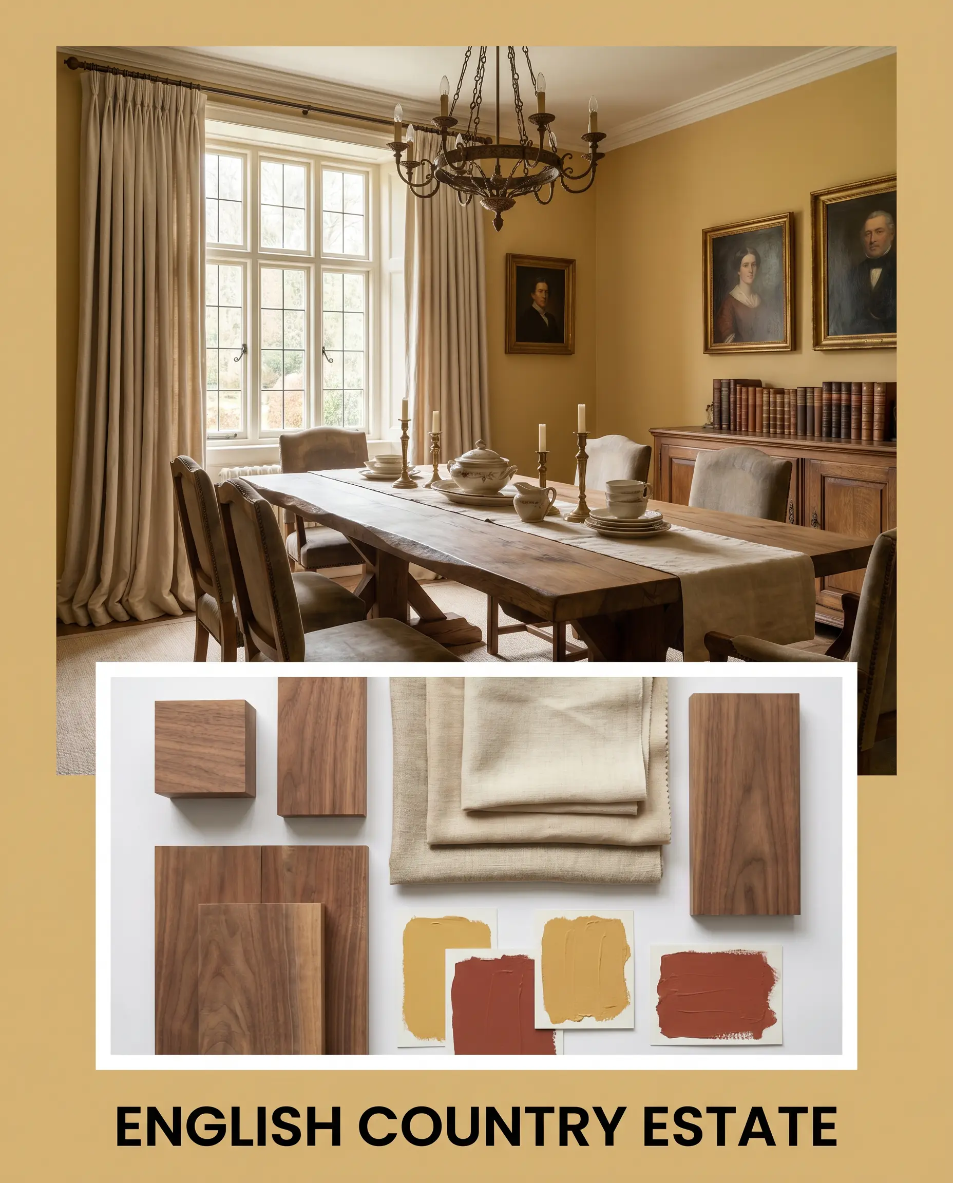
English Country Estate: Grounded by Farrow & Ball Sudbury Yellow 51, this palette relies on the deep, historic contrast of Farrow & Ball Picture Gallery Red 42. Layer in heavily pleated, unbleached heavyweight linen drapery and a massive, raw matte walnut dining table. The energy is deeply layered, collected, and inherently welcoming.
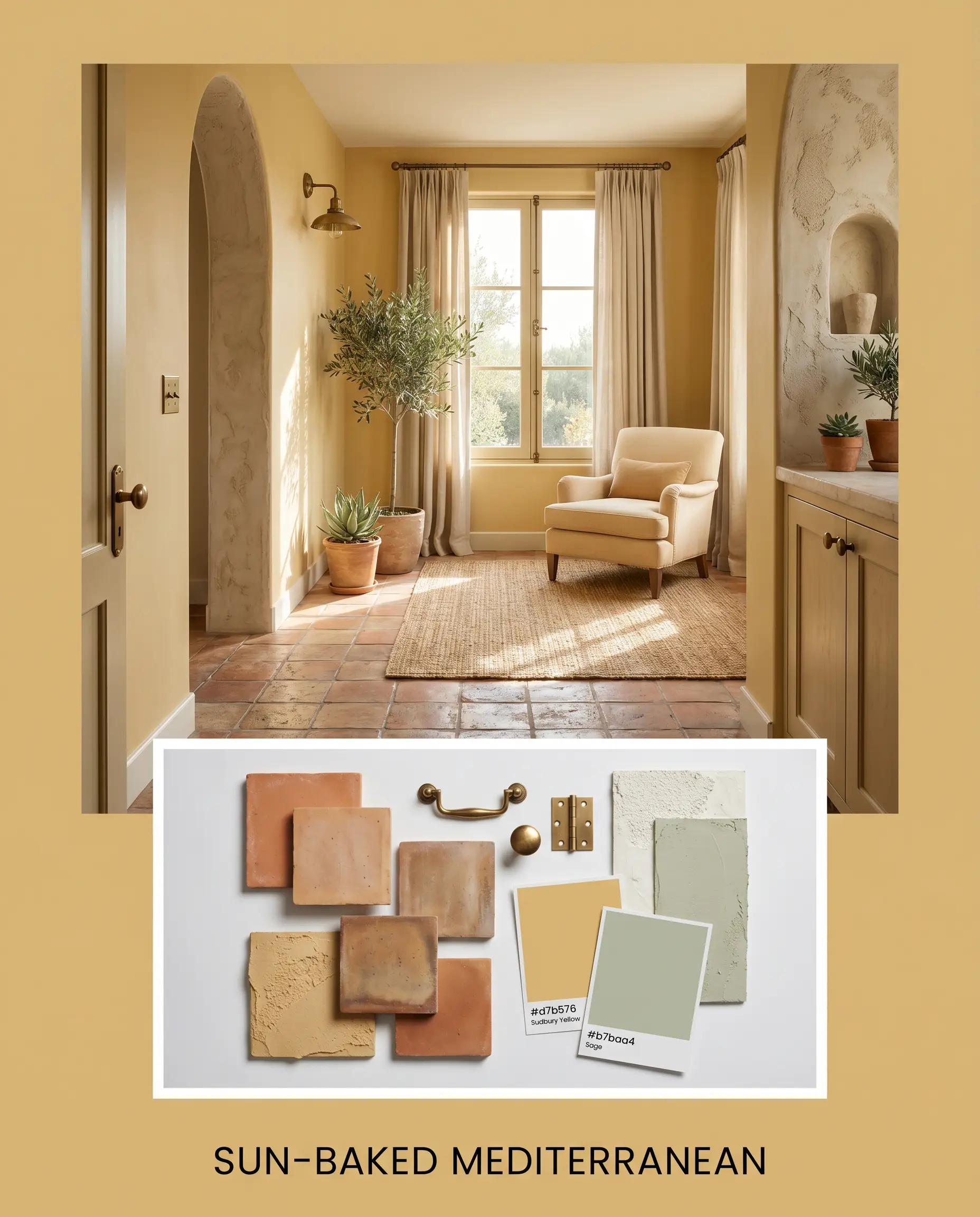
Sun-Baked Mediterranean: This aesthetic leans into the paint’s earthy warmth, pairing the muted gold with the silvery coolness of Farrow & Ball Vert de Terre 234. Introduce rustic terracotta flooring, burnished antique brass hardware, and highly textured plaster accents. The resulting vibe is relaxed, airy, and effortlessly sophisticated.
Moody Heritage: A dramatic, high-tension approach that pairs the golden walls with the deep plum intensity of Sherwin-Williams Carnelian SW 7580. Anchor the space with heavily veined Calacatta Viola marble countertops and dark, moody oil portraits. This combination feels striking, rich, and architecturally profound.
Head-to-Head Comparisons
When finalizing your palette, understanding how this specific gold reacts against its direct competitors is vital for ensuring the undertones align with your home’s lighting.
Farrow & Ball Sudbury Yellow 51 vs. Farrow & Ball India Yellow 66
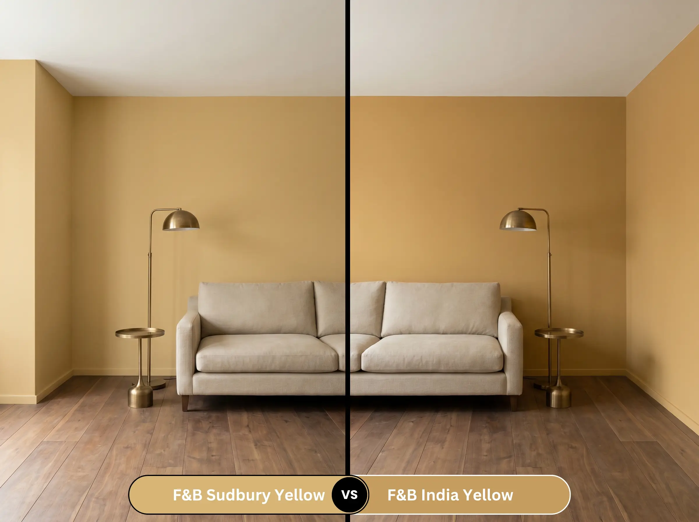
If you need a color with significantly more punch, Farrow & Ball India Yellow 66 is the stronger, more saturated choice. Farrow & Ball Sudbury Yellow 51 leans heavily into its brown and ochre base, making it feel older and more muted. Choose India Yellow if you want a vibrant, moody glow, but stick with Sudbury Yellow if you need a reliable, grounded neutral that won’t overwhelm a large living space.
Farrow & Ball Sudbury Yellow 51 vs. Benjamin Moore Chestertown Buff HC-9
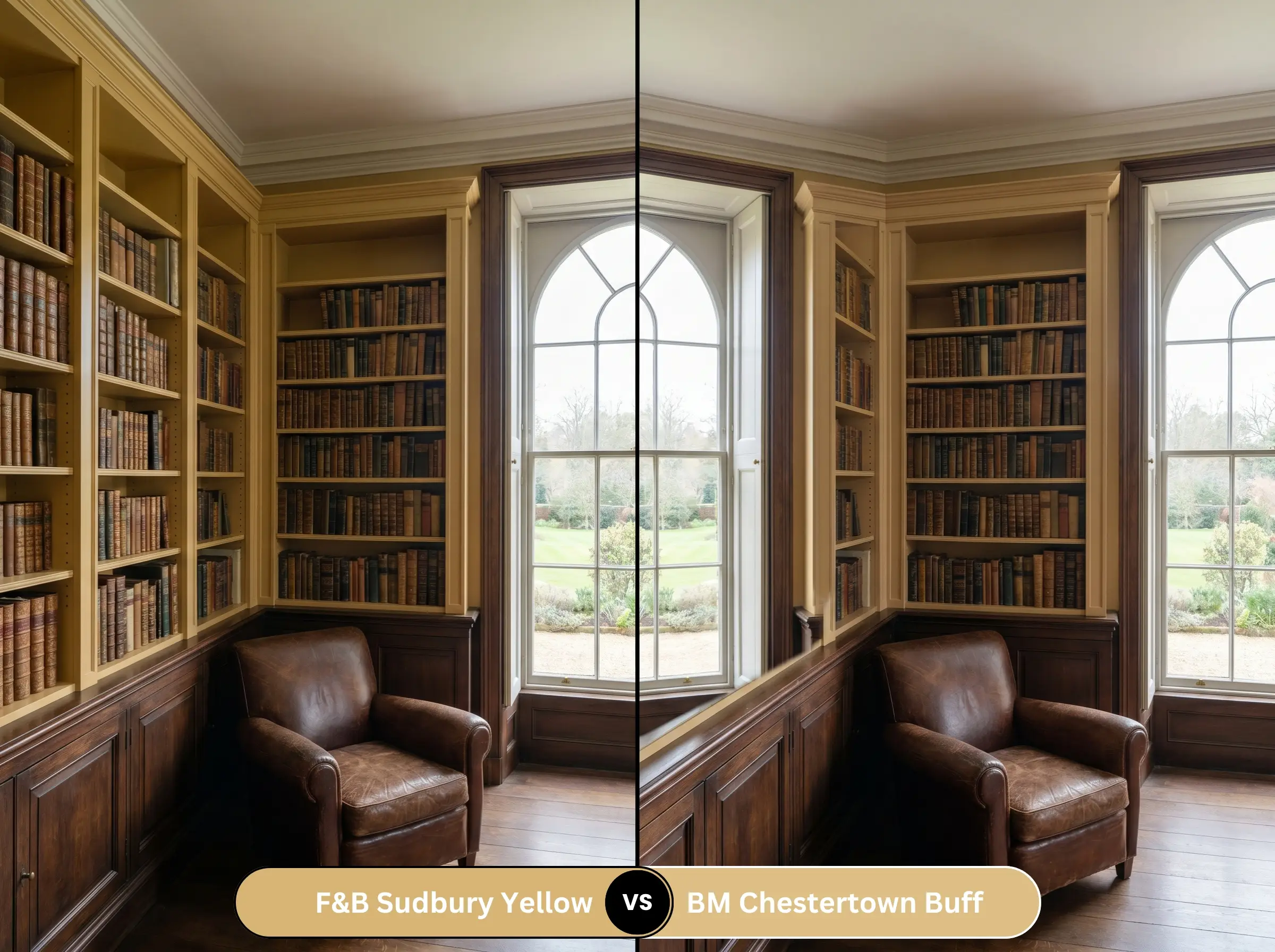
Benjamin Moore Chestertown Buff HC-9 is slightly lighter and carries a touch more clarity in its yellow pigment. Farrow & Ball Sudbury Yellow 51 feels heavier, darker, and more historically accurate due to its complex micro-undertones. If your room lacks abundant natural light, the Benjamin Moore option might feel slightly more uplifting, whereas the Farrow & Ball shade requires decent illumination to shine.
Farrow & Ball Sudbury Yellow 51 vs. Sherwin-Williams Tarnished Trumpet SW 9026
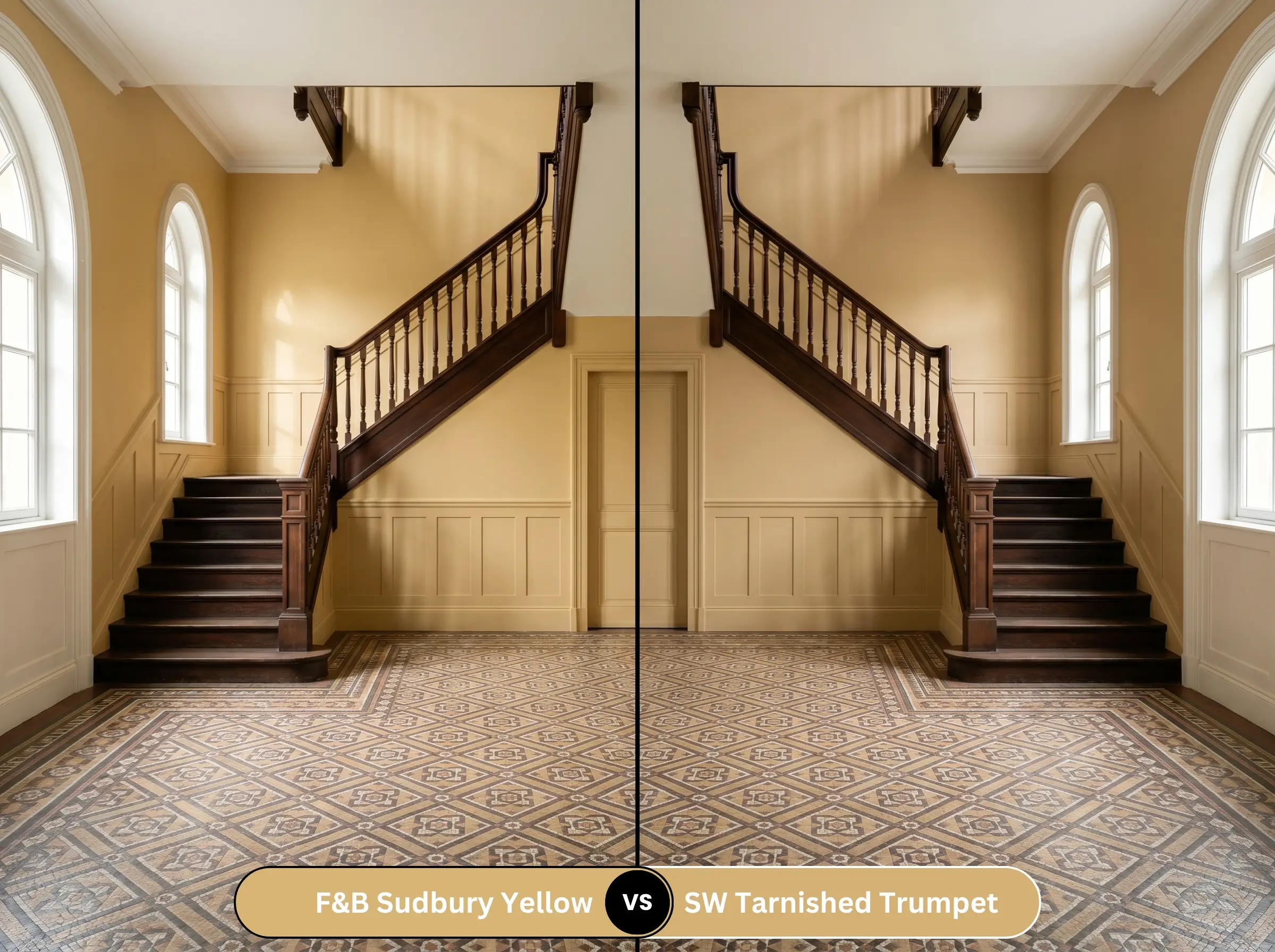
Sherwin-Williams Tarnished Trumpet SW 9026 pushes further into the bronze and mustard territory, feeling a bit more aggressive in its golden warmth. Farrow & Ball Sudbury Yellow 51 remains slightly more restrained and elegant. Opt for the Sherwin-Williams alternative if you are designing a high-energy, eclectic space, but rely on Farrow & Ball for traditional, tailored millwork.
Similar Colors & Brand Equivalents
Whether you are looking for a subtle shift in depth or need to source a match from a different manufacturer, these alternatives provide excellent pathways.
Similar Colors
Cross-Brand Matches
Practical Application & DIY Advice for Sudbury Yellow
Transitioning this beautiful pigment from the tin to your walls requires a strategic approach to finishes and preparation to ensure a flawless, premium result.
The Dynamic Sheen Guide
Primer Strategy
To achieve the true, historic depth of this shade, you must use a mid-tone or specifically tinted primer. Applying this color over a stark white wall or a bare wood surface without the correct base layer will cause the brown undertones to look streaky and uneven.
Coverage & Success Tips
Expect to apply at least two generous coats for full opacity, though highly porous plaster may demand a third. Because of the complex pigments involved, touch-ups on flat finishes can occasionally “flash,” leaving a visible, shiny ring where the new paint dries. To avoid this, maintain a wet edge while rolling, and if a wall gets severely scuffed later, it is often better to repaint the entire single wall corner-to-corner.
Premium, highly pigmented paints take significantly longer to fully cure than standard big-box options. While it may feel dry to the touch in hours, give your freshly painted cabinetry or high-traffic trim at least two full weeks before scrubbing it or resting heavy objects against it to prevent premature chipping.
Hackrea Design Secret (The Curing Window)
Frequently Asked Questions
Because of its heavy ochre and brown micro-undertones, it certainly can. Without natural light to activate the golden hue, the color flattens out, feeling more like a heavy tan. To counteract this in a windowless powder room or hallway, you must saturate the space with warm, layered artificial lighting (around 2700K) to force the yellow back to the surface.
It performs brilliantly in full sunlight. The intense exterior light naturally washes out the color, preventing it from looking like a vibrant, shocking yellow. Instead, the earthy undertones anchor the facade, leaving you with a sophisticated, sun-baked historic glow that looks as though it has been there for centuries.
It is generally not recommended. The earthy, warm brown undertones of the paint will aggressively fight against the icy, blue-based veining of a standard cool gray marble, making the stone look sterile and the paint look dirty. Instead, pivot to a stone with warmer, muddier veining, like a rich cream quartzite or a dramatically warm Calacatta.
Modern Eggshell is the definitive choice for high-touch cabinetry. It provides a durable, washable surface that can withstand daily culinary wear and tear while maintaining a beautifully soft, mid-sheen elegance that perfectly suits the historic nature of the color.
Final Verdict & Expert Warnings
Farrow & Ball Sudbury Yellow 51 is a remarkably grounded, sophisticated pigment designed for those who appreciate the layered nuance of historic color. Its absolute best application is in expansive, traditional spaces—like formal dining rooms, grand entryways, or custom built-in libraries—where its rich, earthy depth can wrap the architecture in a cocoon of warmth. It is the perfect choice for homeowners looking to inject a sense of aged permanence and tactile elegance into their interiors without resorting to heavy, dark neutrals.
You must avoid pairing this shade with icy, blue-toned white trim, stark cool-gray luxury vinyl plank flooring, or highly polished chrome fixtures, as these chilly elements will conflict with the paint’s warm ochre base, making the walls appear dull and unwashed.
Expert Warning (Clash Tips)
Closest Cross-Brand Equivalents
The absolute closest scientific color matches for Sudbury Yellow across top paint brands.