Sea Mariner SW 9640
Sherwin-WilliamsSherwin-Williams Sea Mariner (SW 9640) is a deep, moody charcoal blue with subtle violet undertones. With a low LRV of 7, it absorbs significant light, making it an incredibly grounding, sophisticated choice for cabinetry, exterior trim, and dramatic accent walls.
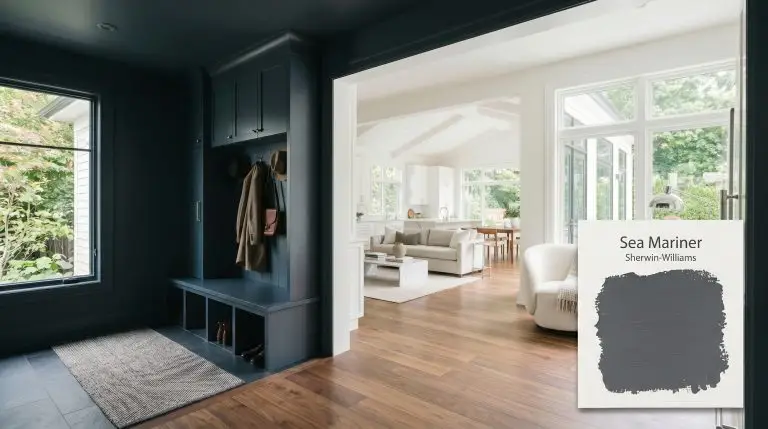
Sherwin-Williams Sea Mariner: Mastering the Perfect Moody Charcoal-Blue
There is a common misconception that ultra-dark paint instantly shrinks a room, but when wielded correctly, a deeply saturated shade acts as an architectural anchor. Sherwin-Williams Sea Mariner SW 9640 is a masterclass in atmospheric grounding. This color is not just a standard navy; it is a highly curated, light-absorbing slate that wraps a space in quiet sophistication. Whether you are aiming for a classic nautical aesthetic on an exterior facade or planning a highly tailored, moody interior design scheme, this pigment provides a brilliant foundation for accessible luxury.
Sherwin-Williams Sea Mariner: Undertones & LRV
Is Sherwin-Williams Sea Mariner warm or cool? This deeply saturated shade is definitively cool, engineered to bring a crisp, tailored elegance to any environment. Its core pigment structure leans heavily away from warmth, relying instead on a shadowy, receding coolness to establish its presence.
To truly understand how this color will behave on your walls, we have to look at how it is built:
At an LRV (Light Reflectance Value) of 7, Sea Mariner SW 9640 is incredibly dark. This severe low light reflectance means it absorbs an astonishing 93% of the light that hits it. Rather than bouncing illumination around the room, this extreme light absorption creates dramatic depth, forcing the walls to visually recede and allowing your furniture and lighting fixtures to take center stage.
You can apply wallpapers, paints, etc. on walls and see how they look in various interiors.

Lighting Effects & The Chameleon Factor
The biggest hesitation homeowners have with ultra-dark paints is the fear of creating a dreary, flat black box or accidentally unleashing an unwanted, vivid purple. Because of its complex build, this charcoal-blue is highly responsive to its environment. Understanding its light reactivity is the key to preventing those failure states.
Here is exactly how the ambient light manipulates the color:
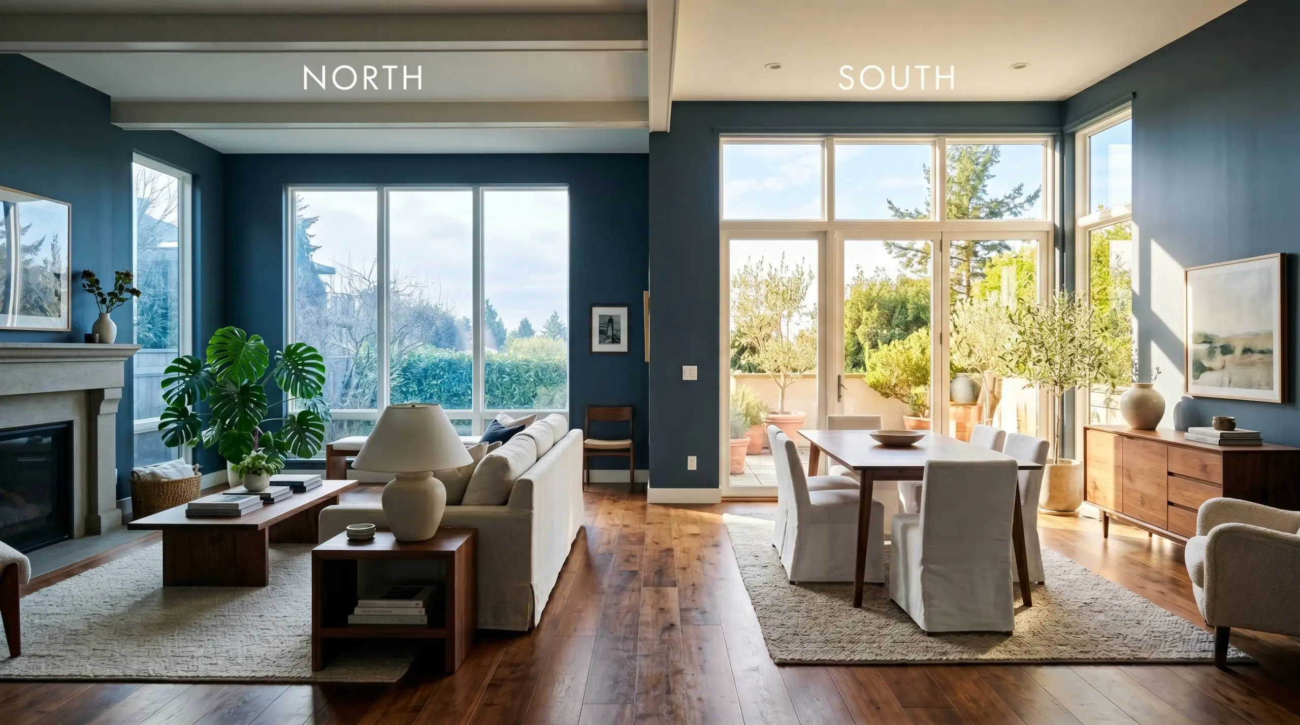
When taking this color outside, remember that direct, unfiltered sunlight dramatically lightens perceived darkness. On a sun-drenched facade, this deep shade will read significantly lighter and bluer than it does on an interior swatch.
Hackrea Pro-Tip (The Exterior Washout)
Sea Mariner in Everyday Spaces
This specific pigment demands to be used intentionally, transforming standard, everyday rooms into highly curated retreats. It brings an undeniable, cohesive energy to a home, acting as a brilliant backdrop for a high-low mix of accessible furnishings and premium accents.
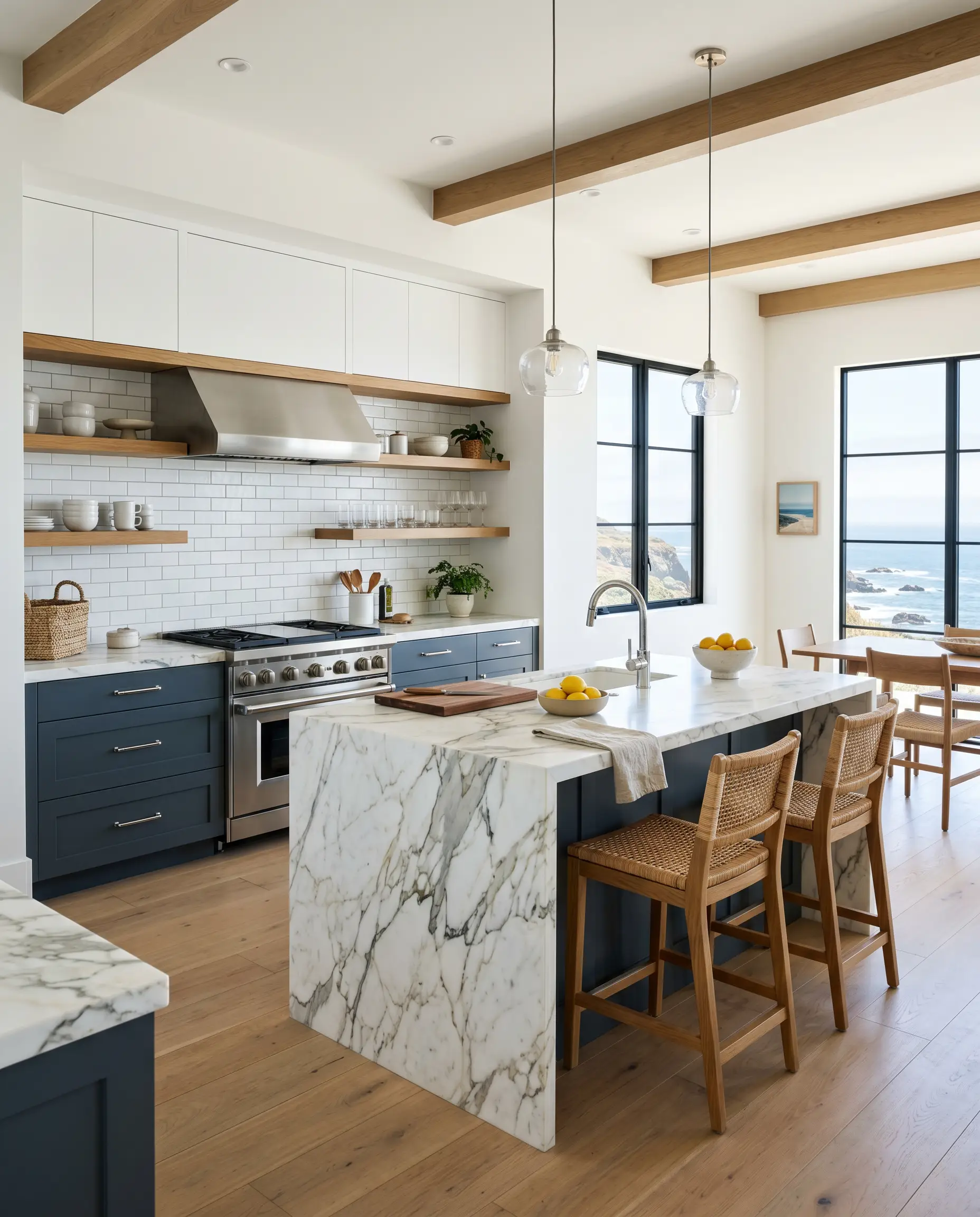
Kitchens
Because of its immense depth, this shade is a brilliant cabinetry accent. Grounding your lower cabinets or a central island with this dark slate instantly elevates standard builder-grade kitchens, especially when paired with crisp white uppers. If you are planning a weekend renovation, understanding how to paint kitchen cabinets properly is crucial, as dark colors require flawless execution to look high-end. Pair this foundation with warm wood floating shelves or a classic subway tile backsplash to balance the visual weight.
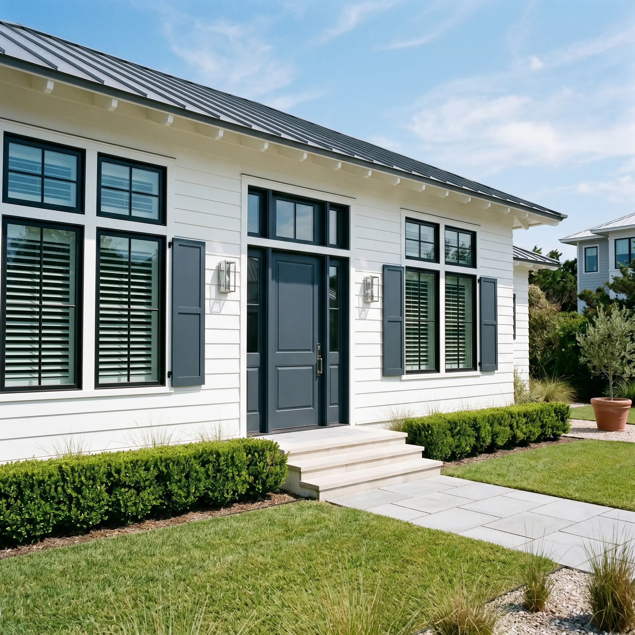
Exteriors
This color shines as an architectural framing tool on the outside of a home. It is a stunning choice for exterior trim, front doors, or shutters, providing a sharp, modern contrast against white siding or classic red brick. It effortlessly bridges the gap between a traditional coastal vibe and a crisp, contemporary update.
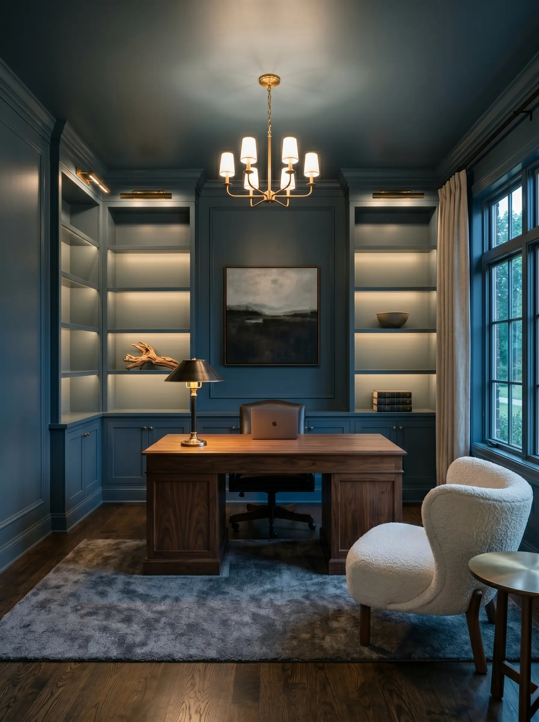
Home Offices
If you want to cultivate focus and sophistication, wrap your entire study in this shadowy blue. The color naturally reduces visual noise, creating an enveloping, distraction-free zone. To keep the space from feeling like a cave, ensure you have multiple layers of lighting, including a bright desk lamp and warm overhead fixtures. It provides a stunning backdrop for a standard glass desk, but also grounds heavy, traditional walnut furniture beautifully.
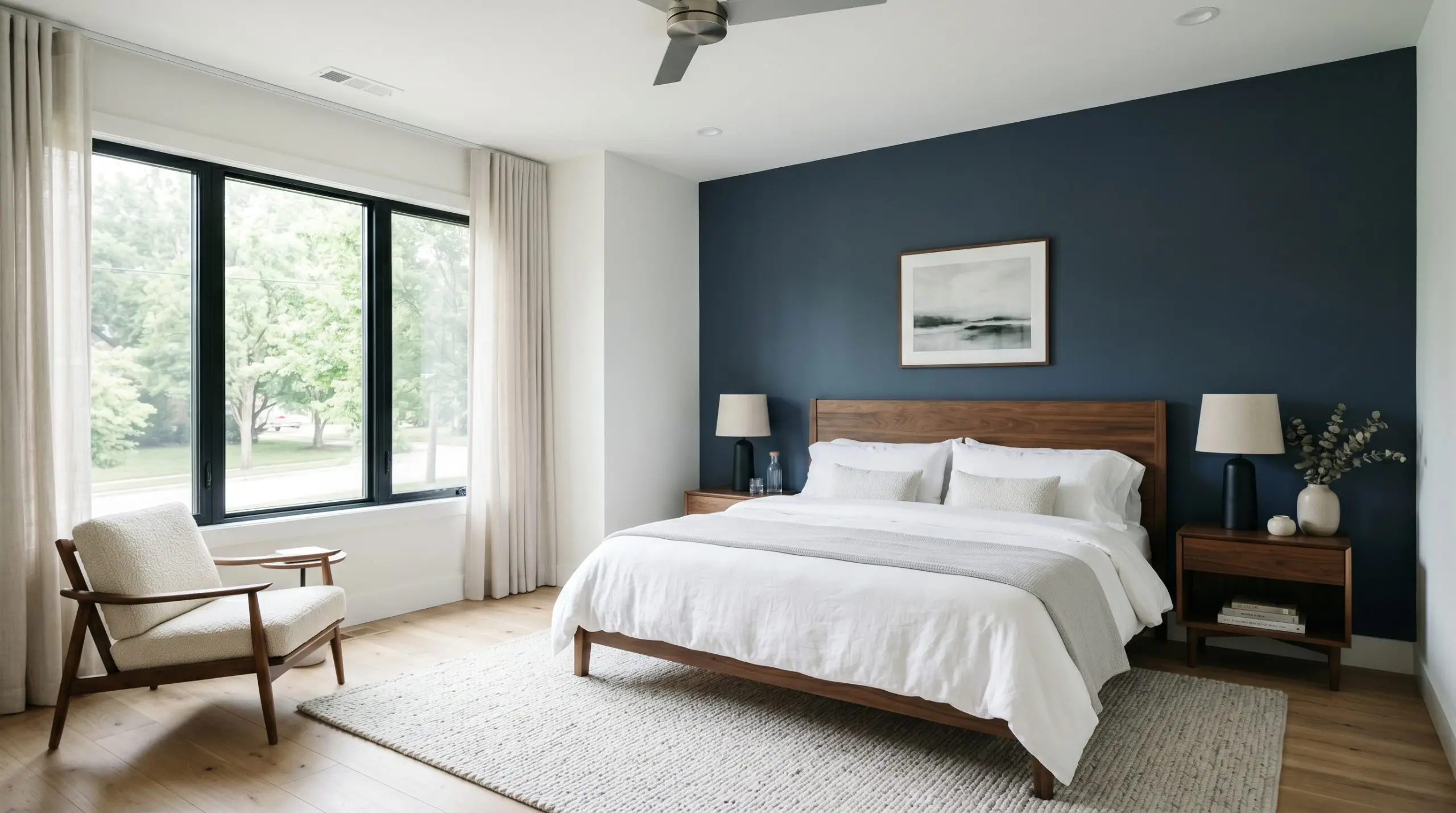
Bedrooms
For a restful retreat, use this charcoal-blue to manipulate the boundaries of the room. A grounding accent wall behind the bed anchors the sleeping space, pulling the eye inward. Dress the bed in breezy white linens to create a high-contrast, hotel-like crispness, or layer in chunky knit throws for a relaxed, textural haven.
Elevating the Color: Unique Architectural Ideas
The true magic of a heavily muted dark shade lies in pushing past standard wall applications. When you leverage its light-absorbing qualities creatively, you can engineer highly distinctive, custom-feeling moments throughout your home.
The Color-Blocked Mudroom Transition
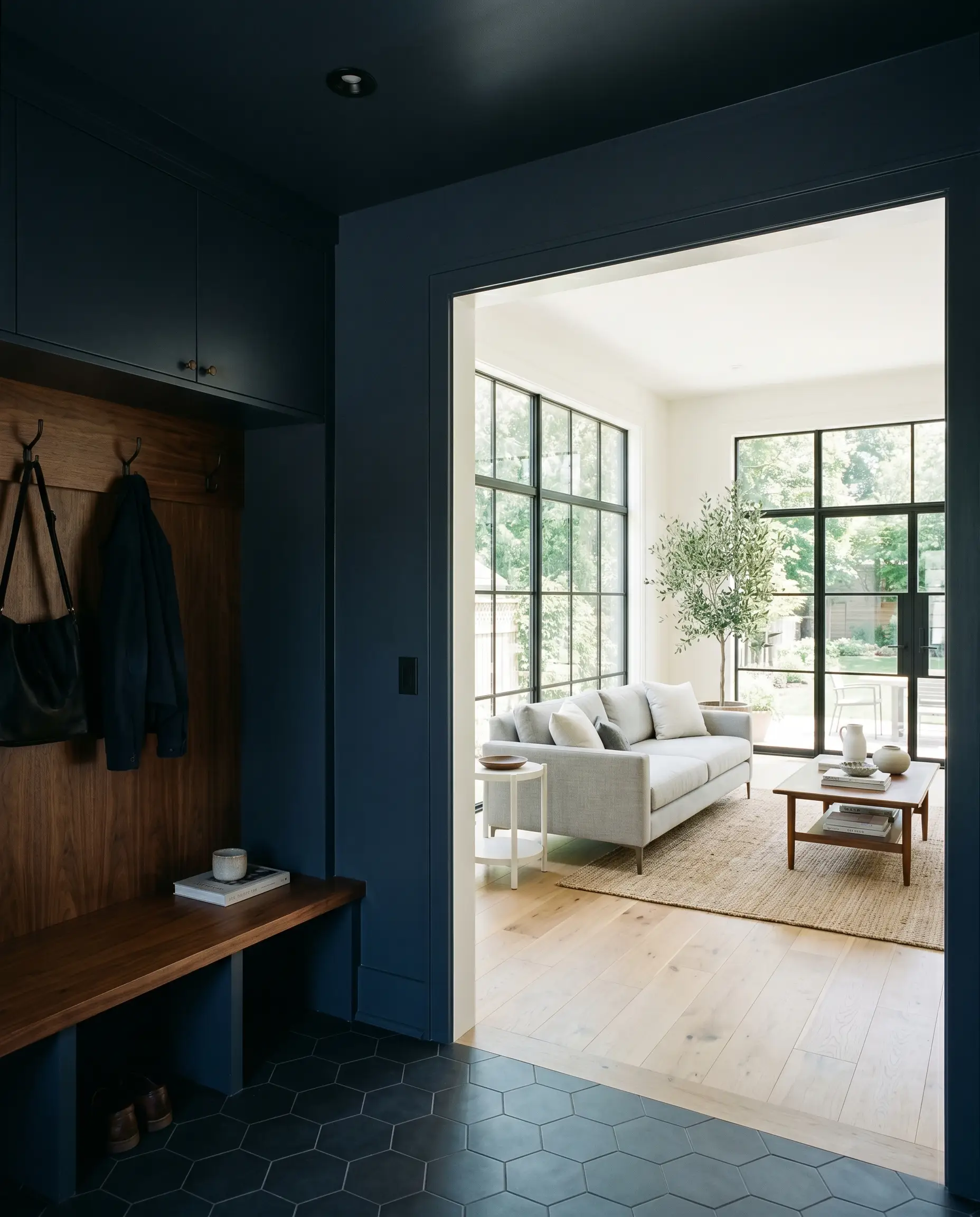
Instead of painting a standard hallway, use Sea Mariner SW 9640 to completely drench a transitional space like a mudroom or a small entryway vestibule. Paint the walls, the ceiling, and the interior doors in this single, unifying shade. This creates a dramatic visual palate cleanser. When you walk through this dark, compressed entryway into a bright, light-filled living room, the main space will feel exponentially larger and more expansive by comparison.
The High-Gloss Ceiling Treatment
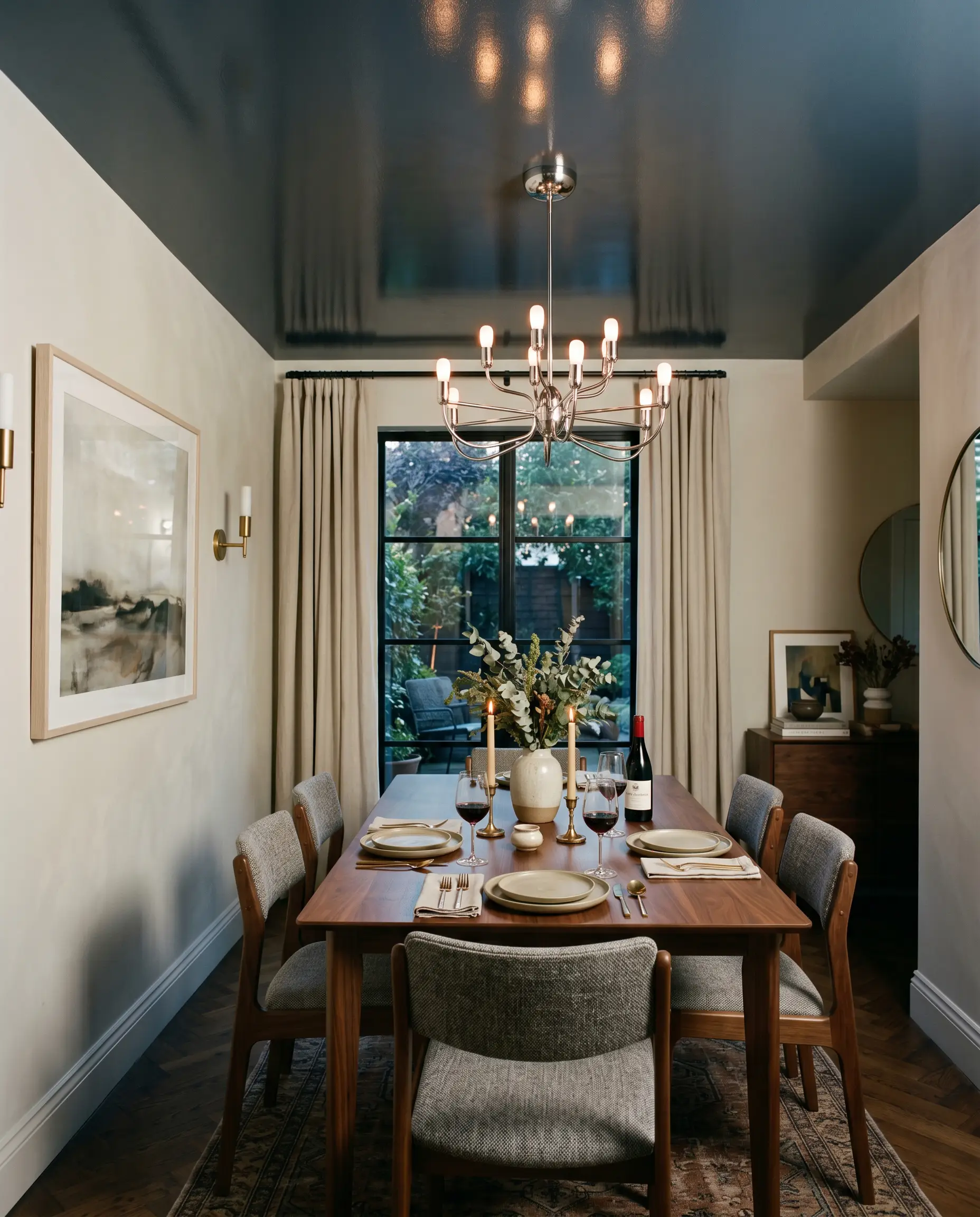
Flip the traditional design script by keeping your walls a soft, neutral white and applying this deep charcoal exclusively to the ceiling. To amplify the effect, use a high-gloss finish. While the color itself absorbs light, the glossy sheen will bounce the ambient room light downward, creating an illusion of endless height. It mimics the feeling of a sophisticated, open night sky, perfect for a dining room or an intimate lounge area.
The Modern Plinth Base
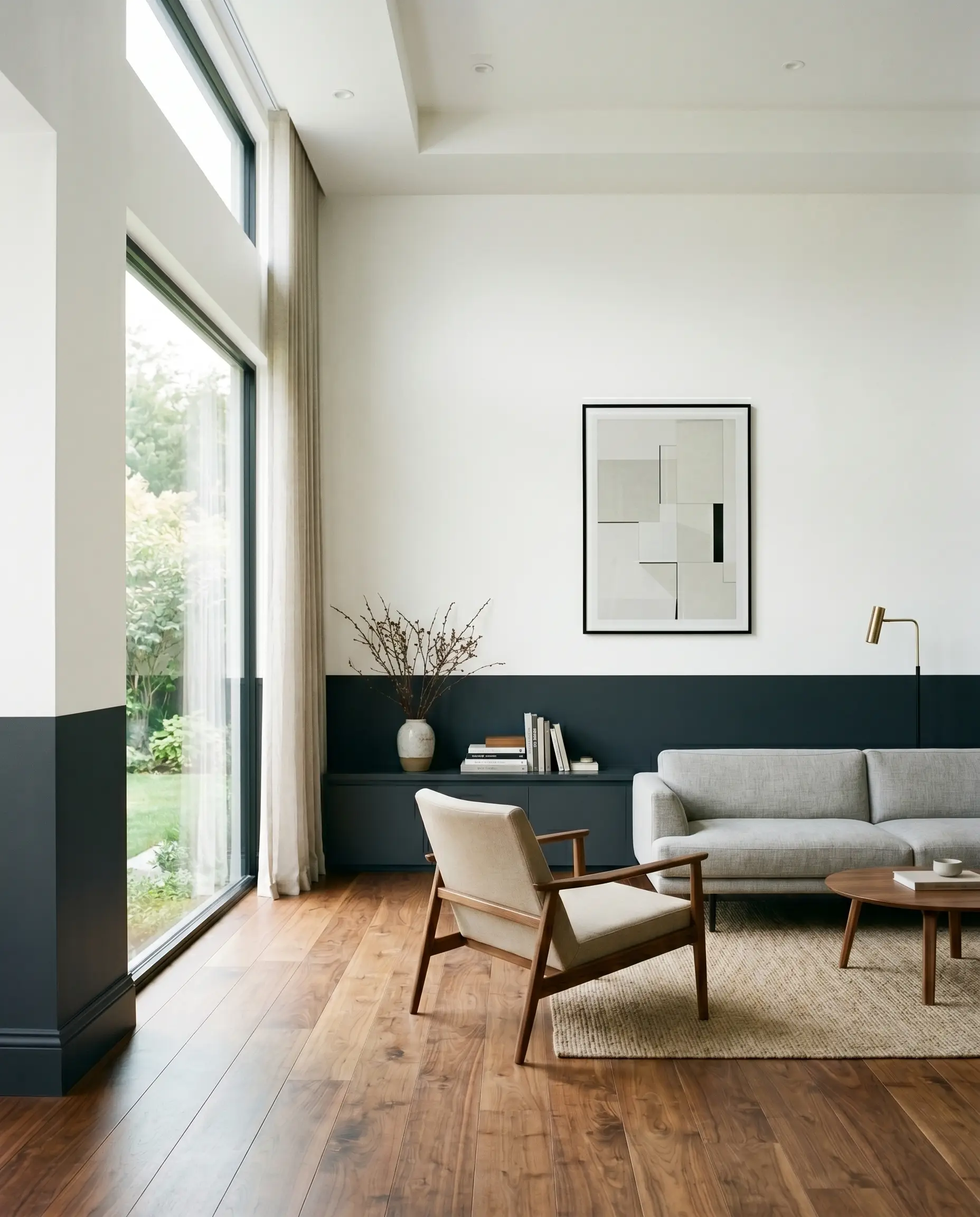
For a highly tailored, contemporary aesthetic, paint only the lower third of your walls, including the baseboards, in this dark slate. Leave the upper two-thirds crisp white. This modern color-blocking technique grounds the room without requiring the commitment of a fully dark space. It visually anchors your furniture to the floor, making lightweight seating look incredibly intentional and rooted.
Coordinating Colors & Best Pairings
A shade with such low reflectance requires strategic, intentional contrast to feel curated. If you are currently exploring the best dark blue-gray paints, you will quickly realize that their success depends entirely on the surrounding boundaries and tactile materials.
Trim & Baseboards
To make this moody tone sing, it needs a razor-sharp boundary.
Hardware, Wood & Material Pairings
The right tactile elements create a sensory dialogue with the paint, either absorbing its depth or bouncing light to lift it.
Coordinating Palettes
When building a whole-room scheme, rely on soft, neutralizing tones to balance the drama.
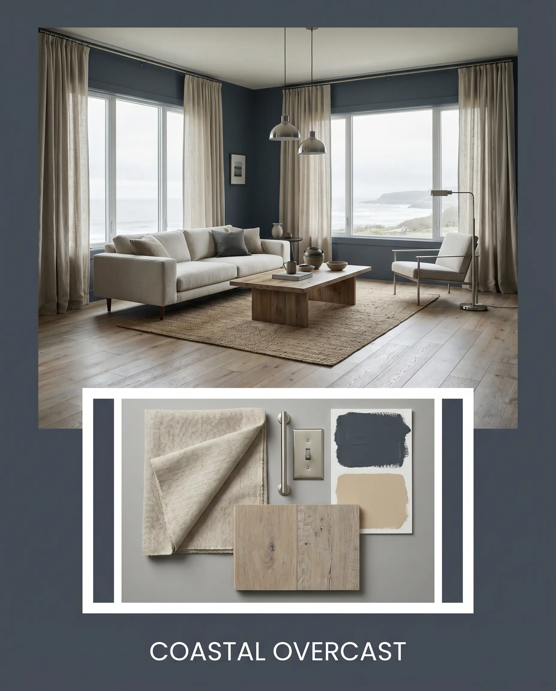
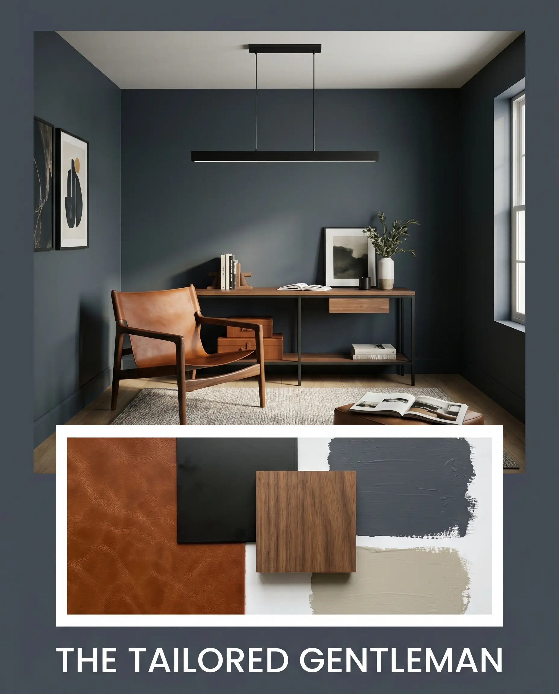
Designer Mood Boards
Coastal Overcast: This palette captures the serene, moody energy of a stormy shoreline. It pairs the deep slate walls with heavily textured linen drapery in a soft oatmeal tone. Add in brushed nickel lighting fixtures and light, weathered oak flooring to keep the energy relaxed, breezy, and effortlessly transitional.
The Tailored Gentleman: A highly structured, sophisticated scheme that leans into the paint’s crisp, architectural qualities. Imagine this dark backdrop supporting a rich, cognac leather sling chair and a sleek, matte black linear pendant light. The interplay between the warm leather and the cool, shadowy walls creates a fearless, magazine-ready tension.
Head-to-Head Comparisons
Sometimes, a slight shift in a home’s lighting exposure or fixed materials requires a pivot. Here is how this shade stacks up against its closest rivals.
Sherwin-Williams Sea Mariner SW 9640 vs. Benjamin Moore Hale Navy HC-154
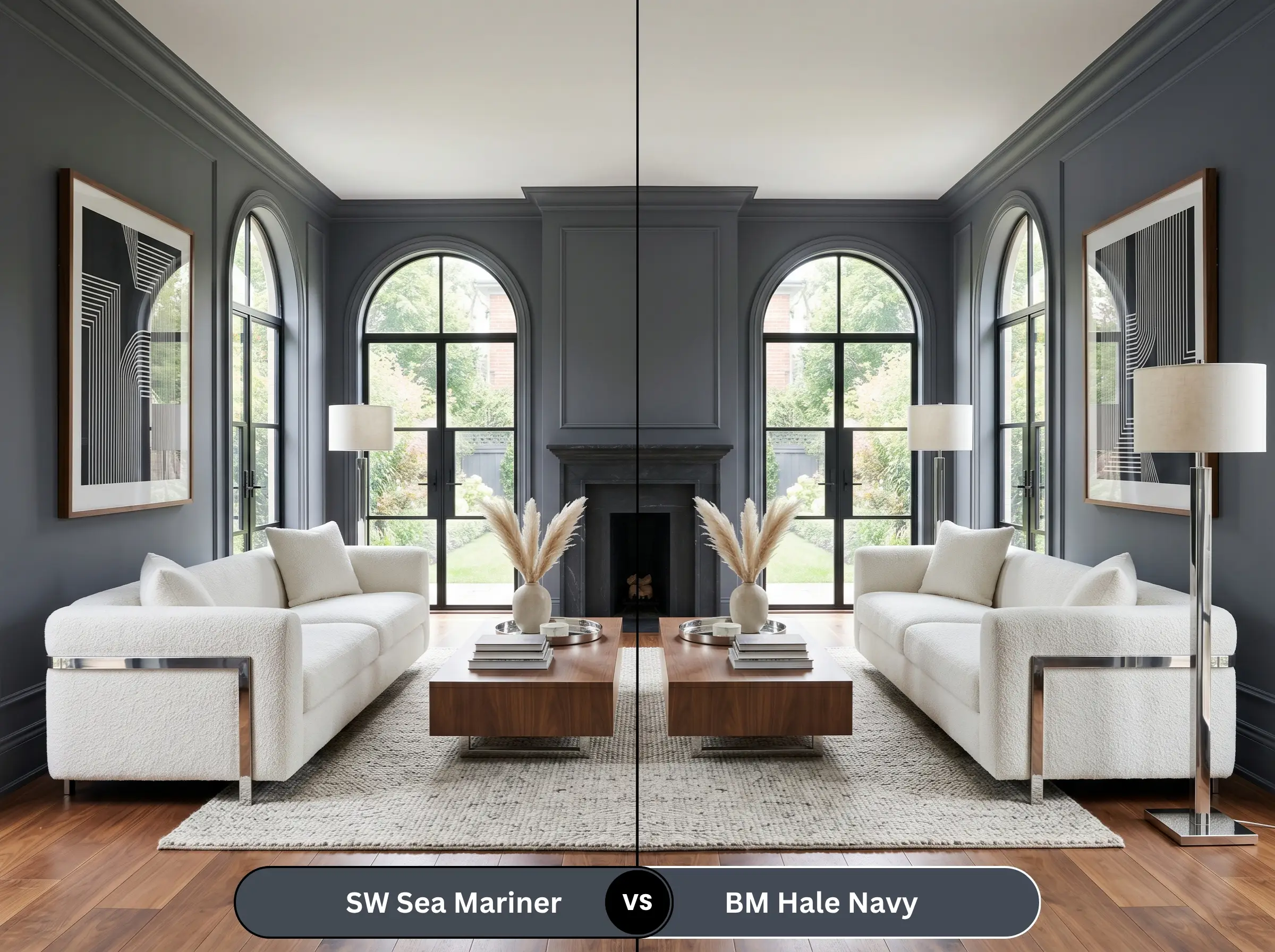
Hale Navy is a legendary, true classic navy with a slightly higher LRV. If your room lacks natural light and you fear Sea Mariner will look too much like a flat gray-black, Hale Navy is the safer choice, as it retains its distinct blue identity even in shadows. However, if you want a more muted, modern, and grayer aesthetic, stick with the Sherwin-Williams option.
Sherwin-Williams Sea Mariner SW 9640 vs. Sherwin-Williams Naval SW 6244
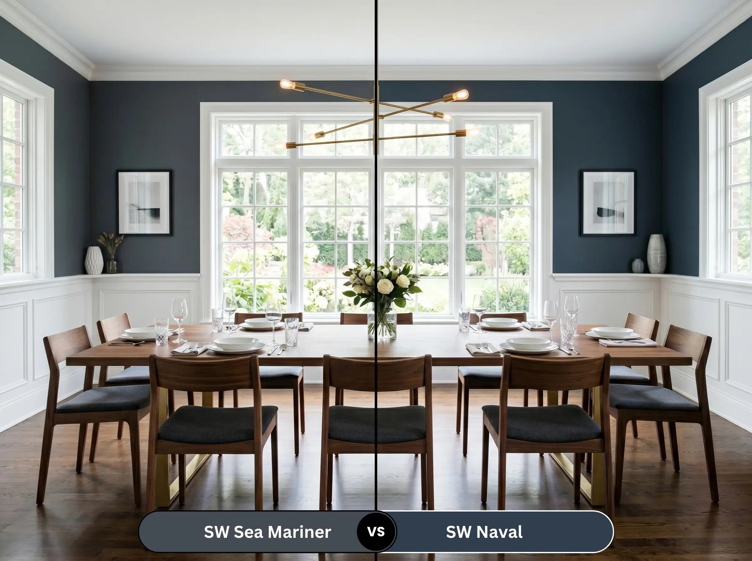
Naval is significantly more vibrant and carries a much stronger, traditional blue presence. It lacks the heavy charcoal muting found in Sea Mariner. If your goal is a punchy, energetic maritime feel, Naval is superior. If you prefer a quiet, receding, and highly sophisticated shadow-color, Sea Mariner SW 9640 is the clear winner.
Similar Colors & Brand Equivalents
If you need to tweak the depth or switch manufacturers based on local availability, these alternatives provide a similar atmospheric energy.
Same-Brand Alternatives
Rival Brand Matches
Practical Application & DIY Advice
Executing a flawless finish with an ultra-dark color requires strict adherence to proper painting techniques.
The Dynamic Sheen Guide
Primer Strategy
You cannot simply paint a dark color over a light wall and expect true depth. You must use a heavily tinted gray primer. A deep gray base coat reduces the number of expensive topcoats required and ensures the final color reaches its true, rich saturation without looking chalky.
Coverage & Success Tips
Expect to apply at least two generous coats, even with premium paint. Dark colors like this are notoriously prone to “flashing”—a visual failure where uneven roller pressure leaves highly visible, shiny streaks across the wall. Keep a wet edge while rolling, work in small sections, and never go back to touch up a semi-dry spot.
Ultra-dark matte and eggshell paints are incredibly difficult to spot-treat later. If your wall gets scuffed, a quick brush touch-up will dry with a different sheen and look like a glaring patch. You will often need to repaint the entire wall corner-to-corner to fix a single scratch.
Hackrea Design Secret (The Touch-Up Trap)
Frequently Asked Questions
Because of the immense power of direct sunlight, the hidden violet-blue micro-nuances will absolutely step forward outdoors. On a bright, south-facing facade, it will read significantly more purple-blue than it does on an interior swatch, so always test a large sample outside first.
Without natural light to activate the blue, it will behave almost entirely like a soft, dramatic charcoal black. This actually creates a brilliant, jewel-box effect, provided you use warm, flattering vanity lighting to keep the space inviting rather than stark.
Yes, but the texture of the stucco will create thousands of tiny micro-shadows, which deepens the perceived color significantly. To prevent the “black void” effect, ensure your surrounding exterior trim is painted a crisp, high-contrast white to define the home’s architectural lines.
The strong orange and red tones inherent in traditional red oak will actively pull the cool, violet-blue notes of the paint forward. The complementary color tension makes the blue feel much more pronounced, effectively stripping away some of its muted, gray sophistication.
Final Verdict & Expert Warnings
Sherwin-Williams Sea Mariner is a phenomenal, architectural color designed for the fearless homeowner who craves deep, receding sophistication. Its absolute best application is as a grounding agent—whether anchoring kitchen cabinetry, wrapping a distraction-free home office, or providing sharp, modern contrast on exterior trim. It is perfect for those who want the drama of a dark room but find true black too harsh and traditional navy too bright. It effortlessly bridges the gap between tailored modernity and moody, historic charm.
However, this deeply cool slate is not universally forgiving. Avoid pairing this shadowy charcoal with heavily yellowed maple floors, bright cherry woods, or stark, primary red and orange textiles. The intense heat of those specific wood tones and fabrics will violently clash with the paint’s cool violet-blue undertones, creating a vibrating, visually chaotic environment. Furthermore, if your home features heavy, Tuscan-style beige tiles or muddy brown stonework, this crisp, cool shade will make those warm, dated elements look incredibly dingy. Success with this color requires a commitment to clean lines, crisp white boundaries, and intentional, cooling contrast.