2026 Bathroom Paint Color Trends: The Rise of “Minimal Opulence” & Earthy Warmth
If the last decade of bathroom design taught us anything, it’s that the era of the “sterile sanctuary”—think bright white subway tiles and cool, clinical gray walls—is officially behind us. As we move into 2026, the interior design world is pivoting toward a concept designers are calling “Minimal Opulence.”
This new aesthetic isn’t about clutter or excess; it’s about using rich, tactile colors to make a space feel “lived-in” and emotionally restorative. Your bathroom is no longer just a utility space for hygiene; it is the primary “decompression zone” of the home. The 2026 palette reflects this urgent need for burnout relief, favoring sun-baked clays, restorative forest greens, and deep, moody browns that feel like a warm hug rather than a cold clinic.
In this comprehensive guide, we will explore the specific shades defining the year, the technical “rules” for choosing finishes in high-humidity zones, and expert styling secrets to make your renovation look professionally designed.
The Psychology of the 2026 Palette: Why These Colors?
Before we dive into swatches, it is helpful to understand the why behind the shift. In 2026, color psychology is playing a massive role in renovation decisions. We are seeing a move away from high-stimulus colors toward those that lower the heart rate.
This psychological shift is a key driver behind the broader 2026 bathroom trends, where emotional durability is just as important as physical durability.
Never commit to a color based on how it looks in the hardware store. Bathroom lighting is unique. Buy a sample pot and paint a large 2×2 foot poster board (not the wall directly). Move this board from the vanity to the shower and check it at three critical times: 8:00 AM (morning routine), 2:00 PM (natural daylight), and 9:00 PM (artificial light). A color like Warm Eucalyptus can look spa-green in the morning but muddy gray at night if your bulbs aren’t right.
📐Designer’s Tip: The “24-Hour” Test
You can apply wallpapers, paints, etc. on walls and see how they look in various interiors.

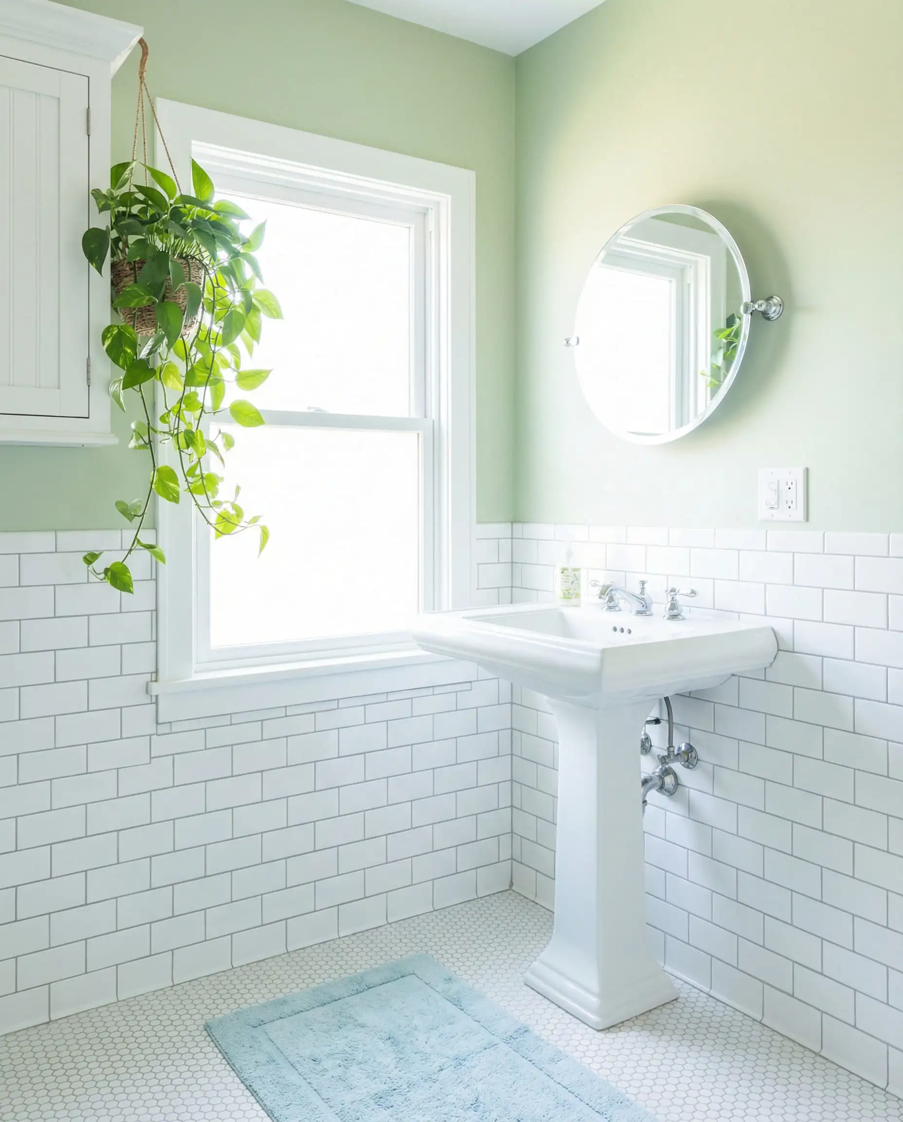
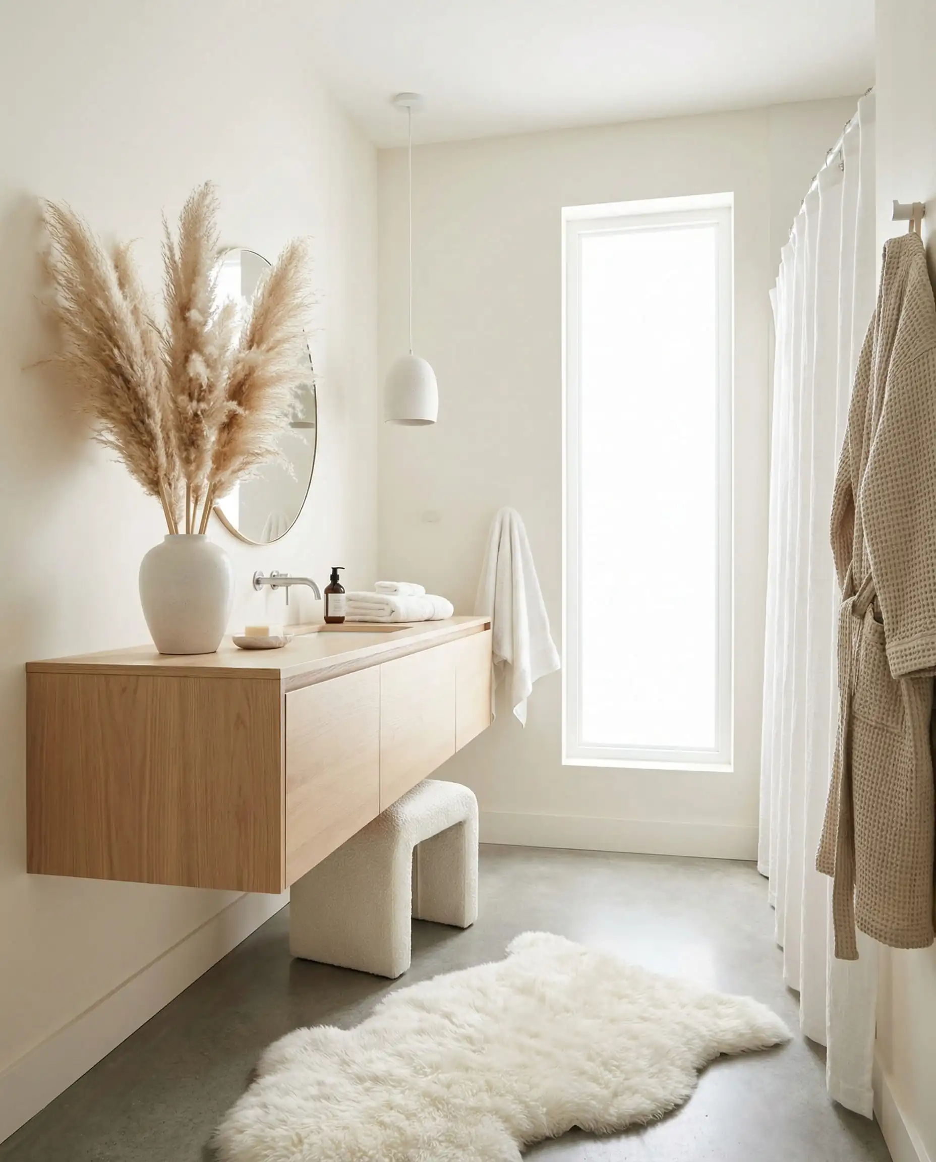
Trend 1: The “New Neutrals” (Warmth Over Starkness)
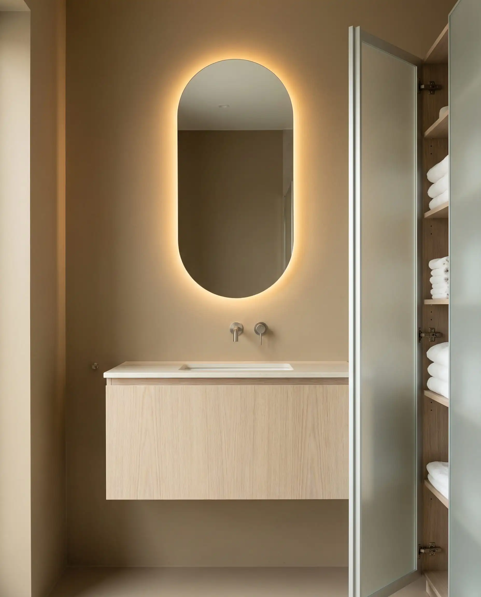
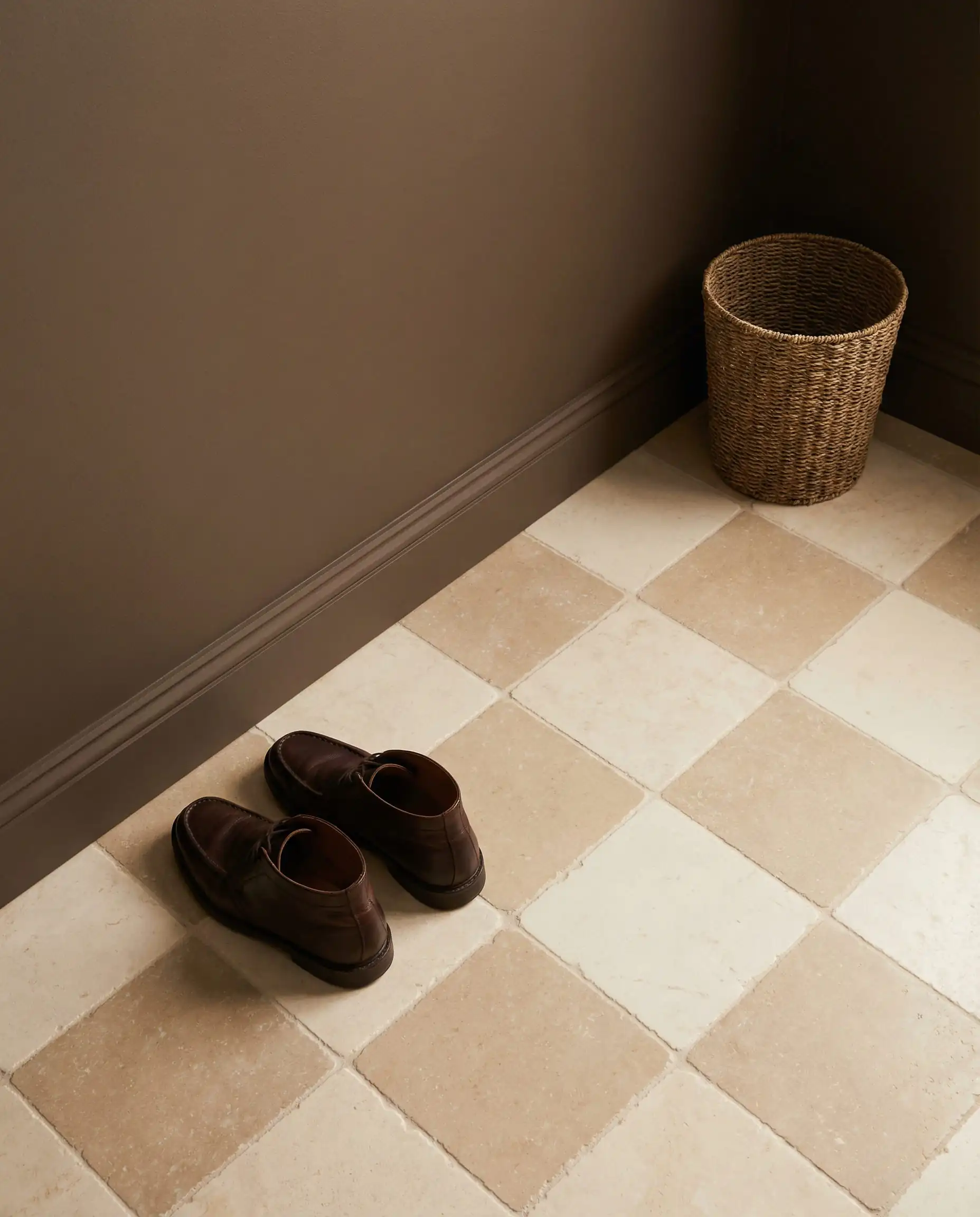
For years, “clean” meant white or cool gray. In 2026, “clean” means “honest.” We are seeing a massive resurgence of sandy, beige-forward neutrals. These shades bring the warmth of the outdoors inside without overwhelming the senses, acting as a perfect backdrop for natural stone and wood.
The Return of Khaki (The “Spa Sand” Evolution)
Forget the dull, yellow-based builder-grade beige of the early 2000s. The 2026 version, often dubbed “Universal Khaki,” is richer, deeper, and more sophisticated. It bridges the gap between gray and beige (greige) but leans heavily into red or orange undertones rather than blue.
- The Vibe: It feels like warm sand or unbleached linen.
- Specific Paint Picks to Sample:
- Sherwin-Williams “Accessible Beige” (SW 7036): A classic that fits the 2026 “warm neutral” criteria perfectly.
- Benjamin Moore “Manchester Tan” (HC-81): A fresh, sophisticated khaki that doesn’t feel dated.
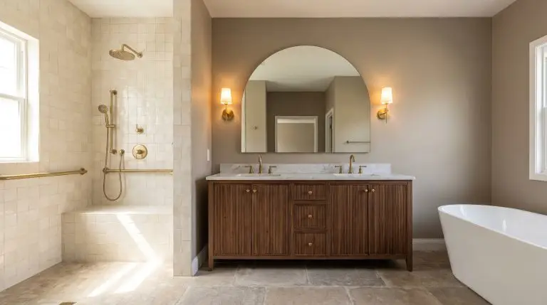
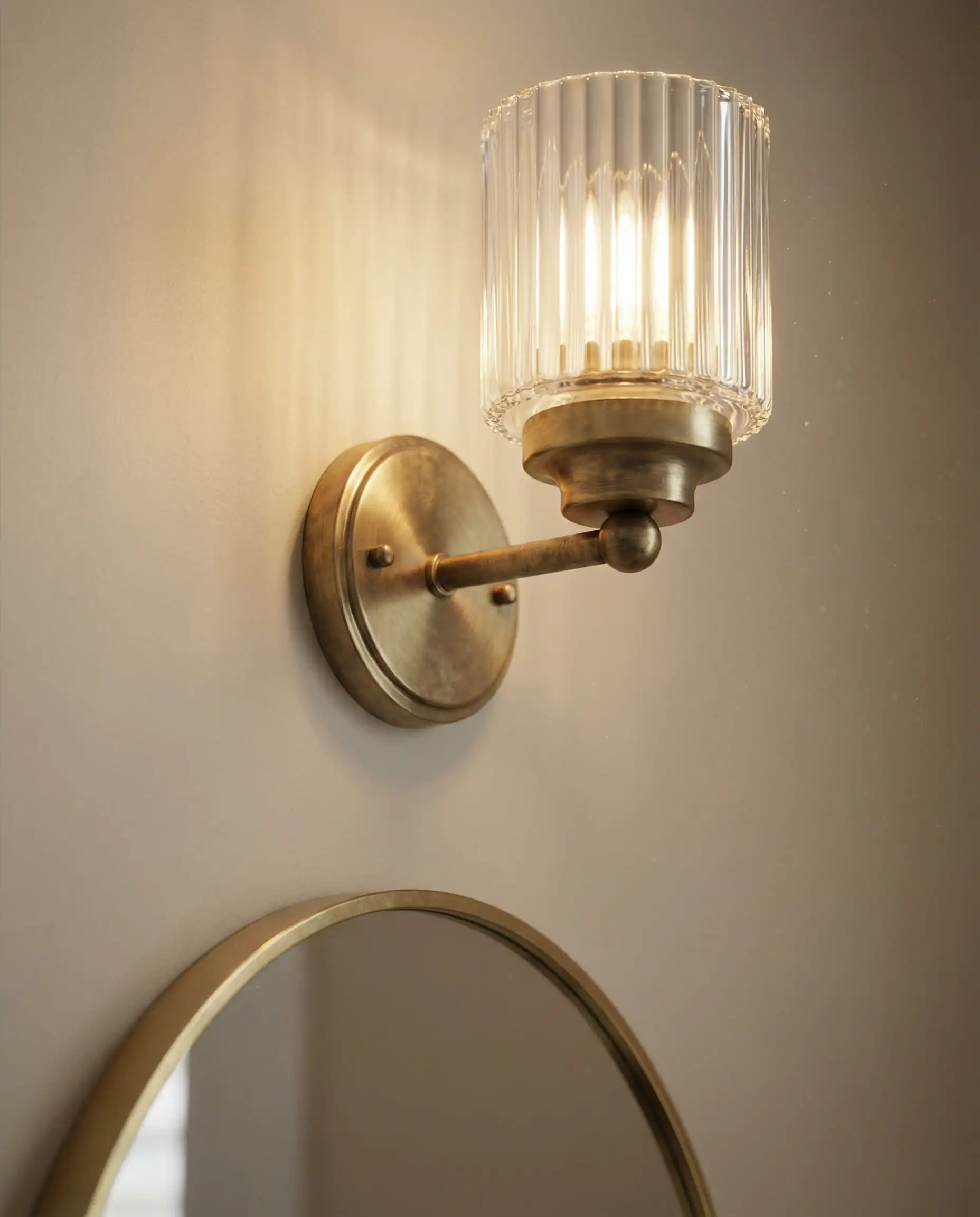
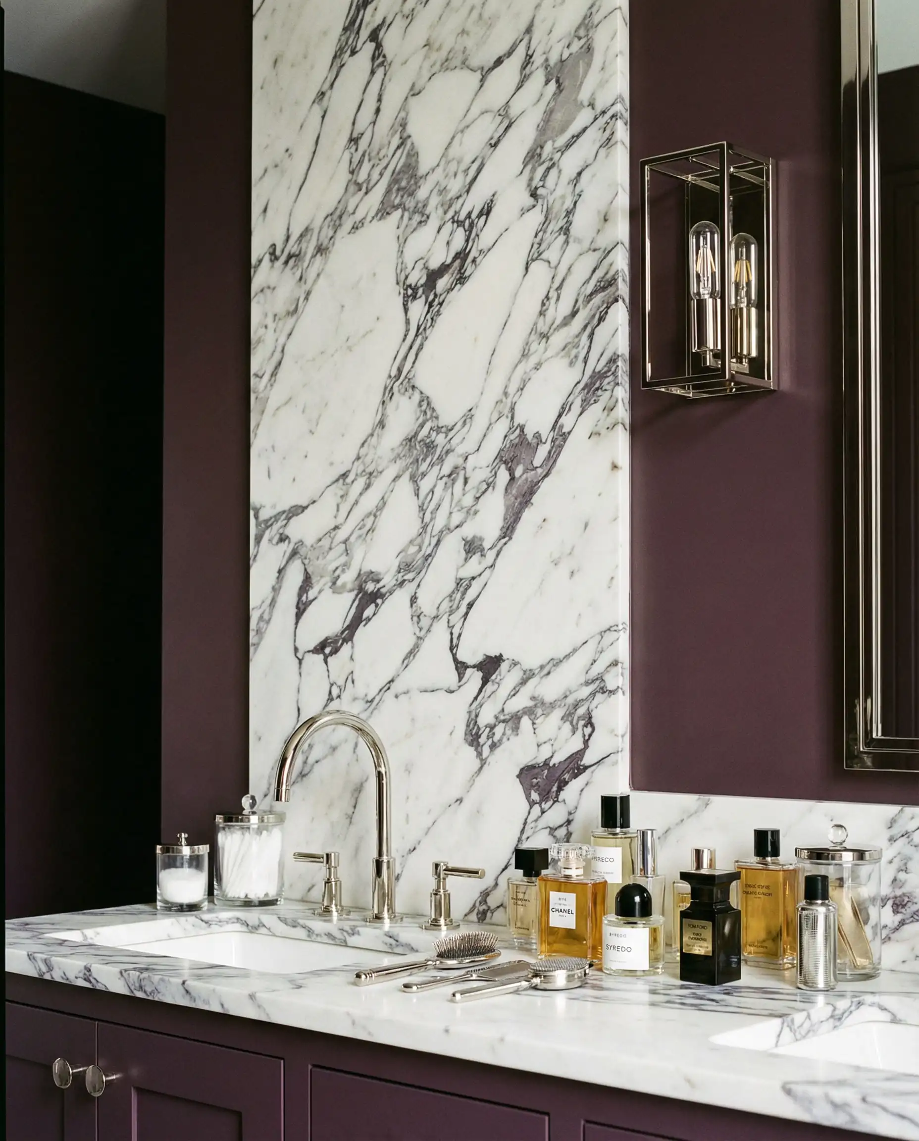
- Material Pairings: This trend pairs flawlessly with Unlacquered Brass or Brushed Gold fixtures. The warmth of the metal reinforces the warmth of the wall, creating a cohesive “golden hour” glow.
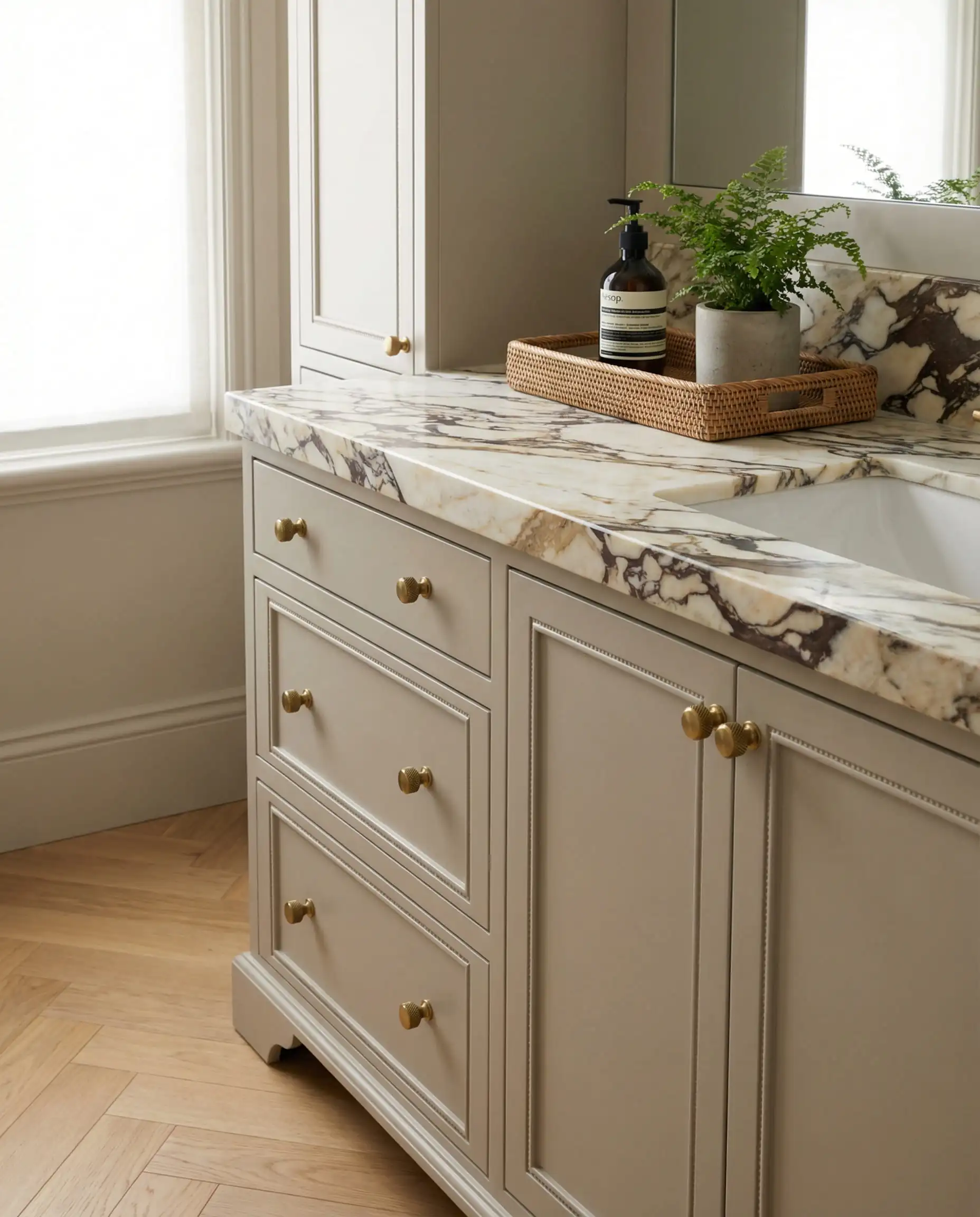
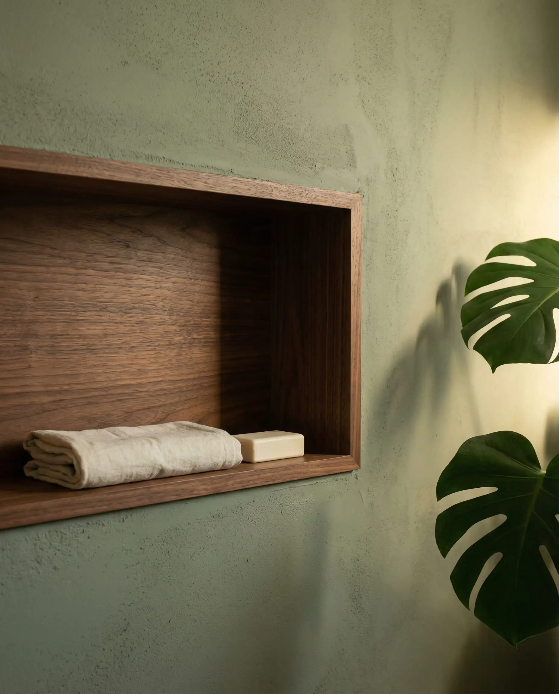
Mushroom & Putty: The “Quiet Luxury” Choice
If Khaki feels too traditional, “Mushroom” is the modern alternative. It is an earthy, grounded taupe that feels incredibly expensive when paired with marble or travertine. It is the color of raw clay before it is fired.
Where to Use It: This is the perfect all-over color for master bathrooms. It reflects light flatteringly, making your skin look better in the mirror than harsh blue-toned grays ever could.
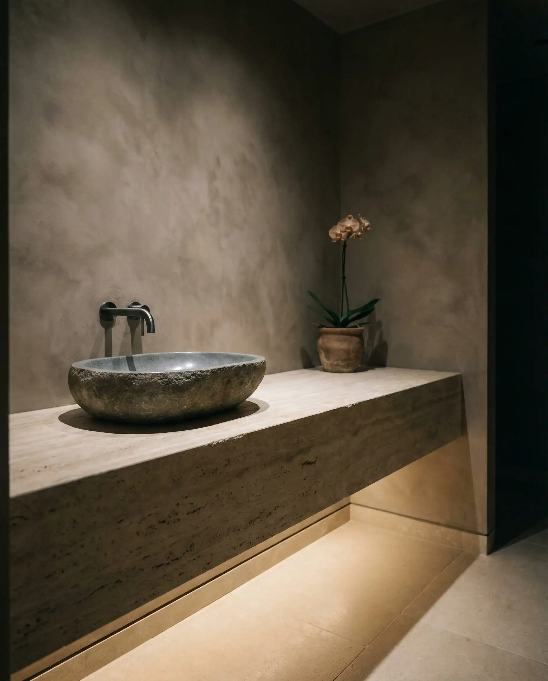
The danger with beige and mushroom tones is that the room can look flat or “muddy.” To avoid this, you must introduce contrast through texture. If your walls are matte mushroom, pair them with a glossy ceramic tile or a rough-hewn wooden stool. The variation in light reflection keeps the monochromatic look interesting rather than boring.
✨Styling Tip: Avoiding the “Bland-age” Effect
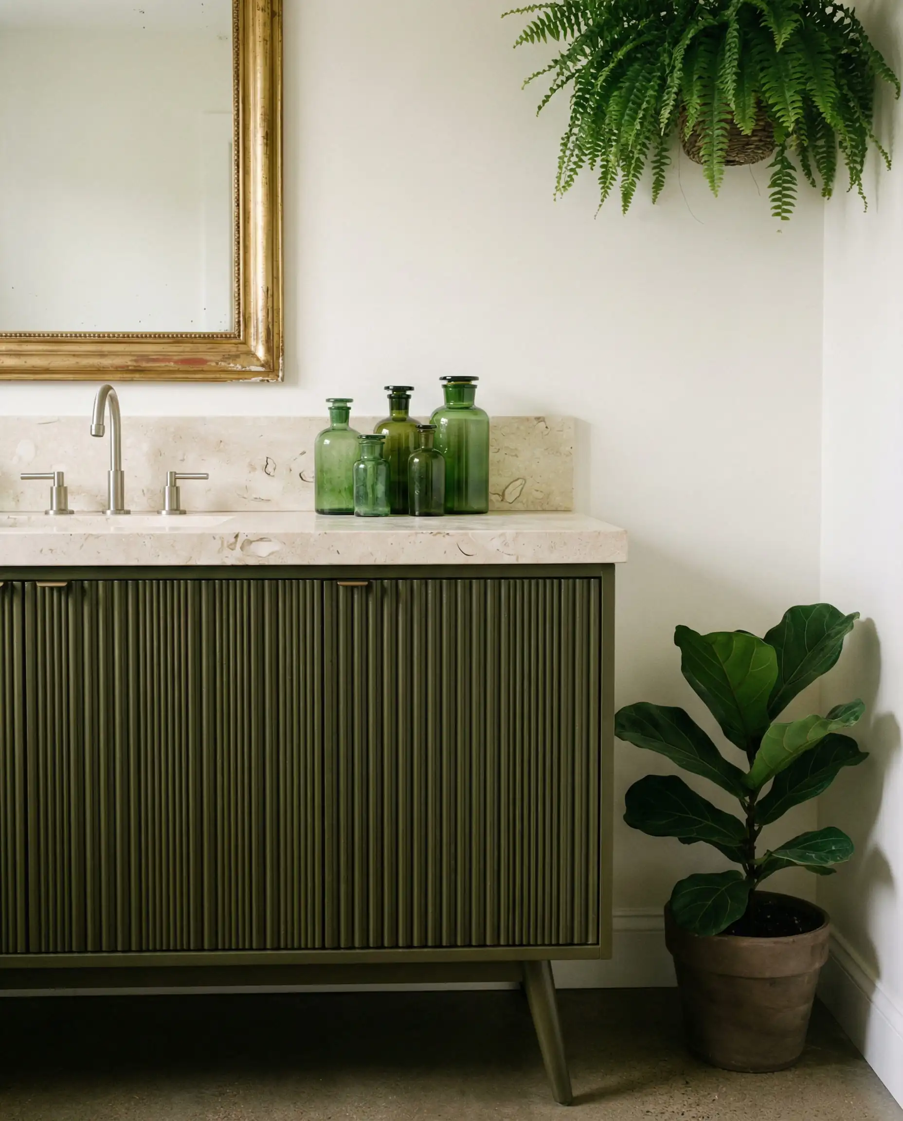
Trend 2: Biophilic 2.0 (Restorative Greens & Blues)
Green has been trending for a few years, but the shade has shifted. We are moving away from crisp, bright “salad” greens toward “muddy” tones that feel more rooted in the earth. This aligns with broader eco-sustainable interior design trends, emphasizing colors that feel permanent and historical rather than fleeting.
Warm Eucalyptus & Olive
The star of 2026 is Warm Eucalyptus—a gray-green that changes with the light. In the morning sun, it feels fresh and energizing. By candlelight in the evening, it recedes into a soothing, dark neutral.
- Specific Paint Picks to Sample:
- Sherwin-Williams “Evergreen Fog” (SW 9130): A chameleon color that shifts between gray and green.
- Farrow & Ball “French Gray” (No. 18): Despite the name, this is a distinctively warm, organic green-gray.
- Design Application: These greens are fantastic for vanity cabinets. If you have a white bathroom that needs an update, painting the vanity in a deep Olive instantly modernizes the space without requiring a full renovation.
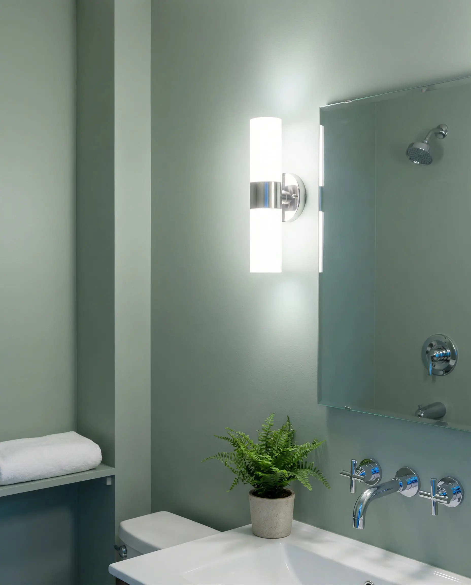
The New Blue: Midnight Teal
While light, “spa blue” is timeless, 2026 introduces a more dramatic player: Midnight Teal. It sits on the fence between blue, green, and slate gray. Unlike bright blues, which can feel juvenile, this shade creates a sense of depth that can actually make small bathrooms feel larger by blurring the corners of the room.
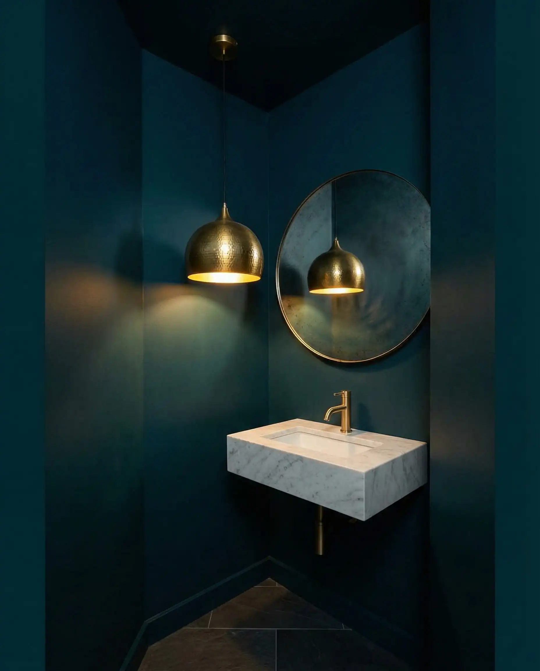
If you choose a bold wall color like Midnight Teal, repeat that color at least twice elsewhere in the room to make it feel intentional. This could be as subtle as a stripe in your hand towels, a specific color in a piece of wall art, or a decorative vase on the vanity. This “triangulation” of color guides the eye around the room.
📐Designer’s Tip: The Rule of Repetition
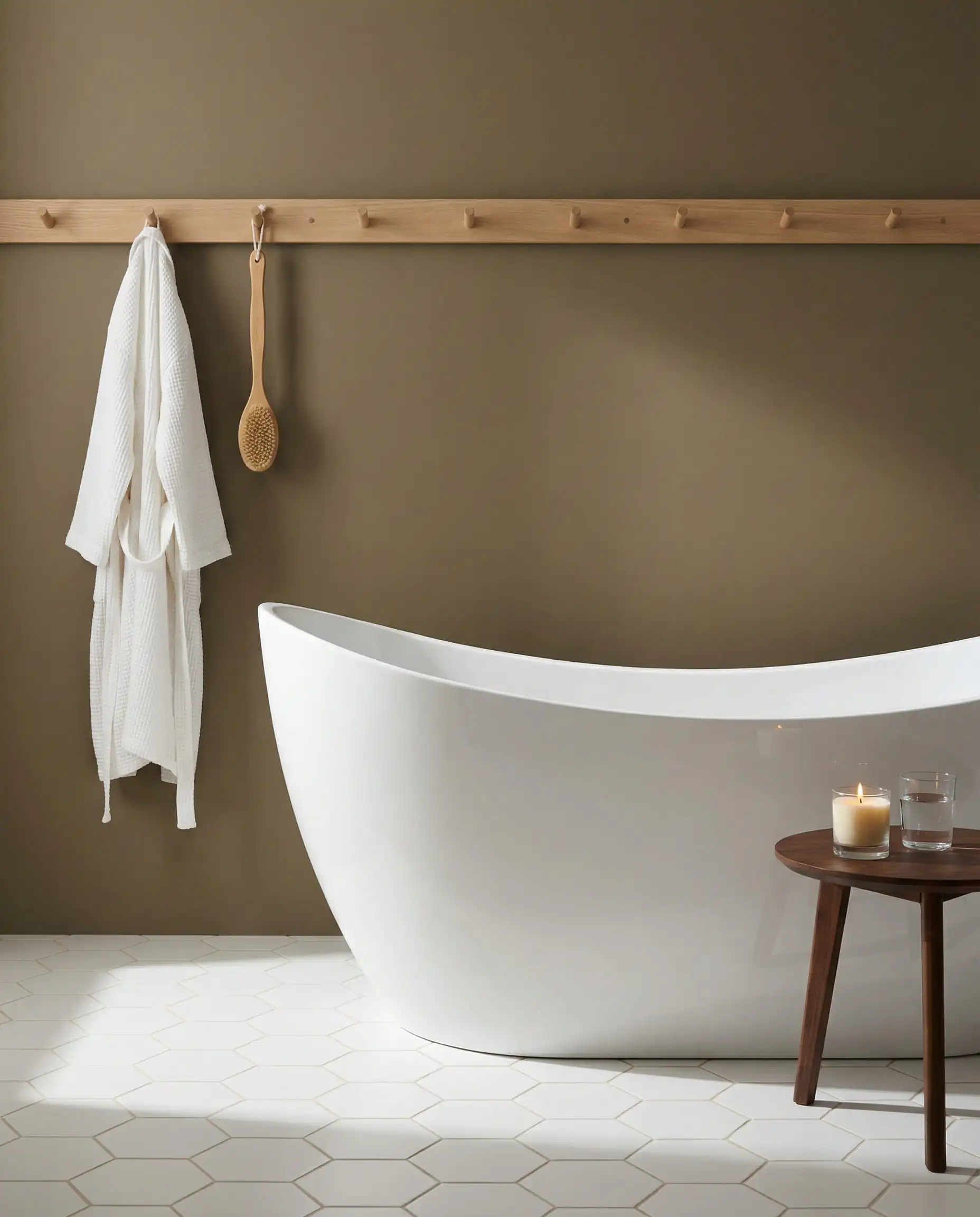
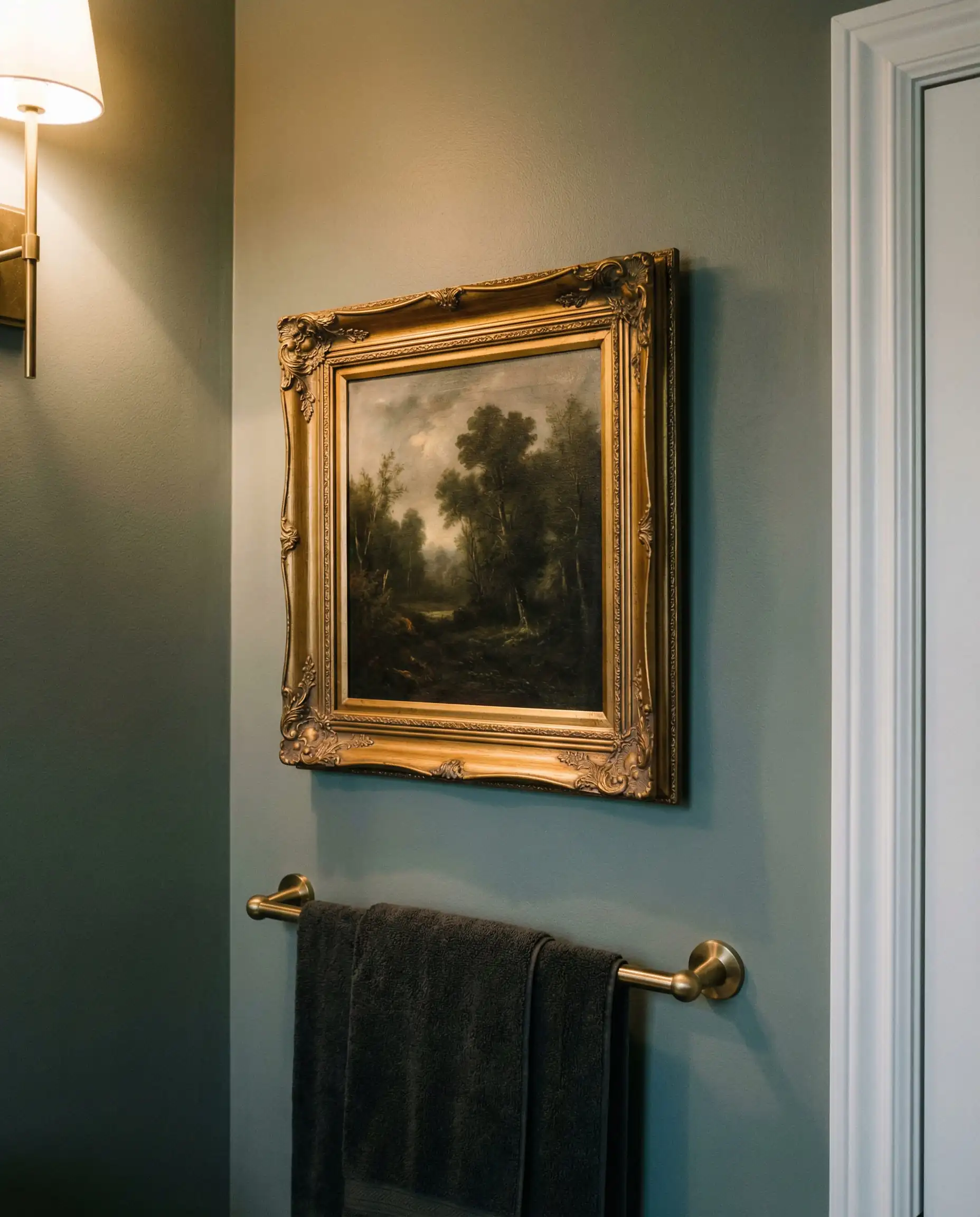
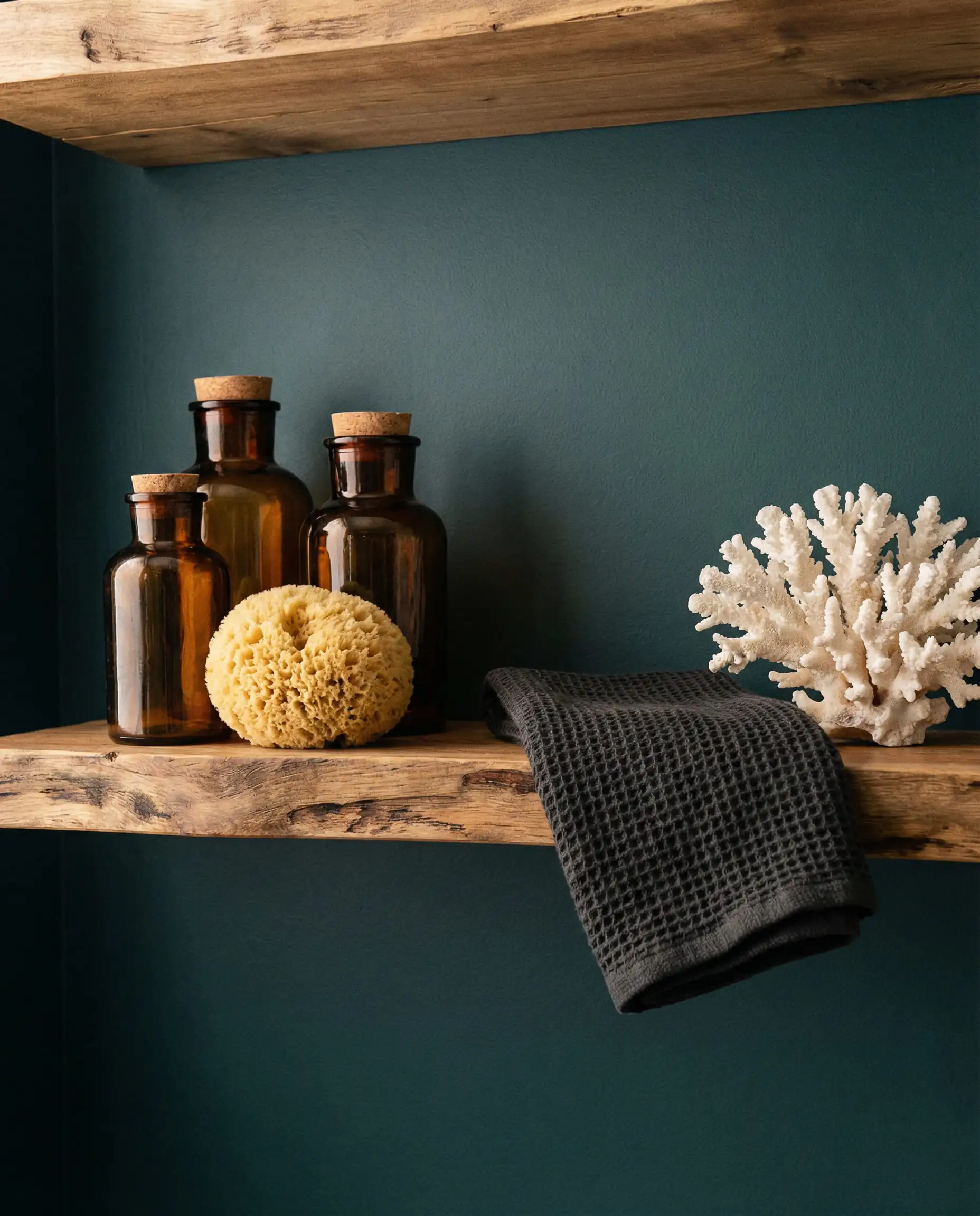
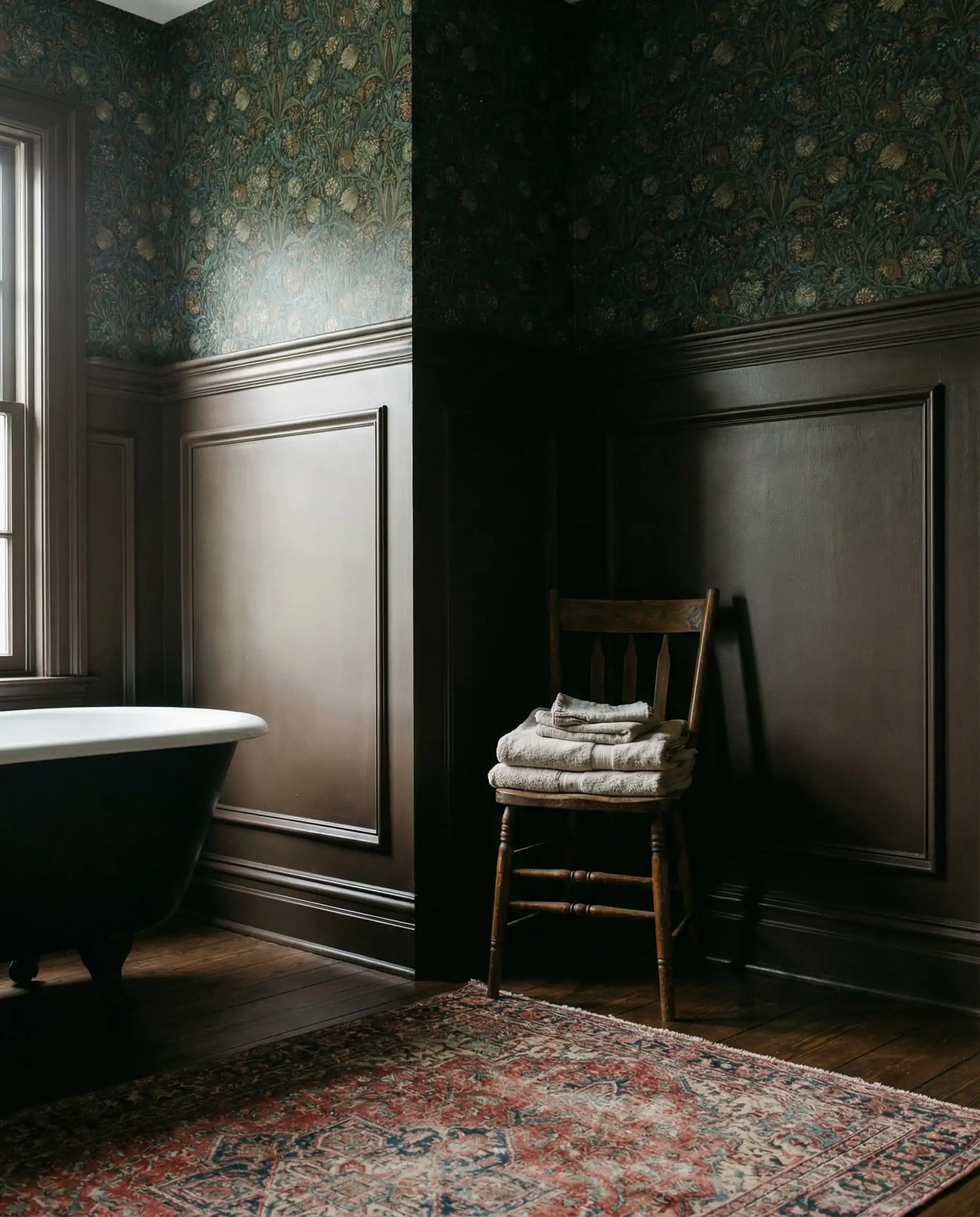
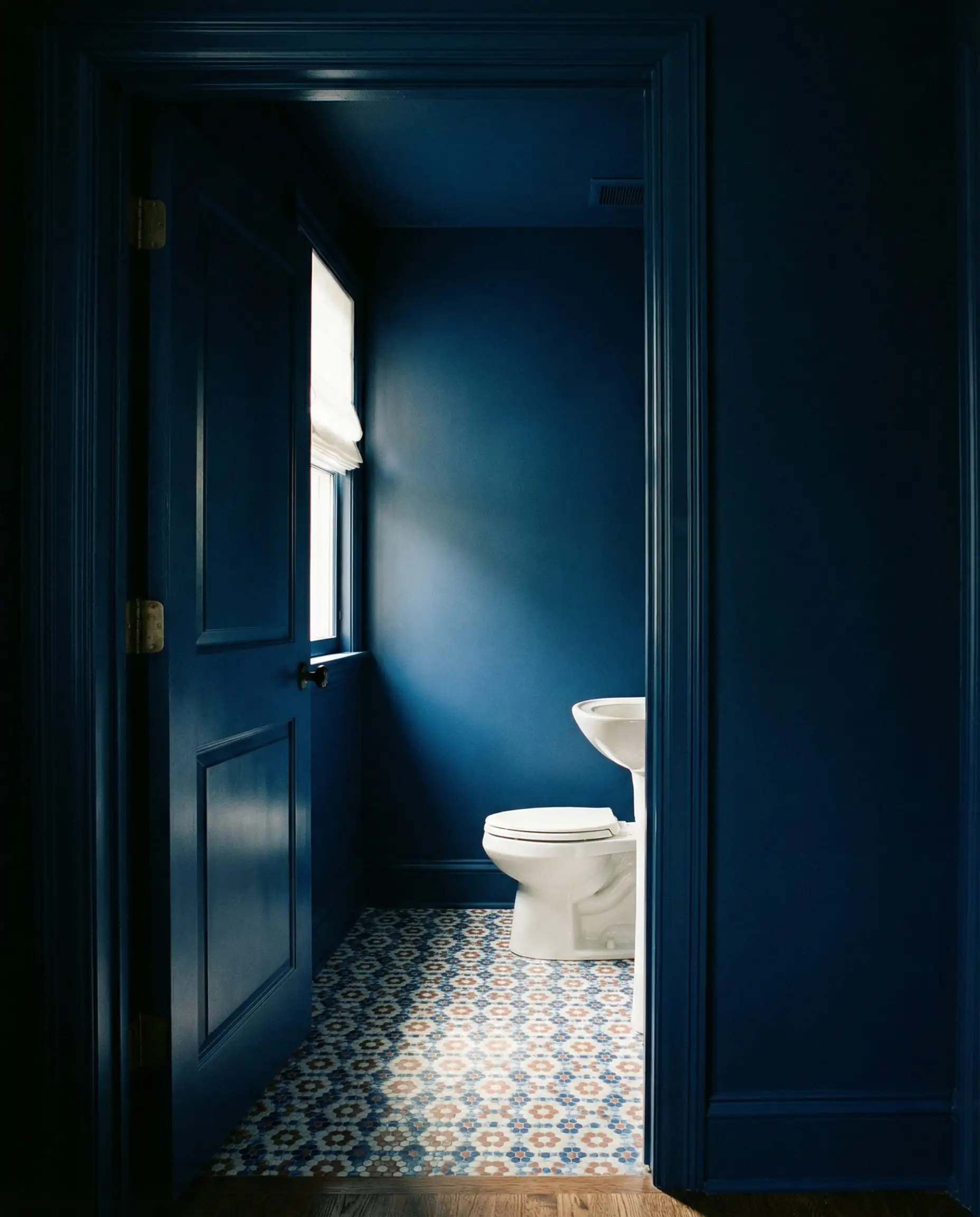
Trend 3: The Bold Shift (Moody Browns & Jewel Tones)
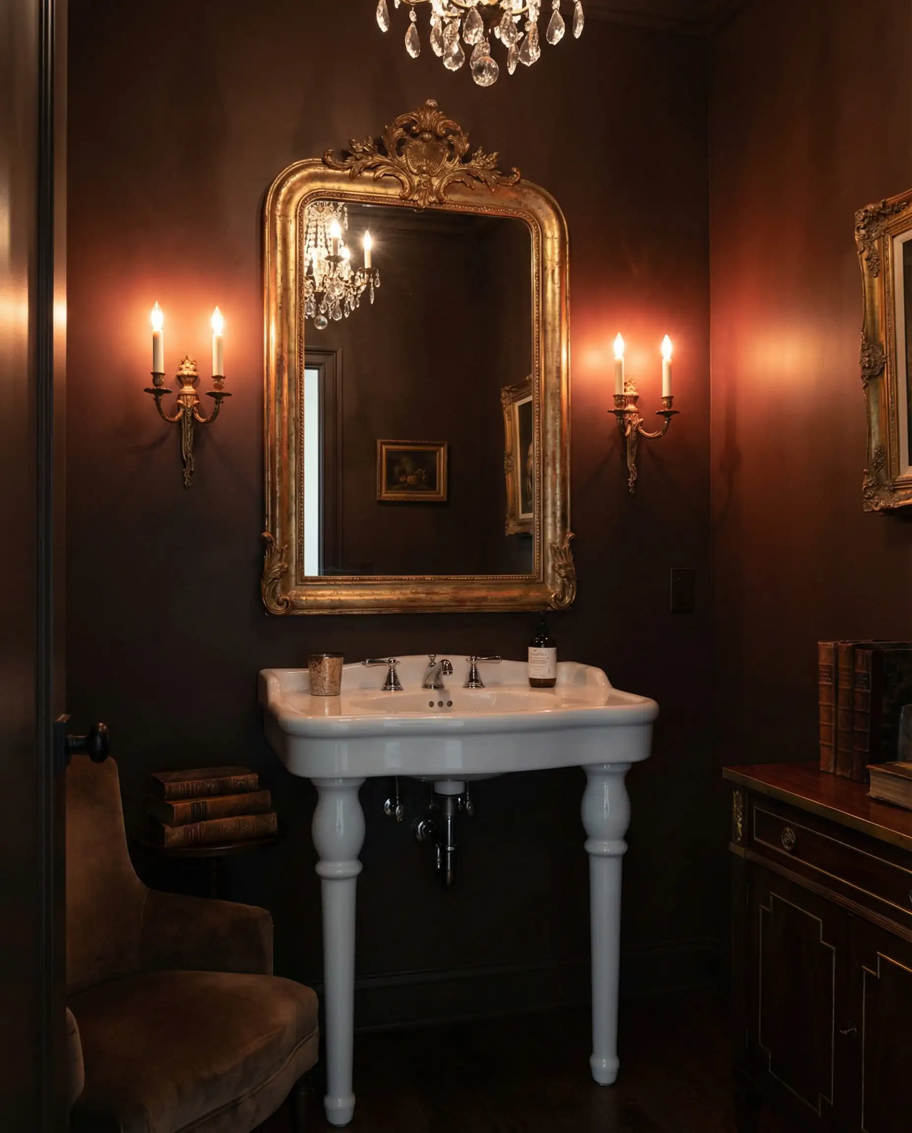
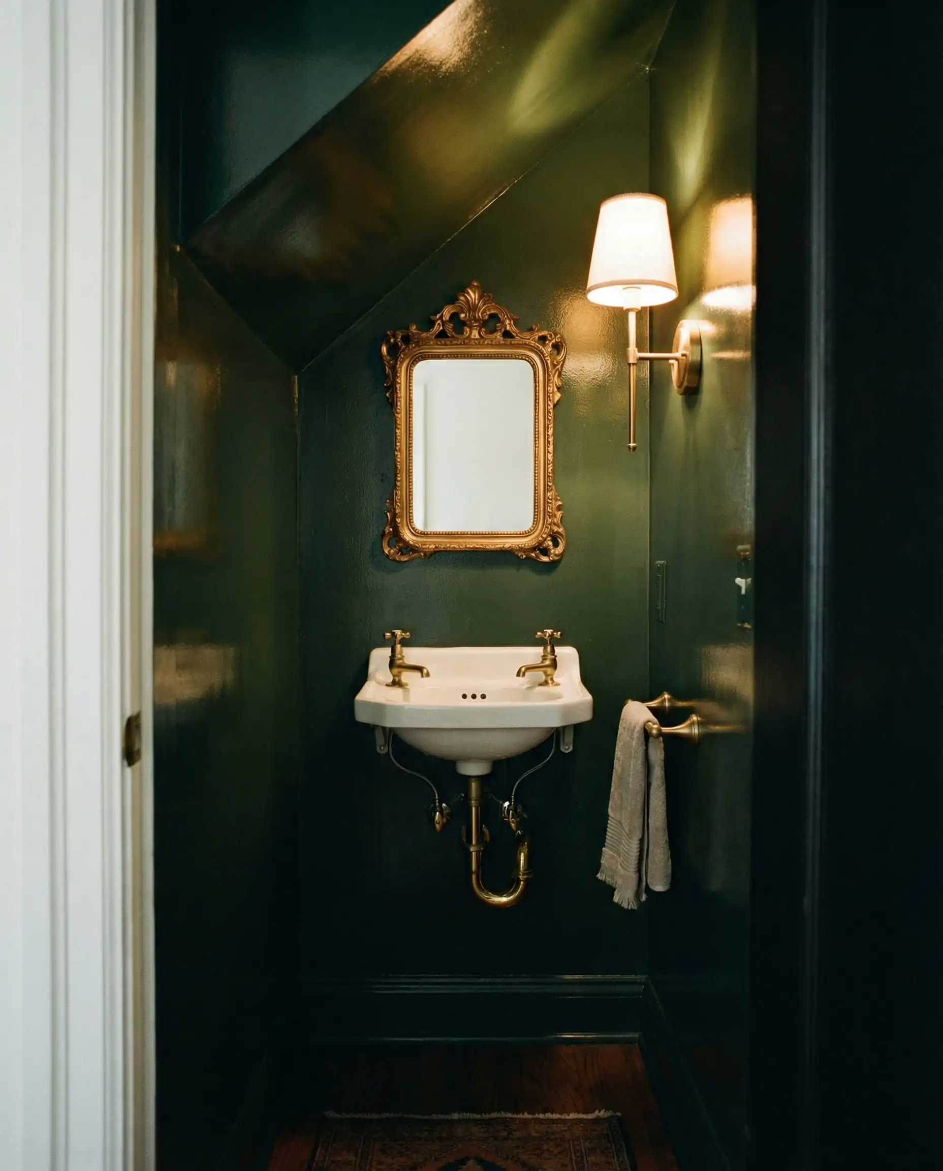
Perhaps the biggest surprise for 2026 is the dethroning of black as the go-to accent color. In its place enters the rich, chocolatey world of Brown and Deep Plum.
“Silhouette” & The Dark Academy Aesthetic
Designers are falling in love with colors like Benjamin Moore’s Silhouette (AF-655)—a sultry, deep brown that feels incredibly cozy. This trend draws inspiration from the “Dark Academia” aesthetic, favoring spaces that feel like a vintage library or a boutique hotel.
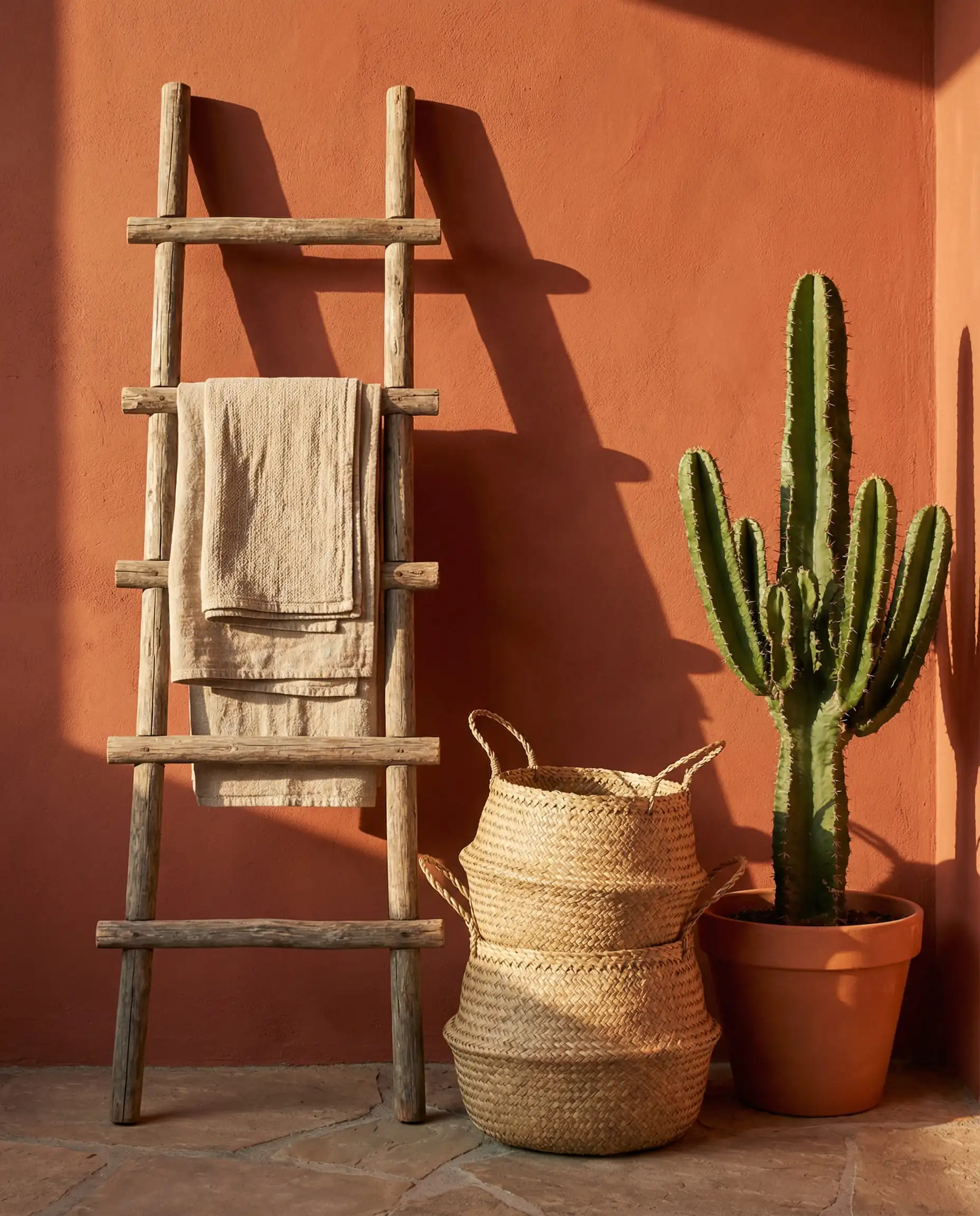
Red-Based Earth Tones: Terracotta Matures
Terracotta has matured. It is no longer the bright “Southwestern” orange; it is now a “Burnt Umber” or “Red Clay.” This color brings an immediate Mediterranean warmth to a bathroom, perfect for warming up spaces that lack natural light.
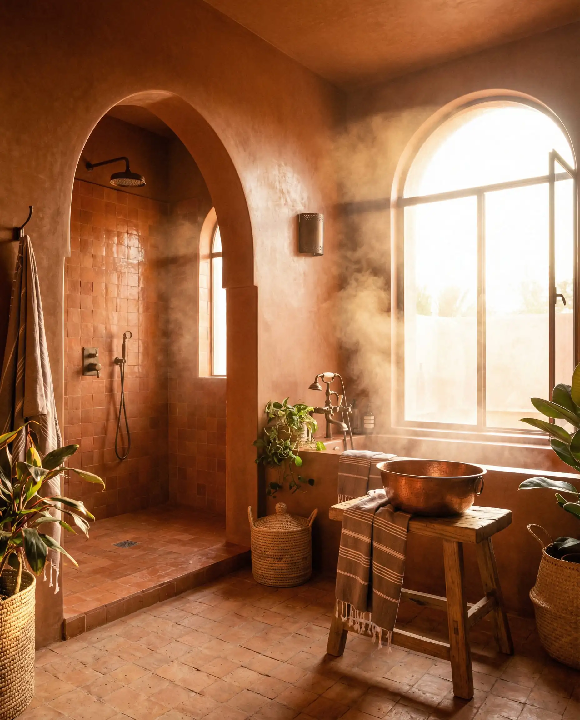
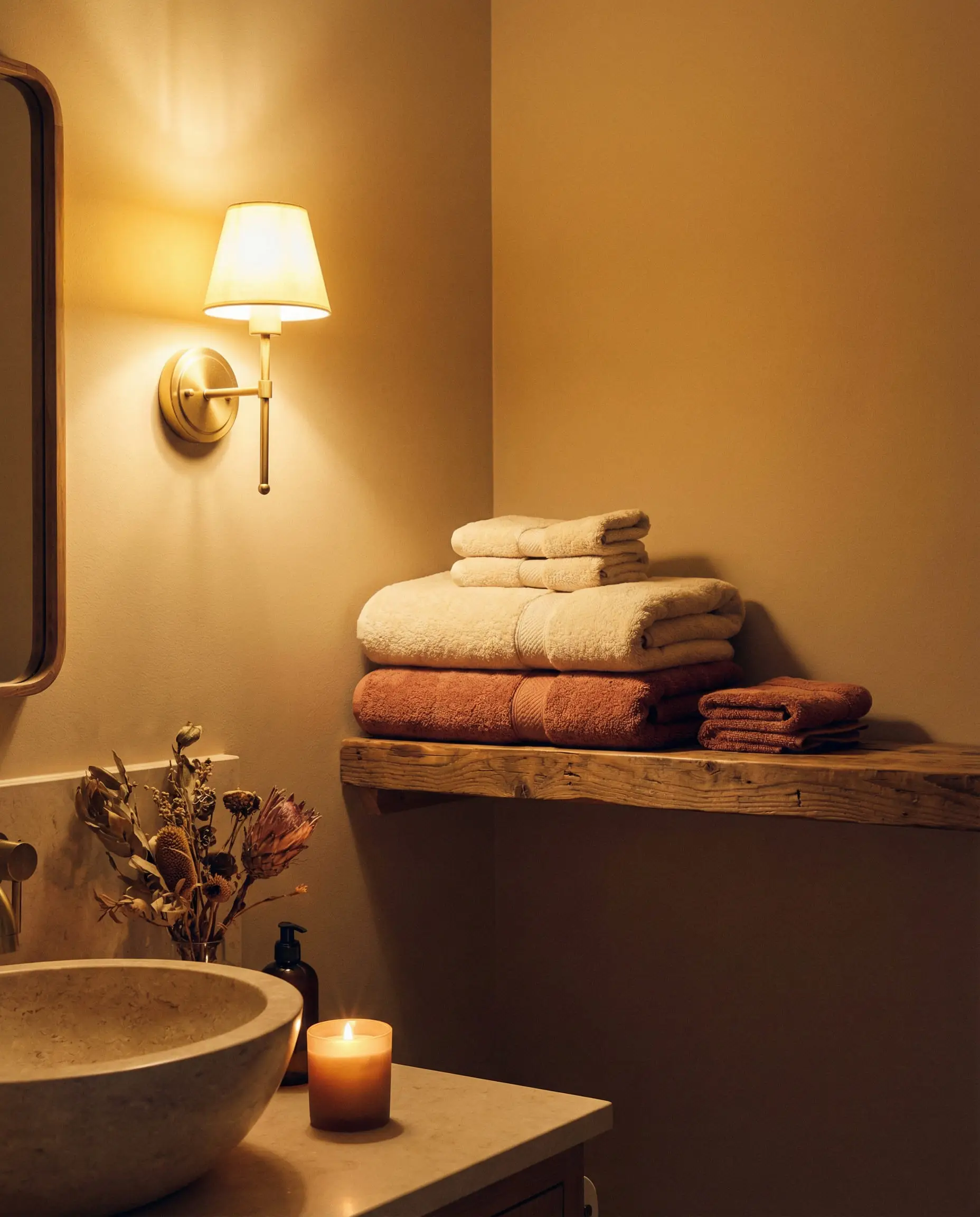
Dark bathrooms require layered lighting. When using moody browns or plums, rely on sconces rather than just overhead cans. Place sconces at eye level on either side of the mirror. This casts a warm glow against the dark walls, creating an intimate, flattering atmosphere, whereas overhead lights alone can create cave-like shadows.
✨Styling Tip: Light it Up
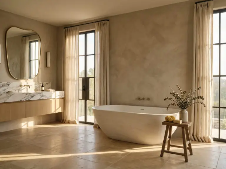
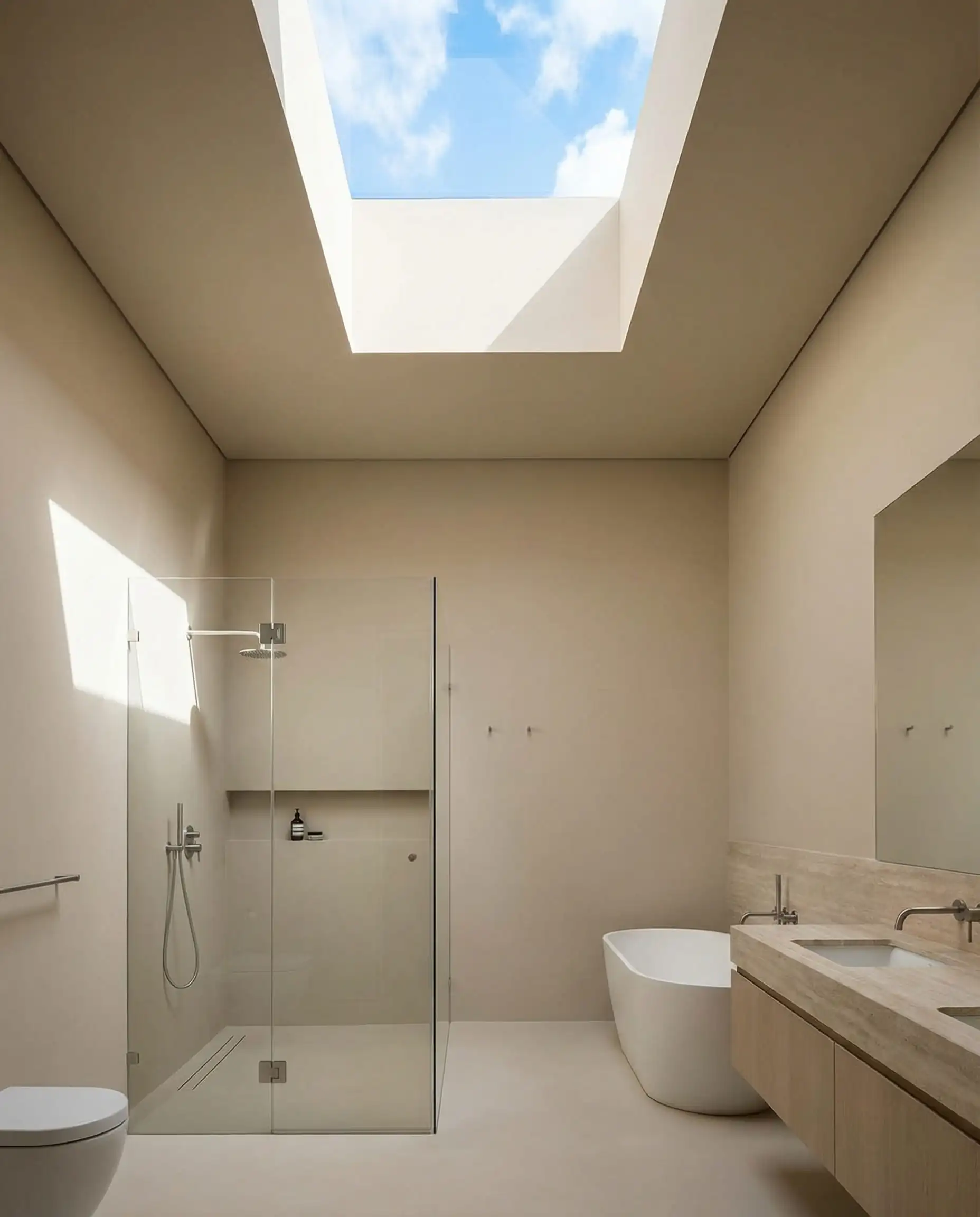
Trend 4: The “Cloud Dancer” Aesthetic (Soft Whites)
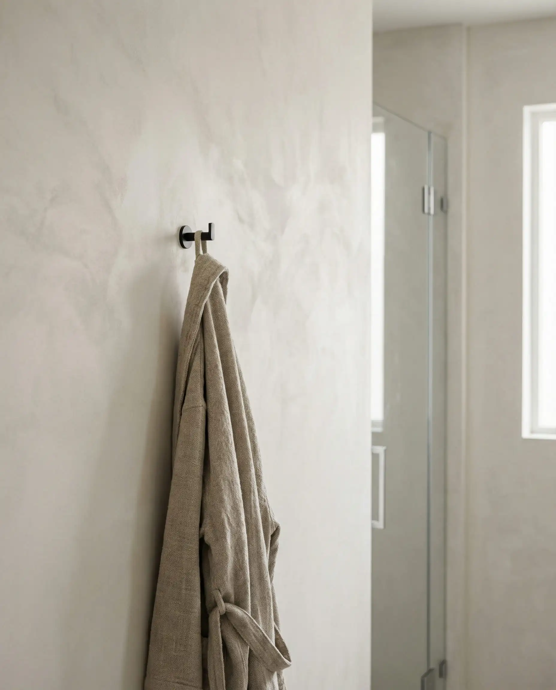
Is white dead? No, but stark white is on life support. If you prefer a light, airy bathroom, look toward “Cloud Dancer” shades. These are whites with creamy undertones that mimic the look of plaster, limestone, or sheep’s wool.
Texture is King
In a white bathroom for 2026, the paint is just the canvas. The interest comes from texture. We are seeing a move toward Limewash paints or Roman Clay finishes that add physical depth to the walls.
The Rule: If you paint your walls white, you must add warmth through other elements. Think modern mirror trends with wooden frames, boucle towels, or brushed bronze lighting to avoid the “hospital” look.
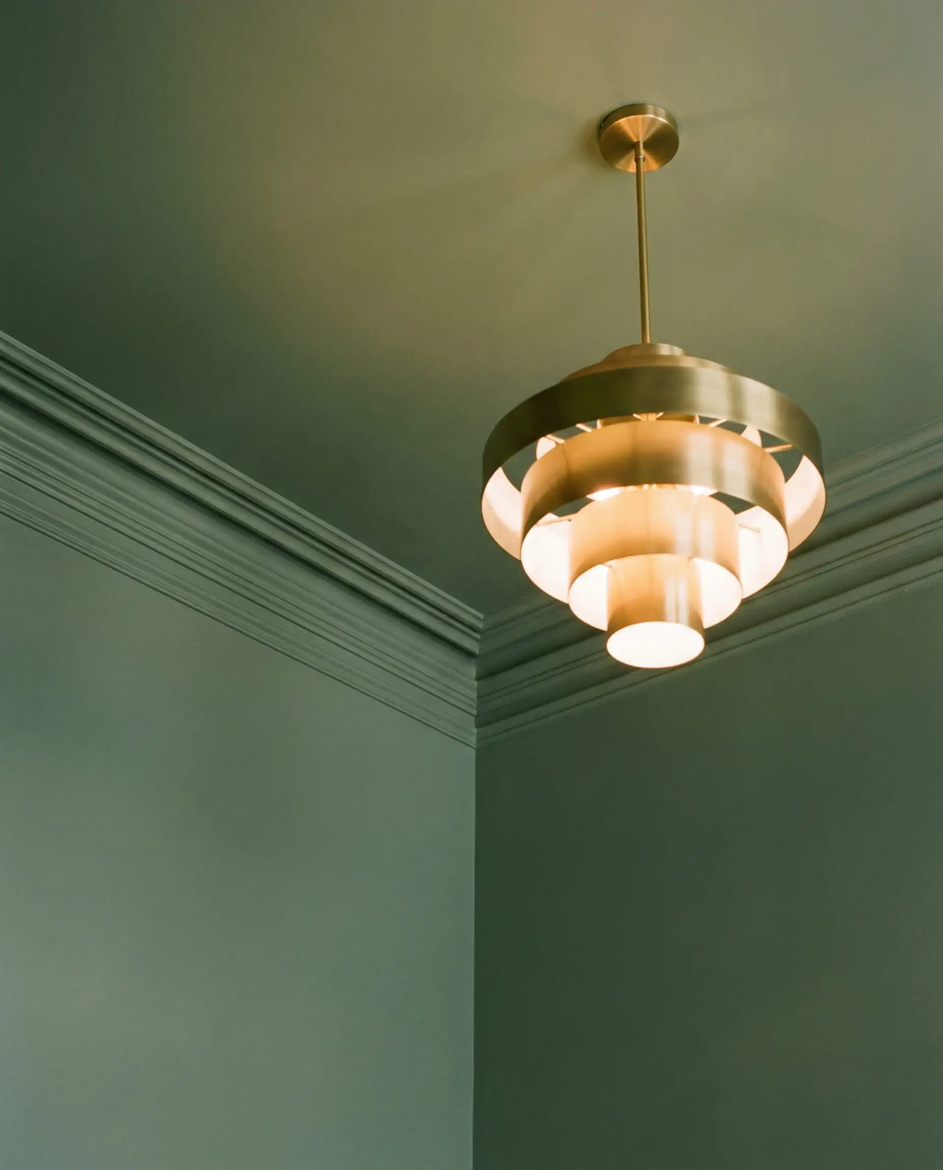
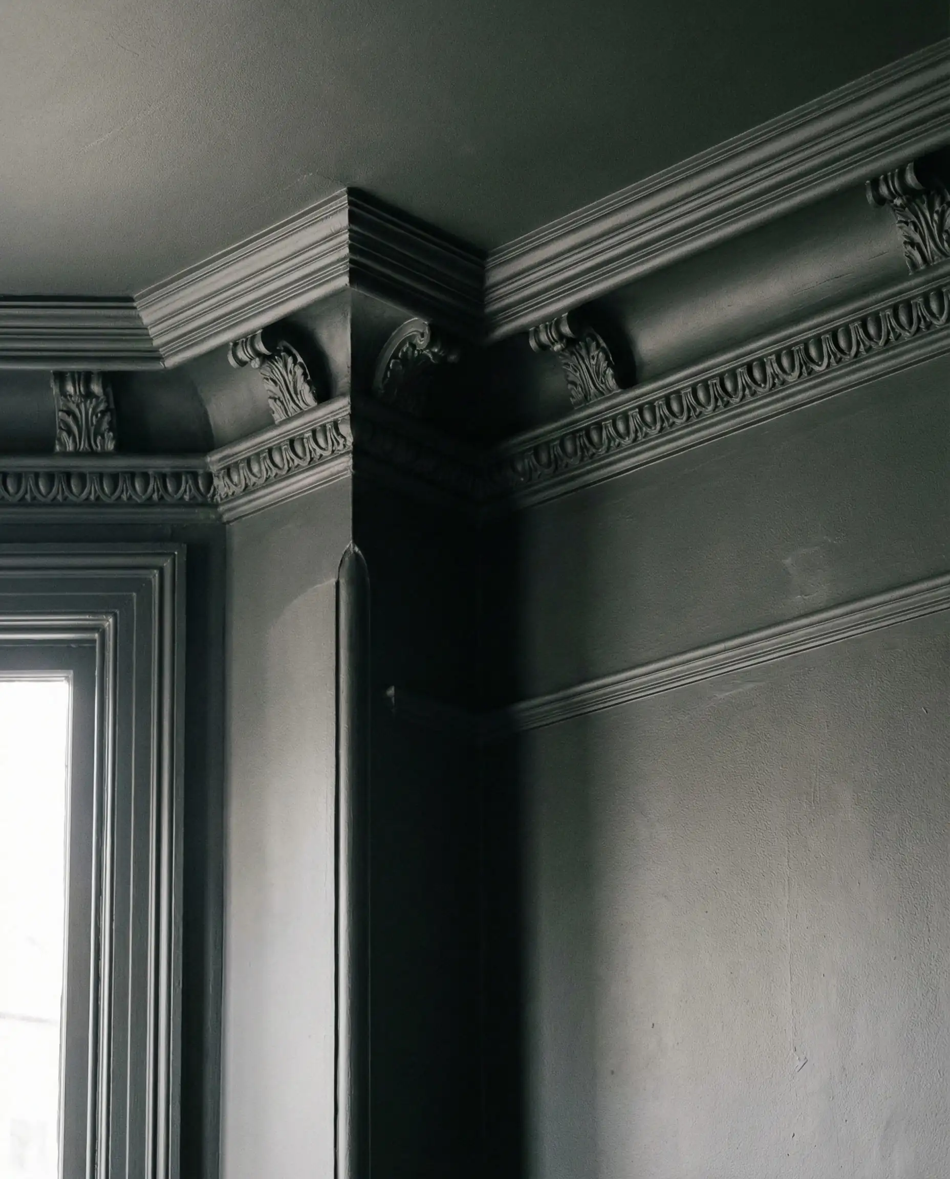
The “Fifth Wall”: Ceiling Paint Trends
For decades, we have defaulted to painting bathroom ceilings flat white. 2026 challenges this default. Designers are now treating the ceiling as a key design element.
Color Drenching
This is the most popular technique of the year. Color Drenching involves painting the baseboards, walls, crown molding, and the ceiling the exact same color.
When color drenching, you can still vary the sheen. Use Satin or Eggshell on the walls for durability, but switch to Flat/Matte for the ceiling (in the exact same color code). The Flat finish on the ceiling hides imperfections and diffuses light softly, preventing glare from overhead bulbs.
📐Designer’s Tip: The Finish Switch
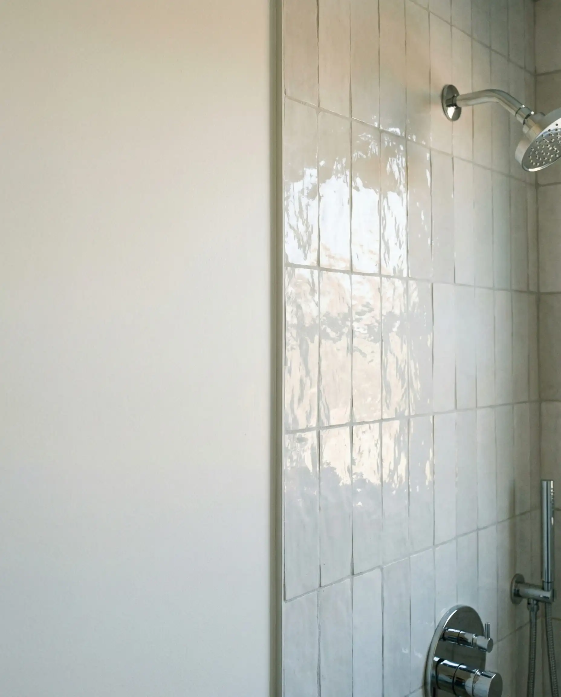
Technical Guide: Finishes & Durability in Humid Zones
You can pick the trendiest color in the world, but if the paint peels or grows mildew, the aesthetic is ruined. Bathrooms are “hostile environments” for paint due to steam, humidity, and cleaning chemicals.
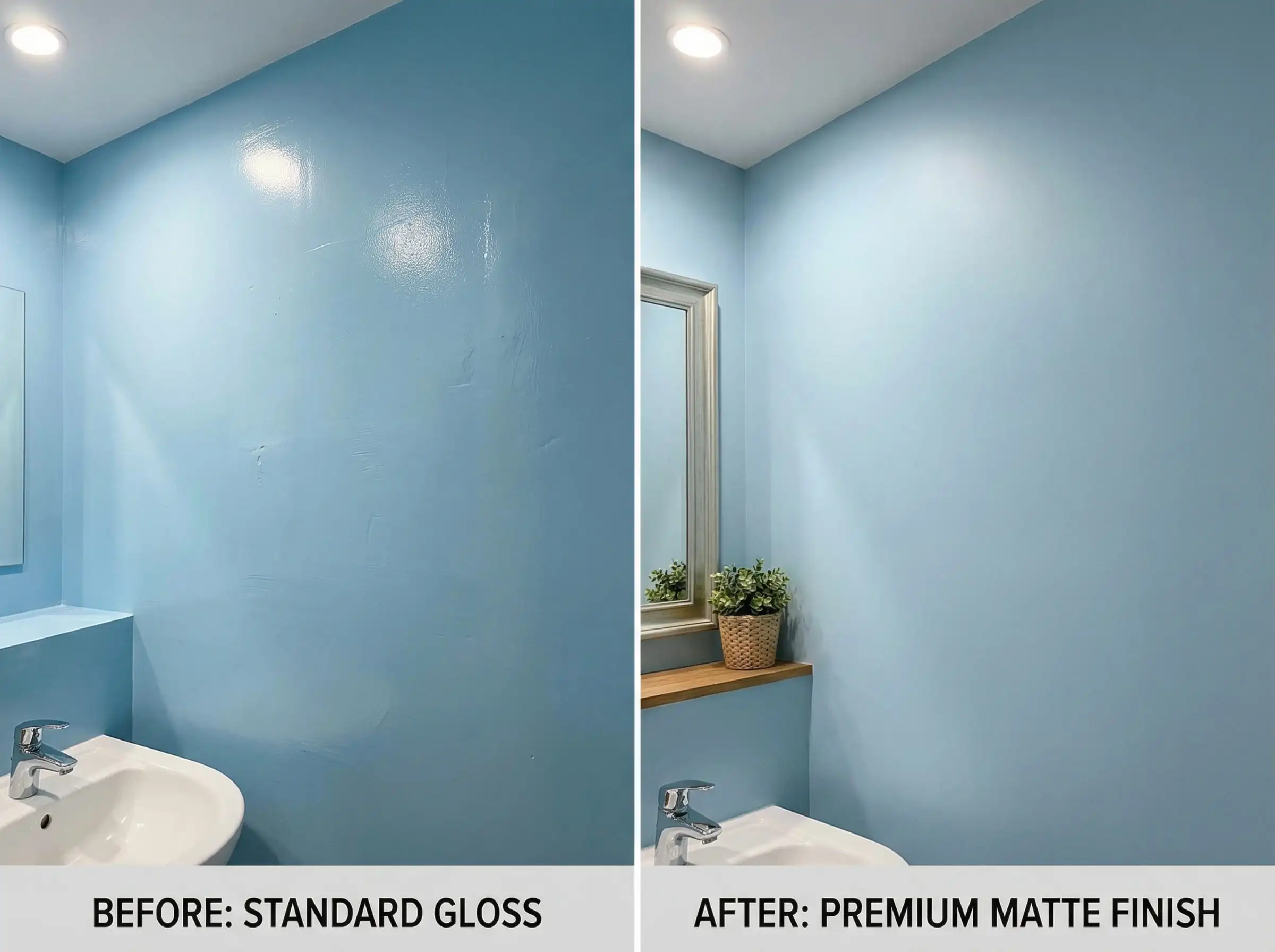
The Sheen Debate: Matte vs. Satin
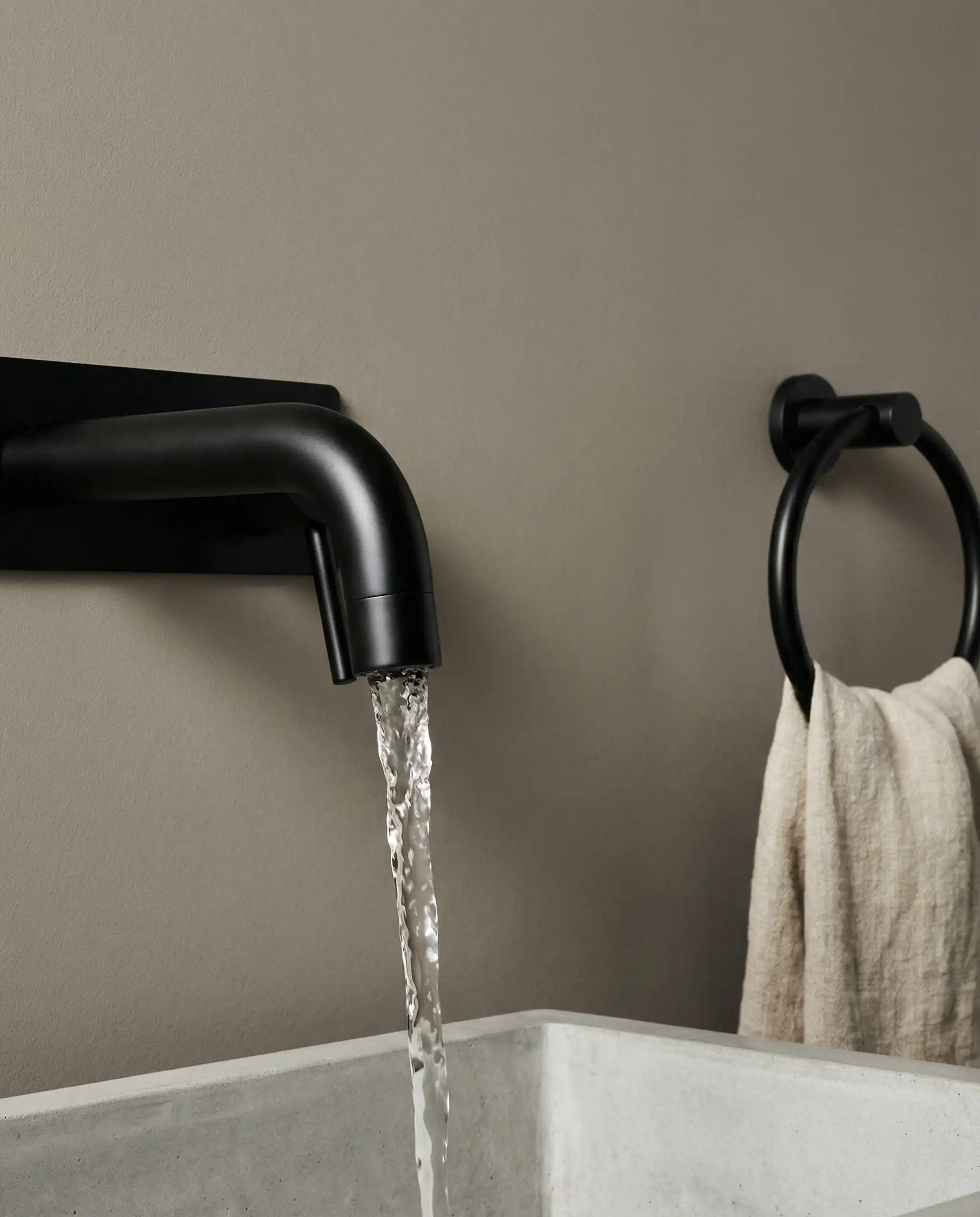
- The Old Rule: “Always use Semi-Gloss in bathrooms to repel moisture.”
- The 2026 Reality: Modern premium paints have advanced significantly. You no longer need a shiny, plastic-looking wall to get durability.
- Satin / Eggshell: This is the “Goldilocks” sheen for 2026 walls. It has enough gloss to be wipeable and resist moisture absorption, but it is dull enough to hide drywall imperfections.
- Matte / Flat: Generally avoid this in a family bath with a shower. However, specialized “Bath & Spa Matte” products now exist (from brands like Aura or Emerald) that offer mildew resistance with a matte finish. Use these if you want that velvety “New Neutral” look.
- Semi-Gloss: Reserve this strictly for trim, baseboards, and doors. It provides a nice contrast against Satin walls.
Critical Guide: Lighting & Metamerism
Metamerism is the phenomenon where a color looks different under different light sources. This is more critical in bathrooms than any other room because we often rely on artificial light for grooming.
The Kelvin (K) Scale
For more on selecting the right fixtures to complement your paint, check out our guide on lighting trends.
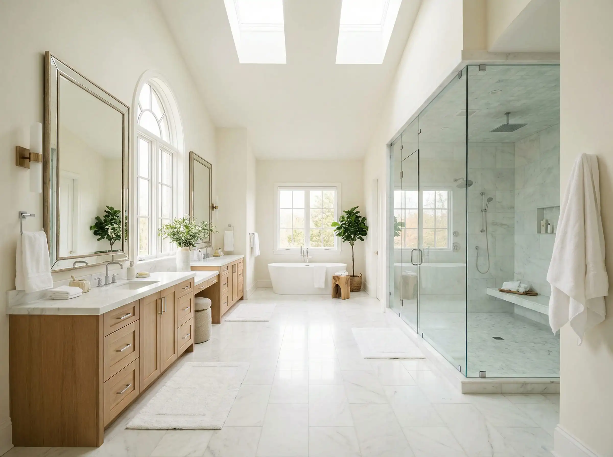
Strategy by Room Size: Master vs. Powder Room
One color does not fit all. The strategy for a cavernous master bath differs from a tiny under-stair powder room.
The Master Bath (The Retreat)
The Powder Room (The Experience)
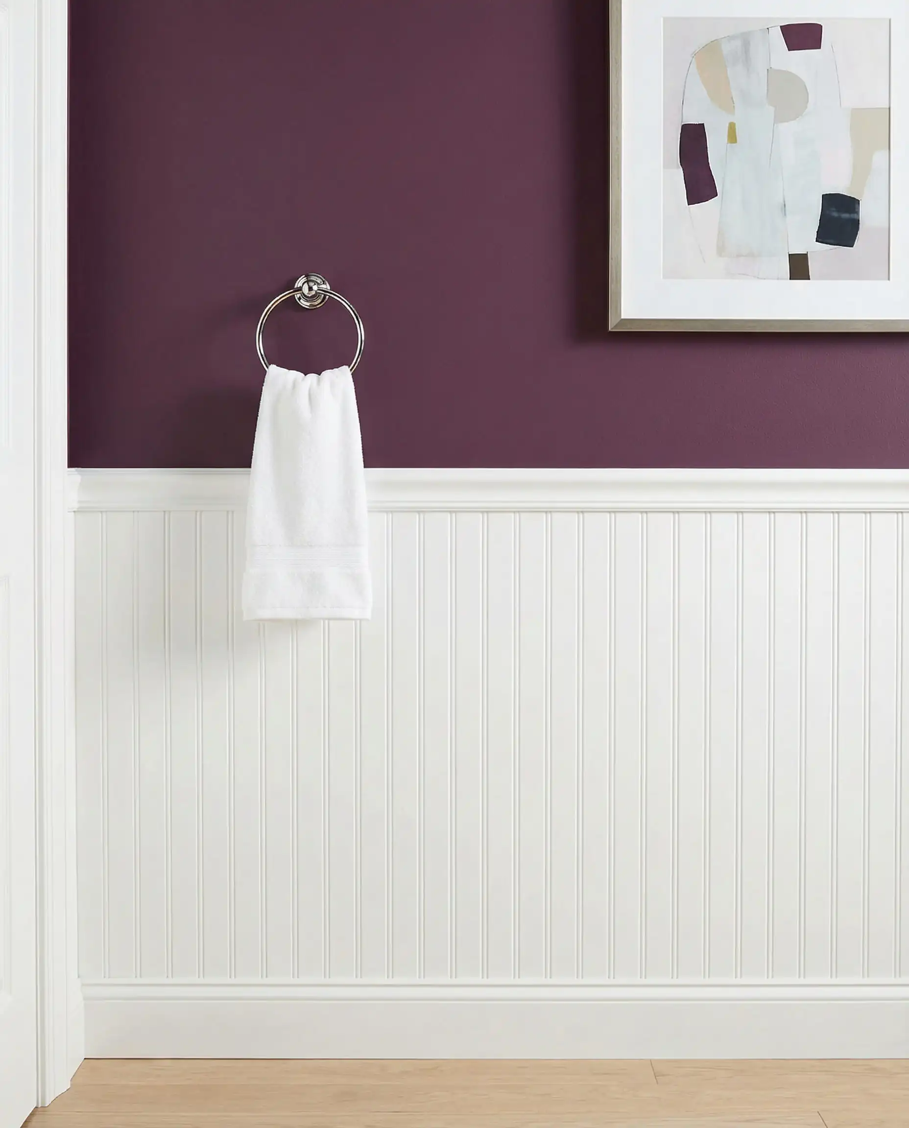
If you love dark colors but are afraid to commit to a full room, use wainscoting or beadboard on the bottom half of the wall (painted white or cream) and paint the top half in your bold trend color (like Plum or Teal). This gives you the color pop at eye level while keeping the room feeling bright and anchored.
✨Styling Tip: The “Half-Wall” Compromise
DIY Tips: Prepping Your Bathroom for Paint
Achieving a professional finish in a bathroom requires more prep than a bedroom. Here is a quick checklist to ensure your 2026 color lasts:
- Kill the Mildew: Do not just paint over mildew spots; they will eat through the new paint. Scrub walls with a bleach-water solution (1:3 ratio) and let them dry completely for 24 hours.
- Sand the Gloss: If your old walls are semi-gloss, new paint won’t stick. Lightly sand the walls with 120-grit sandpaper to “de-gloss” them, creating a tooth for the new paint to grab.
- The Primer is Non-Negotiable: Use a high-quality, moisture-resistant primer. This seals the drywall and prevents the new paint from peeling when the room gets steamy.
FAQ: Common Questions on 2026 Bathroom Colors
A: This is a common challenge. If you have gray fixed elements (tile/flooring) that you can’t change, bridge the gap with a Green-Gray (like Sage or Eucalyptus). Green acts as nature’s neutral—it plays nicely with both warm wood tones and cool gray tiles. Avoid “Yellow-Beige” if you have gray tiles; the clash will be noticeable.
A: Brushed Nickel is making a comeback as a way to “cool down” the very warm paint colors. However, Unlacquered Brass remains the gold standard for a vintage, timeless look with greens and browns.
A: If you are on a budget, yes. Specialized tile paints exist, but they are a short-term solution (3-5 years). If you paint your tile, stick to a solid white or charcoal to minimize the “painted look.”
Conclusion: Designing for “Feeling”
As we look at the broader landscape of interior design trends, the biggest takeaway is that we are designing for feeling, not just for Instagram.
When choosing your bathroom paint color this year, ask yourself: How do I want to feel when I’m brushing my teeth in the morning?
Your bathroom is the first room you see in the morning and the last one you see at night. Make it a space that gives back to you.
Ready to pair your new paint color with the perfect entryway? Don’t miss our update on interior door trends for 2026 to create a seamless flow throughout your home.