What Color Matches Orange Walls? The Ultimate 2026 Guide to Styling the Boldest Shade
Orange. It is the color of energy, creativity, and warmth. It is the sunset over the desert, the zest of a tangerine, and the cozy glow of autumn leaves.
But let’s be honest: in the world of interior design, orange is the “wild child.” It doesn’t play it safe. If you have orange walls—whether you daringly painted them yourself or inherited a bold space—you are likely standing in the middle of the room asking the big question: “What on earth matches this without making my house look like a Halloween decoration?”
You are not alone. And the good news? You aren’t stuck with plain white furniture.
In 2026, orange has matured. We are moving away from the shocking neons of the past and embracing sophisticated, grounded shades like Terracotta, Burnt Rust, Spiced Pumpkin, and Soft Apricot. The secret to unlocking these shades lies not just in color theory, but in texture, lighting, and “temperature” balance.
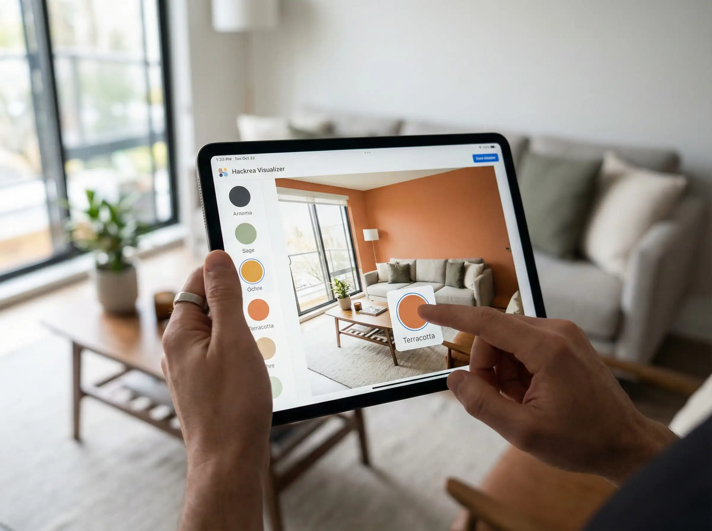
Don’t guess. Lighting changes everything. Before you buy a navy blue sofa or a sage green rug, use the Hackrea Visualizer. Upload a photo of your room and instantly test these combinations to see exactly how they react to your specific lighting conditions.
🎨 Hackrea Stylist Tip
🛑 Quick Look: Top 5 Trending Combinations for 2026
If you are in a rush, here is the cheat sheet for this year’s hottest palettes:
| Orange Shade | Best Match | Vibe |
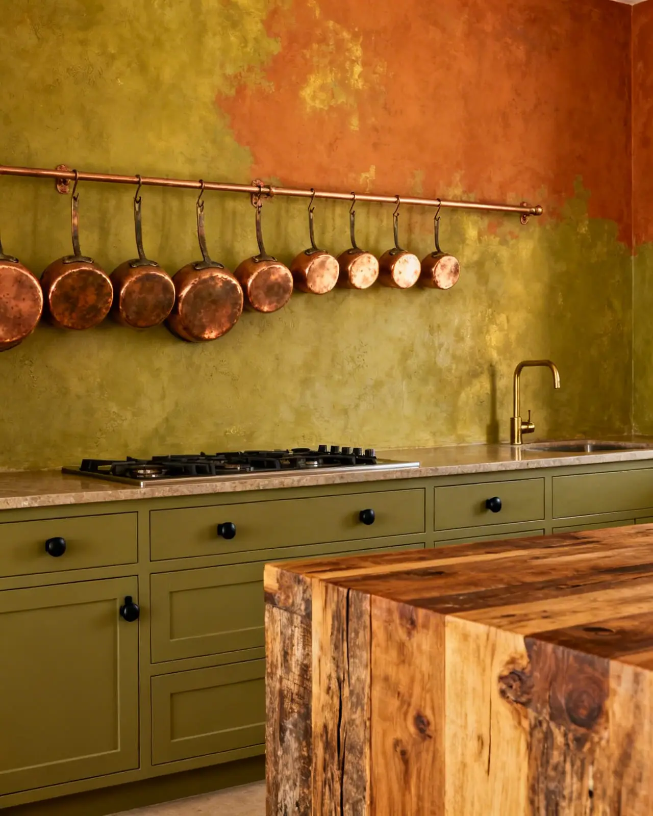
| Burnt Orange / Rust | Olive Green | Biophilic, Earthy, Grounded |
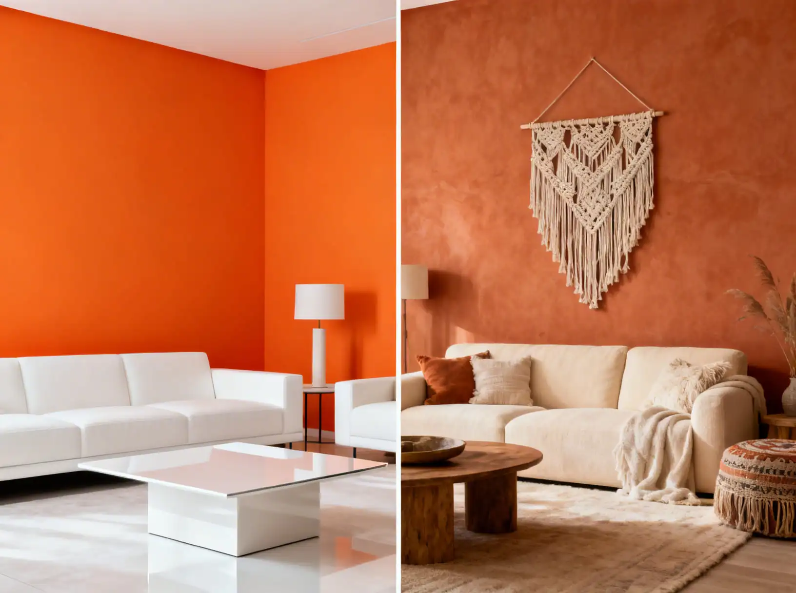
| Bright Tangerine | Crisp White | Modern, Pop-Art, Energetic |
| Terracotta | Cream / Beige | Boho, Japandi, Cozy |
| Pumpkin | Navy Blue | Classic, High-Contrast, Regal |
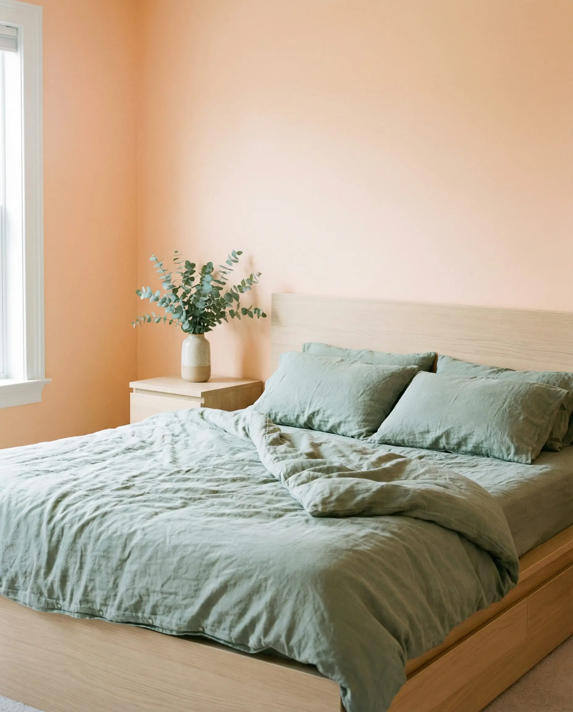
| Peach / Apricot | Sage Green | Soft, Romantic, Airy |
1. First: Diagnose Your Shade (The “Temperature” Check)
You cannot treat all oranges equally. Matching a “Traffic Cone Orange” is a completely different design challenge than styling a “Muddy Clay.” Before you pick a companion color, identify your specific undertone.
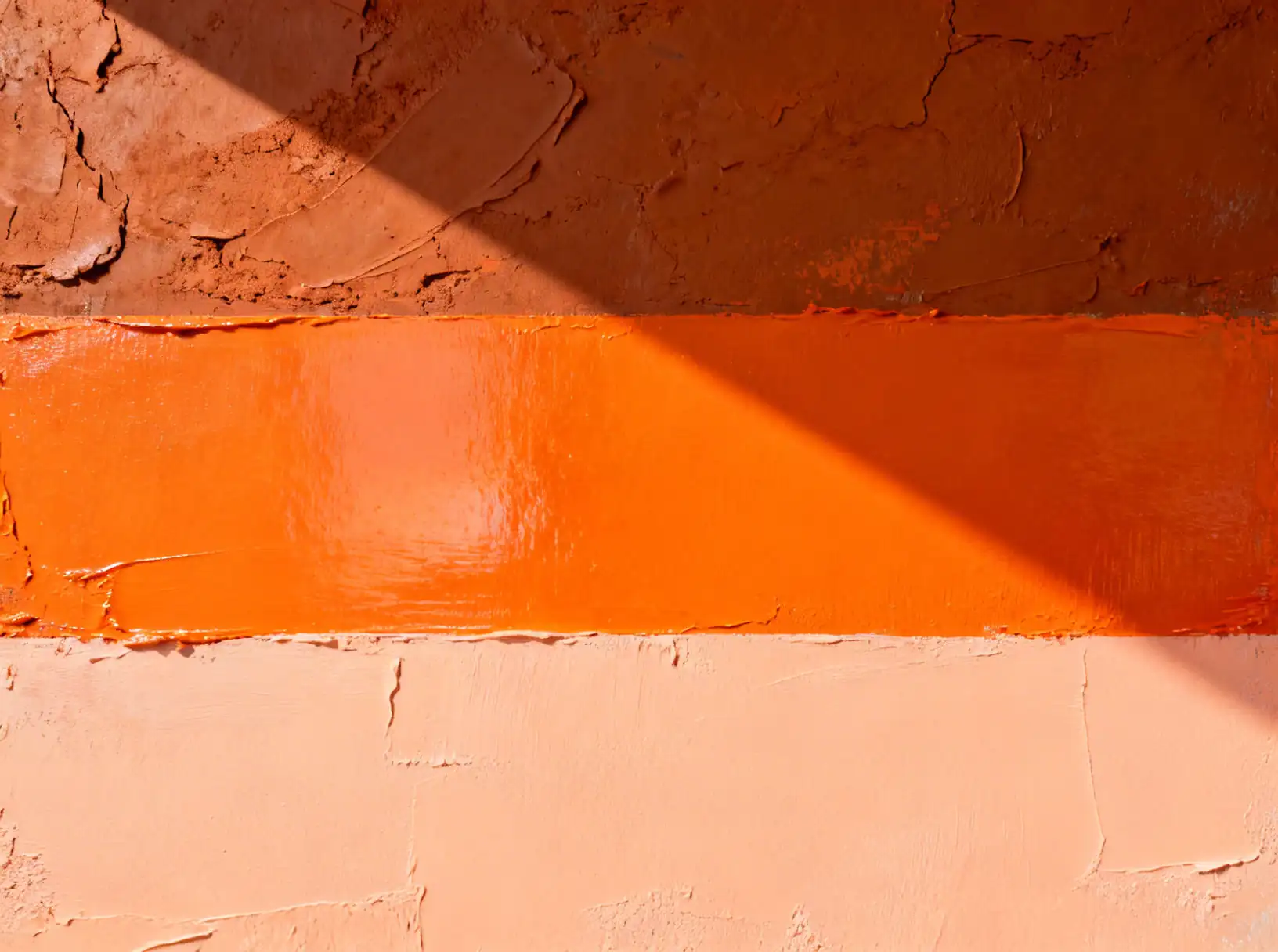
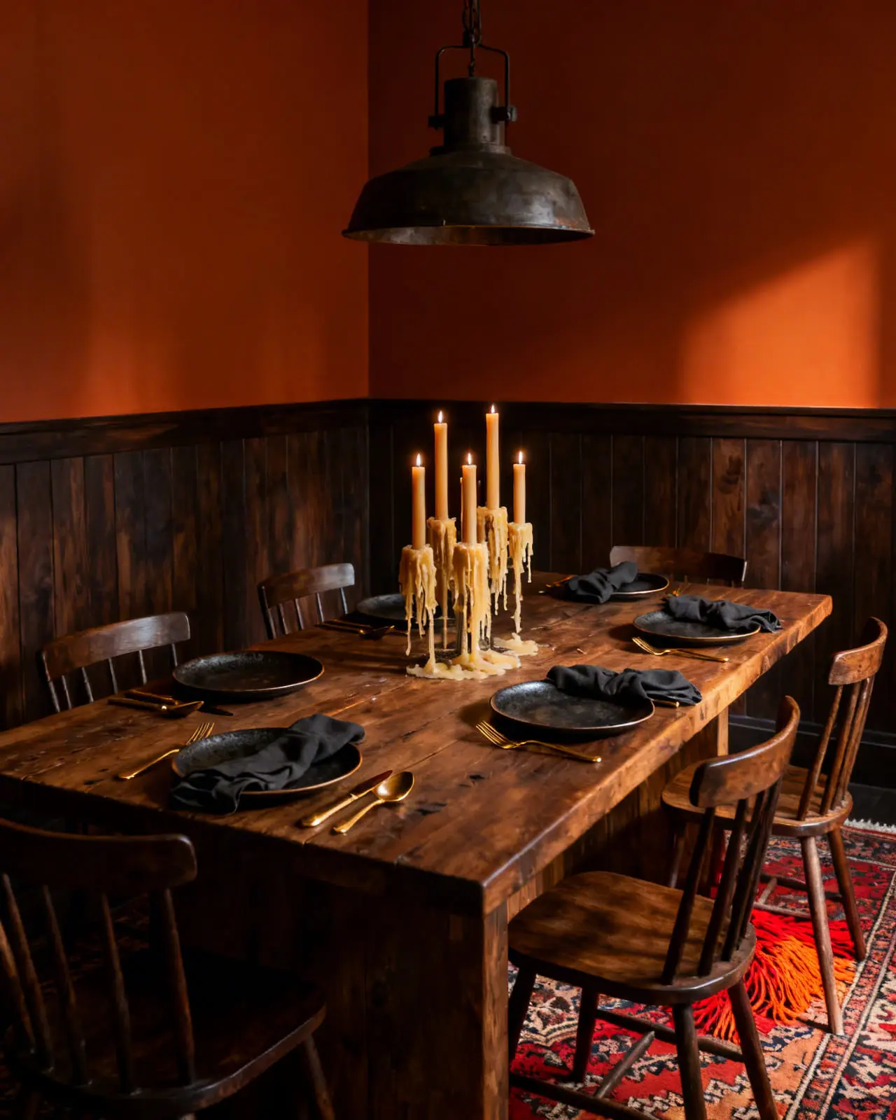
The Earth Tones (Terracotta, Rust, Clay)
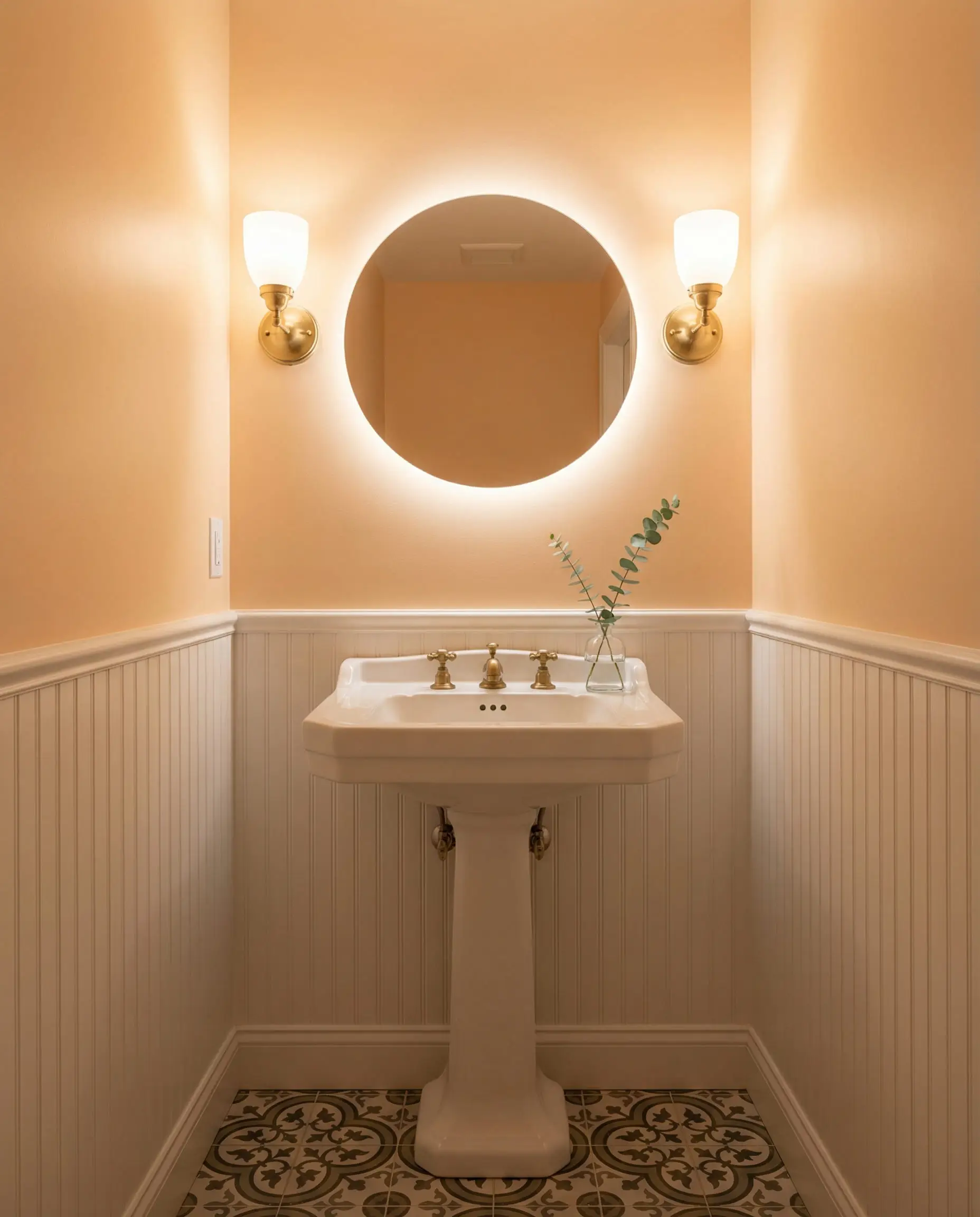
These are the darlings of 2026 design. They have brown or red undertones and act almost like a neutral. They are grounding and cozy.
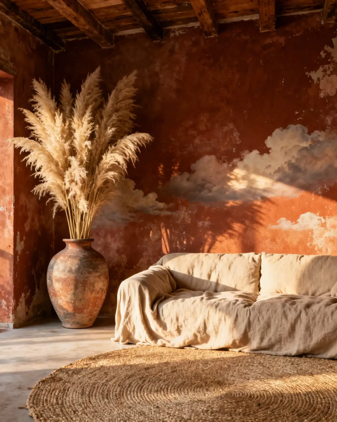
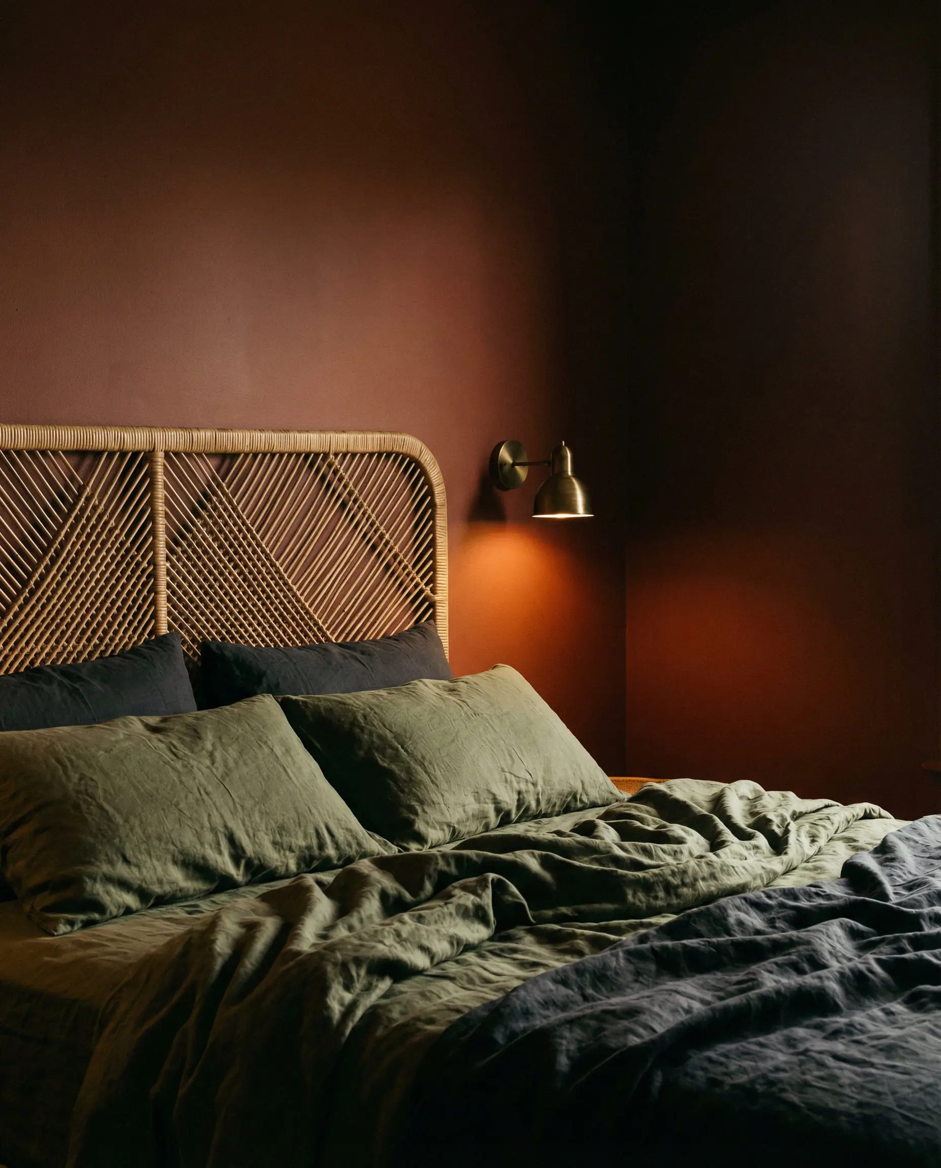
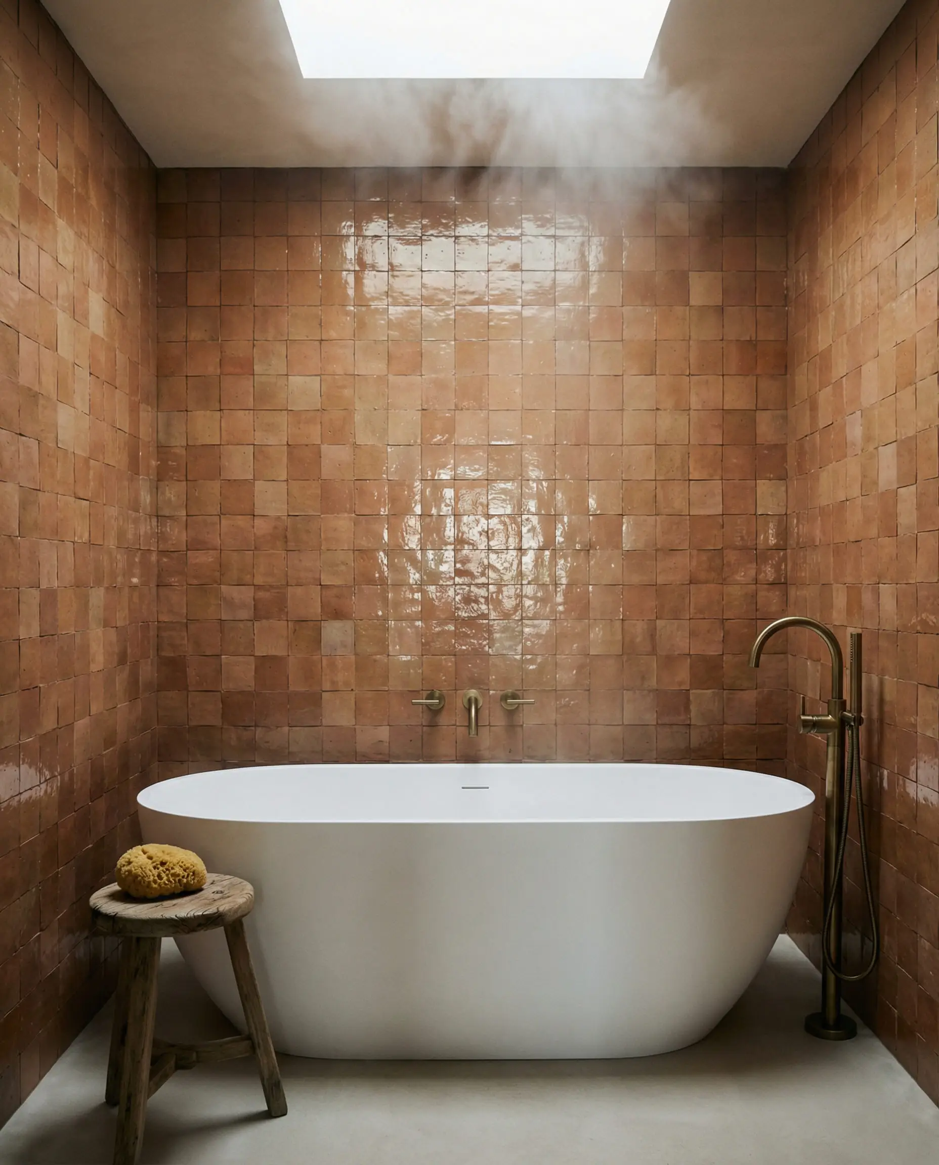
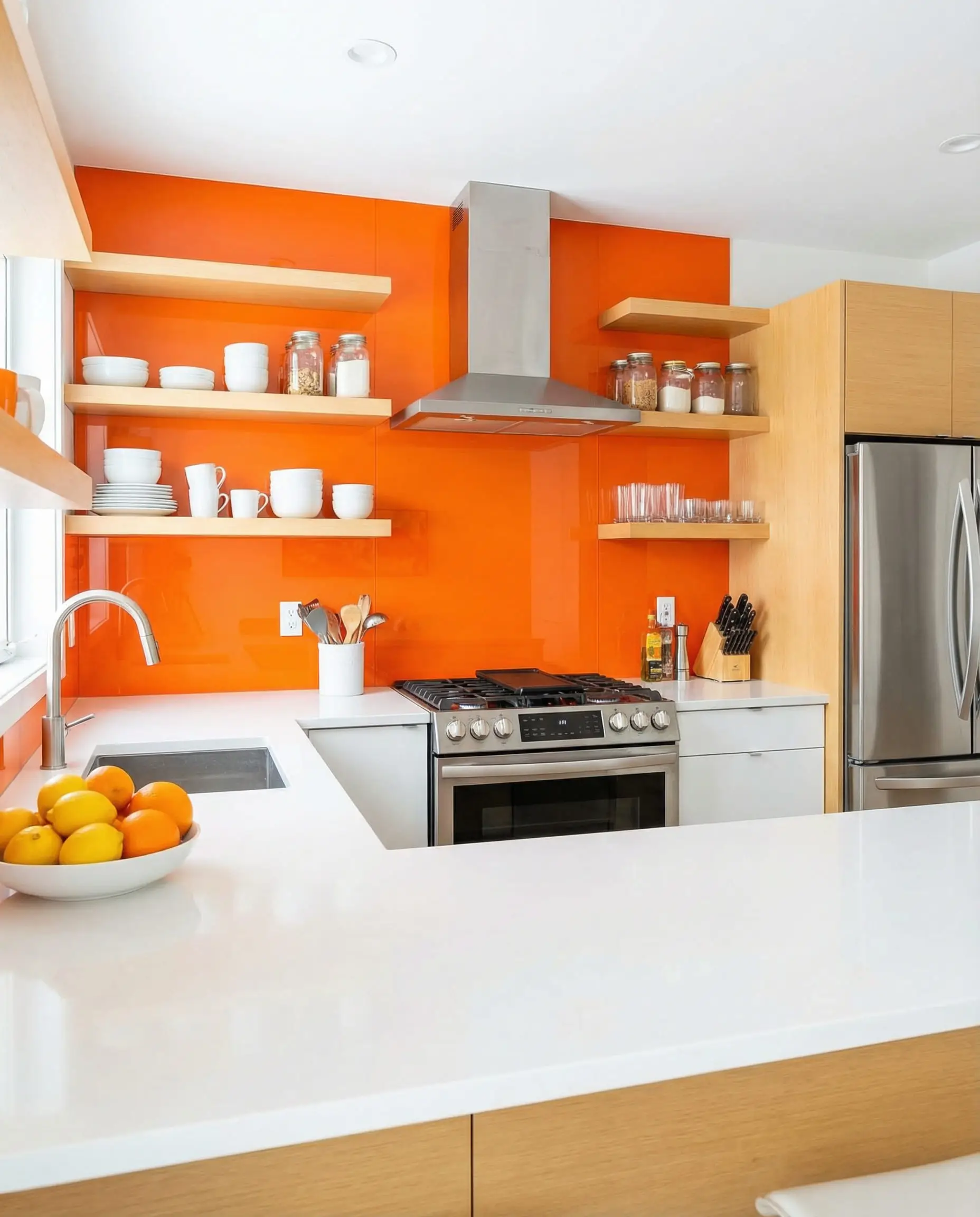
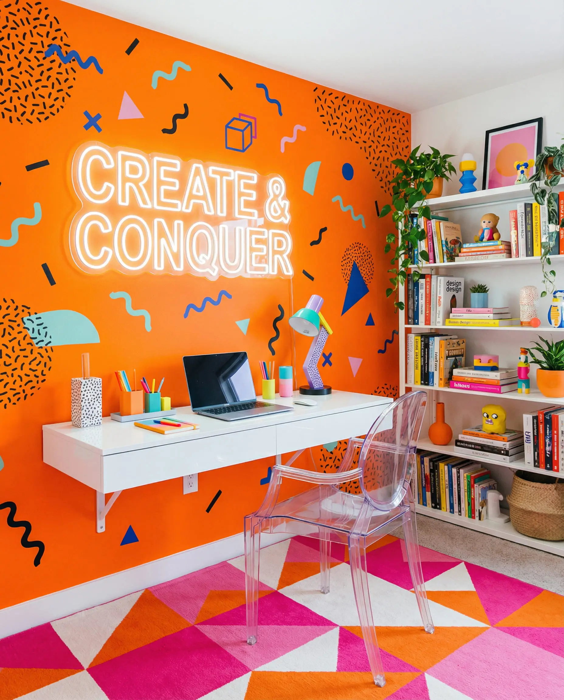
The Citrus Tones (Tangerine, Clementine, Neon)
These are high-energy, yellow-based oranges. They reflect a lot of light and can be overwhelming if not tamed.
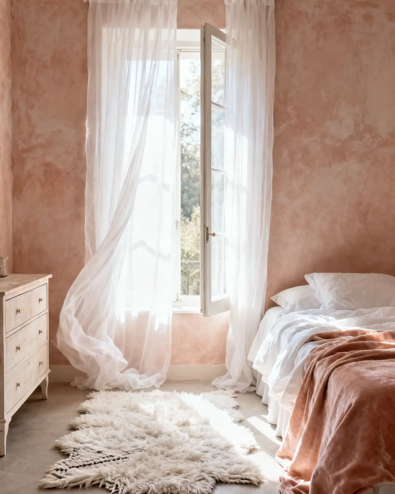
The Pastel Tones (Peach, Apricot, Salmon)
These have white mixed in, softening the blow. They read as “romantic” or “retro.”
(For a deeper dive into how these colors interact, check out our guide on the Color Wheel in Interior Design and Decorating).
2. The Cool Contrasts: Blue & Green (Complementary Harmony)
According to color theory, blue is the direct complement to orange. They sit opposite each other on the wheel, meaning they create the highest possible contrast. However, the trend for 2026 is shifting slightly toward the greens.
Navy Blue & Indigo
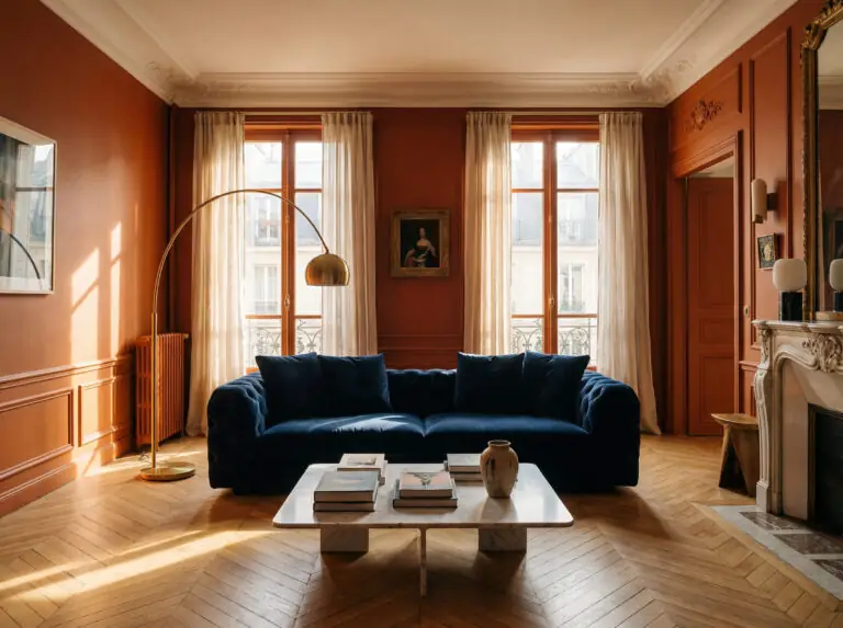
This is the heavyweight champion of styling orange. Deep navy acts as a “coolant” for the heat of orange. It absorbs light, whereas orange reflects it. This push-and-pull creates a dynamic, balanced room.
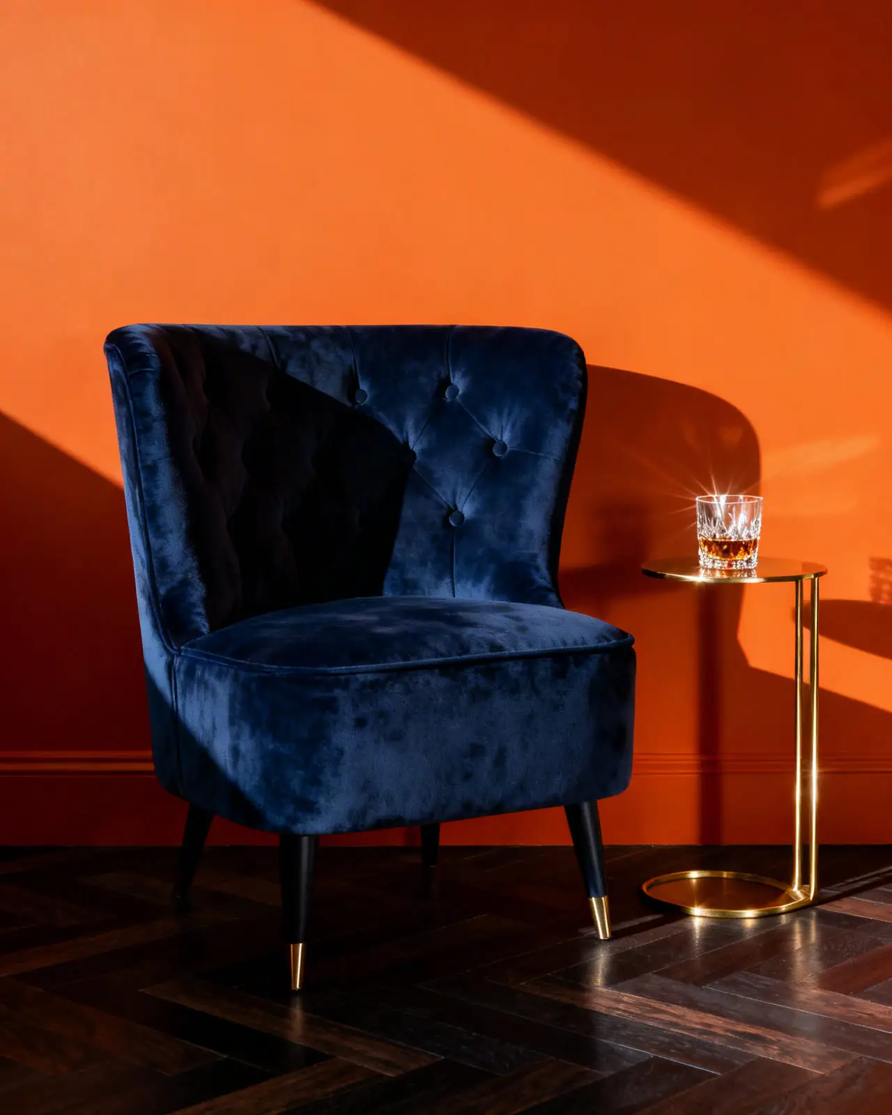
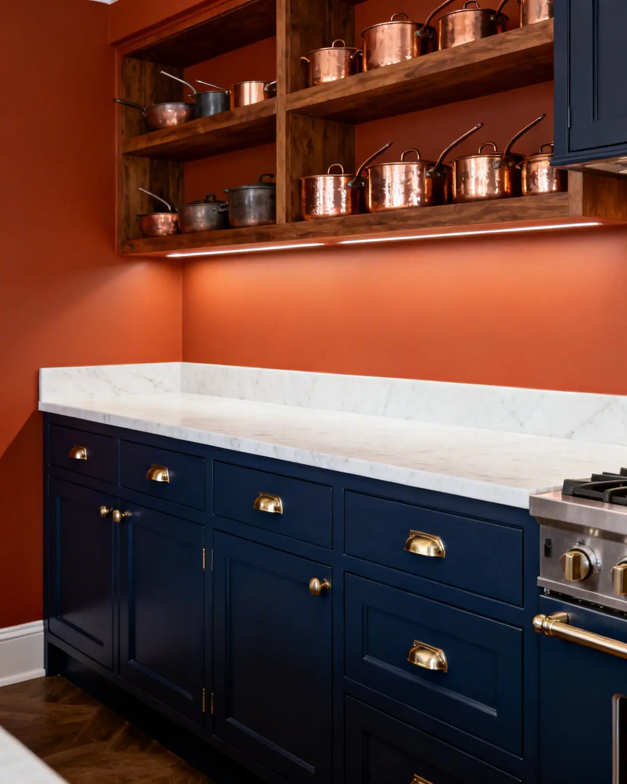
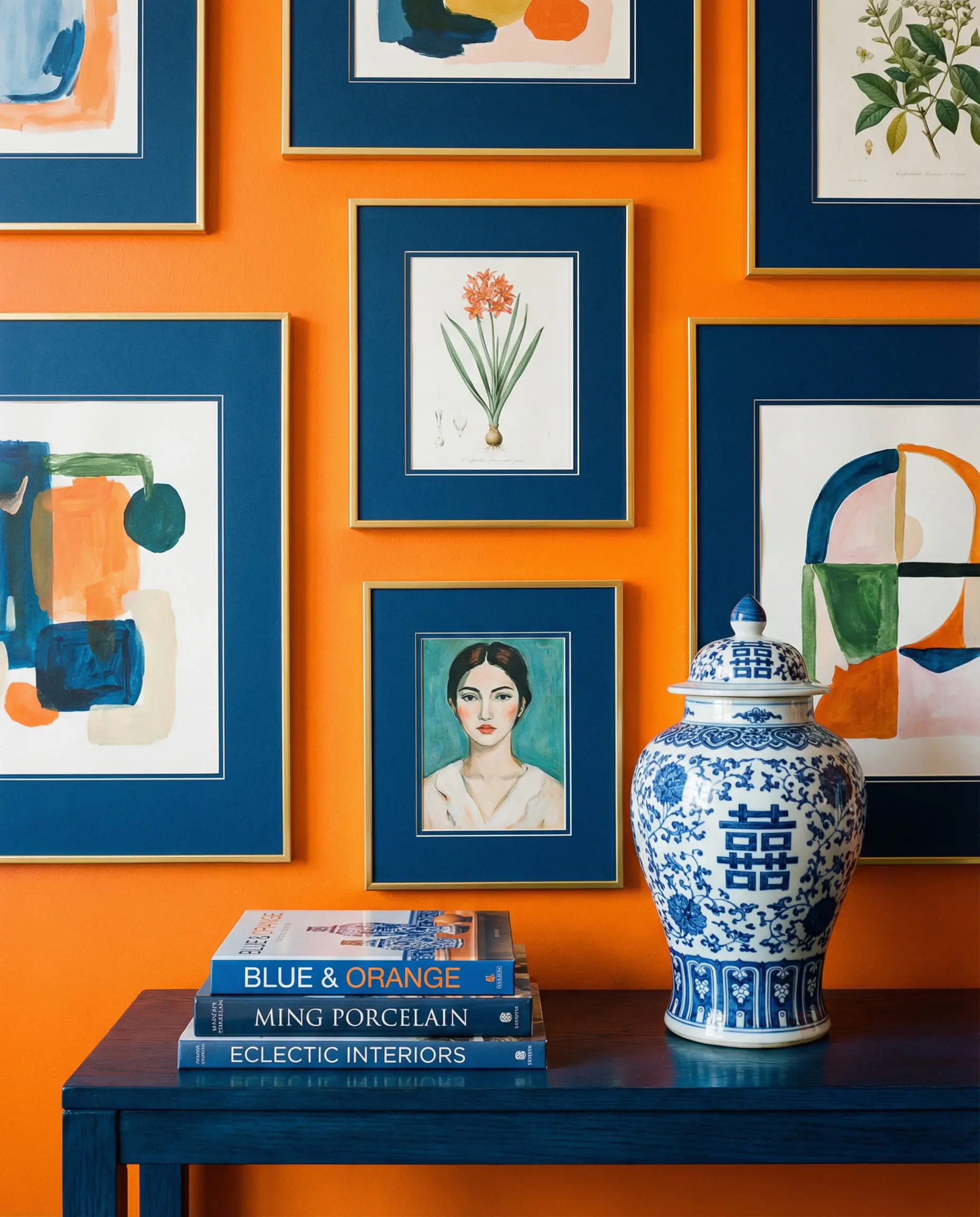
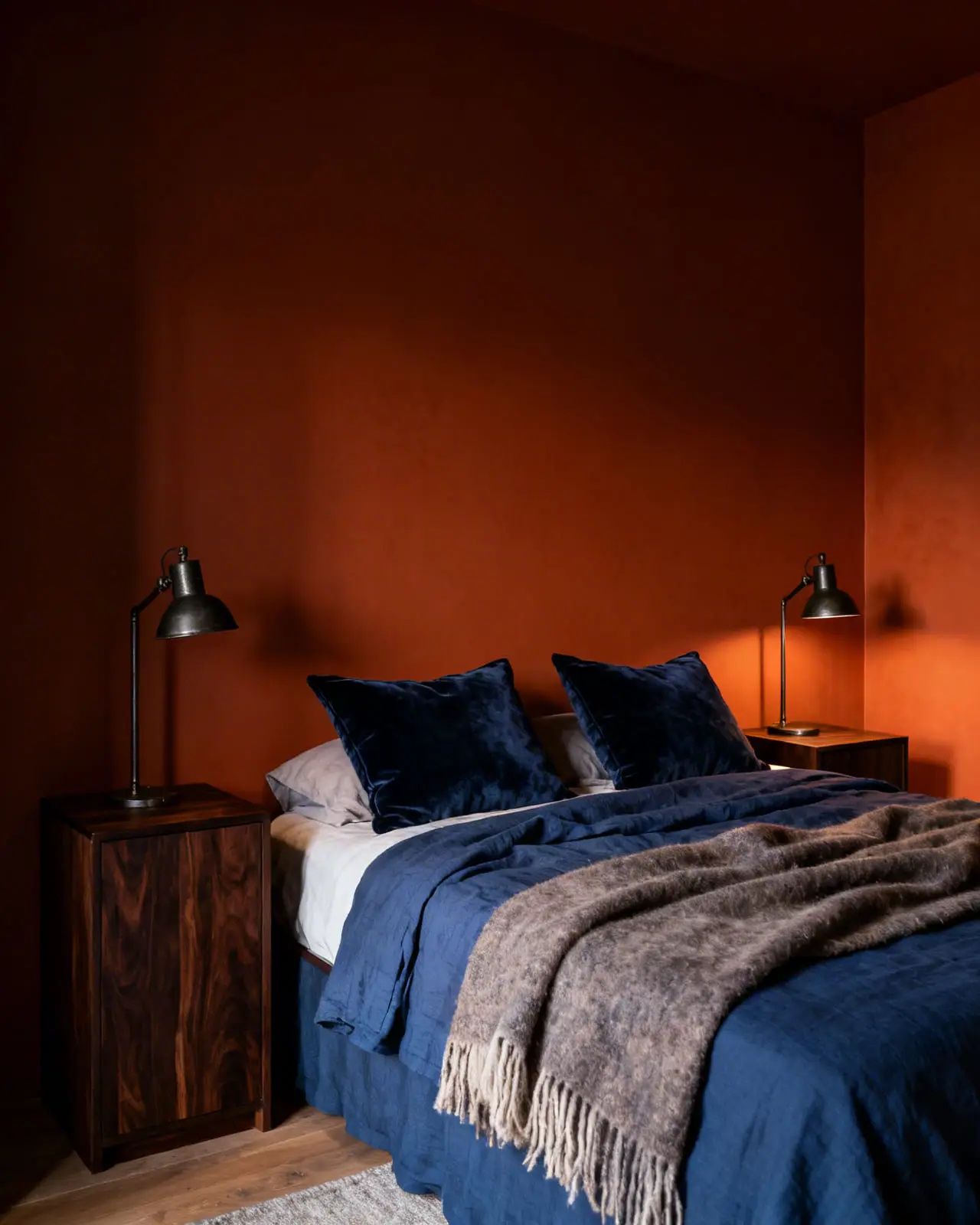
If your walls are bright orange, go darker with the blue (Midnight Blue). If your walls are pale peach, go lighter (Powder Blue).
Stylist Tip 💡
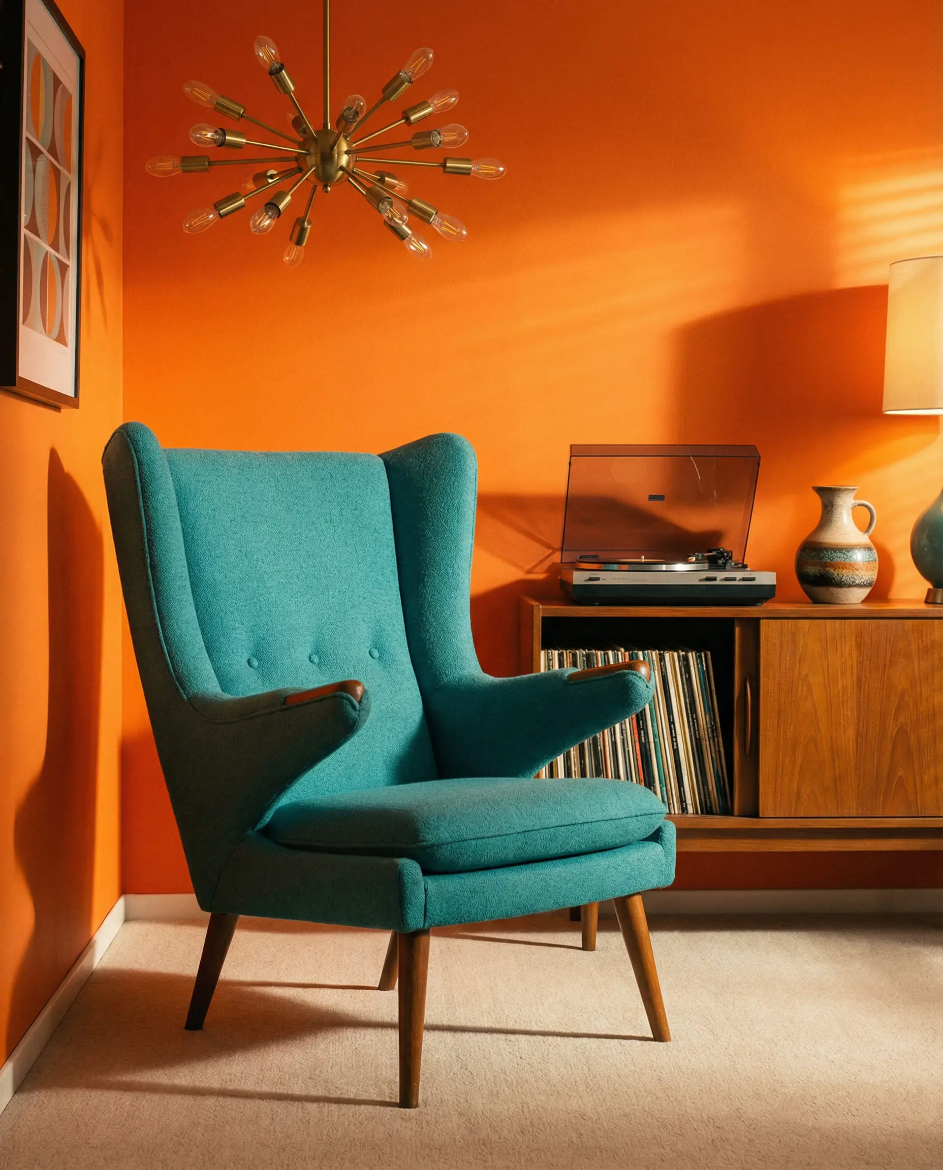
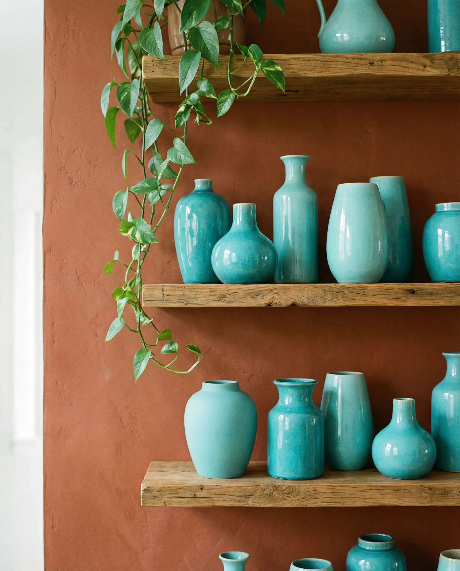
Teal & Turquoise
If you want a fun, retro vibe, this is it. Teal and orange are the signature colors of Mid-Century Modern design. It’s playful, creative, and undeniably happy.
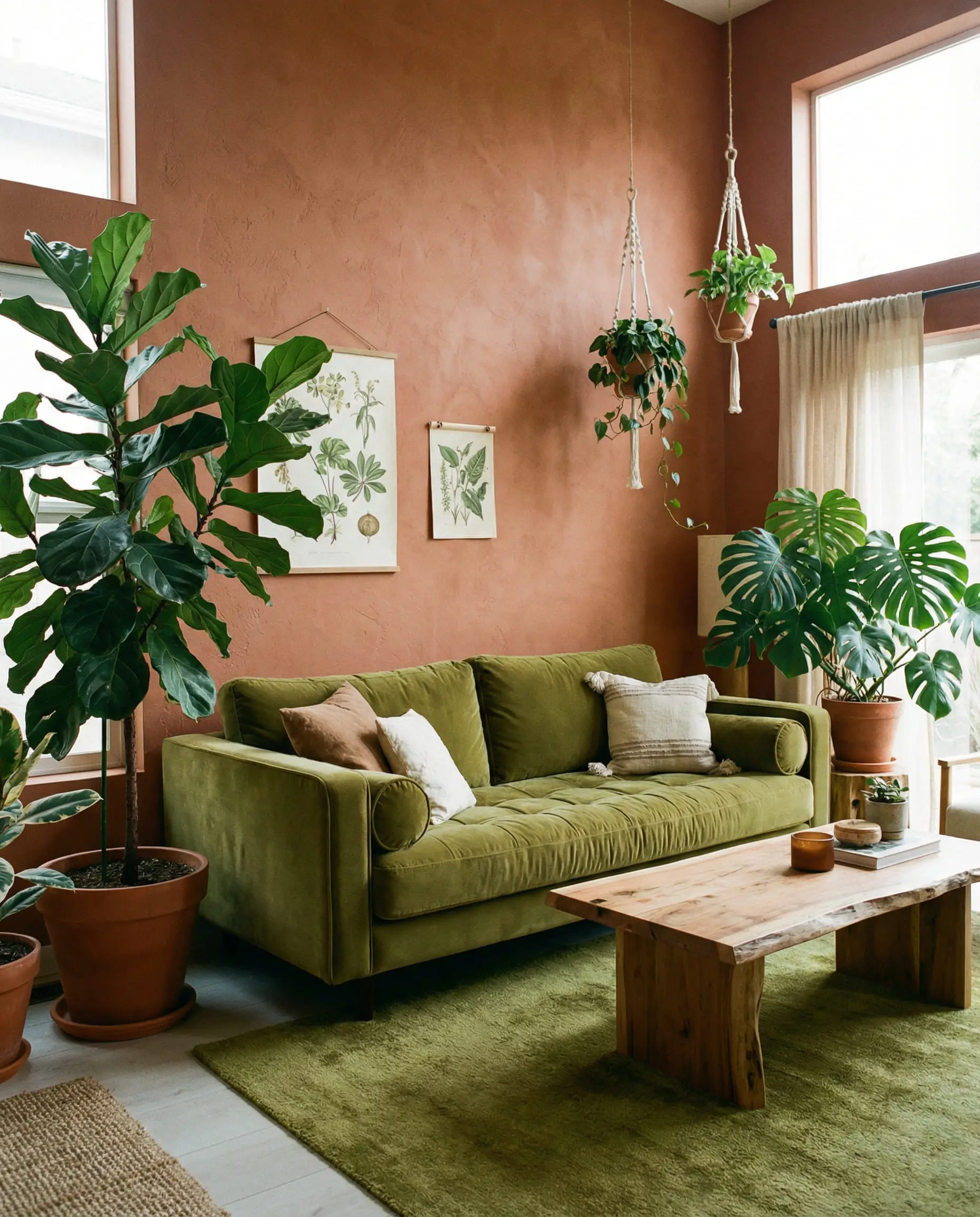
Sage & Olive Green
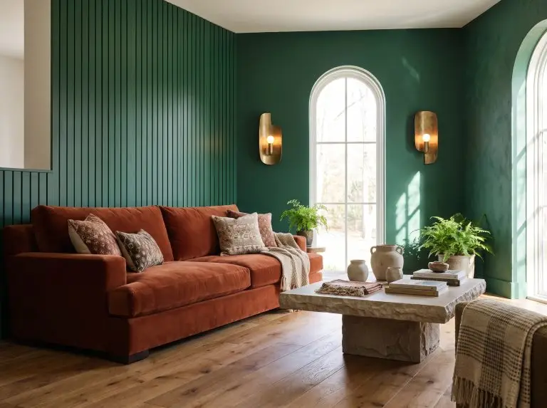
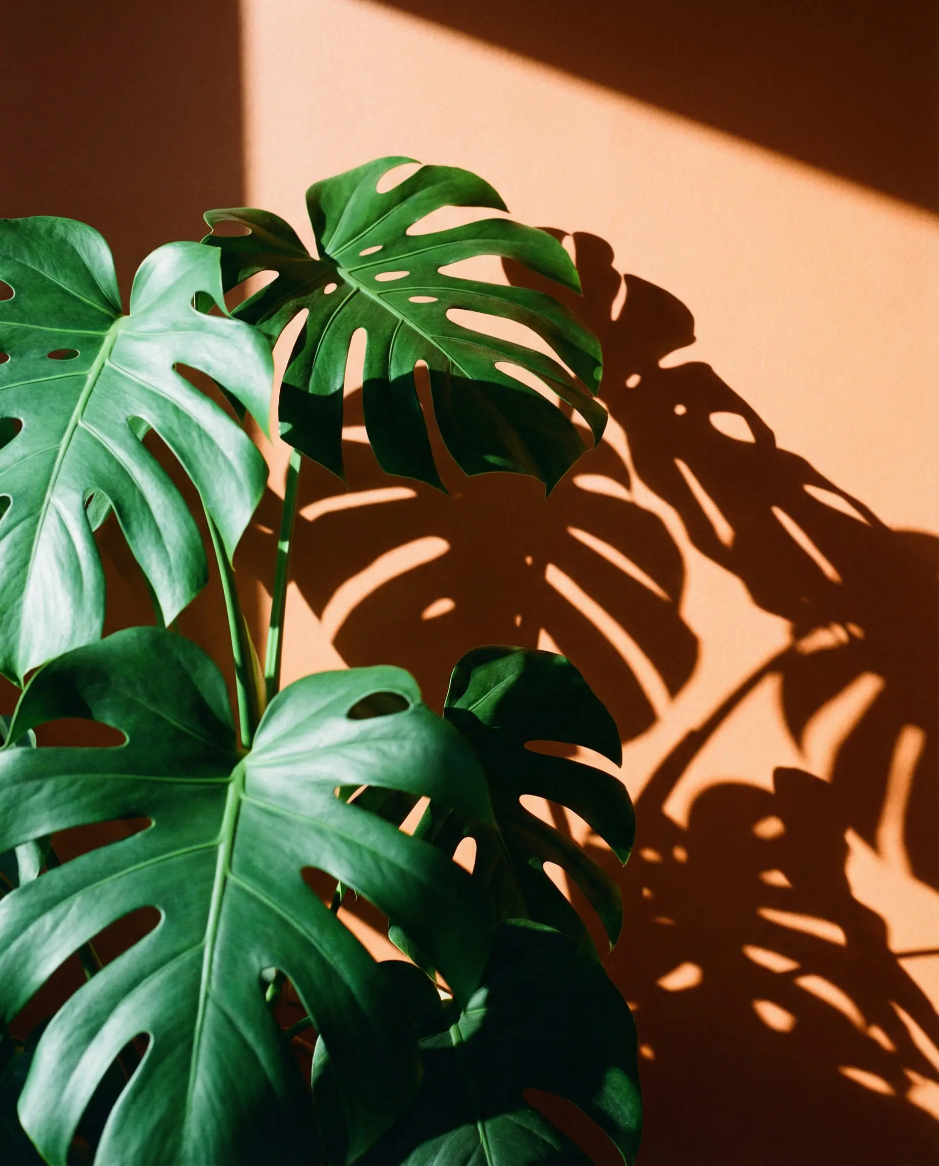
While blue is the scientific complement, green is the natural complement. Think of a pumpkin in a field, a carrot with its leafy top, or autumn leaves against an evergreen tree.
3. The Neutrals: Anchoring the Energy
If you want your orange walls to be the protagonist, your furniture needs to be the supporting cast. Neutrals prevent visual fatigue.
Crisp White vs. Cream
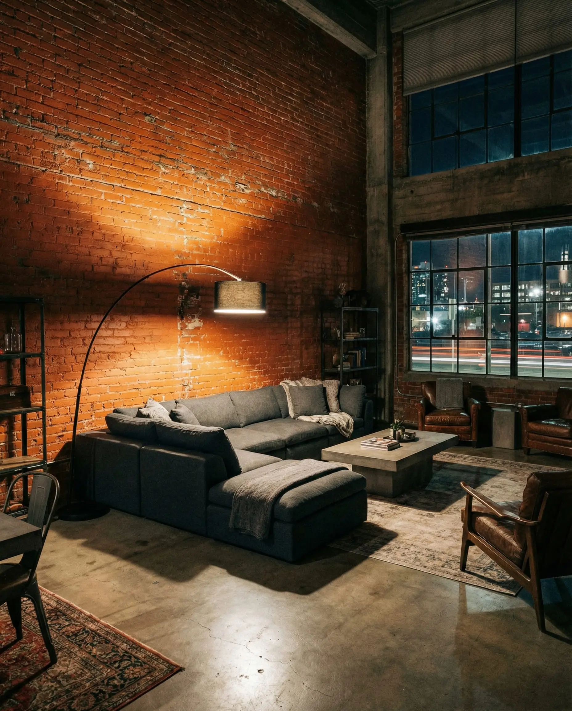
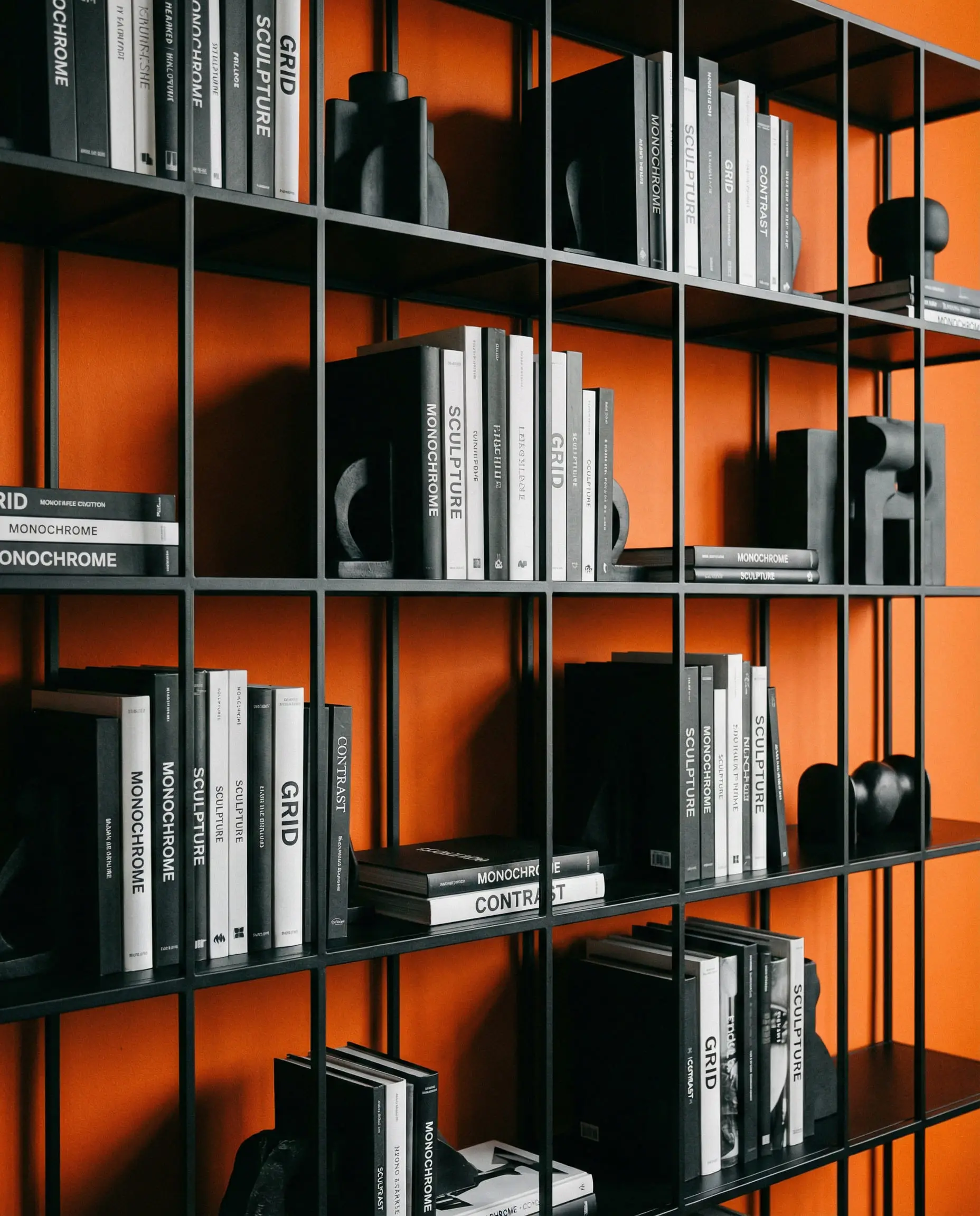
Charcoal Grey & Black
Orange and black is a dangerous combo—get it wrong, and it looks like Halloween. The trick is texture.
The Power of Brown (Wood Tones)
Never underestimate the color of your furniture.
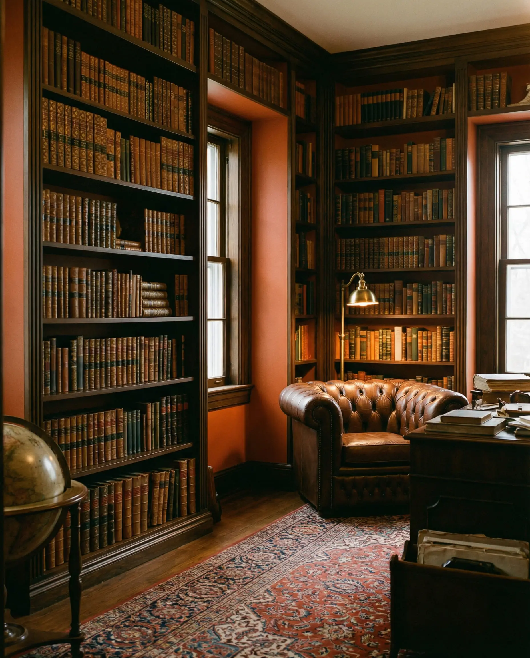
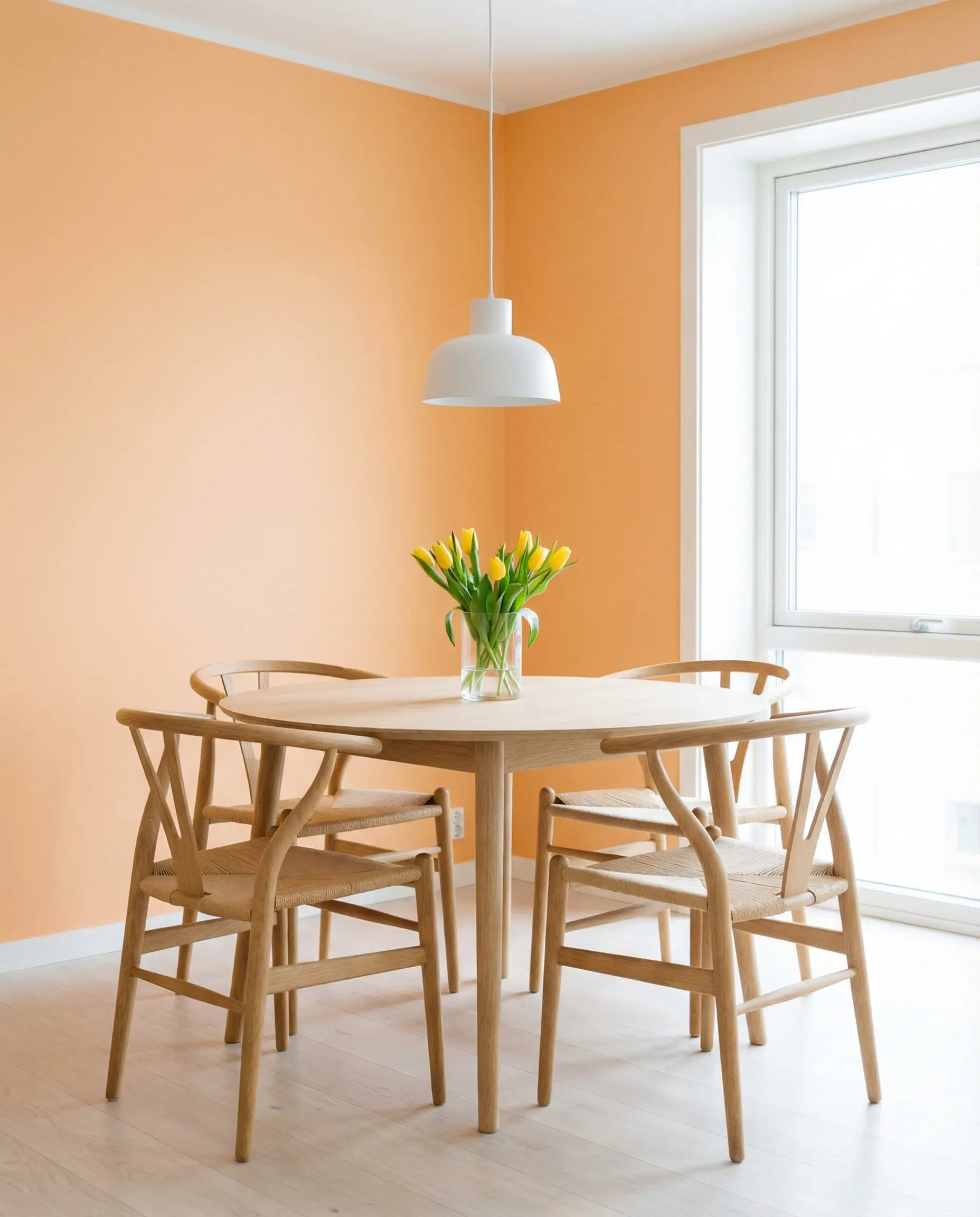
Avoid woods with red undertones (like Cherry or Mahogany) as they will clash with the orange. Stick to ashy or dark browns.
Stylist Tip 💡
4. Warm Analogous Colors (The “Sunset” Palette)
Analogous colors are neighbors on the color wheel. When you use them together, you create a low-contrast, harmonious vibe that feels like a warm hug.
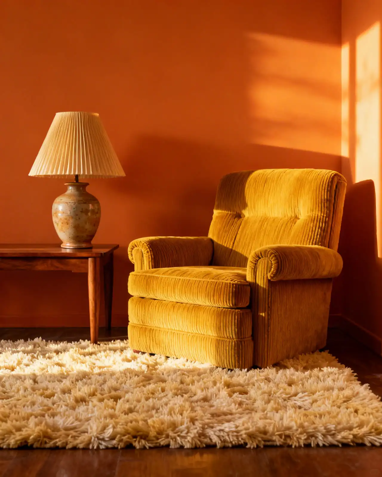
Mustard Yellow
This pairing screams “Retro 70s” in the best way possible. It’s sunny and optimistic. To avoid it looking like a fast-food logo, ensure your textures are rich—think wool rugs, corduroy pillows, and matte paint.
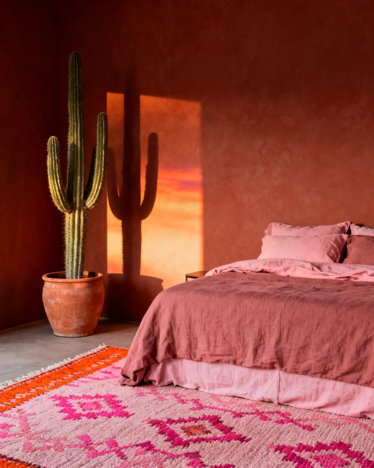
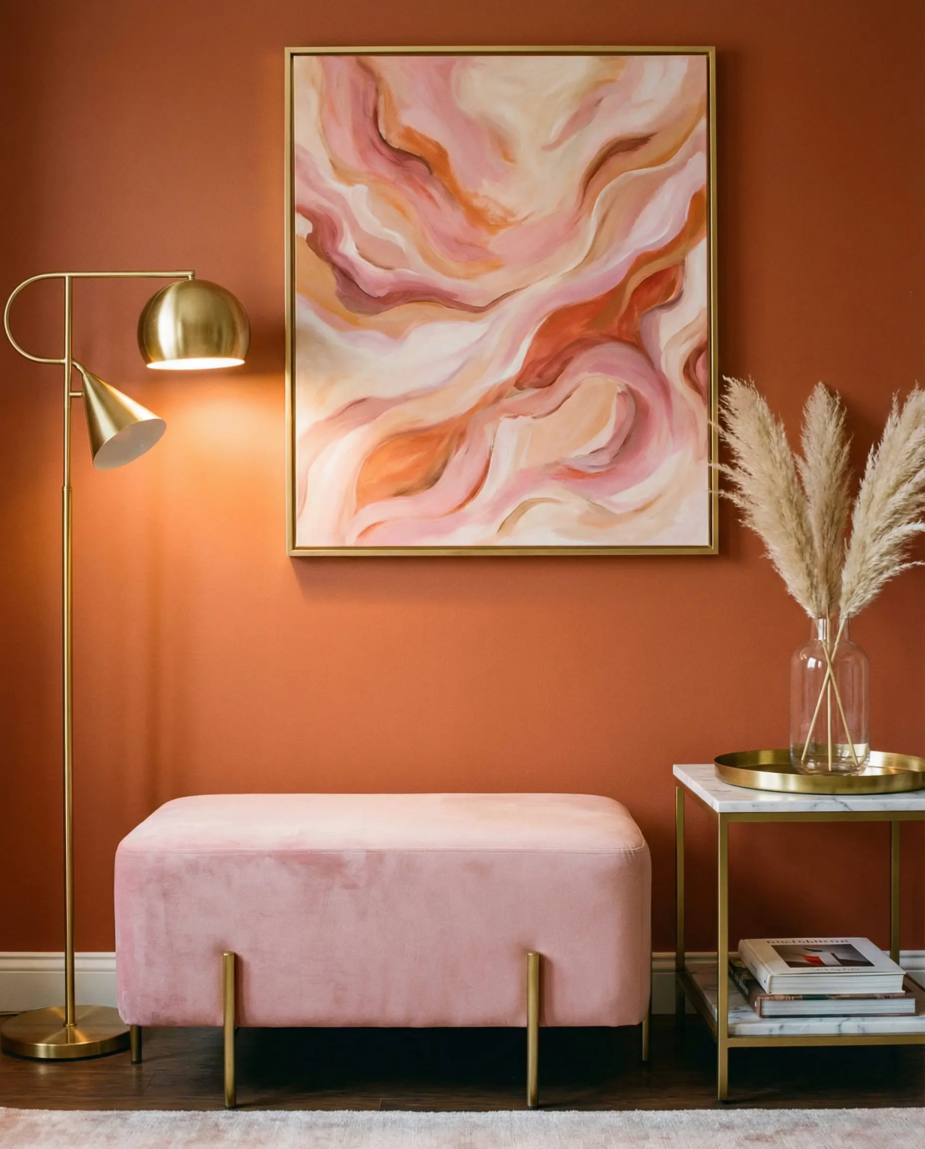
Blush Pink & Dusty Rose
Surprisingly chic, pink and orange are the darlings of the current “Desert Modern” aesthetic. When you pair a deep rust wall with soft blush pink bedding, you get a sunset palette that is universally flattering.
5. Texture & Material: The Missing Link
Color isn’t just about paint—it’s about light reflection. The material you choose changes how the color “reads.”
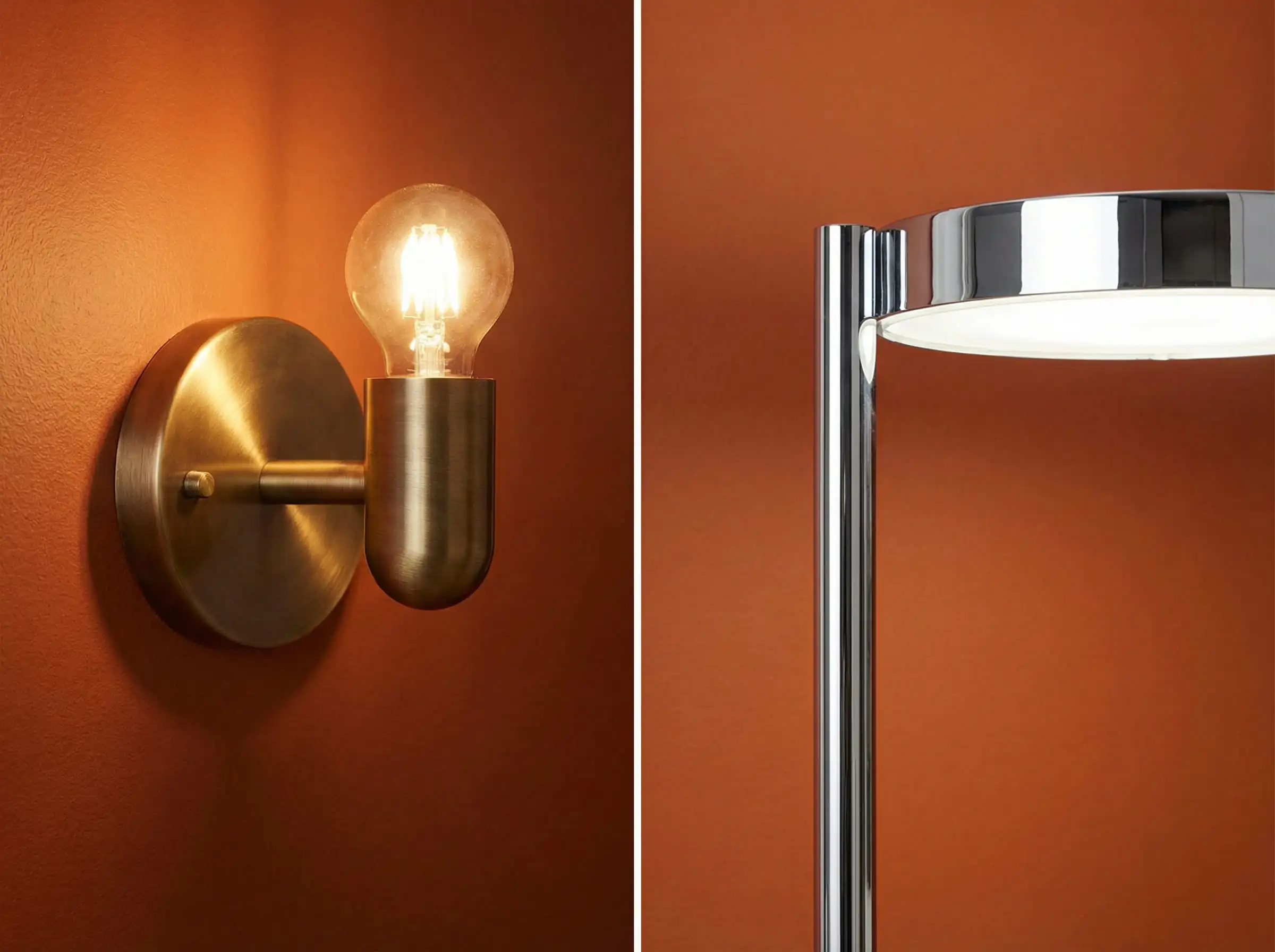
Metals: Gold vs. Silver
Fabrics
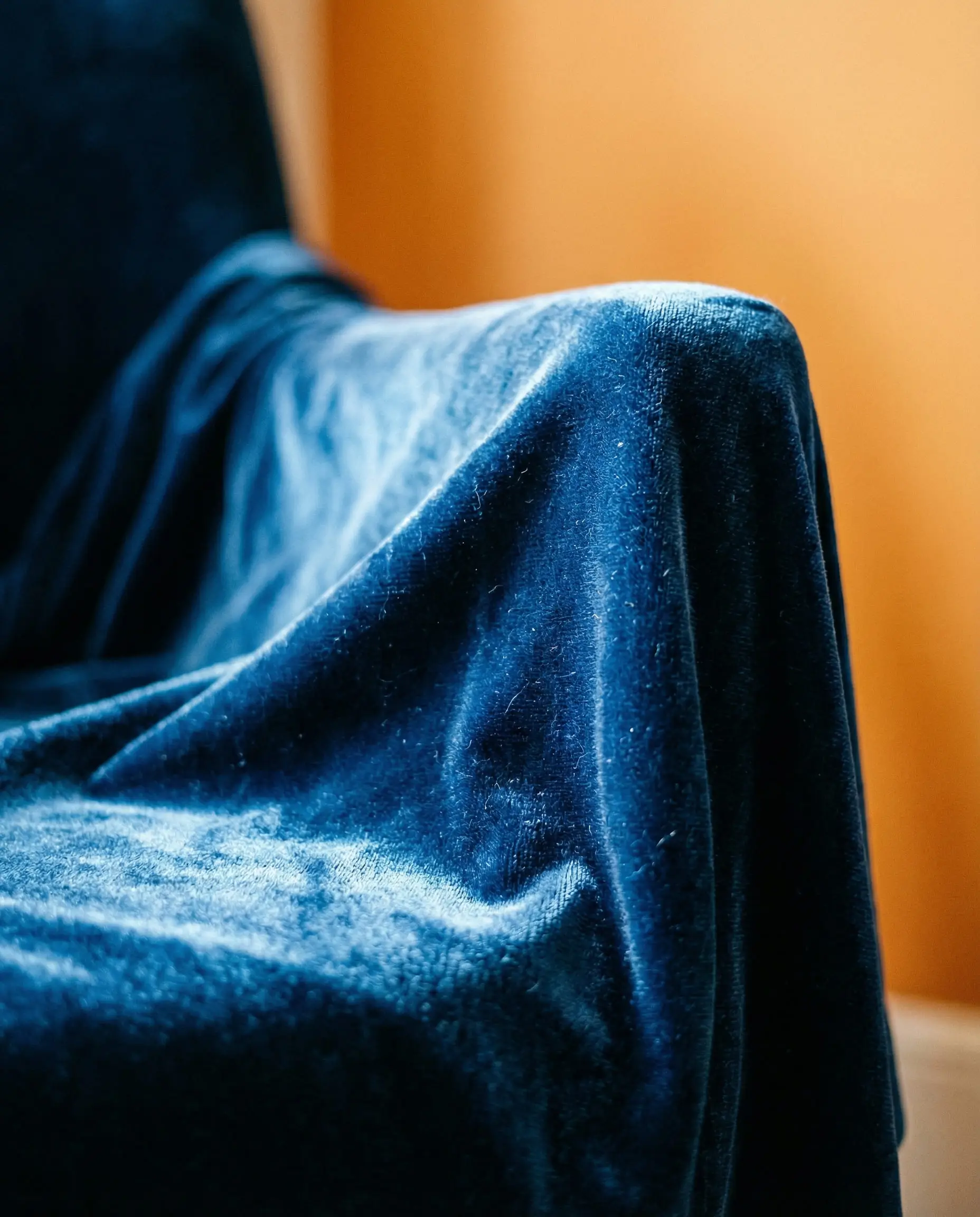
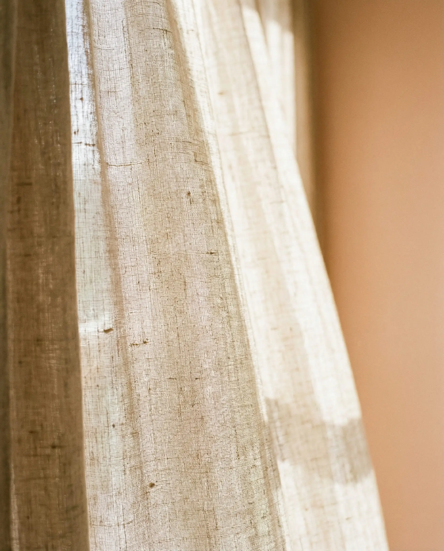
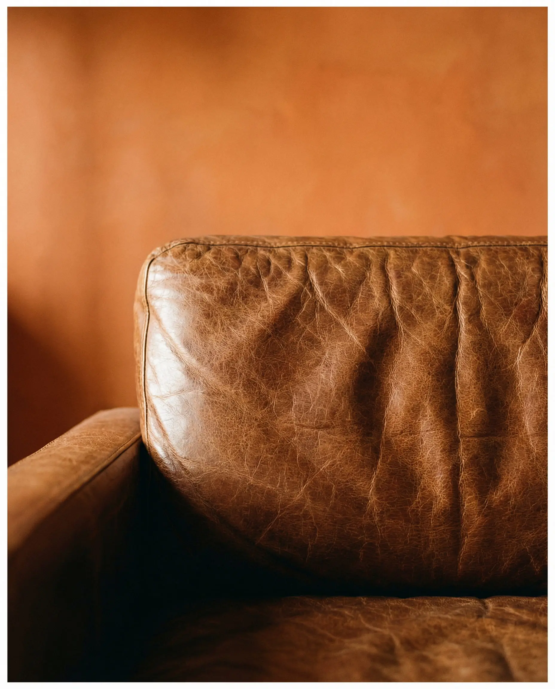
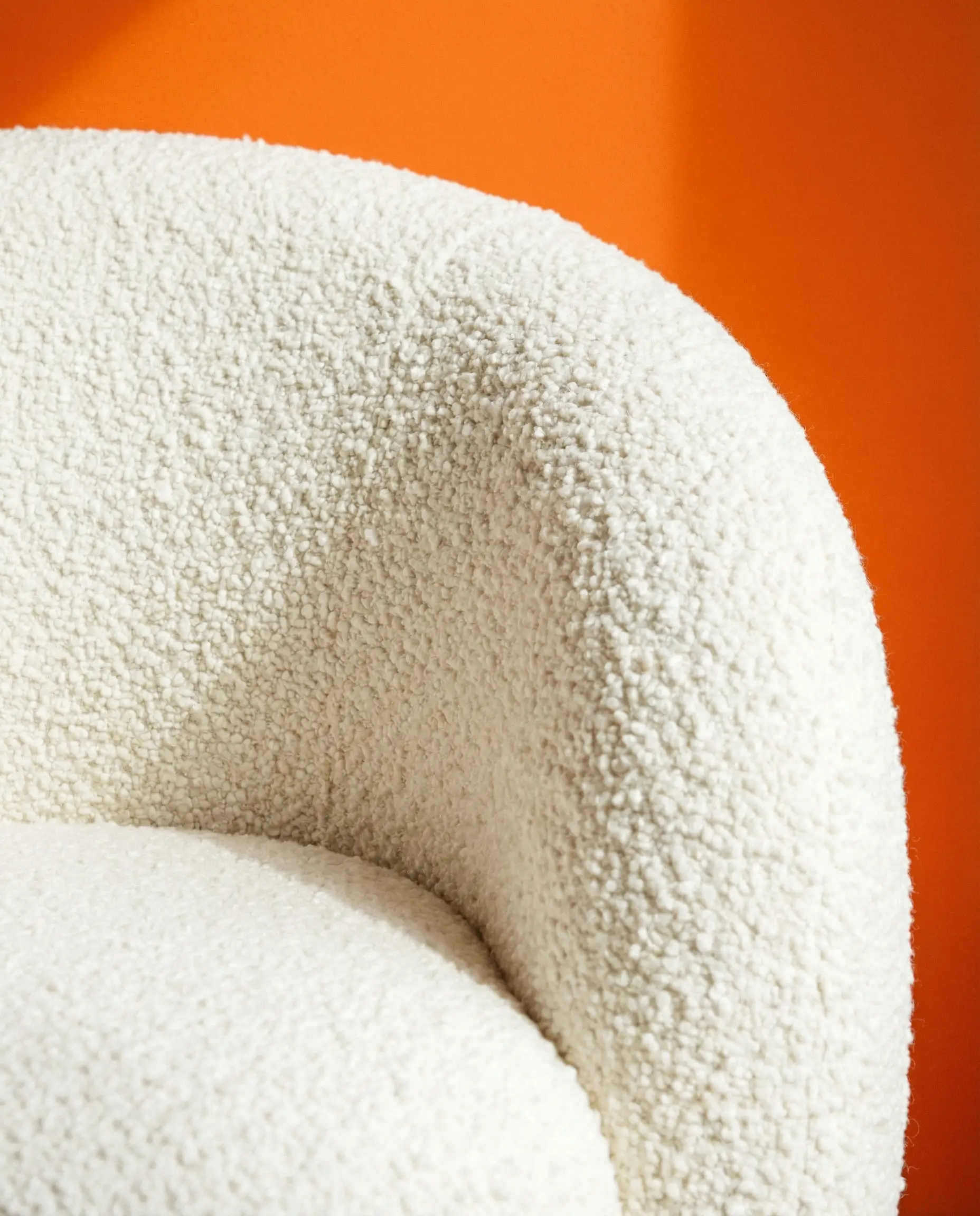
Dive deeper into Home Decor Fabric Trends to choose the right textiles for your bold walls.
6. Lighting: The Game Changer
You can pick the perfect color combo, but if your lighting is wrong, it will fail. Orange is uniquely susceptible to lighting changes.
- Warm White Bulbs (2700K – 3000K): These will make your orange walls glow and feel more intense/red.
- Cool White Bulbs (4000K+): These can make orange walls look brown, muddy, or harsh. Avoid cool lighting with orange walls.
- Natural Light:
- North-Facing Room: The light is cool and blue. Your orange walls might look duller. You need a brighter, punchier tangerine to compensate.
- South-Facing Room: The light is warm and golden. Your orange walls will blaze! You might want to opt for a muted Terracotta to keep it from being blinding.
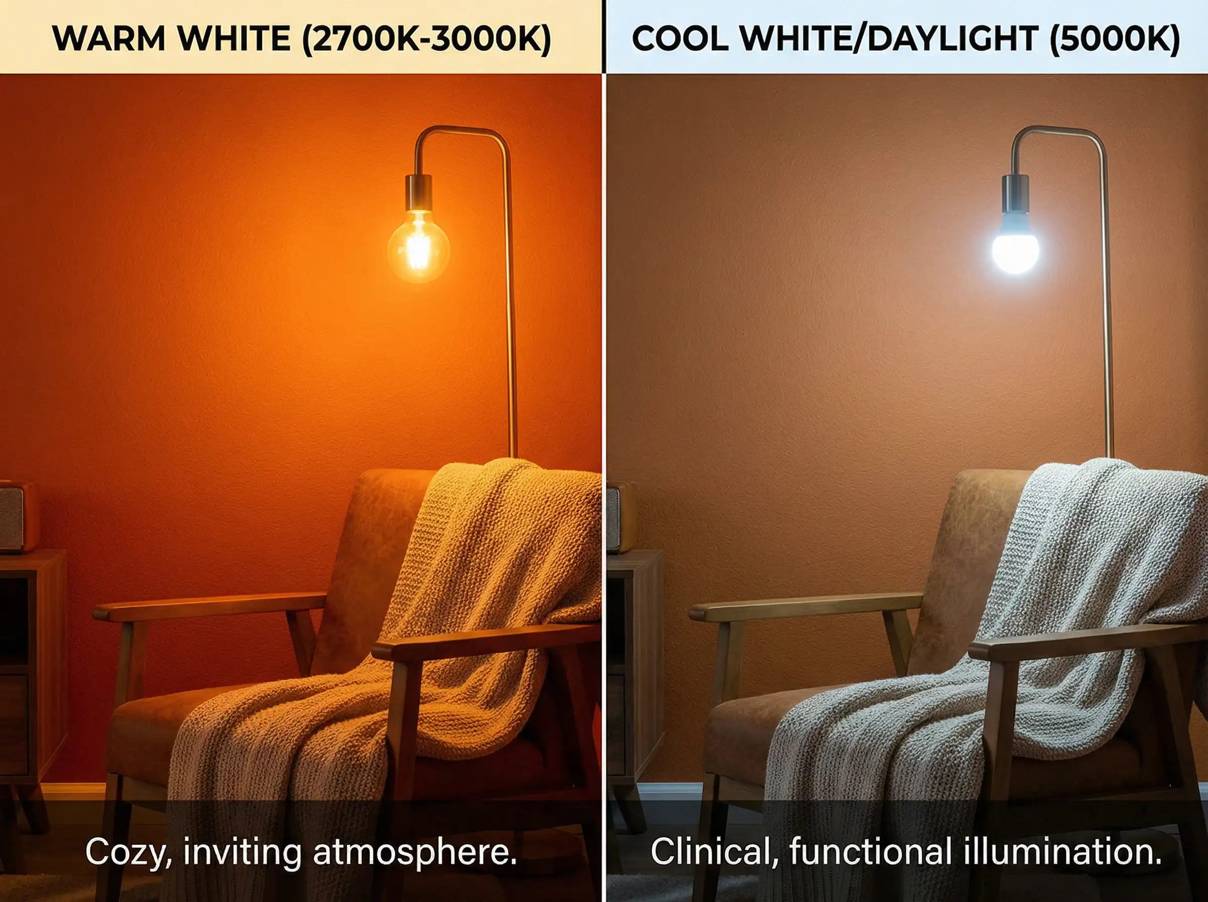
Understanding Lighting Trends is crucial for bold color choices.
7. Room-by-Room Styling Guide
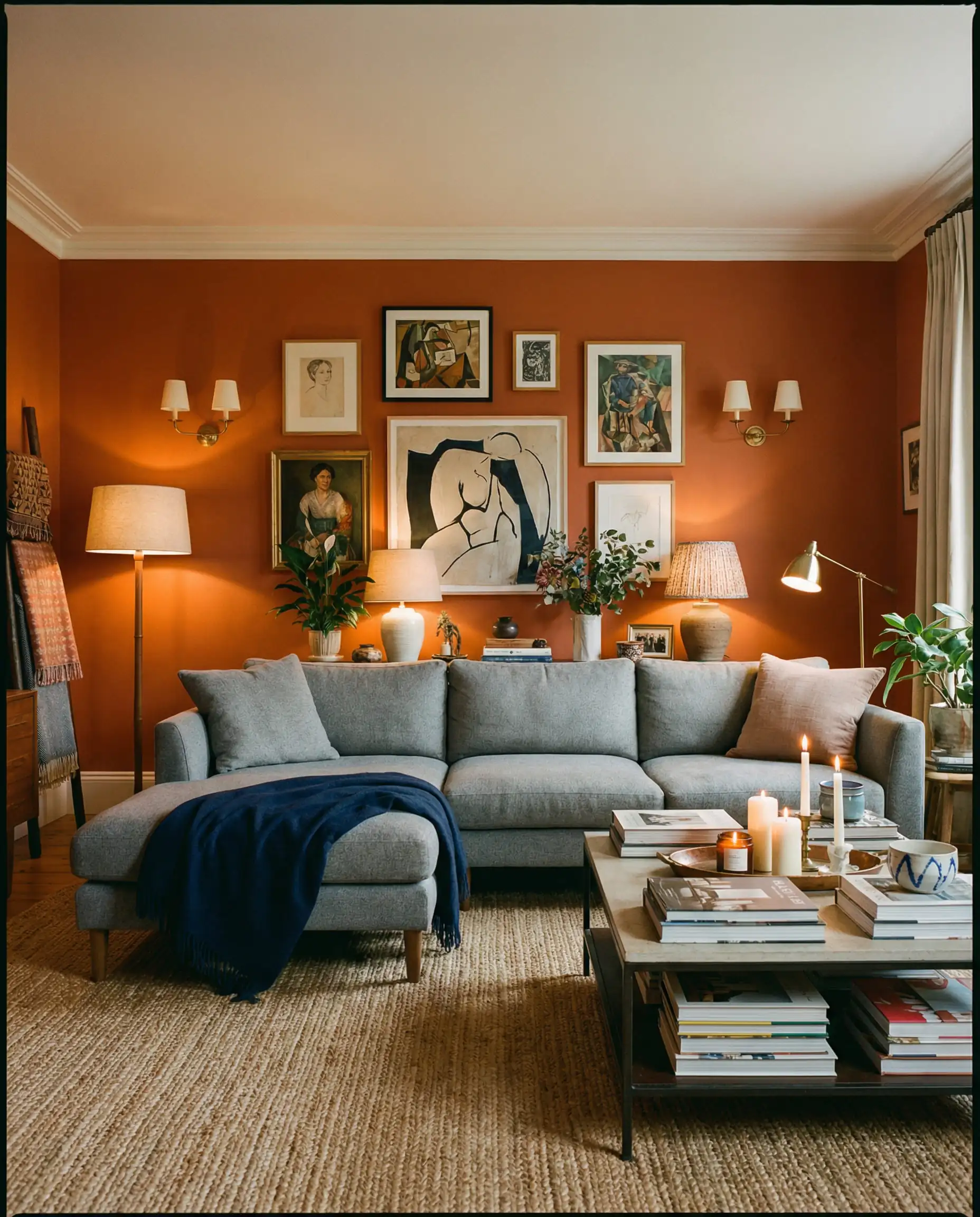
The Living Room
This is where you entertain. You want energy, but also relaxation.
The Kitchen
Orange stimulates the appetite (it’s true!).
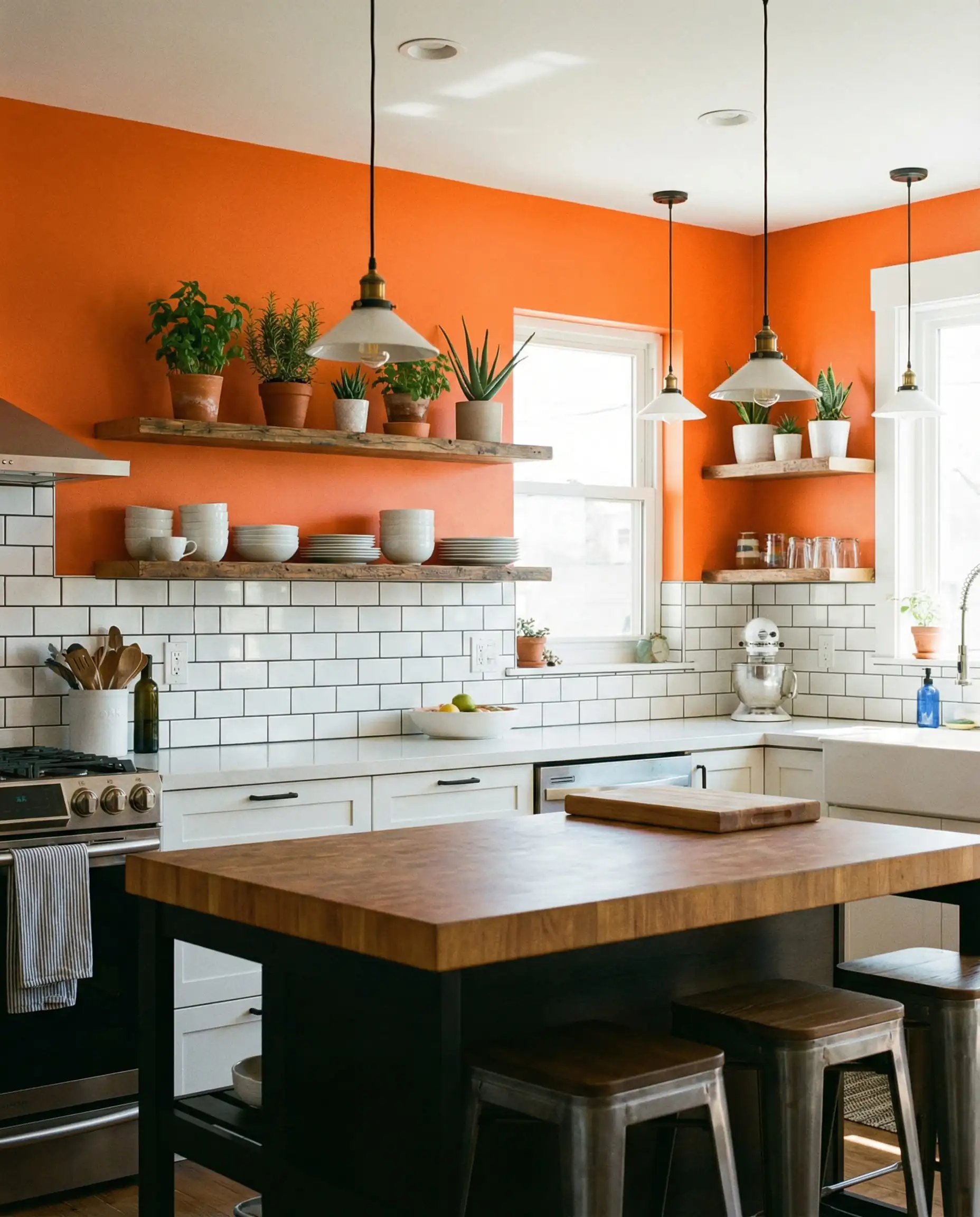
Check out Modern White Kitchen Ideas to see how white creates a canvas for bold colors.
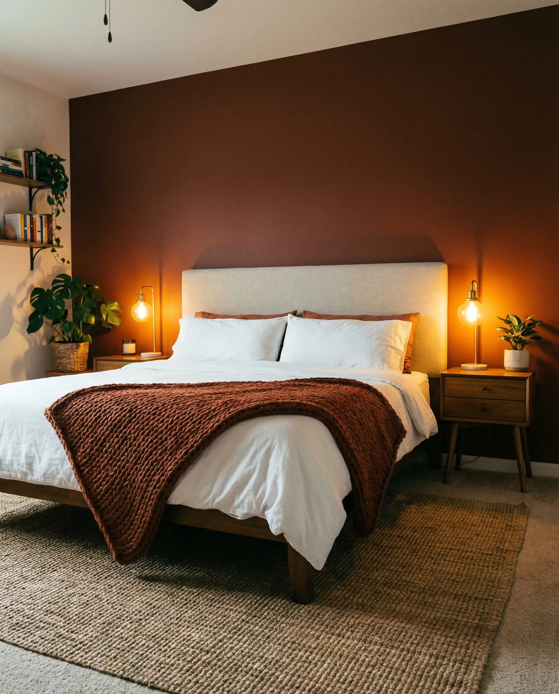
The Bedroom
Be careful here. Bright orange is too stimulating for sleep.
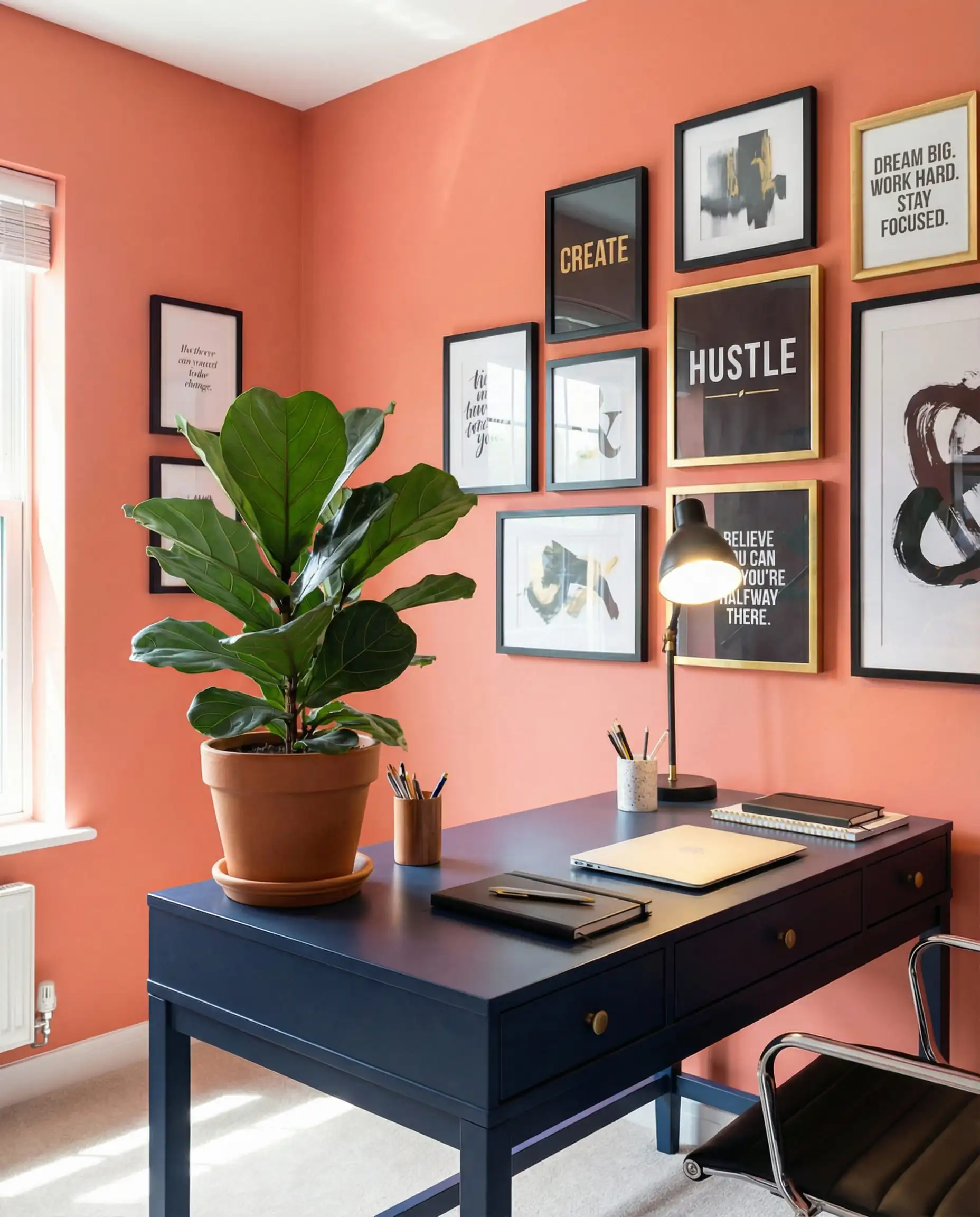
The Home Office
You need creativity and focus.
8. What NOT To Do (Common Mistakes)
Avoid these pitfalls to keep your design looking professional.
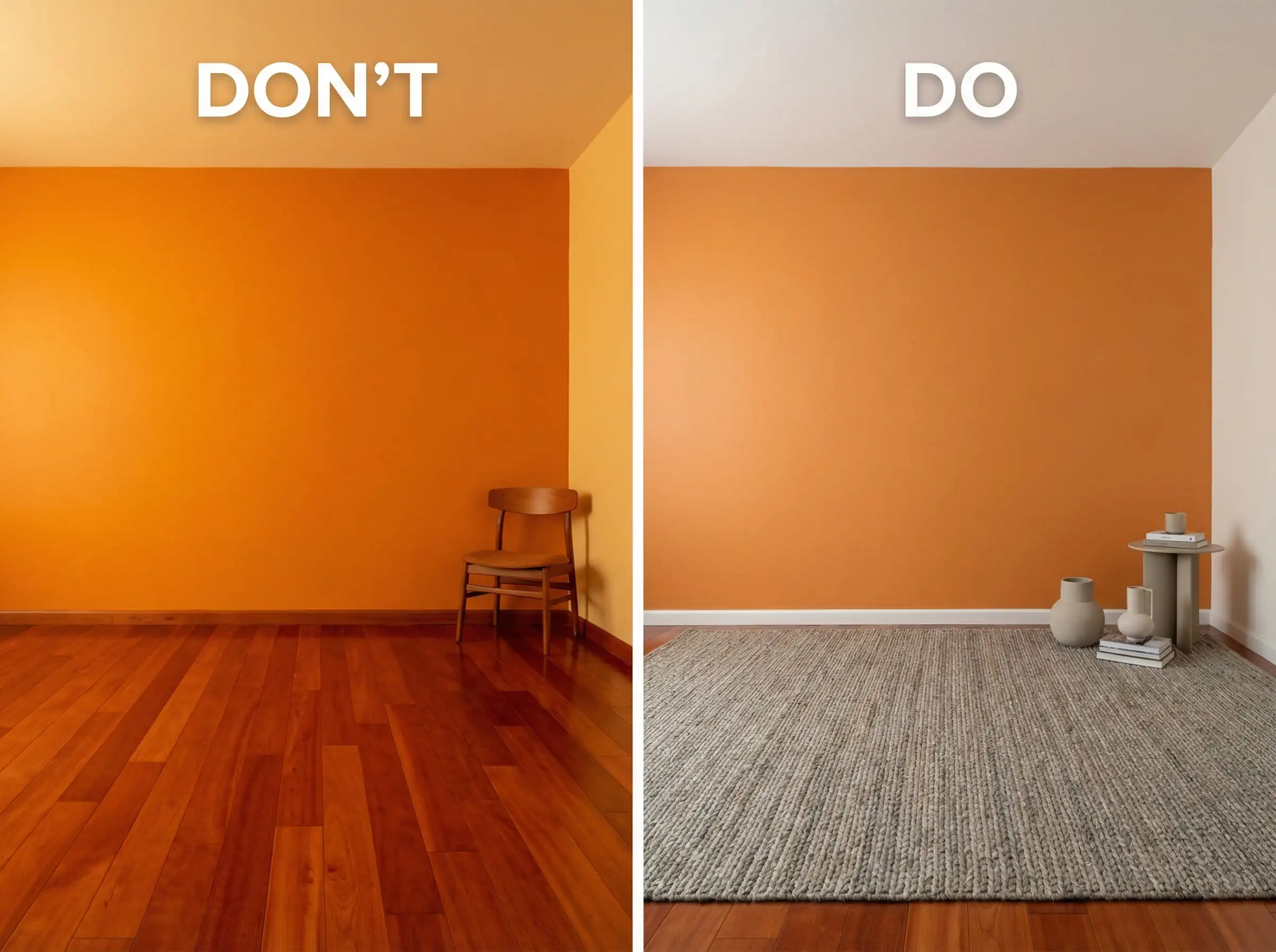
- Ignoring the Floor: If you have reddish-wood floors (like Cherry) and paint the walls orange, the room will look like the inside of a volcano. You need contrast. Use a large area rug in a neutral tone (Beige, Grey, or Jute) to break up the heat.
- The “Halloween” Trap: Pairing bright pumpkin orange with stark black and white. Unless it is October 31st, soften the black to Charcoal and the white to Cream.
- Forgetting the Ceiling: White ceilings are standard, but with orange walls, a stark white ceiling can feel jarring. Consider painting the ceiling a soft cream or a very pale peach to bridge the gap.
9. Interactive: Try It Before You Paint
Imagining these colors is one thing; seeing them in your actual space is another. Design is expensive—paint, rugs, and sofas cost money. Don’t risk a “re-do.”
Use the Hackrea Visualizer to test these theories instantly:
- Upload a photo of your room.
- Mask the walls with a single tap.
- Cycle through Navy, Sage, Cream, and Grey combinations instantly.
👉 Launch the Hackrea Visualizer Tool Now
10. Frequently Asked Questions (FAQ)
A: Yes! A common myth is that dark or bold colors shrink a room. Actually, painting a small room (like a powder room) a deep burnt orange can blur the corners and add depth, making it feel like a jewel box.
A:
For a breezy look: White or Cream Sheers.
For drama: Navy Blue or Charcoal Velvet.
For patterns: Look for geometric prints that include small hints of orange mixed with neutrals.
Link: Curtains for Living Room: Tips and Ideas.
A: Absolutely. It is one of the most popular modern pairings. Light grey cools the orange down, while dark grey makes it pop.
A: If you inherited a neon orange room, you don’t necessarily have to repaint. The solution is coverage.
Hang large artwork with wide white mats.
Install floor-to-ceiling neutral curtains.
Use tall bookcases to break up the wall surface area.
Use “cool” temperature lighting (3500K-4000K) to neutralize the yellow tones slightly.
Conclusion
Orange is not for the faint of heart, but it is for those with a heart full of warmth and creativity. Whether you choose the grounding calm of Rust & Olive, the coastal breeze of Peach & White, or the regal drama of Pumpkin & Navy, the secret is commitment.
Don’t apologize for the color—embrace it. Add texture, check your lighting, and when in doubt, use neutrals to anchor the space.
Still not sure which shade is right for you?
Start visualizing your Orange Room Makeover now!