The Warm Greige Kitchen Masterclass: 21 Ways to Style Mushroom & Taupe Cabinetry
The fear of picking the wrong neutral is a universal rite of passage in kitchen renovations. You stare at a wall of swatches, terrified that your expensive custom inset cabinetry will read sickly green at noon or muddy purple by dinner. A warm greige kitchen—often referred to as mushroom or soft taupe—is the definitive antidote to this undertone anxiety, offering a grounded neutral that bridges modern architectural lines with historical warmth.
But executing this highly reactive chameleon color requires more than just picking a trending paint chip off a shelf. The success of a mushroom neutral depends entirely on its surrounding environment: the light reflectance, the specific veining of the stone, and the patina of the hardware.
Mastering the warm greige kitchen means understanding the exact material pairings and lighting science that pull out the warmth and prevent the space from falling flat.
The Science of Warm Greige: Undertones, LRV, and Lighting
Before selecting a single piece of hardware or stone, you must establish the technical parameters of your space. Warm greige is highly reactive, meaning its appearance shifts violently depending on Light Reflectance Value (LRV) and the color temperature of your ambient lighting. A paint with an LRV sweet spot between 55 and 65 ensures the cabinetry feels substantial without turning the room into a dark cave or glaring white box. Crucially, the lighting must be dialed in at 3000K with a high Color Rendering Index (CRI); anything cooler will instantly turn your rich taupe into a cold, clinical gray.
Optimal Conditions:
- Light Reflectance Value (LRV) between 55–65.
- 3000K color temperature for ambient and task lighting.
- High-CRI (90+) bulbs to render true red and yellow undertones accurately.
- South-facing natural light to naturally warm the paint.
Undertone Killers:
- LRV below 50 (absorbs too much light, causing the paint to read muddy).
- 4000K+ daylight bulbs (casts a harsh, green or blue sterile hue over the room).
- Low-CRI lighting (flattens the complex mushroom tones and kills vibrancy).
- Heavy tree coverage outside windows (filters in green-tinted light that distorts the taupe).
You can apply wallpapers, paints, etc. on walls and see how they look in various interiors.

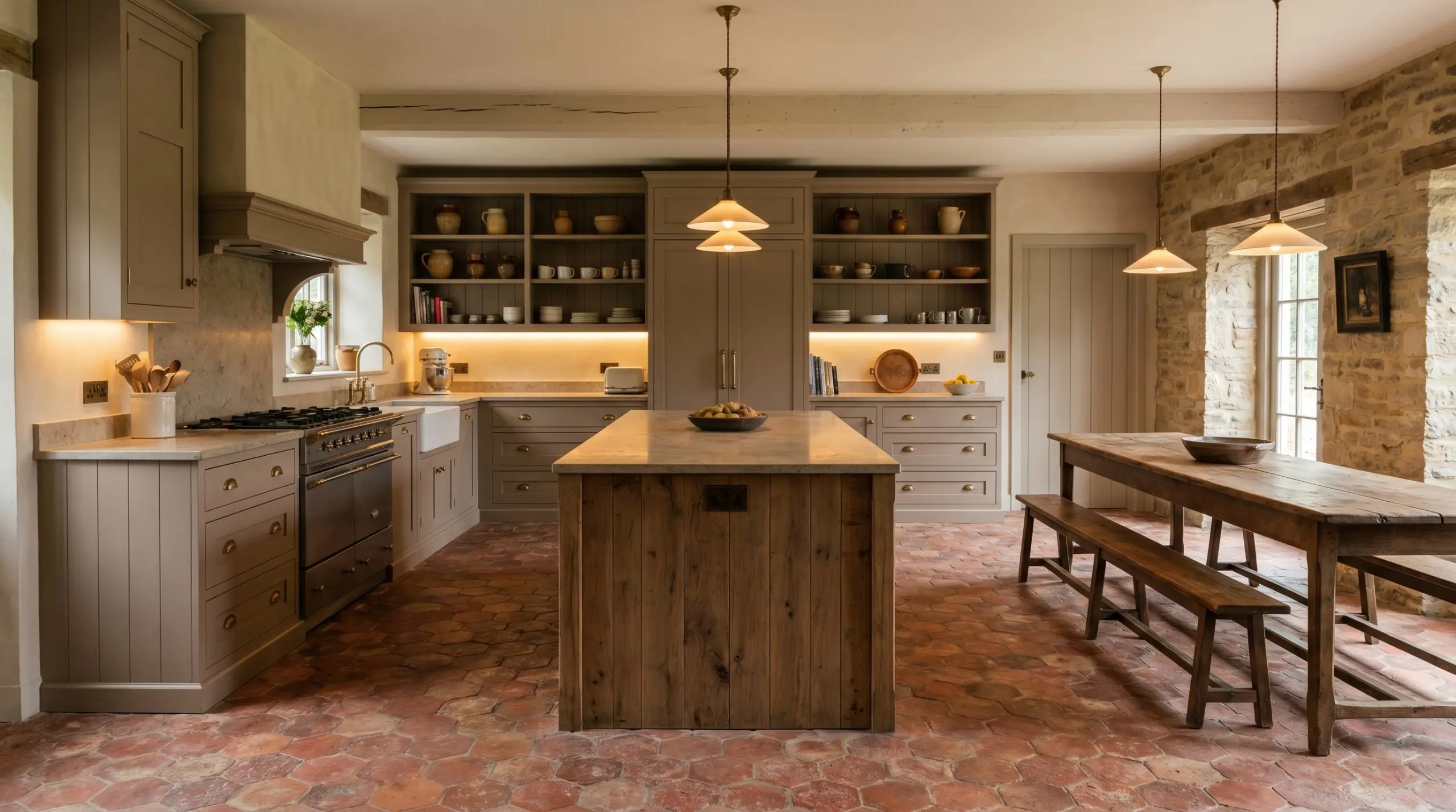
Paint & Millwork: 6 Warm Greige Cabinetry Executions
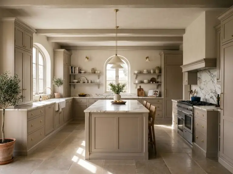
The foundation of your kitchen starts with the millwork profile and the exact shade of paint. A flat, modern door requires a different level of saturation than a deeply profiled historical cabinet, making the specific architectural execution paramount.
Saturate the Room with Color-Drenched English Shaker
A color-drenched approach wraps the entire room in a singular, saturated mushroom hue, immediately establishing a bespoke, historical atmosphere. Painting custom inset shaker doors, baseboards, and window trim the exact same color creates a seamless, enveloping warmth that feels incredibly high-end.
- Designer’s Formula: Color-Drenched Trim + Custom Inset English Shaker + Farrow & Ball Drop Cloth.
- Vibe: Moody, historical, and deeply saturated.
- Key Detail: Specify a flat or matte finish for walls and an eggshell finish for the millwork to create subtle sheen contrast.
Ground a White Kitchen with a Mushroom Greige Island
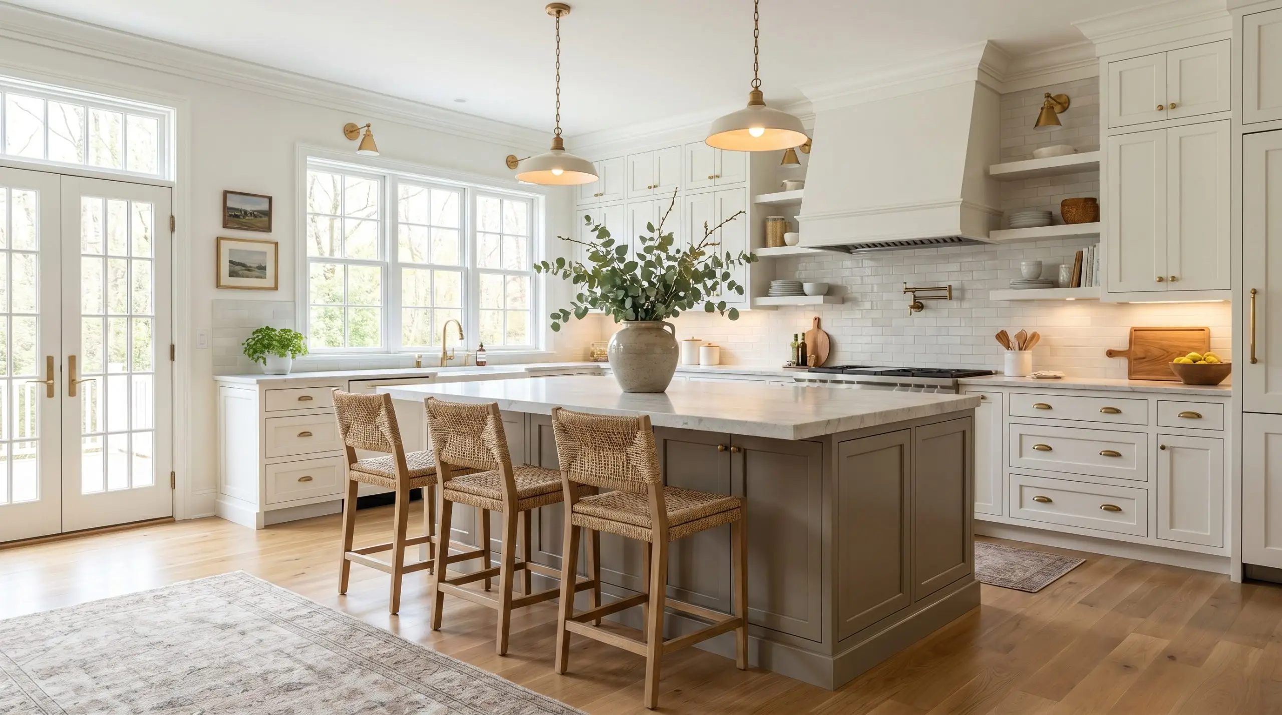
If committing to a fully saturated room feels too heavy, anchor a bright, transitional space with a deeply pigmented taupe island. This strategy grounds the layout, providing a tactile focal point that breaks up the starkness of white perimeter cabinetry.
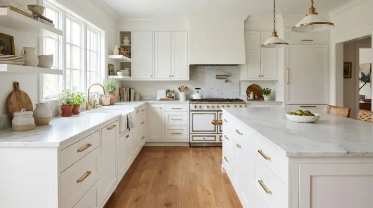
- Designer’s Formula: Benjamin Moore White Dove Perimeters + Mushroom Greige Island + Honed Marble.
- Vibe: Bright, airy, and softly transitional.
- Paint Recommendation: Benjamin Moore Natural Cream for the island base.
Pair Soft Taupe Uppers with Rift-Sawn White Oak Lowers
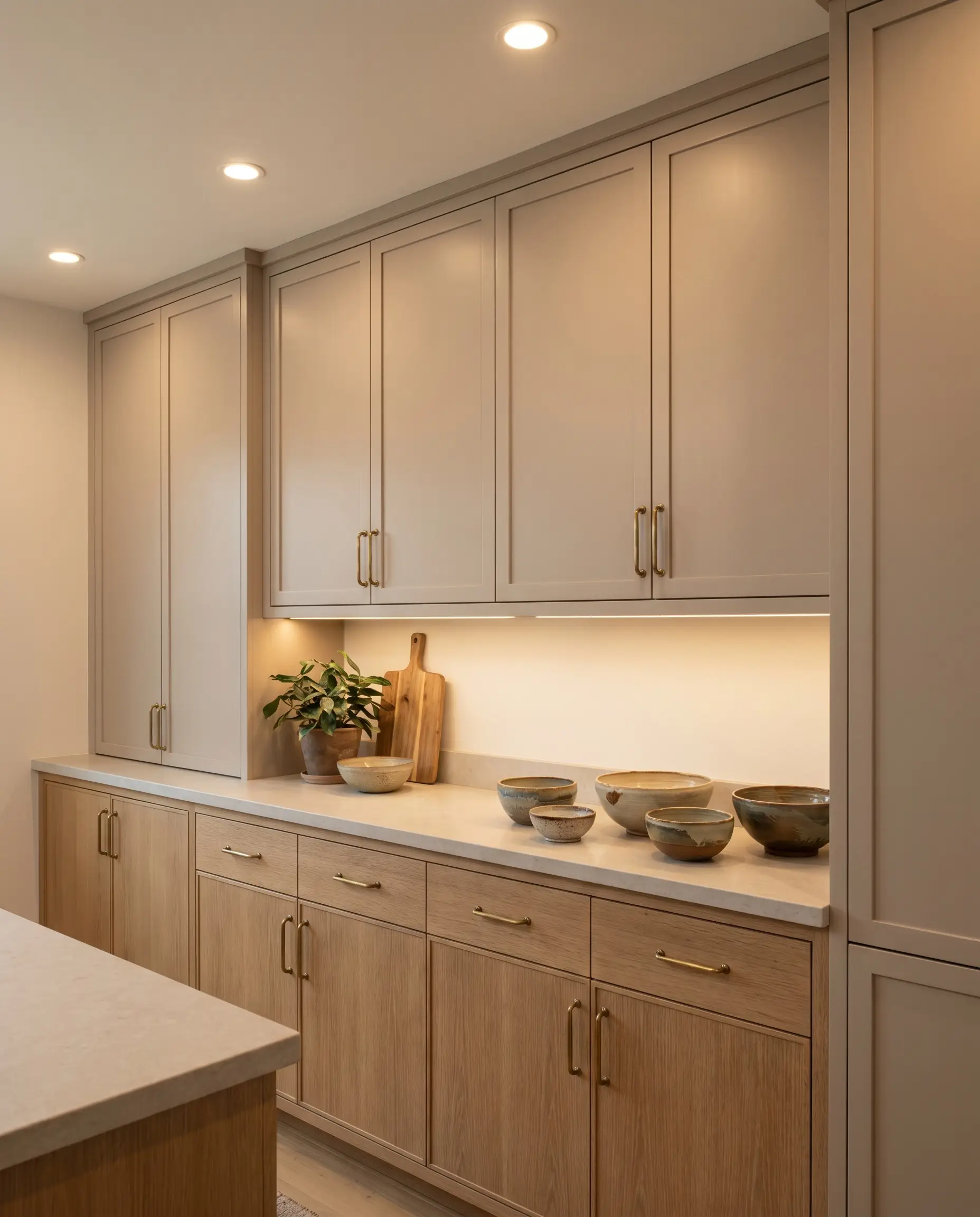
Mixing painted cabinetry with natural wood grain is the hallmark of organic modern design. Pairing soft taupe upper cabinets with rift-sawn white oak lowers introduces a beautiful tactile contrast, where the wood’s natural warmth pulls the underlying red and yellow tones out of the greige paint.
- Designer’s Formula: Soft Taupe Uppers + Rift-Sawn White Oak Lowers + Unlacquered Brass Pulls.
- Vibe: Organic modern with a heavy emphasis on natural texture.
- Wood Spec: Ensure the white oak is finished with a clear, matte sealant to prevent it from yellowing over time.
Pairing a green-leaning greige with cherry or red-toned wood floors will instantly make the cabinets look sickly and discordant. Stick to neutral or slightly ashy white oaks to maintain harmony.
Undertone Alert
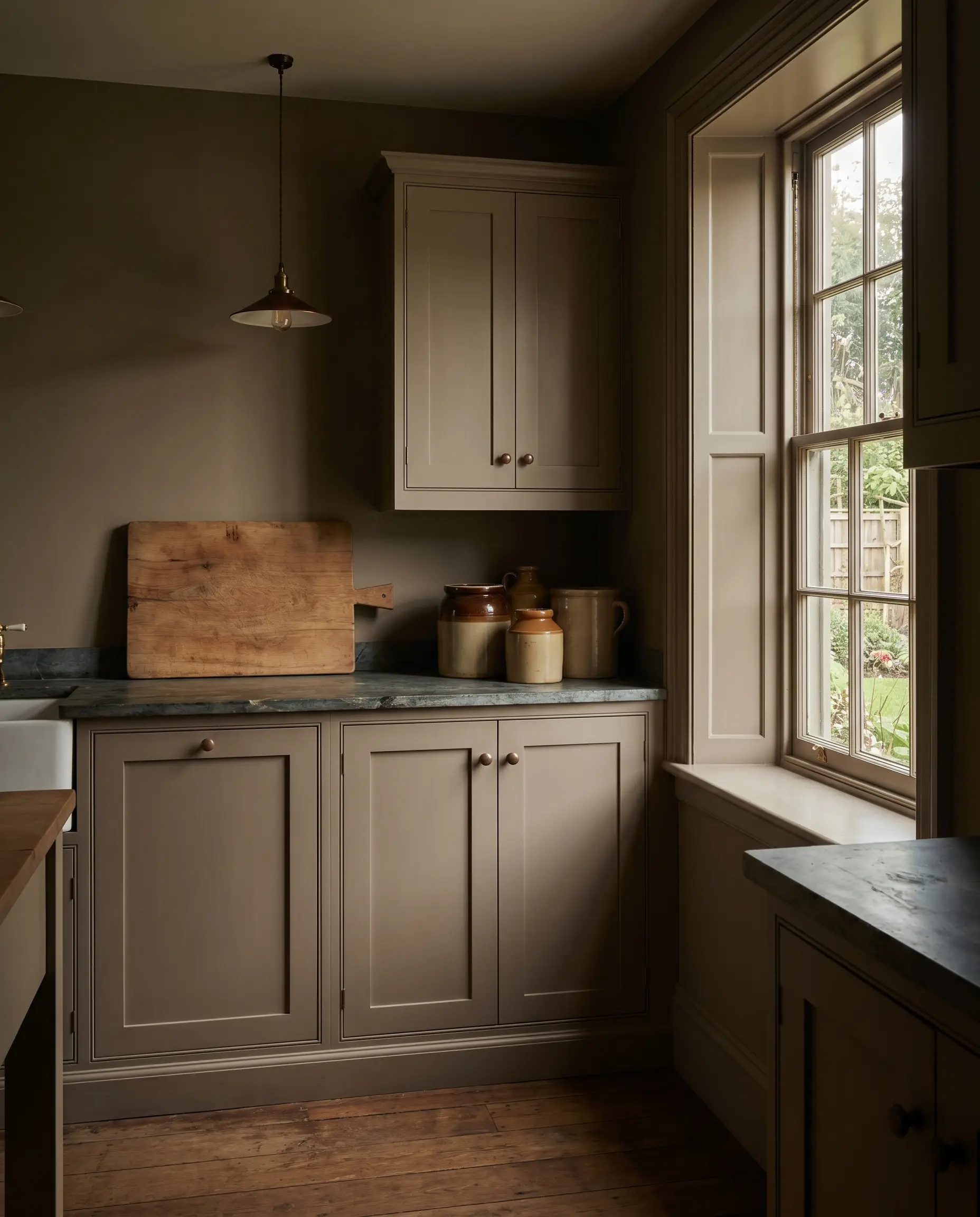
Create Depth with Beadboard Cabinet Fronts in Flat Greige
Beadboard paneling introduces vertical rhythm and heavy shadowing, which is essential for giving lighter taupe paints a sense of depth. The physical grooves of the beadboard catch the 3000K lighting, creating a dynamic wash of light and dark across the cabinetry.
- Designer’s Formula: V-Groove Beadboard Fronts + Flat Greige Paint + Polished Nickel Latches.
- Vibe: Upscale coastal farmhouse with architectural rigor.
- Paint Recommendation: Sherwin-Williams Shiitake.
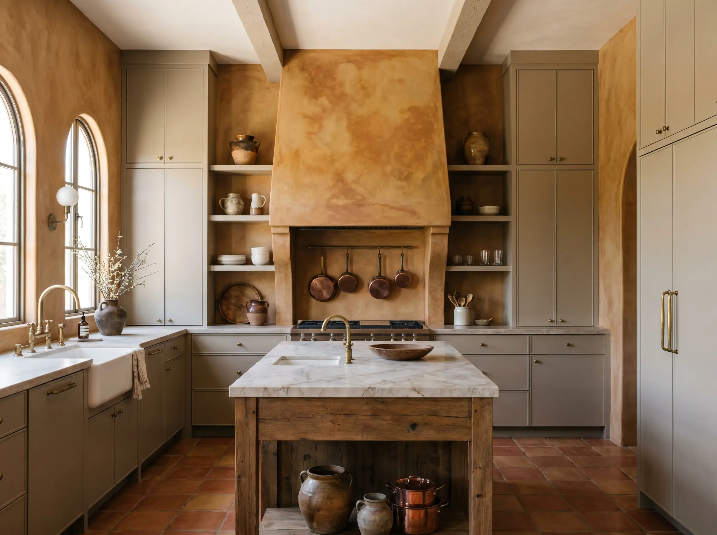
Contrast Warm Greige Perimeters with a Walnut Pantry
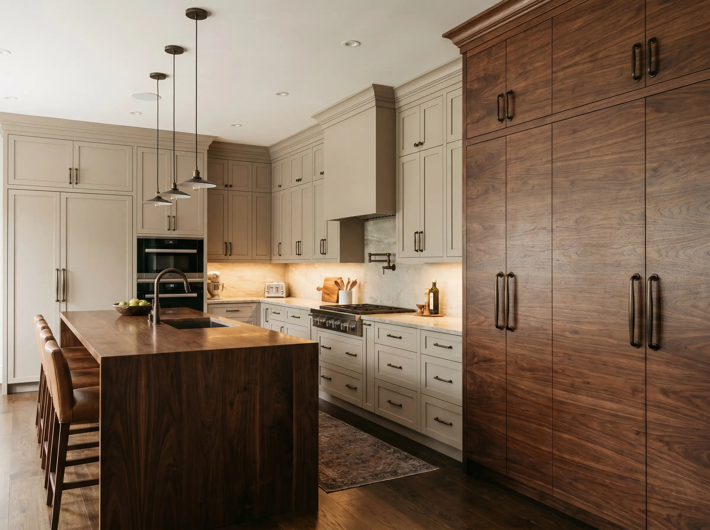
To achieve a high-end bespoke look, contrast the soft, muted nature of greige perimeters with the rich, chocolatey tones of a custom walnut pantry or hutch. The dark, saturated grain of the walnut anchors the space and prevents the lighter painted cabinets from feeling washed out.
- Designer’s Formula: Warm Greige Perimeters + Floor-to-Ceiling Walnut Pantry + Dark Bronze Hardware.
- Vibe: Sophisticated, masculine, and highly tailored.
- Wood Pairing: Specify flat-cut walnut to showcase the sweeping, dramatic grain against the quiet paint.
Execute a True Monochromatic Plaster and Paint Wash
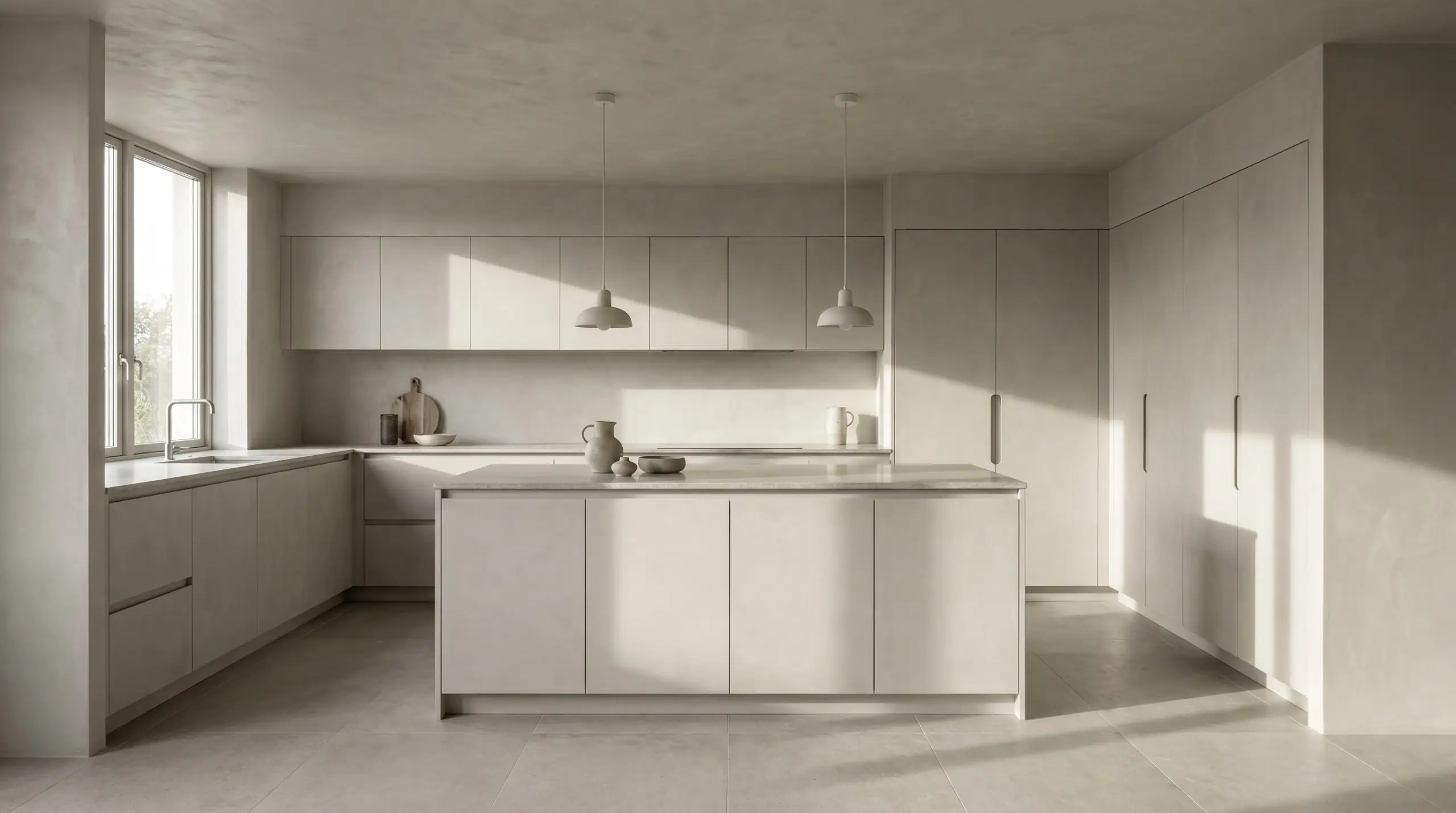
For a warm minimalist aesthetic, blur the lines between the walls and the millwork by matching greige cabinetry to a textural plaster wall treatment. This creates a continuous, highly tactile environment where the focus shifts entirely to light, shadow, and form.
- Designer’s Formula: Tadelakt Plaster Walls + Color-Matched Slab Cabinetry + Finger-Route Grips.
- Vibe: Warm minimalist, serene, and architecturally pure.
- Execution Tip: Have your plaster artisan custom-tint the mix to exactly match the LRV of your cabinet paint.
The Countertop Pairings: 5 Stone & Surface Matches
Bright, stark-white quartz will instantly kill a warm greige, making the cabinets look dirty by comparison. The horizontal surfaces must feature complementary creamy, earthy, or deeply saturated undertones to harmonize with the millwork.
Run Taj Mahal Quartzite Across Counters and Backsplash
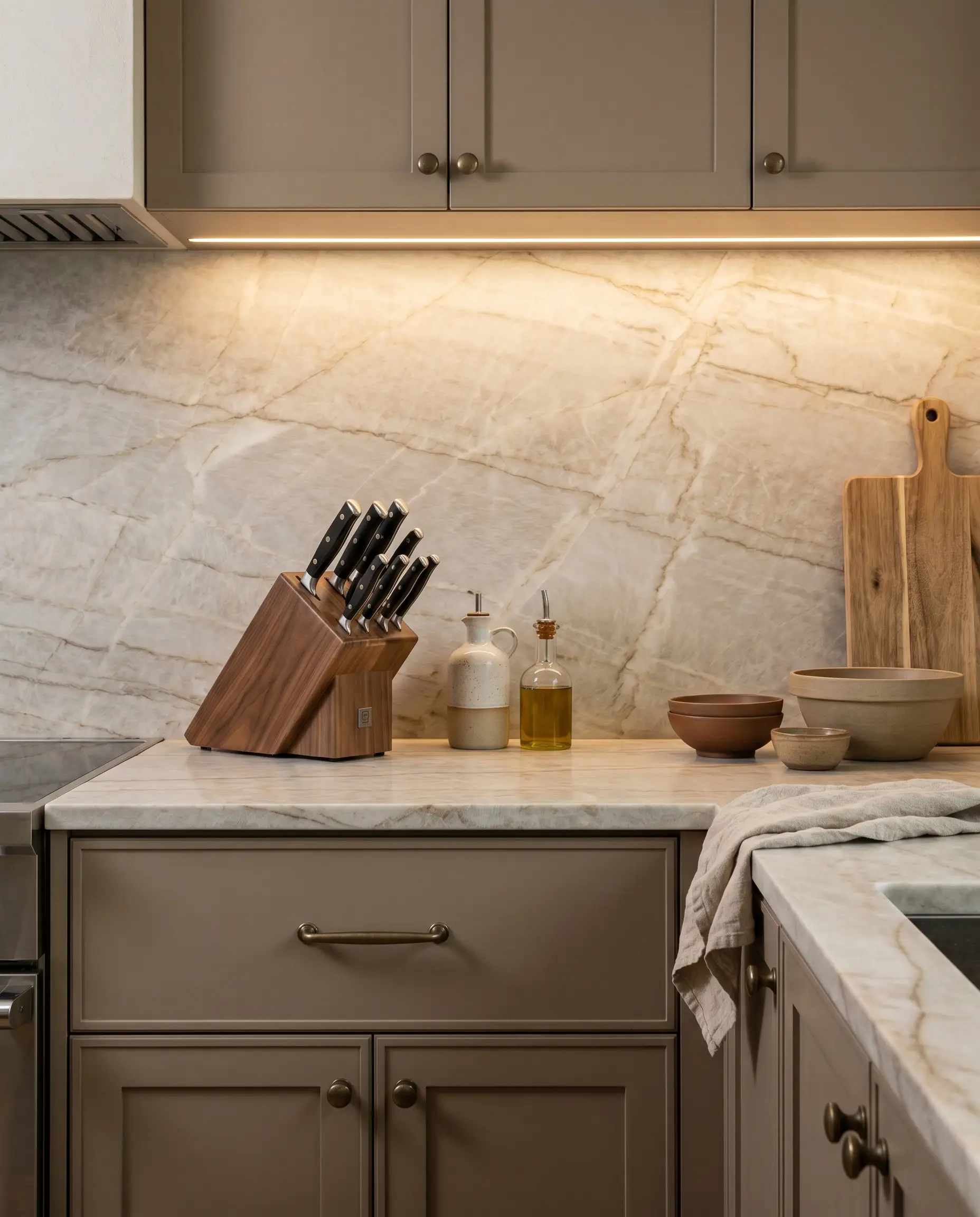
Taj Mahal quartzite is the holy grail for greige kitchens. Its sandy, translucent veining and creamy background perfectly mirror the mushroom tones of the cabinetry, creating an incredibly luxurious, unified look when run seamlessly up the backsplash.
- Material Match: Leathered Taj Mahal Quartzite.
- Vibe: High-end bespoke, seamless, and earthy.
- Styling Pro-Tip: Request a leathered or honed finish to enhance the tactile, organic nature of the stone rather than a glossy polish.
Pair with Heavily Veined Calacatta Gold for Accessible Luxury
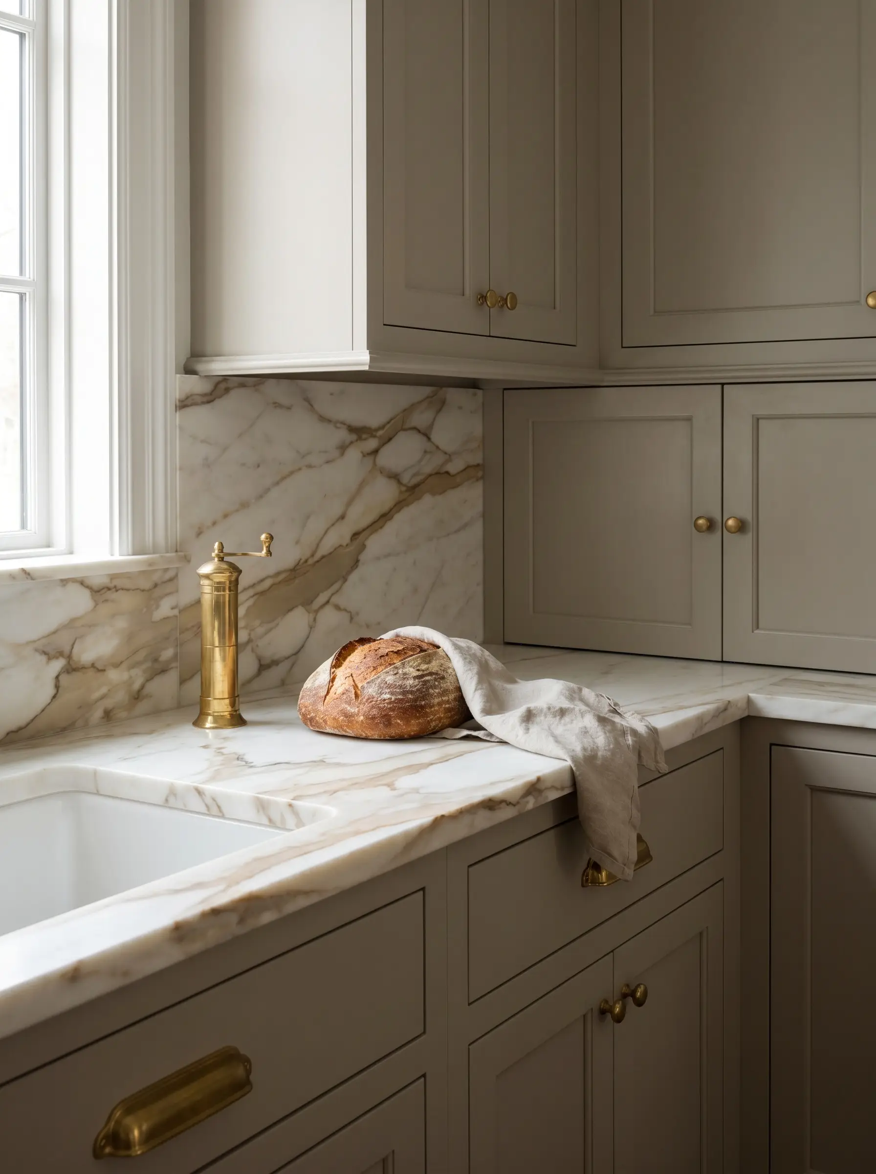
If you desire a classic marble look, select a stone with distinct warmth in its veining. Calacatta Gold introduces sweeping caramel and brassy veins that speak directly to the taupe cabinetry, offering a sophisticated, high-end transitional appeal.
- Material Match: Honed Calacatta Gold Marble (or premium porcelain slab equivalent).
- Vibe: Classic, elegant, and timelessly luxurious.
- Styling Pro-Tip: Keep the edge profile simple—like a mitered eased edge—to let the dramatic veining take center stage.
Ground the Island with Deep Soapstone or Honed Nero Marquina
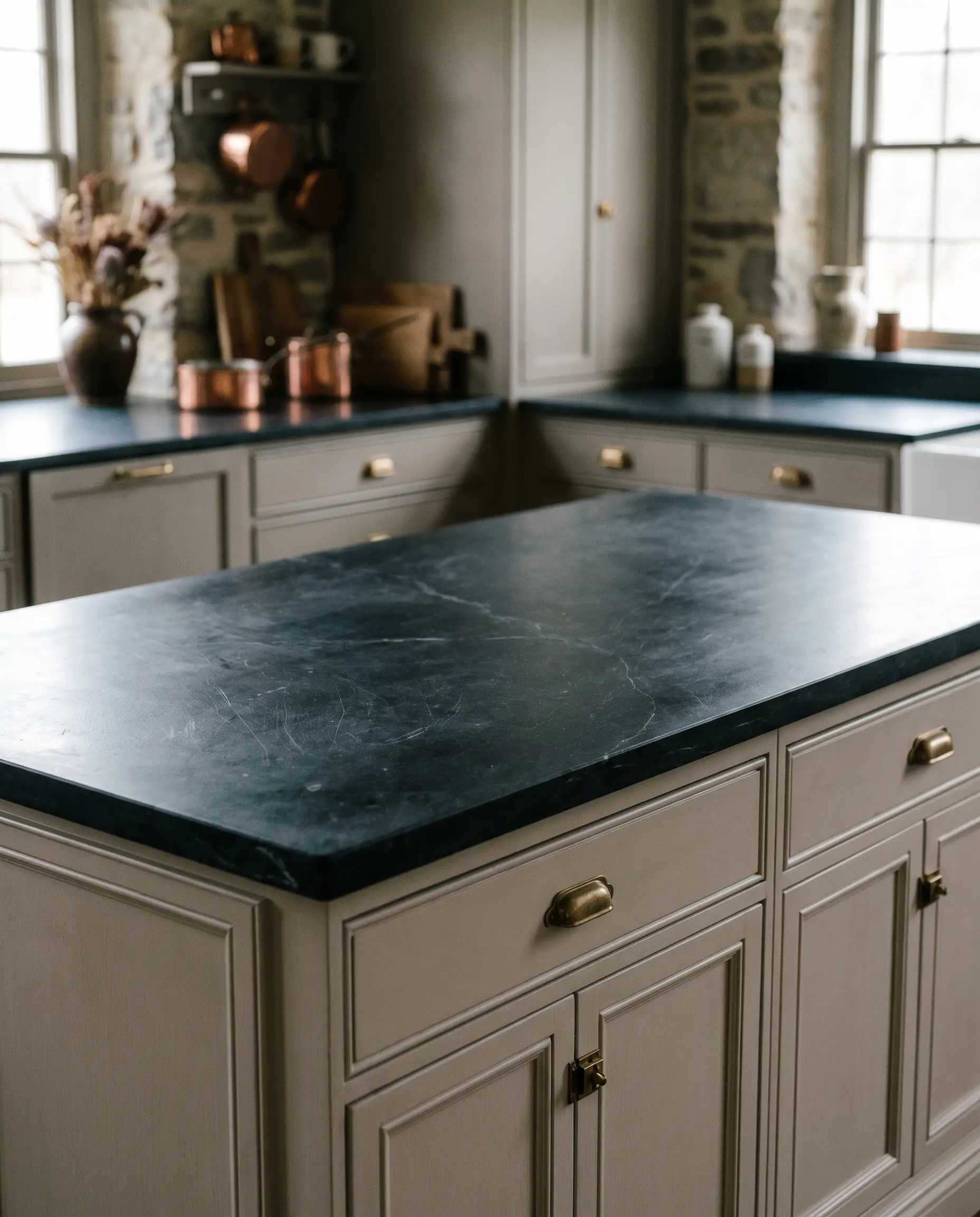
A dark, moody countertop provides immense visual relief in a light-toned kitchen. The chalky, matte black finish of soapstone or the striking white veins of honed Nero Marquina anchor the space, creating a crisp, highly tailored contrast against soft mushroom paint.
- Material Match: Honed Black Soapstone or Nero Marquina Marble.
- Vibe: Moody, historical, and deeply grounded.
- Styling Pro-Tip: Oil the soapstone regularly to keep the color saturated and rich, preventing it from reading as a dusty charcoal.
Soften the Palette with Matte Cream Terrazzo
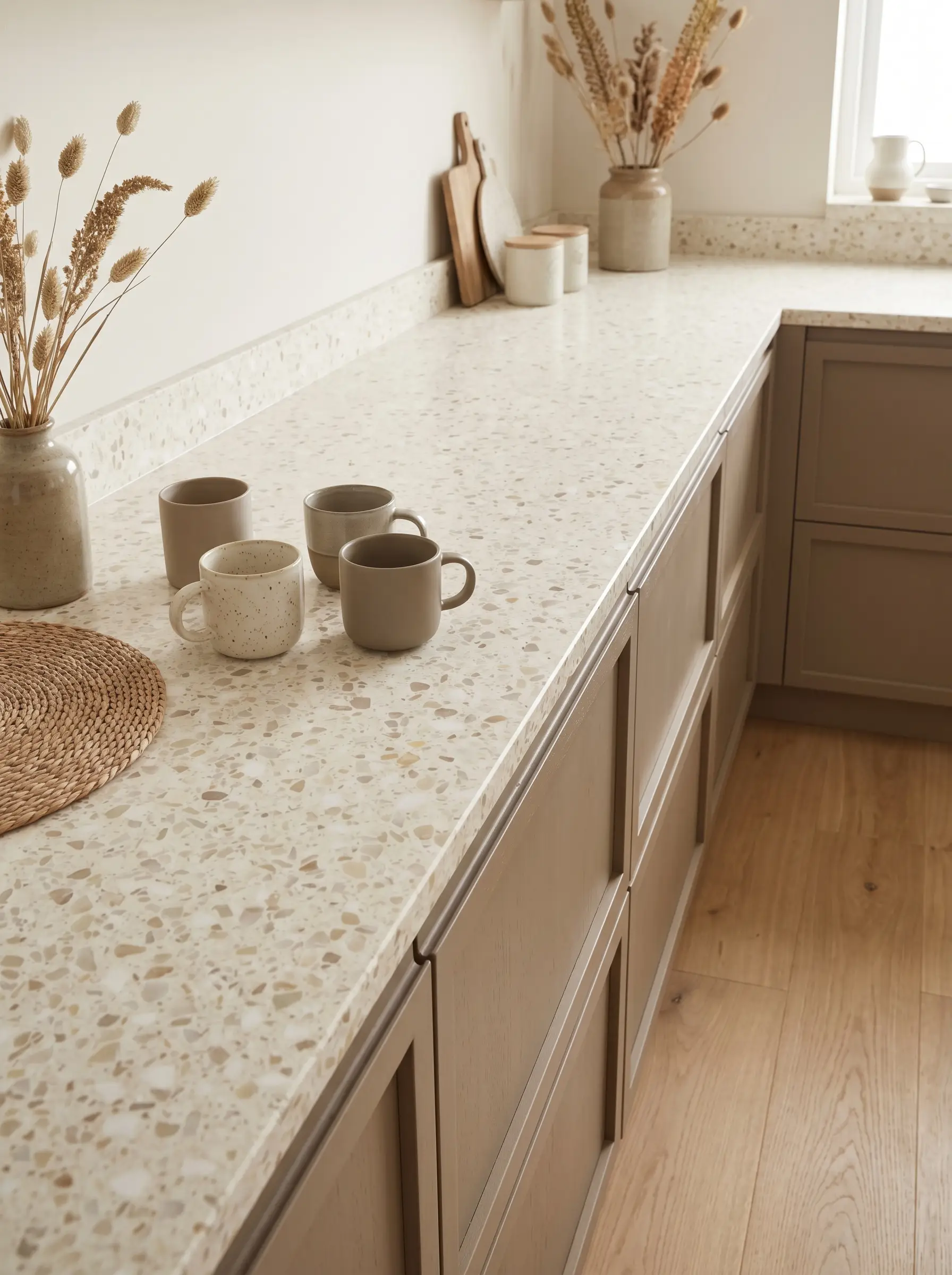
For a warmer, slightly more playful take on organic modernism, introduce a large-aggregate cream terrazzo. The flecks of beige, taupe, and off-white within the stone bridge the gap between the cabinetry and the flooring, providing subtle, earthy texture.
- Material Match: Large-Aggregate Cream Terrazzo.
- Vibe: Warm minimalist, artisanal, and subtly textured.
- Styling Pro-Tip: Ensure the binder color of the terrazzo perfectly matches the undertone of your greige paint to avoid a visual clash.
Warm the Prep Zone with a European Walnut Butcher Block
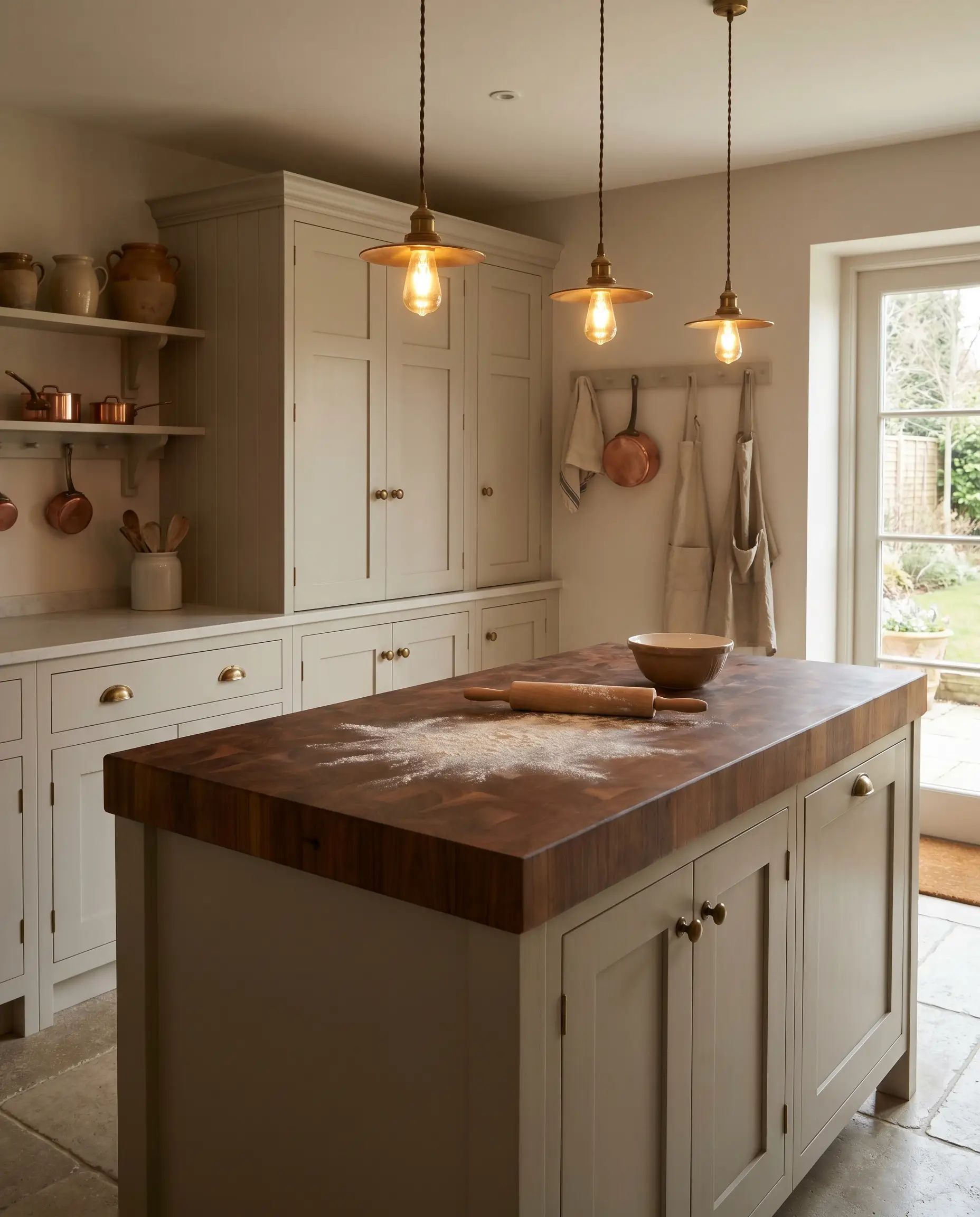
Introducing a dedicated prep zone topped with end-grain European walnut injects immediate, undeniable warmth into a neutral kitchen. The rich, oiled wood adds a layer of historic utility and breaks up the coldness of surrounding stone surfaces.
- Material Match: End-Grain European Walnut.
- Vibe: English heritage, utilitarian, and deeply tactile.
- Styling Pro-Tip: Use this specifically on an island or a dedicated baking station, leaving the perimeter countertops in a more durable stone.
Never seal butcher block with high-gloss polyurethane if you want an upscale look. Use a food-safe mineral oil and beeswax blend to maintain a rich, matte, patinated finish.
Hackrea Material Tip
Hardware & Fixtures: 5 Metal Combinations
Hardware serves as the architectural jewelry of the kitchen, dictating whether your greige leans toward historical heritage or ultra-modern restraint. The finish of the metals interacts directly with the paint’s undertones, either warming them up or providing a sharp, graphic contrast.
Age the Space with Living Unlacquered Brass Pulls
Unlacquered brass is the ideal companion to mushroom cabinetry. The living patina of raw brass naturally warms up any gray notes in the paint, aging gracefully over time to establish an authentic, lived-in character that cannot be faked.
- Hardware Match: Unlacquered Brass Cup Pulls and Ball Knobs.
- Vibe: Historical, patinated, and effortlessly high-end.
- Styling Pro-Tip: Mix hardware styles—use knobs on doors and pulls on drawers—to make the kitchen feel collected over time rather than purchased from a catalog.
Lean Modern with Matte Black Knurled Bar Hardware
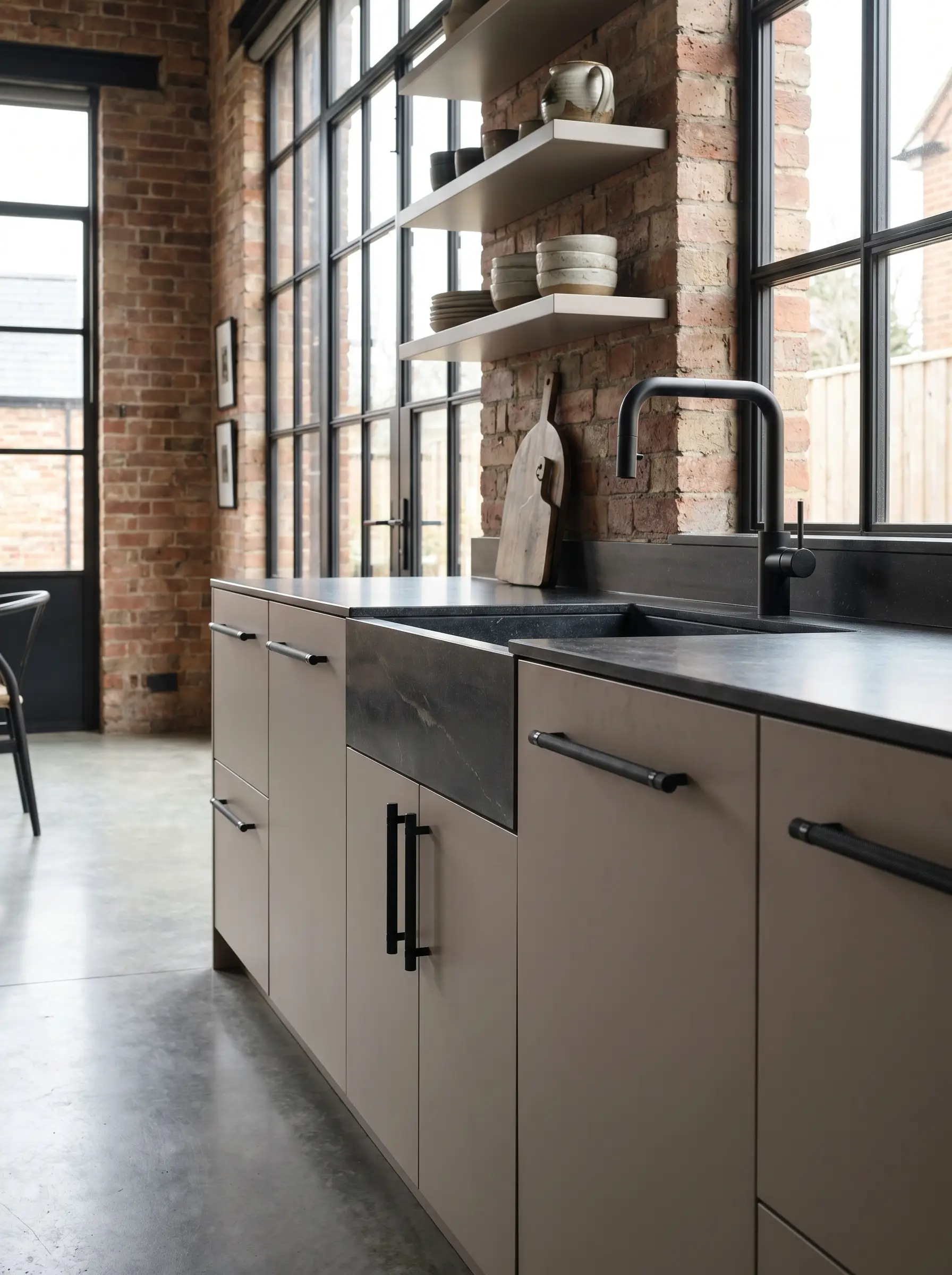
To pull a soft taupe kitchen firmly into contemporary territory, deploy matte black hardware. The dark, light-absorbing finish provides a high-contrast, graphic punch that sharpens the soft paint, while knurled detailing adds necessary tactile friction.
- Hardware Match: Matte Black Knurled Bar Pulls.
- Vibe: Industrial modern, crisp, and high-contrast.
- Styling Pro-Tip: Pair this hardware with a matching matte black culinary faucet to unify the modern sightlines.
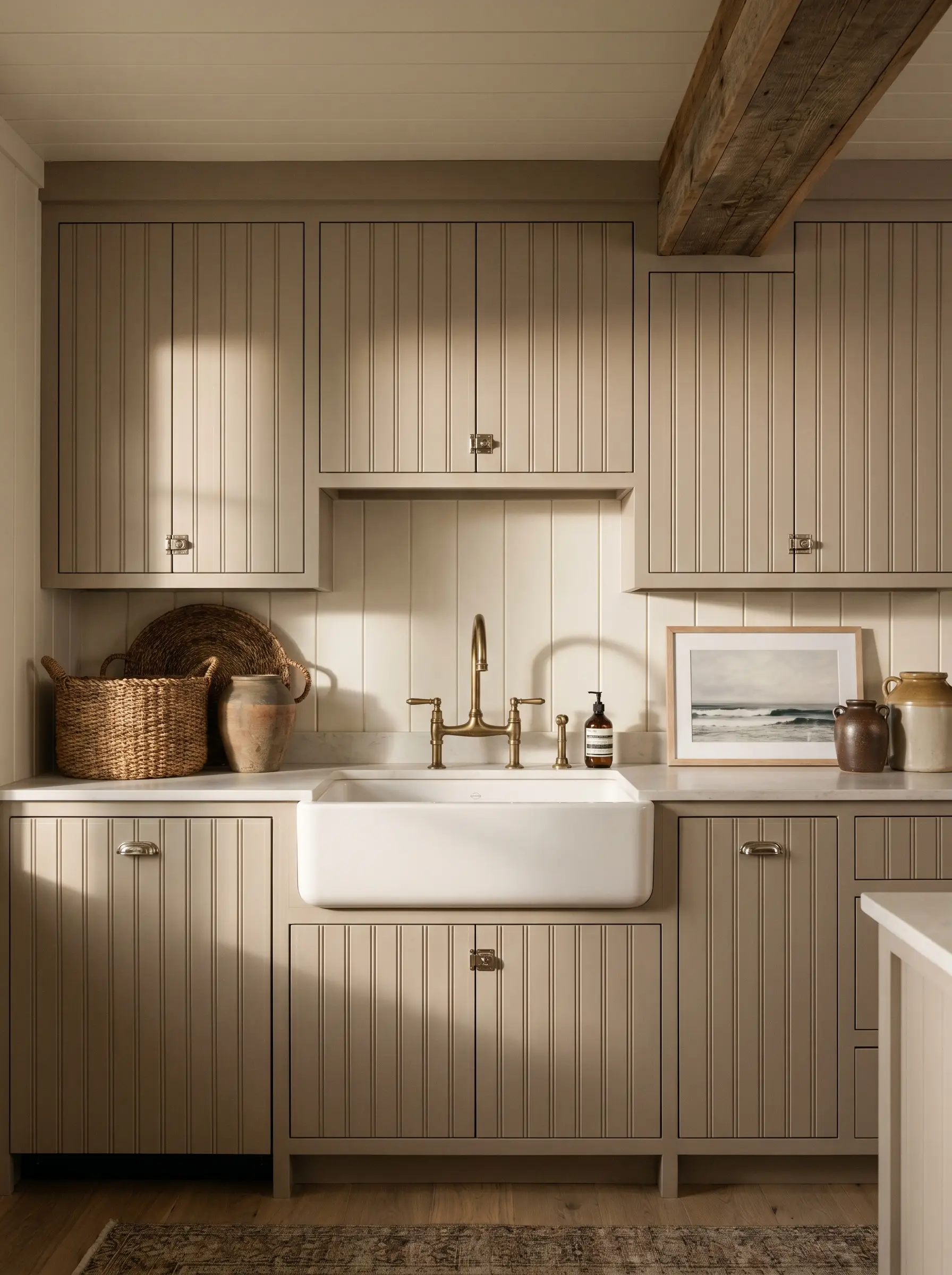
Reflect Warmth with Polished Nickel Cup Pulls
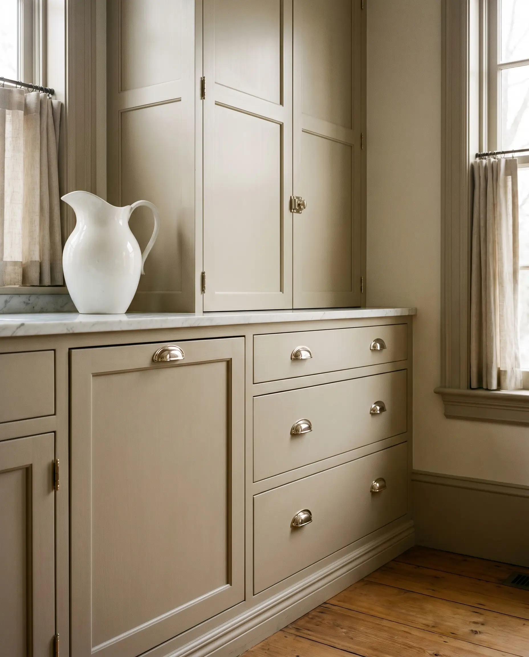
If brass feels too trendy, polished nickel offers a high-end, classic sheen with an inherently warm, slightly golden undertone. Unlike the cold, blue cast of standard chrome, polished nickel reflects the ambient warmth of the room, making it a sophisticated pairing for greige.
- Hardware Match: Polished Nickel Latches and Cup Pulls.
- Vibe: Classic, refined, and softly reflective.
- Styling Pro-Tip: Use exposed polished nickel hinges on inset cabinetry to double down on the bespoke, heritage aesthetic.
Add Organic Texture with Woven Leather Cabinet Tabs
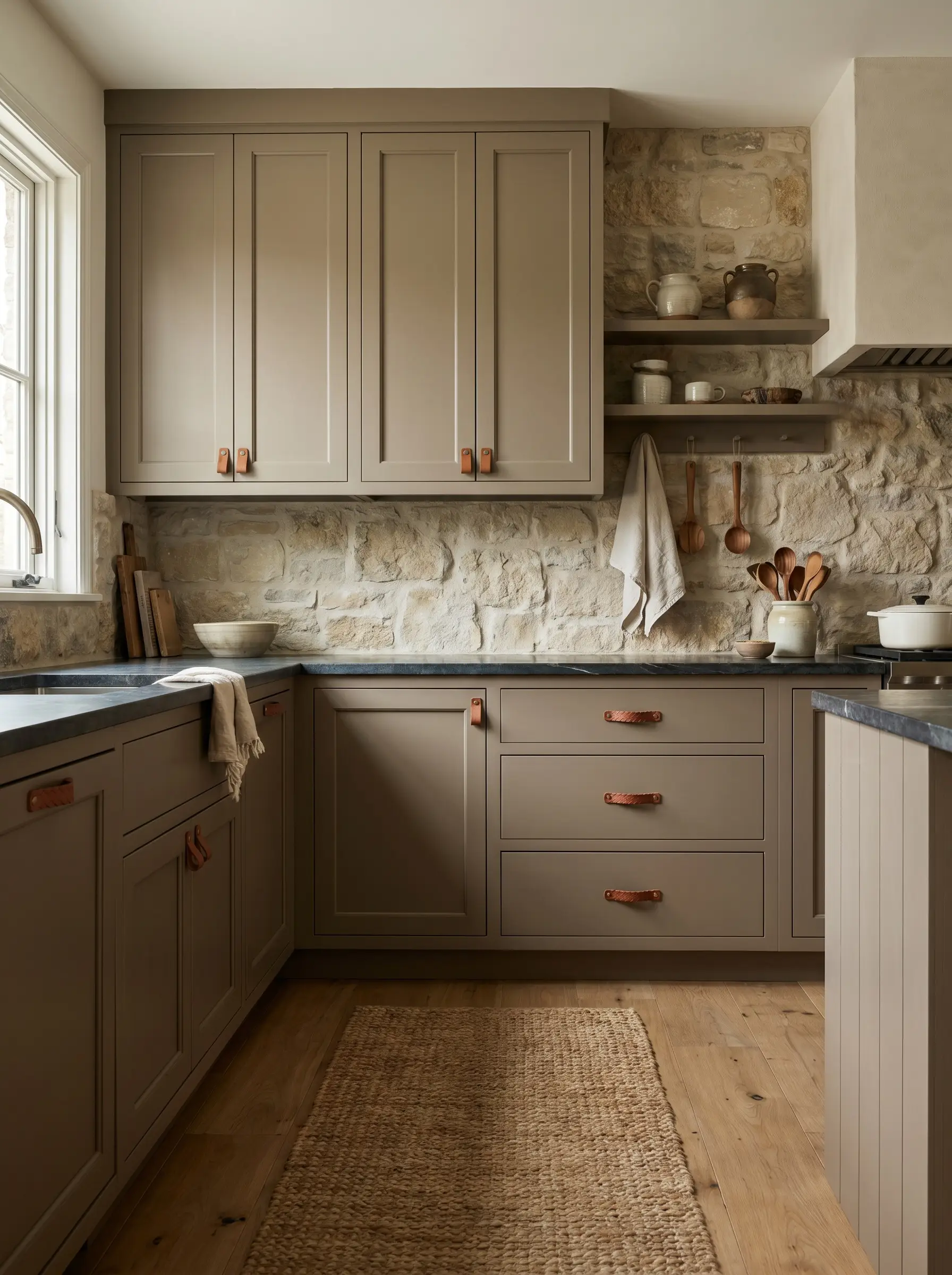
For a softer, highly tactile approach, replace traditional metal hardware with woven leather tabs. The rich, saddle-brown leather introduces an unexpected organic material that beautifully complements the earthy nature of taupe cabinetry.
- Hardware Match: Saddle-Brown Woven Leather Tabs.
- Vibe: Organic modern, artisanal, and understated.
- Styling Pro-Tip: Use leather hardware exclusively on upper cabinets or a dedicated pantry, switching to durable metals for heavy-traffic lower drawers.
Create Seamless Minimalism with Finger-Route Grips
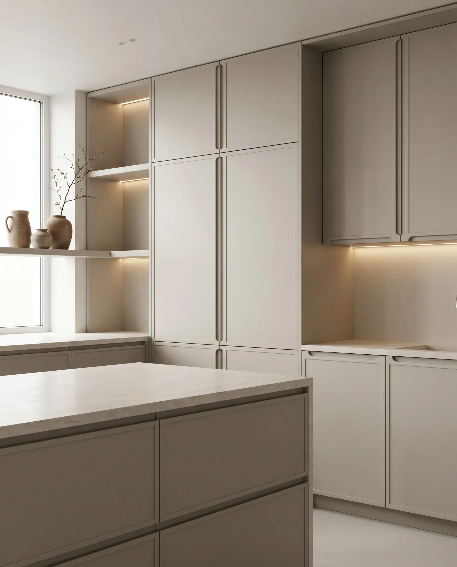
When the goal is pure architectural form, eliminate decorative hardware entirely. Finger-route grips milled directly into the cabinet doors allow the flat wash of the greige paint to stand completely uninterrupted, emphasizing clean lines and spatial purity.
- Hardware Match: Integrated Finger-Route Grips (No visible hardware).
- Vibe: Ultra-modern, serene, and minimal.
- Styling Pro-Tip: Ensure the interior of the routed channel is finished flawlessly, as it will be a high-touch area that catches shadows.
Architectural Accents: 5 Ways to Layer Texture
A neutral kitchen requires aggressive textural layering to avoid looking flat or lifeless. By introducing contrasting architectural finishes, you manipulate how light and shadow interact with the space, giving the greige cabinetry a dynamic environment to live within.
Frame the Range with a Tadelakt Plaster Hood
A custom range hood finished in Tadelakt plaster introduces a stunning, velvety texture that contrasts beautifully against smooth, painted millwork. The organic imperfections and subtle mottling of the plaster catch the light, adding a layer of old-world artisanship to the cooking zone.
- Accent Focus: Custom Tadelakt Plaster Range Hood.
- Vibe: Mediterranean-inspired organic modern.
- Styling Pro-Tip: Carry the plaster finish slightly down the adjacent walls to integrate the hood seamlessly into the architecture.
Break Up Heavy Cabinetry with Reeded Glass Uppers
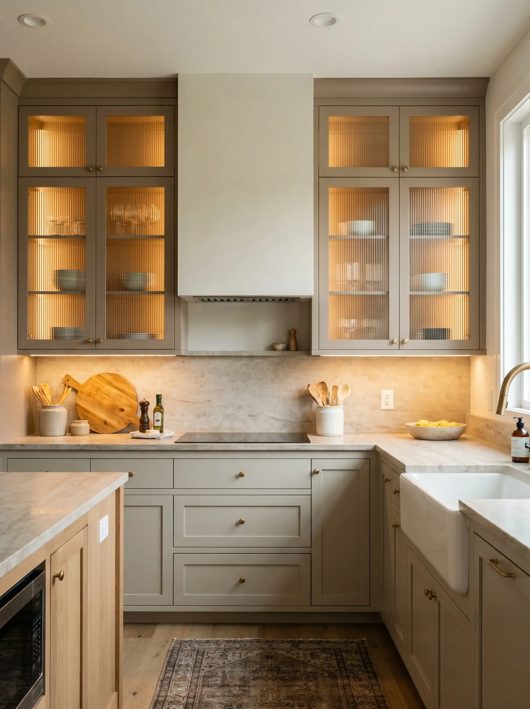
A solid wall of taupe cabinetry can feel visually heavy; reeded glass inserts offer the perfect aesthetic relief. The fluted texture of the glass distorts the interior shelving, adding vertical rhythm and allowing light to filter through without demanding perfectly styled dishware.
- Accent Focus: Reeded Glass Cabinet Inserts.
- Vibe: Transitional, airy, and texturally rich.
- Styling Pro-Tip: Install warm LED tape lighting inside the reeded cabinets to create a soft, glowing lantern effect at night.
Bounce Light with Glossy Zellige Tile Backsplashes
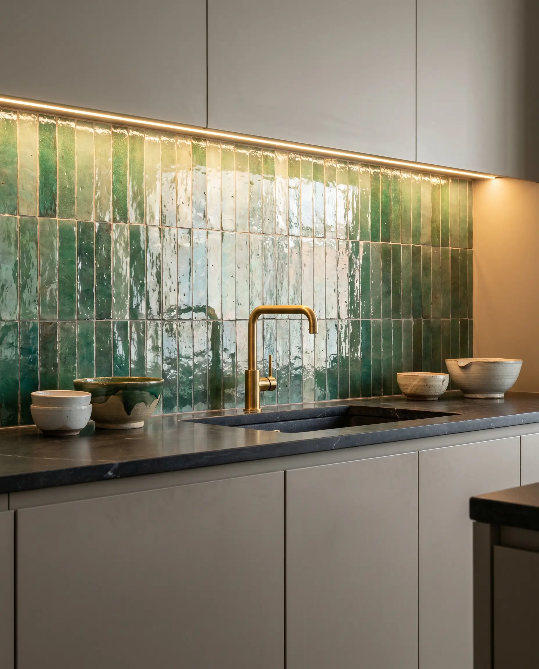
The undulating, hand-formed surface of Moroccan Zellige tile is the premier tool for bouncing light around a neutral kitchen. Pairing a high-gloss, slightly imperfect tile against the matte finish of greige cabinetry creates a striking tension between rustic craft and refined millwork.
- Accent Focus: Glazed Zellige Tile.
- Vibe: Artisanal, reflective, and highly textured.
- Styling Pro-Tip: Stack the tiles vertically rather than in a traditional brick pattern to modernize the application.
Wash the Space in Warmth with Brass Articulating Sconces
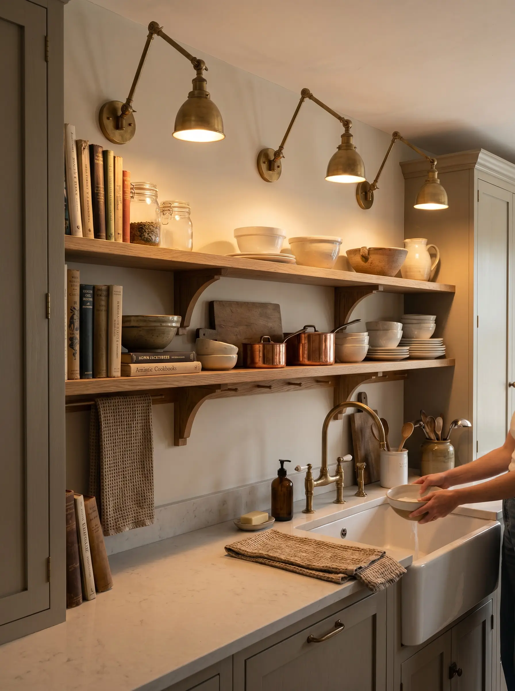
Relying solely on recessed ceiling cans will flatten the complex tones of a mushroom kitchen. Installing articulating brass sconces above open shelving or flanking the sink introduces localized, 3000K pools of light that actively wash the greige paint in warmth.
- Accent Focus: Articulating Unlacquered Brass Sconces.
- Vibe: Task-oriented, historical, and layered.
- Styling Pro-Tip: Put all sconces on dedicated dimmer switches to control the mood and light reflectance throughout the evening.
Anchor the Floor with Reclaimed Terracotta Pavers
To firmly ground a taupe kitchen in an earthy, European farmhouse aesthetic, anchor the space with reclaimed terracotta flooring. The chalky, heavily patinated red and orange tones of the clay provide a massive, warm counterweight to the soft neutral cabinetry above.
- Accent Focus: Reclaimed Terracotta Hexagon or Brick Pavers.
- Vibe: European heritage, rustic, and incredibly grounded.
- Styling Pro-Tip: Seal the terracotta with a matte, penetrating sealer to protect it from kitchen spills without adding an artificial plastic sheen.
The Designer’s Color Testing Protocol
Do not hire a painter or sign off on custom cabinet fabrication until you have rigorously tested your chosen shade. Undertones are treacherous, and what looks like the perfect mushroom greige in a showroom can easily turn muddy in your specific home. Follow this strict, non-negotiable testing protocol to ensure flawless execution.
First, order large, painted peel-and-stick samples; tiny paper chips are entirely useless for gauging light reflectance on a large scale. Second, place these large swatches vertically against your existing cabinets or walls. Never lay them flat on a table, as the angle of illumination completely alters the color perception. Finally, observe the swatch at three distinct times: 9 AM in crisp morning sun, 2 PM during peak daylight, and 8 PM with your 3000K kitchen lighting turned on. If the color holds its warmth and depth through all three phases without turning green or pink, you have found your match.
Ready to dial in your fixtures? Explore Hackrea’s complete guide on transitional kitchen lighting ideas to perfect your layout.
The Hackrea Style Desk treats interior decoration as an exact visual science. Rather than focusing on demolition or floor plans, this desk masters the art of color theory, undertone matching, material pairings, and spatial proportion. From balancing the visual weight of mixed metals to finding the perfect bridging tone between disparate wood species, this desk provides the rigorous aesthetic rules needed to achieve high-end, editorial-quality harmony in any space.