The Ultimate Guide to Warm Neutral Living Room Color Palettes
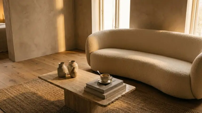
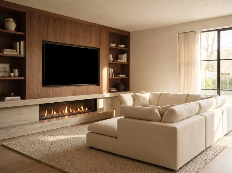
The best warm neutral color palettes for your living room combine earthy taupe, mushroom, and soft white bases with rich textural accents. To achieve a modern, inviting space, balance these grounding shades using natural materials like travertine, organic linen, and warm-toned woods like walnut.
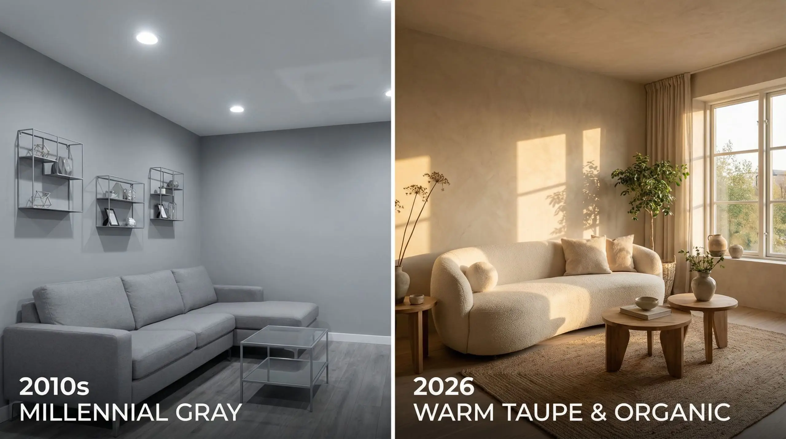
The era of icy, “millennial gray” interiors has officially come to a close. Today’s most compelling spaces are defined by an enveloping, earthy warmth that instantly grounds the nervous system. We are moving away from sterile, cool-toned rooms toward sophisticated warm neutral living room designs that feel deeply tactile and relentlessly inviting.
In the high-end interior design world of 2026, a “neutral” is no longer a flat, builder-grade beige. The modern warm neutral spectrum is incredibly nuanced. It encompasses complex shades of mushroom, muddy taupe, creamy warm white, rich camel, and soft terracotta. These shades form an architectural canvas that allows your furnishings and art to take center stage.
Whether you are embarking on a full-scale renovation or simply looking to elevate your current aesthetic, mastering warm neutral color palettes requires intention. In this comprehensive guide, we are breaking down our approved color combinations, the exact paint formulas designers swear by, and the styling secrets required to keep these tones from ever falling flat.
Why Warm Neutrals Are Dominating 2026 Design
If you pay attention to the world’s top architectural digests, you will notice a distinct psychological shift in how we approach our homes. Our studio partners are seeing a massive shift toward Quiet Luxury interiors—spaces that prioritize high-quality, understated materials over flashy, trend-chasing patterns.
This movement goes hand-in-hand with Biophilic Design, an architectural philosophy that seeks to connect our indoor environments with the natural world outside. Warm neutrals are the ultimate biophilic foundation. They mimic the organic hues found in stone, sand, and dried foliage, creating a sensory experience that feels inherently calming.
Most importantly, investing in a warm neutral palette is an investment in timelessness. Unlike harsh jewel tones or hyper-specific micro-trends, a beautifully executed beige or taupe provides a sophisticated, enduring backdrop. It flatters architectural features, gracefully bounces natural light, and adapts effortlessly as your personal furniture collection evolves over the decades.
Understanding Undertones: The Secret to a Perfect Neutral
The most common problem readers submit to our platform is a variation of this story: they painted their living room “beige,” only to realize it looks unexpectedly pink or sickly green in the afternoon light. This happens because neutrals are essentially complex, muted versions of primary colors.
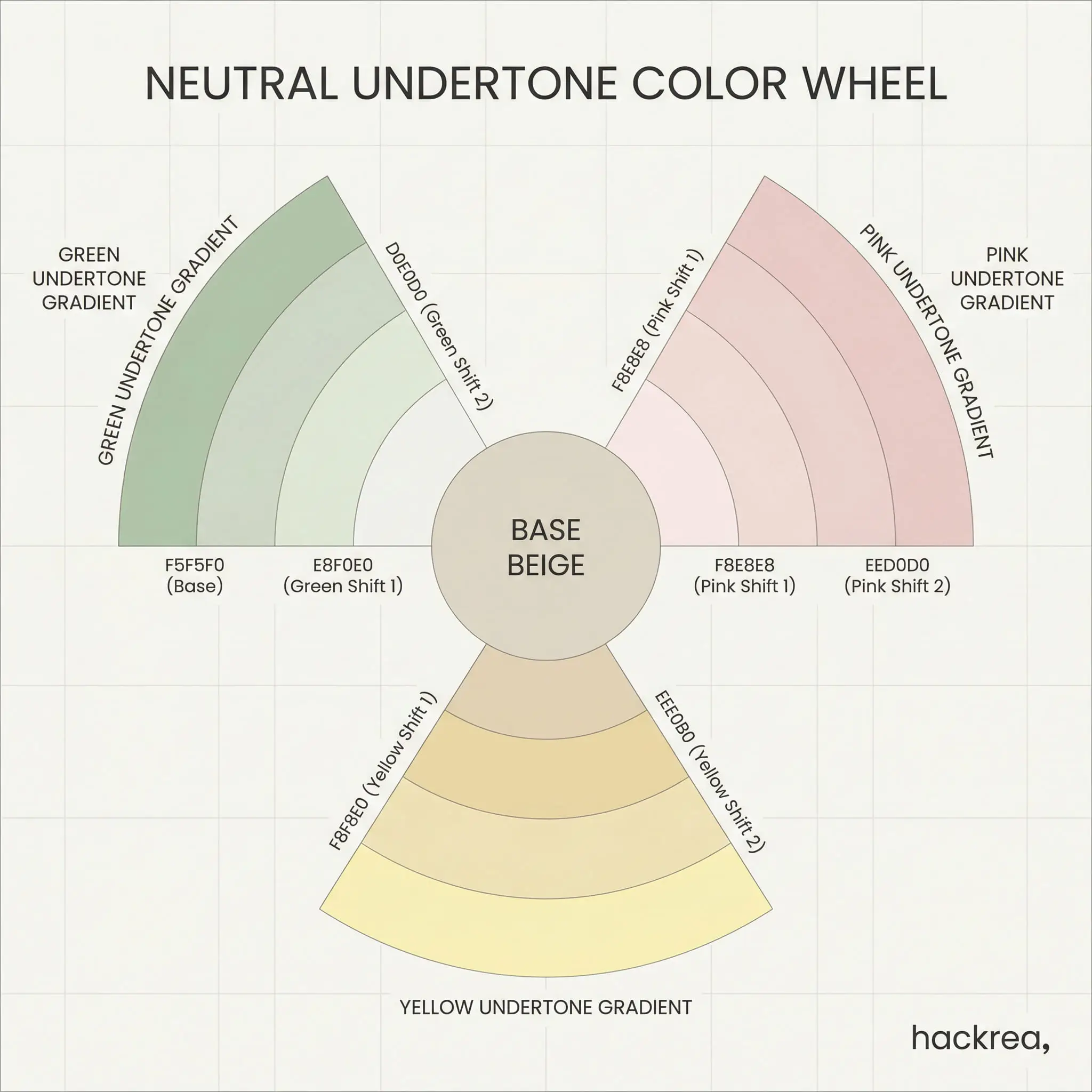
To prevent expensive mistakes, you must identify the underlying DNA of your paint. Warm neutrals generally feature one of four distinct undertones: Green, Yellow, Pink, or Gray. A yellow-based cream will feel incredibly sunny and expansive, while a green-based taupe will feel moody, sophisticated, and earthy. A pink undertone can read delicately warm but risks looking like raw plaster if not balanced with darker elements.
To perfectly diagnose an undertone before you commit, utilize this foolproof testing method:
When finalizing your beige living room ideas, always evaluate your paint swatch against your heaviest, most dominant piece of furniture—like your sofa or area rug—to ensure their undertones do not aggressively clash.
💡 Hackrea Designer Tip
Key Takeaway: Undertones dictate the entire emotional temperature of a room. Master the undertone, and you master the palette.
5 Designer-Approved Warm Neutral Color Palettes
Curating a flawless palette is about striking a delicate balance between light bases, medium-toned transitional shades, and deep, grounding accents. Here are five meticulously balanced combinations to inspire your space.
Palette 1: Earthy Taupe, Cream, and Matte Black
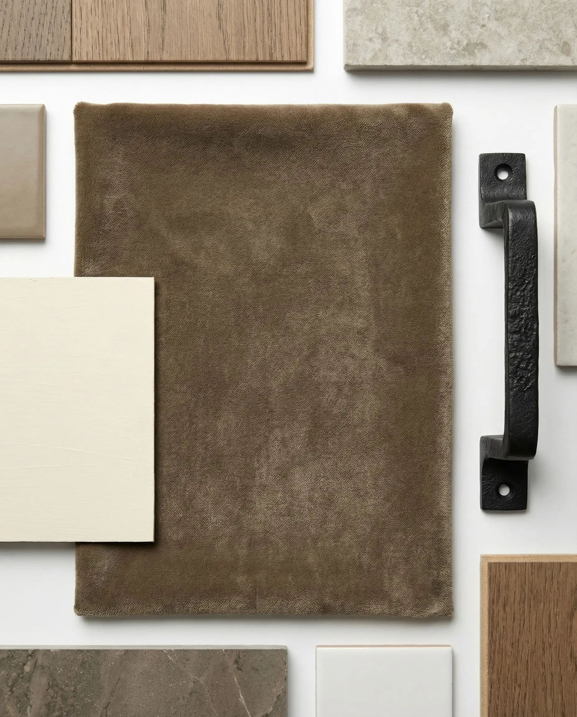
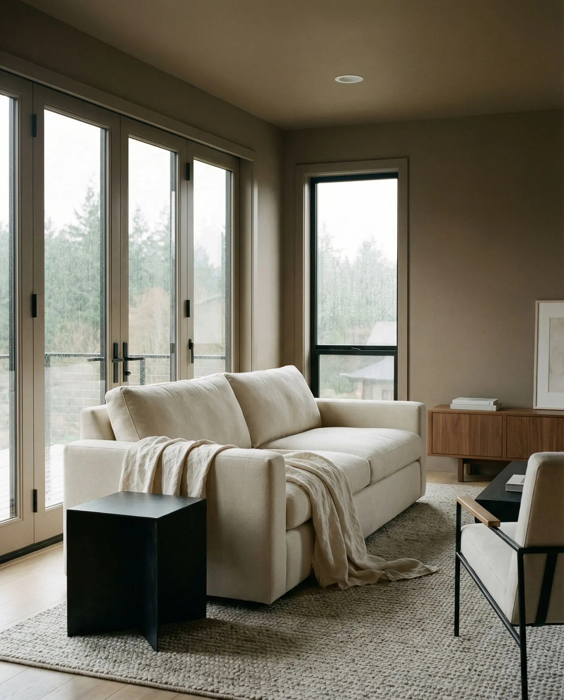
This combination represents a highly modern, architectural approach to neutral design. By pairing a muddy, mid-tone taupe wall with creamy, soft white upholstery, you create a sophisticated, layered environment.
The secret weapon here is the introduction of matte black. In a sea of soft taupe, the eye needs a definitive resting place. Matte black acts as a visual anchor, sharpening the room and preventing the softer shades from blurring together into a muddy mess.
Palette 2: Warm White, Caramel, and Olive Green
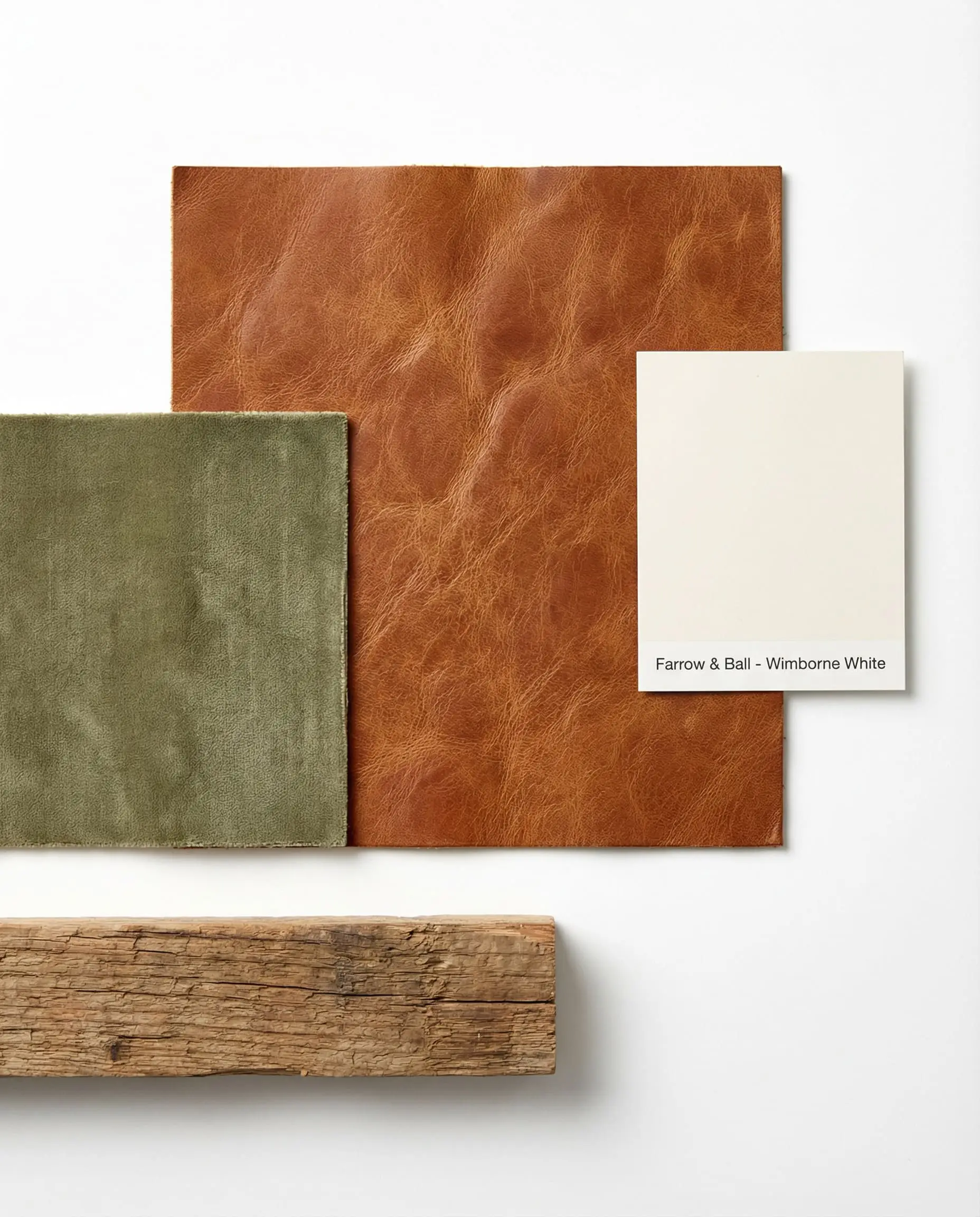
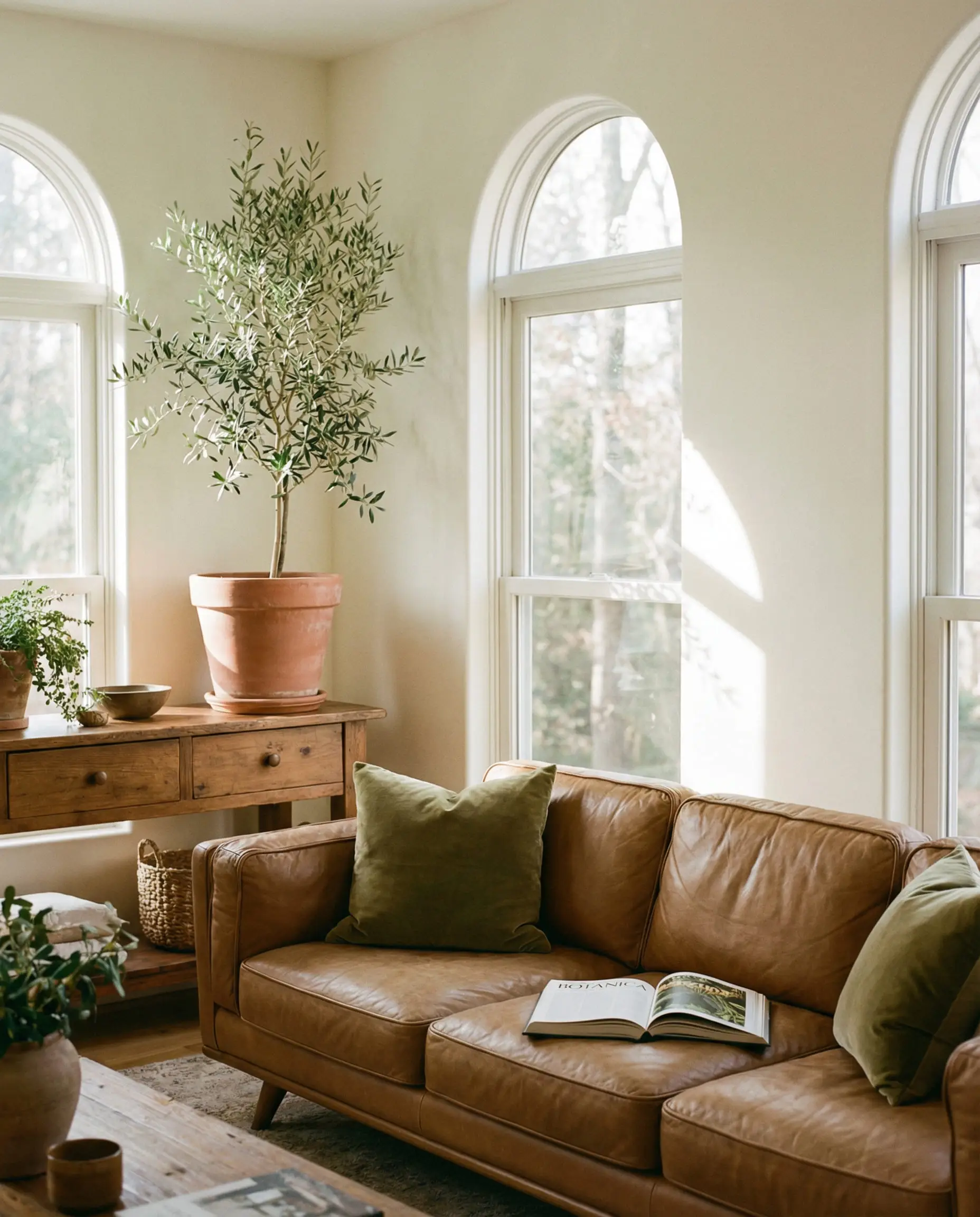
For those deeply inspired by organic modernism, this palette brings the outdoors inside without relying on literal botanical prints. It starts with an enveloping, creamy white foundation that reflects maximum sunlight.
We then layer in deep caramel tones, typically through a high-quality, patinated leather sofa or a vintage timber console. The olive green is introduced through living elements—like a towering indoor olive tree—or through heavy, tactile textiles like a muted green linen throw.
Palette 3: Mushroom, Sand, and Brushed Brass
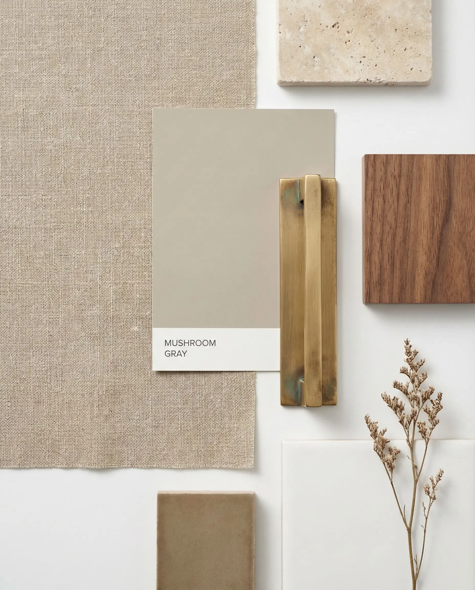
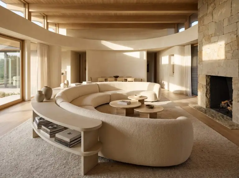
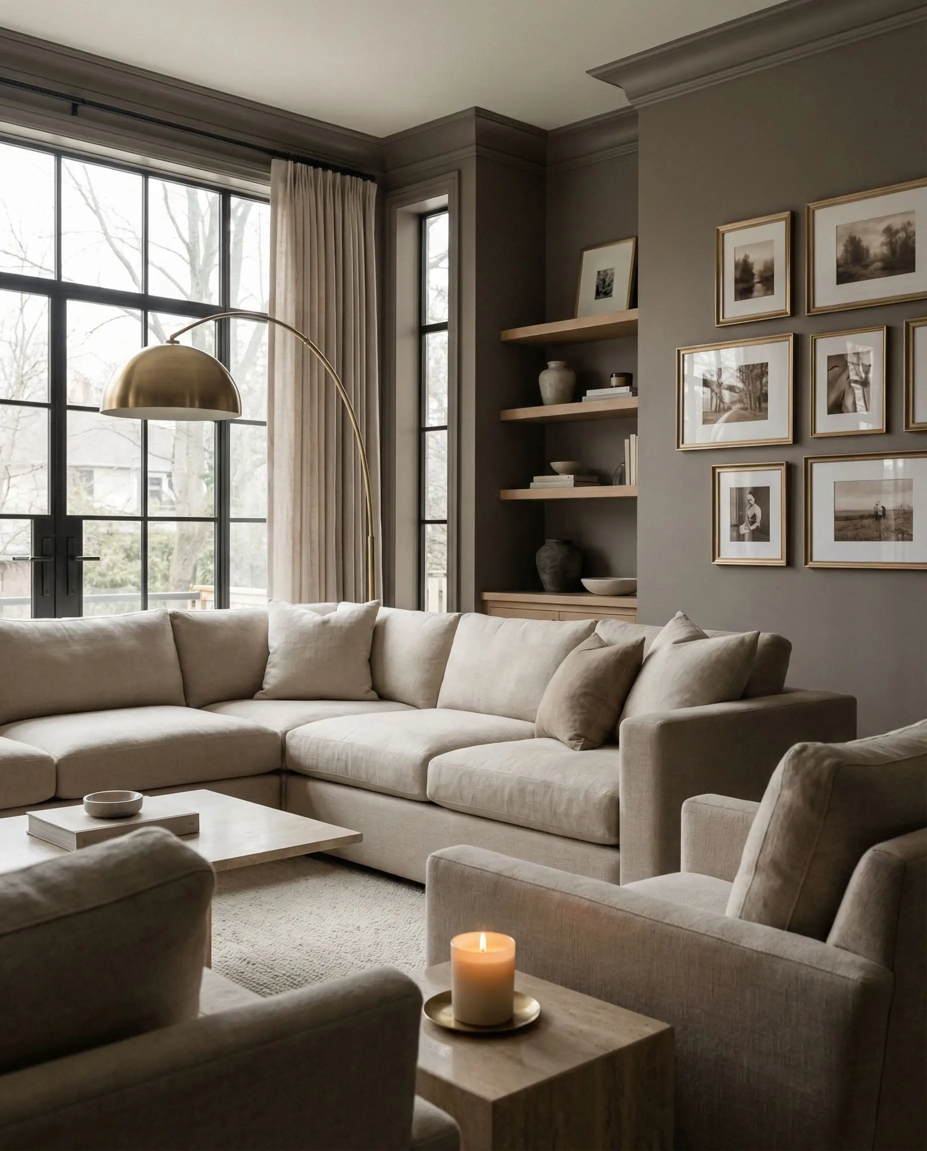
If you are pursuing the ultimate expression of Quiet Luxury, this tone-on-tone palette is your blueprint. Mushroom is a highly sophisticated, gray-brown hybrid that feels incredibly expensive and bespoke.
When you pair mushroom walls with sandy, pale beige furnishings, the lack of sharp contrast forces the eye to appreciate the actual shapes of your furniture. To bring this subtle combination to life, generous splashes of brushed, unlacquered brass are required to bounce light around the room.
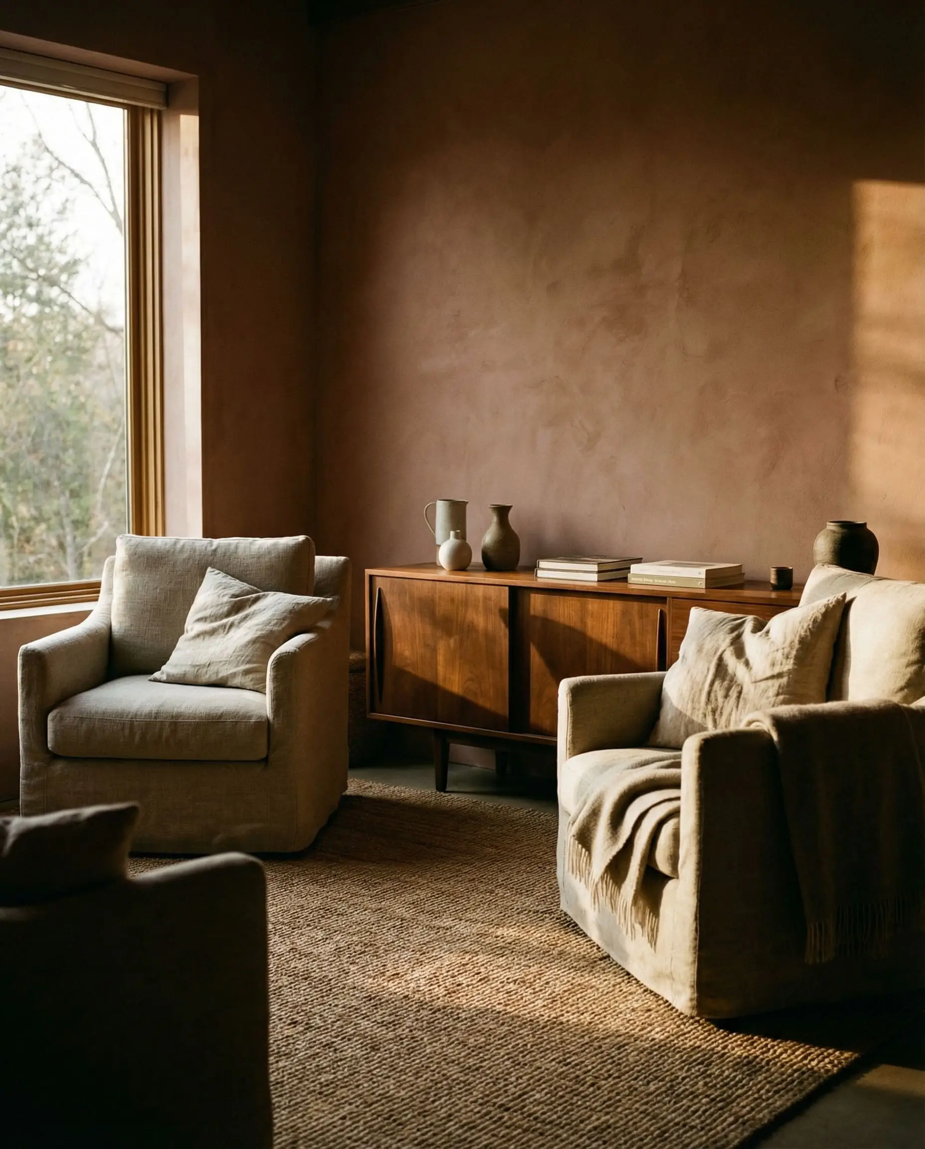
Palette 4: Soft Terracotta, Oatmeal, and Walnut
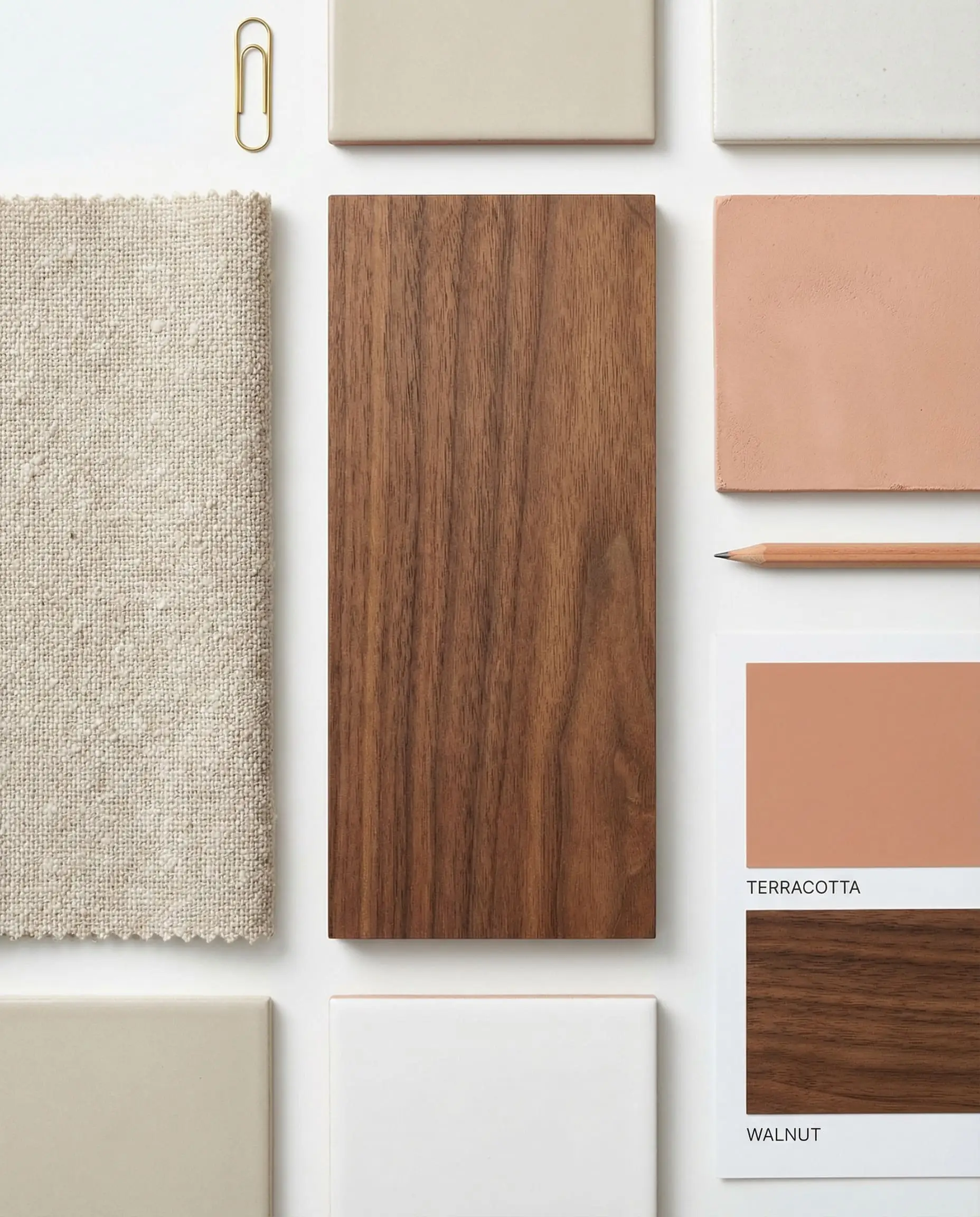
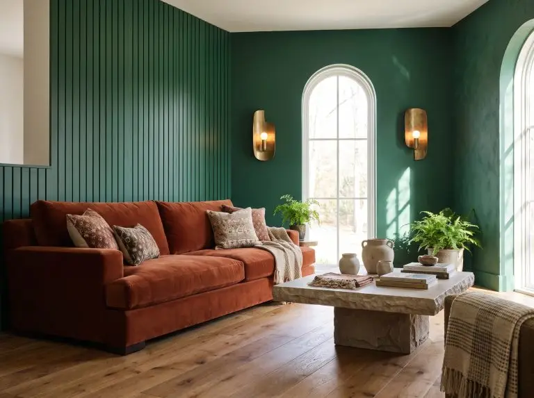
This palette is a much richer, deeper take on traditional neutrals, perfect for cozy, intimate spaces. Soft terracotta introduces incredibly subtle red and orange undertones, capturing the magic of Tuscan plaster without overwhelming the eye.
To cool down the terracotta, we lean heavily on cool-toned oatmeal fabrics. The critical finishing touch is the introduction of dark, sweeping wood grains. Walnut is the premier choice here, as its deep, chocolatey grain balances the warmth of the plaster-like walls.
Palette 5: Greige, Chocolate Brown, and Travertine
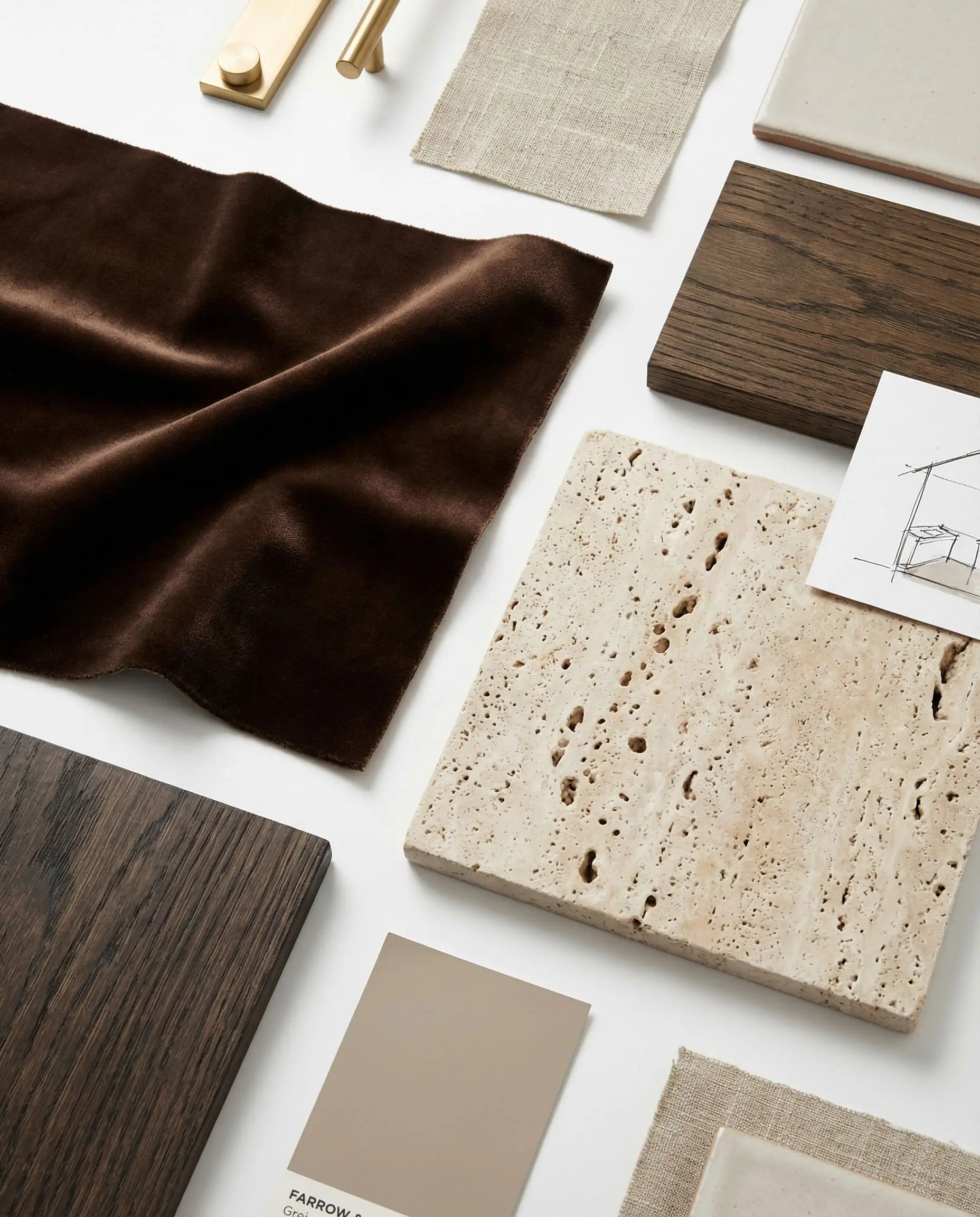
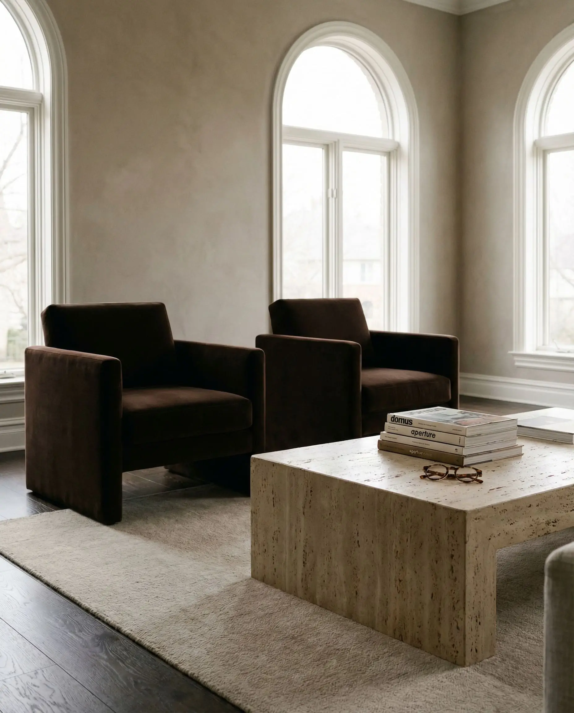
For homeowners transitioning away from a strictly gray house, this palette brilliantly bridges the gap. “Greige” offers the familiarity of gray but with a distinctly warm, beige core that makes the room feel instantly more livable.
In 2026, rich chocolate brown has entirely replaced charcoal gray as the ultimate dark neutral. When you combine greige walls with brown velvet seating and the porous, earthy texture of travertine stone, you achieve an incredibly grounded, European-inspired aesthetic.
The Best Warm Neutral Paint Colors (By LRV)
When a reader recently asked us how to confidently choose the best warm neutral paint colors, our immediate answer was to study the Light Reflectance Value (LRV). LRV is a crucial metric that measures how much light a paint color reflects on a scale from 0 (absolute black) to 100 (pure white).
For a living room that feels light and airy but still distinctly warm, you generally want an LRV between 60 and 82. Anything lower begins to feel like a moody, enveloping mid-tone. Below is our definitive, designer-approved index of the best warm neutrals on the market today.
| Brand | Color Name | LRV Score | Undertone | Best Room Orientation |
|---|---|---|---|---|
| Benjamin Moore | Swiss Coffee | 81.91 | Subtle Green/Yellow | South or East |
| Farrow & Ball | Jitney | 48.0 | Brown/Mushroom | West or North |
| Sherwin-Williams | Alabaster | 82.0 | Warm Beige | Any Orientation |
| Benjamin Moore | Pale Oak | 68.64 | Warm Gray/Pink | South-Facing |
| Farrow & Ball | Drop Cloth | 50.0 | Yellow/Gray | Any Orientation |
| Sherwin-Williams | Accessible Beige | 58.0 | Gray/Green | East or North |
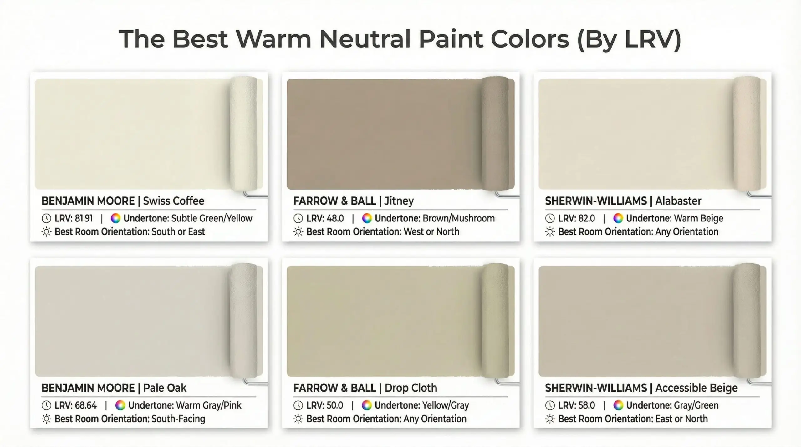
Benjamin Moore Swiss Coffee is an industry icon for a reason. It is the ultimate “chameleon” white that instantly warms up a cold room, but we highly recommend requesting it at 75% strength if your room gets overwhelming direct afternoon sunlight.
💡 Hackrea Pro Tip
How to Layer Textures to Prevent a “Flat” Room
The absolute greatest risk when designing a beige or taupe living room is creating a space that looks like a sterile, uninspired waiting room. When you remove high-contrast color from a design scheme, you must aggressively replace it with tactile texture.
Our studio partners relies on the “Rule of 3 Textures” to solve this exact dilemma. Every single sightline in your living room should feature an interplay of something Soft, something Hard, and something Organic. If your walls and sofa are both flat, smooth beige, your room will visually collapse. You must introduce friction.
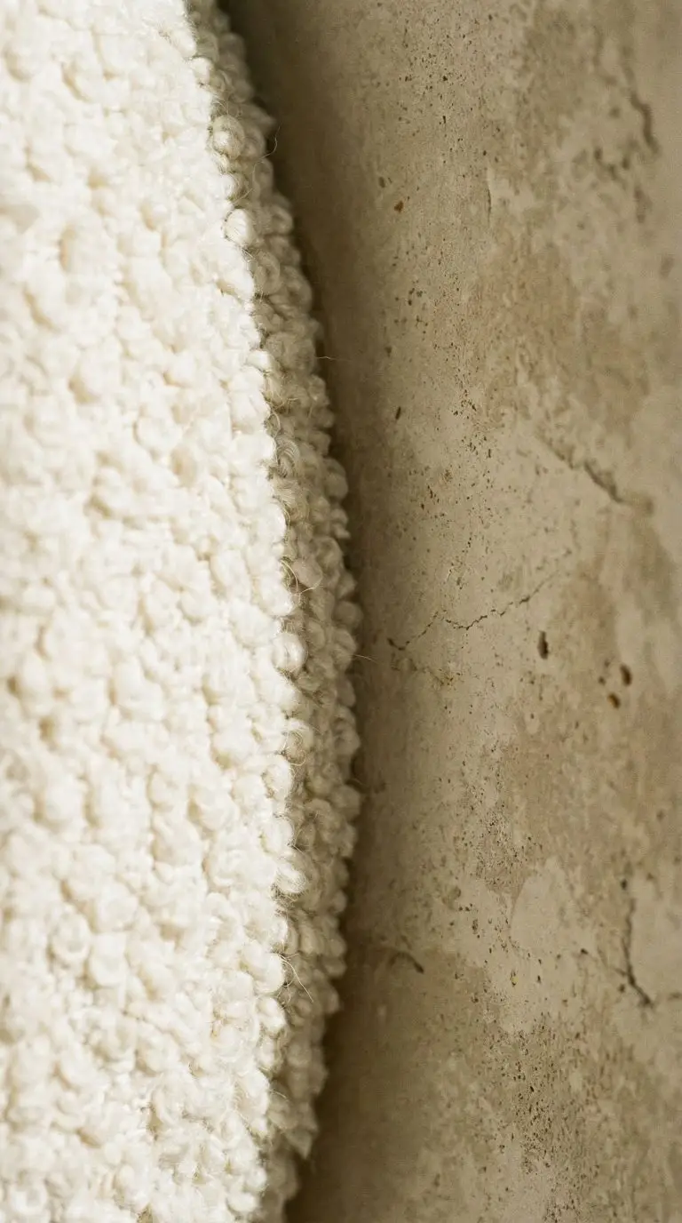
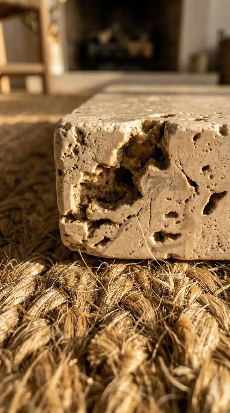
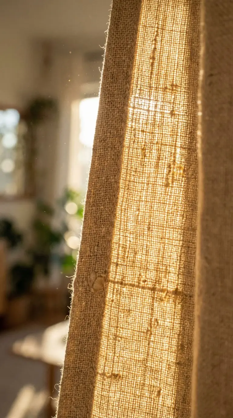
To execute the organic modern living room aesthetic flawlessly, ensure you are pulling from this master textural checklist:
To instantly elevate a neutral sofa, aggressively mix your throw pillow fabrics. Pair a sleek, buttery leather lumbar pillow directly against a nubby, heavily textured wool square. The friction between the smooth and rough materials creates instant visual luxury.
🛋️ Hackrea Styling Tip
Lighting Considerations: North vs. South-Facing Rooms
A collaborating interior designer recently told us, “Paint colors do not exist in a vacuum; they only exist in relation to the light hitting them.” Understanding your room’s architectural orientation is non-negotiable before finalizing a warm neutral.
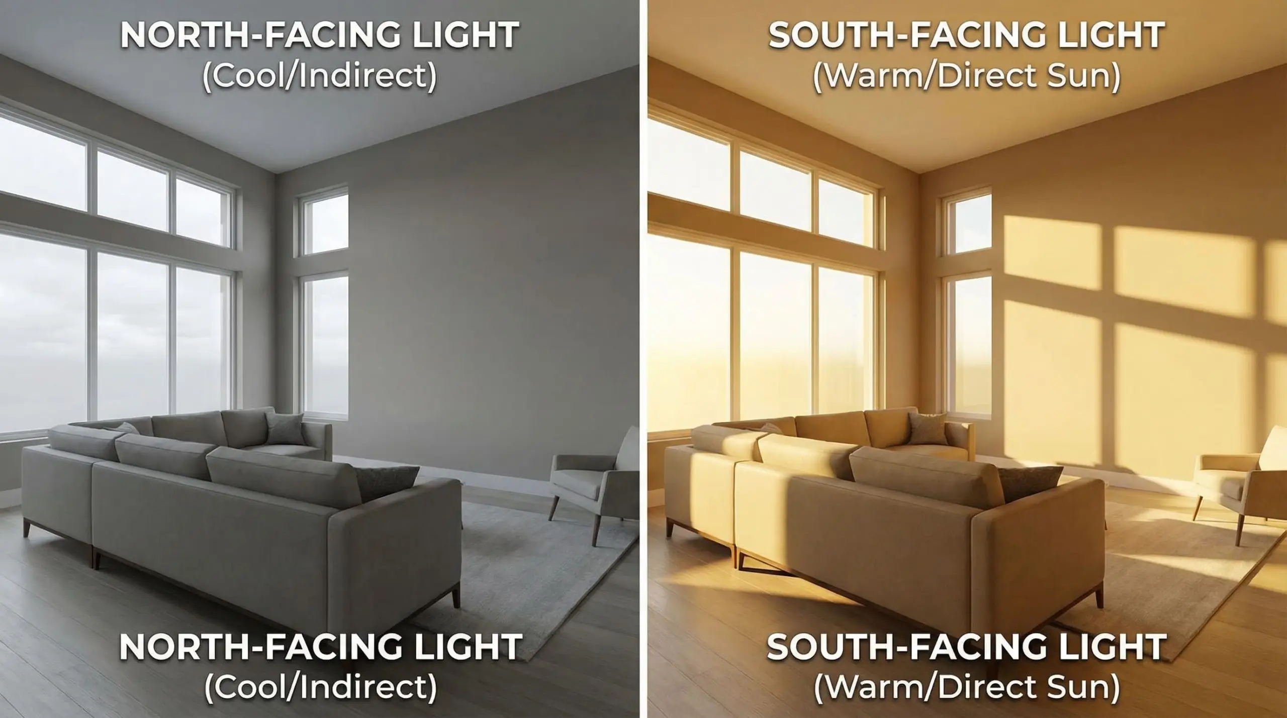
Rooms with South-facing windows are flooded with intense, golden, warm light throughout the afternoon. This direct sunlight acts as an amplifier. A warm white with a yellow undertone will suddenly look aggressively yellow, and a terracotta tone might scream bright orange. In South-facing rooms, you can afford to use neutrals with cooler gray or green undertones, as the natural sunlight will warm them up beautifully.
Conversely, rooms with North-facing windows receive indirect, cool, and often slightly blue-tinted light. This icy light acts as a dampener. It will suck the warmth right out of a delicate beige, making it look muddy, dirty, or distinctly gray. For these challenging spaces, you must overcompensate by choosing a heavily saturated warm shade—like an ochre-leaning cream or a deep mushroom. If your space lacks natural light altogether, you must carefully engineer your artificial bulbs using our lighting strategies for low-light rooms.
Common Mistakes When Decorating with Warm Neutrals
Looking at the floor plan photos sent to our team, we see well-meaning design enthusiasts fall into the same structural traps time and time again. To ensure your space feels curated rather than catalog-bought, avoid these cardinal sins of neutral design.
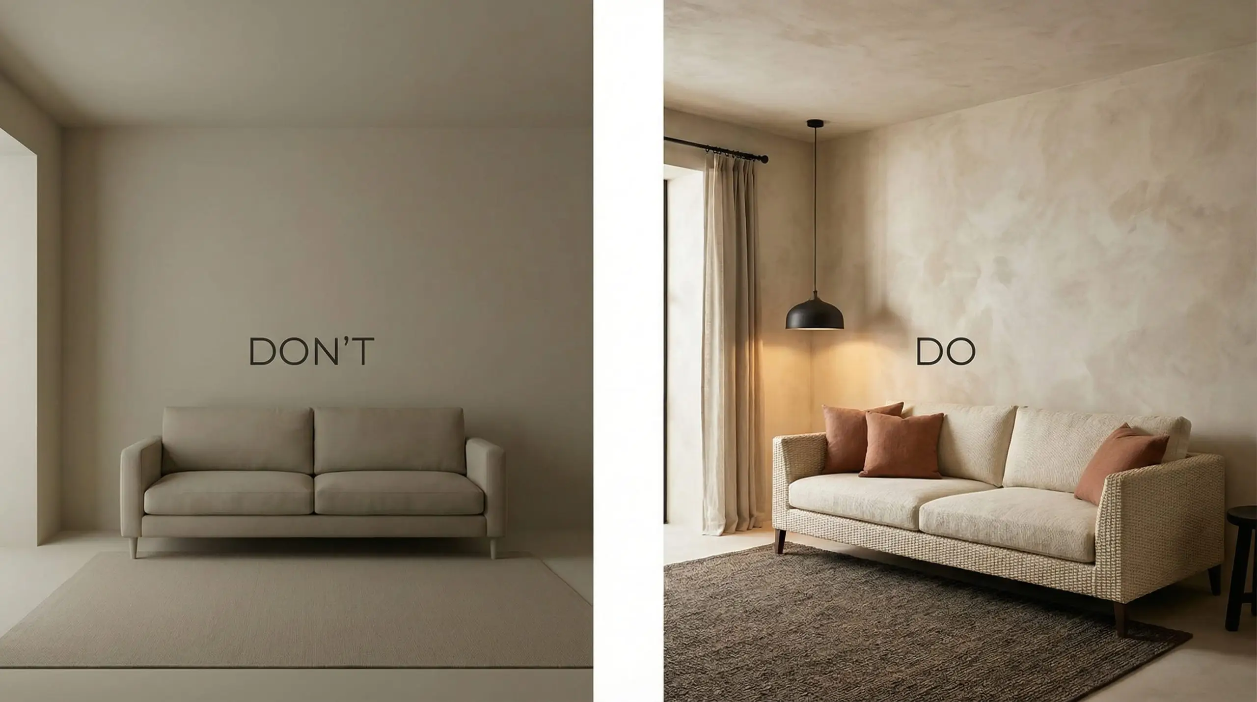
Always ensure your furniture arrangement is properly anchored; even the best paint color can’t save a room if you haven’t mastered choosing the right living room rug size.
Frequently Asked Questions
A: While trends continuously evolve, Benjamin Moore Swiss Coffee and Farrow & Ball Jitney remain the undisputed industry favorites for 2026. They offer a highly sophisticated, chameleon-like warmth that perfectly bridges the gap between classic traditionalism and organic modern design.
A: Yes, but you must be incredibly specific. Icy, blue-toned grays will violently clash with warm beiges and taupes. Instead, opt for “greige” or deep, moody charcoal grays with brown undertones to seamlessly weave them into a warm palette.
A: The secret to expensive-looking beige is relentless textural variation and strategic architectural lighting. Layer high-end tactile materials like bouclé, unlacquered brass, and heavy linen, and ensure you utilize wall sconces to cast warm, dramatic shadows across your neutral surfaces.
Final Thoughts
The transition toward warm neutral living room color palettes marks a beautiful return to spaces that actually nurture us. By mastering undertones, balancing your LRVs, and aggressively layering earthy textures, you can transform any basic room into a sophisticated sanctuary. Ready to start curating your furniture? Dive into our comprehensive masterclass on Organic Modern living room ideas to find the perfect pieces for your new canvas.

The Aesthetics Desk curates the visual direction for Hackrea. Specializing in design history, global architectural movements, and interior styling, this desk focuses on the psychology of space and how to translate high-end, magazine-quality aesthetics into approachable residential design without falling into fleeting micro-trends.