25 Sophisticated Pink and Gray Living Room Ideas (2026 Trends & Guide)
If you still think “pink and gray” means a nursery or a 2010s geometric pastel explosion, it’s time for a reset. In 2026, this color duo has grown up. It has graduated from bubblegum and slate to something far more refined, earthy, and moody.
We are seeing a massive shift in interior design toward spaces that feel like a sanctuary—warm, enveloping, and sophisticated. The new pinks are plaster-like, muddy, and grounded. The grays are either warming up into “greige” or diving deep into dramatic charcoal. When paired together correctly, they create a living room that feels both contemporary and timelessly elegant.
Whether you are looking to do a full renovation or just swap out some textiles, this guide will walk you through the nuances of mastering this palette. We aren’t just giving you pictures; we’re giving you the design theory behind why they work.
The New Rules: Trending Palettes for 2026
Before we dive into specific layout ideas, we need to talk about the “vibe.” The success of a pink and gray living room depends entirely on the undertones.
1. The “Moody” Aesthetic
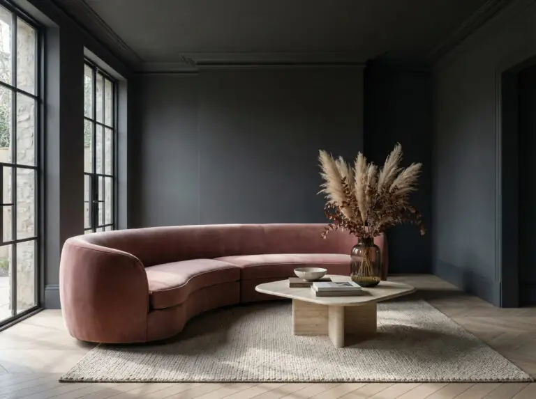
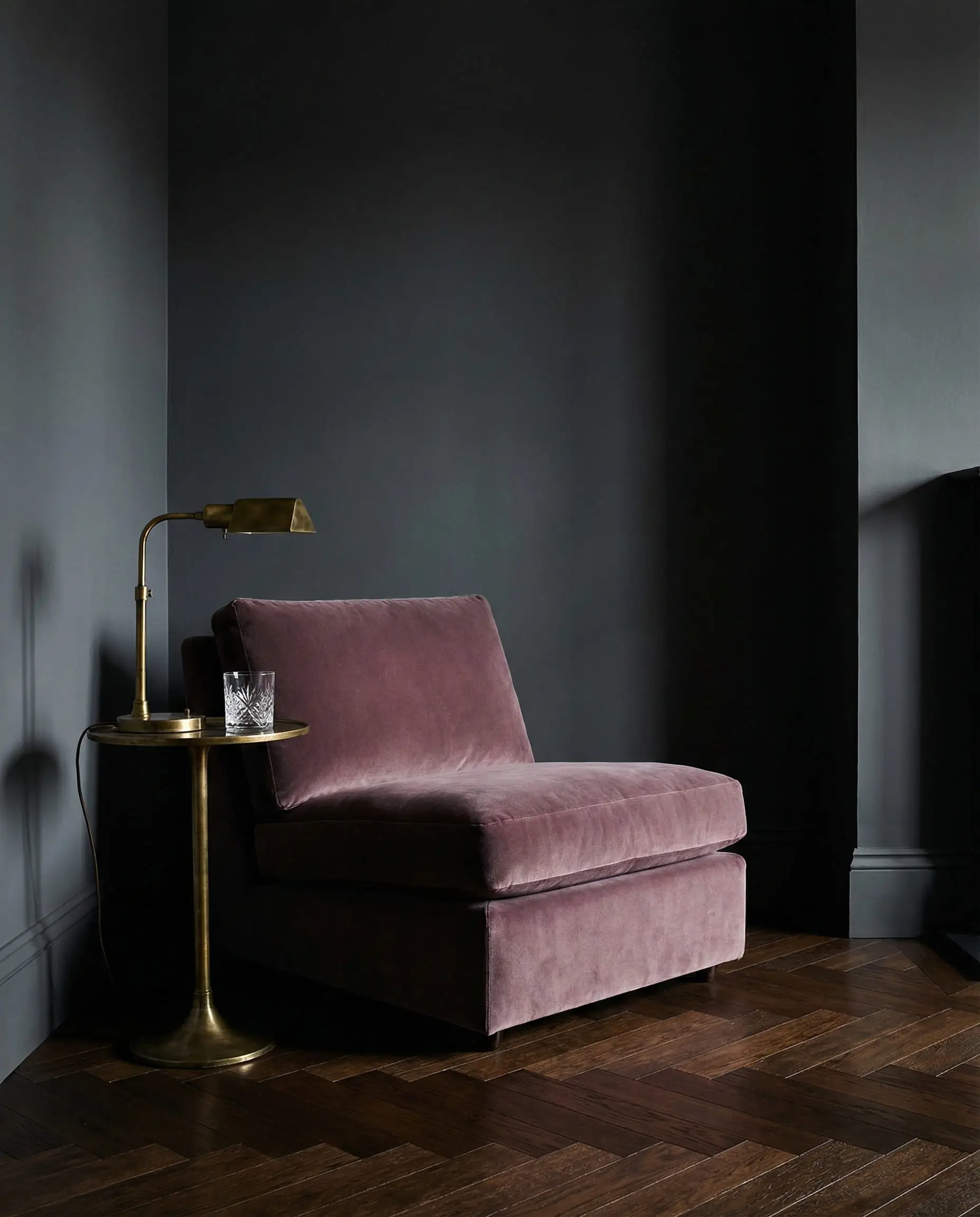
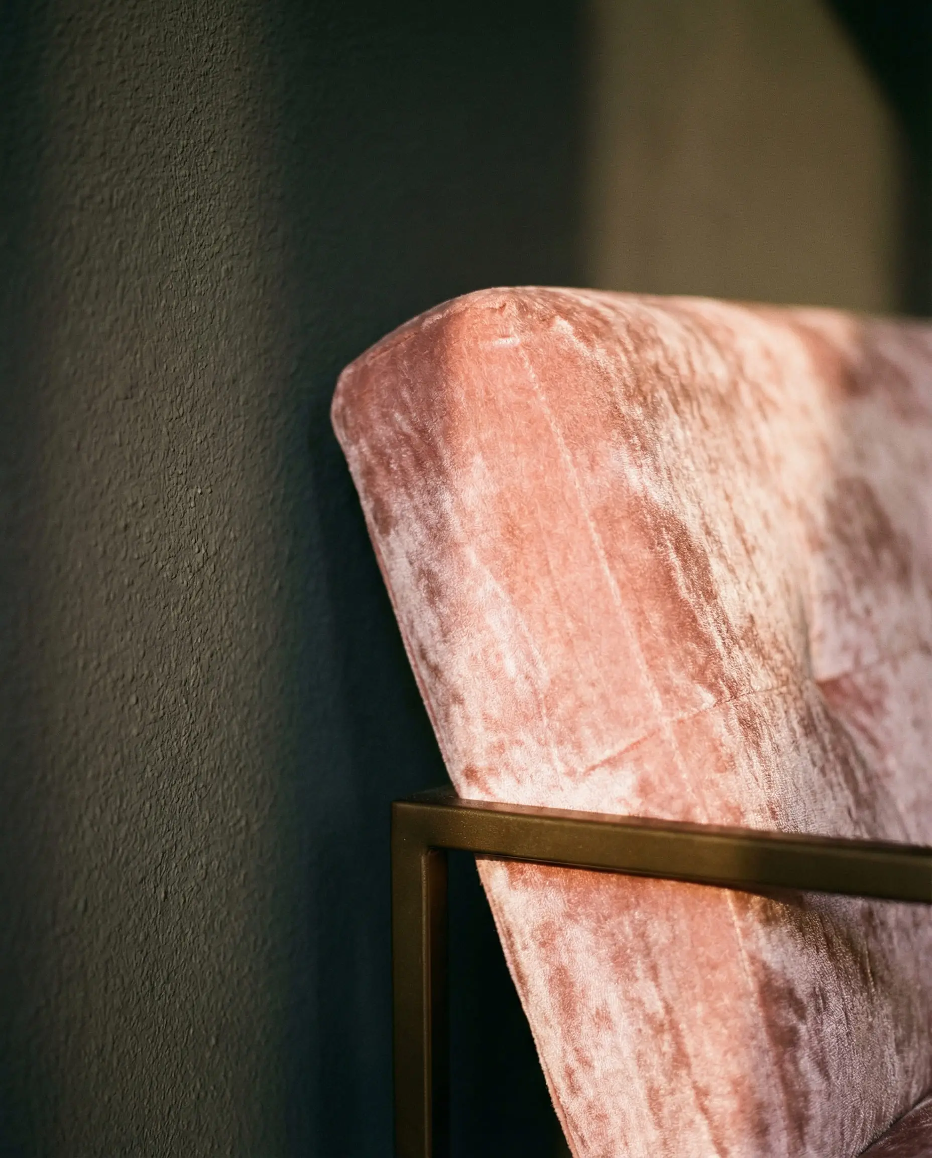
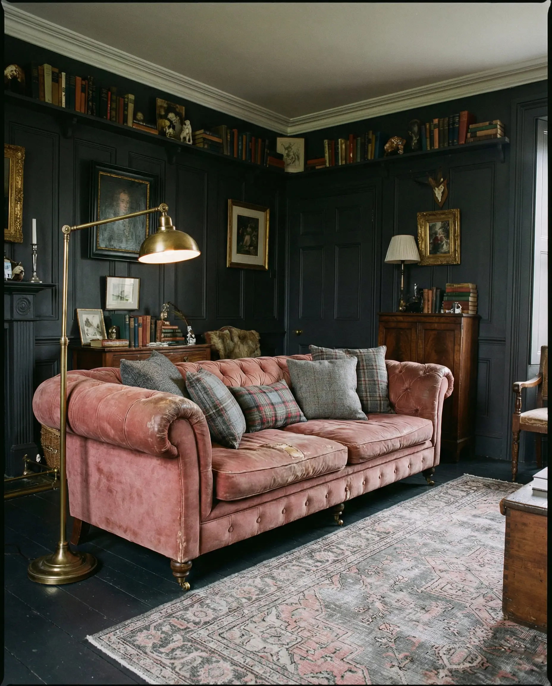
Forget light and airy; 2026 is embracing the dark side. Think deep, matte charcoal walls (almost black) paired with dusty rose or mauve velvet furniture. This high-contrast look creates an intimate, lounge-like atmosphere perfect for evening relaxation. It’s dramatic, yes, but surprisingly cozy.
2. Organic & Earthy (The “Greige” Shift)
Cool, blue-based grays can feel sterile. The trend is moving toward “greige” (gray + beige) and warm stone tones. When you pair a warm stone gray with a plaster pink (a pink with brown/yellow undertones), the room feels organic. It evokes the feeling of natural clay and unpolished stone.
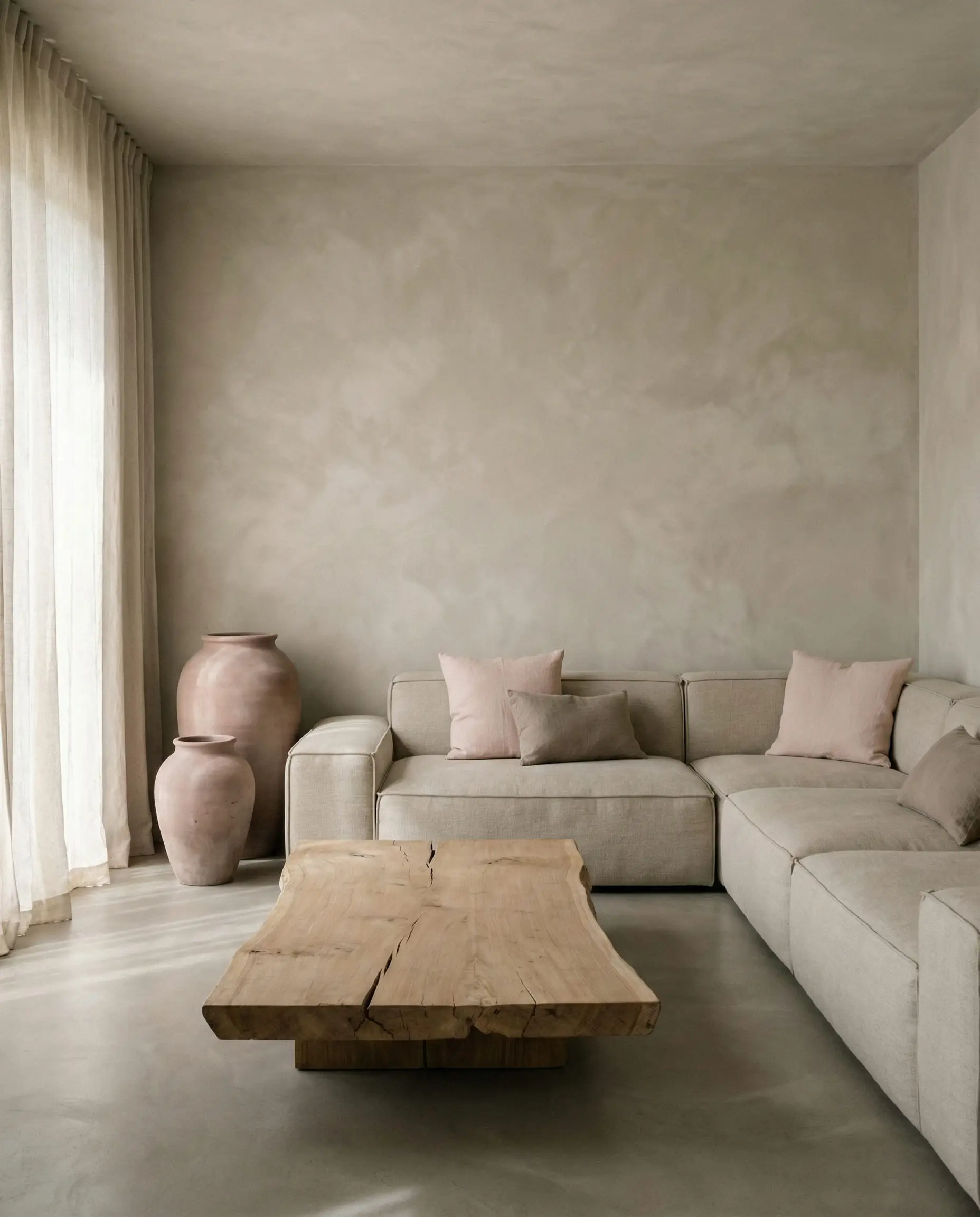
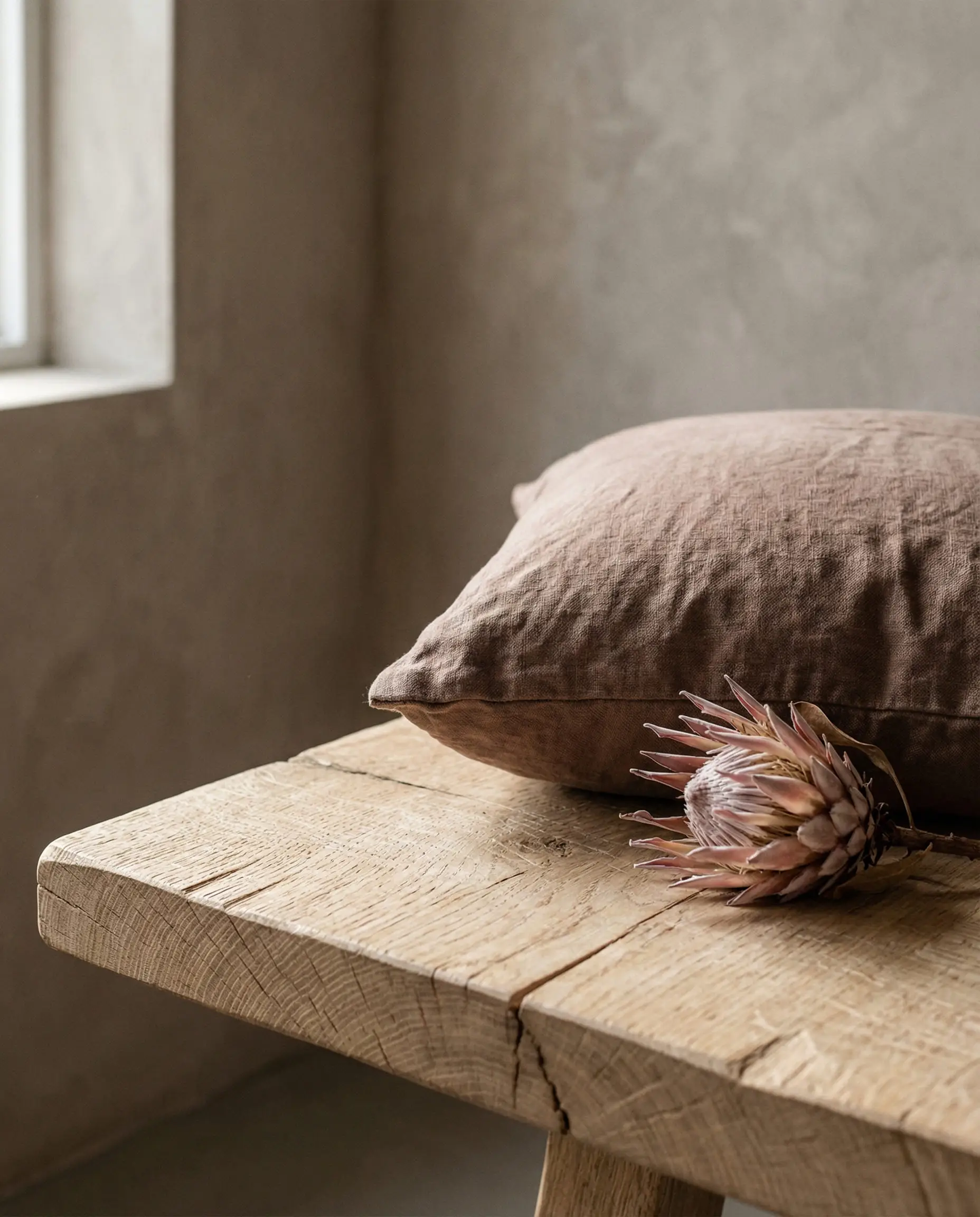
To nail the organic look, texture is your best friend. Don’t just rely on paint. Introduce gray via concrete planters or textured wall panels to add depth that flat paint can’t achieve.
Hackrea Styling Tip 💡
3. Scandi-Cool
If you prefer a lighter space, the Scandinavian influence is still strong, but it’s softer. Instead of stark white, we are using pale, icy grays as a neutral backdrop for “barely there” blush accents. It’s crisp, clean, and maximizes natural light.
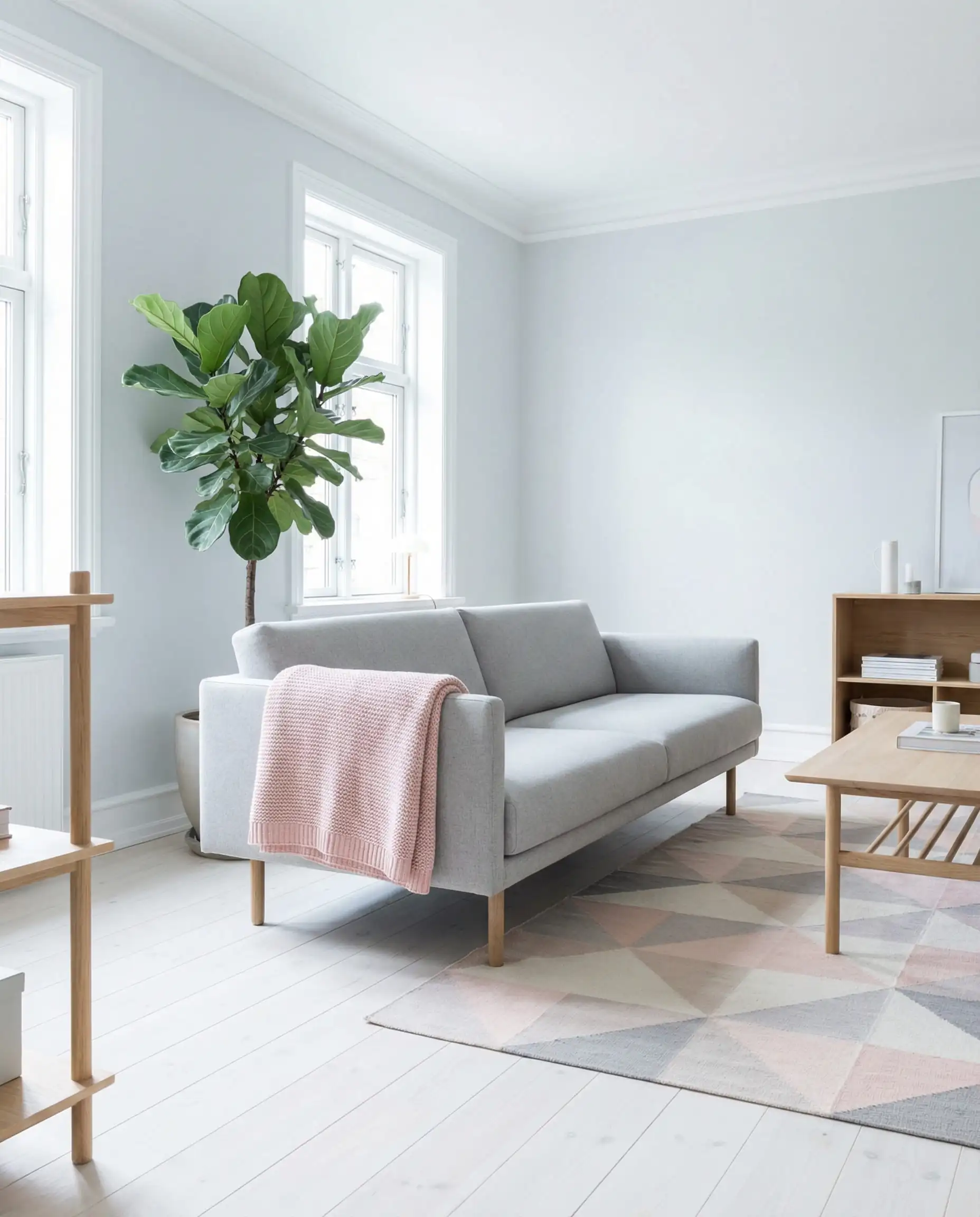
25 Inspiring Pink and Gray Living Room Ideas
Here is how to bring these concepts to life in your home.
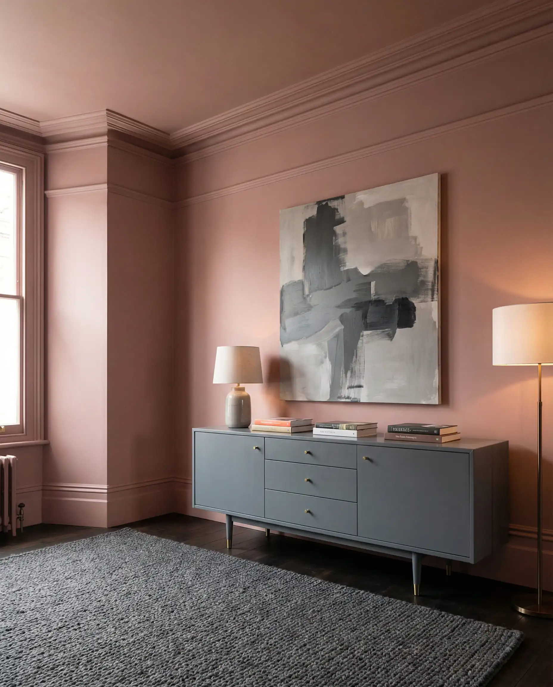
1. Color Drenching the Ceiling
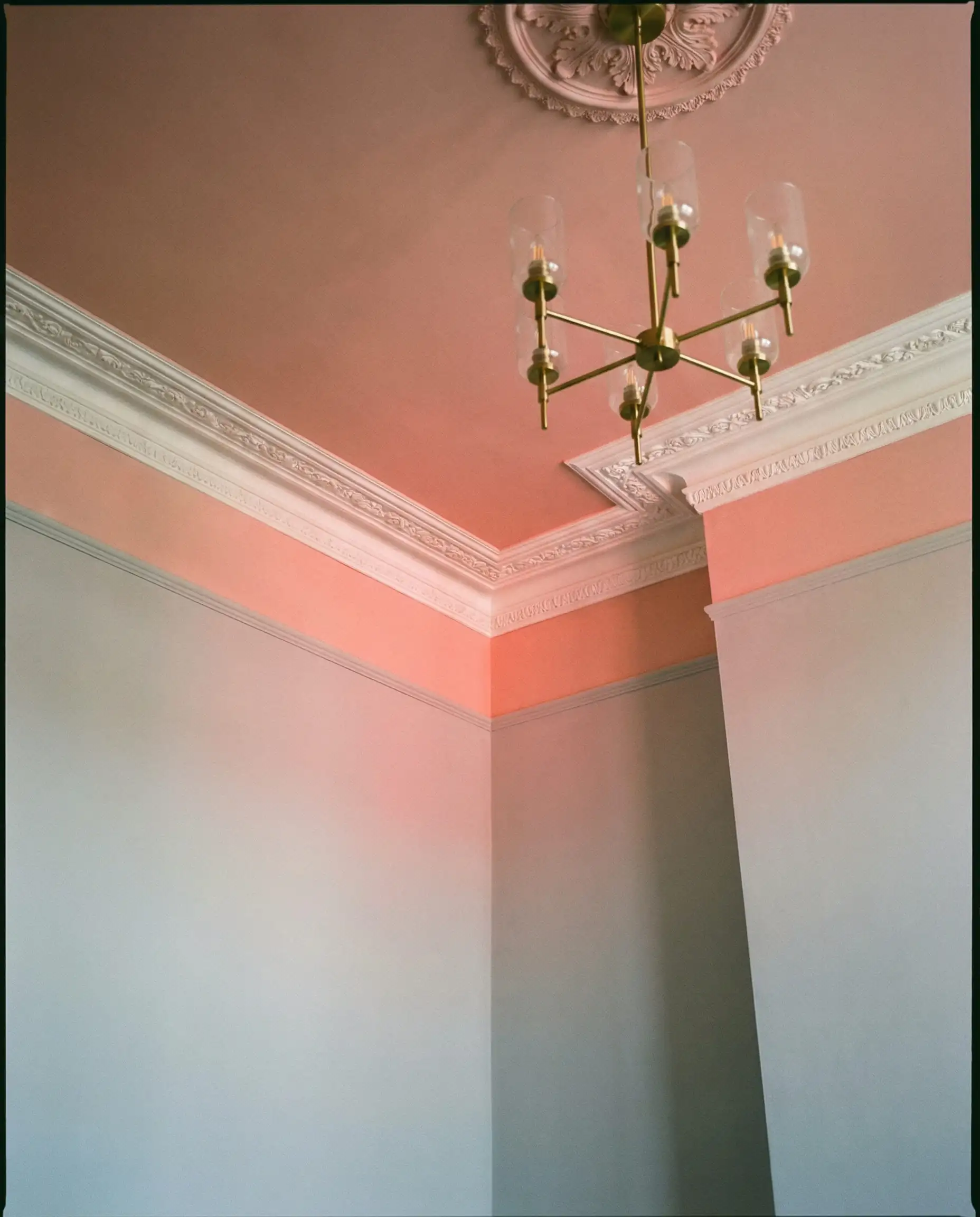
One of the boldest trends this year is “color drenching.” Instead of stopping at the picture rail, take your dusky pink paint up the walls and across the entire ceiling. This blurs the boundaries of the room, making it feel larger and more enveloping. Keep the floor and furniture in varying shades of cool gray to ground the space.
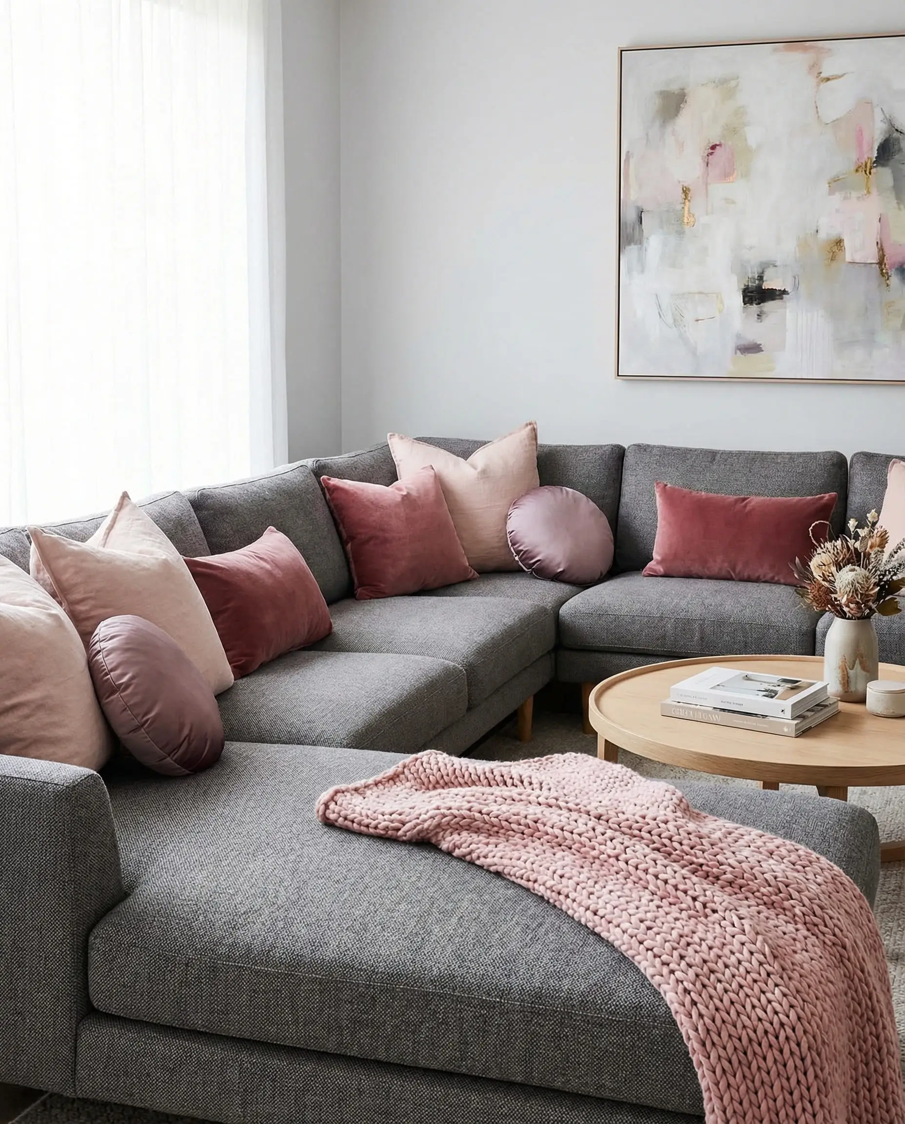
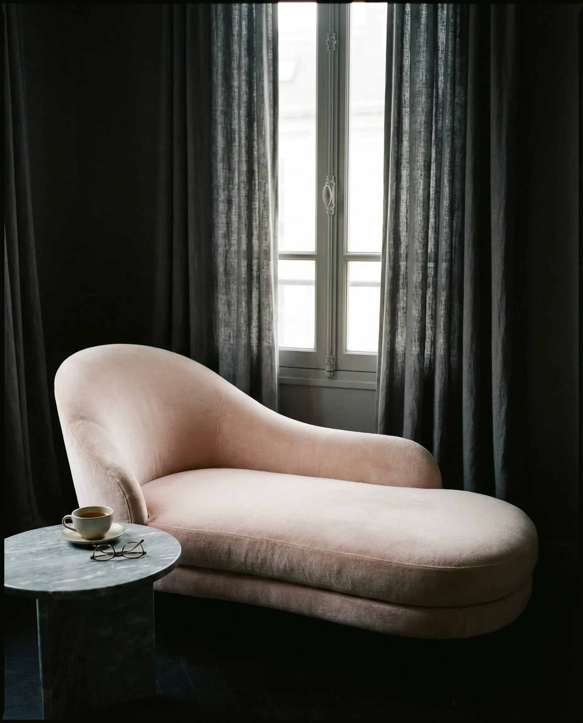
2. The Statement Velvet Sofa
If you have neutral gray walls, a pink sofa is the ultimate focal point. But be careful with the fabric choice. A cotton pink sofa can look casual or juvenile, but a velvet pink sofa screams luxury. The sheen of the velvet catches the light, giving the pink dimension.
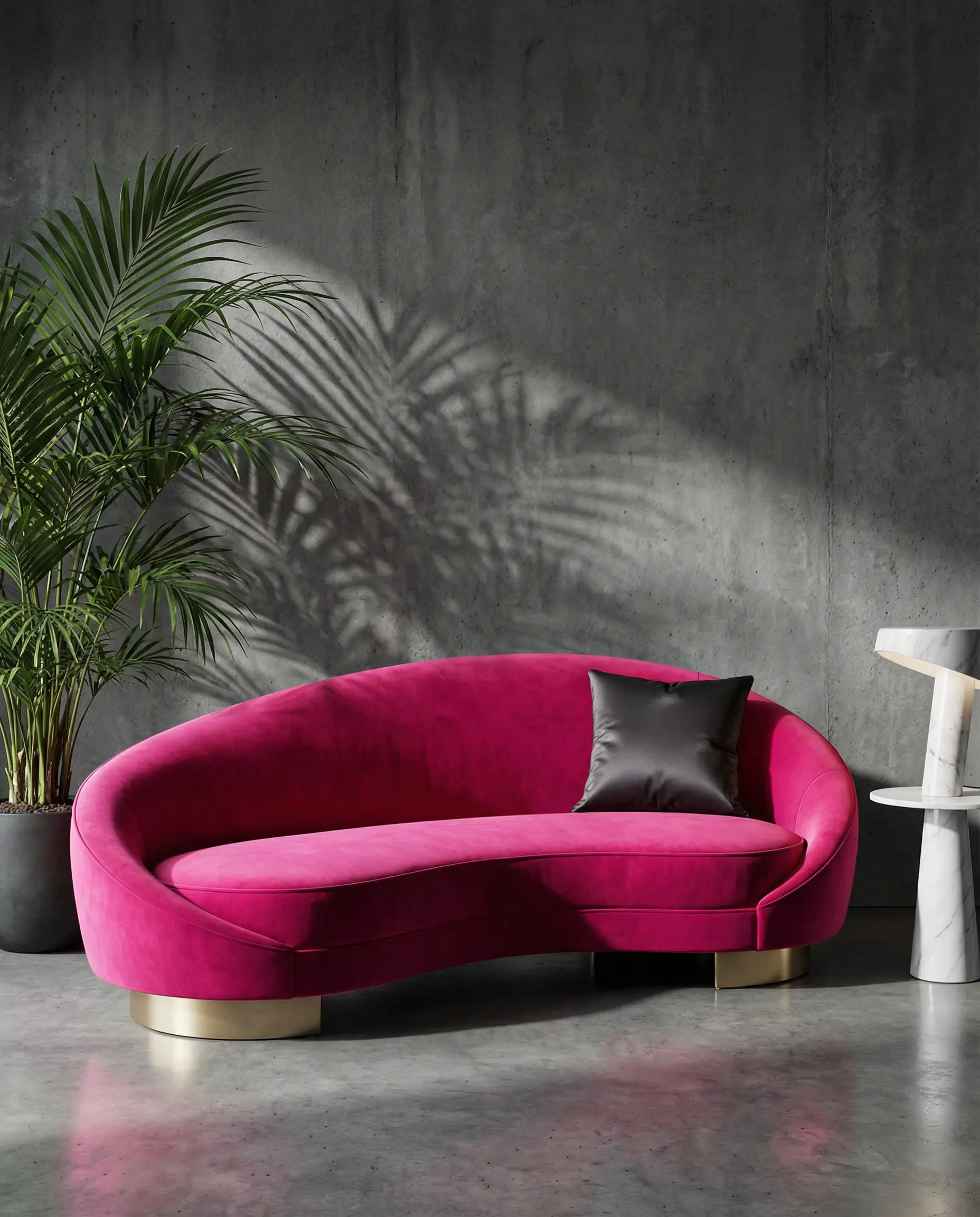
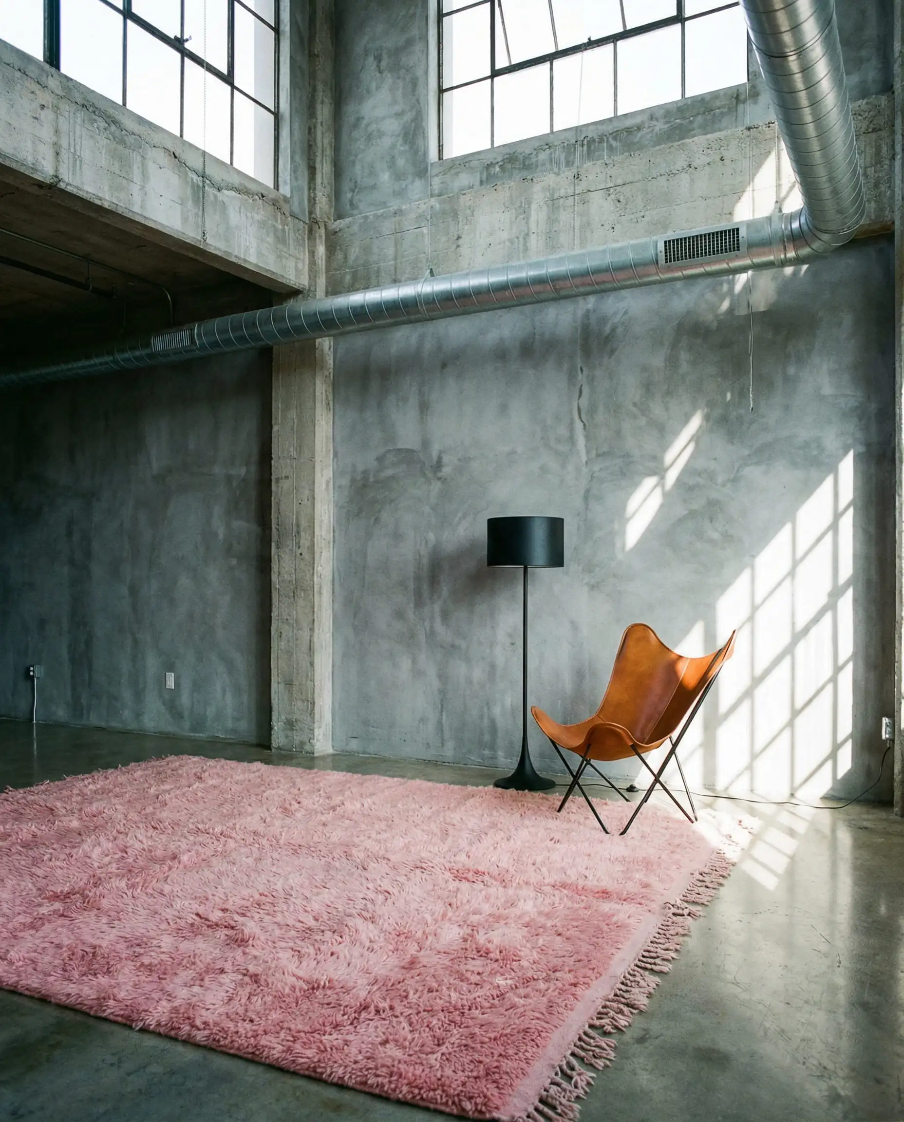
3. Industrial Edge with Concrete
Pink softens the harshness of industrial design perfectly. If you have exposed concrete walls or gray concrete floors, they can feel cold on their own. Layering in soft, blush textiles—like heavy linen curtains or a thick wool rug—creates a “warm industrial” look that is incredibly chic.
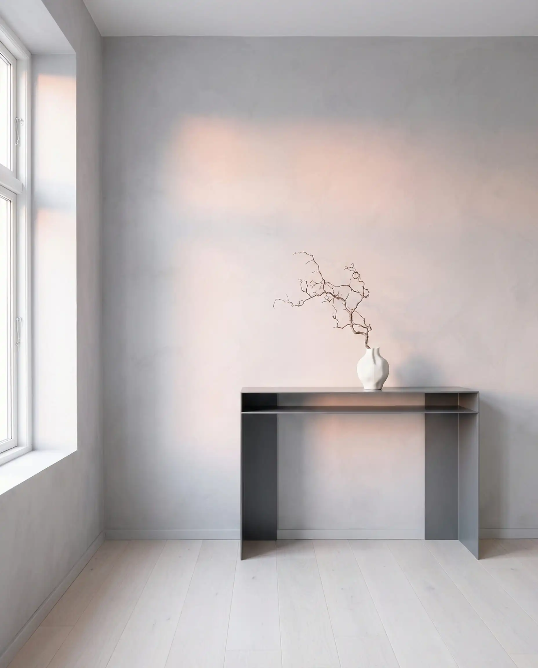
4. The “Invisible” Pink
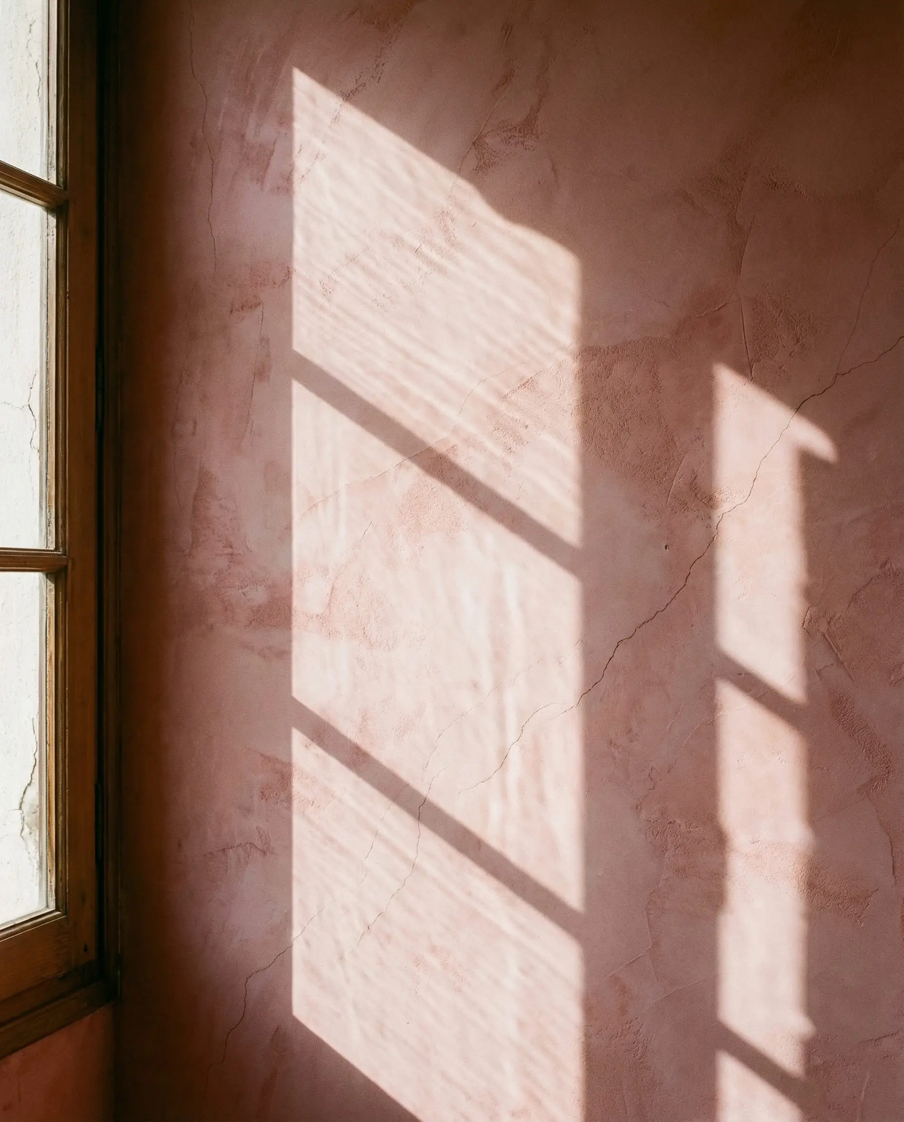
For those scared of color, try a gray wall with pink undertones (often called a “lilac gray”). It reads as a neutral until the late afternoon sun hits it, revealing a warm, rosy glow. It’s the perfect backdrop for darker gray furniture.
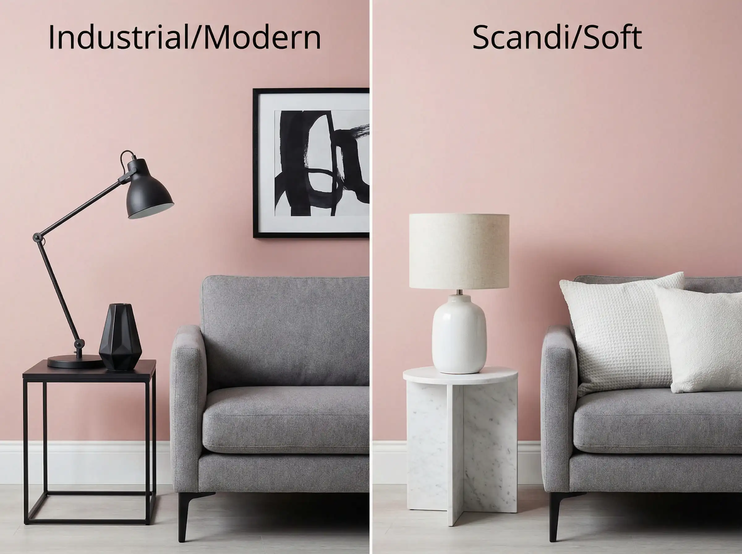
5. Metallic Accents: Gold vs. Black
Hardware changes everything.
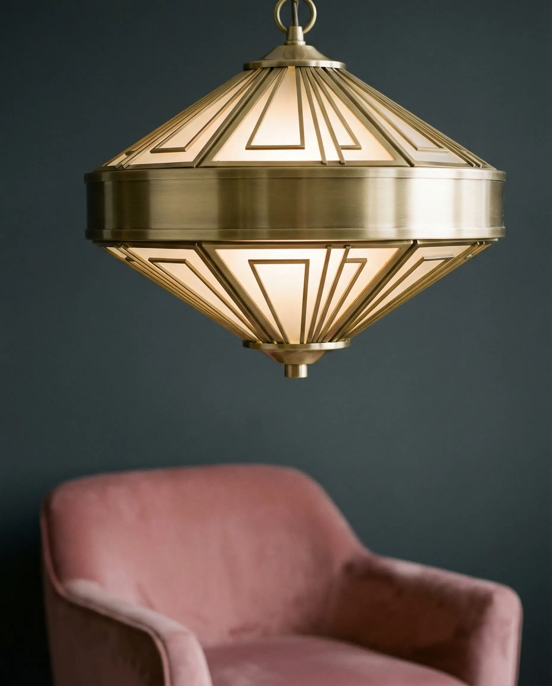
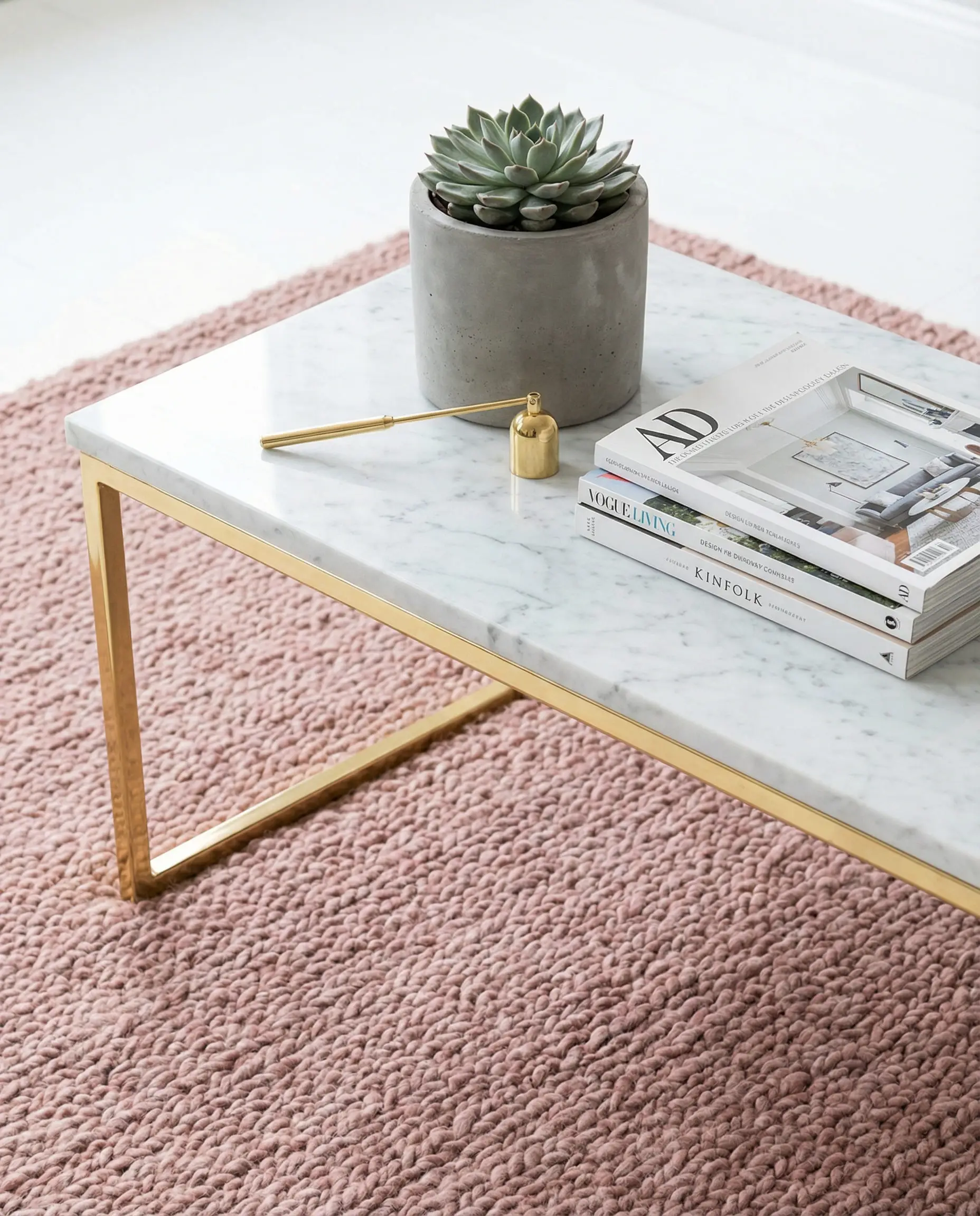
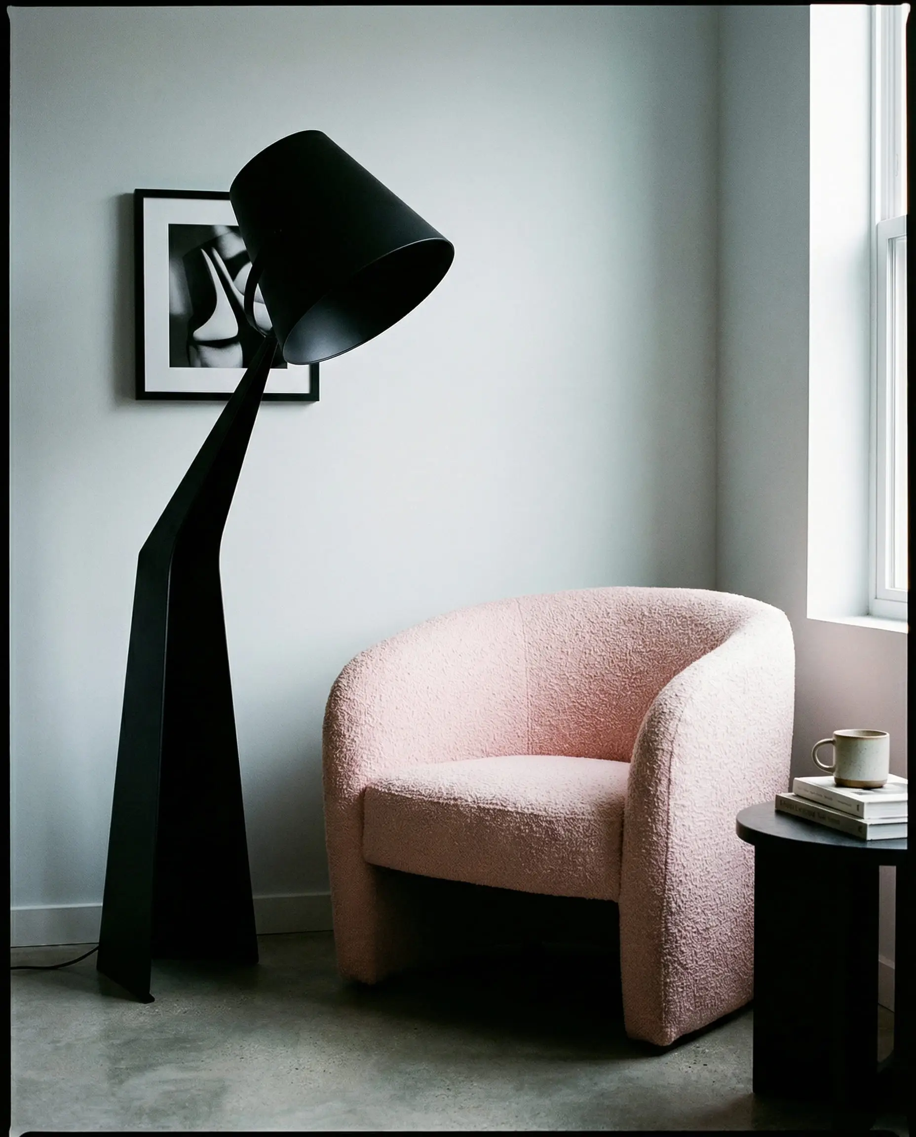
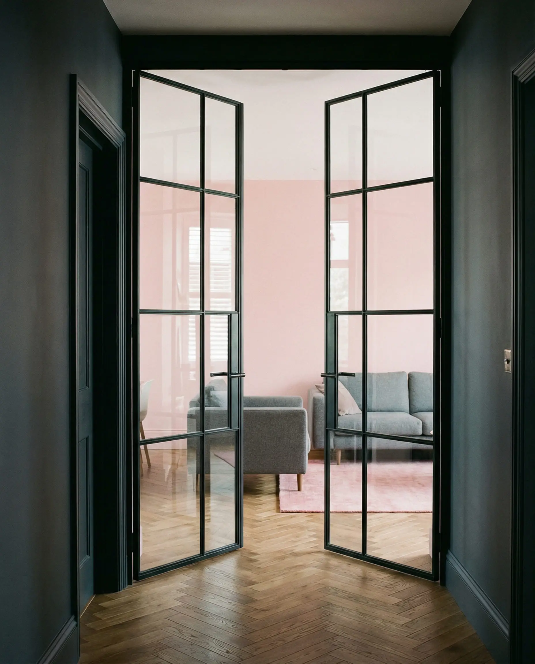
Swap out your cabinet handles or light fixtures to match the vibe you want. A modern chandelier in brushed brass can instantly warm up a cool gray room.
Hackrea Pro Tip 💡
6. Gallery Walls with a Twist
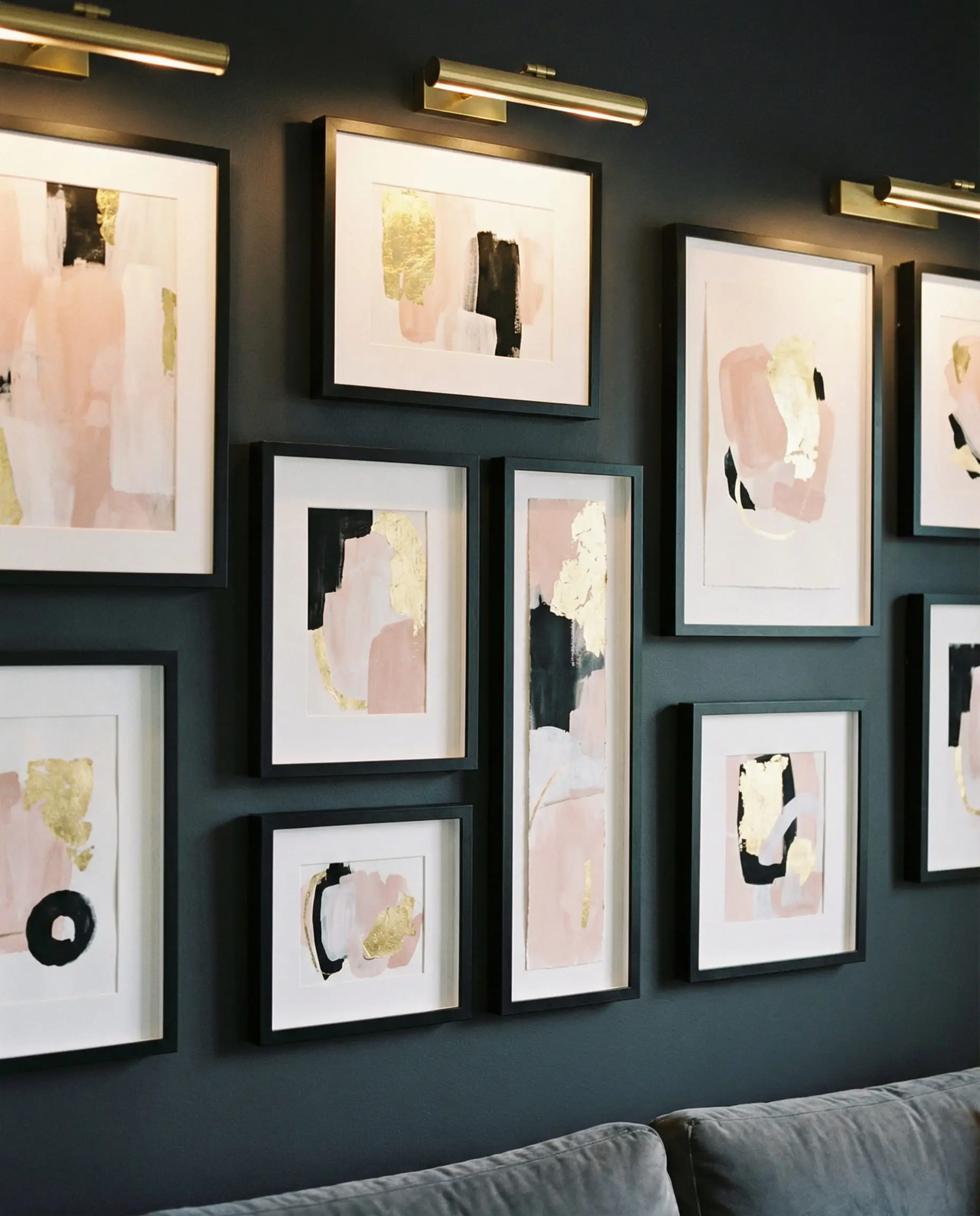
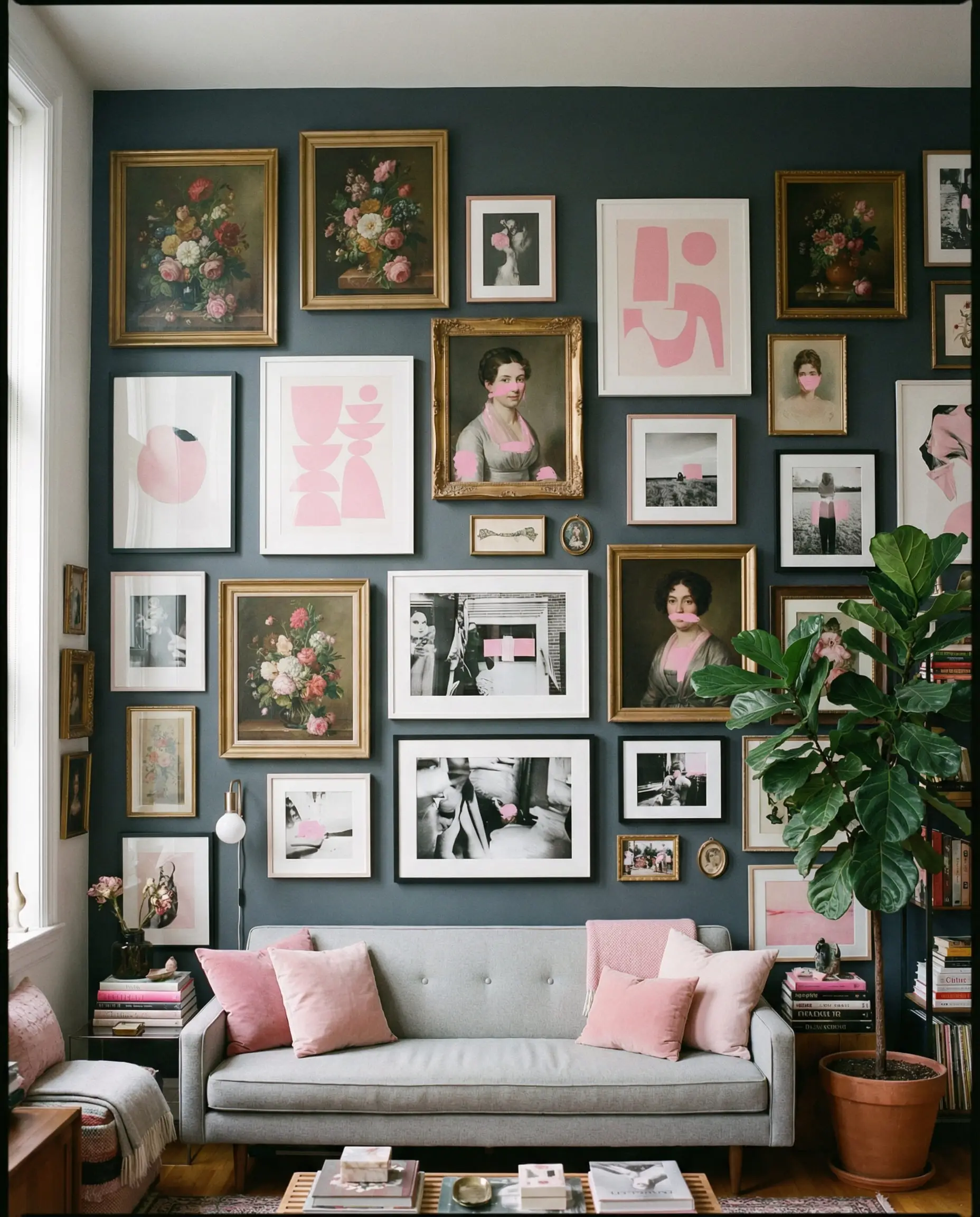
Don’t just hang art; curate it. On a dark gray wall, create a gallery wall using prints that feature only pink, white, and black. The pink in the art will pop against the dark background, tying the room together without you needing to buy new furniture.
7. Layering Rugs
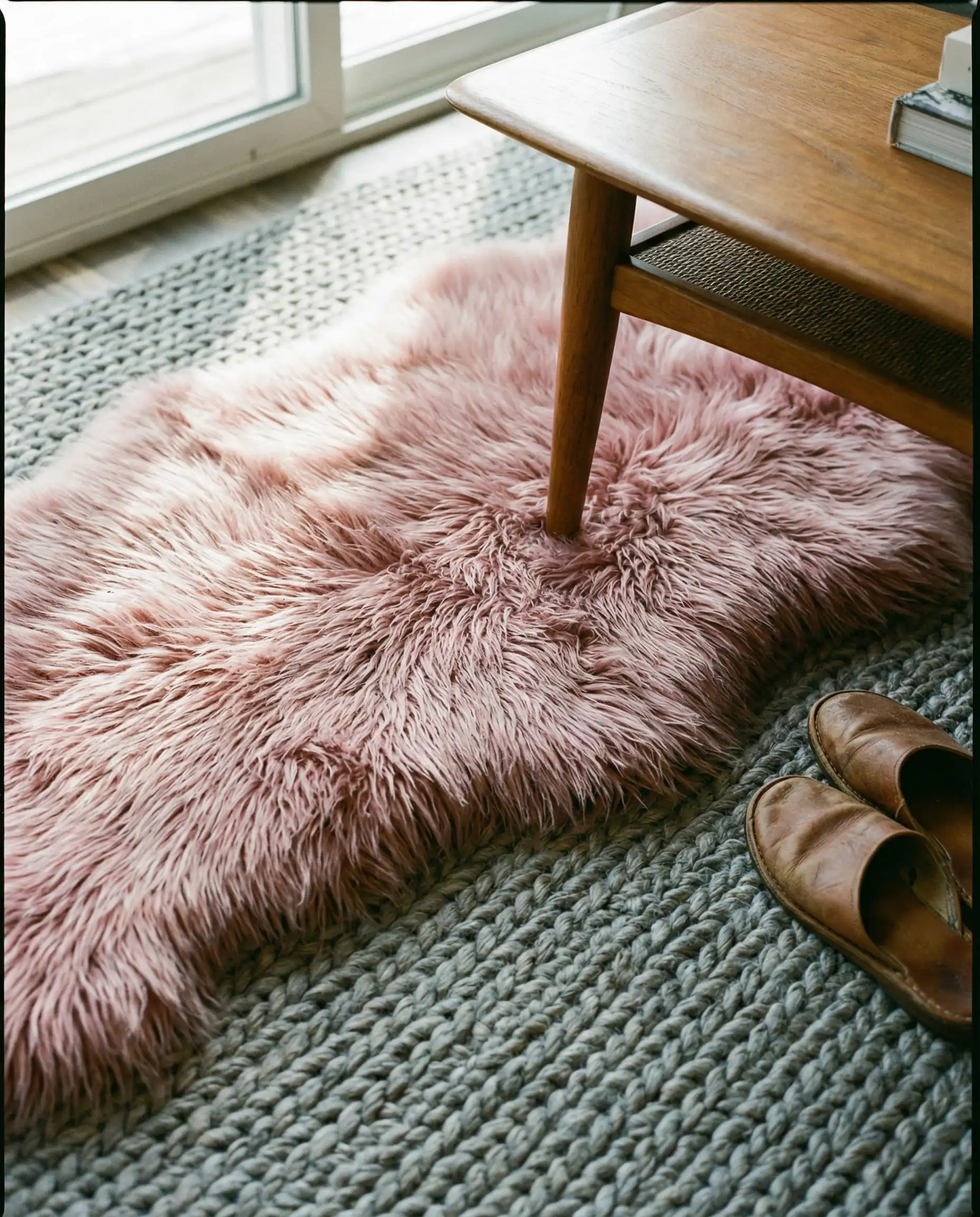
Texture is crucial in a dual-color scheme. Try layering a large, flat-weave gray jute rug as your base, and place a smaller, plush pink faux-fur or vintage Persian rug on top. This “island” of color anchors your coffee table and adds immediate coziness.
8. Painted Joinery
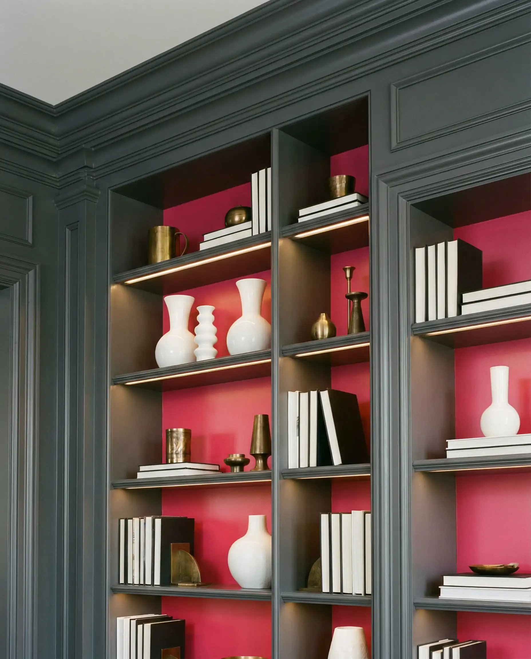
If you have built-in bookshelves, paint the back paneling a deep raspberry or terracotta pink, while keeping the shelves and frame a dark gray. This adds a surprise pop of color that highlights your books and decor objects.
9. The Split Wall
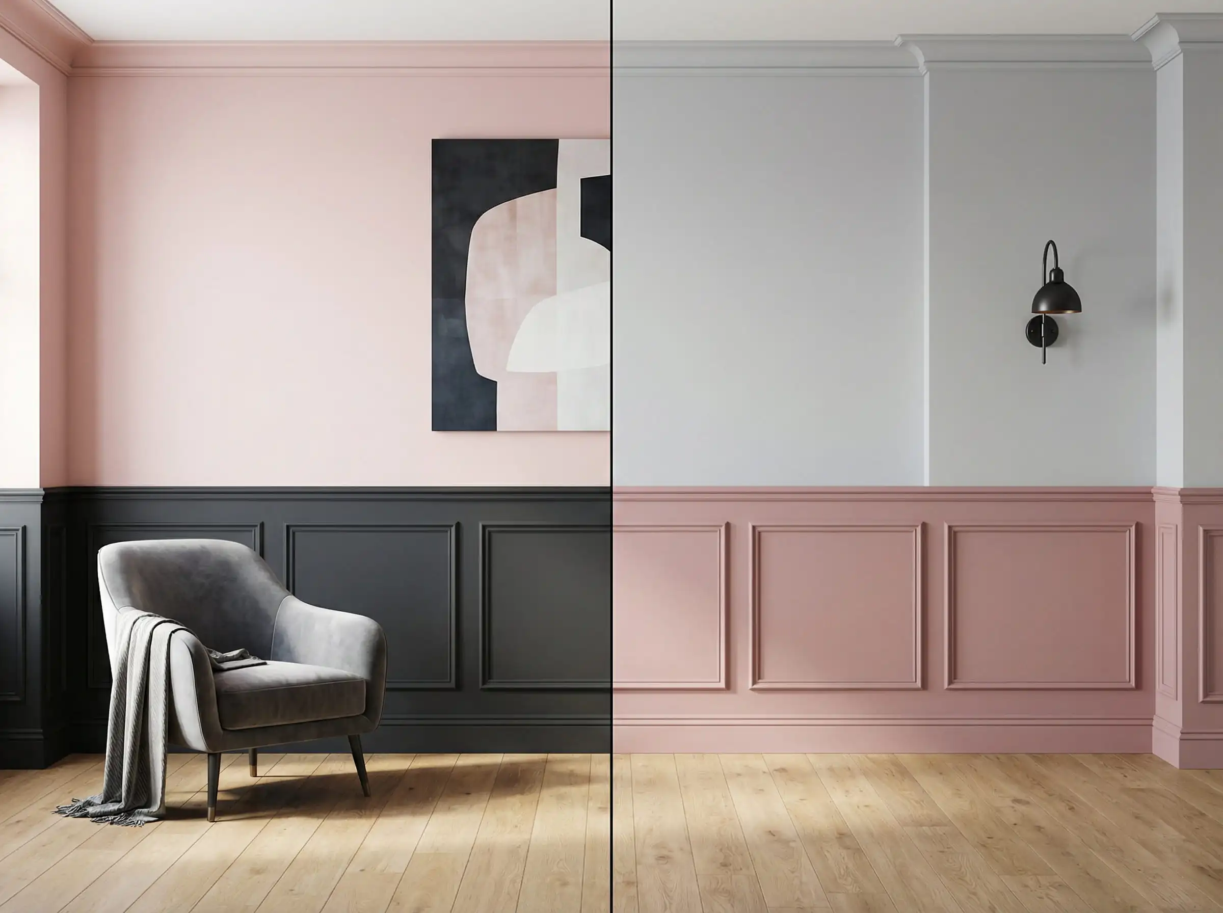
Can’t decide? Use a chair rail or dado rail. Paint the bottom half a practical, scuff-resistant dark gray (great for hiding marks) and the top half a light, airy blush pink to keep the ceiling feeling high.
10. Natural Wood Elements
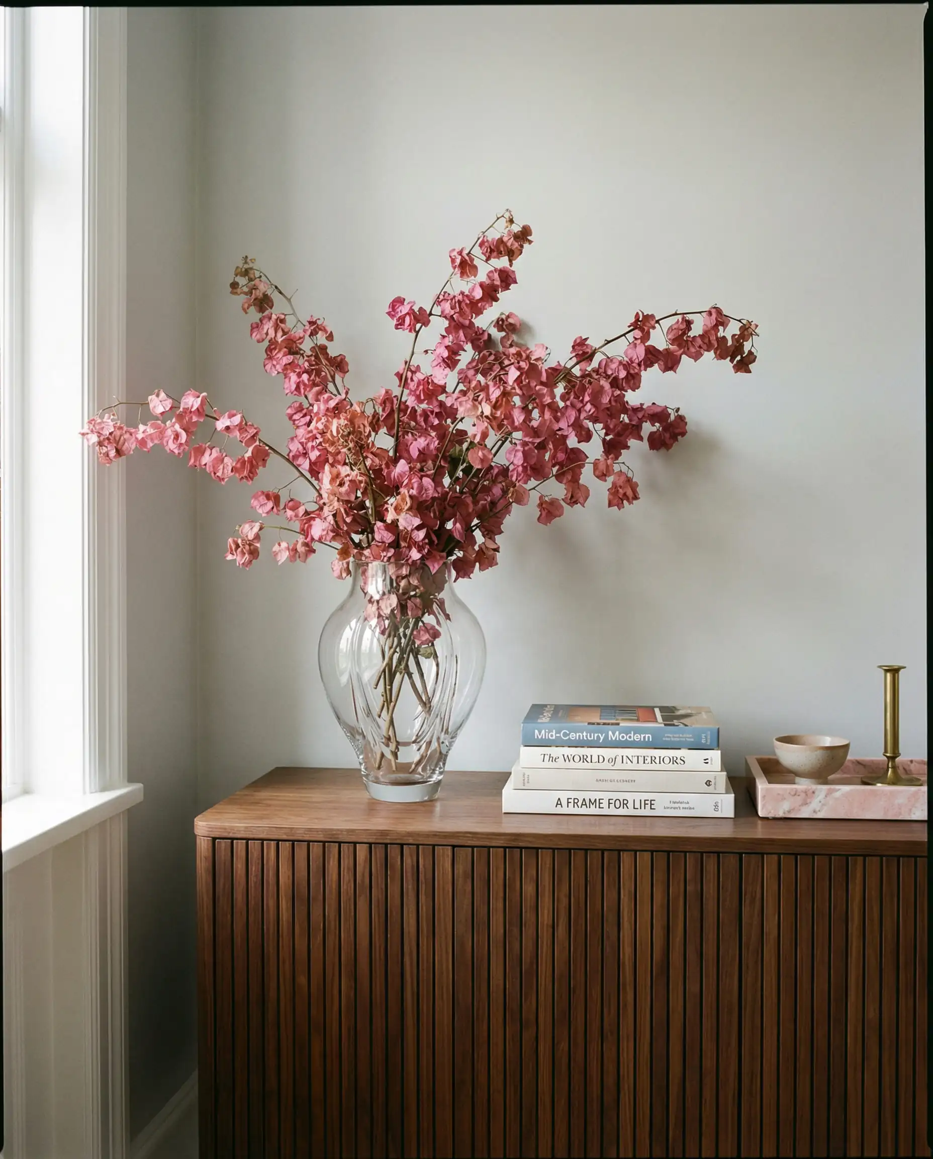
To stop a pink and gray room from feeling too “synthetic” or showroom-like, introduce wood. A walnut coffee table or oak sideboards bridge the gap between the two colors, adding warmth that harmonizes with both.
11. Dark Gray Curtains on Pink Walls
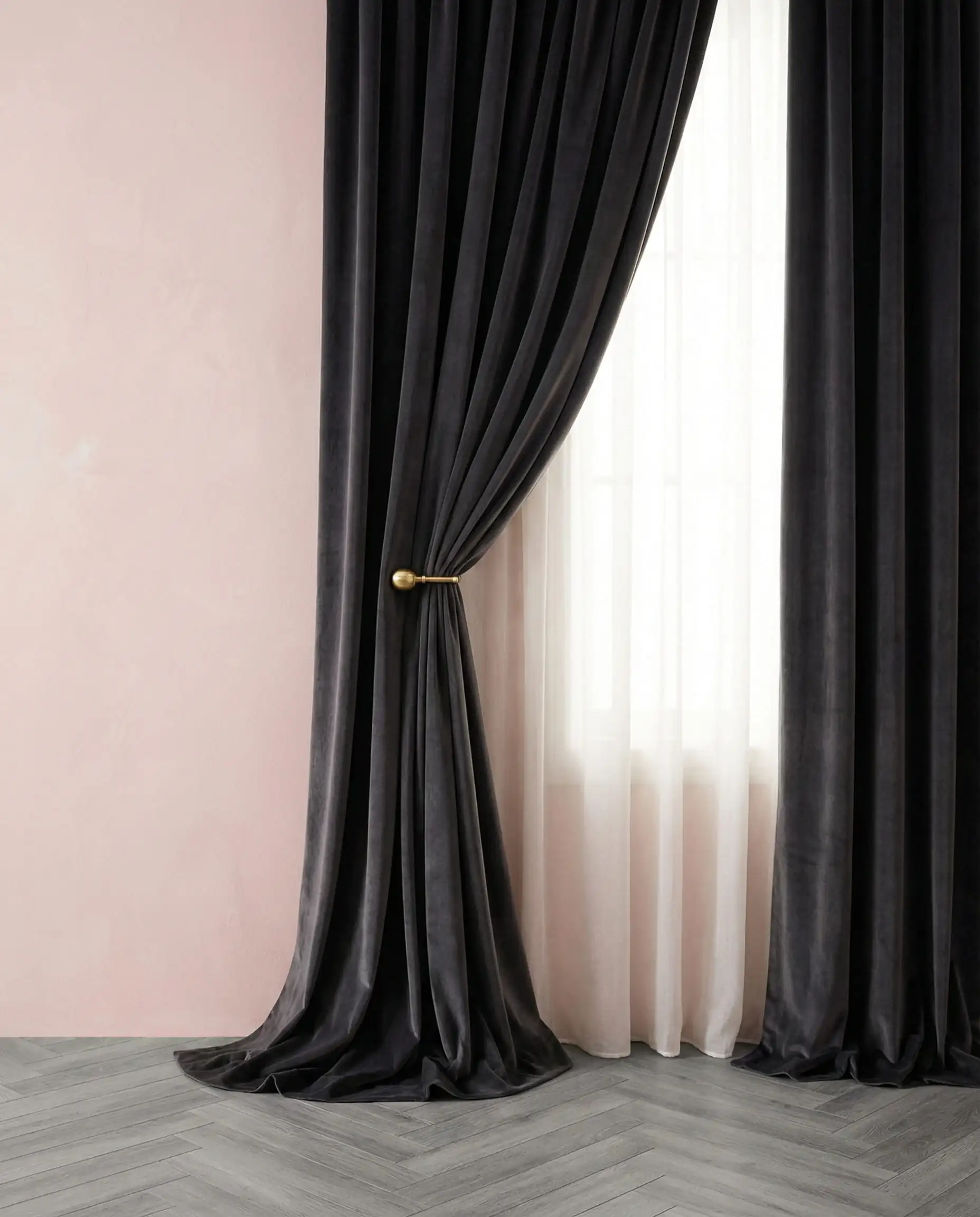
If you’ve been bold enough to paint your walls pink, ground them with heavy, floor-to-ceiling charcoal curtains. This vertical stripe of dark gray adds height and drama, preventing the pink from feeling too sugary.
12. Terrazzo Textures
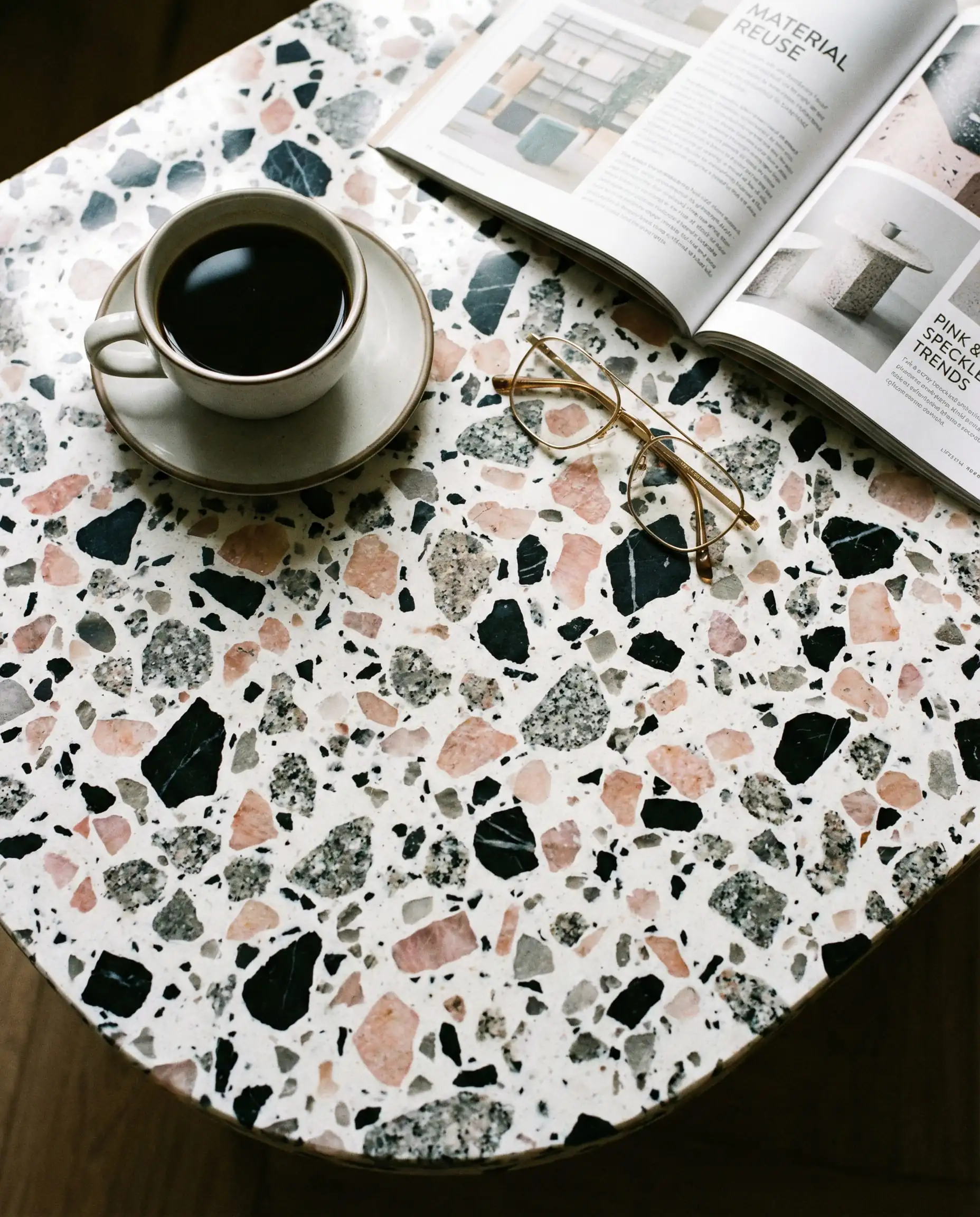
Terrazzo is having a major moment. Look for coffee tables or side tables with a terrazzo top that includes chips of both gray and pink. It’s a subtle way to unite the color palette through a material rather than just textiles.
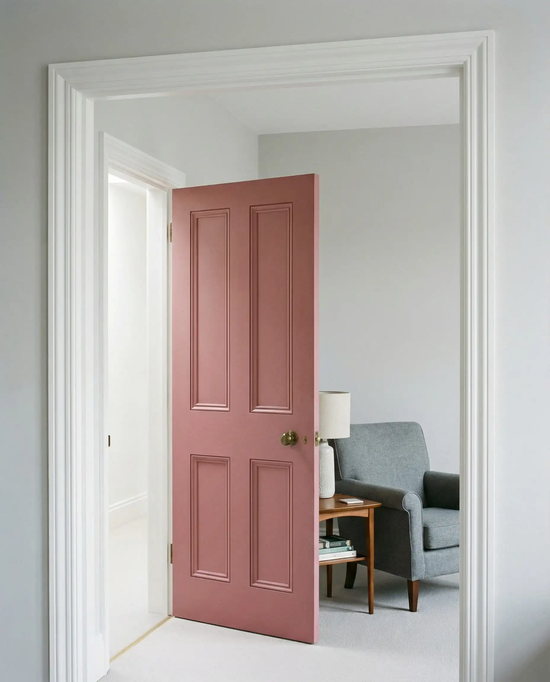
13. The “Feature” Door
Keep your walls white or pale gray, but paint your interior door a bold, dusty rose. It’s a low-risk commitment that adds a fun, architectural element to the living room.
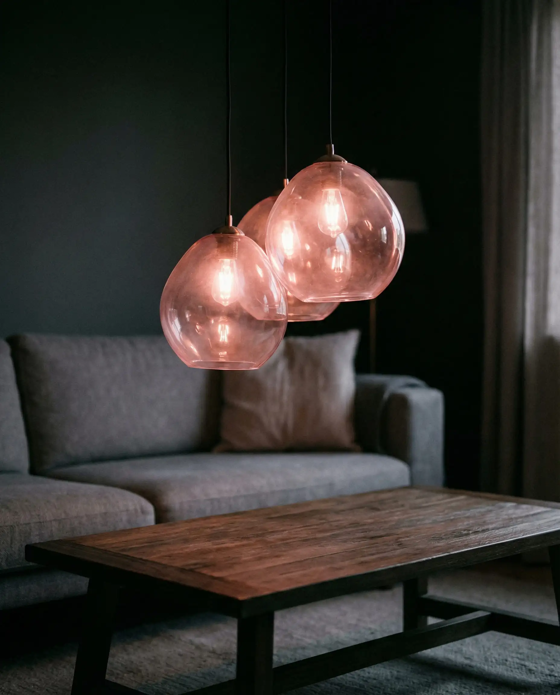
14. Blush Lighting Fixtures
Lighting is often overlooked as a color source. A pendant light with a pink glass shade casts a warm, flattering glow over the room in the evening, softening any cool gray tones in your furniture.
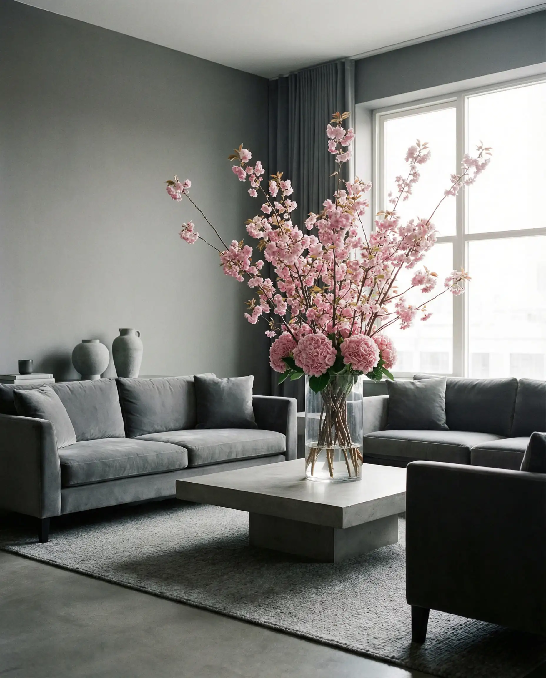
15. The Monochrome Gray Room with Pink Florals
Sometimes, the best pink accent is nature itself. A monochromatic gray living room can be brought to life simply by placing oversized vases filled with dried pampas grass (which is a natural beige-pink) or fresh pink hydrangeas.
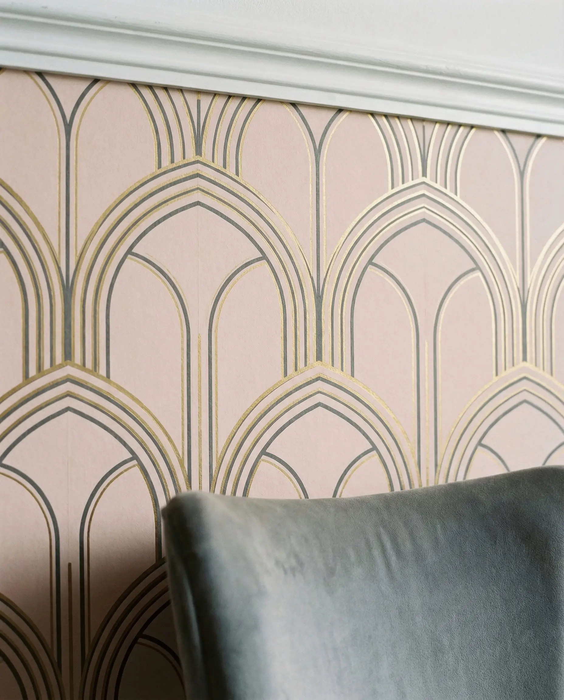
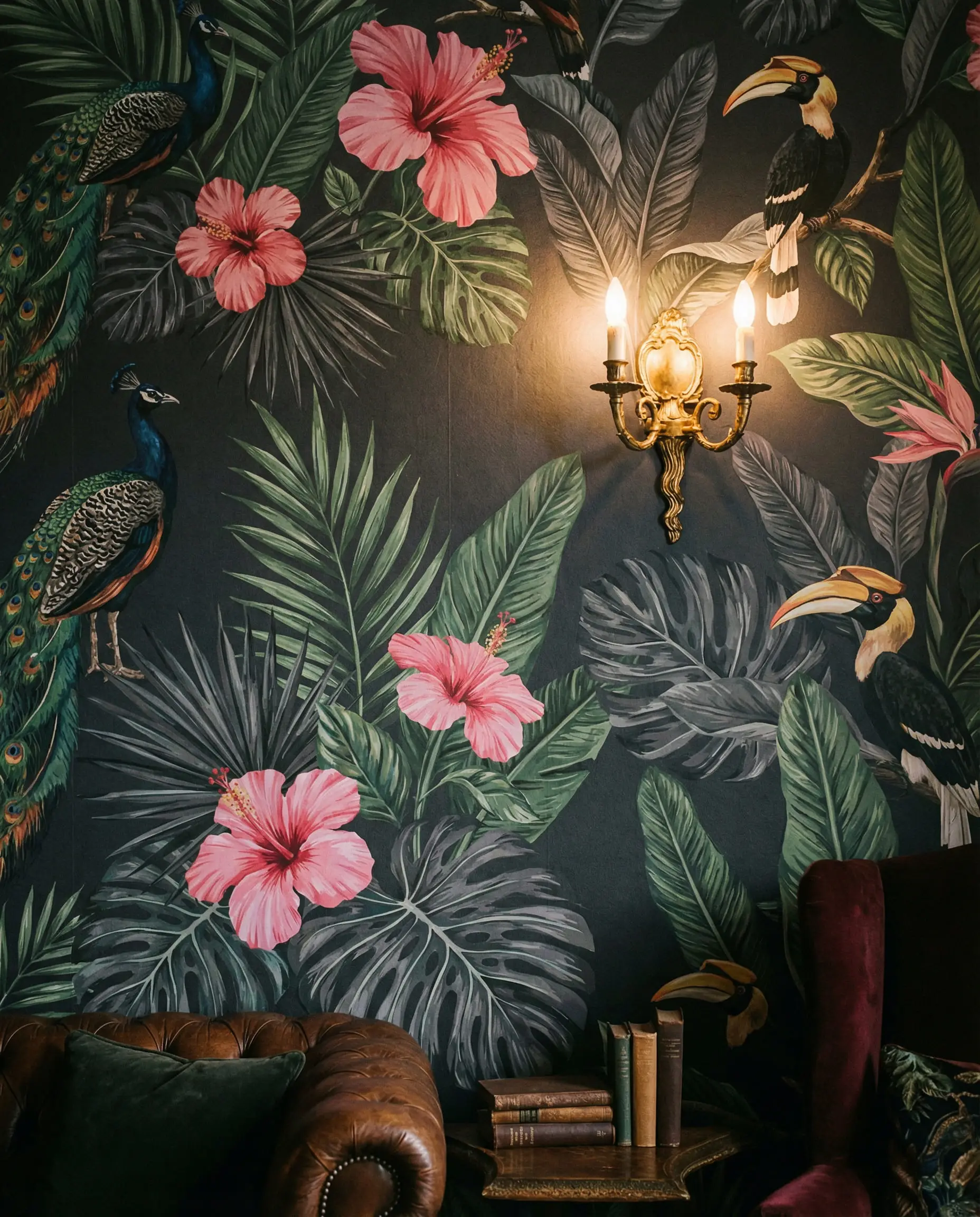
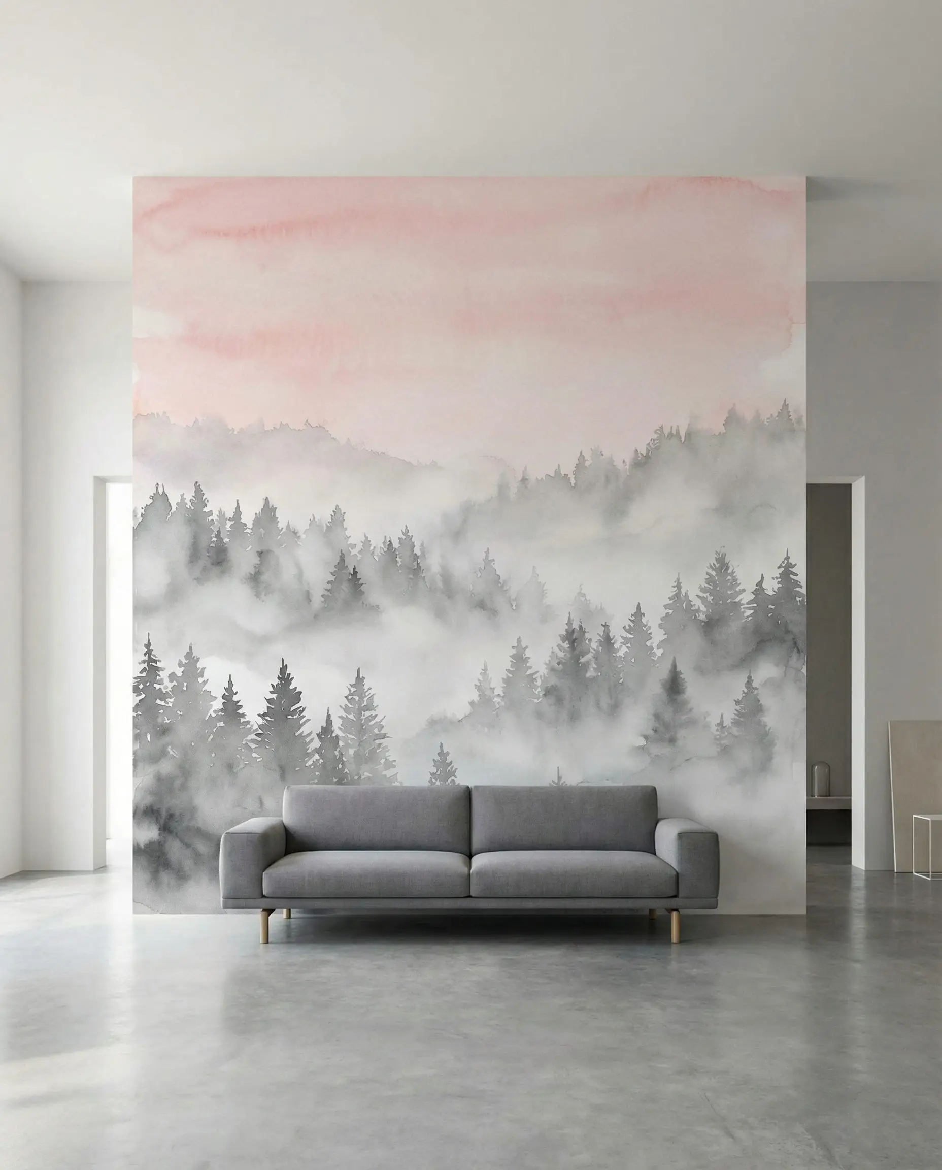
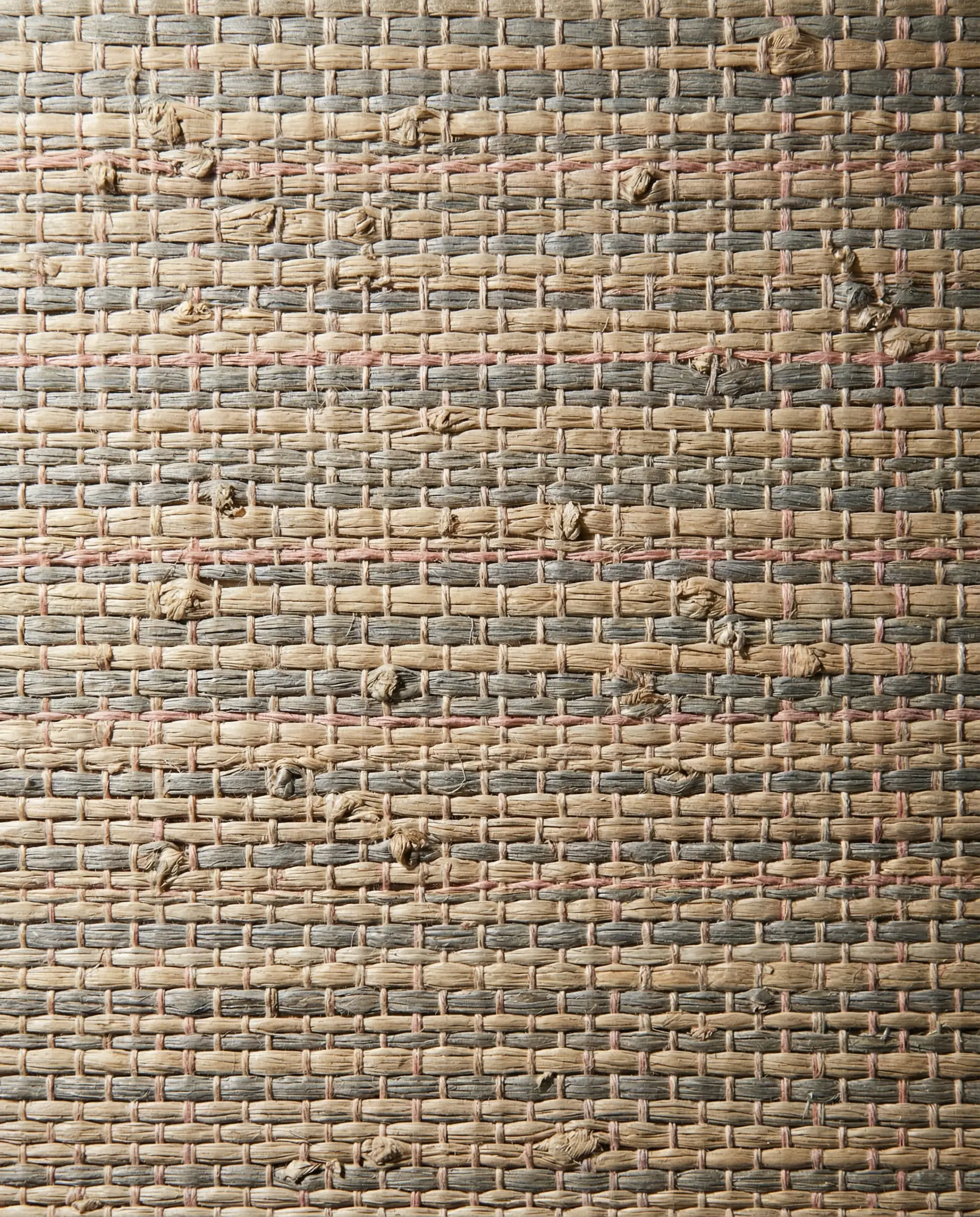
16. Patterned Wallpaper
Wallpaper is back. A subtle gray geometric wallpaper with a thin pink line running through it can add texture to a feature wall without overwhelming the space.
17. The Zoning Technique
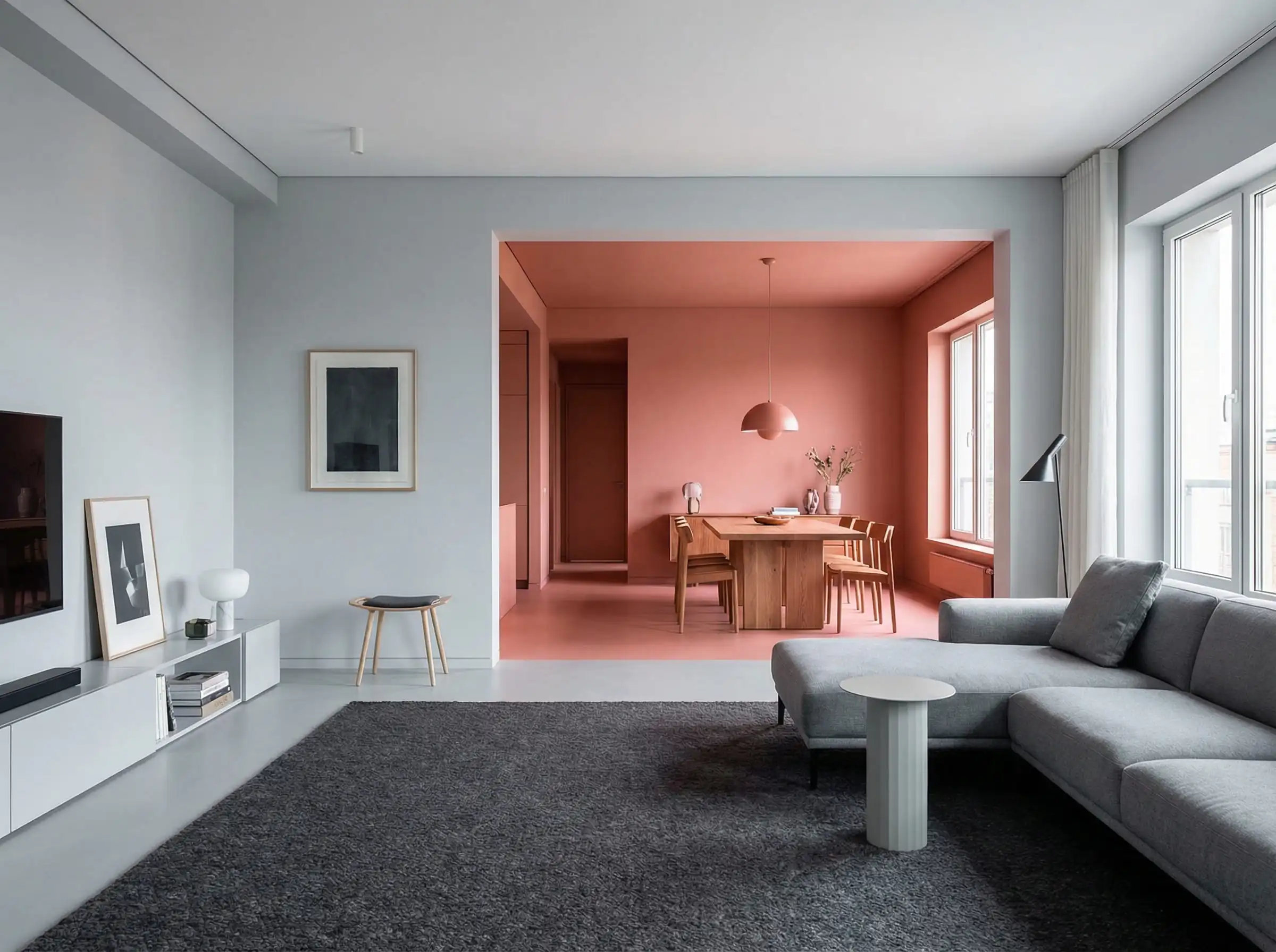
In open-plan living/dining areas, use color to define zones. Paint the living room zone a cozy gray and the dining nook a stimulating pink (which is known to aid appetite and conversation).
18. Pink ceiling, Gray Walls
Flip the script. Paint your walls a sophisticated gray and your ceiling a soft blush. This reflects warm light down into the room, making everyone’s skin tone look better!
19. Corduroy Textures
Velvet’s cooler cousin, corduroy, adds a retro 70s vibe. A gray corduroy armchair with a pink throw pillow feels vintage yet modern.

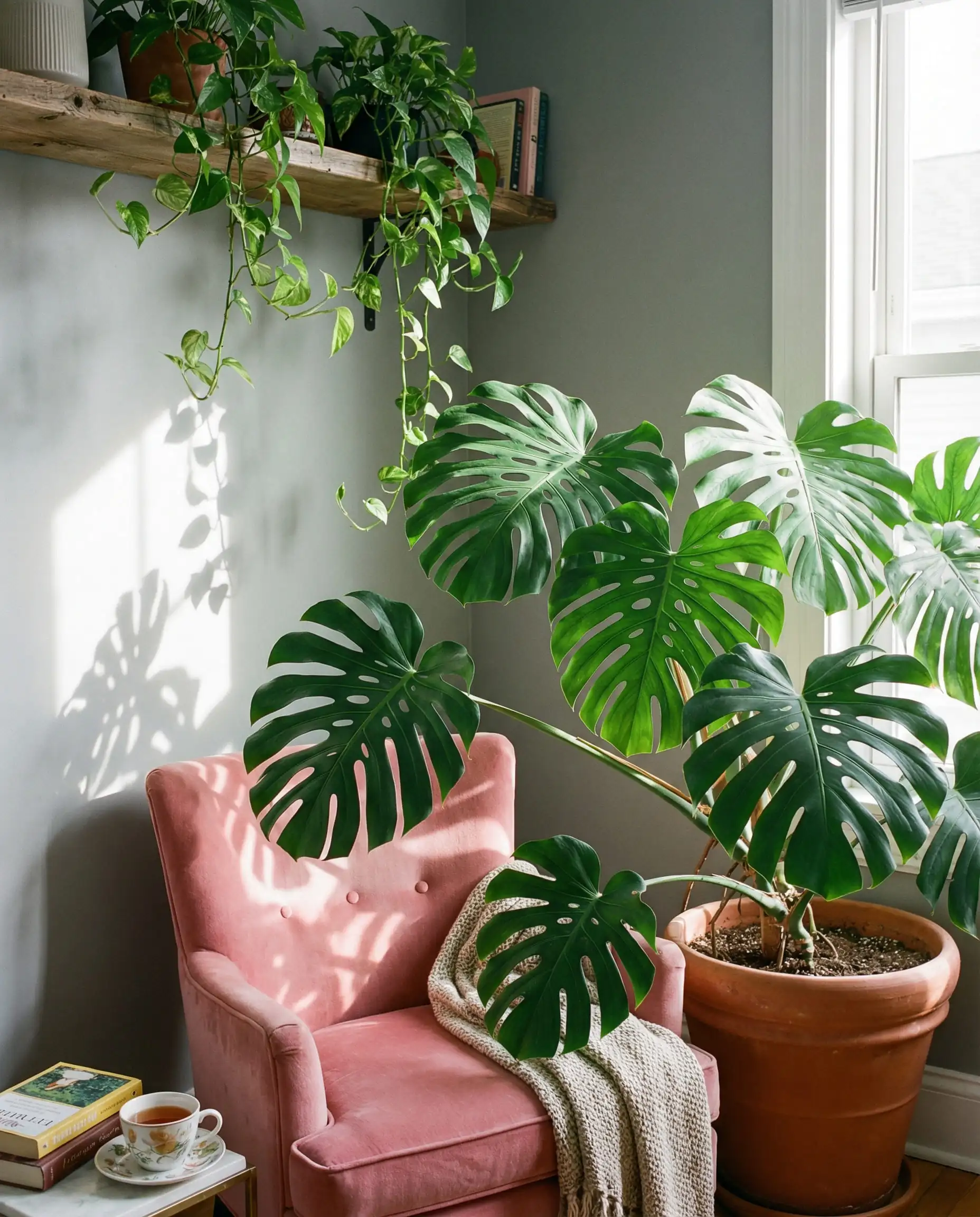
20. Biophilic Design
Plants are essential. The green of houseplants is the natural complementary color to pink’s red tones. A gray room with pink accents and lush green monsters looks vibrant and alive.
21. Black and White Accents
To prevent the room from looking “muddy,” ensure you have crisp black and white accents—like a white marble coffee table or black picture frames—to provide visual relief.
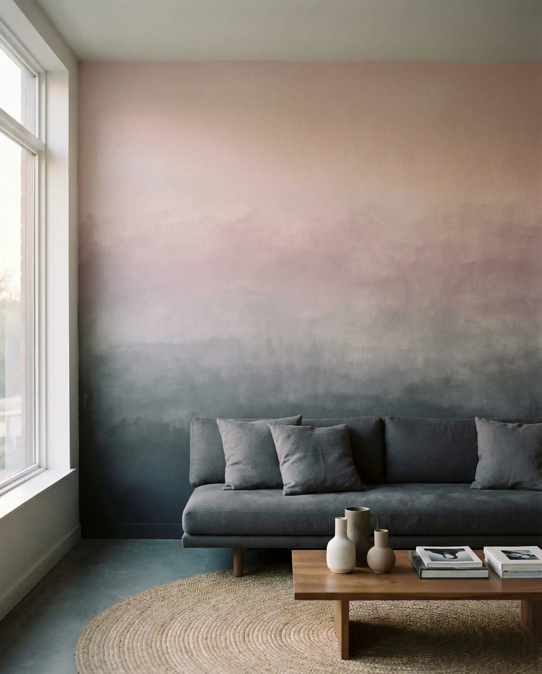
22. The Gradient Effect (Ombre)
For the artistic homeowner, an ombre wall that fades from dark gray at the bottom to blush pink at the top creates a dreamlike, ethereal quality.
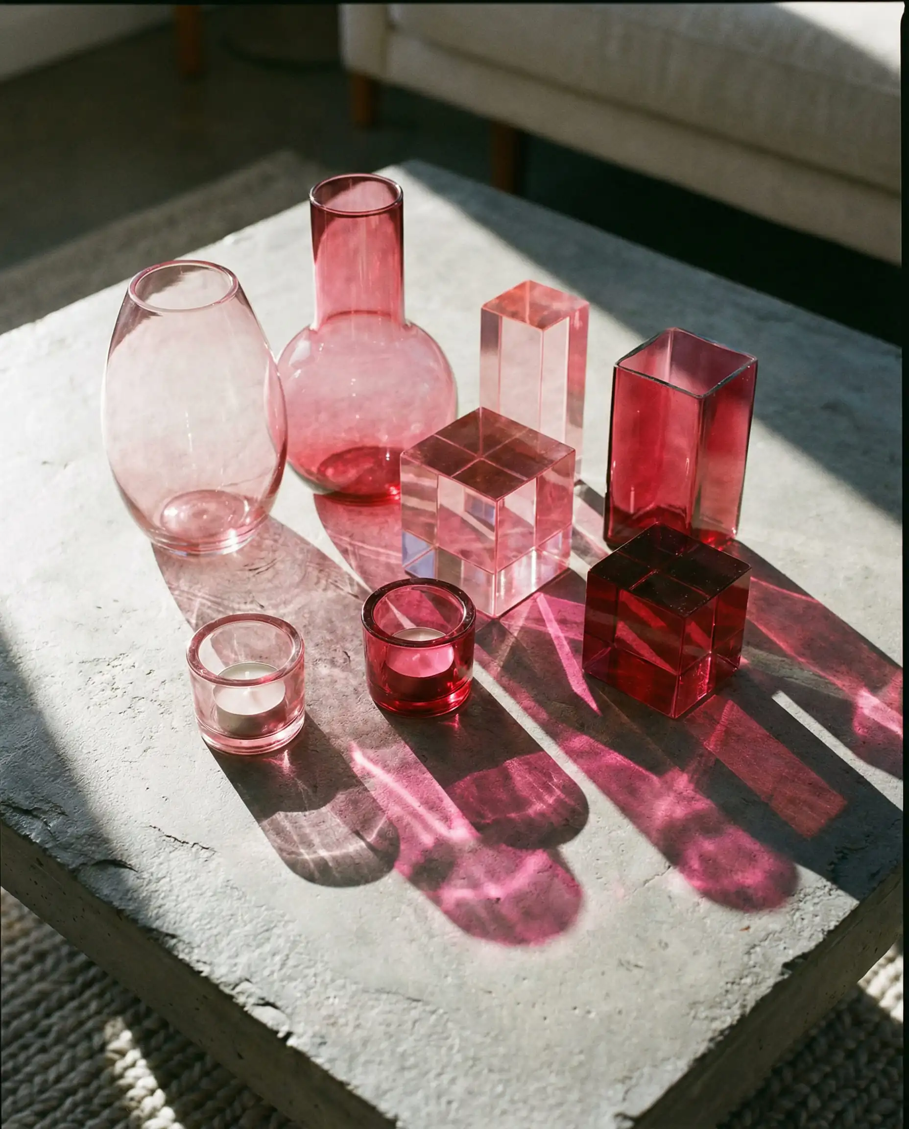
23. Colored Glassware
Style your coffee table with pink glass vases or candle holders. When the sunlight hits them, they project pink shadows onto gray surfaces, creating a dynamic, ever-changing piece of art.
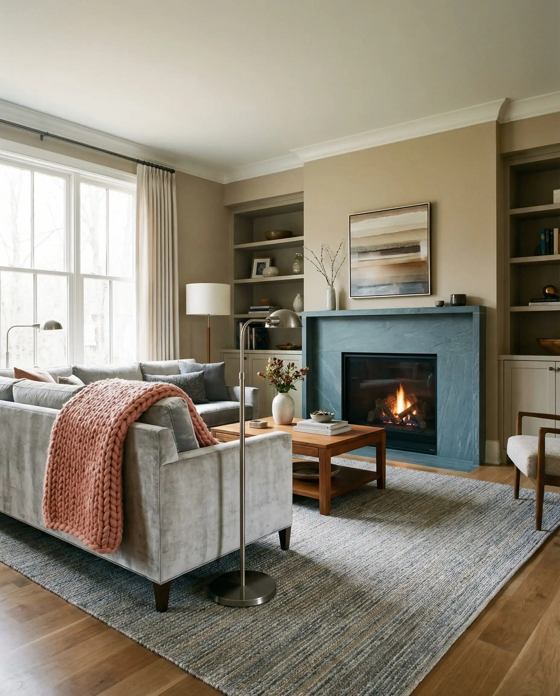
24. Mix Warm and Cool Grays
Don’t stick to just one gray. Layering a cool slate gray sofa with warm “greige” walls and a pink rug creates a rich, designer-level complexity.
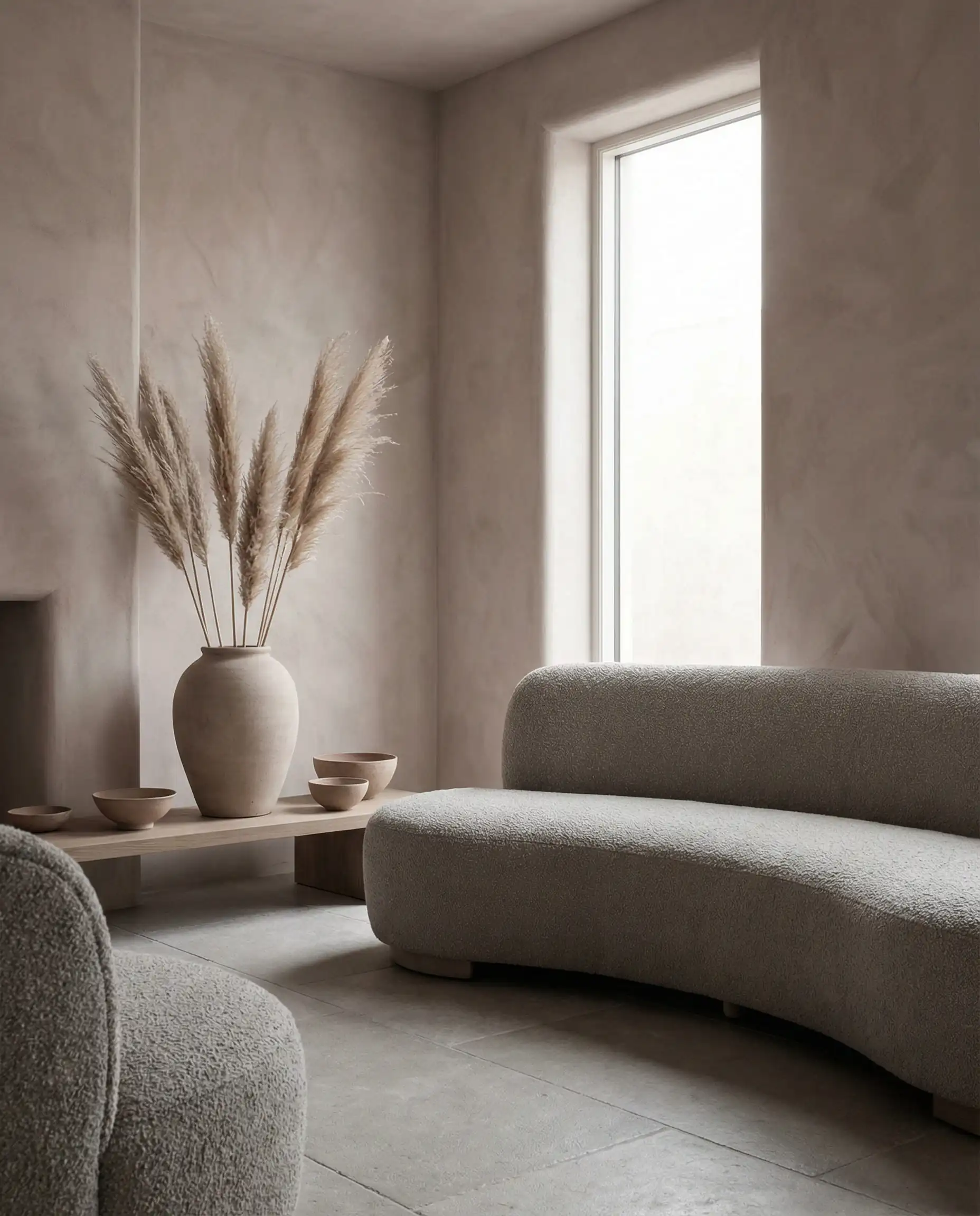
25. The “Nude” Pink
If “pink” scares you, opt for a nude or beige-pink. It acts almost like a neutral tan but brings that crucial warmth to a gray scheme that beige alone lacks.
Expert Advice: How to Choose the Right Shades
The biggest mistake people make is buying paint under the harsh fluorescent lights of a hardware store. Here is how the pros choose.
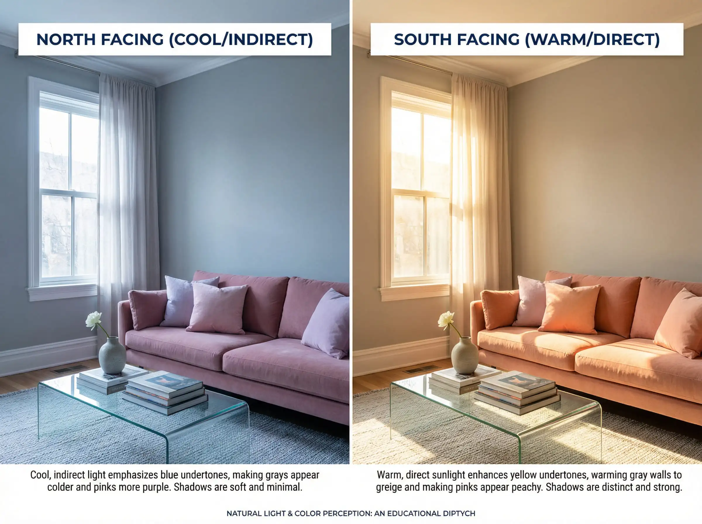
North-Facing vs. South-Facing Rooms
Light changes color.
The 60-30-10 Rule
To ensure balance, apply the classic design ratio:
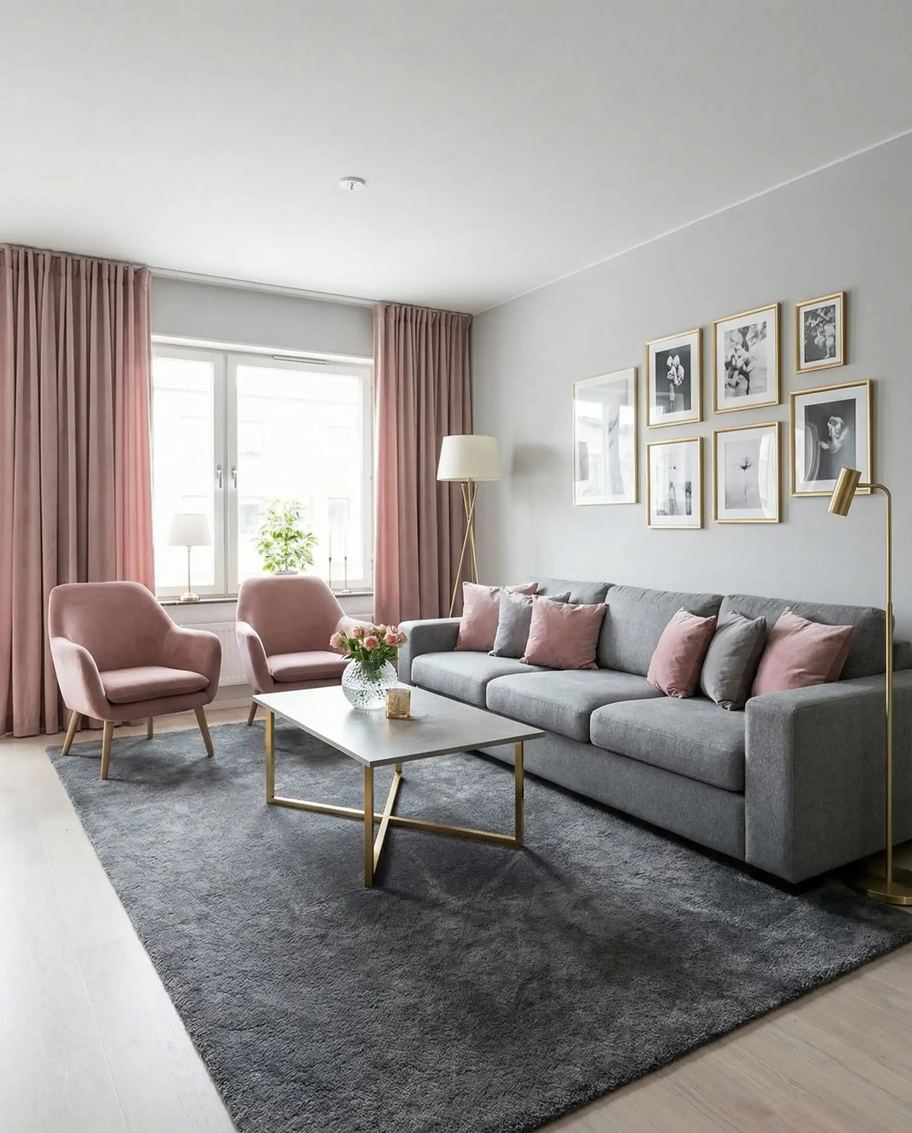
Don’t forget the “Fifth Wall”—the floor! If you have gray flooring, you might need a large rug to break up the color before adding gray furniture, or it will look like a concrete box.
Designer Tip 💡
The Best Paint Colors for 2026
We have analyzed the trends and dug through the catalogs to find the exact paint codes you need.
The Perfect Grays
Finding a gray that doesn’t look purple or blue is tough. Here are the winners for this year:
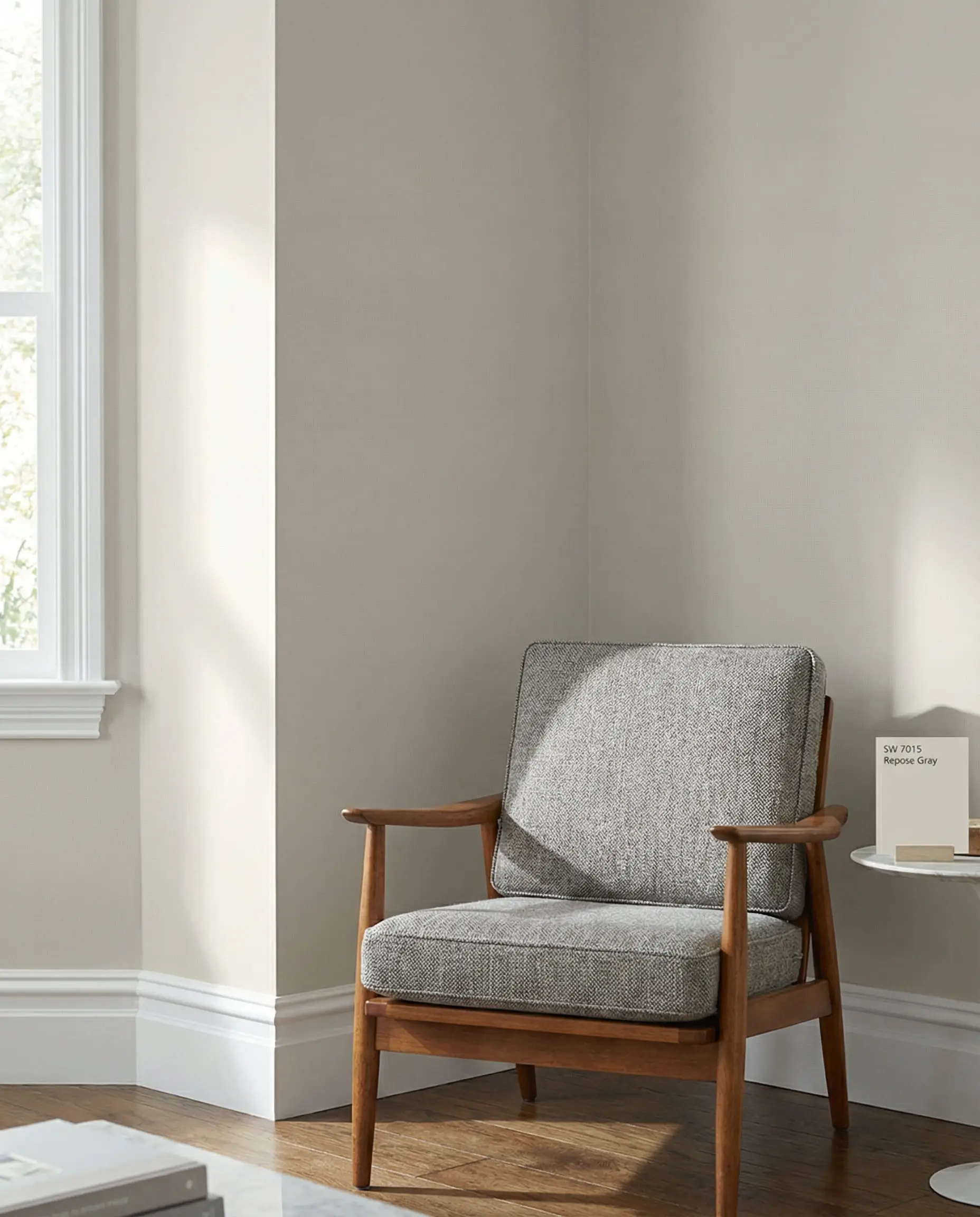
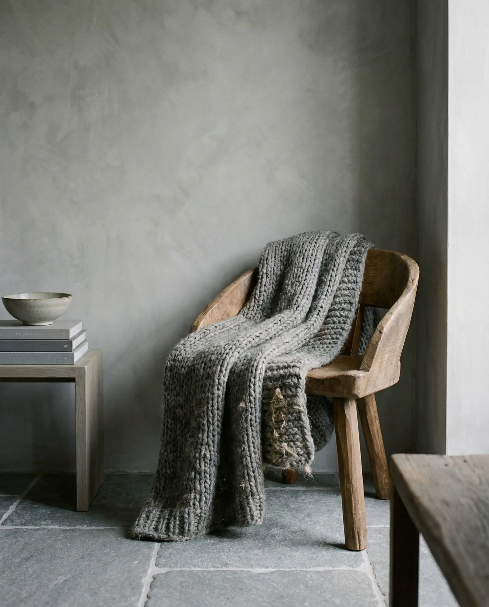
- Repose Gray (Sherwin Williams SW 7015): This is the holy grail of “greige.” It has a slight warmth that makes it perfect for living rooms, pairing beautifully with muddy pinks.
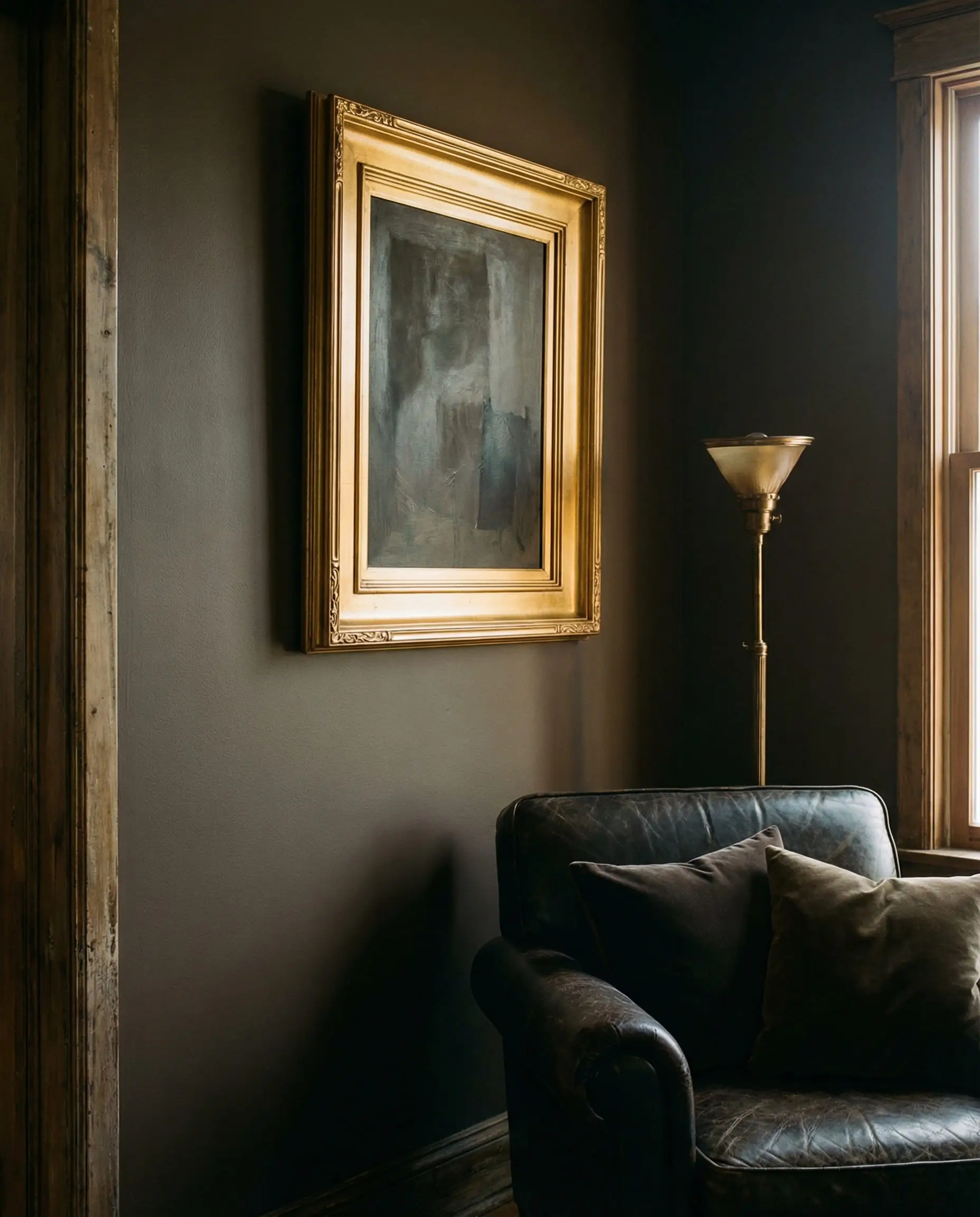
- Urbane Bronze (Sherwin Williams SW 7048): If you want that dramatic, moody look, this is your color. It’s a deep, brownish-gray that looks incredible with metallic accents.
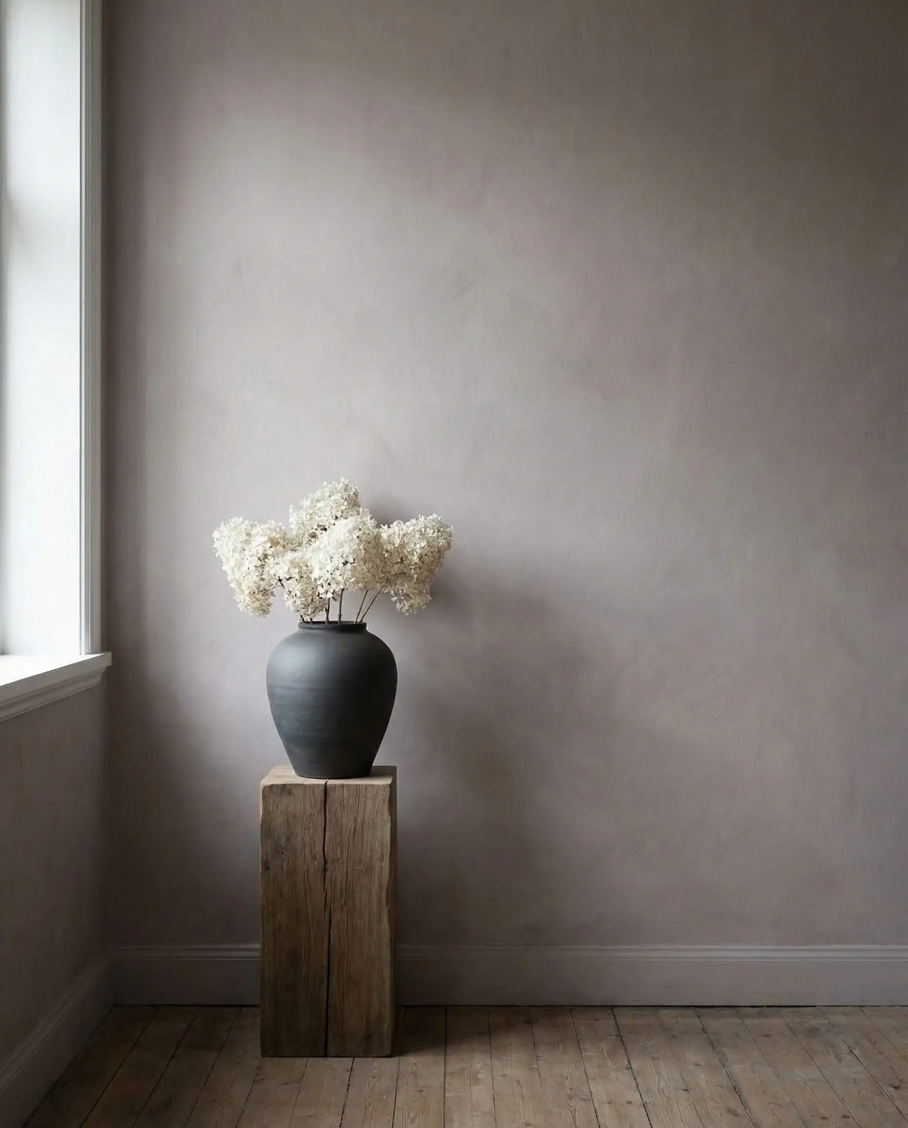
- Smokey Pink (Behr N150-2): Wait, this is a gray list? This color is a chameleon—a gray that leans heavily into pink. It’s perfect for a monochromatic look.
The Trending Pinks
We are avoiding “Barbie Pink” and leaning into sophistication.
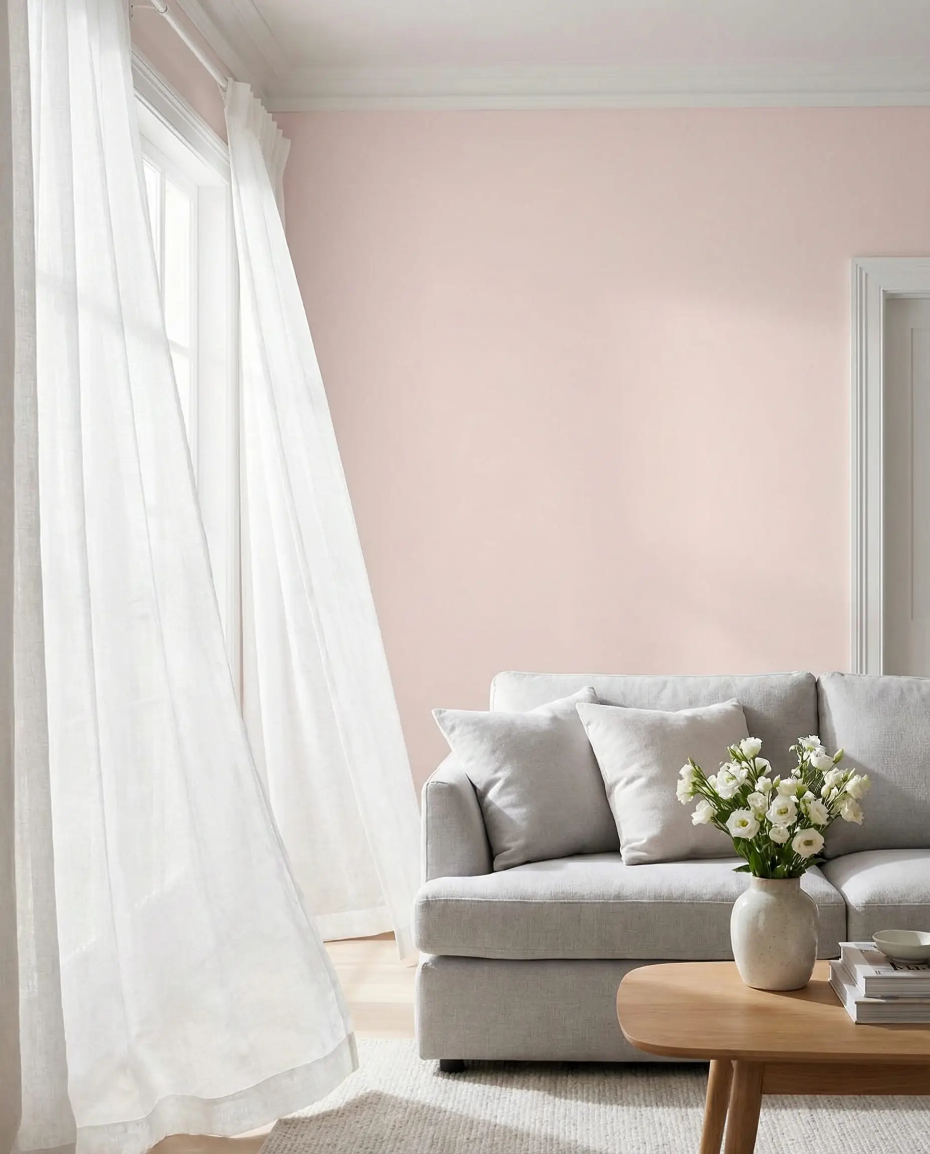
- Sweet Embrace (Dulux): A soft, approachable pink that acts almost like a neutral. It’s light enough to paint all four walls without overwhelming the eye.
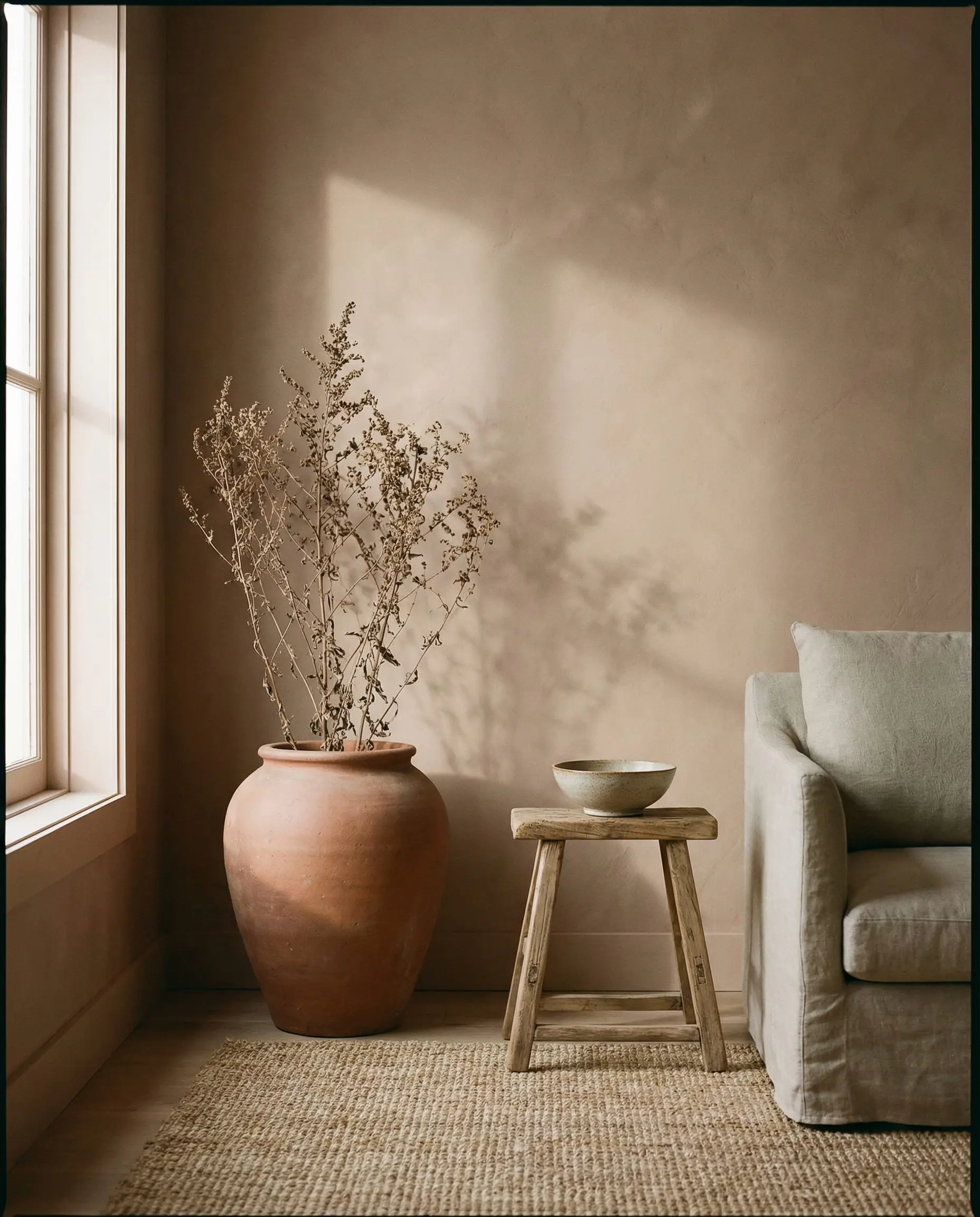
- Redend Point (Sherwin Williams SW 9081): This is an earthy, soulful blush-beige. It pairs exceptionally well with cool grays to warm them up.
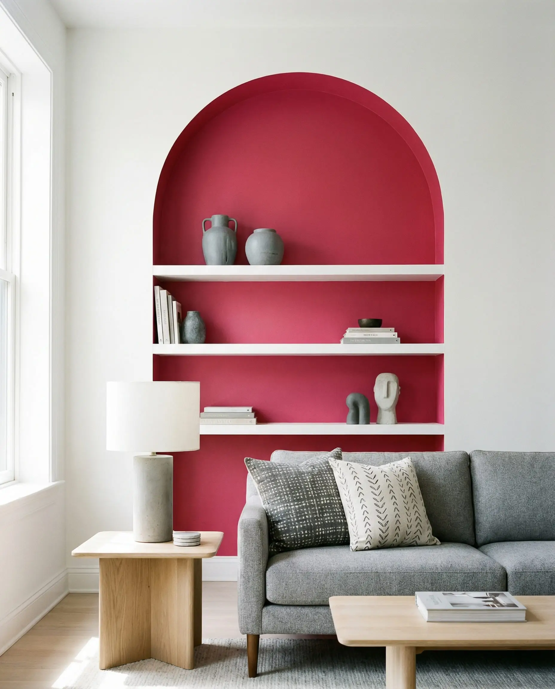
- Raspberry Blush (Benjamin Moore 2008-30): For those who want a pop of energy. Use this as an accent color (maybe inside a bookshelf or on a single piece of furniture) against a dark charcoal wall.
Frequently Asked Questions (FAQ)
A: Absolutely, provided you choose the right shades. The high-contrast “geometric” look is dated, but the “muddy,” organic, and textural combination of warm stone gray and plaster pink is a top interior design trend.
A: To make the look more mature, add Mustard Yellow, Emerald Green, or Teal. These deep, jewel tones bridge the gap between the soft pink and the neutral gray.
A: Avoid pastels. Choose pinks that have “brown” or “gray” in them (dusty rose, mauve, terracotta). Also, introduce sharp black lines (frames, lamp bases) to give the room definition and edge.
Conclusion
The pink and gray living room has evolved. It’s no longer just about color contrast; it’s about creating a feeling—moody, organic, or serene. By focusing on texture, lighting, and the right “grown-up” paint shades, you can create a space that feels curated and high-end.
Start small if you need to—perhaps a gray velvet cushion on a pink armchair, or a new rug. See how the light in your room interacts with the colors, and then build from there.
What’s your favorite combination? Are you Team Moody (Charcoal & Rose) or Team Scandi (Pale Gray & Blush)? Let us know in the comments or tag us in your makeover photos!