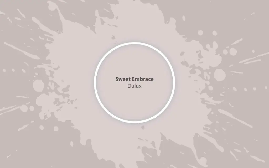
Sweet Embrace
DuluxThe color of the year 2024, a feathery pastel pink that nurtures our need of belonging and enhances the feeling of home.
Paint Technical Profile
| HEX Code | #dbcfcd |
| Light Reflectance (LRV) | 64 |
| Use | Interior, Exterior |
Sweet Embrace (Dulux): What Color Is, Review, and Use
The uncertain times we live in and the desire to belong have determined trendsetters that worked for Dulux’s 2024 color forecast to name Sweet Embrace, a pale shade of delicate and optimistic pink, the color of the year. Moreover, colorists predict softer pinks will replace last year’s trending rich pinks. Inspired more by the concept of “home sweet home,” this delightful pink tone from Dulux seems like the warm embrace we are all craving. The story behind Sweet Embrace by Dulux will make you fall in love with it even more. Let’s dwell in the world of peaceful and nurturing pinks!
Sweet Embrace Paint Color Features
“Like a whisper of reassurance in a moment of stress, it has a visual softness that calms the senses and creates an atmosphere of serenity,” says Dulux’s creative director, Marianne Shillingford. Sweet Embrace is a mid-tone to light pastel pink that teaches us to care for our well-being and show care towards our dear ones.
Since the new design season promises more light pastels and neutrals full of character, it is worth paying attention to this unmatchable pale pink. Feel safe and at peace at home when surrounded by this gorgeous shade of nurturing pink “inspired by the softness of feathers and evening clouds.”
Sweet Embrace: Is It Warm or Cold?
While staying true to its slightly neutral personality, the color of the year at Dulux still feels warm, the kind of warmth you feel when sharing and receiving love and compassion. Even the RGB value, used to determine how warm or cold a color is, shows a more significant amount of red, which makes it a warm color.
How Does Lighting Affect Sweet Embrace?
Sweet Embrace is one of these colors that reveal various upper veils under different lighting conditions. We should expect a more neutral pink in the morning, a blush pastel shade when bathed in sun rays, and a violet pink in the evening. Still, exposure has its say in this regard. In north-facing rooms, this pink feels relatively paler; a subtle gray note may come to the surface. On the other hand, a warmer, sun-kissed, or even violet-pigmented pink reveals itself in spaces with south-facing windows. The latter also applies to rooms with eastern exposure in the morning and western in the evening.
Sweet Embrace LRV
Before using a particular paint color in your home, make sure to check out its Light Reflectance Value, showing how dark or light a shade is, depending on how much light it reflects. Sweet Embrace has an LRV of approximately 64. It stands out as a light mid-tone shade on a scale from 0 (black) to 100 (white). In plain words, the beloved pink shade from the giant brand is a skillful color for reflecting light in a room and making it feel spacious and well-lit.
Sweet Embrace Undertones
We all know Sweet Embrace is a blush pastel. Yet, there is more to this pink. If we were to analyze this color carefully, we would notice a subtle gray tinge that paves its way to the surface, especially when bathed in cold natural light. Lighting is indeed essential. Under warm lighting conditions, we can notice the fading yellowish-violet undertone, bringing this color to a true warm pink.
Similar Colors
Are you acquainted with the term “millennial pink”? In a few words, pink has been popular for several years, if not decades, and homeowners, together with designers, cannot get tired of this mainstream color. Undoubtedly, you can find alternatives to any shade of pink at renowned brands, and Sweet Embrace is no exception. If, for one reason or another, you are searching for Dulux’s Sweet Embrace similar colors, you know where to find them.
Coordinating Colors
When naming Sweet Embrace the color of the year, trendsetters at Dulux came up with three color palettes to complement the soft and nurturing pink. They started with three defining trends – search for belonging, peace of mind, and moments of joy, resulting in three color stories: warm, calm, and uplifting. Explore the color palettes on Dulux’s website.
Still, here are a few designer-choice matching colors to pair with Sweet Embrace for both monochromatic and contrasting color codes:
Use of Sweet Embrace in the Interior
According to Dulux colorists, Sweet Embrace is a great standalone color, while using it as a canvas for new colorful palettes seems no less stylish. Allow yourself the liberty to decorate any room with this caring shade of pink. Get to know comfort and peace with Sweet Embrace through the following design ideas!
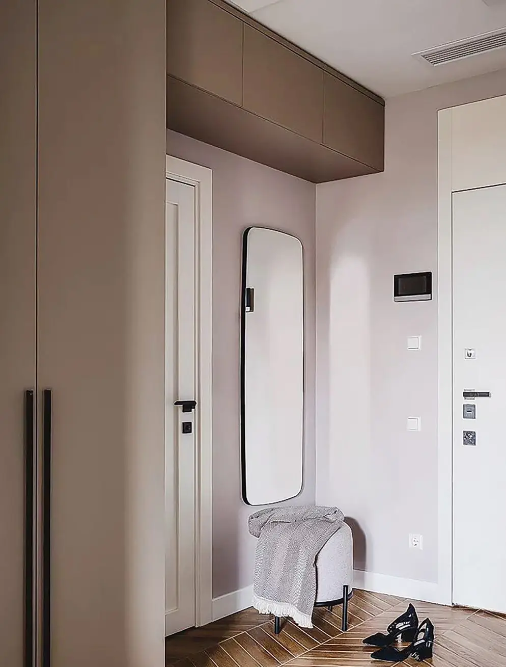
Reinterpreted Minimalism
Does the return of light neutrals draw our attention to the comeback of Minimalism? Maybe, yet it will definitely not be the same. If you are a true amateur of sleek and monochromatic design solutions, you should absolutely try updated minimalism. Instead of simplistic neutrals, use pastels full of personality, such as Sweet Embrace. Pair the color of the year with light wood, white, or occasional houseplant green splashes.
“Ombre” Effect
Dulux experts put a gorgeous wall design at our disposal. Think out of the box and opt for color-flow walls in your living room, dining room, or home office. Make it a source of inspiration or a conversation starter. You can pair Sweet Embrace with any shade from the earlier-mentioned color palettes. If you decide to dive into a tiny DIY project, check out Dulux’s step-by-step on how to paint a color flow wall with the color of the year.
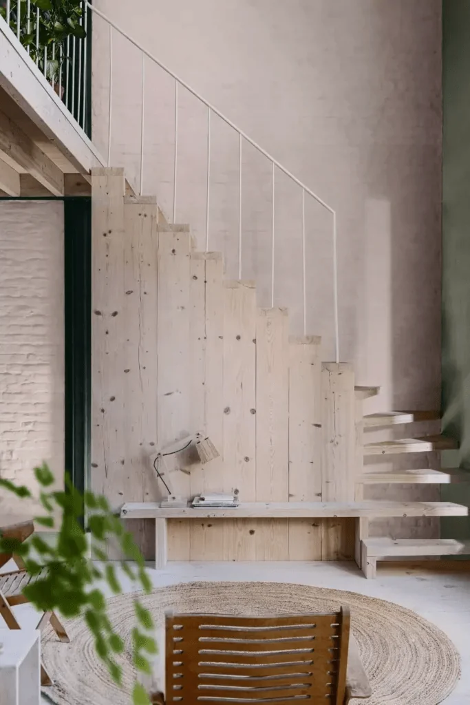
Living Room
The popularity of eclectic design solutions led to a range of bold colors that contrast the timeless neutral tones. Still, if you don’t resonate with either of the extremes, stop in between and opt for the emerging light neutrals, such as Sweet Embrace. Rebalance calmness and make your home feel like home by painting the walls pink in the room where you spend most of your time with your dear ones. Enjoy the diversity of color palettes created by pairing pink with earthy shades, greens, blues, and pastels.
Bedroom
It’s time to restore your peace of mind by surrounding yourself with the calmest and most nurturing pink shade. Paint the bedroom walls all pastel pink, or opt for one of the mentioned color palettes with Sweet Embrace – calm, warm, or uplifting, depending on your taste. Allow this delicate pink shade to transform your sleeping space into an escape from the daily routine and the outside world.
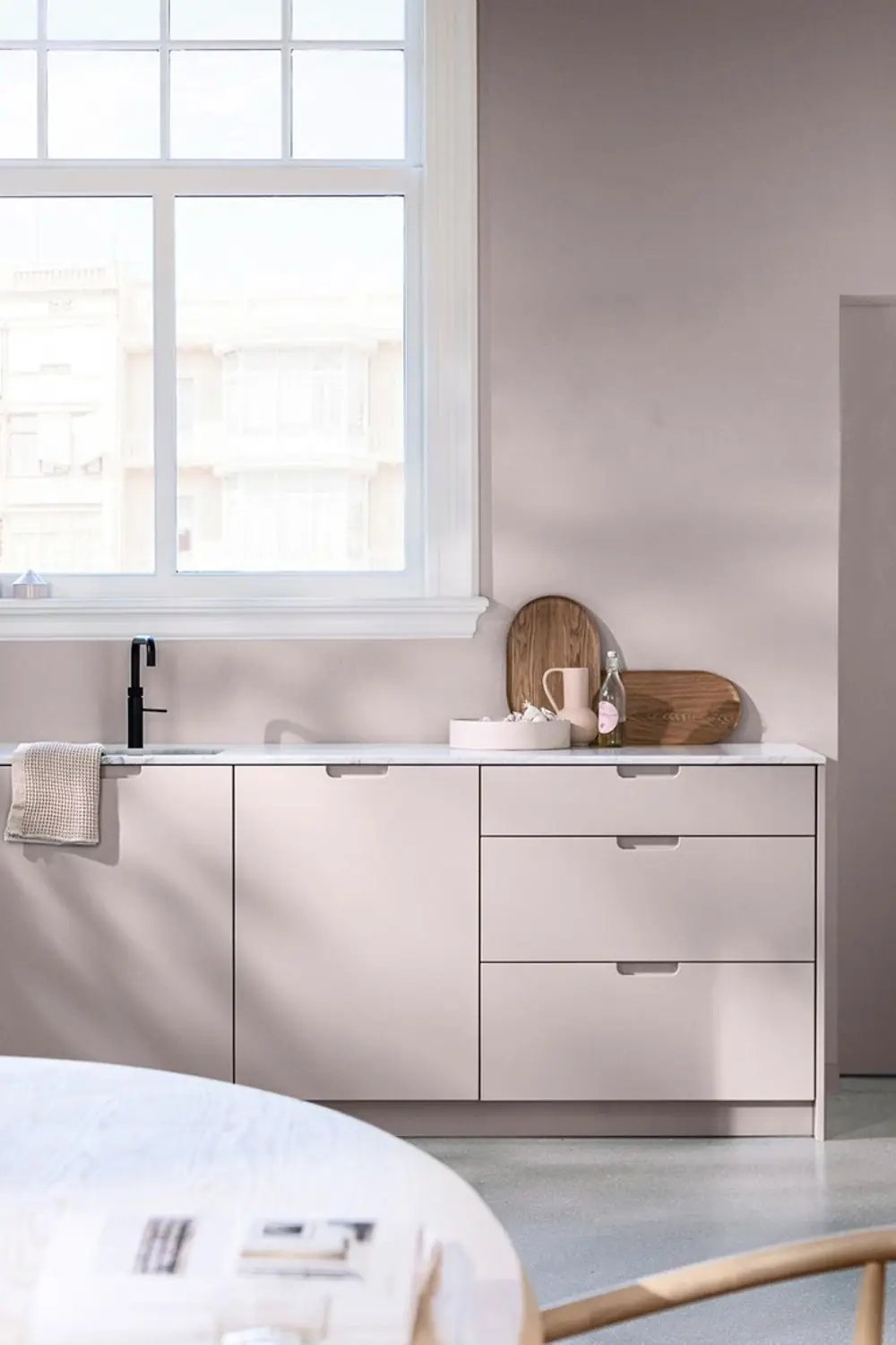
Kitchen and Dining Room
We have been working with paint color trends lately and discovered the return of pastels on designers’ list of favorites. Take on the challenge and consider a pastel color palette for your kitchen and dining room this season. They will bring you joy for more than one year as part of trends. Sweet Embrace can become your new favorite cabinet or wall paint color. Moreover, decorators recommend considering this pastel pink on brick or unevenly finished walls.
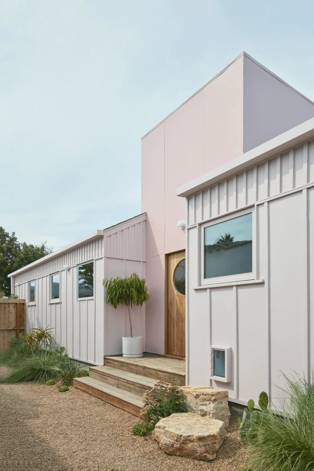
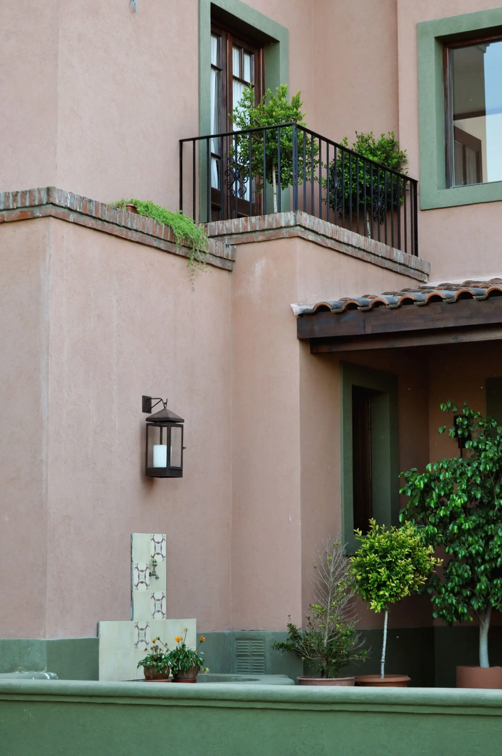
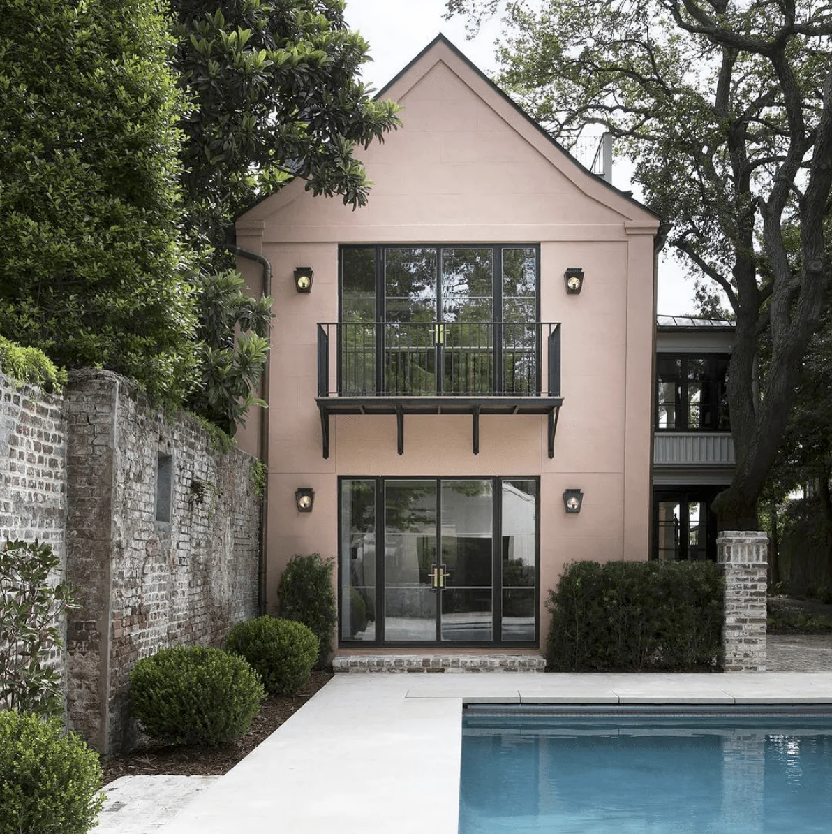
Use of Sweet Embrace for the Exterior
That’s the magic of Sweet Embrace – it won’t fade in direct sunlight since it’s not just any neutral color. Sweet Embrace is a new-generation neutral – a gorgeous pastel that adds curb appeal to houses. Be it the front door or the exterior walls – your house exterior won’t look too barbiecore. On the contrary, this delicate pink will add charm in the most confident and stately way.
Dulux’s Sweet Embrace paint color was created out of the need to nurture our desire for peace, comfort, and security. That’s why colorists expect it to be mainstream among decorators and homeowners. Be among the first to use this trendy pastel pink for your interior or exterior design, but mostly, enjoy the sweet feeling of belonging when surrounded by this color.