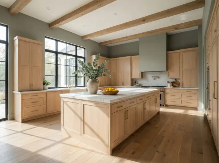
There is a reason maple wood cabinets were the darling of the 2000s and are seeing a massive resurgence today. Maple is durable, smooth, and possesses a natural warmth that makes a kitchen or living space feel essentially homey.
But if you are here, you’ve likely encountered the “Maple Dilemma.”
As maple wood ages, it deepens. That subtle honey finish you loved ten years ago might now lean heavily into orange, amber, or yellow territory. The result? That cool gray paint you saw on Pinterest makes your expensive cabinets look dated, and bright white walls can make them look surprisingly dingy.
The good news is that you don’t need to paint over your beautiful wood to modernize your space. You just need the right wall color to bridge the gap.
In 2026, the interior design world has shifted away from sterile cool tones toward biophilic greens, creamy off-whites, and moody contrasts. These colors embrace the warmth of maple rather than fighting it.
In this guide, we’re breaking down the science of maple undertones, the specific paint codes you need to test, and the exact strategies designers use to make wood cabinets look fresh and modern.
In a Hurry? Here is the Quick Answer (Featured Snippet)
The best paint colors for maple wood cabinets in 2026 are warm off-whites, earthy greens, and warm greiges. These shades harmonize with the wood’s natural honey and amber tones rather than clashing with them.
The Golden Rule: Avoid “cool” grays (icy/blue undertones) and yellow paints. Stick to colors with warm or earthy undertones to bridge the gap with the wood.
The Science: Understanding Maple Wood Undertones
Before we open a single paint can, we need to talk about color theory. Skipping this step is the number one reason DIY paint jobs fail.
Maple wood is unique. Unlike oak (which often has heavy grain and brown undertones) or walnut (which is cool and dark), maple is warm and light. Most maple cabinets fall into one of two categories:
- Natural/Clear Maple: Light blonde with subtle yellow undertones.
- Honey/Spice Maple: Deeper, richer tones with distinct orange or reddish-amber undertones.
The Two Strategies for Matching Paint
When choosing a wall color, you have two strategic paths:
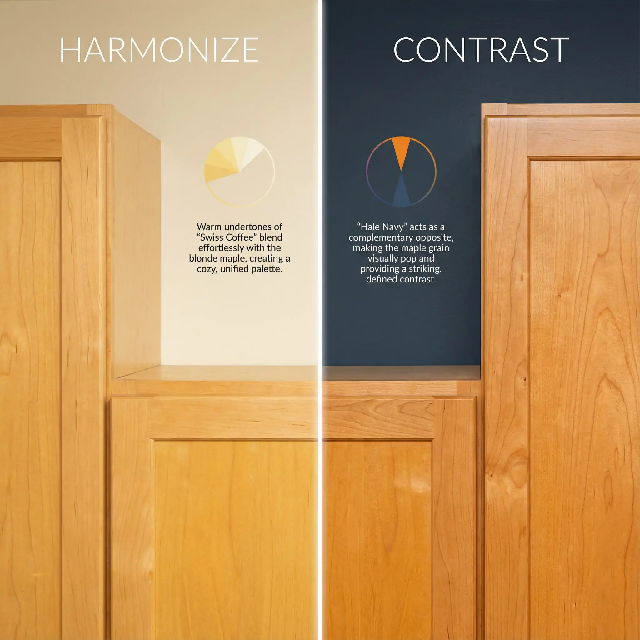
If your goal is to make your kitchen look larger and brighter, go with Strategy A (Harmonize). If you want your kitchen to look “designed” and modern, go with Strategy B (Contrast) using the trending greens of 2026.
Hackrea Verdict
1. The Best White & Cream Paints (The “Safe” Choice)
Best for: Scandi-style kitchens, small spaces, and modernizing honey oak.
For years, homeowners tried to pair stark, printer-paper white with maple. The result? The walls looked blueish, and the cabinets looked essentially orange. To make white work with maple, you need warmth. You need off-whites with yellow or beige undertones that bridge the gap between the wall and the wood.
Benjamin Moore Swiss Coffee (OC-45)
This is arguably the most famous white paint in the interior design world for a reason. Swiss Coffee is not a pure white; it is a soft, creamy white with subtle yellow/green undertones.
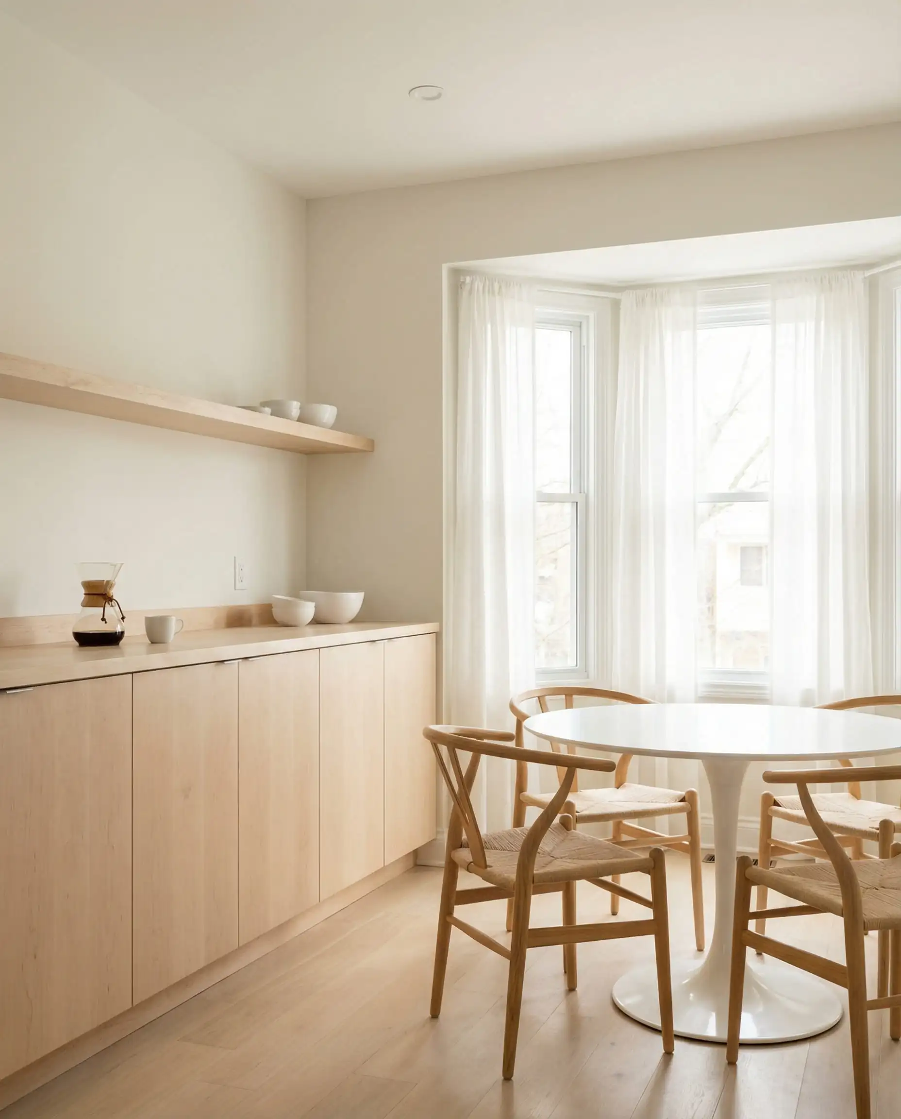
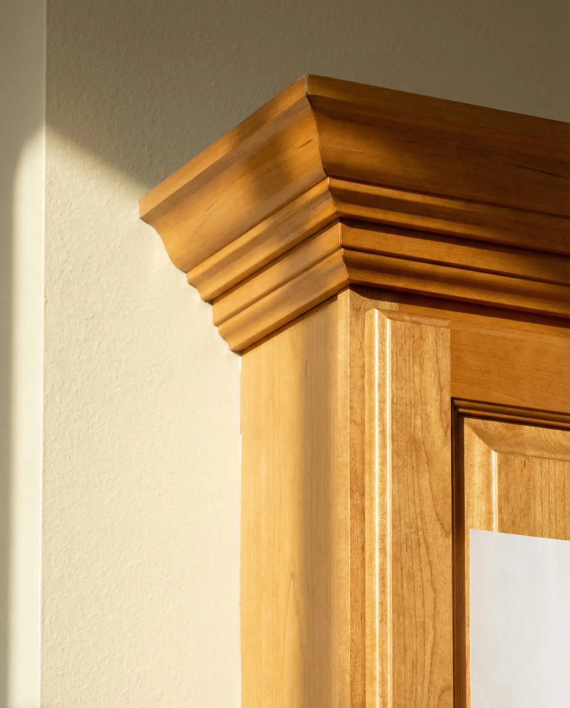
Will Swiss Coffee work with your specific maple wood undertones and interior?
Sherwin-Williams Shoji White (SW 7042)
Shoji White is a favorite for 2026 because it blurs the line between cream and greige. It is significantly darker than a standard white trim, which gives it a velvety, high-end texture.
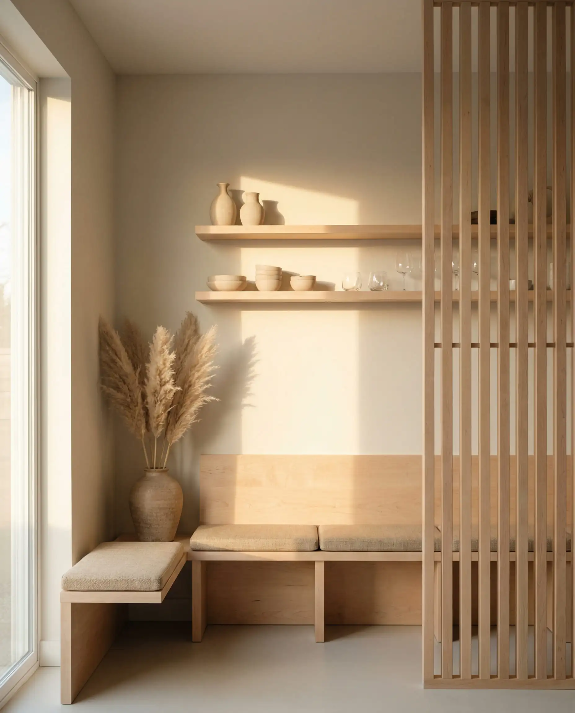
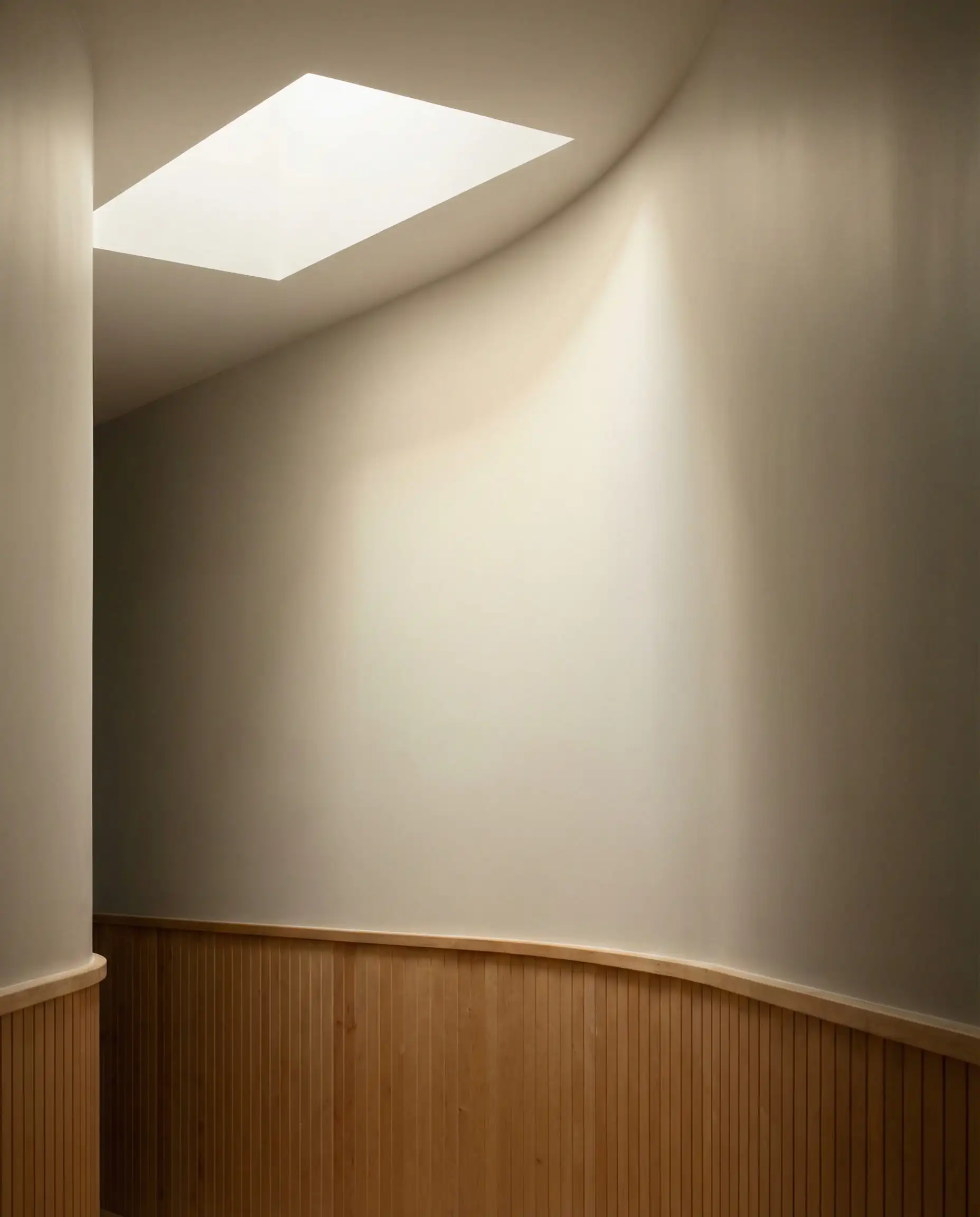
Will Shoji White work with your specific maple wood undertone and interior?
Sherwin-Williams Alabaster (SW 7008)
If Swiss Coffee feels too yellow for you, Alabaster is your answer. It is brighter and cleaner but still holds enough warmth to avoid looking sterile. It’s the “Goldilocks” white.
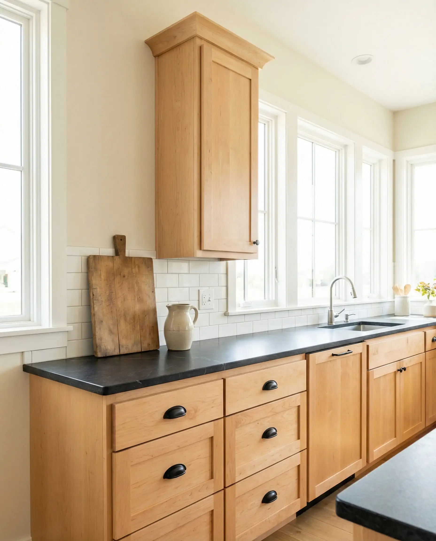
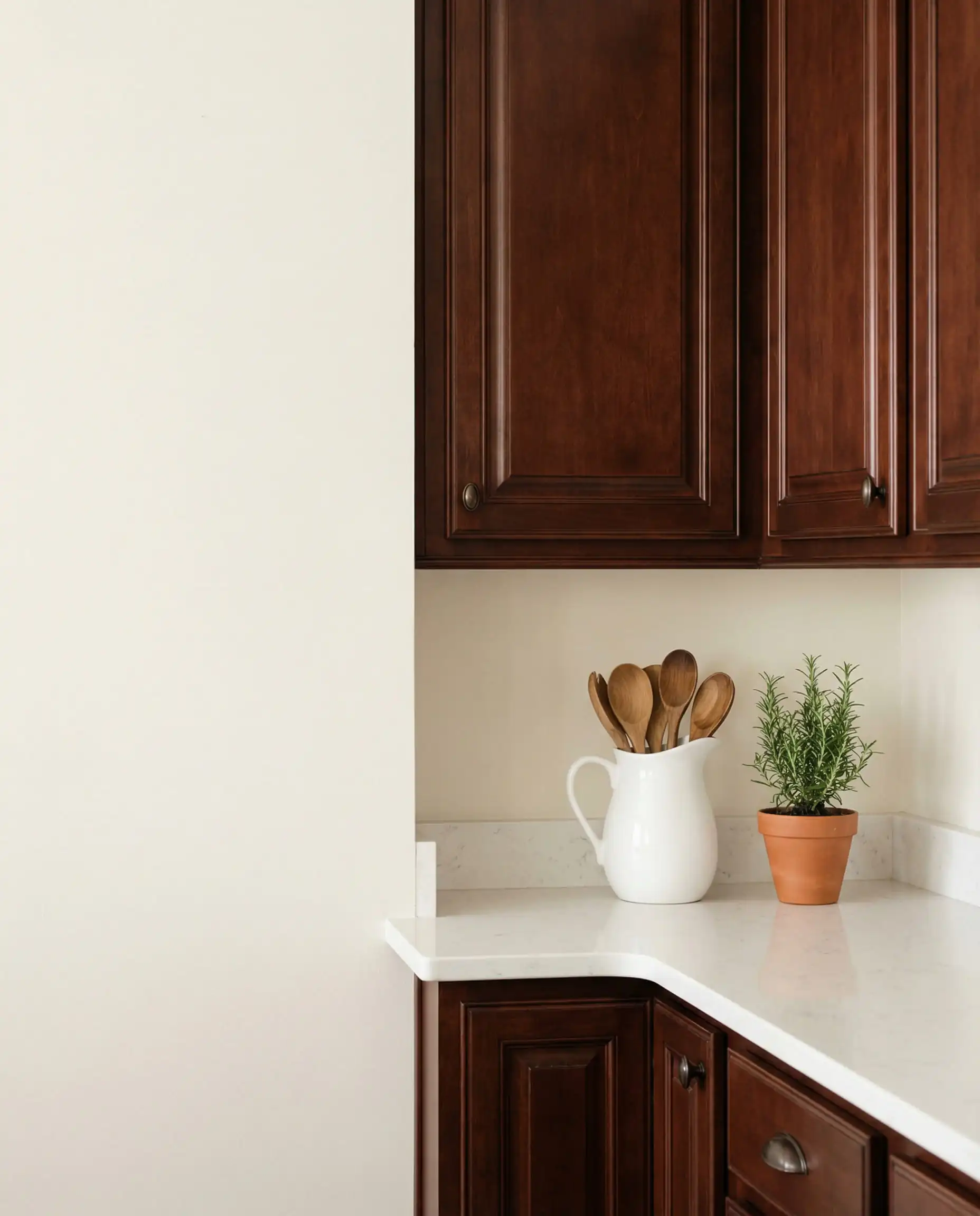
Will Alabaster work with your specific maple wood undertones and interior?
Avoid “Chantilly Lace” or “Extra White” with maple cabinets. They are too cool and crisp. The contrast will make your cabinets look like they have a spray tan. Stick to creamy whites.
Hackrea Verdict
2. Trending Greens: The 2026 “New Neutral”
Best for: Modern farmhouses, organic modern styles, and neutralizing orange tones.
If you only take one thing away from this article, let it be this: Green is the best friend of maple wood.
On the color wheel, green sits opposite the red/orange family. This means green paint acts as a “toner” for your room. Just as purple shampoo neutralizes yellow hair, green walls neutralize orange cabinets, making the wood look richer and more intentional rather than dated.
Sherwin-Williams Evergreen Fog (SW 9130)
A former “Color of the Year,” Evergreen Fog remains a titan in 2026. It is a chameleon color—a blend of green and gray with a hint of blue.
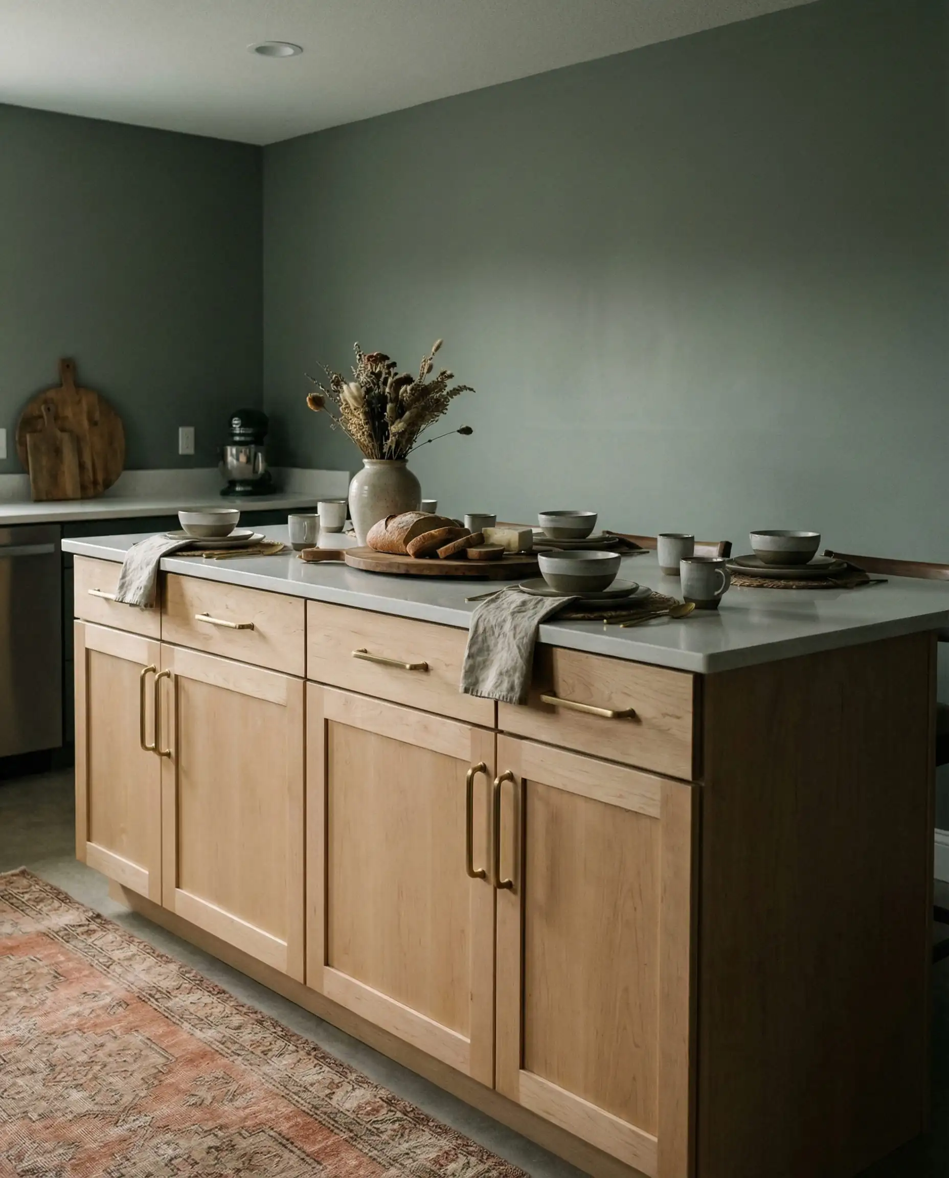
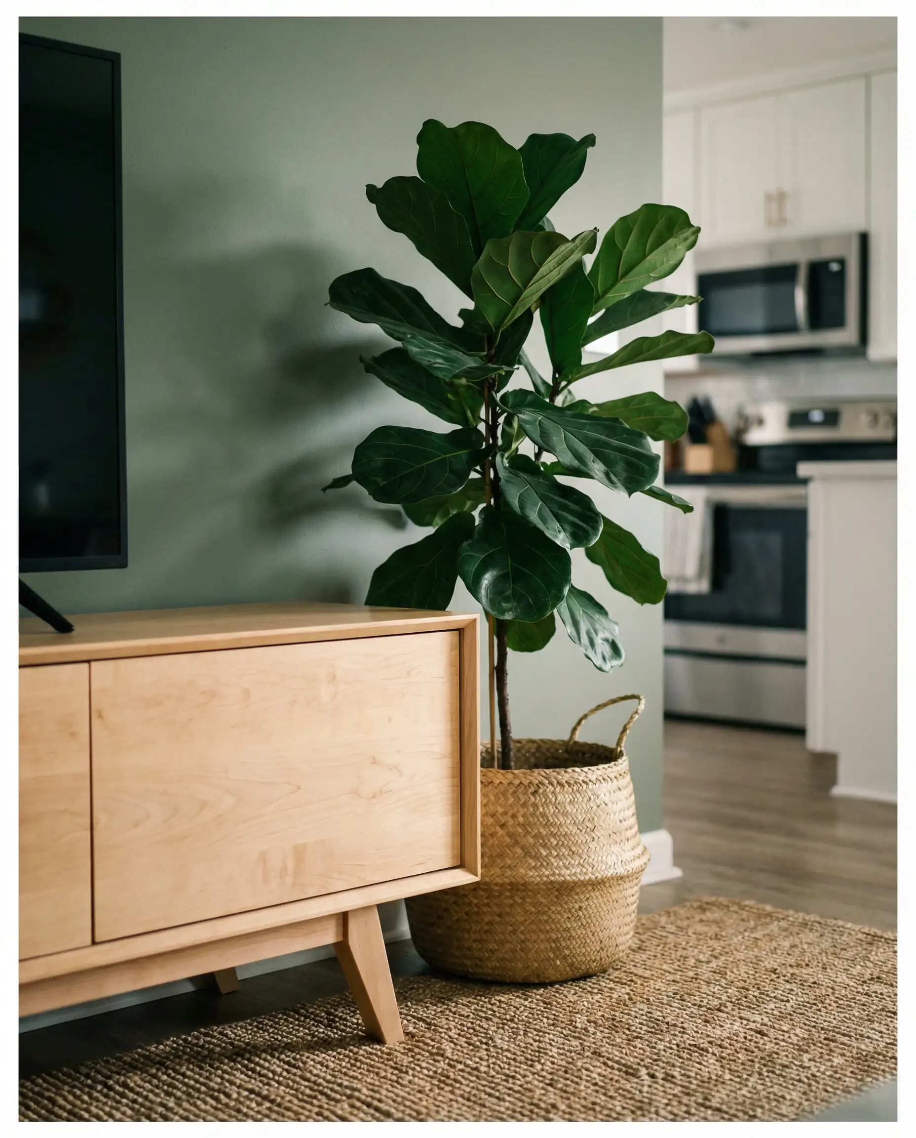
Will Evergreen Fog work with your specific maple wood undertones and interior?
Benjamin Moore October Mist (1495)
Lighter and airier than Evergreen Fog, October Mist is a silver-sage. It is subtle enough to act as a neutral color (you won’t feel like you’re living in a jungle), but it provides enough color to separate the cabinets from the walls.
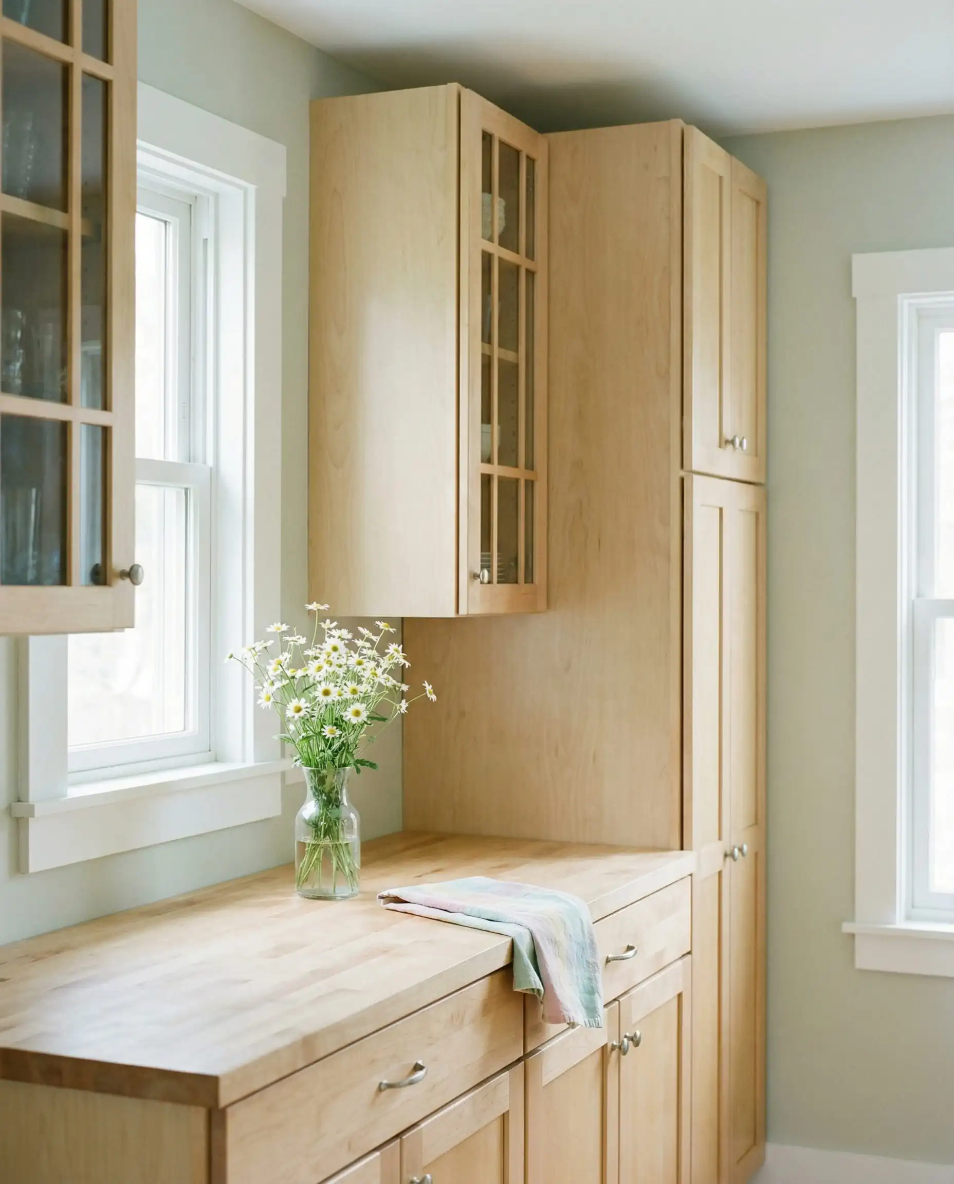
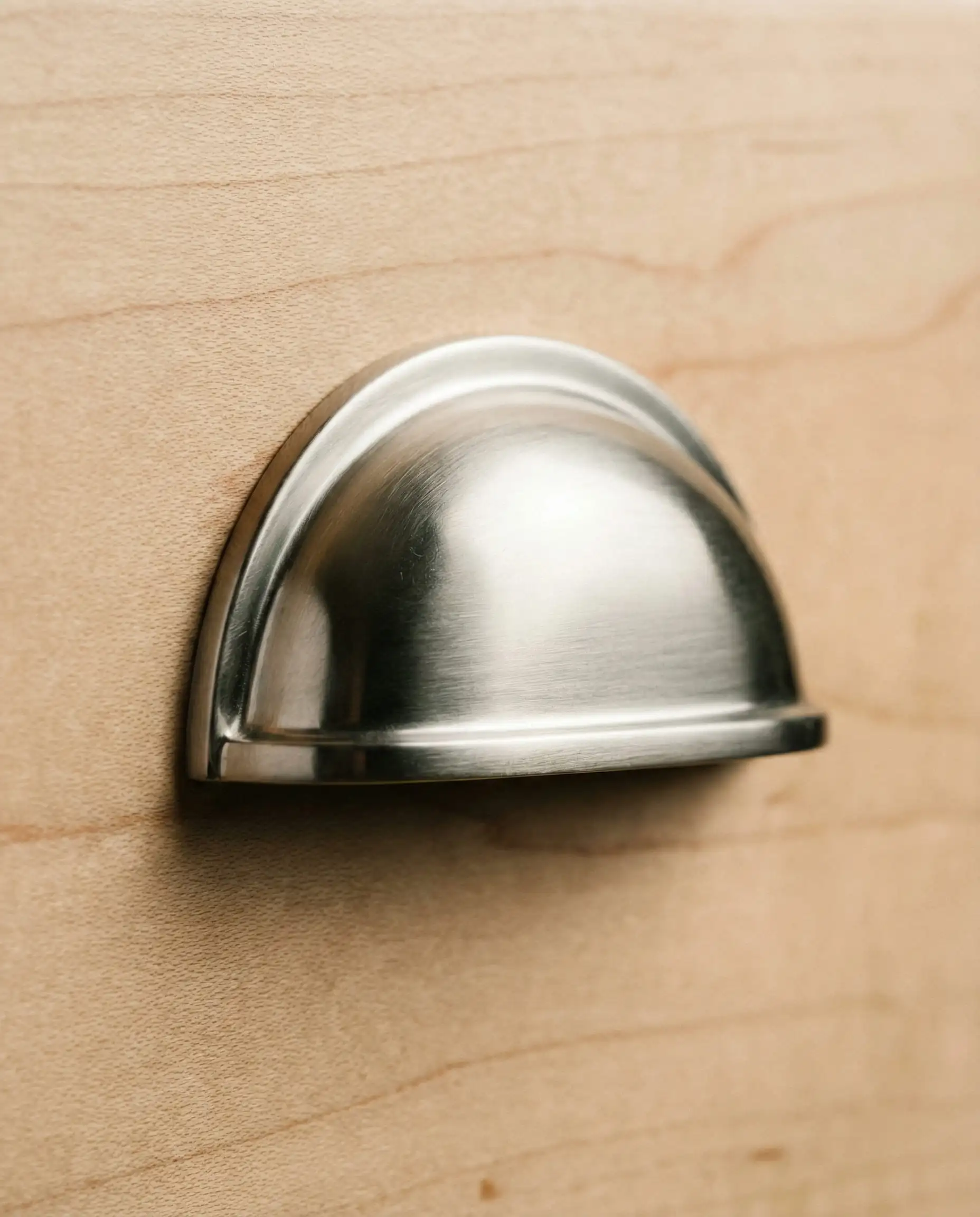
Will October Mist work with your specific maple wood undertones and interior?
Farrow & Ball French Gray
Don’t let the name fool you—this is heavily green. It’s a historic, heritage color that brings a sense of age and permanence to a room. If you have traditional maple cabinets with raised panels, this color can make them feel like classic furniture rather than builder-grade boxes.
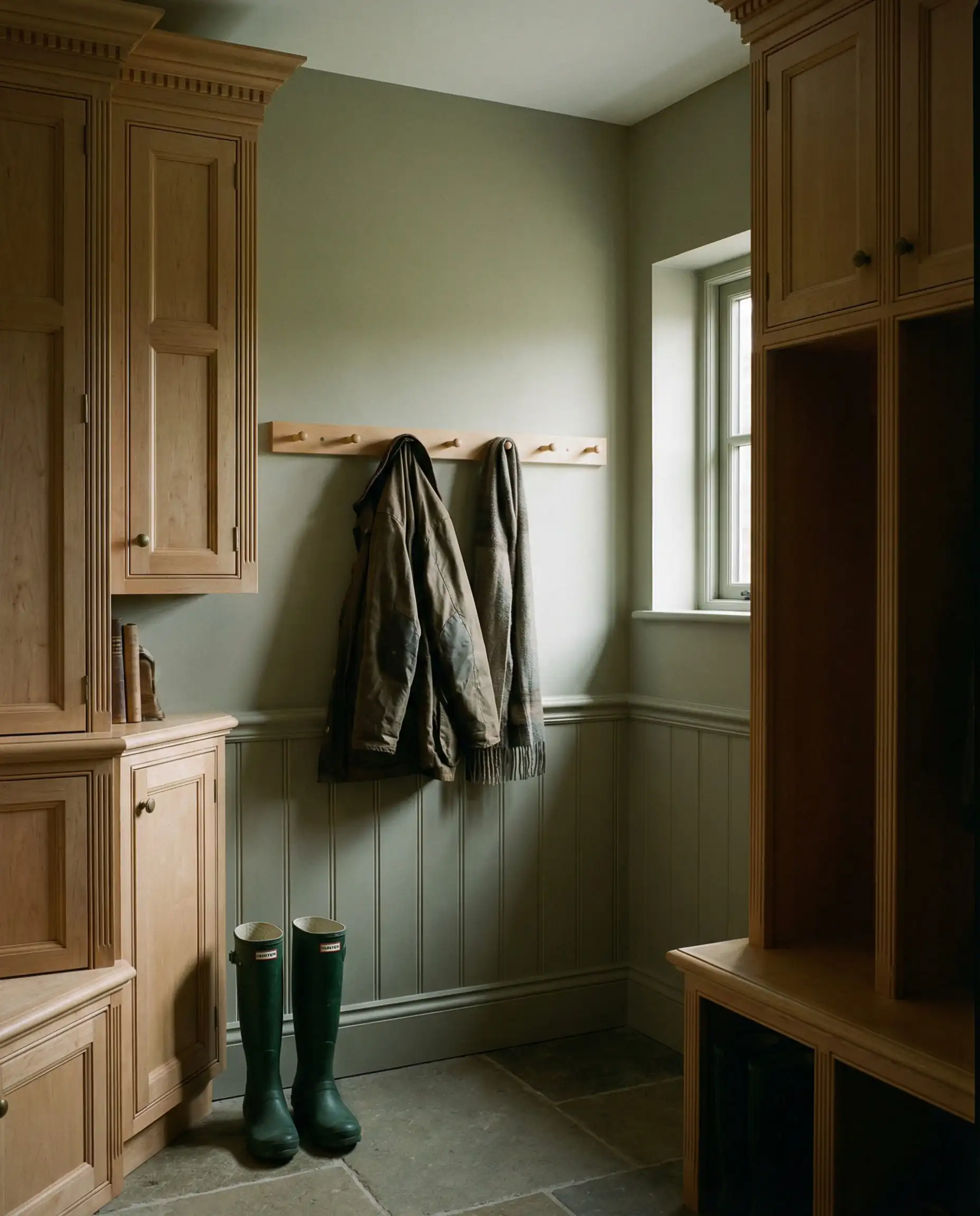
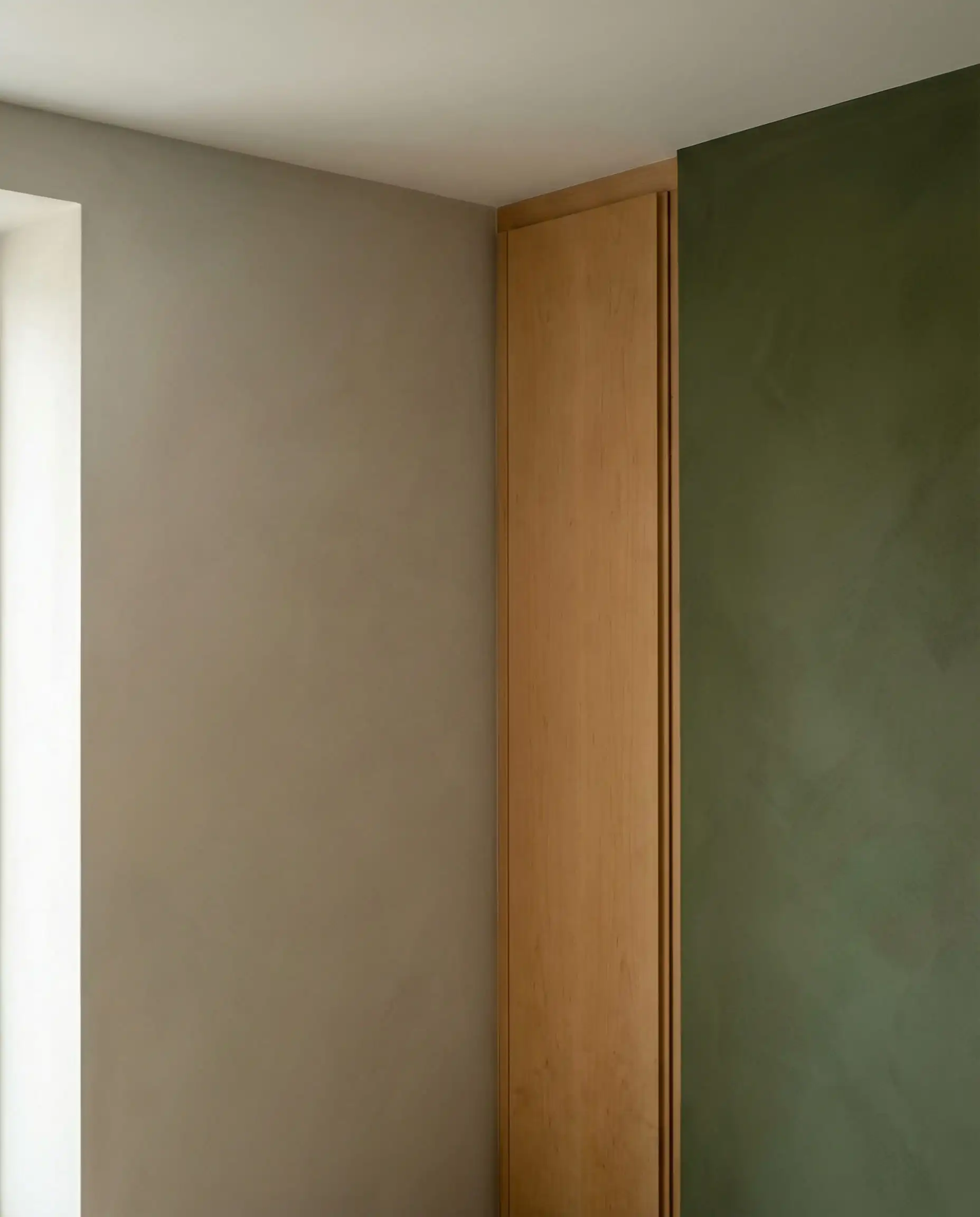
Will French Gray work with your specific maple wood undertones and interior?
3. Modern Neutrals: Greige & Taupe
Best for: Open floor plans, rental properties, and transitional styles.
The era of “Cool Gray” is over. We have moved into the era of “Greige” (Gray + Beige) and Taupe. These colors are essential for maple because they offer the modernization of gray but contain the brown undertones necessary to connect with the wood.
Sherwin-Williams Agreeable Gray (SW 7029)
You cannot write a paint guide without mentioning the king of greiges. Agreeable Gray is the best-selling paint for a reason: it works with almost everything.
With Maple: It reads as a true soft gray. The warmth in the paint latches onto the warmth in the wood, preventing that dreaded “blue wall/orange cabinet” clash.
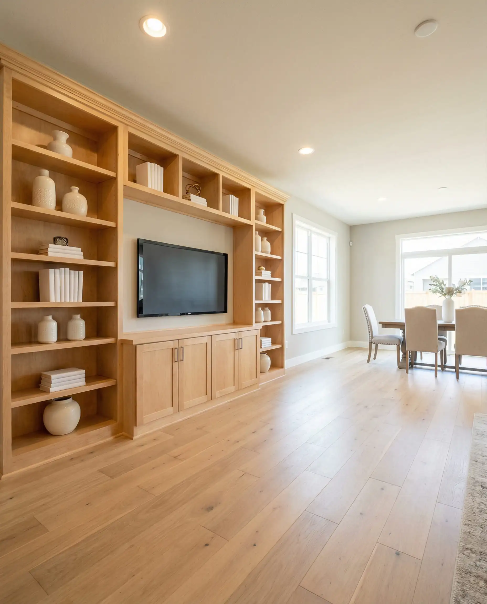
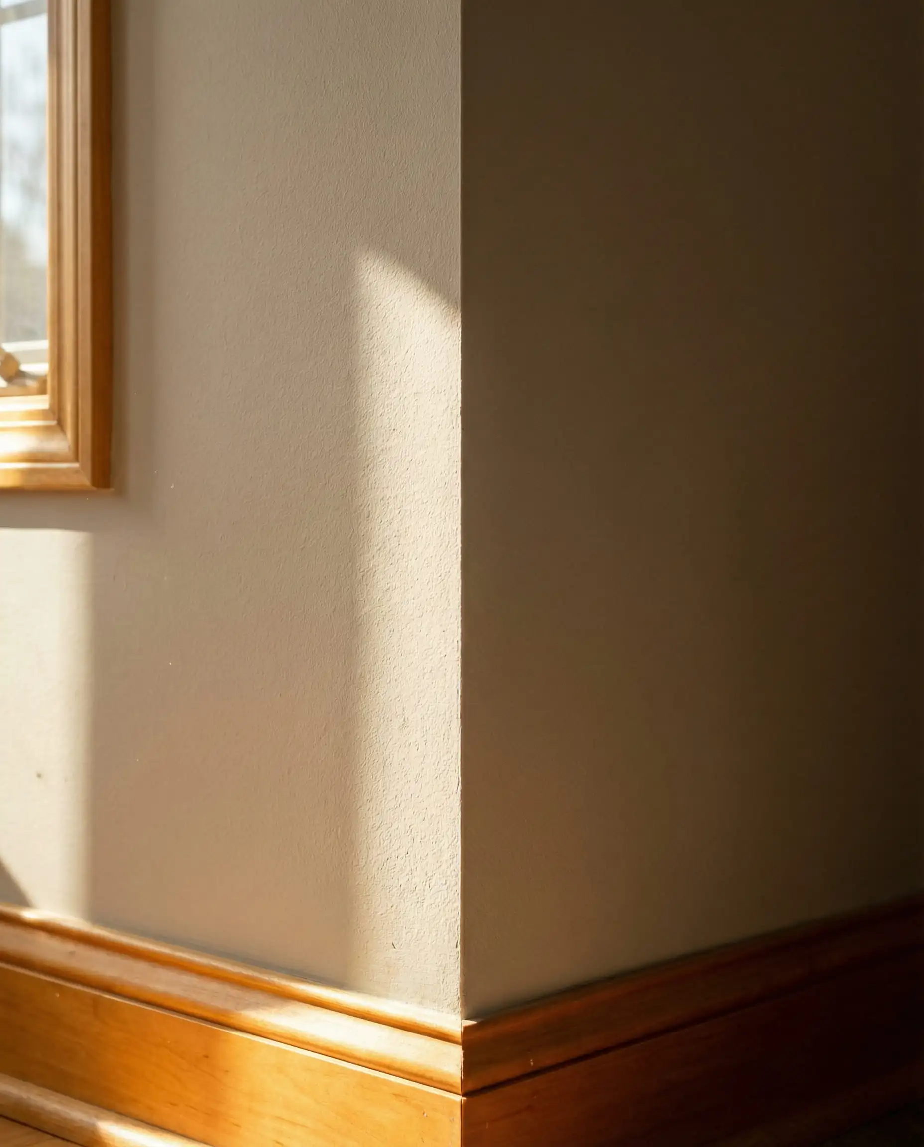
Will Agreeable Gray work with your specific maple wood undertones and interior?
Benjamin Moore Revere Pewter (HC-172)
Ideally suited for darker “spice” maple cabinets. Revere Pewter is an earthy, muddy greige.
The Undertone Check: It has a slight green undertone (which, as we learned above, is good!). This subtle green cast helps it harmonize with the reddish tones in darker maple stains.
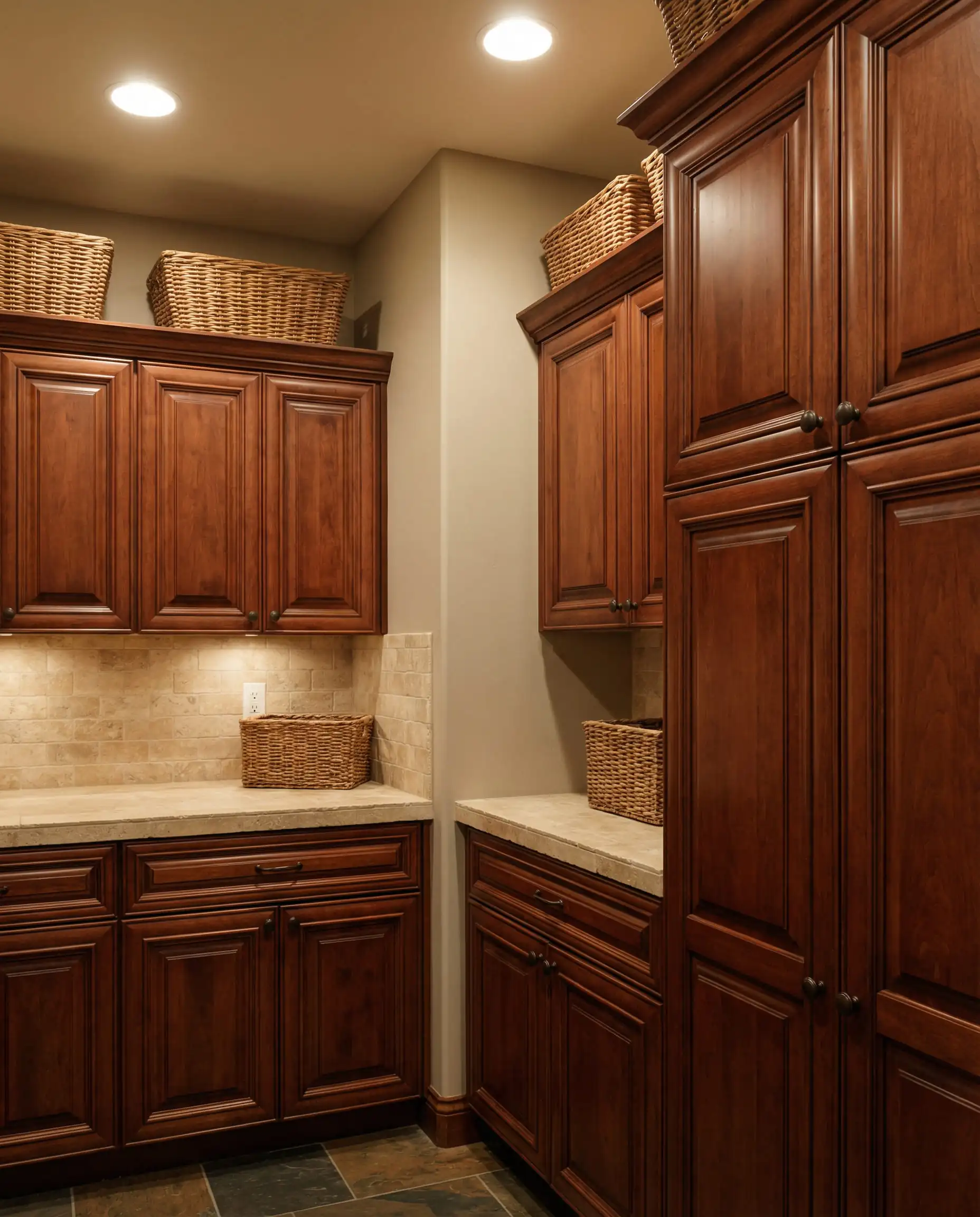
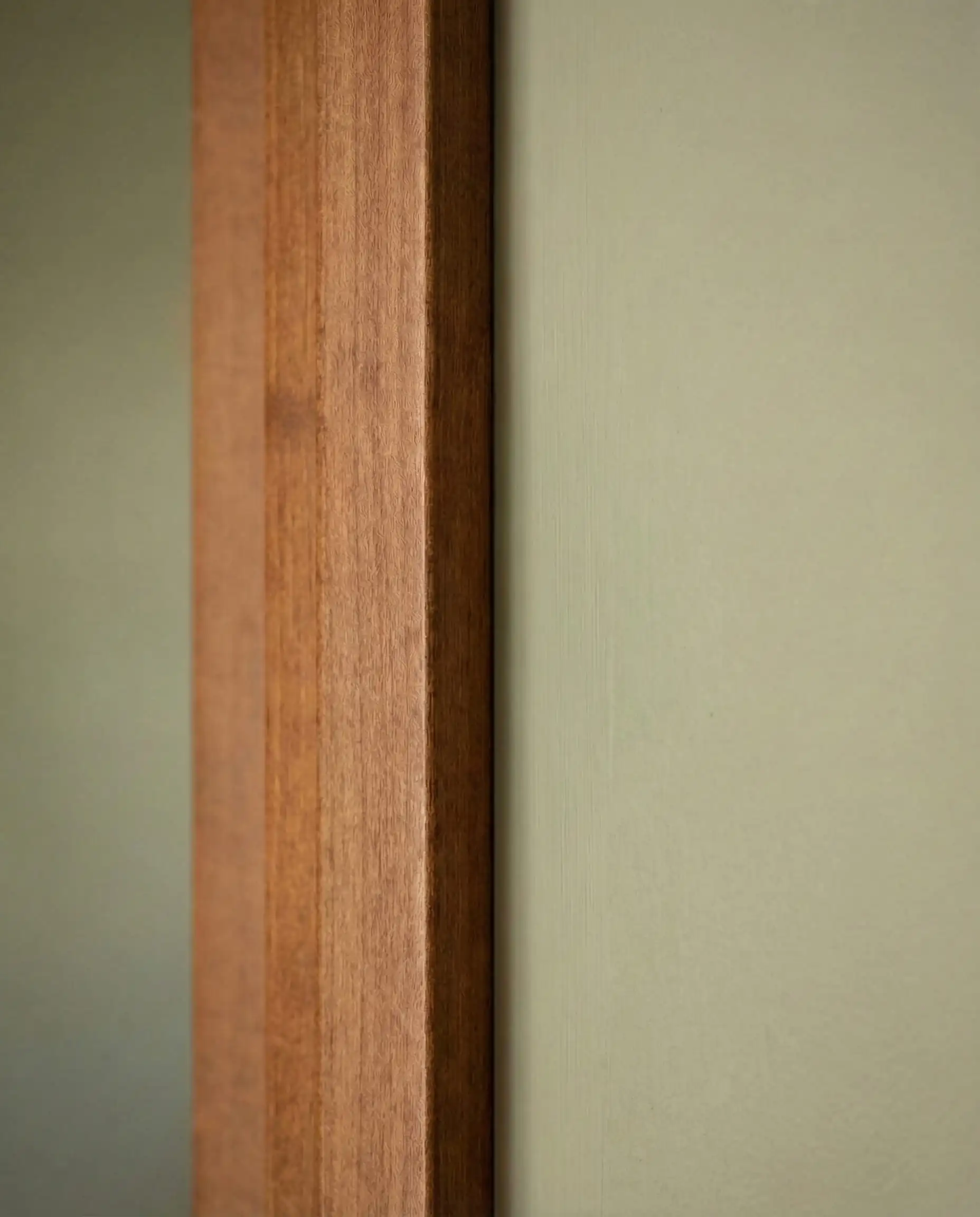
Will Revere Pewter work with your specific maple wood undertones and interior?
Sherwin-Williams Accessible Beige (SW 7036)
If you are afraid of gray making your home feel cold, go here. Accessible Beige is definitely beige, but it lacks the pinky-yellow tones of the 90s beiges. It feels fresh and sandy, perfect for a coastal or beachy vibe with light maple floors.
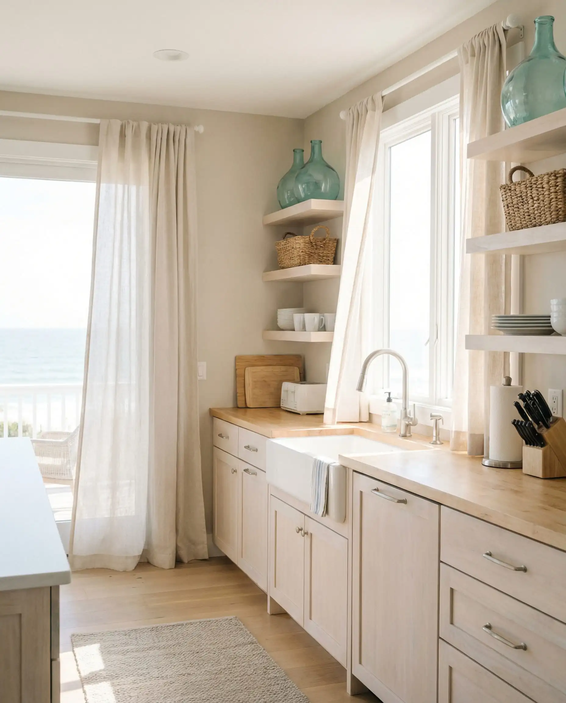
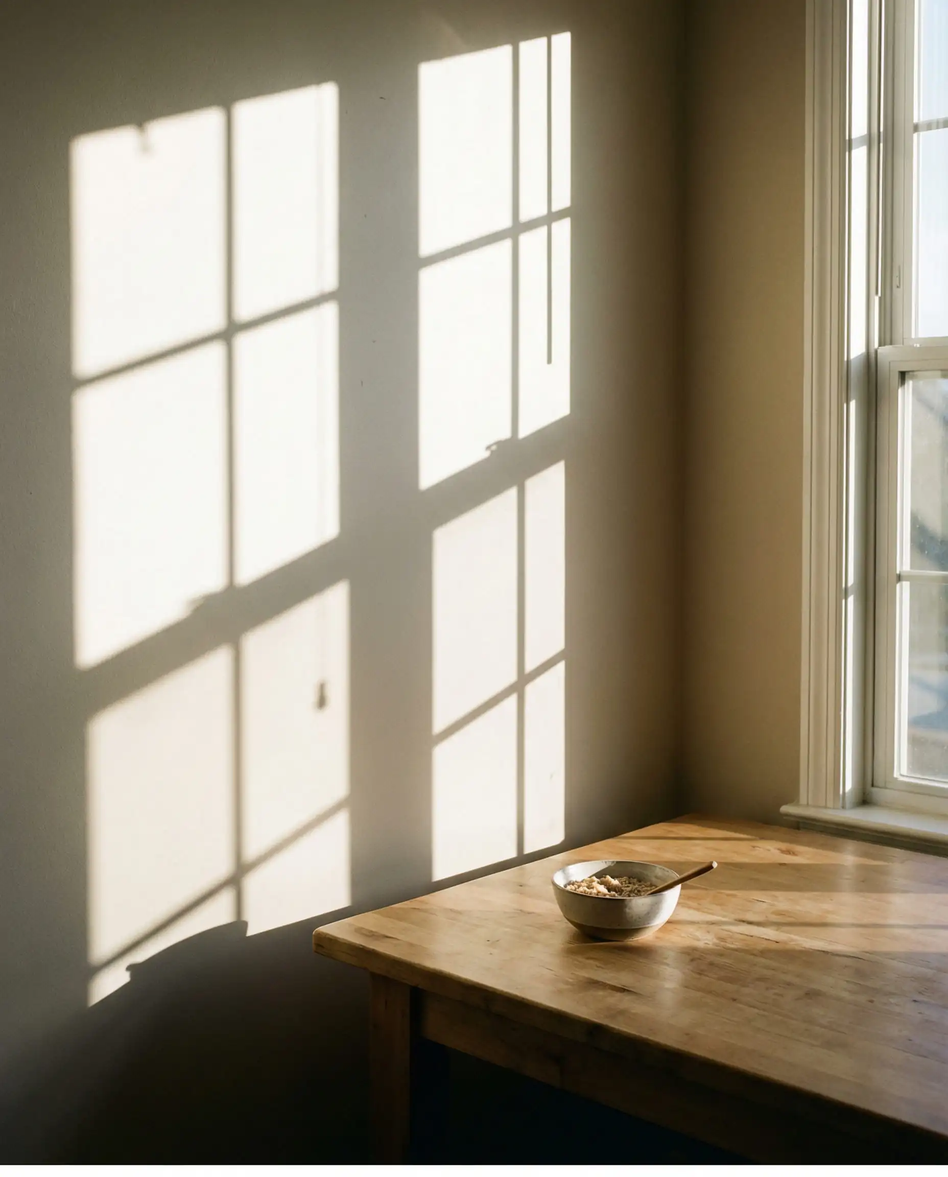
Will Accessible Beige work with your specific maple wood undertones and interior?
4. Dark & Moody Contrasts
Best for: Large kitchens, accent walls, and industrial/modern aesthetics.
Sometimes, the best way to handle wood cabinets is to create drama. Placing light maple against a dark, moody wall creates high contrast. This tricks the eye into seeing the cabinetry as a bright, luminous focal point.
Benjamin Moore Hale Navy (HC-154)
A classic, deep navy blue.
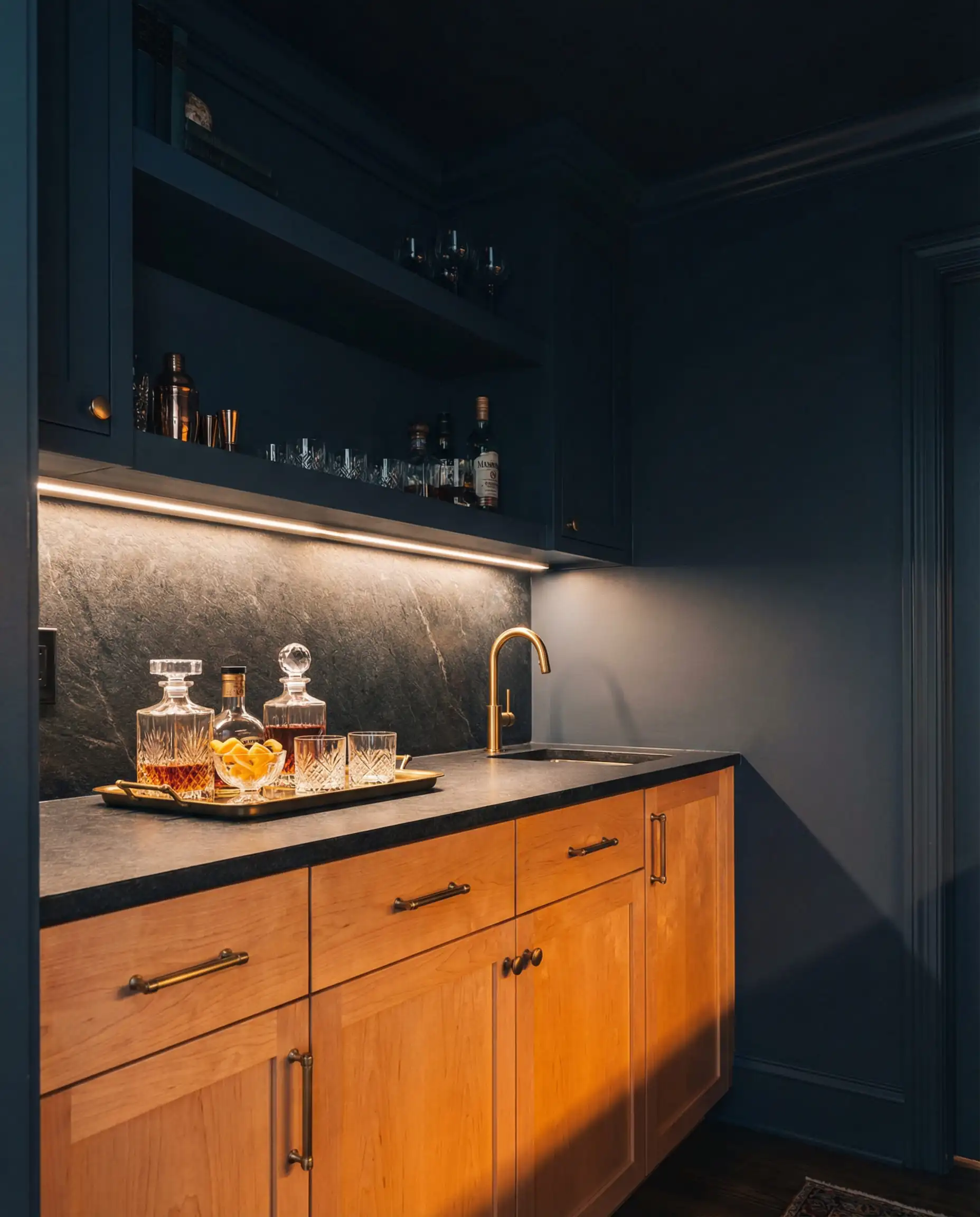
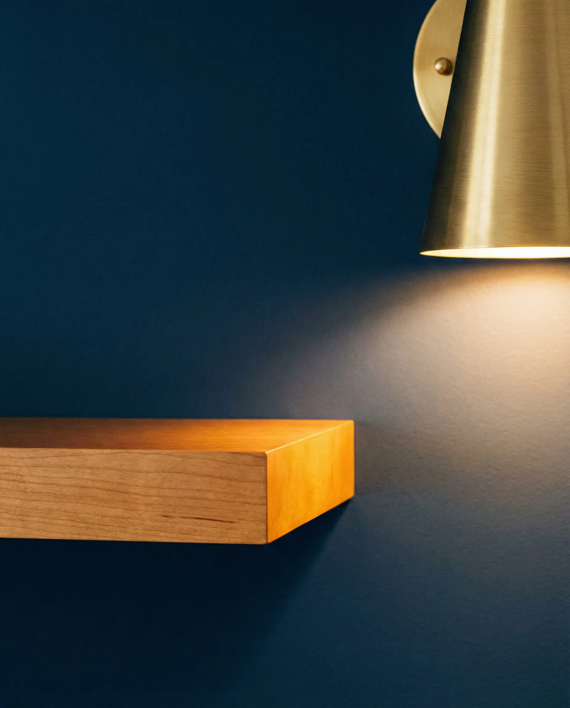
Will Hale Navy work with your specific maple wood undertones and interior?
Sherwin-Williams Iron Ore (SW 7069)
Iron Ore is not black, but it’s close. It’s a soft charcoal with brownish undertones.
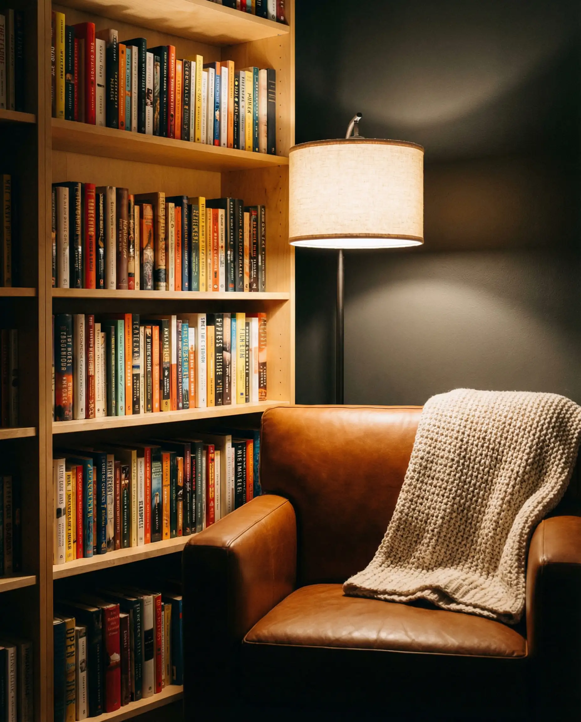
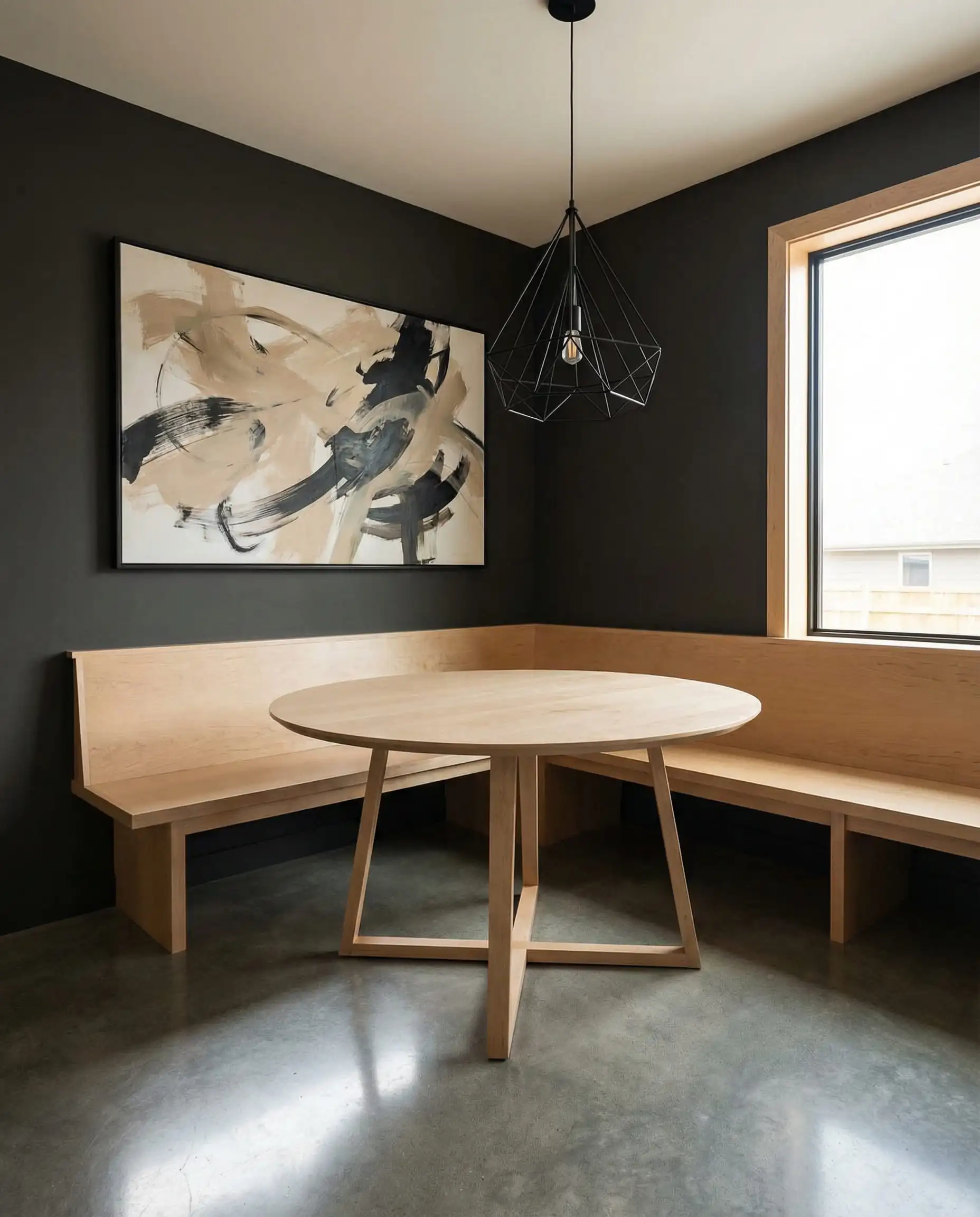
Will Iron Ore work with your specific maple wood undertones and interior?
If you choose a dark color, lighting is non-negotiable. You need under-cabinet lighting and good overhead fixtures, or the room will feel like a cave. Dark colors absorb light; maple reflects it. Use that balance.
Hackrea Verdict
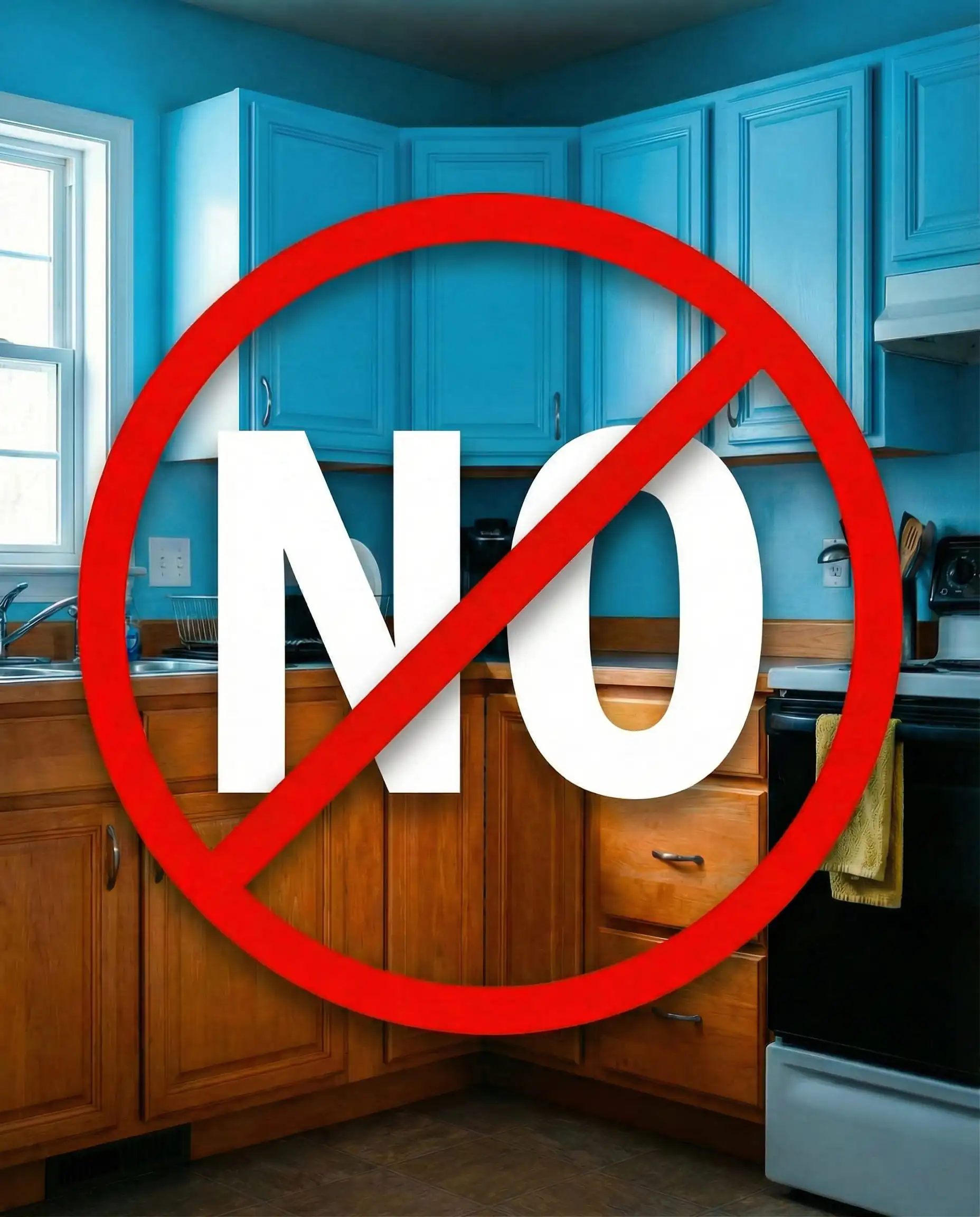
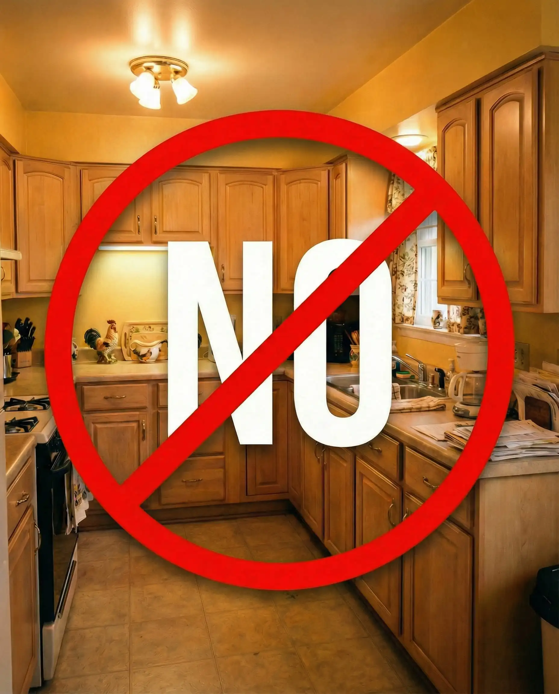
5. Colors to Strictly Avoid (The “Do Not Paint” List)
Saving you time and money is just as important as inspiring you. Here are the colors that generally fail when paired with maple.
- Icy/Cool Blues: Baby blue or sky blue will make maple look intensely orange. Unless you are going for a very specific “Lakers” team color vibe, avoid this.
- Yellows & Golds: Maple already has yellow in it. Painting the walls yellow creates a “muddy” look where nothing stands out. It feels hot and overwhelming.
- Pink/Rose Beiges: These often clash with the yellow-orange of the wood, creating a dissonant, fleshy look that is unappealing.
6. Pro Tips: How to Test Paint Correctly
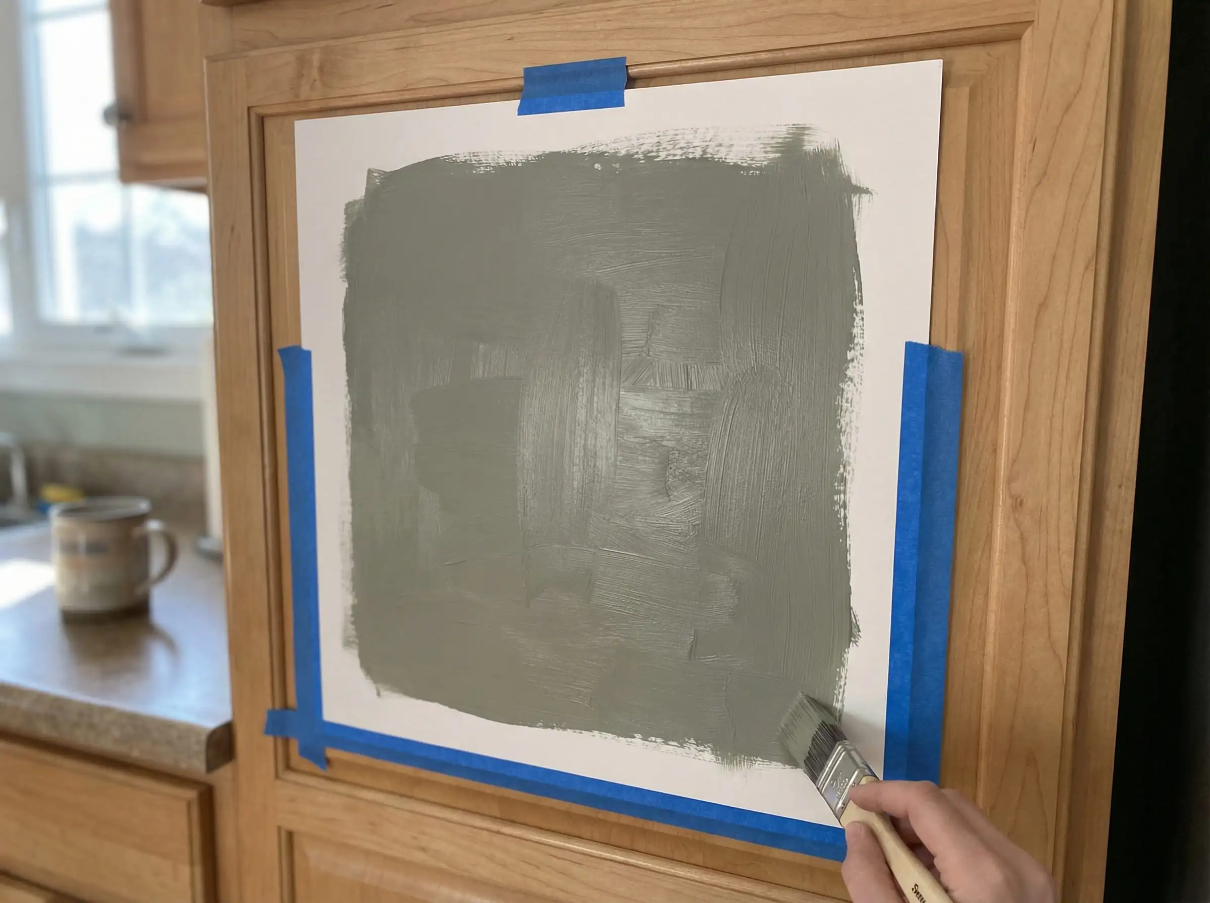
You’ve picked three colors from this list. Now what? Do not just paint a patch on the wall. The interaction between paint and wood changes based on lighting and angles.
The “Vertical” Rule
Never test paint by laying a swatch flat on a table or counter. Light hits vertical surfaces differently than horizontal ones.
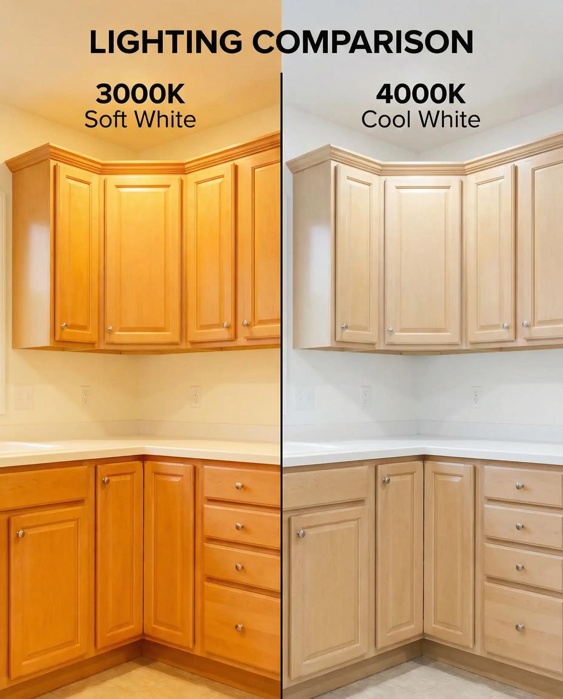
Check Your Light Bulbs
Before you blame the paint, check your bulbs.
7. Visualize It Before You Commit
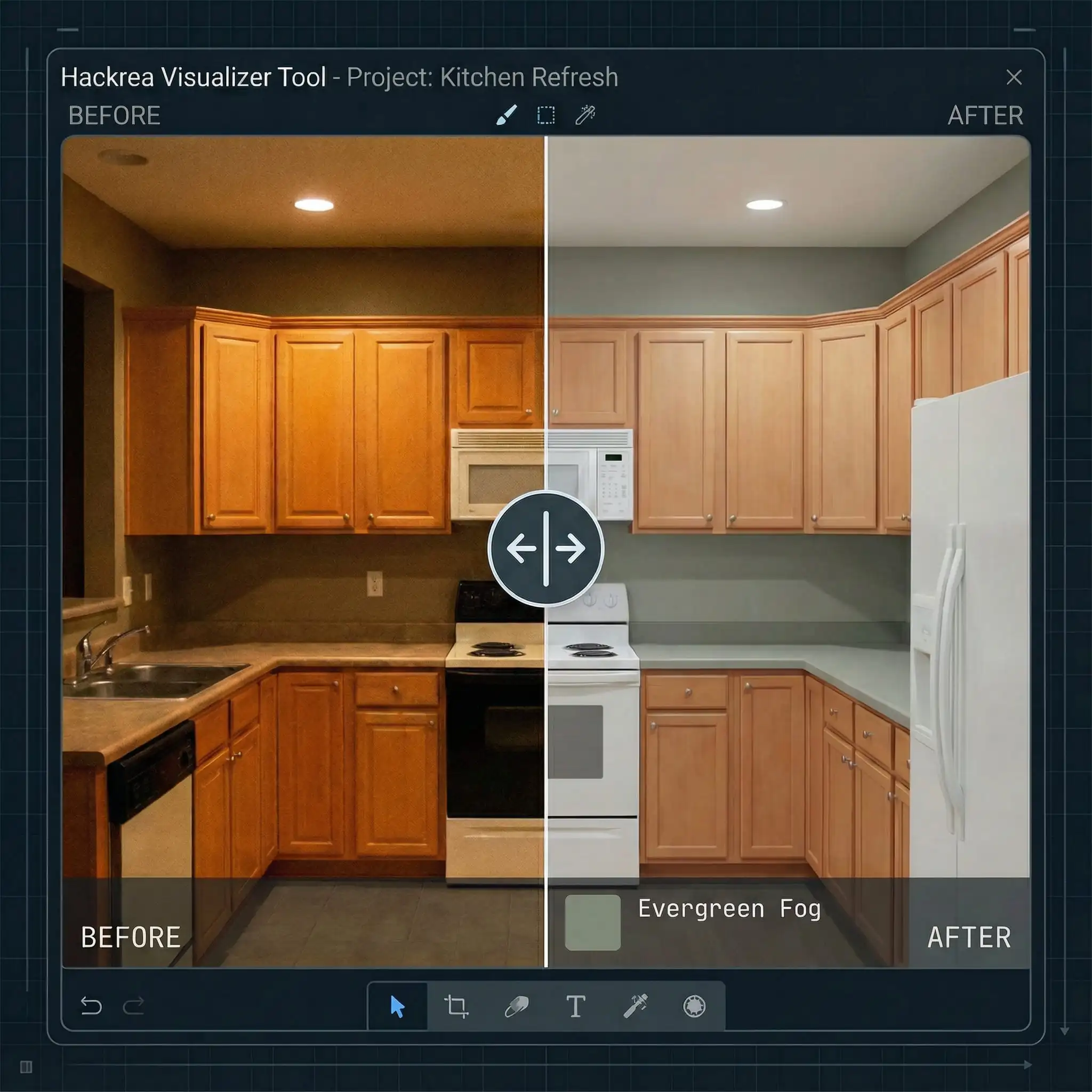
Imagination is great; visualization is better. Paint is difficult to judge until it covers all four walls.
If you are struggling to picture how Evergreen Fog will look next to your specific shade of honey maple, don’t guess.
Try the Hackrea Interior Visualizer Tool
- Upload a photo of your actual kitchen.
- Select the exact paint codes mentioned in this article.
- See the result instantly.
This is the single best way to prevent “Remorse Renovations.”
Frequently Asked Questions
A: Yes, but you must choose the right gray. Avoid “cool” grays with blue undertones (like silver or slate). Stick to “warm” grays or greiges (like Sherwin-Williams Agreeable Gray) that have brown or beige undertones to harmonize with the wood.
A: The fastest way to modernize maple is to introduce contrast. Swap out old chrome hardware for matte black or brushed brass. Then, paint the walls a biophilic green (like Sage) or a warm off-white. Avoid yellow-based wall colors, which make the room look dated.
A: Contrast is key here. If you have light maple cabinets, avoid matching light maple floors. Go for a darker wood floor (walnut) or a stone/tile look (slate gray or beige travertine) to create separation between the floor and the cabinetry.
A: You fix it with color theory. Do not paint the walls white; it highlights the orange. Paint the walls a color that absorbs the orange, such as a muted blue-gray, navy, or a sage green. These cool tones balance the warmth of the wood.
Final Thoughts
Maple wood cabinets are a timeless asset, not a burden. The “dated” look usually comes from the surrounding elements, not the wood itself. By updating your wall color to a 2026-approved warm neutral or earthy green, you can breathe new life into your kitchen without the massive expense of a renovation.
Grab a sample of Shoji White or October Mist, tape it to your cabinet, and see the magic happen.
Ready to start? Click here to use our Visualizer Tool and test these colors in your room right now.