Living Room Paint Colors 2026: The Shift to “Grounded Comfort”
Let’s be honest: for the better part of a decade, our living rooms were dominated by a single, unwavering rule—keep it cool, keep it gray, and keep it bright. But if the design world has signaled anything for 2026, it is that the era of the sterile showroom is officially over.
Welcome to the age of “Grounded Comfort.”
As we move deeper into the mid-2020s, the collective mood has shifted. We no longer want our homes to feel like crisp art galleries; we want them to feel like sanctuaries. The trending living room paint colors for 2026 reflect a desire for warmth, organic connection, and a touch of cinematic drama. We are seeing a pivot toward “biophilic 2.0″—where nature-inspired tones get moodier—and a resurgence of rich, complex neutrals that wrap you in a hug the moment you walk through the door.
Whether you are looking to refresh a single accent wall or completely color-drench your space, this guide covers the essential palette for 2026, the technical finishes you need to know, and exactly how to light these new, deeper hues.
Quick Summary: The 2026 Living Room Palette
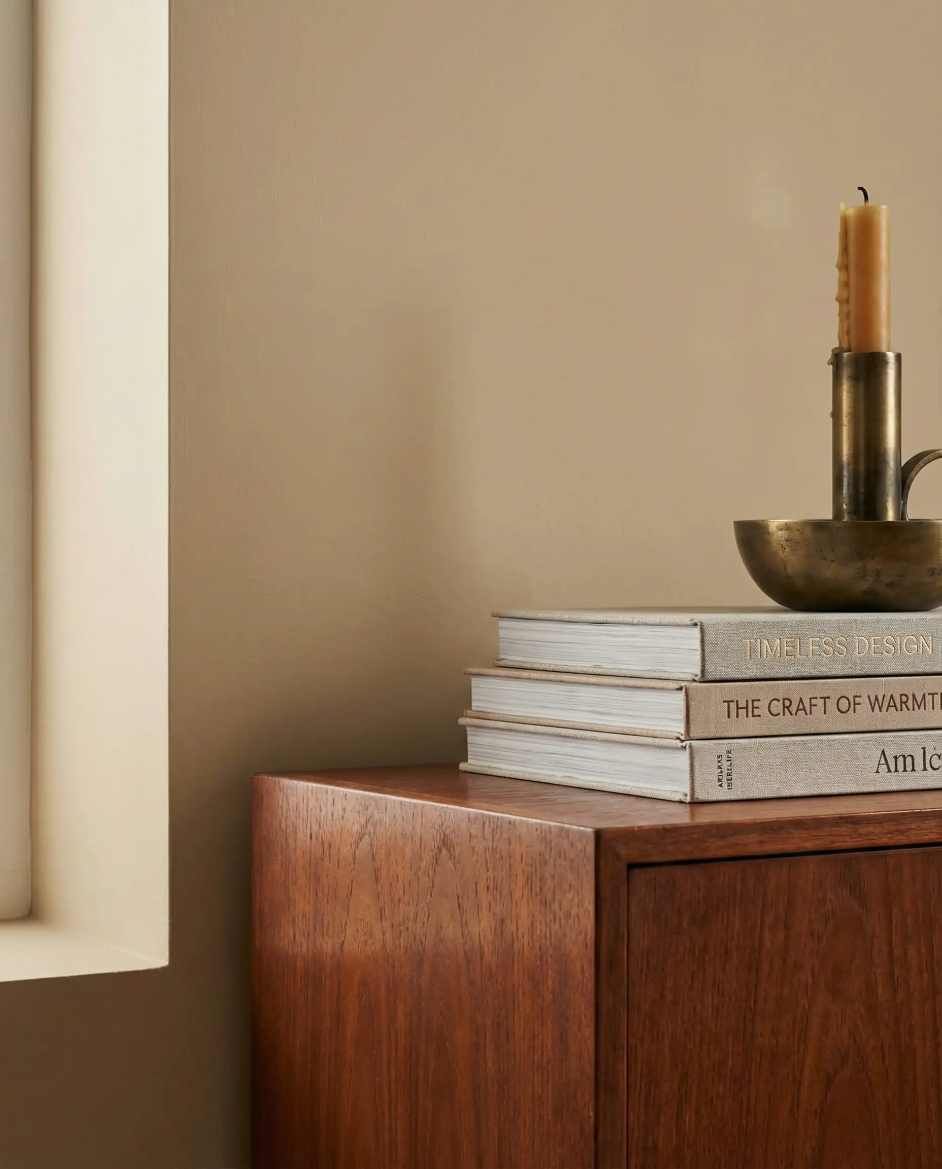
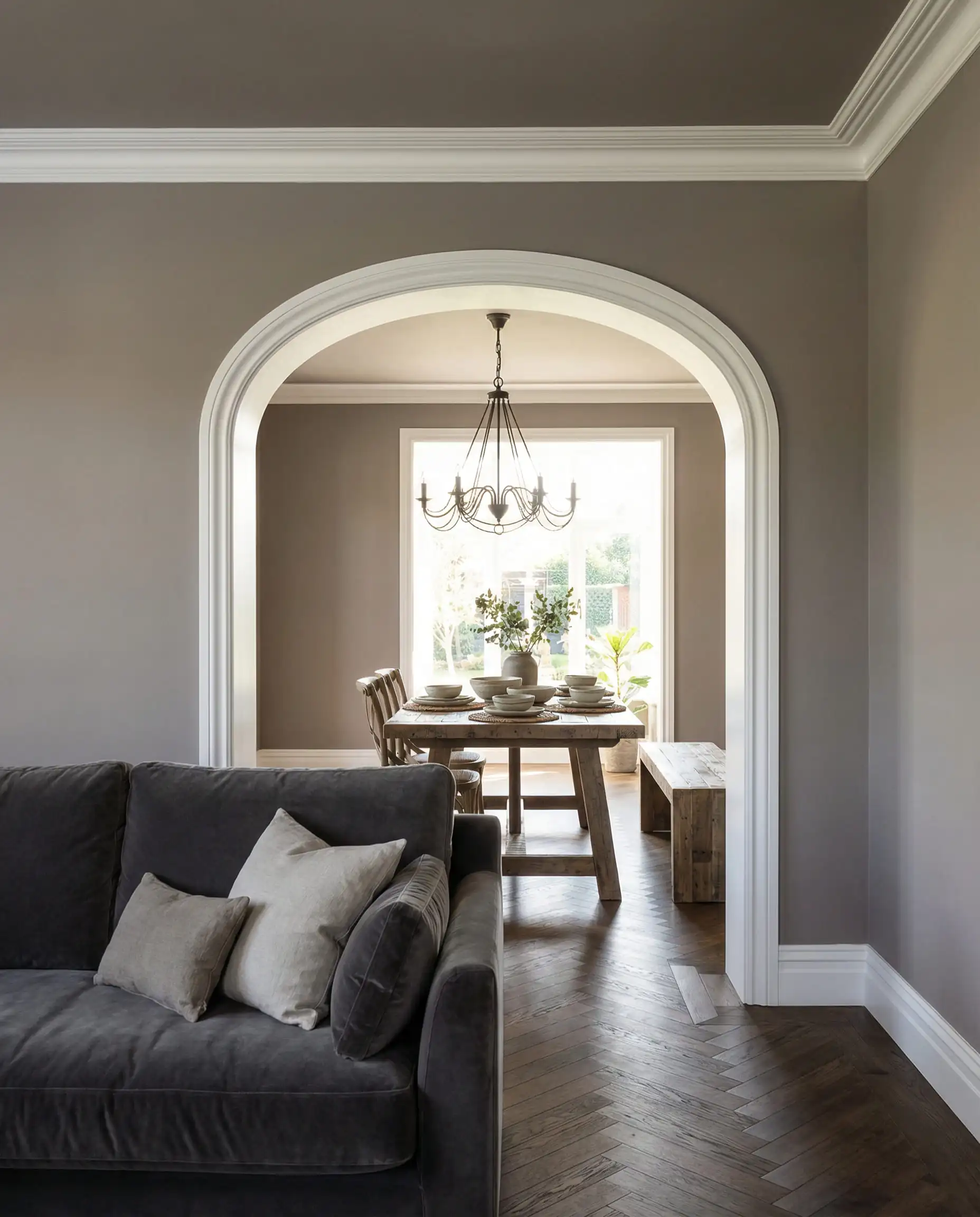
The New Neutrals: Goodbye Cool Gray, Hello Khaki
If you take only one thing away from the 2026 forecasts, let it be this: Beige is back, but it has had a major glow-up.
For years, “builder beige” was the enemy. But the new wave of neutrals replacing cool grays are sandy, textured, and incredibly sophisticated. These shades are being dubbed “The It Neutrals” because they serve as a perfect bridge between traditional warmth and modern minimalism.
Universal Khaki & The Sandy Shift
Leading the pack is the resurgence of khaki. Unlike the yellow-based creams of the 90s, the 2026 khaki is closer to the color of unbleached linen or wet sand. It is a “chameleon color”—it reads as a soft tan in the morning light and settles into a cozy, stone-like hue in the evening.
This shift is monumental because it changes how we style our furniture. A khaki backdrop allows you to mix warm wood tones (like walnut or white oak) much more seamlessly than gray ever did. It feels historic yet fresh, grounding the room without demanding attention.
Khaki walls can sometimes look ‘muddy’ if paired with yellow-toned floors. If your flooring is honey oak, choose a Khaki with a slight green undertone to neutralize the yellow and create a fresh, modern contrast.
Designer’s Tip
Mushroom and Putty: The Sophisticated Middle Ground
For those who aren’t quite ready to commit to full brown, “Mushroom” and “Putty” are the ultimate compromise. These are complex greiges (gray-beige) with heavy brown undertones. They feel organic and earthy, evoking the look of raw clay or dried earth.
These shades are magic in open-concept spaces. If your living room connects to other areas, a putty color can unify the space while adding more depth than a standard white. To see how these neutrals influence the broader layout of your home, check out our guide on living room trends for 2026.
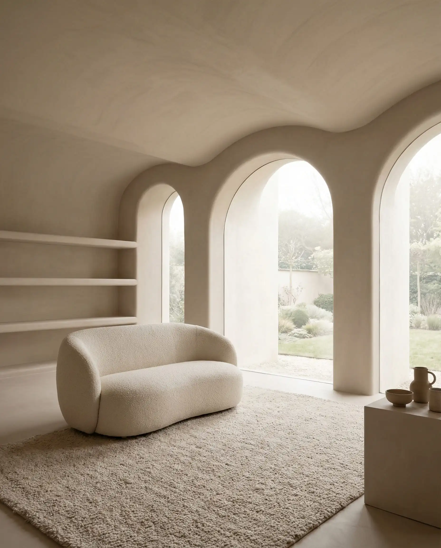
The “Soft White” Controversy
White paint is never just “white,” and 2026 is drawing a line in the sand. Stark, brilliant whites with blue undertones are being swapped out for creamy, whipped-whites like Swiss Coffee or Soft Chamois. The goal is to avoid the “hospital” feel.
When testing white paint, place the swatch next to your trim, not in the middle of the wall. If your current trim is a cool white and you paint the walls a warm creamy white, the trim might look dirty or blue. You may need to paint the trim to match the new warm walls.
Designer’s Tip
You can apply wallpapers, paints, etc. on walls and see how they look in various interiors.

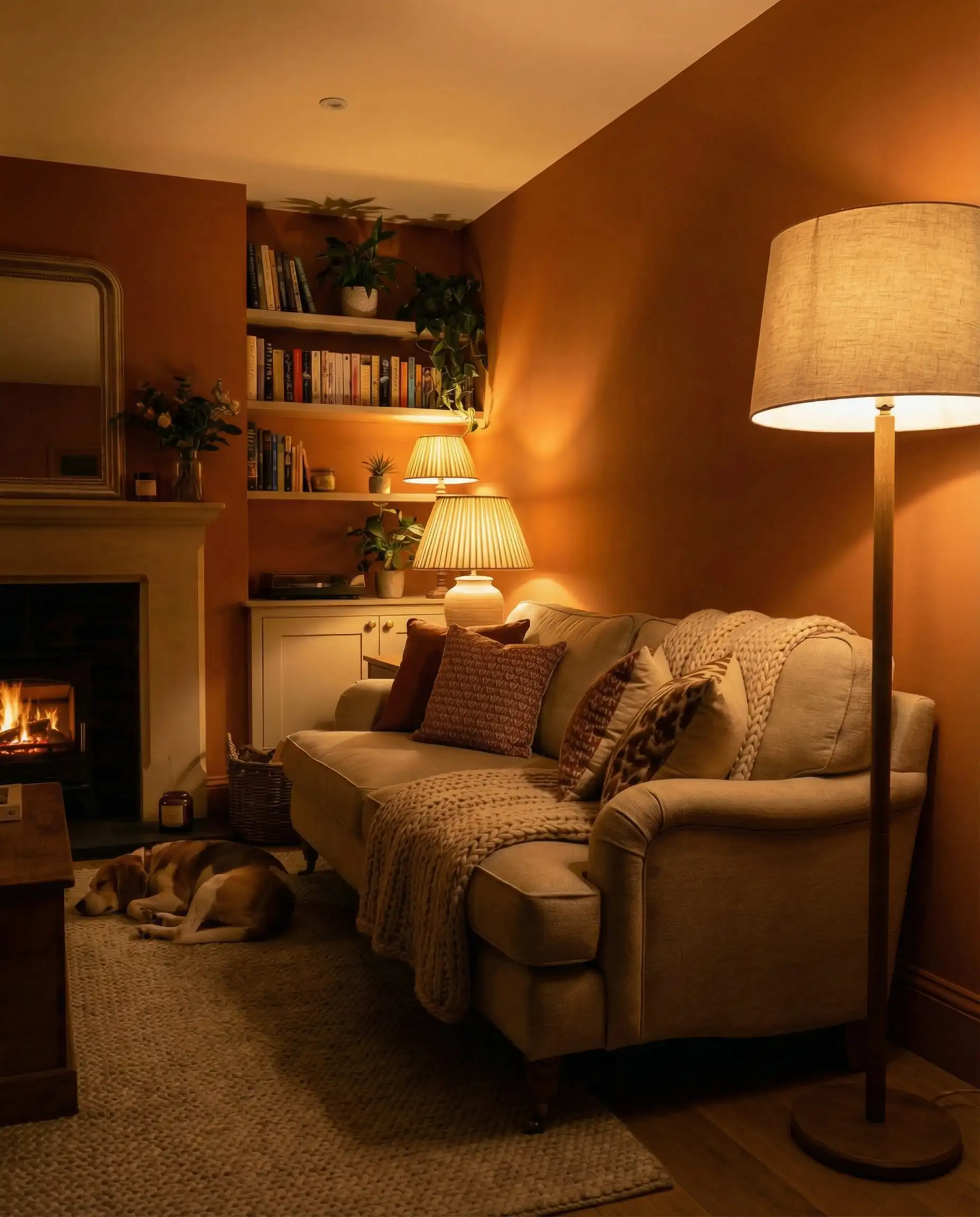
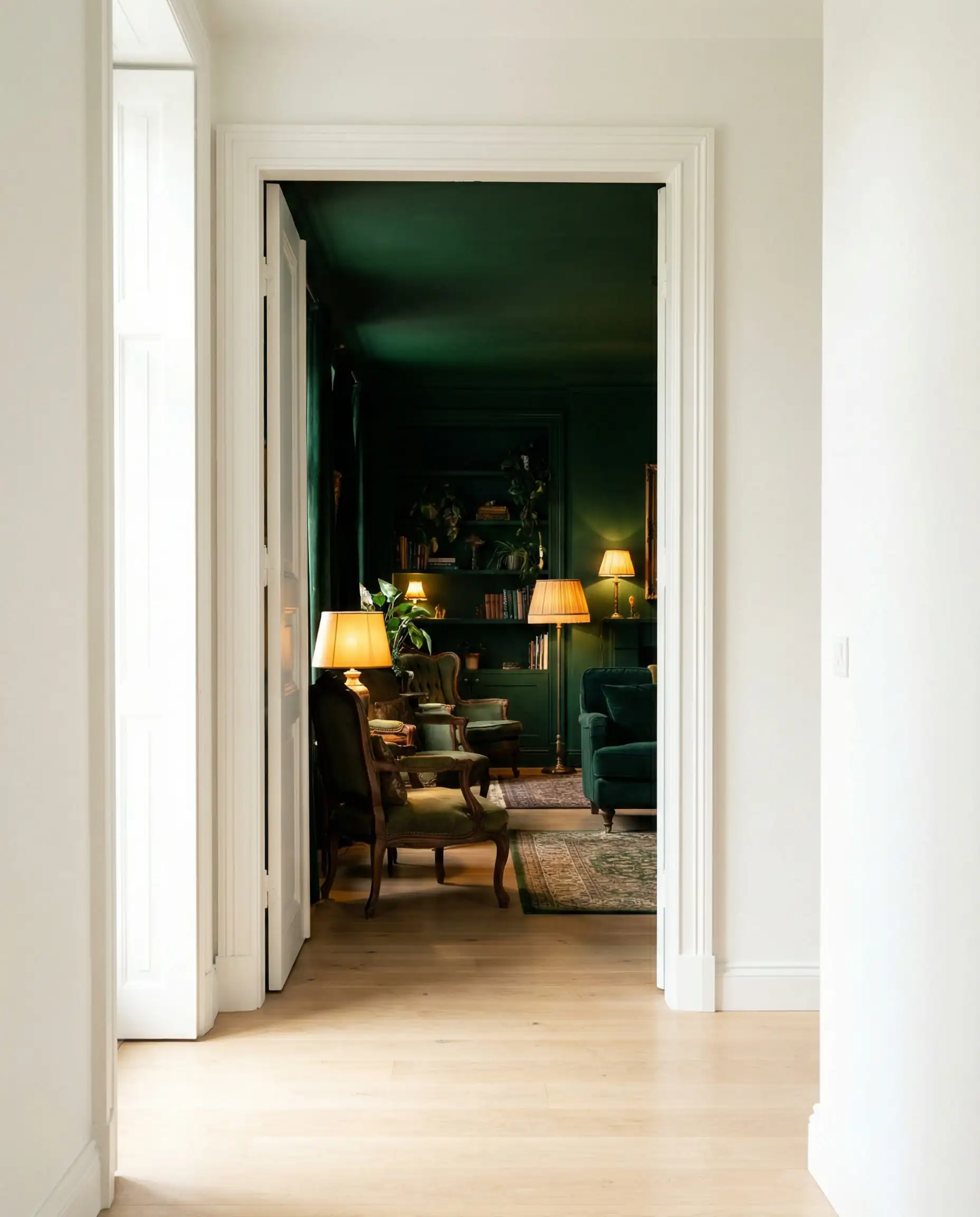
The “Dark Academia” Aesthetic: Moody & Dramatic Tones
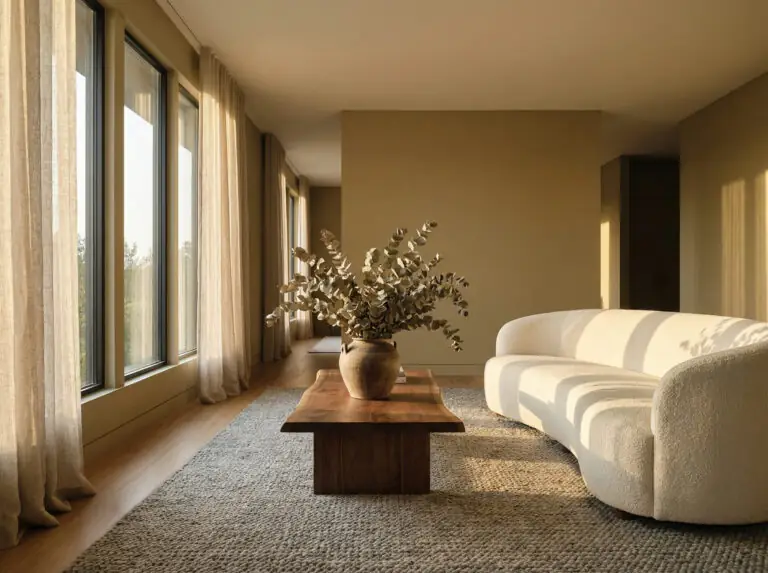
There was a time when painting a living room dark was considered a risk—something reserved for a media room or a bachelor pad. In 2026, dark colors are mainstream, driven by a desire for intimacy and “cocooning.”
This trend, often associated with the “Dark Academia” aesthetic, uses shadow and depth to create a sense of luxury. It’s about making the living room feel like a boutique hotel lounge where you want to curl up with a book and a glass of wine.
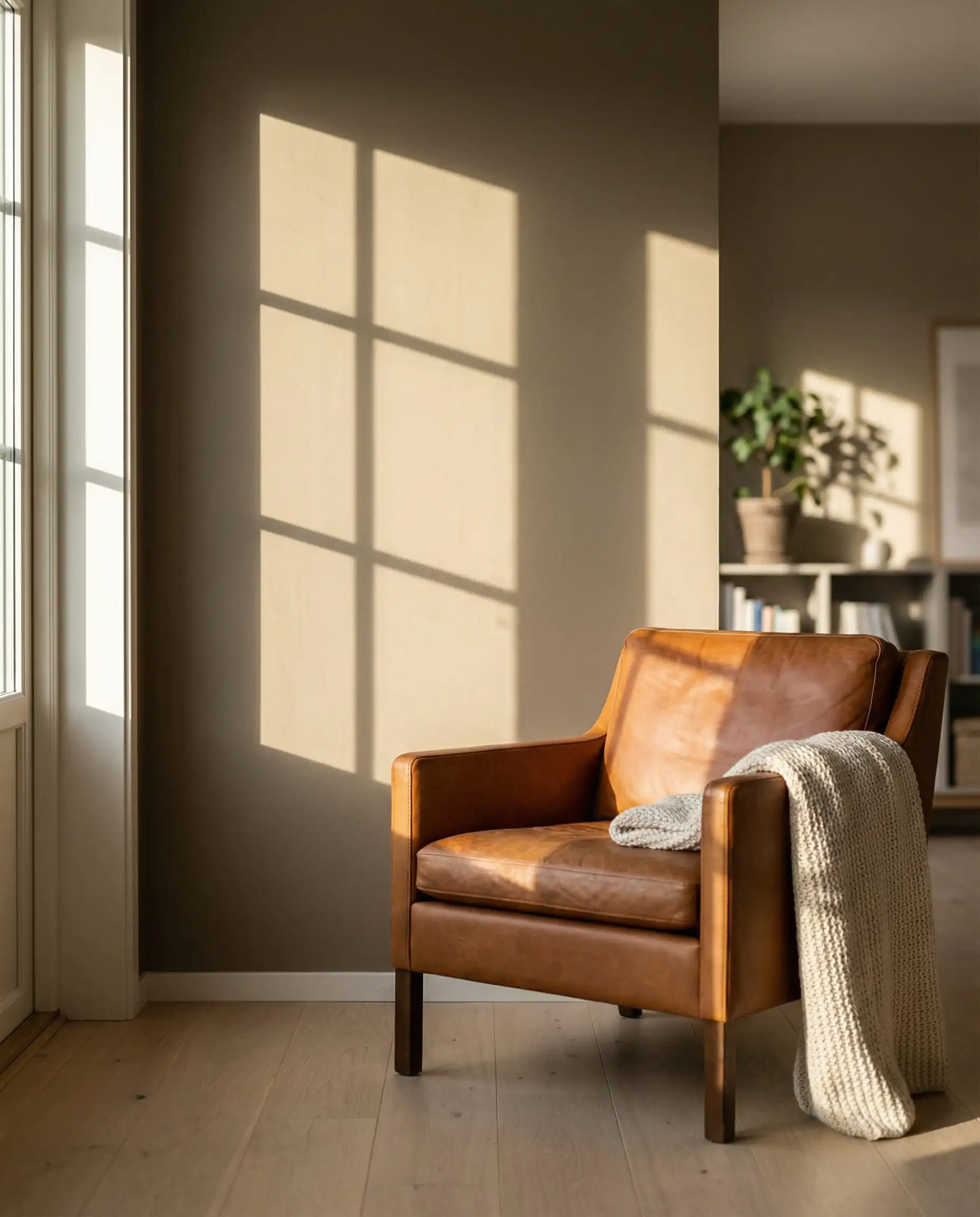
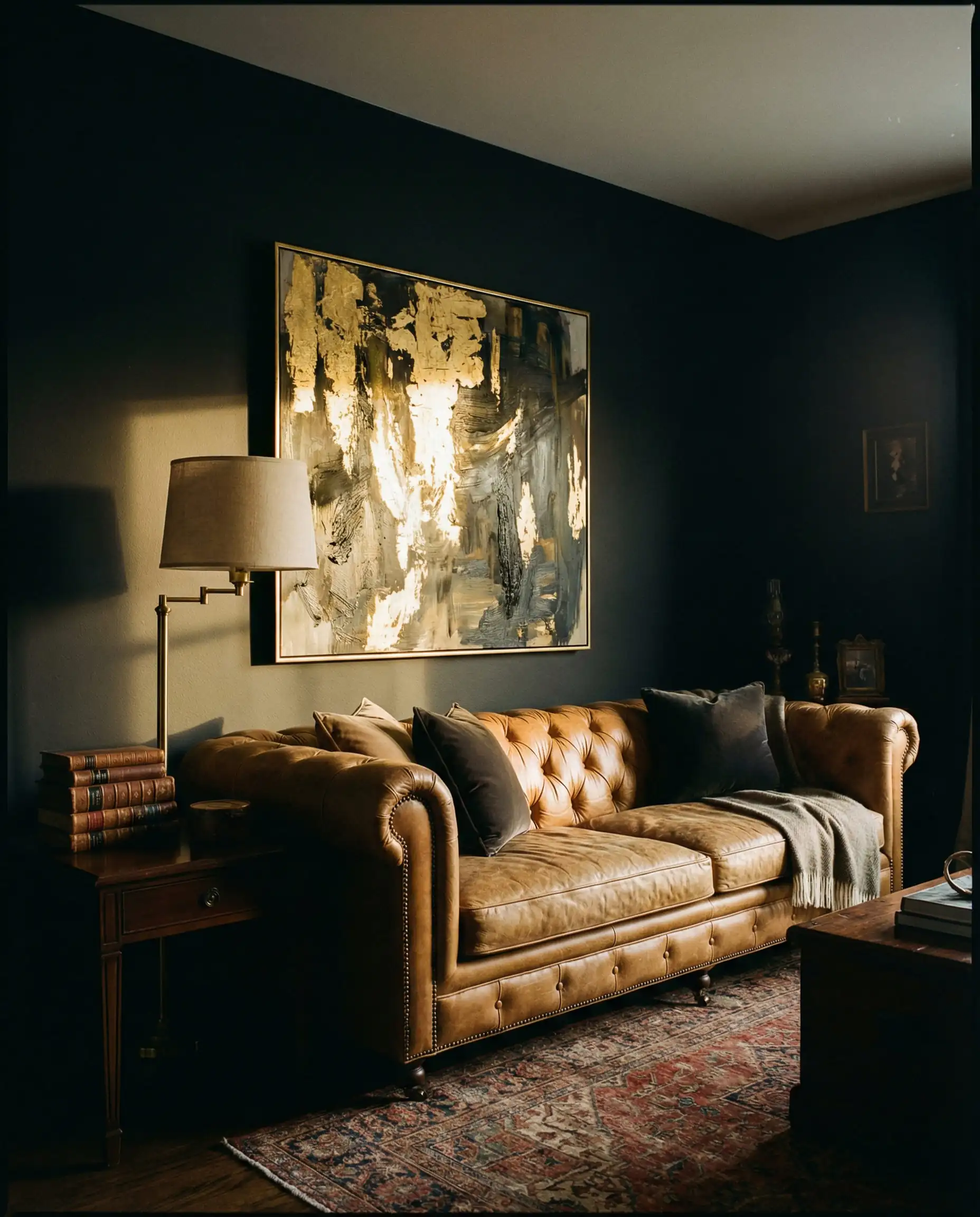
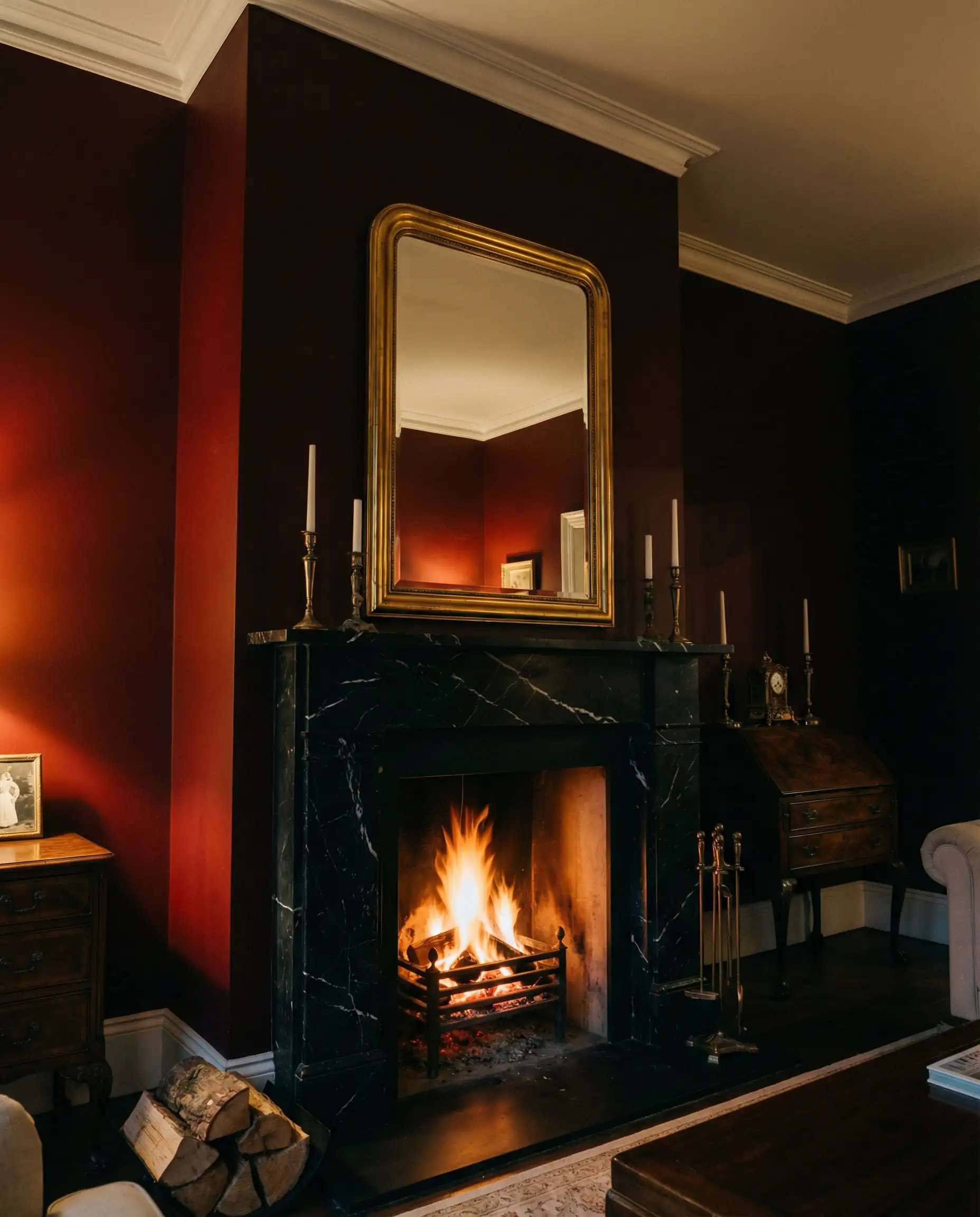
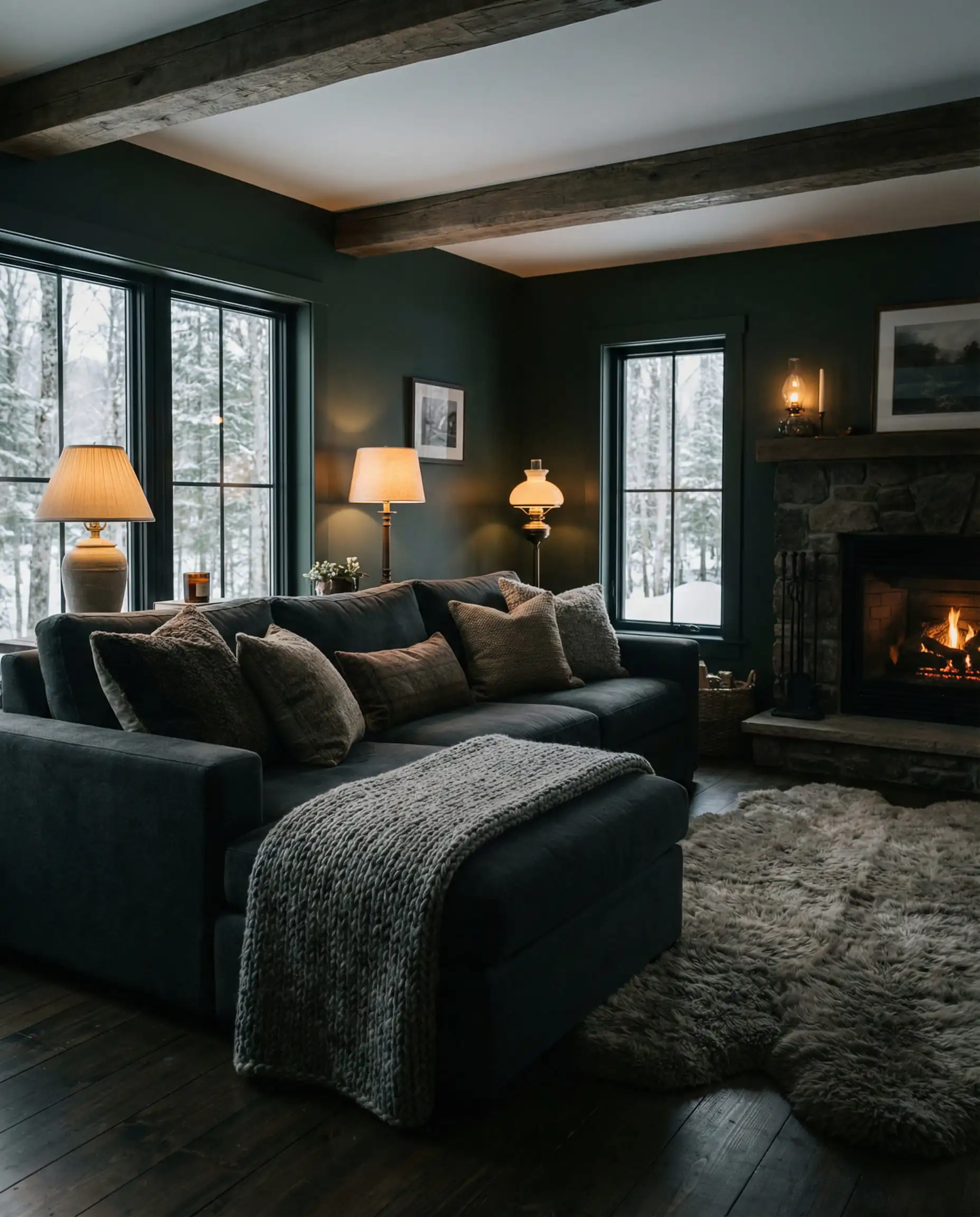
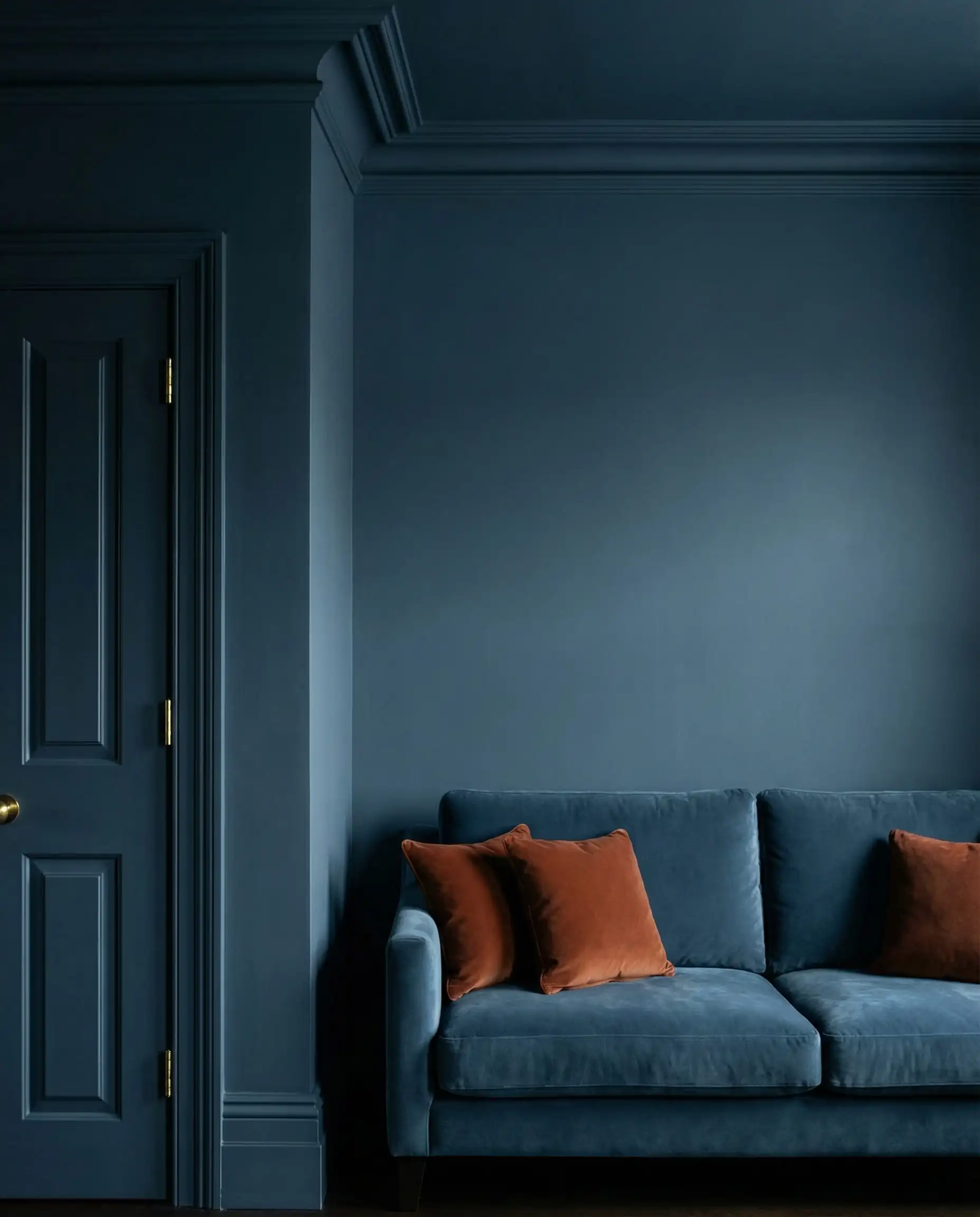
The Rise of Espresso & Silhouette
Black is harsh; Espresso is welcoming. That’s the mantra for 2026. Deep, blackened browns—like Benjamin Moore’s Silhouette—are replacing pure black as the go-to dramatic shade. These colors have charcoal undertones but retain a warmth that pure black lacks.
When paired with brass hardware or a camel leather sofa, an espresso wall creates an incredible, high-contrast look that feels timeless. It’s particularly effective in rooms with high ceilings, as it brings the scale down to a human level, making grand spaces feel intimate.
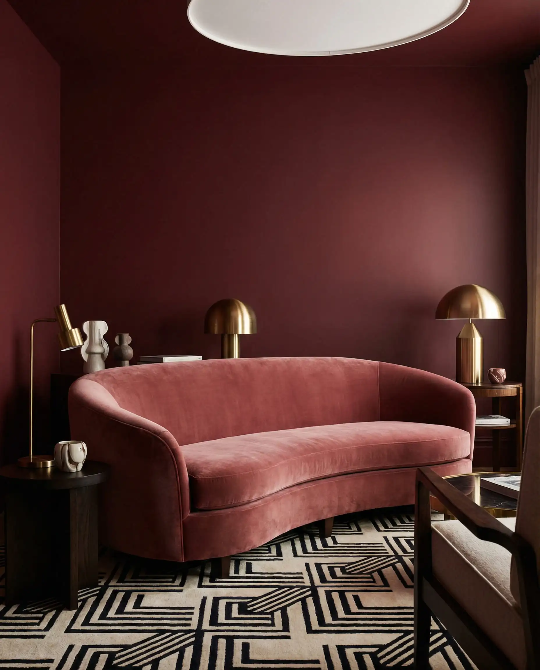
Warm Mahogany & Burgundy
Red is notoriously difficult to use in interior design, but 2026 sees the return of “Oxblood,” “Merlot,” and “Warm Mahogany.” These aren’t fire engine reds; they are browned-down, earthy reds that look almost like leather or dark wood.
A living room painted in a deep burgundy exudes confidence. It pairs beautifully with the heavy, textured fabrics trending this year, such as velvet and bouclé. If you are planning to incorporate these rich tones, you might want to ensure your furniture can hold its own against such a strong backdrop. A look at the latest sofa trends reveals that designers are favoring bold, curvy furniture that complements these dramatic wall colors perfectly.
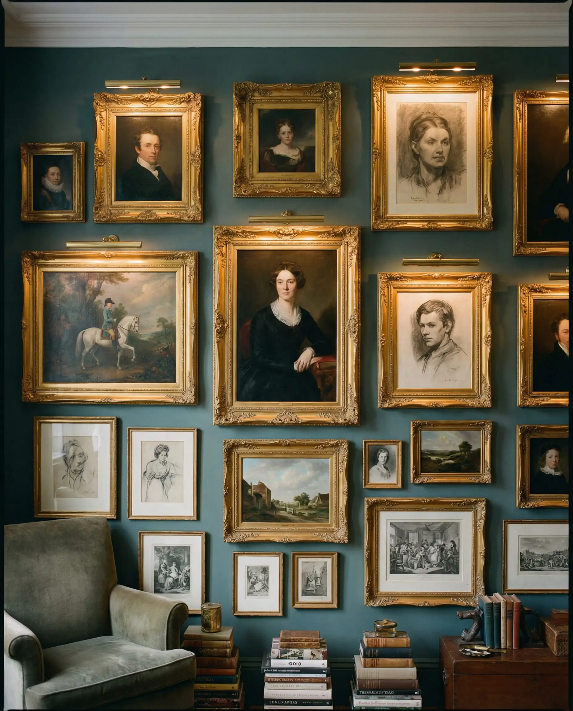
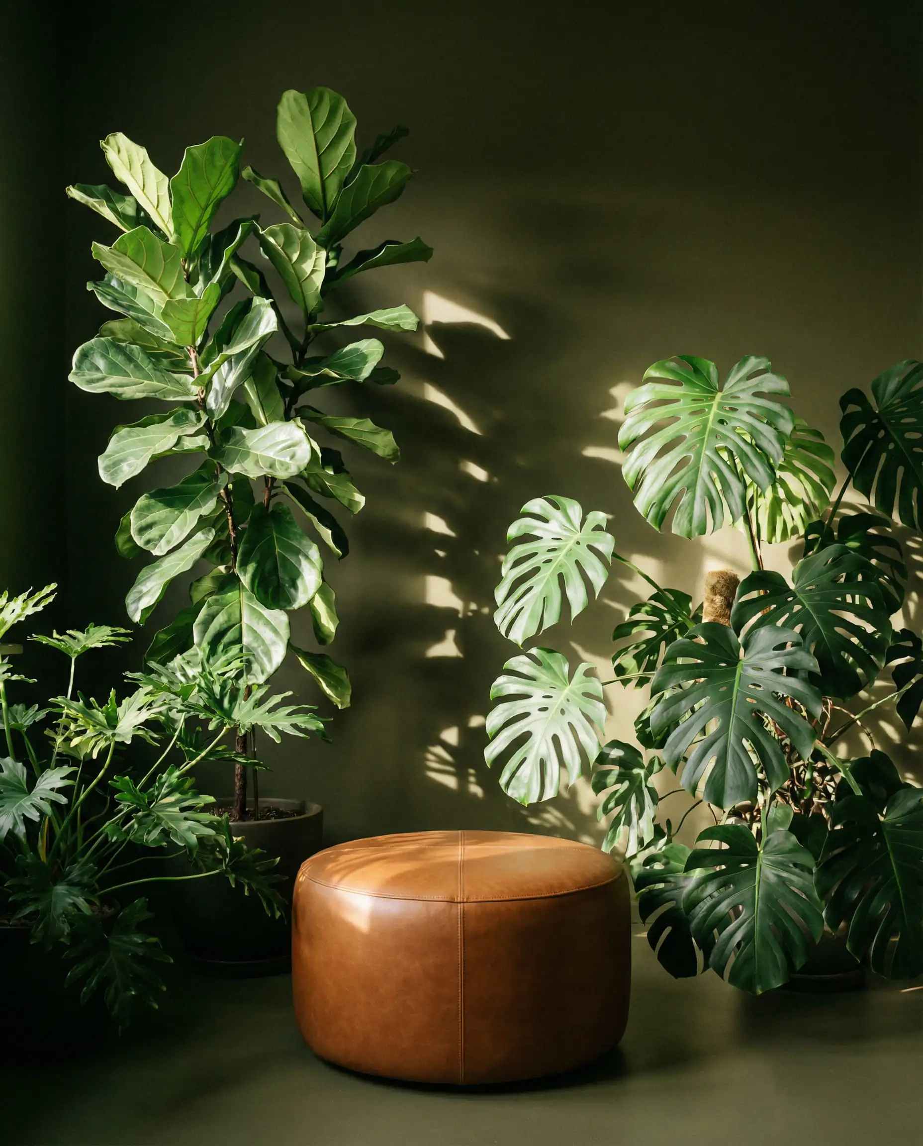
Hidden Gem: The Smoky Teal
If brown and red feel too traditional, look toward the deep, smoky teals. Colors like Hidden Gem (Behr’s focus) offer a dramatic flair that still feels connected to nature. It’s a jewel tone, but “dusted” with gray so it doesn’t scream for attention. It works exceptionally well as a backdrop for a gallery wall, making gold frames and artwork pop.
Nature Reimagined: Earthy Greens & Sun-Baked Yellows
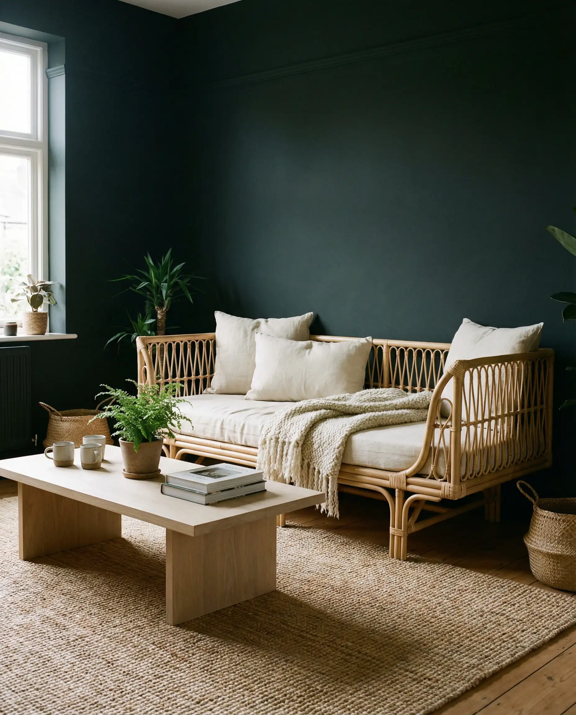
Green has been a top contender for the last three years, but the 2026 variation is less “botanical garden” and more “deep forest.” We are moving away from the crisp sage greens into muddier, swampier, and inkier territories.
Olive & Inky Greens
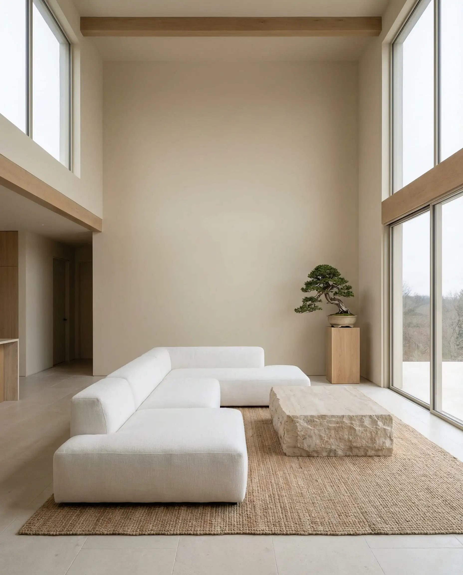
Think of the color of a dried olive leaf or deep moss. These greens act almost as neutrals in 2026. They are calming and restorative, perfect for a living room where you want to decompress after a high-stress day.
The psychological effect of these deep greens is profound—they lower heart rates and signal “shelter” to the brain. Because they are so heavy, they work beautifully when paired with lighter, natural materials like rattan, jute, or light oak flooring. For those looking to emphasize eco-friendly materials in their renovation, these greens are the perfect palette match for eco-sustainable interior design trends.
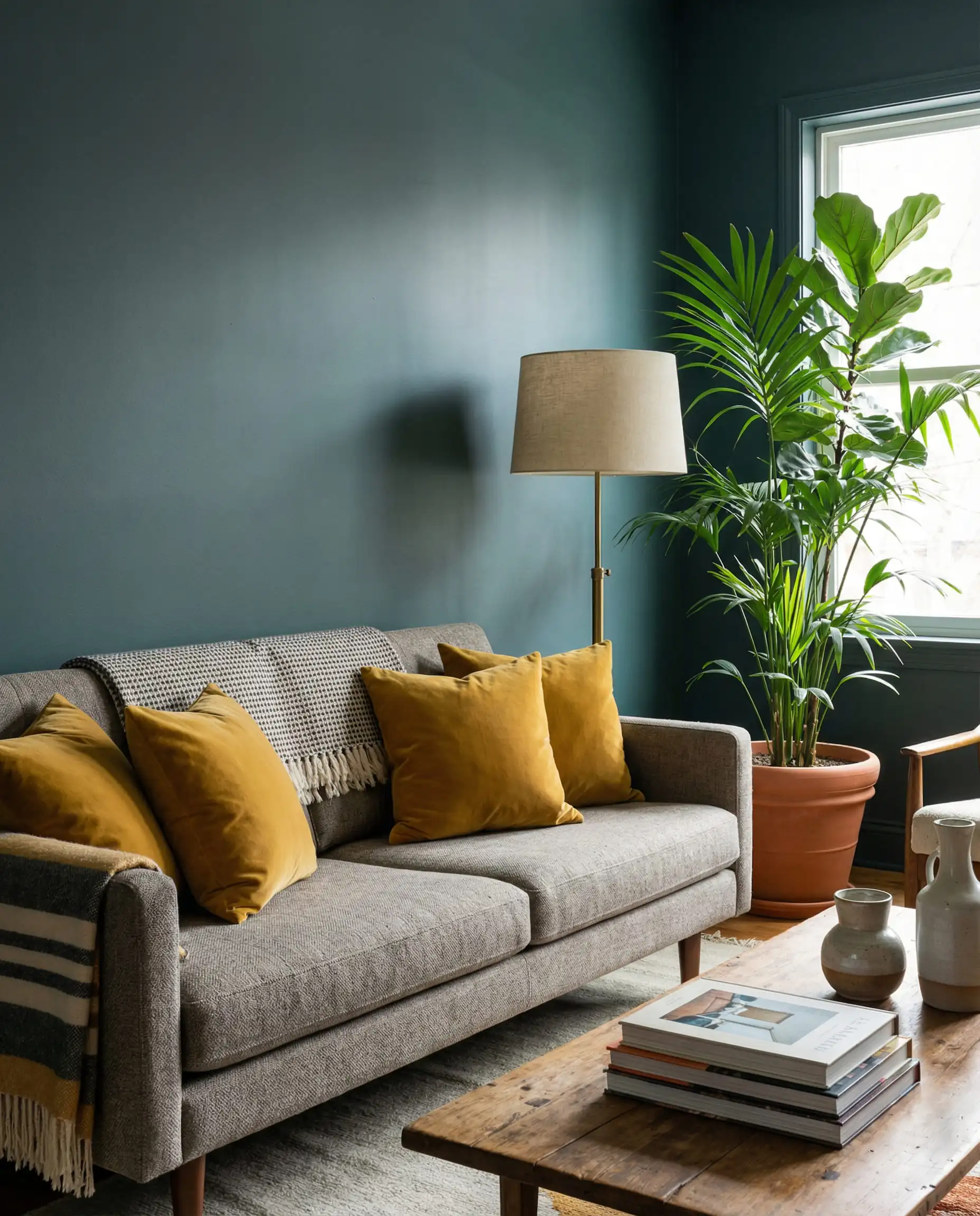
The Return of Ochre & Butter Yellow
Perhaps the most surprising comeback of 2026 is yellow. But erase the thought of “school bus yellow” or “pastel nursery lemon.” The trending yellows are “Ochre,” “Mustard,” and “Butter.”
These are sun-baked, earthy yellows that feel grounded, not manic.
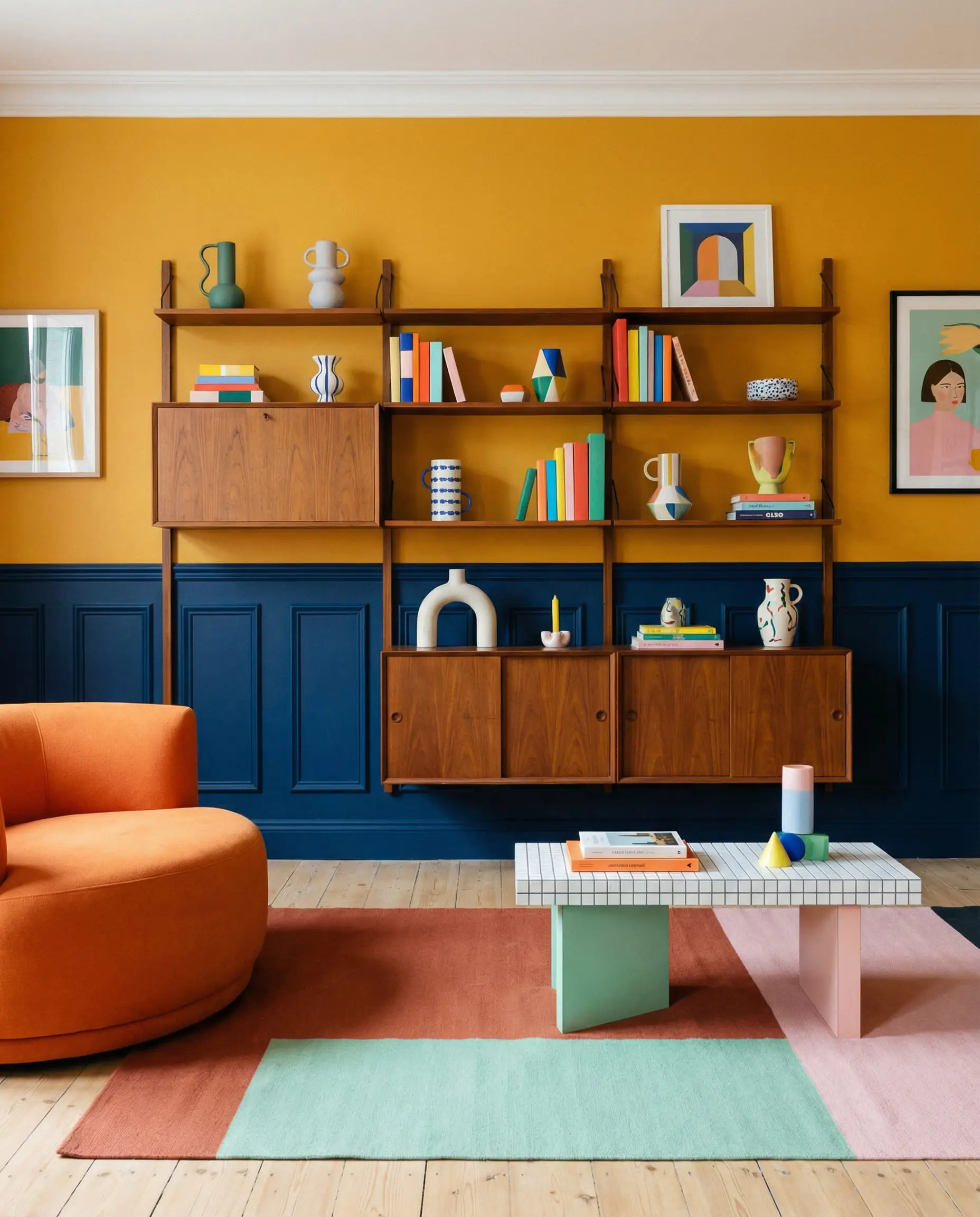
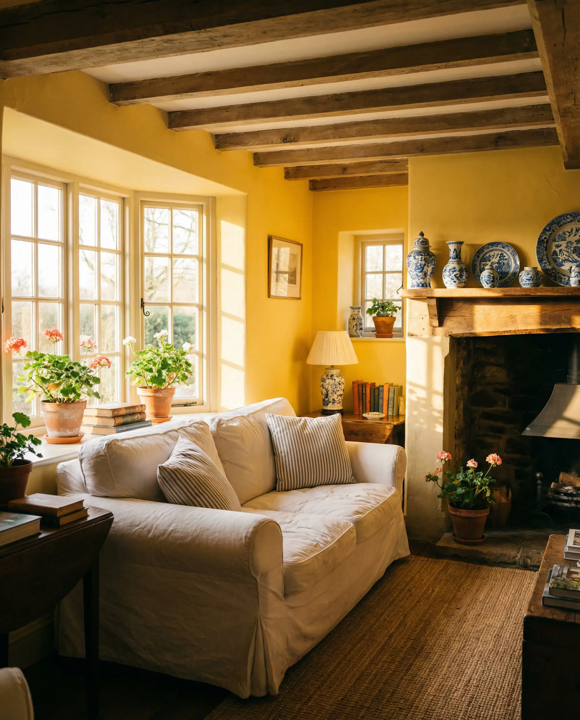
Yellow is the most reflective color in the spectrum. It intensifies when applied to four walls. Always choose a shade that looks slightly ‘too gray’ or ‘too brown’ on the chip; once it’s on all four walls, it will brighten up to the perfect sunny yellow.
Designer’s Tip
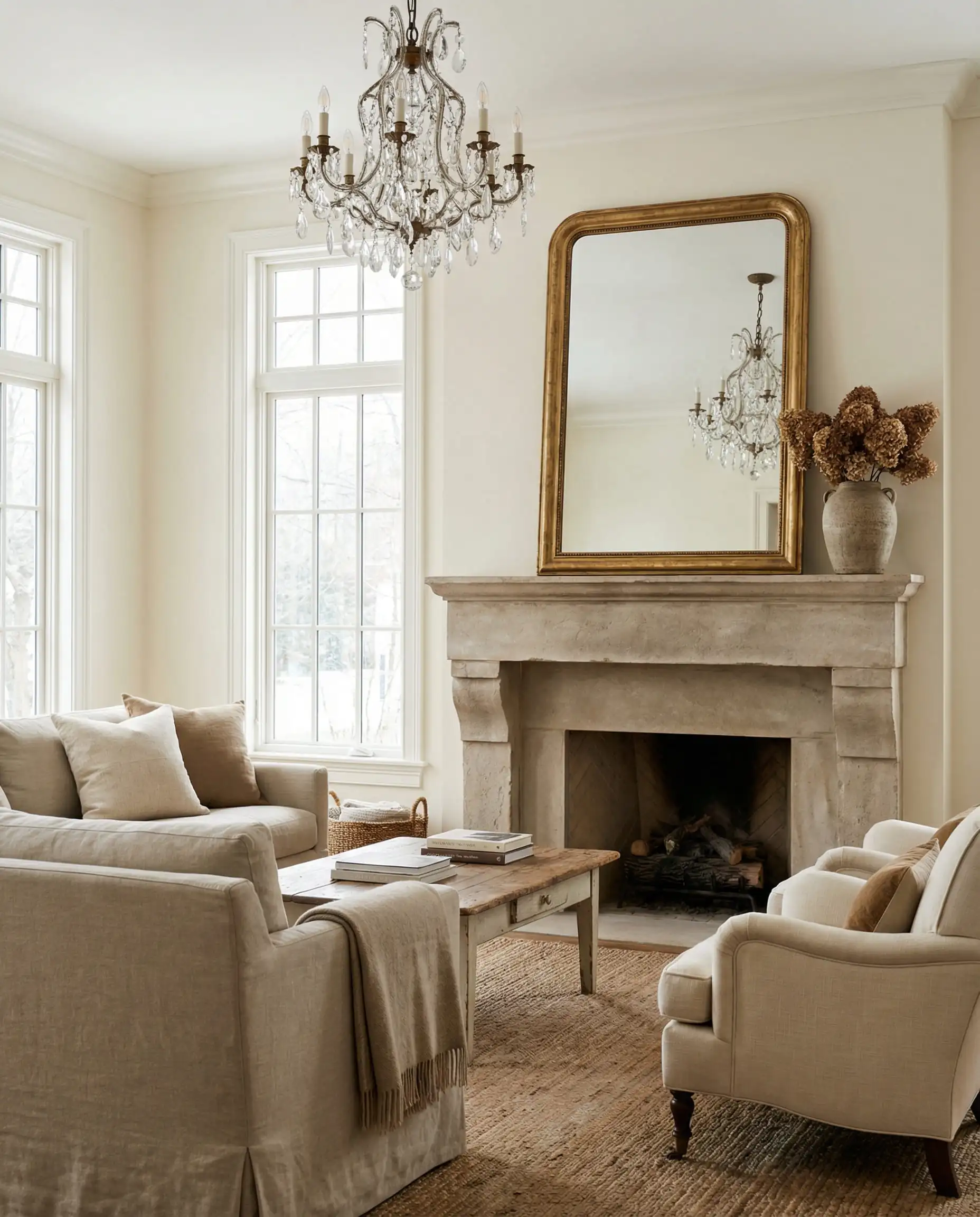
Technical Deep Dive: Finishes & Lighting
You can pick the trendiest color of the year, but if you choose the wrong finish (sheen), the effect will fall flat. In 2026, the texture of the paint is just as important as the color itself.
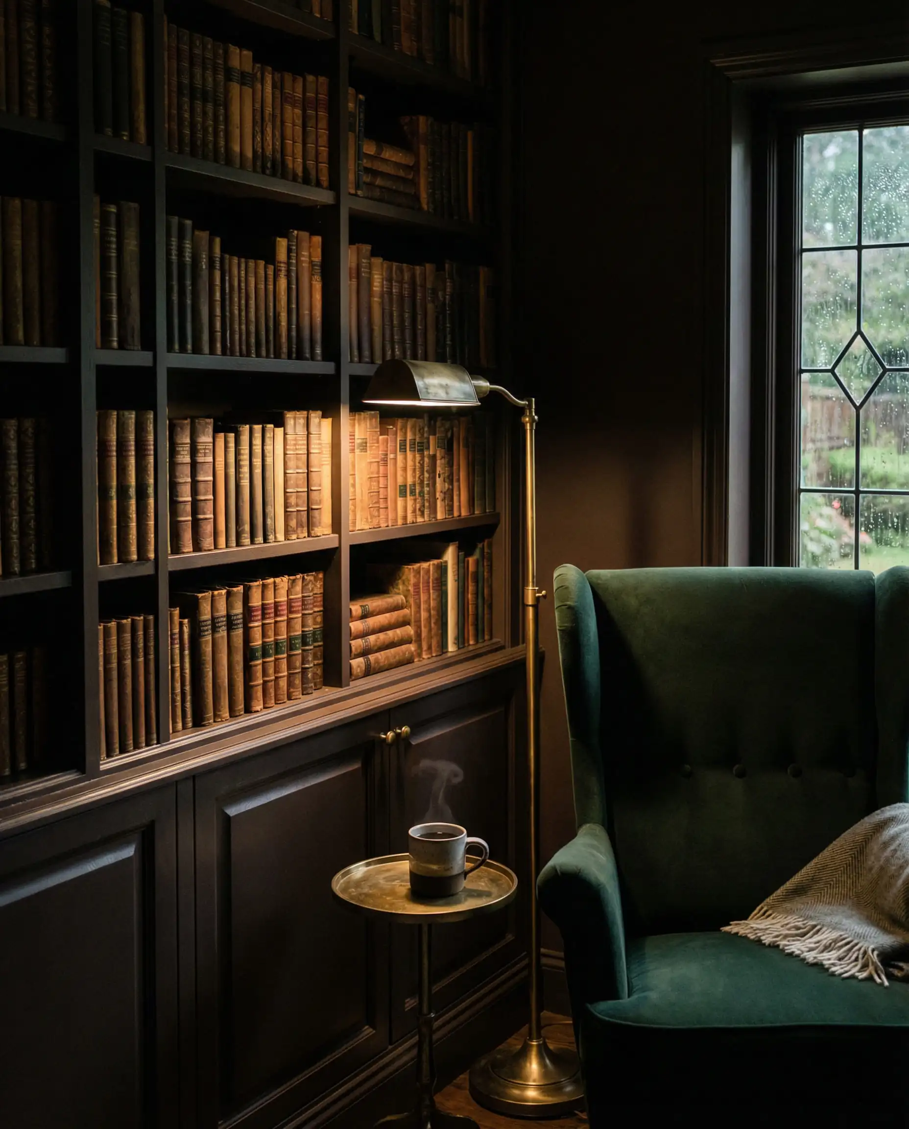
The Reign of Matte
For the moody, dark colors mentioned above (Espresso, Burgundy, Deep Green), a Matte or Flat finish is almost mandatory.
Why: Dark colors absorb light. If you use a satin or semi-gloss finish on a dark wall, every single imperfection in the drywall will be highlighted by the glare. A matte finish absorbs the light, making the walls look velvety, soft, and endless. It hides bumps and creates that luxury “plaster” look.
For lighter neutrals (Khaki, Mushroom), an Eggshell finish remains the standard—it offers a slight washability without being shiny.
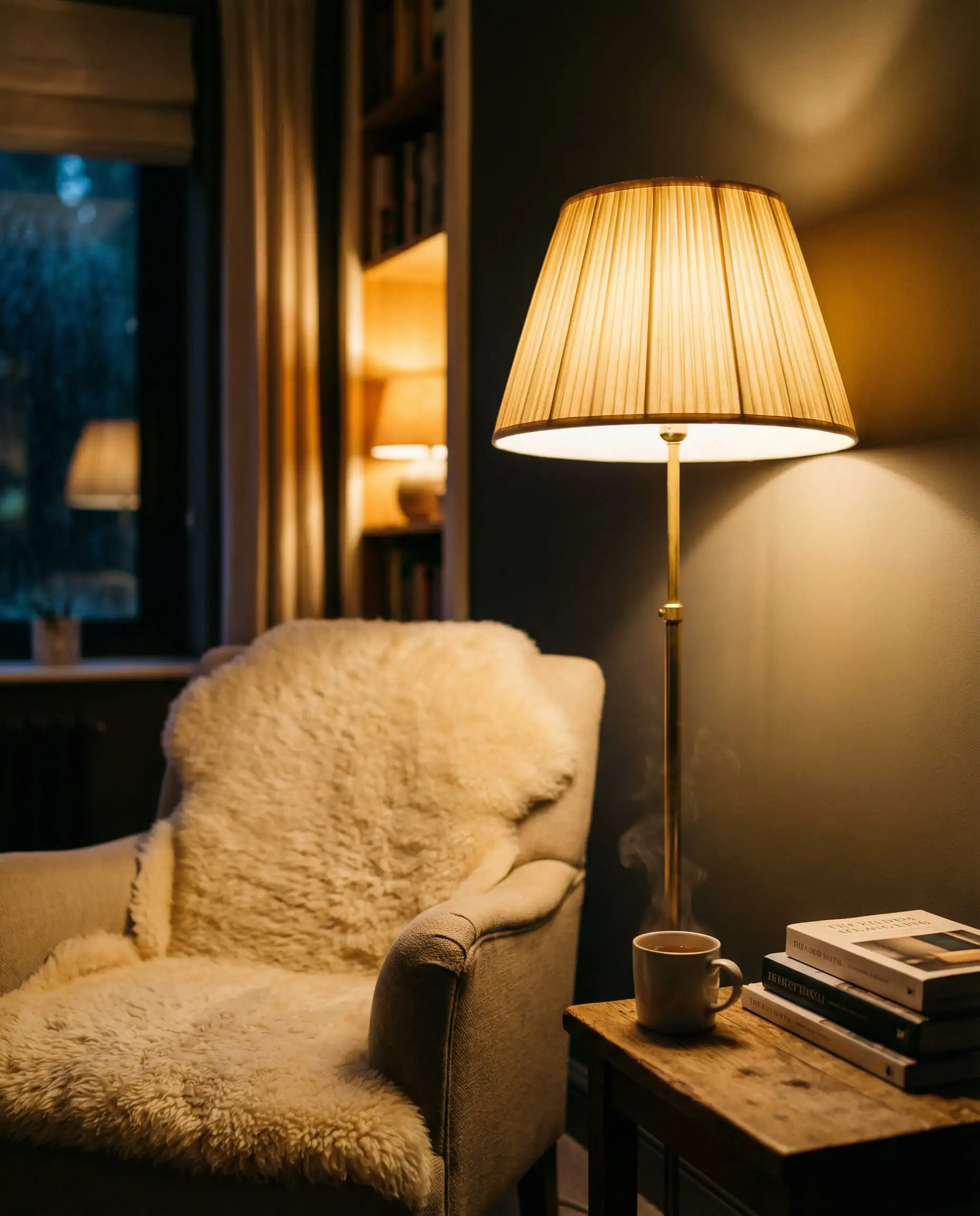
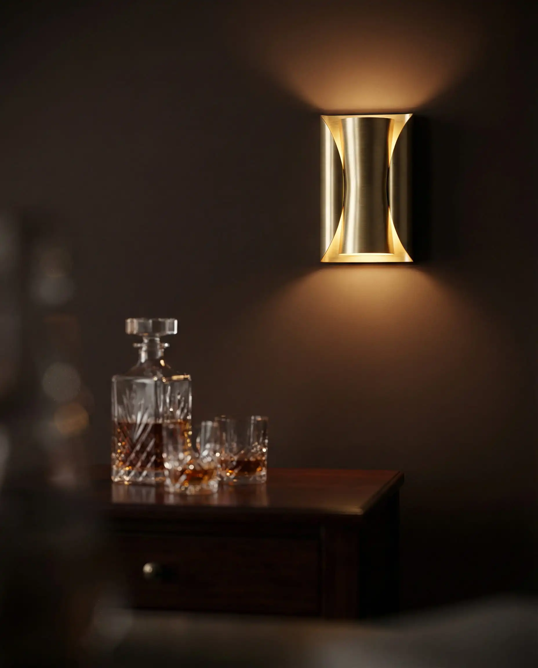
Lighting: The Make-or-Break Factor
The “Grounded Comfort” palette relies heavily on lighting temperature.
If you are repainting, you must audit your light fixtures. A deep burgundy wall will look black if the room is poorly lit. Consider layering your lighting with floor lamps and sconces to wash the walls with light. For inspiration on fixtures that complement these rich tones, explore the newest lighting trends.
Trending Techniques: It’s Not Just About the Walls
In 2026, how you paint is just as important as what you paint. The standard “white ceiling, white trim, colored walls” formula is being challenged.
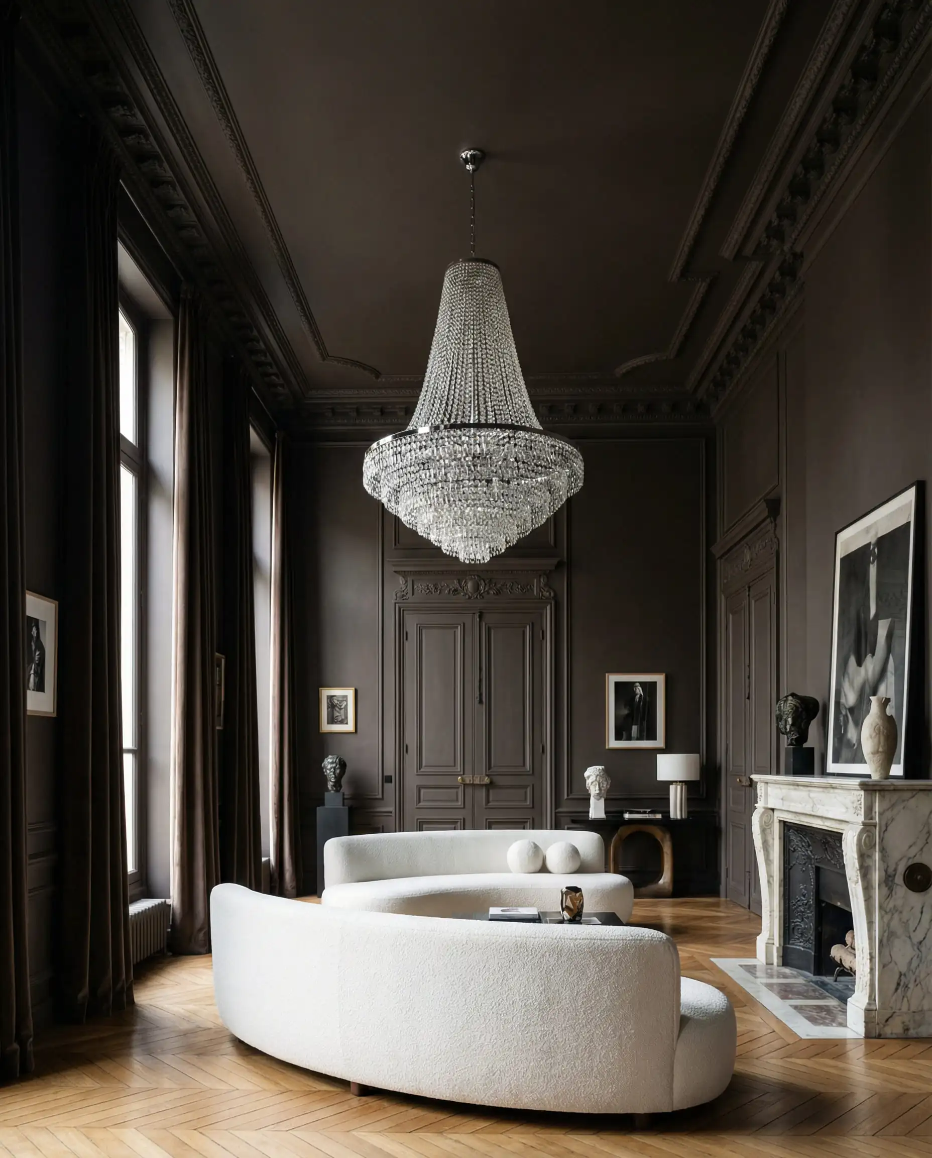
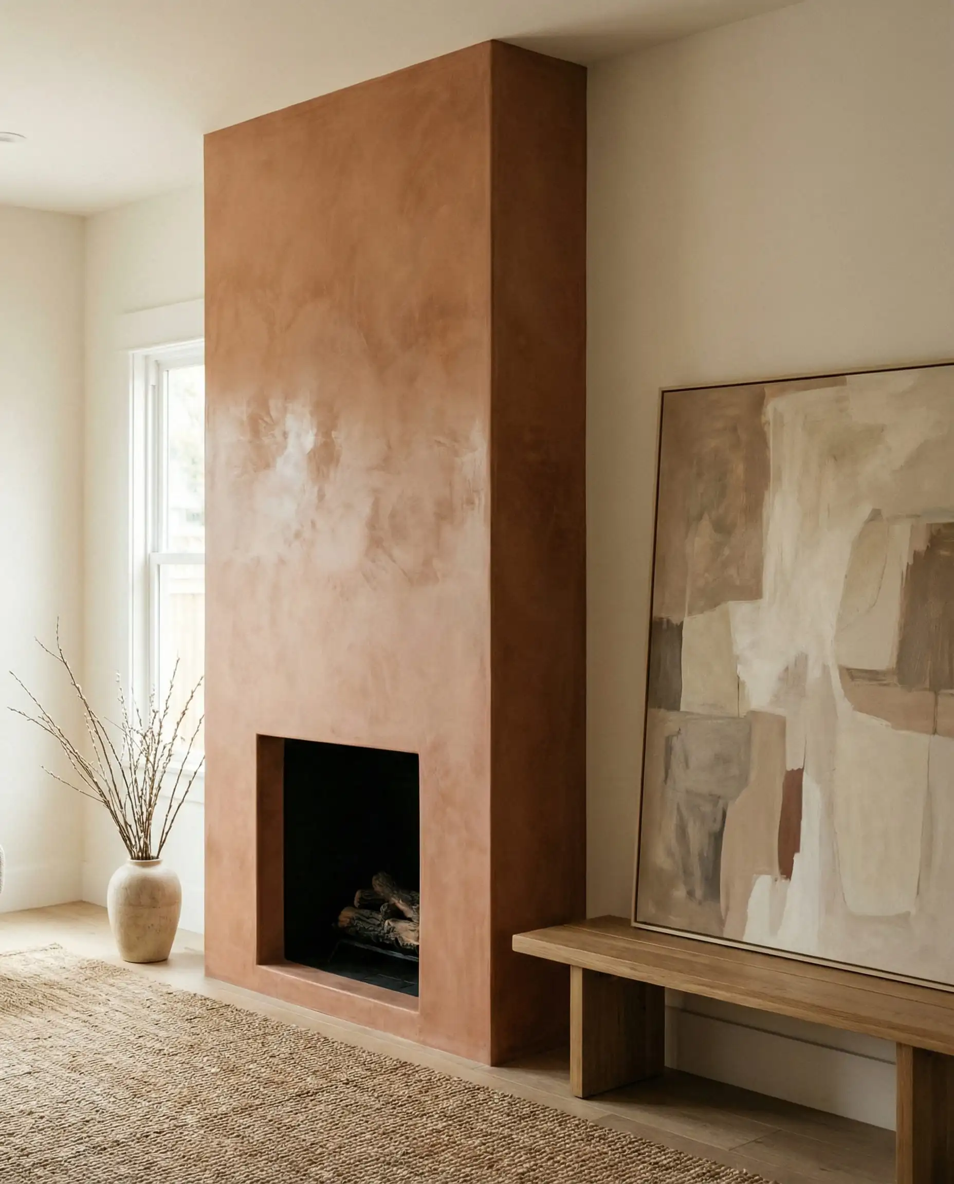
Color Drenching
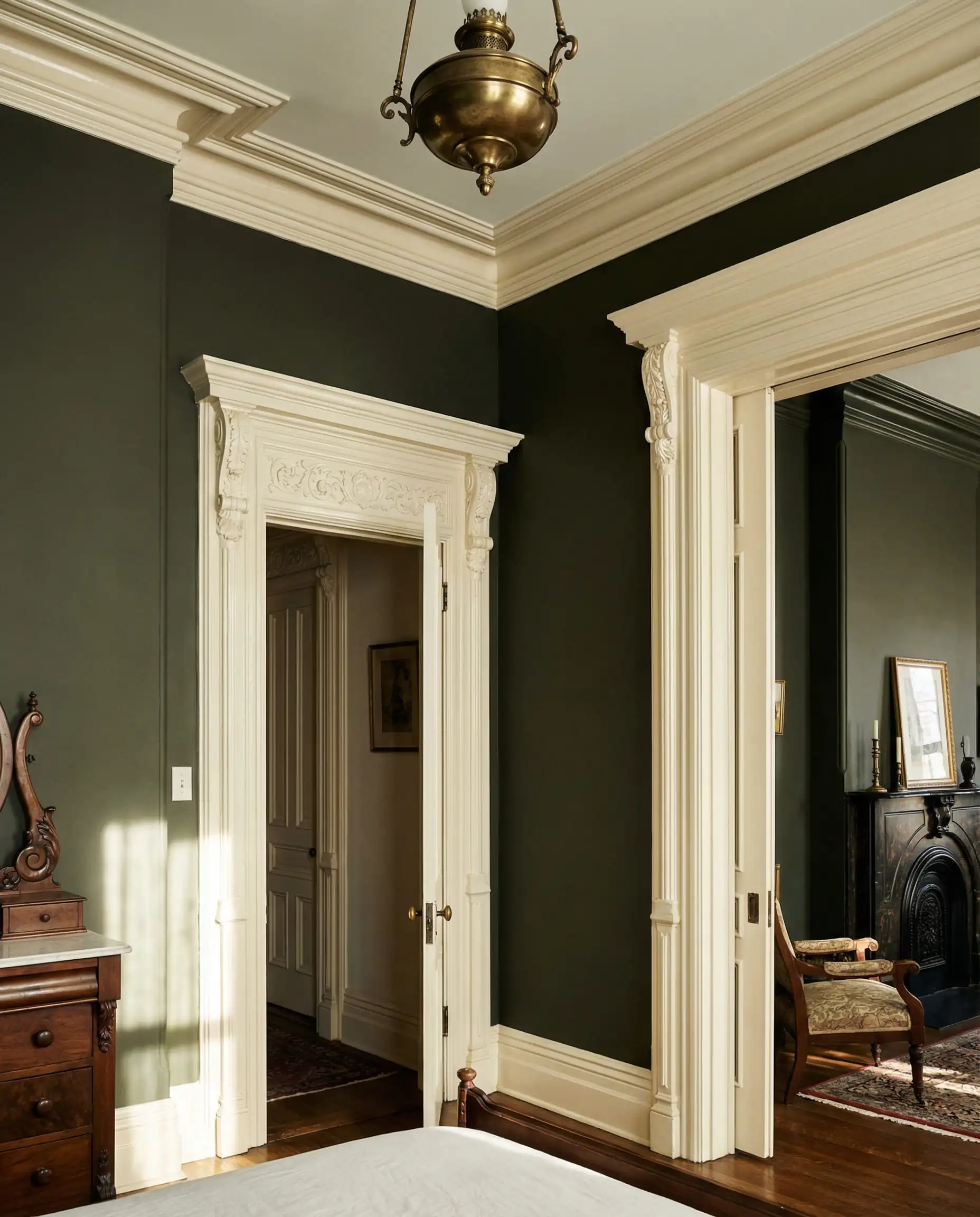
This is the biggest application trend of the year. Color drenching involves painting the walls, the baseboards, the door frames, the crown molding, and sometimes even the ceiling in the exact same color.
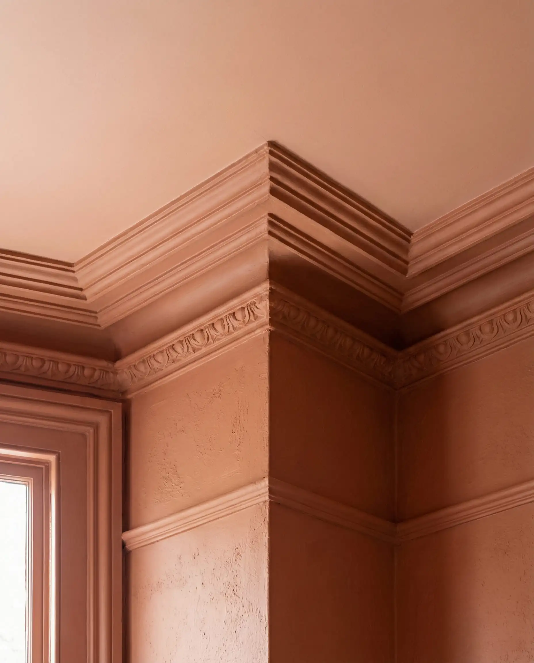
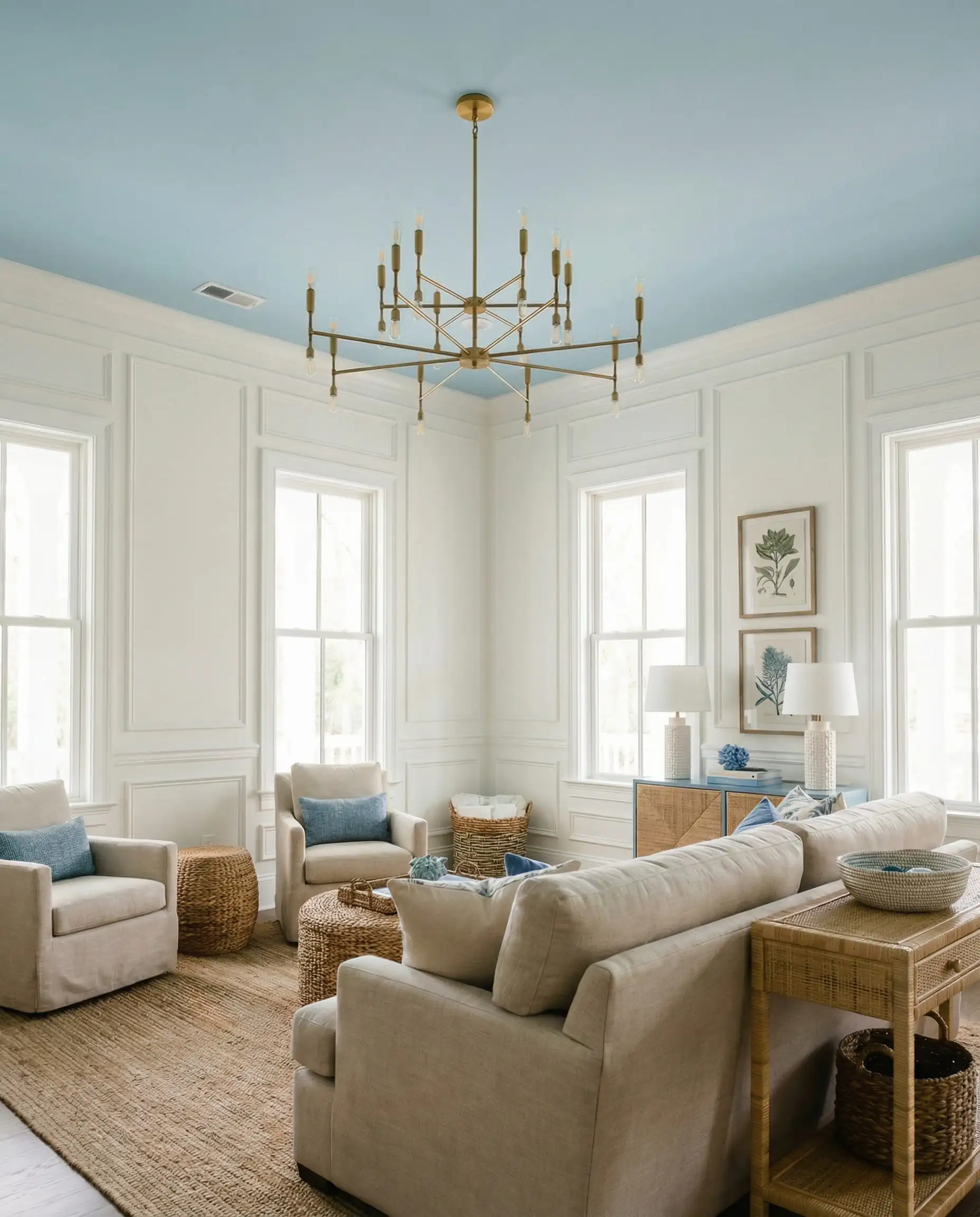
The “Fifth Wall”
If color drenching feels too intense, 2026 is the year to treat the ceiling as a canvas. We are seeing a rise in contrasting ceilings—for example, walls in a soft Mushroom tone with a ceiling painted in a pale, dusty blue or a soft terracotta.
This draws the eye up and adds a layer of surprise. However, this works best in rooms with average to high ceilings. If you have low ceilings, stick to a lighter shade up top. For more ideas on how to handle this surface, check out our dedicated article on ceiling paint color trends.
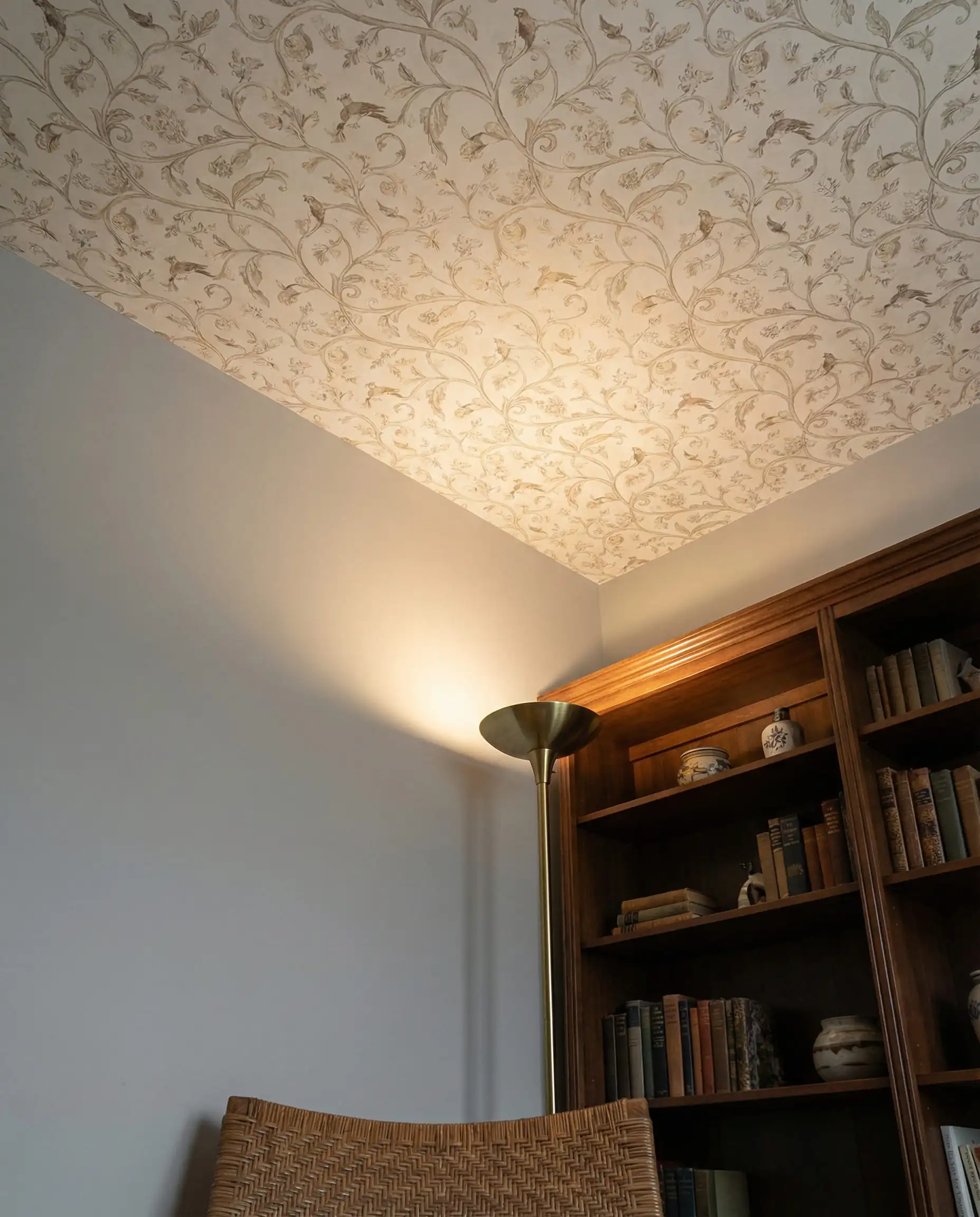
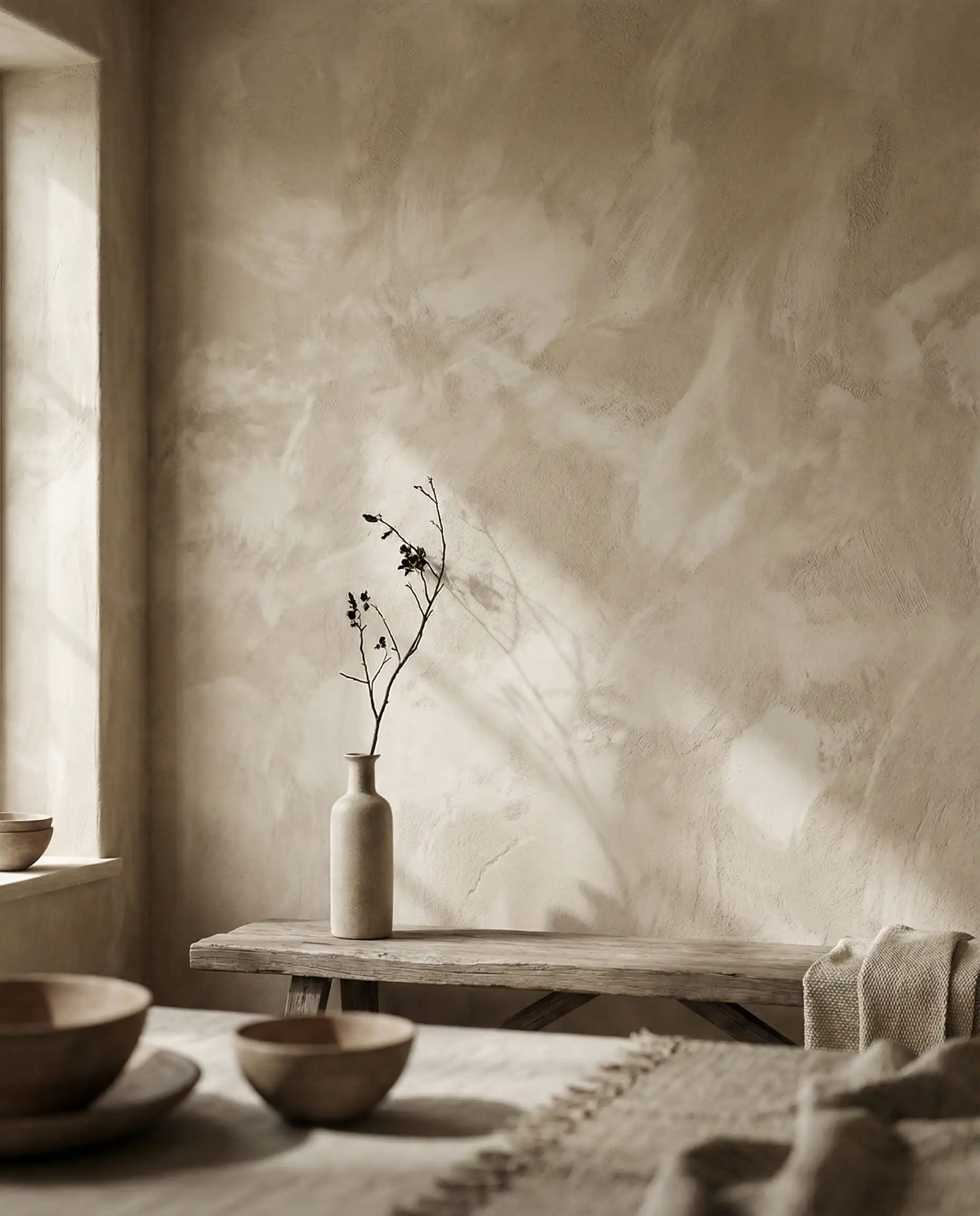
Textured Walls
While not strictly “paint,” the application of Limewash and Roman Clay is skyrocketing. These finishes add physical texture and movement to the color, making a flat beige wall look like a historic European plaster wall. If you want the look of the “New Neutrals” but want more depth, a limewash in a sandy tone is the peak of 2026 luxury.
Frequently Asked Questions (FAQ)
A: The cool, steel grays of the 2010s are definitely on the decline. However, gray isn’t gone—it has just warmed up. “Greige” (gray-beige) and warm taupes are very much in style because they offer the neutrality of gray but with the warmth that current trends demand.
A: Contrary to popular belief, white isn’t the only answer for small spaces. In 2026, designers are using medium-tone earthy pinks (like terracotta) or soft khakis to make small rooms feel intentional and jewel-box-like. Using the “Color Drenching” technique mentioned above is also a great trick to expand a small space visually.
A: Look at your natural light. If your living room is north-facing (low light), a dark color can actually embrace the shadows and make it cozy, whereas white might look dingy. If you have a south-facing room (lots of light), the new neutrals like Khaki will sing and feel airy.
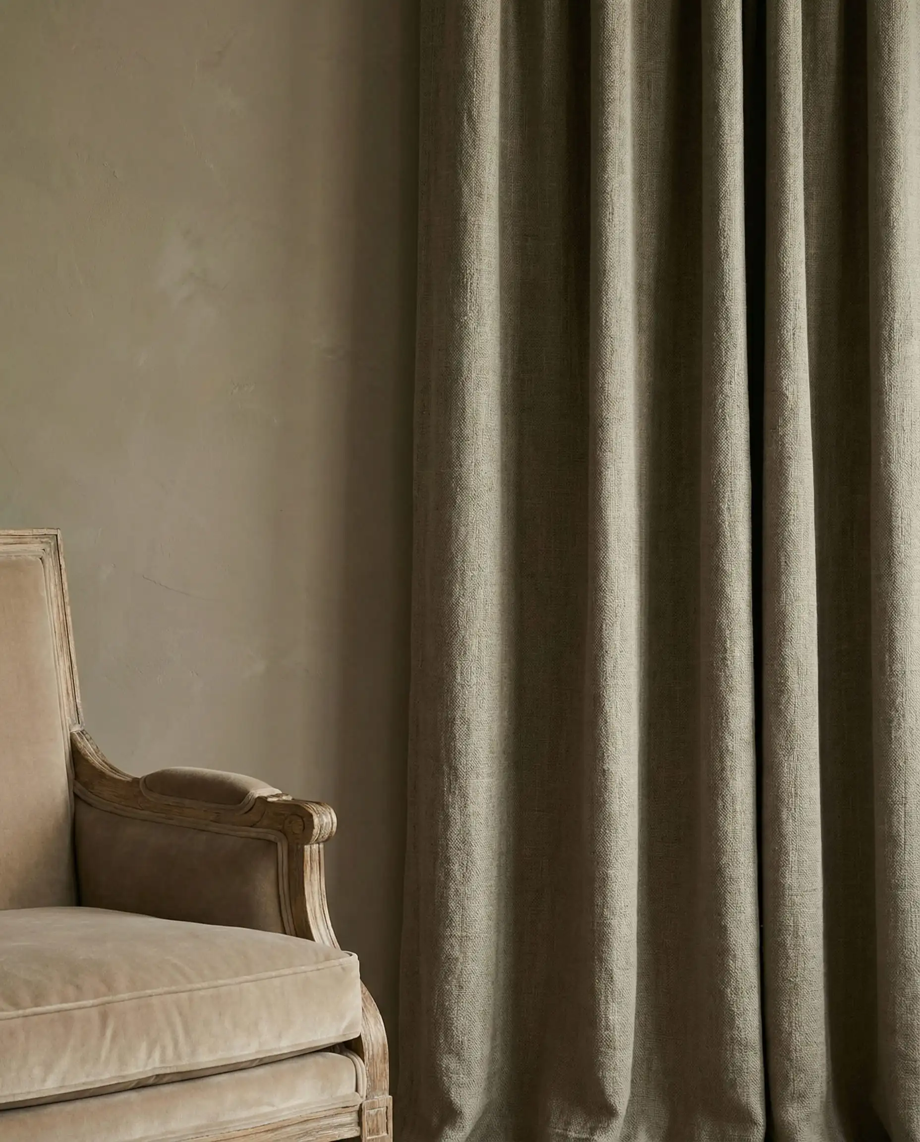
A: Not necessarily. The beauty of the 2026 palette is that it is rooted in nature. Wood tones, black metal, and neutral fabrics (gray, white, cream) work with almost all these colors. However, you might want to update soft furnishings like throw pillows or curtains to bridge the gap. For window treatments specifically, you can find inspiration in our curtain trends 2026 guide.
Conclusion
The living room paint colors for 2026 are an invitation to exhale. Whether you are drawn to the safety and warmth of Universal Khaki, the cocoon-like embrace of Silhouette Espresso, or the optimistic glow of Ochre, the goal is the same: to create a home that feels lived-in, grounded, and undeniably yours.
Don’t be afraid to test these colors. Paint is the least expensive renovation you can do, but it has the highest impact. Buy the samples, paint large swatches on your walls, and watch how the light changes them throughout the day. Your living room is ready for its transformation.