Authentic Moroccan zellige commands a room unlike any other material, bringing an unmatched wabi-sabi texture to modern kitchens. Yet, for all its visual magnetism, it remains a high-commitment, technically demanding installation that terrifies even seasoned renovators. The fear of choosing the wrong grout or inadvertently creating a dated, chaotic aesthetic prevents many from utilizing this masterful material.
Mastering zellige requires moving beyond stark whites and sterile modernism. Cream zellige is the superior choice for high-end execution, specifically because it allows the room to breathe with lived-in soul. This is not a surface that strives for perfection; it is a deeply tactile material that celebrates its own flaws, demanding careful spatial planning, precise color theory, and an exacting eye for lighting.
The magic of cream zellige lies entirely in its terracotta base. Because the hand-applied glaze is semi-translucent, the earthen red clay bleeds through the ivory surface, creating an undulating color shift that machine-made ceramics simply cannot replicate.
Stylist’s Note
Why Cream Zellige is the Ultimate Warm Minimalist Choice
When analyzing current kitchen backsplash trends, it becomes immediately apparent that the industry is rejecting sterile, hyper-glossy surfaces in favor of materials with organic gravity. Authentic, hand-chiseled cream zellige stands in stark contrast to machine-made ceramic lookalikes. The latter attempts to mimic the uneven surface through repeated factory molds, resulting in a predictable, soulless repetition. True Moroccan zellige relies on the human hand, ensuring no two tiles are identical in thickness, glaze opacity, or edge structure.
This inherent unpredictability—the celebrated “pit and chip” flaws, the iron spots, and the glaze pooling—are defining features, not manufacturing bugs. Cream zellige specifically acts as a textural bridge in warm minimalist spaces, grounding rigid architectural lines with an earthen softness that shifts dynamically as natural light moves through the room.
You can apply wallpapers, paints, etc. on walls and see how they look in various interiors.

Cabinet & Countertop Pairings for Cream Zellige
Cream zellige is a notorious chameleon, shifting its undertones dramatically based on adjacent materials. The undulating, semi-translucent glaze will pull colors from your cabinetry and countertops, making precise color theory and material selection the foundation of a flawless execution.
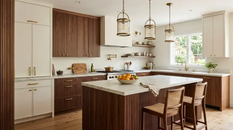
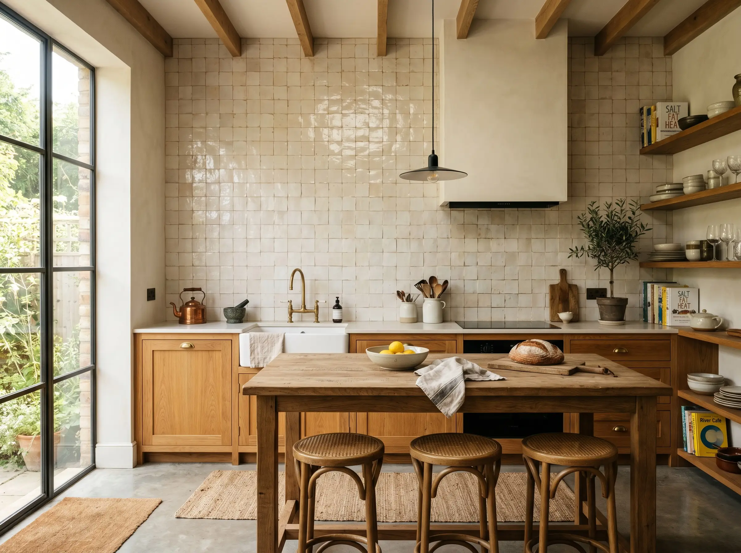
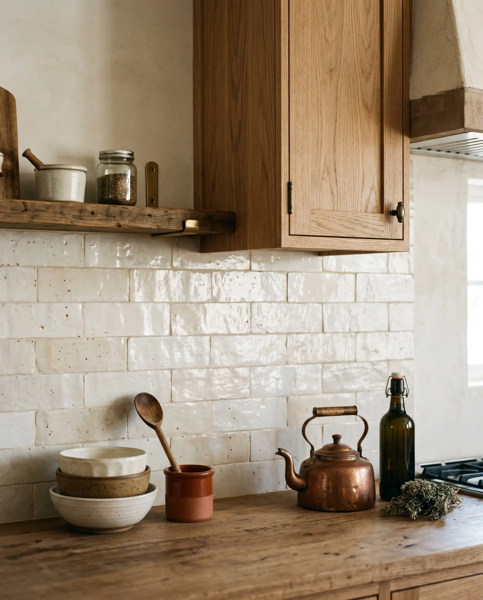
Pair with Rift-Sawn White Oak for Organic Modernism
The linear, highly controlled grain of rift-sawn white oak creates a necessary architectural tension against the irregular, undulating surface of authentic zellige. The cream tile acts as a transitional bridge, pulling the warmth of the wood upward toward a crisp white ceiling without jarring the eye.
- Vibe: Restrained Organic Modernism.
- Key Material: Flat-panel rift-sawn white oak cabinetry with a clear, matte sealant.
- Why it Works: The rigid, predictable lines of the rift-sawn grain provide a visual anchor, allowing the chaotic, wabi-sabi texture of the tile to serve as the primary visual movement in the space.
Contrast with Moody, Desaturated Greens
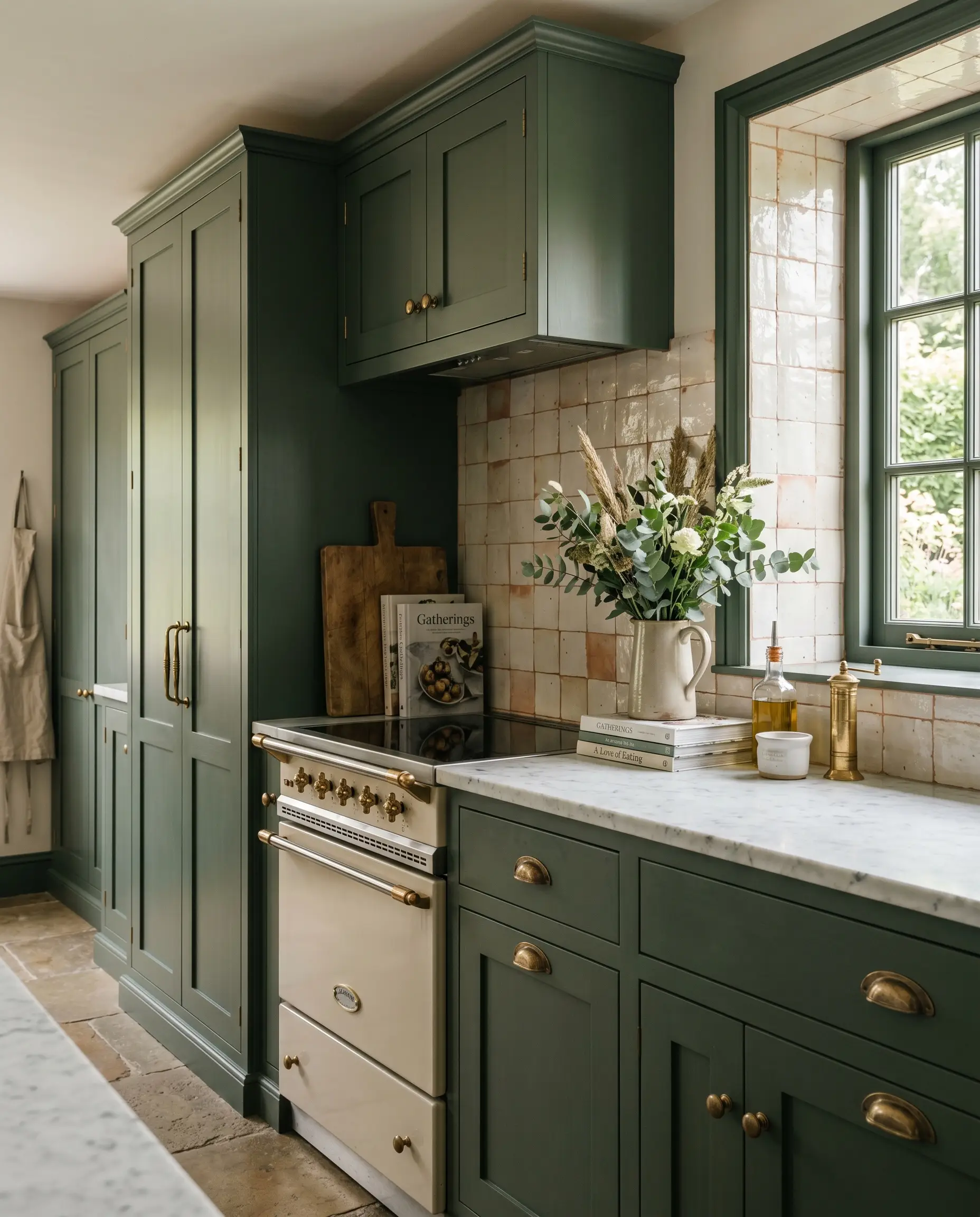
Muddy, desaturated greens provide a sophisticated anchor that prevents the kitchen from feeling overly sterile or overwhelmingly brown. Because the red and terracotta undertones in the cream tile sit directly across the color wheel from green, this pairing creates an immediate, natural harmony.
- Vibe: English Country meets Transitional.
- Key Material: Shaker or slab cabinetry with unlacquered brass hardware.
- Paint Match: Farrow & Ball Green Smoke (No. 47).
- Styling Pro-Tip: Carry the green paint onto the baseboards and window casings to frame the zellige installation like a piece of art.
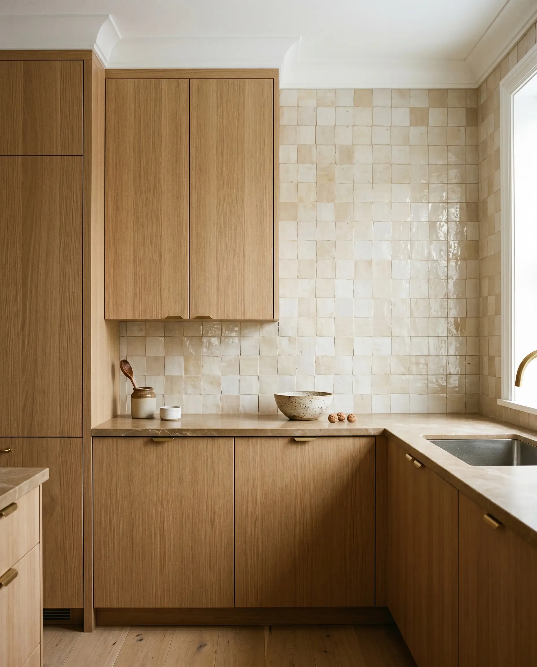
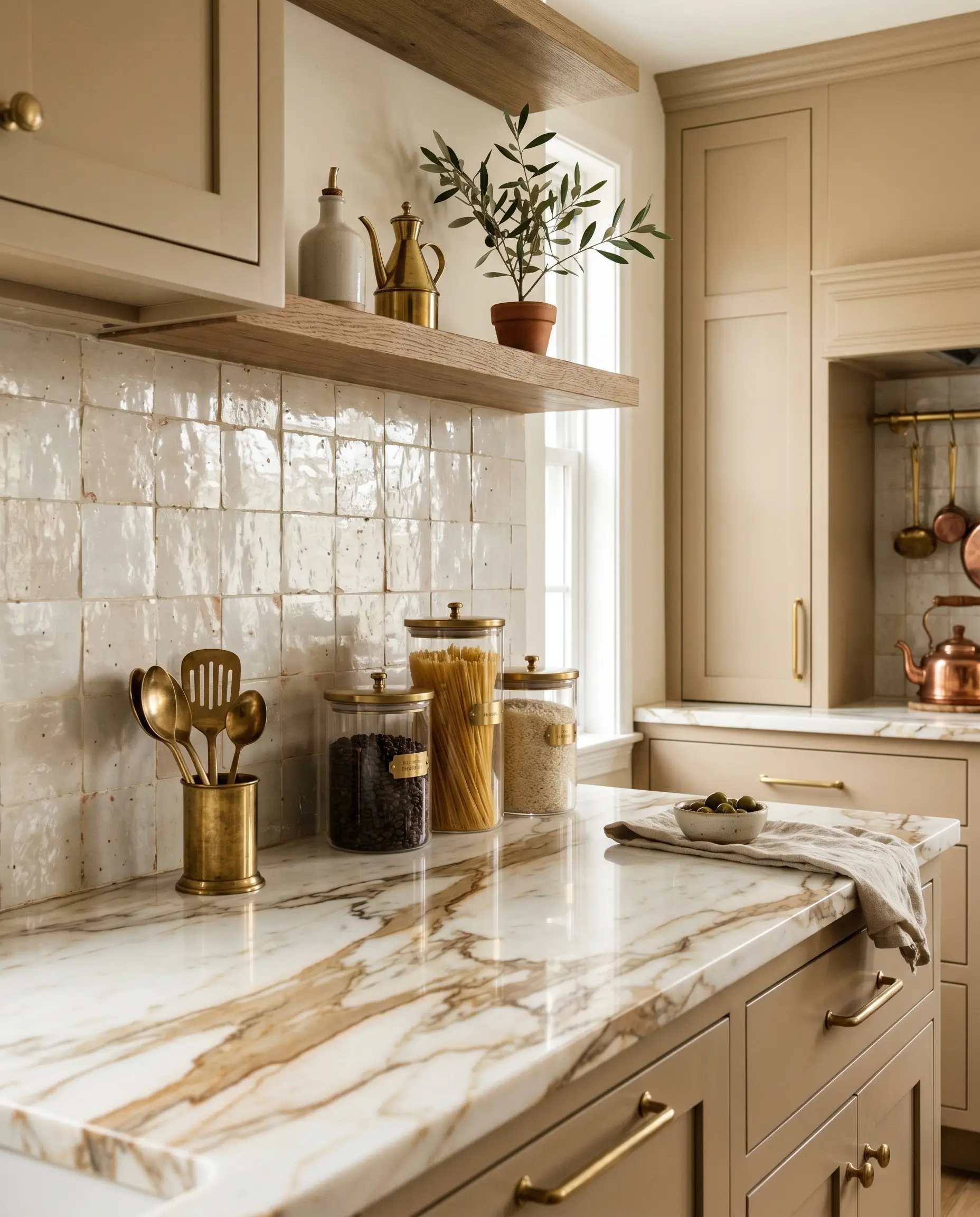
Monochromatic Warmth with “Greige” Cabinetry
For spaces demanding low-contrast harmony, pairing cream zellige with mushroom, putty, or greige cabinetry is the definitive move. By closely matching the tonal value of the cabinets to the darkest glaze pool in the tile, the physical texture of the zellige does the heavy lifting rather than the color.
- Vibe: Warm Minimalism.
- Key Material: Smooth, matte-painted cabinetry paired with honed limestone or plaster range hoods.
- Paint Match: Farrow & Ball Drop Cloth (No. 283).
- Why it Works: Stripping away high-contrast color forces the eye to focus entirely on the tactile, undulating surface of the backsplash.
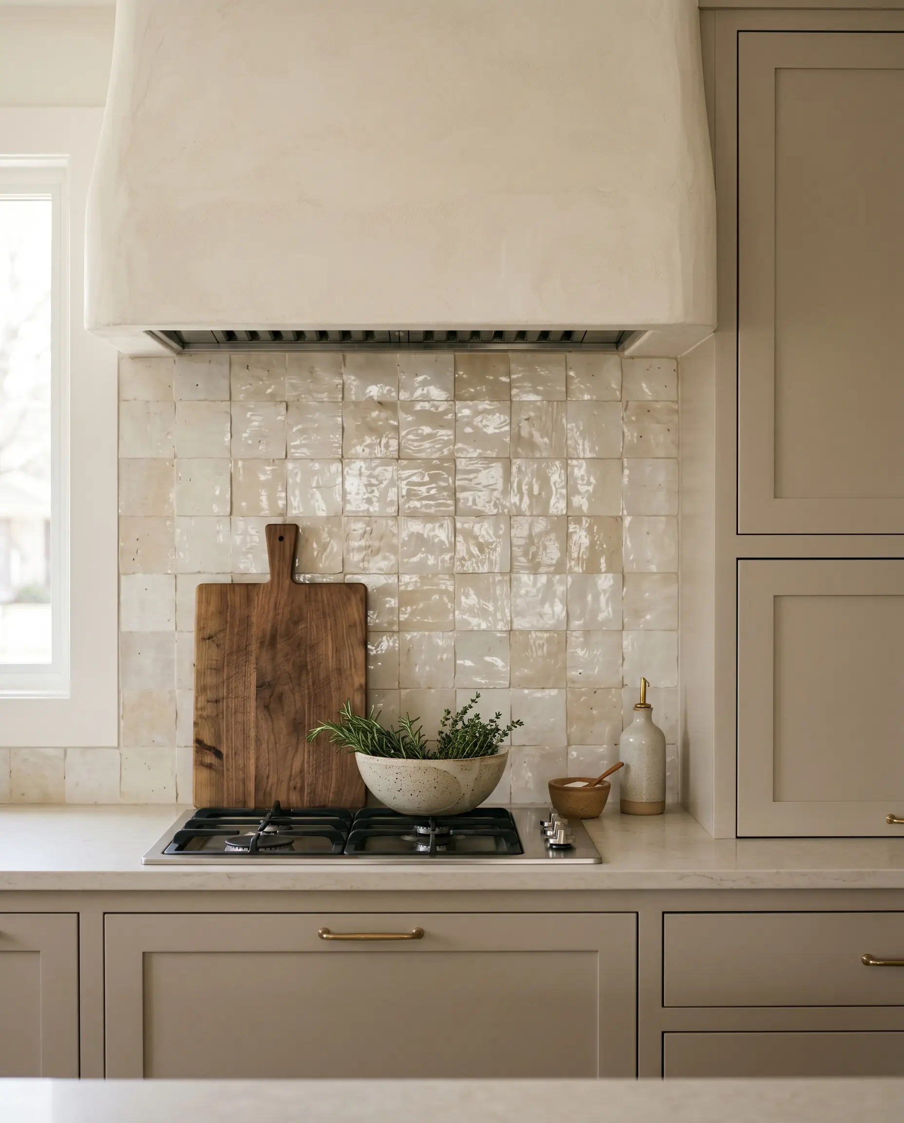
Ground the Cream with Honed Pietra Gray Marble
Glossy, liquid-like tile requires the grounding presence of a matte surface to achieve true high-end balance. Honed Pietra Gray marble provides a moody, sophisticated base that anchors the luminous tile and prevents the cream tones from appearing washed out or overly rustic.
- Vibe: Accessible Luxury.
- Key Material: Honed (matte) Pietra Gray or similar charcoal-toned natural stone countertops.
- Styling Pro-Tip: Run a minimal 2-inch slab of the Pietra Gray up the wall before beginning the zellige installation to protect the delicate bottom row of tiles from standing water.
Complement with Heavily Veined Calacatta Gold
The gold and caramel veining inherent in premium Calacatta marble acts as a visual magnet, actively pulling out the warm terracotta undertones bleeding through the cream glaze. This pairing requires a delicate balance of visual weight, ensuring the dramatic veining of the stone does not fight the heavy texture of the tile.
- Vibe: Bespoke Classic.
- Key Material: Polished or honed Calacatta Gold marble slabs.
- Why it Works: The shared warm undertones create a cohesive dialogue between two highly active, luxurious materials.
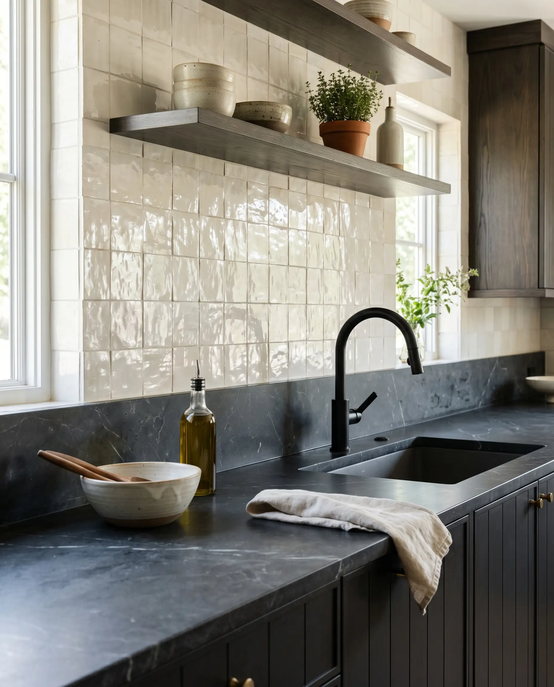
The Classic Contrast: Matte Black Lower Cabinets
Utilizing matte black base cabinets anchors the lower half of the kitchen with heavy visual weight, allowing the cream zellige to act as a luminous, light-reflecting focal point on the upper half of the room. This sharp contrast modernizes the earthen tile instantly.
- Vibe: Edgy Transitional.
- Key Material: Matte black flat-panel or slim-shaker cabinetry.
- Why it Works: The ultra-matte finish of the black cabinetry absorbs light, which aggressively highlights the high-gloss, reflective glaze pooling of the zellige above it.
Layout Orientations and Spatial Tricks
While 4×4 squares and 2×6 subways represent the industry standard formats, the physical orientation of the tile changes the entire psychological feel of the room. The layout must be a deliberate architectural decision.
Classic Horizontal Brick Bond for Timeless Appeal
The traditional 2×6 staggered subway pattern feels familiar and grounded, but the wabi-sabi nature of the hand-chiseled material completely transforms it from standard builder-grade to bespoke luxury.
To achieve the authentic Moroccan aesthetic, master installers dictate that zellige must be butt-jointed. Do not use standard spacing wedges; push the tiles as close together as the irregular edges will physically allow.
Architect’s Secret
- Vibe: Elevated Traditional.
- Key Material: 2×6 Cream Zellige.
- Layout Rule: 50% offset staggered brick bond.
Vertical Stacked for a Modern, Ceiling-Elongating Effect
Stacking 2×6 tiles vertically in a straight set forces a rigid, architectural grid that immediately draws the eye upward, making standard 8-foot ceilings feel significantly taller. The strict geometry of the grid creates a brilliant contrast against the organic, imperfect edges of the tiles.
- Vibe: Architectural Modern.
- Key Material: 2×6 Cream Zellige.
- Why it Works: The tension between the highly structured vertical grid and the chaotic, undulating surface of the individual tiles creates high-end visual intrigue.
A Subtle Herringbone Moment Behind the Range
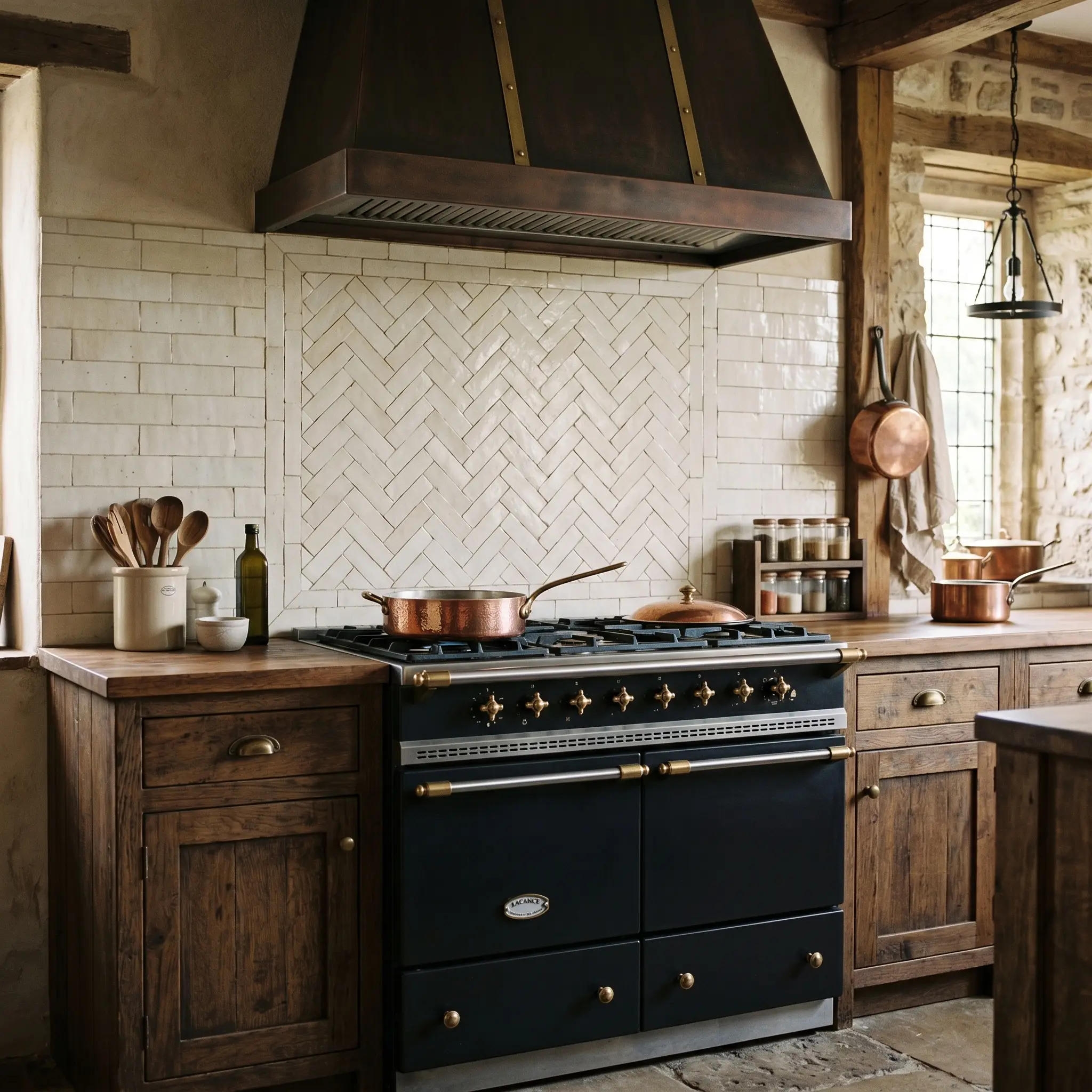
Deploying cream zellige in a herringbone pattern exclusively behind a heavy statement range breaks up the monotony of a massive horizontal backsplash. This creates a dedicated focal point that honors the craftsmanship of the material without overwhelming the entire kitchen.
Herringbone layouts require significantly more precision and cutting. Due to the fragile nature of the terracotta base, you must order a minimum of 20% overage to account for the high waste factor when cutting zellige on a 45-degree angle.
Architect’s Secret
- Vibe: Old World Artisan.
- Key Material: 2×6 Cream Zellige paired with a Lacanche or Wolf range.
- Layout Rule: Limit the herringbone strictly to the width of the range hood to maintain spatial balance.
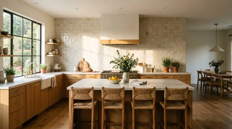
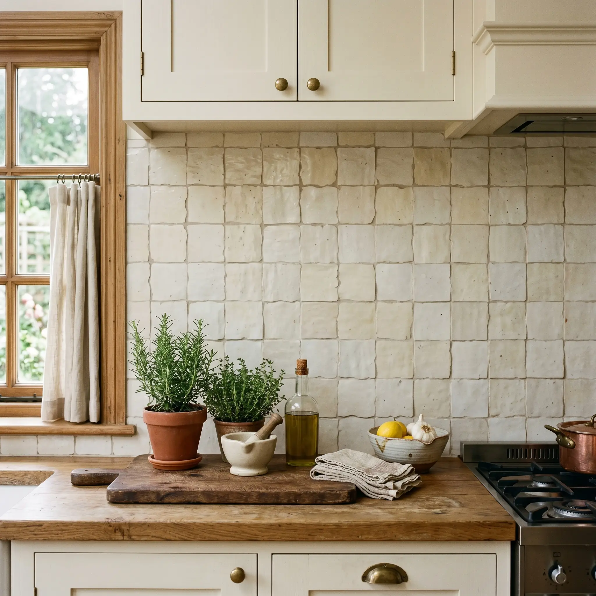
The Square 4×4 Grid for a Transitional Edge
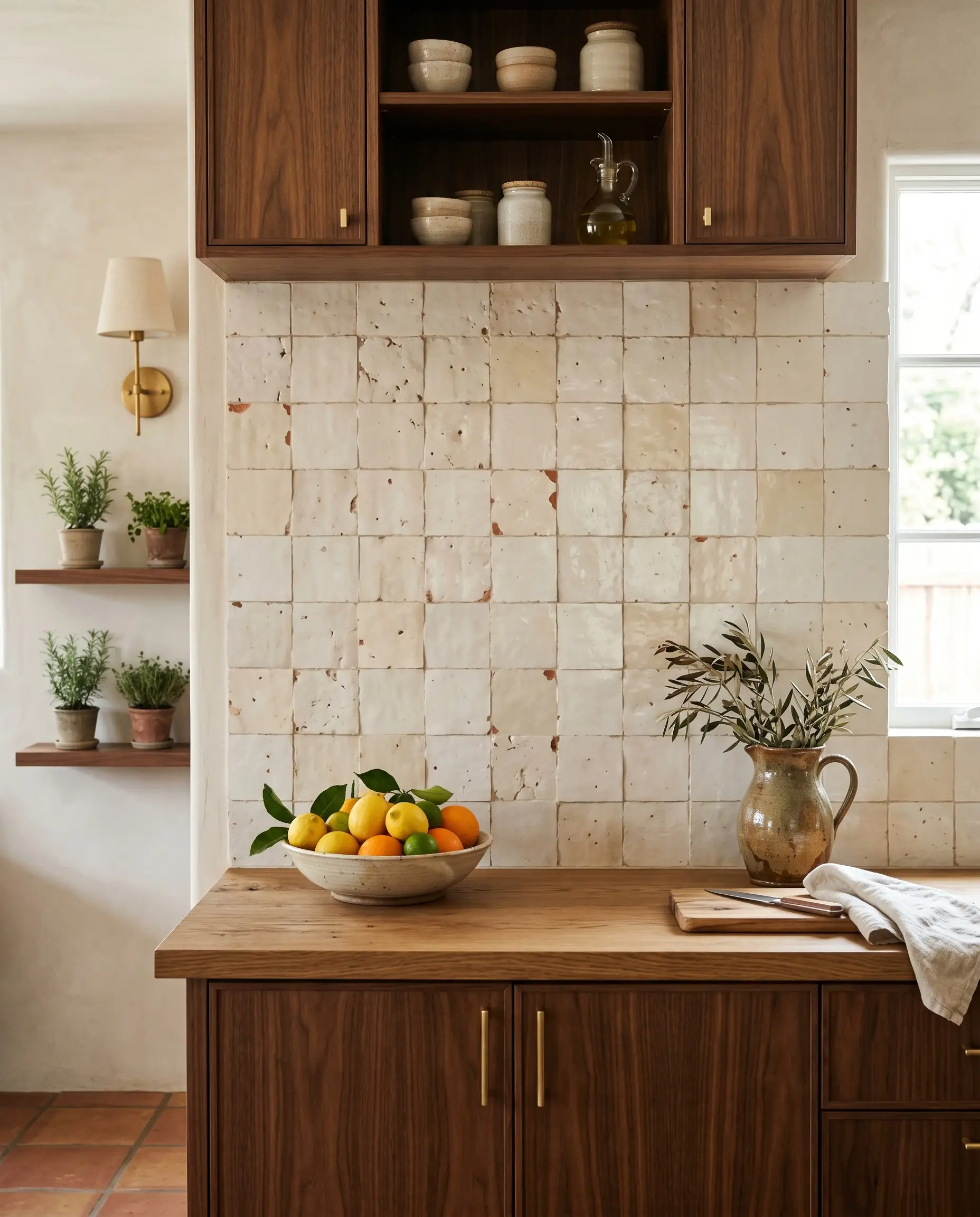
The 4×4 straight-stacked grid currently dominates high-end design because it perfectly straddles the line between mid-century modern structure and Mediterranean revival warmth. The larger surface area of the square format showcases the “pit and chip” variations far more prominently than smaller subway tiles.
- Vibe: Organic Mediterranean.
- Key Material: 4×4 Cream Zellige.
- Why it Works: The symmetrical grid recedes into the background, allowing the unique color shifts of the individual terracotta squares to become the primary focus.
Counter-to-Ceiling Installation for Maximum Impact
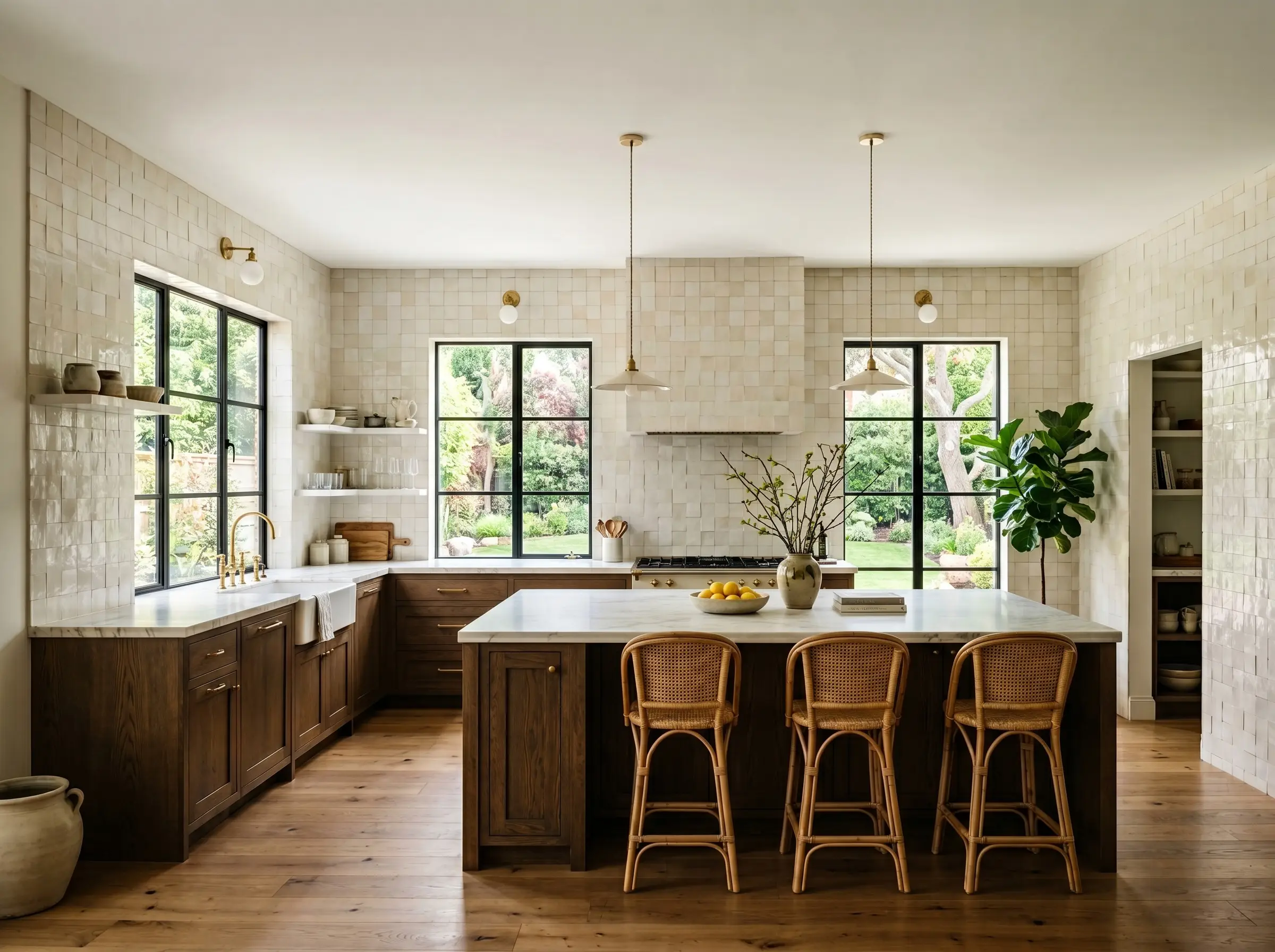
Ditching upper cabinets entirely and wrapping the full wall—around windows and straight to the ceiling—in cream zellige creates a monolithic, immersive textural experience. While this requires a substantial material budget, it delivers the absolute highest return on investment for visual impact.
- Vibe: Bespoke Luxury.
- Key Material: 4×4 or 2×6 Cream Zellige applied continuously.
- Styling Pro-Tip: Keep the ceiling painted a crisp, flat white to cap the installation and prevent the room from feeling like a heavy, enclosed cavern.
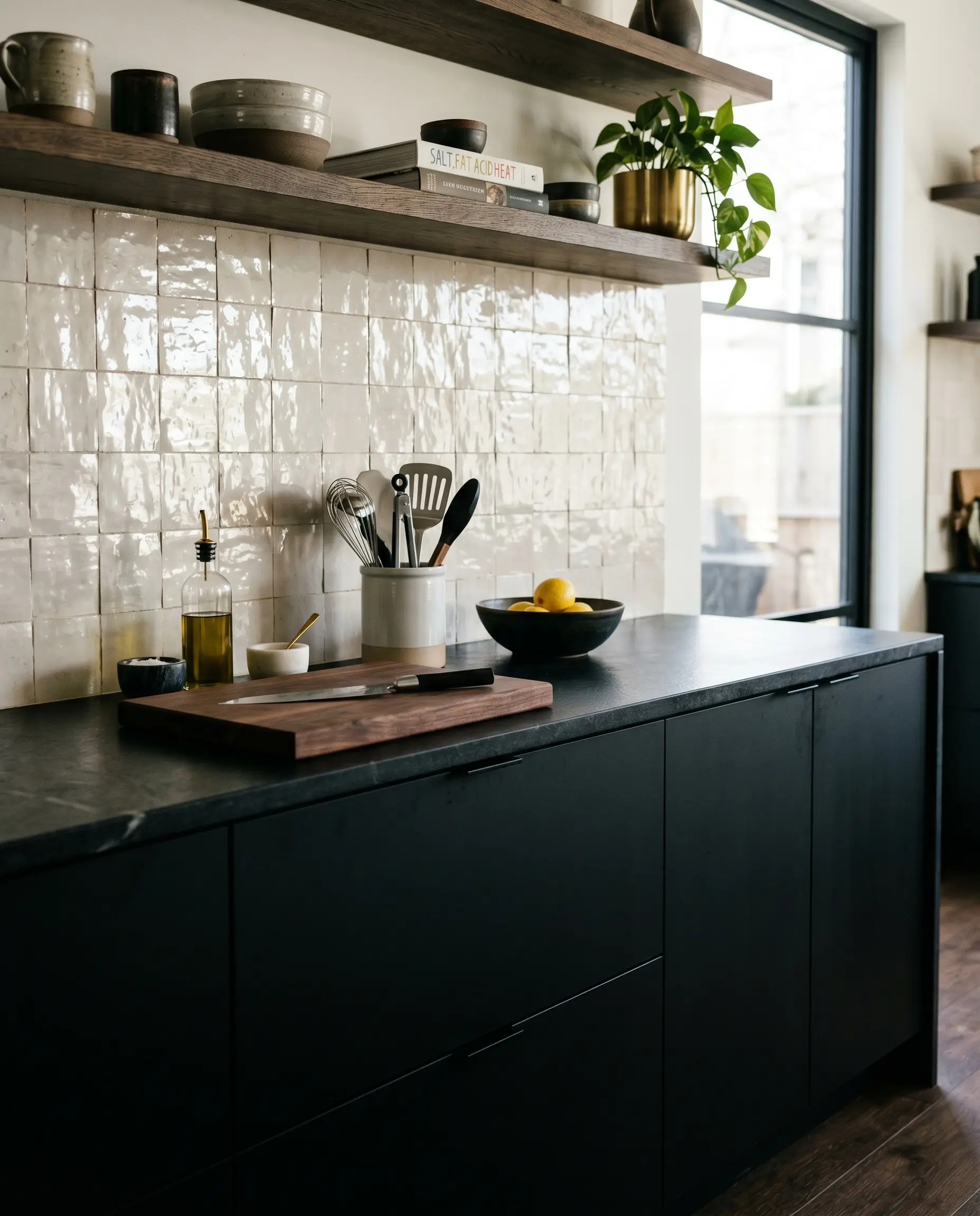
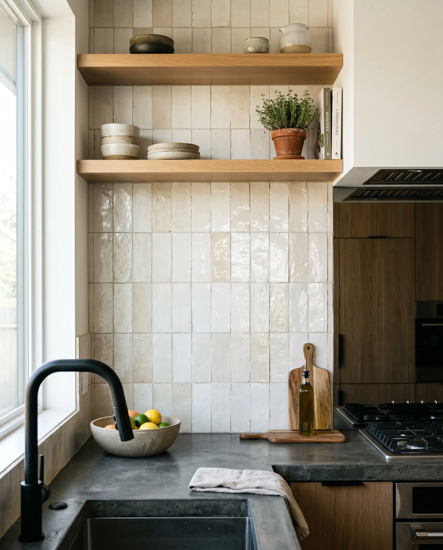
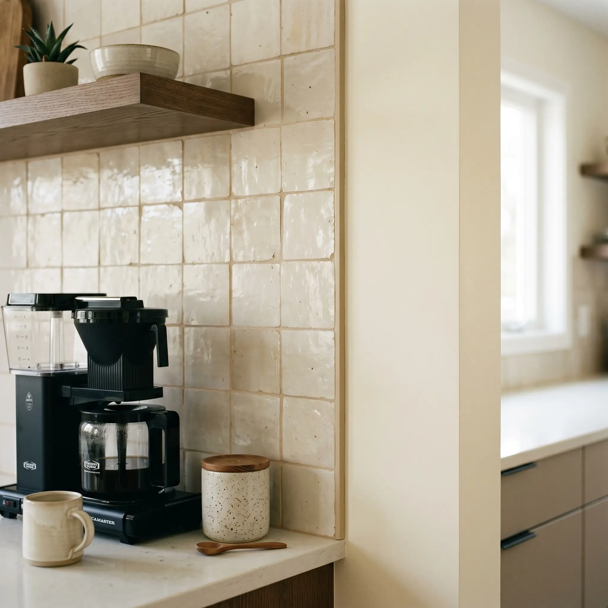
The Low Wash: 18-Inch Splash with Open Shelving
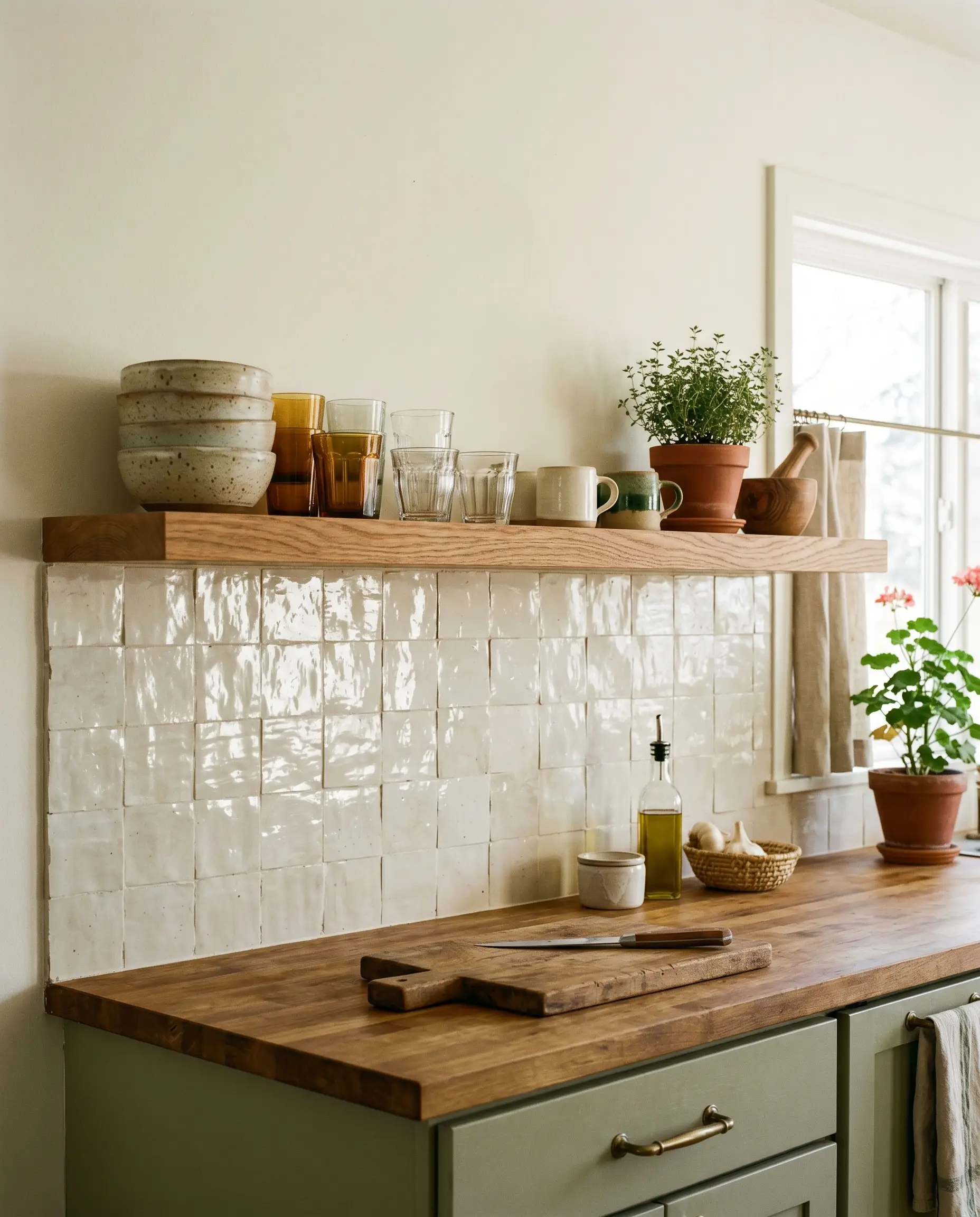
Running the tile strictly 18 inches up the wall and capping it with a single, continuous floating shelf offers a budget-conscious, airy alternative that still delivers deep architectural character. The cream tile serves as a highly textured, luminous backdrop for displaying ceramics and everyday glassware.
- Vibe: Casual Organic.
- Key Material: Cream zellige paired with a thick-cut white oak floating shelf.
- Why it Works: It grounds the wet zones of the kitchen with durable material while leaving the upper walls open and breathable.
Perfecting the Details: Grout, Metals, and Edge Finishing
Executing a zellige installation requires navigating highly technical pain points. Zellige rarely features finished bullnose edges, and the wrong grout color will instantly ruin the investment. These finishing details separate master craftsmanship from amateur hour.
Choose “Alabaster” Grout for a Seamless, Monolithic Look
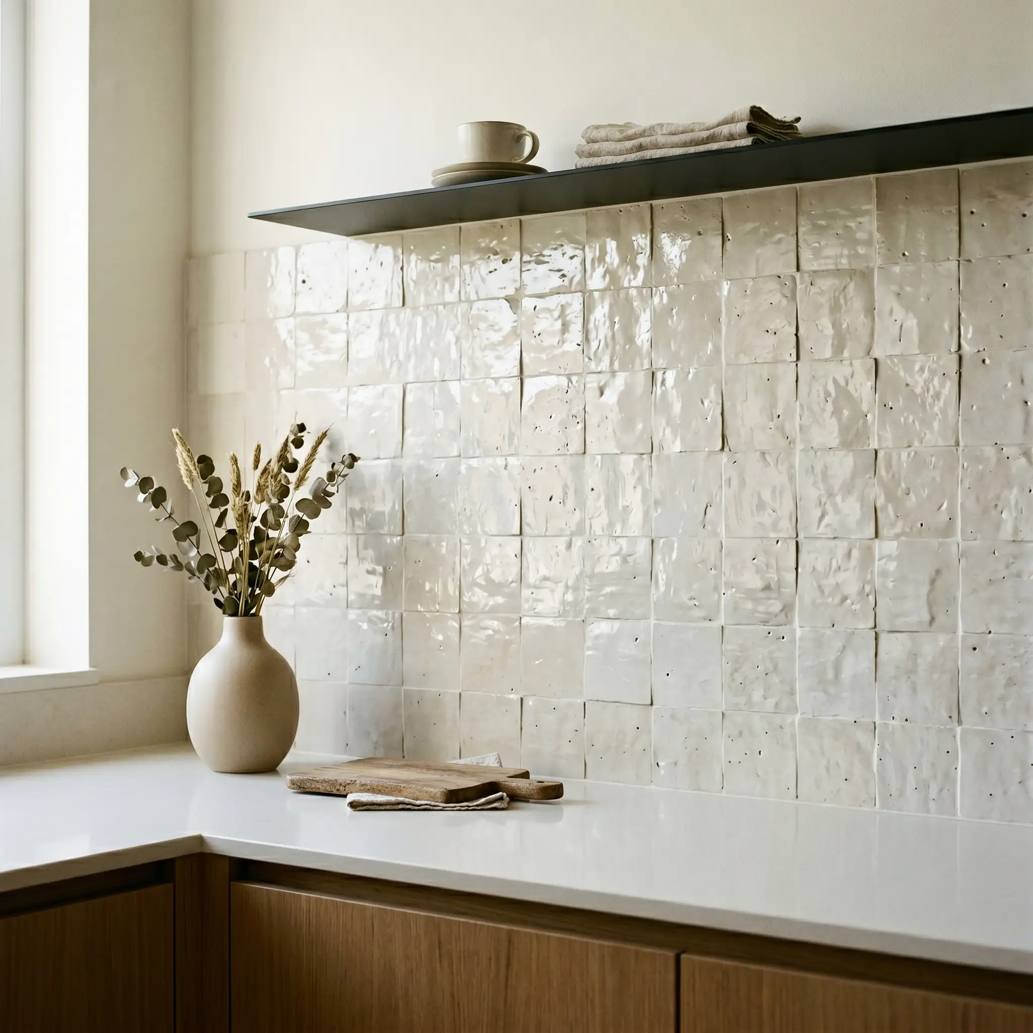
Matching the grout to the lightest tones of the cream glaze minimizes the visual grid lines, fusing the installation together. This technique tricks the eye into reading the wall as one continuous, undulating, liquid-like surface rather than thousands of individual tiles.
Specify a premium, color-matched grout like Mapei Alabaster. When paired with a butt-jointed installation, the alabaster grout simply fills the natural voids and chips, hiding the seams and maximizing the monolithic aesthetic.
Architect’s Secret
- Vibe: Seamless Minimalist.
- Material Match: Mapei Alabaster (or equivalent warm white).
- Application Rule: Float the grout heavily over the surface to fill the irregular pits, then wipe back meticulously.
Use Warm Gray Grout to Highlight the Undulating Edges
If the architectural goal is to emphasize the handmade craftsmanship of the material, utilize a light, warm gray grout to gently outline the irregular, hand-chiseled edges of every single tile. You must strictly avoid stark, dark contrasting grouts (like charcoal or black), which will aggressively highlight the uneven joints and make the wall look messy and chaotic.
- Vibe: Rustic Traditional.
- Material Match: Mapei Warm Gray.
- Why it Works: The subtle gray tone mimics natural shadow, providing gentle definition without overwhelming the delicate cream glaze.
Pair with Unlacquered Brass Hardware for a Living Patina
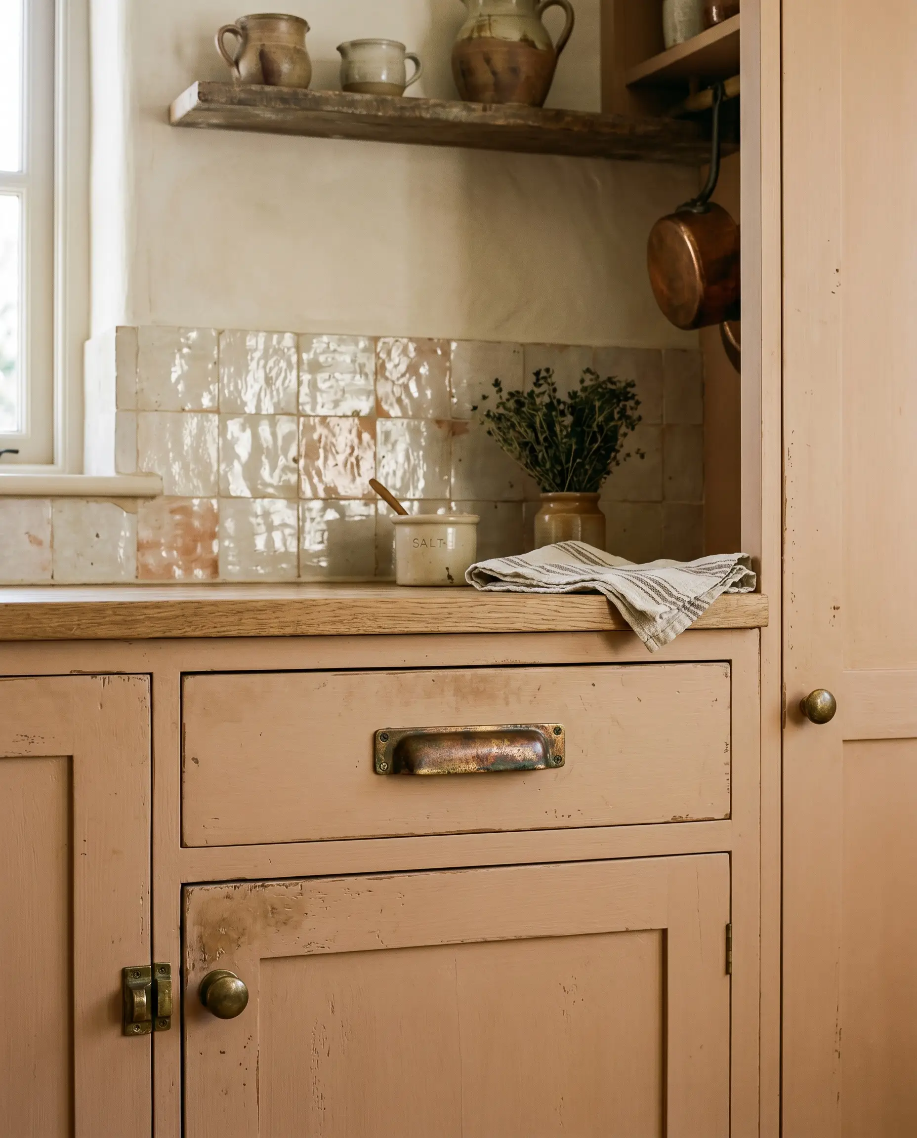
Unlacquered brass is designed to age, tarnish, and wear over time, creating a rich, evolving finish. This “living patina” conceptually mirrors the perfectly imperfect, wabi-sabi ethos of the cream zellige, ensuring the hardware and the tile age together gracefully.
- Vibe: Soulful Heritage.
- Key Material: Solid, unlacquered brass pulls and knobs.
- Styling Pro-Tip: Allow the brass to tarnish naturally; do not polish it. The resulting brown and green undertones will beautifully complement the terracotta base of the tile.
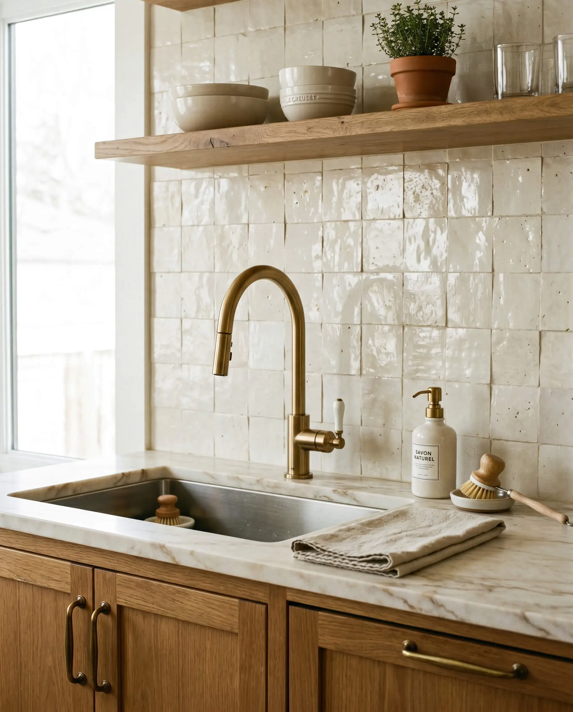
Contrast the Glaze with Polished Nickel Fixtures
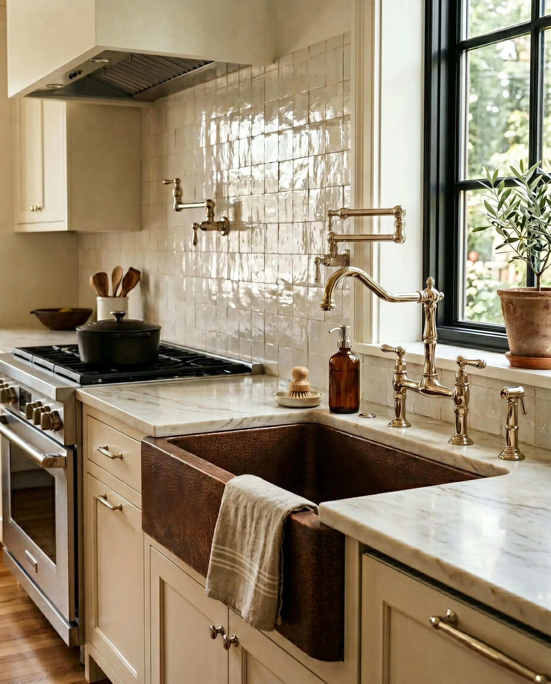
For high-end transitional spaces that require a crisper finish, polished nickel offers a brilliant solution. The warm, liquid-like shine of polished nickel mirrors the glossy sheen of the zellige glaze, while its silver tone provides a sharp, clean contrast to the earthen cream warmth.
- Vibe: Refined Transitional.
- Key Material: Polished nickel bridge faucets and pot fillers.
- Why it Works: Polished nickel carries a subtle golden undertone (unlike the stark blue undertone of chrome), allowing it to harmonize beautifully with cream palettes.
Finish Edges with a Subtle Schluter Jolly in Sand
Because authentic zellige does not come with matching bullnose trim pieces, finishing an exposed edge requires technical precision. To finish an edge elegantly without introducing a jarring silver metal line, utilize a minimal metal profile that color-matches the tile.
Use a Schluter Jolly edge-protection profile in a Sand or Warm Beige powder-coated finish. This creates a crisp, protective architectural boundary that blends seamlessly into the cream glaze.
Architect’s Secret
- Vibe: Tailored Modern.
- Key Material: Powder-coated Schluter Jolly trim (Sand/Beige).
- Application Rule: Install the trim flush with the highest point of the undulating tile to protect the delicate glazed edges from chipping.
The Floating Edge: Running Zellige Straight into Drywall
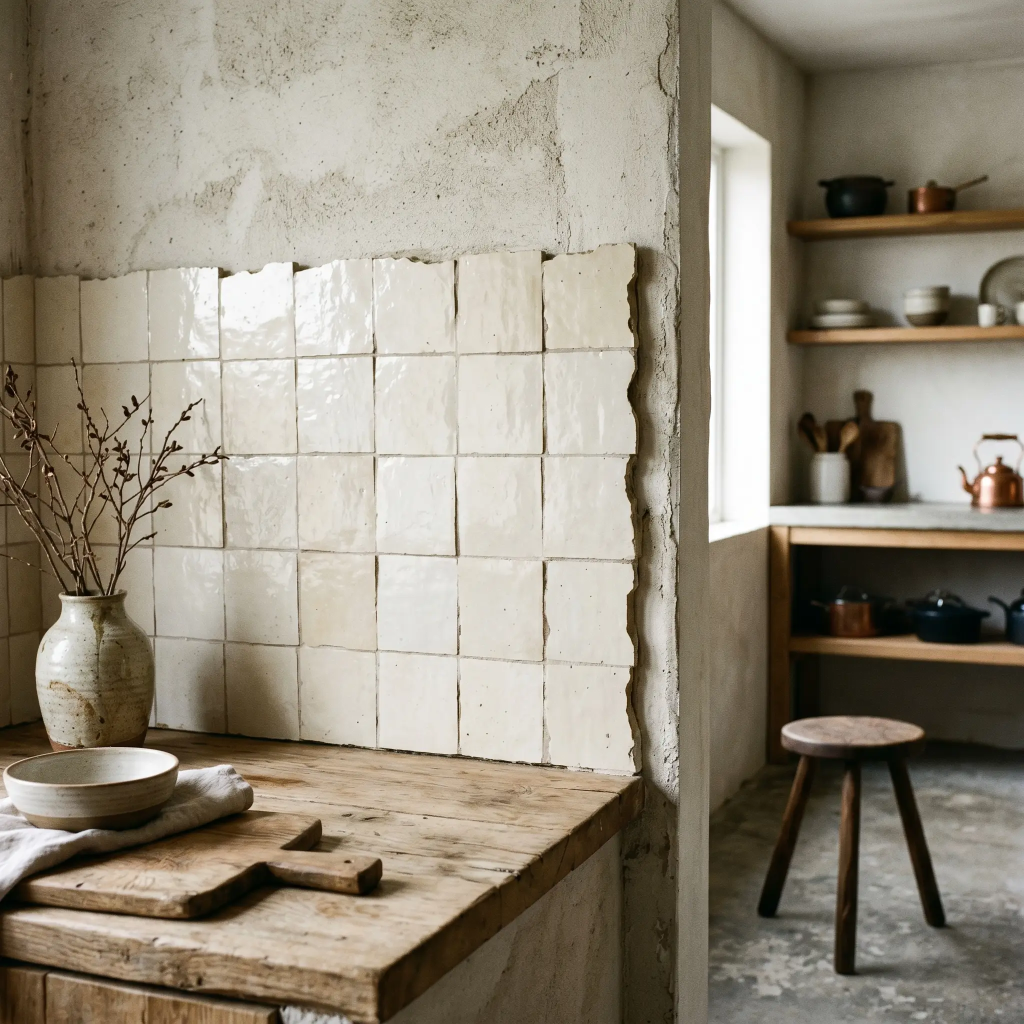
For a truly organic, rustic aesthetic, skip the metal trim entirely and let the jagged, glazed edge of the zellige sit slightly proud of the surrounding drywall. This floating edge requires an expert hand to execute properly without looking unfinished.
- Vibe: Wabi-Sabi Purist.
- Key Material: Raw, glazed tile edges.
- Execution Warning: This requires a highly skilled master tile setter to meticulously sort the tiles, ensuring the exposed exterior edges are fully glazed and free of sharp, dangerous chips.
Lighting & Glaze Nuances
Cream zellige possesses a high Light Reflectance Value (LRV), meaning its glossy, undulating surface will aggressively bounce surrounding light back into the room. If you fail to control the temperature and angle of your lighting, you will ruin the warmth of the glaze.
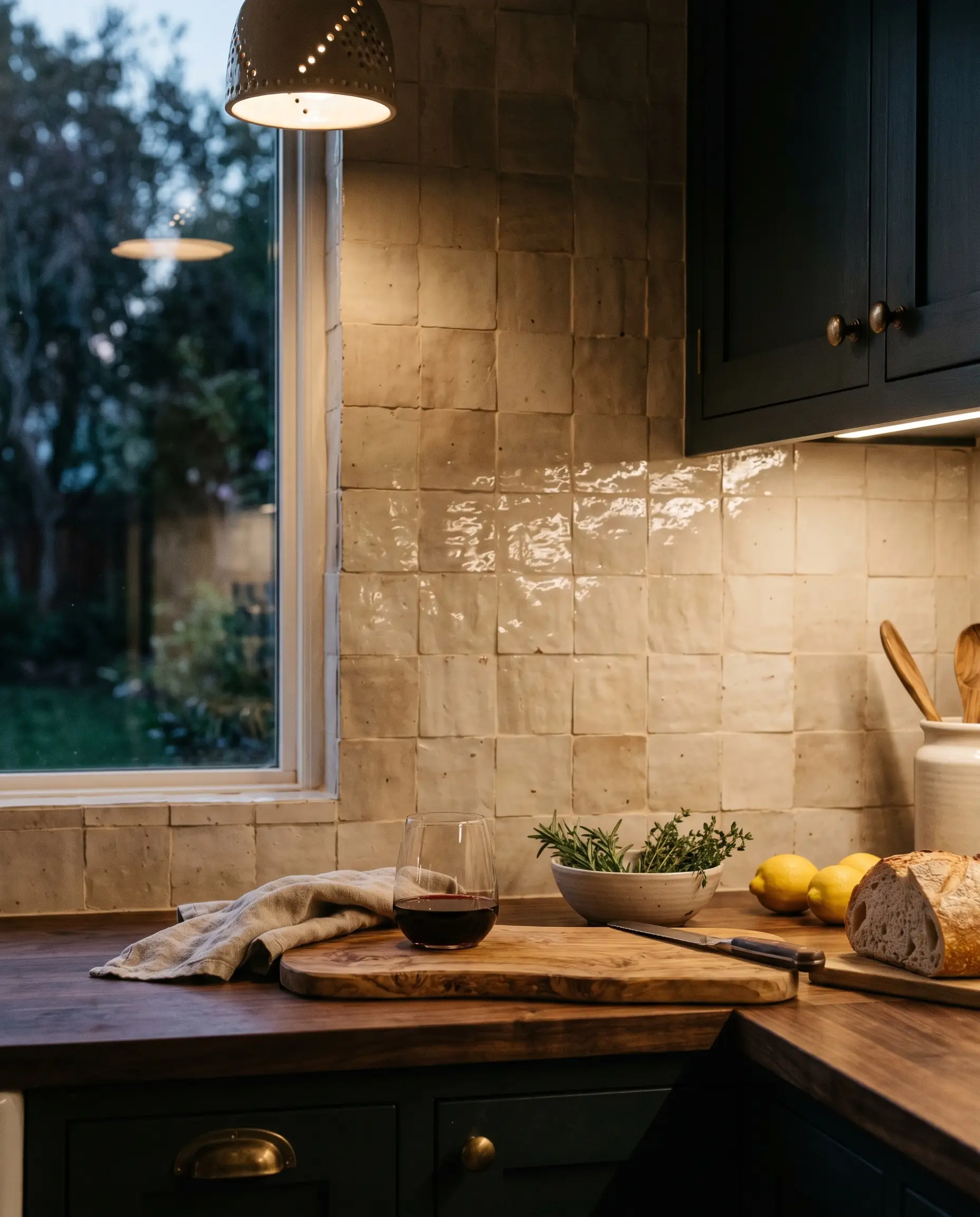
Wash the Tile in 2700K Under-Cabinet Lighting
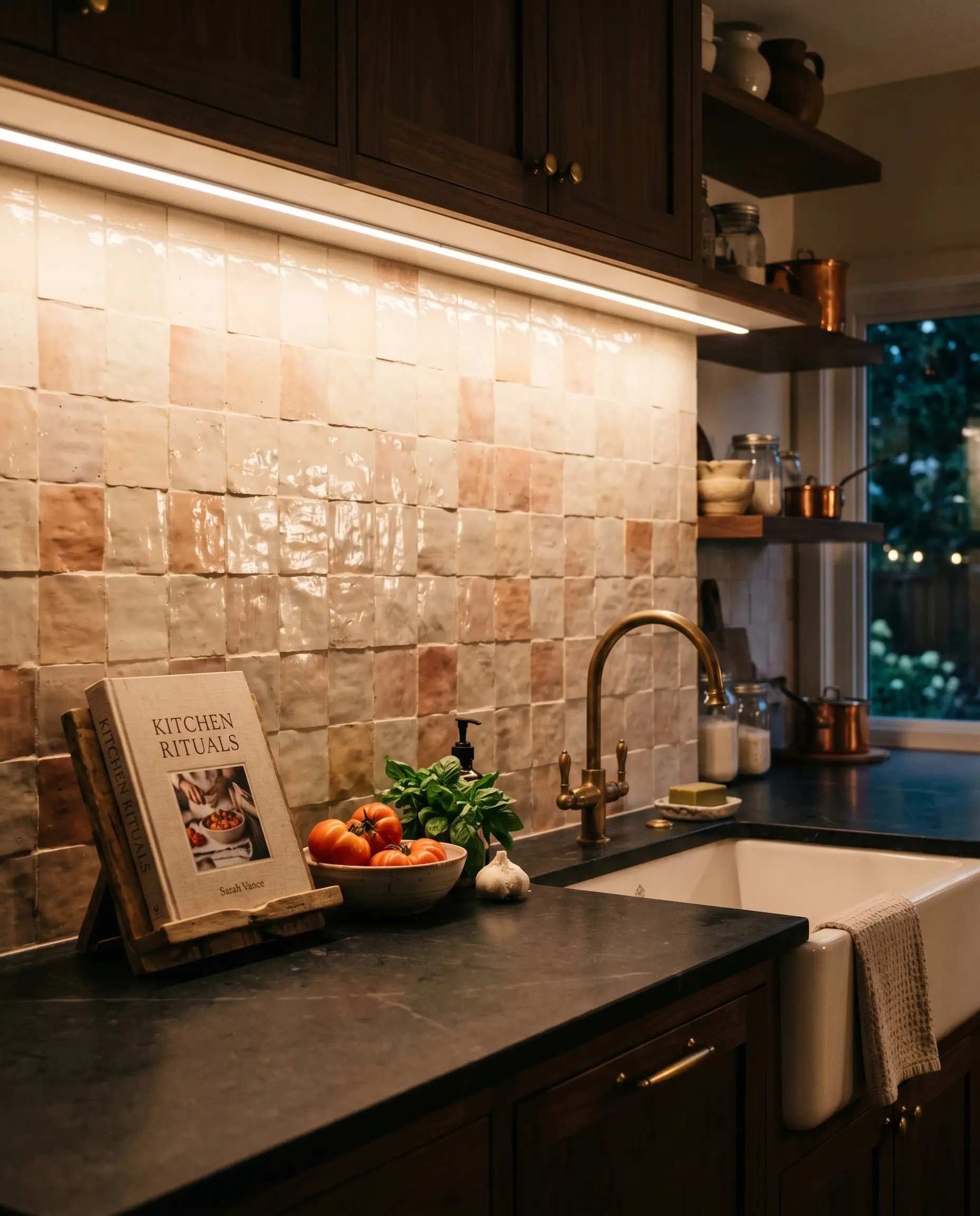
Cream zellige can quickly look sickly, green, or aggressively yellow when exposed to cool or daylight-balanced LEDs. You must wash the tile in strict 2700K (warm white) under-cabinet lighting to properly enhance the cozy, terracotta undertones of the material.
2700K is a hard, non-negotiable rule. Ensure your LED tape light is paired with a frosted diffuser channel so individual LED diodes do not reflect harshly in the high-gloss glaze of the tile.
Architect’s Secret
- Vibe: Inviting and Luminous.
- Key Material: 2700K LED tape lighting with frosted aluminum channels.
- Why it Works: The warm temperature mimics incandescent light, pulling out the earthen blush and ivory tones hidden in the glaze.
Maximize Natural Light to Reveal the “Pit and Chip” Texture
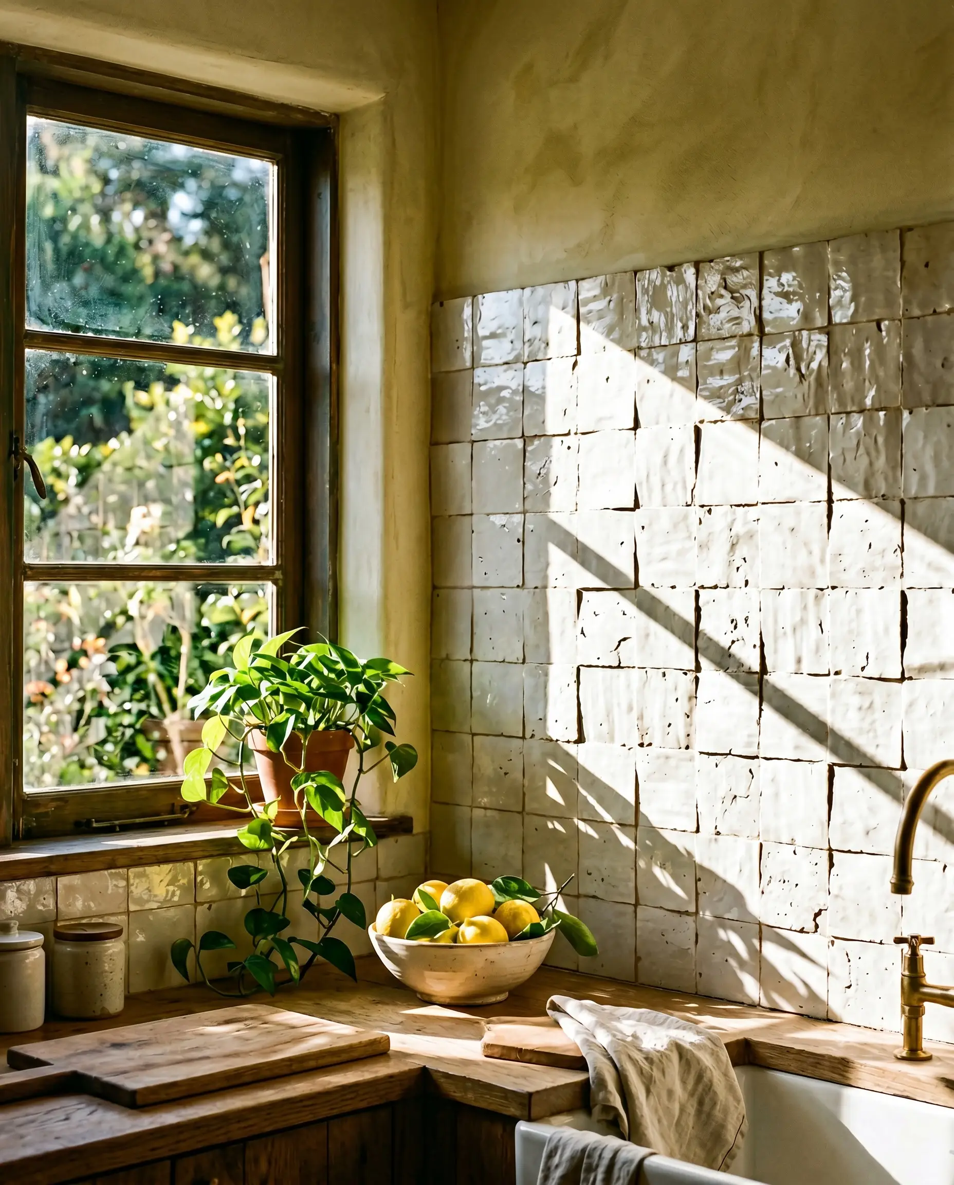
Positioning the zellige installation on walls that receive raking natural sunlight from an adjacent window is a masterstroke in spatial planning. As the sun moves across the sky, the sharp angle of the light will cast micro-shadows across the undulating surface, violently highlighting its handmade nature.
- Vibe: Dynamic Organic.
- Key Element: Unobstructed, raking natural daylight.
- Why it Works: Raking light emphasizes physical texture better than any artificial overhead source, turning the wall into a living, shifting installation.
Highlight the Glaze Pooling with Aged Brass Sconces
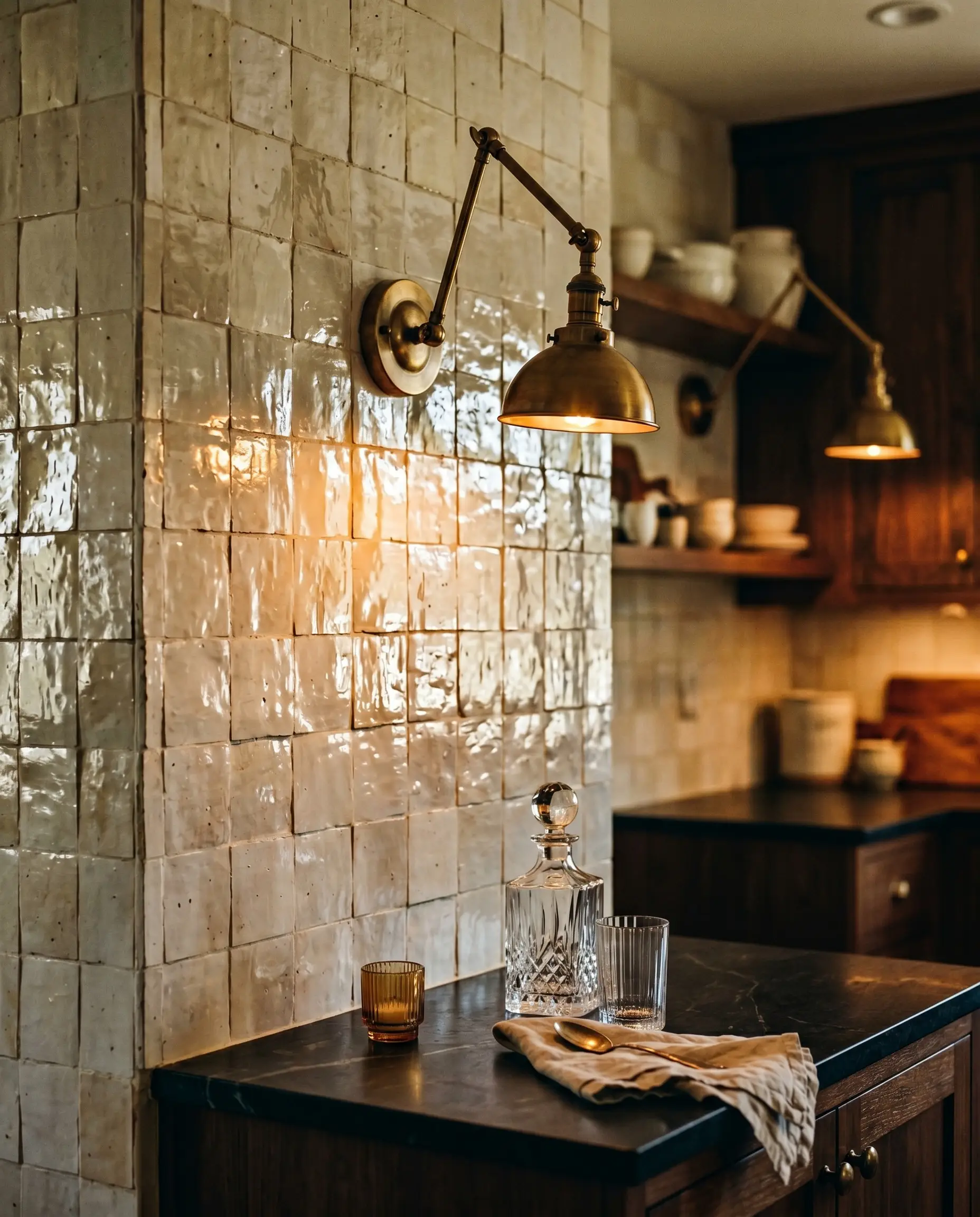
Mounting articulating brass sconces directly through the zellige backsplash creates localized pools of warm light that reflect beautifully off the uneven, glossy tile. The sensory experience of seeing light bounce off the heavy glaze pooling brings an undeniable romance to the kitchen.
- Vibe: Intimate Luxury.
- Key Material: Hardwired, articulating aged brass sconces.
- Application Rule: Position the sconces slightly above eye level, ensuring the bulbs are shielded to prevent harsh glare bouncing off the tile into the user’s eyes.
Embrace the Color Shift from Morning to Evening Light
Cream zellige is the ultimate chameleon material, and homeowners must set realistic expectations for its daily performance. It will look crisp, highly reflective, and ivory in morning daylight, but will shift into a deep, moody beige as the sun sets and artificial lights take over.
- Vibe: Earthy and Grounded.
- Key Concept: Material acceptance.
- Why it Works: This drastic color shift is not a flaw; it is the ultimate luxury of living with authentic, earthen materials that respond organically to their environment.
The Realities of Cream Zellige: Installation & Maintenance
Achieving a bespoke, high-end finish with authentic Moroccan zellige requires total transparency about the realities of the material. You are paying a premium specifically for its imperfection, which means standard installation methods and casual cleaning routines simply do not apply. Zellige requires a master installer who understands that the clay body must be soaked prior to cutting, and who possesses the artistry to manually sort and blend the tiles to distribute the color variations evenly.
| Material Attribute | The Aesthetic Benefit (Pros) | The Reality (Cons & Maintenance) |
|---|---|---|
| Undulating Surface | Creates unmatched visual movement and bounces light dynamically. | Notoriously difficult to wipe down. Grease and kitchen splatter get trapped in the uneven dips. |
| “Pit and Chip” Glaze | Delivers authentic wabi-sabi character and proves the tile is handmade. | Exposed terracotta pits are porous and can stain if heavy oils or dark sauces splash and sit uncleaned. |
| Butt-Jointed Installation | Provides a seamless, monolithic look that elevates the architecture. | Requires a highly skilled master installer. The lack of standard grout lines means sealing the raw tile face is critical. |
| Terracotta Base | Provides the warm, soulful undertones that make cream zellige glow. | Highly fragile before installation. High waste factor (order 15-20% extra) due to breakage during shipping and cutting. |
Final Thoughts: Bringing Textural Soul to Your Kitchen
Choosing a cream zellige backsplash is a definitive investment in the soul of your home. It actively rejects the sterile, mass-produced perfection of standard builder-grade materials in favor of warmth, architectural gravity, and profound character. By mastering the exact cabinet pairings, commanding the lighting temperature, and executing the installation with uncompromising precision, you transform a simple kitchen wall into a living, breathing focal point.
Before committing to a layout or a grout color, you must order physical samples. Place the tiles vertically against your kitchen wall, observe how the glaze pooling interacts with your specific natural light from morning until dusk, and embrace the magnificent, undulating texture of true craftsmanship.
The Hackrea Style Desk treats interior decoration as an exact visual science. Rather than focusing on demolition or floor plans, this desk masters the art of color theory, undertone matching, material pairings, and spatial proportion. From balancing the visual weight of mixed metals to finding the perfect bridging tone between disparate wood species, this desk provides the rigorous aesthetic rules needed to achieve high-end, editorial-quality harmony in any space.