Designing a boy’s room often defaults to a predictable catalog of stark primary reds and royal blues that resemble a commercial daycare center. These high-voltage hues might thrill a toddler, but they rapidly lose their charm, demanding an exhausting and costly repaint within three short years.
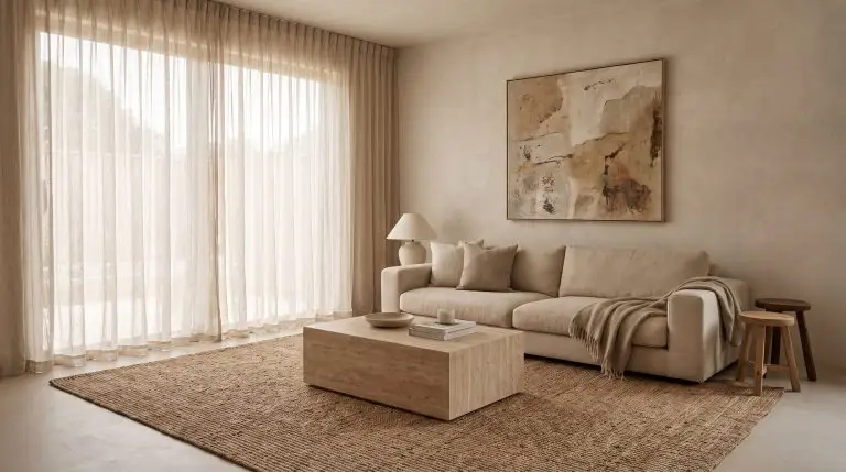
The secret to a space that grows alongside your child lies in longevity through complexity. By selecting desaturated, muddy tones—shades heavily weighted with gray or brown undertones—you create a bedroom that feels distinctly designed, playful, yet deeply grounded. These complex colors flow seamlessly with the curated aesthetic of your home, maturing effortlessly from the preschool years straight through to adolescence.
Before committing a roller to drywall, you must understand how light and formulation dictate the final architectural result. Navigating the mechanics of pigment and sheen is the critical first step in specifying a paint that endures both shifting tastes and inevitable scuff marks.
The Mechanics of Kids’ Room Paint
To guarantee your color choice translates beautifully from the swatch to the wall, you must evaluate its Light Reflectance Value (LRV). This metric determines how much natural light a pigment absorbs or bounces back into the room; muddy colors with a lower LRV require ample natural light to prevent the room from feeling cavernous.
Equally vital is the finish formulation you specify for the walls. We strongly advocate abandoning cheap, shiny eggshell finishes that aggressively highlight wall imperfections. Instead, invest in premium washable mattes—like Farrow & Ball’s Dead Flat—which deliver a sophisticated, velvety aesthetic while remaining highly durable against daily wear.
Always test a muddy color on both a window wall and a shadow wall. A pigment that looks sophisticated in direct sunlight can read excessively heavy in a dark corner if the LRV drops below 30.
Hackrea Colorist Tip
The Organic Earth Tones (Grounded & Warm)
Move away from stark whites and primary brights toward nature-inspired, organic modern hues. These heavily pigmented shades bring immense warmth and tactile depth to a bedroom, acting as a sophisticated foundation that easily adapts to changing interests.
1. Desaturated Terracotta
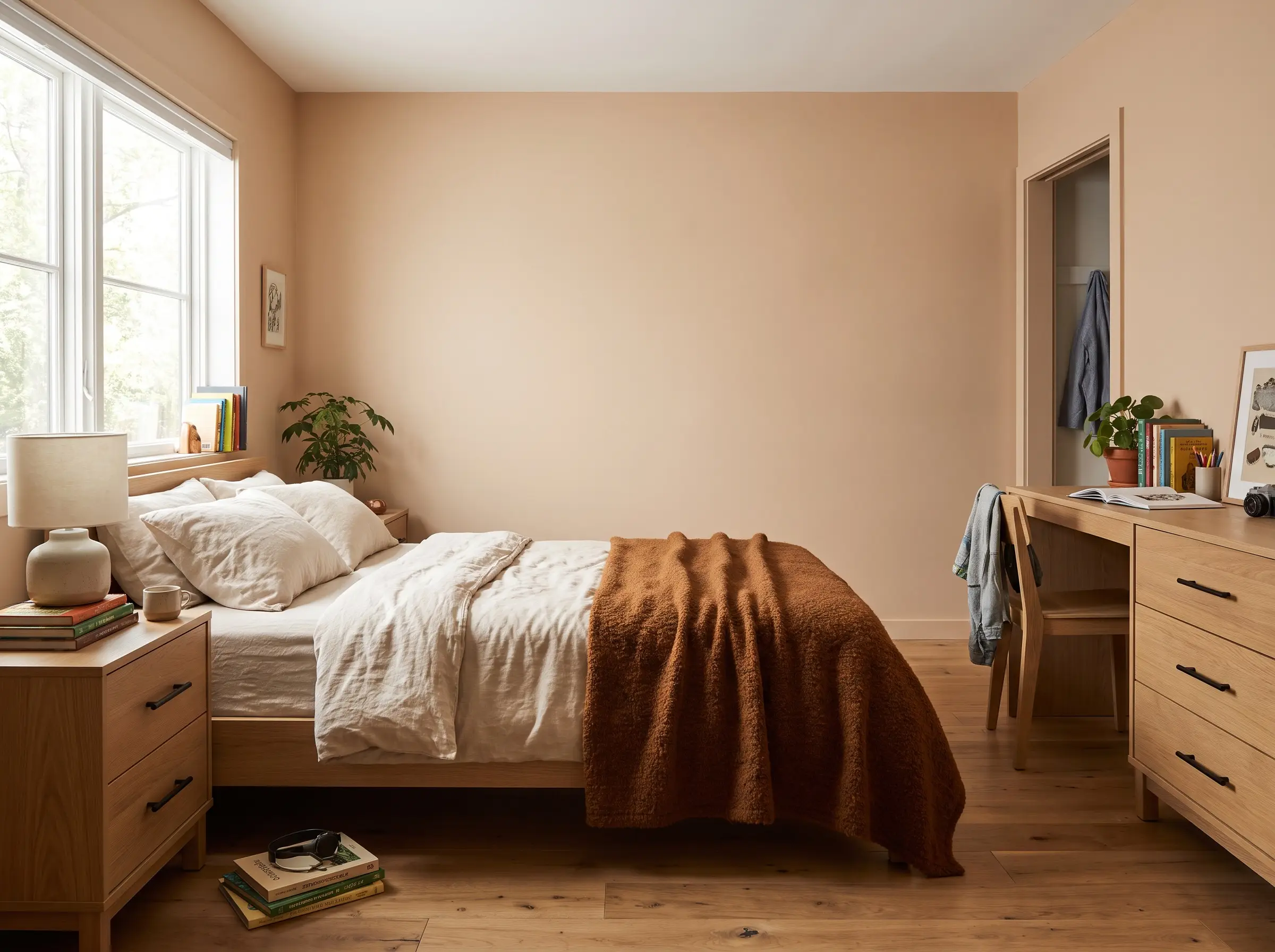
This muted terra cotta acts as a highly sophisticated alternative to traditional fire-engine red, functioning instead as a warm, enveloping neutral. It brings a grounded, earthy richness that feels playful for a toddler but mature enough for a teenager.
- Brand Match: Benjamin Moore Clay Beige
- Palette Pairing: Matte black hardware and rift-sawn white oak
2. Dark Olive & Sage Blends
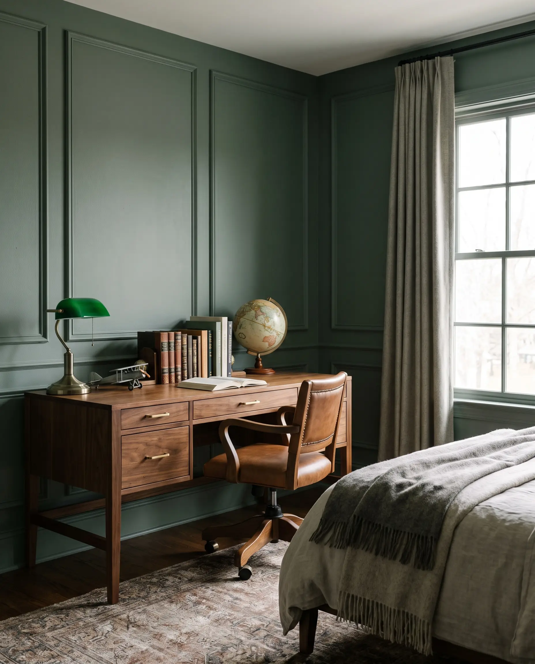
Deep green blends create a grounding, restorative environment that seamlessly bridges the gap between youthfulness and teen maturity. The heavy brown undertones prevent the walls from looking vibrant, offering a highly versatile, architectural backdrop.
- Brand Match: Sherwin-Williams Jasper Stone
- Palette Pairing: Unlacquered brass and warm walnut
3. Warm Mushroom & Greige
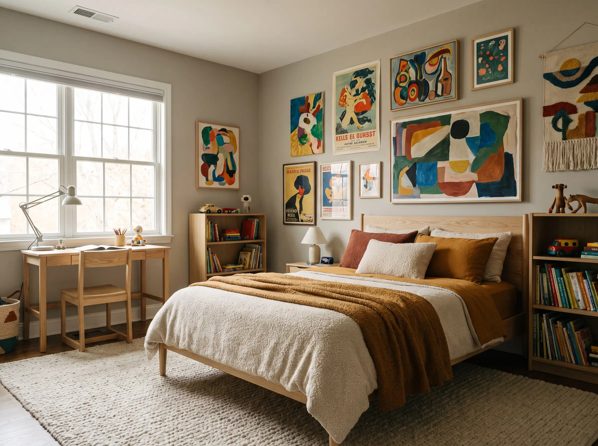
Stepping away from stark white, heavily pigmented greige provides the perfect anti-clinical canvas for a boy’s room. This allows colorful toys, eclectic art, and patterned textiles to inject energy without the walls feeling cold or sterile.
- Brand Match: Sherwin-Williams Repose Gray
- Palette Pairing: Layered textiles, boucle, and ash wood
4. Mustard & Ochre Accents
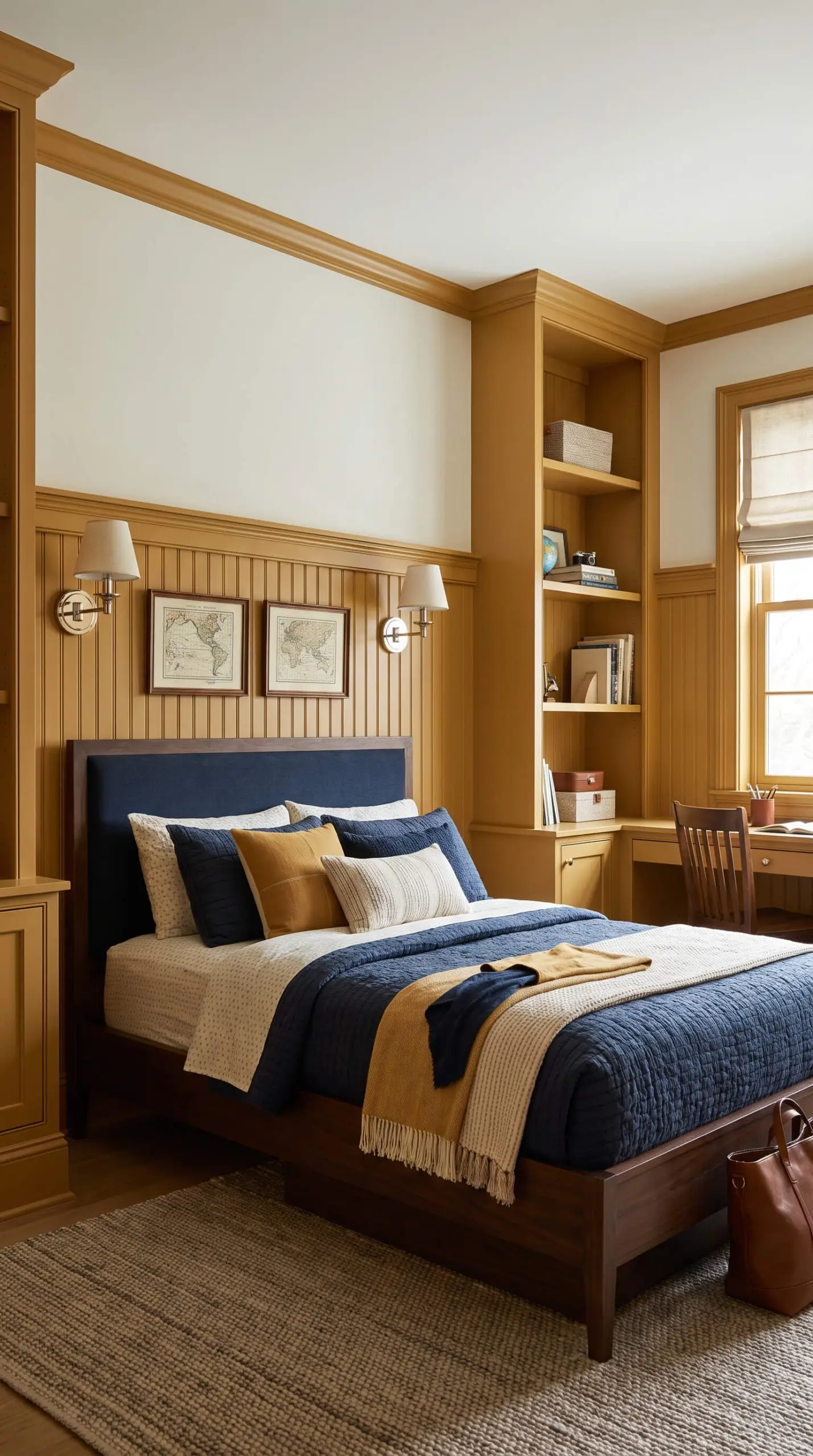
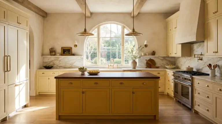
Ochre injects undeniable energy into a space without the visual assault of a primary yellow. To maintain a boutique premium feel, apply this muddy golden hue strictly to millwork, interior doors, or wainscoting rather than all four walls.
- Brand Match: Farrow & Ball Babouche
- Palette Pairing: Deep navy textiles and polished nickel
5. Roman Clay & Plaster Textures
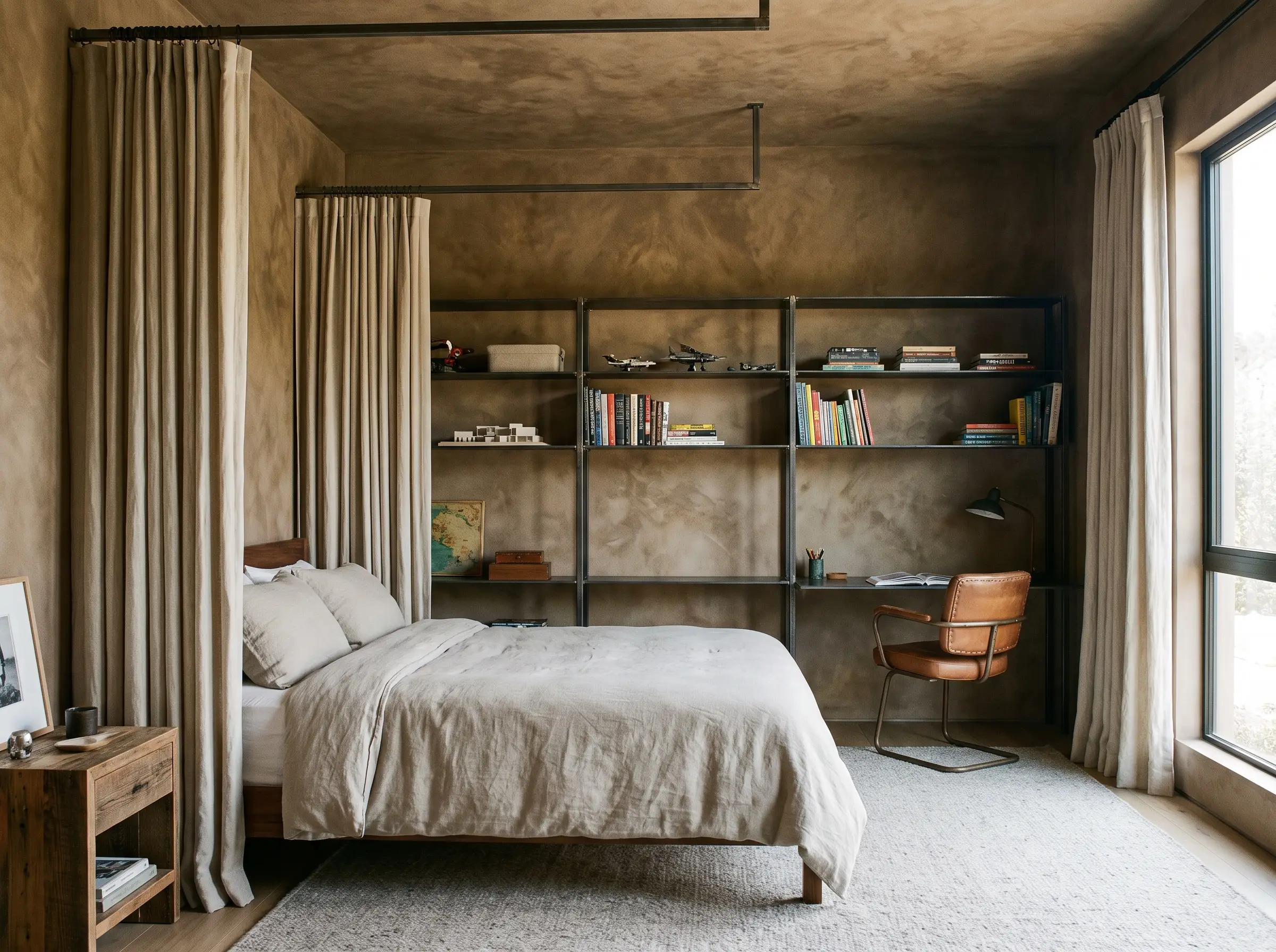
Moving beyond flat paint to tactile finishes introduces a suede-like depth that completely alters standard drywall. The mottled, organic texture of Roman clay is incredibly forgiving, hiding inevitable scuffs and fingerprints remarkably well.
- Brand Match: Portola Paints (Various Earth Tones)
- Palette Pairing: Linen curtains and raw steel accents
The Evolving Blues (Coastal to Transitional)
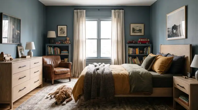
Blue remains a table-stakes expectation for a boy’s room, but we are decisively abandoning standard pastel baby blues. By upgrading to complex, architectural slate blue and navy shades with heavy gray or green undertones, you secure a transitional space that never feels juvenile.
6. True Ink Navy
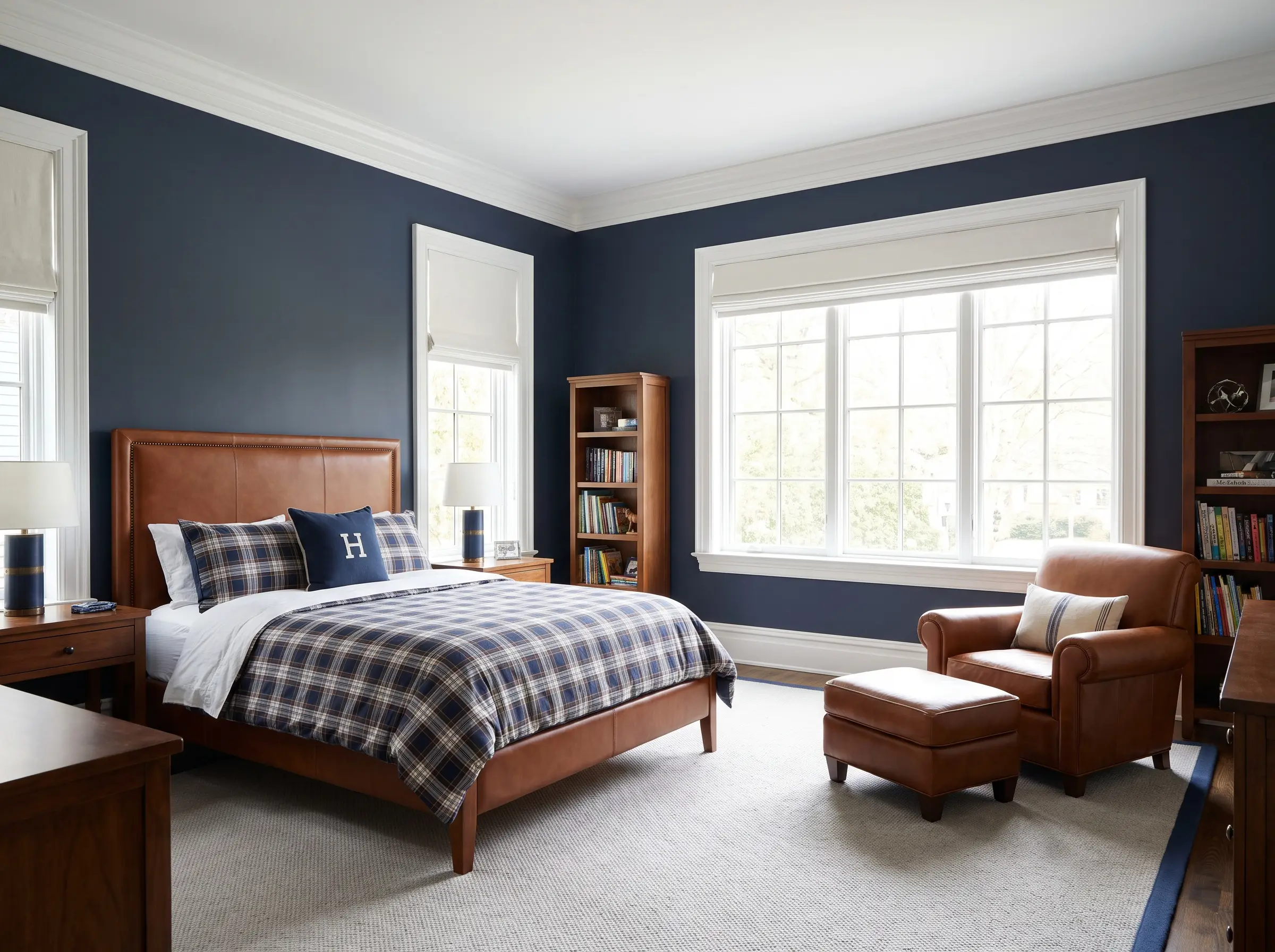
This timeless anchor delivers dramatic weight while reading as a sophisticated neutral in well-lit rooms. A heavily saturated navy visually recedes, making the space feel tailored, expansive, and deeply classic.
- Brand Match: Benjamin Moore Hale Navy
- Palette Pairing: Crisp white trim and saddle leather accents
7. Muted Slate & Denim
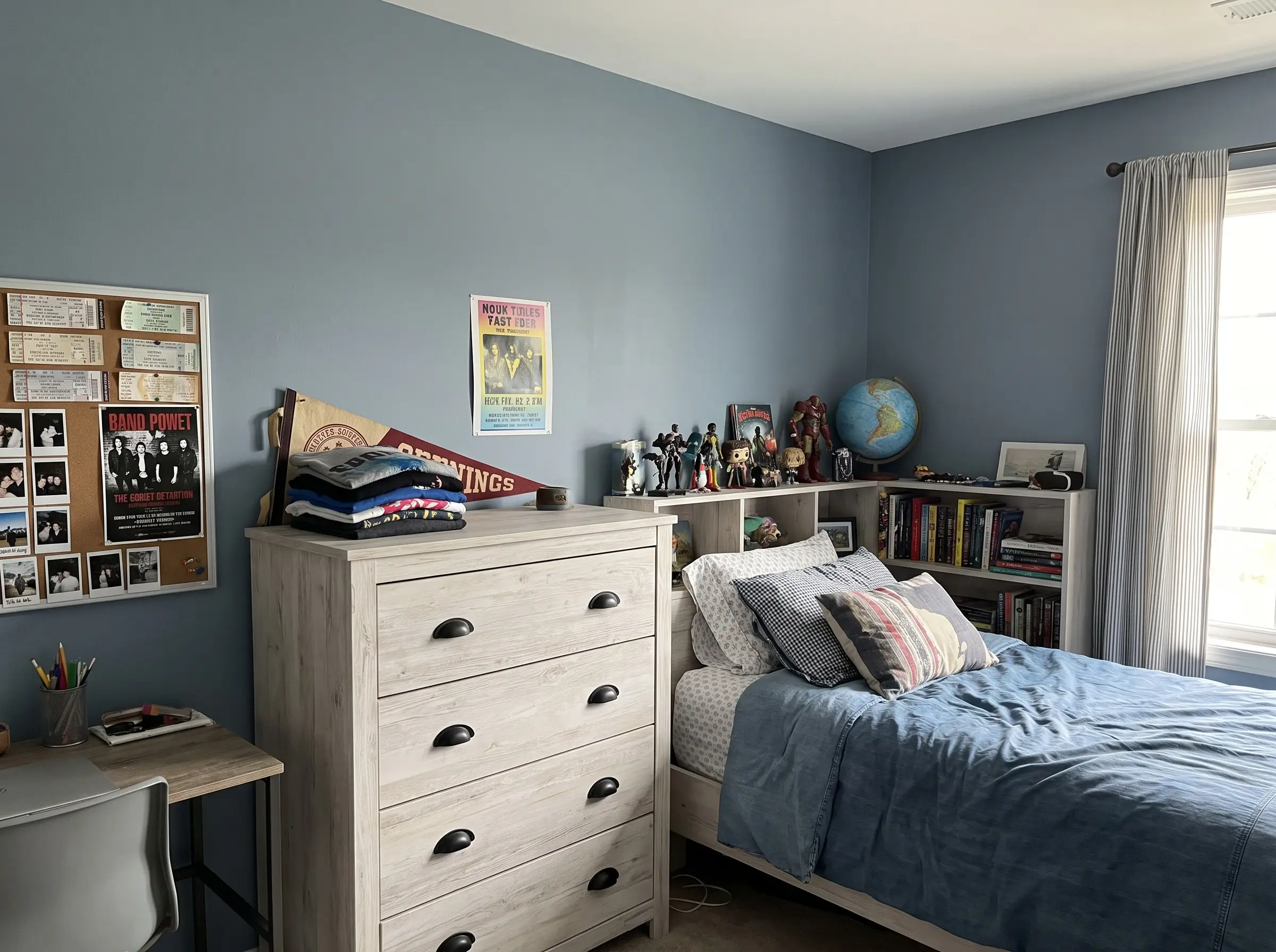
Operating as a casual, lived-in neutral, this shade wraps the room in the comforting familiarity of a favorite pair of jeans. The strong gray undertones strip away any lingering nursery associations, leaving a distinctly architectural finish.
- Brand Match: Farrow & Ball Light Blue
- Palette Pairing: Whitewashed woods and matte black
8. Vibrant Cobalt
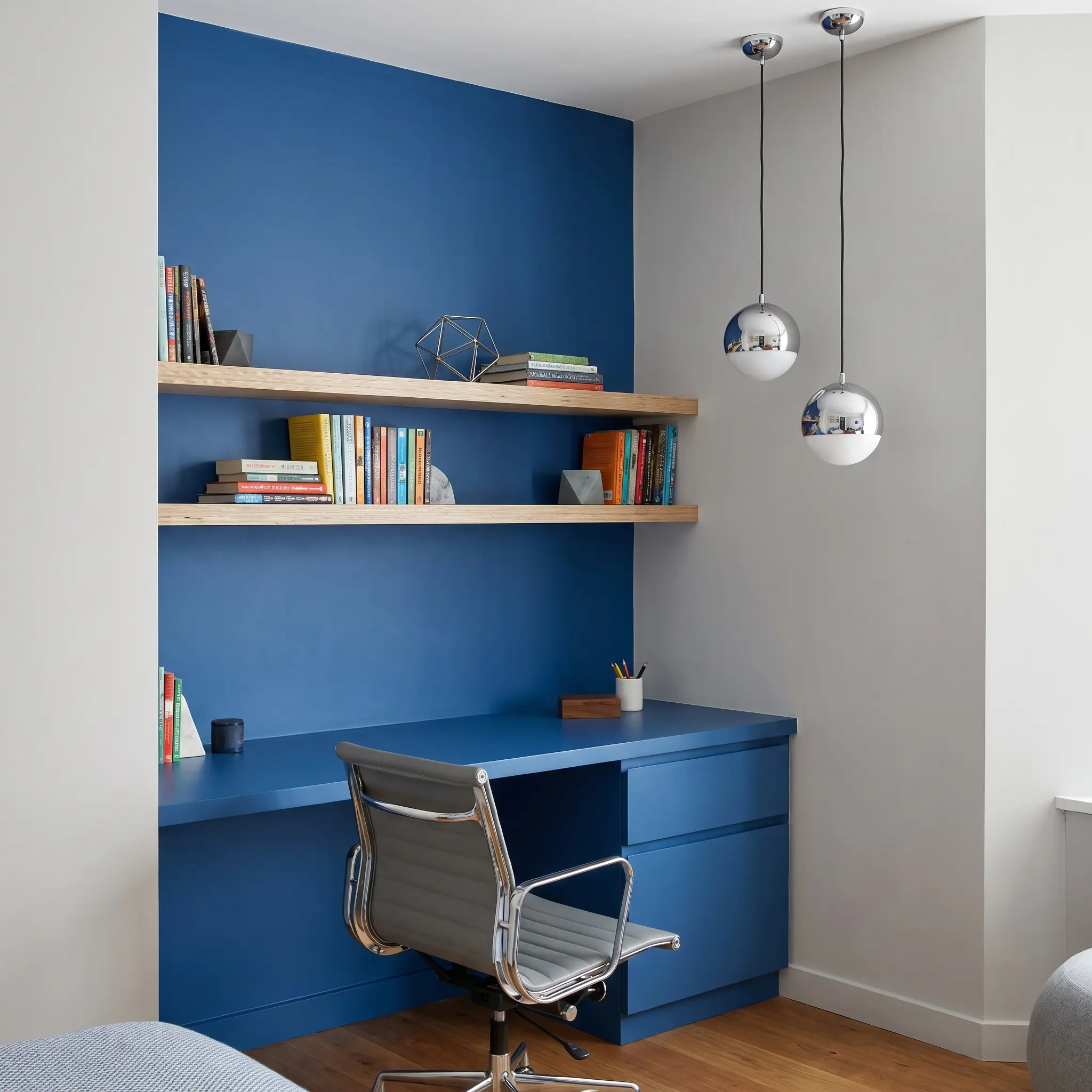
For a postmodern, high-energy environment, a sharp cobalt introduces an unapologetic focal point. To preserve the room’s sophistication, deploy this intense hue sparingly on functional furniture or a single architectural feature rather than saturating all four walls.
- Brand Match: Farrow & Ball Cook’s Blue
- Palette Pairing: Chrome lighting and birch plywood
9. Aqua & Seafoam Hybrids
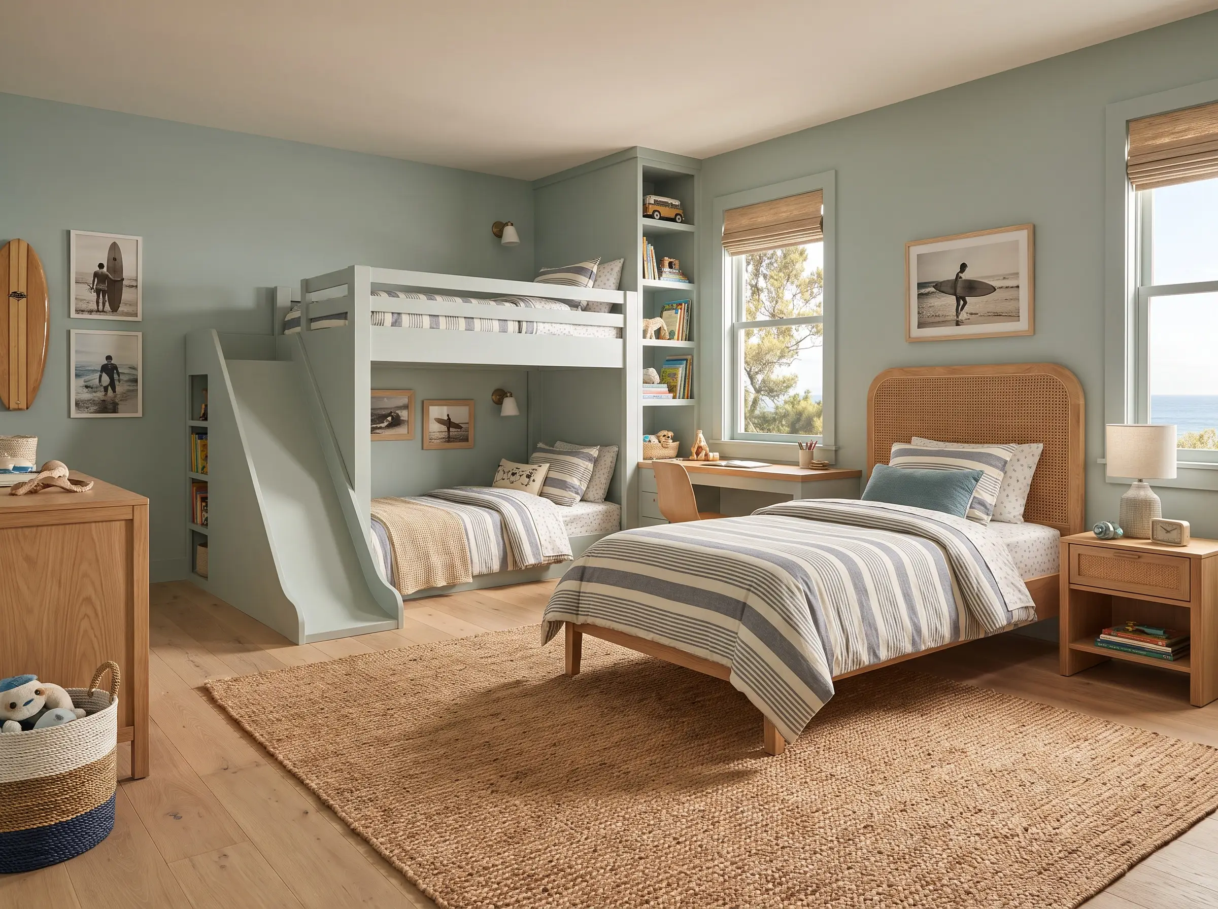
Blending green and blue creates a fresh, energetic environment perfect for smaller rooms that need to feel expansive. The muddy undertones ensure the space remains playful without crossing into a chaotic, overly bright territory.
- Brand Match: Farrow & Ball Teresa’s Green
- Palette Pairing: Rattan, jute, and crisp white oak
10. Icy, Barely-There Blue
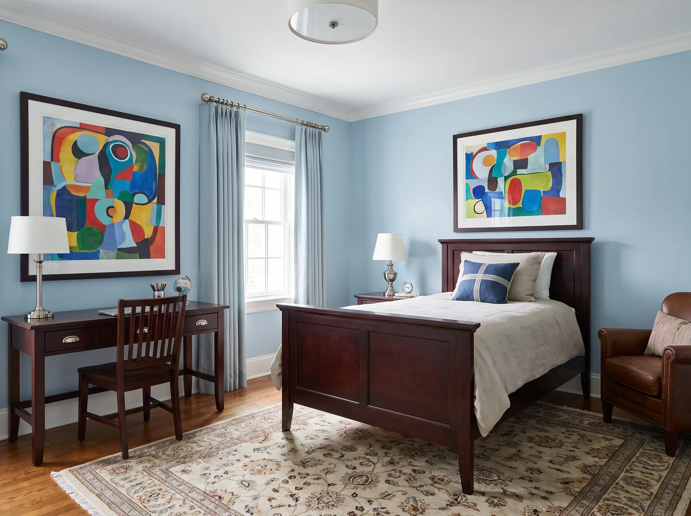
This ethereal alternative to standard builder-grade white expands the room visually while providing a crisp, tailored backdrop. It allows vibrant, modern art and rich wood tones to command attention without fighting the walls.
- Brand Match: Benjamin Moore Sapphire Ice
- Palette Pairing: Polished nickel and dark mahogany
Moody & Dramatic Darks (For Tweens & Teens)
As boys age, their desire for a cozy, independent space naturally grows. Embracing a dark palette intentionally fosters focus and rest, shaping a standard bedroom into a sophisticated, den-like retreat.
11. Soft Charcoal & Peppercorn
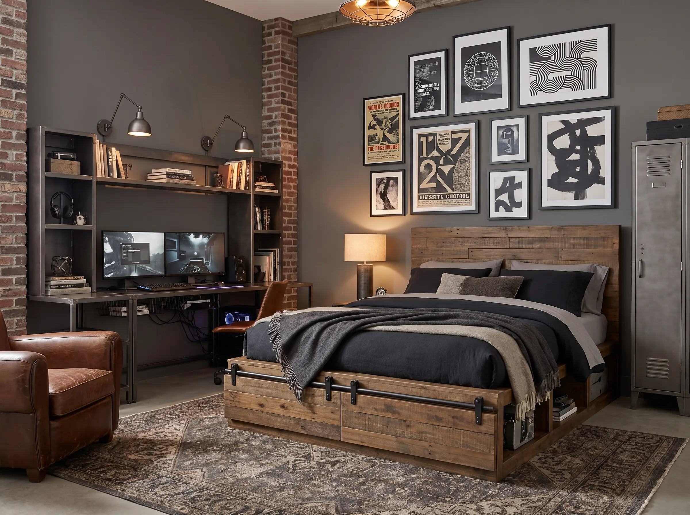
This shade establishes an urban, industrial vibe that absorbs the visual clutter of tech setups and sports memorabilia. It provides a sharp, high-contrast backdrop for graphic art, ensuring a teenage room looks curated rather than messy.
- Brand Match: Benjamin Moore Kendall Charcoal
- Palette Pairing: Gunmetal hardware and reclaimed wood
12. Deep Forest Green
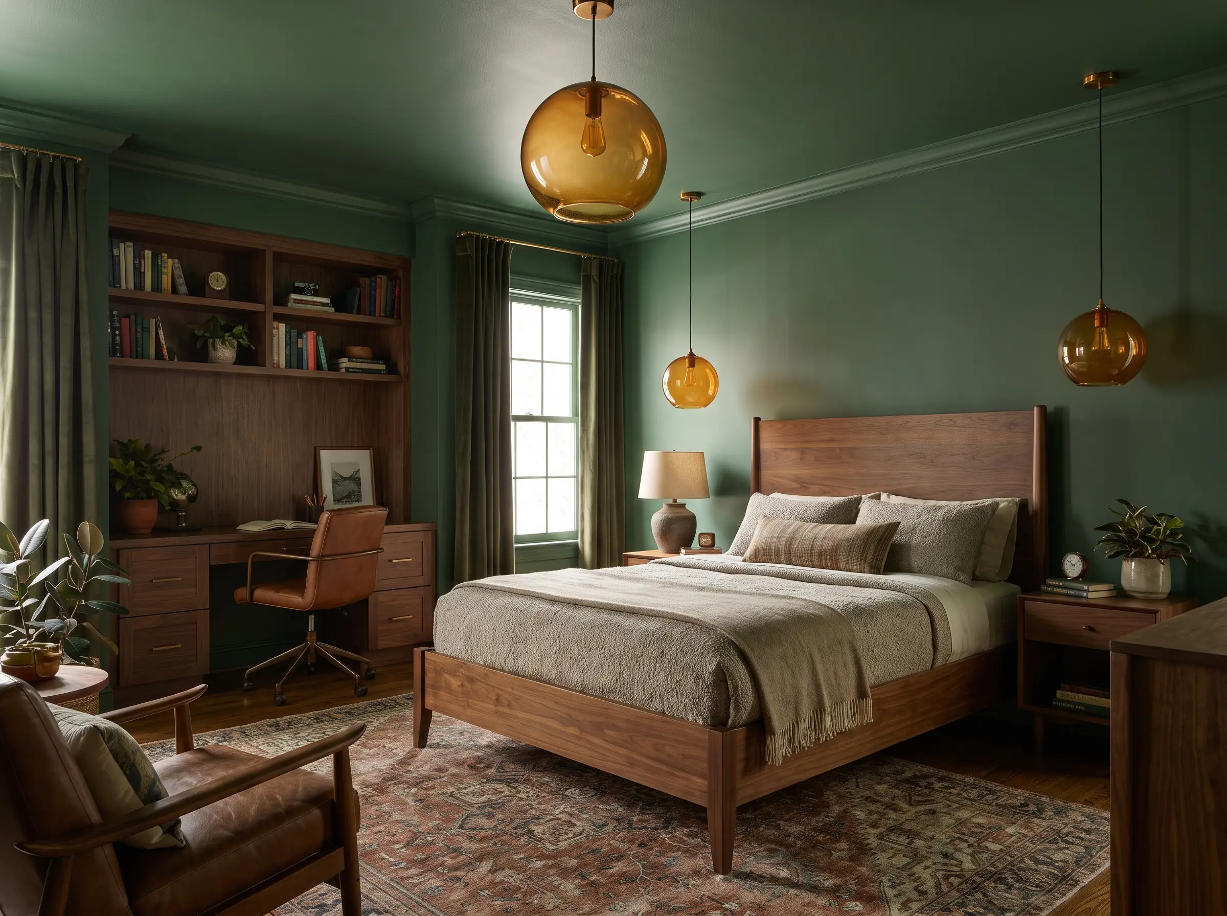
Saturated forest green creates a restorative, den-like atmosphere that actively promotes focused studying and restful sleep. The heavy pigmentation feels incredibly grounding, drawing the eye inward and establishing a quiet sense of sanctuary.
- Brand Match: Benjamin Moore Dark Olive
- Palette Pairing: Amber glass lighting and medium-tone walnut
13. Inky Black
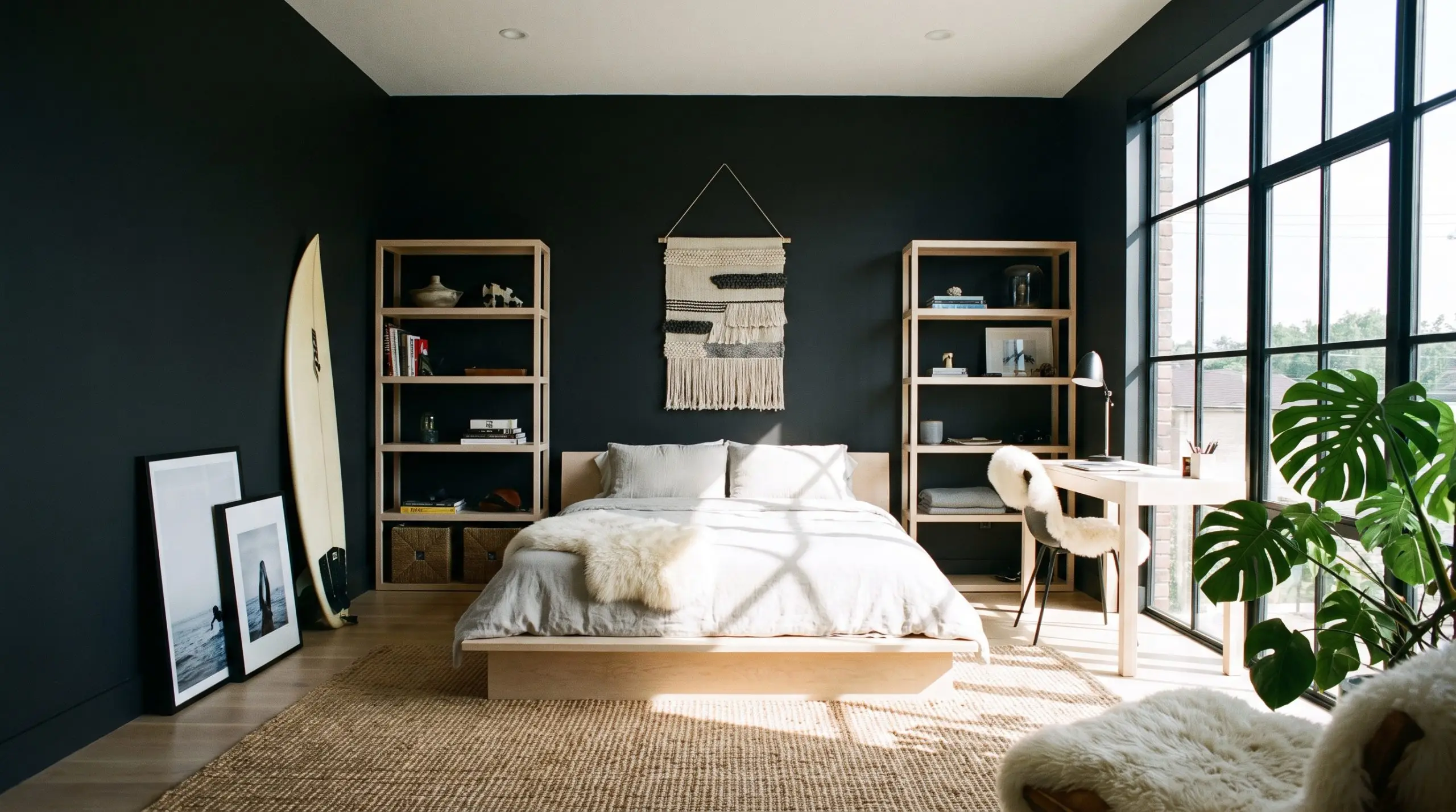
High contrast and incredibly chic, an inky black room makes a fearless architectural statement. When balanced with abundant natural light and highly textured organic materials, the walls recede, creating a profound sense of depth.
- Brand Match: Sherwin-Williams Tricorn Black
- Palette Pairing: Bleached maple wood to provide high contrast
14. Espresso Brown (The New Black)
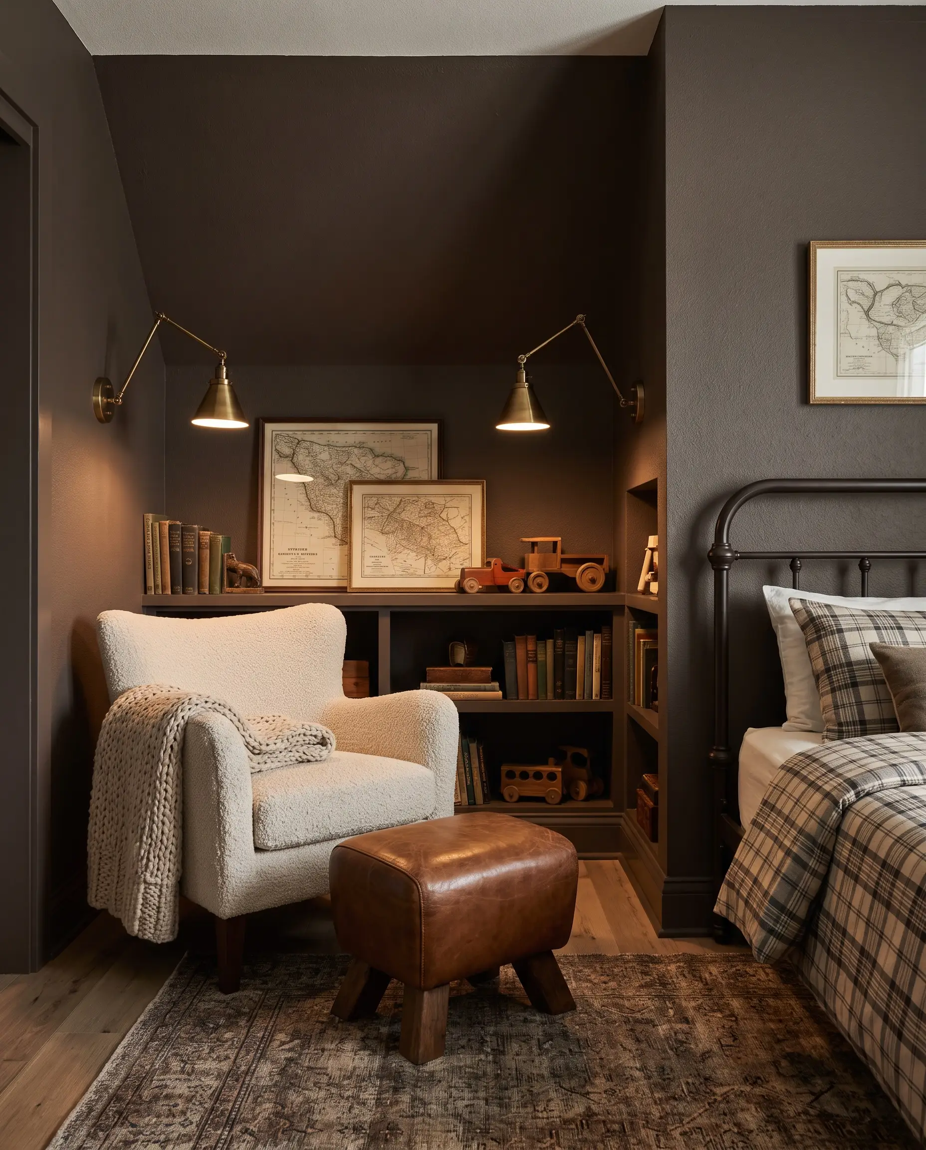
Serving as a rich, enveloping alternative to standard charcoal, deep brown brings immense warmth and a vintage, collected feel. This muddy, highly tactile shade grounds the room with a sophisticated, old-world masculinity.
- Brand Match: Farrow & Ball London Clay
- Palette Pairing: Aged brass and boucle fabrics
High-Impact Paint Applications (Beyond the Four Walls)
Selecting the perfect hue is only half the execution; how you apply the pigment dictates the architectural quality of the room. Mastering spatial illusion through strategic paint application turns standard drywall into a bespoke design feature.
15. The Monochromatic Color Drench
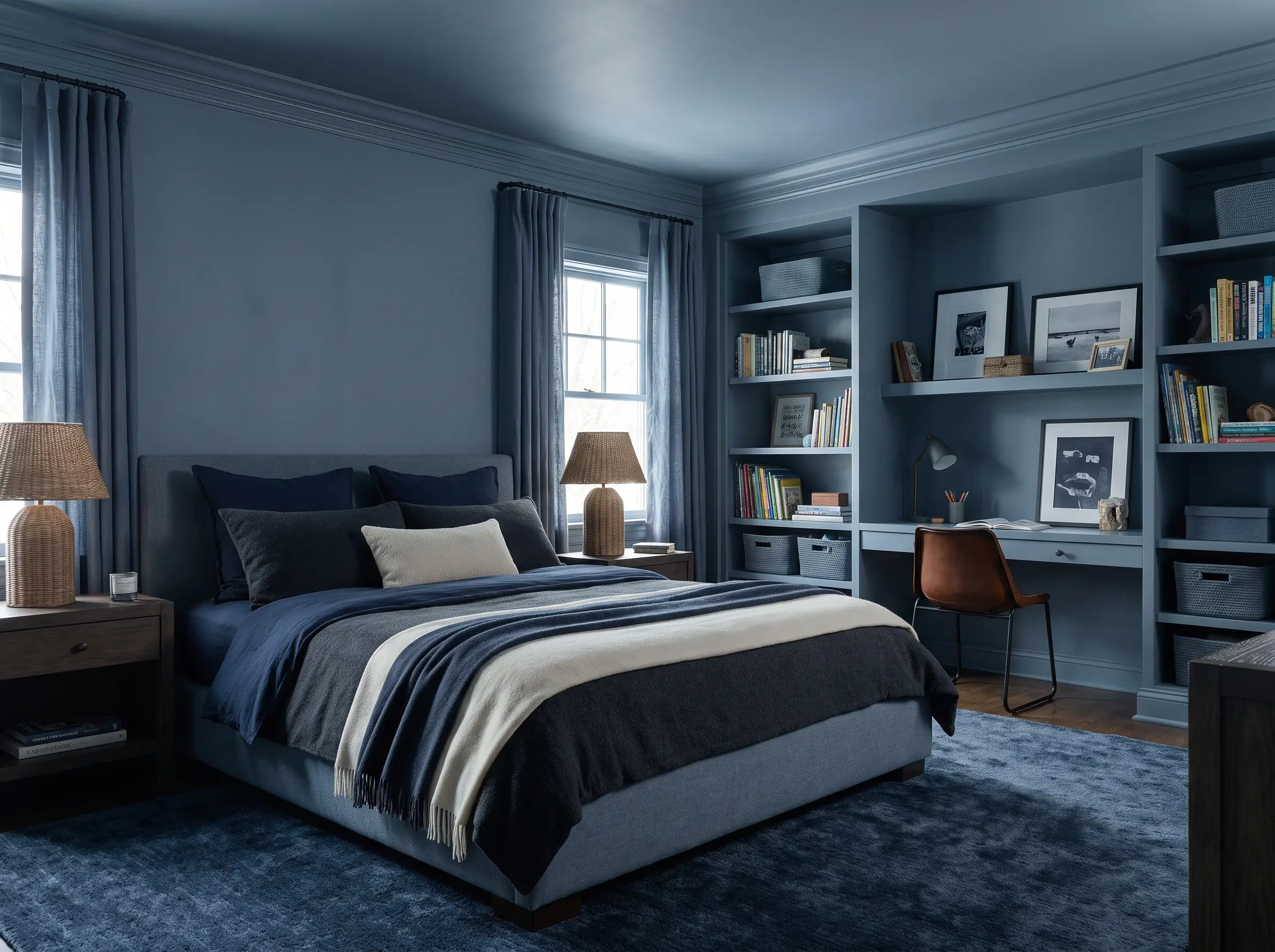
Painting the walls, baseboards, doors, and window casings the exact same color erases visual clutter and establishes a seamless, enveloping environment. This technique instantly makes standard builder-grade trims look custom and highly intentional.
- Spatial Effect: Blurs the boundaries of the room, making low ceilings feel infinitely higher.
- Clutter Reduction: Camouflages necessary but visually disruptive elements like closet doors and heavy baseboards.
- Pro-Tip: Use a single dead-flat finish across all surfaces for a truly modern, velvety aesthetic.
16. Two-Tone Wainscoting
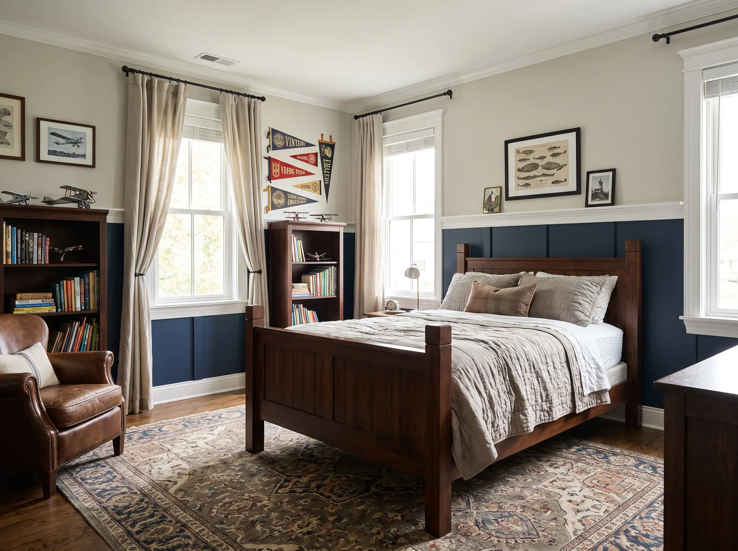
Grounding the bottom third of the room in a dark, durable pigment while keeping the upper walls light anchors the space beautifully. This classic architectural division is highly practical for scuff-prone areas, protecting the high-traffic zones from daily wear.
- Spatial Effect: Visually widens the room by establishing a continuous horizontal datum line.
- Practicality: Confines inevitable fingerprints and toy scuffs to a darker, more forgiving color.
- Pro-Tip: Install a simple chair rail to crisp up the transition between the two tones.
17. Asymmetrical Color Blocking
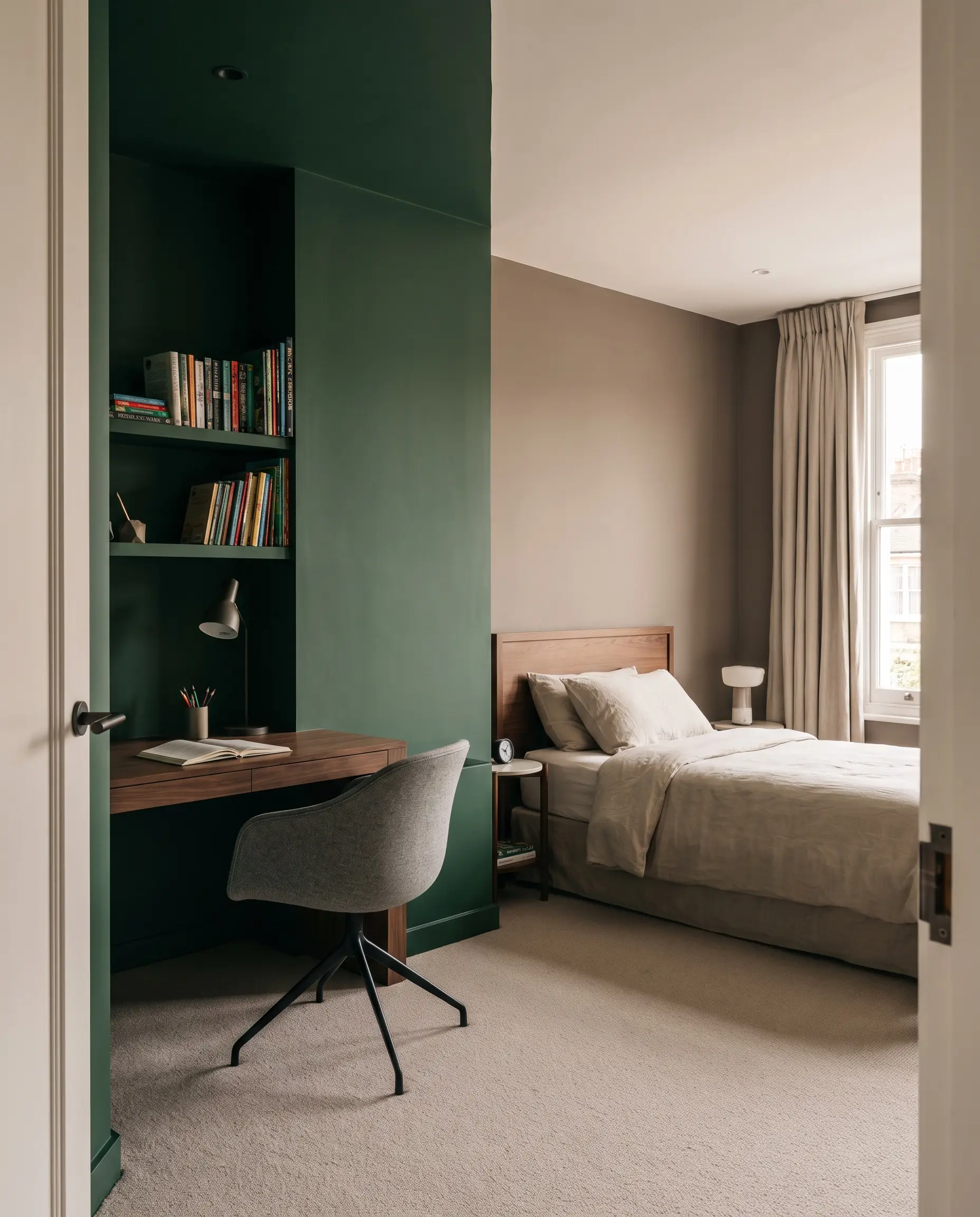
Defining distinct functional zones within a single bedroom through painted arches or crisp vertical color blocks adds architectural interest without structural work. This effectively separates a dedicated study zone from a restful sleep zone.
- Spatial Effect: Creates a room-within-a-room, adding visual depth and purposeful layout cues.
- Visual Balance: Allows you to introduce a vibrant or dark shade without it dominating the entire space.
- Pro-Tip: Use a laser level and high-quality edge tape to ensure razor-sharp transitions between blocks.
18. The “Fifth Wall” Painted Ceiling
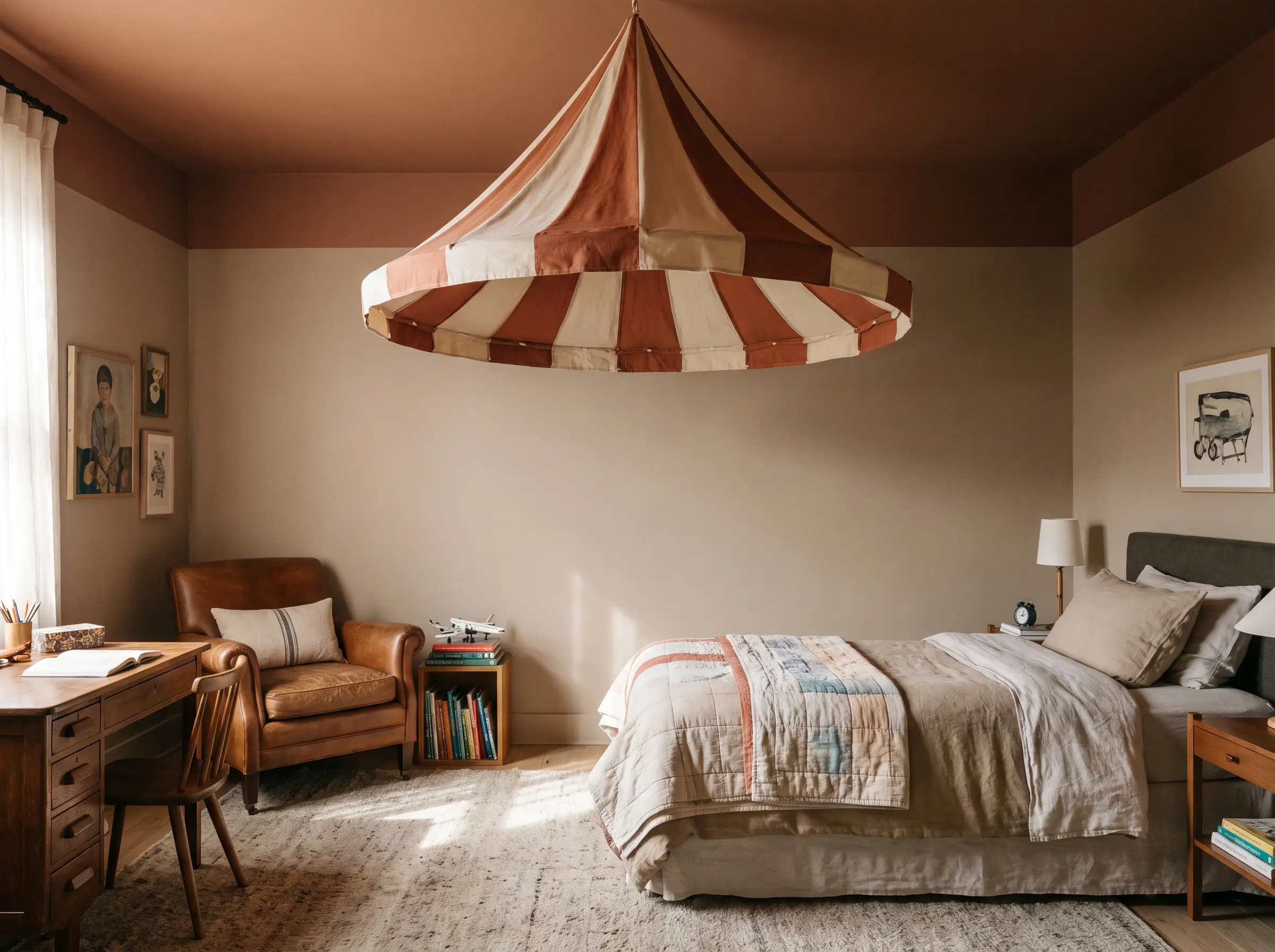
Leaving the vertical walls a warm mushroom while painting the ceiling plane a muddy terracotta or true navy draws the eye upward. This unexpected placement creates a custom, tented effect that feels incredibly intimate and designed.
- Spatial Effect: Lowers a cavernous ceiling for added intimacy or draws attention to beautiful crown molding.
- Design Impact: Injects heavy personality into the room while keeping eye-level sightlines clean and neutral.
- Pro-Tip: Carry the ceiling color down the top six inches of the wall to create a modern, wrap-around canopy.
Paint Finish Matrix: Choosing Durability for Boys’ Rooms
Specifying the correct sheen is just as critical as selecting the perfect hue. The right formulation guarantees that your carefully chosen color withstands the rigorous reality of a boy’s bedroom without highlighting every drywall imperfection.
| Finish Type | Visual Effect | Durability/Washability | Best Application |
|---|---|---|---|
| Flat / Matte (Standard) | Velvety and non-reflective; hides drywall flaws beautifully. | Poor. Absorbs oils and marks easily; difficult to wipe down. | Ceilings only. |
| Washable Matte / Dead Flat | Ultra-chic, powdery finish with zero glare. | Premium durability. Wipes clean without burnishing (shiny spots). | High-traffic walls, color-drenched architectural trim. |
| Eggshell Finish | Slight, soft sheen that reflects minimal light. | Moderate. Easier to clean than standard flat, but can highlight wall texture. | Walls in moderately used bedrooms. |
| Satin | Noticeable gloss; highly reflective. | Excellent washability, but visually dated for broad wall applications. | Baseboards, interior doors, and high-touch millwork. |
The Final Coat: Securing Longevity in Boys’ Room Design
Designing a boy’s room that endures requires a decisive shift away from fleeting, juvenile trends. Invest in complex, muddy colors, prioritize premium washable finishes, and respect the architectural boundaries of the space.
Never trust a digital screen to dictate your final pigment choice. Secure physical swatches, paint large test patches on your walls, and observe how the light interacts with the undertones from morning sun to evening shadows. Lock in your palette, select your hardware, and create a sophisticated, tactile environment that your child will appreciate long into their teenage years. To ensure your execution is flawless, explore our internal guides on Organic Modern Kids Room Ideas or master the exact mechanics in How to Color Drench a Bedroom.

The Aesthetics Desk curates the visual direction for Hackrea. Specializing in design history, global architectural movements, and interior styling, this desk focuses on the psychology of space and how to translate high-end, magazine-quality aesthetics into approachable residential design without falling into fleeting micro-trends.