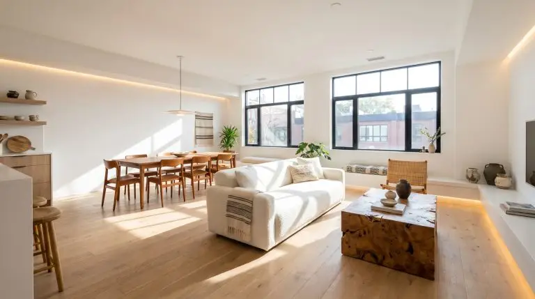
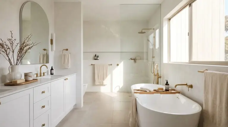
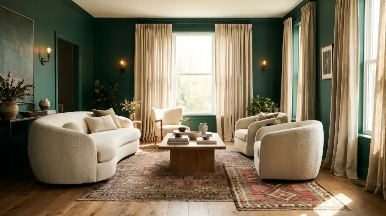
The Best White Paint Colors for 2026: The Ultimate Guide to Warm, Cozy, and Trending Neutrals
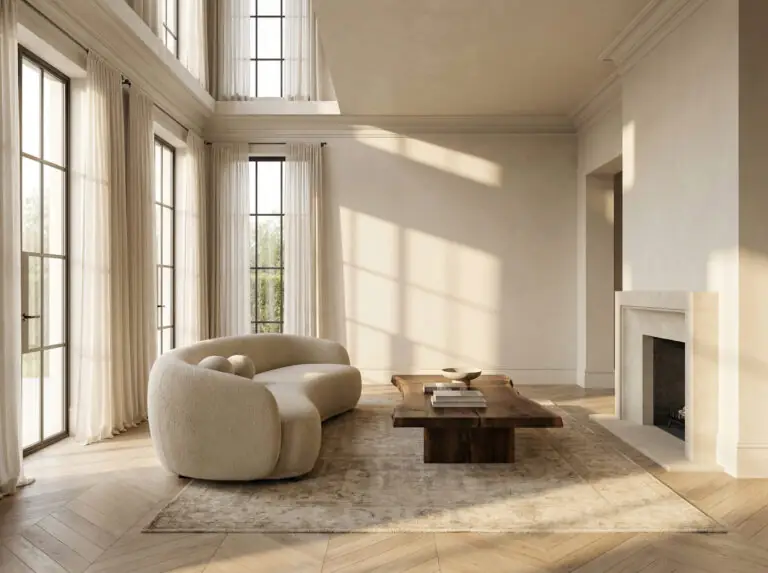
Let’s be honest: walking into a paint store to pick out a “simple white” is one of the most deceptively difficult tasks in interior design. You think you’re going in for one color, and you’re met with a wall of 300 chips ranging from “blue-ish blizzard” to “yellow-ish heavy cream.”
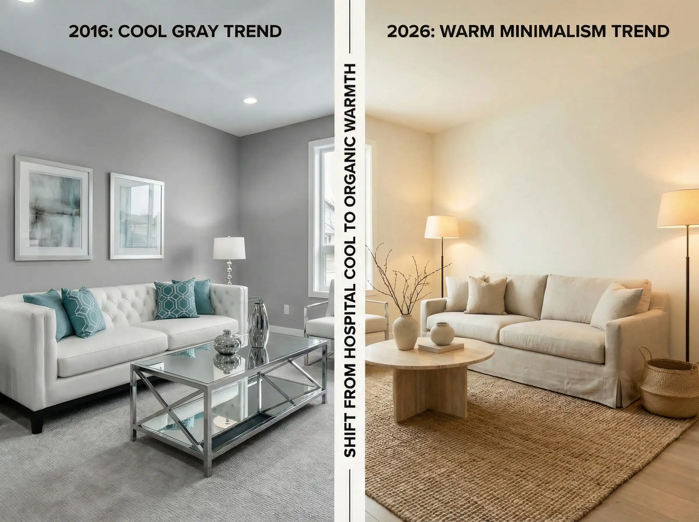
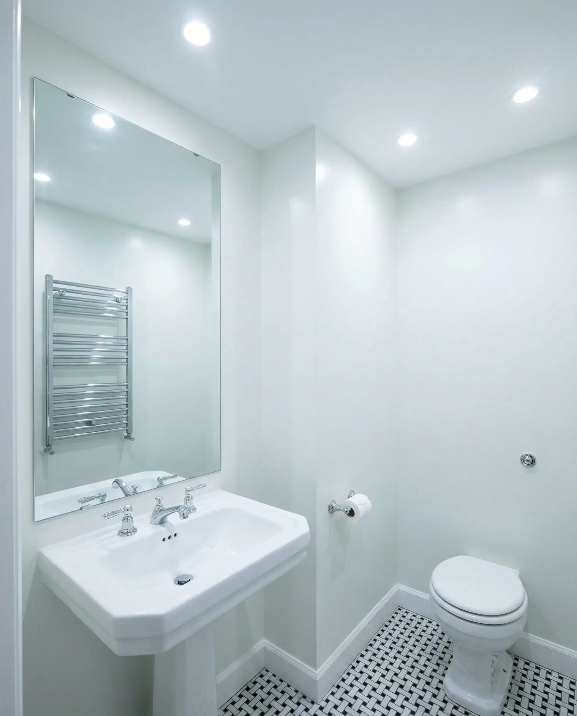
For years, the design world was dominated by stark, gallery-like whites. We wanted our homes to look crisp, clean, and perhaps a little sterile. But as we move deeper into 2026, the vibe has shifted dramatically. The “Hospital White” era is officially over.
2026 is the year of the “Un-White.”
We are craving comfort, softness, and organic warmth. The trending whites for 2026 aren’t just background noise; they are velvety, complex, and capable of wrapping a room in a hug rather than chilling it down. From the airy elegance of Pantone’s Cloud Dancer to the creamy resurgence of Swiss Coffee, this year is about finding whites that feel lived-in and luxurious.
Whether you are repainting a north-facing bedroom or updating your kitchen cabinets, this comprehensive guide will walk you through the top white paint colors of 2026, the science of undertones, and exactly which shade is right for your home.
Quick Take: What is the Best White Paint Color for 2026?
If you are looking for the short answer to win your next renovation discussion, here it is:
The Verdict: The most popular white paint trend for 2026 has shifted away from cool, stark whites toward warm, “mushroom” off-whites. The top trending color is Pantone’s Cloud Dancer (11-4201) for its airy versatility. However, for walls that need to feel cozy, Benjamin Moore’s Swiss Coffee and Sherwin-Williams Shoji White are the top practical choices. These shades bridge the gap between white and beige, offering a soft backdrop that pairs perfectly with the dark wood and earth tones trending this year.
The 2026 Shift: Why “Mushroom” and “Cream” Are Taking Over
Why the change? For the better part of a decade, the “Cool Gray” and “Bright White” aesthetic reigned supreme. But as our homes continue to serve as sanctuaries, our eyes have grown tired of the glare.
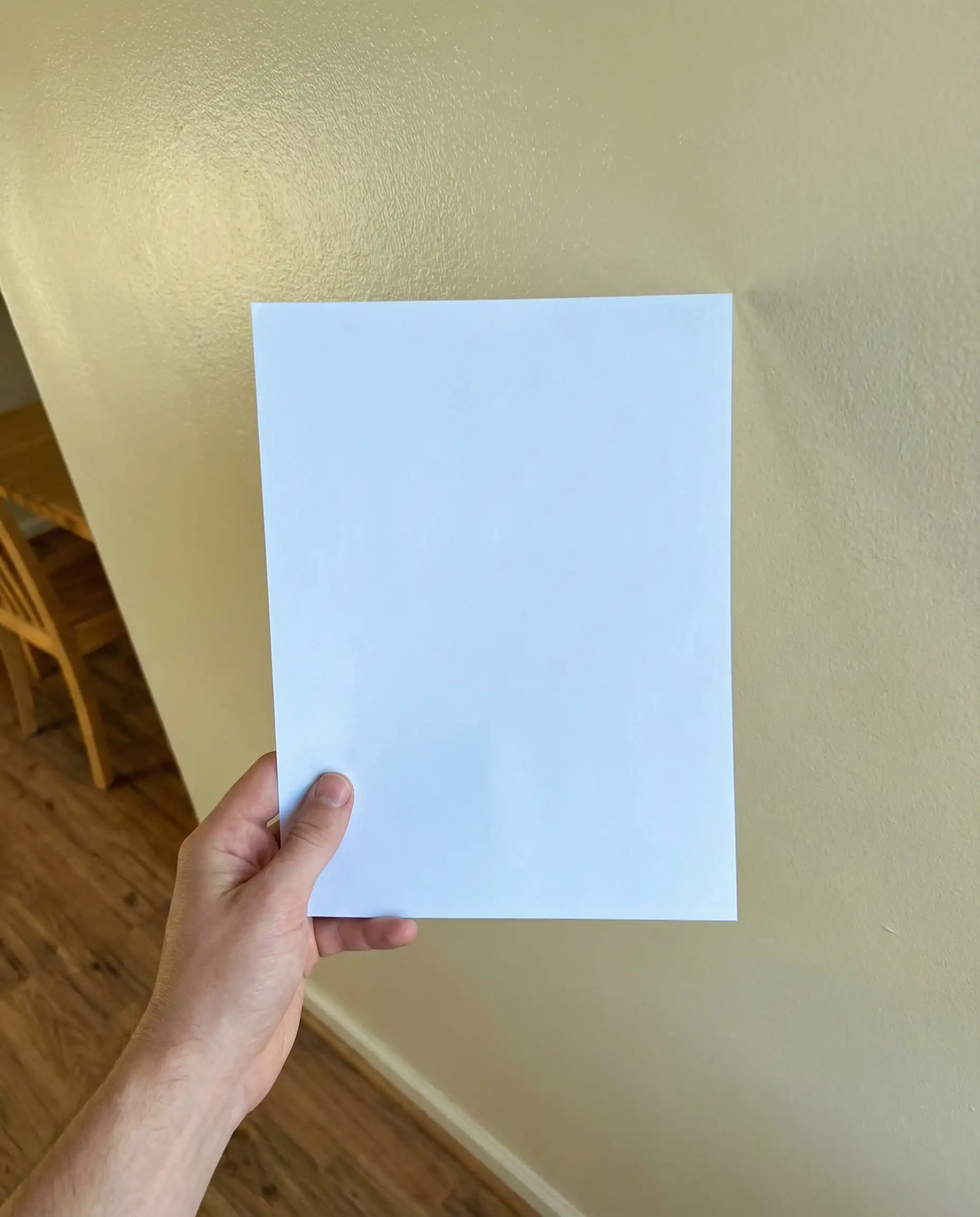
In 2026, we are seeing the rise of “Warm Minimalism.” This style keeps the clutter-free look of minimalism but swaps the cold palette for organic textures. We want stone, dark walnut wood, unlacquered brass, and linen. Stark bright white (like a sheet of printer paper) looks jarring against these natural materials.
Enter the “Mushroom Whites.” These are whites with heavy doses of yellow, red, or gray undertones. They don’t reflect light aggressively; they absorb it slightly, creating a soft glow. They make a large open-plan space feel intimate rather than cavernous.
Part 1: The 2026 Trendsetters (Warm, Organic & Creamy)
These are the “It” colors of the year. If you want your home to look current and professionally styled, start here.
1. Pantone Cloud Dancer (11-4201)
Vibe: Airy, floaty, and effortlessly chic.
Best For: Living rooms, ceilings, and open-concept spaces.
Named the Pantone Color of the Year 2026, Cloud Dancer is the answer to the question, “How do I get a white that isn’t boring?” It is technically an off-white, but it feels incredibly airy. It lacks the heavy yellow “buttery” feel of older creams, opting instead for a sophisticated, barely-there beige undertone that grounds the space. It signifies a return to openness and calm.
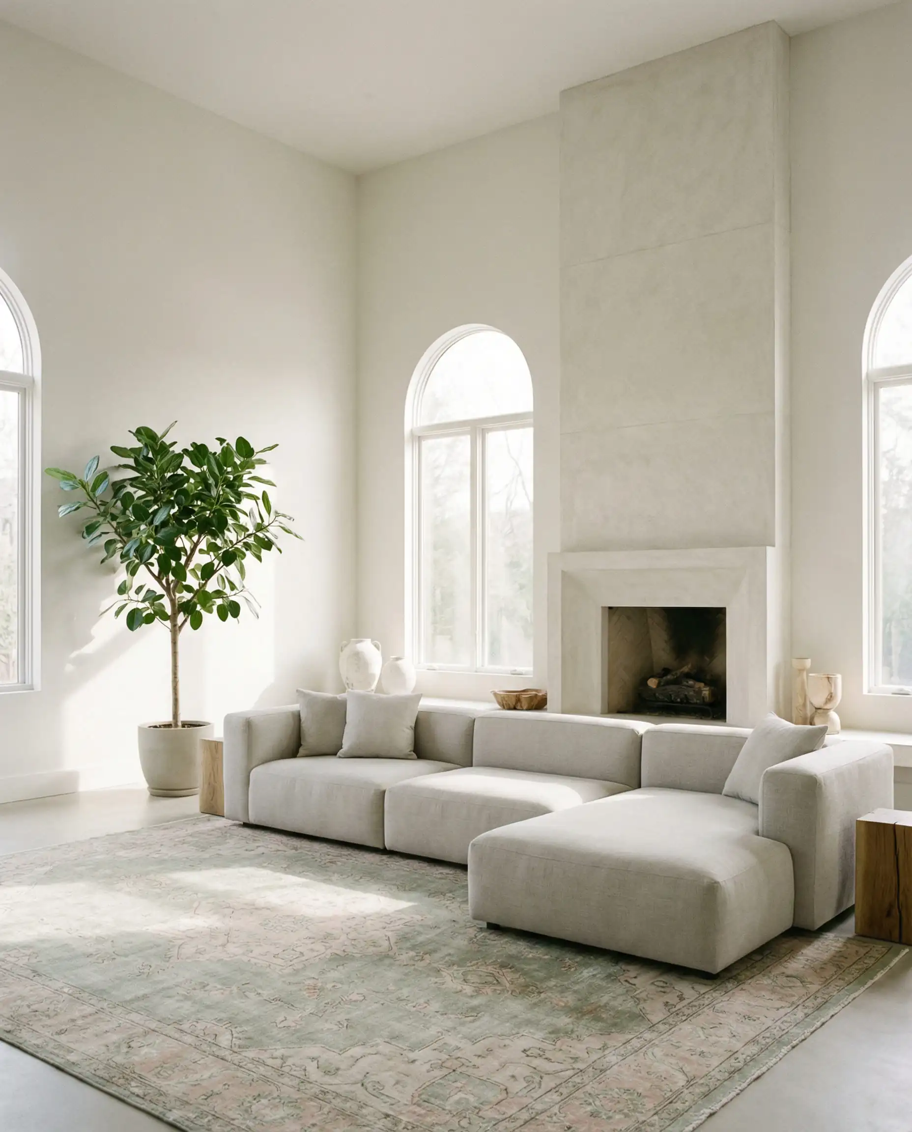
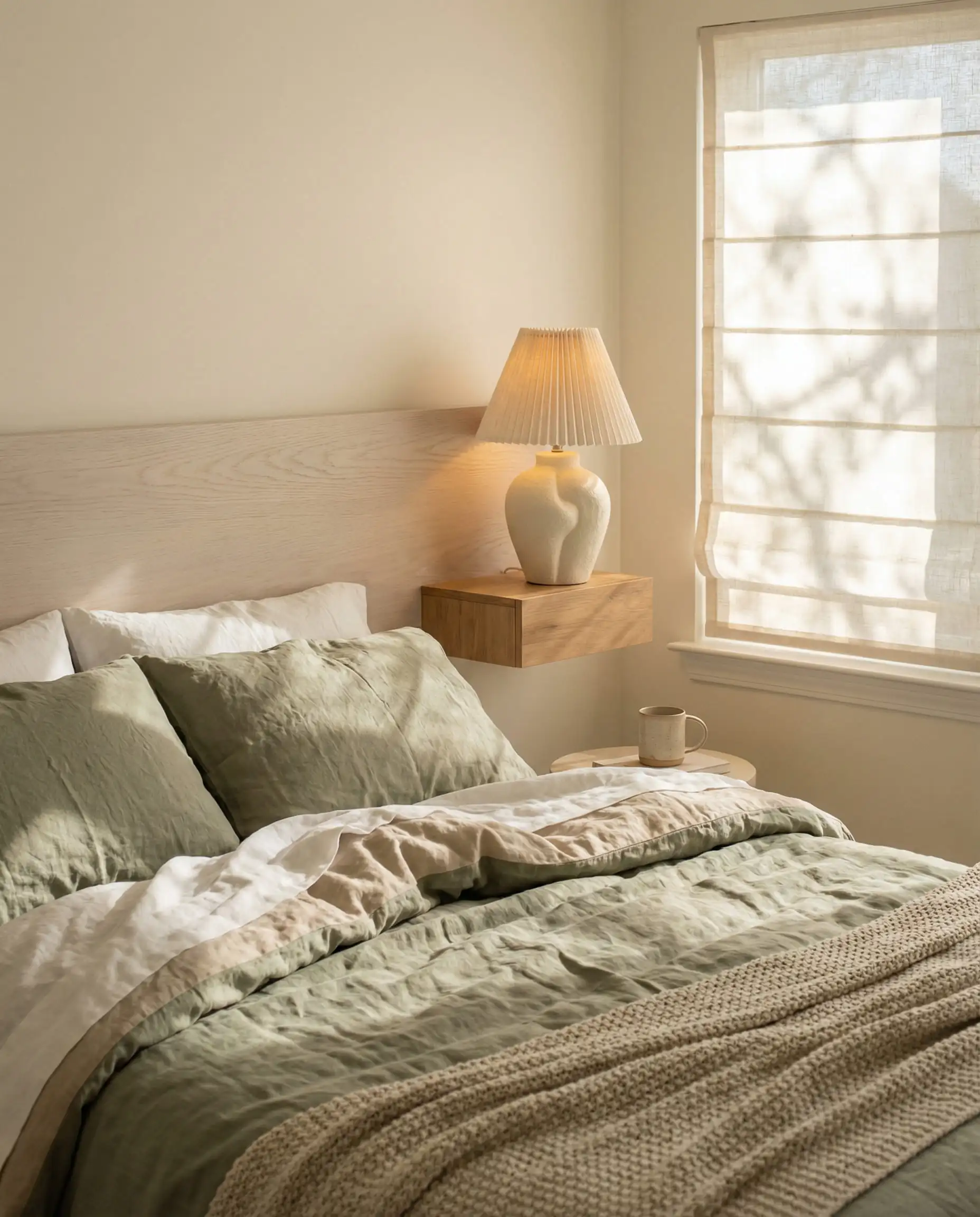
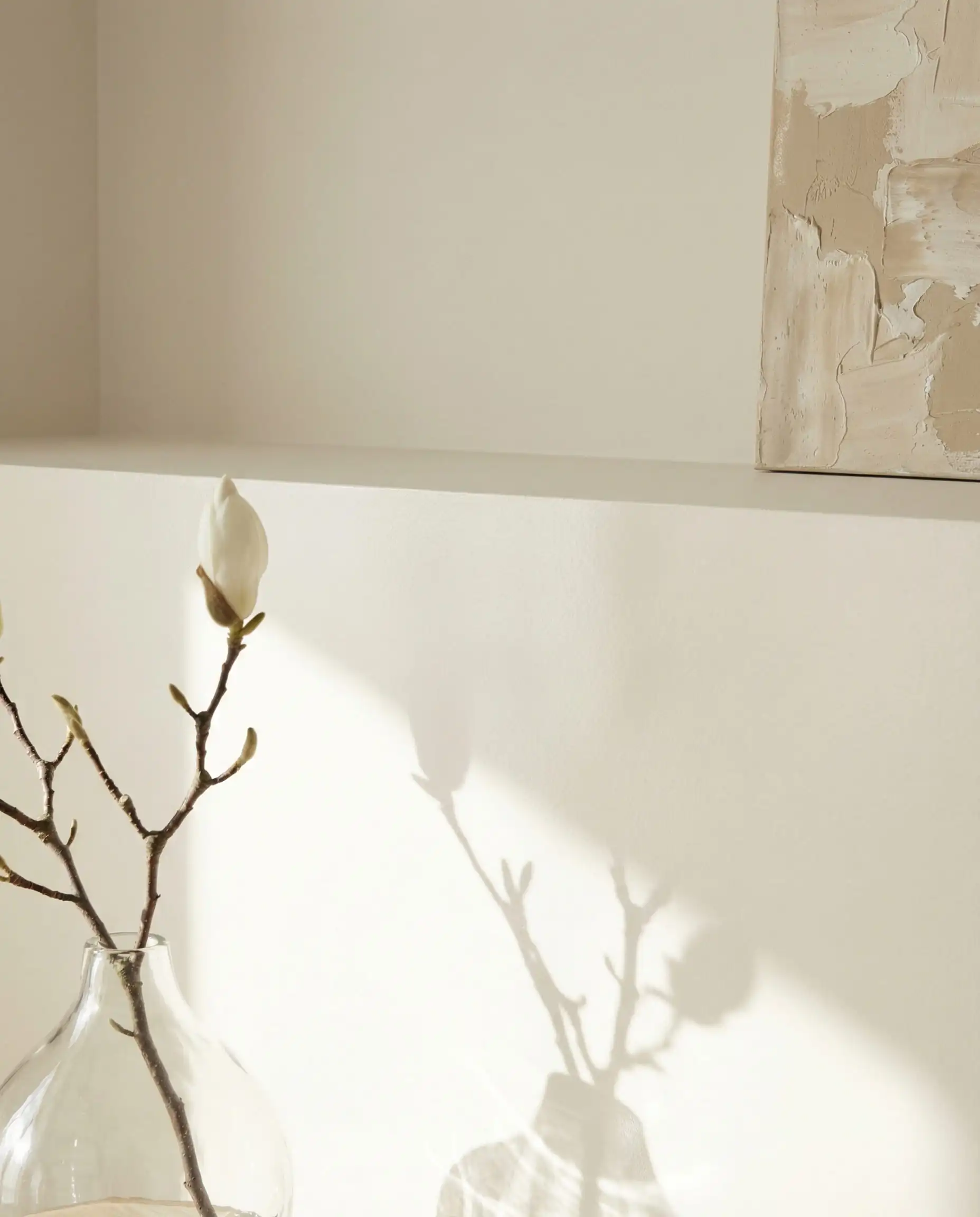
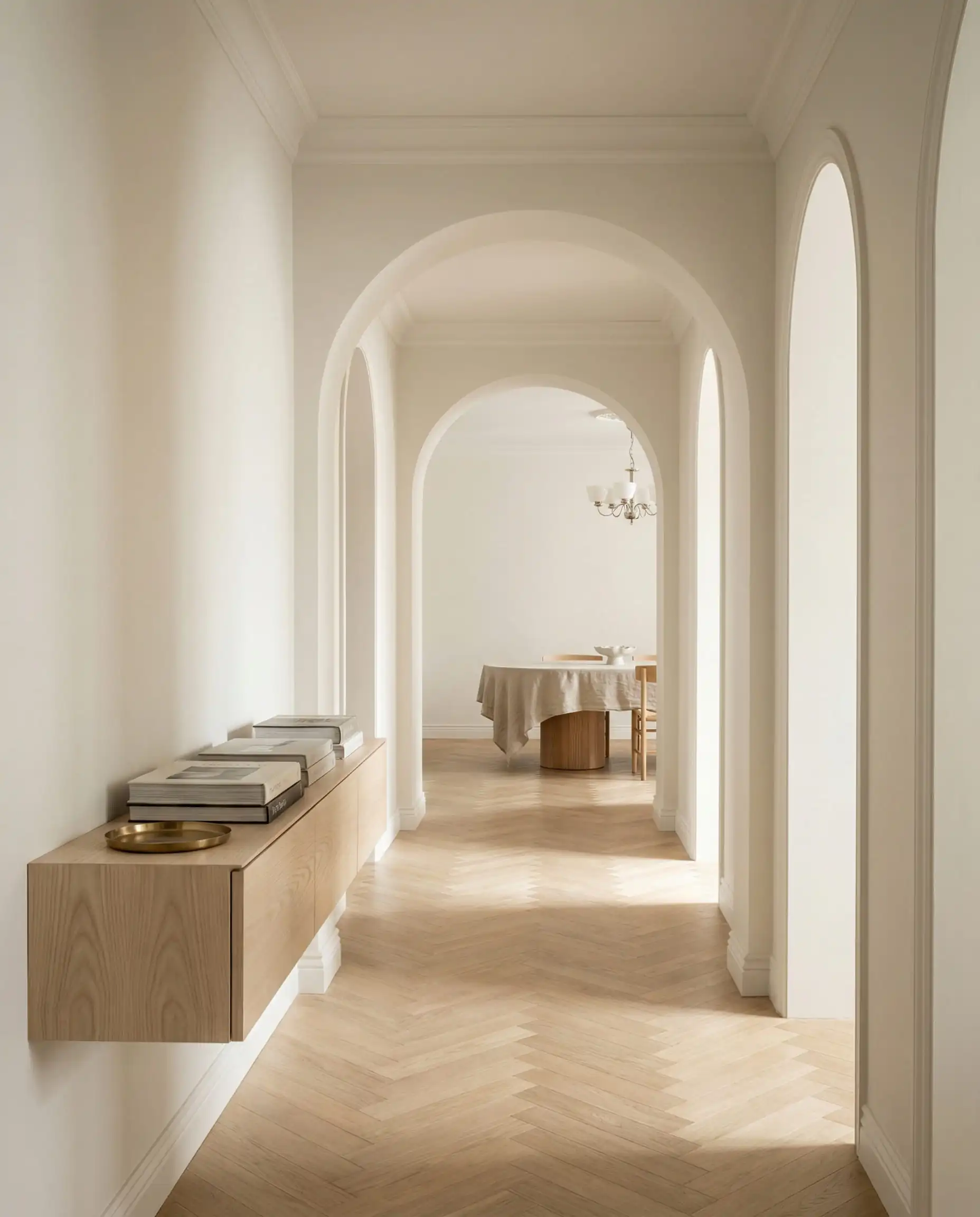
Use this if you are afraid of committing to a full beige but hate the starkness of pure white. It is the perfect ‘middle ground’—it feels fresh in the morning and cozy at night.
Hackrea Verdict
2. Benjamin Moore Swiss Coffee (OC-45)
LRV: 81.91
Undertones: Warm, creamy yellow/green.
Best For: Living rooms, traditional aesthetics, and softening modern architecture.
The Queen is back. While Swiss Coffee has been a designer secret for decades (it’s a favorite of Studio McGee), it is exploding in 2026 as the go-to wall color. It is not a bright white; it is a rich, indulgent creamy white. It has a high enough LRV to bounce light, but enough depth to contrast beautifully against crisp white trim.
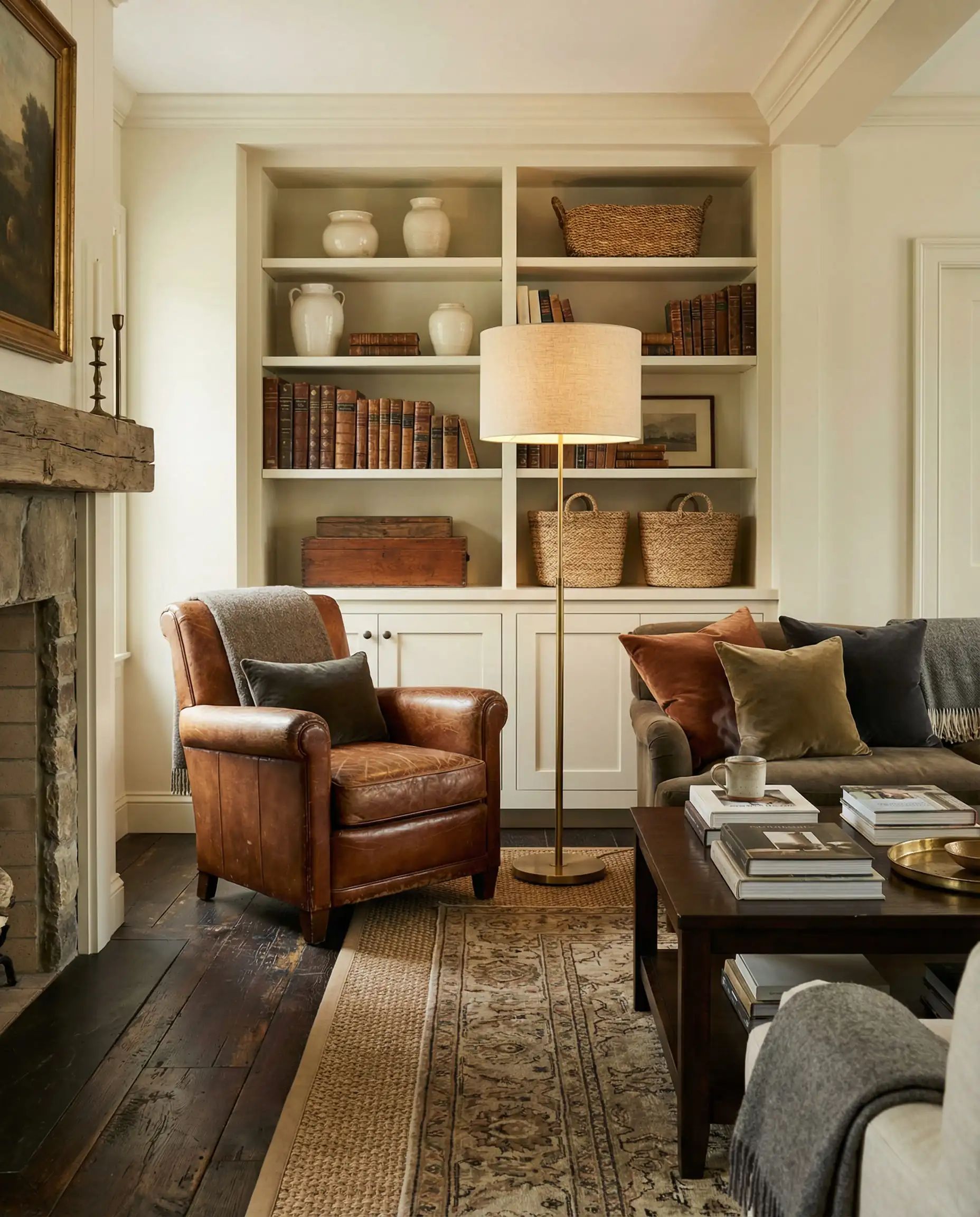
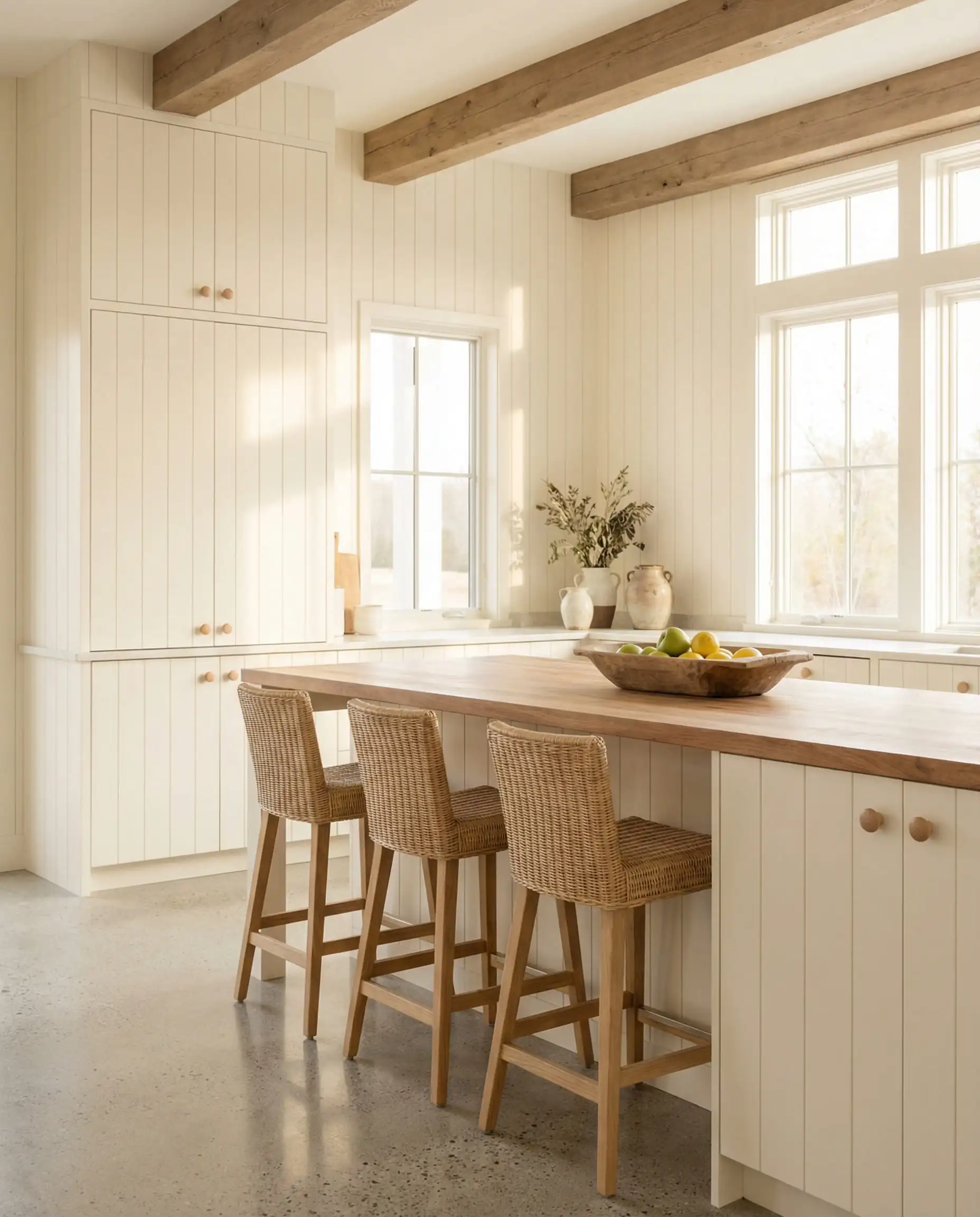
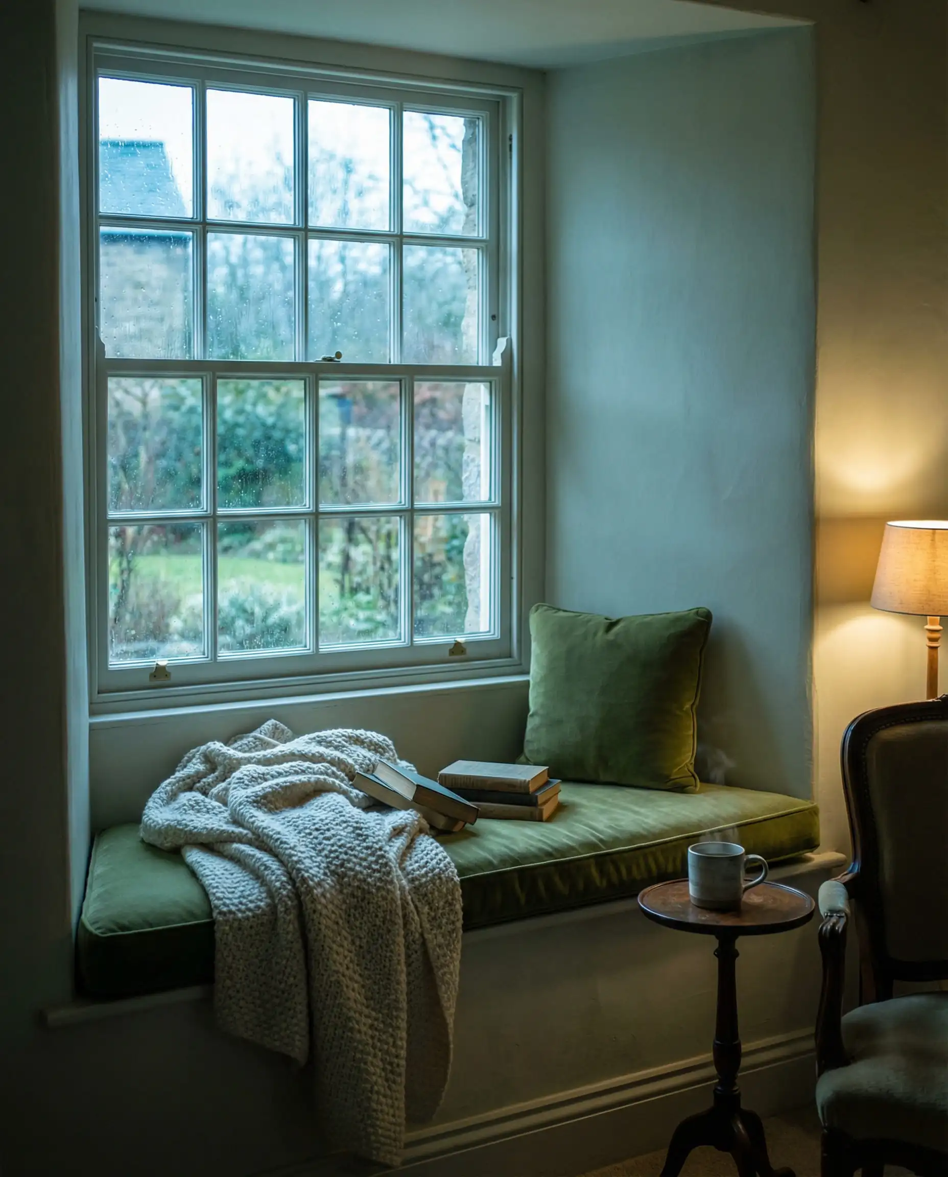
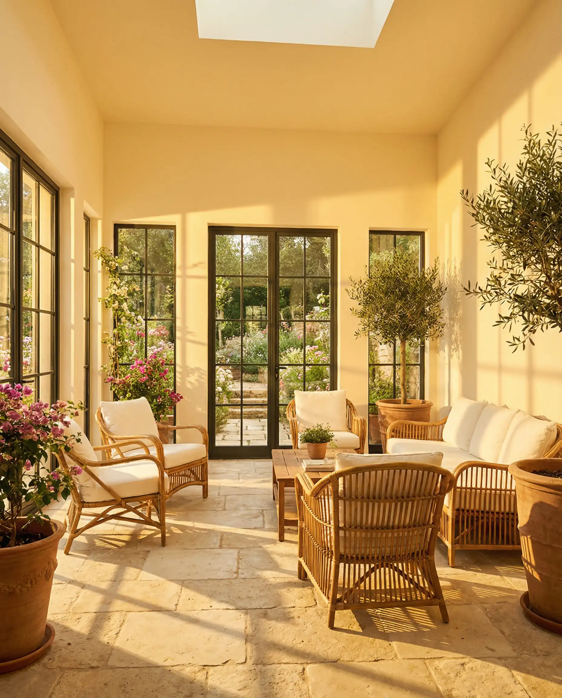
Be careful with your lighting. In a south-facing room, this will glow beautifully. In a dark north-facing room with cheap 3000K LED bulbs, it can look a bit green. Always test it first, but when it works, it looks expensive.
Hackrea Verdict
3. Sherwin-Williams Shoji White (SW 7042)
LRV: 74
Undertones: Greige, Mushroom, Cream.
Best For: Exteriors, bedrooms, and spaces with lots of natural wood.
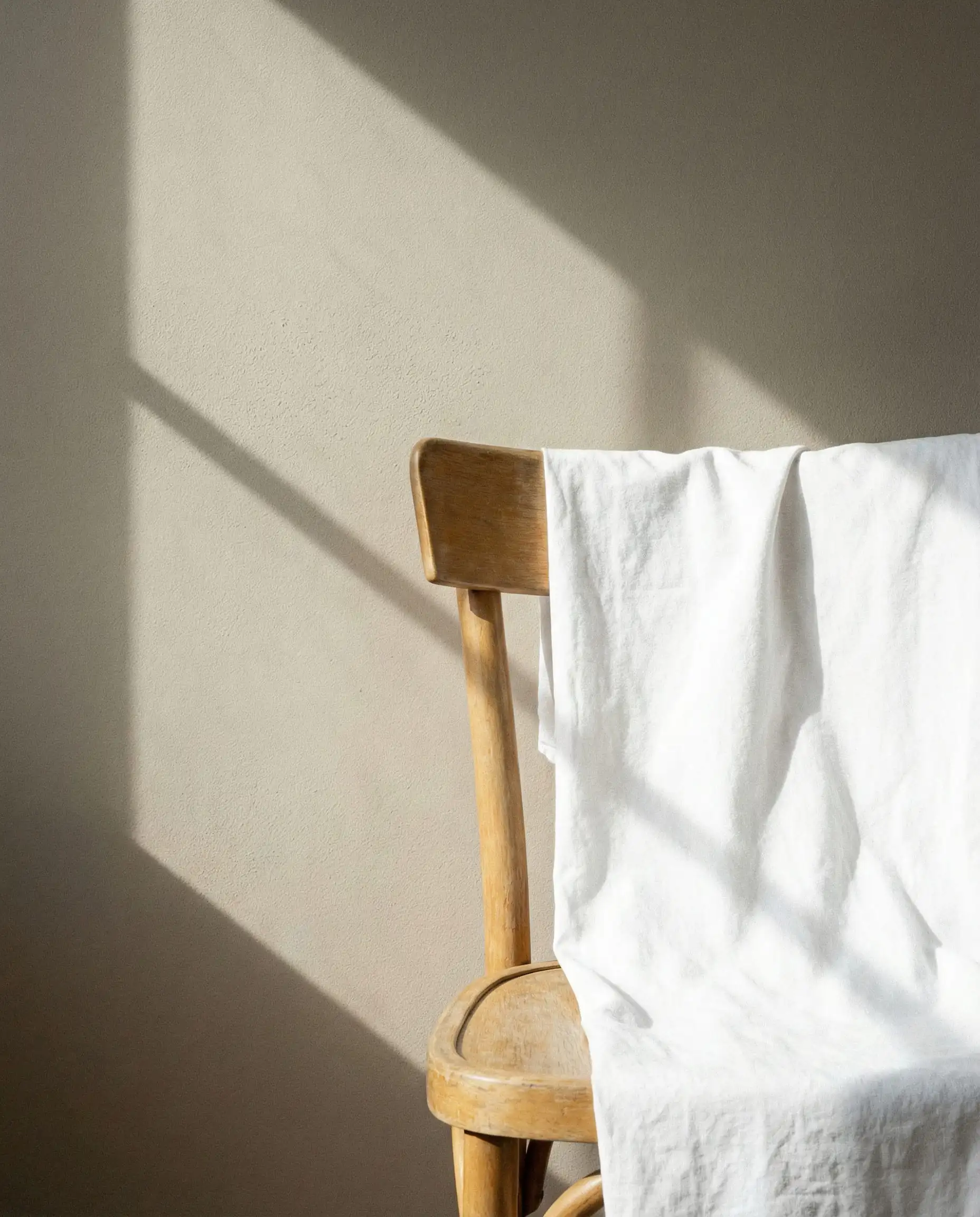
Shoji White is the leader of the “Anti-White” movement. With an LRV of 74, it is bordering on a very light greige. It is creamy, warm, and creates an incredible backdrop for the chocolate browns and moss greens that are trending in 2026 furniture. It wraps the room in a blanket of calm.
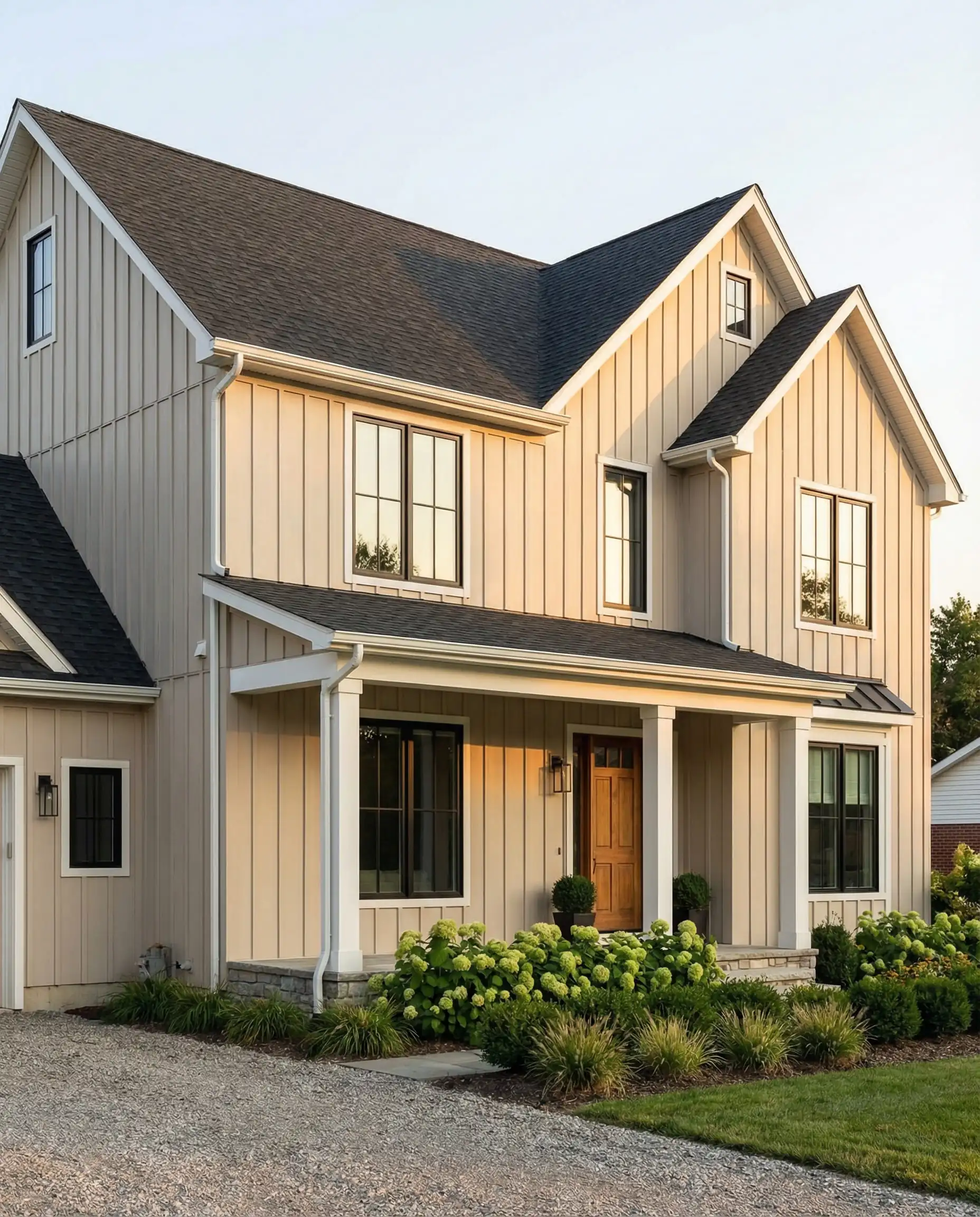
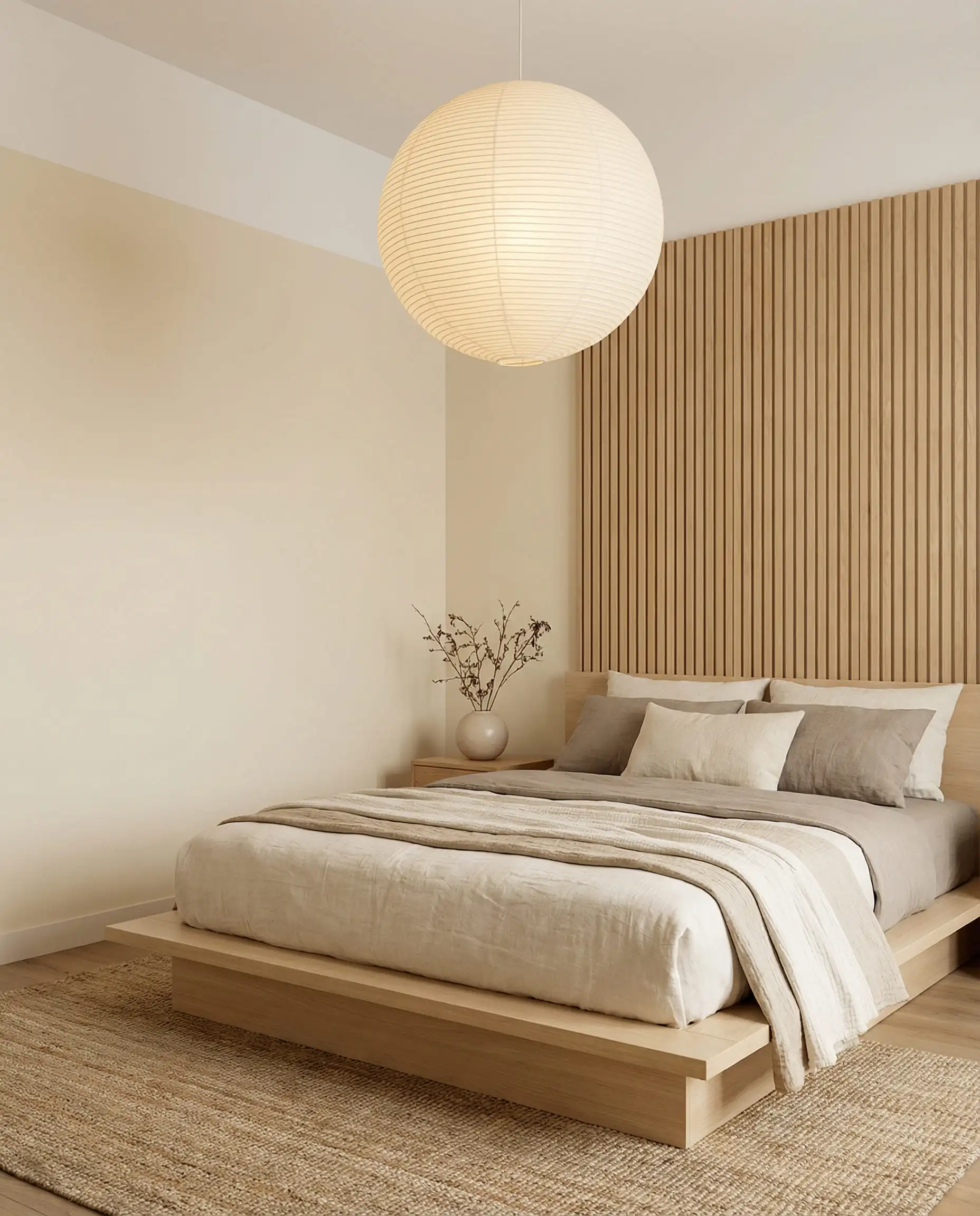
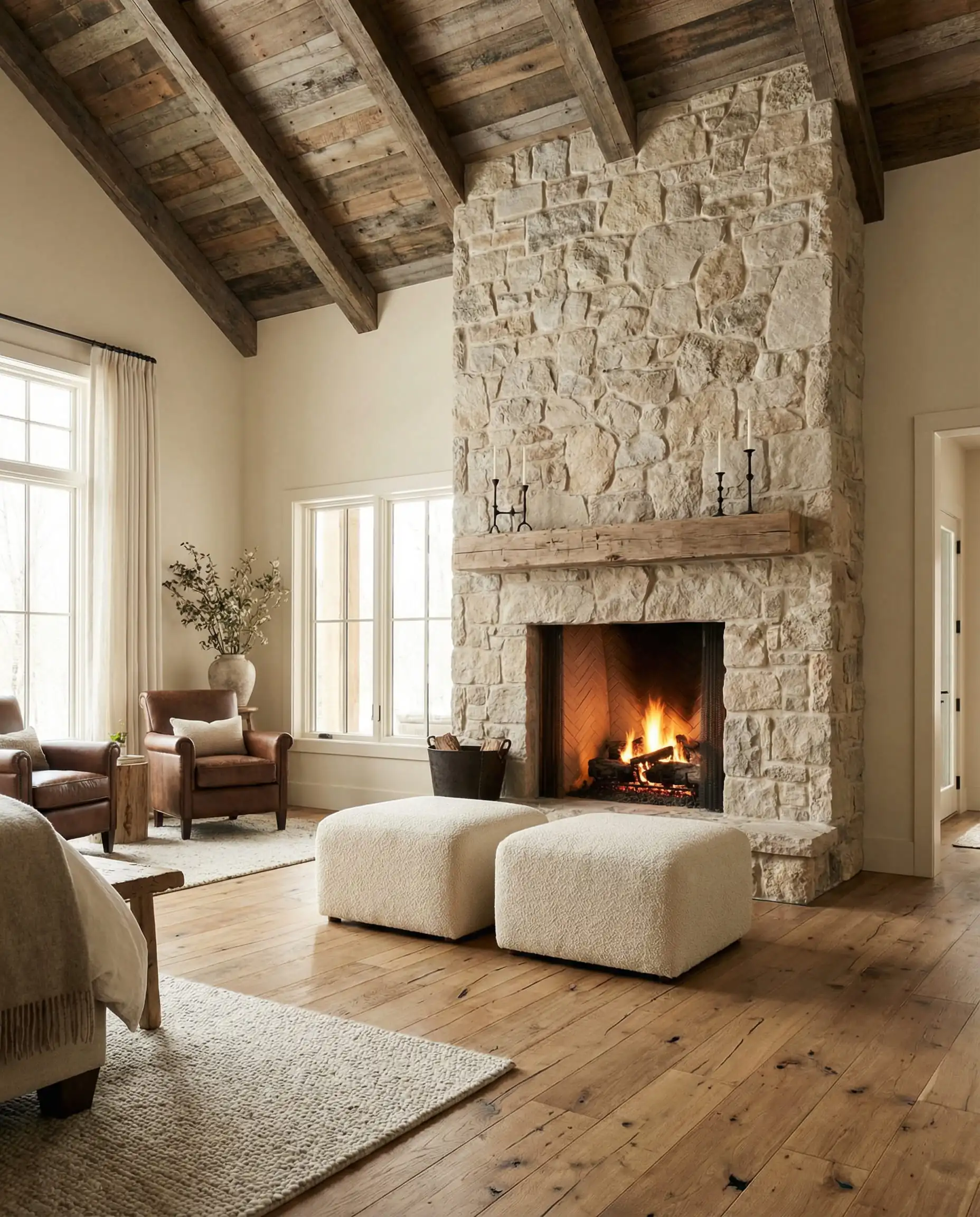
If you are afraid of your house looking too ‘yellow’ in the sun, skip the Creamy (SW 7012) and stick to Shoji White—the slight gray undertone keeps it neutral even in harsh noon sun.
Hackrea Verdict
4. Benjamin Moore First Crush (CSP-310)
LRV: 78
Undertones: Subtle pink/blush.
Best For: Bathrooms, powder rooms, and romantic bedrooms.
Part of the specific 2026 trend palette, this is for the bold who want “white with a wink.” It reads as a soft white on the walls, but it has a distinctive blush undertone that flatters skin tones (making it amazing for bathrooms). It adds a subconscious layer of warmth that standard creams can’t achieve.
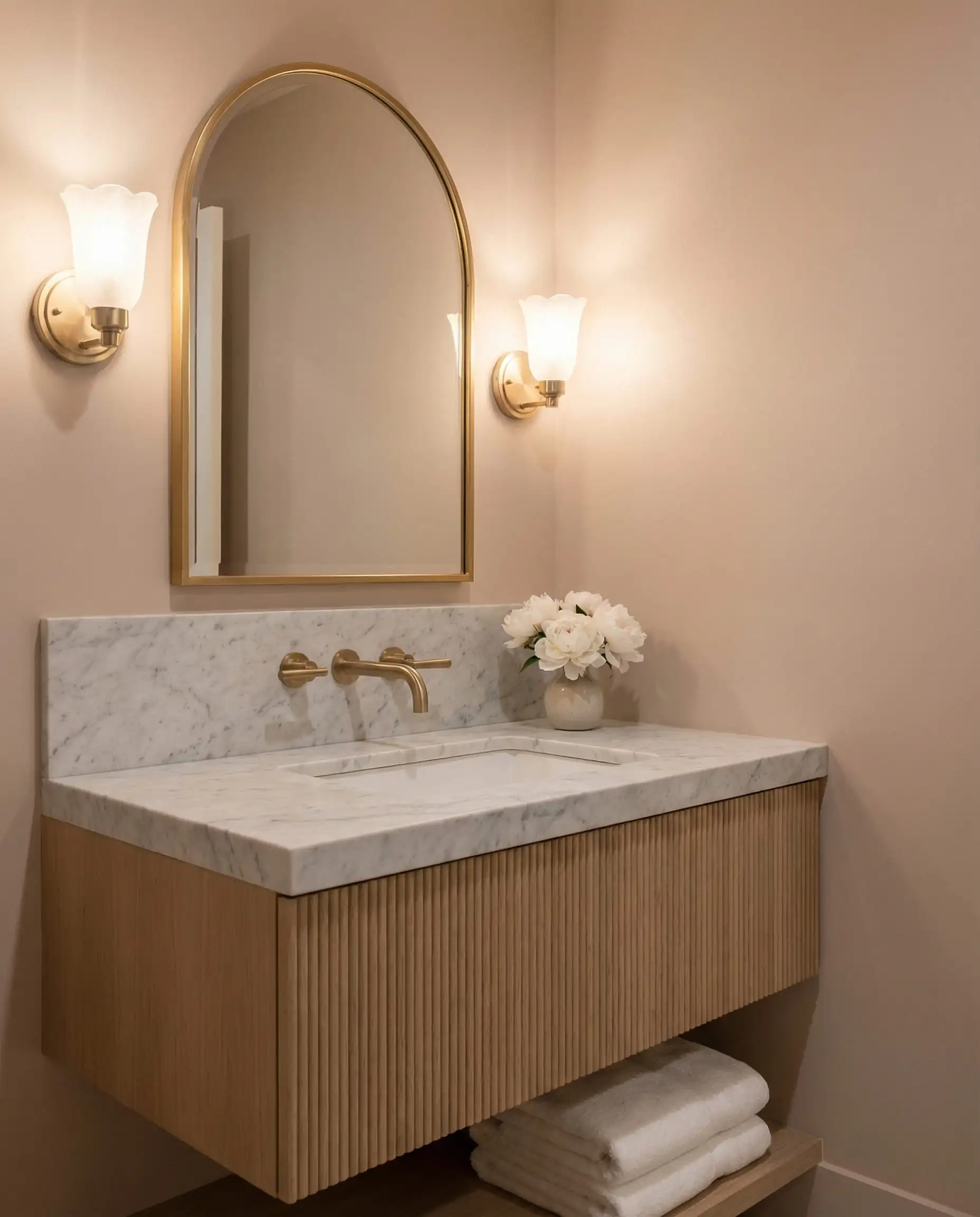
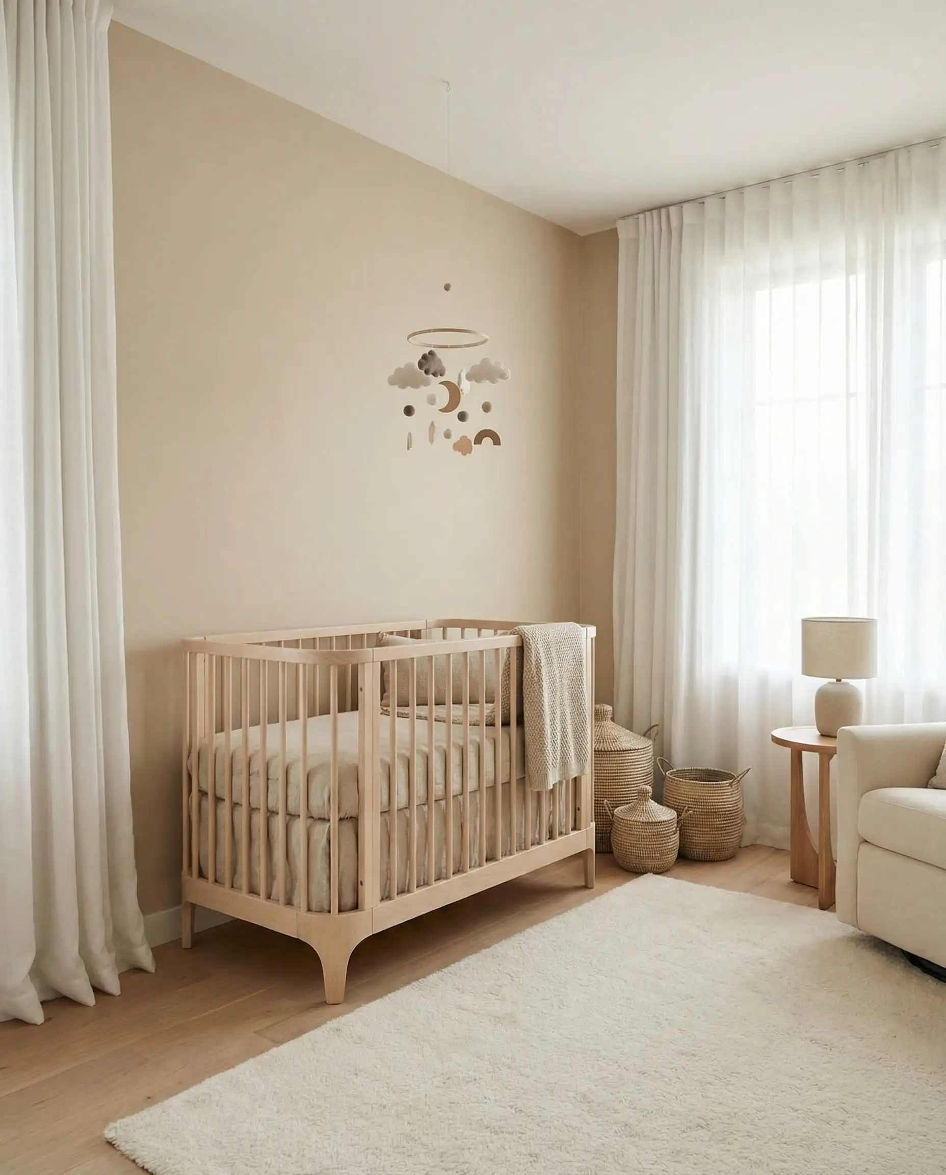
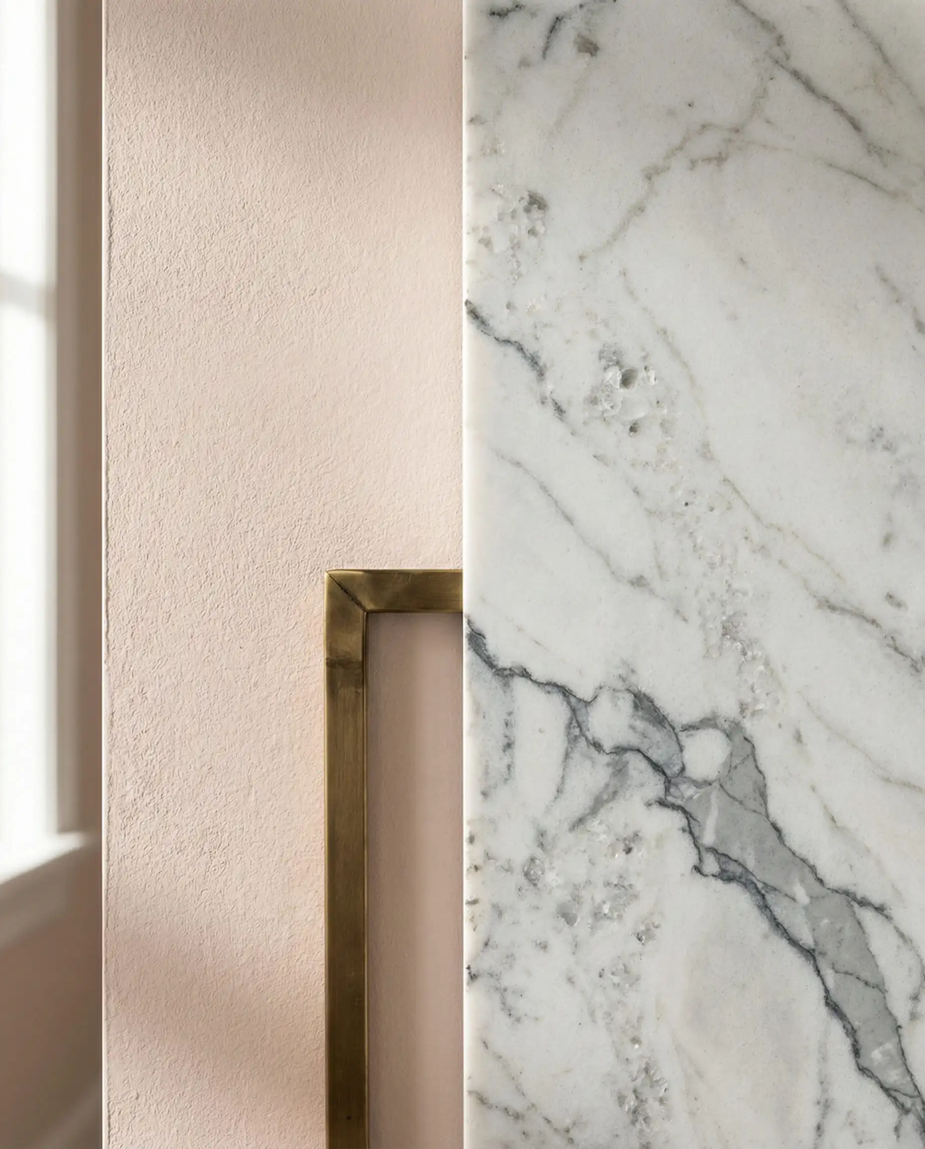
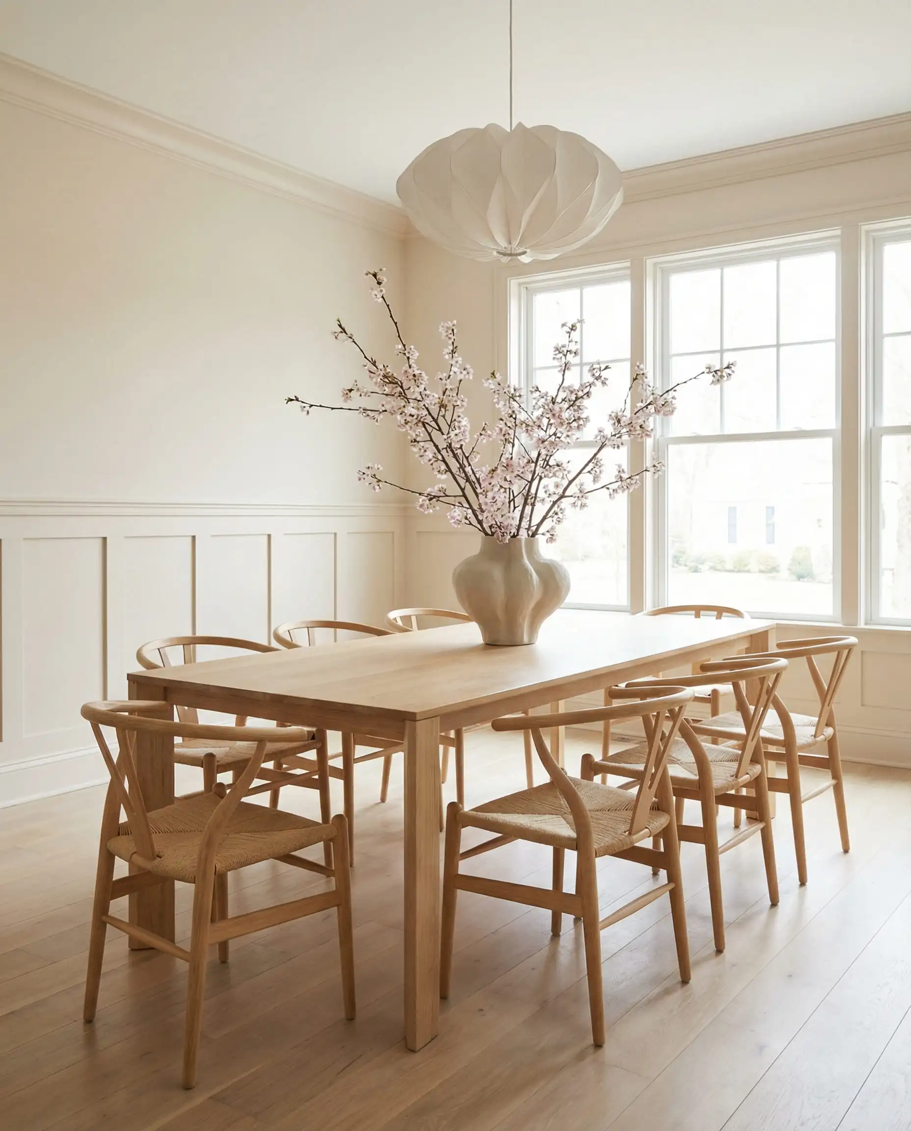
Don’t panic at the word ‘pink.’ On the wall, it reads as a warm, glowy white. However, keep it away from orange-toned wood floors, or the clash will be noticeable.
Hackrea Verdict
Part 2: The “Safe” Classics (Versatile & Timeless)
These colors aren’t chasing a trend—they are the standard. If you are painting a house to sell, or just want a color you won’t hate in 10 years, choose one of these.
5. Sherwin-Williams Alabaster (SW 7008)
LRV: 82
Undertones: Soft warm beige.
Best For: Shiplap, farmhouse styles, and whole-house interiors.
Alabaster is the “Goldilocks” of white paint. It isn’t too stark, but it isn’t too yellow. It has been a top seller for years because it just works. It provides a soft, soothing backdrop that doesn’t demand attention.
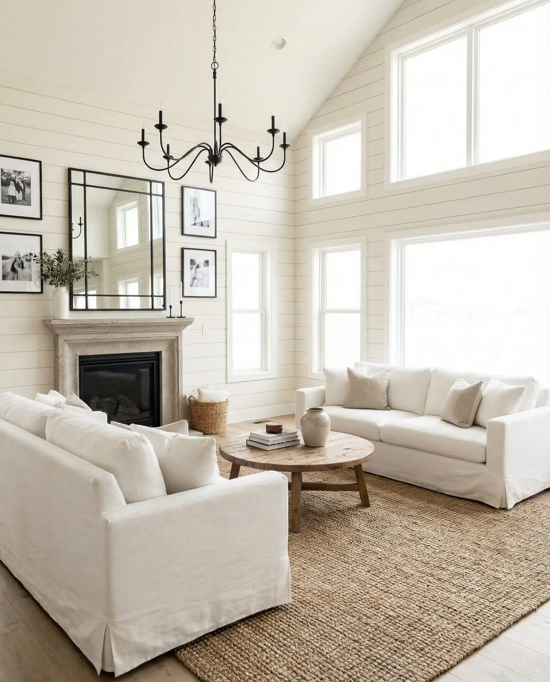
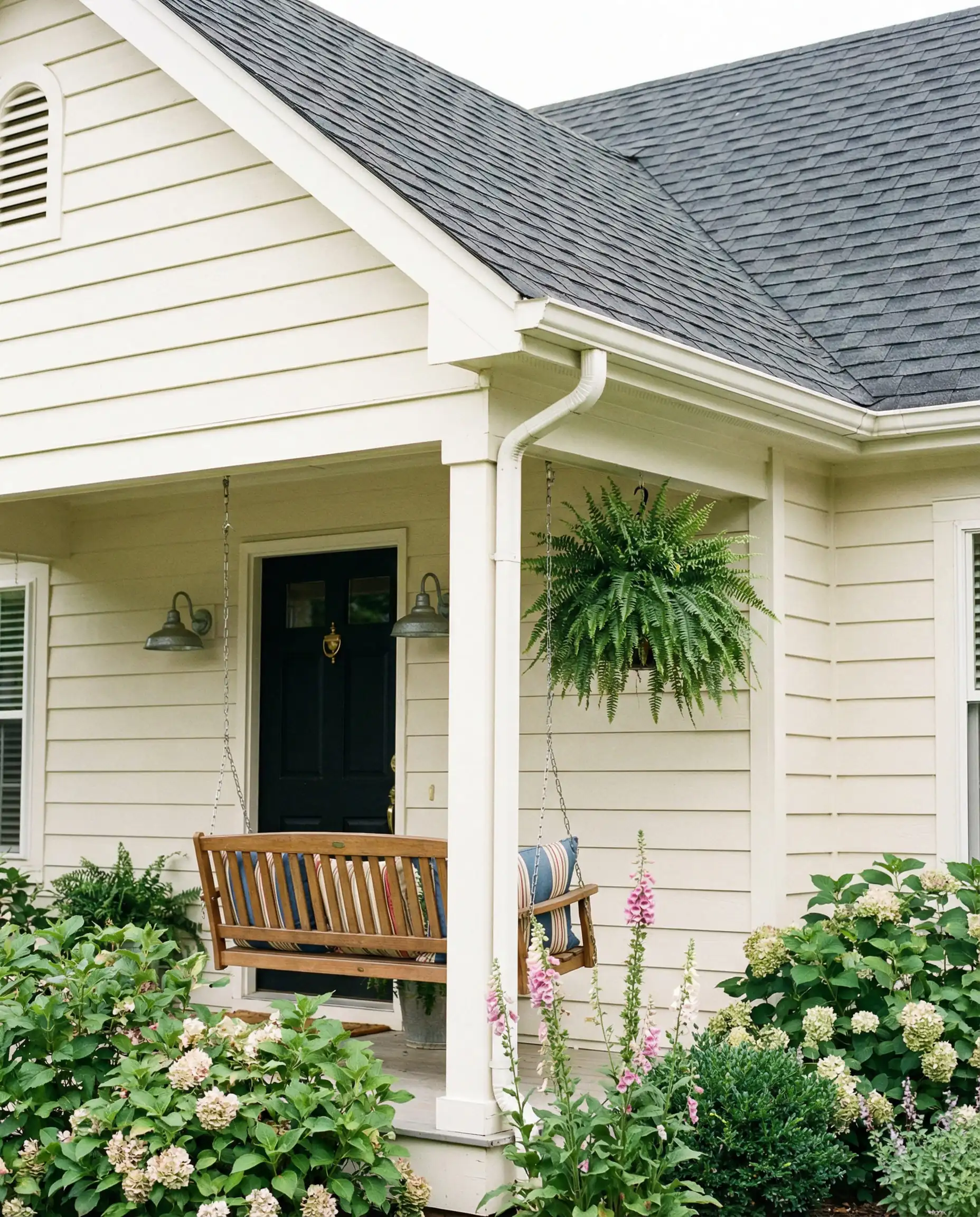
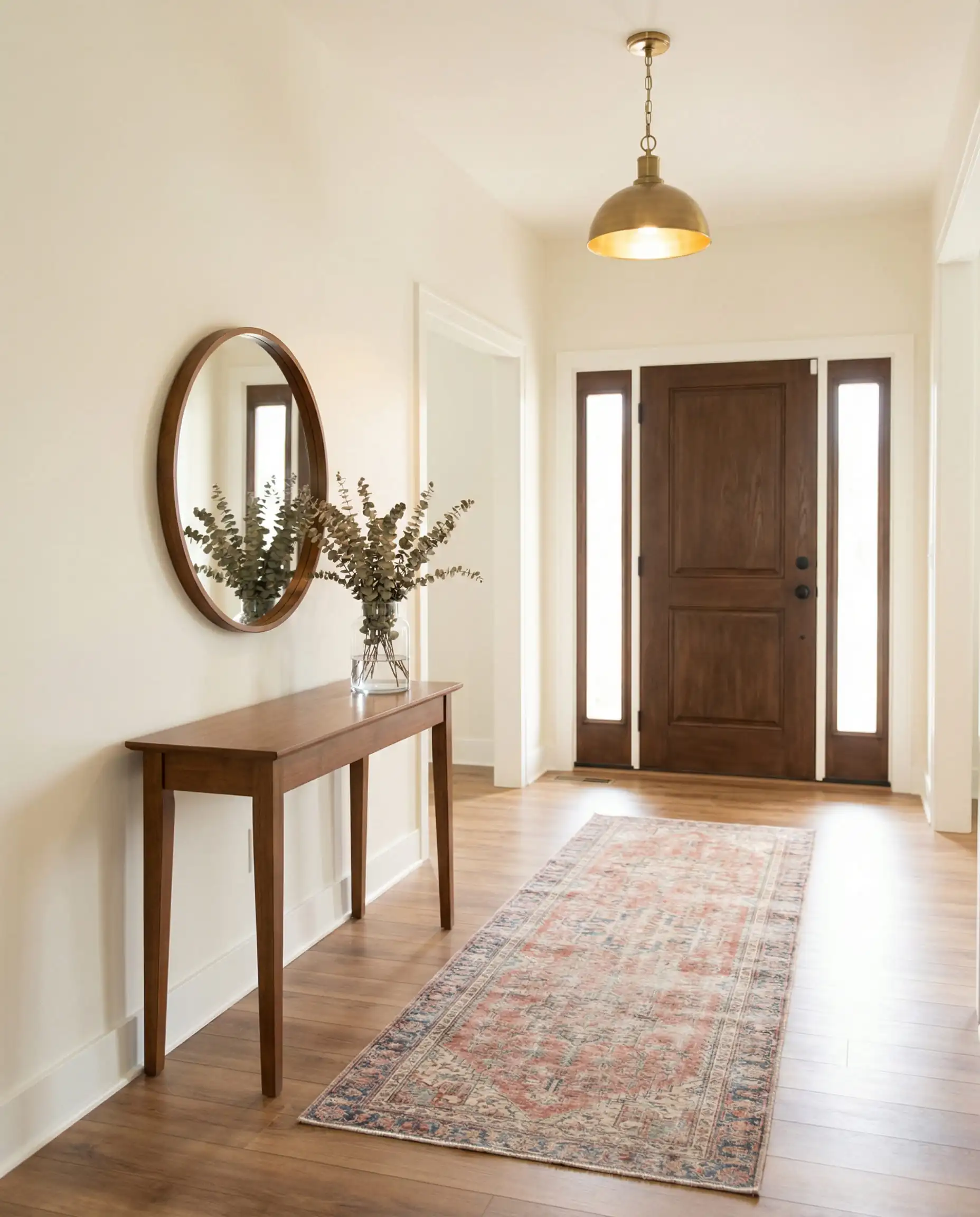
If you are paralyzed by decision fatigue, just buy Alabaster. It has a 95% success rate in most homes. It’s the ultimate safety net that still looks high-end.
Hackrea Verdict
6. Benjamin Moore White Dove (OC-17)
LRV: 83.16
Undertones: Greige/Yellow (muted).
Best For: Trim, cabinetry, and walls in older homes.
White Dove is legendary for a reason. It has a tiny drop of black in the formula, which “dirties” the color just enough to stop it from being blinding. It is slightly lighter than Alabaster and less creamy than Swiss Coffee, making it the universal donor for trim and doors.
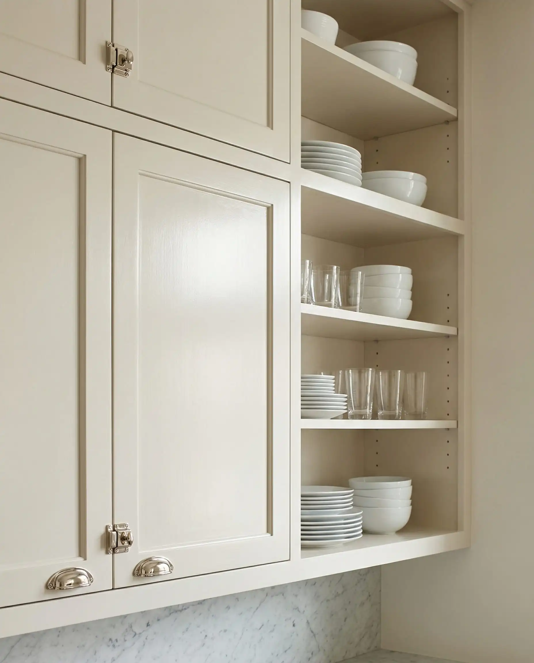
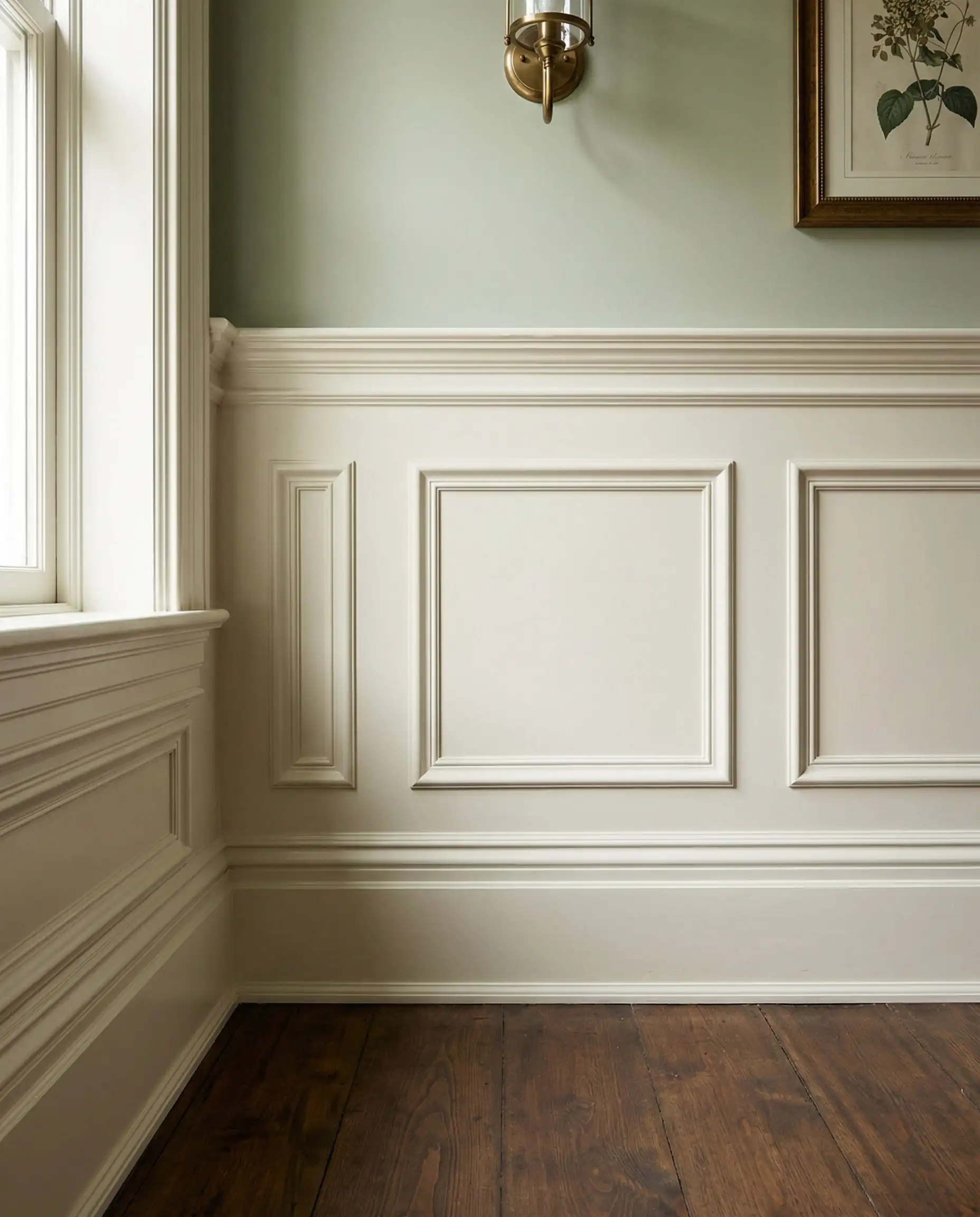
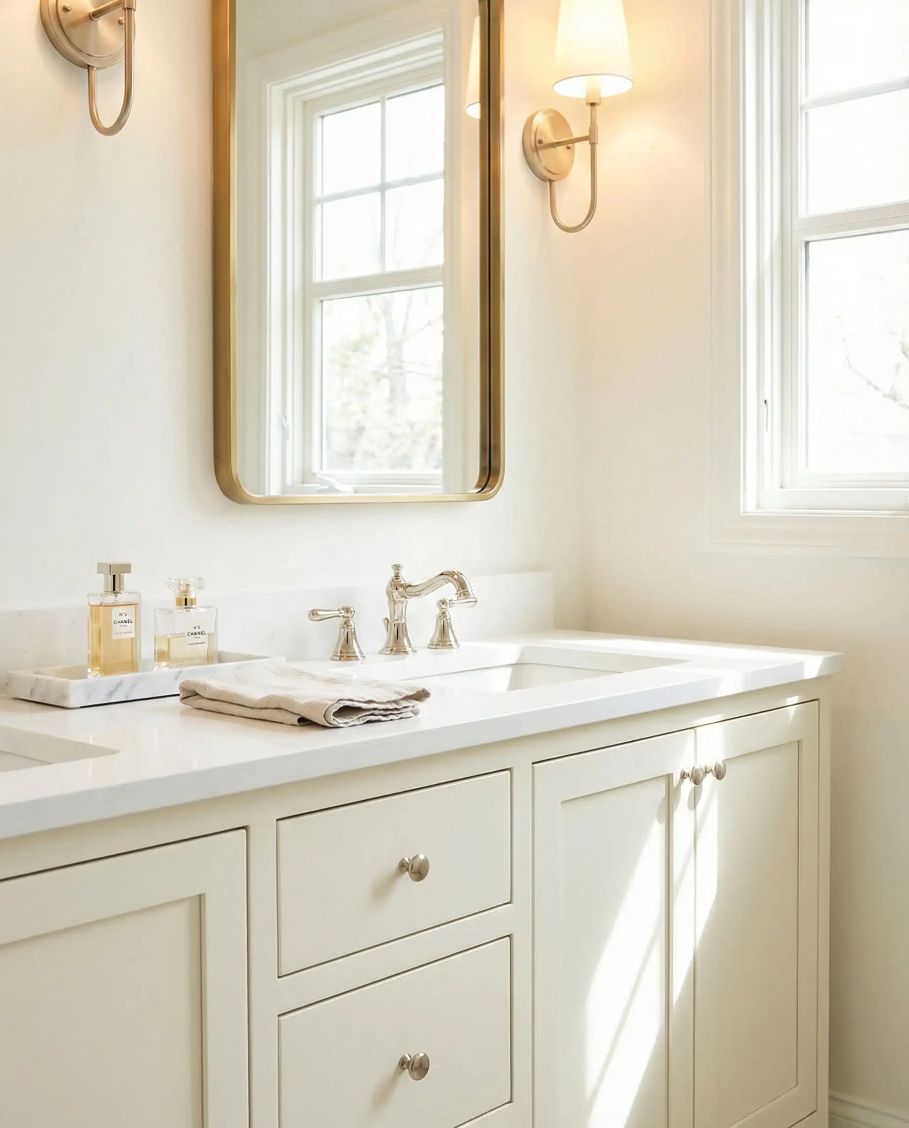
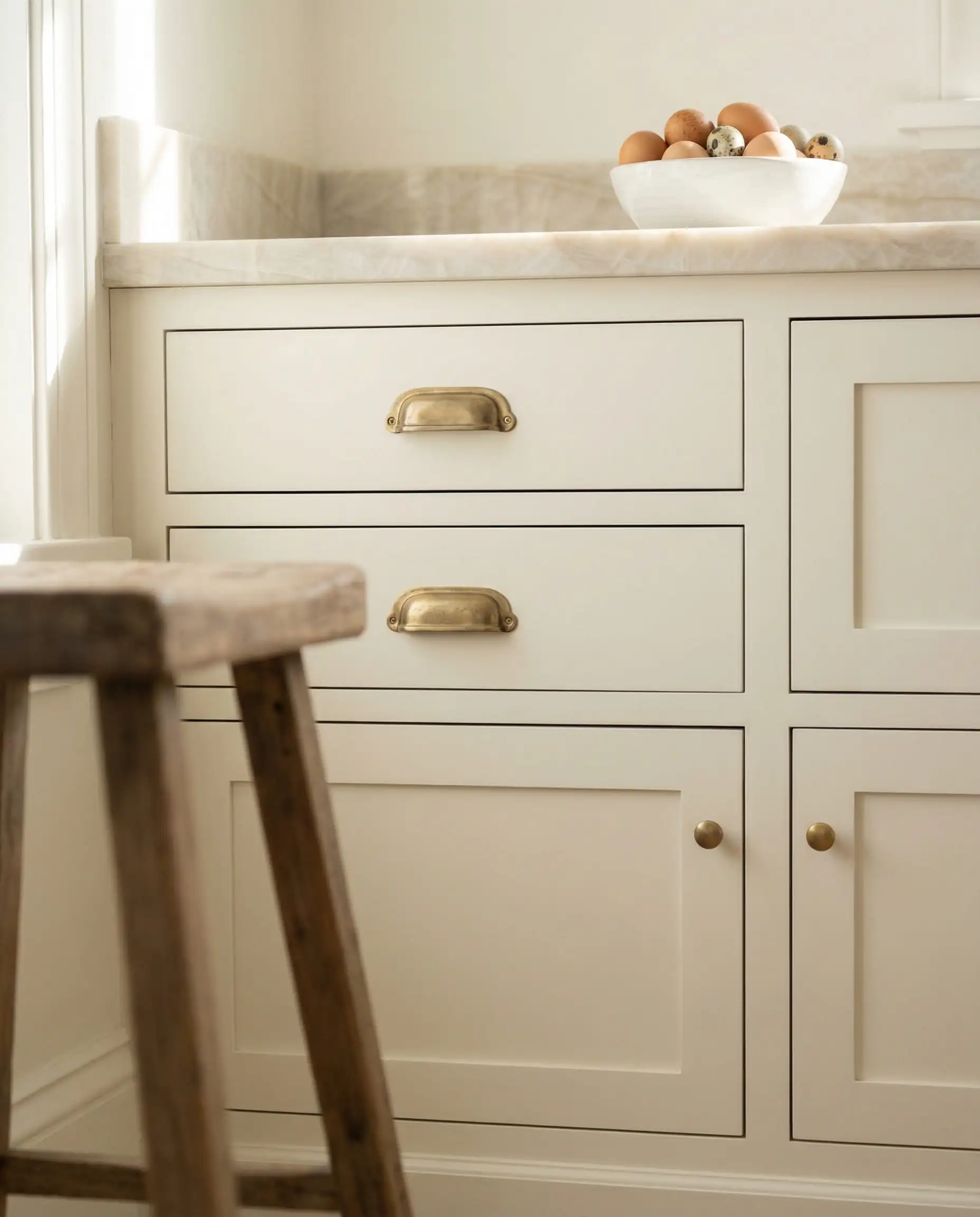
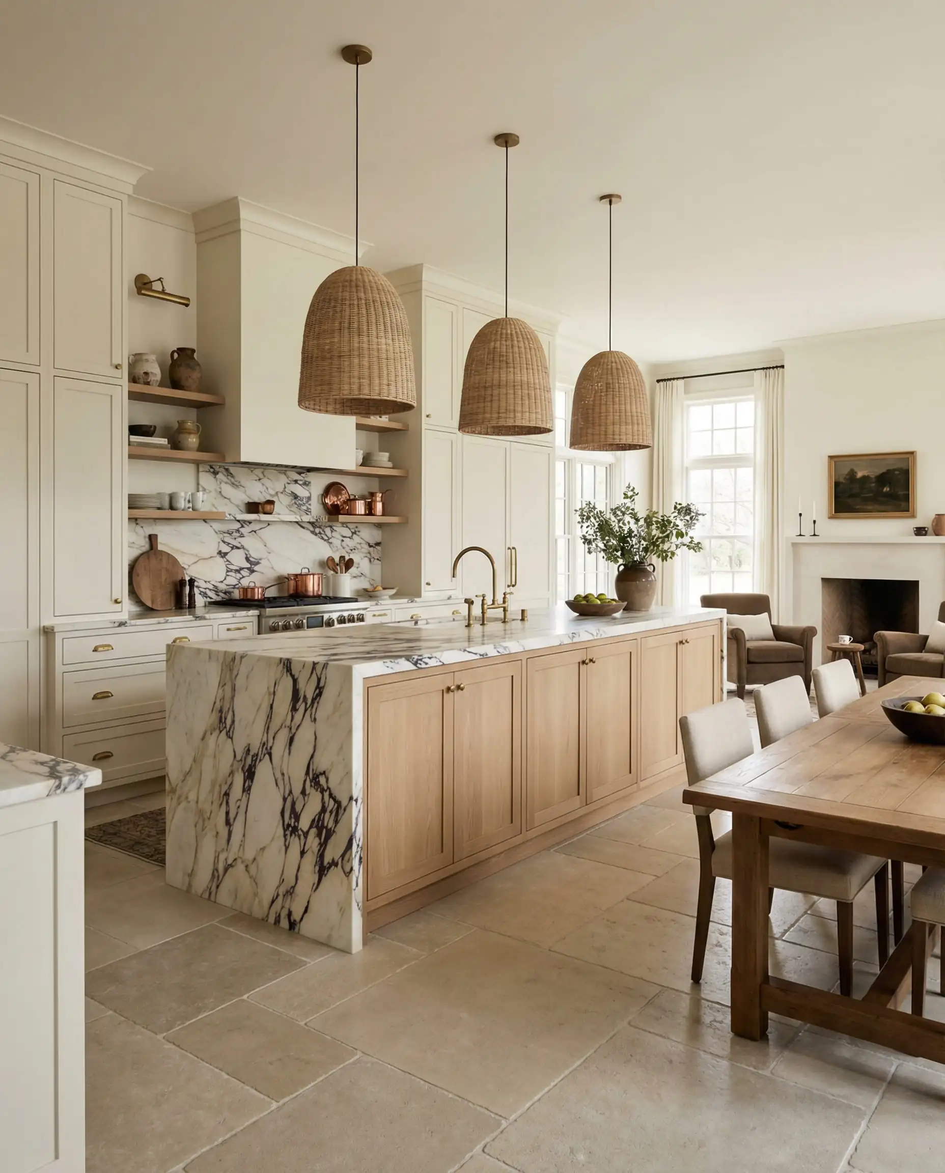
This is our #1 pick for kitchen cabinets in 2026. It pairs beautifully with marble countertops and brass hardware without looking sterile like a hospital clinic.
Hackrea Verdict
7. Farrow & Ball Wimborne White (No. 239)
LRV: ~88
Undertones: Warm yellow (but very subtle).
Best For: Historic homes and rooms with character.
If you want that depth of color that only Farrow & Ball seems to achieve, Wimborne White is the winner. It is a “just off-white” that feels incredibly soft. Because F&B paints have high pigment levels, this color changes beautifully throughout the day as the shadows move across the room.

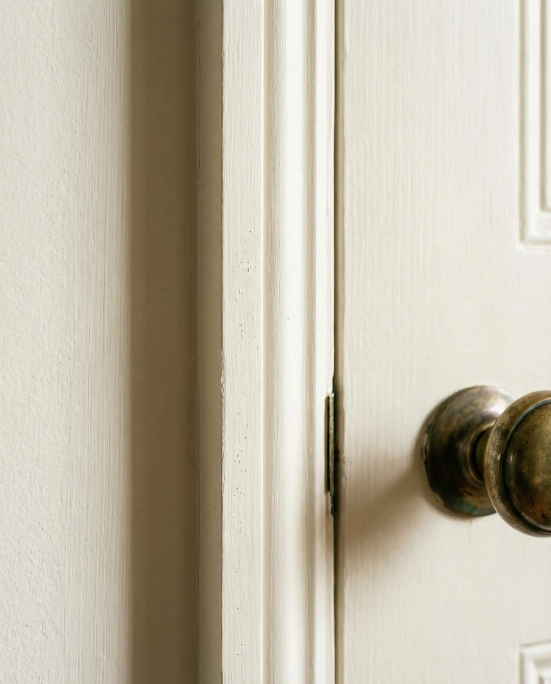
It’s pricey, but worth it for a living room. Note that you cannot color-match Farrow & Ball at a hardware store successfully—the chemistry is different. Buying the real stuff matters here.
Hackrea Verdict
Part 3: The Modern Crisp Whites (Trim & Ceilings)
Even in 2026, you sometimes need a clean slate—especially for ceilings and trim to contrast against those warmer walls.
8. Sherwin-Williams Pure White (SW 7005)
LRV: 84
Undertones: Neutral (very slight black/yellow).
Best For: Modern trim, doors, and contemporary condos.
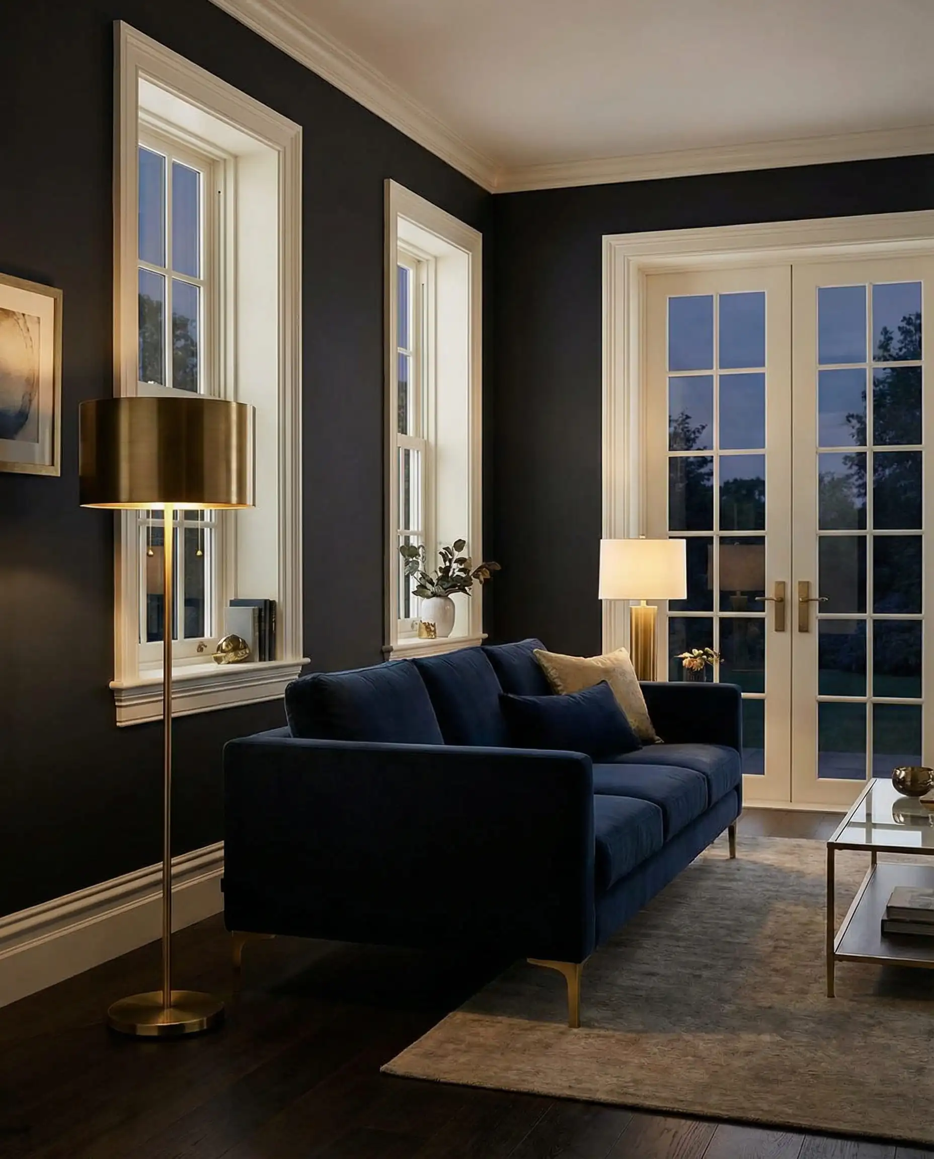
Despite the name, it isn’t “pure” white (which is good!). It has just enough gray to soften it. It is less stark than “Extra White” but cleaner than “Alabaster.” It is currently the most popular trim color to pair with trending wall colors like sage green or navy.
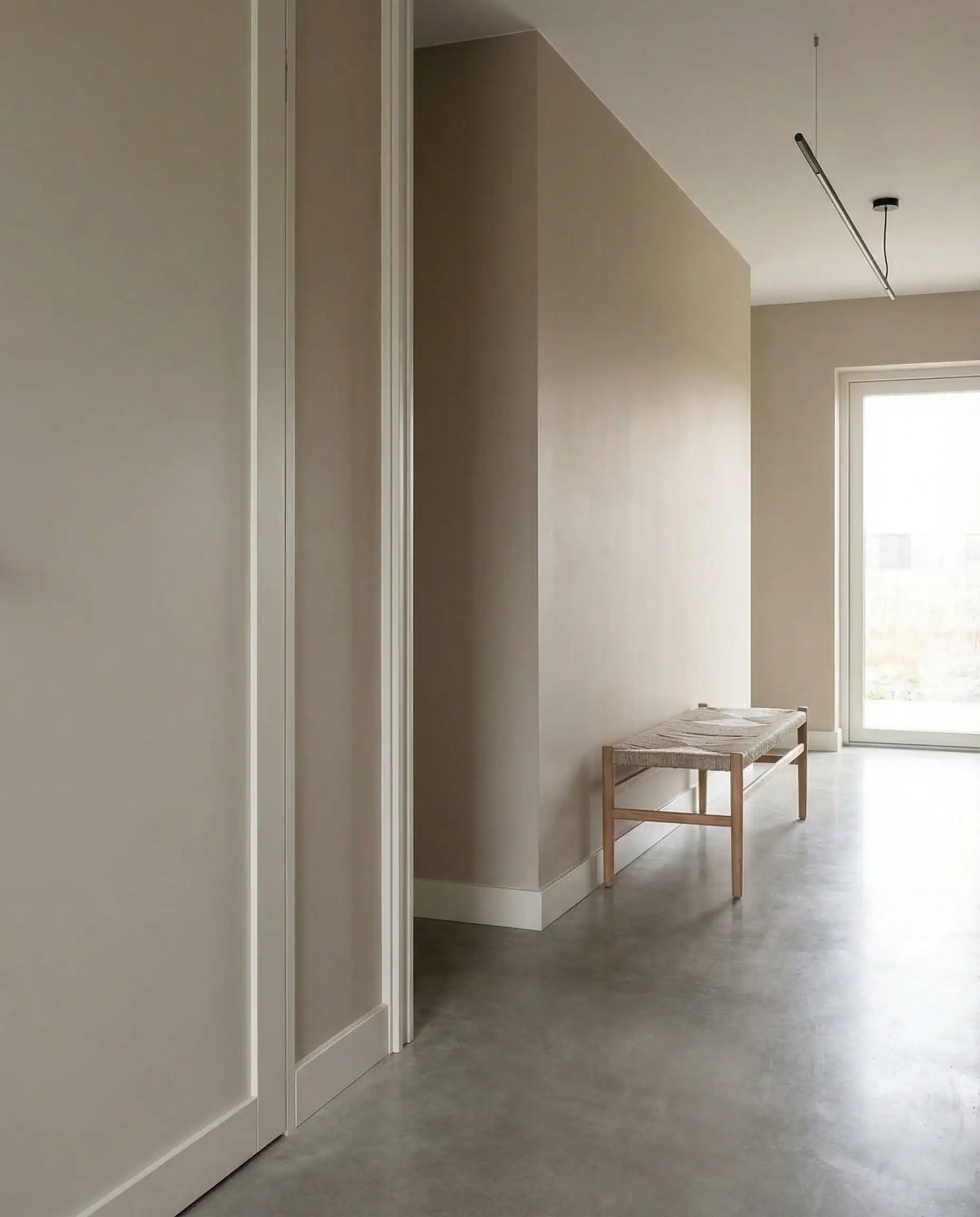
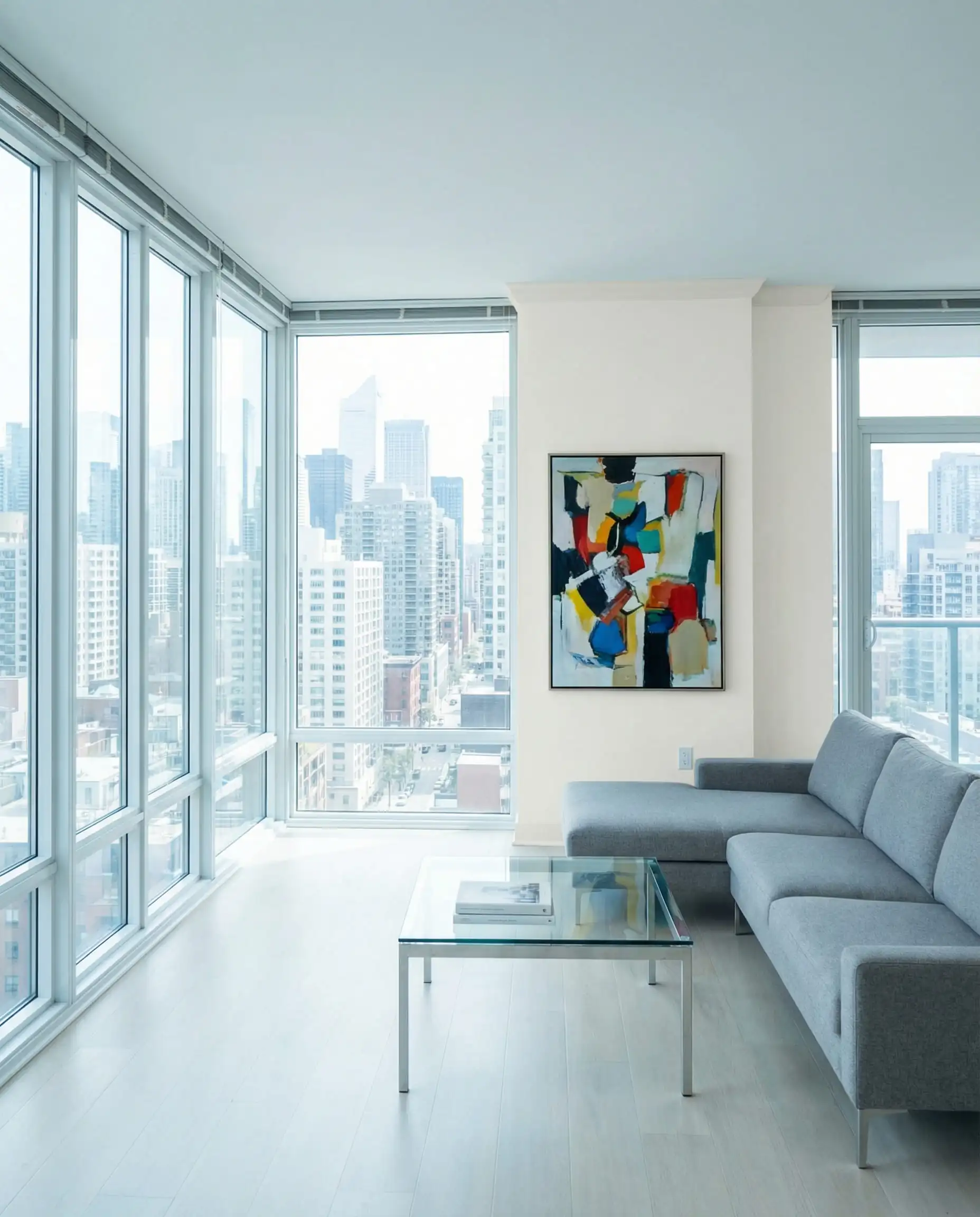
If you are painting your walls a color (blue, green, beige), use Pure White on the trim. It won’t clash with anything.
Hackrea Verdict
9. Benjamin Moore Chantilly Lace (OC-65)
LRV: 90.04
Undertones: None (The cleanest white).
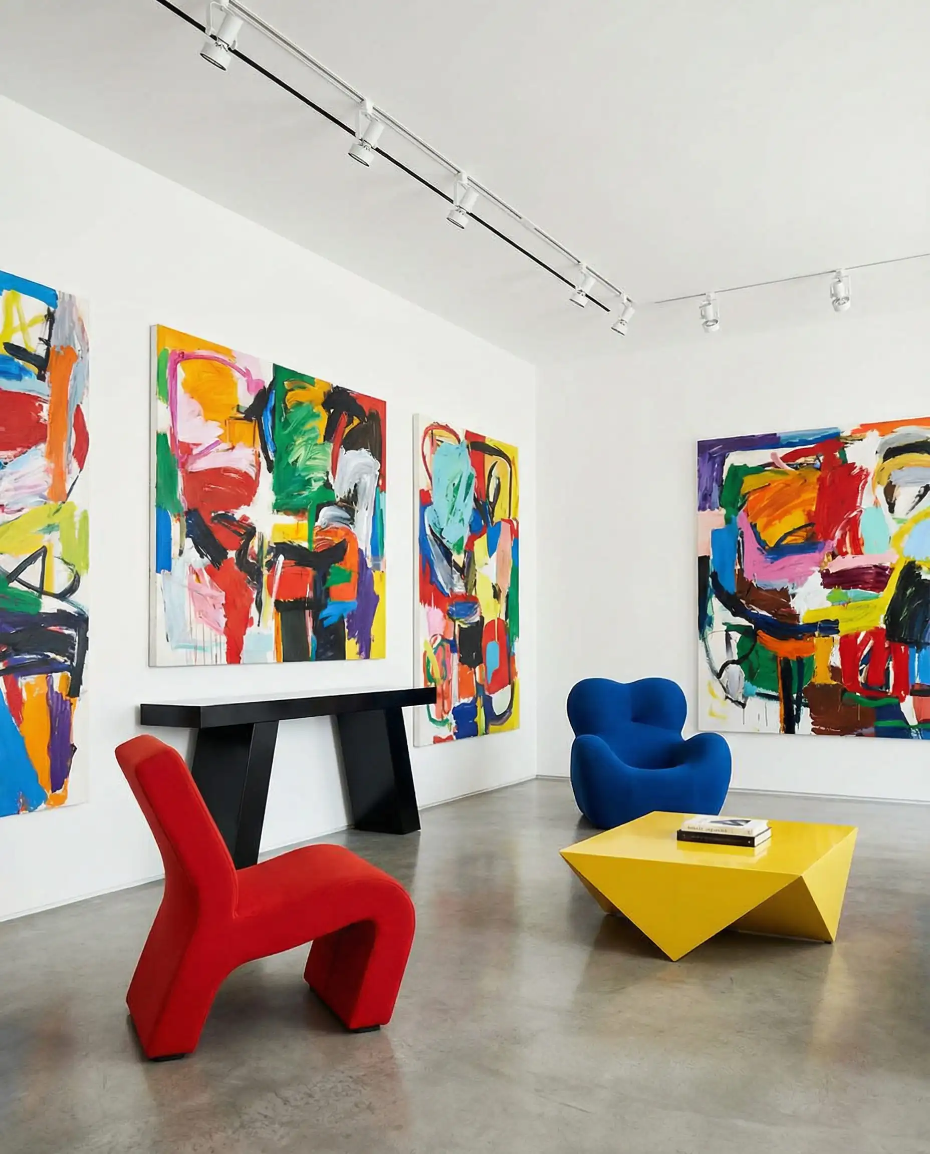
Best For: Gallery walls, modern architecture, and dark rooms that need brightening.
Chantilly Lace is famous for having almost no visible undertones. It is crisp, clean, and very bright. In 2026, we are using this less on walls and more as a “cleanser” palette for trim in rooms that have heavy, dark furniture.
Warning: This paint covers poorly because it lacks pigment (which is why it’s so clean). Be prepared to pay for 3 or even 4 coats to get solid coverage. Ask your painter for a quote before committing!
Hackrea Verdict
Technical Guide: How to Choose the Right White
Listing colors is easy; choosing the right one for your specific living room is where the science comes in. Here are the three factors that must dictate your choice.
1. Understanding LRV (Light Reflectance Value)
LRV is a scale from 0 (Pure Black) to 100 (Pure White). It measures how much light a color reflects.
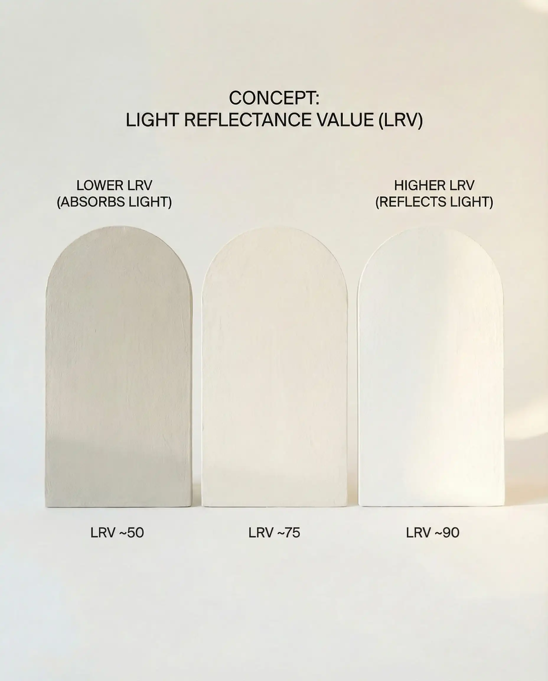
If your room is dark and has small windows, do not choose a high LRV bright white. Without natural light to reflect, bright white looks gray and dingy in the shadows. Instead, choose a lower LRV (creamy white) like Swiss Coffee. The pigment will hold its own even in the dark.
The Hackrea Rule
2. The “Paper Test” for Undertones
White is never just white. It’s always White + (Yellow, Blue, Red, or Gray). To see the undertone:
- Take your paint chip.
- Place it on a sheet of bright white printer paper.
- Look at it in natural light.
Suddenly, “Simple White” might look like “Lemon Yellow” or “Ice Blue” against the paper.
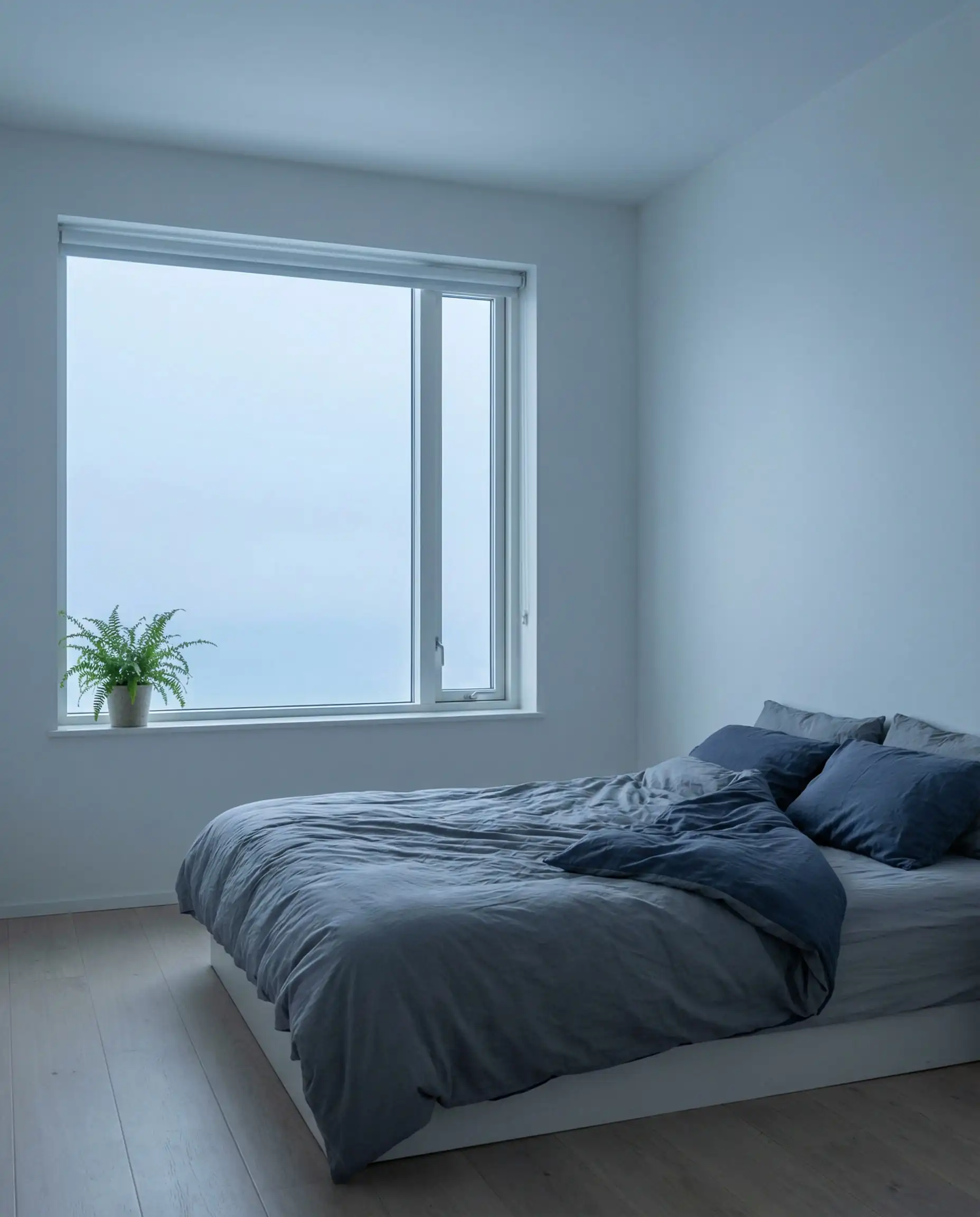
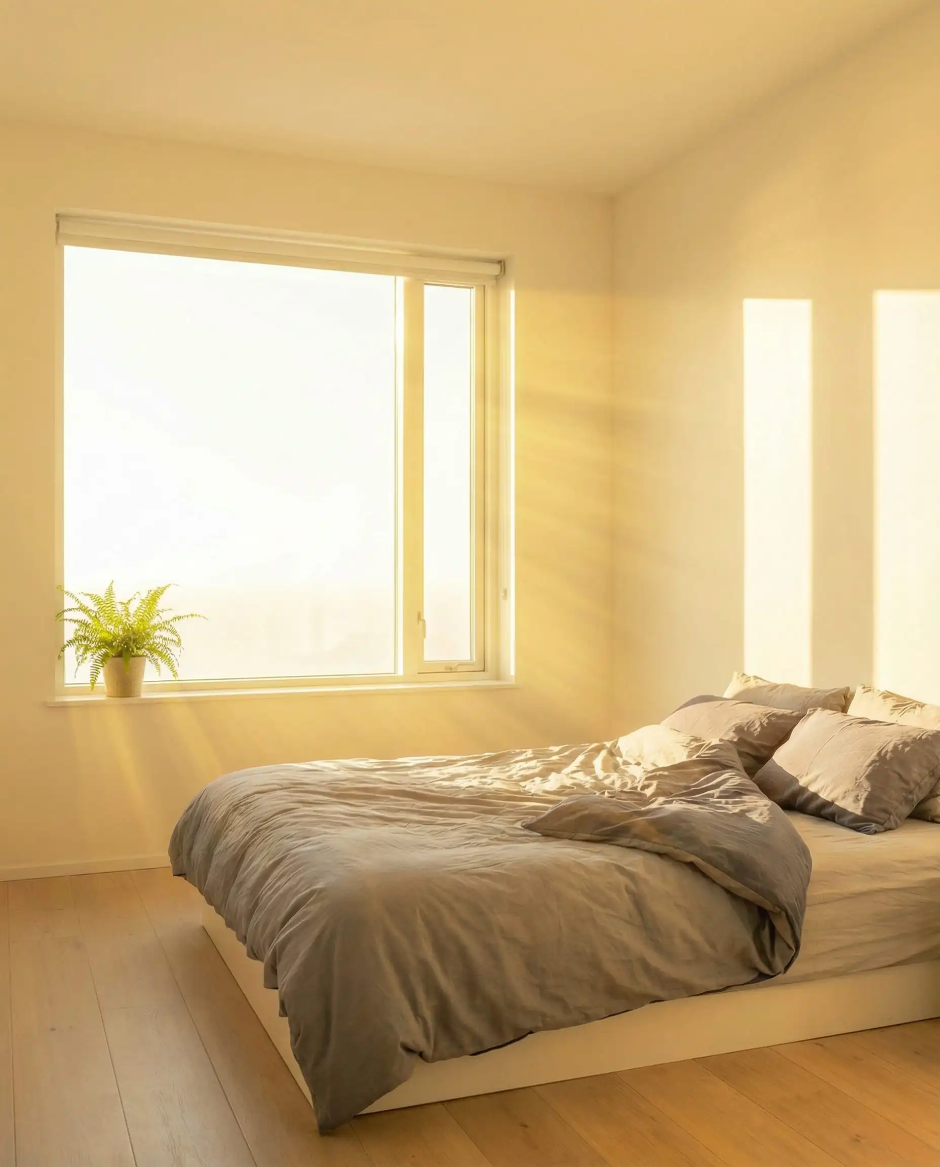
3. North vs. South Facing Rooms
The direction your windows face changes the color of the light entering your room.
North-Facing Rooms: The light is cool, blue, and consistent.
South-Facing Rooms: The light is warm, golden, and intense.
Comparison Table: The 2026 Cheat Sheet
| Color Name | Brand | LRV | Tone | Best For… |
| Cloud Dancer | Pantone | N/A | Airy Neutral | 2026 Trend Look |
| Swiss Coffee | Ben Moore | 82 | Warm Cream | Cozy Living Rooms |
| Shoji White | Sherwin | 74 | Warm Greige | Exteriors & Bedrooms |
| Alabaster | Sherwin | 82 | Soft Warm | Whole House |
| White Dove | Ben Moore | 83 | Soft Greige | Cabinets & Trim |
| Pure White | Sherwin | 84 | Neutral | Modern Trim |
| Chantilly Lace | Ben Moore | 90 | Cool/Crisp | Dark Rooms / Gallery |
2026 Application Trends: How to Use These Colors
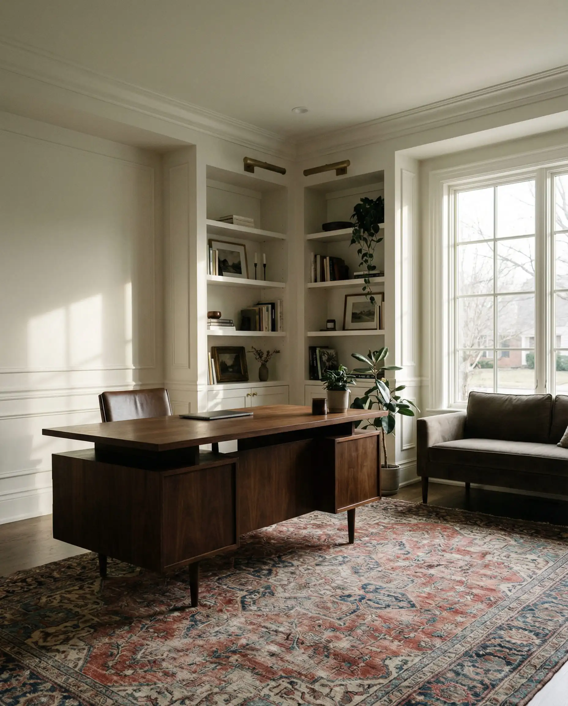
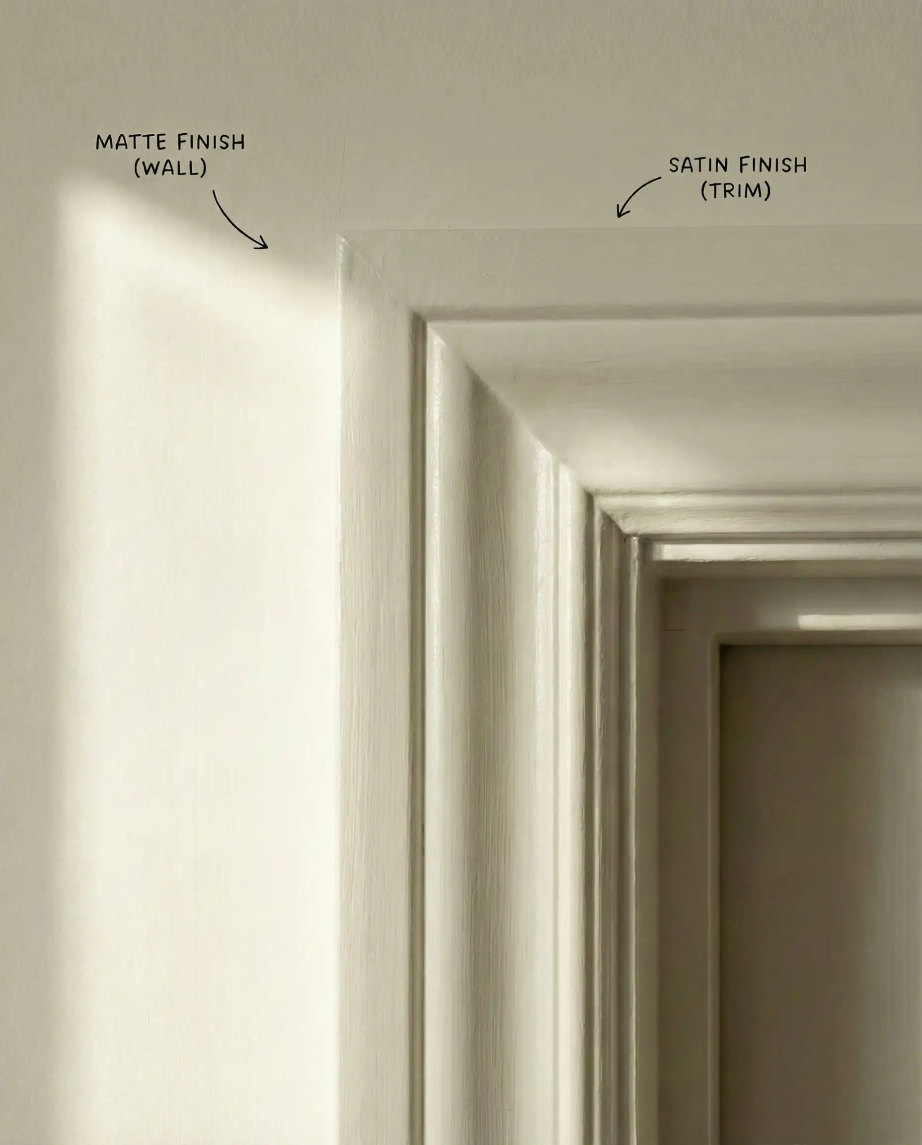
The “Color Drenching” Technique
In 2026, the trend of painting white walls with white trim is evolving. Instead of using a different color for the trim, use the same color for everything (walls, baseboards, crown molding, and even the ceiling) but change the sheen.
The “Cream” Kitchen
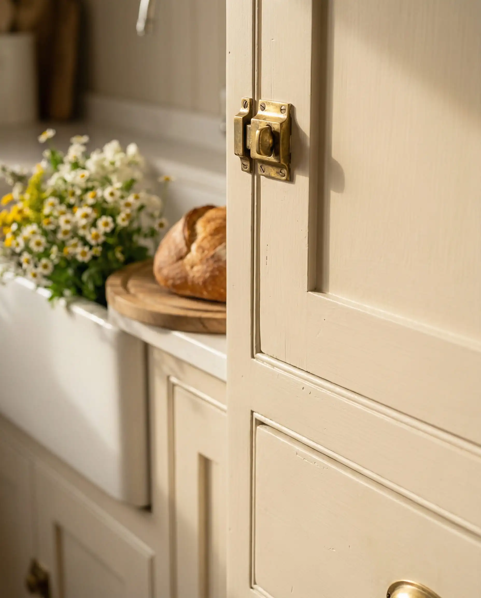
The all-white kitchen is softening. Instead of stark white cabinets, homeowners are opting for White Dove or Swiss Coffee on cabinetry, paired with unlacquered brass hardware and warm wood islands. It feels more like a furniture piece than a sterile workstation.
Frequently Asked Questions (FAQ)
A: The “Cool Gray” of 2016 is out. However, warm grays (greiges) and “Mushroom” colors (like SW Shoji White) are very much in. We are swapping steel grays for stone grays.
A: Stick to Sherwin-Williams Alabaster. It is warm enough to feel homey to buyers but neutral enough that it doesn’t feel like a specific “choice” they have to paint over.
A: Proceed with caution. Placing a creamy wall (Swiss Coffee) next to a blue-white trim (Extra White) can make the walls look dirty or nicotine-stained. It is safer to keep your undertones in the same family, or just use the same color in different sheens.
Final Thoughts
Updating your paint color is the single highest ROI investment you can make in your home. For 2026, give yourself permission to let go of the “stark white” safety blanket. Embrace the warmth. Whether you choose the trendy ethereal vibe of Cloud Dancer or the proven coziness of Swiss Coffee, your home will thank you for the added layer of comfort.
Next Step: Don’t guess! Colors look different on a screen than they do on your drywall. We highly recommend ordering Peel-and-Stick samples of your top 3 choices and living with them for a few days before buying a gallon.
Happy Painting!