If you have been following interior design trends for the past decade, you might think the era of “grey” is over. And you would be partially right—the era of flat, sterile, builder-grade grey is certainly behind us. But rising from the ashes of that trend is something far more sophisticated, dramatic, and enduring: Anthracite.
In 2026, we aren’t just looking for colors that blend in; we are looking for colors that anchor a space. Anthracite has emerged as the “New Neutral”—a shade that possesses the gravity of black but with a softer, more complex character. It is the color of volcanic rock, deep shadows, and modern luxury.
Whether you are looking to drench a living room in moody elegance or find the perfect cabinet shade that isn’t navy blue, this guide will walk you through everything you need to know about mastering the anthracite color in your home.
What Exactly is Anthracite?
Before we start painting walls, we need to understand exactly what we are working with. The term “anthracite” comes from the Greek word anthrakítēs, meaning “coal-like.” Geologically, it refers to a hard, compact variety of coal that has a sub-metallic luster. It isn’t just “dark grey”; it has a specific sheen and depth.
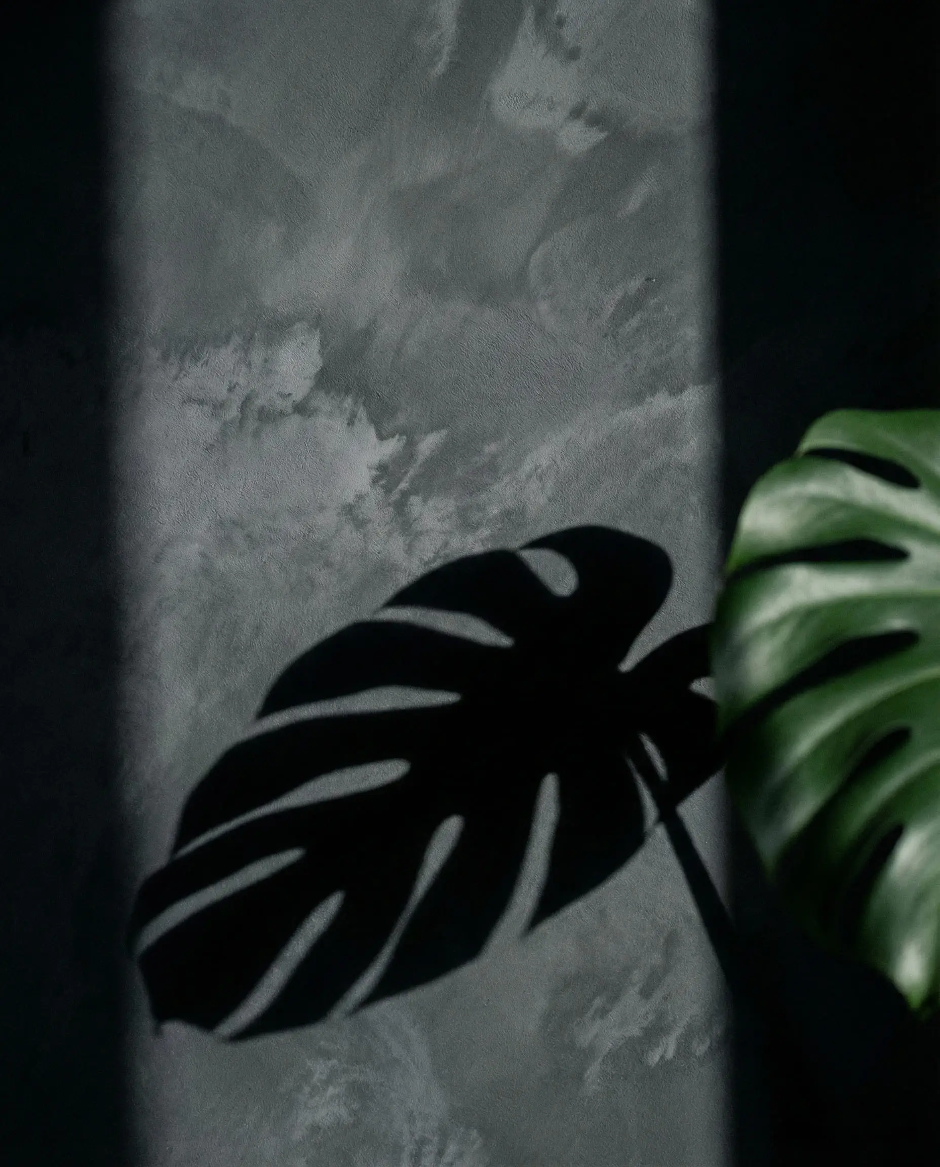
In the world of interior design, anthracite is a very dark grey that sits on the precipice of black. However, unlike a true black which absorbs all light, anthracite reflects just enough to reveal its undertones. Depending on the light source, it can read as a stormy grey, a deep graphite, or even show very subtle hints of blue or green.
The Magic Number: RAL 7016
If you are working with architects, window manufacturers, or professional painters, you will often hear the code RAL 7016. This is the European standard color code for “Anthracite Grey.”
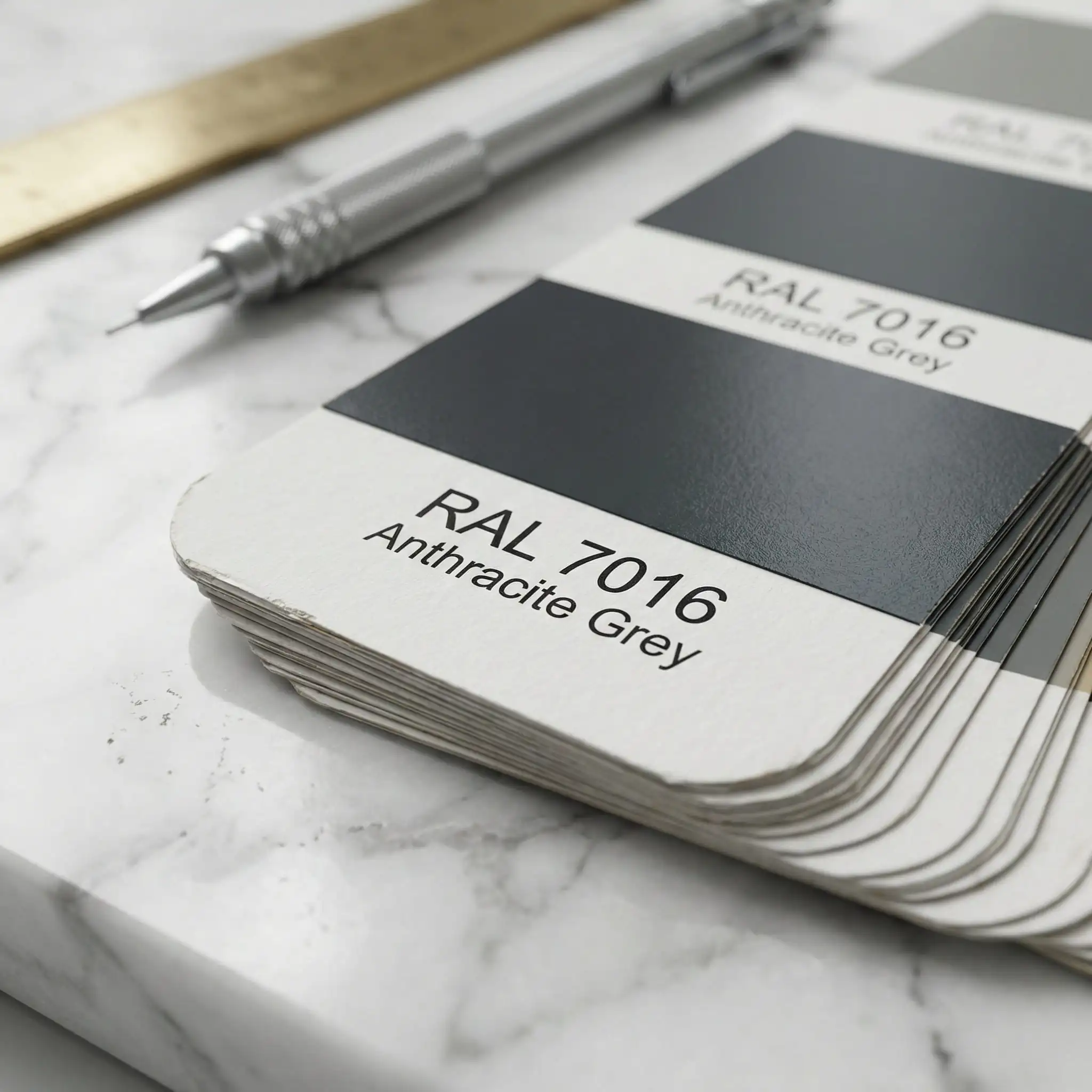
If you are ordering composite doors, window frames, or garage doors, RAL 7016 is the industry standard. However, be careful when matching paint! Interior paints named “Anthracite” vary wildly between brands. Always bring a physical RAL 7016 swatch to the paint store if you want to match your windows exactly.
Hackrea Tip 💡
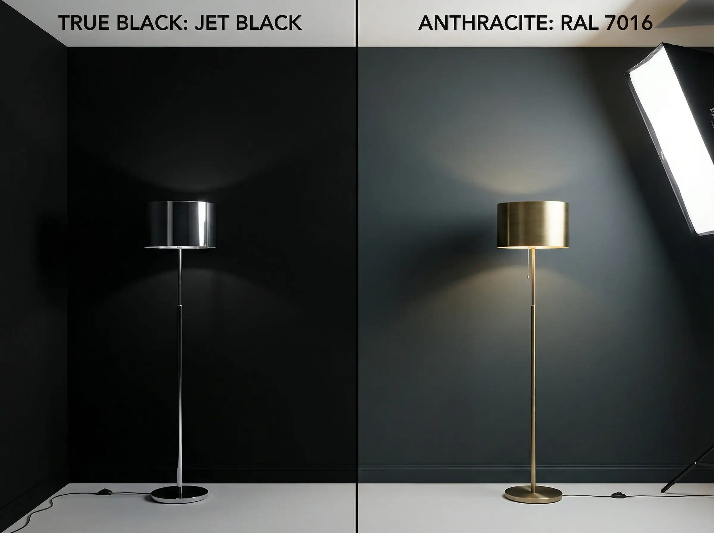
Anthracite vs. Charcoal vs. Black
One of the most common questions we get is: “What is the difference?” It is a valid confusion, as they look similar on a small phone screen. Here is how to distinguish them:
| Feature | Anthracite | Charcoal | Pure Black |
| Undertones | Cool (Blue/Green) or Earthy | True Neutral Grey | None (Absence of light) |
| Vibe | Chalky, soft, organic | Industrial, smoky | Sharp, graphic, high-contrast |
| Light Reaction | Changes depth with sunlight | Stays relatively consistent | Absorbs light heavily |
| Best Use | “Color Drenching” & Cabinetry | Accent walls & Textures | Trim & Hardware |
If you are struggling to decide which dark neutral fits your specific style, you might find our guide on how to choose the color of the interior helpful for narrowing down your palette.
You can apply wallpapers, paints, etc. on walls and see how they look in various interiors.

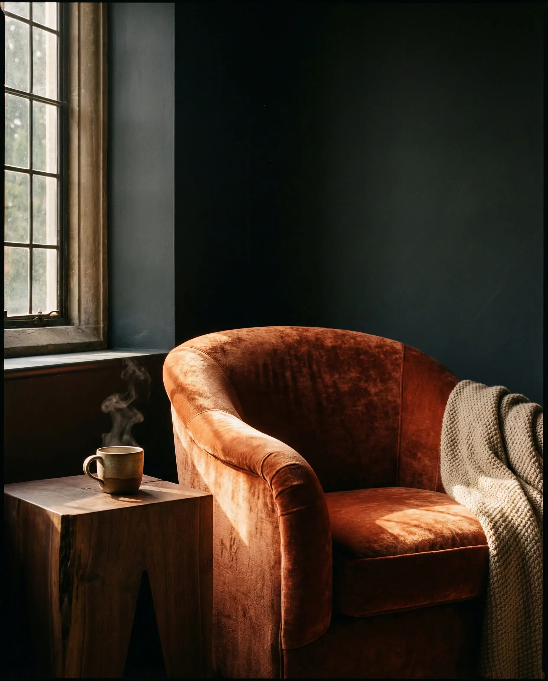
The Psychology of Anthracite
Why are we so drawn to this dark hue in 2026? Color psychology tells us that while light colors expand and energize, dark colors ground and protect.
Anthracite creates a psychological effect known as “cocooning.” In a world that feels increasingly chaotic and fast-paced, our homes are becoming sanctuaries. A room painted in anthracite doesn’t feel “sad” or “small” if done correctly; it feels quiet. It visually muffles the noise.
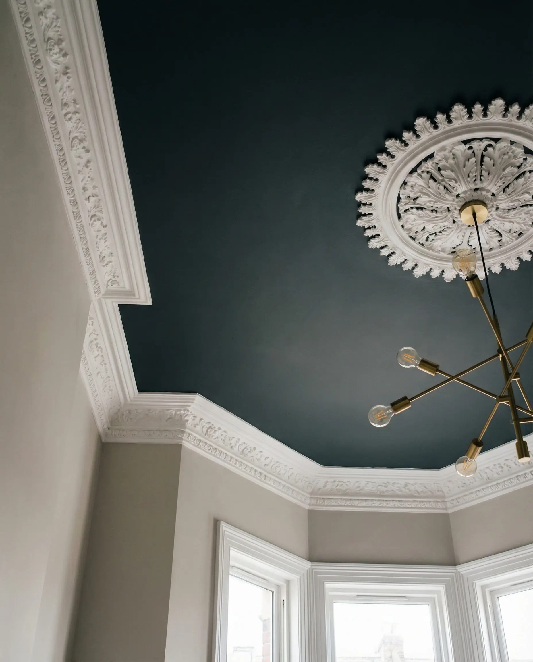
Furthermore, dark colors have a unique ability to blur edges. When you paint a small room white, you see the corners clearly, defining the limits of the space. When you paint a small room anthracite, the corners recede into shadow, often tricking the eye into thinking the space is infinite. This makes it a surprisingly excellent choice for cozy areas like reading nooks or the hygge corner you’ve been dreaming of.
Top Anthracite Color Combinations for 2026
The biggest shift in 2026 is how we are pairing this color. Five years ago, the trend was Anthracite + Bright White + Chrome. That look is now considered dated and a bit too “clinical” for residential spaces.
Today, we are warming it up. We are pulling anthracite away from the industrial and toward the organic.
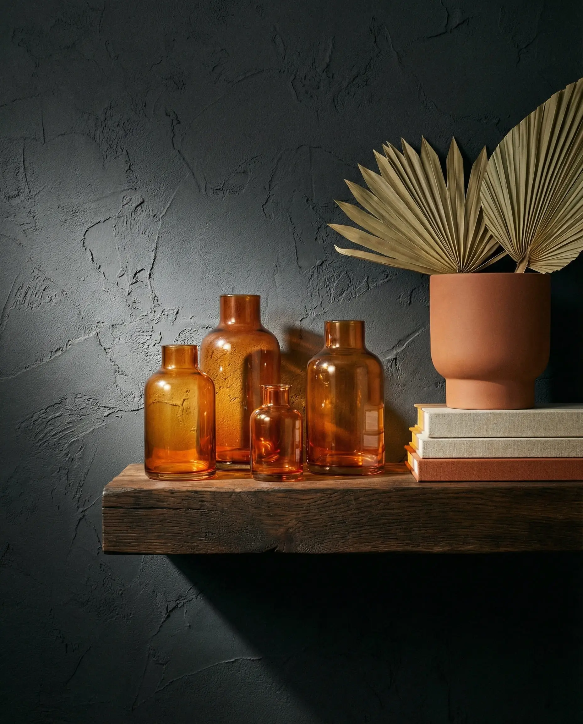
1. The Earthy Shift: Terracotta & Rust
This is the “It” combination of the year. The cool, blueish undertones of anthracite (RAL 7016) are the perfect complementary opposite to the warm, baked orange tones of terracotta.
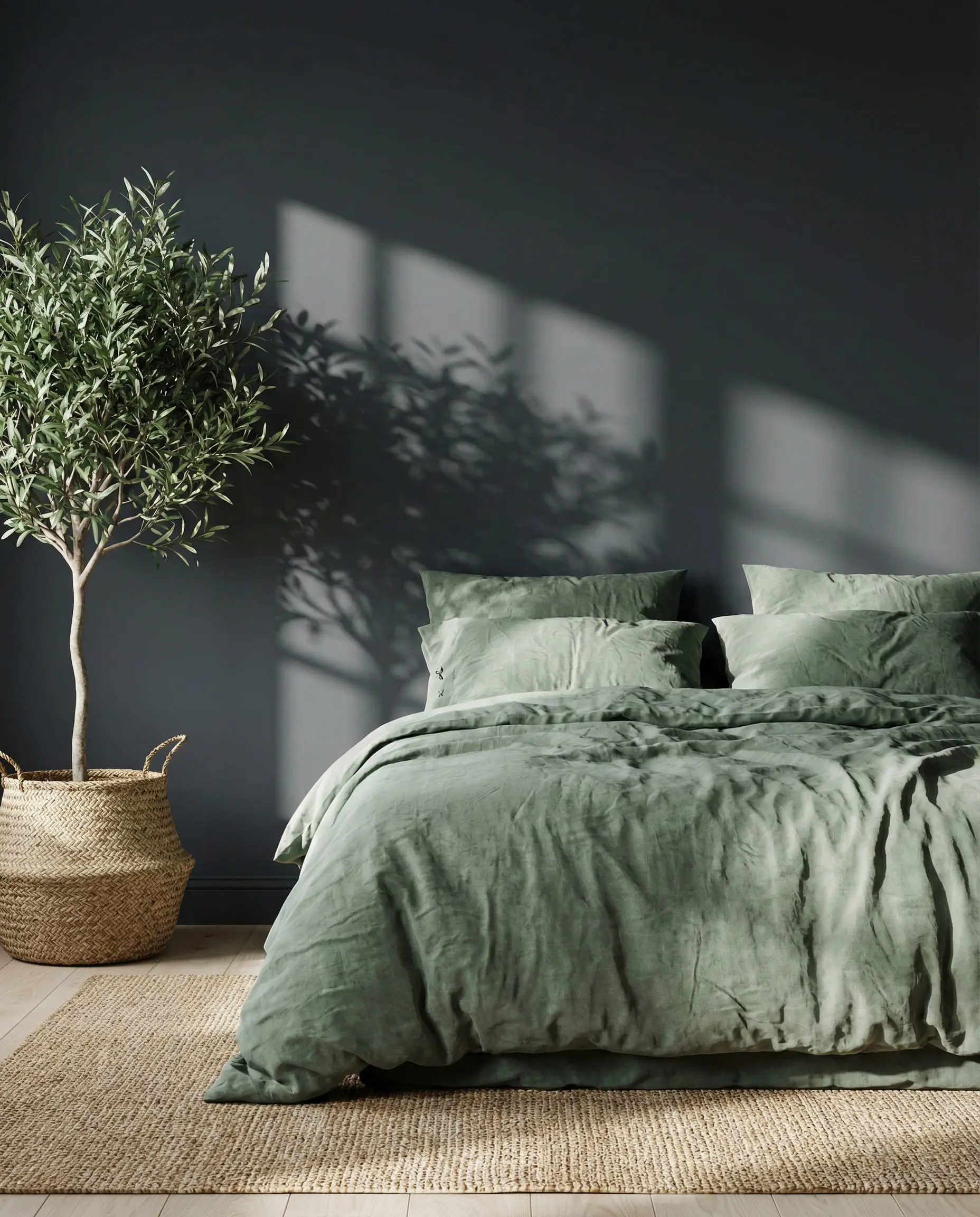
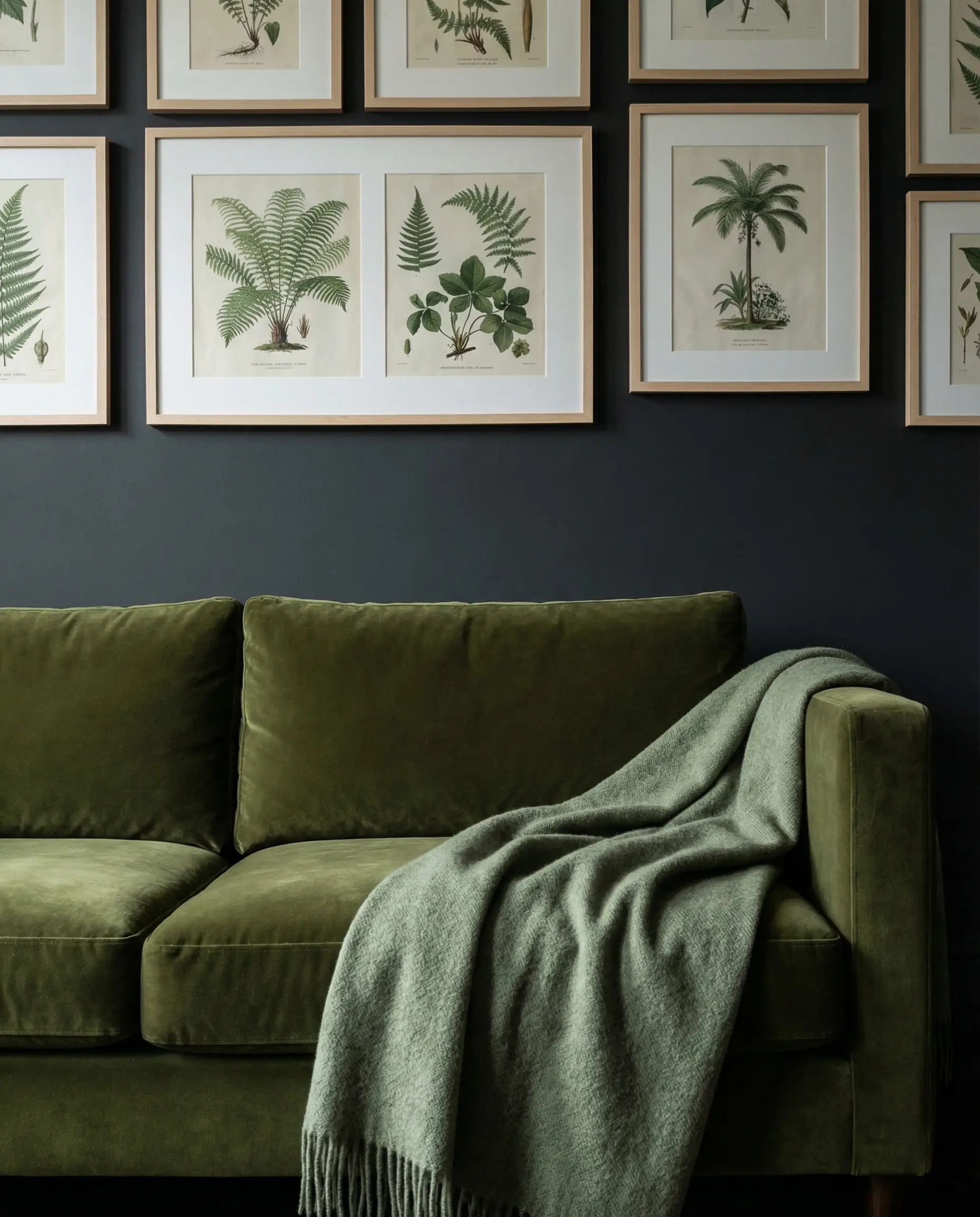
2. Nature’s Pair: Sage & Olive Green
Biophilic design isn’t going anywhere. Because anthracite is essentially a color found in stone and mountains, it pairs naturally with the colors of foliage.
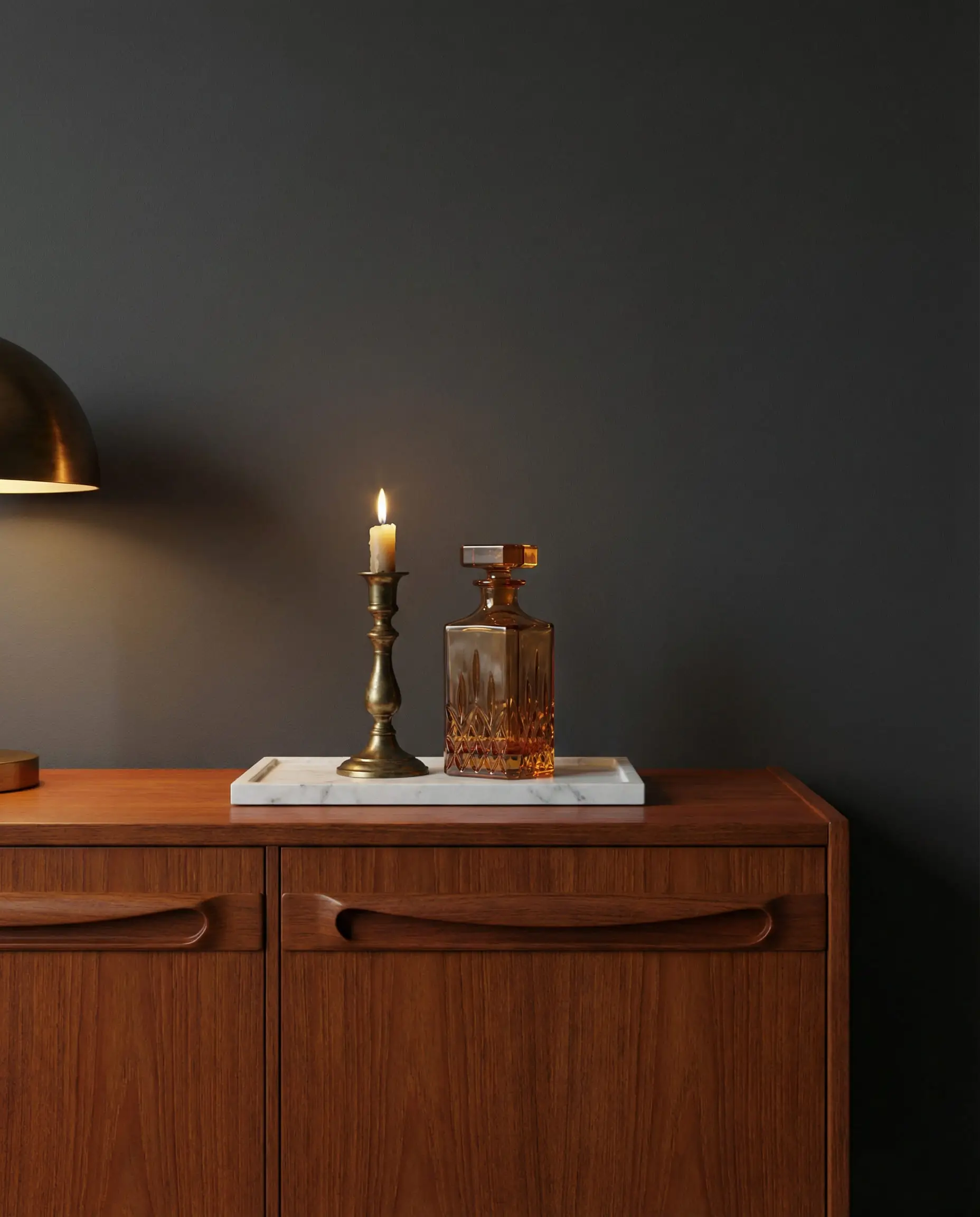
3. Luxurious Warmth: Mocha & Cream
Say goodbye to stark bright white trim. In 2026, we are pairing dark grey with “Mocha Mousse” (a light, creamy brown) or warm beige. This lowers the contrast level, making the room feel expensive and curated rather than harsh.
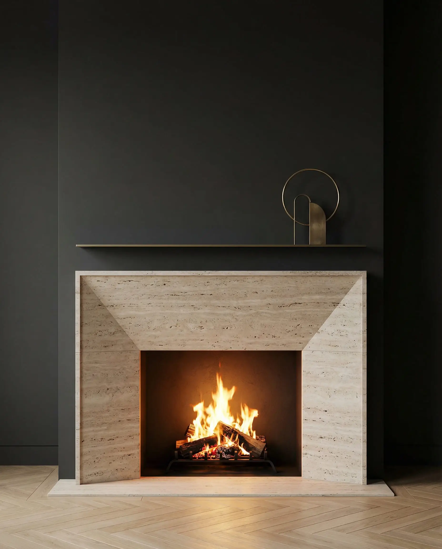
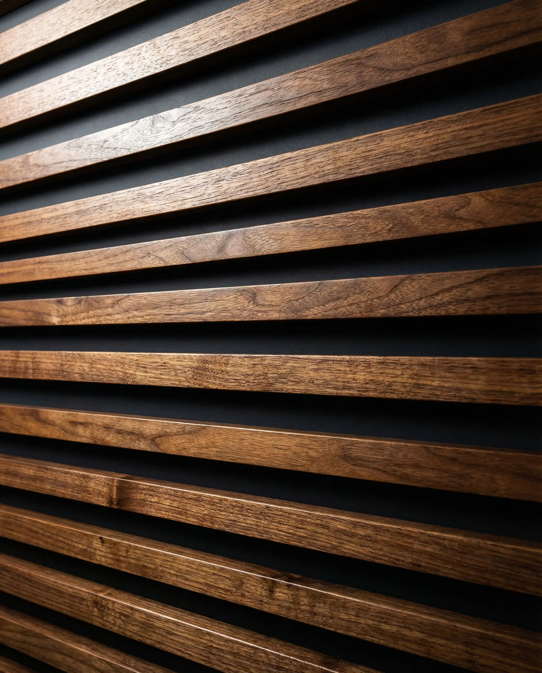
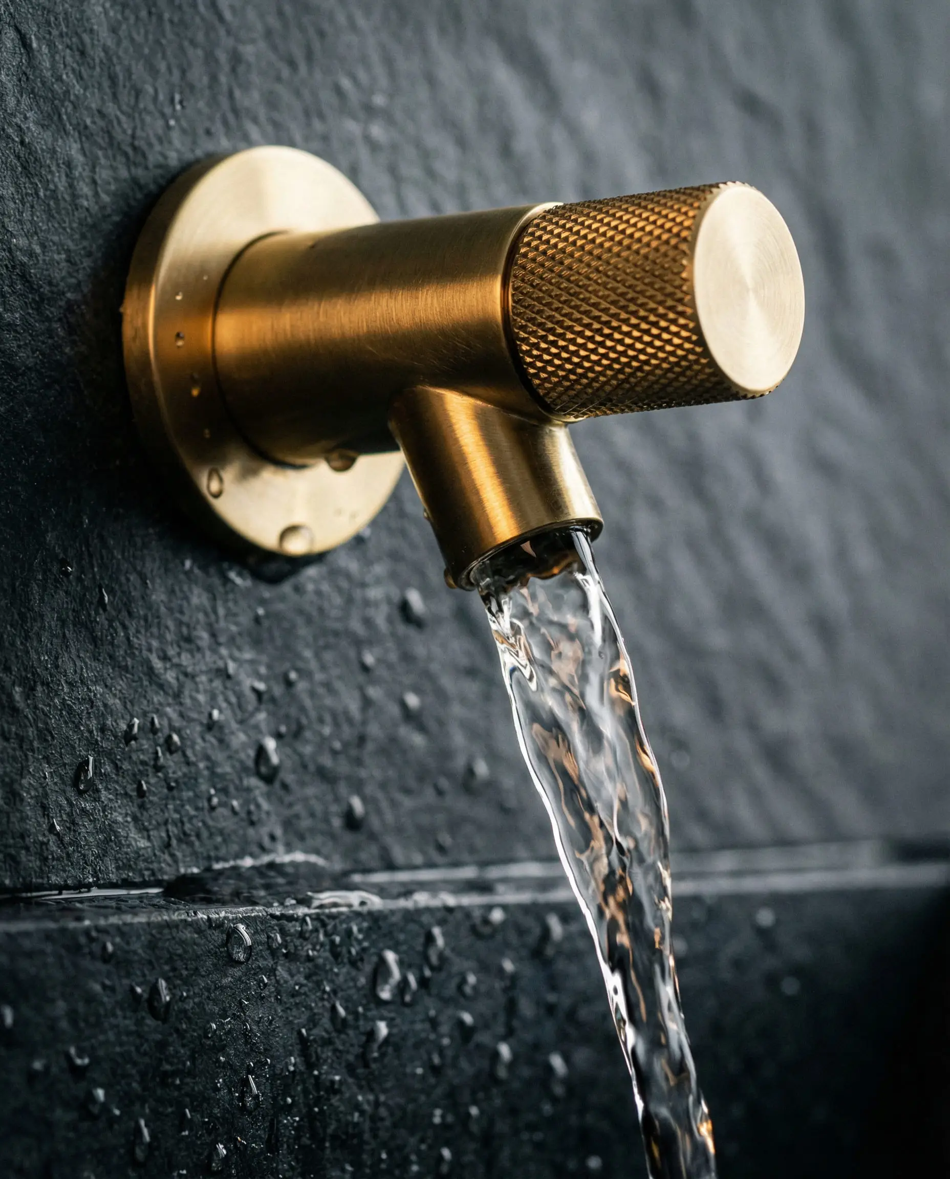
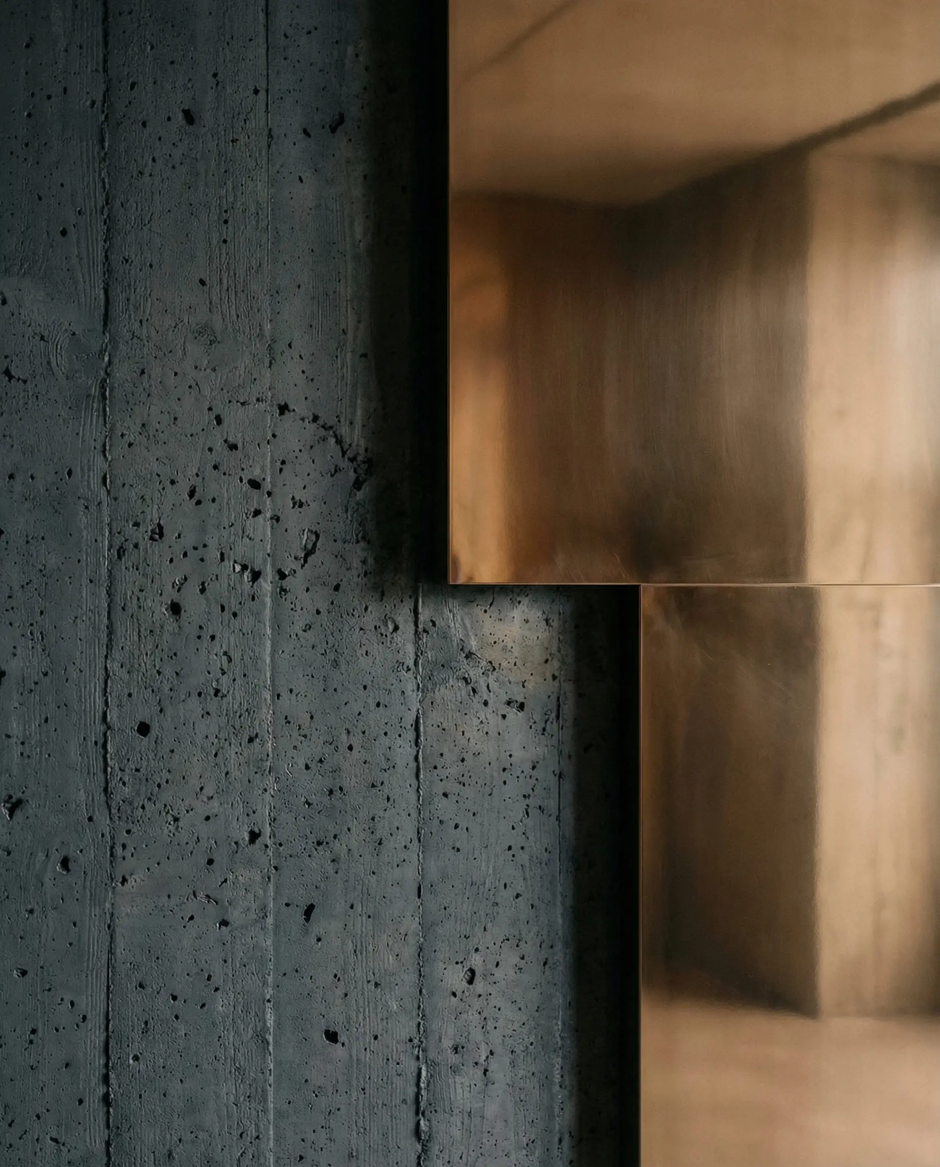
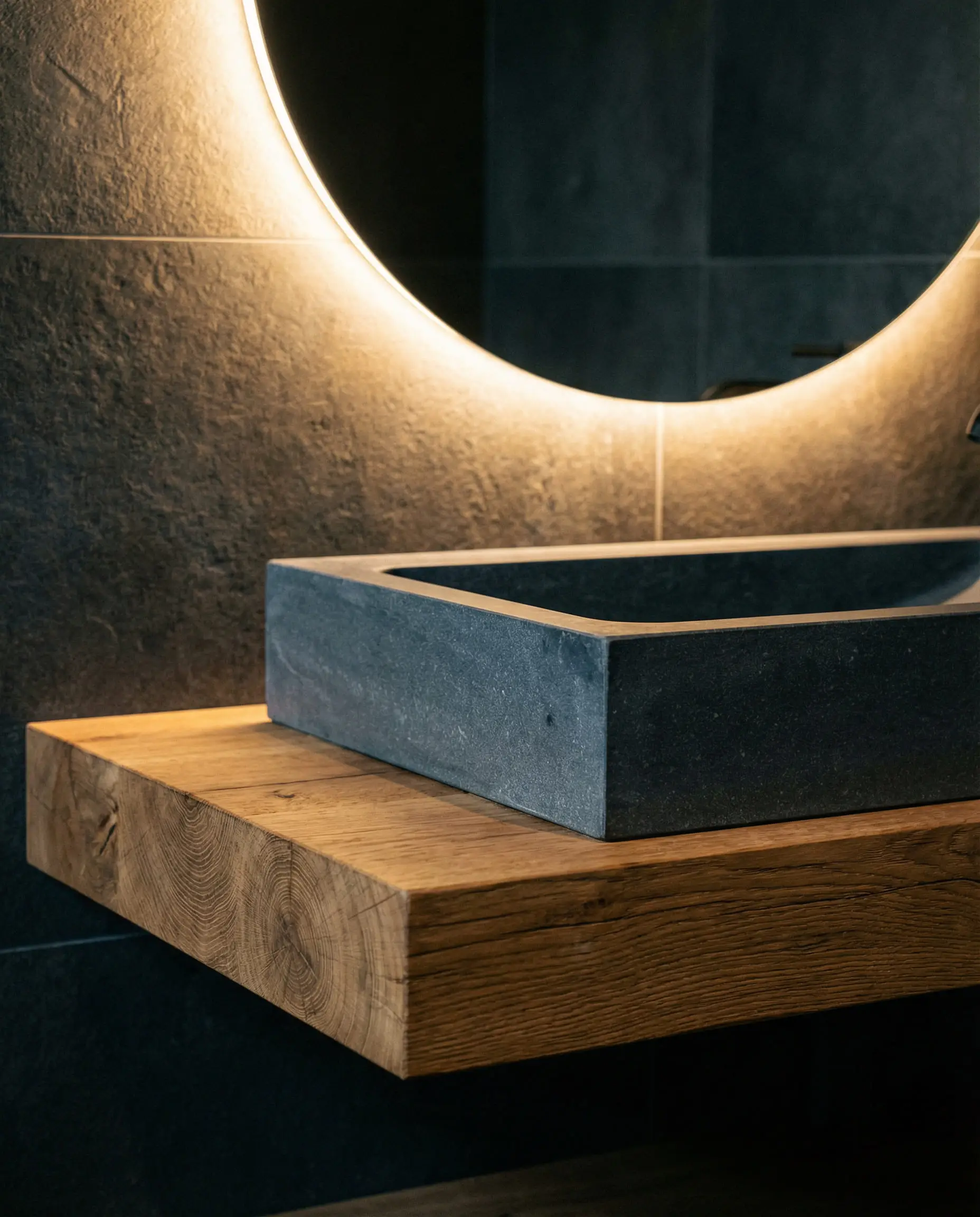
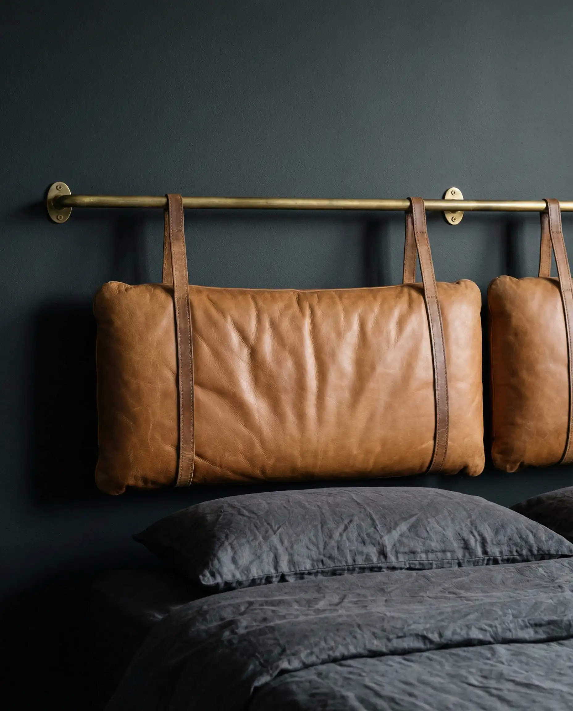
4. Materials: Wood, Stone, and Brass
Texture is a color in itself. Anthracite can look flat if you aren’t careful.
Room-by-Room Styling Guide
How do you practically apply this bold color without overwhelming your house? Here is the room-by-room breakdown.
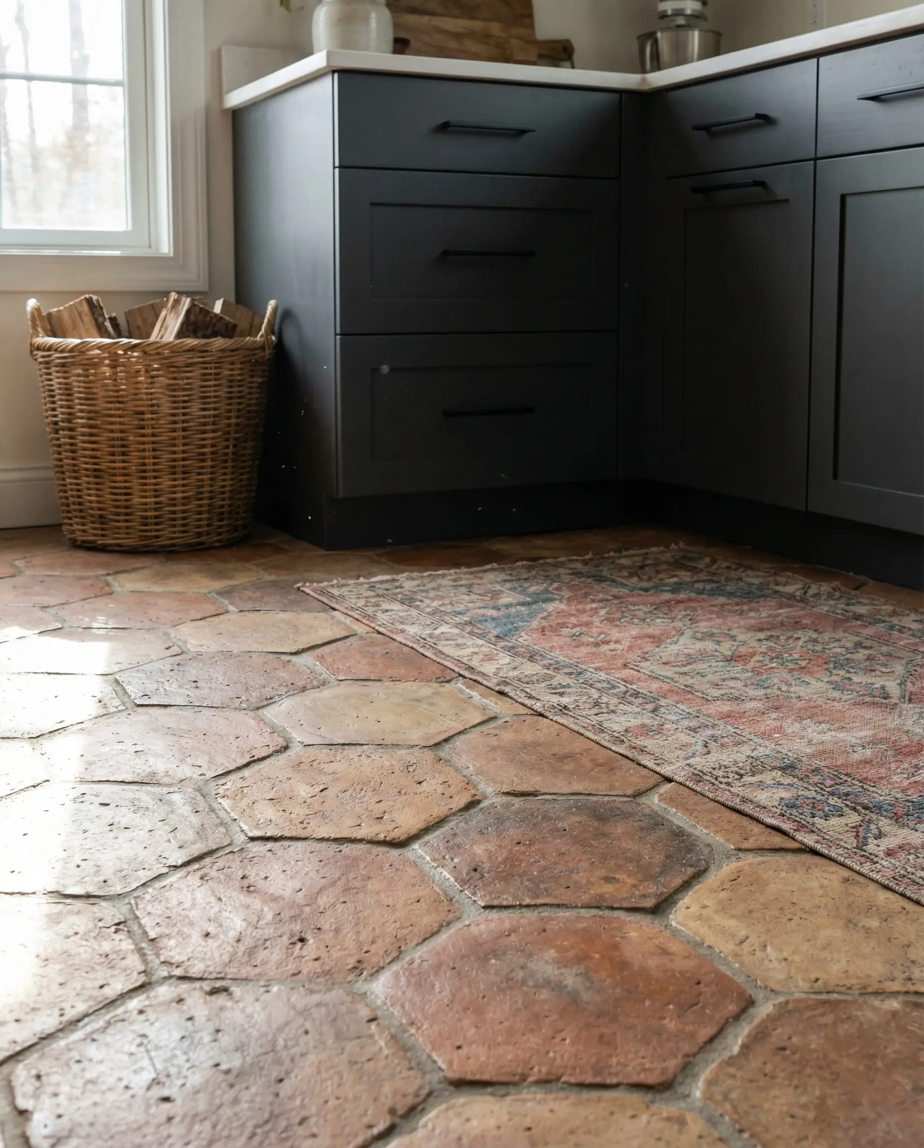
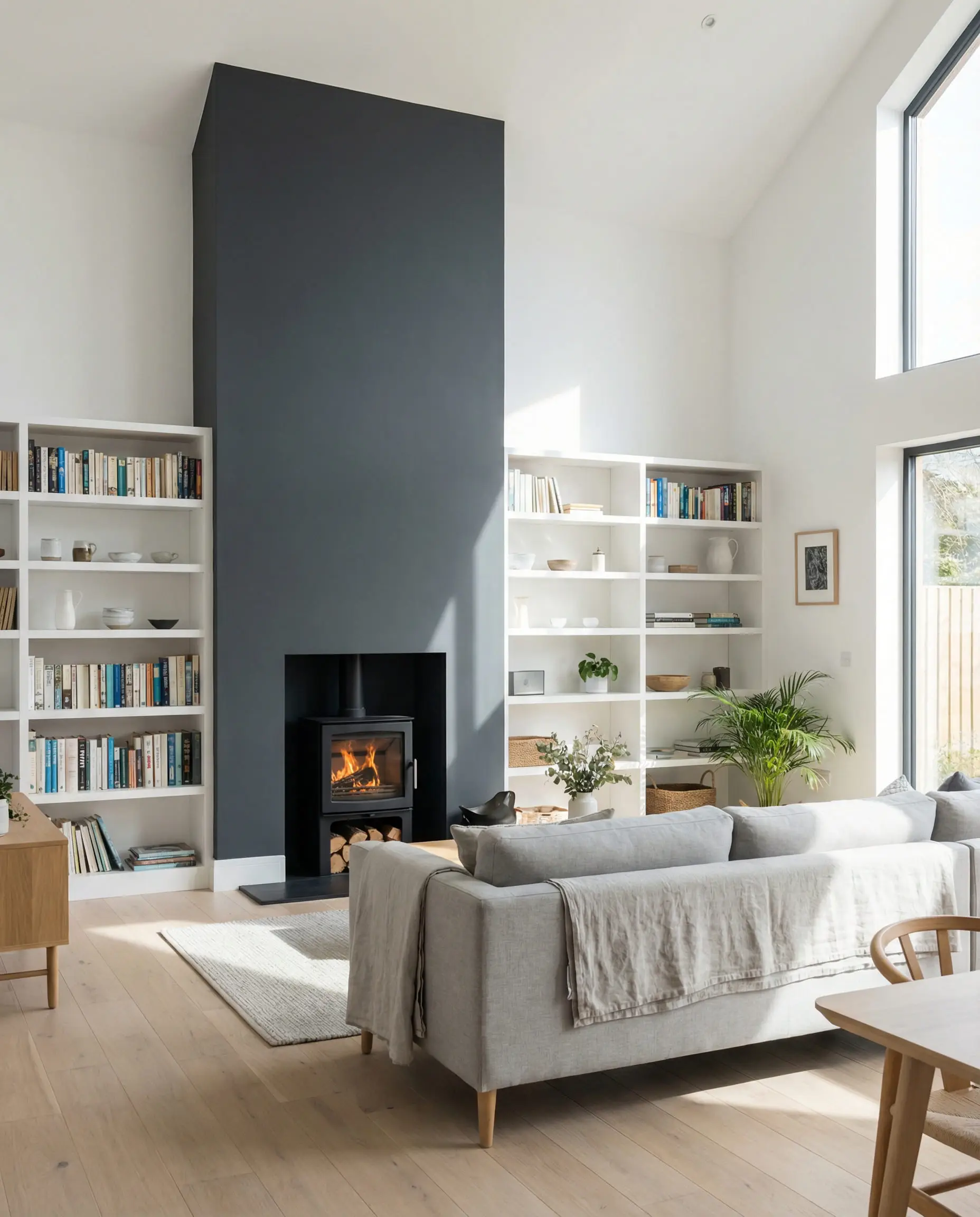
Kitchens: The New Navy
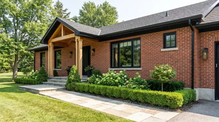
For years, navy blue islands were the standard. Anthracite is taking that spot. It hides scuffs better than black and looks cleaner than light grey.
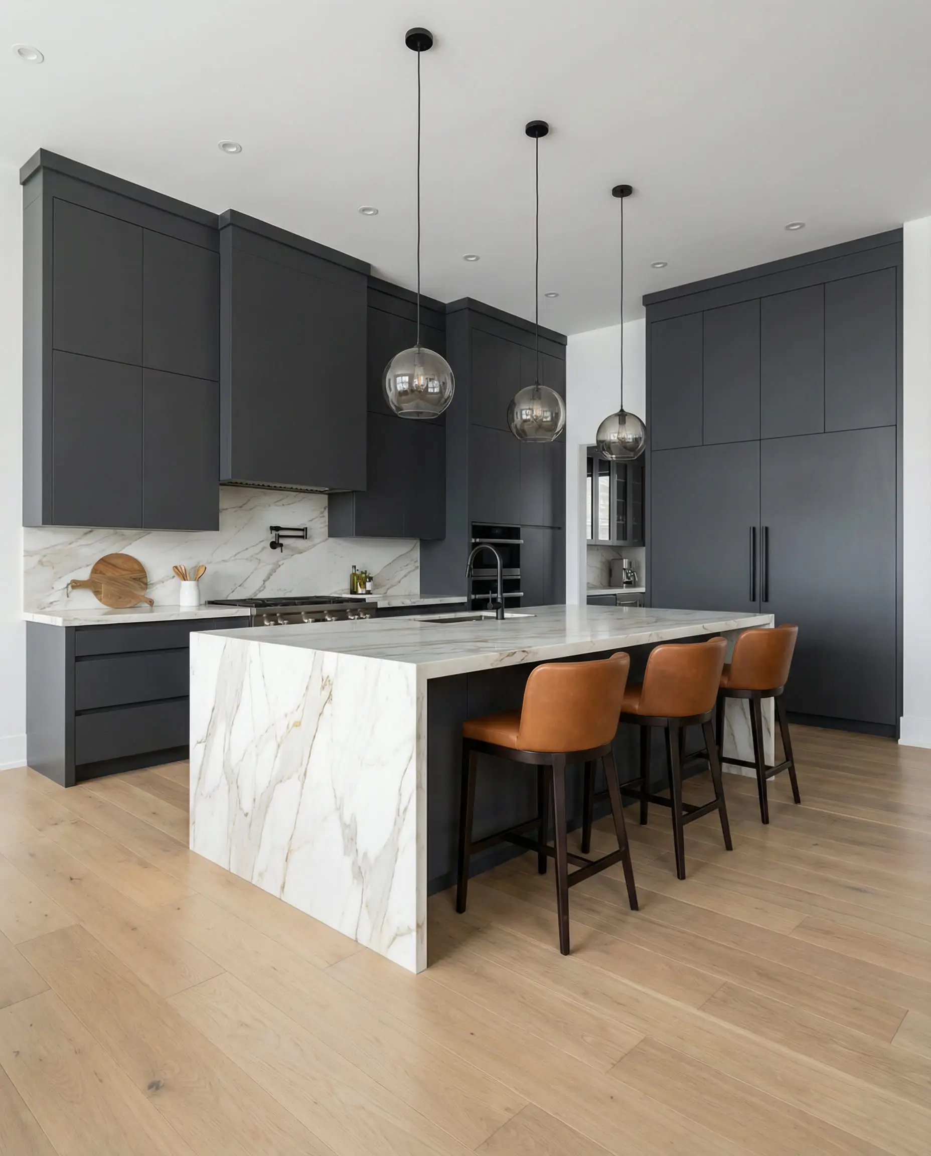
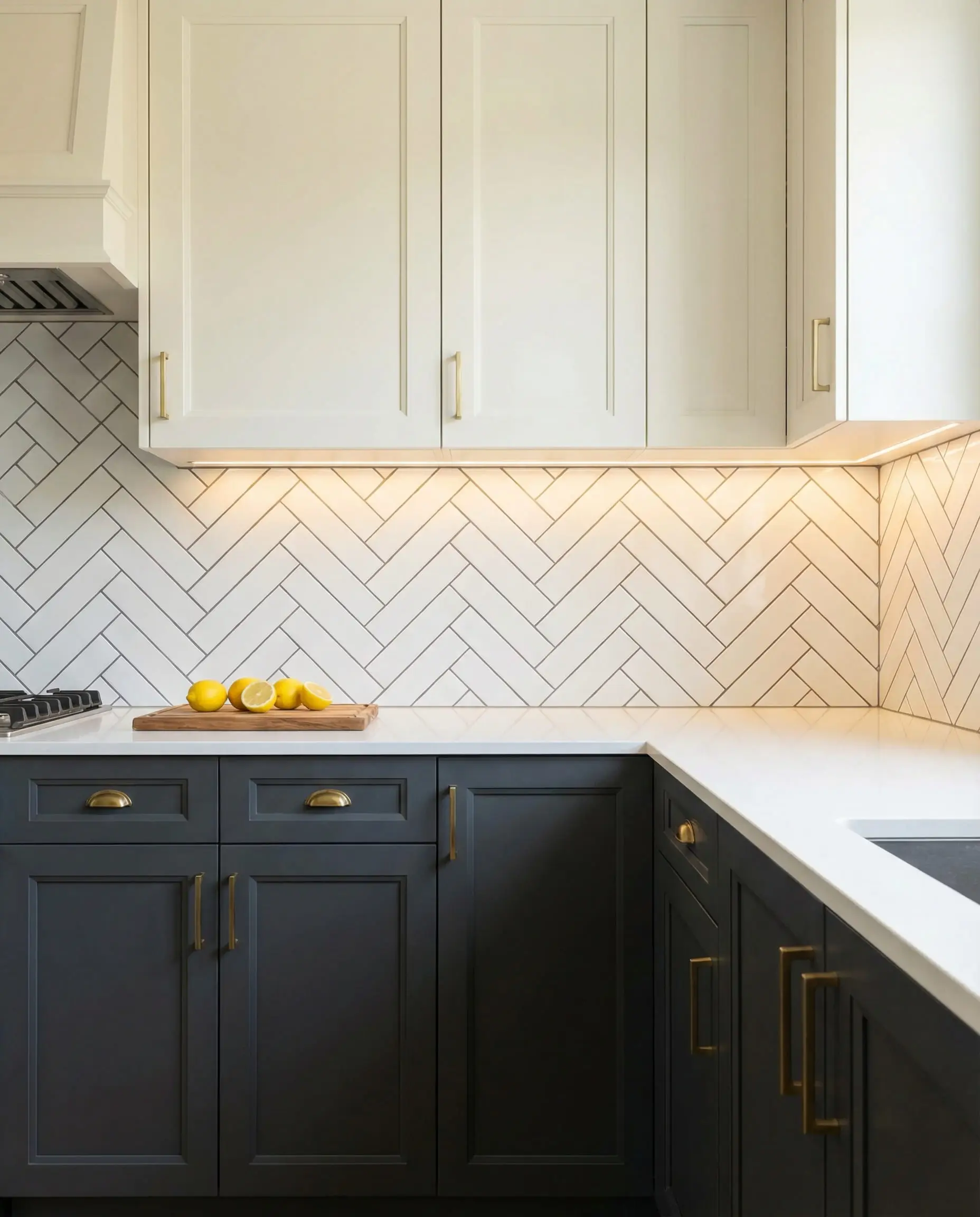
If a full dark kitchen feels too heavy, try the “Tuxedo” look: Anthracite on the lower cabinets and a warm white or open shelving on the top. See our modern kitchen design trends for more layout ideas.
Hackrea Stylist Tip 💡
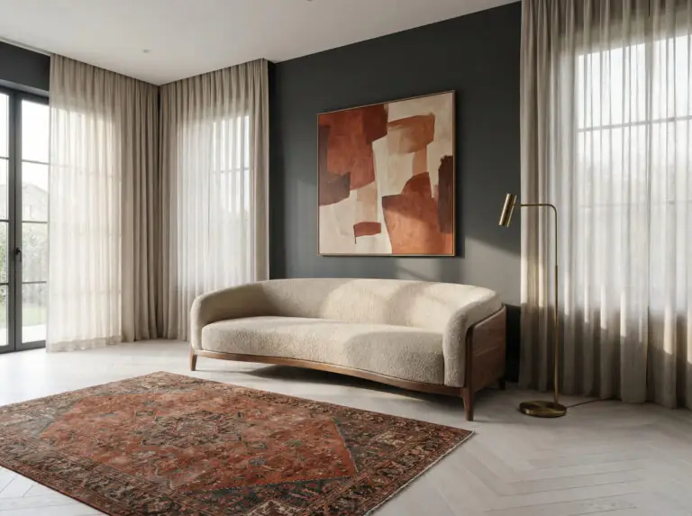
Living Rooms: “Color Drenching”
“Color Drenching” is a technique where you paint the walls, the skirting boards (baseboards), the door frames, and sometimes even the ceiling in the same color.
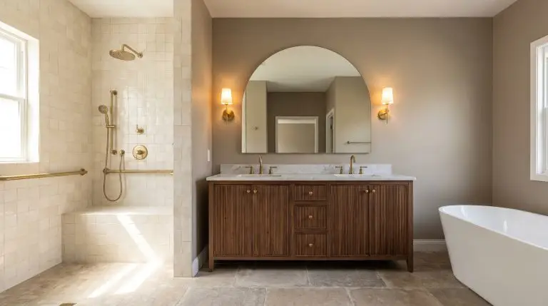
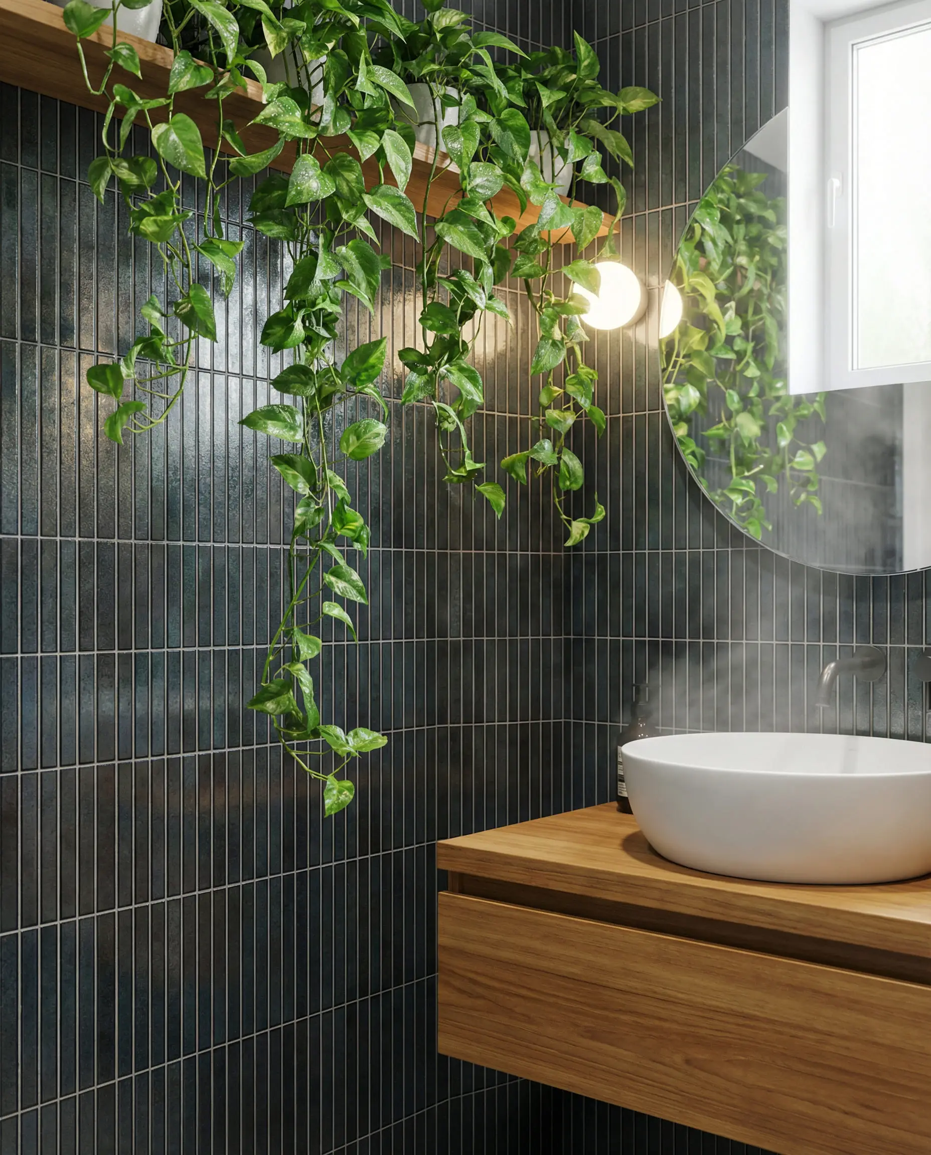
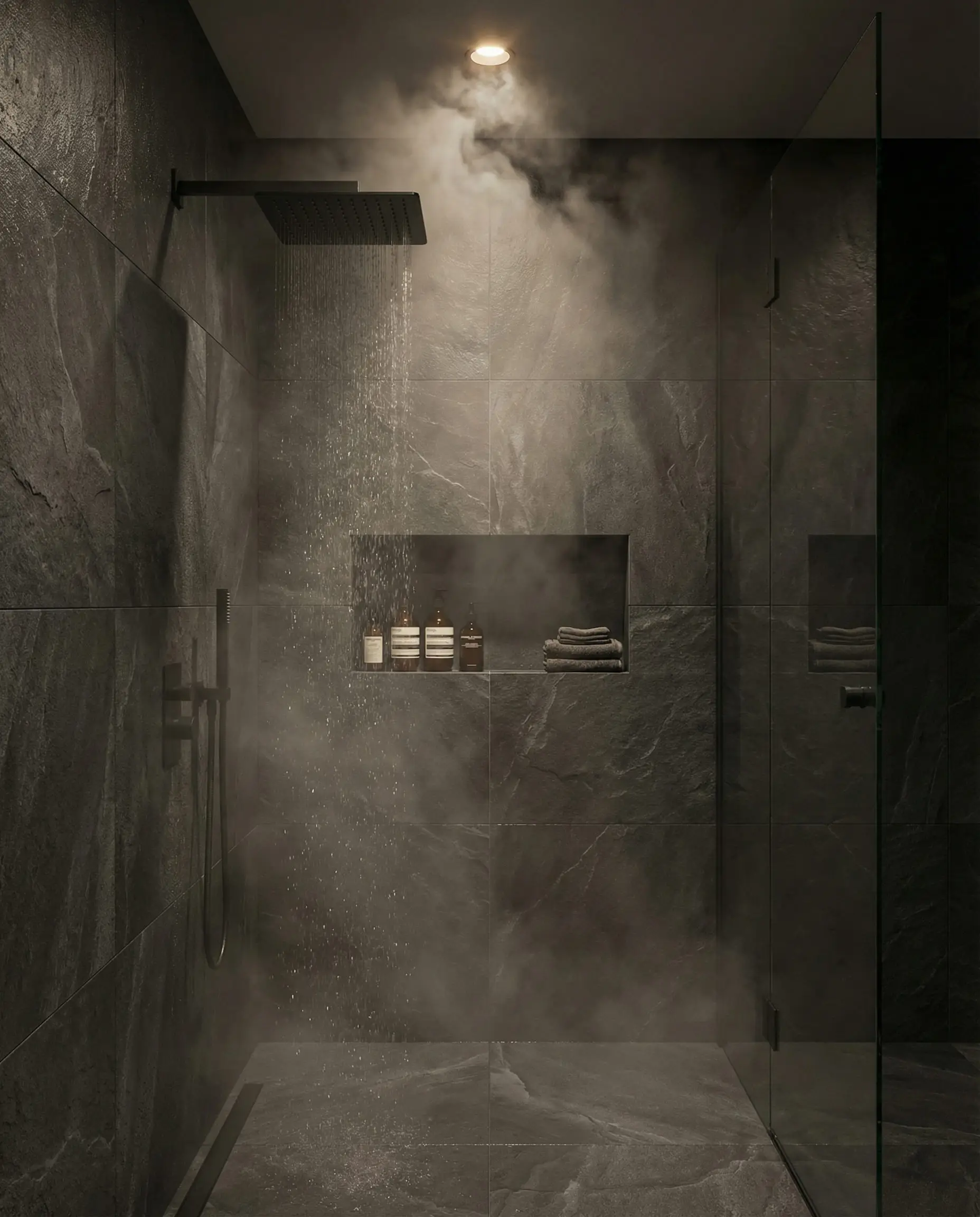
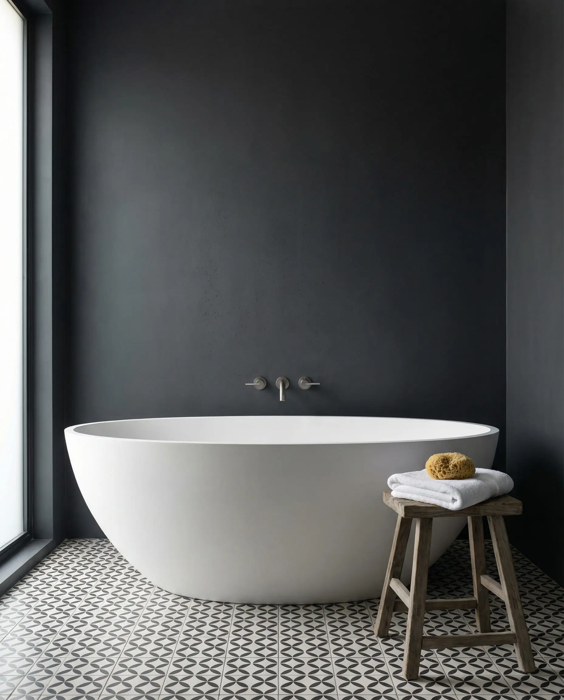
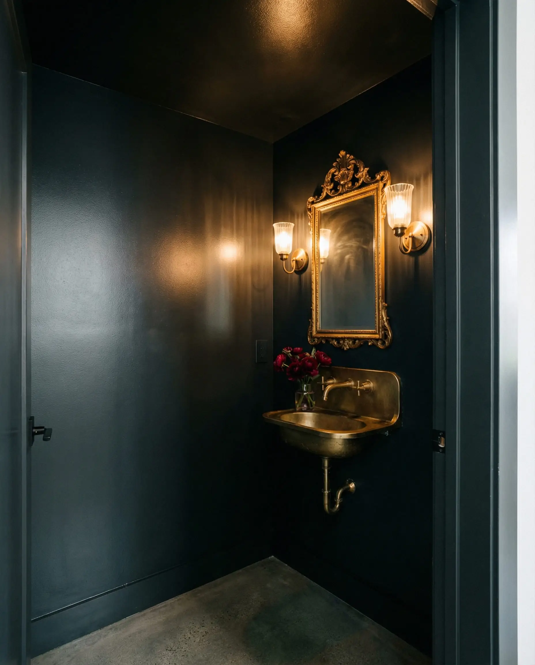
Bathrooms: The Spa Vibe
Anthracite is a staple in modern bathroom design because it mimics natural slate found in high-end spas.
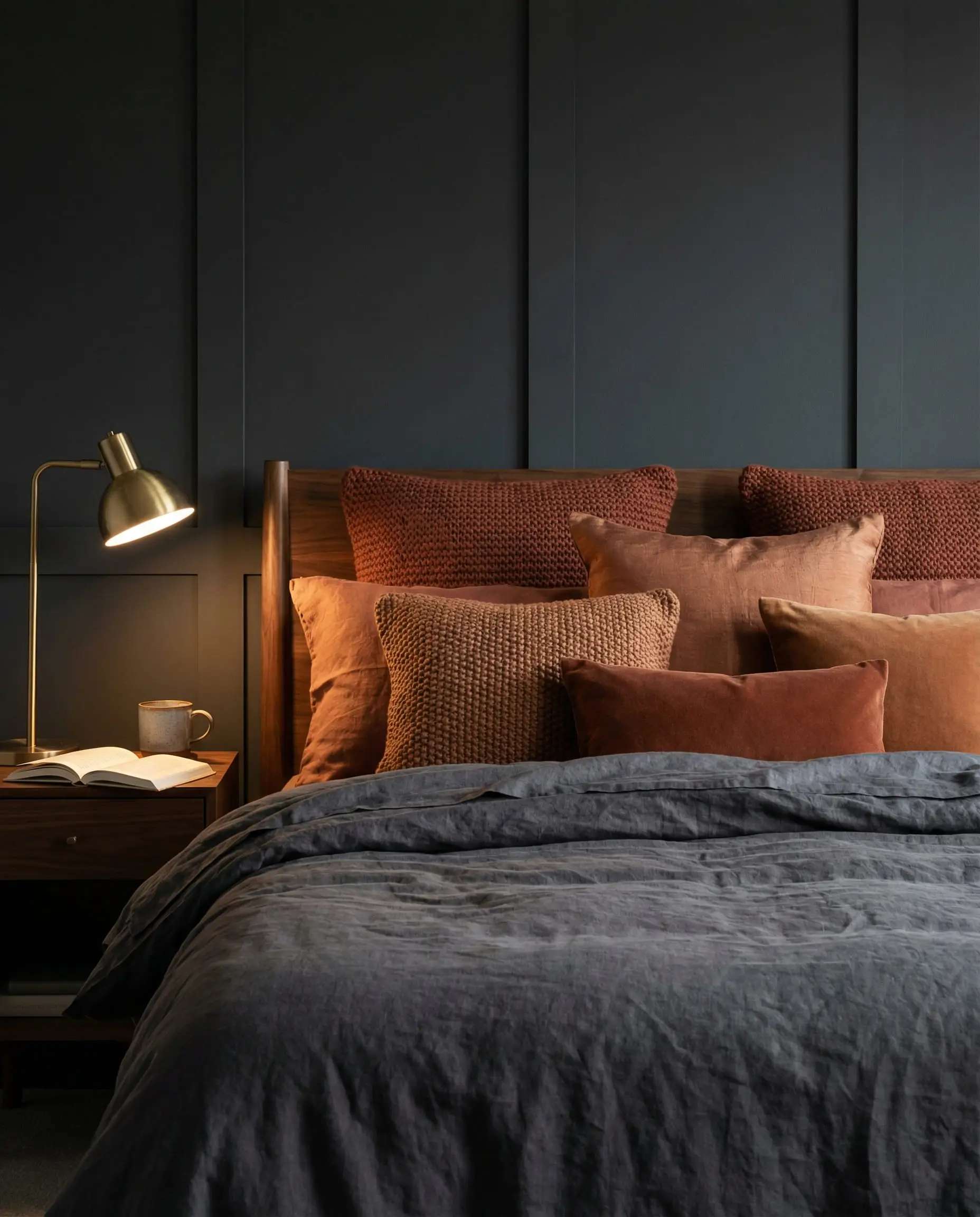
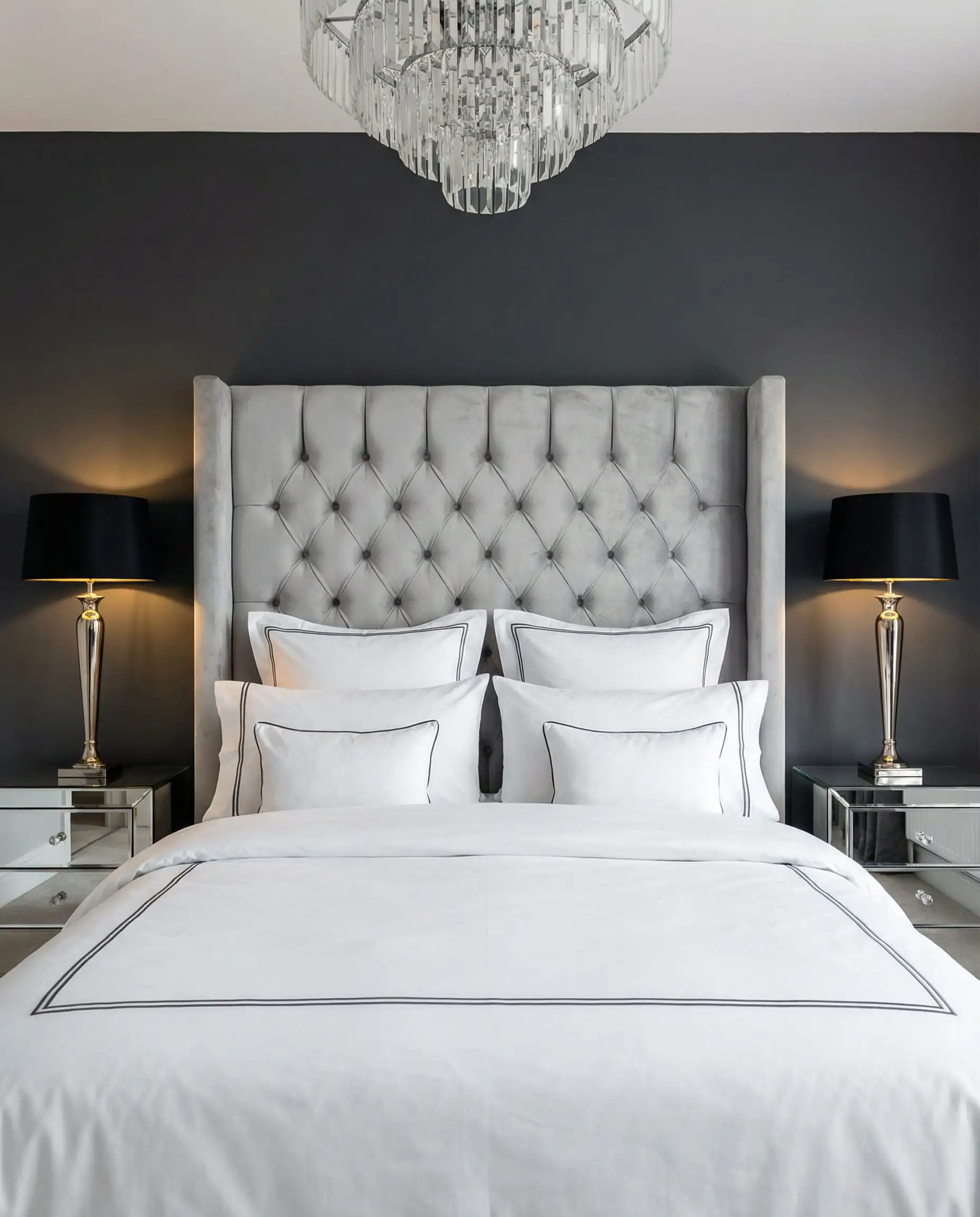
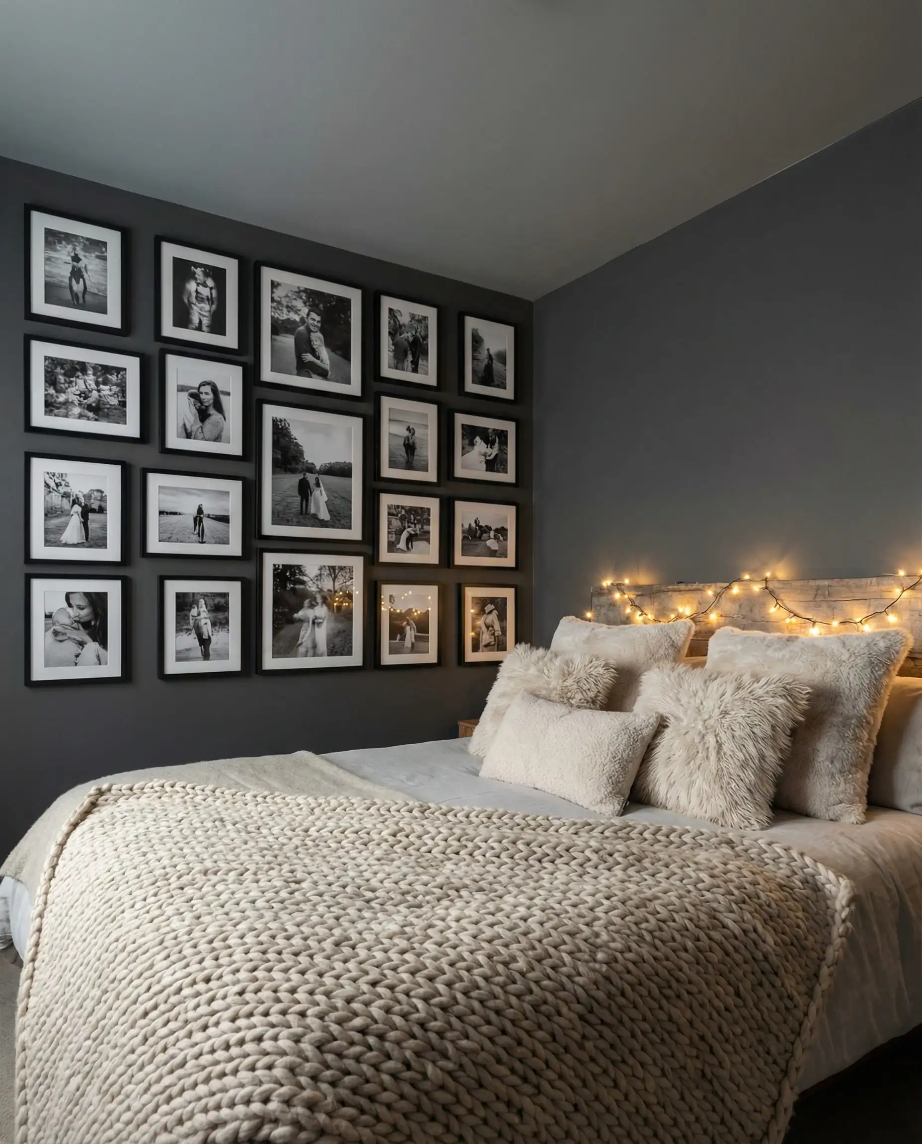
Bedrooms: Creating Intimacy
This is where the “cocoon” effect shines.
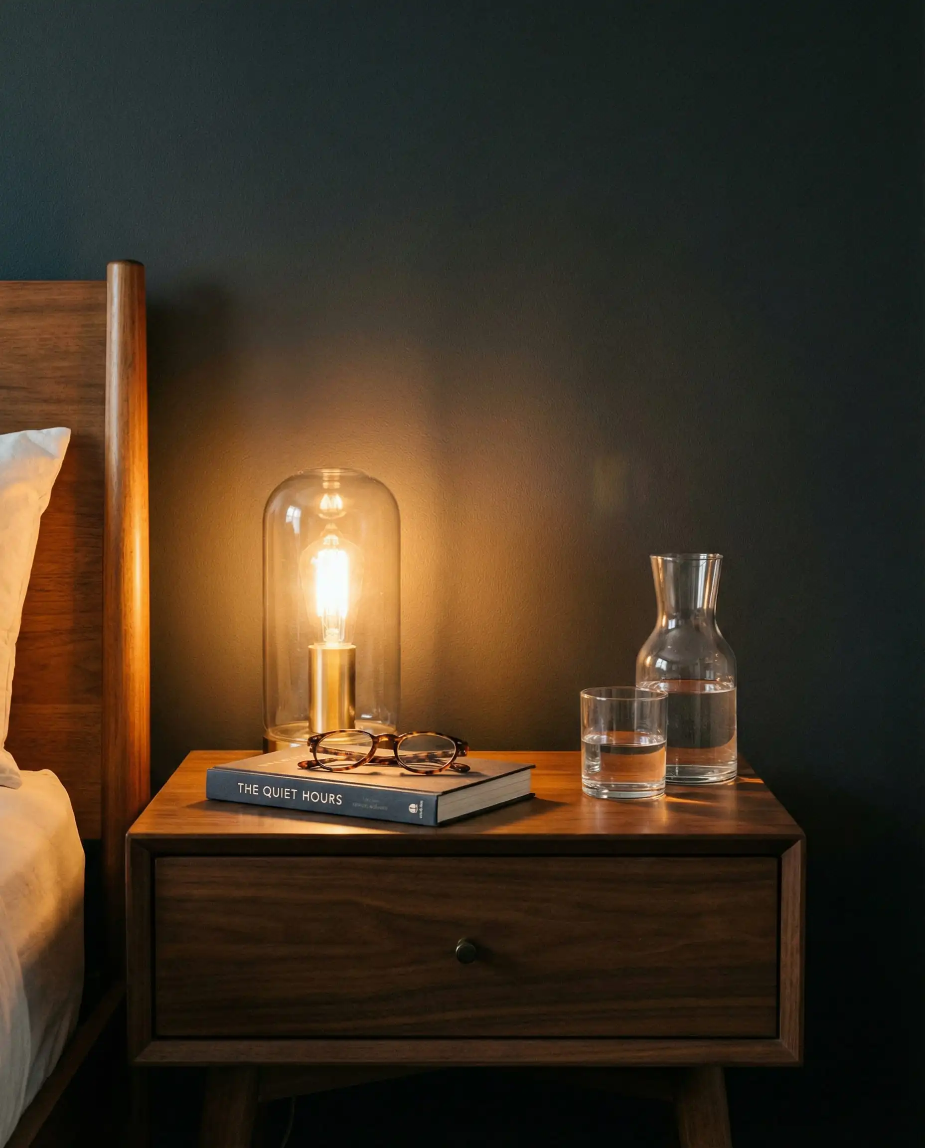
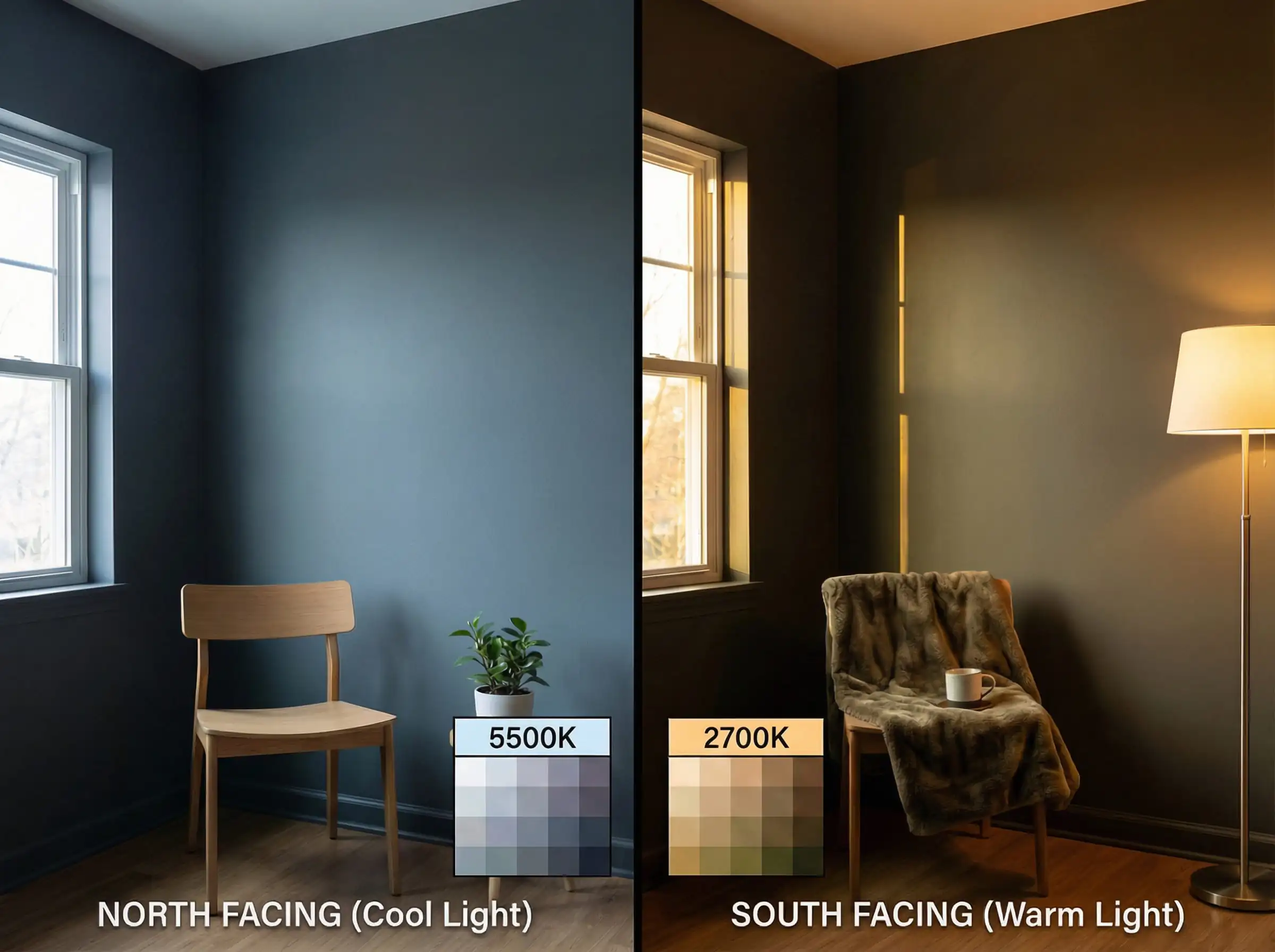
Lighting: The Make or Break Factor
We cannot stress this enough: Lighting changes everything with anthracite. Because dark walls absorb light, you need to be strategic.
North-Facing Rooms (The Danger Zone)
In the Northern Hemisphere, north-facing rooms get cool, indirect light. This brings out the blue undertones in anthracite, making the room feel cold or “icy.”
South-Facing Rooms (The Ideal Spot)
South-facing rooms get warm, golden sunlight. This is where anthracite sings. The sun will hit the wall and reveal the complex brown or green undertones, making the color feel alive and warm.
Layering Light
A single ceiling light won’t cut it. You need:
- Ambient: Ceiling spots or a chandelier.
- Task: Reading lamps.
- Accent: LED strips under shelves or behind the TV.
For a deeper dive into structuring your lights, check our comprehensive home lighting design guide.
Common Mistakes to Avoid
Even experienced decorators can stumble with dark paints. Here are the pitfalls to watch out for:
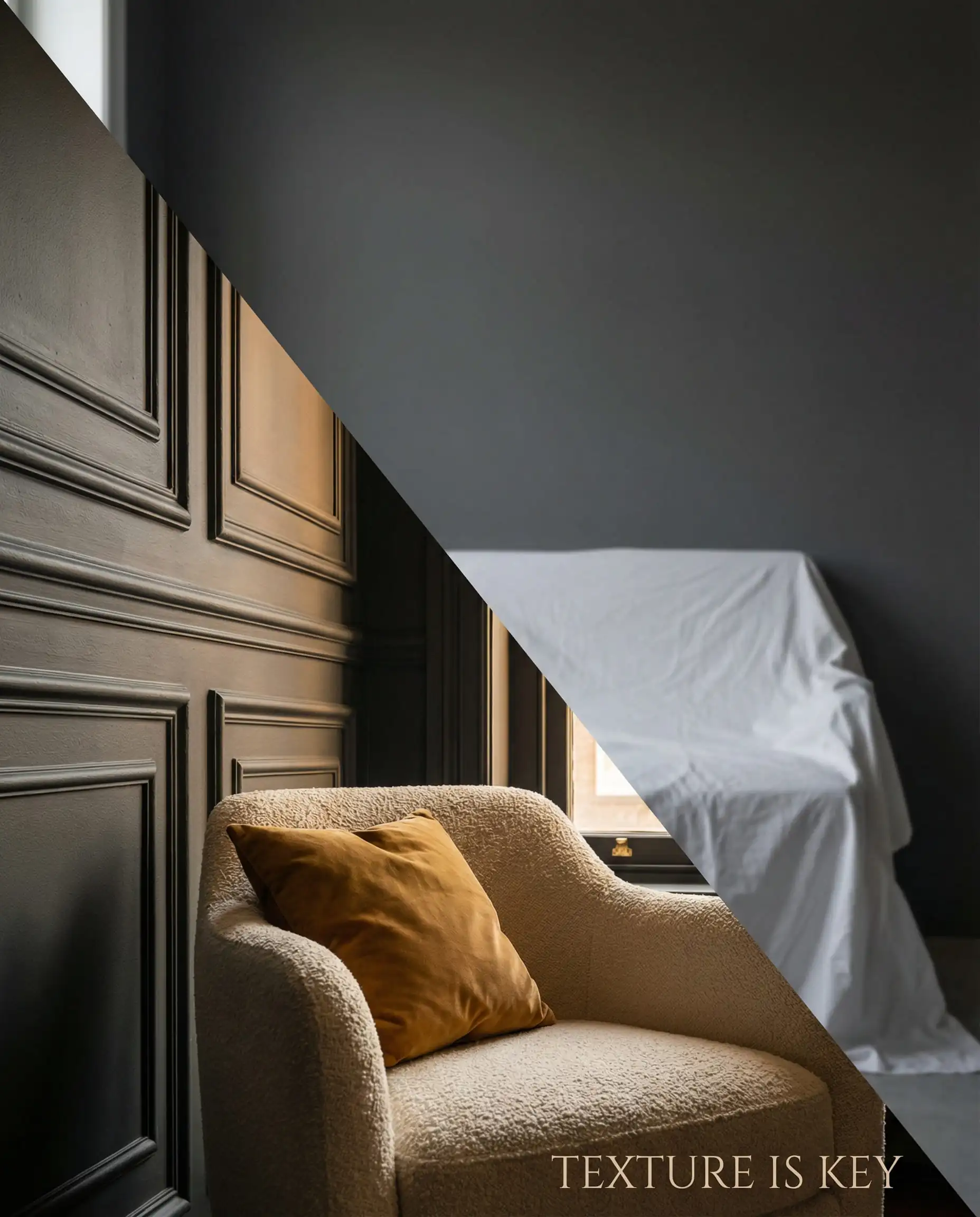
1. Ignoring Texture
If you paint a flat wall anthracite and put a grey cotton sofa in front of it, the room will look two-dimensional and flat. You must add texture. Think chunky knit throws, boucle chairs, velvet cushions, or decorative wall panels. The light needs something to catch onto.
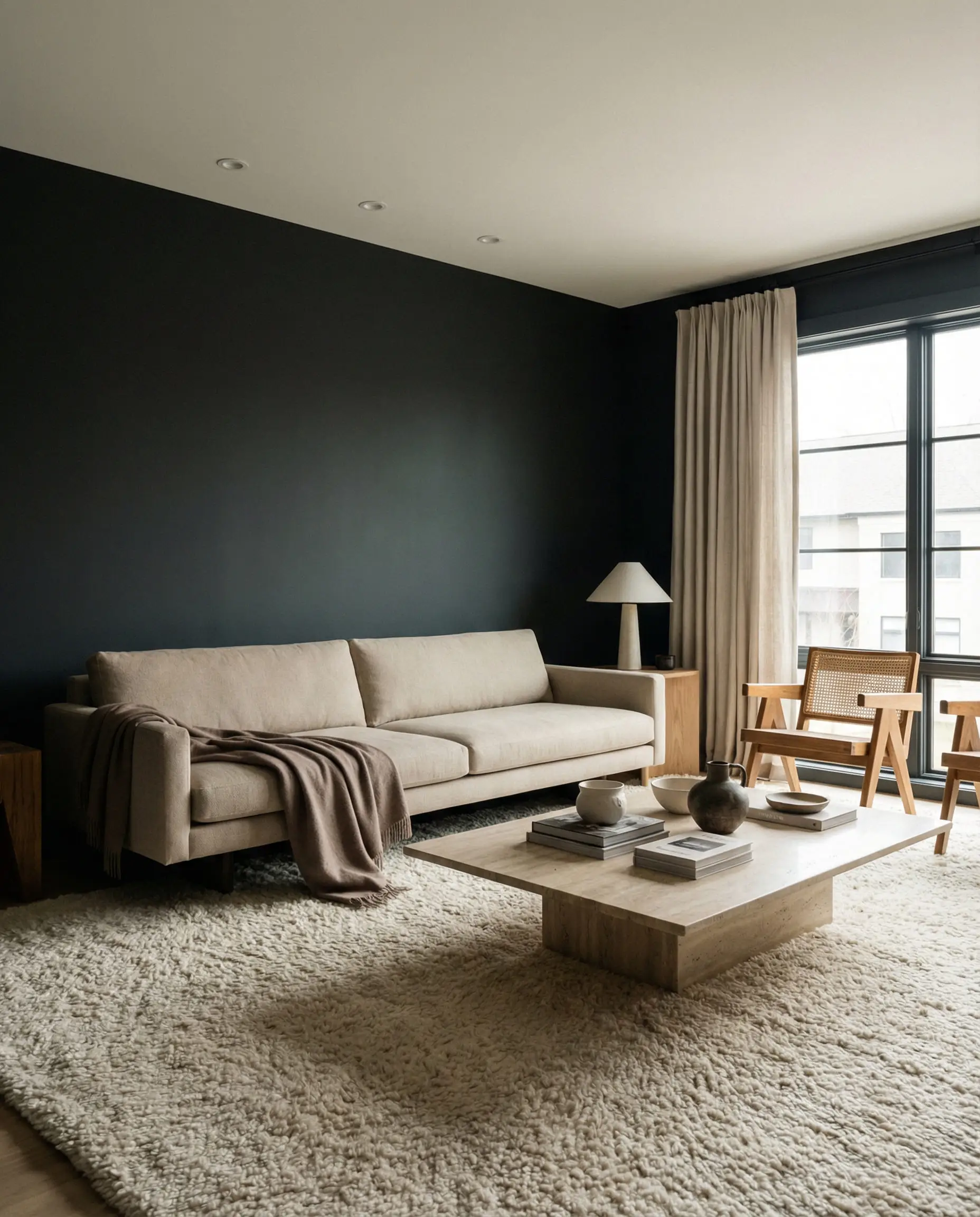
2. The “Floating” Furniture Effect
If you have dark walls and a dark floor, your furniture might disappear. Conversely, if you have dark walls and a very light white rug, the furniture might look like it’s floating in space. Ground the room with a rug that incorporates both the dark wall color and the lighter furniture tones to bridge the gap.
3. Sampling on a White Background
Hackrea Pro Tip 💡: When you test paint samples, don’t paint a small square in the middle of a white wall. The contrast with the white will make the anthracite look almost black. Paint a large piece of card/poster board and move it around the room to see how it looks in dark corners vs. near the window.
Frequently Asked Questions (FAQ)
A: Technically, anthracite (especially RAL 7016) is a cool color with blue/green undertones. However, “warm” anthracite variations exist where paint brands add a drop of red or brown pigment. Always check the undertone before buying.
A: Not necessarily. While it absorbs light, dark colors recede visually. If you paint the ceiling and trim the same color, you blur the boundaries of the room, which can actually make a small space feel expansive and infinite, rather than cramped.
A: You have three great paths:
High Contrast: Cream, off-white, or light oak.
Moody/Monochrome: Dark charcoal, black leather, or walnut wood.
Pop of Color: Burnt orange (terracotta), mustard yellow, or emerald green.
Avoid mid-tone cool greys, as they often clash.
A: Matte or Eggshell. Avoid gloss or satin finishes on large walls. Dark colors show every imperfection in the plaster (bumps, dents). A matte finish absorbs the light and hides these flaws, giving that velvety, luxurious look.
A: Absolutely. It is a classic choice for small powder rooms (half-baths). It adds drama and “wow” factor that light colors simply can’t achieve in a tiny space. Just ensure you have a large mirror to bounce light around.
Conclusion
Anthracite is no longer just a trend; it has cemented its place as a design classic. It offers a depth and sophistication that standard grey lacks and a softness that pure black cannot provide.
As we move through 2026, we are seeing this color embrace its softer side—paired with tactile woods, warm stones, and earthy textiles. Whether you use it as a grounding accent on a kitchen island or commit to a full color-drench in your living room, anthracite is a bold choice that pays off.
Ready to take the plunge? Don’t just guess. Grab a sample pot, paint a board, and watch how the light plays with this fascinating color throughout the day. And if you’re looking for the perfect furniture to match your new dark walls, explore our guide on furniture trends to complete the look.