White Heron OC-57
Benjamin MooreBenjamin Moore White Heron (OC-57) is a classic, bright off-white with a very subtle cool cast. Boasting an LRV of 86.69, it reads as a crisp, clean white that beautifully balances warm southern light without feeling overly sterile or clinical.
| Temperature | Slightly Cool |
|---|---|
| Primary Undertone | Faint blue-gray |
| Hidden Undertones | Subtle green-gray |
| Best Exposures | South-facing or well-lit spaces |
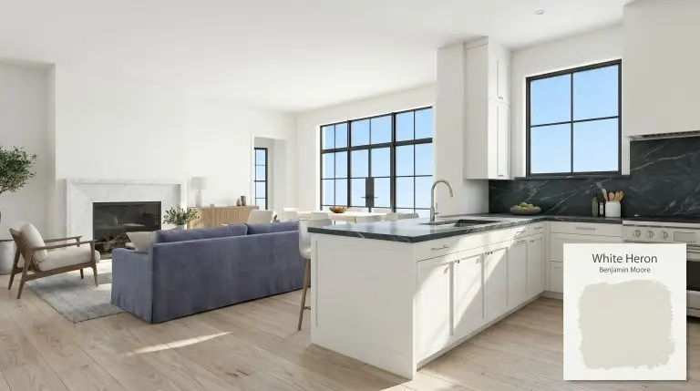
| Best For | Trim, ceilings, kitchen cabinets, contemporary living rooms, modern exteriors |
Hackrea Review
White Heron is an incredibly reliable, crisp white that avoids the starkness of pure whites while maintaining a fresh, modern edge. It’s our go-to choice for trim and ceilings when you need a clean contrast against both warm and cool wall colors.Architectural Applications for Benjamin Moore White Heron
Crisp Trim & Baseboards
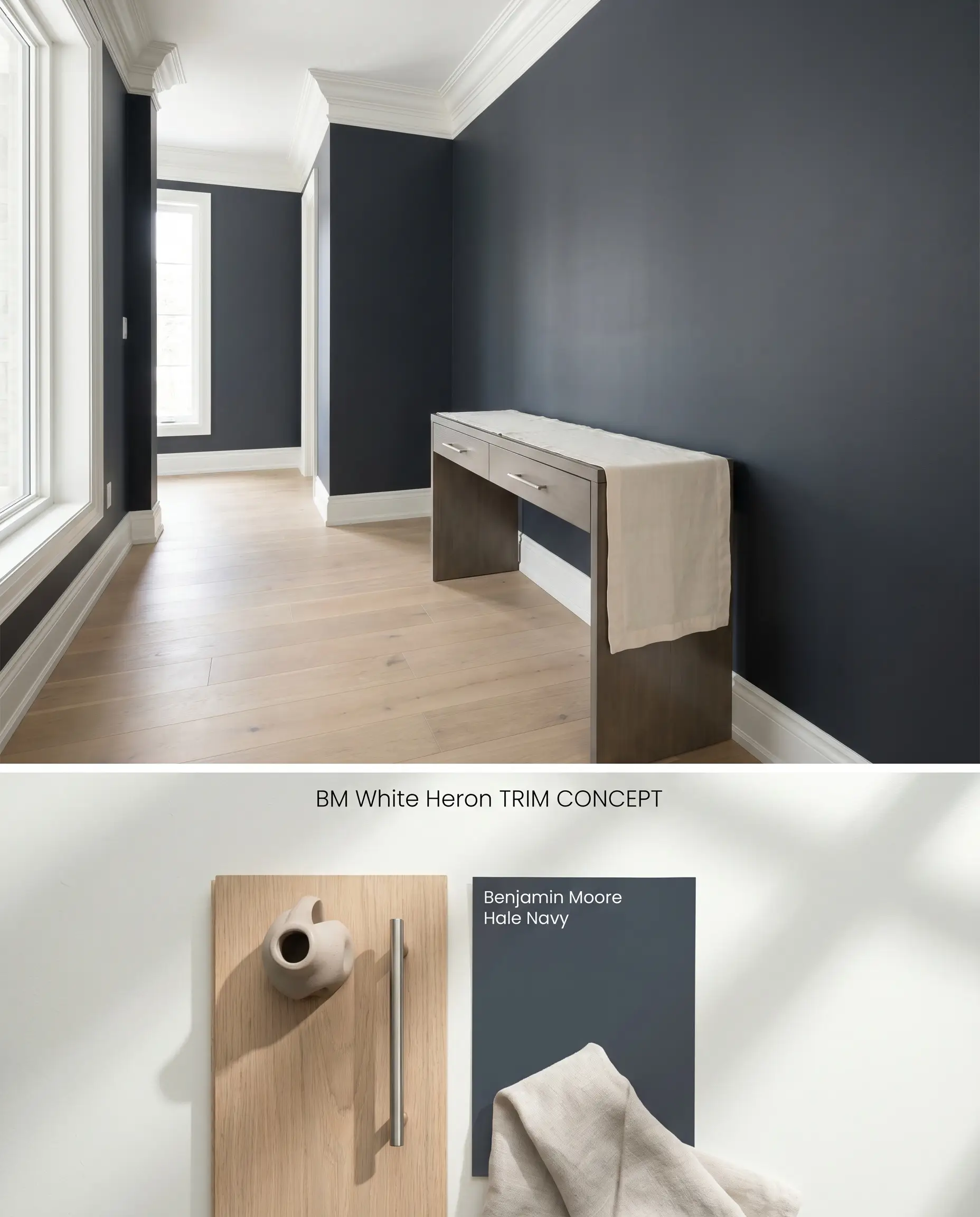
White Heron operates as a sharp boundary for trim and millwork against mid-tone and dark walls. Its subtle blue-gray cast prevents the transitions from looking overly plastic, grounding the visual shift between flooring and drywall. The high Light Reflectance Value (86.69) ensures baseboards retain their crisp chromatic profile even under shadows cast by heavy furniture.
Contemporary Living Rooms
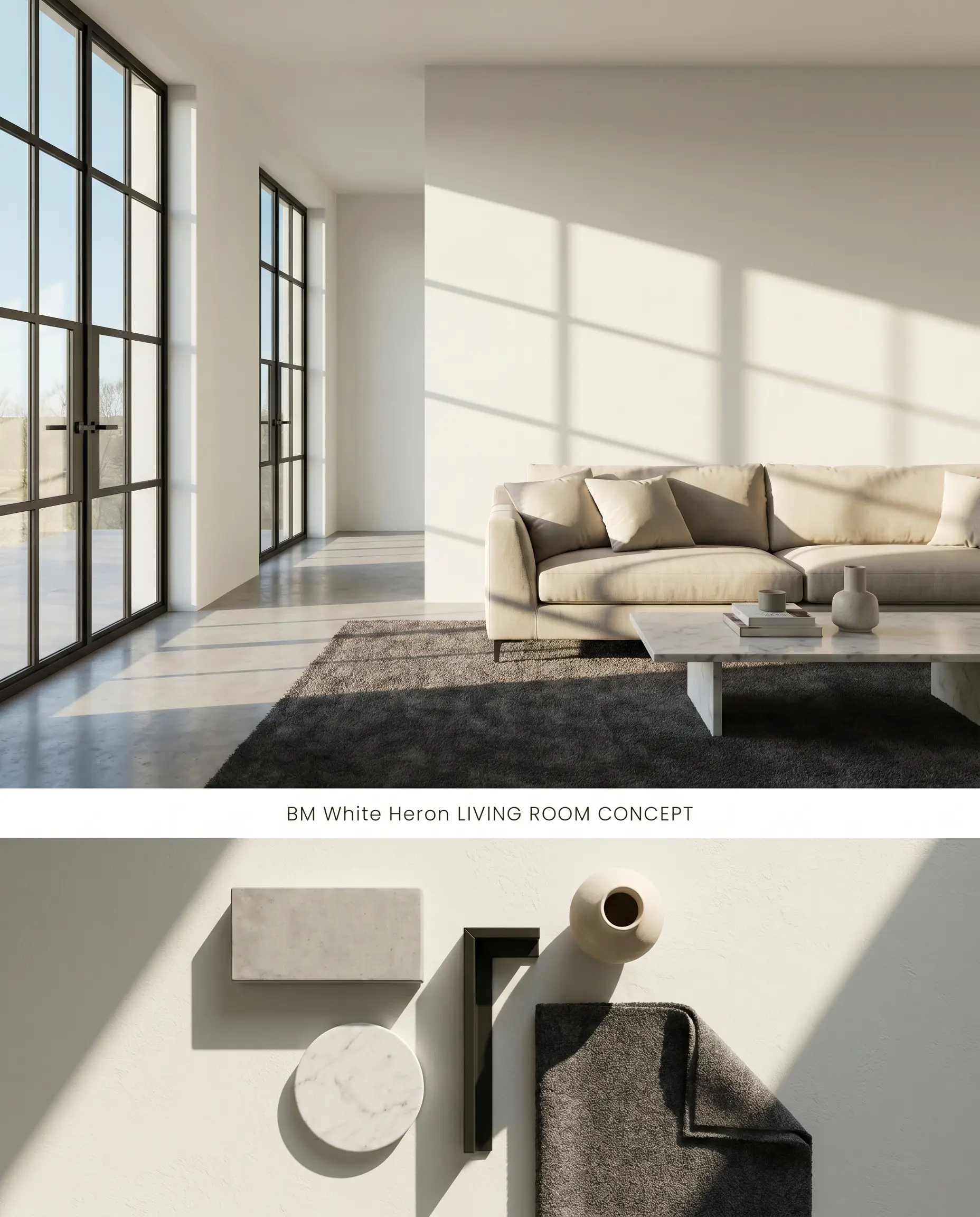
As an off-white architectural finish, White Heron provides a clean, expansive backdrop for modern forms without leaning sterile. Its cool-toned white base actively rejects the yellowing common in traditional paints, allowing natural light to bounce efficiently across the room. Due to its high reflectivity, you must monitor exterior foliage, as a large canopy of green trees will easily bounce a green tint directly onto the drywall.
Kitchen Cabinets & Islands
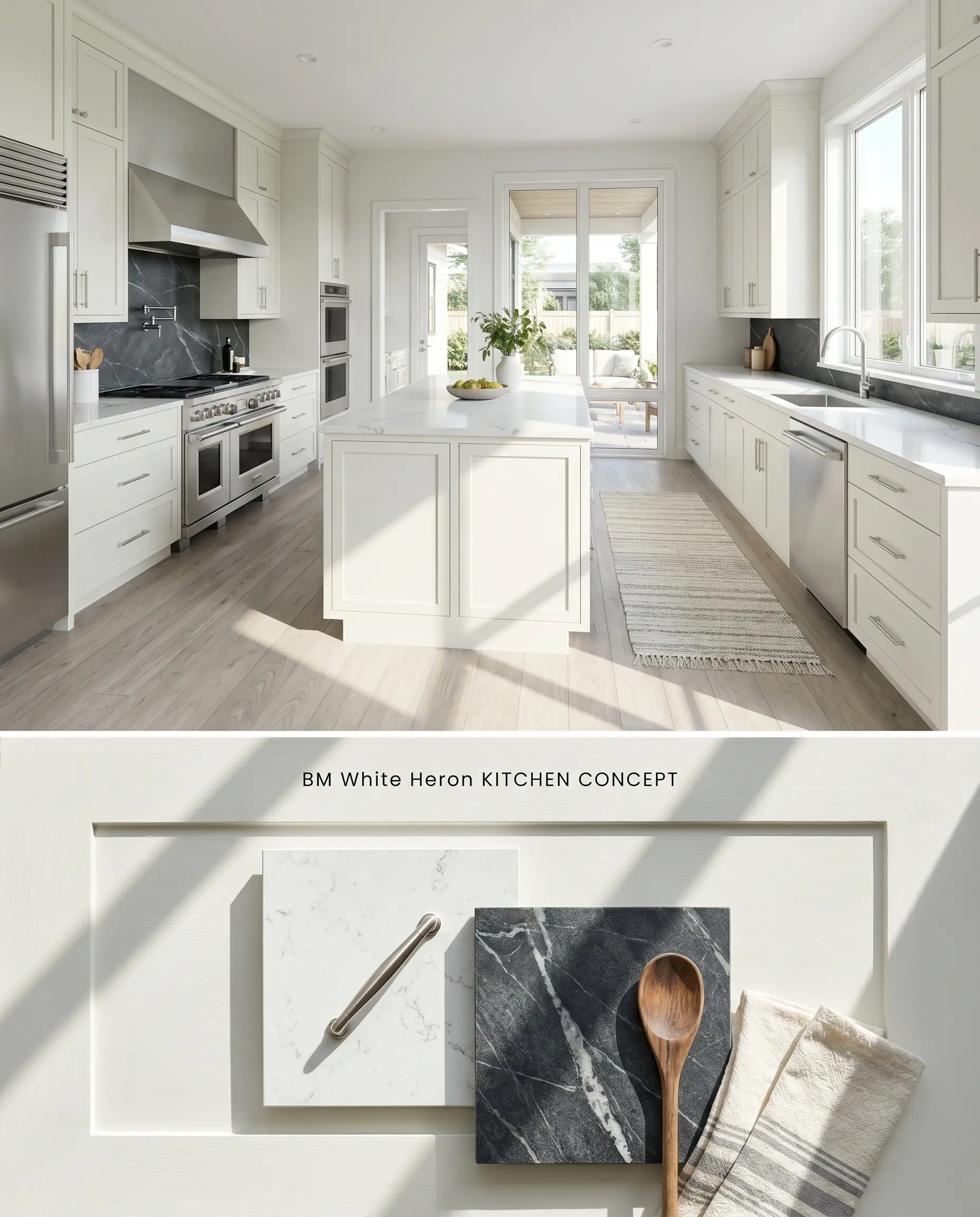
Applying this shade as a cabinetry finish creates a sharp, tailored aesthetic that pairs seamlessly with cool-veined natural stone. The color structure remains stable under varying LED temperatures, maintaining a crisp profile against stainless steel appliances. You must explicitly avoid pairing these cabinets with Tuscan tile or golden oak floors, which will immediately force the paint to look like un-tinted primer.
Well-lit South-Facing Bedrooms
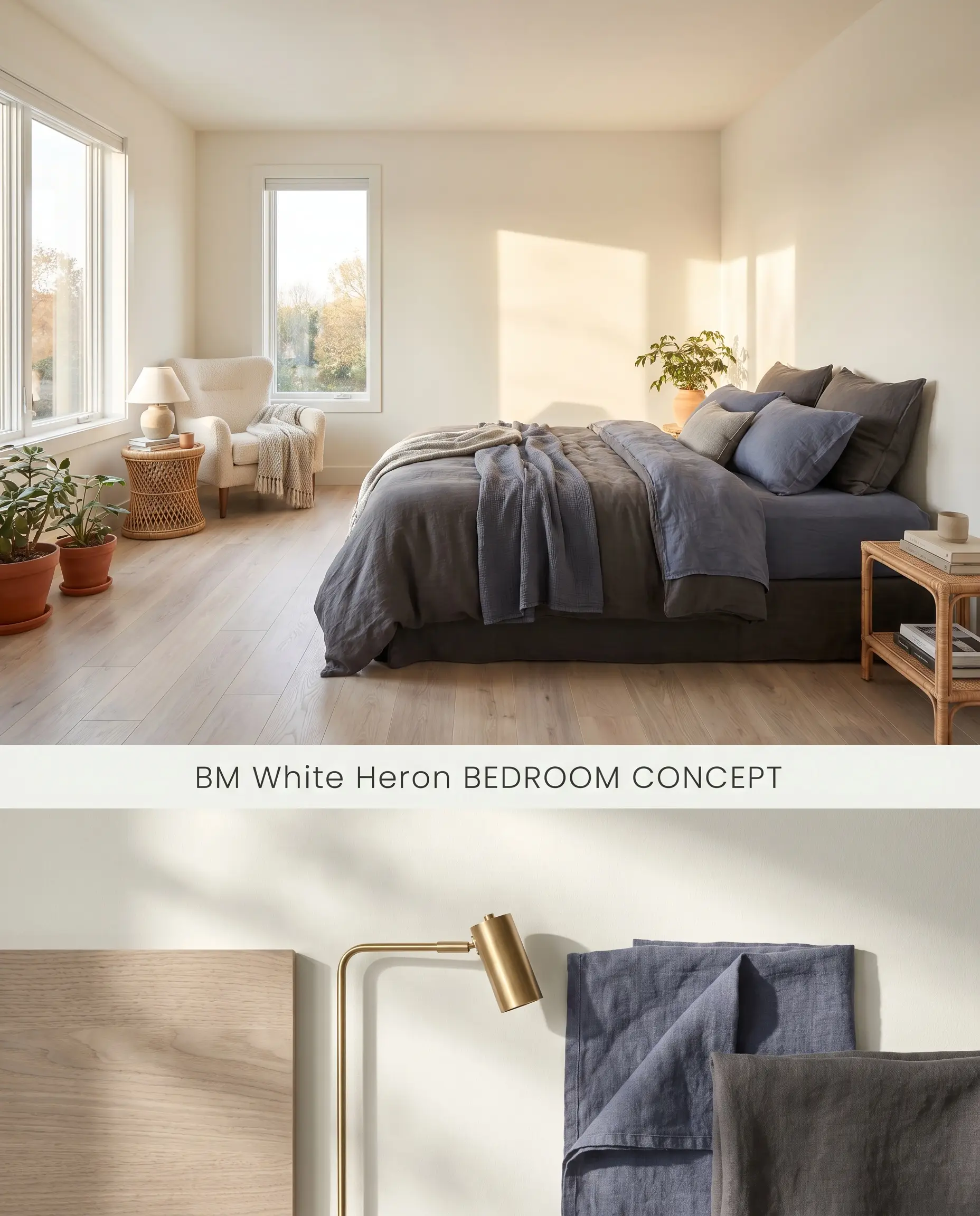
South-facing light amplifies the warmth of the sun, which perfectly neutralizes White Heron’s inherent cool-toned tendencies. This interaction yields a balanced, airy retreat that feels neither icy nor overly warm. The paint acts as a passive reflector, amplifying the ambient light while maintaining a soft, clean envelope for layered textiles.
Ceilings (often at 50% tint)
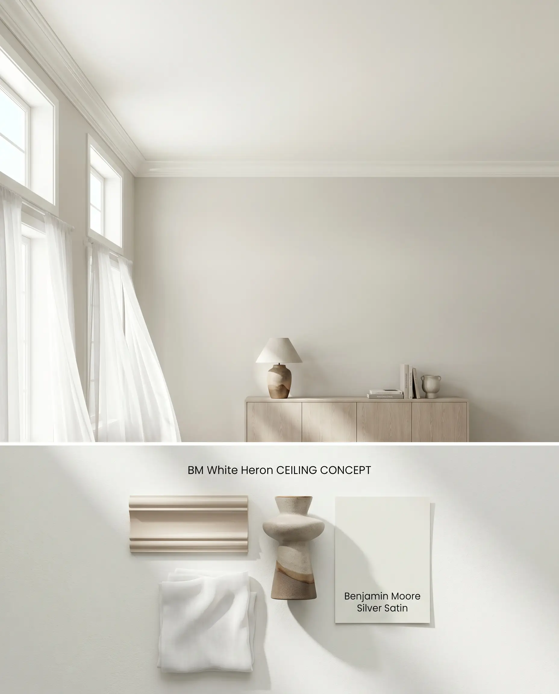
Cutting the tint by 50% elevates the ceiling plane without introducing the jarring contrast of a pure, untinted factory white. This subtle integration draws the eye upward, maximizing perceived volume while maintaining cohesive undertones with the surrounding walls. The modified formula prevents the ceiling from reading as a muddy gray in the ambient shadows above window lines.
You can apply wallpapers, paints, etc. on walls and see how they look in various interiors.

Analyzing the Color Structure: White Heron vs. Industry Rivals
Benjamin Moore White Heron OC-57 vs. Benjamin Moore Chantilly Lace OC-65
Chantilly Lace OC-65 is Benjamin Moore’s cleanest white, lacking any discernible warm or cool undertones, with a slightly higher LRV of 90.04. White Heron OC-57 carries a distinct blue-gray cast that grounds it slightly more than Chantilly Lace under direct light. In a room with intense southern exposure, Chantilly Lace can occasionally glare, whereas White Heron absorbs just enough of that intensity to remain comfortable. Specify Chantilly Lace when you need a stark, gallery-white backdrop, but utilize White Heron when integrating cool-toned hard finishes like slate or blue macaubas quartzite.
Benjamin Moore White Heron OC-57 vs. Benjamin Moore Simply White OC-117
Simply White OC-117 (LRV 89.52) is driven by a distinct, warm yellow undertone that fundamentally contrasts with White Heron’s cool blue-gray base. Placing these two next to each other reveals their opposing natures; Simply White will amplify the chill in White Heron, making it read like a sterile primer. Specify Simply White for spaces featuring golden oak, warm terracotta, or north-facing light that needs artificial warming. Reserve White Heron strictly for rooms with abundant natural light and cool-toned or desaturated wood floors.
Benjamin Moore White Heron OC-57 vs. Sherwin-Williams Extra White SW 7006
Sherwin-Williams Extra White SW 7006 (LRV 86) and White Heron share nearly identical light reflectance values and both lean toward the cooler end of the spectrum. However, Extra White carries a slightly more rigid, pure-blue undertone compared to the softer blue-gray cast of White Heron. Extra White excels as a sharp, high-contrast trim color against vivid primary wall colors, while Benjamin Moore’s Gennex Color Technology ensures White Heron operates better for broad wall applications where a muted off-white prevents visual fatigue.
Technical FAQs: Form & Function
Yes, in north-facing or low-light rooms, the inherent cool blue-gray cast of White Heron becomes highly prominent. This lighting shift can make the space feel chilly or dingy, so it is strictly recommended for well-lit, south-facing, or western exposures.
White Heron will severely clash with warm, earthy finishes like golden oak cabinets or Tuscan tile. The cool-toned white base reacts poorly to yellow-heavy surroundings, causing the paint to look like a stark, unfinished primer.
As a highly reflective white, it will appear significantly brighter and cooler outdoors, often flashing a distinct icy blue under the open sky. It also easily bounces surrounding colors, meaning large green trees or red brick pathways will cast their hues directly onto the siding.
You can use it on both surfaces if the room has abundant natural light, but in low-light environments, the ceiling will fall flat and muddy. To maintain crispness overhead, professionals often tint the ceiling application to 50% strength or rely on a dedicated, untinted ceiling white.
Similar Paint Colors
Same Brand
Cross-Brand Equivalents