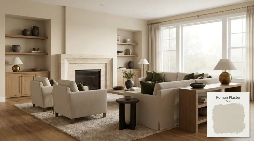
Behr Roman Plaster is a warm, light-to-medium creamy beige with a Light Reflectance Value of 65. It features subtle sandy and yellow undertones, making it an excellent choice for adding cozy warmth to living spaces without reading as too dark or muddy.
Will Roman Plaster clash with your room?
Paint Technical Profile
| Color ID / SKU | PPU7-10 |
| HEX Code | #DDD2BF |
| Light Reflectance (LRV) | 65 |
| Temperature | Warm |
| Primary Undertone | Beige |
| Hidden Undertones | Subtle Yellow And Sandy Clay |
| Use | Interior, Exterior |
| Best Exposures | North-facing (adds warmth), East-facing (softens morning light) |
| Best For | Whole-house neutral, living rooms, bedrooms, pairing with warm wood cabinets |
Roman Plaster Digital Design Concept Boards
Whole-House Neutral Base
Will Roman Plaster work with your specific lighting, floor, or furniture?
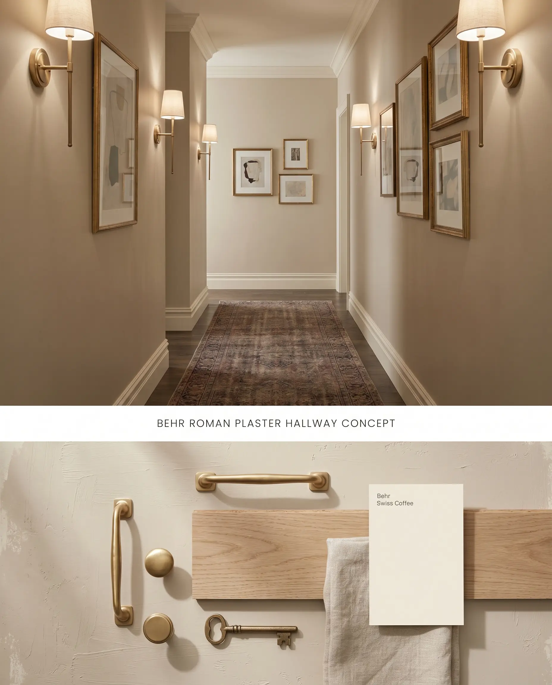
This creamy beige maintains its structural warmth in windowless hallways and shadowed corridors without collapsing into muddy undertones. By avoiding stark white trim, the transition between rooms feels intentional and cohesive. The LRV of 65 provides enough reflection to keep enclosed spaces airy while establishing a reliable color structure for a whole-house palette.
Living Rooms with Warm Wood Floors
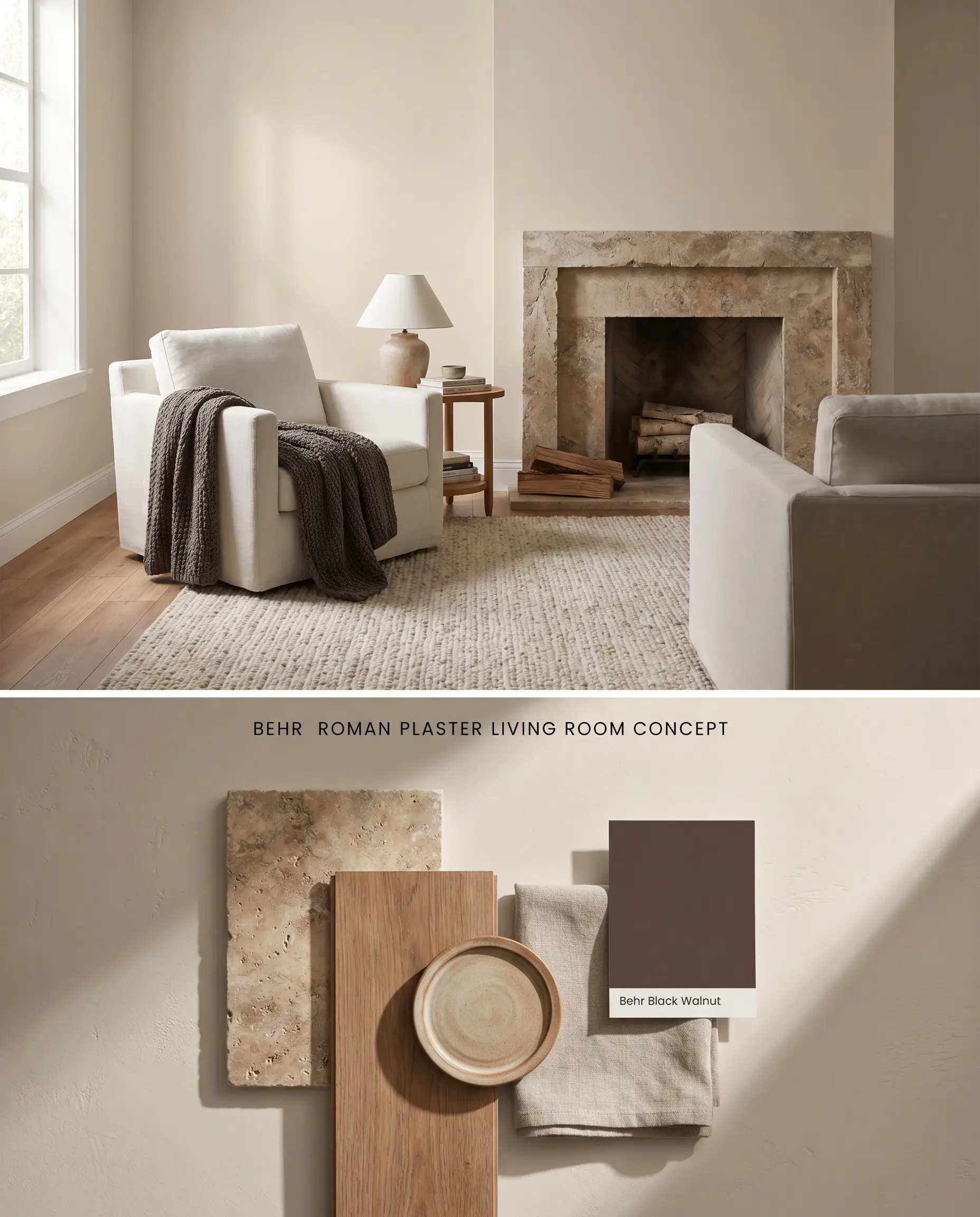
Wood flooring inherently bounces ambient light back onto the walls, amplifying the yellow-orange undertones of this sandy clay hue. To counteract this bounce effect, layer thickly woven, neutral area rugs and utilize matte architectural finishes to absorb excess light. This grounds the space and prevents the wall color from reading overly saturated.
Kitchens with 90s Oak or Warm Wood Cabinets
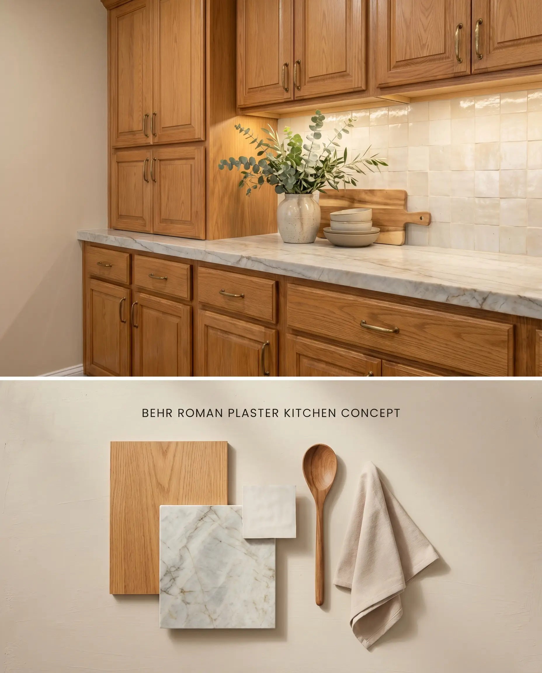
Instead of fighting the dominant orange tones of 90s oak cabinets with cool blue-grays, this warm neutral bridges the gap between the wood and modern countertops. The shared warm undertones create a unified chromatic profile, softening the visual impact of the outdated grain. It acts as a transitional backdrop that integrates the honey oak into the architecture.
Mediterranean or Spanish Colonial Exteriors
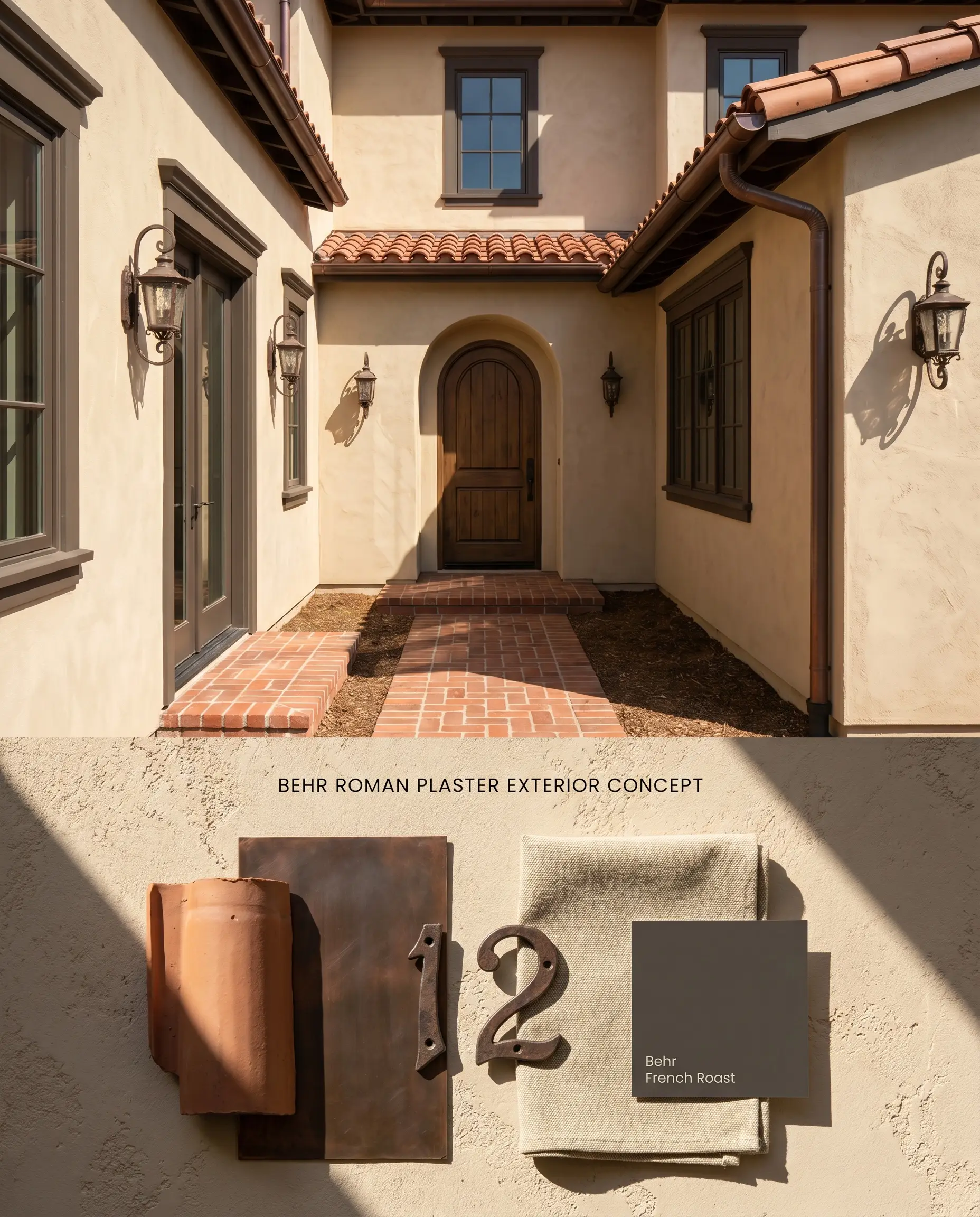
The intense UV exposure of exterior applications washes out subtle undertones, rendering this shade as a crisp, sun-baked stucco rather than a traditional beige. Red brick walkways or terracotta roof tiles will actively bounce warmth back onto the siding, reinforcing its Mediterranean aesthetic. Avoid pairing with stark white exterior trim to maintain the authentic, earthy facade.
Comparative Color Structure Analysis
Behr Roman Plaster PPU7-10 vs. Sherwin-Williams Canvas Tan SW 7531
Will Roman Plaster work with your specific lighting, floor, or furniture?
Sherwin-Williams Canvas Tan SW 7531 carries a slightly cooler, khaki-green undertone compared to the distinct yellow-orange base of Behr Roman Plaster. In south-facing light, Roman Plaster will amplify into a prominent creamy beige, whereas Canvas Tan holds a more muted, stone-like neutrality. Specify Canvas Tan if your space features cool gray floors that would otherwise clash aggressively with Roman Plaster’s inherent warmth.
Behr Roman Plaster PPU7-10 vs. Behr Creamy Mushroom PPU5-13
Behr Creamy Mushroom drops significantly lower in LRV, presenting a dense, taupe-leaning profile that absorbs light rather than reflecting it. Roman Plaster functions as an airy, warm neutral base, while Creamy Mushroom requires abundant natural light to avoid feeling overly dark. Reserve Creamy Mushroom for high-contrast trim or cabinetry, utilizing Roman Plaster on the surrounding walls to maintain spatial volume.
Behr Roman Plaster PPU7-10 vs. Benjamin Moore Pale Oak OC-20
Will Roman Plaster work with your specific lighting, floor, or furniture?
Benjamin Moore Pale Oak OC-20 is a true greige anchored by subtle gray and violet undertones, directly contrasting the sandy clay hue of Roman Plaster. Pale Oak interacts beautifully with cool blue-grays and stark whites, elements that sharply clash with Roman Plaster. If your architectural finishes lean cool or you are working with northern light that turns warm beiges muddy, Pale Oak is the structurally sound choice.
Technical FAQs
Yes, the intense, direct sunlight of a south-facing room will actively amplify its yellow-orange undertones. To mitigate this lighting shift, use a flat finish or reserve this color for north-facing or shadowed spaces where it reads as a softer gray-beige.
It fights aggressively with cool, stark whites and cool blue-grays. You must pair it with warm, creamy off-whites for trim and avoid cool gray flooring entirely to maintain a cohesive chromatic profile.
It bridges the gap between the dominant orange tones of honey oak and modern elements by sharing a warm undertone. This prevents the harsh contrast that occurs when using cool grays, making the 90s oak cabinets feel integrated rather than outdated.
Yes, but the red brick will create a bounce effect, reflecting warmth back onto the siding and amplifying the paint’s yellow tones. The high UV exposure will also wash out its subtlety, turning it into a bright, sun-baked stucco finish.
Room Compatibility & Clashes Diagnoses
Hackrea's reports evaluating the compatibility of Roman Plaster in real rooms.No compatibility tests for Roman Plaster yet.
Be the first to see how this color reacts to your space. Run a free architectural diagnostic now.
Paint Aesthetic & Practical Analysis
| Profile | Analysis | |
|---|---|---|
| Aesthetic | Roman Plaster is a highly versatile beige that successfully bridges the gap between dated tans and stark modern whites. It is an incredibly forgiving color that breathes life into a room, though it requires careful pairing to avoid flashing overly yellow. | |
| The Coverage Catch | Performs well, but one-coat hide is only guaranteed when tinted into Behr Dynasty or Marquee lines over previously coated surfaces. | |
| The Lighting Shift | Can pull a surprisingly strong yellow in bright, south-facing light or when applied to trim, but reads as a much softer, creamy gray-beige in shadowed or north-facing rooms. | |
| The Clash Warning | Fights aggressively with cool, stark whites and cool blue-grays. Avoid pairing with cool-toned trim. | |
| The Bounce Effect | Highly reflective of its environment; warm wood floors or red brick exteriors can amplify its yellow-orange undertones. | |
| The Low Light Trap | Maintains its warmth well, avoiding the flat or muddy look that plagues darker beiges in windowless spaces. | |
| The Touch Up | Highly stable and user-friendly, behaving predictably across most lighting conditions when using a premium finish. |
Closest Cross-Brand Equivalents
The absolute closest scientific color matches for Roman Plaster across top paint brands.