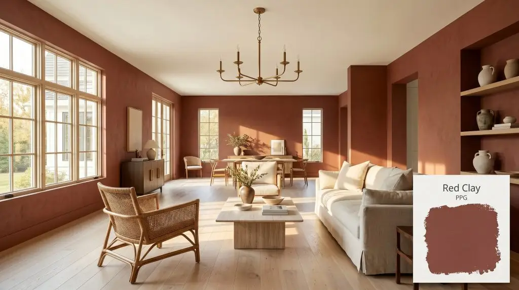
Red Clay PPG16-32
PPGPPG Red Clay (PPG16-32) is a dark, subdued, earthy red-orange with a dusty pink and brown undertone. Boasting an LRV of 11, this warm terracotta hue brings a grounded, fired-brick aesthetic to interiors and exteriors alike.
Paint Technical Profile
| Color ID / SKU | PPG16-32 |
| HEX Code | #89483e |
| Light Reflectance (LRV) | 11 |
| Use | Interior, Exterior |
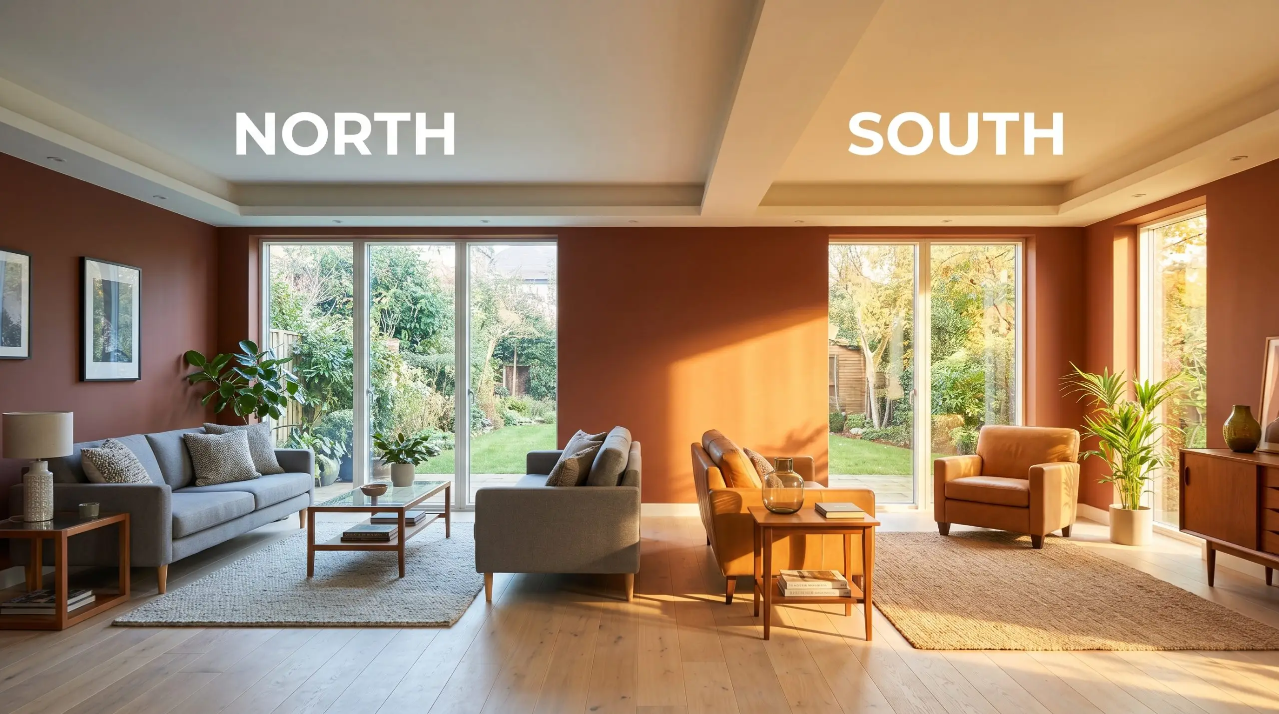
| Best Exposures | South, West |
| Best For | Dining rooms, exterior accents, kitchen islands, cozy dens, mudrooms |
PPG Red Clay: How to Style This Sun-Baked Terracotta Paint
Some paint colors sit quietly in the background, but others immediately change the emotional temperature of a room. PPG Red Clay acts as a rich, tactile layer that brings the raw warmth of sun-baked ceramics directly onto your walls. It offers a sophisticated departure from stark whites and predictable grays, wrapping a space in a comforting, earthy embrace.
This specific hue thrives on its complex pigmentation, feeling incredibly intentional and custom-built even in the most standard residential spaces. By relying on a highly muted color structure, it delivers vibrant energy without ever overwhelming the eye. Whether you are aiming for a refined biophilic design or simply want to inject a sense of history into a newer build, this terracotta tone provides a masterful foundation.
Understanding how this color is physically constructed is the secret to unlocking its full potential. Because it interacts so dynamically with natural light and surrounding materials, you have to treat it as an active architectural element rather than just a simple backdrop. Let’s break down the exact undertones and lighting behaviors that make this paint so transformative.
The Core DNA of PPG Red Clay: Undertones & LRV
If you are wondering whether this paint leans warm or cool, the answer is definitively warm. PPG Red Clay is built upon an earthy red-orange base that radiates a cozy, sun-baked energy throughout any space. However, it completely avoids the harsh, aggressive nature of a primary red thanks to a highly specific blend of underlying pigments.
To truly understand this terracotta color structure, we have to look at the hidden tones working beneath the surface:
The LRV Translation: With an Light Reflectance Value (LRV) of 11, this color creates a dense, enveloping atmosphere. It features low LRV light absorption, meaning it drinks in ambient illumination rather than bouncing it around the room. This low reflectance is exactly what turns a standard wall into a moody, warm architectural finish that feels incredibly rich and substantial.
Because an LRV of 11 absorbs so much light, you must introduce strategic contrast to keep the room feeling dynamic. Pair this paint with highly reflective materials like polished unlacquered brass, glossy zellige tiles, or a crisp, creamy white ceiling to maintain visual balance.
Hackrea Pro-Tip (The Contrast Strategy)
How Light Alters This Muted Clay Tone
This paint is a true chameleon, shifting its personality dramatically depending on the direction and temperature of your light source. Because of its complex pink and brown undertones, the time of day will dictate exactly which version of the color you experience.
Here is exactly how you can expect the hue to behave across different lighting scenarios:
Never mix warm and cool artificial lighting in a room painted with this color. The competing light temperatures will cause the paint to look muddy and confused, destroying the intentional, curated aesthetic you are trying to achieve.
Clash Warning (The Bulb Temperature Rule)
Popular Real-World Applications
Understanding the numerical data behind a paint color is only half the battle; the real magic happens when you apply it to your architecture. Because this muted clay tone is so adaptable, it can completely redefine the function and mood of various spaces within your home. Here is how to strategically deploy this terracotta hue for maximum design impact.
Dining Rooms
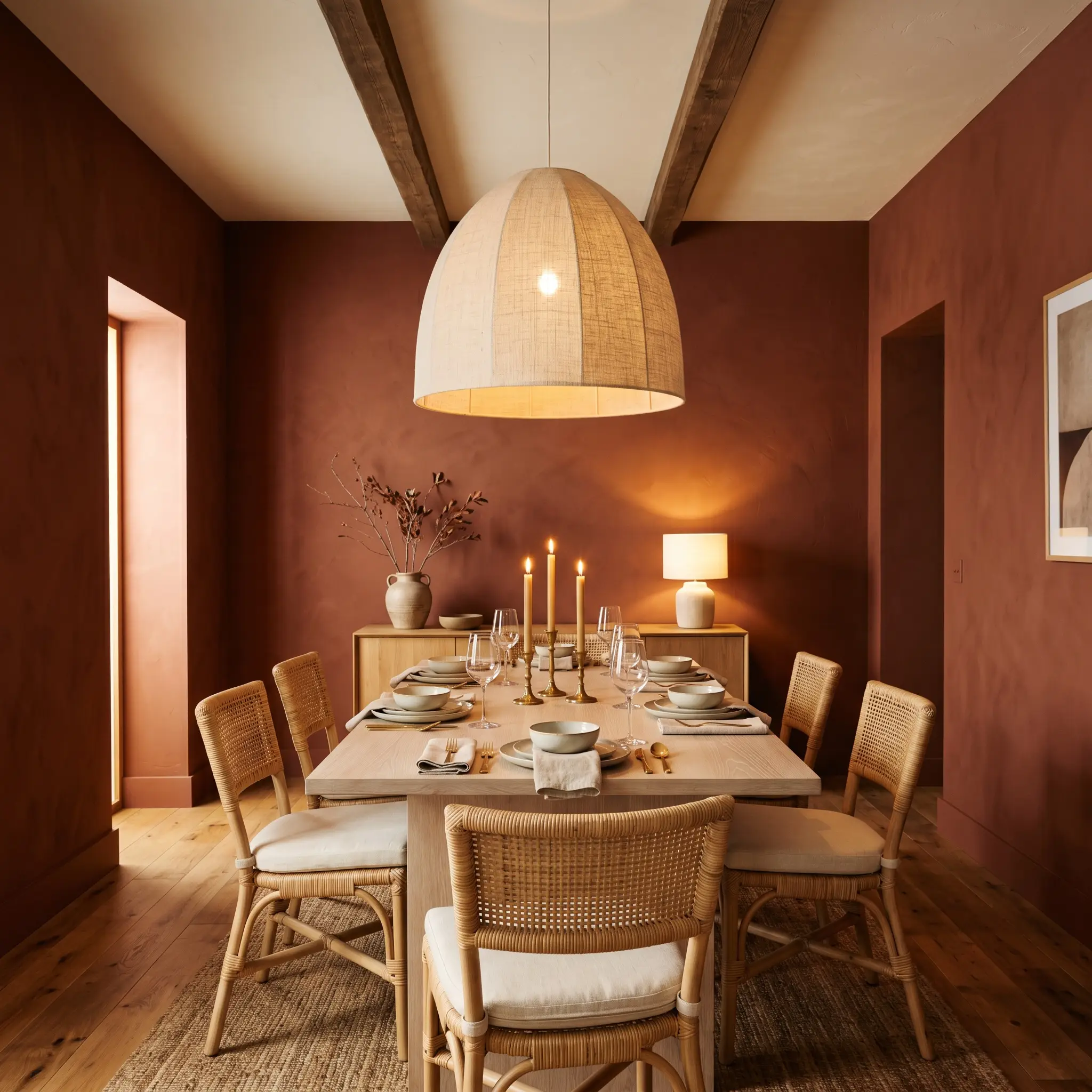
Dining spaces are naturally suited for immersive, conversational colors, making this the perfect environment for a grounding accent wall or a fully wrapped room. When applied to all four walls, the paint cultivates an intimate, candlelit atmosphere that encourages guests to linger long after dinner is finished.
To prevent the room from feeling overly traditional, lean into an Organic Modern aesthetic by introducing raw, tactile materials. Pair the rich walls with a bleached white oak dining table, woven rattan chairs, and an oversized linen pendant light. This combination of earthy paint and relaxed, natural textures creates a highly curated space that feels both sophisticated and effortlessly welcoming.
Kitchen Islands and Lower Cabinets
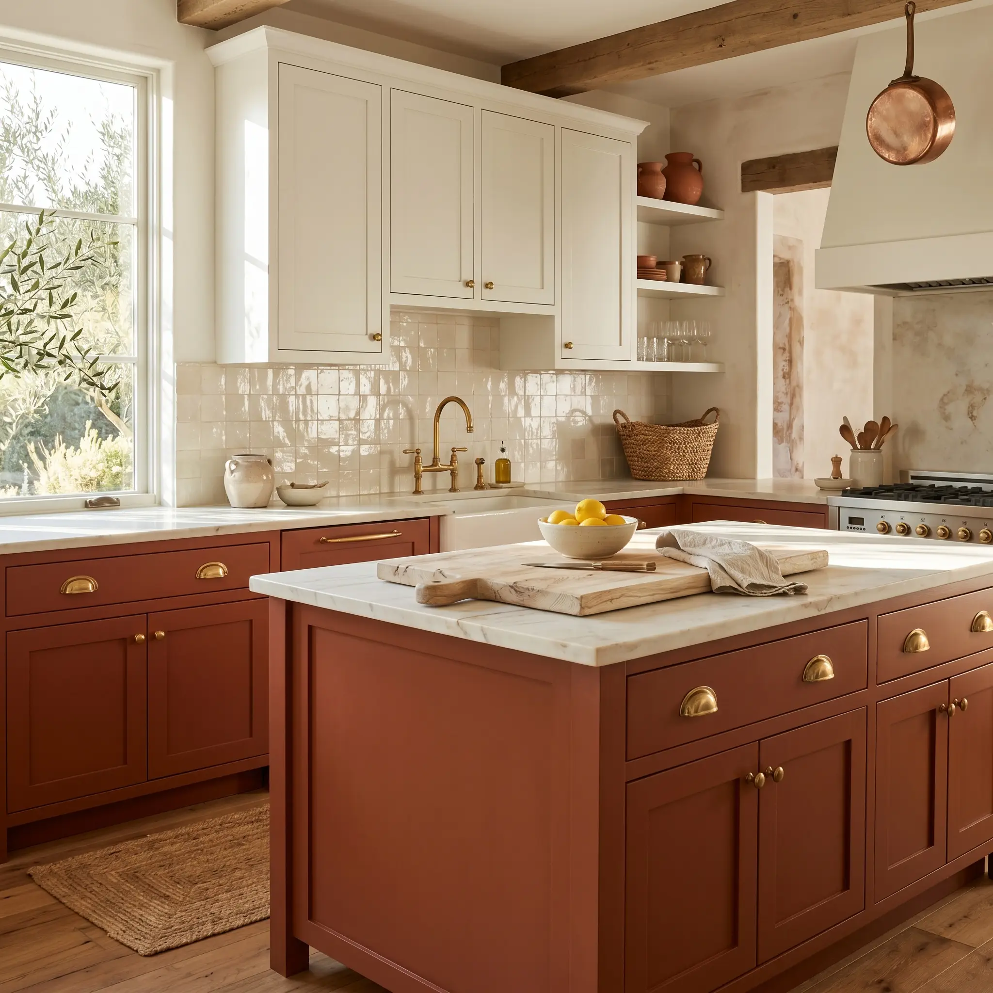
If you are hesitant to commit to vibrant walls, using this color on your lower cabinetry or a central kitchen island is a brilliant compromise. The rich, earthy pigment establishes a gorgeous visual foundation, allowing your upper cabinets and countertops to feel light and airy.
This application shines beautifully in a Mediterranean Rustic design scheme. Enhance the baked-clay warmth by installing unlacquered brass cup pulls and pairing the cabinetry with a backsplash of creamy, irregular zellige tiles. The glossy texture of the tile will bounce light around the room, perfectly offsetting the dense, light-absorbing nature of the painted wood.
Cozy Dens and Libraries
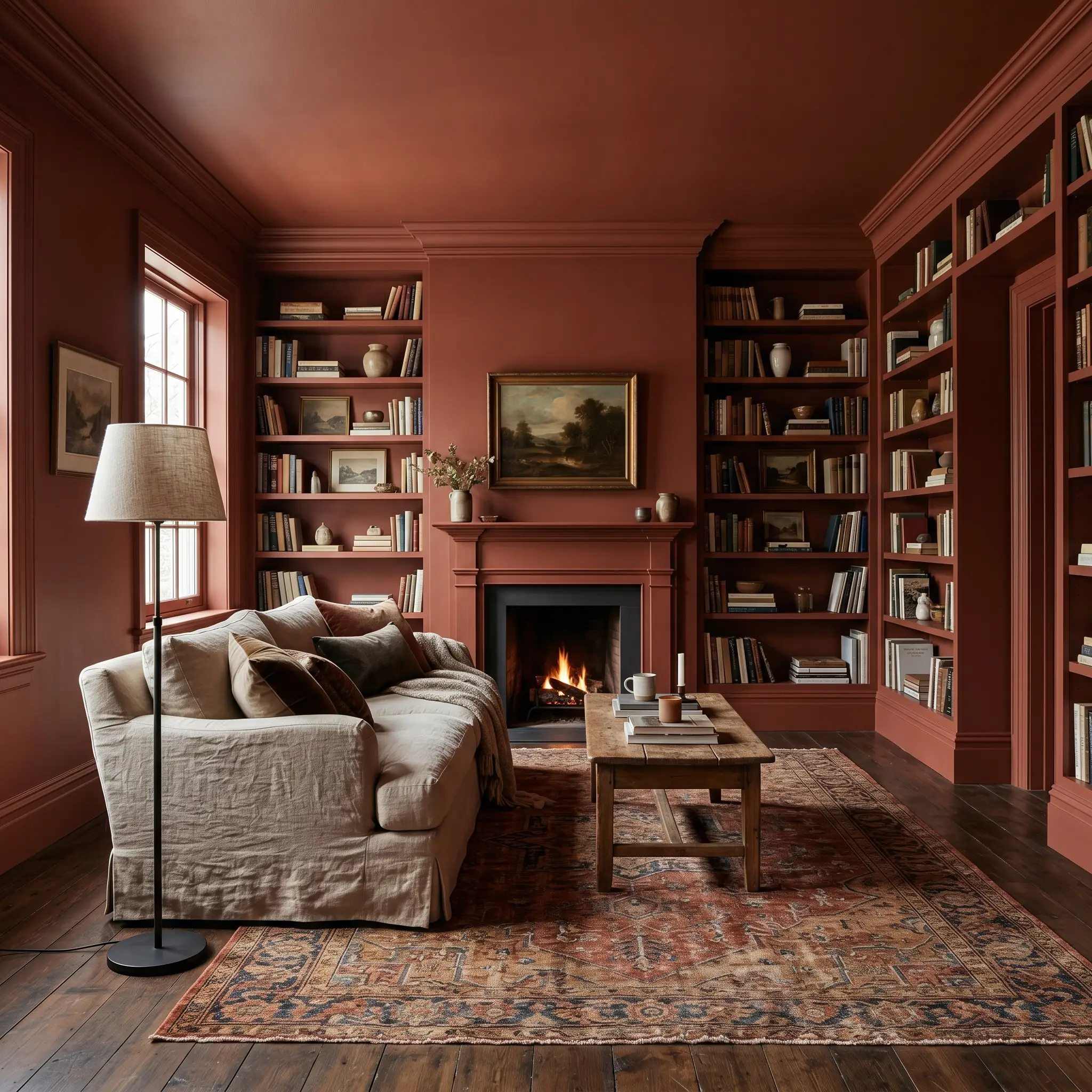
For a remote worker needing a focused retreat or a family wanting a dedicated reading room, this color offers incredible psychological comfort. Take an immersive approach by color-drenching the entire space—painting the walls, baseboards, crown molding, and built-in bookcases in the exact same finish.
This continuous application erases visual boundaries, making the room feel like a seamless, enveloping jewel box. Style the space with a Vintage Eclectic mindset by rolling out a distressed, tonal rug, adding a slipcovered sofa in washed linen, and incorporating a matte black iron floor lamp for a touch of modern contrast.
Exterior Doors and Shutters
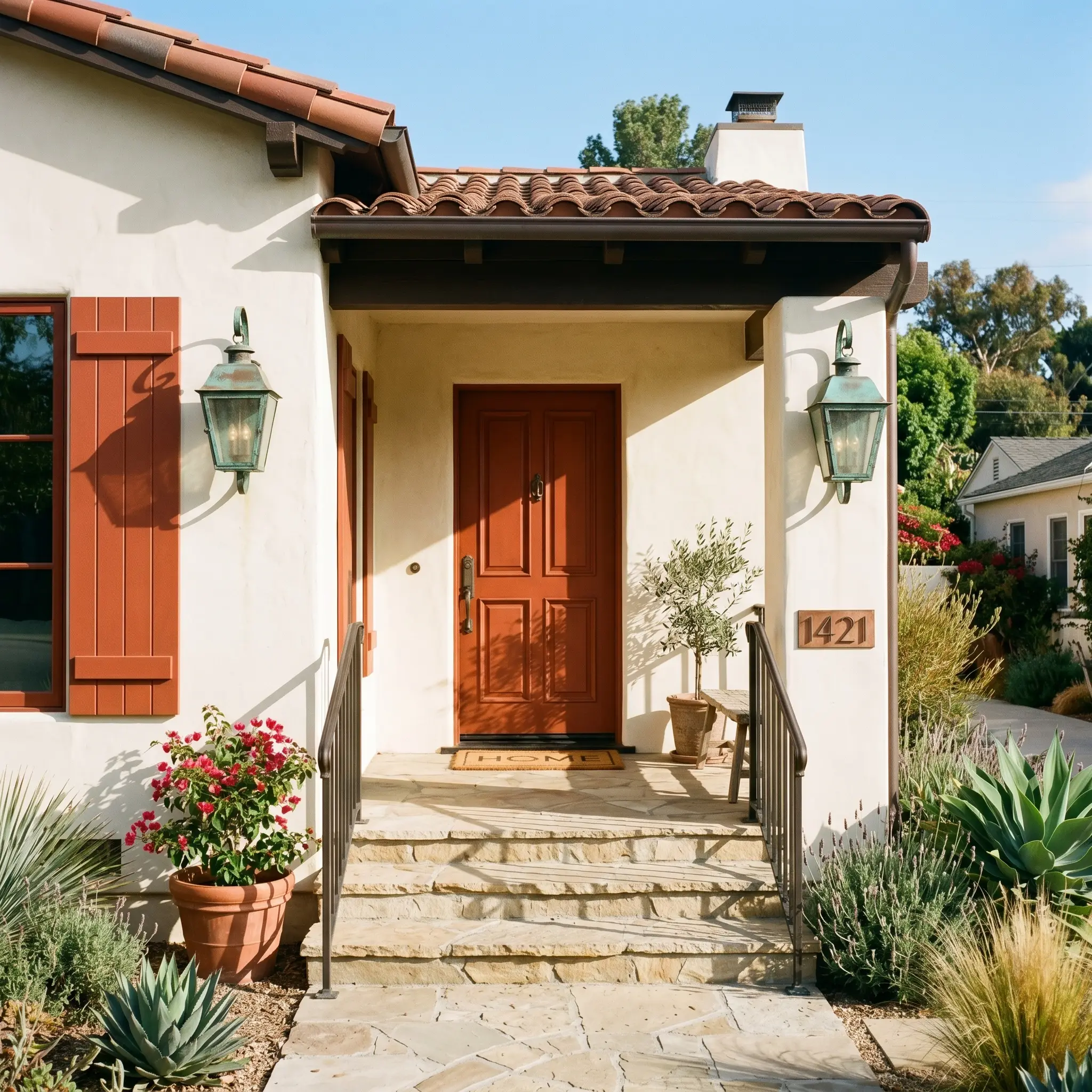
Taking this color outside is a fantastic way to boost your home’s curb appeal with a welcoming, classic Southwestern palette. However, you must account for the intense power of direct exterior sunlight, which will naturally wash out the pigment and amplify the red-orange base.
To ensure the color remains sophisticated on your facade, pair it with the right exterior materials. This fired brick hue looks exceptionally striking against warm, creamy white stucco, natural limestone siding, or weathered cedar shingles. Finish the look with oversized, oxidized copper sconces flanking the doorway to highlight the paint’s rustic, historic undertones.
High-Traffic Mudrooms
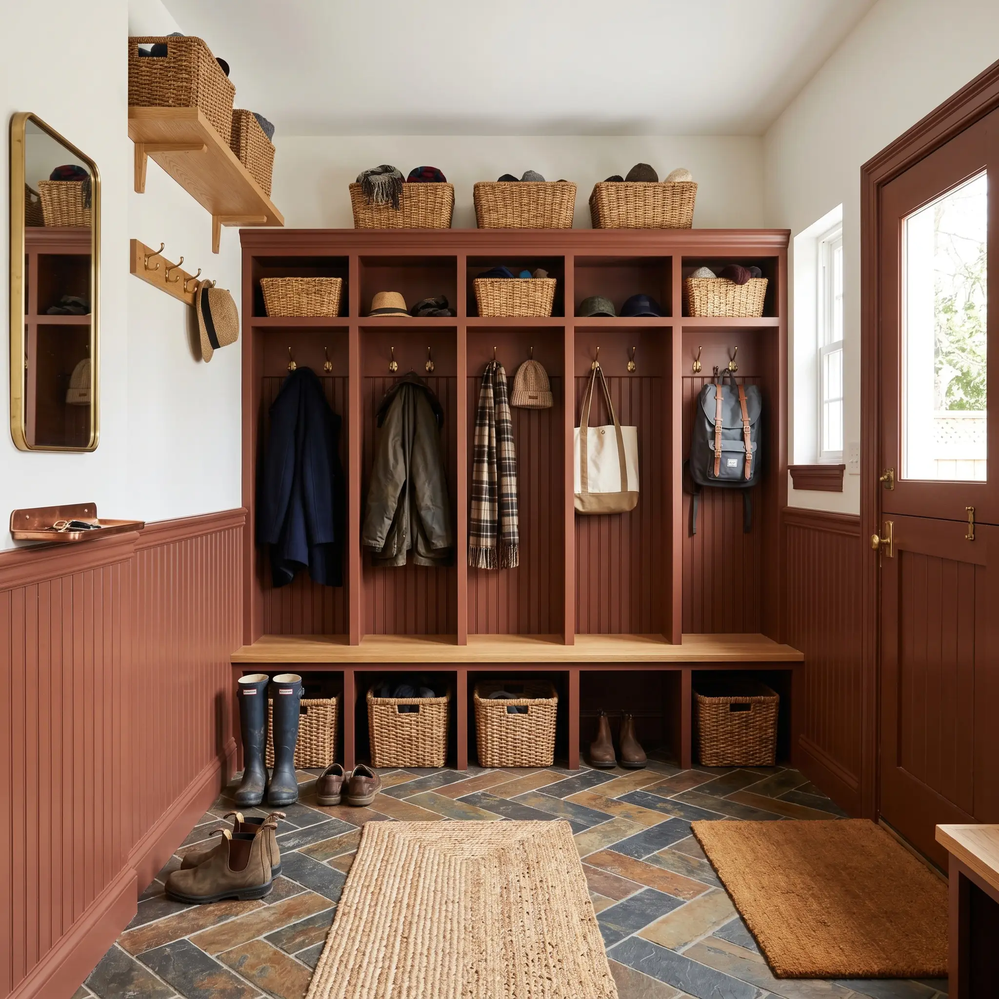
Mudrooms are hardworking, utilitarian spaces that often lack intentional design, making them the perfect canvas for a bold color intervention. Applying this rich terracotta to beadboard wainscoting or built-in storage lockers instantly elevates the room from a simple drop-zone to a beautiful architectural feature.
Because it is a substantially muted, darker shade, it is incredibly forgiving when it comes to hiding everyday scuffs and dirt from a busy household. Keep the upper half of the walls a crisp, warm white to maintain a sense of height, and introduce practical styling like woven storage baskets, brass coat hooks, and a durable slate tile floor.
Crafting the Perfect Palette for PPG Red Clay
Because this rich pigment carries such a dense, light-absorbing profile, it requires distinct architectural boundaries to prevent the room from feeling visually muddy. Rather than letting this terracotta color structure bleed seamlessly into other spaces, you must use contrasting trim and highly intentional material pairings to give the hue a tailored, deliberate shape.
Choosing the Right Architectural Trim
Selecting the right white for your baseboards, crown molding, and door casings will dictate how modern or historic this paint ultimately feels. You need a trim color that harmonizes with the dusty pink undertone without leaning so yellow that it creates a sickly contrast.
Tactile Materials and Hardware Finishes
The most successful rooms treat paint as just one layer of a larger tactile experience. To truly elevate this muted clay tone, you must introduce materials that either bounce light to counteract its density or offer organic textures that lean into its earthy nature.
Secondary Paint Pairings
Building a cohesive whole-home color scheme requires secondary shades that balance the intense warmth of your primary walls. The following colors interact beautifully with this fired brick hue, either by cooling it down or enhancing its organic nature.
Curated Styling Aesthetics
To help you visualize how these individual elements come together, we have designed two distinct aesthetic pathways. These curated styling directions prove that this specific pigment can easily shift its personality based entirely on the surrounding decor.
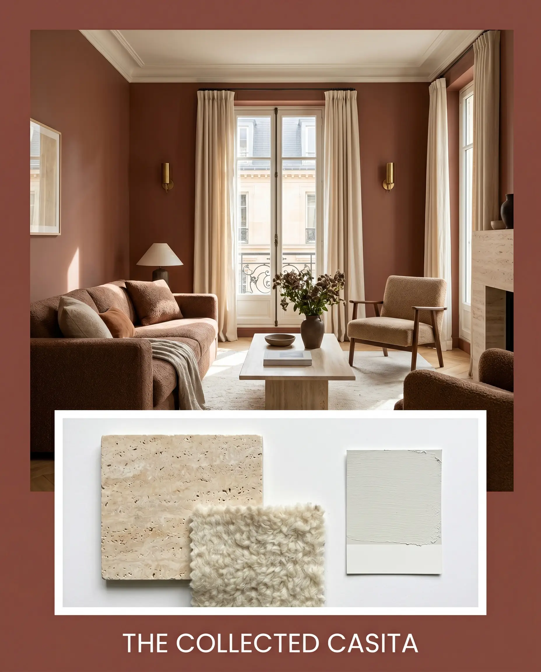
The Collected Casita This aesthetic leans into a relaxed, sun-drenched European vibe that feels effortlessly curated over decades. Anchor the room with honed travertine accents and layer the space with nubby wool textiles in shades similar to PPG Aria. Incorporate unlacquered brass wall sconces to bounce warm light around the room, and finish the styling with hand-thrown pottery and oversized branches in minimalist ceramic vases. The resulting energy is incredibly grounded, organic, and perfectly imperfect.
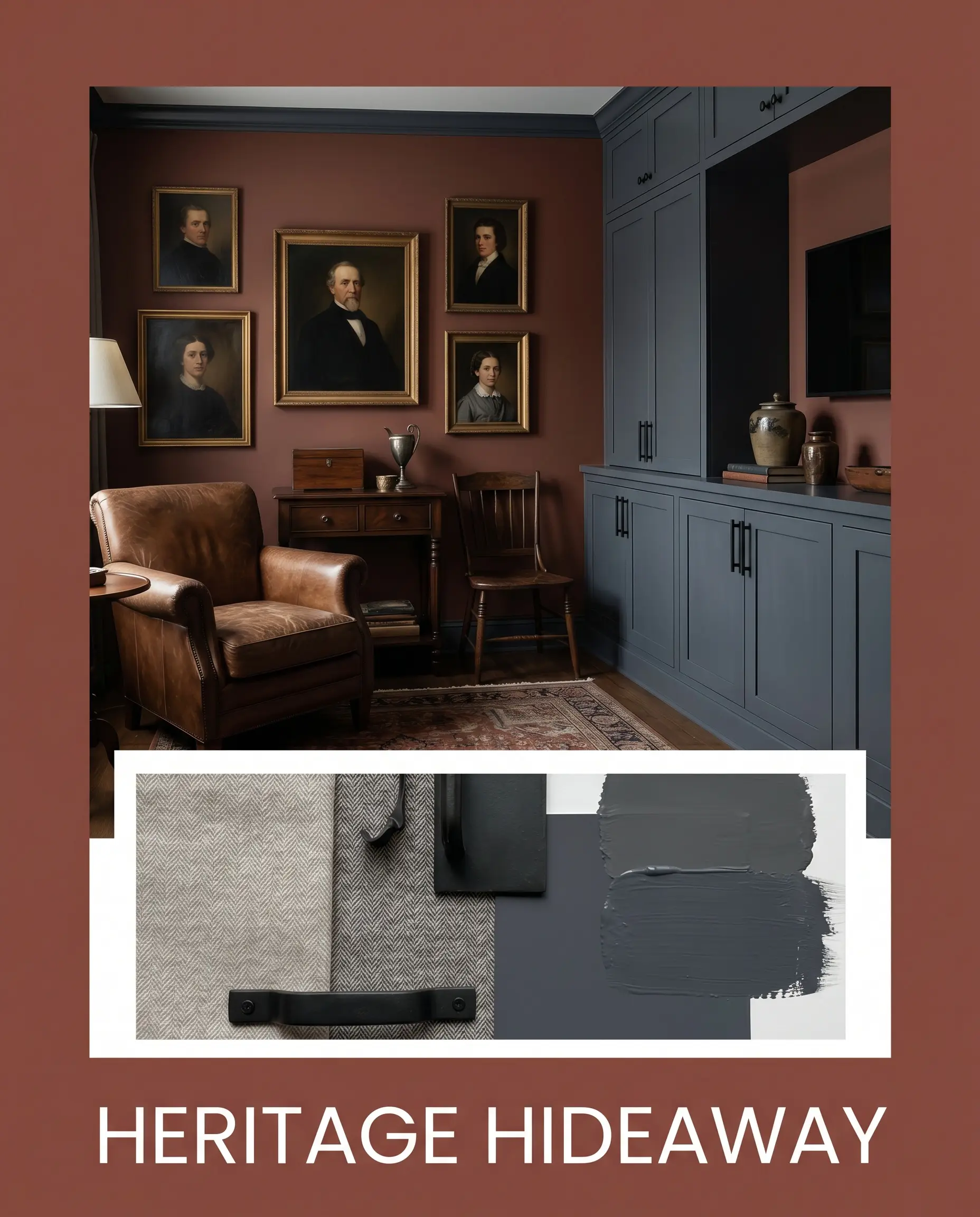
Heritage Hideaway For a more tailored, moody atmosphere, this palette uses sharp contrast to elevate the earthy walls into a sophisticated retreat. Introduce Benjamin Moore Hale Navy on adjacent doors or built-in cabinetry to create a crisp, handsome boundary. Ground the vibrant walls with matte black iron hardware and layer in vintage oil portraits and classic subtle herringbone textiles. This combination pulls out the historic, dusty pink undertones, creating an environment that feels rich, intellectual, and deeply comforting.
Comparing This Fired Brick Hue to Rival Brands
When finalizing a color choice, it is crucial to test your leading options against one another to reveal their true underlying pigments. Depending on your home’s specific lighting exposure or your existing hard finishes, a rival shade might actually provide the exact structural balance you need.
PPG Red Clay vs. Sherwin-Williams SW 7701 Cavern Clay
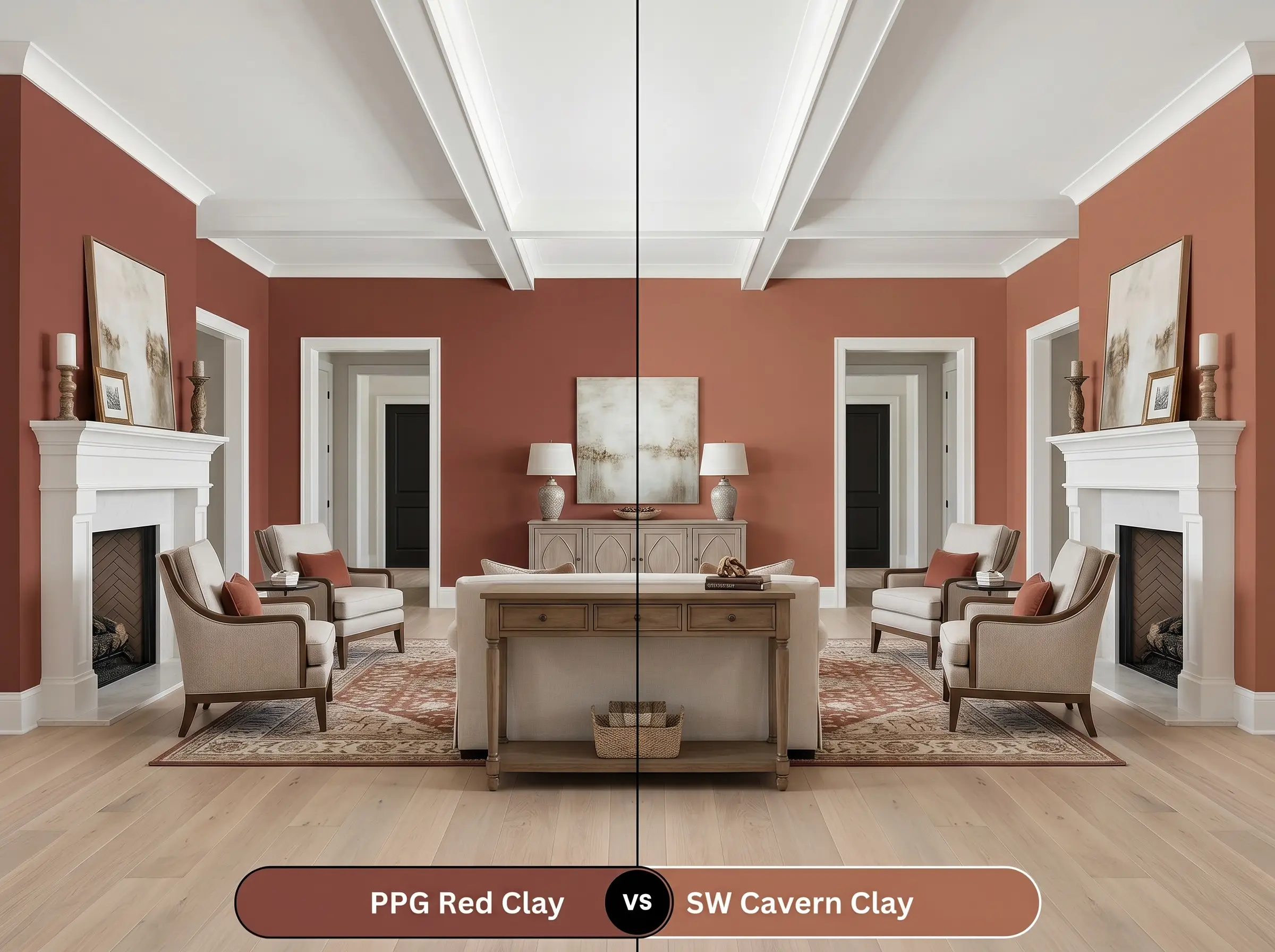
If you place these two side-by-side, you will immediately notice a significant shift in vibrancy. Cavern Clay SW 7701 carries a much brighter, more pronounced orange base that feels highly energetic and aggressively warm. If your room lacks natural light and needs a manufactured sunny glow, Sherwin-Williams is the better choice; however, if you prefer a shaded, historically muted clay tone, the PPG option remains far more sophisticated.
PPG Red Clay vs. Benjamin Moore HC-51 Audubon Russet
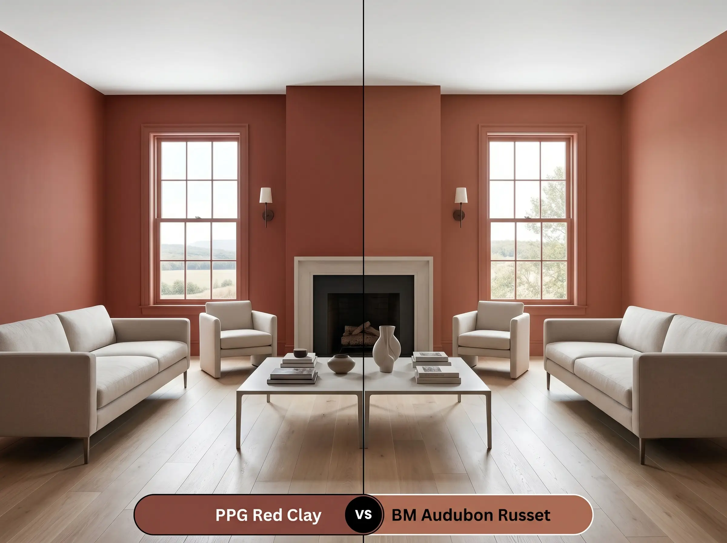
This comparison is a master lesson in identifying foundational undertones. Audubon Russet HC-51 is built upon a distinct yellow-brown base, giving it a golden, autumnal quality that pairs beautifully with traditional wood tones. In contrast, PPG’s formulation leans heavily into a dusty pink undertone, making it feel softer, slightly more romantic, and better suited for modern plaster-like applications.
PPG Red Clay vs. Farrow & Ball Red Earth No. 64
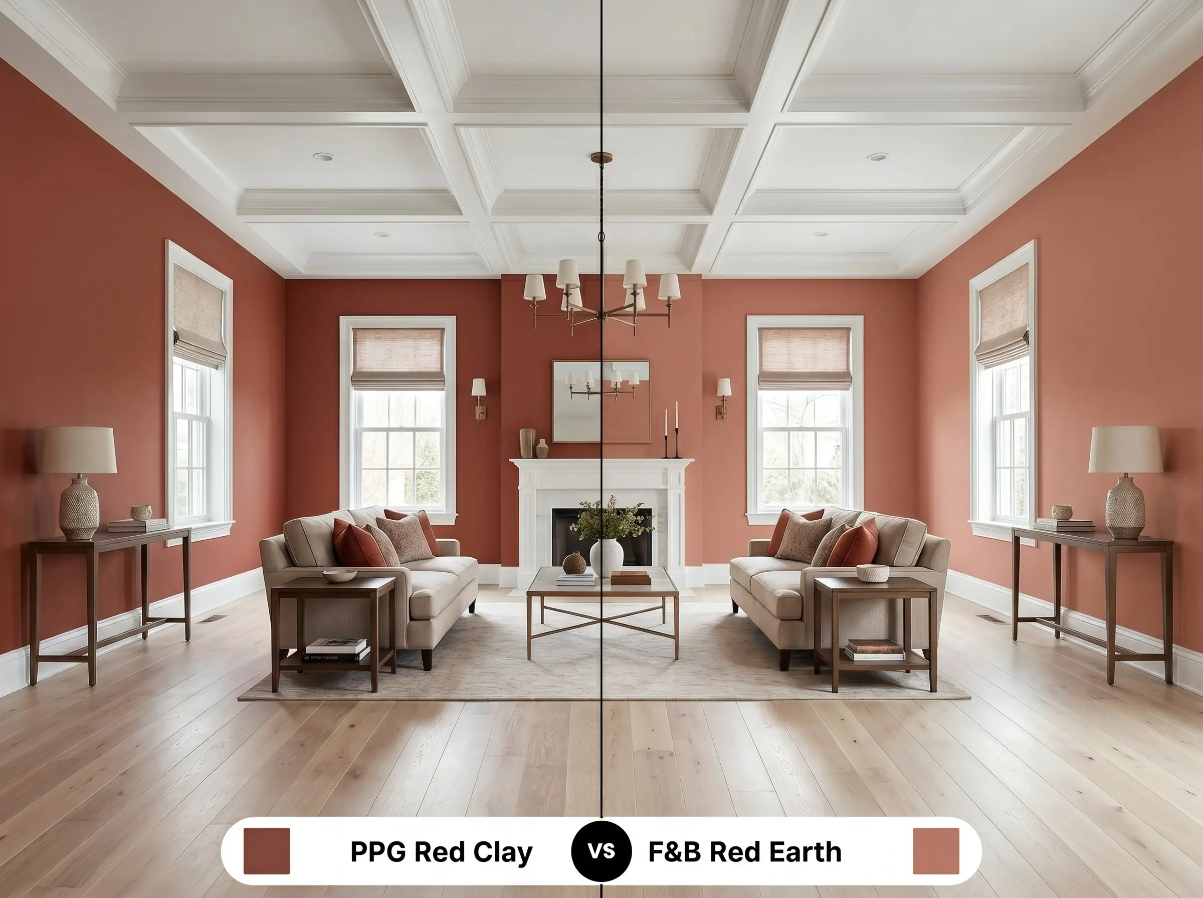
Here, the decision comes down entirely to light reflectance and visual density. Red Earth No. 64 is significantly lighter and reflects far more ambient light, resulting in a cheerful, airy terracotta that feels wonderfully uplifting. If you want a moody, light-absorbing architectural finish that wraps the room in shadows, you must stick with the darker, denser profile of the PPG hue.
Alternative Options to This Earthy Red-Orange
Sometimes a color is almost perfect, but your specific room requires a minor adjustment in depth or intensity to truly sing. Whether you need to stay within the same manufacturer or match a tone from a different store, here are the closest relational alternatives.
Shifts Within the Same Brand
Competitor Brand Matches
Professional Execution and Paint Finishes
Transitioning this rich pigment from a digital swatch to a flawless physical wall requires specific application strategies. Darker, highly saturated colors demand careful preparation and the correct finish to ensure the final result looks intentional and premium.
Selecting the Ideal Sheen
Primer and Coverage Expectations
You cannot apply a color with this much red pigment directly over a stark white wall or builder-grade beige and expect a perfect finish. You must use a high-quality, gray-tinted primer to provide a neutral base that helps the dark terracotta adhere and show its true depth.
Deep, saturated hues are notorious for “flashing”—a frustrating issue where uneven roller pressure leaves visible, shiny streaks as the paint dries. To avoid this, maintain a wet edge while rolling, apply the paint generously, and plan for a strict minimum of two to three coats for a truly professional, opaque result.
Hackrea Pro-Tip (The Flashing Warning)
Answering Your Top Application Questions
Because of its low light reflectance, this shade looks incredibly organic on highly textured surfaces like stucco, where the shadows deepen the earthy brown notes. On smooth siding, the color will appear slightly brighter and more uniform, pulling the red-orange base forward in direct sunlight.
Absolutely, as long as you lean into the moodiness rather than fighting it. By color-drenching the windowless space and adding warm, layered artificial lighting, the dense pigment transforms the room into a cozy, intentional jewel box rather than a cramped closet.
It actually harmonizes beautifully with red oak. The underlying pink and brown tones in the paint effortlessly bridge the gap with the warm, reddish grain of the wood, creating a cohesive, deeply grounded foundation for the room.
Warm metallics are the ultimate pairing for this hue. The golden, reflective surface of unlacquered brass slices through the dense, light-absorbing paint, providing a necessary spark of contrast that elevates the entire aesthetic.
The Final Verdict on PPG Red Clay
PPG Red Clay is a masterful, highly intentional color choice for homeowners who want to introduce genuine warmth and character into their architecture. Its greatest strength lies in its perfectly calibrated brown foundation, which prevents the earthy red-orange from ever feeling synthetic or overwhelming. This paint is absolutely perfect for spaces that crave intimacy—think candlelit dining rooms, enveloping studies, or rustic kitchen cabinetry. It thrives in homes that embrace an Organic Modern, Mediterranean, or Vintage Eclectic style, rewarding those who pair it with raw, tactile materials like honed stone and woven textiles.
However, you must respect the specific lighting and material demands of this dense pigment. If your home is heavily outfitted with cool, icy gray luxury vinyl plank flooring or stark, blue-toned LED lighting, this paint will actively fight its environment. The cool undertones of those elements will instantly turn this beautiful, sun-baked terracotta into a muddy, confused brown. To succeed with this hue, you must fully commit to a warm, organic palette, allowing its rich history and comforting depth to truly anchor your home.