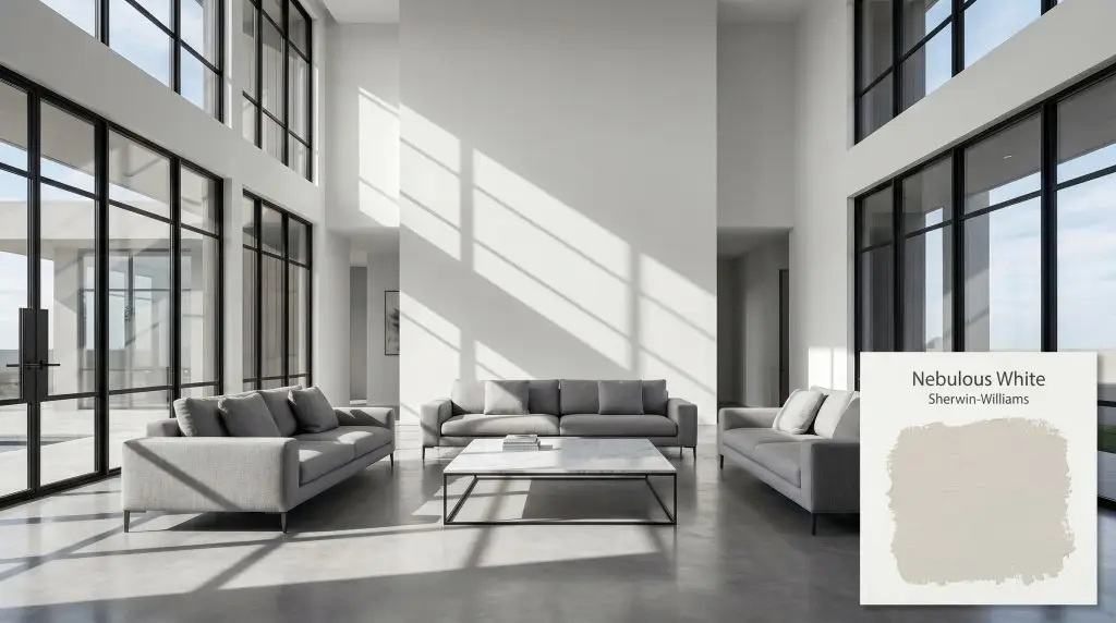
Sherwin-Williams Nebulous White (SW 7063) is a crisp, cool white with distinct gray and blue undertones. With an LRV of 74, it acts as a very light gray that brings a refreshing, airy feel to south-facing rooms, but can shift baby blue in cooler lighting.
Will Nebulous White clash with your room?
Paint Technical Profile
| Color ID / SKU | SW 7063 |
| HEX Code | #DEDFDC |
| Light Reflectance (LRV) | 74 |
| Temperature | Cool |
| Primary Undertone | Gray |
| Hidden Undertones | Blue And Icy Purple |
| Use | Interior, Exterior |
| Best Exposures | South-facing, West-facing |
| Best For | Modern living rooms, airy bedrooms, exterior siding, bathroom vanities, ceilings |
Nebulous White Digital Design Concept Boards
Modern living rooms
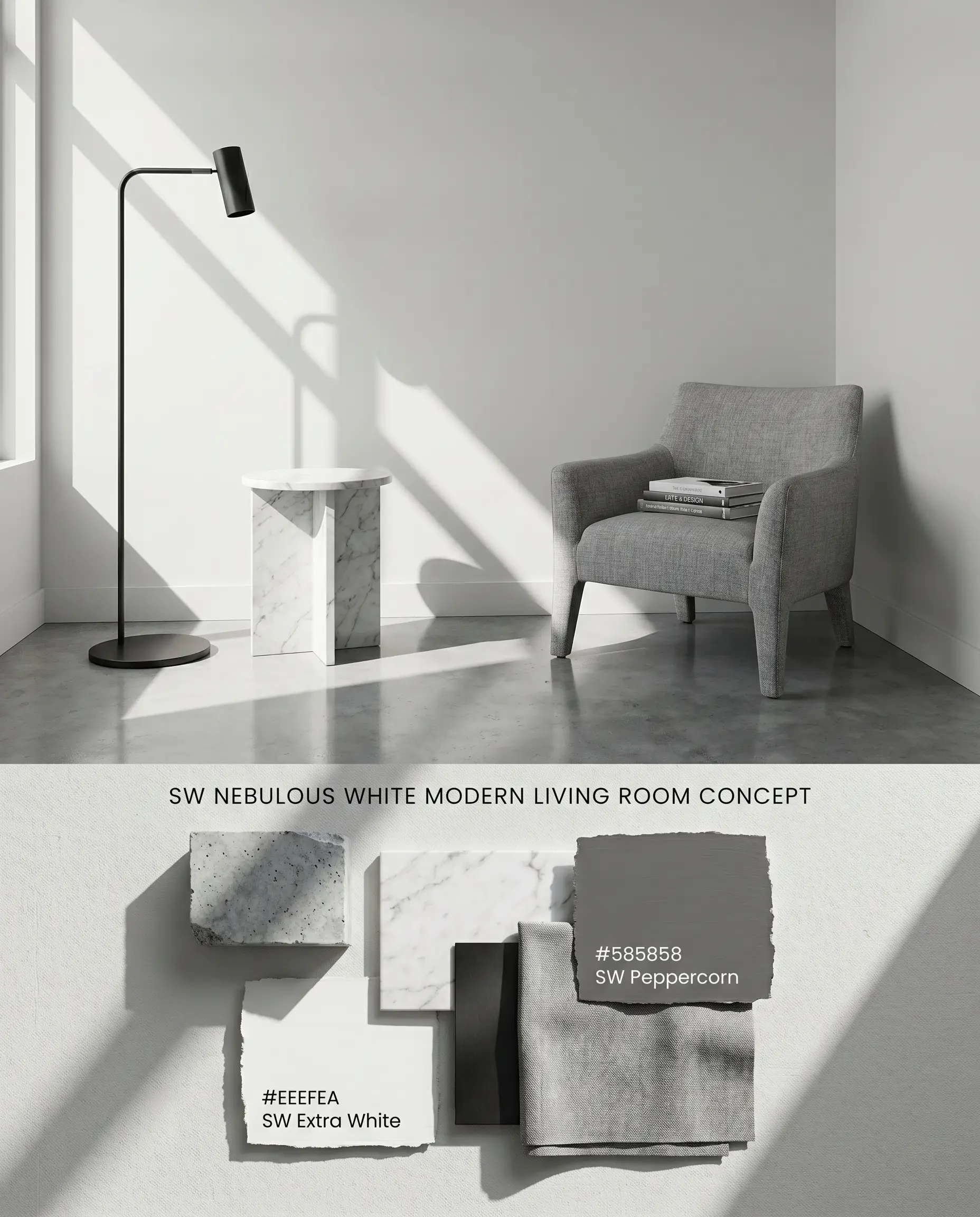
In expansive living areas, this cool white operates as a crisp, structural backdrop that sharpens the edges of contemporary furniture. By pairing it with matte black steel fixtures and cool-toned concrete, the subtle blue undertones retreat, allowing the room’s architectural lines to dominate. The high LRV 74 actively pushes light across the floor plan, expanding the visual footprint without relying on stark, sterile gallery whites.
South-facing bedrooms
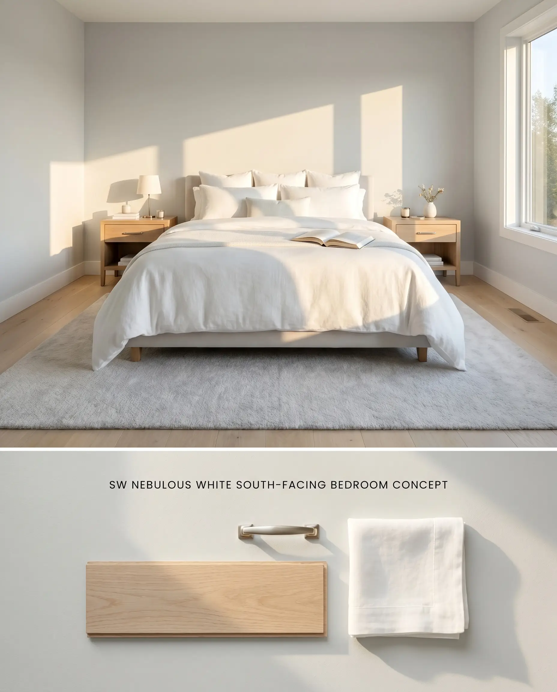
Abundant Southern sunshine naturally warms the inherent chill of this icy gray, neutralizing its blue cast into a balanced, refreshing neutral. Layering crisp white linens and cool, pale walnut tones softens the high-contrast chromatic profile while maintaining a serene, modern aesthetic. The resulting environment feels tailored and expansive, utilizing the natural light to stabilize the color temperature.
Exterior siding
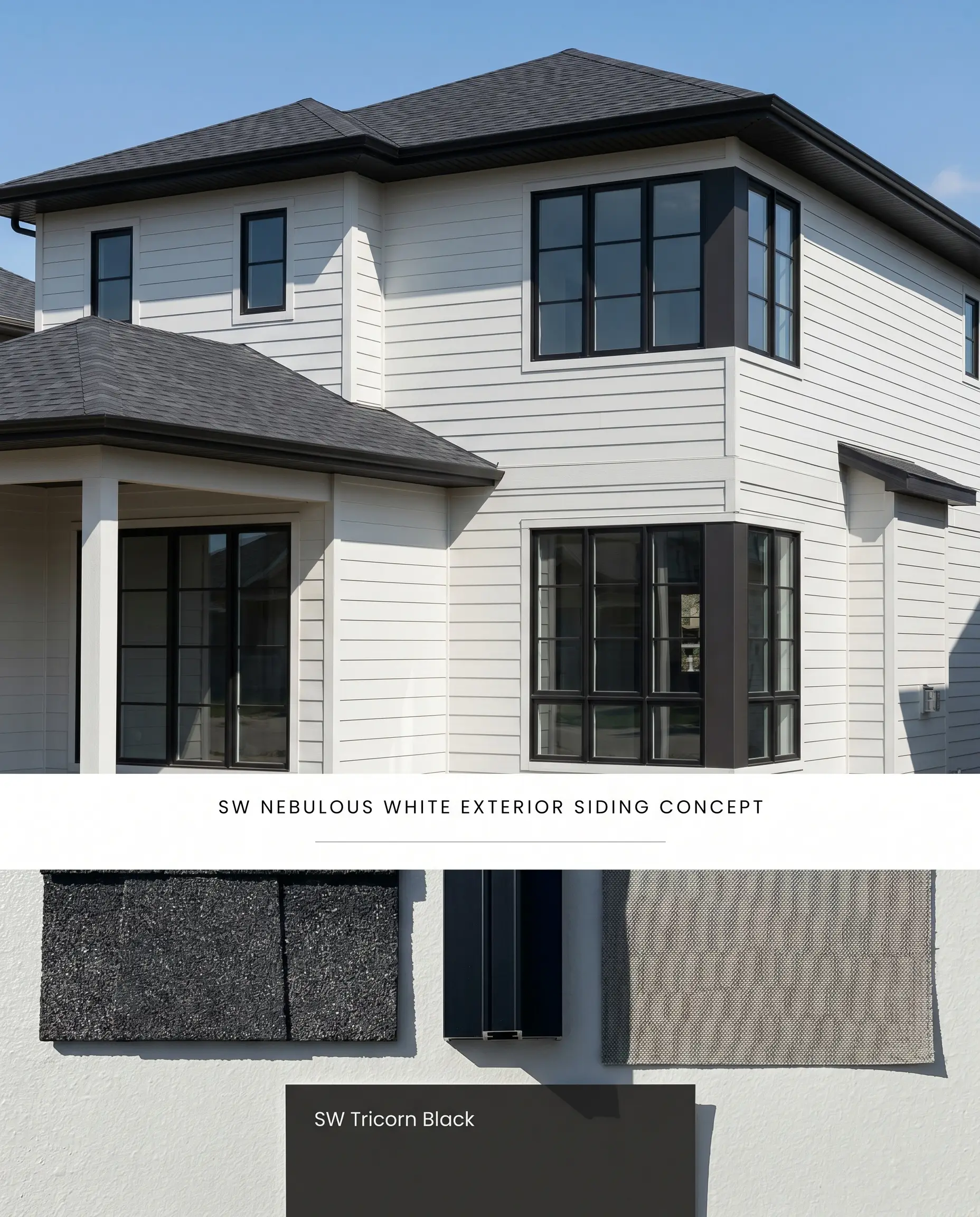
Under intense, direct sunlight, the color structure of this tint washes out slightly, presenting as a brilliant, stark white with just enough gray to prevent blinding glare. Pairing it with dark charcoal roof shingles and sharp black window mullions creates a high-contrast facade that defines the architectural geometry. Transitioning over existing dark siding mandates a high-quality tinted primer to prevent the old shade from muddying the delicate cool cast.
Ceilings
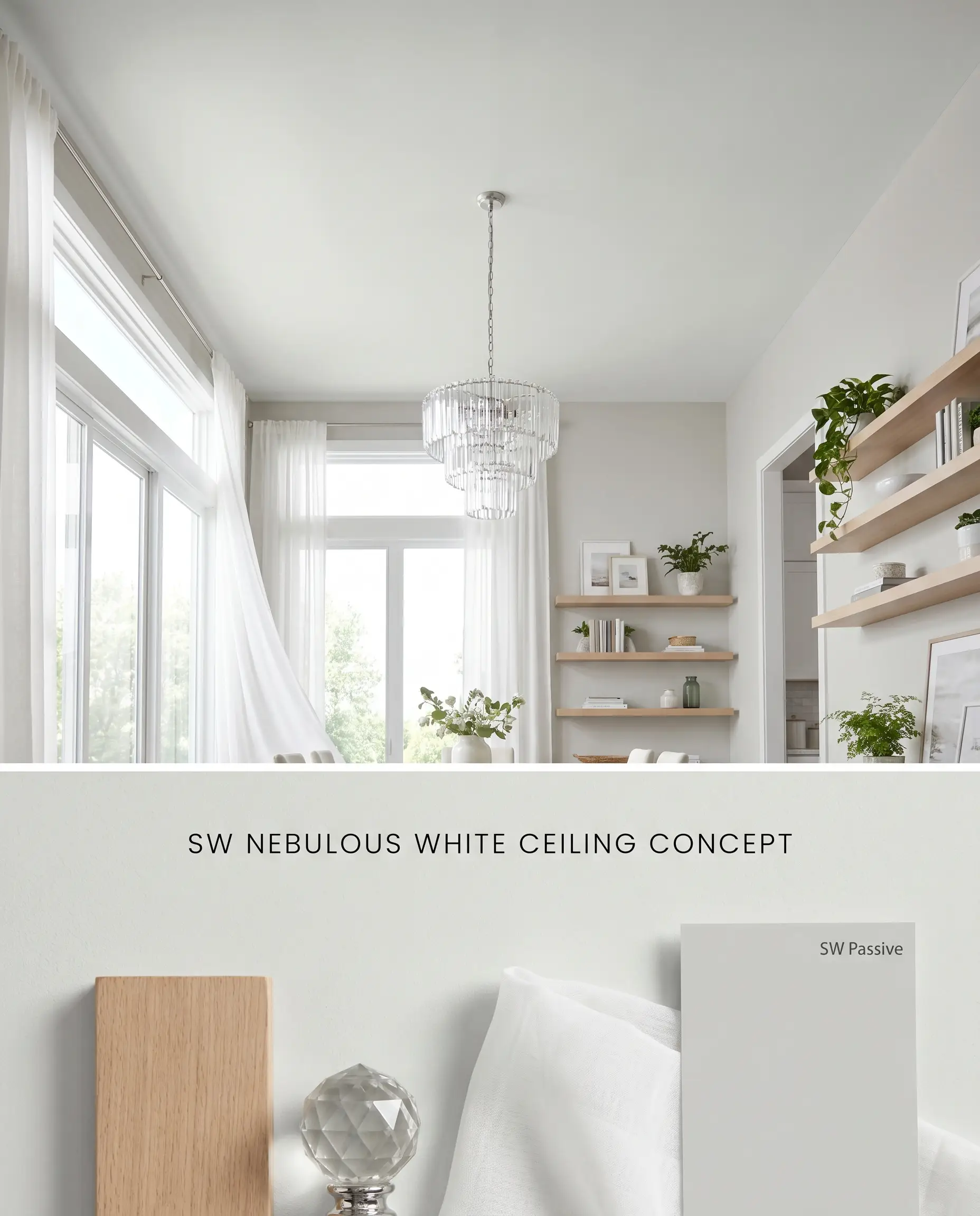
Applying this cool white overhead visually raises the roofline by mimicking the recession of a clear sky. In rooms with abundant natural light, the subtle blue undertones pull the eye upward, breaking the monotony of standard ceiling white. It requires careful pairing with equally cool-toned wall colors to maintain a cohesive, temperature-matched envelope.
Bathroom vanities
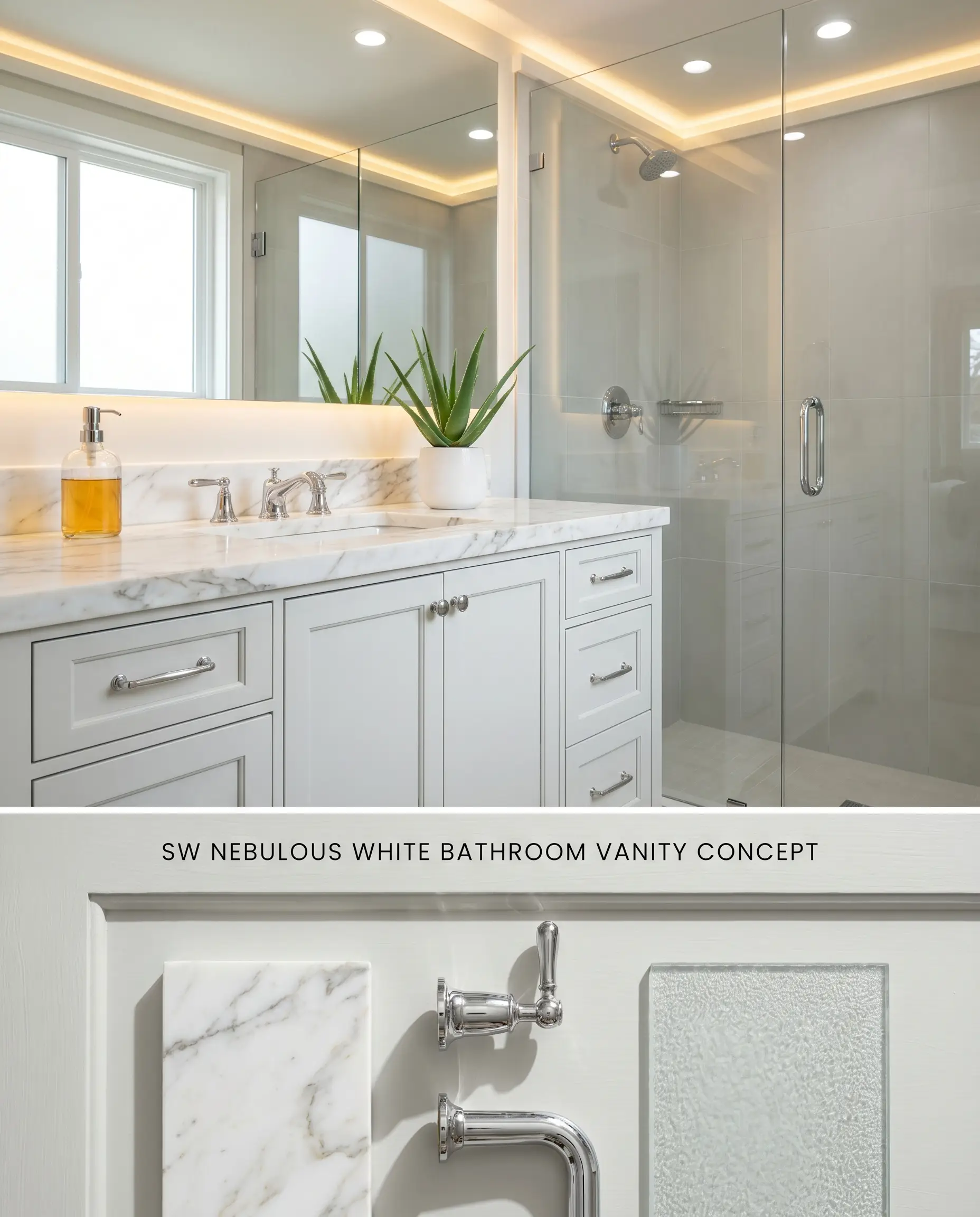
As a cabinetry color, this icy gray provides a crisp, sanitary aesthetic that pairs flawlessly with cool-veined marble countertops and polished chrome fixtures. The rigid color structure cuts through the humidity of a wet room, anchoring the space with a tailored, architectural finish. It demands a high-lumen lighting plan to prevent the color from flattening out in the shadows of the vanity alcove.
Chromatic Profile Comparisons
Sherwin-Williams Nebulous White vs. Sherwin-Williams Passive SW 7064
With an LRV of 74, Nebulous White is significantly lighter and more reflective than SW 7064 Passive (LRV 60). Passive contains more physical gray pigment, anchoring it firmly as a cool gray, whereas Nebulous acts as a highly reflective cool white with icy undertones. Use Nebulous to expand tight, south-facing spaces, and deploy Passive when you need a stronger, more grounded contrast against stark white trim.
Sherwin-Williams Nebulous White vs. Sherwin-Williams Snowbound SW 7004
Sherwin-Williams Snowbound SW 7004 (LRV 83) relies on a warm, slightly pink-taupe base, contrasting sharply with the icy blue-gray cast of Nebulous White. Snowbound harmonizes effortlessly with warm wood floors and yellow-dominant creams, whereas Nebulous actively clashes with those materials, turning them orange by comparison. Specify Snowbound for transitional spaces with earthy elements, and reserve Nebulous for strict, modern applications featuring concrete and chrome.
Sherwin-Williams Nebulous White vs. Benjamin Moore Gray Owl OC-52
Benjamin Moore Gray Owl OC-52 (LRV 65.77) is a deeper gray that carries a distinct green-yellow undertone, making it highly reactive to shifting light. Nebulous White remains strictly in the blue-gray spectrum. If your room features dense greenery outside, Gray Owl will amplify that foliage, while Nebulous will bounce it into an unexpected minty teal. Choose Nebulous for a cleaner, bluer cooling effect in direct southern light, and Gray Owl for spaces needing a touch of earthy warmth.
Color Structure Technical FAQs
Yes, in North-facing rooms or under cool daylight LED bulbs (4000K+), the color is notorious for flashing a distinct baby blue or icy lavender. To neutralize this effect, it requires warm, South-facing light or 3000K artificial lighting.
Yes, pairing this hue with honey oak or warm earthy tones creates a stark, unflattering contrast. The cool blue base of the paint will look aggressively blue, while the yellow-orange tones in the wood will be artificially amplified.
In North-facing rooms, the indirect, cool light exaggerates its blue undertones, often turning it icy or lavender. In South-facing rooms, the intense, warm sunlight balances the chill, rendering it as a crisp, refreshing, and balanced cool white.
Paint Aesthetic & Practical Analysis
| Profile | Analysis | |
|---|---|---|
| Aesthetic | Nebulous White is a beautiful, airy color if you want a crisp, modern aesthetic. However, it requires careful lighting consideration. If you aren't prepared for its icy blue-gray shifts in north-facing rooms, it might feel too chilly. It shines best when balancing out intense, warm southern light. | |
| The Coverage Catch | As a highly reflective tint, it generally covers well, but transitioning over dark or highly saturated warm colors will require a high-quality tinted primer to prevent the old shade from altering its delicate cool cast. | |
| The Lighting Shift | This is its biggest quirk: in North-facing rooms or under cool daylight LED bulbs (4000K+), Nebulous White is notorious for flashing 'baby blue' or icy lavender. | |
| The Clash Warning | Avoid pairing this hue with yellow-heavy creams, warm earthy tones, or honey oak cabinets. The stark contrast will make the paint look aggressively blue and the wood look orange. | |
| The Bounce Effect | In rooms with lots of green foliage outside, the green light bouncing in can mix with the blue base, creating an unexpected minty or teal cast on the walls. | |
| The Low Light Trap | In windowless bathrooms or hallways, it loses its crispness and can read as a flat, chilly, and somewhat sterile gray. | |
| The Touch Up | It touches up relatively well in flat or eggshell architectural finishes, but its high LRV means any sheen differences from touch-ups will be visible on large, well-lit walls. |
Real-World Inspiration Be the first to upload a real photo of Nebulous White!
No Photos Yet
Includes +20 First Upload Bonus!
Real Experiences
Insights from people who have used Nebulous White.No reviews yet
Be the first to share your experience with Nebulous White.
Earn 15 points instantly!
Closest Cross-Brand Equivalents
The absolute closest scientific color matches for Nebulous White across top paint brands.