Firenze AF-225
Benjamin MooreBenjamin Moore Firenze (AF-225) is a deeply saturated, earthy terracotta orange with a muted red-and-gold base. Part of the Affinity Collection, this warm hue boasts an LRV of 23.6, offering a grounded, organic aesthetic perfect for intimate dining rooms, libraries, or striking accent walls.
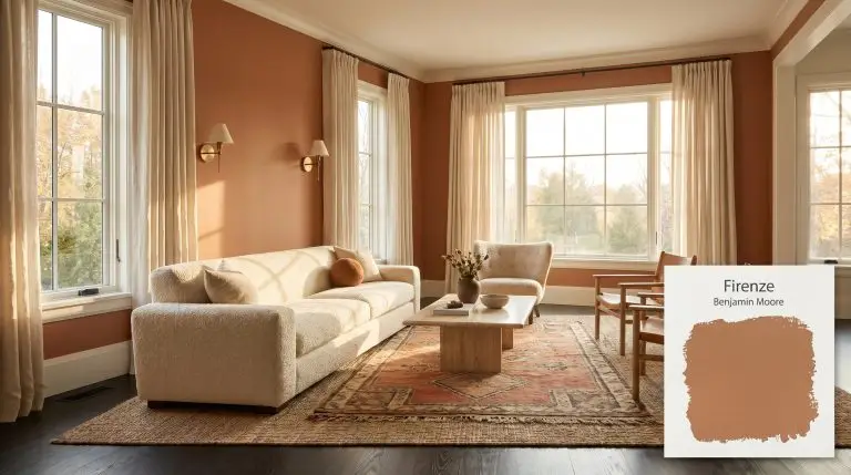
Benjamin Moore Firenze: Sculpting Interiors With Sun-Baked Terracotta
Some paints simply sit on the surface of drywall, but Benjamin Moore Firenze AF-225 behaves entirely like a structural material. Sweeping this saturated hue across a room feels less like a color update and more like applying a layer of sun-baked clay to your architecture. It possesses a raw, tactile energy that instantly turns flat, unremarkable walls into a warm architectural finish.
Temperature, Undertones & LRV of Benjamin Moore Firenze
If you are wondering whether Benjamin Moore Firenze leans warm or cool, the answer is a resounding, fiery warm. This shade operates as a beautifully organic tone within the Affinity Color Collection, built to wrap a space in absolute coziness.
With a light reflectance value (LRV) of 23.6, this specific color structure absorbs a significant amount of illumination. It sits firmly in the medium-dark category, meaning it pulls the walls inward to create a secure, enveloping atmosphere rather than bouncing light around an open floor plan.
You can apply wallpapers, paints, etc. on walls and see how they look in various interiors.
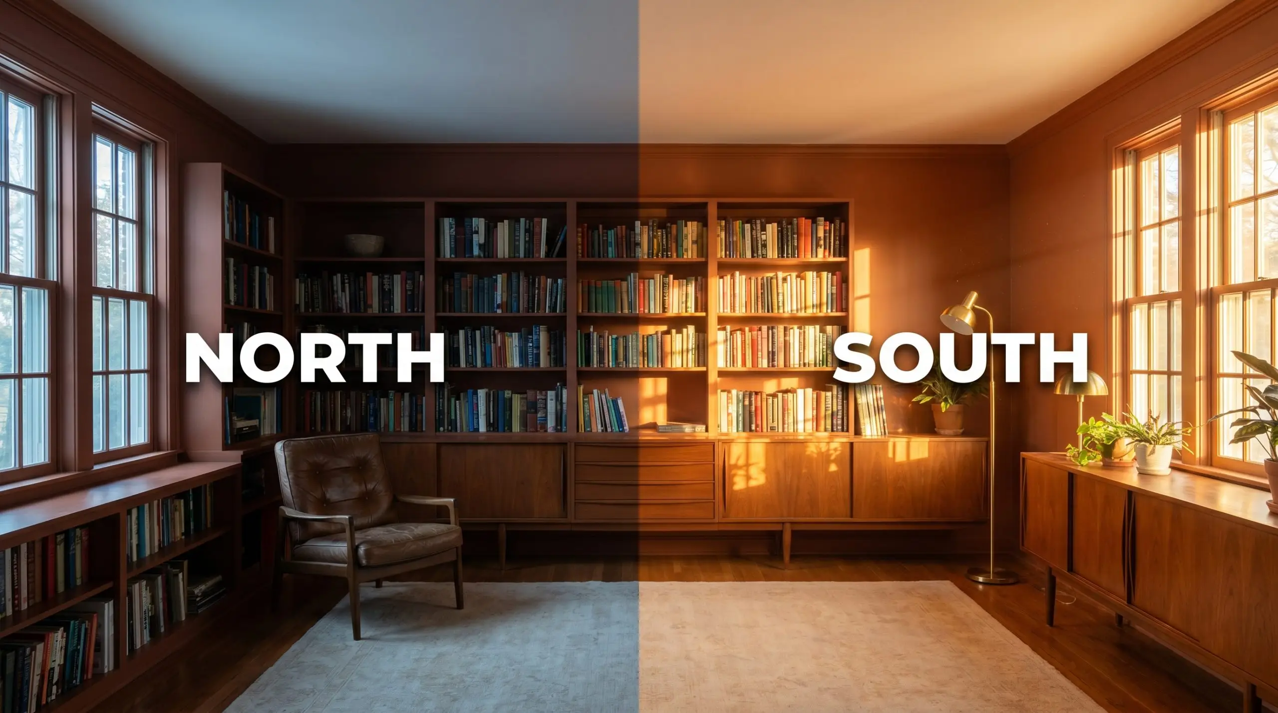
Lighting Effects & The Chameleon Factor
A rich chromatic profile like this never remains static throughout the day. The Gennex Color Technology behind this pigment means it actively responds to the shifting temperature of your light sources.
Popular Room Applications for This Earthy Cast
Because this color absorbs more light than it reflects, it thrives in spaces designed for intentional gathering or focused retreat. You can manipulate its mood entirely through your choice of surrounding materials and lighting fixtures.
Intimate Dining Spaces
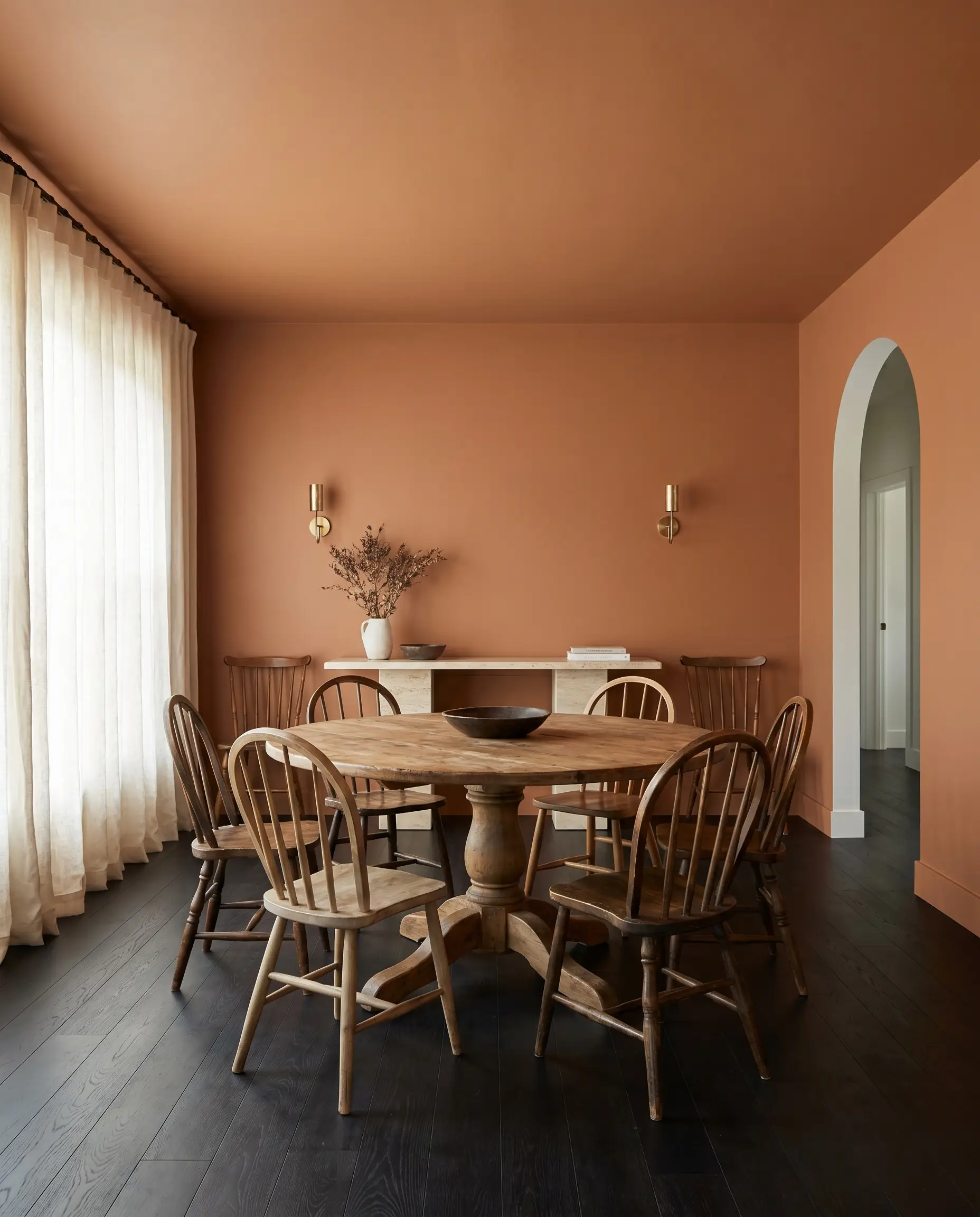
Dining rooms are the perfect canvas for this saturated hue. Instead of defaulting to a formal, heritage aesthetic, push the room toward a relaxed, transitional vibe by pairing the walls with a pedestal dining table and mismatched spindle-back chairs. Consider running the color across the ceiling to create a seamless, tent-like canopy for evening dinner parties. To balance the warmth, introduce a cool, honed travertine serving console or unlacquered brass sconces that will patina beautifully alongside the terracotta walls.
When wrapping a dining room in a medium-dark orange, break up the visual weight with floor-to-ceiling stonewashed linen drapery in a soft cream; the textured fabric softens the transition between the vibrant walls and the windows.
Hackrea Design Secret (The Fabric Filter)
Libraries and Studies
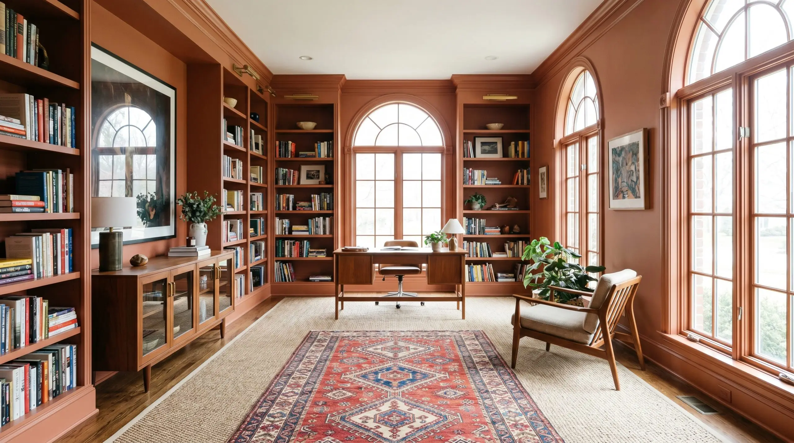
While home libraries often lean into moody, dark greens or blues, using this baked clay shade creates a completely different psychological environment. It fosters a stimulating, creative energy perfect for a modern home office or a writer’s retreat. Try painting the built-in bookcases and the surrounding trim in the exact same AF-225 finish to unify the architecture. Layer a vintage, geometric Moroccan rug over a simple sisal base, and bring in a mid-century teak credenza to echo the golden undertones of the paint.
Powder Rooms
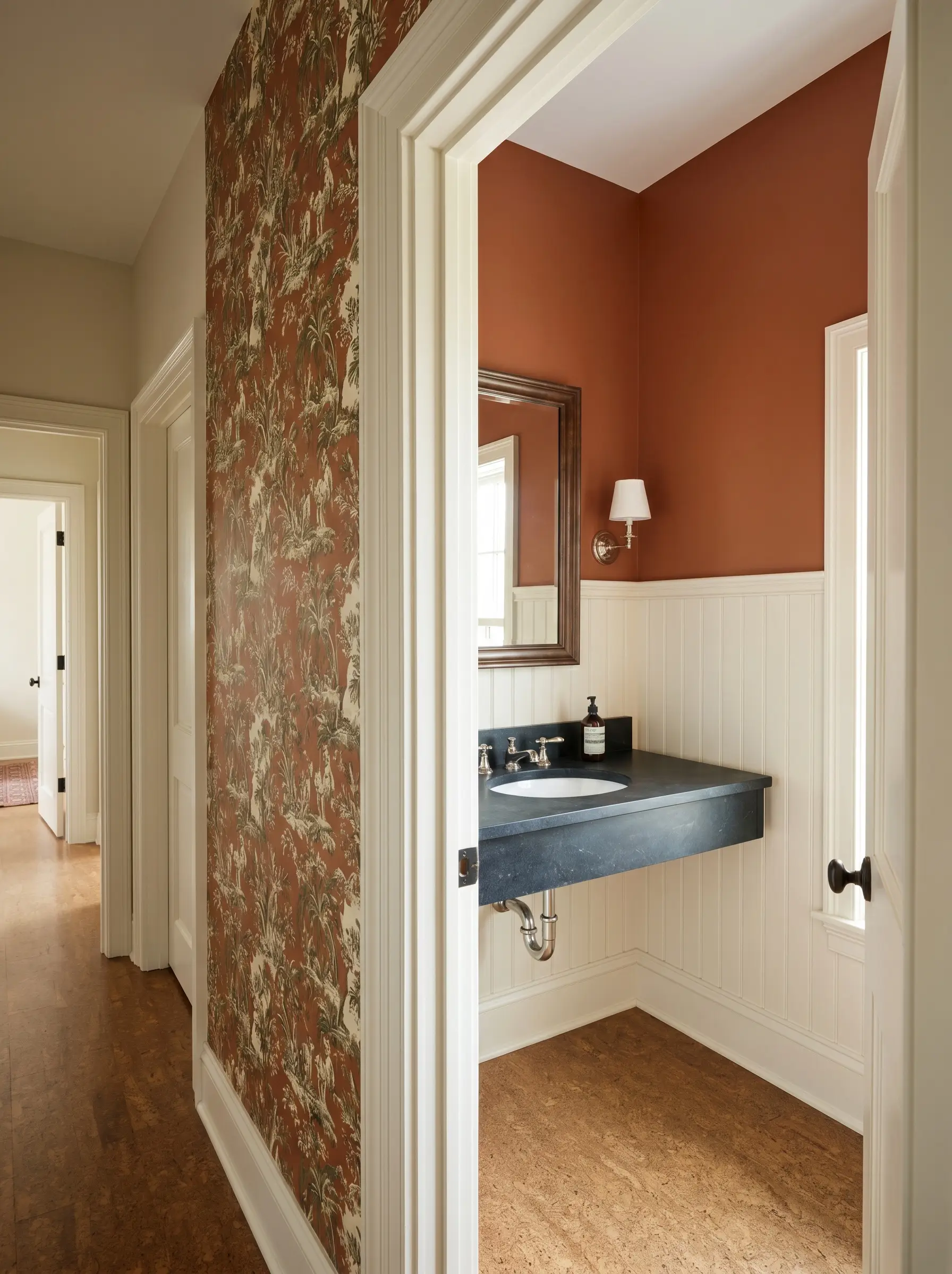
Small, windowless bathrooms are ideal testing grounds for high-impact color blocking. Install classic beadboard on the lower half of the walls painted in a crisp, warm white, and apply Firenze to the upper half to draw the eye upward. If you want a truly custom, jewel-box experience, pair the painted wainscoting below with a botanical toile mural wallpaper that features subtle hits of rust and olive green. Finish the vanity with a soapstone counter and polished nickel plumbing fixtures to provide a sharp, premium contrast against the earthy walls.
Kitchen Islands and Lower Cabinets
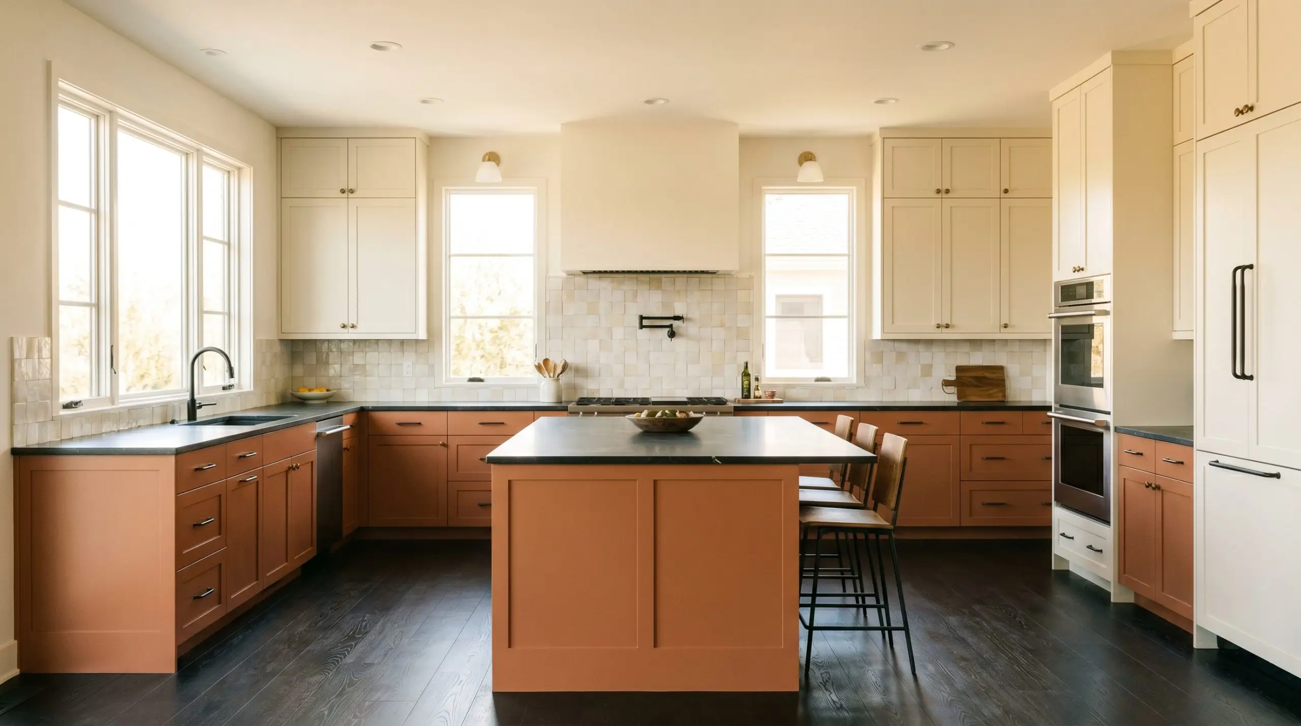
Introducing this muted red-and-gold base to your kitchen cabinetry completely changes the temperature of a standard culinary space. It works exceptionally well on lower cabinets or a central island when paired with creamy, off-white upper cabinets and Zellige tile backsplashes. To keep the kitchen feeling modern and intentional, avoid overly ornate cabinet hardware. Instead, opt for sleek, blackened steel pulls or brushed bronze knobs that complement the organic nature of the color without competing for attention.
Be highly strategic when pairing this specific hue with heavily veined, cool-toned marble countertops. The stark white and gray veining can fight the warmth of the cabinetry, so opt for warmer, quieter surfaces like soapstone, butcher block, or a subtly flecked terrazzo.
Clash Warning (The Countertop Conflict)
Sunrooms

In a sun-drenched enclosed porch or conservatory, this shade acts as a literal bridge between your interior styling and the outdoor landscape. Because the intense southern or western light will significantly amplify the paint’s golden saturation, you must balance the room with highly textured, neutral furnishings. Bring in natural rattan lounge chairs, a chunky bouclé sofa, and oversized terracotta planters filled with trailing pothos or indoor olive trees. The raw, tactile materials will absorb the vibrant sunlight, keeping the room feeling relaxed rather than visually overwhelming.
Coordinating Colors & Best Pairings for Benjamin Moore Firenze
This saturated terracotta requires deliberate contrast to establish its shape, relying on crisp boundaries or highly textured companions to keep it from feeling overwhelmingly warm. Placing this hue next to the right finishes dictates whether the room reads as a curated, modern retreat or a muddled, overly rustic space.
Architectural Millwork and Baseboards
Establishing a tailored boundary against this vibrant orange requires whites with highly specific undertones to avoid a harsh visual clash.
Tactile Finishes and Hardware
Balancing the visual heat of this baked clay requires tactile finishes that either absorb light or provide a stabilizing dark contrast.
Complementary Palette Selections
Surrounding this assertive hue with the right secondary colors is essential for controlling its overall temperature.
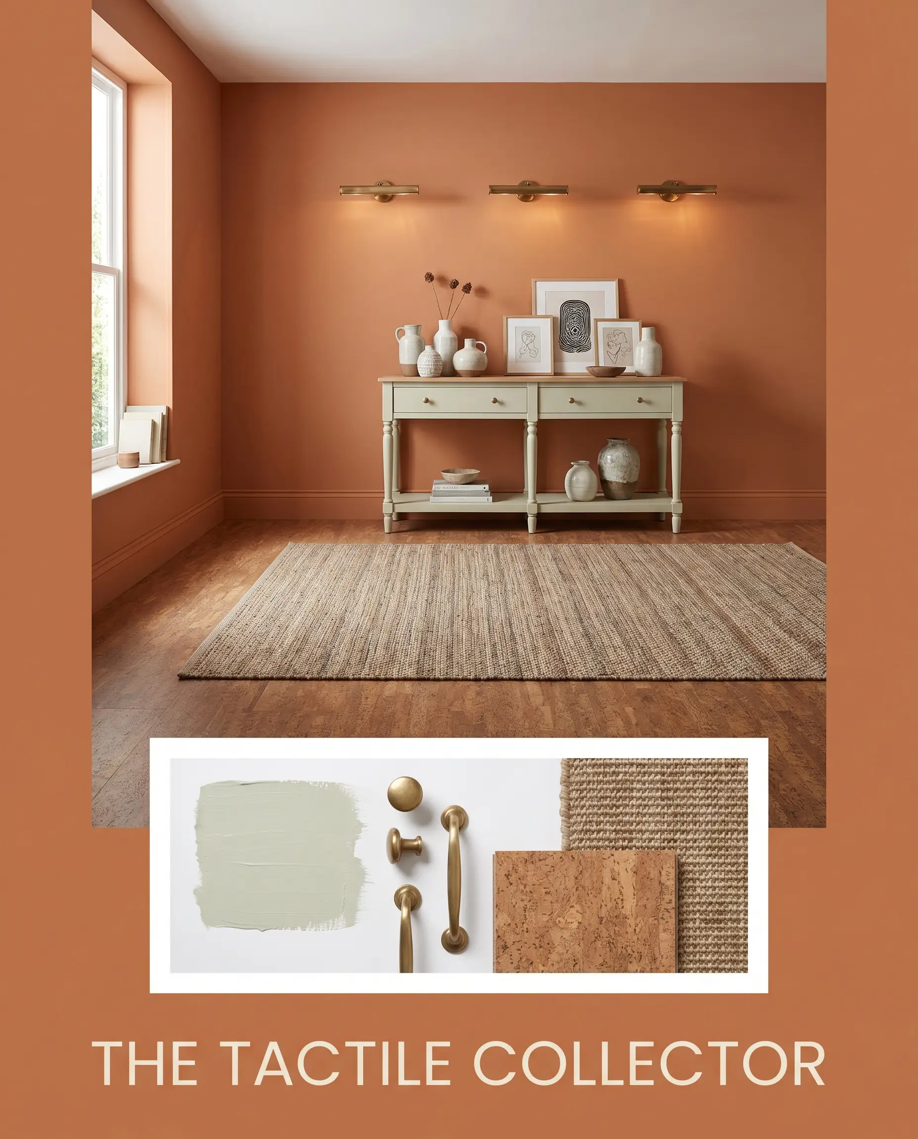
Curated Room Concepts
The Tactile Collector This aesthetic relies on highly textured, sensory materials to soften the intense vibrancy of the wall color. Imagine a foundation of natural cork flooring layered with a vintage sisal rug, while a console painted in Benjamin Moore Healing Aloe provides a necessary cooling breeze. The introduction of unlacquered brass picture lights adds a premium, reflective gleam that slowly patinas alongside the warm walls.
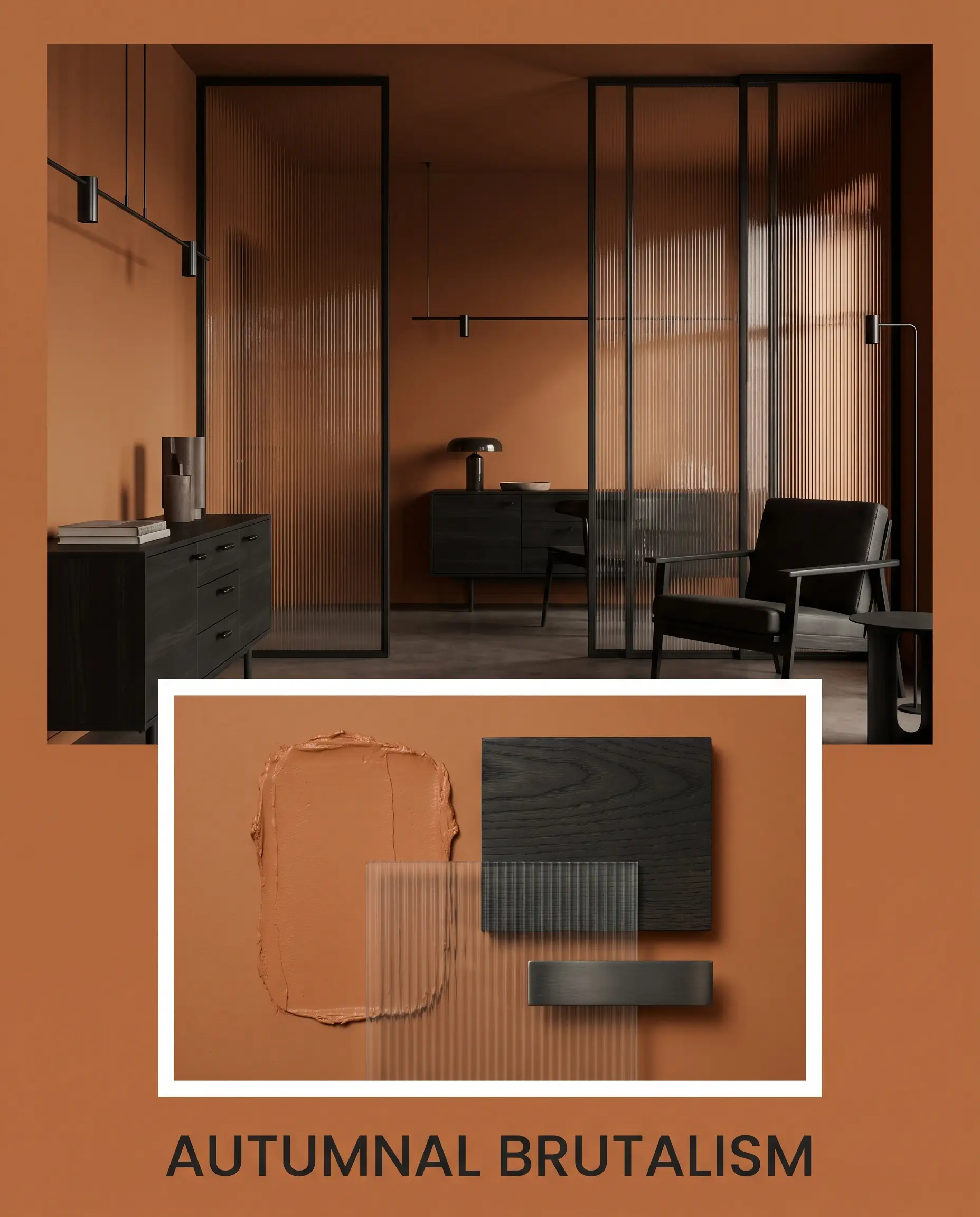
Autumnal Brutalism Here, the baked clay hue acts as a vibrant focal point against sharp, unforgiving materials, creating a moody, high-tension environment. Ebonized ash wood furniture with rigid, geometric silhouettes establishes a stabilizing, dark contrast against the energetic terracotta. Weave in fluted glass room dividers and sleek blackened steel hardware to modernize the organic tone, stripping away any rustic connotations.
Comparing Benjamin Moore Firenze Against Industry Rivals
Selecting the perfect earthen orange requires analyzing how the pigment reacts to your specific lighting and surrounding architecture. When your room lacks natural sunlight or your flooring leans too cool, this particular terracotta might lose its vibrancy, making a rival shade the more successful candidate.
Benjamin Moore Firenze AF-225 vs. Sherwin-Williams Cavern Clay SW 7701
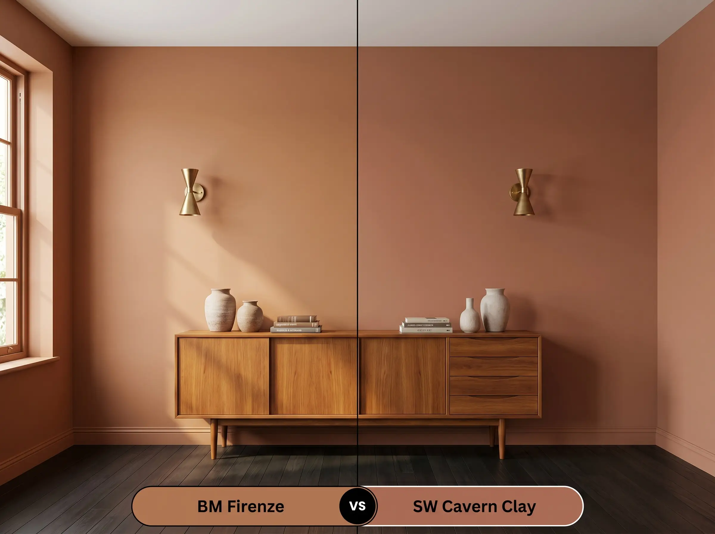
If you are styling a space with stark, cool-toned lighting, Sherwin-Williams Cavern Clay might be the better choice because it carries a slightly dustier, more muted profile that resists turning overly vibrant. Firenze, by contrast, holds a stronger golden-red saturation that demands careful balancing to avoid taking over the room. Choose Cavern Clay for a quieter, more weathered aesthetic, and reserve Benjamin Moore’s version for spaces that need a distinct injection of energy.
Benjamin Moore Firenze AF-225 vs. Farrow & Ball Red Earth 64
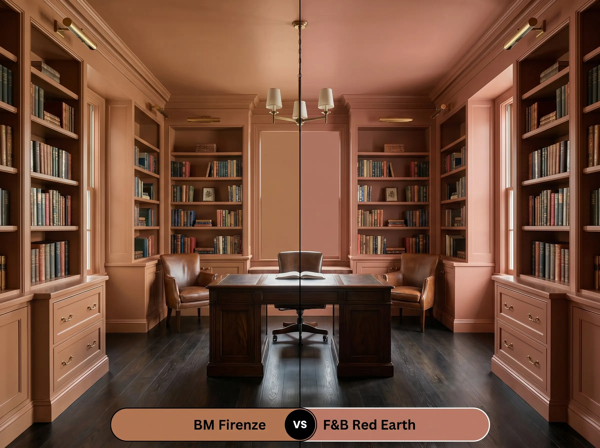
Farrow & Ball Red Earth leans noticeably more pink and chalky, making it highly effective in historic homes where you want a softer, more faded plaster effect. If your room features extensive unlacquered brass and rich woods, Firenze provides a much stronger, browner foundation that stands up to heavy architectural elements. Red Earth feels like a sunset fading into dusk, while this Benjamin Moore alternative maintains the intense heat of mid-afternoon.
Benjamin Moore Firenze AF-225 vs. Benjamin Moore Rustique AF-275
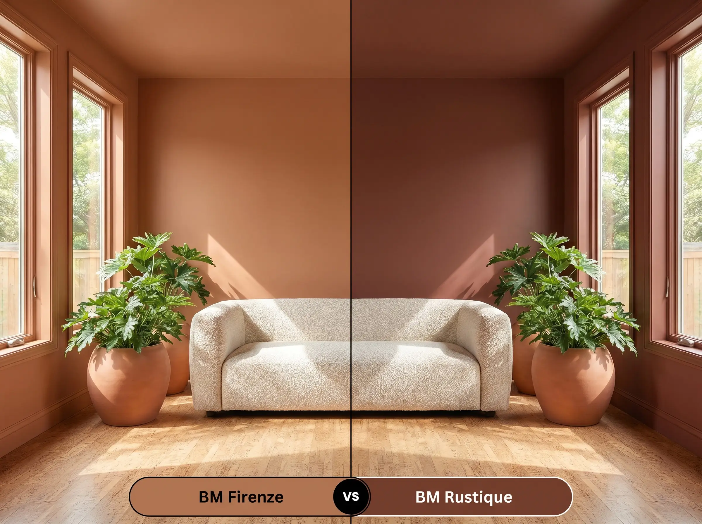
If your space receives an abundance of blinding southern light, Rustique offers a slightly darker, more brown-dominated base that absorbs the glare beautifully. Firenze contains more active orange pigment, which will amplify significantly when hit by direct sun, potentially overwhelming a small room. Opt for Rustique when you need a stabilizing shadow, and stick with AF-225 when you want the walls to actively radiate warmth.
Alternative Terracotta Selections
Sometimes a color is just one shade too vibrant or a fraction too dark for your specific lighting conditions. If you need a subtle shift in temperature or a practical alternative from a different manufacturer, these closely related hues offer excellent secondary options.
Same-Brand Alternatives
Competitor Matches
Professional Application Guide for Firenze
Translating this rich, earthy cast from a tiny paint chip to a full wall requires precise execution and the right technical finishes.
Optimal Sheen Selection
The way light hits the surface of this paint fundamentally alters how its warmth is perceived in the room.
High-Adhesion Primer Strategy
Because this hue relies on a complex mix of red and yellow colorants, it notoriously struggles to achieve full opacity over existing dark or highly contrasting walls. You must use a high-quality, gray-tinted primer rather than a standard white base. The gray foundation prevents the vibrant orange from looking streaky and ensures the true, muted depth of the color develops evenly.
Coverage & Success Tips
Plan for a mandatory two-coat application, though highly textured surfaces like brick or old plaster may require a third pass to push the pigment into every crevice. Maintain a strict “wet edge” while rolling to prevent flashing, which occurs when overlapping sections dry at different rates and leave visible, dark vertical bands. Touch-ups on this specific depth of color are notoriously difficult once fully cured, so paint wall-to-wall continuously for a flawless finish.
When working with highly saturated colors like AF-225 against crisp white trim, always score the edge of your painter’s tape with a utility knife before peeling it away. This prevents the heavy, rubbery pigment of the terracotta from lifting and ruining your perfectly tailored boundary.
Hackrea Pro-Tip (The Tape Pull)
Common Questions About This Terracotta Hue
Because this hue lacks the harsh neon undertones of a standard orange, it actually performs beautifully in enclosed spaces. Without natural light to amplify its golden base, it reads as a rich, sophisticated clay, creating a moody and intimate atmosphere when paired with warm artificial lighting.
Textured surfaces are the absolute best canvas for this specific color structure. The physical peaks and valleys of brick or plaster create natural shadows that highlight the muted red-and-gold base, making the finish look like authentic, aged terracotta rather than flat paint.
Cooler 4000K daylight bulbs will immediately flatten the vibrancy of this paint, pulling forward its underlying brown notes. If you want the walls to maintain their fiery, welcoming heat, you must swap your bulbs for a warmer 2700K to 3000K range.
Final Verdict & Styling Warnings
Benjamin Moore Firenze is a highly effective, architectural color tool designed for the fearless homeowner who wants to build warmth into their environment. It performs best in gathering spaces, dining areas, and creative studios where its enveloping, sun-baked energy can actively stimulate conversation and focus. This hue brilliantly elevates Transitional, Eclectic, and Modern Organic homes, proving that terracotta can feel incredibly tailored and contemporary when paired with the right tactile materials.
While this vibrant clay hue is incredibly versatile, it actively fights against sterile, cool-toned environments. Placing this energetic orange alongside icy gray flooring or highly polished chrome fixtures creates a jarring visual tension that makes the paint look artificial. Furthermore, you must actively avoid pairing it with red-toned cabinetry, such as traditional cherry, as the competing red undertones will clash and muddy the entire room.
Clash Warning (The Temperature Collision)