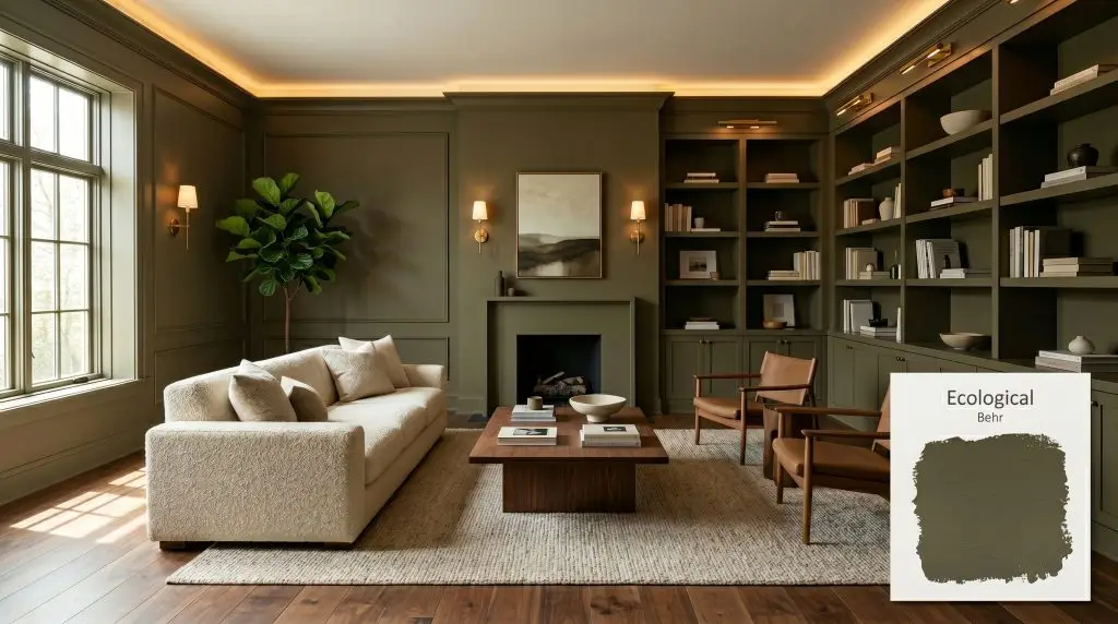
Ecological S380-6
BehrBehr Ecological (S380-6) is a warm, muted olive green with distinct yellow and gray undertones. Boasting an LRV of 22, it acts as a grounding architectural finish that brings a calming, biophilic presence to both interior and exterior spaces.
Paint Technical Profile
| Color ID / SKU | S380-6 |
| HEX Code | #808367 |
| Light Reflectance (LRV) | 22 |
| Use | Interior, Exterior |
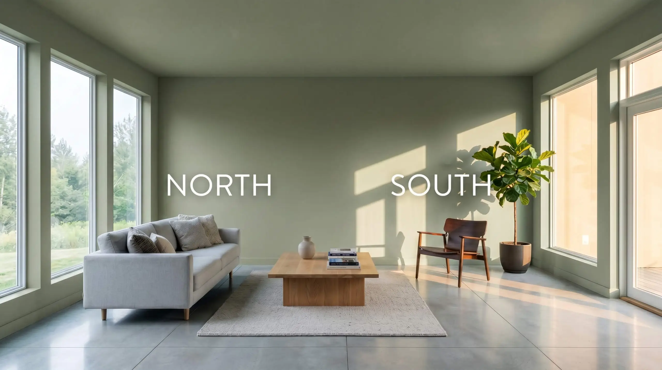
| Best Exposures | South, West |
| Best For | Kitchen Cabinets, Accent Walls, Home Offices |
Behr Ecological S380-6: The Subdued Olive Green That Transforms Everyday Architecture
Green paint often runs the risk of feeling overly vibrant, turning a calm living room into an unintentional jungle. Behr Ecological S380-6 sidesteps that trap entirely by offering a muted botanical hue that feels effortlessly intentional. This specific shade relies on a complex RGB balance to deliver an organic color structure that wraps a room in quiet sophistication.
The Core DNA: Undertones & LRV of Behr Ecological
When homeowners ask if Behr Ecological is warm or cool, the answer is a definitive, enveloping warm. This earthy olive green achieves its welcoming temperature through a highly specific pigment mix that prevents it from turning icy.
With a light reflectance value (LRV) of 22, this medium-dark shade absorbs a significant amount of light. Instead of bouncing illumination around a room, it creates an intimate atmosphere that acts as a grounding architectural finish, making standard drywall feel incredibly premium.
Light Reflectance & The Chameleon Factor
Because of that complex gray-yellow tension, this shade shifts dramatically depending on the sun’s trajectory and your fixture choices.
To keep this olive feeling organic after dark, strictly avoid daylight bulbs. Always opt for 2700K to 3000K bulbs to highlight the warm khaki notes rather than washing them out.
Hackrea Pro-Tip (Bulb Selection)
Popular Architectural Applications for This Organic Color Structure
You do not need a historic mansion to make this shade work beautifully. By strategically applying this versatile green, you can give everyday rooms and standard exteriors a highly intentional, custom-built aesthetic.
Elevating Kitchen Cabinetry and Central Islands
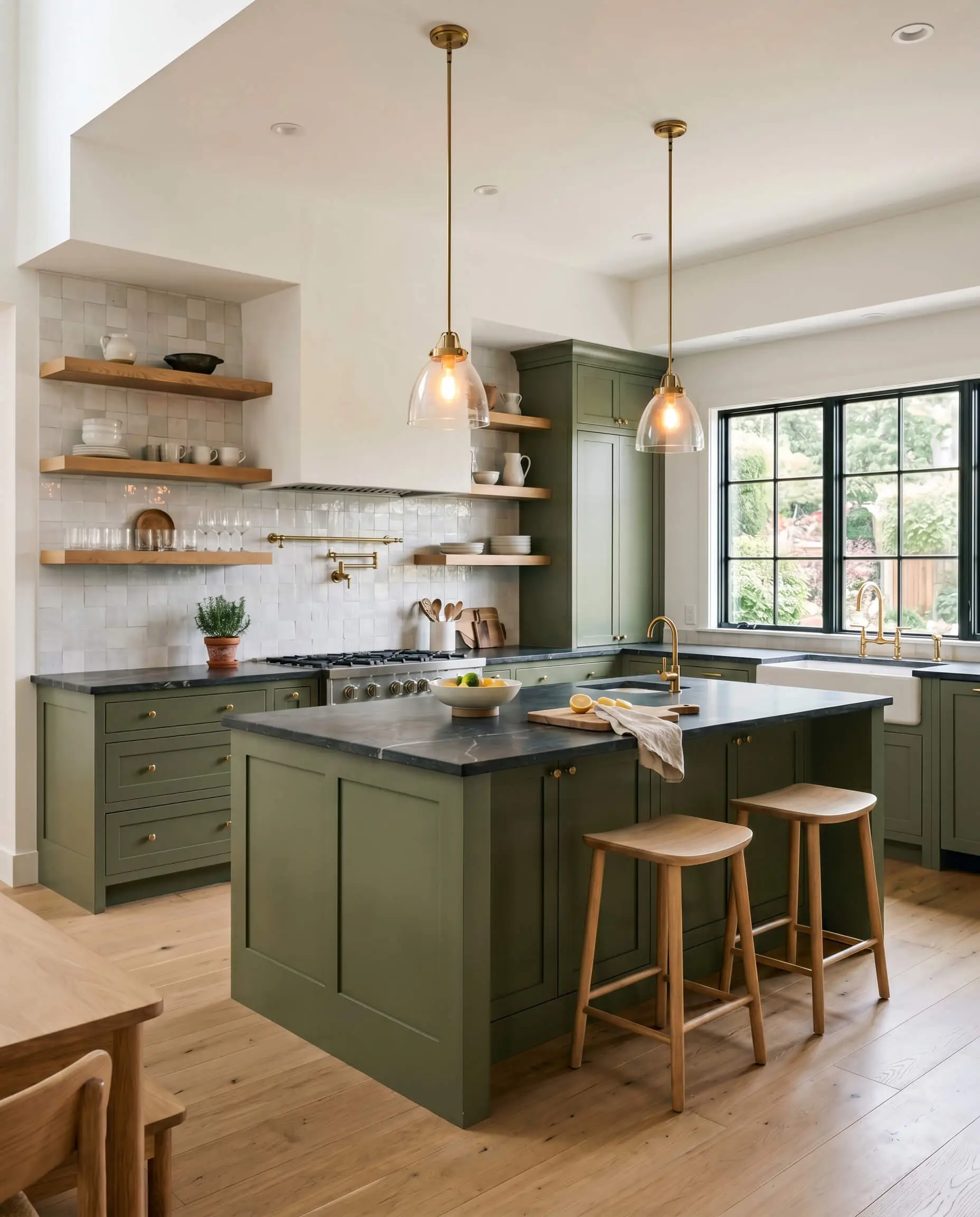
Applying Behr S380-6 to kitchen cabinetry instantly upgrades the heart of the home without requiring a massive structural renovation. Pair this shade with unlacquered brass hardware and honed soapstone countertops to create a sophisticated, transitional culinary space. The warm gray cast prevents the cabinets from looking too retro, allowing them to sit beautifully alongside sleek white oak floating shelves and textured zellige tile backsplashes.
When painting high-traffic kitchen islands, opt for a satin or semi-gloss finish. The slight sheen adds durability while subtly reflecting light, preventing the dark olive from feeling flat against your flooring.
Hackrea Design Secret (Cabinet Finishes)
Designing Focused Home Offices and Reading Rooms
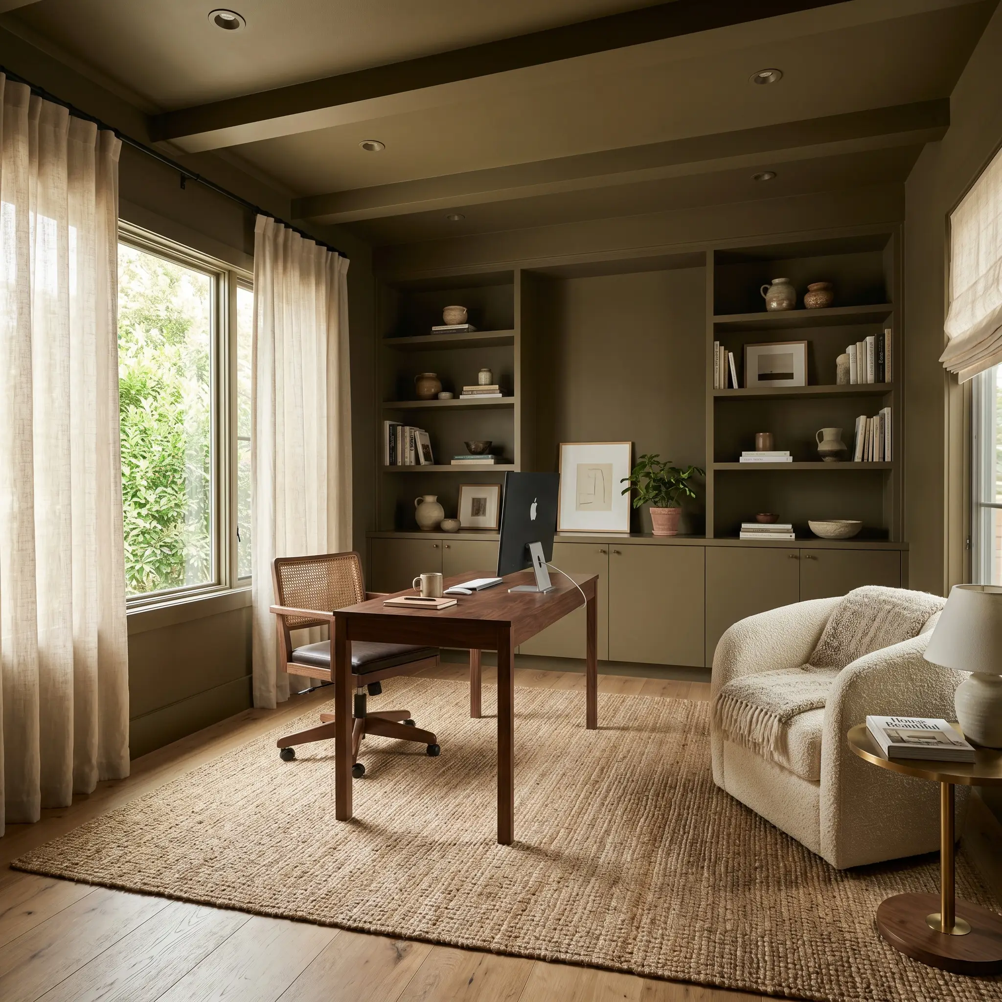
While it is tempting to push a dark green office into a predictable, moody academic aesthetic, this hue thrives in a soft modern setting. Color-drenching the room—painting the baseboards, walls, and built-in bookcases in the exact same finish—creates a seamless, distraction-free environment for remote work. Soften the intense color with natural textures like a jute rug, a bouclé accent chair, and sheer linen curtains to maintain a sense of breathable calm.
Transforming Exterior Siding and Entry Doors
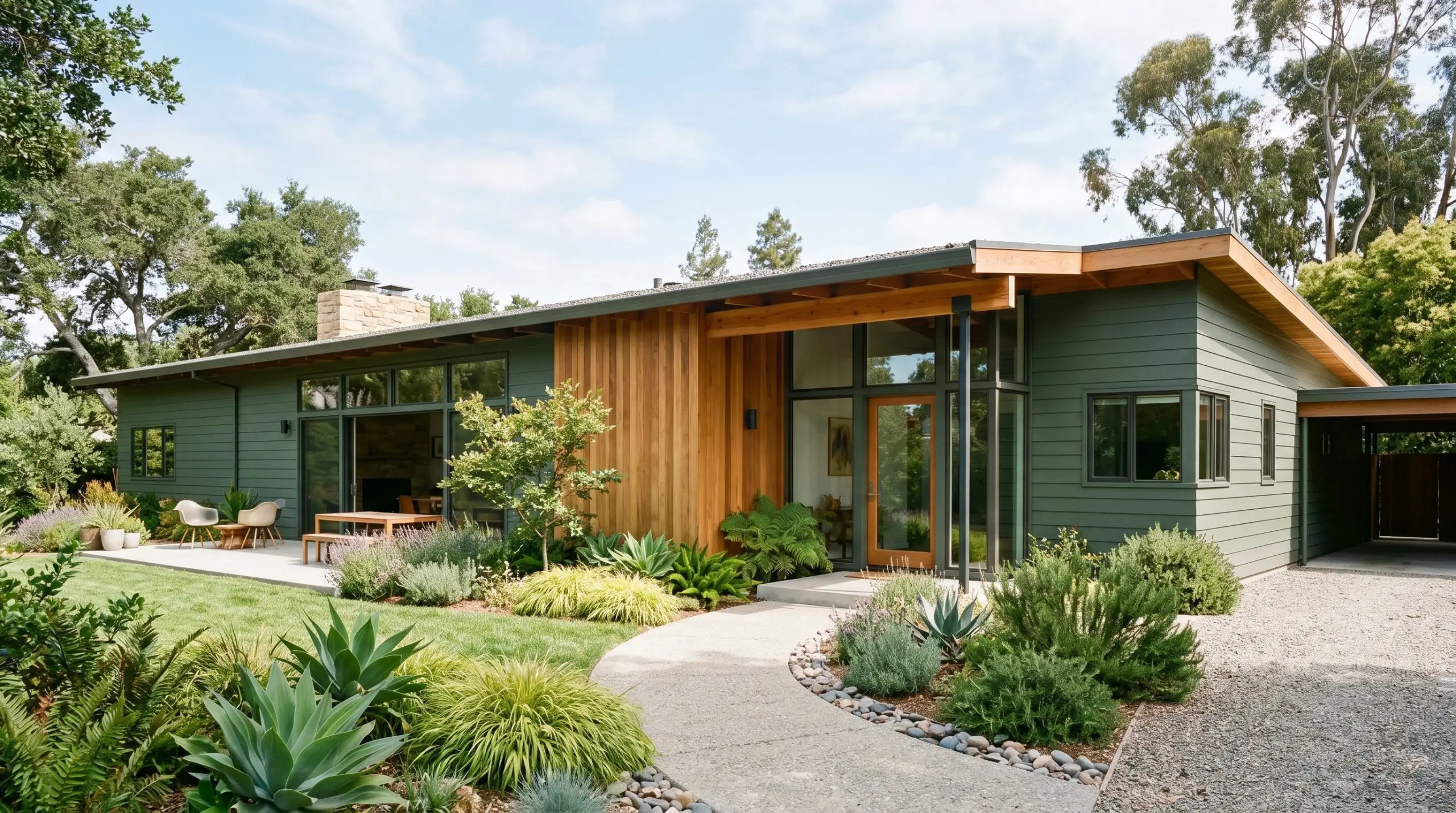
On a home’s exterior, direct sunlight will wash out subtle nuances, but this shade retains its rich character beautifully. Using Ecological S380-6 as a main siding color on a mid-century ranch or contemporary exterior blends the architecture directly into the surrounding landscaping. If you are just updating the entry, a front door painted in this hue looks incredibly crisp against creamy white brick, especially when framed by matte black sconces and terracotta planters.
Styling Windowless Powder Rooms and Half-Baths
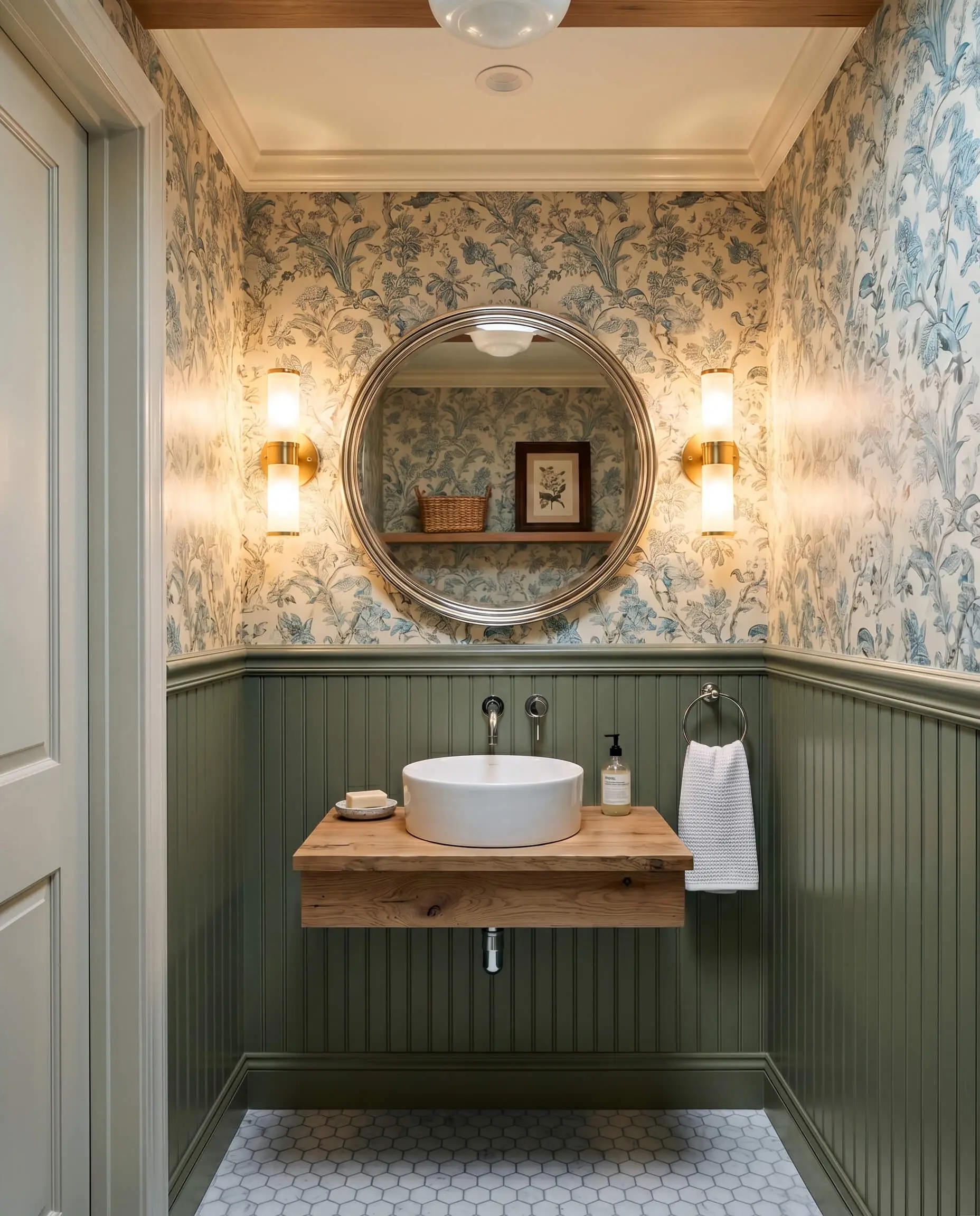
A windowless powder room is the perfect place to lean into the light-absorbing qualities of this medium-dark shade. Instead of fighting the lack of natural light, embrace the shadows by installing vertical beadboard painted in Behr Ecological. Contrast the solid color with a patterned botanical toile wallpaper above the trim, and finish the space with a polished chrome mirror to bounce the warm ambient vanity lighting around the room.
Perfect Pairings and Harmonious Styling
Instead of requiring strict, high-contrast boundaries to hold its shape, this subdued olive thrives when allowed to softly bleed into warm, tactile surroundings. Its complex pigment structure acts as a stabilizing anchor, making surrounding earthy tones feel richer and more deliberate.
Ideal Trim Combinations for a Crisp Finish
To keep the walls feeling intentional rather than murky, frame this green with soft, creamy whites. Benjamin Moore White Dove OC-17 offers a subtle greige undertone that seamlessly connects with the olive’s warm gray cast, creating a gentle, atmospheric transition. For a slightly more luminous boundary, Sherwin-Williams Alabaster SW 7008 provides just enough warmth to highlight the green’s organic structure without creating a jarring, sterile contrast.
Elevating the Olive with Tactile Materials
A Curated Palette of Harmonious Shades
Curated Aesthetics: Bringing the Palette to Life
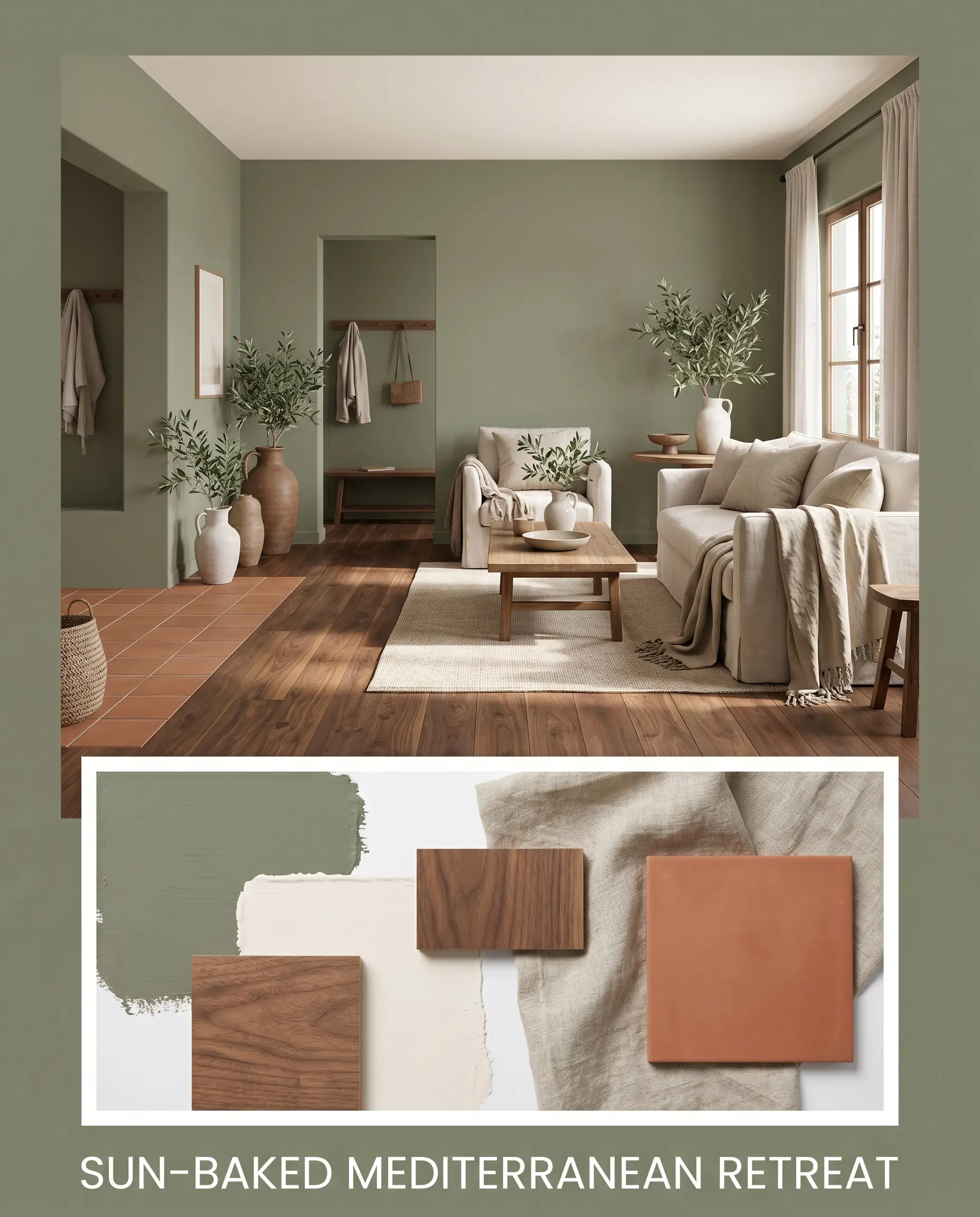
Sun-Baked Mediterranean Retreat This aesthetic relies on the friction between raw, earthy textures and the subdued green walls to create a deeply relaxed, restorative energy. By layering washed linen textiles over rich walnut flooring, the environment feels both lived-in and effortlessly curated. Accent the space with Behr Blank Canvas DC-003 on the ceiling and display oversized olive branches in ceramic jugs to amplify the organic warmth, while matte terracotta floor tiles ground the entire design.
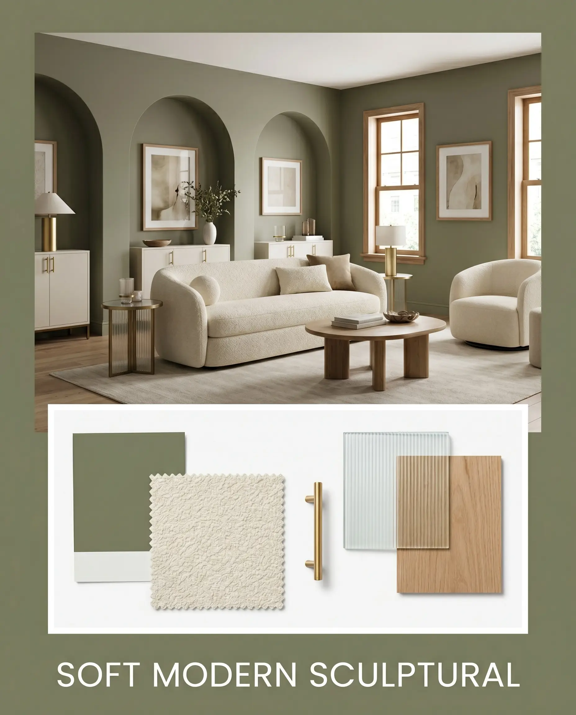
Soft Modern Sculptural Here, the low-chroma green acts as a dense, velvety backdrop that allows curved, modern silhouettes to take center stage. The tactile softness of a creamy bouclé sofa directly contrasts with the sleek, reflective gleam of unlacquered brass hardware and fluted glass accents. This styling strategy creates a sophisticated, quiet luxury that feels incredibly tailored yet inviting, especially when paired with minimalist line art framed in natural wood.
Head-to-Head: Behr Ecological vs. Rival Greens
While this specific olive is incredibly versatile, certain architectural exposures or strict lighting conditions might demand a slightly different undertone. If your room faces north and risks turning this shade too murky, or if you need a crisper finish to combat intense shadows, comparing rival greens is the safest way to finalize your choice.
Behr Ecological S380-6 vs. Sherwin-Williams Artichoke SW 6179
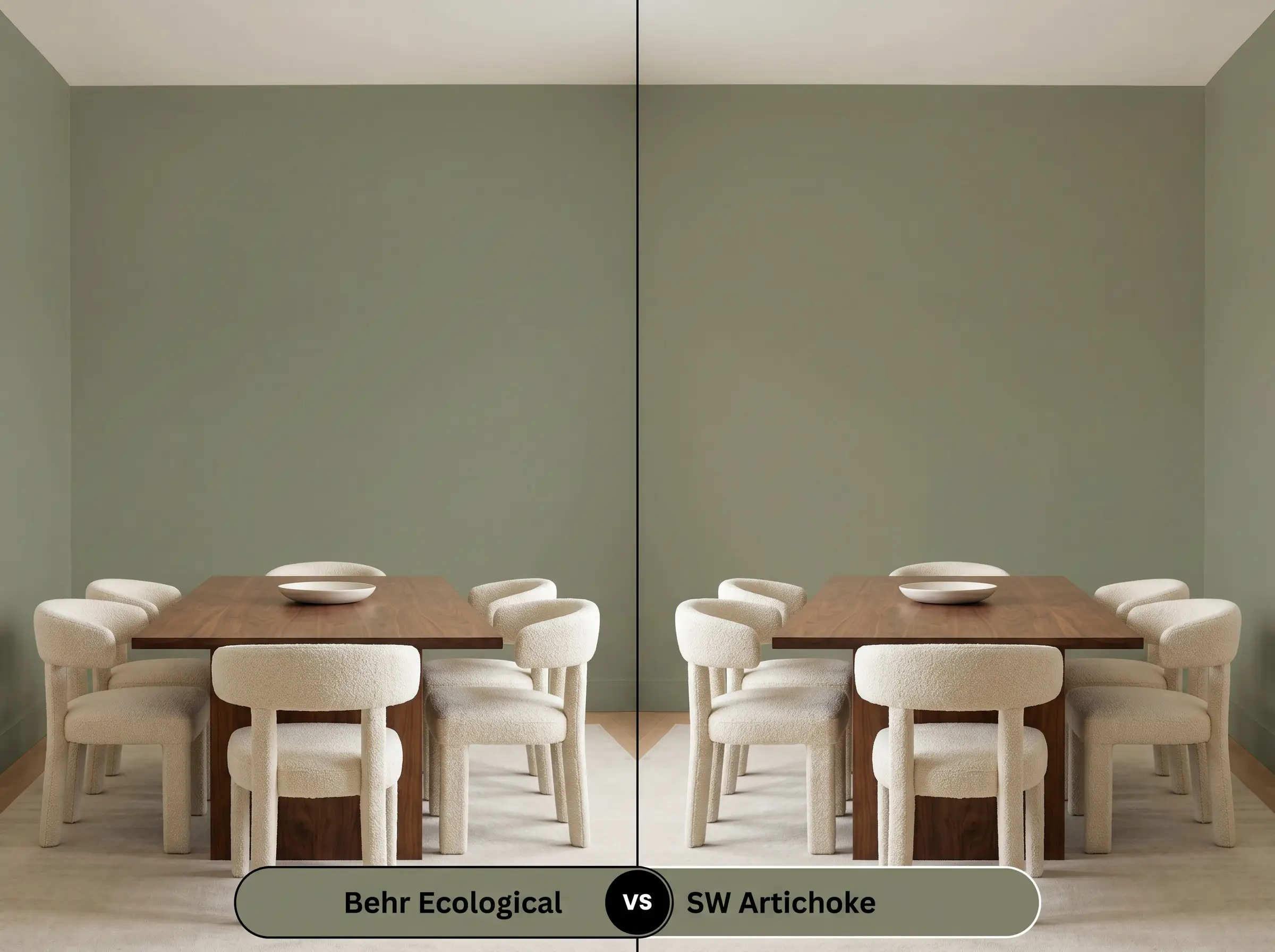
Sherwin-Williams Artichoke SW 6179 carries a noticeably higher dose of yellow pigment, making it feel significantly more vibrant and energetic on the wall. If your room lacks natural light and you want to artificially inject warmth, Artichoke will perform beautifully without turning gray. However, if you prefer a more subdued, historic feel that recedes quietly into the background, stick with the Behr option.
Behr Ecological S380-6 vs. Benjamin Moore Sussex Green HC-109
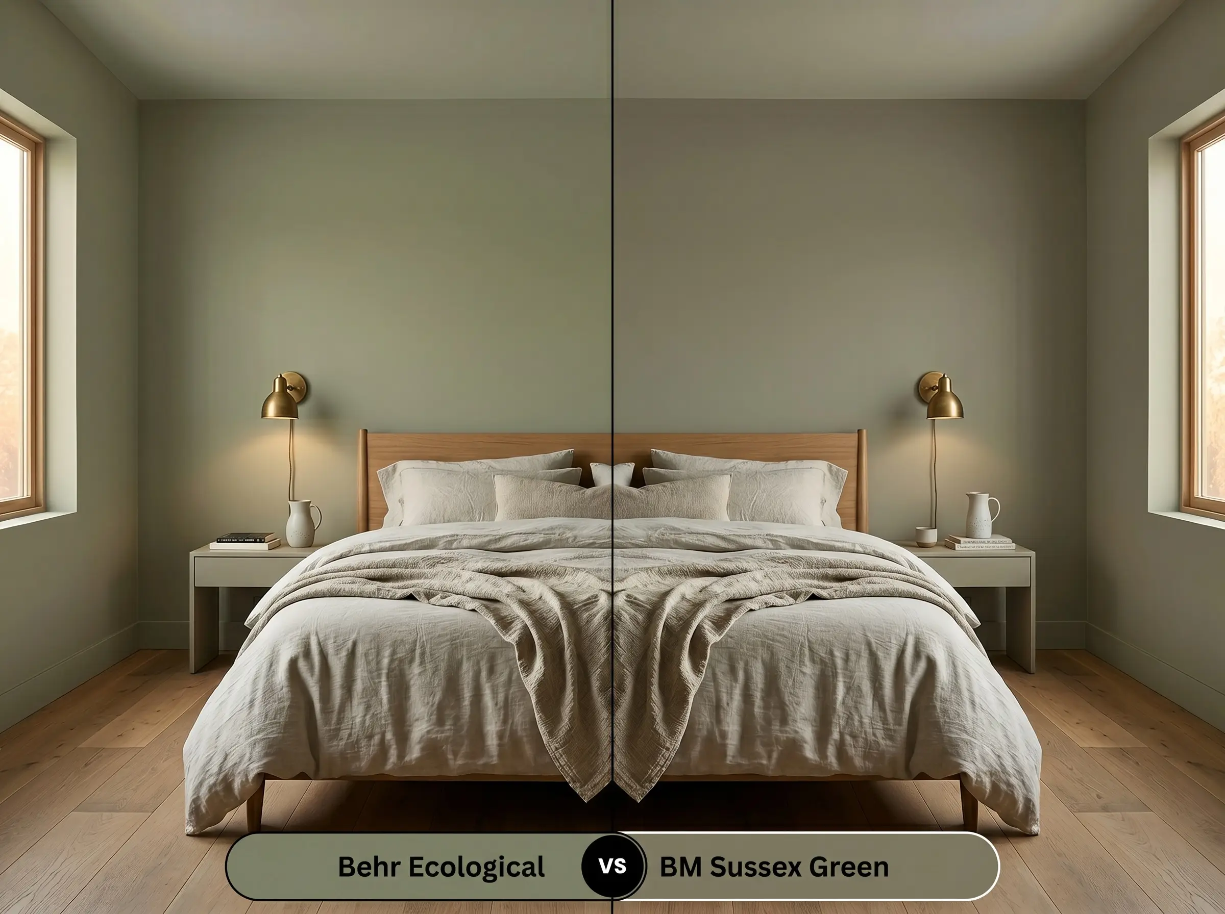
Benjamin Moore Sussex Green HC-109 is slightly deeper and leans further into a classic, true olive profile with less of that prominent gray cast. If you are styling a space with extensive natural light and want a richer, more saturated color payoff, the Benjamin Moore formulation is exceptional. Conversely, if you need a softer, more muted backdrop that pairs effortlessly with modern casual furnishings, Ecological remains the better fit.
Alternative Options and Brand Matches
Sometimes a space requires just a subtle tweak in depth or light reflectance to achieve the perfect atmosphere. Whether you need a slightly lighter alternative for a shadowy hallway or are simply shopping across different paint manufacturers, these closely related shades offer excellent flexibility.
Subtle Shifts Within the Same Brand
Color Matching Across Rival Brands
Expert Application Tips for a Flawless Finish
Shifting from color theory to a roller pan requires a clear understanding of how this specific pigment behaves on a physical surface. Executing a flawless finish with a medium-dark hue hinges entirely on your sheen selection and prep work.
Selecting the Perfect Sheen
Primer Strategy and Coverage Expectations
Because this shade absorbs a significant amount of light, applying a high-quality, tinted gray primer is essential to ensure the true undertones develop correctly. Without a tinted base, you will likely need three coats to prevent the old wall color from bleeding through and altering the final aesthetic.
Medium-dark colors are notoriously unforgiving when it comes to “flashing”—those visible, shiny roller marks that appear when the paint dries unevenly. Always maintain a wet edge while rolling, and avoid aggressive touch-ups after the wall has started to set, or you will disrupt the uniform finish.
Clash Warning (Avoiding the Flashing Effect)
Frequently Asked Questions About Ecological S380-6
Because of its low light reflectance, this shade actually creates a brilliantly moody, jewel-box effect in spaces without natural light. To prevent it from feeling murky, simply pair it with polished metallic hardware and bright, warm ambient lighting to illuminate its rich undertones.
Direct, intense sunlight will inevitably wash out some of the subtle gray nuances, making the color read as a warmer, softer sage. It performs exceptionally well on textured surfaces like stucco, as the deep crevices provide natural shadowing that retains the color’s original depth.
This muted botanical hue serves as a stunning, grounding anchor beneath the dramatic, sweeping gray veins of premium marble. The organic warmth of the green beautifully offsets the cool, crisp white background of the stone, creating a highly sophisticated, balanced kitchen.
Rather than clashing, the shared warmth between the green’s yellow-gray base and the rich tones of red oak creates a highly cohesive, earthy foundation. To ensure the room does not feel overly warm, introduce crisp white trim or a cool-toned textured rug to break up the visual plane.
The Final Verdict on This Muted Botanical Hue
Behr Ecological S380-6 is a remarkably sophisticated tool for homeowners looking to inject organic depth into their spaces without overwhelming the architecture. Its absolute best application is in rooms where you want to foster a calm, focused energy, such as transitional home offices, cozy dens, or richly textured living rooms. By pairing this grounded olive with tactile materials and creamy whites, you can effortlessly cultivate a custom-feeling, intentional aesthetic that feels both timeless and deeply inviting.
While this color is incredibly adaptable, it is absolutely not the right choice for homes dominated by stark, cool-toned gray flooring or icy blue-gray furnishings. When placed next to rigid, cool grays, the warm yellow-khaki base of this paint will immediately rebel, making the walls look unpleasantly yellowed and the floors appear dingy. If your home features cool-toned fixed finishes, you are much better off selecting a crisper, blue-leaning green to maintain a harmonious visual flow.
Hackrea Design Secret (The Temperature Clash)