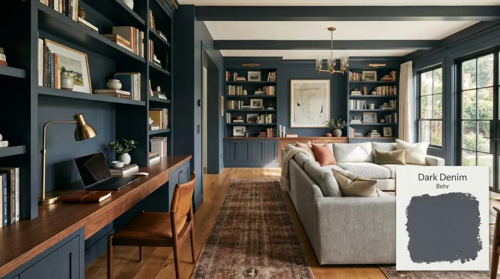
Dark Denim S510-7
BehrBehr Dark Denim (S510-7) is a deeply saturated, moody slate blue with prominent charcoal and gray undertones. Sitting at an LRV of 8, it is a sophisticated, cool-toned dark neutral that shifts between a stormy navy and a soft black depending on the lighting.
Paint Technical Profile
| Color ID / SKU | S510-7 |
| HEX Code | #48505d |
| Light Reflectance (LRV) | 8 |
| Use | Interior, Exterior |
| Best Exposures | South-Facing, West-Facing |
| Best For | Cabinets, Accent Walls, Home Offices, Exteriors |
Behr Dark Denim (S510-7) Paint Color Review: The Perfect Moody Anchor
Most people think painting a wall dark blue means committing to a preppy, nautical theme or a generic coastal vibe.
Behr Dark Denim (S510-7) shatters that assumption entirely.
This shade offers an incredibly accessible way to bring premium, architectural depth into everyday spaces without spending a fortune on luxury brands. It delivers that coveted, high-end designer look on a realistic DIY budget, acting as a sophisticated backdrop for both modern and transitional homes.
Behr Dark Denim: Undertones & LRV
This color reads definitively cool on the wall, bringing a crisp, tailored energy to a room. If you are currently understanding cool undertones in dark paint, this specific shade is a fantastic teacher. It relies heavily on its hidden gray structure to keep the blue grounded and sophisticated rather than bright or juvenile.
With a light reflectance value (LRV) of 8, this Behr shade is a heavy light-absorber. It behaves as a cavernous, moody anchor, meaning it will aggressively pull light out of a room rather than bouncing it around. To prevent the walls from feeling visually heavy, you must pair this low LRV with strategic lighting plans, reflective accents, or bright adjacent spaces.
Lighting Effects & The Chameleon Factor
Many DIYers fear that deeply saturated colors will dry flat, turning their living room into a light-sucking black box. The brilliance of Behr Dark Denim is its built-in resistance to going completely dead in the shadows. Its complex pigment structure ensures that even when the light drops, the denim blue character fights through the darkness.
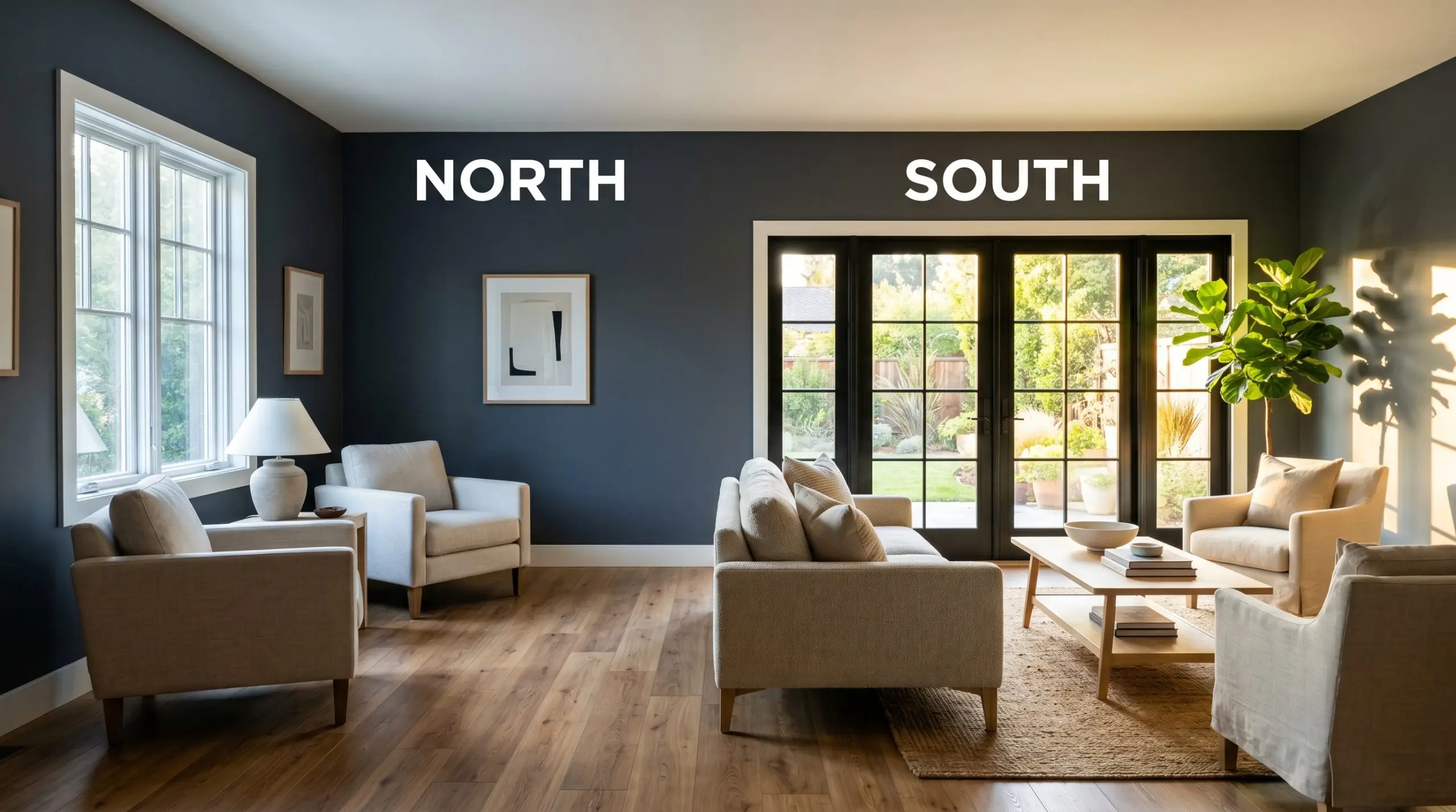
If you are using this shade in a room with limited natural light, swap your standard 2700K bulbs for 3000K to 3500K LEDs. This specific temperature range provides enough warmth to feel inviting while keeping the blue pigments from turning muddy.
Hackrea Design Secret (Lighting Control)
Everyday Spaces Elevated by This Muted Navy
This color brings a deeply cohesive, grounding energy to a home, demanding to be used intentionally. It excels in spaces where you want to create a sense of boundary, focus, or enveloping comfort.
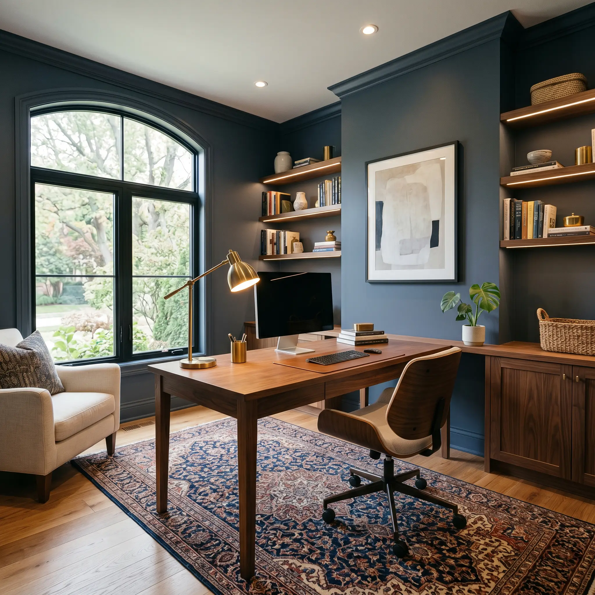
Home Offices
This shade was practically engineered for deep focus and productivity. If you are exploring the best moody blue paints for home offices, S510-7 is a top-tier contender because its charcoal base prevents eye strain. Pair it with warm walnut desks, a textured vintage runner, and brushed brass task lighting to create a handsome, tailored workspace.
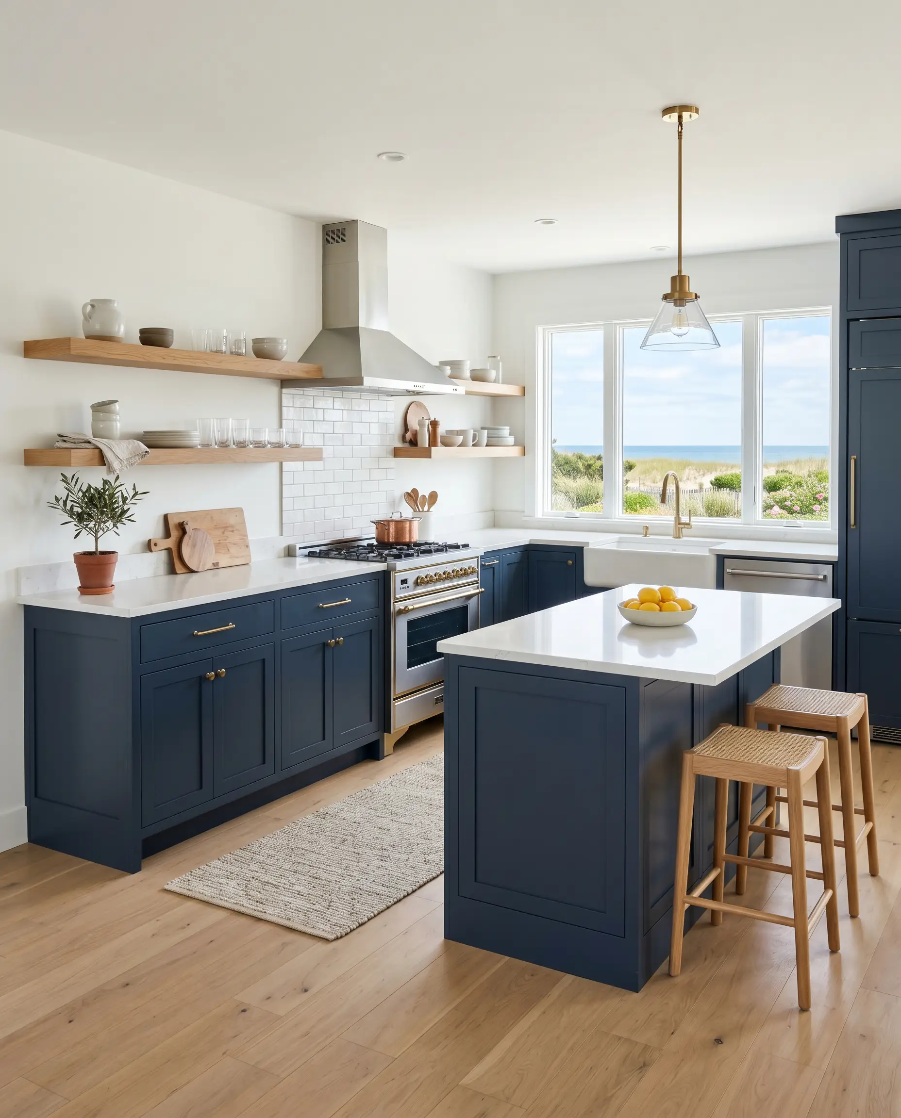
Kitchens
Dark lower cabinets instantly elevate builder-grade kitchens, giving them a bespoke, custom feel. When learning how to paint kitchen cabinets dark, you quickly realize that pure black shows every speck of dust, while bright blue feels too trendy. This muted navy strikes the perfect balance, grounding white quartz countertops and floating oak shelves beautifully.
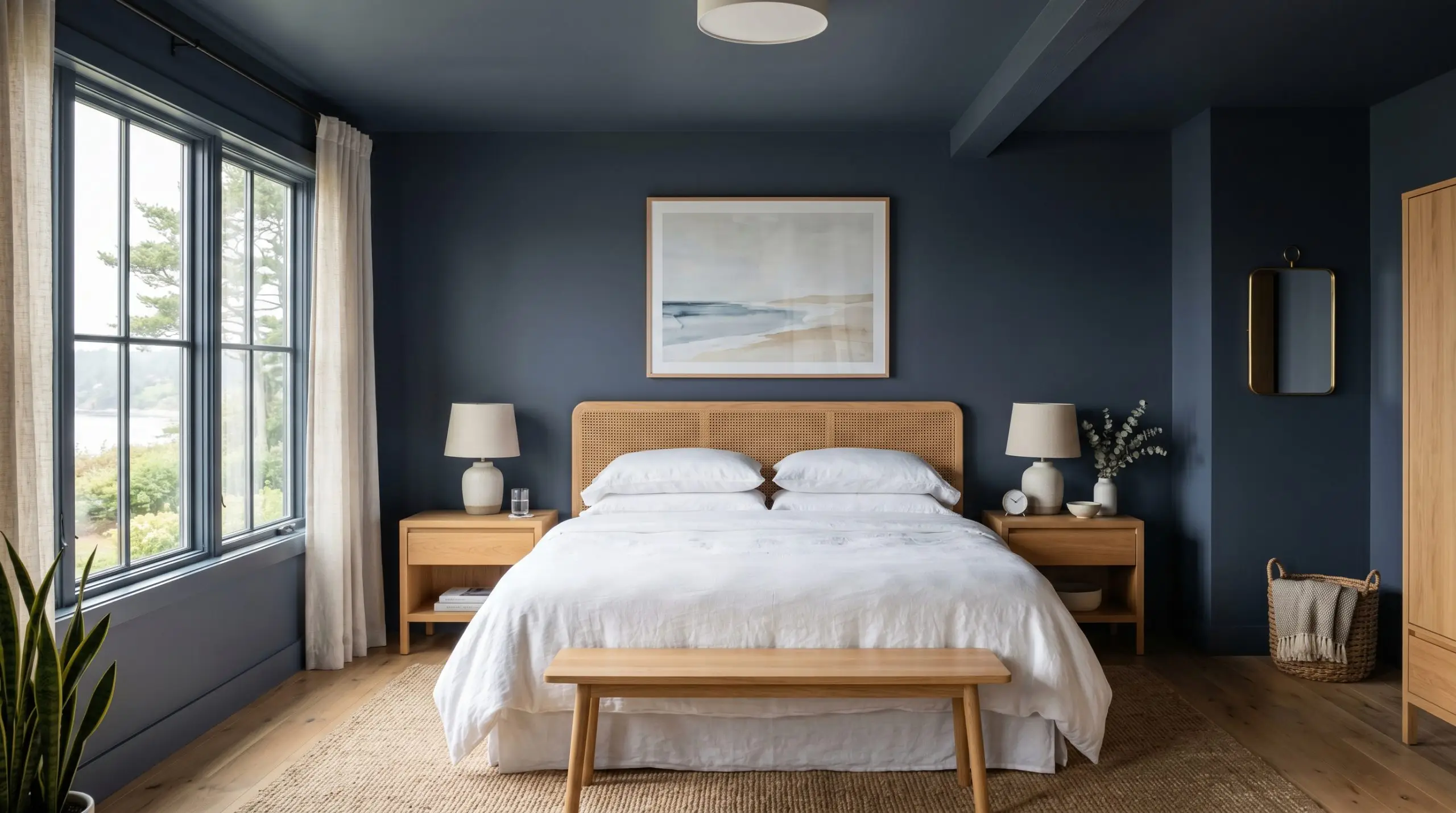
Bedrooms
Because it acts as a moody anchor, this color physically recedes, making bedroom walls feel like they are wrapping around you. It provides a stunning, high-contrast backdrop for crisp white linen bedding, woven rattan headboards, or heavy velvet drapes in warm mustard tones. Keep the ceiling bright white to maintain a sense of height, or wrap the color up onto the ceiling for absolute coziness.
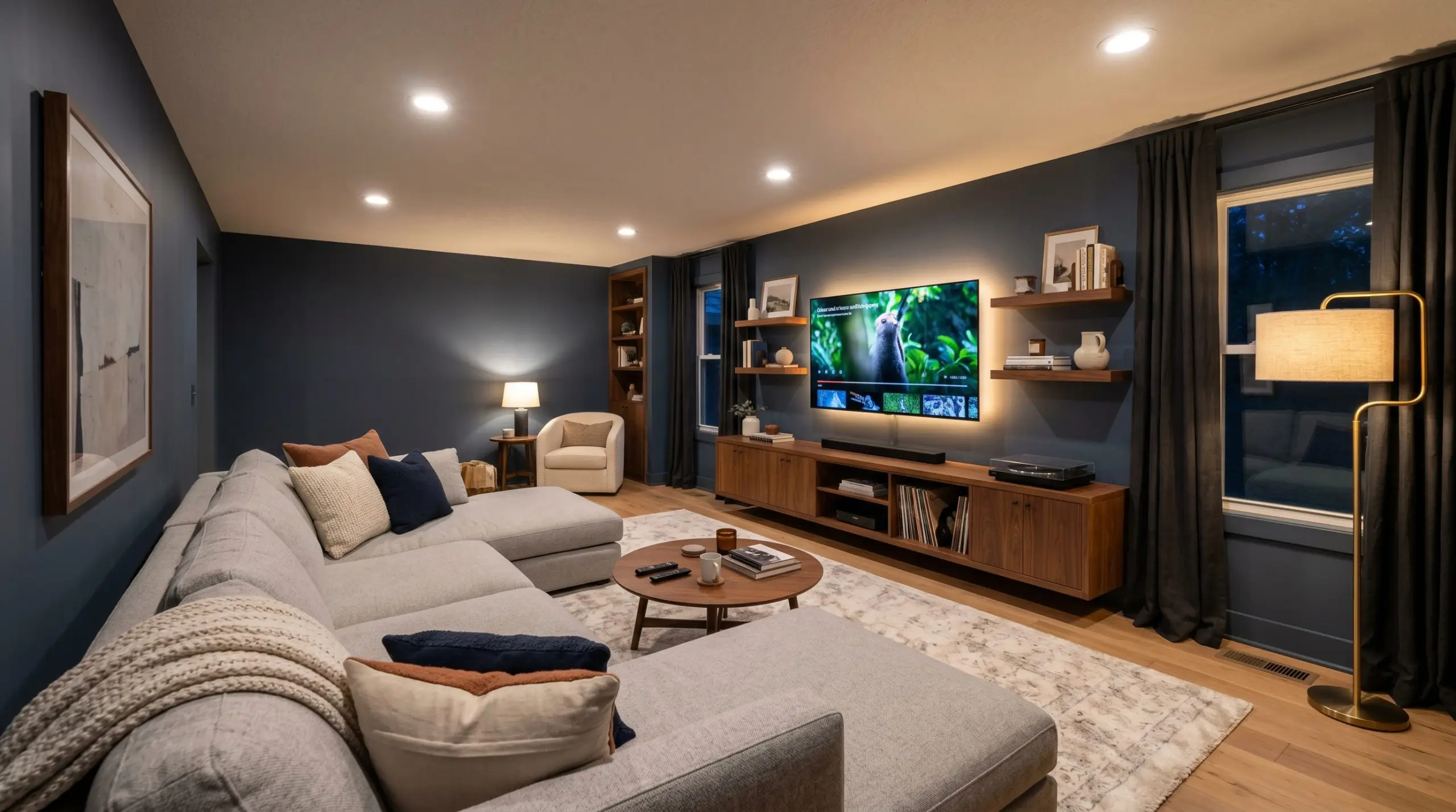
Media Rooms
For spaces dedicated to screens, you need a color that absorbs glare without feeling like a commercial movie theater. The charcoal undertones here swallow excess light from the television, while the blue keeps the space feeling domestic and stylish when the lights are on. Soften the room with an oversized, light gray sectional and a plush, low-pile rug.
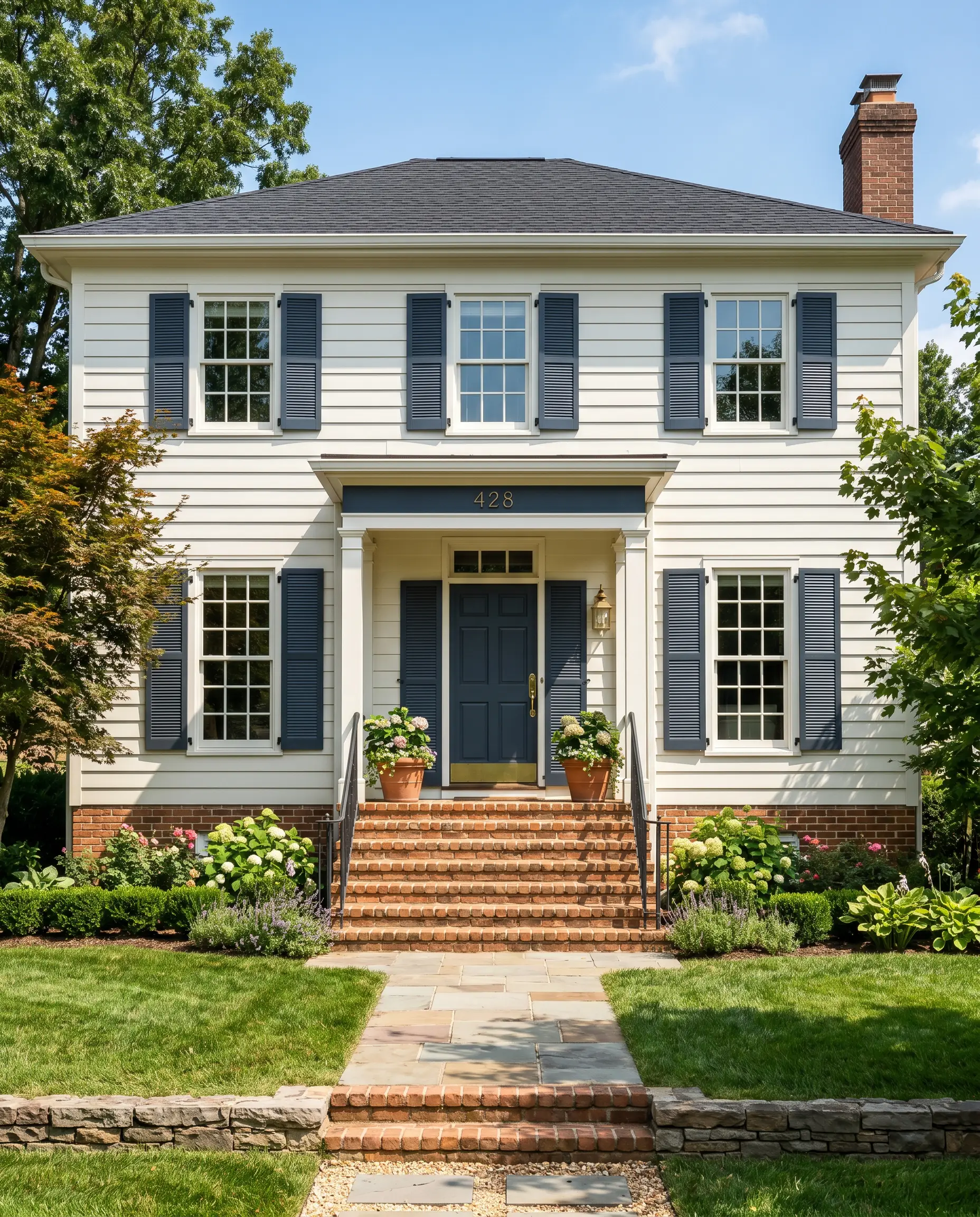
Exteriors
On a home’s facade, direct sunlight washes out dark colors, making them appear significantly lighter than they do indoors. Behr Dark Denim thrives outside, holding onto its rich blue identity on front doors and exterior shutters. It pops brilliantly against warm brick, creamy stucco, or classic white clapboard siding.
Creative Ways to Use Behr Dark Denim
Moving beyond the standard accent wall requires a bit of fearless design thinking. Here are a few high-impact, accessible ways to manipulate this color.
The Monochromatic Mudroom Drop Zone
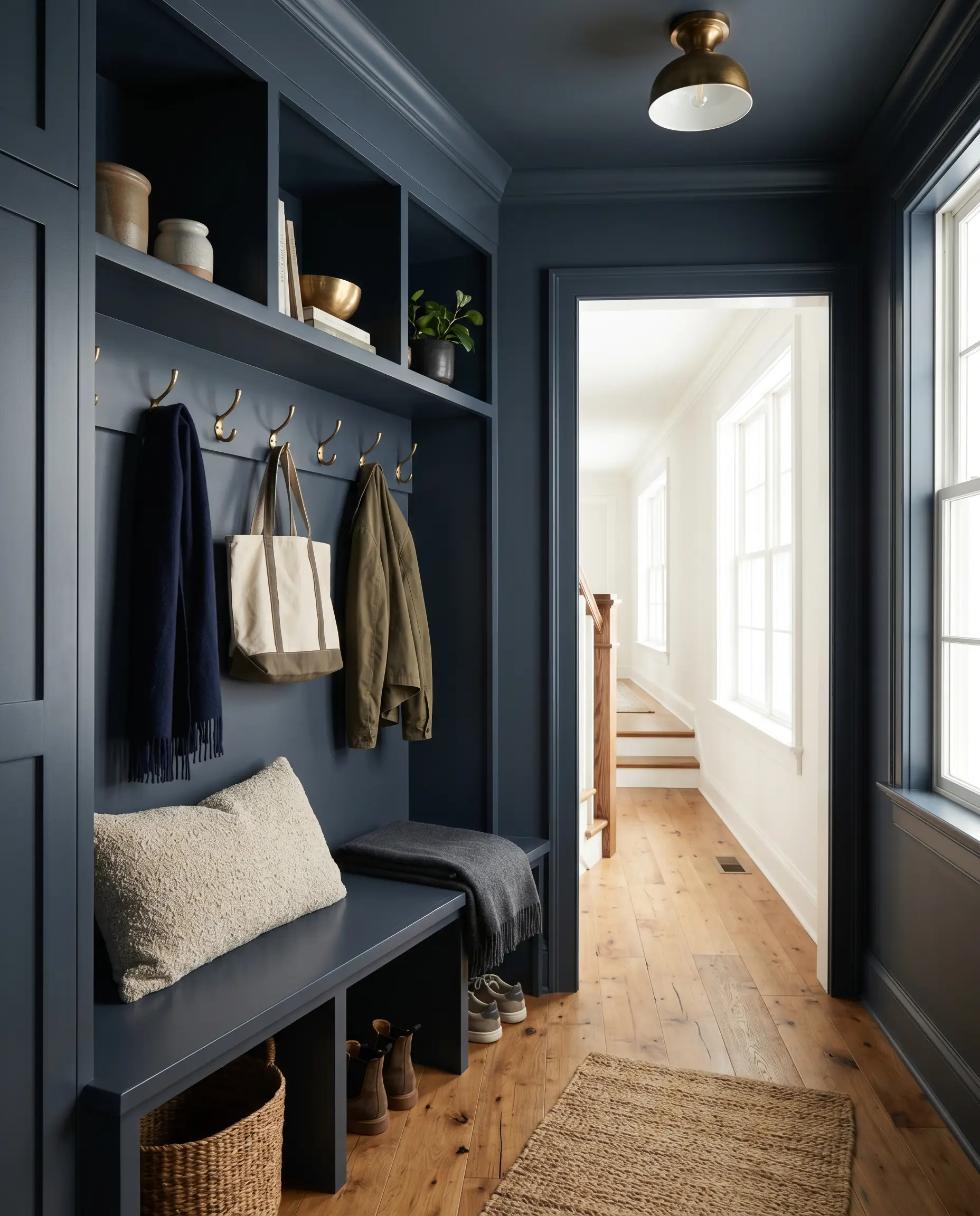
Transform a chaotic entryway by applying this color drenching technique to a small mudroom. Paint the walls, the built-in cubbies, the bench, and the trim entirely in S510-7. This monochromatic approach hides scuffs and dirt effortlessly while turning a purely functional transition zone into a striking architectural jewel box.
Color-Blocked Hallway Arches
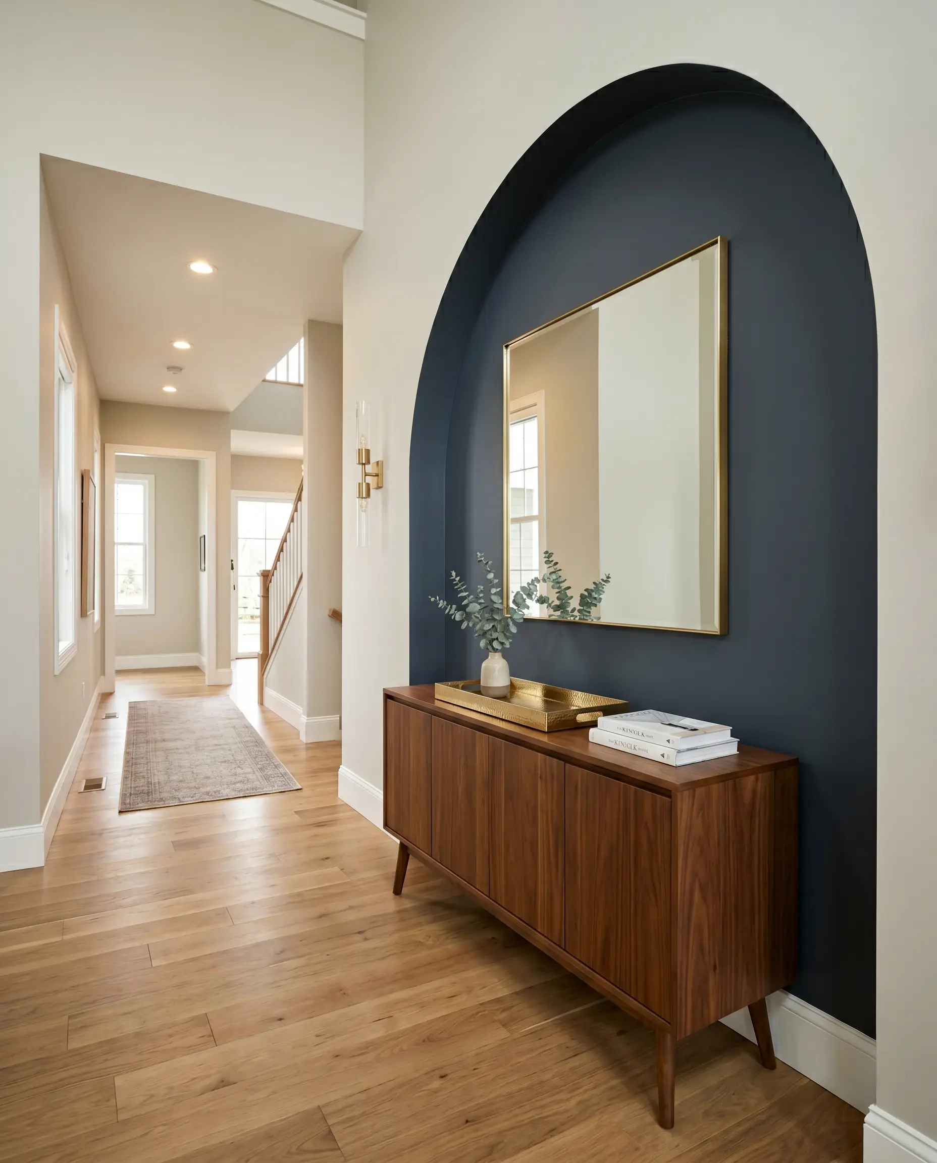
If you have a standard, boxy hallway, use this heavy shade to paint a large, sweeping arch directly onto the wall behind a console table. The deep, absorbing nature of the slate blue creates a false sense of architectural depth, tricking the eye into believing there is an alcove where none exists. Ground the shape with a warm wood table and a highly reflective mirror.
A Cinematic Dining Nook
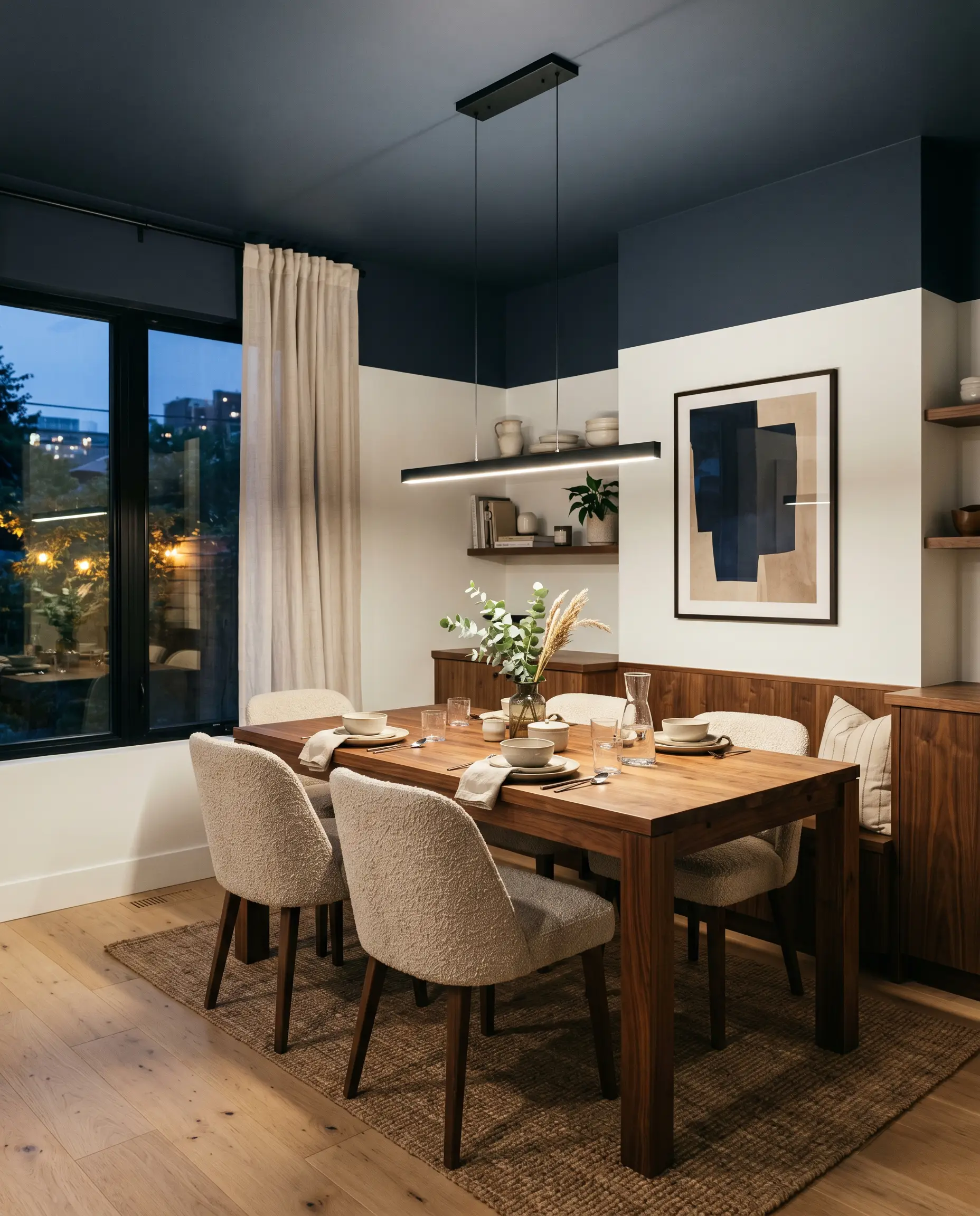
Define an open-concept dining space by painting just the ceiling and the top quarter of the walls in this stormy hue, leaving the lower walls crisp white. This modern, inverted wainscoting effect visually lowers the ceiling over the dining table, creating an intimate, cinematic atmosphere for dinner parties without requiring expensive millwork.
Hardware & Palette Pairings
This shade thrives on intentional contrast, requiring either crisp, tailored boundaries or warm, complementary tones to feel truly curated.
Trim & Baseboards
Hardware, Wood & Material Pairings
Coordinating Colors
Because of the deeply embedded trace of indigo within its DNA, avoid pairing this paint with generic stark whites or standard mint greens.
Designer Mood Boards
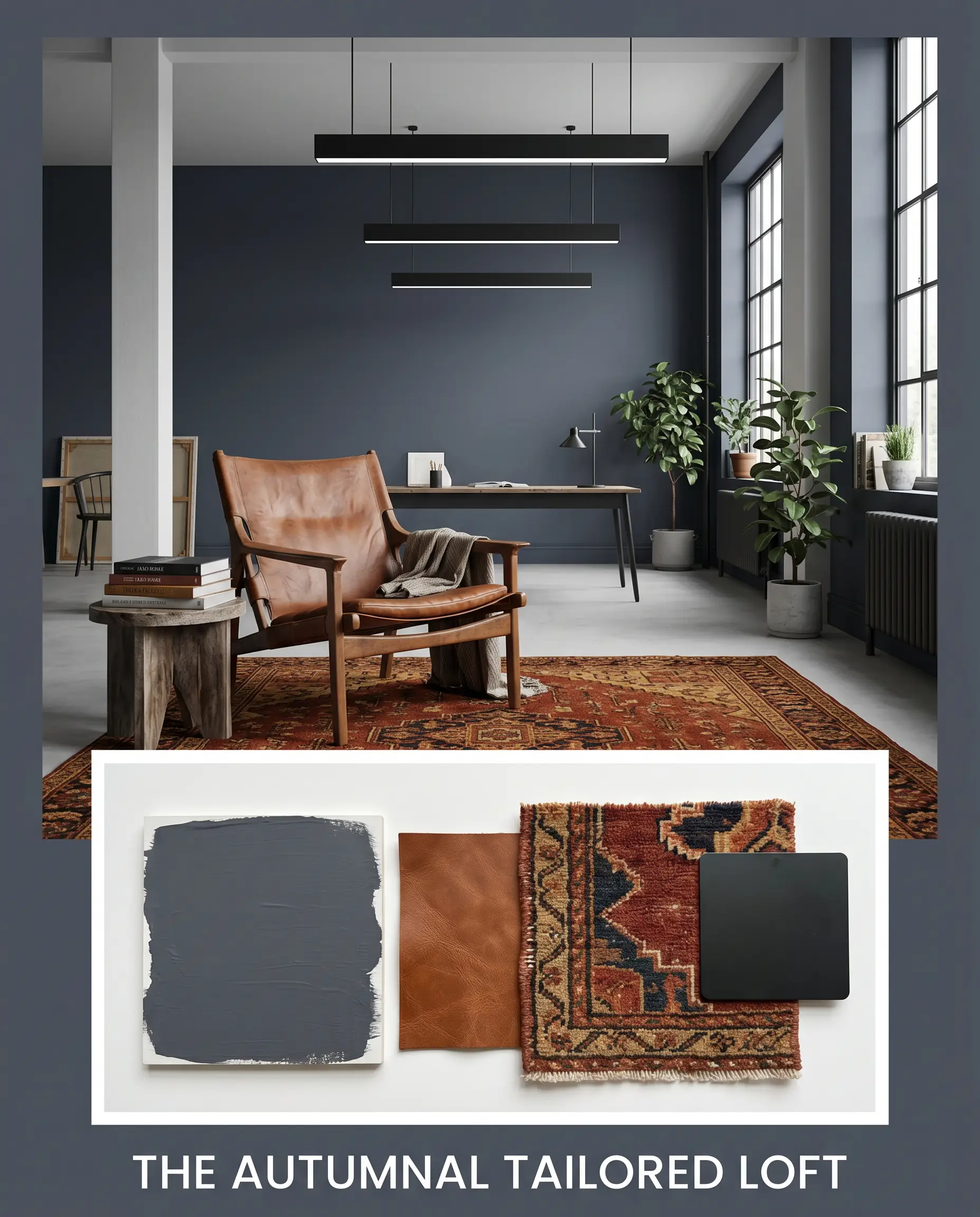
The Autumnal Tailored Loft: This palette relies on the tension between the cavernous walls and rich, tactile warmth. Picture the slate blue walls serving as a backdrop for a heavily worn, cognac leather sling chair. Anchor the room with a vintage Persian rug featuring deep rust and Farrow & Ball India Yellow No. 66 accents, finishing the space with matte black linear pendants for a touch of modern industrial edge.
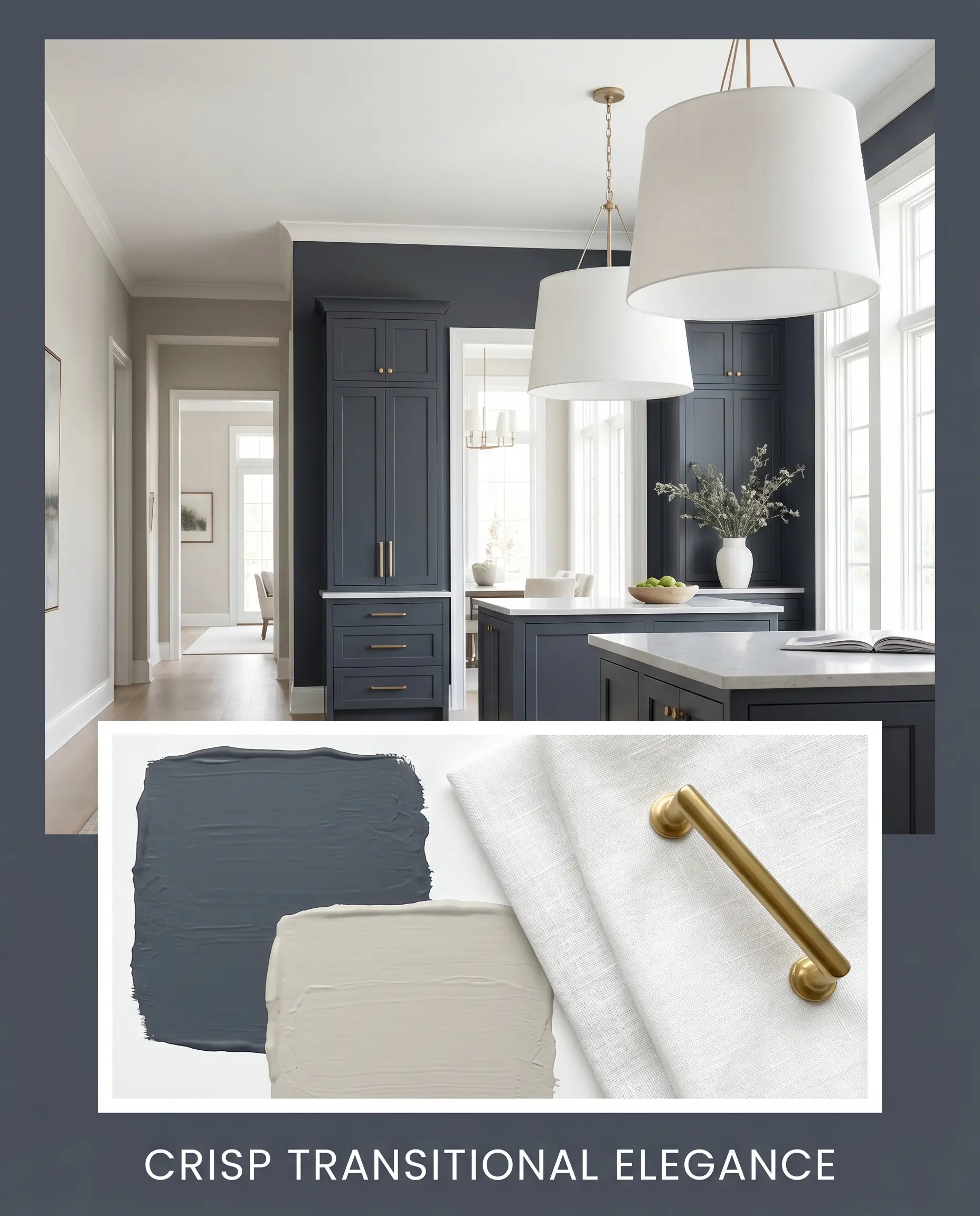
Crisp Transitional Elegance: Focusing on high-contrast sophistication, this aesthetic pairs the dark walls with Sherwin-Williams Agreeable Gray SW 7029 on adjacent hallway walls. Introduce brushed brass cabinet hardware and oversized, white linen drum shades to bounce light around the room. The overall vibe is tailored, clean, and effortlessly expensive.
Behr Dark Denim Head-to-Head Comparisons
Sometimes, the lighting in your specific home demands a slight pivot. Here is how S510-7 stacks up against its closest rivals.
Behr Dark Denim vs. Behr Starless Night PPU14-20
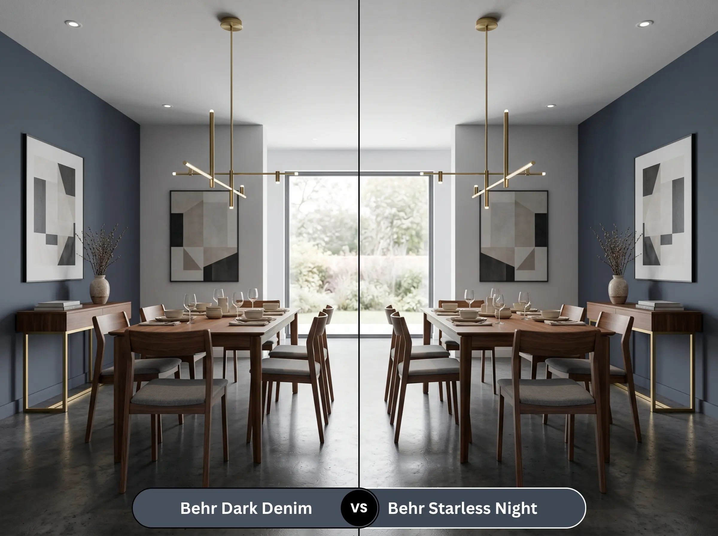
If you need a color that reads closer to a true, inky black, shift to Starless Night. Dark Denim retains a noticeable blue identity even in the shadows, whereas Starless Night drops its blue almost entirely in low light, offering a much more aggressive, gothic edge.
Behr Dark Denim vs. Sherwin-Williams Naval SW 6244
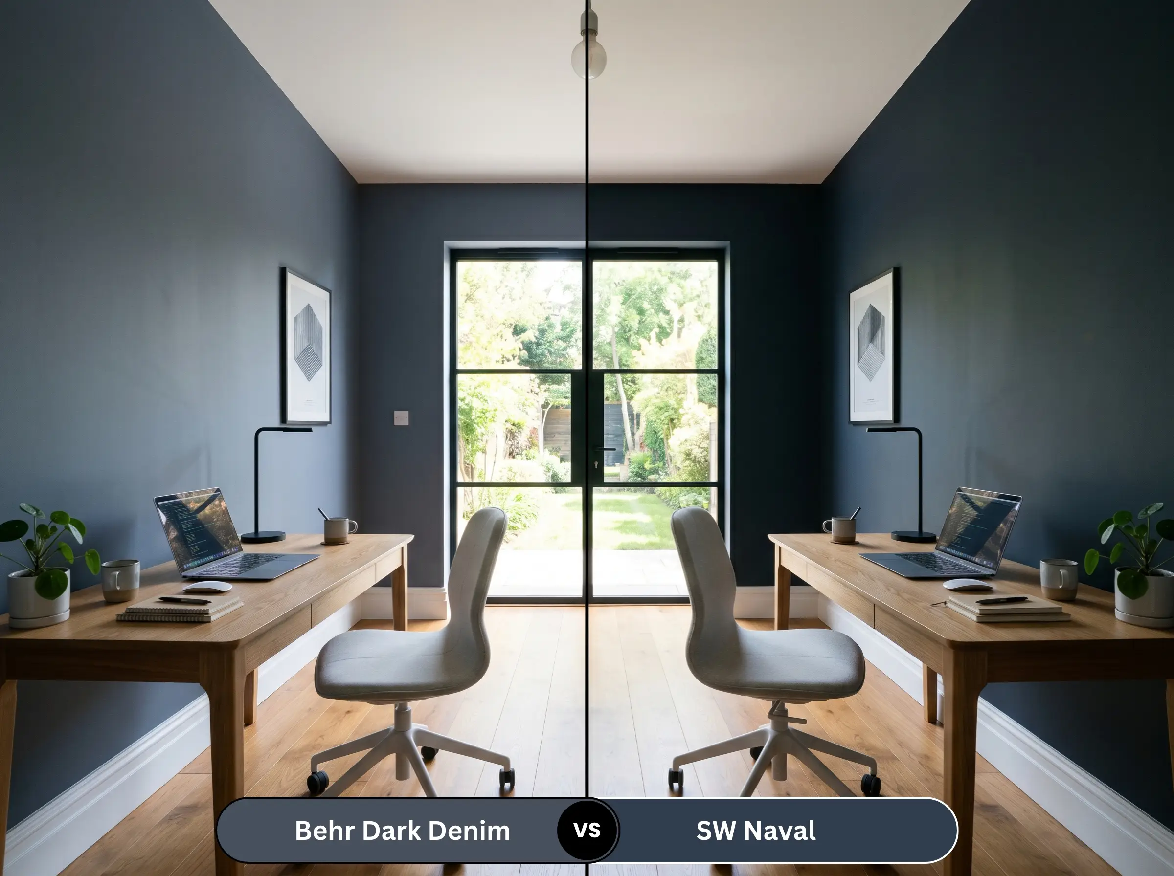
Naval is significantly more vibrant and lacks the heavy charcoal filter found in the Behr option. If your room feels too playful or nautical with Naval, S510-7 is the perfect alternative, as its gray foundation matures the space instantly.
Behr Dark Denim vs. Benjamin Moore Hale Navy HC-154
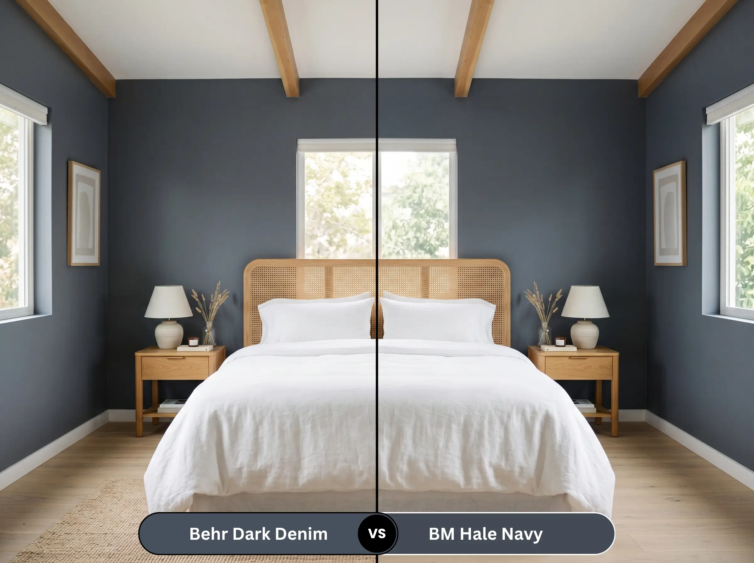
Hale Navy is the industry standard for a transitional dark blue, but it leans slightly warmer and more muted. If you want a crisper, slightly more modern edge with that hidden violet nuance, the Behr formulation provides a sharper, cooler aesthetic.
Alternatives to This Stormy Charcoal Blue
If this specific Behr shade isn’t quite hitting the mark for your project, consider these accessible alternatives.
Similar Colors
Cross-Brand Matches
DIY Guide to Painting with Behr Dark Denim
Executing a flawless dark wall requires a bit more prep than rolling on a standard off-white.
The Dynamic Sheen Guide
Primer Strategy
You cannot skip primer with a color this deep. Ask the paint desk to mix a tinted gray primer (specifically formulated for dark topcoats). Using a standard white primer will force you to apply three or four coats of the blue to achieve true opacity.
Coverage & Success Tips
Even with a tinted primer, expect to apply two full, generous coats for a professional finish. Be incredibly careful about “flashing”—this happens when you touch up a dry dark wall, leaving a visible, shiny patch that catches the light. Always maintain a wet edge while rolling, and if you need to touch up a scuff later, you may have to repaint that entire wall corner-to-corner to keep the sheen perfectly even.
Dark paints form a thick, rubbery skin as they dry. To prevent peeling your beautiful new blue paint off the wall, always score the edge of your painter’s tape lightly with a utility knife before pulling it away from the trim.
Hackrea Pro-Tip (The Tape Pull)
Frequently Asked Questions
Because of its extremely low light reflectance, it will absolutely lean into its charcoal foundation in a room with zero natural light. However, if you use bright 3500K LED vanity lights and pair it with highly reflective white subway tile, it creates a stunning, jewel-box effect rather than feeling like a cave.
Like all deeply saturated blues and blacks, it is susceptible to UV fading over time on a highly exposed, south-facing facade. To protect the denim blue character, ensure you are using Behr’s highest-tier exterior formula with built-in UV protectants, and expect to touch it up every five to seven years.
Yes, but it requires the right context. Painting a ceiling dark blurs the visual boundary of where the walls end and the ceiling begins, much like the night sky. This trick works beautifully in media rooms or bedrooms, provided the walls are also painted a deeply saturated hue to maintain the illusion.
Polished chrome and shiny silver finishes tend to pull the absolute coolest, most sterile notes out of this paint. Instead of highlighting the rich blue, highly polished cool metals make the paint look flat, icy, and slightly inexpensive.
Final Verdict: Is This Moody Blue Right For You?
Behr Dark Denim (S510-7) is a spectacular, budget-friendly gateway into premium, high-contrast design. It is perfect for the homeowner who wants the dramatic impact of a black wall but needs the approachable, domestic softness of a blue. It excels in home offices, on kitchen cabinetry, and as a grounding force in cozy bedrooms, delivering a tailored, sophisticated energy that rivals luxury paint brands.
However, this color will aggressively fight against the wrong foundational elements in your home. You must avoid pairing this stormy shade with heavy, red-leaning cherry wood floors or cabinetry, as the red and the indigo micro-nuance will violently clash, making the wood look dated and the paint look bruised. Furthermore, if your home features stark, icy gray luxury vinyl plank flooring, this paint will amplify those sterile tones, resulting in a room that feels uninviting and cold. Stick to warm domestic woods, creamy off-whites, and brass accents, and this muted navy will instantly elevate your home’s aesthetic.
Warning