The Sophisticated Yellow Kitchen: 25 Ways to Master Ochre, Mustard, and Buttercream
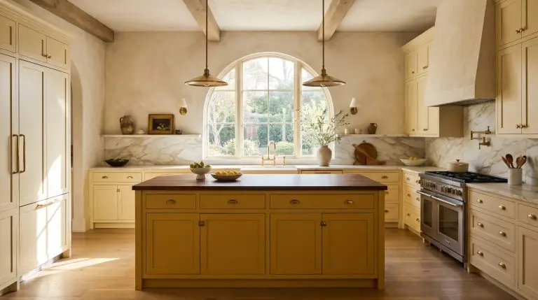
Yellow is the most intimidating color you can bring into a culinary space, often triggering immediate flashbacks to garish 1990s Tuscan decor or fast-food dining rooms. Fortunately, a modern yellow kitchen is entirely divorced from that aesthetic, relying instead on exacting undertones, sophisticated Light Reflectance Values (LRV), and highly curated material pairings. When executed with precision—grounding a sharp mustard with dark walnut or cooling a pale buttercream with honed marble—yellow becomes historically rich, fiercely architectural, and undeniably high-end.
The Subtle Approach: Pale Buttercream and Soft Lemon
For English Country or soft transitional styles, low-chroma yellows act beautifully as a warm neutral. The secret to success here is minimizing the saturation so the color reads as a trick of the sunlight rather than a heavy coat of paint.
1. Pair Buttercream Shaker Cabinets with Honed Soapstone
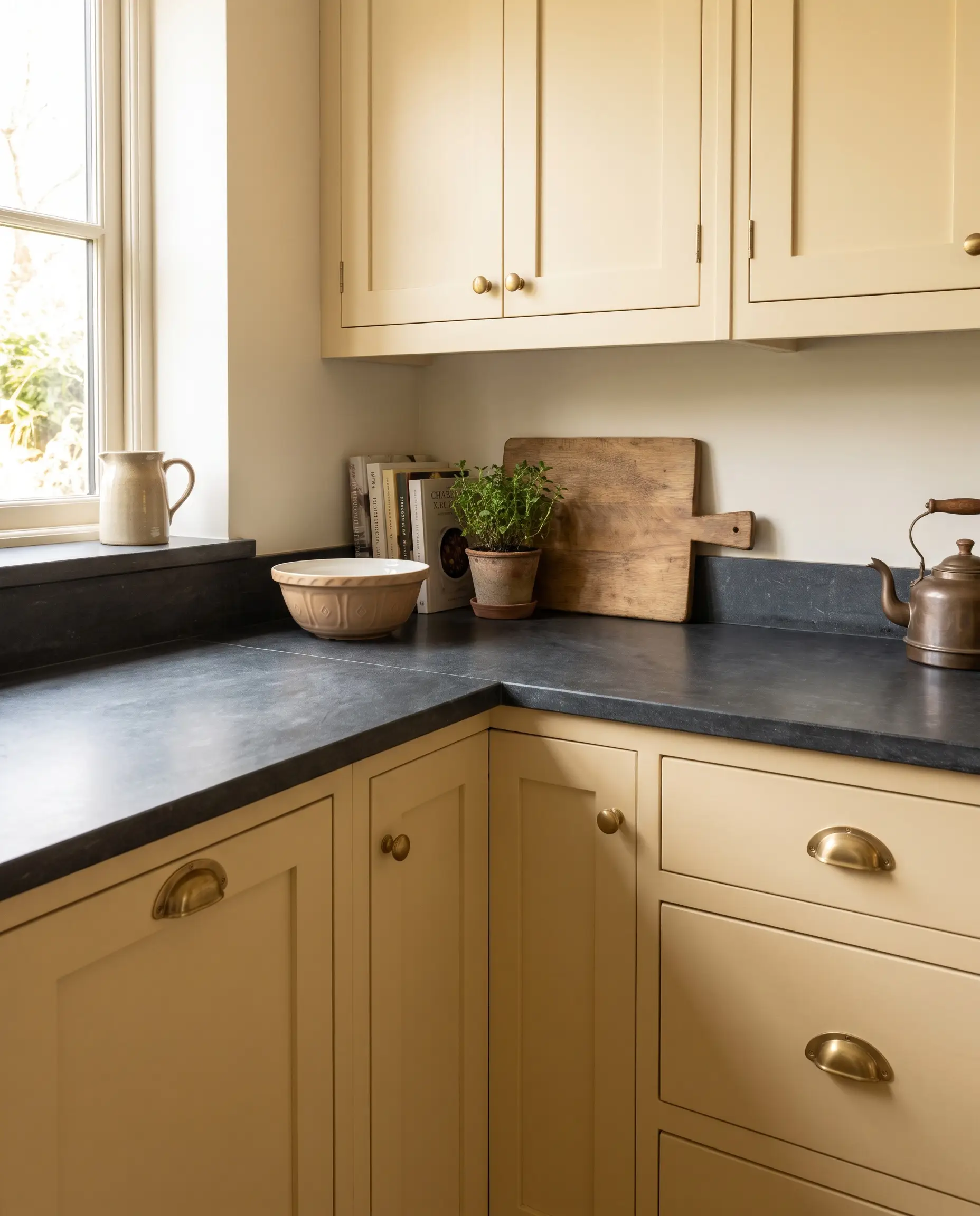
Sweet, pale cabinetry requires an immediate architectural counterweight to prevent the room from feeling juvenile. The dark, chalky density of soapstone absorbs light, instantly grounding the airy quality of the buttercream.
- Vibe: Restored English Manor
- Key Materials: Shaker-profile cabinetry, dark soapstone slab
- Styling Pro-Tip: Keep the edge profile of the soapstone squared rather than bullnose for a cleaner, modern transition.
- Material Pairing: The matte, chalky texture of honed soapstone cools down the sweet warmth of buttercream, providing critical visual gravity.
Benjamin Moore Hawthorne Yellow (HC-4) is a historical favorite that reads as a sophisticated, creamy neutral in well-lit spaces.
Designer Paint Pick
2. Wash the Walls in a Pale Lemon Plaster Finish
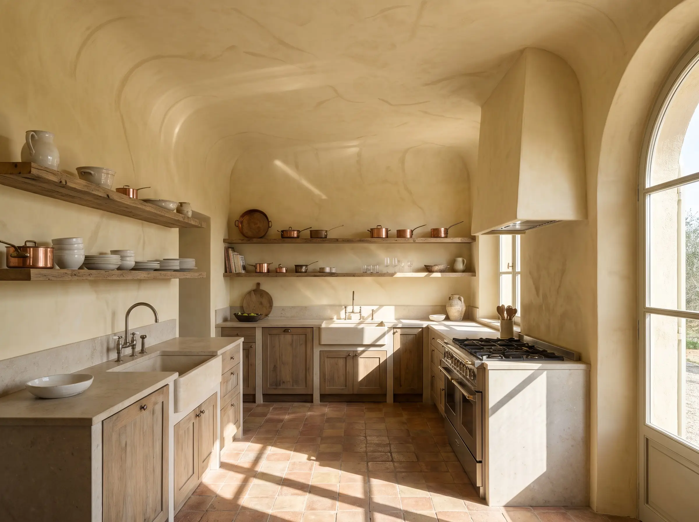
Flat drywall painted pale yellow can occasionally look unfinished or cheap. Applying a subtle lemon tone via a textured plaster finish adds essential shadow lines and organic movement, giving the color a lived-in, old-world patina.
- Vibe: Sun-Drenched European Villa
- Key Materials: Roman clay or Tadelakt plaster
- Styling Pro-Tip: Carry the plaster over the ceiling to blur harsh transition lines.
Farrow & Ball Dorset Cream (No. 68) applied in a limewash or plaster finish offers incredible depth without reading too heavy.
Designer Paint Pick
3. Use Beadboard Paneling for Historical Charm
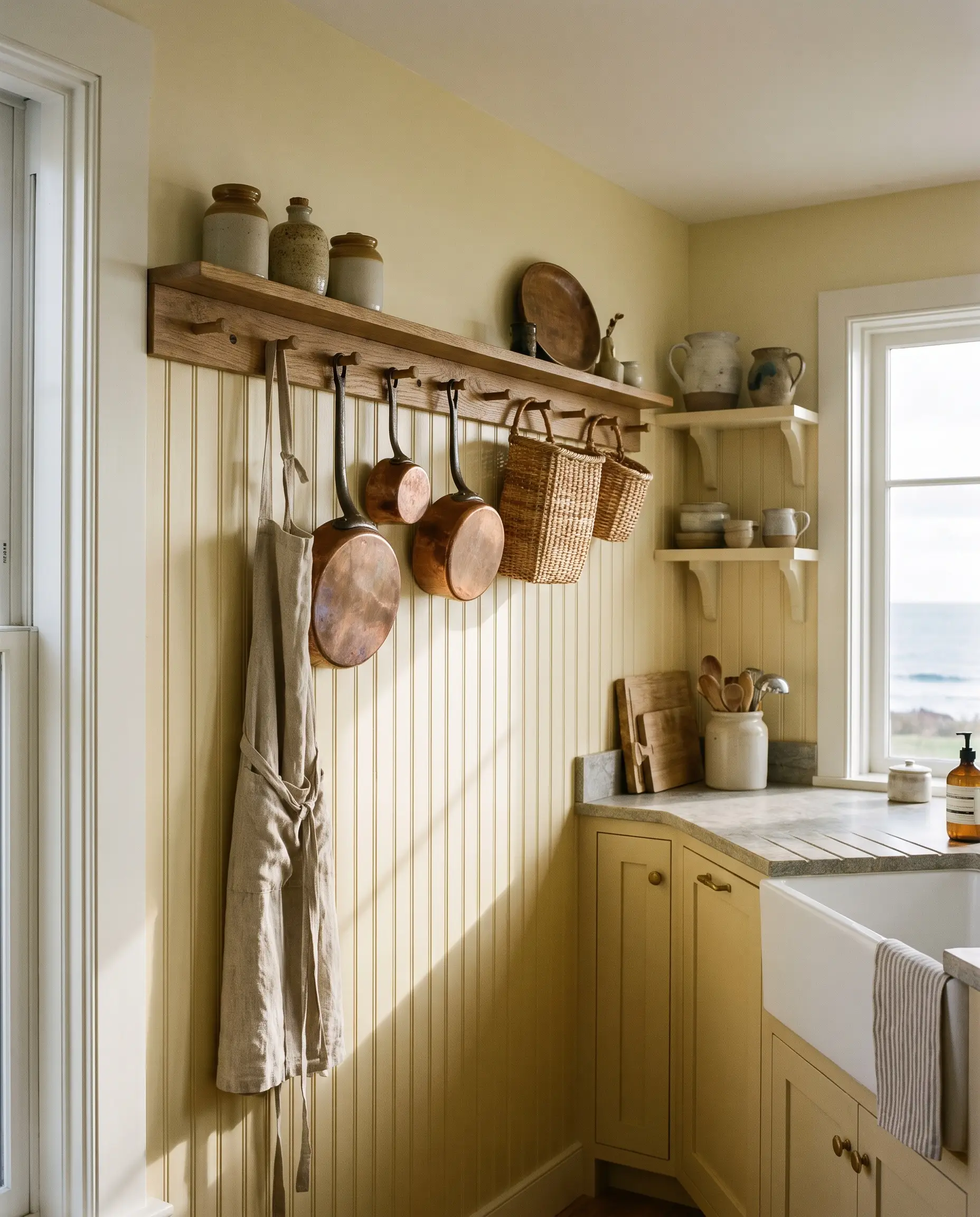
Vertical beadboard paneling introduces necessary rhythm to a subtle yellow palette. The rhythmic grooves of the wood break up the color field, allowing the paint to pool in the recesses and highlight the architectural details.
- Vibe: Historic Coastal Cottage
- Key Materials: 3-inch vertical beadboard, satin-finish paint
- Styling Pro-Tip: Terminate the beadboard with a chunky peg rail for functional, high-taste storage.
4. Ground Soft Yellows with Checkerboard Marble Flooring
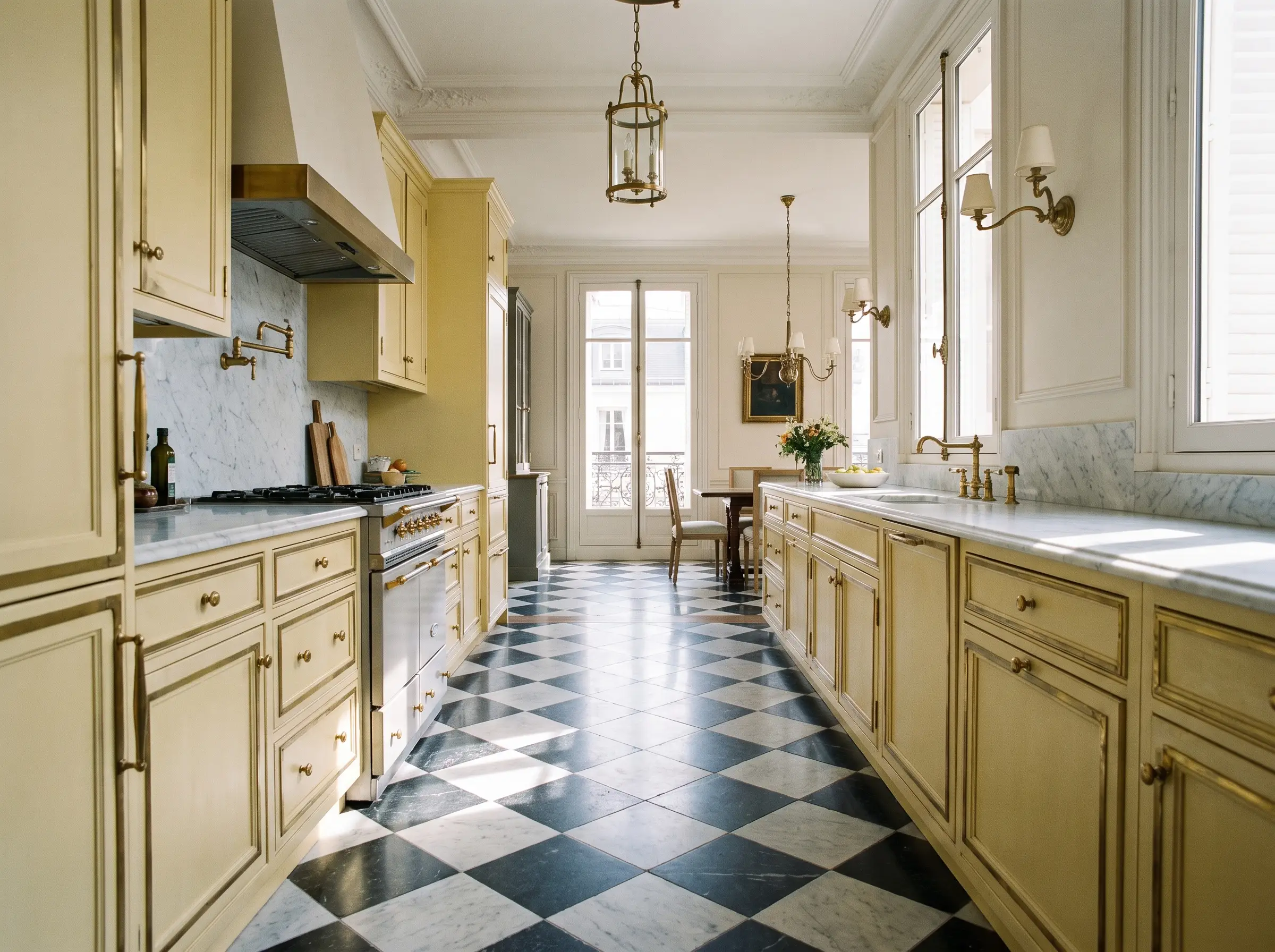
A pale yellow cabinet run needs a strong geometric foundation to maintain a sophisticated edge. Classic checkerboard flooring in muted, tumbled stone anchors the space and introduces a sharp, tailored contrast to the soft cabinetry.
- Vibe: High-End Parisian Apartment
- Key Materials: Tumbled Carrara and Nero Marquina marble tiles
- Styling Pro-Tip: Lay the tiles on a diagonal to visually expand the width of a narrow galley.
5. Match Butter Cabinets with Unlacquered Brass Hardware
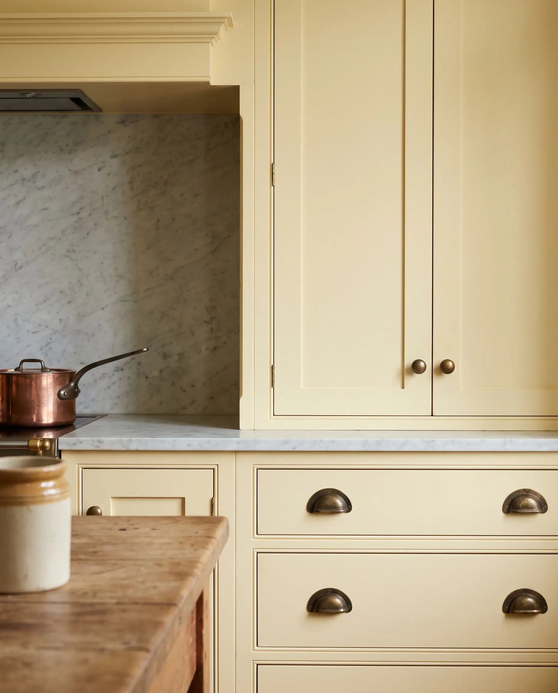
Standard polished brass can clash aggressively with pale yellow, turning the palette overly bright. Unlacquered brass, however, develops a living patina that harmonizes perfectly with the warm undertones of butter-colored cabinetry as it ages.
- Vibe: Lived-in Luxury
- Key Materials: Solid unlacquered brass cup pulls and ball knobs
- Styling Pro-Tip: Mix hardware shapes—knobs on doors, pulls on drawers—to keep the traditional look feeling custom.
6. Apply a Monochromatic Wash to Crown Molding and Trim
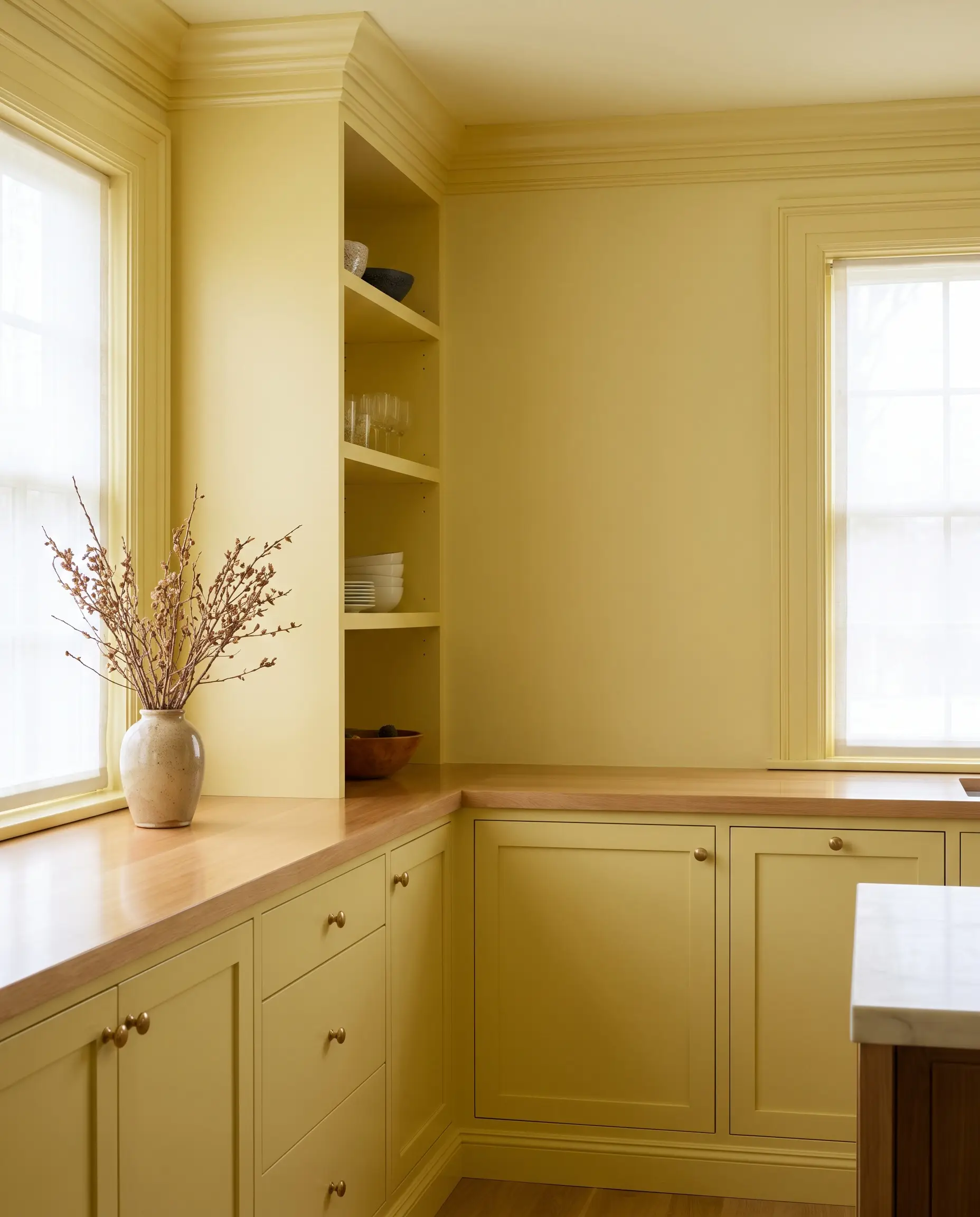
Standard white trim creates a jarring break against pale yellow walls, drawing the eye to the transitions rather than the space itself. Color drenching the crown molding and baseboards in the exact same soft lemon shade unifies the architecture.
- Vibe: Tailored Transitional
- Key Materials: Satin or semi-gloss trim paint matched to flat wall paint
- Styling Pro-Tip: Use a slightly higher sheen on the trim than the walls to create subtle, light-reflective contrast.
Earthy and Grounded: Mustard, Saffron, and Ochre
When shifting toward Mid-Century and Mediterranean design, adding brown and green undertones transforms primary yellow into mature ochre and mustard. These shades feel incredibly rooted, commanding a space with organic, architectural confidence.
7. Contrast Flat-Panel Mustard Cabinets with Dark Walnut
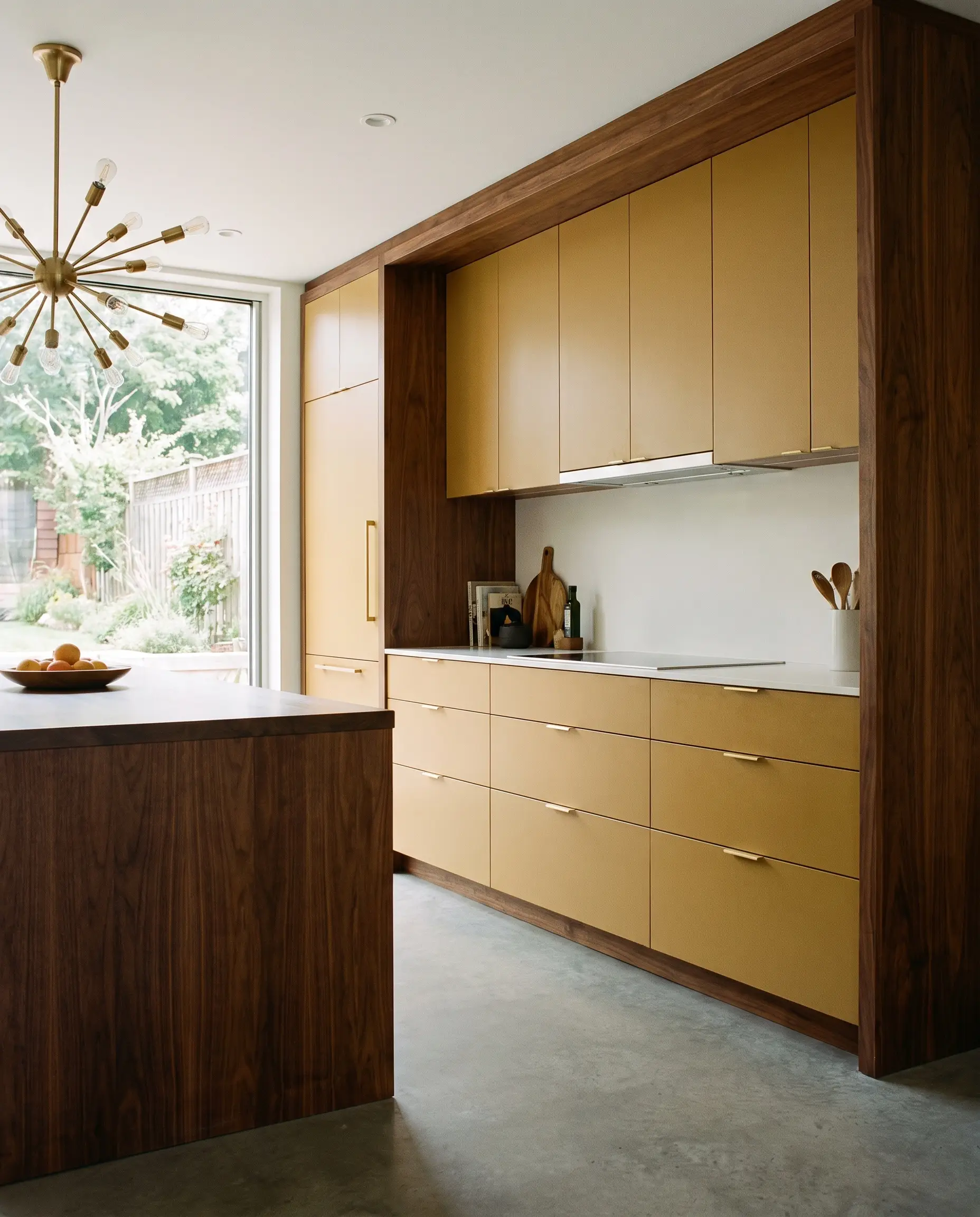
High-chroma mustard requires an exceptionally rich wood tone to balance its aggressive warmth. The deep, chocolatey grain of dark walnut provides the perfect mid-century anchor, ensuring the yellow reads as intentional and bespoke.
- Vibe: Curated Mid-Century Modern
- Key Materials: Flat-panel mustard fronts, solid walnut framing
- Styling Pro-Tip: Keep the cabinetry hardware minimal or integrated to let the color and wood grain dominate the visual field.
Farrow & Ball India Yellow (No. 66) is a masterful, muddy mustard that pairs flawlessly with rich, dark woods.
Designer Paint Pick
8. Install Saffron Zellige Tiles for a Textural Backsplash
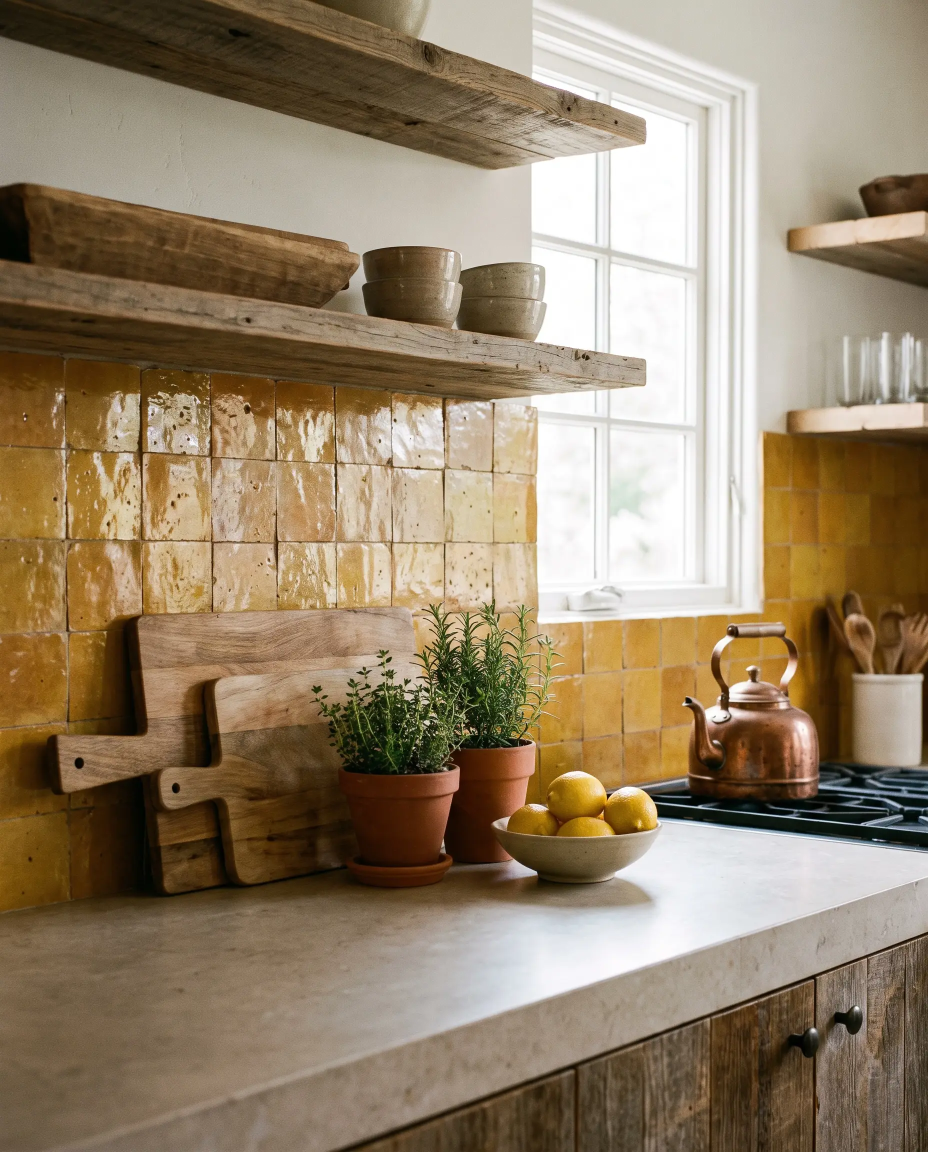
A flat, solid saffron backsplash can quickly overwhelm a room. The natural glaze variations, pits, and uneven edges of handmade zellige tile scatter light, preventing the earthy yellow from looking plastic or monolithic.
- Vibe: Organic Mediterranean
- Key Materials: 4×4 glazed Moroccan zellige
- Styling Pro-Tip: Butt-joint the tiles without visible grout lines to emphasize the handcrafted texture.
9. Anchor Ochre Cabinetry with Terracotta Floor Tiles
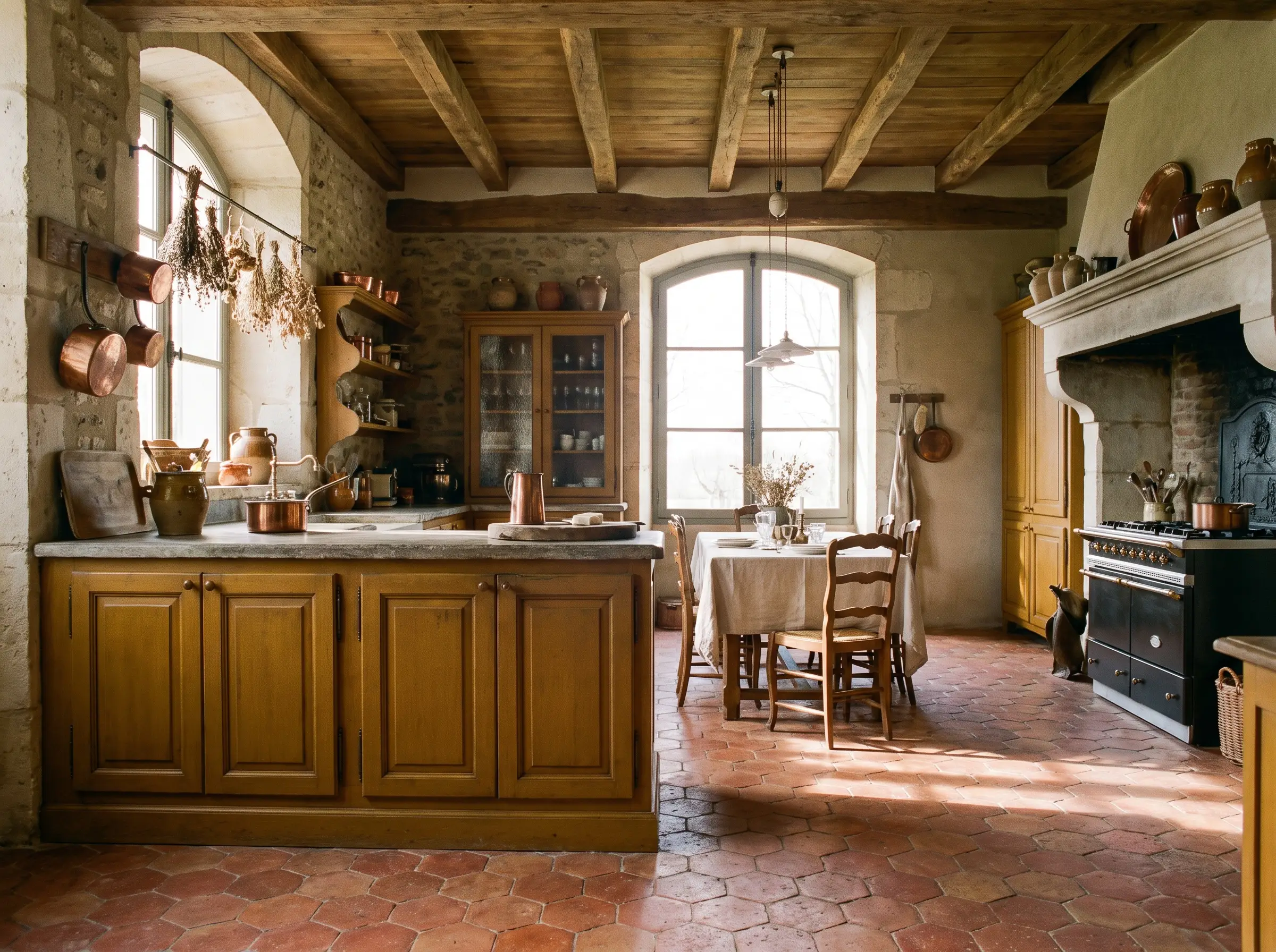
To fully commit to a grounded, organic aesthetic, pair deep ochre cabinetry with raw terracotta flooring. The red and orange undertones in the baked clay pull out the warmth of the ochre without competing for dominance.
- Vibe: Rustic European
- Key Materials: Reclaimed or handmade terracotta hex tiles
- Styling Pro-Tip: Seal the terracotta with a matte finish to protect it while maintaining its dusty, authentic texture.
10. Frame a Plaster Range Hood in a Deep Earthy Yellow
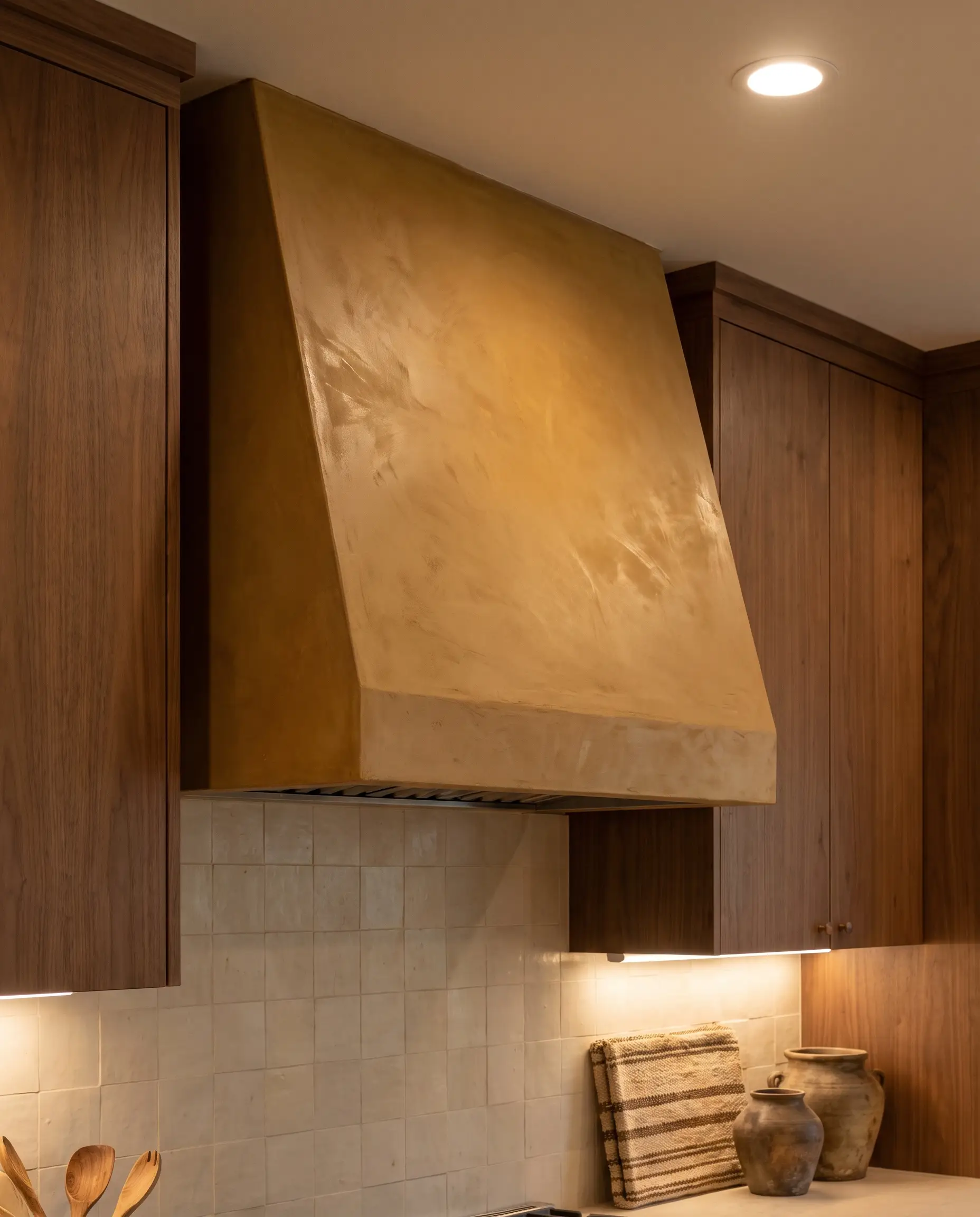
Turning the range hood into an architectural focal point demands a color with significant visual weight. A deep earthy yellow applied in a custom plaster finish turns a functional appliance surround into a stunning, sculptural anchor.
- Vibe: Bespoke Artisan
- Key Materials: Sloped custom range hood, tinted lime plaster
- Styling Pro-Tip: Keep the surrounding backsplash understated to let the hood command the room.
11. Pair Mustard Tones with Polished Copper Accents
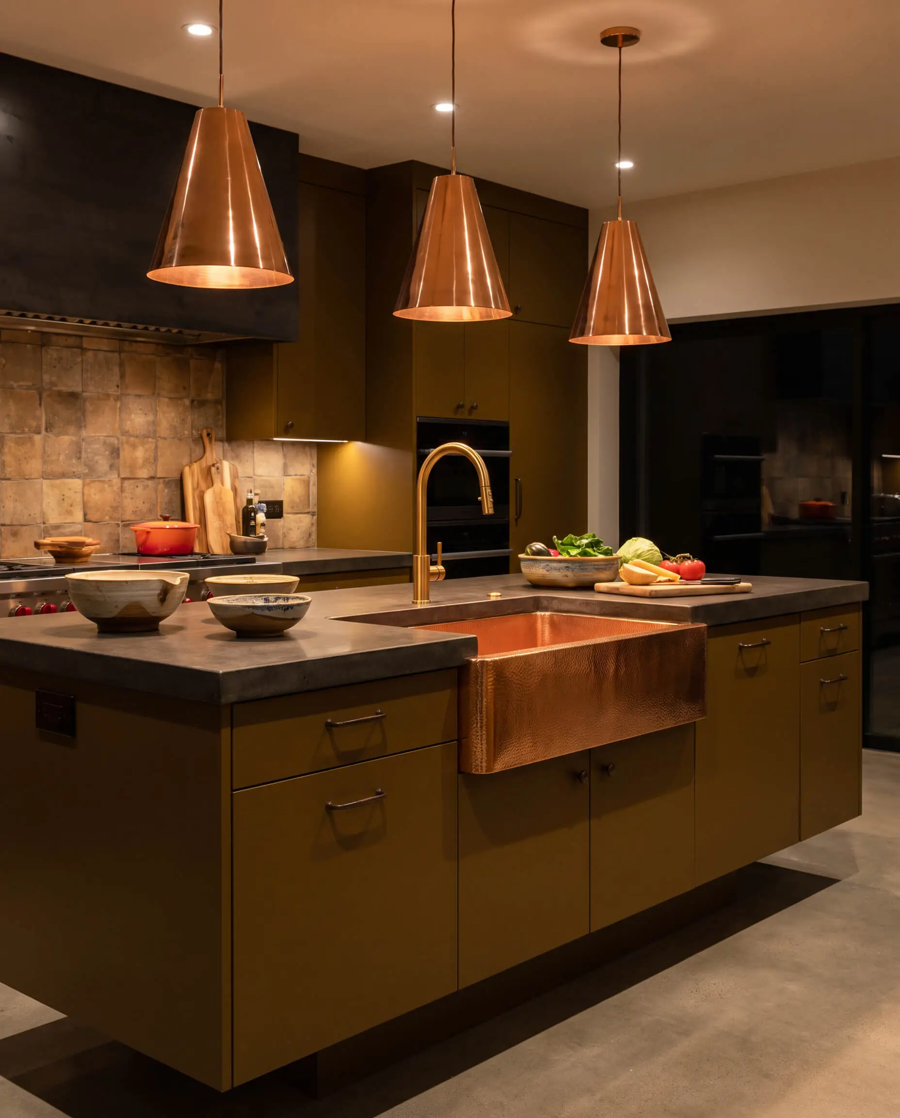
While brass is standard, polished copper introduces an unexpected, fiery metallic that sings against the muddy brown undertones of mustard. The reflective quality of the copper cuts through the density of the earthy cabinet color.
- Vibe: Elevated Industrial
- Key Materials: Copper pendant lights or an exposed copper sink
- Material Pairing: The highly reflective, orange-leaning sheen of polished copper brings out the hidden warmth in muddy mustard paint.
12. Use Open Rift-Sawn Oak Shelving to Break Up Heavy Saffron
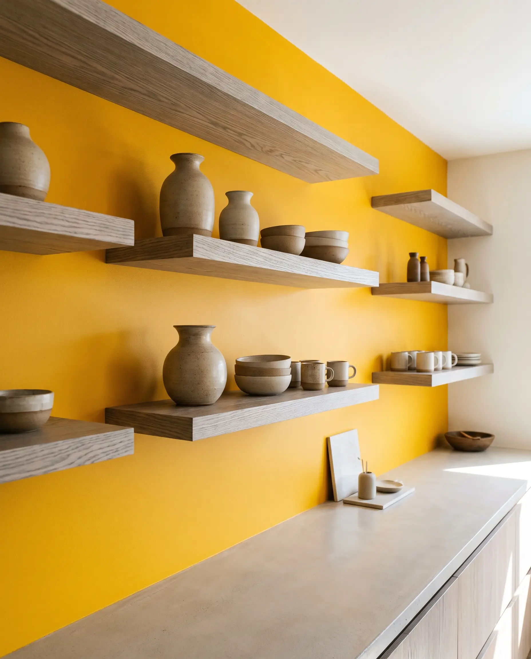
A solid wall of saffron upper cabinets can feel visually oppressive. Replacing the uppers with open, rift-sawn white oak shelving introduces negative space and a cool, linear wood grain that instantly relaxes the saturated palette.
- Vibe: Modern Organic
- Key Materials: 2-inch thick floating rift-sawn white oak shelves
- Styling Pro-Tip: Style the shelves sparingly with ceramic stoneware to maintain an uncluttered aesthetic.
High-Contrast Pairings: Two-Tone Yellow Kitchens
For those who desire the energy of yellow without a monochromatic commitment, two-tone cabinetry is an exceptional strategy. By using yellow as a high-impact feature against contrasting neutrals or deep tones, you control exactly where the eye travels.
13. Anchor the Space with a Mustard Island Against Soft White Perimeters
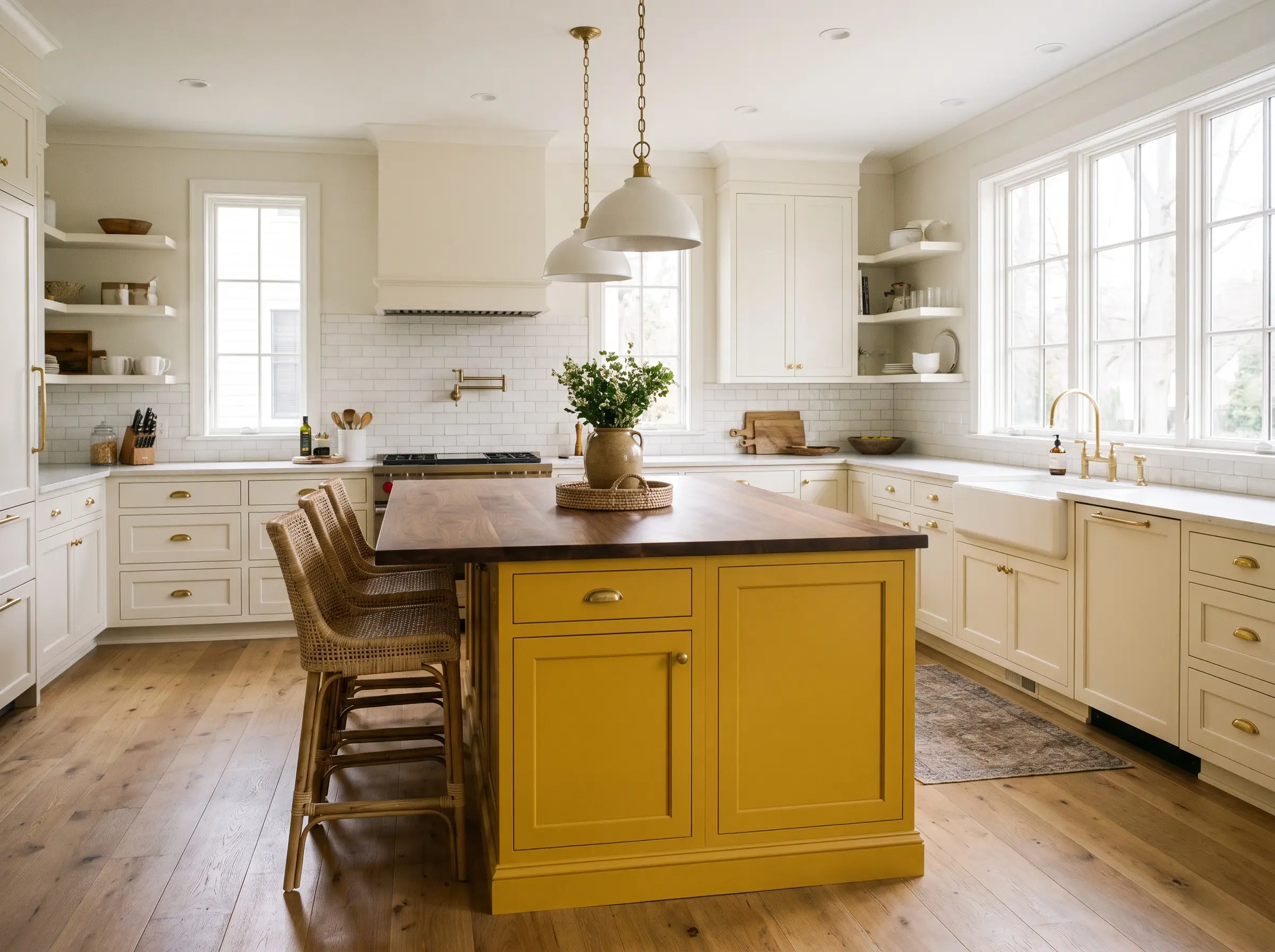
Centralizing the color on the island while keeping the perimeter cabinetry a soft, warm white creates a highly controlled focal point. This layout injects massive personality into the room while maintaining a bright, airy envelope.
- Vibe: Contemporary Classic
- Key Materials: Saturated mustard island, creamy white perimeter cabinets
- Styling Pro-Tip: Tie the two zones together by using the same hardware finish across both cabinet colors.
14. Pair Pale Yellow Upper Cabinets with Deep Forest Green Lowers
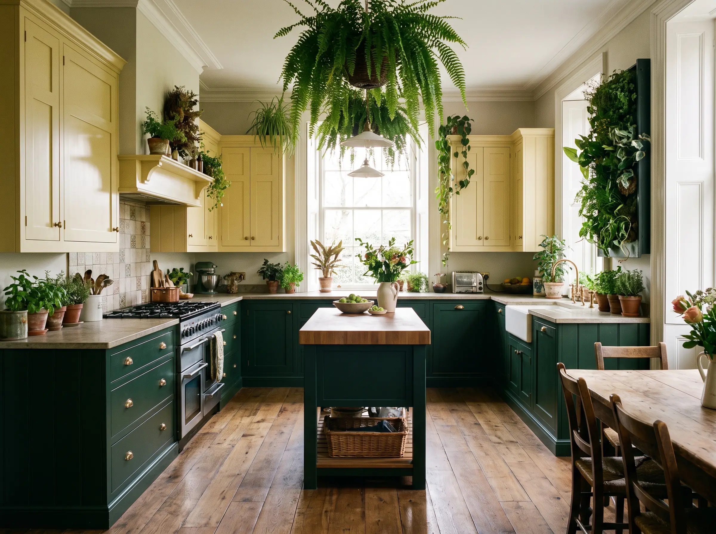
This pairing leverages the organic relationship between sunlight and foliage. The deep green grounds the lower half of the room, while the pale yellow uppers bounce light around, creating a beautifully balanced, biophilic space.
When executing a two-tone kitchen, always place the darker, heavier color on the lower cabinets. This anchors the room visually and prevents the space from feeling top-heavy.
Designer Rule
- Vibe: English Heritage
- Key Materials: Pale yellow uppers, dark green lowers, brass hardware
- Styling Pro-Tip: Ensure both paints share the same sheen to keep the contrast focused purely on color, not texture.
15. Use Matte Black Hardware to Sharpen Saturated Yellows
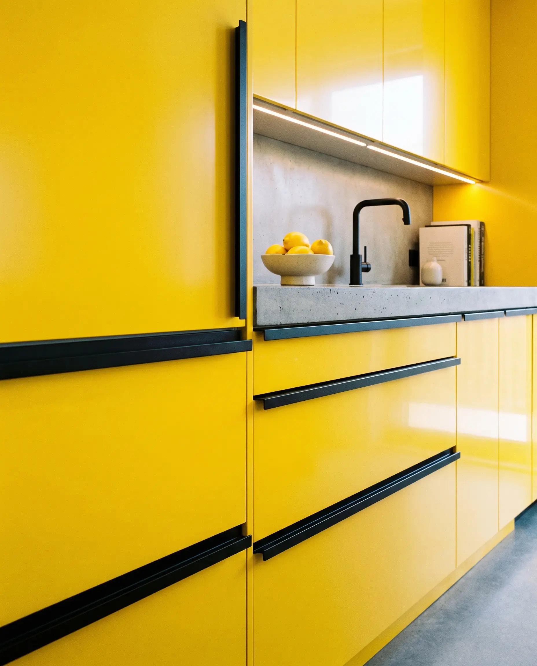
Bright, saturated yellows can easily lean overly sweet or retro. Introducing matte black hardware acts as a sharp, graphic interjection, instantly modernizing the cabinetry with crisp, architectural contrast.
- Vibe: Modern Graphic
- Key Materials: Saturated yellow paint, linear matte black pulls
- Material Pairing: The light-absorbing quality of matte black hardware cuts through the aggressive brightness of high-chroma yellow, forcing a sleek, contemporary edge.
16. Combine Ochre with Cool Slate Gray for Modern Balance
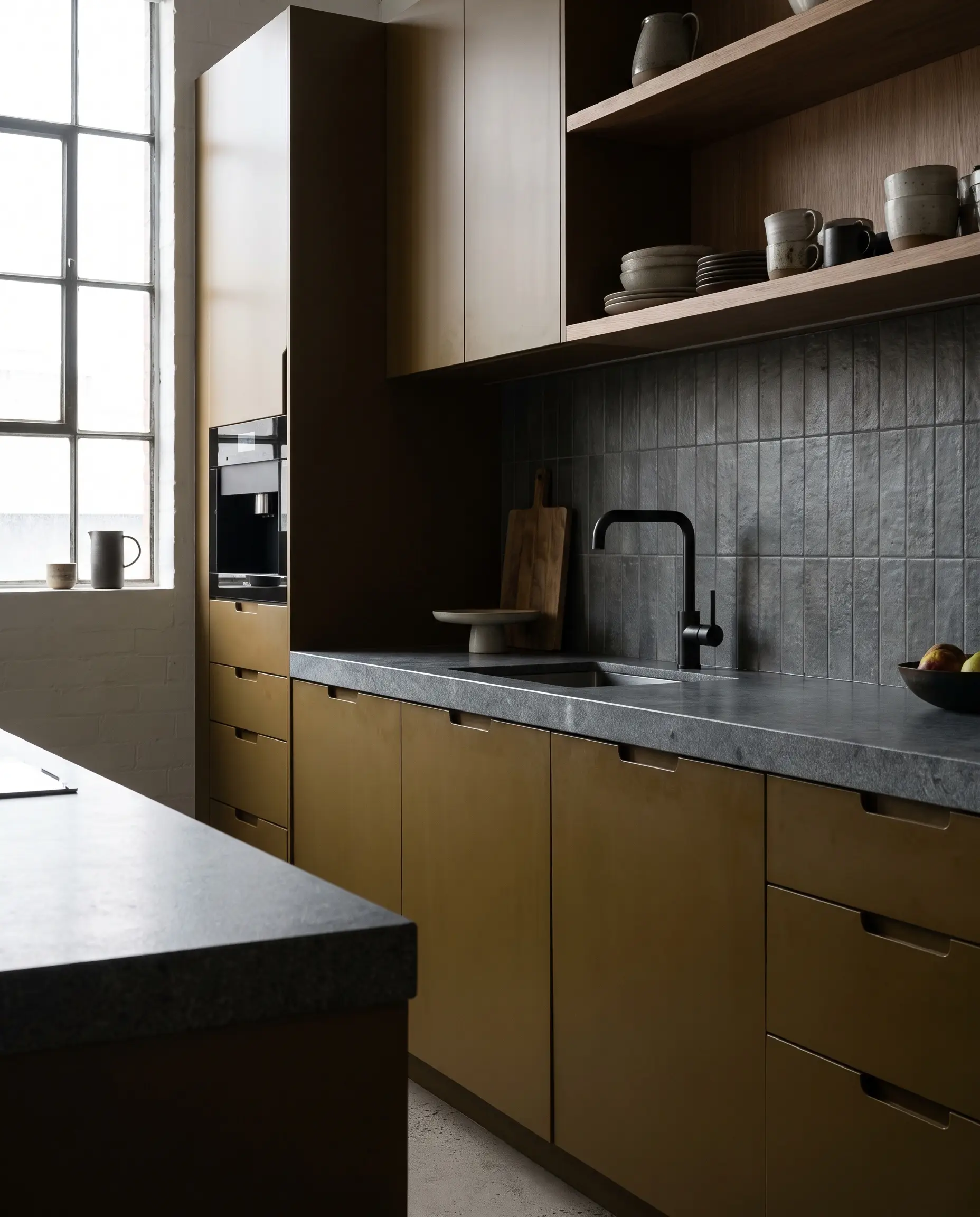
The intense, muddy warmth of ochre requires a strict cooling counterpart to keep the room feeling sophisticated. Cool slate gray acts as the perfect atmospheric neutral, neutralizing the heat of the yellow without washing it out.
- Vibe: Urban Contemporary
- Key Materials: Ochre cabinetry, slate gray stone counters or backsplash
- Styling Pro-Tip: Opt for a matte finish on the gray elements to emphasize the modern, muted aesthetic.
17. Frame Yellow Millwork with Bright White Quartzite
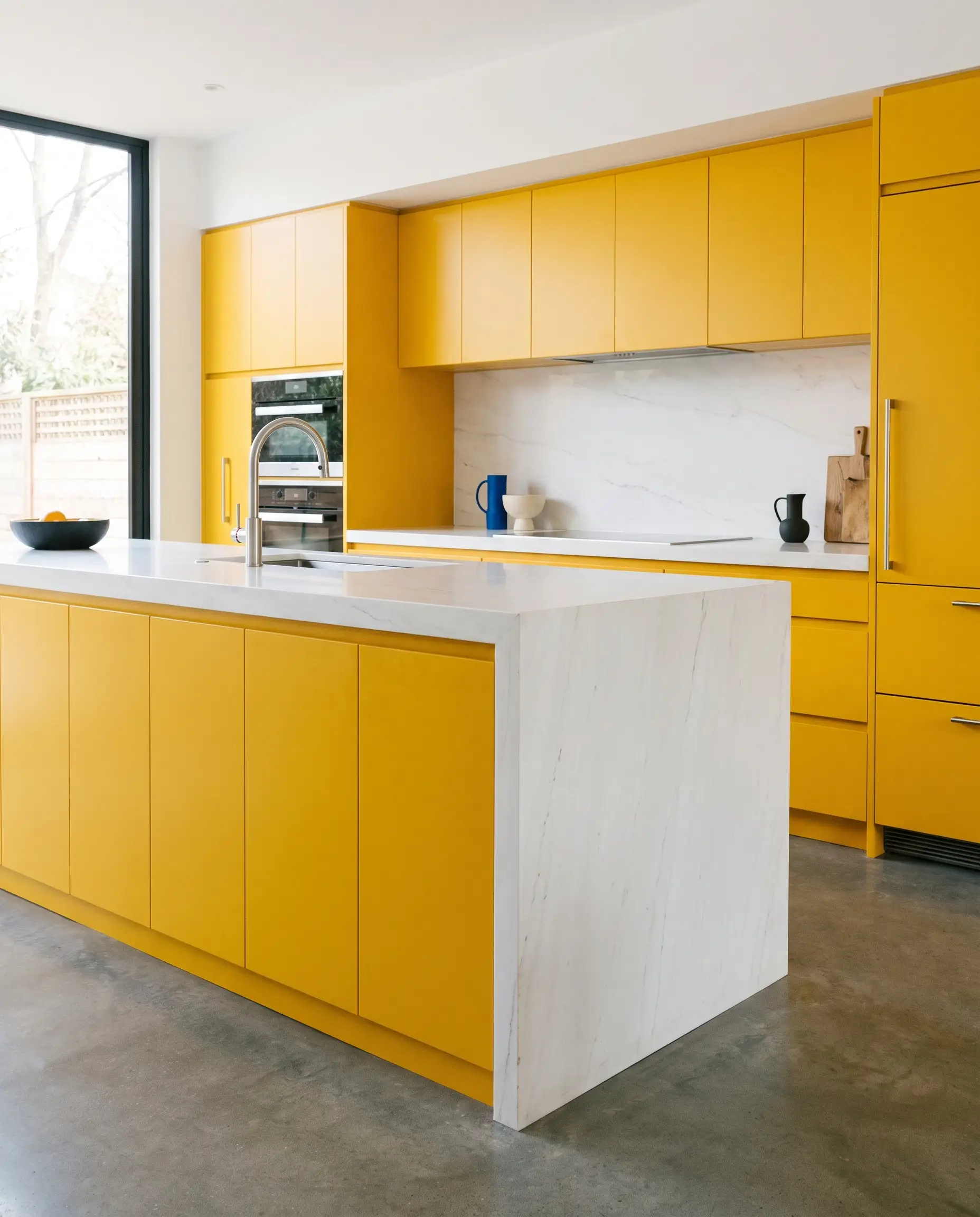
To make a bold yellow cabinet run look expensive and deliberate, wrap it in a thick, stark white stone. Bright white quartzite provides a crisp, high-definition border that frames the yellow like a piece of modern art.
- Vibe: High-End Postmodern
- Key Materials: Saturated yellow cabinets, waterfall-edge white quartzite
- Styling Pro-Tip: Choose a quartzite with minimal veining to keep the focus entirely on the color block contrast.
Textural and Architectural Yellows
High-end design dictates that color should never merely sit flat on drywall. The most successful yellow kitchens rely heavily on structural texture to create shadow lines, manipulating how the eye perceives the hue throughout the day.
18. Wrap the Kitchen Island in Fluted Yellow Oak
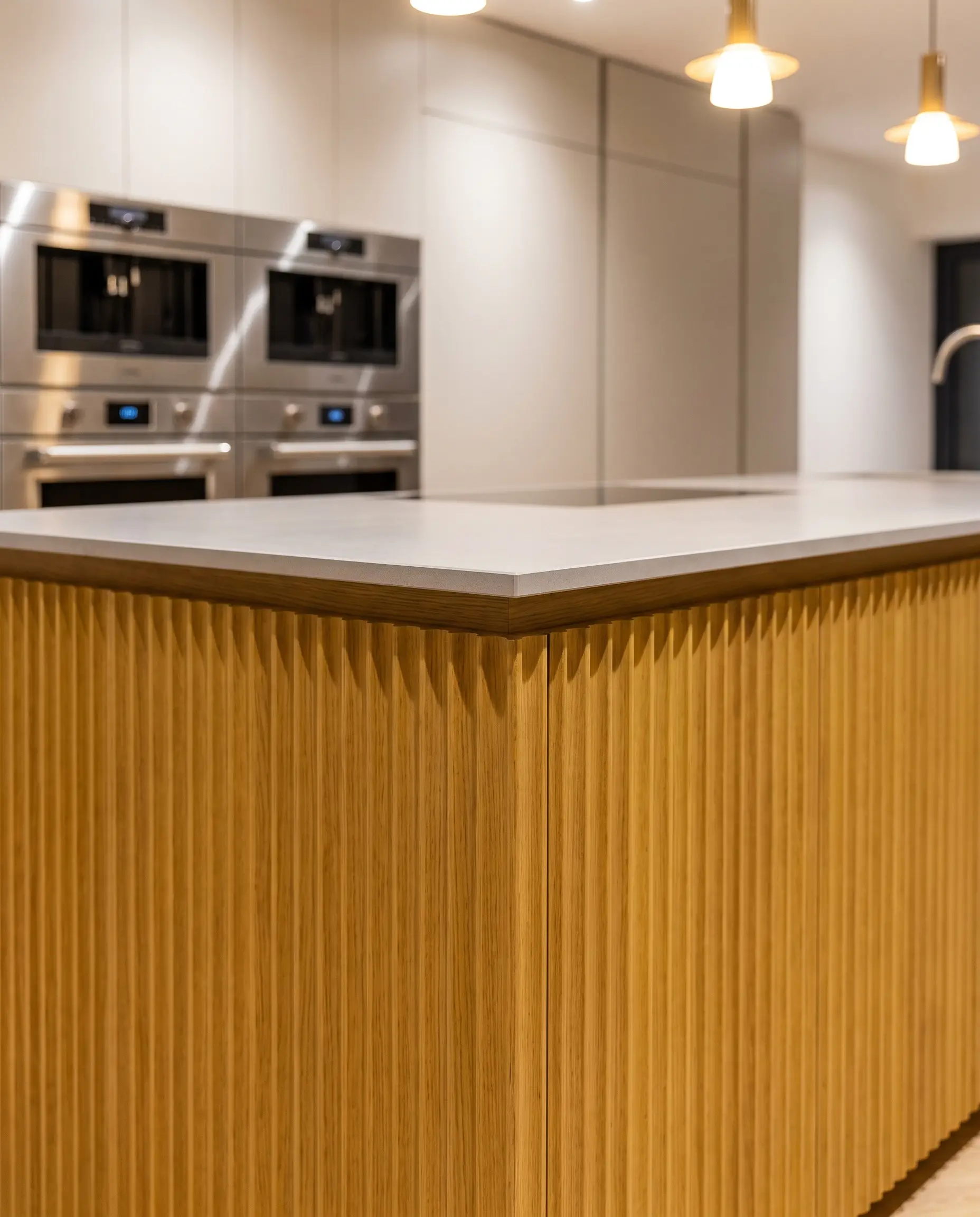
Fluting introduces rigorous vertical rhythm to an island base. When painted yellow, these undulating wooden ridges create dynamic micro-shadows, ensuring the color shifts constantly as natural light moves across the room.
- Vibe: Tactile Contemporary
- Key Materials: Custom fluted oak panels, satin yellow lacquer
- Styling Pro-Tip: Keep the countertop ultra-thin (e.g., 2cm flat-ease edge) to let the heavy texture of the fluting take center stage.
19. Install High-Gloss Yellow Ceramic Subway Tile vertically
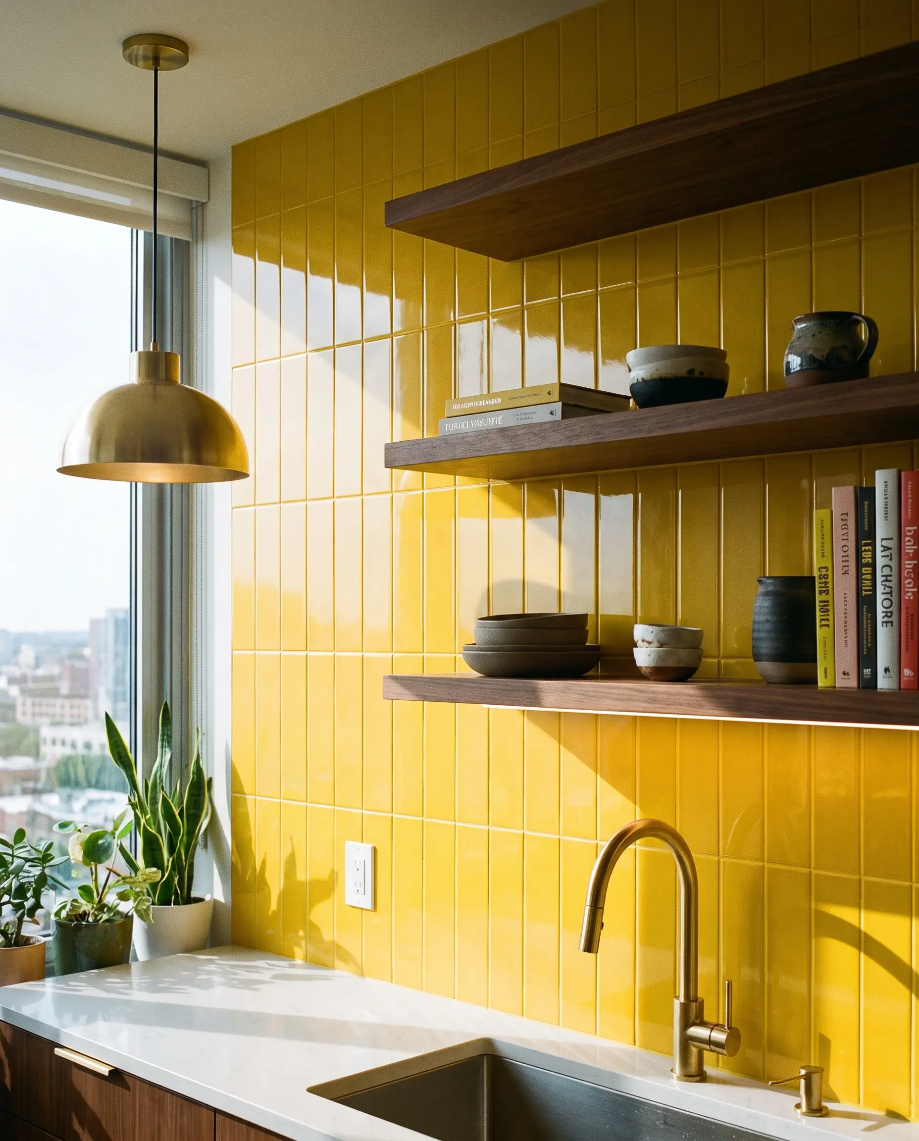
Flipping the orientation of subway tile to a vertical stack immediately modernizes the application. When finished in a high-gloss yellow, the tiles act like mirrors, bouncing vibrant, energetic light into the darkest corners of the kitchen.
- Vibe: Retro-Modern
- Key Materials: 2×8 high-gloss yellow ceramic tiles
- Styling Pro-Tip: Use a color-matched yellow grout to create a seamless, highly architectural wall of color.
20. Anchor the Room with a Bespoke Yellow Enamel Range
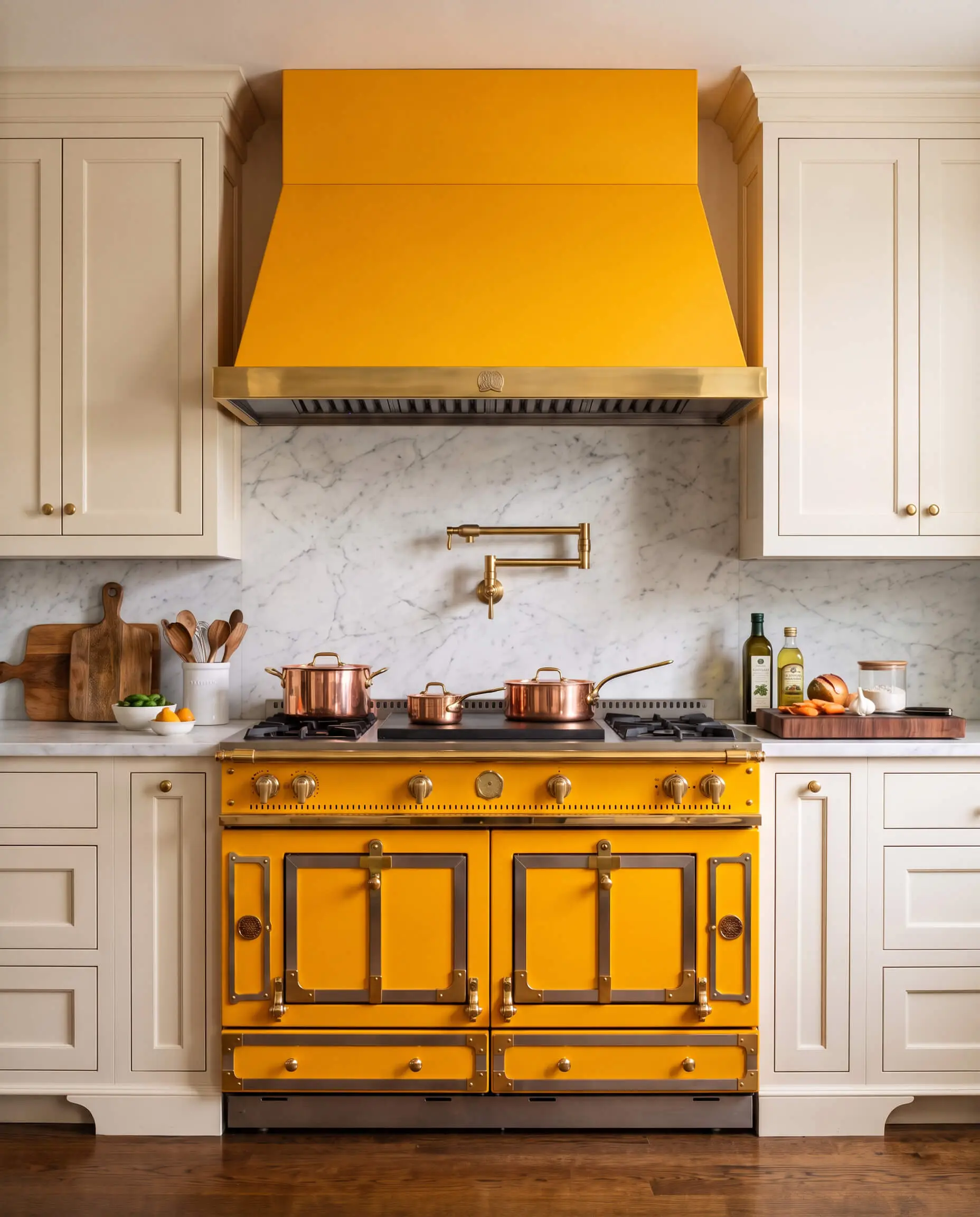
Sourcing a luxury enamel range in a custom yellow finish commands incredible authority in kitchen design. Brands like La Cornue transform the cooking zone into a monumental, jewelry-like focal point that dictates the entire room’s palette.
- Vibe: Unapologetic Luxury
- Key Materials: French luxury range in custom yellow enamel
- Styling Pro-Tip: Surround the range with quiet, neutral cabinetry so the appliance remains the undisputed star of the space.
21. Paint Exposed Ceiling Beams a Muted Ochre
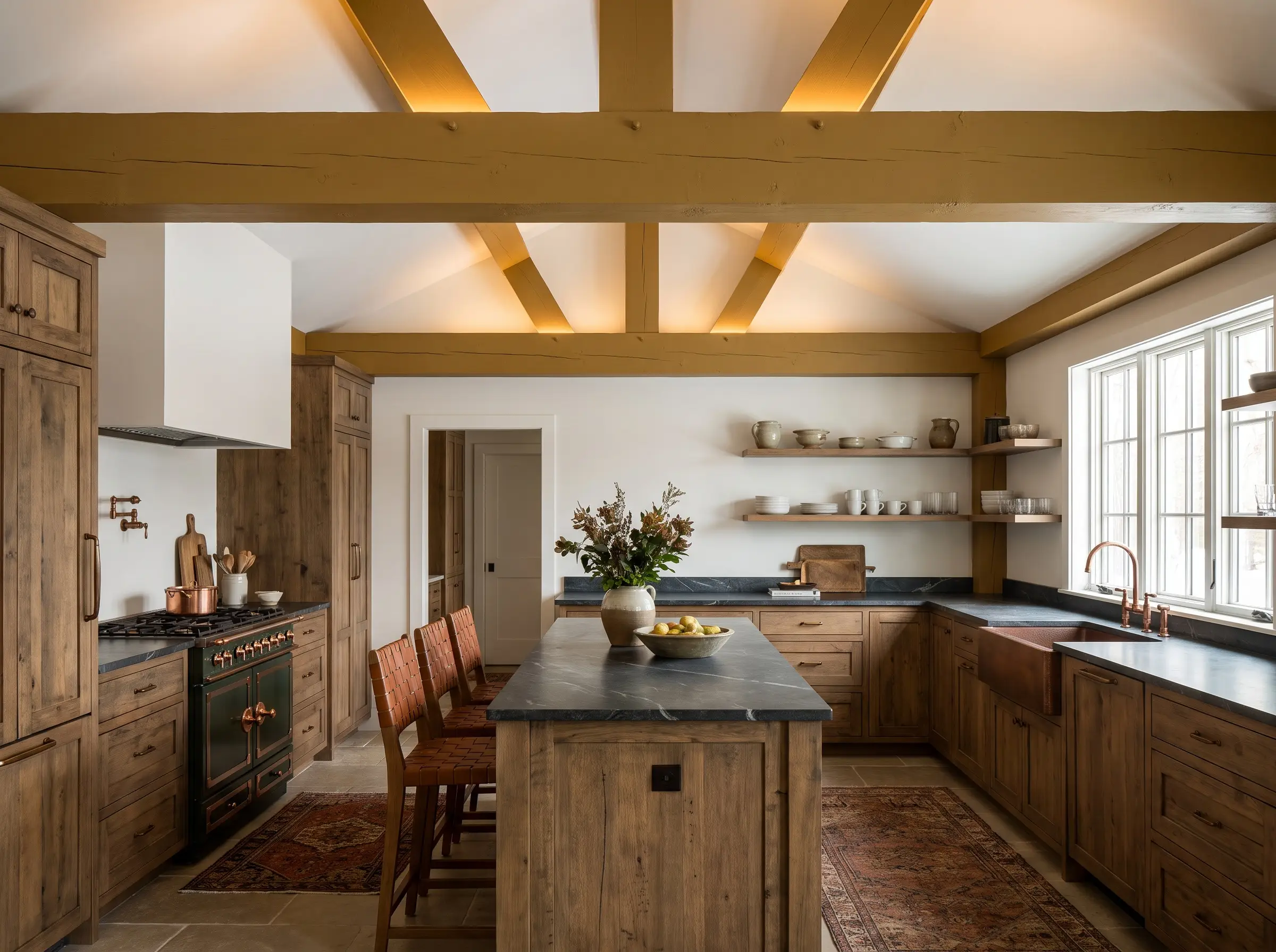
Drawing the eye upward expands the perceived volume of a kitchen. Painting heavy structural ceiling beams in a muted ochre highlights the architecture while casting a warm, subtle glow over the space below.
Portola Paints’ Sundance is an excellent, earthy ochre that adds immense character to overhead architectural elements.
Designer Paint Pick
- Vibe: Refined Rustic
- Key Materials: Exposed structural timber, matte ochre paint
- Styling Pro-Tip: Keep the ceiling drywall between the beams a crisp, flat white to maximize the contrast.
22. Use Yellow Terrazzo Countertops for Postmodern Flair
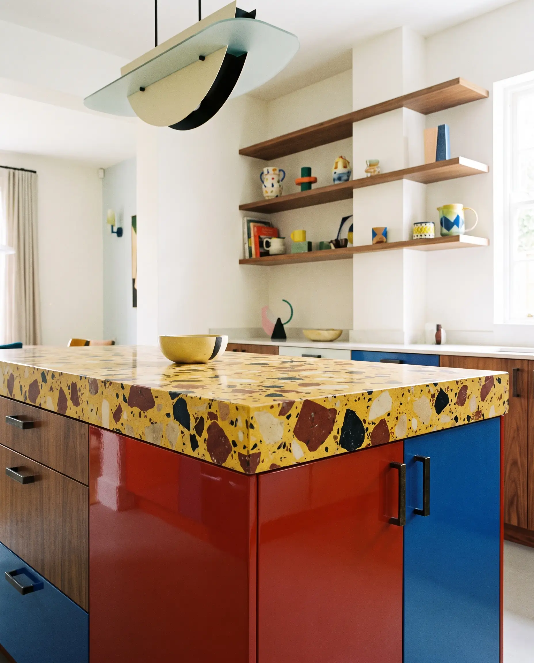
Terrazzo introduces playful, aggregate texture that breaks up solid blocks of color. A yellow-based terrazzo slab provides a highly durable, fiercely stylized surface that nods to Italian postmodernism while remaining highly functional.
- Vibe: Postmodern Italian
- Key Materials: Custom poured or slab yellow terrazzo
- Styling Pro-Tip: Pull one of the aggregate colors from the terrazzo (like a deep rust or black) and use it for your cabinetry hardware.
Strategic Accents: Low-Commitment Yellow
For the renter or the highly cautious homeowner, a full renovation isn’t necessary to harness the warmth of this palette. You can inject high-taste, architectural yellow through strategic, low-commitment accents that pack a massive visual punch.
23. Source Vintage Yellow Enamel Pendants for Island Lighting
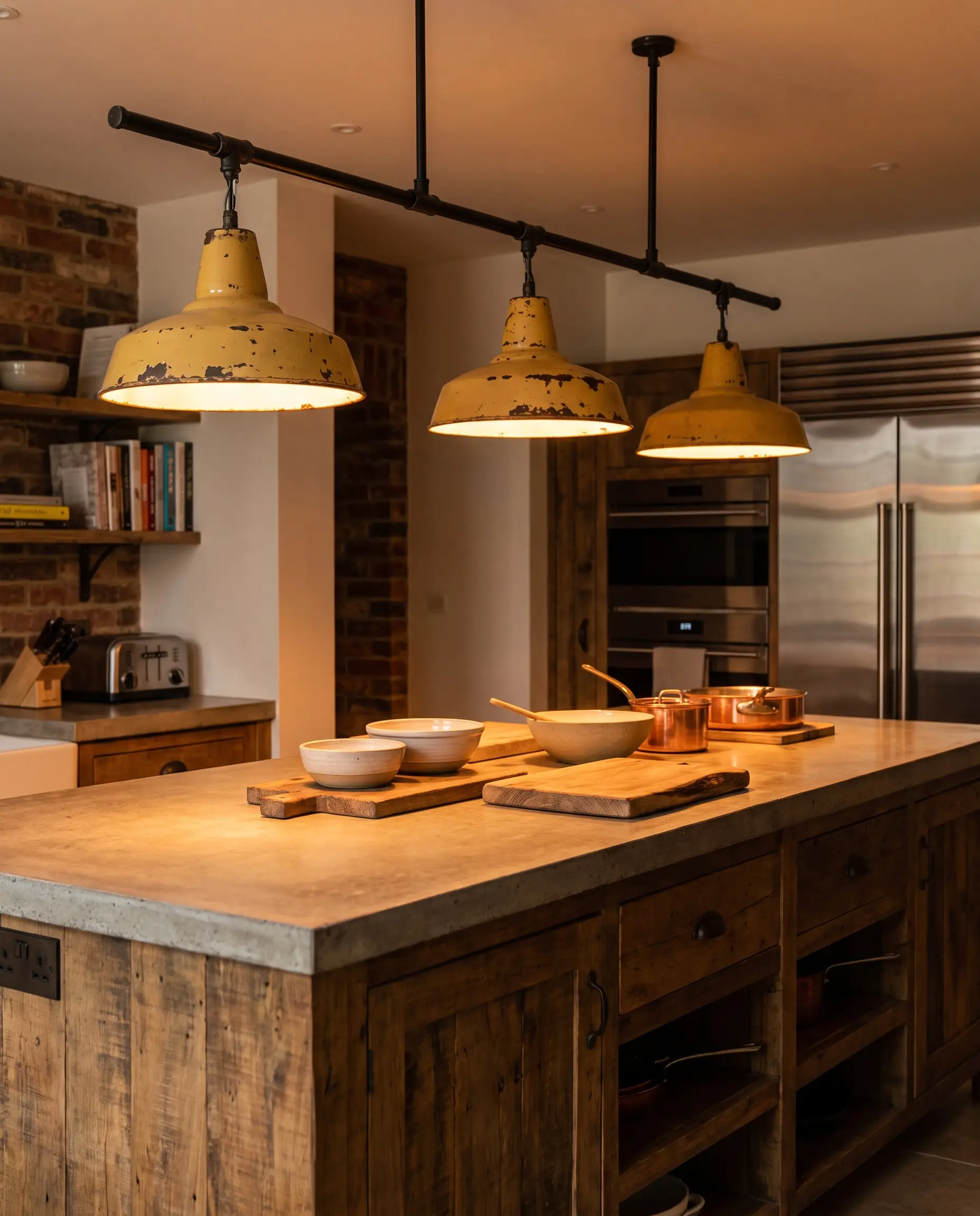
Swapping out builder-grade lighting for vintage industrial pendants instantly upgrades the room’s character. The chipped, patinated yellow enamel of a salvaged fixture brings authentic history and a concentrated burst of color to the sightline.
- Vibe: Curated Industrial
- Key Materials: Salvaged factory pendants, yellow enamel
- Styling Pro-Tip: Hang the pendants slightly lower than standard (around 32 inches above the counter) to create a more intimate, dramatic lighting zone.
24. Style with Upholstered Mustard Counter Stools
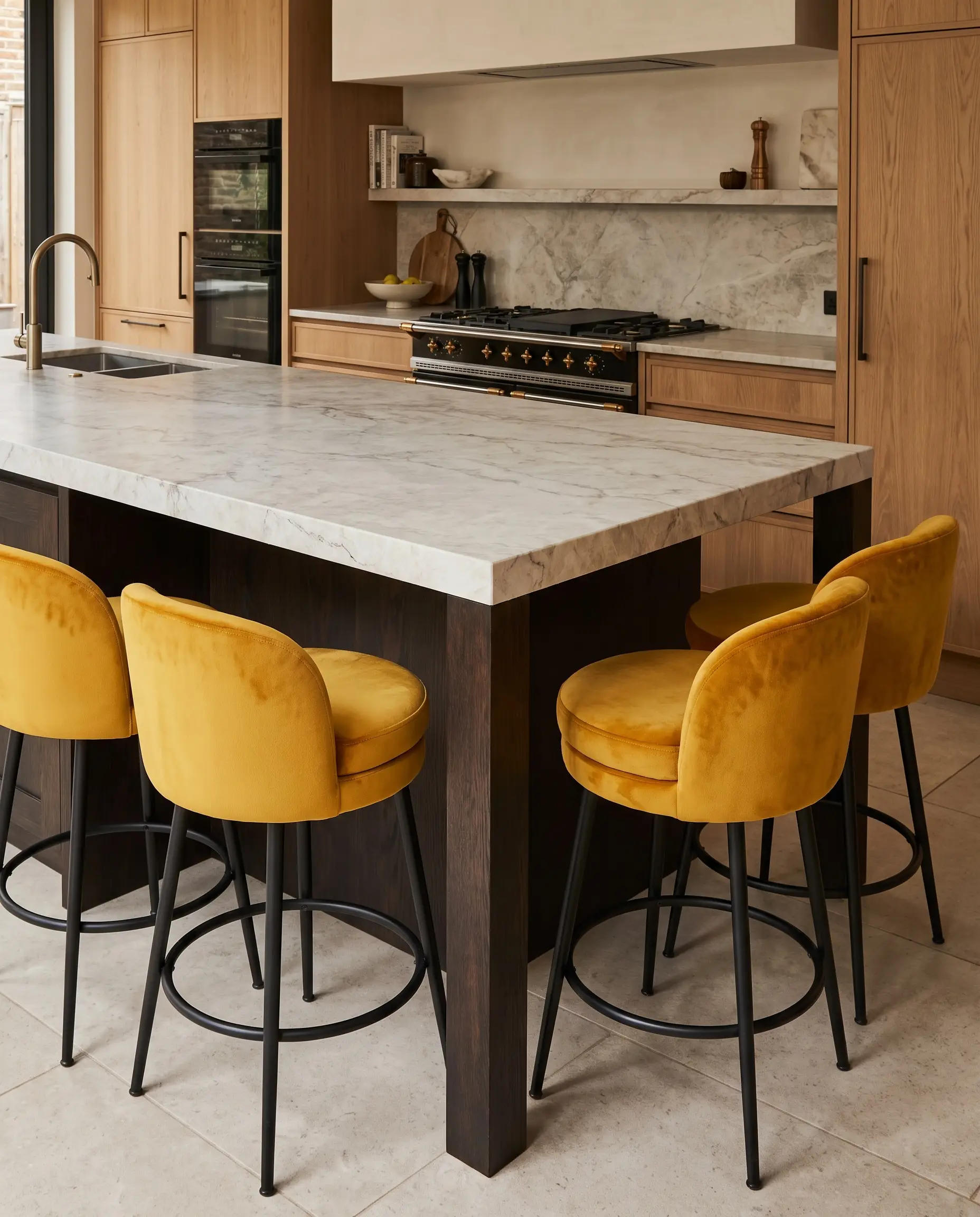
Seating is the easiest way to introduce saturated color and soft texture into a hard-surfaced kitchen. Upholstered mustard stools command attention against a neutral island, injecting warmth exactly where guests gather.
- Vibe: Accessible Luxury
- Key Materials: Performance velvet or leather mustard barstools
- Styling Pro-Tip: Choose stools with blackened steel or dark wood legs to ground the bright upholstery.
25. Paint the Pantry Door or Window Sashes a High-Impact Yellow
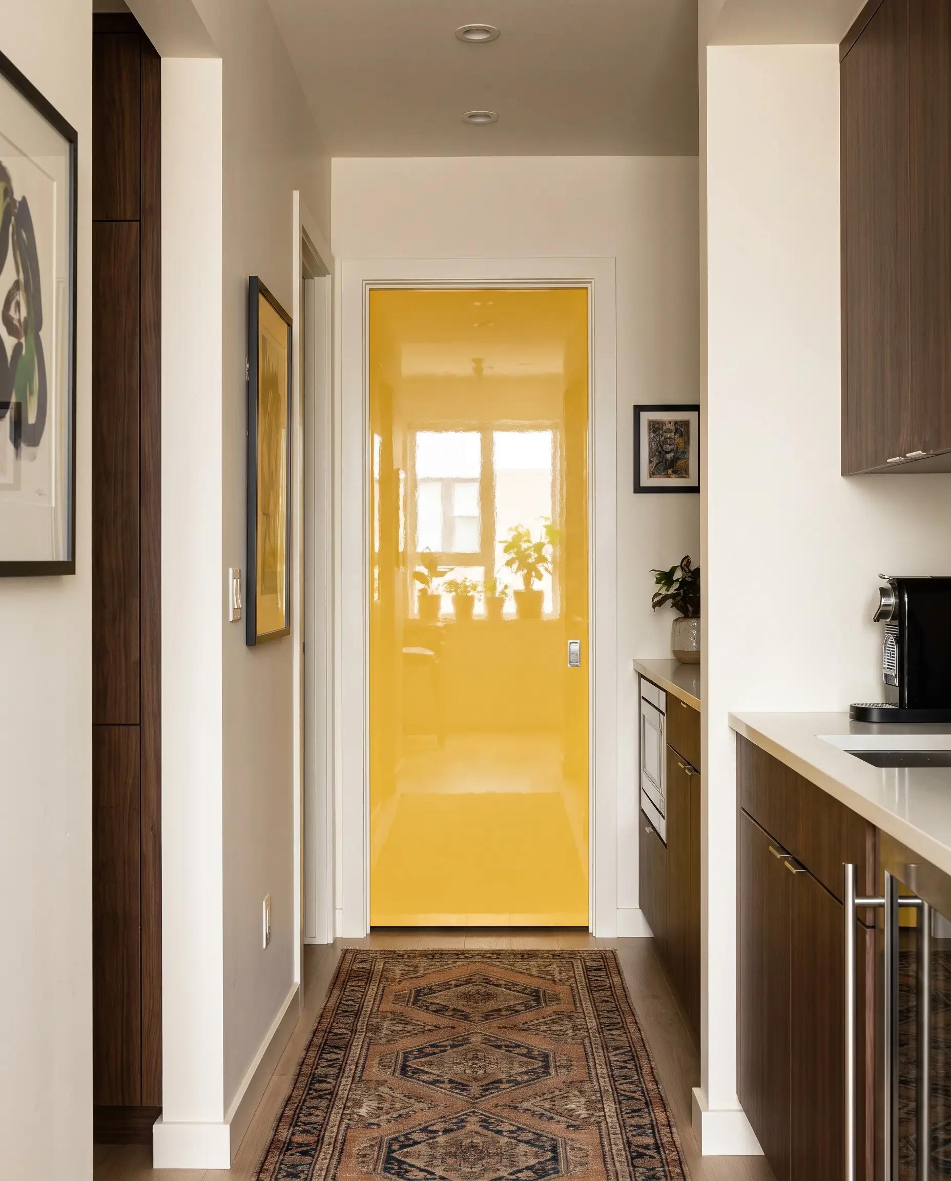
Treating architectural elements like doors or window sashes as accent pieces is a classic designer secret. A high-impact yellow pantry door acts as a brilliant, unexpected surprise that enlivens a kitchen without overwhelming the primary cabinetry.
Sherwin-Williams Lemon Twist (SW 6909) is a brilliant, highly saturated yellow perfect for small, high-impact architectural accents.
Designer Paint Pick
- Vibe: Tailored Eclectic
- Key Materials: High-gloss or semi-gloss yellow enamel paint
- Styling Pro-Tip: Use a high-gloss finish on the door to maximize durability and reflect natural light into the hallway.
The Yellow Kitchen Master Checklist: Lighting and Finishes
Executing this color perfectly requires a strict understanding of environmental factors. Directional lighting is paramount: North-facing rooms cast a cool, blue light that turns pale yellows muddy and green, while South-facing light intensifies yellow, requiring you to select a shade with a lower LRV to avoid a blinding effect. To finalize your palette, rely on this strict hardware pairing methodology.
| Hardware Finish | Best Yellow Match | Visual Effect |
|---|---|---|
| Unlacquered Brass | Pale Buttercream | Enhances historical warmth and ages organically alongside the paint. |
| Matte Black | Saturated Primary Yellow | Sharpens the aesthetic, forcing a highly graphic, modern contrast. |
| Polished Copper | Muddy Mustard/Ochre | Cuts through the density of earthy tones with a fiery, reflective metallic. |
| Polished Nickel | Soft Lemon | Cools down the palette, pushing the room toward a crisp, transitional elegance. |
Never commit to a cabinet or wall color based on a tiny paper swatch. Always paint large, 24×24-inch samples on foam board and move them around the kitchen to observe how the undertones shift from morning coffee to evening prep.

The Aesthetics Desk curates the visual direction for Hackrea. Specializing in design history, global architectural movements, and interior styling, this desk focuses on the psychology of space and how to translate high-end, magazine-quality aesthetics into approachable residential design without falling into fleeting micro-trends.