Beyond Basic: The 12 Best Sherwin-Williams Furniture Paint Colors for a Factory-Smooth Finish
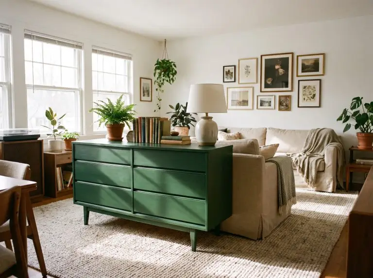
Sanding down an outdated vanity or a thrift-store dresser puts a literal blank canvas in your hands. But selecting the right color is only half the battle; choosing the correct chemistry is what separates a frustrating Pinterest fail from a bespoke heirloom. If you have ever spent a weekend painting a piece only for it to feel sticky a month later, you already know standard wall paint is a liability on tactile surfaces.
We are bypassing the amateur pitfalls entirely to focus on highly durable, designer-approved executions. By pairing premium finishes with exact hardware selections, you can achieve a factory-smooth, highly durable surface that transforms a $50 thrifted dresser into a statement piece for a total project cost under $150.
The Technical Foundation: Why Emerald® Urethane Trim Enamel is Non-Negotiable
Standard acrylic latex wall paint remains soft and tacky, practically guaranteeing it will peel off a desk or cabinet the moment it encounters daily friction. To achieve a rock-hard, professional-grade surface, master tradespeople rely on Emerald® Urethane Trim Enamel. This specific product is a waterborne urethane-modified alkyd, meaning it levels out brush strokes perfectly like traditional oil paint, but cleans up with water and refuses to yellow over time.
| Feature | Emerald® Urethane Trim Enamel | Standard Latex Wall Paint |
|---|---|---|
| Durability | Rock-hard, scuff-resistant | Soft, prone to chipping and peeling |
| Self-Leveling | Self-leveling chemistry erases brush strokes | Retains heavy, visible brush marks |
| Yellowing | Resists yellowing, maintains true color | Often yellows, especially under topcoats |
| Price | Premium investment ($80+/gallon) | Budget-friendly ($30-$50/gallon) |
Moody & Dramatic: Best Sherwin-Williams Colors for Statement Pieces
Dark, saturated colors work beautifully on vintage furniture because they instantly ground a room while expertly hiding minor imperfections in aged wood. By pairing deep hues with highly textured surfaces and precise metal finishes, you can completely transform a forgotten thrift find into a commanding focal point.
Tricorn Black (SW 6258) on Fluted Consoles with Matte Black Hardware
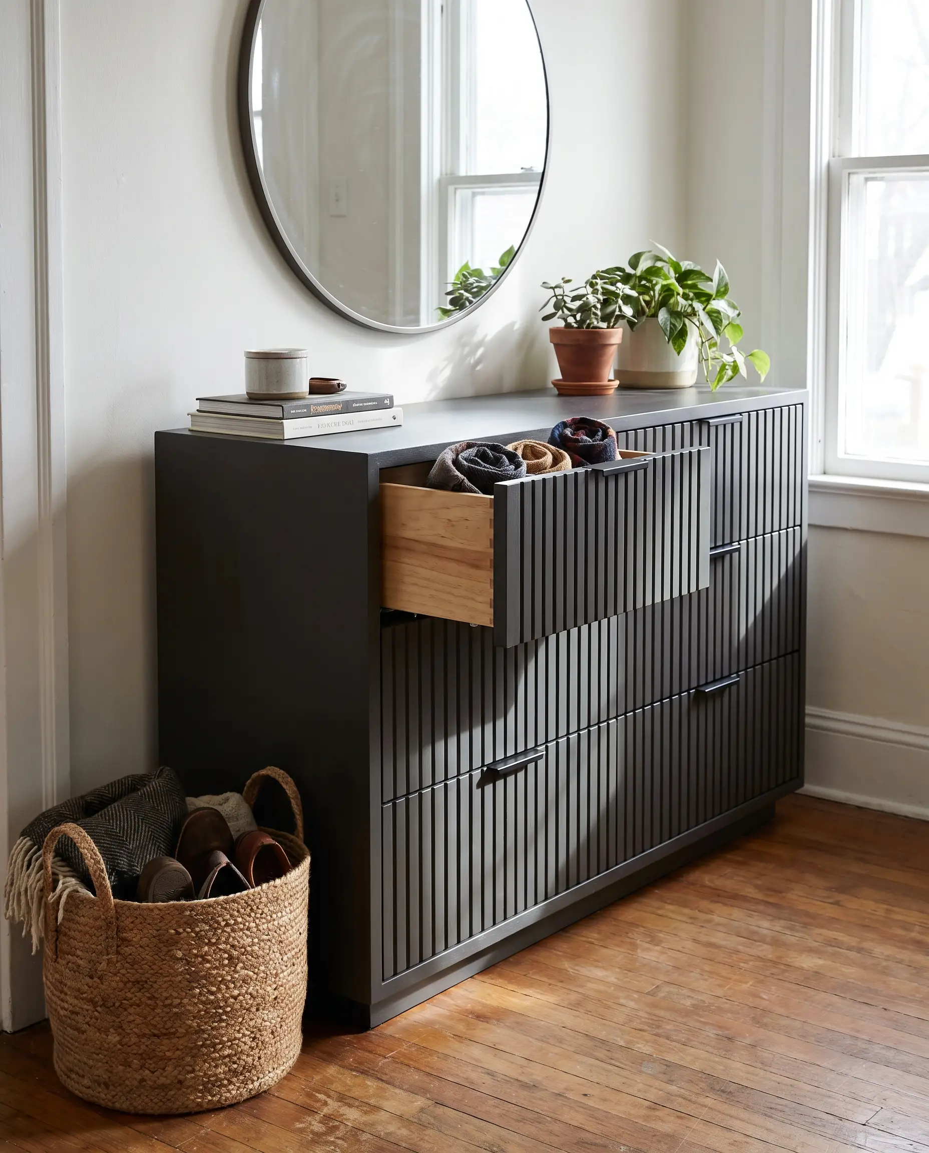
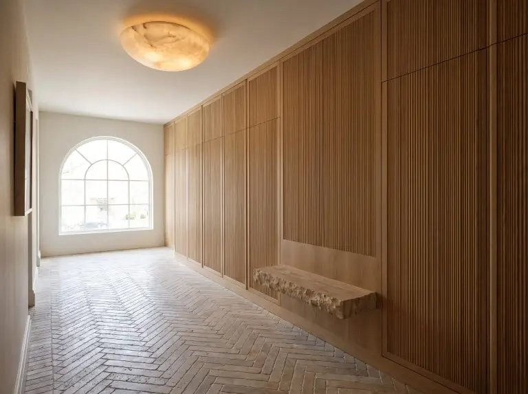
This is the truest black on the market, boasting absolutely zero undertones so it never leans unexpectedly blue or brown. Applying it to an architectural, fluted console creates spectacular shadow play, turning a basic storage piece into a modern luxury staple.
- Vibe: Brutalist Luxury
- Key Material Match: Fluted or reeded wood surfaces
- Hardware Recommendation: Monochromatic matte black pulls
When painting an antique piece, leave the interior drawers raw and condition them with beeswax to maintain the vintage wood smell and ensure smooth gliding.
Designer Secret
Naval (SW 6244) on Mid-Century Dressers with Satin Brass Pulls
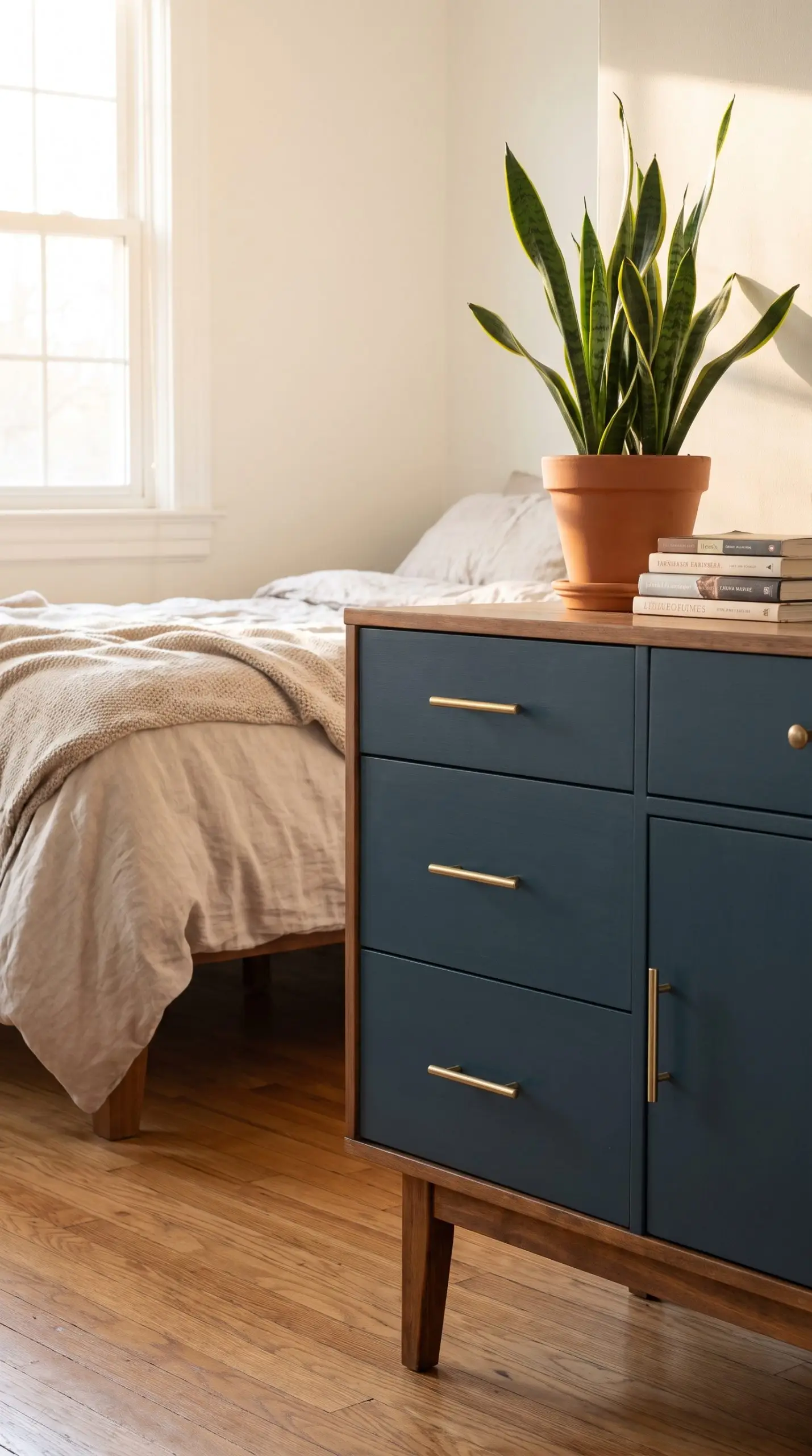
This cult-favorite deep navy brings a cool, saturated contrast that perfectly highlights the warm tones of exposed Mid-Century wood. By painting the heavy body of the dresser but leaving the iconic tapered legs sanded and stained, you achieve a highly intentional, nautical-meets-modern aesthetic.
- Vibe: Mid-Century Modern
- Execution Strategy: Paint the casing and drawer fronts; stain the legs
- Hardware Recommendation: Satin brass hardware
Sea Mariner (SW 9640) for Apothecary Cabinets with Aged Copper
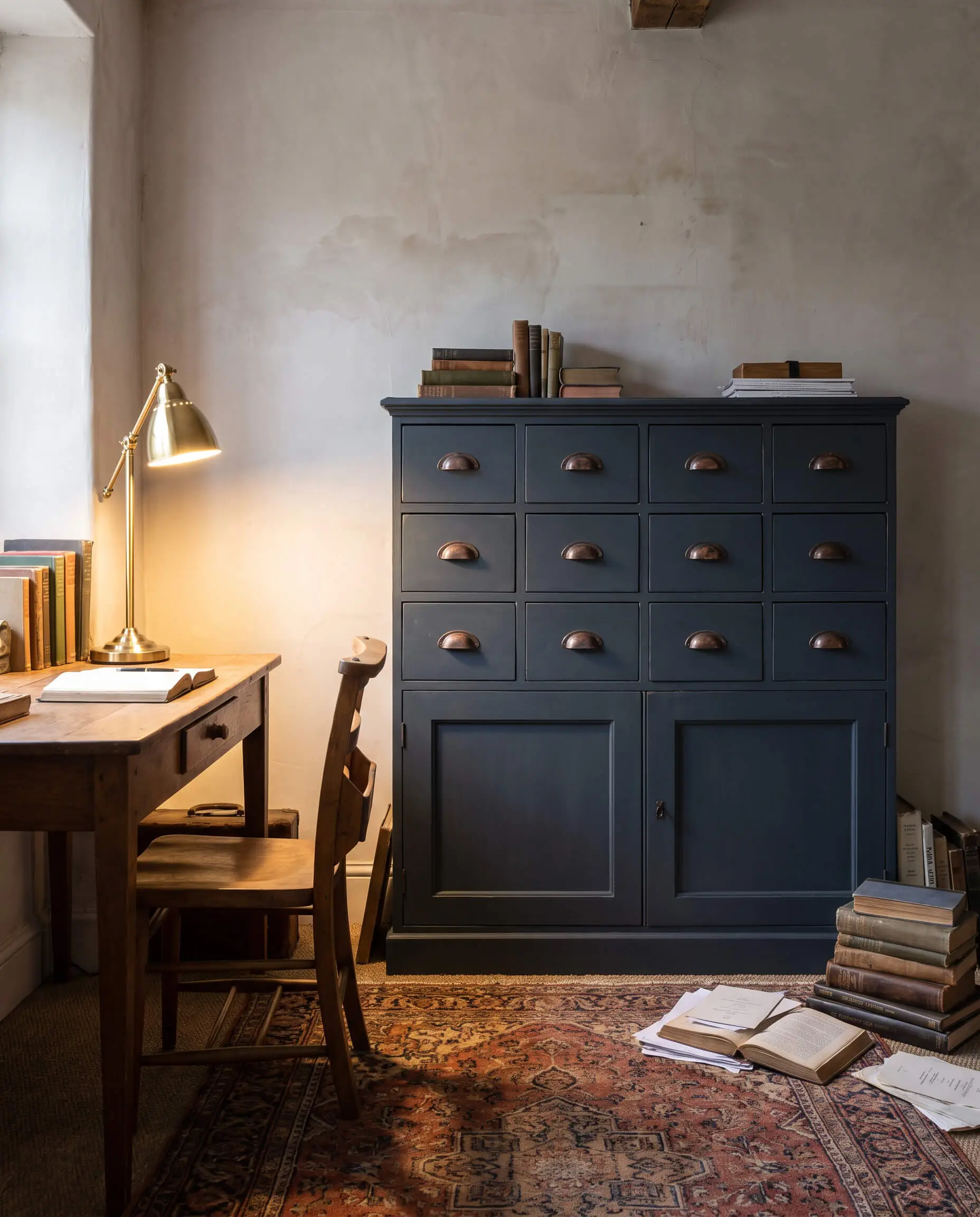
As a trending dark oceanic hue, this rich color shifts dramatically between deep green and navy depending on your room’s lighting conditions. It feels particularly historic and moody when applied to flat-front, multi-drawer apothecary or filing cabinets.
- Vibe: Moody Historical
- Key Material Match: Flat-front multi-drawer cabinets
- Hardware Recommendation: Aged, patinated copper cup pulls
Peppercorn (SW 7674) on Traditional Nightstands with Polished Nickel
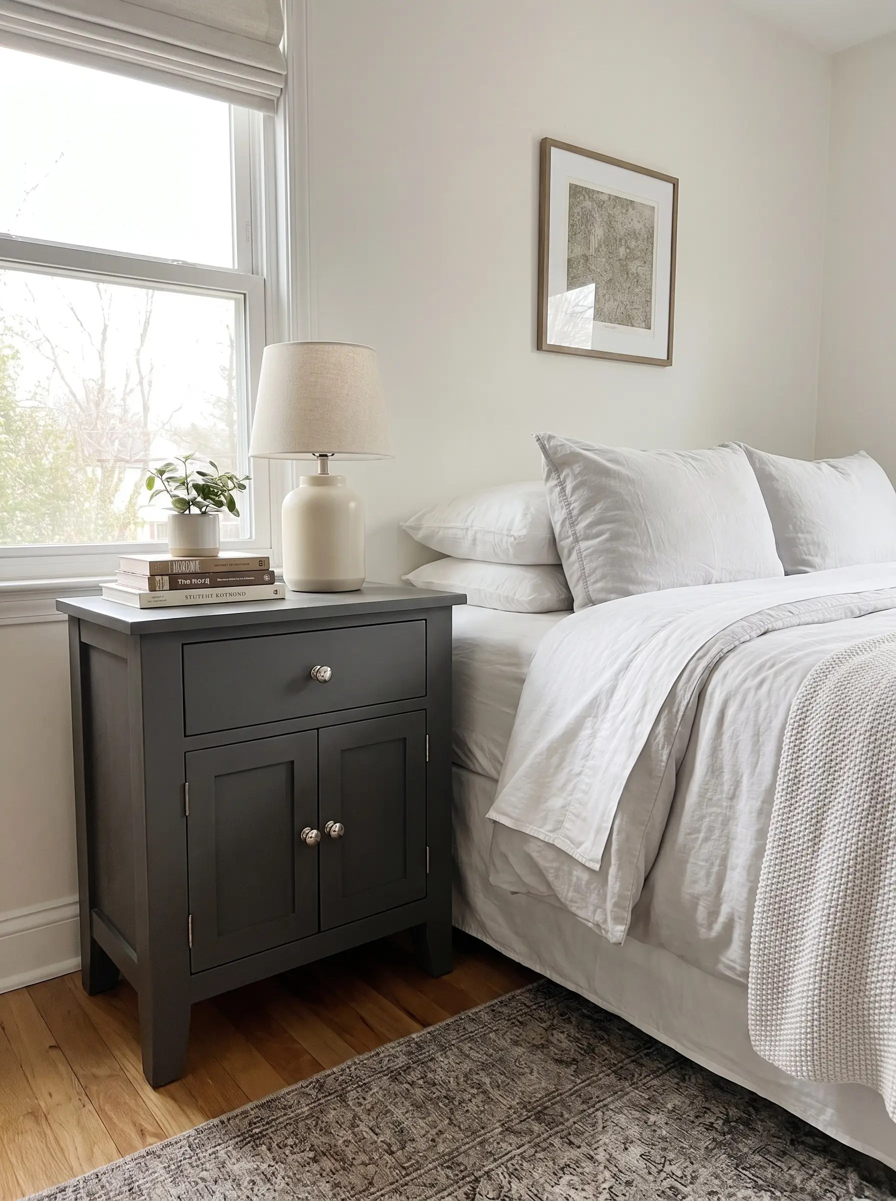
For a softer alternative to stark black, this deeply saturated dark gray modernizes heavy, traditional nightstands without erasing their classic charm. The crisp, cool depth of the paint looks incredibly sharp against highly reflective, polished metals.
- Vibe: Transitional Elegance
- Undertone Profile: Cool charcoal with subtle blue/purple shifts
- Hardware Recommendation: Polished nickel knobs
The Earthy Organics: Best Greens & Browns for Biophilic Design
The Organic Modern trend relies on muddy greens and soft browns that mimic the natural world, bringing essential warmth to stark, white-walled spaces. These earthy hues are incredibly forgiving and look their absolute best when paired with raw, tactile materials.
Halcyon Green (SW 6213) on Scalloped Sideboards with Leather Pulls
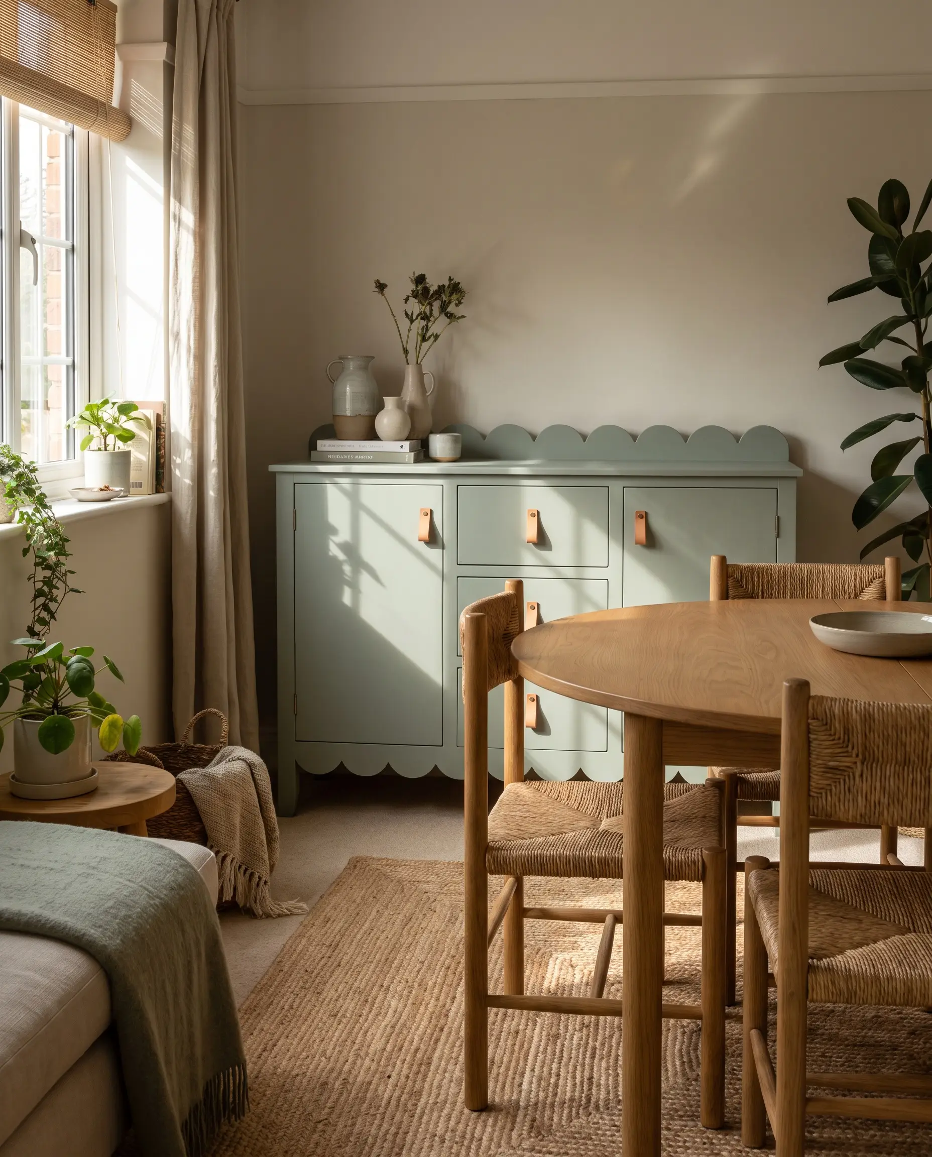
This restorative, muted blue-green softens the visual weight of rounded furniture, especially scalloped or arched sideboards. The smooth satin sheen of the paint contrasts beautifully against the rugged, organic texture of natural leather hardware.
- Vibe: Soft Organic Modern
- Key Material Match: Curved or scalloped wood details
- Hardware Recommendation: Natural tan leather pulls
Rosemary (SW 6187) for Farmhouse Dining Tables against White Oak
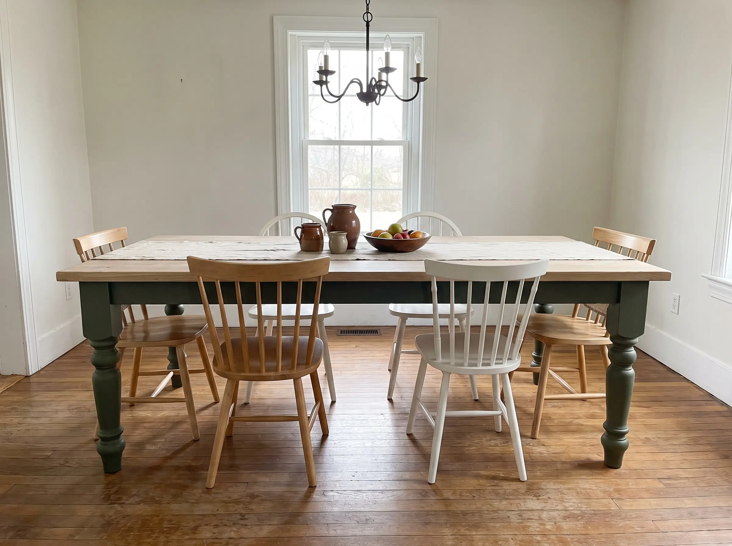
A deep, herbaceous green grounds the heavy base of a farmhouse dining table while preventing the room from feeling overly dark. This two-tone approach keeps the design breathable and highlights the natural grain of the wood top.
- Vibe: Refined Farmhouse
- Execution Strategy: Paint the table apron and legs in Rosemary; sand and seal the top in raw white oak
- Hardware Recommendation: N/A (Focus on wood grain contrast)
Rojo Marrón (SW 9182) on Arched Curio Cabinets with Unlacquered Brass
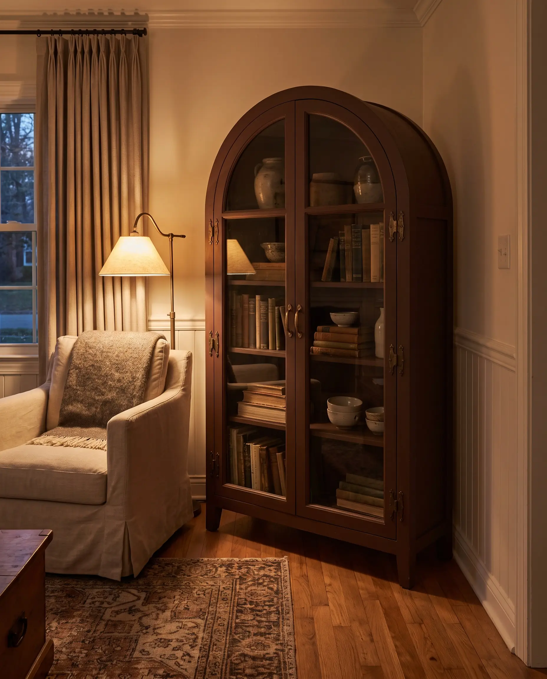
This moody, earthy terracotta radiates visual warmth in low lighting, making it the perfect backdrop for displaying ceramics or vintage books. The artisanal, baked-earth vibe is beautifully amplified by raw metals that age alongside the piece.
- Vibe: Artisanal Warmth
- Key Material Match: Arched glass-front cabinets
- Hardware Recommendation: Unlacquered brass that develops a natural patina
Sanderling (SW 7513) on Rattan-Inset Wardrobes
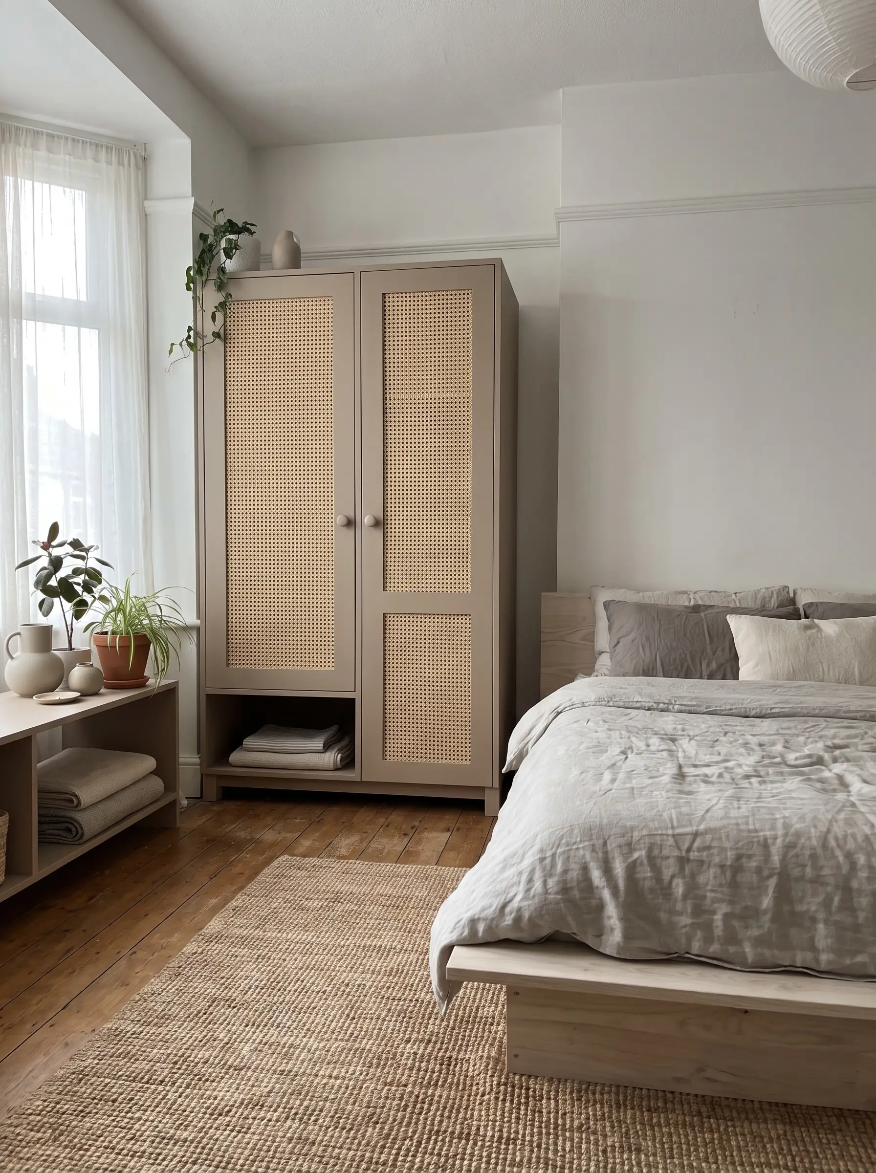
This modern, mushroom-beige provides a subtle, tone-on-tone coastal or Japandi aesthetic when applied to the solid frame of a wardrobe. The visual interest relies on the intense textural contrast between the flawless, smooth painted frame and the rough, natural cane insets.
- Vibe: Japandi / Textural Minimalist
- Execution Strategy: Paint the structural frame; leave cane or rattan webbing raw
- Hardware Recommendation: Matte ceramic knobs
Elevated Neutrals: Whites & Greiges That Never Look Dingy
Painting furniture white or beige is notoriously intimidating because the wrong undertone can instantly make a piece look cheap, yellowed, or dingy. Choosing a sophisticated neutral requires strict undertone management and a flawless application to ensure the final product looks intentional rather than primed and forgotten.
Pure White (SW 7005) for Crisp Shaker Cabinets with Iron Knobs
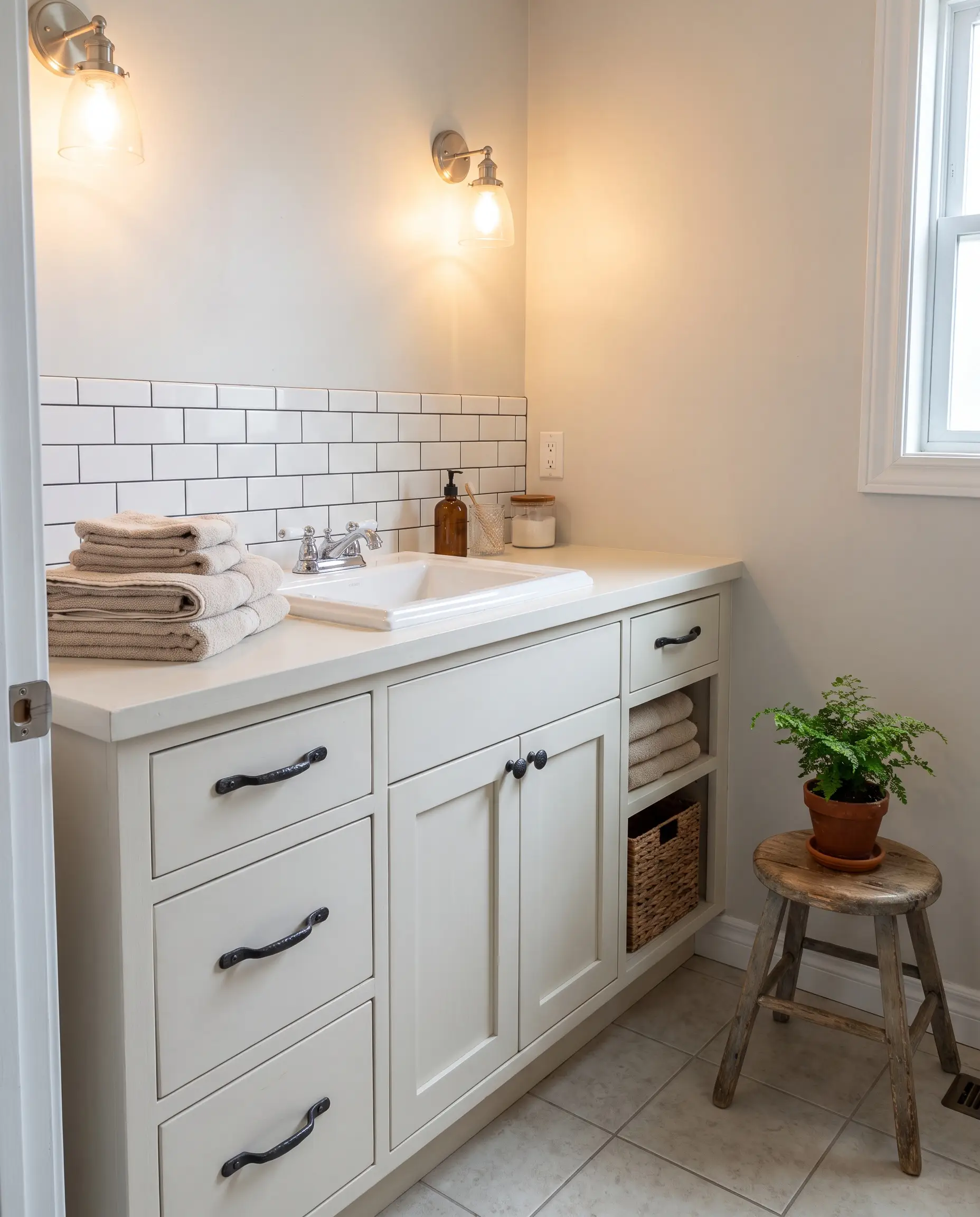
As the cleanest, safest white available, this shade is neither too stark nor unpleasantly creamy, making it ideal for a classic shaker-style bathroom vanity. It provides a brilliant, grounding contrast when paired with dark, heavy metals.
- Vibe: Timeless Crisp
- Key Material Match: Shaker-style cabinet doors
- Hardware Recommendation: Forged iron knobs
Never apply an oil-based polyurethane topcoat over Pure White, as the chemical reaction will inevitably cause the crisp white finish to yellow over time.
Hackrea Warning
Accessible Beige (SW 7036) on Waterfall Desks with Travertine Accents
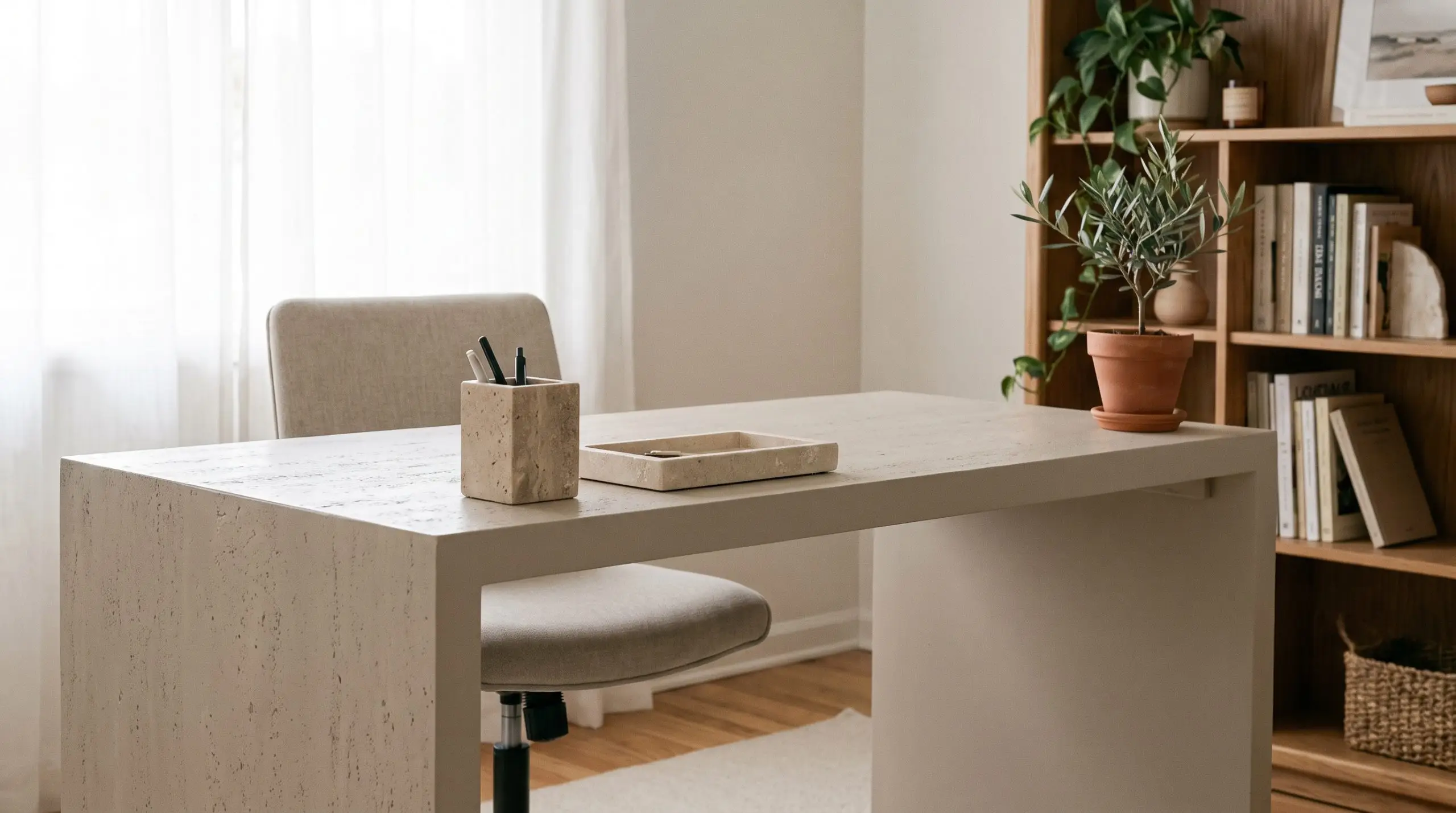
The definitive greige, this color turns a sleek, minimalist waterfall desk into a sophisticated architectural feature. Its warm, stone-like undertones play perfectly off of natural, porous styling objects.
- Vibe: Sleek Minimalism
- Key Material Match: Seamless waterfall desk frames
- Styling Recommendation: Travertine or limestone desk accessories
Shiitake (SW 9173) for Plinth Coffee Tables in Monochromatic Rooms
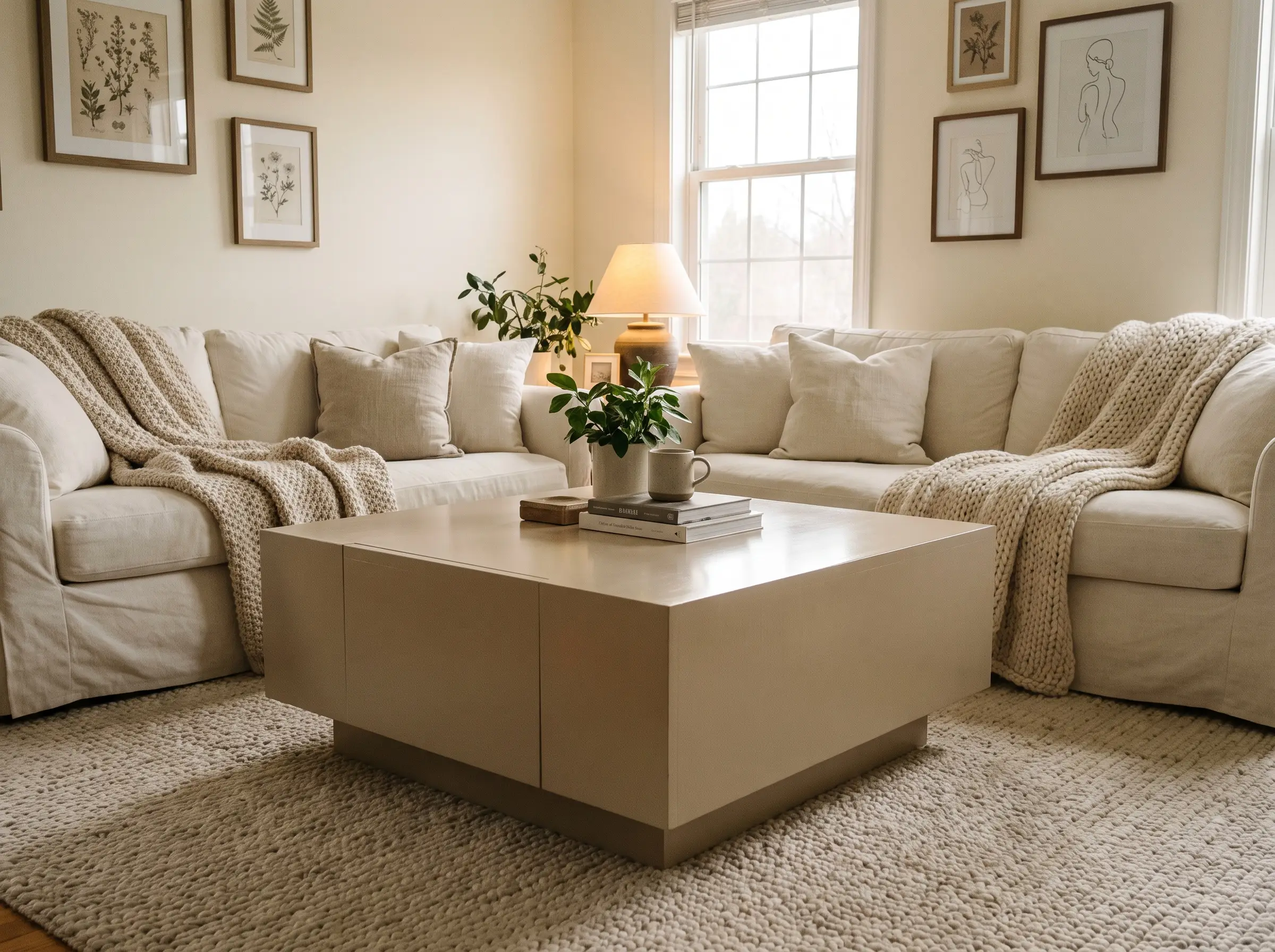
This slightly darker, warmer mushroom tone provides just enough contrast for a heavy, blocky plinth coffee table in a room already layered in creams and whites. A satin sheen on such a large, flat surface beautifully catches ambient light without breaking the neutral palette.
- Vibe: Monochromatic Layering
- Key Material Match: Solid block or plinth-style tables
- Hardware Recommendation: Concealed or push-to-open mechanisms
Passive (SW 7064) on Spindle Beds with Brushed Gold
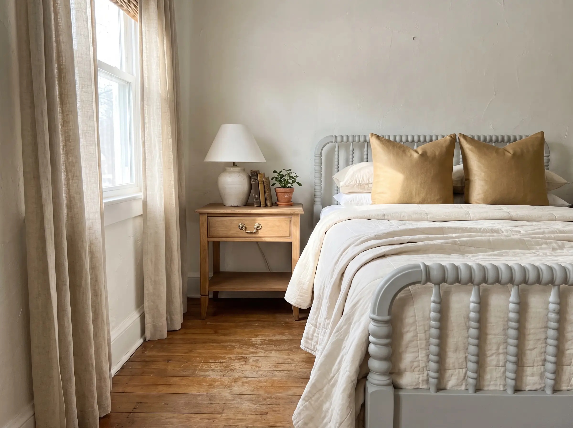
A cool, clean light gray with subtle blue undertones breathes new life into a vintage wooden spindle bed frame. The crisp gray acts as a brilliant background, making warm metal hardware or bedding accents pop aggressively.
- Vibe: Vintage Modern
- Key Material Match: Intricate spindle or Jenny Lind beds
- Hardware Recommendation: Brushed gold accents
Spraying a spindle bed using an HVLP sprayer is highly recommended over brushing; the intricate curves are notorious for catching drips and ruining the final finish.
Application Pro-Tip
Expert Execution: The 3-Step Mandate for a Factory Finish
Even the most stunning Sherwin-Williams color will fail spectacularly if you cut corners during the prep and application phases. To guarantee maximum adhesion and a flawless, durable surface, follow this strict, non-negotiable execution protocol.
- Step 1: The Primer Mandate: After a thorough scuff-sand, you MUST use a shellac-based primer (like B-I-N) on vintage wood. Older pieces, especially mahogany or cherry, are notorious for tannin bleed-through, which will permanently stain your topcoat pink or yellow if not sealed chemically.
- Step 2: Application: Apply your paint using a high-density foam roller for large, flat surfaces, and a high-quality synthetic brush for tipping off edges. Because Emerald Urethane features self-leveling properties, do not overwork the paint; lay it on, tip it off once, and walk away.
- Step 3: The Curing Window: Understand the critical difference between “dry to the touch” (a few hours) and fully cured (up to 30 days). Do not place heavy objects like lamps, televisions, or ceramic vases on your freshly painted furniture during this 30-day cure time, or they will stick and rip the paint down to the primer.
The Curator’s Verdict: Which SW Furniture Paint Matches Your Project?
The long-term success of your upcycling project relies entirely on the thoughtful marriage of color, hardware, and uncompromising chemistry. Choose Tricorn Black for modern drama, Halcyon Green for organic warmth, and Pure White for timeless resale value.
Before committing to a gallon, we strongly recommend purchasing a sample quart and brushing it onto a piece of scrap wood to observe how the color shifts in your home’s specific lighting. Have you recently rescued a thrifted dresser or transformed an outdated vanity? Share your upcycled furniture projects in the comments below or tag Hackrea on social media so we can see your bespoke finishes.

The Aesthetics Desk curates the visual direction for Hackrea. Specializing in design history, global architectural movements, and interior styling, this desk focuses on the psychology of space and how to translate high-end, magazine-quality aesthetics into approachable residential design without falling into fleeting micro-trends.