Foolproof Layouts and Formulas for Arranging Wall Art
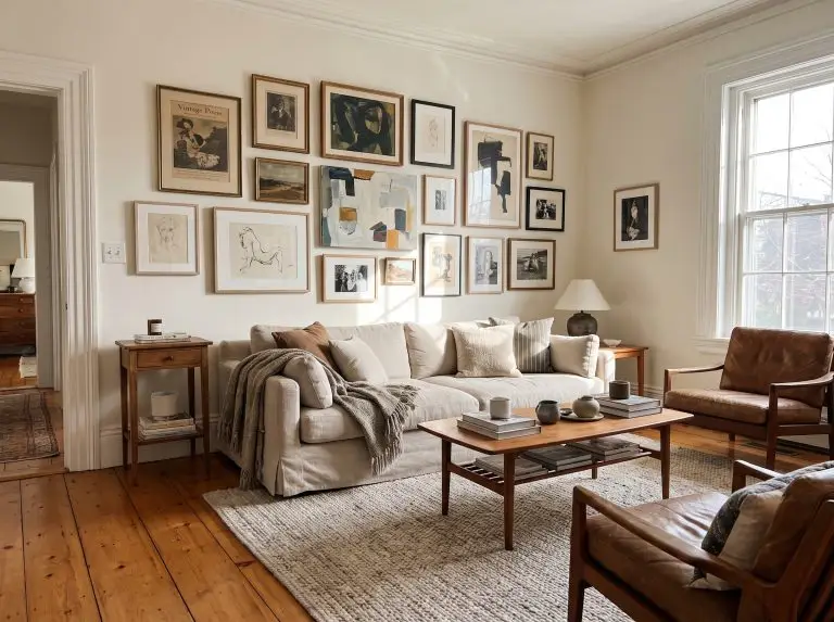
You are standing in the middle of your living room, holding a framed print with one hand while desperately trying to step back and judge the placement. It is a familiar, exhausting dance fueled by “blank canvas paralysis”—the terrifying assumption that one misplaced nail will ruin the drywall forever. Hanging art should not induce a panic attack, nor should it rely on blind guesswork.
The truth of the matter is that a successful wall arrangement is only 40% art selection; the remaining 60% relies entirely on rigorous spatial math. To figure out how to arrange pictures on a wall with the precision of a professional curator, you must stop eyeballing the center-point and start relying on hard dimensions.
We are going to abandon vague inspiration and focus strictly on execution. From the exact inch-by-inch formulas used in high-end galleries to the structural layouts that fix awkward sightlines, here is exactly how to master the physical mechanics of wall decor.
The Universal “Gallery Math”: Spacing and Height Rules
Before you even think about selecting a specific layout, you must understand the non-negotiable foundation of picture hanging. If you ignore the spatial math, even the most expensive art will look entirely out of place.
The 57-Inch Center Rule (Eye-Level Anchoring)
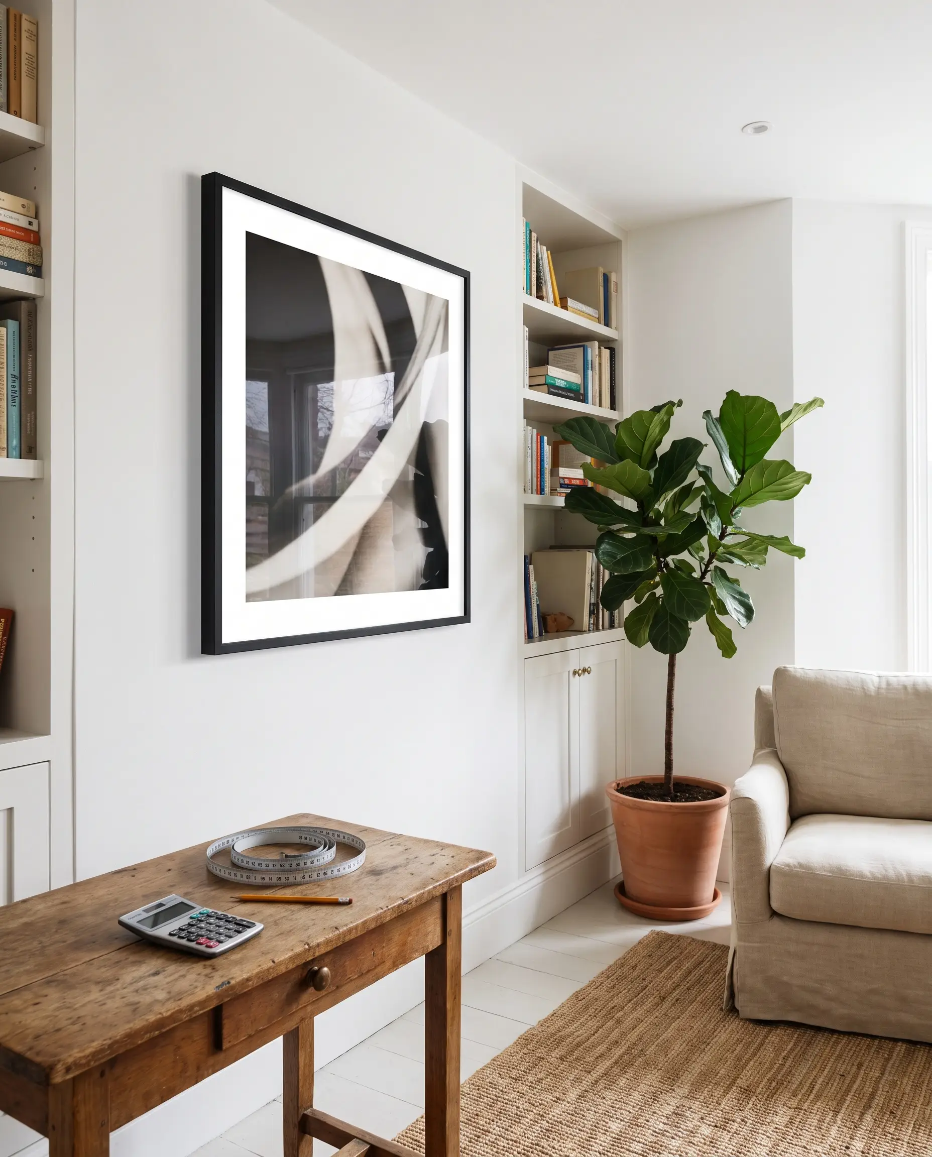
Museums and professional preparators hang art so the absolute center of the piece—or the center of a grouped arrangement—hits exactly 57 to 60 inches from the floor. Anchoring the piece directly in the human sightline prevents the amateur mistake of hanging frames far too close to the ceiling.
- Vibe: Professional Gallery Precision
- Key Materials: Steel tape measure, pencil, calculator
- Paint Recommendation: Farrow & Ball Wevet (A crisp, gallery-white backdrop that lets the art breathe)
Measure the height of your frame and divide by two. Add that number to 57. Measure the distance from the top of the frame down to the tightened hanging wire. Subtract that wire distance from your previous number. That final number is exactly where your hook goes.
The Spatial Math
The 2-to-3 Inch Spacing Standard
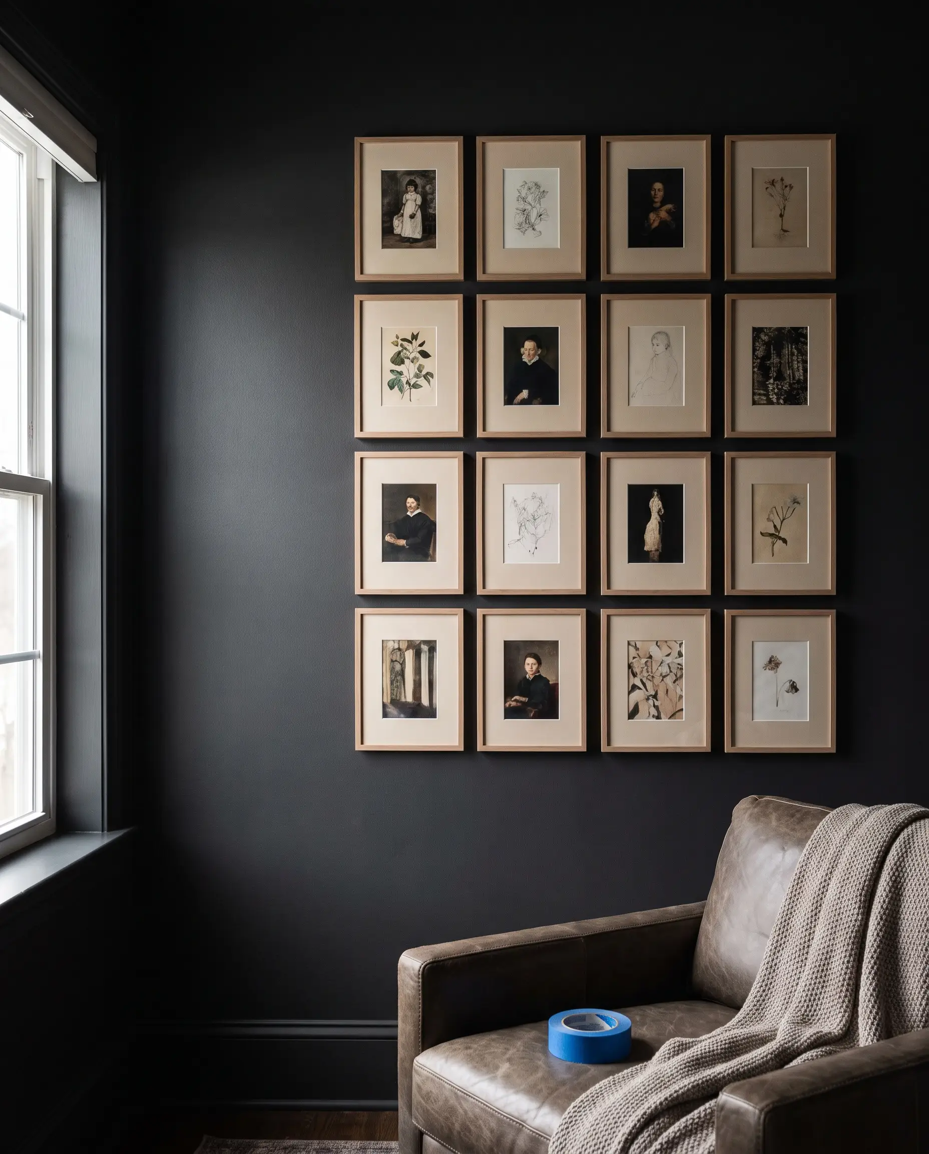
When grouping multiple frames, pushing them too far apart shatters the composition, turning a cohesive gallery wall into disconnected islands. Enforcing a strict 2 to 3 inches of negative space between frames fuses them into a single, high-impact visual unit.
- Vibe: Cohesive and Intentional
- Key Tool: A standard 2-inch wide painter’s tape roll (used as a physical spacer)
- Paint Recommendation: Sherwin-Williams Peppercorn (Dark walls absorb the negative space, making the frames push forward)
Always leave exactly 2 inches between frames in a tight grid, no exceptions. For organic layouts, you can push the spacing to 3 inches, but never exceed it.
The Curator’s Rule
The 2/3 Furniture Ratio (Scaling Above Sofas and Consoles)
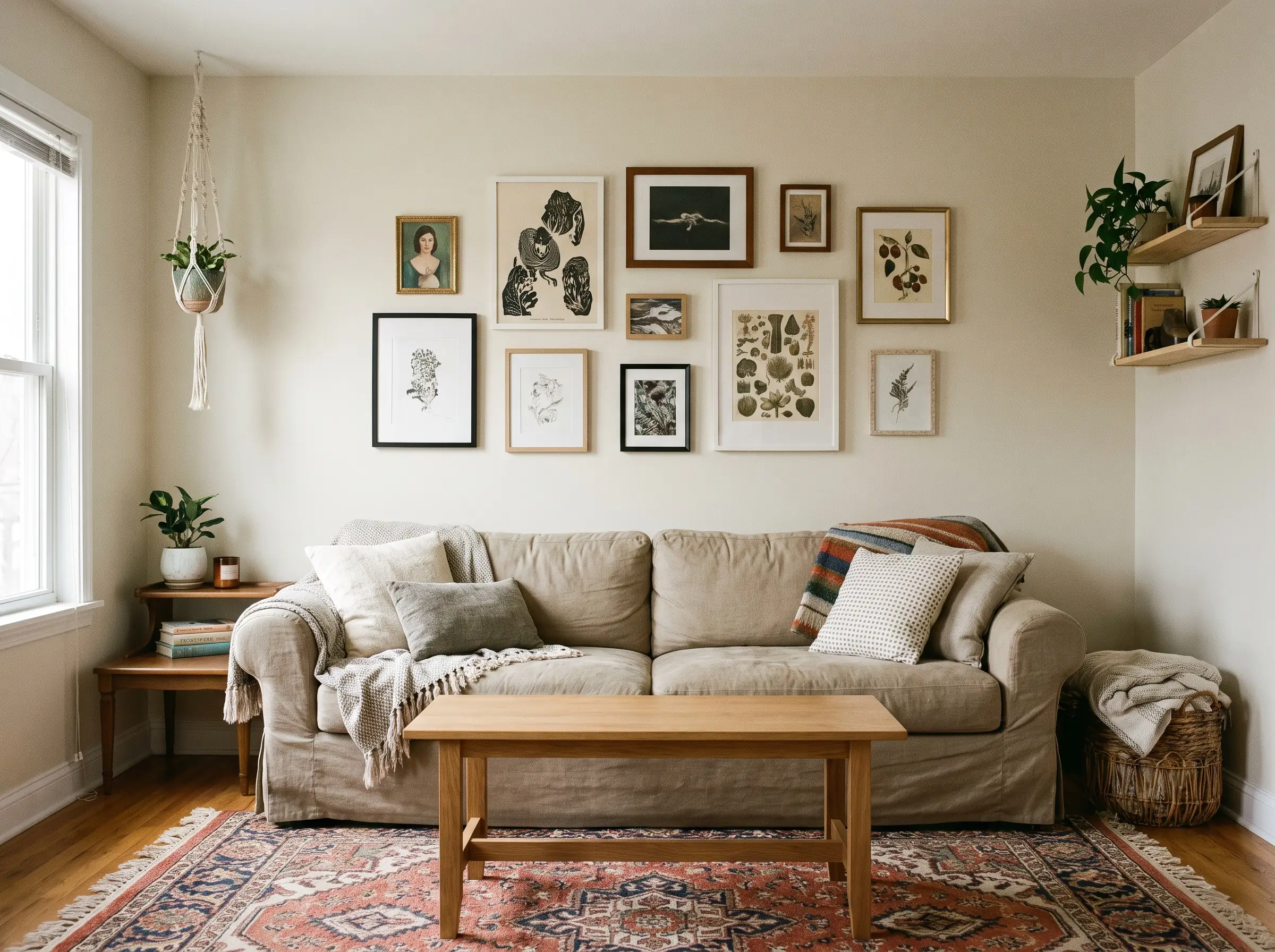
Hanging tiny art over a massive sofa creates an uncomfortable imbalance in visual weight. The total width of your art arrangement must span approximately two-thirds the width of the furniture below it, establishing a grounded architectural anchor.
- Vibe: Architecturally Balanced
- Key Metric: Arrange the bottom of the lowest frame exactly 6 to 8 inches above the back of the sofa.
- Paint Recommendation: Benjamin Moore Swiss Coffee (A warm, versatile neutral that bridges the gap between furniture and art)
Symmetrical and Grid Layouts (The Architect’s Approach)
Symmetrical layouts thrive in transitional, modern, and formal spaces, bringing rigorous order to blank walls. They require precise measuring, but this exacting spatial math delivers maximum visual impact.
The Classic Triptych Over the Sofa
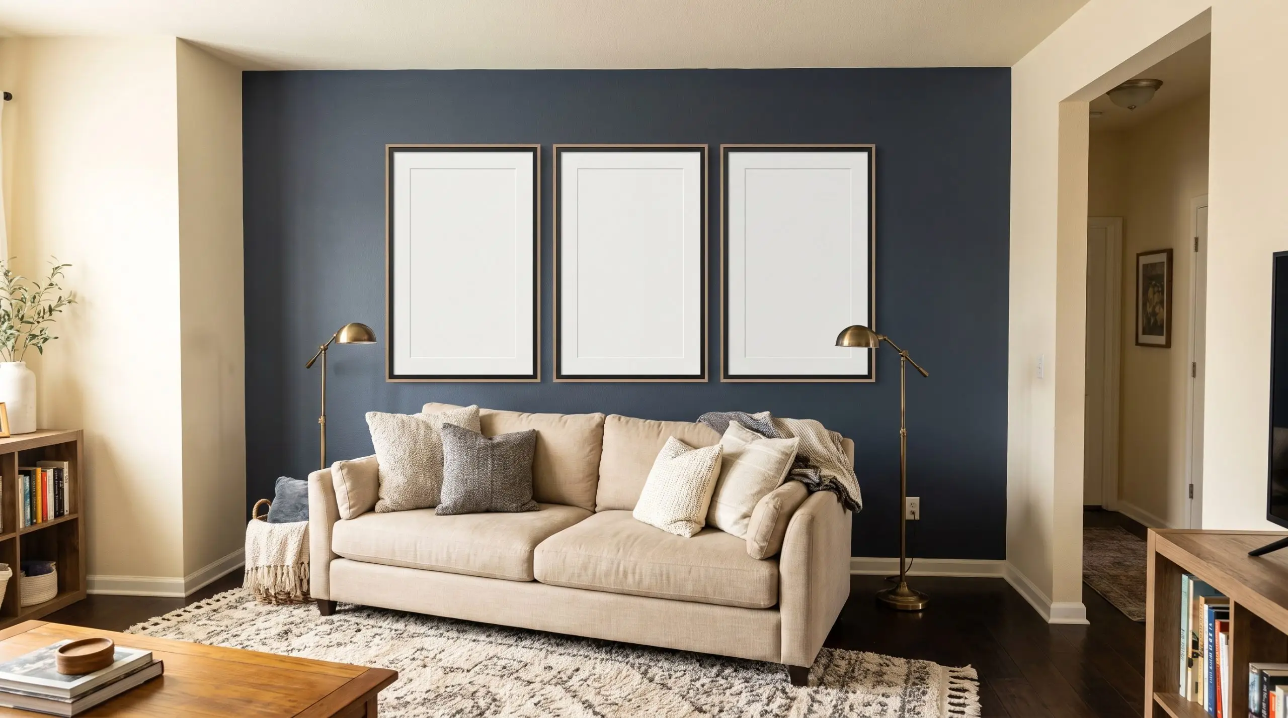
Three large, identically sized vertical frames create a commanding focal point that respects traditional sightlines. Utilizing oversized white mat boards inside thin frames makes affordable prints look like high-end, bespoke gallery pieces.
- Vibe: Transitional Elegance
- Key Materials: Thin matte black or light oak frames, 8-ply oversized white mats
- Paint Recommendation: Benjamin Moore Hale Navy (Provides a stark, classic contrast against crisp white matting)
The 9-Square Botanical Grid
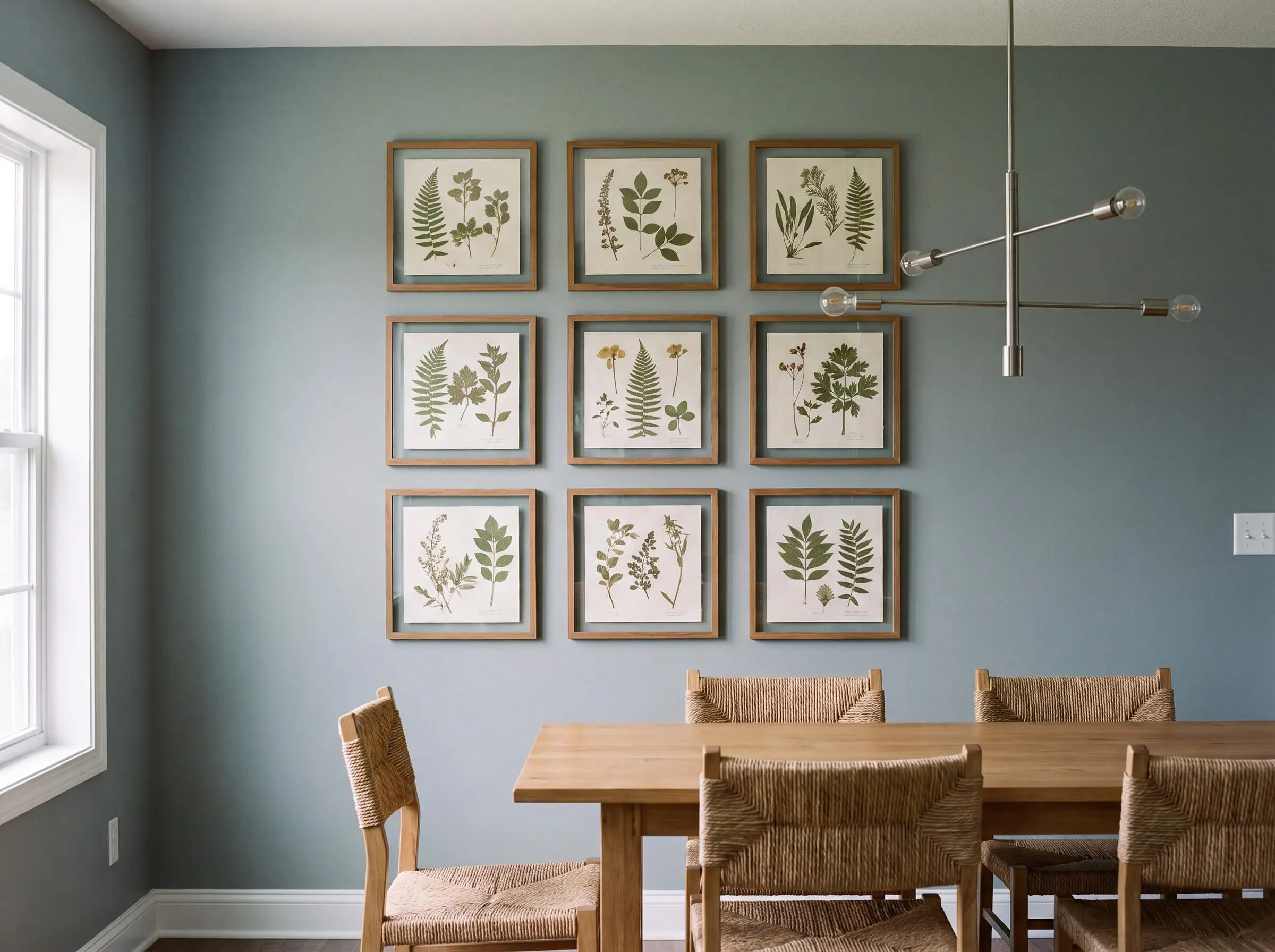
A three-by-three grid of identical square frames instantly fills a large dining room wall with rhythmic, architectural precision. Filling these frames with a continuous series, such as botanical pressings or architectural sketches, creates a unified visual narrative.
- Vibe: Structured and Academic
- Key Materials: Nine identical 16×16 inch square frames, uniform prints
- Paint Recommendation: Farrow & Ball Pigeon (A muted blue-gray that flatters vintage botanical greens)
Grids require a laser level. A 1/4-inch mistake on a single frame will compound and ruin the entire layout. Do not attempt this with just a tape measure and a pencil.
Pro-Tip Callout
The Floor-to-Ceiling Column
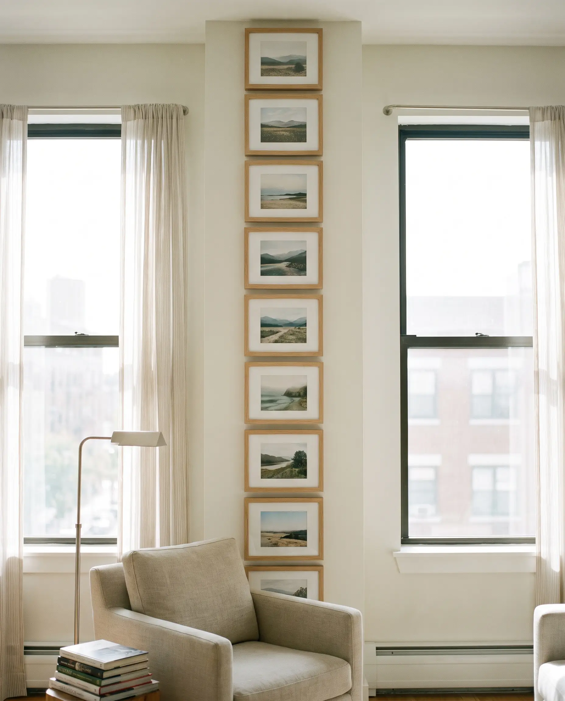
A vertical stack of tightly spaced frames perfectly utilizes narrow, awkward spaces like the drywall between two tall windows. This linear approach draws the eye upward, maximizing vertical sightlines and emphasizing ceiling height.
- Vibe: Linear and Modern
- Key Materials: Identical landscape-oriented frames stacked vertically
- Paint Recommendation: Sherwin-Williams Pure White (Keeps the narrow column feeling open and airy)
The Mirrored Diptych
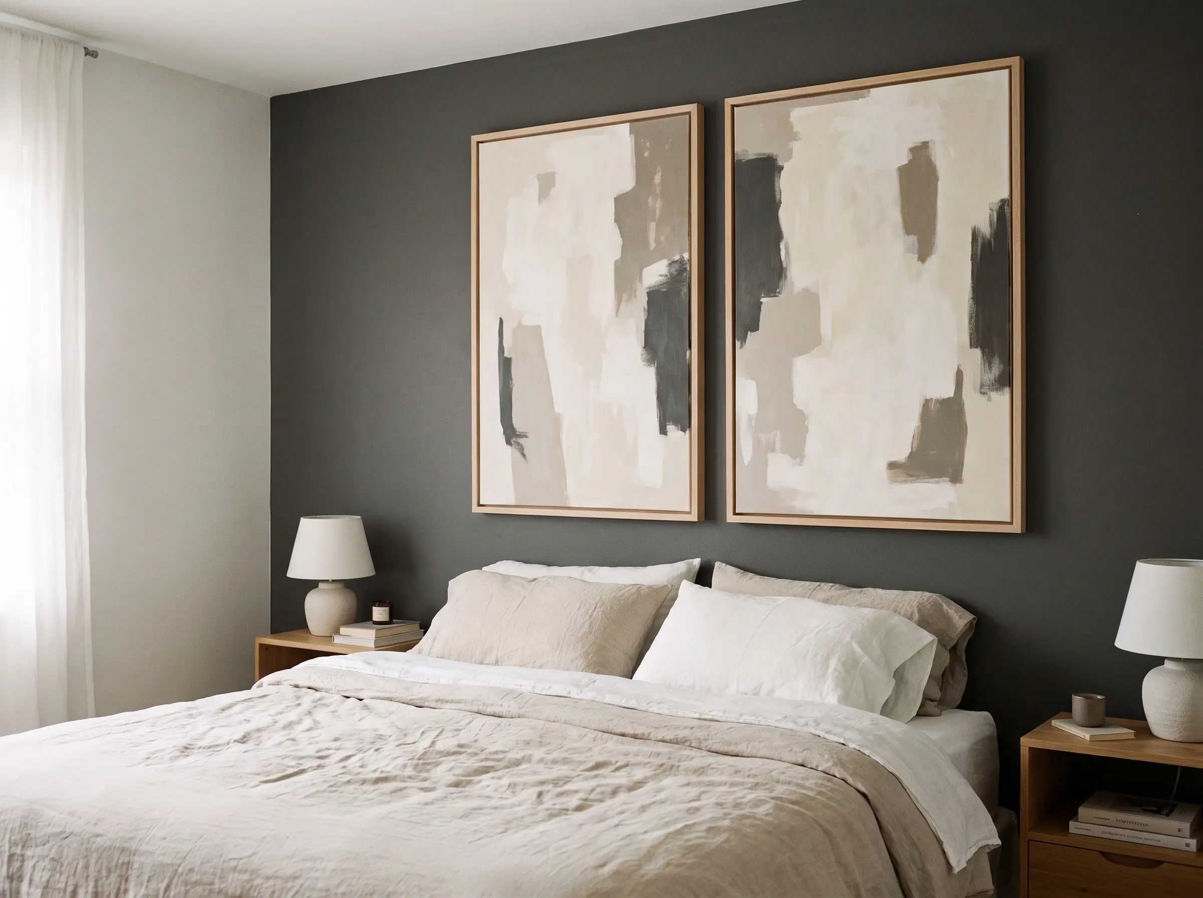
Hanging two massive, identical frames side-by-side delivers a bold, minimalist statement perfectly scaled for the space above a king-sized bed. The strict 2-inch spacing rule applies heavily here to ensure the two pieces read as a singular anchor piece.
- Vibe: Minimalist Impact
- Key Materials: Two oversized frames (minimum 24×36 inches each), D-rings
- Paint Recommendation: Benjamin Moore Kendall Charcoal (Adds rich depth behind large, light-colored abstract canvases)
Organic and Asymmetrical Arrangements (The Collector’s Vibe)
Organic layouts offer the perfect solution for eclectic spaces, growing collections, and awkwardly shaped architectural features. In these asymmetrical arrangements, balancing visual weight matters infinitely more than rigid symmetry.
The Anchor-and-Orbit Method
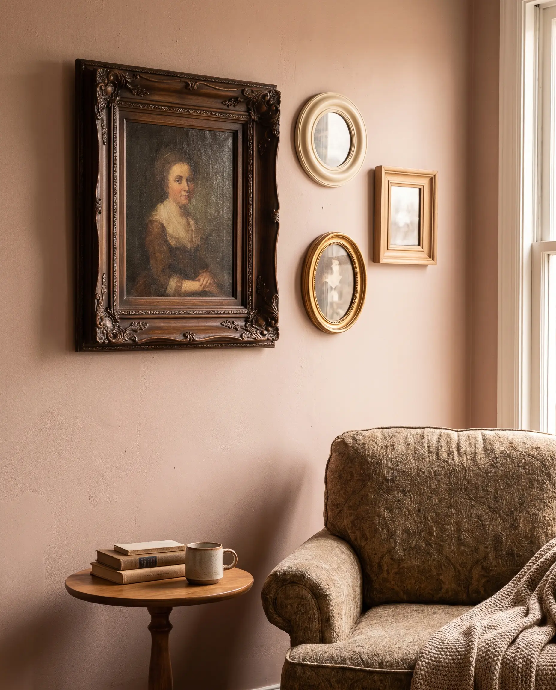
Hang one oversized, dominant anchor piece slightly off-center, then meticulously orbit it with three to five smaller frames of varying shapes. You must balance the heavy, dark frame on the left by clustering multiple lighter, smaller frames on the right to maintain spatial equilibrium.
- Vibe: Eclectic and Collected
- Key Materials: One large ornate frame, mixed gallery frames, varied art mediums
- Paint Recommendation: Farrow & Ball Setting Plaster (A dusty pink that acts as a sophisticated, warm neutral for mixed art)
The Staircase Step-Down
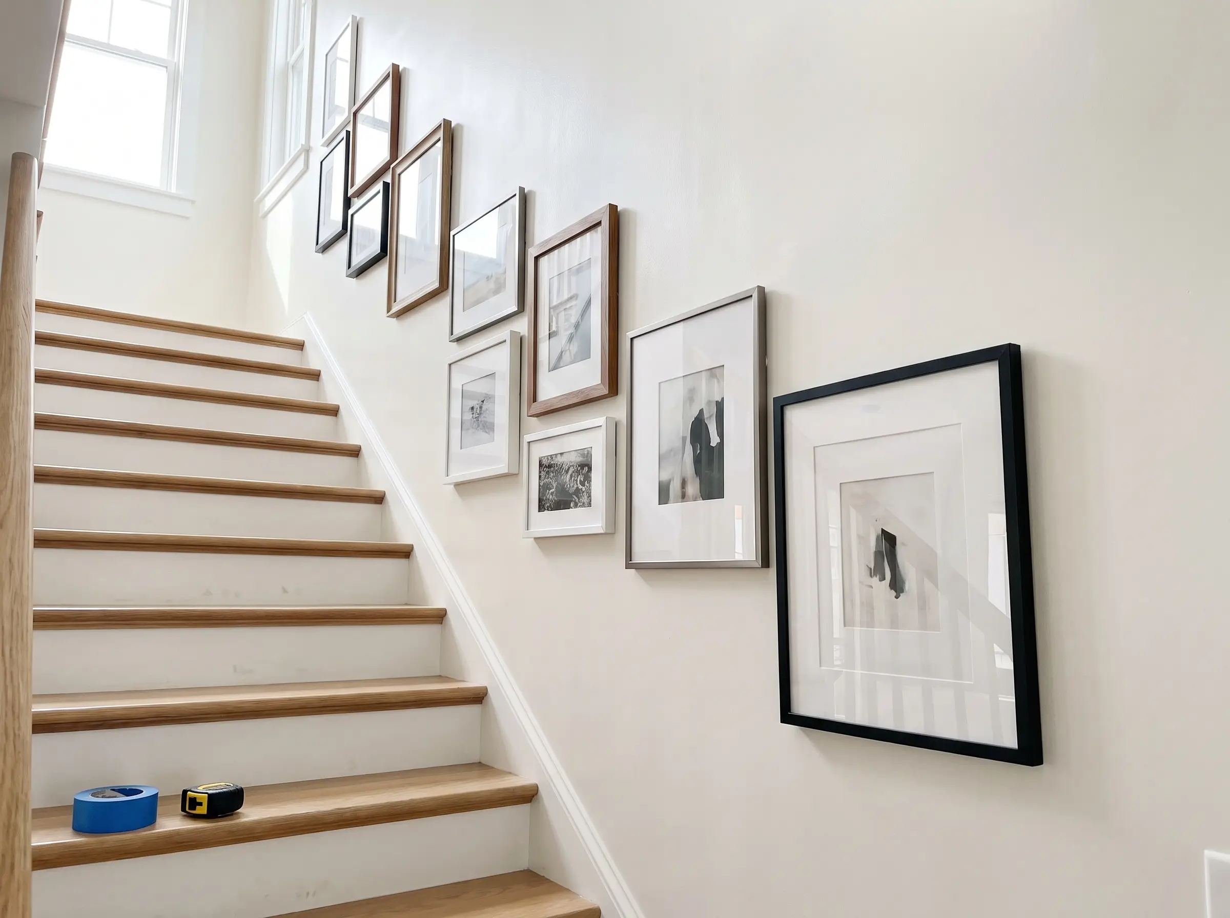
Staircase gallery walls cannot follow a straight horizontal line; they must step down in parallel with the exact angle of the stairs. Anchoring the absolute center of your key pieces at 57 inches above every third step maintains a consistent, flowing sightline as you ascend.
- Vibe: Dynamic and Flowing
- Key Materials: Painter’s tape, measuring tape, varied frame sizes
- Paint Recommendation: Sherwin-Williams Alabaster (A highly reflective white that brightens notoriously dark stairwells)
Measurement Guide:
- Measure straight up 57 inches from the center of the bottom tread and mark the wall.
- Repeat this exact measurement above every third step all the way up the staircase.
- Snap a chalk line or run painter’s tape diagonally across these marks to create your angled, infallible baseline.
The Corner Wrap Layout
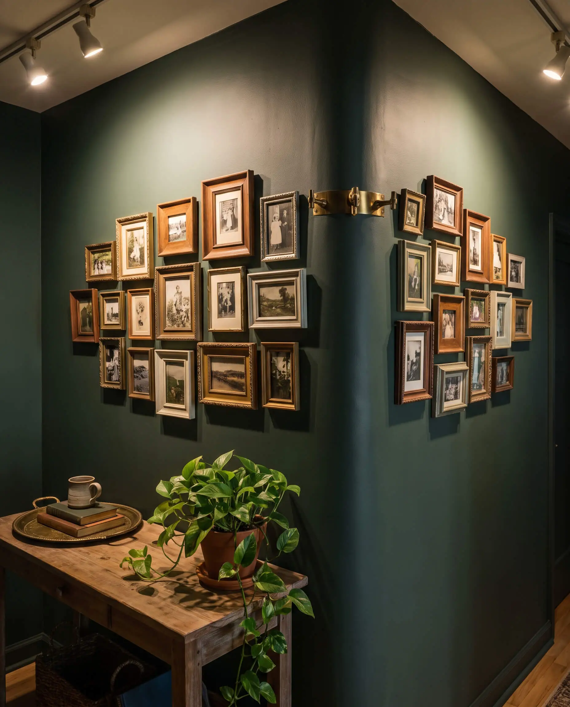
Wrapping a gallery arrangement directly around an inward or outward corner brilliantly utilizes dead negative space. This immersive layout works best with eclectic, mismatched frames that seemingly spill over the architectural bend.
- Vibe: Immersive and Unexpected
- Key Materials: Small to medium eclectic frames, corner-friendly hanging hardware
- Paint Recommendation: Benjamin Moore Salamander (A deep, moody green that blurs the harsh lines of a drywall corner)
The Bottom-Heavy Ledge Illusion
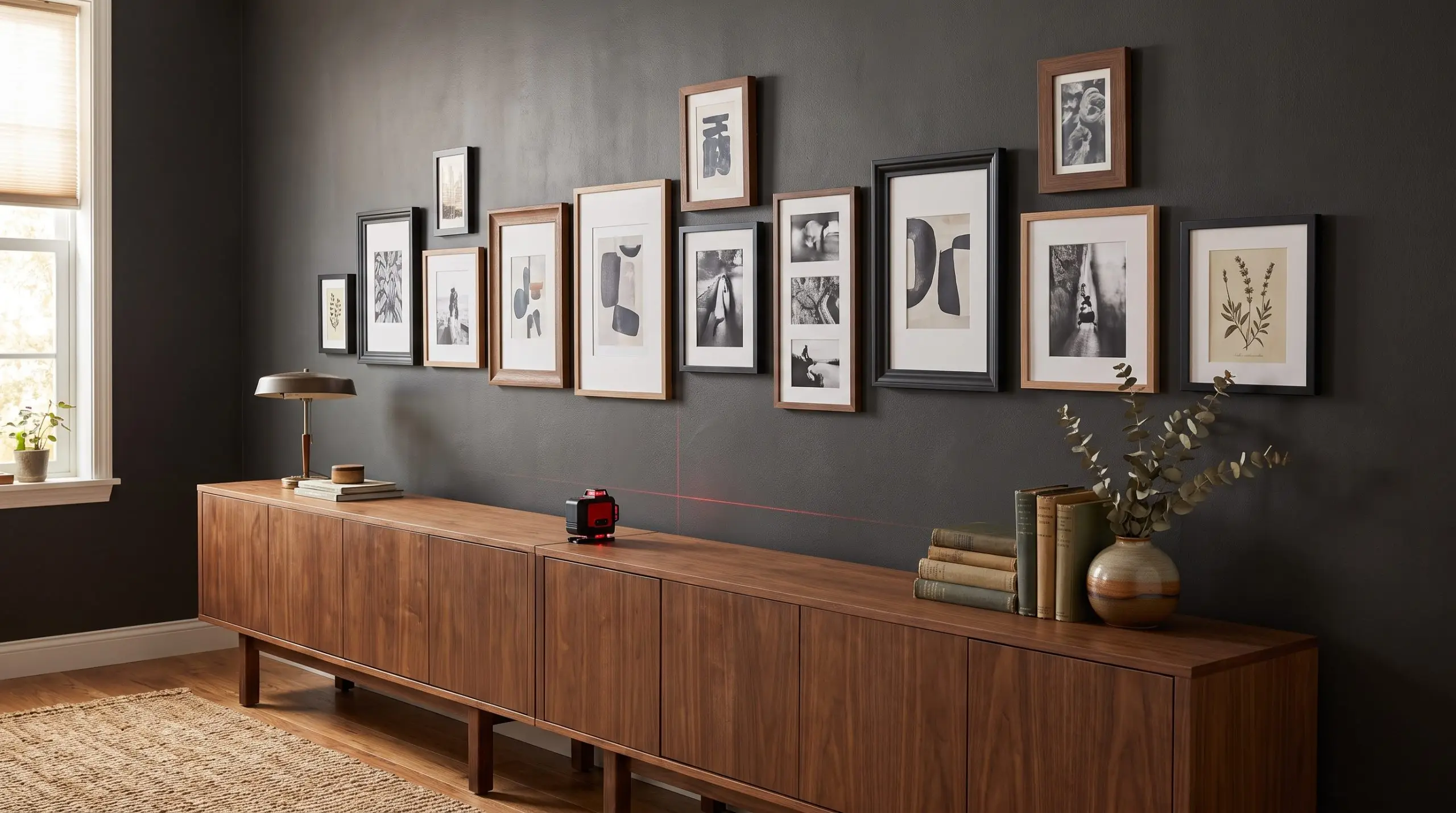
This asymmetrical approach aligns the bottom edges of wildly varying frames perfectly flat along an invisible horizontal line, while allowing the top heights to stagger organically. It creates a grounded, architectural anchor that looks incredible floating 6 to 8 inches above a long, low credenza.
- Vibe: Grounded and Modern
- Key Materials: Laser level (to shoot the bottom baseline), varied vertical frames
- Paint Recommendation: Sherwin-Williams Iron Ore (Provides a dramatic, high-contrast backdrop for the staggered top heights)
Picture Ledges and Leaning Methods (The Fluid Approach)
For renters, chronic re-decorators, or anyone terrified of drywall anchors, leaning art offers a highly sophisticated alternative. This fluid approach relies entirely on intentional layering and material contrast rather than precise hammering.
The Layered Picture Ledge
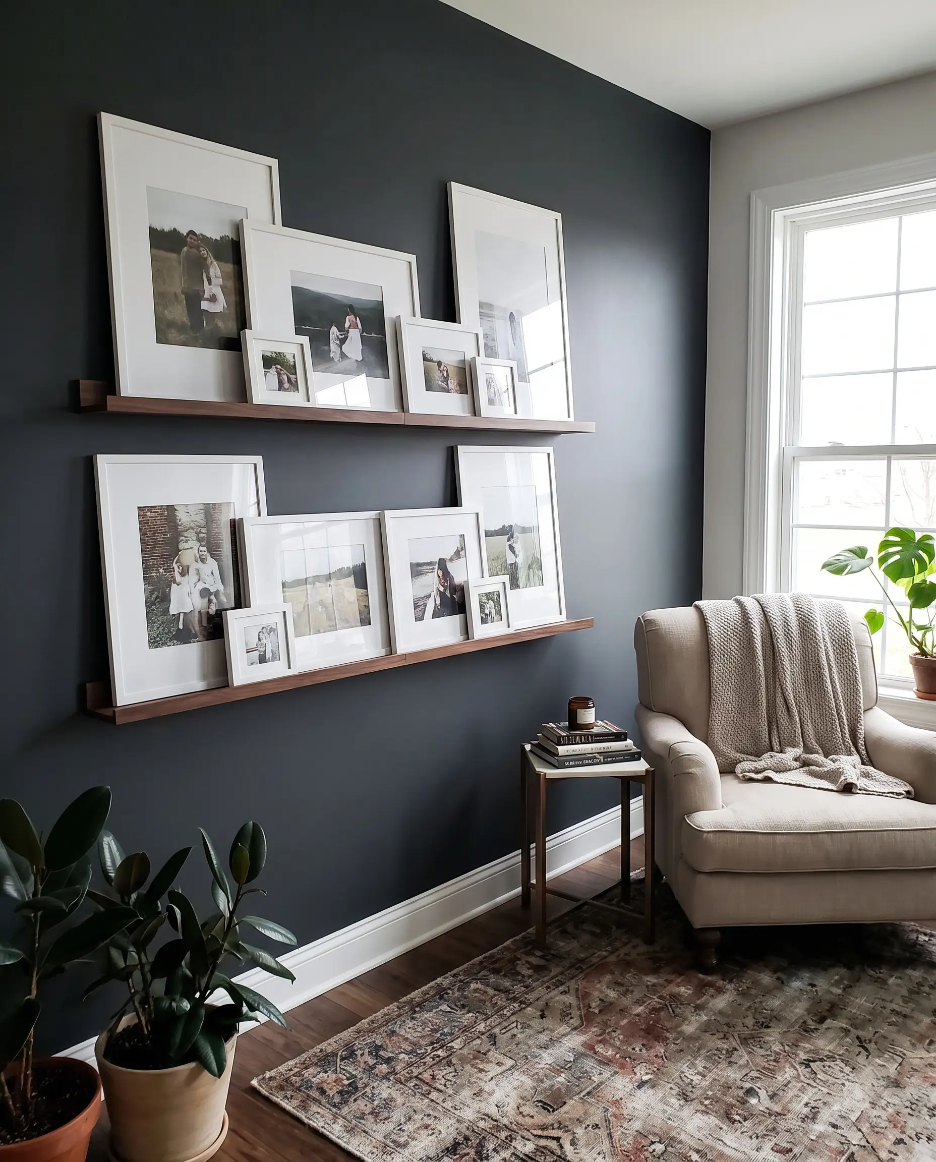
Installing a shallow architectural ledge transforms a blank wall into a rotating gallery space. The secret is intentional overlap: place the tallest pieces in the back, lean medium frames in the middle so they slightly obscure the large piece, and tuck tiny frames in the absolute front.
- Vibe: Casual and Curated
- Key Materials: Floating picture ledges (minimum 4 inches deep), mixed frames
- Paint Recommendation: Farrow & Ball Railings (A soft black that makes the white mats on the ledge visually jump forward)
Art on a ledge should never stand in a straight, spaced-out row like soldiers. If the frames are not physically overlapping, the layout will look stiff and amateurish.
The Curator’s Rule
The Mantelpiece Lean
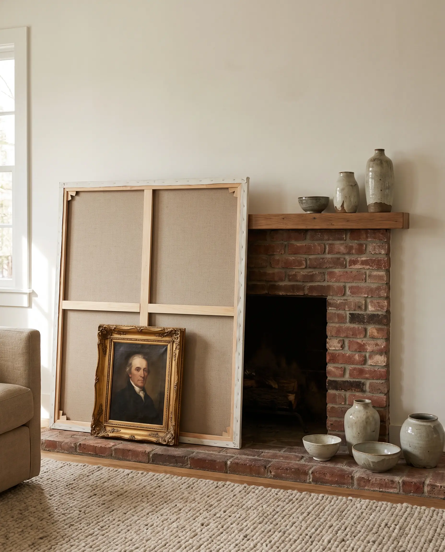
Leaning an oversized mirror or raw canvas directly on a fireplace mantel establishes a massive focal point without drilling into masonry. Anchor this large piece by leaning a smaller, heavily textured frame directly against it, flanked by sculptural ceramics to break up the flat planes.
- Vibe: Effortlessly Chic
- Key Materials: Oversized statement piece, contrasting small frame (e.g., gilded vintage against raw wood)
- Paint Recommendation: Benjamin Moore White Dove (A soft, warm white that flatters masonry and mixed metals)
The Oversized Floor Lean
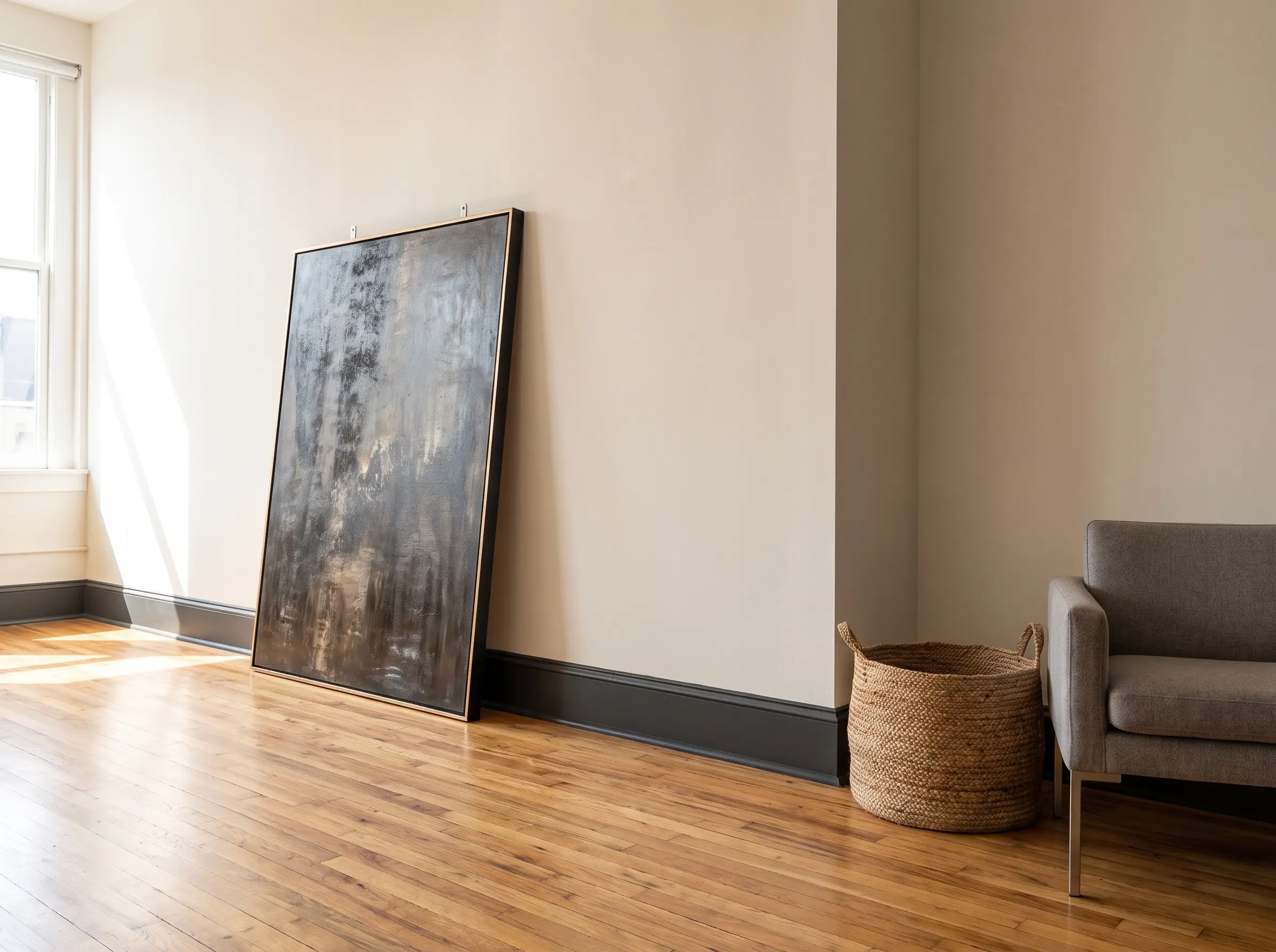
Massive, heavy canvases or oversized floor mirrors (measuring 60+ inches tall) look incredibly architectural when leaned directly against the wall, resting on the floor. This technique grounds the room, drawing the eye down to highlight beautiful baseboards or hardwood floors.
- Vibe: Lofty and Industrial
- Key Materials: 60-inch+ artwork, heavy-duty wall anchors
- Paint Recommendation: Sherwin-Williams Tricorn Black (A sharp, definitive black for painting the baseboards behind the leaned art)
Do not rely on gravity alone. You must explicitly secure oversized leaned pieces to the wall using heavy-duty anti-tip hardware or steel cables, especially in homes with pets or children.
Safety Warning
Mixed Media & Dimensional Styling
A masterfully arranged wall is rarely just flat paper sitting in flat frames. Introducing dimensional styling, lighting, and sculptural objects breaks the monotony and brings tactile depth to the spatial math.
Integrating Plug-In Sconces
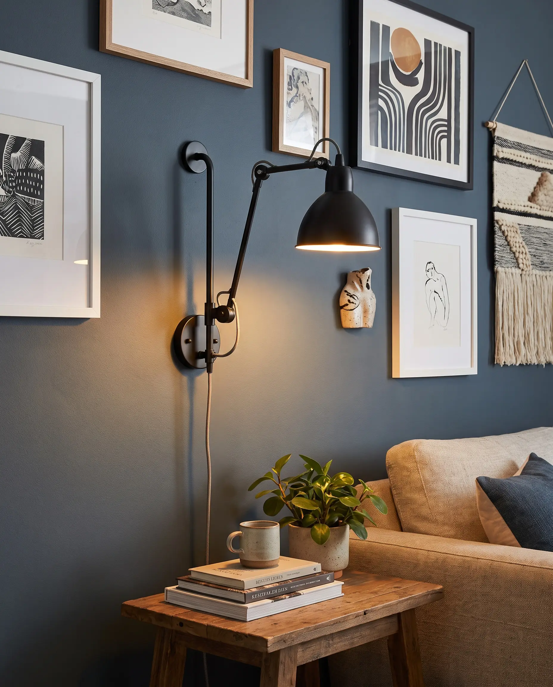
Mounting a brass or matte black plug-in sconce directly into the gallery arrangement disrupts the flat grid and provides essential sculptural relief. Articulating swing-arm sconces or dedicated picture lights instantly upgrade affordable prints to museum quality.
- Vibe: High-End Bespoke
- Key Materials: Brass picture lights, matte black articulating sconces, cord covers
- Paint Recommendation: Farrow & Ball Hague Blue (A deep, dramatic backdrop that makes brass lighting glow)
Breaking the Grid with Sculptural Objects
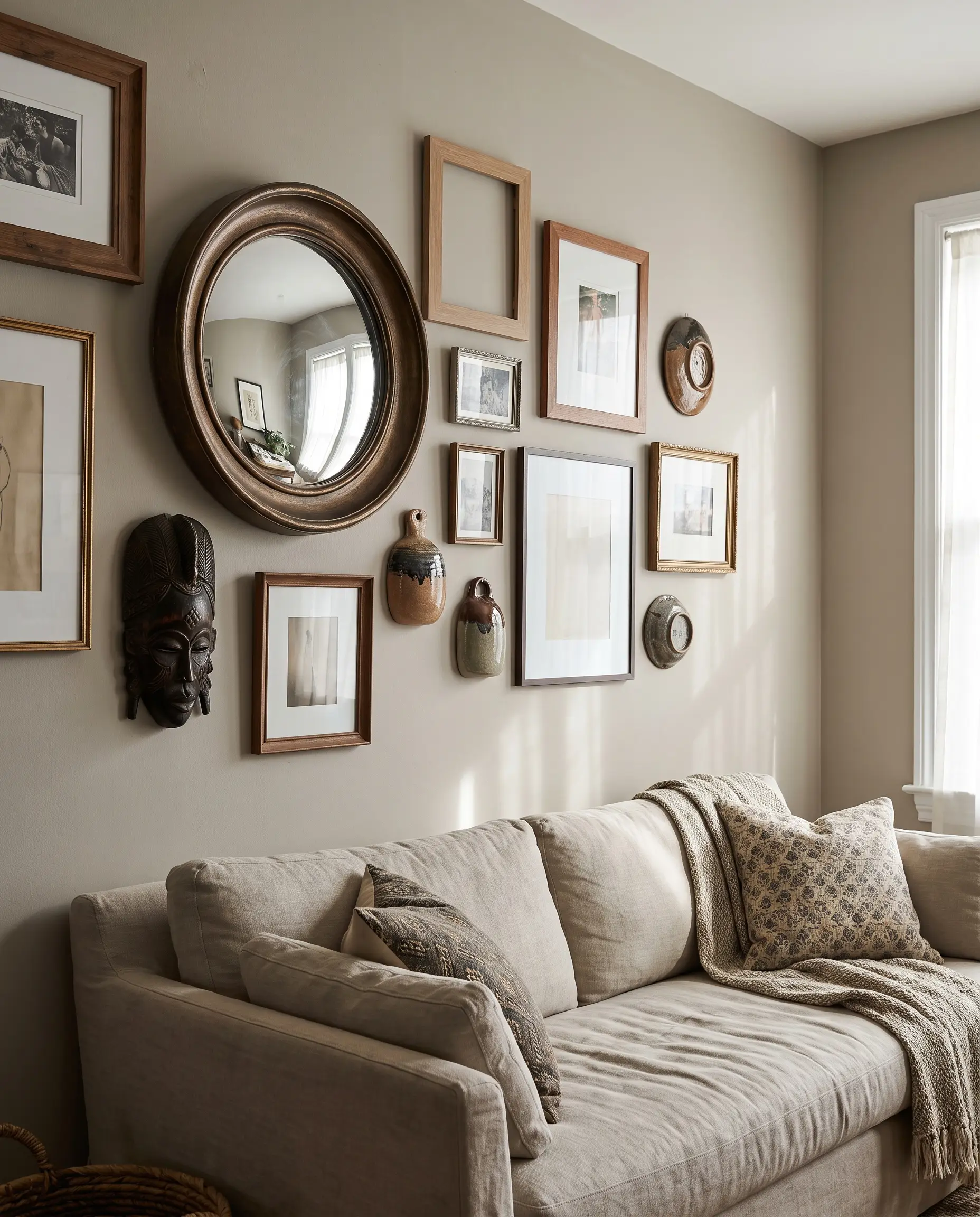
Mixing flat frames with 3D objects—such as a convex mirror, a carved wooden mask, or an architectural bracket—shatters the predictability of an asymmetrical layout. These dimensional additions play with natural light, casting shifting shadows that give the wall organic life.
- Vibe: Tactile and Global
- Key Materials: Convex mirrors, wooden masks, ceramic wall hangings
- Paint Recommendation: Benjamin Moore Revere Pewter (A warm greige that highlights the subtle shadows cast by 3D objects)
Blending Canvas, Mat-Framed Prints, and Floating Frames
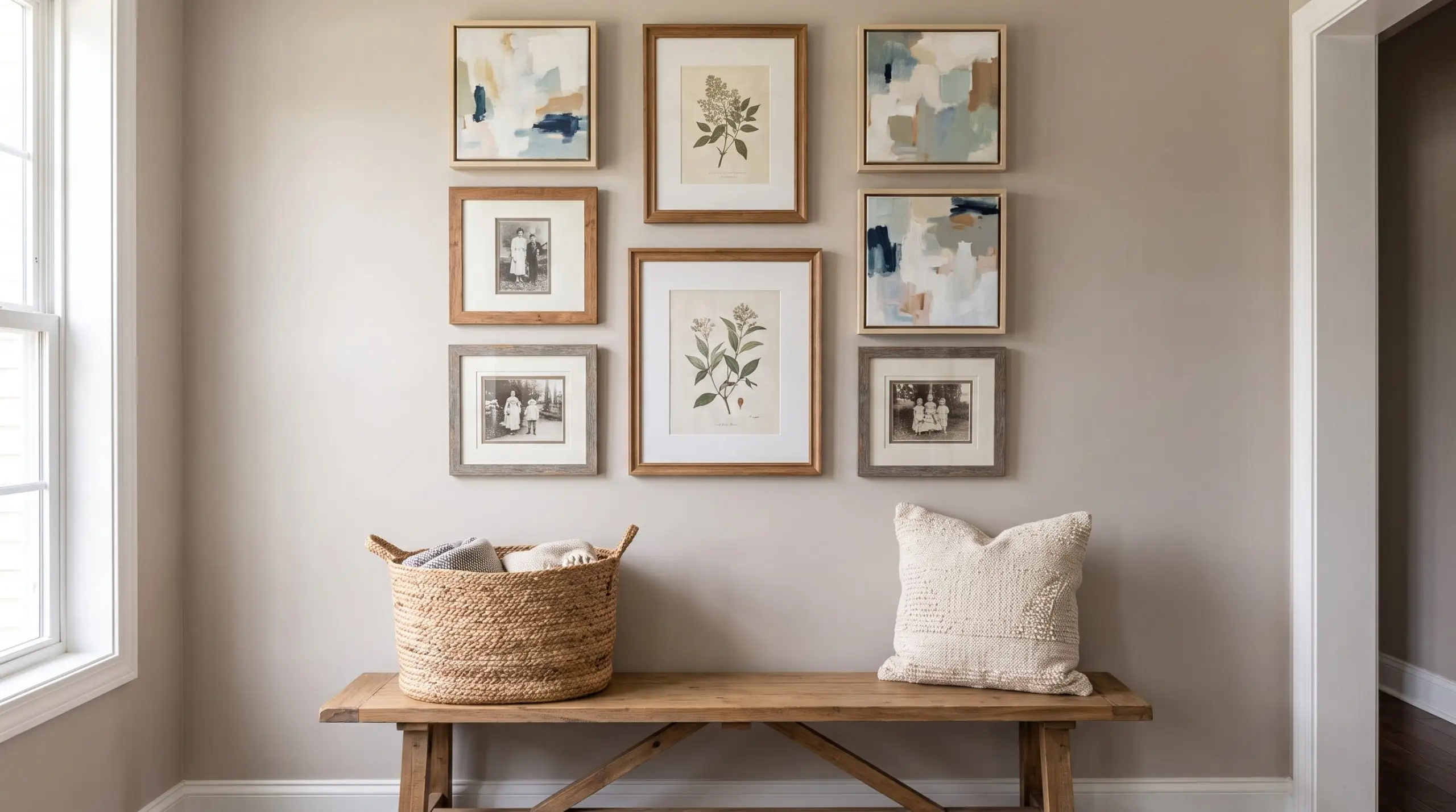
Mixing frame profiles prevents the wall from looking like a sterile catalog purchase. Enforce the rule of threes to maintain order: ensure at least three pieces share a common trait, such as three floating frames or three pieces with oversized white mats, to tie the visual weight together.
- Vibe: Intentionally Curated
- Key Materials: Canvas float frames, traditional glass frames, varied mat boards
- Paint Recommendation: Sherwin-Williams Agreeable Gray (A perfect, quiet backdrop for highly varied frame materials)
Before You Hammer: Foolproof Execution Hacks
You have mastered the spatial math and selected your layout. Now, you must translate that arrangement from your brain to the drywall without destroying your room in the process.
The Kraft Paper Template Trick
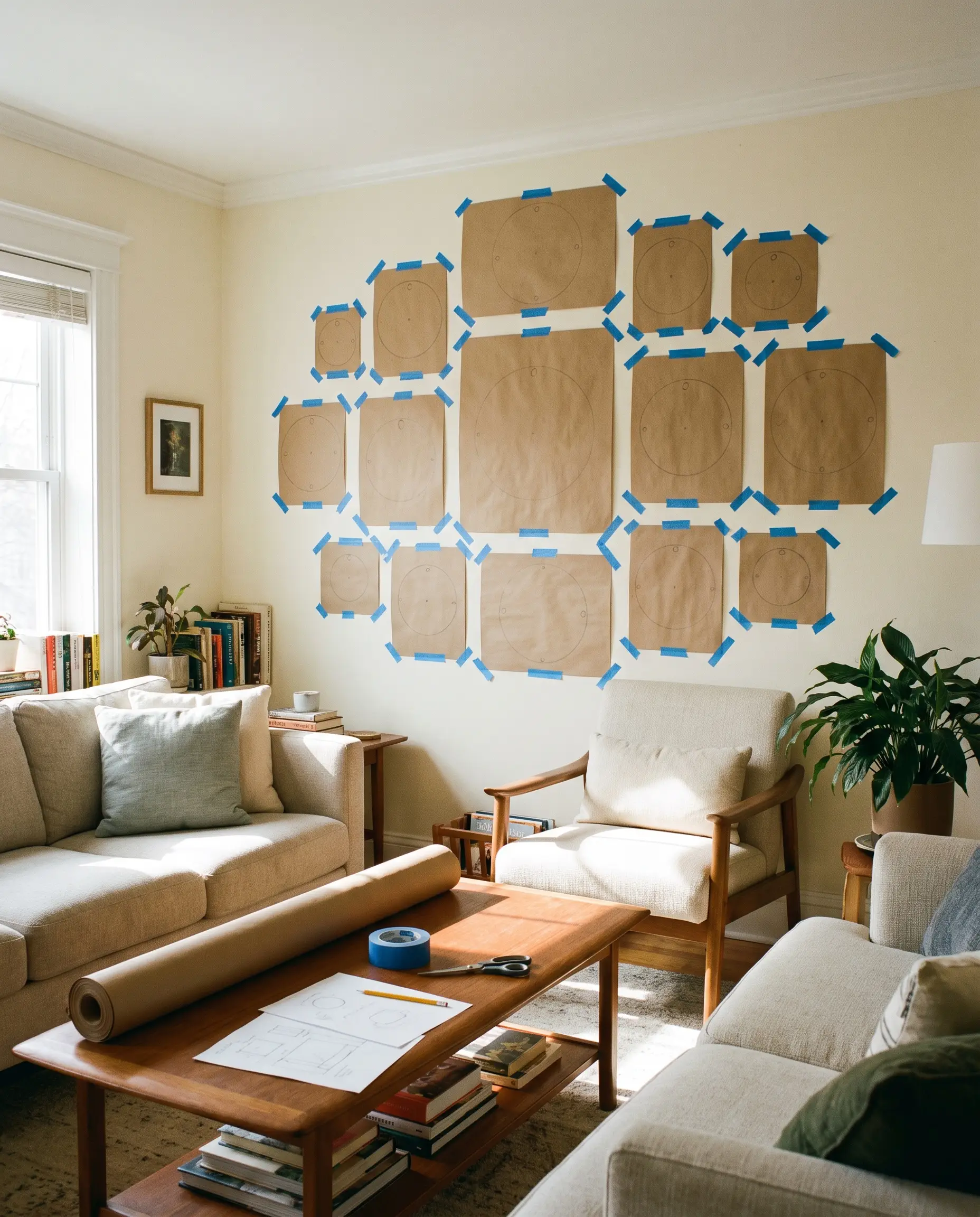
This is the most critical pre-installation hack for executing complex gallery wall layouts. By creating exact physical templates of your frames, you can perfect the spacing, adjust the visual weight, and mark your nail holes before ever picking up a hammer.
- Vibe: Professional Preparation
- Key Materials: Roll of kraft paper, painter’s tape, scissors, pencil
Step-by-Step Chronological Guide:
- Roll out kraft paper and trace the exact perimeter of every single frame.
- Cut out the templates and measure the exact distance from the top of the real frame down to the tightened wire.
- Mark that specific wire/hook spot directly on the corresponding paper template.
- Tape the templates to the wall, step back to review the layout, and hammer your nails directly through the marked dot on the paper.
Choosing the Right Hardware (French Cleats vs. D-Rings)
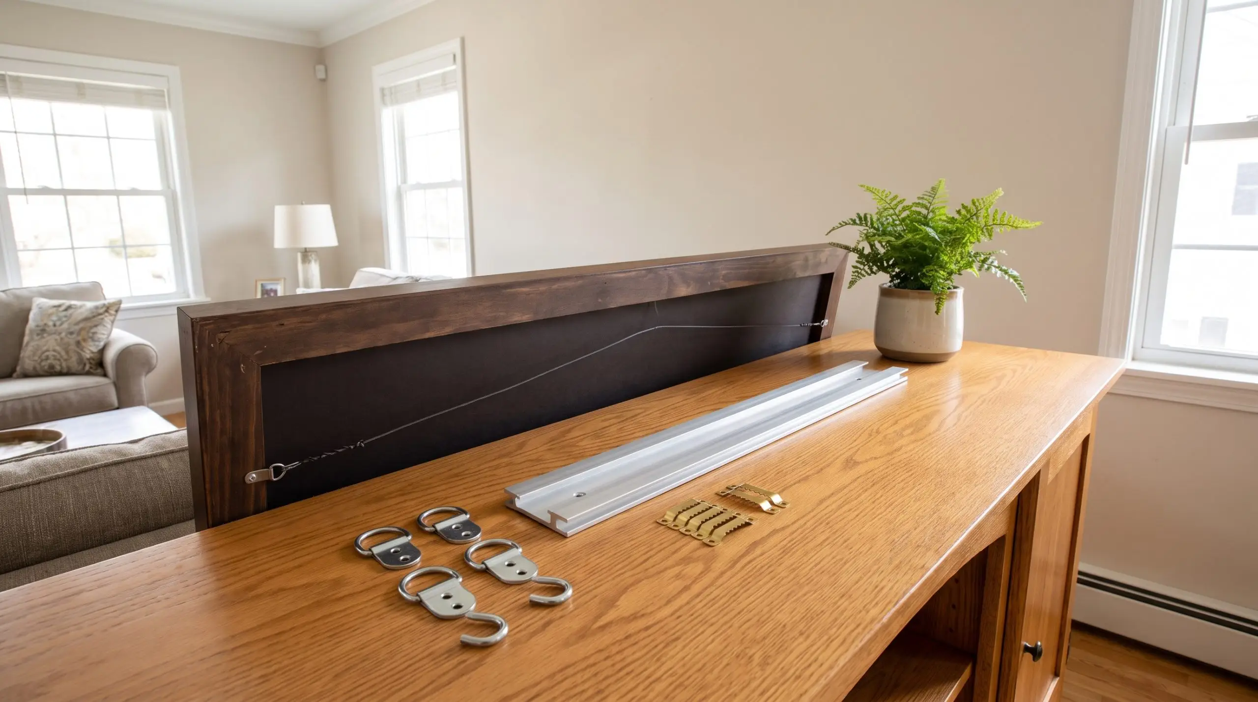
Amateurs hang heavy art on a single, tiny nail and pray it holds. Professional installers treat hardware as a structural necessity, matching the fastener perfectly to the weight and profile of the frame to ensure it sits flush and perfectly level.
- Command Strips: Strictly for lightweight, renter-friendly applications or stabilizing the bottom corners of framed prints so they do not shift.
- Sawtooth Hangers: Acceptable only for very small, lightweight frames (under 5 lbs).
- D-Rings with Two Hooks: The industry standard for medium-to-heavy frames; using two distinct wall hooks prevents the art from ever swinging off-level.
- French Cleats: Mandatory for massive canvases, heavy mirrors, or anything exceeding 40 lbs, locking the piece completely flush against the drywall.
Curating Your Final Composition
Your wall arrangement is a living, breathing architectural feature that will naturally evolve over time. Stop staring at the blank drywall in a state of paralysis. Grab your tape measure, apply the spatial math, and hang your anchor piece this weekend.
Remember, spackle is cheap, and holes can always be patched—but living in a sterile, undecorated box offers absolutely no joy. Which layout archetype are you going to map out on your floor tonight? Tag us in your final grids and asymmetrical orbits; we want to see your precision in action.

The Hackrea Style Desk treats interior decoration as an exact visual science. Rather than focusing on demolition or floor plans, this desk masters the art of color theory, undertone matching, material pairings, and spatial proportion. From balancing the visual weight of mixed metals to finding the perfect bridging tone between disparate wood species, this desk provides the rigorous aesthetic rules needed to achieve high-end, editorial-quality harmony in any space.