The Timeless Appeal of Monochrome Wall Art in Home Design
Interior trends come and go every season. One choice, though, has quietly outlasted nearly all of them: black and white wall art. While paint colors cycle through moody greens, dusty pinks, and back again, a well-chosen monochrome piece keeps working, room after room, year after year.
This isn’t just a hunch. It’s backed by how the wall decor market is actually moving right now, and by what interior professionals are gravitating toward as 2026 unfolds. Below is a look at why monochrome art holds its value across design eras, where it fits stylistically, and how to choose, size, and light it so it earns its place on your wall.
Why Monochrome Art Never Goes Out of Style
The global wall decor market was valued at USD 48.78 billion in 2025 and is projected to reach USD 69.56 billion by 2032, growing at a 5.2% compound annual rate, according to Coherent Market Insights. Wall art alone, meaning paintings and prints rather than mirrors or shelving, is expected to hold 34.8% of that market in 2025. That’s a lot of money chasing a category that, on paper, should feel saturated. It isn’t, and the reason comes down to durability of taste.
Color decor dates itself. A sage-green accent wall says “2022” the moment a new palette takes over Pinterest. Black and white art doesn’t carry that risk because it has no season to belong to. It reads as fresh in a 1960s ranch house and just as fresh in a 2026 new-build condo, because contrast and composition, not a trending hue, do the work.
If you’re building a room you don’t want to redecorate again in three years, a well-made black and white painting is one of the few purchases that functions as both decor and a long-term investment. It doesn’t compete with your color scheme; it sits above it, which means you can repaint walls, swap throw pillows, and change rugs without ever touching the art itself.
Where Monochrome Art Fits: Style by Style
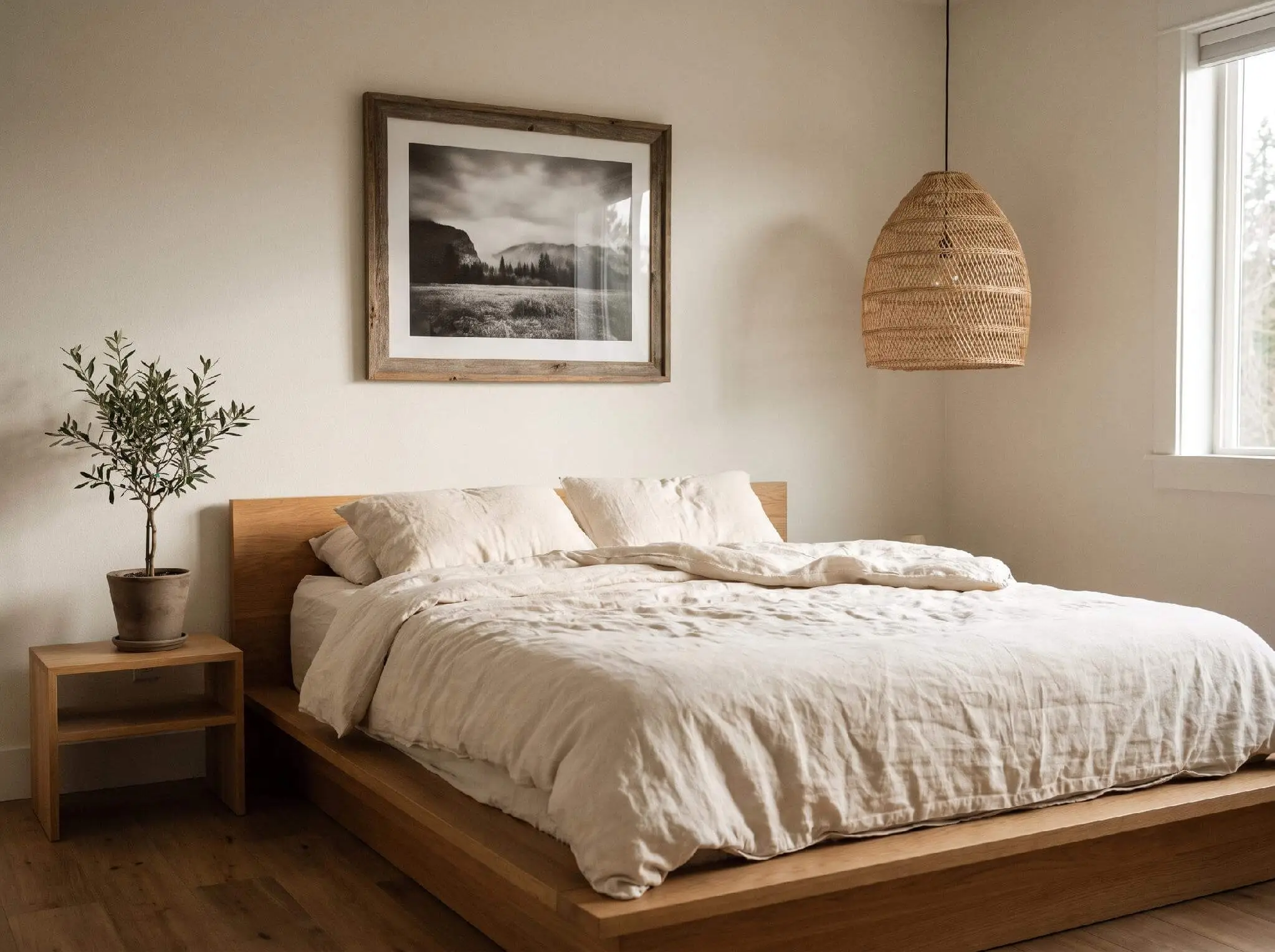
Part of what makes monochrome art so durable is that it doesn’t belong to a single design language. It moves comfortably between Scandinavian minimalism, where clean lines and negative space already dominate, and Japandi interiors, where the piece adds visual weight without disrupting the room’s calm.
It also works in quiet luxury spaces, the understated, expensive-looking aesthetic. Quiet luxury leans on tonal restraint and quality materials over logos or loud pattern, and a large-format black and white piece delivers exactly that kind of confidence without shouting.
There’s a psychological angle here too. A peer-reviewed NIH study on interior color and psychological functioning found that neutral, low-saturation color environments were associated with better psychological functioning among residents in shared living spaces. High-contrast monochrome art gives a room visual interest without introducing the sensory noise that busy, multicolor decor can create.
Even the newest trend on the radar supports this. Forbes reported in May 2026 that Yelp’s Summer 2026 trend data points to “midiminimalism,” a middle ground between full minimalism and maximalism that favors character alongside serenity. Monochrome art fits that description almost perfectly: it adds personality without adding clutter, which is likely why 64% of architecture and design professionals surveyed for that same report had already experimented with AI visualization tools to test similar pared-back looks before committing to them physically.
Choosing the Right Piece for Your Room
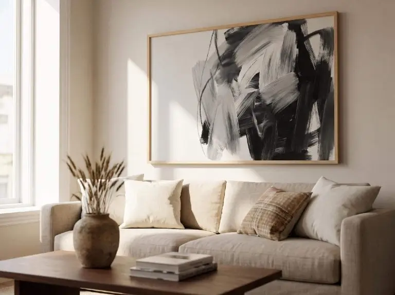
Not every black and white piece works the same way, and picking the wrong one is a common mistake. Abstract compositions read as bold and modern, ideal for a living room or entryway where you want an immediate visual anchor. Black and white photography, landscapes or cityscapes especially, tends to feel calmer and works well in bedrooms or home offices where you don’t want too much visual tension.
Size matters more than most people expect. A piece meant to anchor a wall above a sofa or bed generally needs to span at least 24 by 36 inches, and ideally two-thirds the width of the furniture below it. Undersized art is the single most common styling mistake in living rooms; a small frame on a large wall reads as an afterthought rather than a focal point.
Monochrome art also has a practical use beyond decoration: zoning. In an open-concept layout, a large-scale piece can visually define a seating area or reading nook without adding a physical divider. If you’re weighing options for splitting up a shared space, our piece on zoning an open-concept room covers several approaches, and a statement painting is one of the lowest-commitment ones since it doesn’t block light or airflow.
Framing, Lighting, and Styling Tips
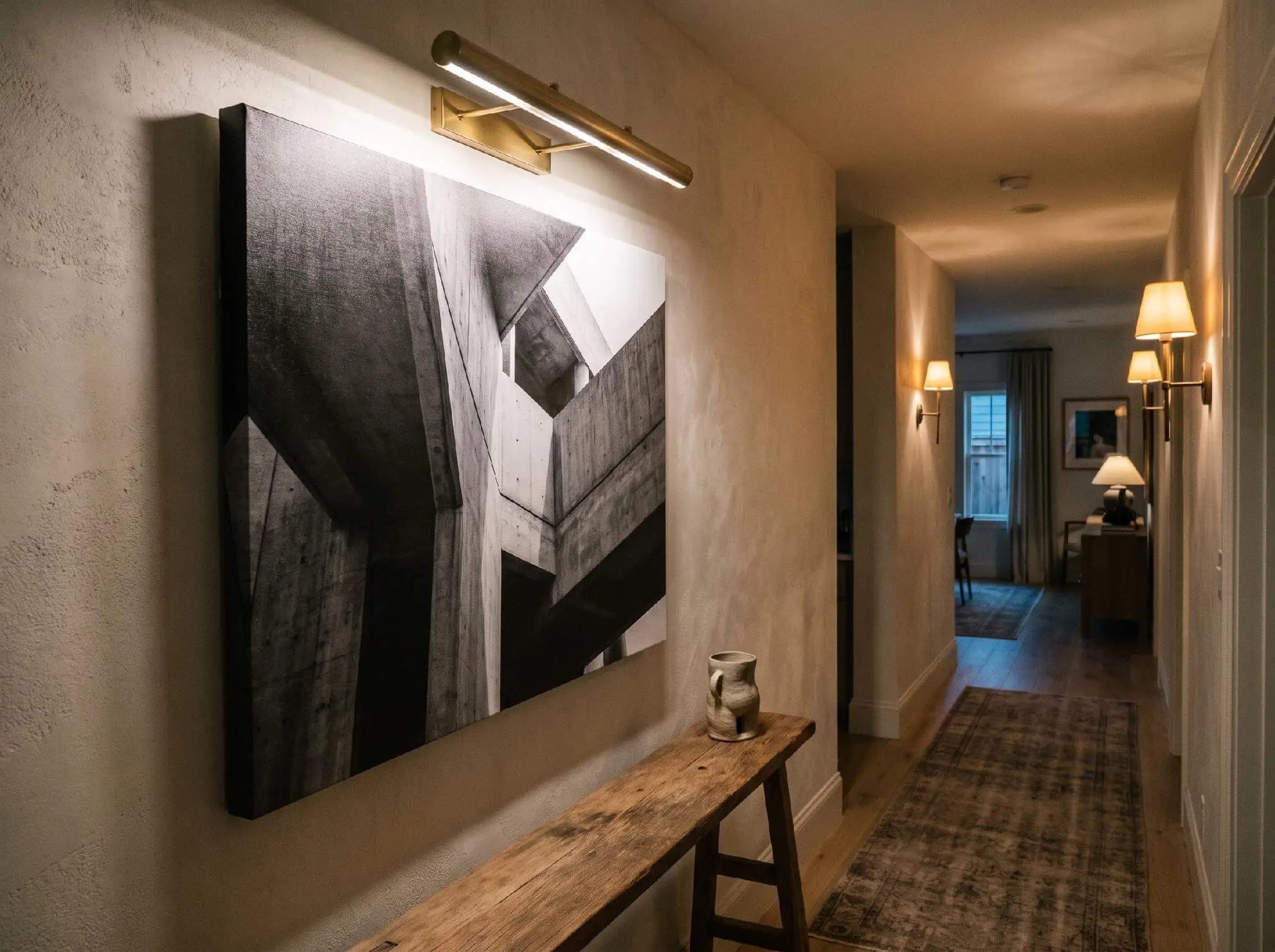
How you frame and light a black and white piece changes how it reads almost as much as the image itself does. Canvas prints feel looser and more textural, good for abstract work, while glass framing with a mat gives photography and fine art a crisper, gallery feel.
Because monochrome art has no color to soften it, pairing it with warm materials keeps a room from feeling sterile. Linen throws, a wool rug, or a wood frame in walnut or oak all add the warmth that black and white alone doesn’t provide. This is also where wall color matters: if you’re deciding on choosing the right paint undertone for the wall behind your art, a warm white or soft greige tends to let contrast pieces pop more than a stark cool white does.
Lighting deserves more attention than it usually gets. A dedicated picture light angled across the surface of a canvas print brings out texture and shadow that flat overhead lighting flattens out entirely. In the U.S. specifically, wall art already makes up roughly 75% of the total wall decor market, according to Mordor Intelligence, with that market forecast to grow from USD 14.93 billion in 2025 to USD 19.98 billion by 2031. That scale of demand is exactly why lighting and framing decisions are worth getting right: this isn’t a niche purchase category, it’s the dominant one, and pieces bought carelessly tend to get replaced within a year or two.
Monochrome Art as a Smart, Lasting Investment
2026 has been a tighter year for home spending than most homeowners expected. Between 74% and 77% of shoppers report trading down across product categories this year, per Coherent Market Insights’ market analysis, with rising credit delinquencies and stalled real wage growth putting mid-tier decor under the most pressure. Premium and budget-tier pieces are still finding buyers; it’s the middle that’s getting squeezed.
That trend makes a strong case for treating art purchases differently than other decor categories. A trend-driven colored piece bought today risks looking dated within two or three years, at which point you’re paying to replace it. A well-made black and white painting doesn’t carry that same depreciation risk, because its value was never tied to a color trend in the first place. It’s less a decor purchase and more a long-horizon one.
That distinction matters more now than it did five years ago, when redecorating every couple of seasons felt more affordable and more expected. In a year defined by cautious spending, buying fewer, better pieces that don’t need replacing is arguably the smarter decorating strategy, not just the safer one.
The Bottom Line
Design trends will keep rotating through color palettes, textures, and buzzwords. Monochrome wall art sits outside that cycle, which is precisely why it keeps showing up in Scandi living rooms, Japandi bedrooms, and quiet luxury interiors alike, regardless of what else is trending that year.
If you’re planning a room refresh in 2026, the smartest move might be the simplest one: invest in one well-sized, well-framed black and white piece rather than several trend-chasing accents. It won’t need replacing when the next micro-trend arrives, and that alone makes it worth the extra thought at the framing shop.