Research S15D8
DuluxA muted olive yellow-green symbolizing peace, earthy warmth, and harmony and bringing natural beauty, exploration, and hope to the table.
Paint Technical Profile
| Color ID / SKU | S15D8 |
| HEX Code | #8c7344 |
| Light Reflectance (LRV) | 22 |
| Use | Interior, Exterior |
Research (Dulux): What Color Is, Review, and Use
In the season of greens and blues, paint manufacturers offer a wide variety of shades that bring us closer to simple, unsophisticated, and natural things. Sometimes beauty hides in the most uncomplicated aspects. Honoring the outdoor picture, colorists emphasize the tendency of bringing as much natural color indoors as possible. Green lovers will certainly like our new find, the vivid olive green Research from one of the most trusted brands, Dulux.
Research Paint Color Features
Unlike most olive shades, this is a muddy yellowish green, echoing an intensely ripe olive, even a dusted one. Interestingly, Research is part of the Yellow color group in Dulux’s collection. And not least, let’s pay a drop of attention to the name as if it encourages us to explore the natural world and its vibrant colors.
Mainly associated with harmony and balance, Research teaches us self-love and peace. Surrounded by this muted yellow-green, you feel hope, compassion, and confidence. Generally, Research looks flattering in interior design and effortlessly adds warmth to the most unconventional design styles.
Research: Is It Warm or Cold?
What do you associate with an olive shade? Is it the Greek landscape? We involuntarily imagine a warm yellow-green, which is true. Let’s see what colorists say. On Dulux’s official website, you can easily find any color’s RGB value, the amount of red, green, and blue mixed to create a paint. At Research, the concentration of red visibly prevails, resulting in a truly warm olive green.
How Does Lighting Affect Research?
As usual, in rooms that face the southern side, Research appears in its warmest version, delighting your eyes with a muted, muddy yellowish-green. It even gives off an organic brown vibe. Choose Research in a room flooded with cold northern light if you want a more neutral olive tone. That’s when the dusty olive effect comes to the surface. You can even notice a subtle blue-green trace. Isn’t it intriguing?
By the way, this dusty yellow-green is relatively dark, and we don’t suggest using it in poorly lit spaces, particularly at night, unless you fancy a moody and dramatic effect.
Research LRV
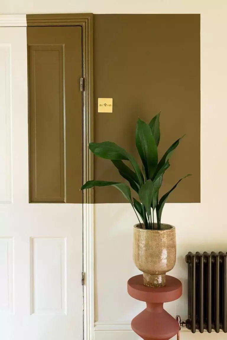
The dark olive green from Dulux is a medium paint color, slightly yet firmly gravitating towards the dark group. How do you tell this with such precision? Easy if you know about the Light Reflectance Value. Reflecting 22% of light out of 100 makes for a somewhat dark paint color, recommended to use in rooms with plenty of natural light.
Research Undertones
You may have noticed we mentioned a few colors besides green and yellow. These are subtle brown and blue undertones resulting from the play between lighting and base colors. A more distinguishable gray undertone also ensures the dusty effect on this muted yellow-green.
Similar Colors
If you ever want a skillful alternative to Research, a pretty close substitute, a darker or a lighter shade, say no more. Here are the most prominent representatives of the group:
Coordinating Colors
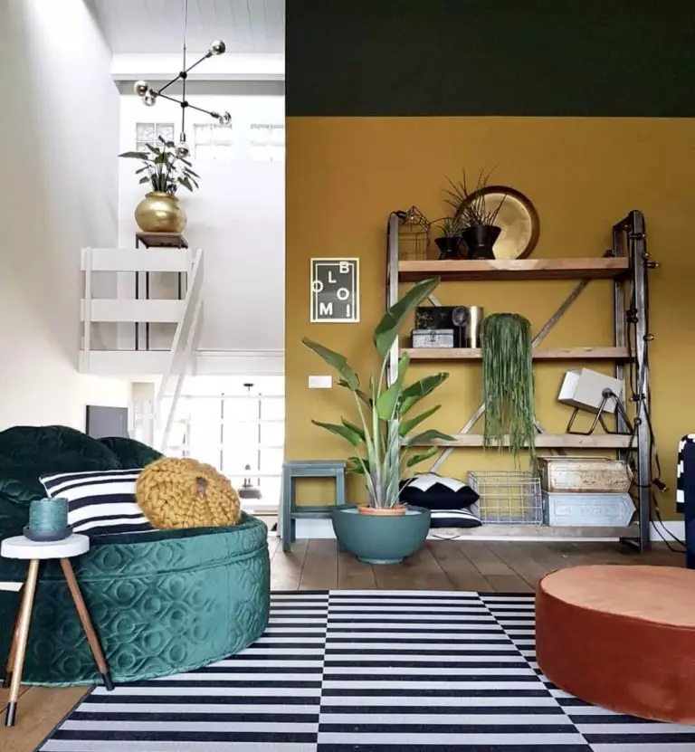
They say olive green looks great alongside gray and navy blue if you intend to create an organic color palette. Softer schemes suppose white, tan, beige, and greige, while brighter choices include violet, red, black, and crimson. As usual, we share the expert color matchings from Dulux.
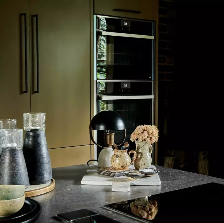
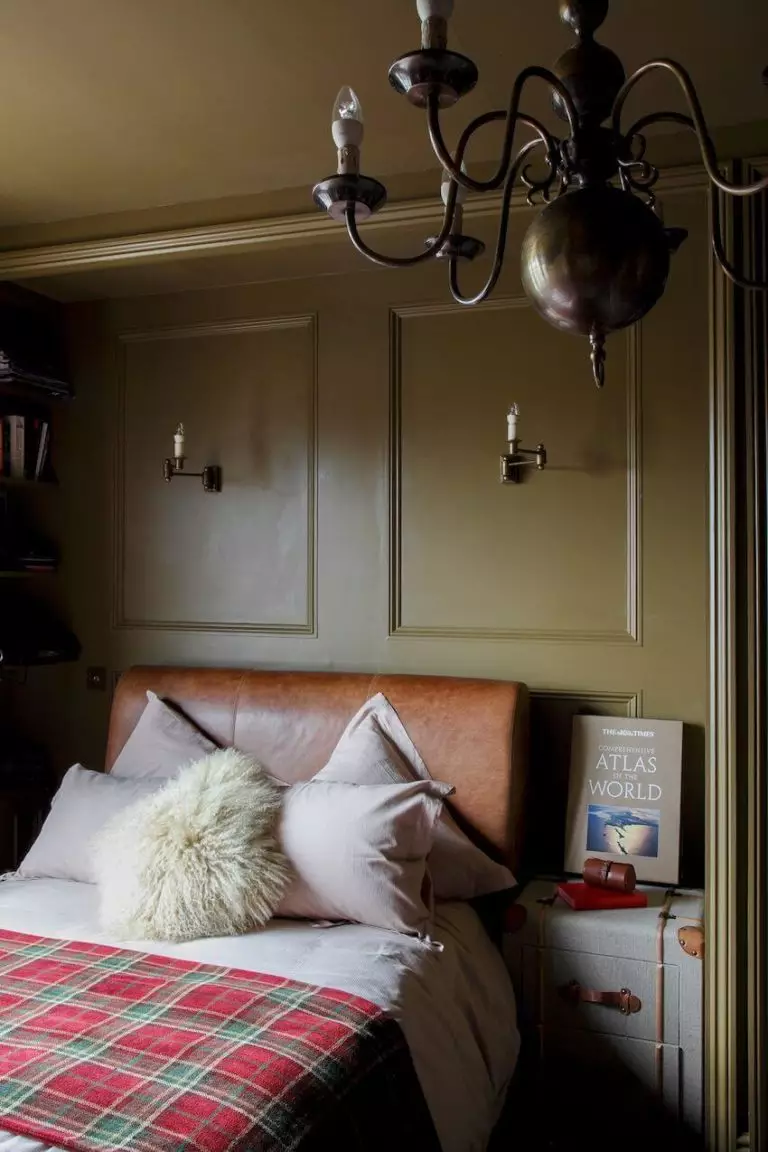
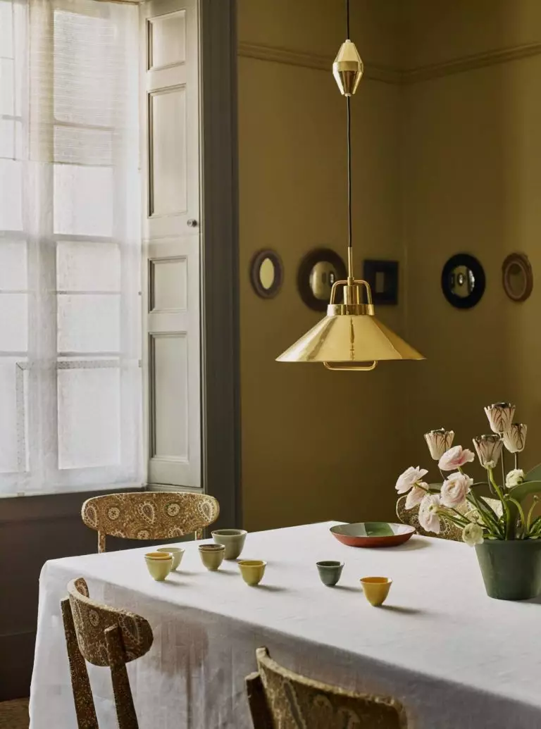
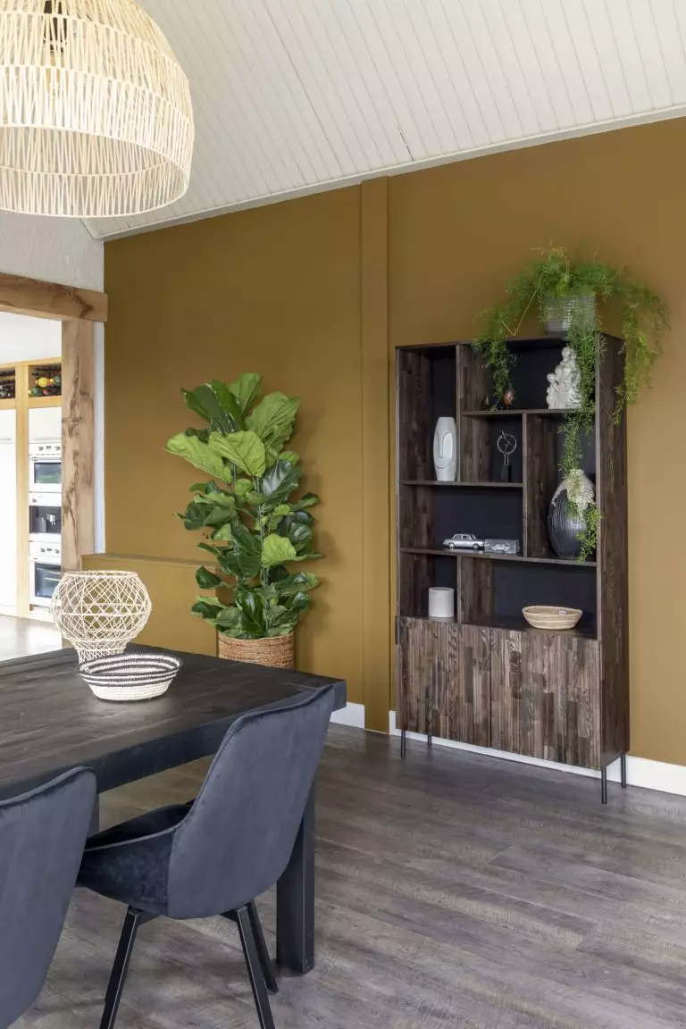
Use of Research in Interior Design
Looking at the organically sparkling yellow-green Research, we instantly get a natural vibe and want to decorate this color with raw texture. That’s how the Eco design concept arises. Since this charming tone is traced to olives, we unconsciously associate it with the Mediterranean style. Familiar Rustic, Provence, and Cottage come next. However, an appropriate combination of colors and textures may lead to astonishing Modern interiors. Research is a genuinely versatile paint color. Some of the following design ideas may draw your attention.
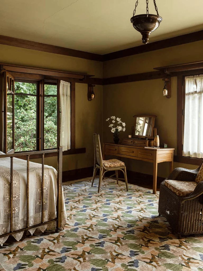
Research Feels at Home in Nature
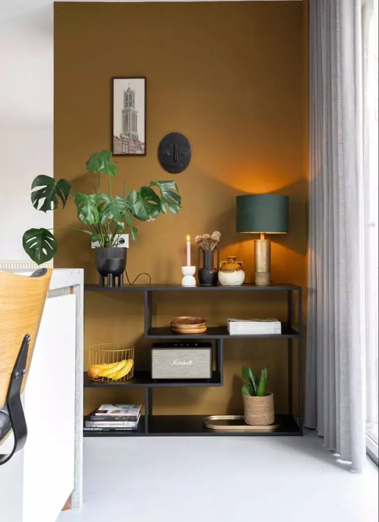
Any naturally textured material looks pretty near the gold-polished green Research. Therefore, a wide range of design style possibilities opens up. Try Rustic or Cottage with Vintage motifs for personalized decor that remind you of the countryside. Think French Provence or Mediterranean. Or, choose between Modern Eco-style and Vintage. The standard rule is to surround Research with wood, stone, clay, organic textiles, natural light, and live plants.
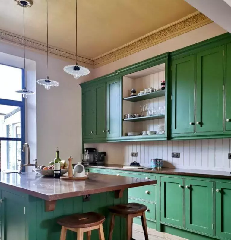
Modern Olive Green
Unlike traditional olive greens, this Modern olive green is muted and radiates earthy energy, combining two prominent color trends – green shades and earthy tones. A Modern color feels perfect for a Contemporary interior. Today, Modern goes beyond minimalist layouts, neutral color palettes, and functional design. It integrates more vibrant colors, intricate shapes, and subtle allusions to remarkable styles, such as Art Deco, Retro, or Mid-Century Modern.
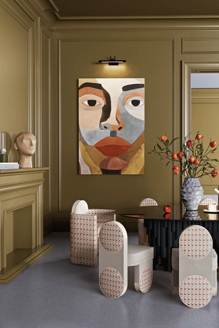
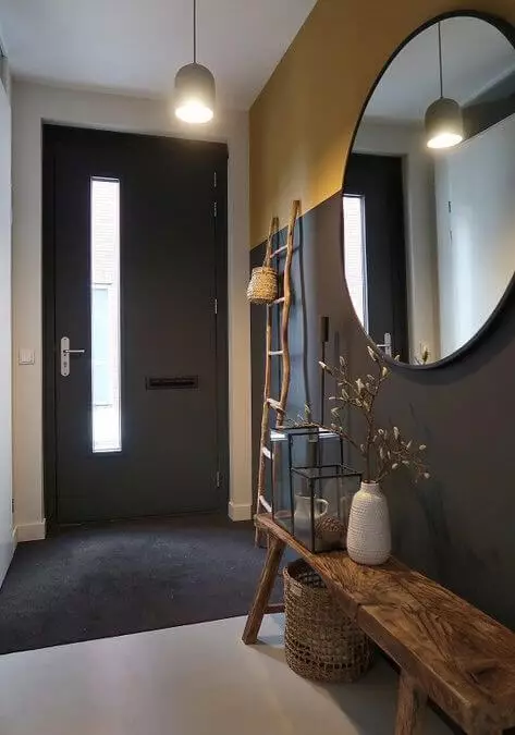
Research in High-Traffic Areas
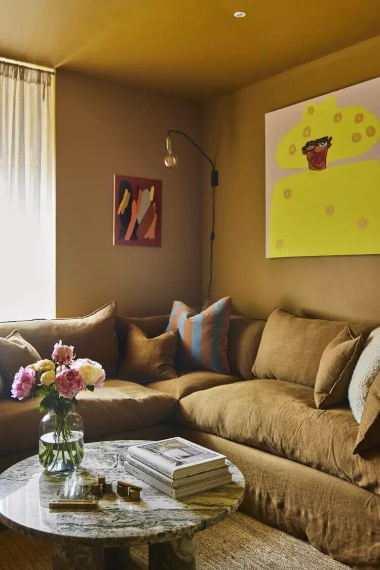
Use Research in lounge areas, bedrooms, hallways, kitchens, dining rooms, and other spaces often visited by you. Surrounding yourself and your routine with such a warm and compassionate green tone equals winning the lottery in the interior design world. Whether an olive green accent wall or a full-green makeover, this paint increases your appetite for happiness, warms up the overall environment, and makes your abode feel like home.
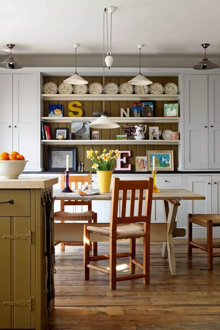
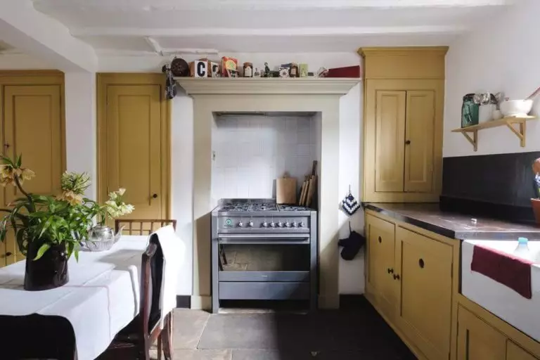
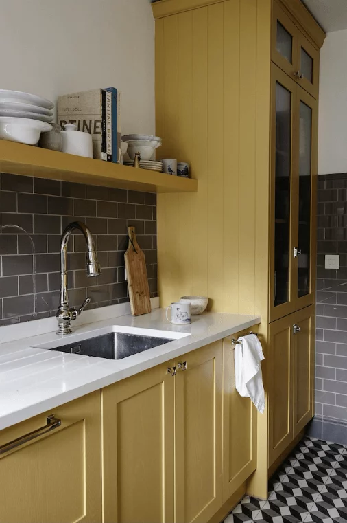
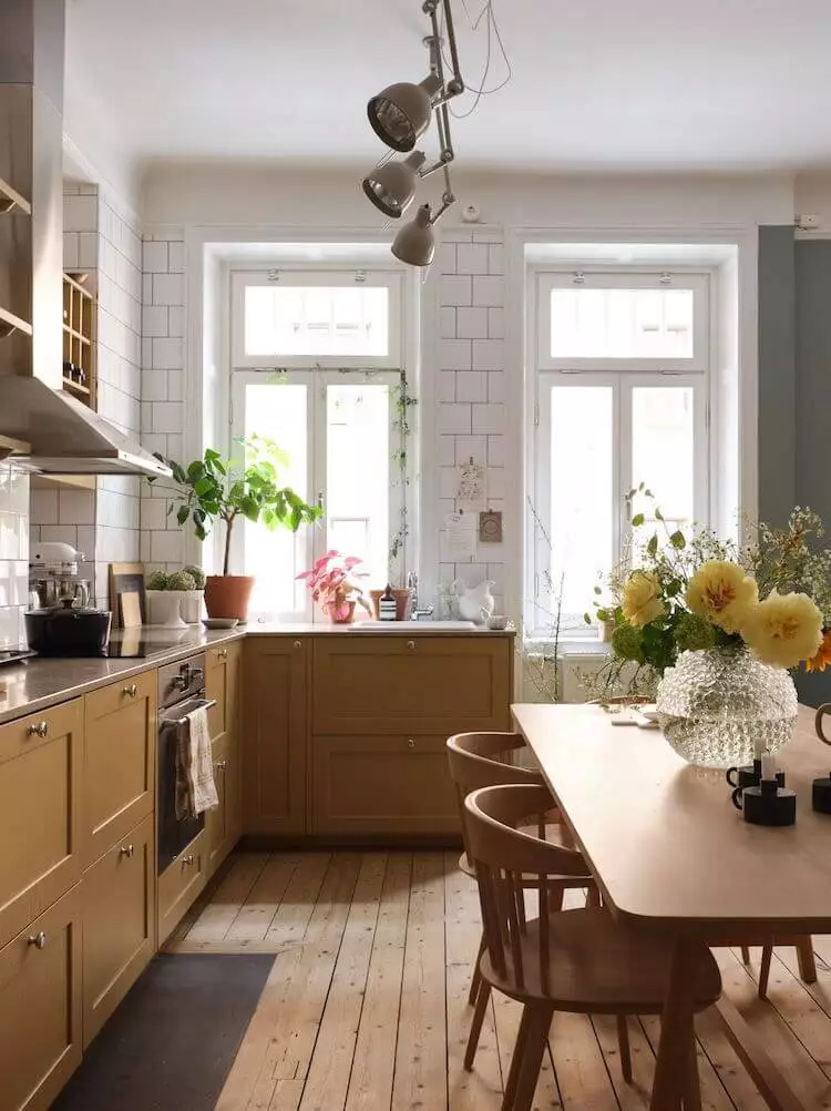
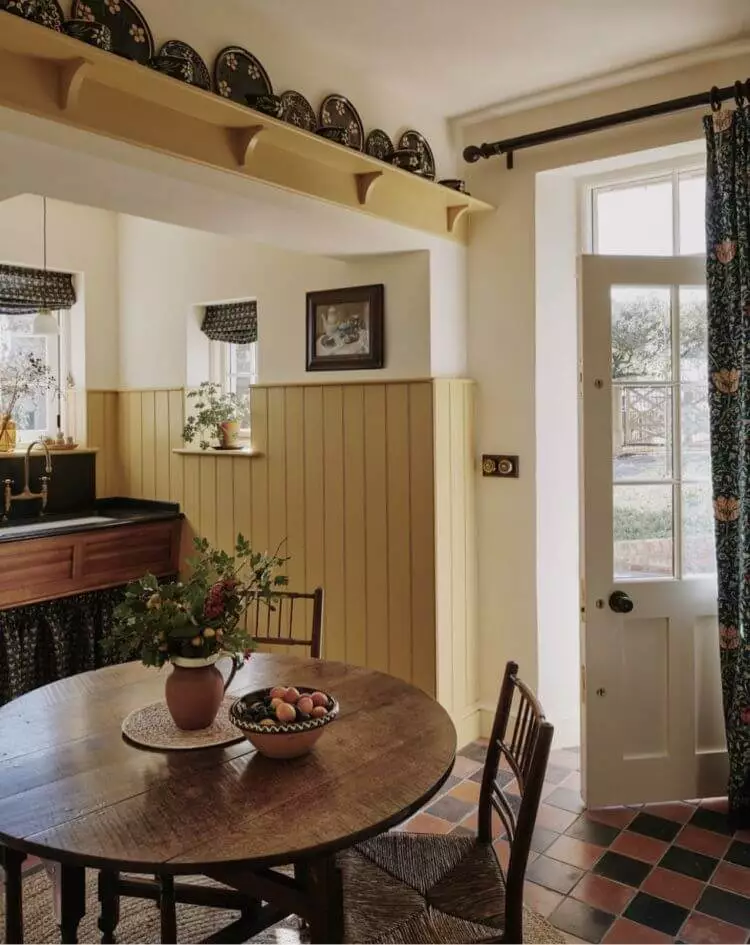
Cottage-Style Kitchen
This worn-by-time yellow-green tone is the perfect match for Cottage-style cooking spaces with an abundance of untreated wood surfaces, traditional kitchen cabinets, large windows, open storage, and exposed kitchen utensils. This color will look great on your vacation cottage kitchen surrounded by the countryside beauty on the other side of the window or your apartment kitchen if accessorized with Rustic details.
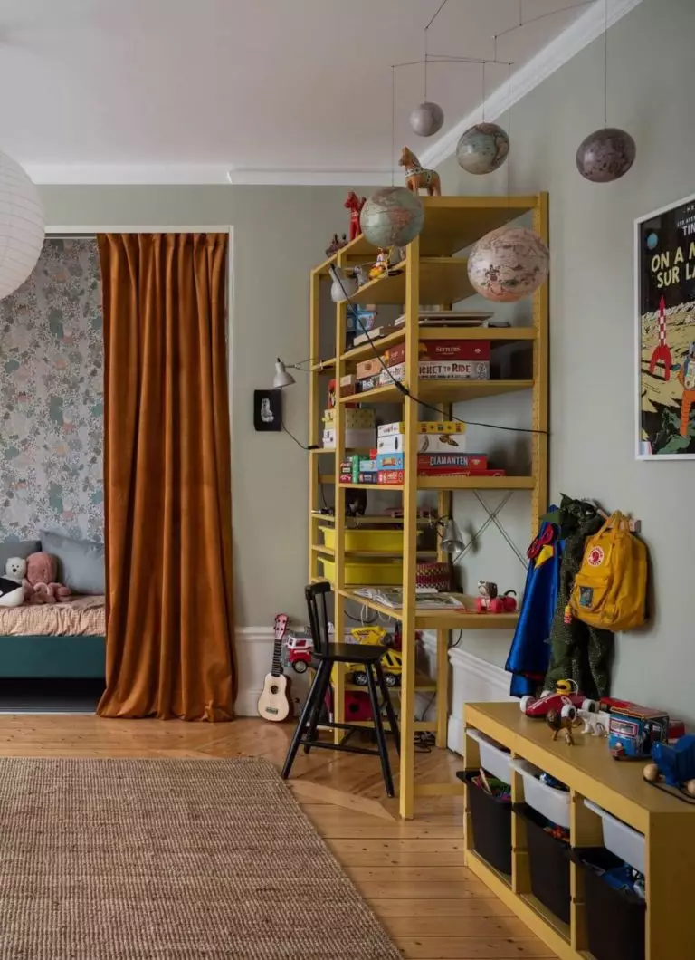
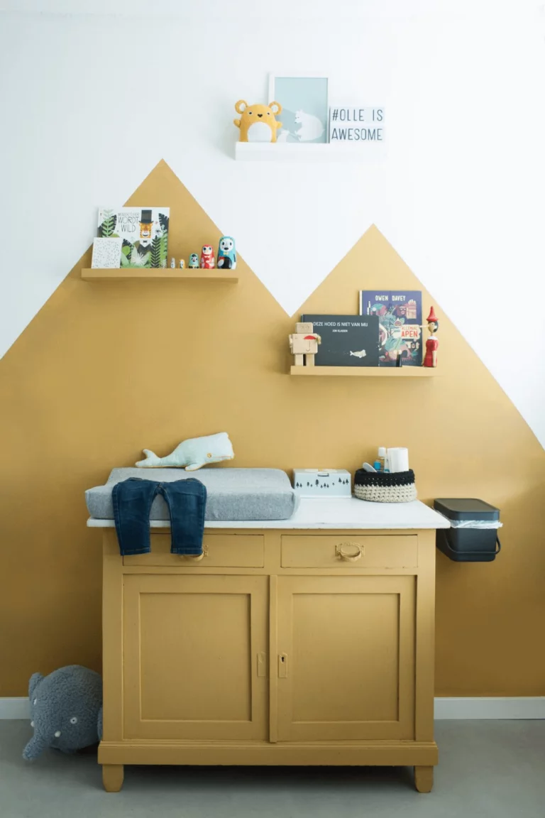
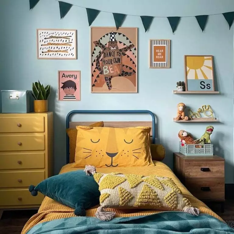
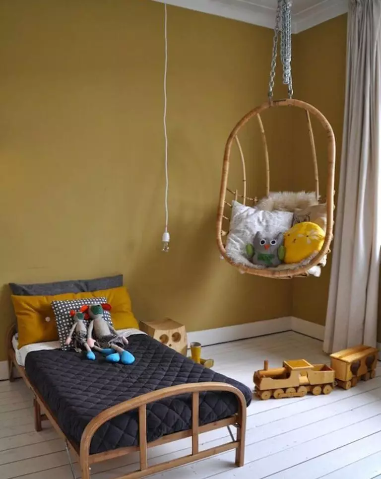
Research Color for Little Explorers: Kids Room
Why stop at overused neutrals when decorating the kids’ room in an era when color brands offer so many bright tones that enliven the interior design and share an endless amount of positive emotions? Pick the gender-neutral gold olive tone Research and help your child explore the beautiful colorful world from a young age.
Helpful tip – pair yellow-green wall accents with white to make Research seem lighter or use on furniture besides light-colored walls.
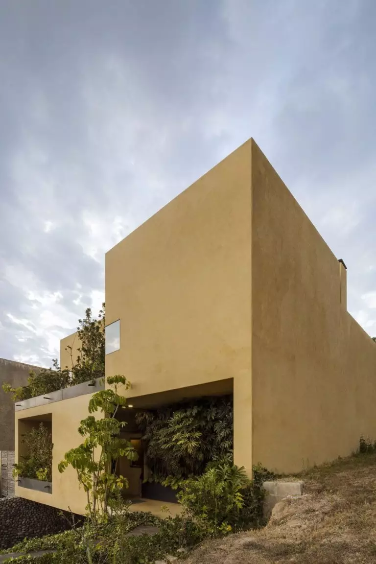
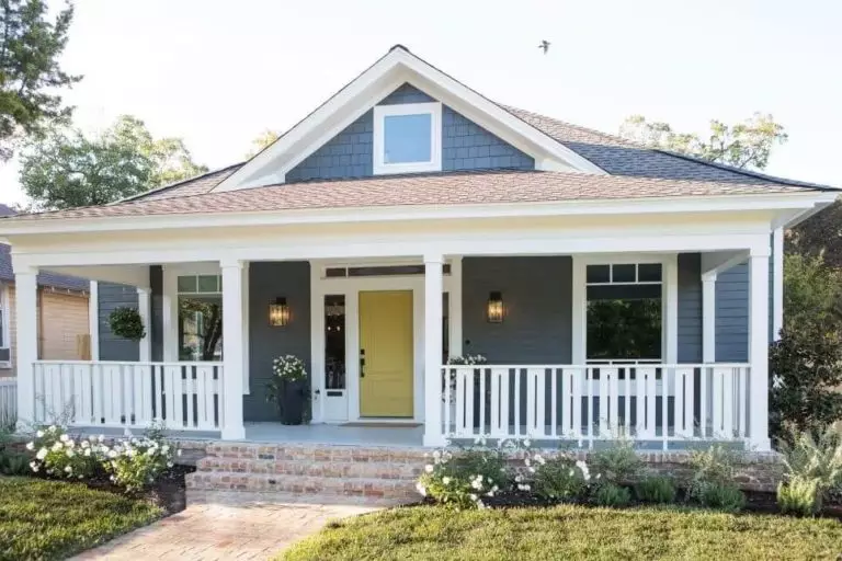
Use of Research for House Exterior
Applied to traditional exteriors, Research risks making your house seem too conservative since this paint alone has worn-by-time effect features. A whole new story is futuristic exteriors with up-to-the-minute architectural details. Although this autumnal green shade loses a bit of brightness when in contact with direct natural light, it acquires a one-of-a-kind aesthetic appeal.
Still, for lovers of traditional, they can safely paint the front door yellow-green and enjoy its vibrant effect on neutrally painted walls; gray walls are a great choice.
Dulux’s muted shade of lush yellow-green is a brilliant accent paint color. Its smooth switch from Traditional to Modern impresses, while its unstoppable warmth and limitless allure empower self-confidence and hope.