Black Satin 2131-10
Benjamin MooreBenjamin Moore Black Satin (2131-10) is a sophisticated, soft black paint color with subtle cool blue and green undertones. With an LRV of 4.58, it acts as a rich, dimensional charcoal rather than a stark, flat black, making it perfect for dramatic accents and cabinetry.
| Temperature | Cool-leaning Neutral |
|---|---|
| Primary Undertone | Charcoal |
| Hidden Undertones | Subtle cool blue and green |
| Best Exposures | South-facing or well-lit rooms |
| Best For | Interior doors, kitchen cabinets, accent walls, home theaters, exterior doors and shutters, dining rooms |
Hackrea Review
Black Satin is a striking example of moody elegance. It strikes a beautiful balance between a true black and a deep charcoal, offering a velvety depth that feels tailored and luxurious without the harshness of pitch black.Application & Styling Recipes for Benjamin Moore Black Satin
Interior doors and trim
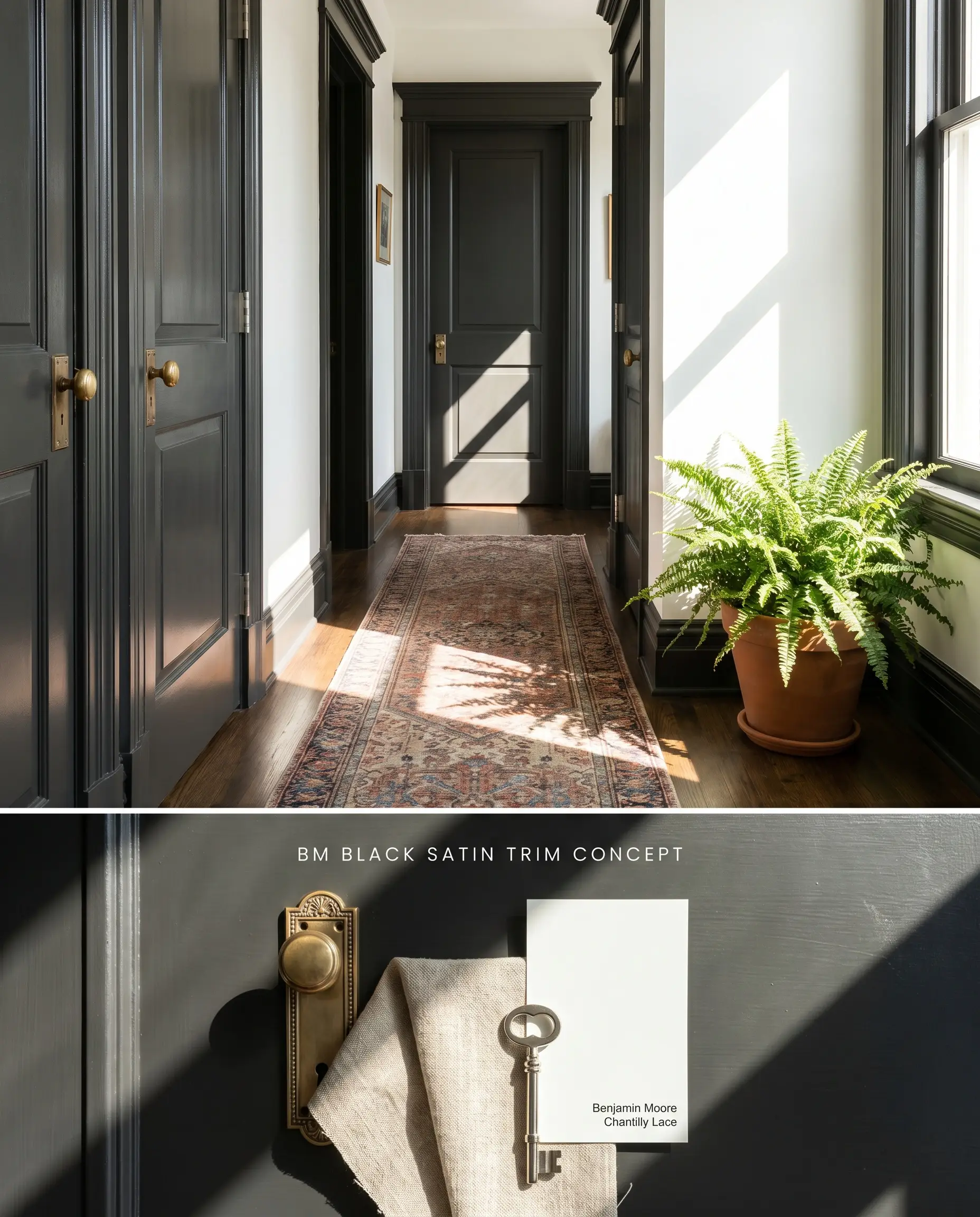
Grounding interior transitions with a deep charcoal provides sharp architectural definition against crisp white walls. The cool undertones of this soft black anchor sightlines without the harsh visual shock of a true jet black. Treating the millwork as a framing device pulls the eye outward, emphasizing the structural boundaries of the hallway or passage.
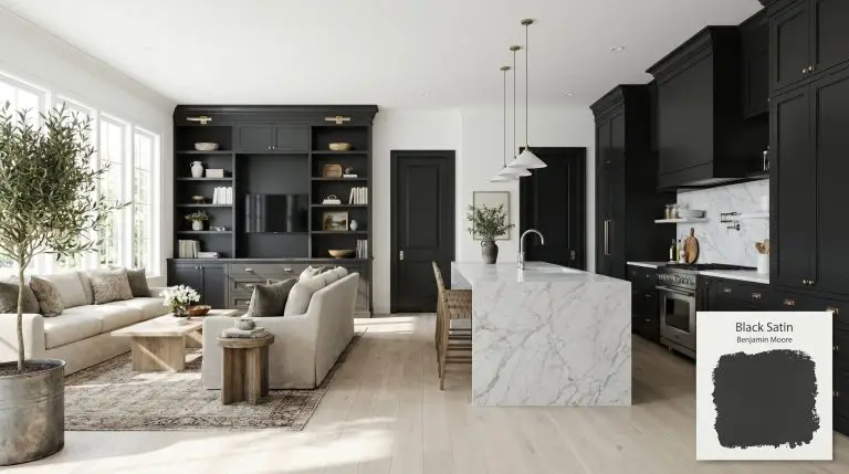
Kitchen islands and cabinetry
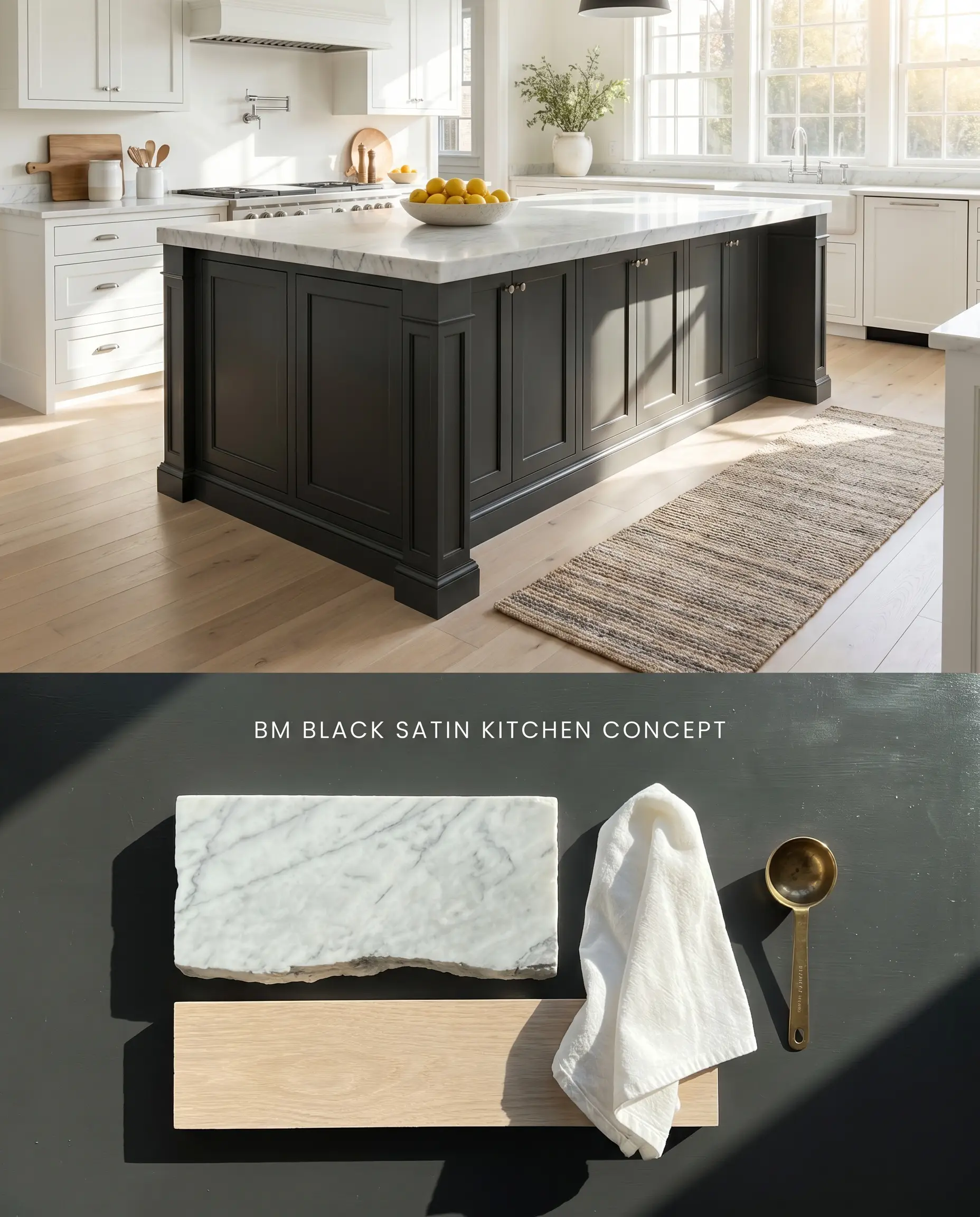
A dark island anchors the spatial layout of an open-concept kitchen, absorbing ambient light to create a central focal point. Paired with cool-veined stone, the chromatic profile of this paint visually recedes, forcing the surrounding perimeter cabinetry to appear brighter and more expansive. The stark value difference establishes a high-contrast design that defines the work zone.
Dramatic accent walls
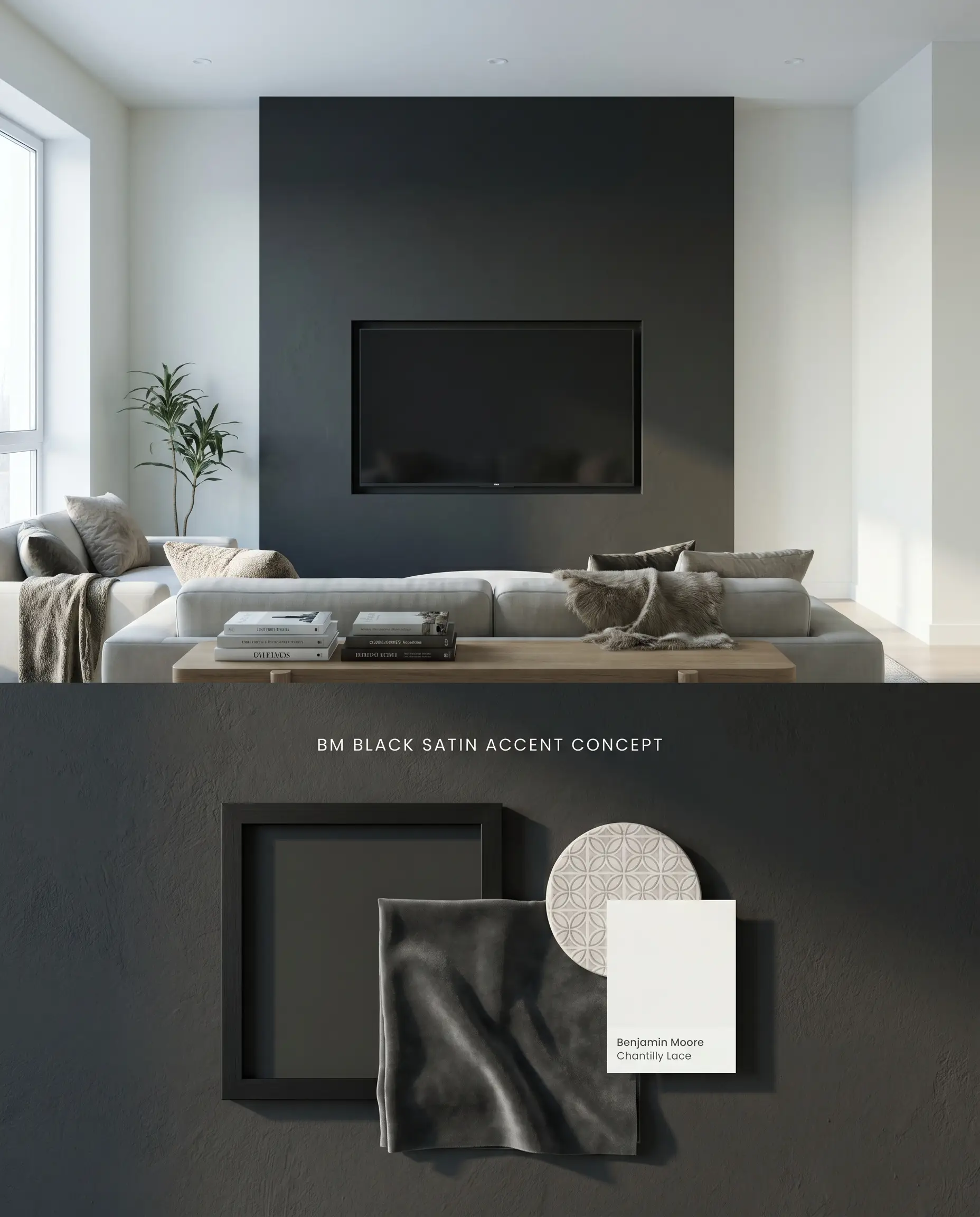
Utilizing a low light reflectance value on a single focal wall manipulates depth perception, pushing the physical boundary of the room outward. The velvety depth of the dark surface absorbs harsh glare, allowing mounted artwork or flat-screen televisions to blend seamlessly into the architecture. This targeted application mitigates the risk of the bounce effect shrinking the entire room.
Dedicated home theaters
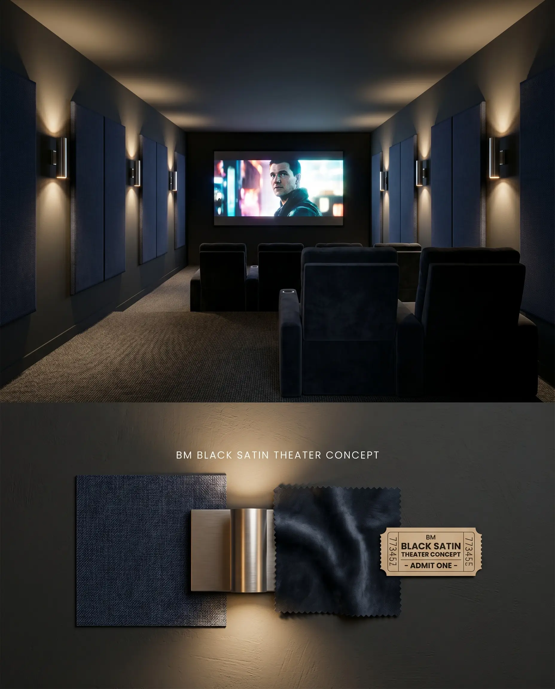
Engineered to eliminate light bounce, this moody aesthetic swallows projector bleed and ambient screen glow. The cool undertones recede visually, dissolving the physical boundaries of the ceiling and walls to force all optical focus onto the screen. Wrapping the entire envelope in a dark architectural finish prevents distracting reflections from LED indicators or sconce lighting.
Exterior front doors and shutters
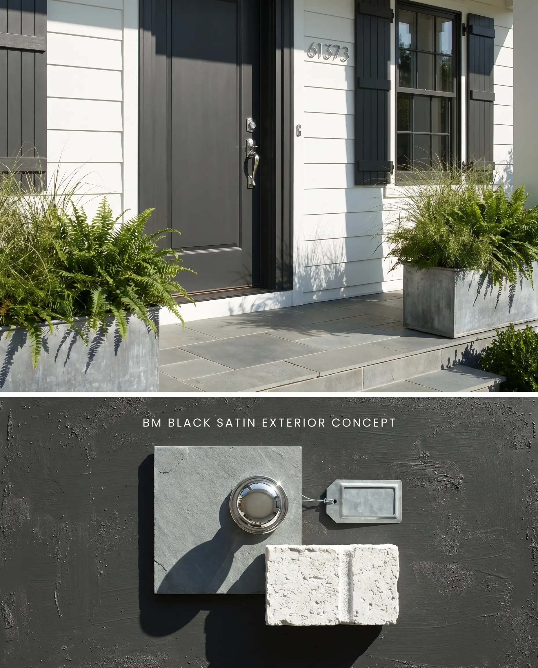
High-contrast design on exteriors requires a soft black to bridge the gap between bright daylight and rough masonry textures. The subtle blue-green undertone harmonizes directly with natural landscaping foliage while standing out sharply against white siding or cool brick facades. Intense sunlight washes out true blacks, allowing this specific formula to read with visible dimension.
Formal dining rooms
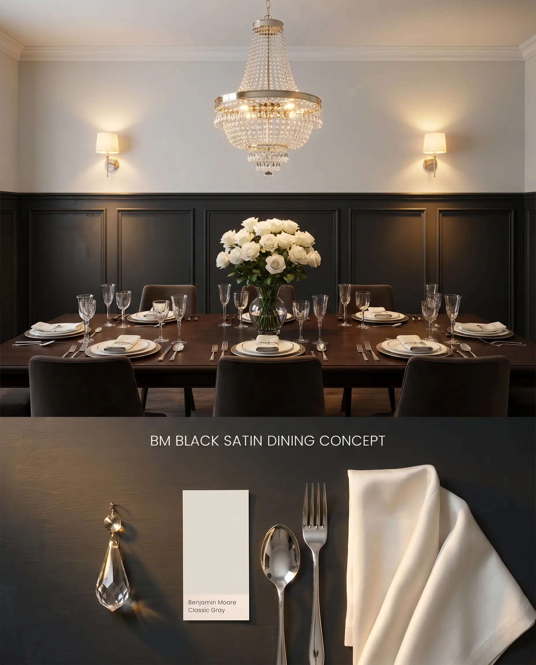
Wrapping a dining space in a dark color structure compresses the room, creating an intimate, inward-focused atmosphere. The dark background interacts with metallic fixtures and crystal chandeliers, amplifying their refractive sparkle by absorbing the surrounding ambient light. This specific value prevents the walls from bouncing light, ensuring the dining table remains the primary illuminated focal point.
You can apply wallpapers, paints, etc. on walls and see how they look in various interiors.

Chromatic Profile and Undertone Comparisons
Benjamin Moore Black Satin 2131-10 vs. Sherwin-Williams Tricorn Black SW 6258
Sherwin-Williams Tricorn Black SW 6258 features an LRV of 2.45, functioning as a true, neutral black devoid of discernible undertones. Benjamin Moore Black Satin 2131-10 (LRV 4.58) reads noticeably lighter, presenting as a soft black with distinct cool blue and green undertones. Specify Tricorn Black SW 6258 when structural elements include warm honey oak or terracotta, as its strict neutrality prevents temperature clashing. Deploy BM Black Satin 2131-10 when transitioning against cool white walls or Carrara marble, where its nuanced undertones bridge the gap between stark white and absolute black.
Benjamin Moore Black Satin 2131-10 vs. Benjamin Moore Onyx 2133-10
Benjamin Moore Onyx 2133-10 (LRV 3.18) operates with subtle warm, brown undertones that ground the color in earthy palettes. BM Black Satin 2131-10 relies on a cool, blue-green base. If a room features warm wood flooring or Western afternoon light, Onyx 2133-10 will harmonize and absorb the warmth naturally. In cool, North-facing light, Onyx 2133-10 remains stable, whereas BM Black Satin 2131-10 will actively flash blue or green.
Benjamin Moore Black Satin 2131-10 vs. Sherwin-Williams Iron Ore SW 7069
Sherwin-Williams Iron Ore SW 7069 (LRV 6.15) sits firmly in the dark charcoal category, reflecting significantly more light than BM Black Satin 2131-10. SW Iron Ore SW 7069 softens the visual transition on massive exterior facades facing harsh Southern light, preventing the architecture from looking like a void. BM Black Satin 2131-10 is required when the design dictates a starker, high-contrast punch for narrow elements like interior window sashes or front doors.
Light Reflectance Value & Application FAQs
In cool, North-facing light or heavily shaded areas, its subtle cool undertones will often flash blue or green. To neutralize this shift, pair it with warm 3000K artificial lighting or reserve it for South-facing rooms.
Yes, the cool blue and green base of this paint creates a harsh visual temperature clash when placed directly against yellow-heavy oak or warm earthy tones. It pairs accurately with cool-toned woods like bleached white oak or pale ash.
Intense direct sunlight washes out dark colors, making this soft black read more like a deep charcoal. Its cool undertones harmonize precisely with natural green foliage and cool stone masonry.
Without abundant natural light or a rigorously planned artificial lighting scheme, it absorbs too much ambient light and creates a flat, unhinged environment. It should be avoided in low-light traps unless utilized sparingly on base cabinetry or lower wainscoting.
Similar Paint Colors
Same Brand
Cross-Brand Equivalents