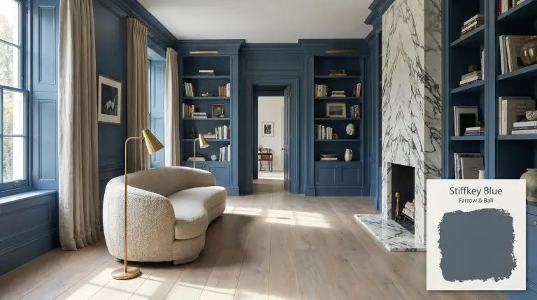
Stiffkey Blue No. 281
Farrow & BallFarrow & Ball Stiffkey Blue No. 281 is a deep, inky navy blue with subtle slate and blue-green undertones. Named after a Norfolk beach, this dramatic yet grounding shade boasts an LRV of 10.0, making it perfect for moody bedrooms, sophisticated cabinetry, and striking exterior accents.
| Temperature | Cool |
|---|---|
| Primary Undertone | Slate / Blue-Green |
| Hidden Undertones | Charcoal grey with a subtle green cast |
| Best Exposures | South-facing or well-lit rooms |
| Best For | Kitchen cabinets, moody bedrooms, bathroom vanities, front doors, and color-drenched studies. |
Hackrea Review
Stiffkey Blue is an absolute triumph for those seeking a dramatic but accessible navy. While Farrow & Ball's signature chalky finish brings out its incredible depth, be prepared for its notorious coverage issues—you will likely need a tinted primer and three coats to achieve that flawless, velvety look.Architectural Applications for Stiffkey Blue No. 281
Kitchen Island and Base Cabinets
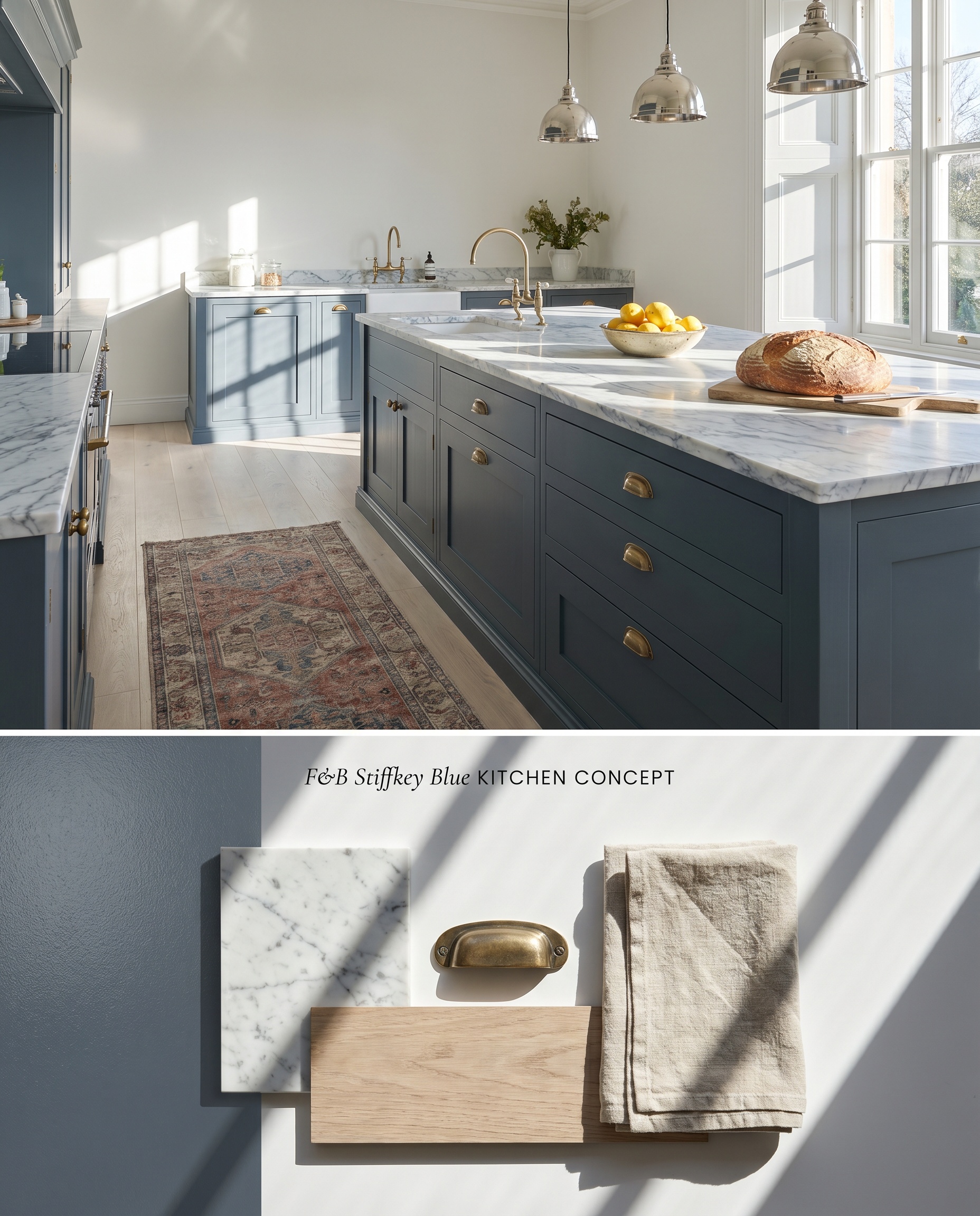
Anchoring a kitchen with this inky navy grounds the visual weight of the room, especially when paired with pale, prominently veined marble countertops. The slate undertones cool down the ambient temperature of the space, contrasting sharply with unlacquered brass hardware. Avoid pairing this base with honey oak flooring, as the yellow tones will aggressively clash with the greyed-out blue structure, rendering the wood overly orange.
Moody Primary Bedrooms
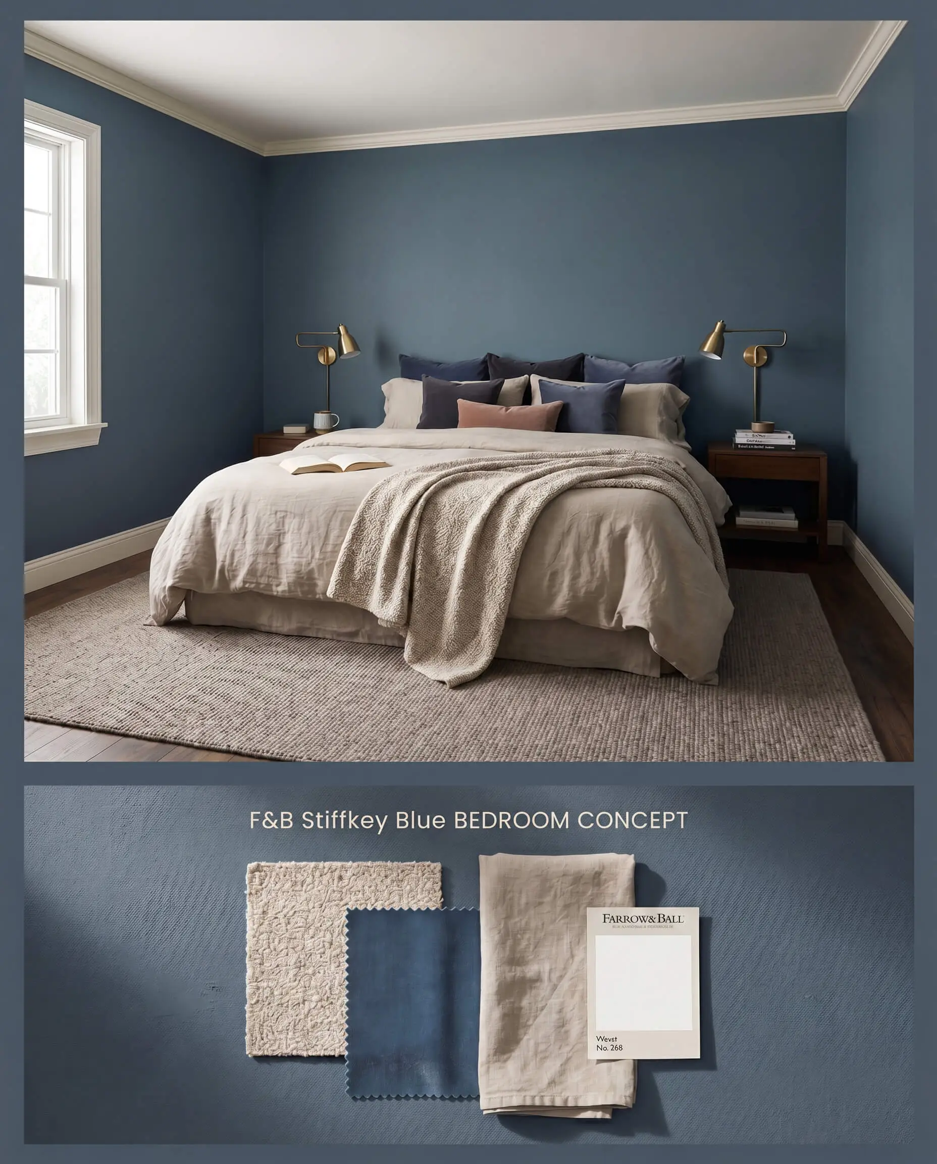
Utilizing this low light reflectance value hue on all four walls creates an enveloping, pulled-in spatial effect that fosters a restful environment. Because it retains its blue identity in shadows rather than reading as a flat black, it maintains architectural depth even at night. Layering densely woven linens and matte wool rugs softens the chalky finish of the walls.
Bathroom Vanities and Powder Rooms
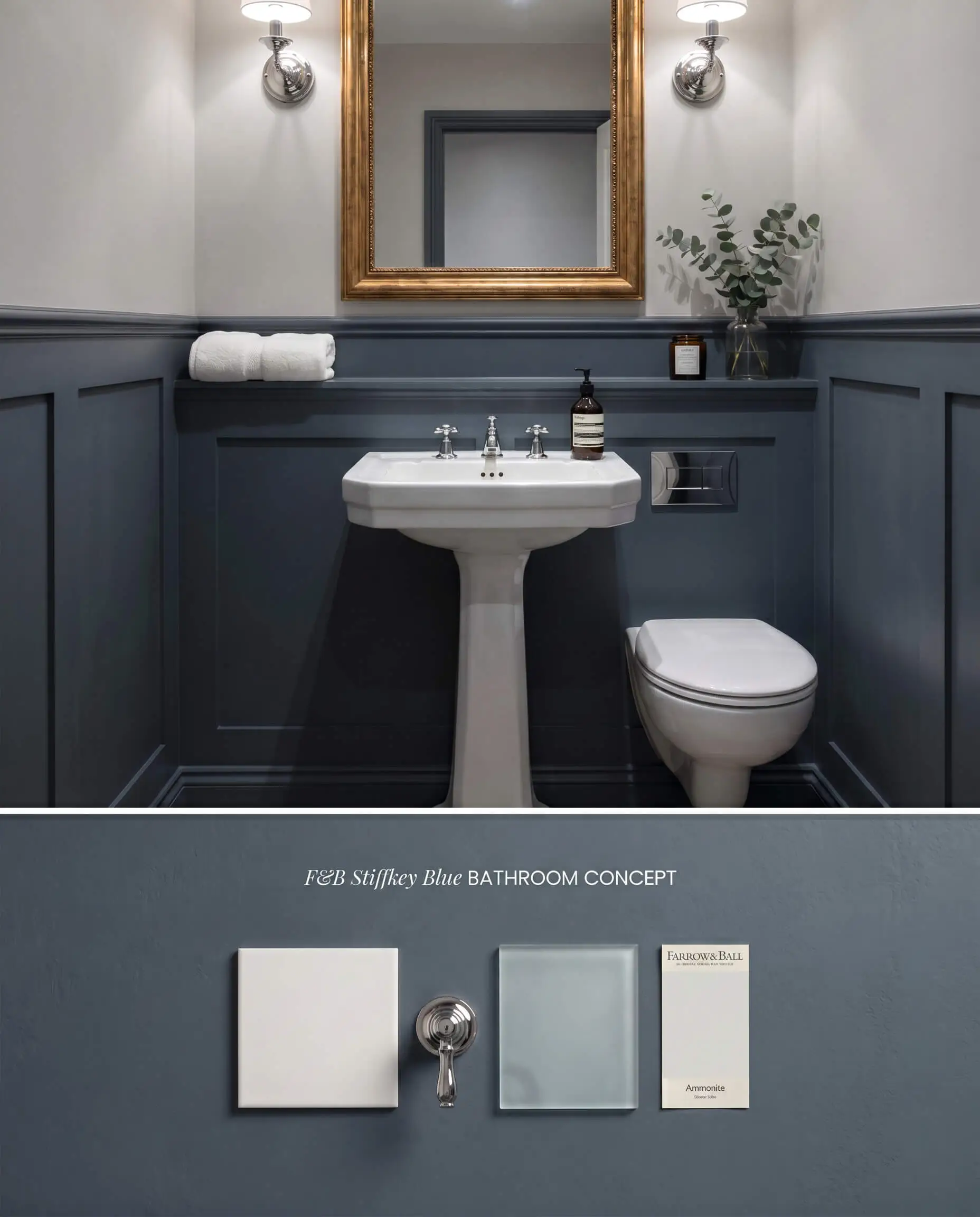
Applying this shade to wainscoting or a custom vanity introduces a dense chromatic profile that grounds the stark white porcelain fixtures typical of washrooms. The absorbing nature of the color minimizes harsh glare from overhead vanity lighting. Pairing it with polished chrome sconces creates a sharp, tailored contrast between the matte architectural finish and reflective metal.
Exterior Front Doors and Shutters
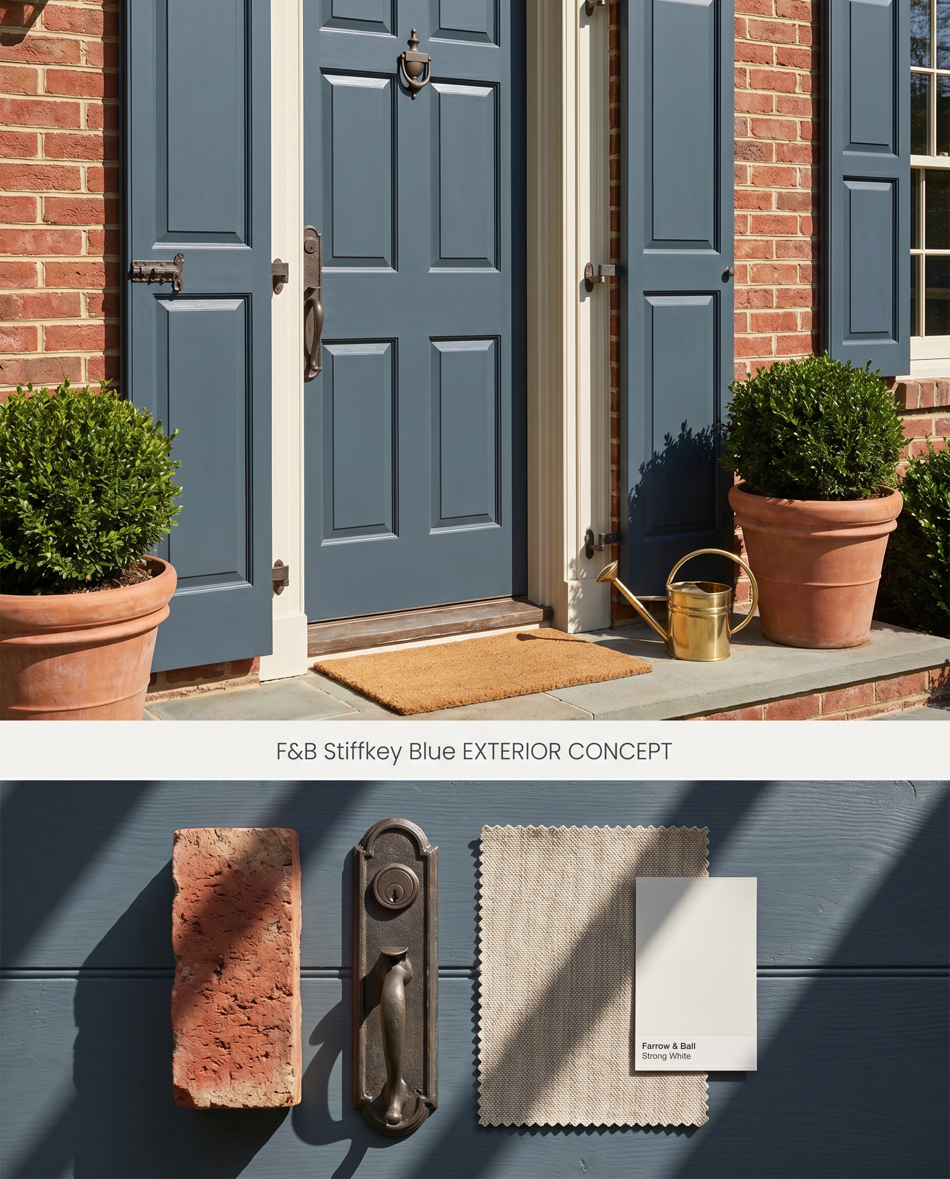
When exposed to direct, unshielded daylight, the Norfolk beach mud origins of this pigment fade into the background, allowing a vibrant, traditional navy to step forward. The deep hue anchors the exterior facade, contrasting cleanly against white clapboard or natural red brick. The high UV exposure demands a robust chemical barrier to prevent the rich blue from prematurely chalking.
Color-Drenched Studies and Home Offices
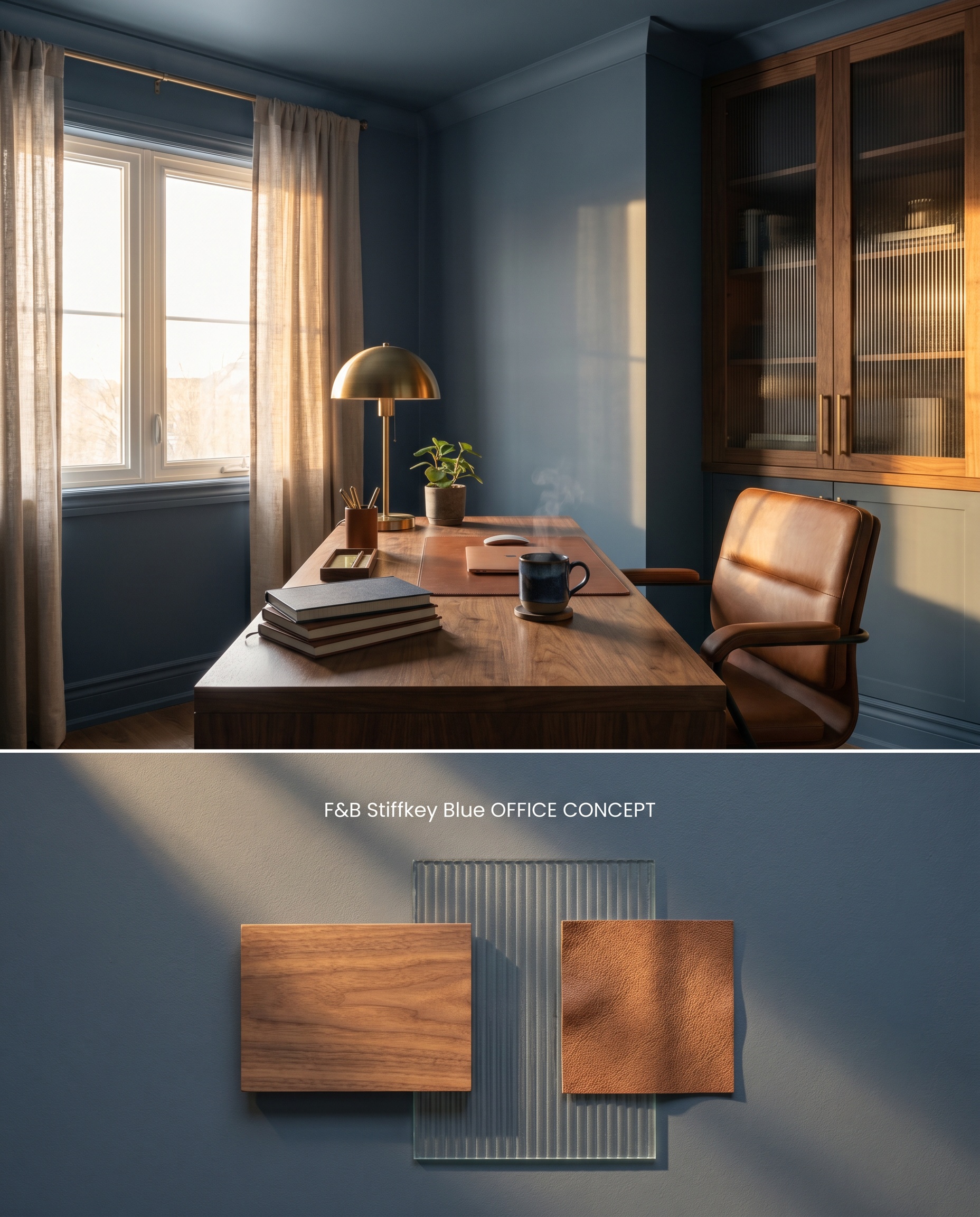
Wrapping the baseboards, walls, and ceiling in a single continuous shade erases the visual boundaries of the room, masking uneven plaster lines and creating a seamless, intimate envelope. This color drenching technique leverages the paint’s tendency to pull walls inward, maximizing focus in a working space. To prevent the room from feeling monolithic, introduce varied textures like ribbed glass and natural walnut.
You can apply wallpapers, paints, etc. on walls and see how they look in various interiors.

Evaluating the Chromatic Profile Against Rival Navies
Farrow & Ball Stiffkey Blue No. 281 vs. Farrow & Ball Hague Blue No. 30
Hague Blue No. 30 features a distinct green undertone, giving it a teal-leaning, highly saturated presence on the wall. Stiffkey Blue No. 281 relies on a slate-grey base, making it cooler and more muted in natural light. Choose Hague Blue No. 30 when you want a rich, jewel-box effect that warms up under incandescent bulbs, but specify Stiffkey Blue No. 281 when dealing with north-facing light where you need the grey structure to stabilize the room without reading green.
Farrow & Ball Stiffkey Blue No. 281 vs. Benjamin Moore Hale Navy HC-154
Hale Navy HC-154 is a deeply charcoal-infused navy with an LRV of 8.36, rendering it significantly darker and more neutral than the Farrow & Ball option. Stiffkey Blue No. 281 maintains a more pronounced, vibrant blue identity, especially in south-facing exposures. Specify Hale Navy HC-154 for transitional spaces where you need a near-black anchor that won’t shift blue, but utilize Stiffkey Blue No. 281 when you want the distinct character of an inky navy to remain visible even in shadowy corners.
Farrow & Ball Stiffkey Blue No. 281 vs. Benjamin Moore Newburyport Blue HC-155
Newburyport Blue HC-155 carries a higher LRV of 10.31 with a slightly cleaner, more traditional blue profile that lacks the muddy, slate-grey complexity of its British counterpart. Stiffkey Blue No. 281 absorbs light differently, creating an enveloping, moody aesthetic rather than a crisp nautical feel. Deploy Newburyport Blue HC-155 in coastal or high-contrast traditional interiors, but reserve Stiffkey Blue No. 281 for color-drenched applications where the grey undertones are needed to soften the visual impact.
Technical Application FAQs
No, Stiffkey Blue does not flash purple. In north-facing or low light, its slate-grey color structure takes over, significantly muting the blue and pulling it closer to a deep, moody charcoal.
Stiffkey Blue is notorious for poor hide due to its specific pigment structure. Achieving its signature depth requires applying a dark-tinted primer followed by at least three coats of paint, particularly when transitioning over lighter walls.
Yes, the cool, slightly greyed-out base clashes aggressively with yellow-leaning honey oak. This interaction forces the wood to look overly orange while making the paint feel cold and disconnected from the architecture.
Estate Emulsion is highly susceptible to burnishing and scuffs in high-traffic areas. Attempting to spot touch-up these marks will cause noticeable flashing, frequently necessitating full wall repaints for repairs.
Similar Paint Colors
Same Brand
Cross-Brand Equivalents