Philadelphia Cream HC-30
Benjamin MooreBenjamin Moore Philadelphia Cream (HC-30) is a warm, historical yellow-cream paint color. With an LRV of 69.12, it reflects a generous amount of light while providing a soft, buttery glow that is grounded by subtle earthy brown undertones.
Benjamin Moore Philadelphia Cream: Crafting a Luminous, Earth-Toned Heritage Glow
Yellow paint is notorious for turning a well-intentioned room into an overwhelming, overly saturated box. Real-world homeowners often crave the warmth of sunlight on their walls but retreat to sterile whites out of fear that a golden hue will look childish or artificial. Benjamin Moore Philadelphia Cream HC-30 solves this exact design dilemma by offering the luminous warmth of a yellow without the aggressive glare.
Part of Benjamin Moore’s revered Historical Collection, this shade is formulated to feel lived-in and structurally permanent. It behaves less like a standard primary color and more like an architectural finish, instantly giving brand-new drywall the soulful, settled appearance of a century-old plaster wall.
By relying on Benjamin Moore’s proprietary Gennex Color Technology, the pigmentation remains incredibly stable, allowing the color to flex beautifully across different materials. Whether you are brushing it over traditional interior design elements like intricate crown molding or rolling it across a modern, unadorned hallway, this buttercream hue establishes a highly sophisticated, sunlit atmosphere.
Temperature, Undertones & LRV of Benjamin Moore Philadelphia Cream
When evaluating whether Benjamin Moore Philadelphia Cream is warm or cool, the answer is definitively warm. This paint operates as a highly saturated warm neutral, radiating a gentle, golden heat that instantly raises the visual temperature of any space.
Its underlying color structure prevents it from flashing too bright or turning sour on the wall. The chromatic profile is built on the following elements:
With a light reflectance value (LRV) of 69.12, this shade absorbs roughly 30% of the light in a room while bouncing back nearly 70%. This specific metric means the paint acts as a bright, highly reflective canvas that maintains its distinct pigment identity, rarely washing out entirely even when hit by direct, intense sunlight.
You can apply wallpapers, paints, etc. on walls and see how they look in various interiors.

Lighting Effects & The Chameleon Factor
The earthy brown undertone in BM HC-30 is highly reactive to the shifting color temperature of the light hitting it. Because of this built-in muting agent, the paint will subtly alter its personality as the sun moves across your home.
If you want to maintain the sophisticated buttercream aesthetic after the sun goes down, strictly avoid bulbs above 3000K. Cool blue artificial light will clash with the golden base, creating a harsh, sickly green shadow in the corners of the room.
Hackrea Pro-Tip (The Bulb Rule)
Popular Applications
Because it strikes such a precise balance between bright reflection and earthy depth, this color is highly adaptable across various architectural challenges. The key to unlocking its full potential lies in how you pair its golden base with surrounding hard materials, textiles, and specific room functions.
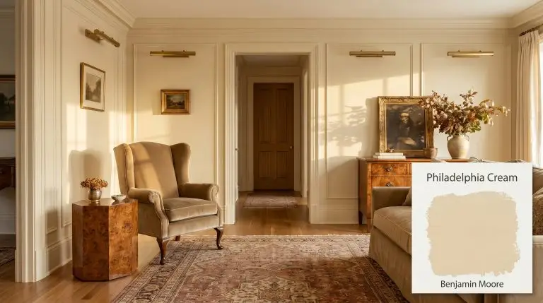
Traditional Living Rooms
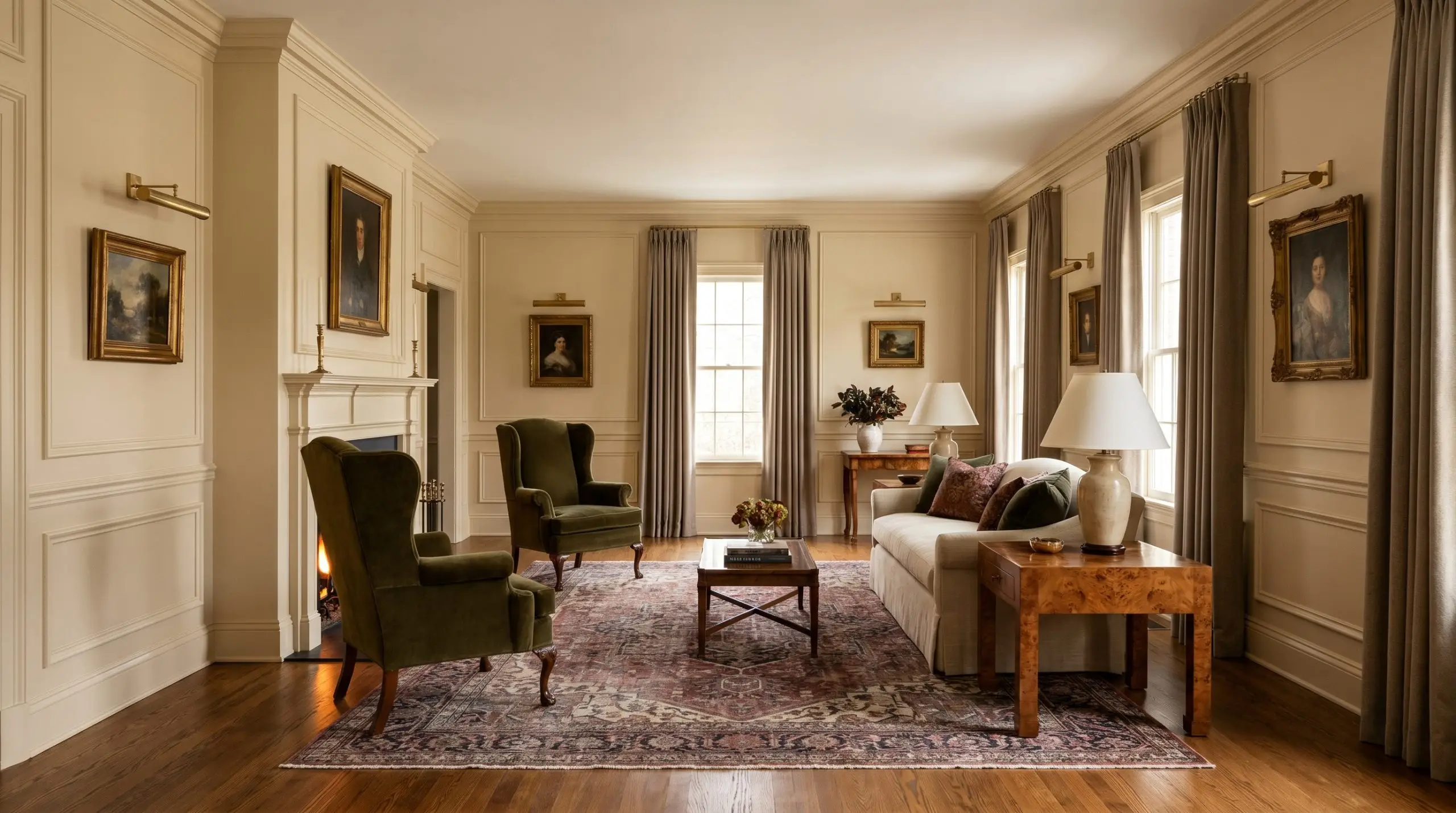
In a living space designed around classic proportions, this shade acts as the ultimate foundational layer. Apply it across walls featuring extensive picture molding or tall baseboards to highlight the architectural shadows, allowing the earthy brown undertone to settle into the crevices of the trim.
To execute a high-end traditional aesthetic, pair the golden walls with rich, tactile fabrics like worsted wool curtains or a mohair wingback chair. Avoid cool, blue-toned gray sofas, as the stark temperature difference will make the furniture look entirely disconnected from the warm envelope of the room.
Instead, lean into complementary warmth by introducing unlacquered brass picture lights, a vintage Persian rug featuring muted oxblood, and polished burl wood side tables. This combination creates a distinguished, collected-over-time atmosphere perfect for empty-nesters or anyone who appreciates formal, tailored comfort.
Farmhouse Kitchen Cabinets
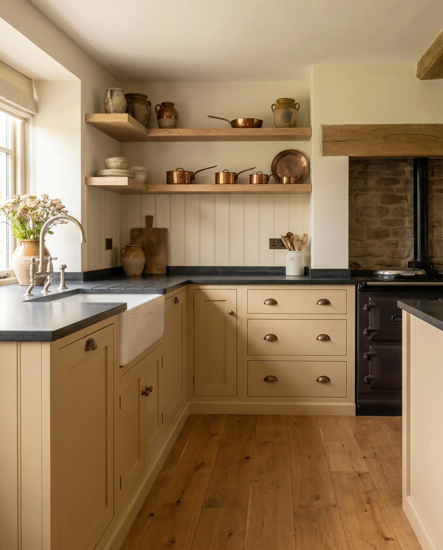
When applied to cabinetry, this muted golden-beige completely transforms the energy of a kitchen, moving it away from the sterile, all-white builder-grade look. Coating standard shaker cabinets in this hue instantly establishes a bespoke, English countryside farmhouse aesthetic.
To balance the buttery warmth of the lower cabinets, install honed soapstone countertops; the dark, matte charcoal provides a necessary visual weight that grounds the golden tones. Open shelving crafted from raw white oak introduces a natural wood grain that harmonizes perfectly with the paint’s earthy cast.
Do not pair these golden cabinets with bright, stark white subway tile or cool Carrara marble. The high-contrast white will make the cabinets look unintentionally aged or yellowed. Instead, opt for a creamy zellige tile or an off-white beadboard backsplash to maintain a seamless, warm transition.
Clash Warning (Kitchen Finishes)
Cozy Primary Bedrooms
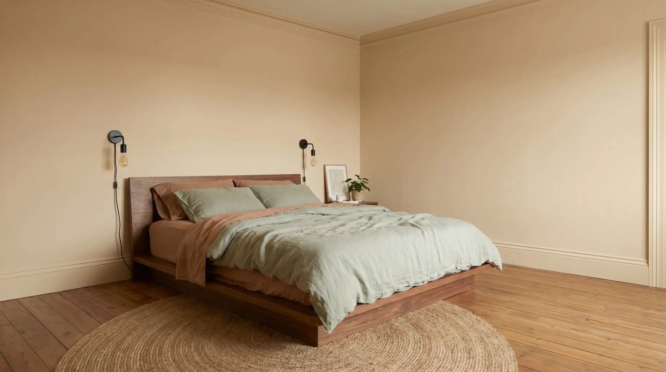
While the brief often associates this paint with historic homes, it translates beautifully into a modern, transitional bedroom retreat for busy professionals seeking a restful sanctuary. Instead of standard wall application, consider color-drenching the entire room—painting the baseboards, walls, and crown molding in the exact same finish to blur the architectural boundaries.
This technique wraps the room in a continuous, soft glow that feels incredibly soothing in the morning light. Pair the walls with a low-profile walnut bed frame and layer the mattress in crisp, washed linen percale sheets in a soft sage green or muted terracotta.
Keep the styling intentional and restrained by flanking the bed with simple, blackened steel plug-in sconces. The dark metal provides a sharp, contemporary punch that cuts through the softness of the walls, ensuring the room feels tailored rather than overly sweet.
Heritage Exterior Siding
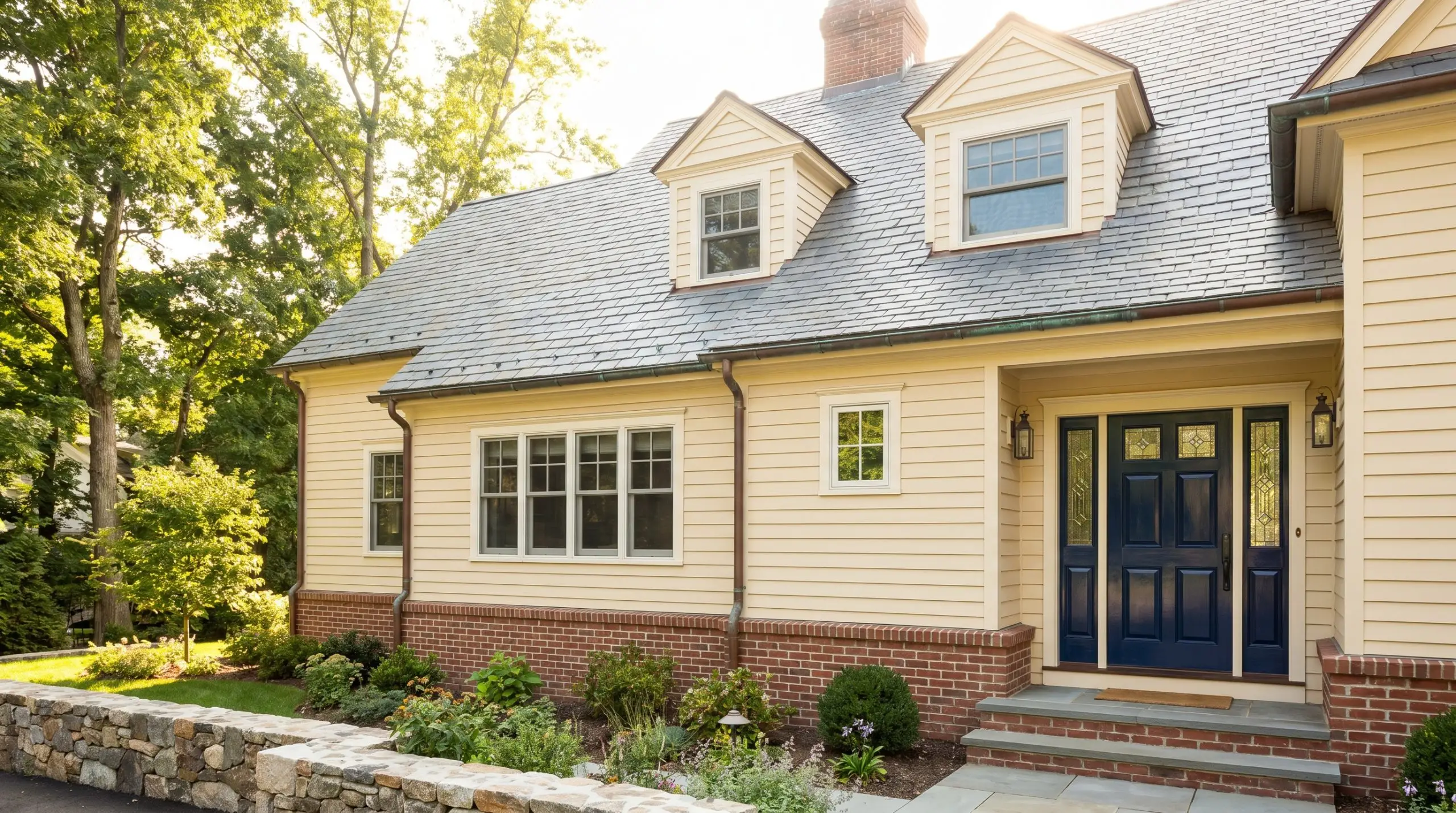
On an exterior facade, natural sunlight will drastically wash out any paint color, which is why this shade’s 69.12 LRV is highly strategic. The intense exterior light strips away some of the yellow vibrancy, leaving behind a rich, creamy beige that feels established and historically appropriate.
It is an exceptional choice for wood clapboard or cedar shake siding, particularly on colonial or craftsman-style homes. To complete the heritage exterior, pair the siding with a natural slate roof and functional copper gutters that will eventually develop a beautiful green patina.
Frame the foundation with traditional red brick skirting, as the warm tones in the masonry will pull out the subtle brown undertones in the siding. Finish the look by painting the front door a high-gloss navy or deep forest green to create a striking, classic entry point.
Windowless Powder Rooms
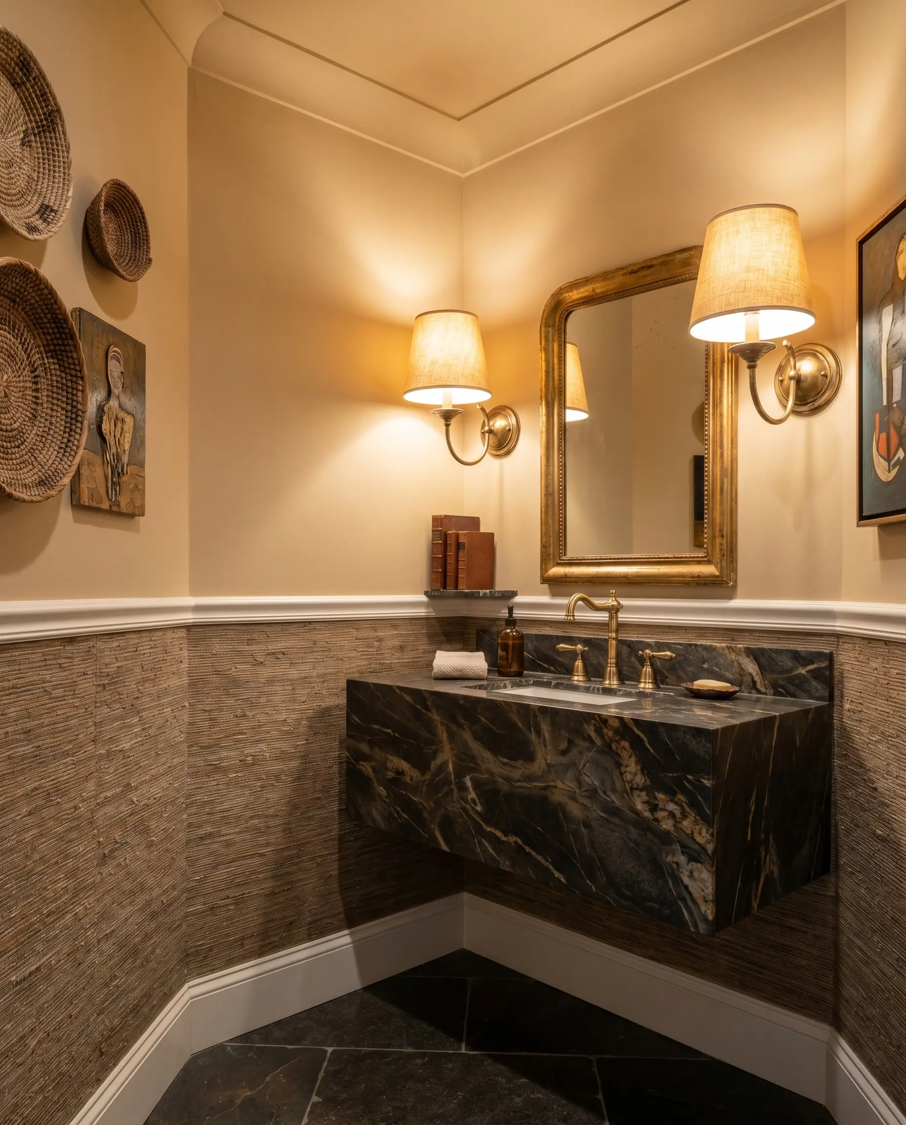
A powder room with zero natural light is the perfect laboratory for pushing this color into an eclectic, jewel-box aesthetic. Without the unpredictable shifts of the sun, you have complete control over how the warm golden base behaves using strictly artificial lighting.
Apply the paint to the ceiling and upper half of the walls, installing a heavily textured grasscloth wallpaper below a chair rail to introduce immediate tactile interest. Install a floating marble vanity with heavy veining to bring a touch of modern luxury into the small footprint.
Light the space using heavily shaded, 2700K wall sconces placed at eye level. This specific lighting setup will pull the deepest, richest yellow tones out of the paint, creating an intimate, glowing atmosphere that surprises guests the moment they open the door.
Building a Palette Around Benjamin Moore Philadelphia Cream
This inherently warm hue relies on intentional contrast to maintain its structural shape on the wall. Rather than allowing it to bleed softly into similarly toned ceilings or floors, you must frame this golden base with crisp architectural boundaries and grounding tactile materials to prevent the room from feeling washed out.
Defining the Architectural Boundaries
Benjamin Moore White Dove OC-17 acts as the ultimate soft-contrast border for this golden neutral. Because White Dove carries a subtle, muted warmth of its own, it creates a seamless, highly tailored transition between the wall and the baseboard without flashing a stark, icy white.
Sherwin-Williams Alabaster SW 7008 offers a slightly deeper, creamier edge that works beautifully in south-facing rooms. The higher concentration of beige in Alabaster absorbs the intense afternoon sunlight, establishing a soft, glowing boundary that feels incredibly organic.
Farrow & Ball Pointing No. 2003 introduces a faint red undertone that physically cuts through the yellow base of the primary wall color. This pairing forces a sharp visual distinction, making traditional interior design elements like intricate crown molding pop with structural clarity.
Tactile Elements for a Golden Base
Harmonizing Palettes and Accent Hues
Curated Aesthetic Concepts
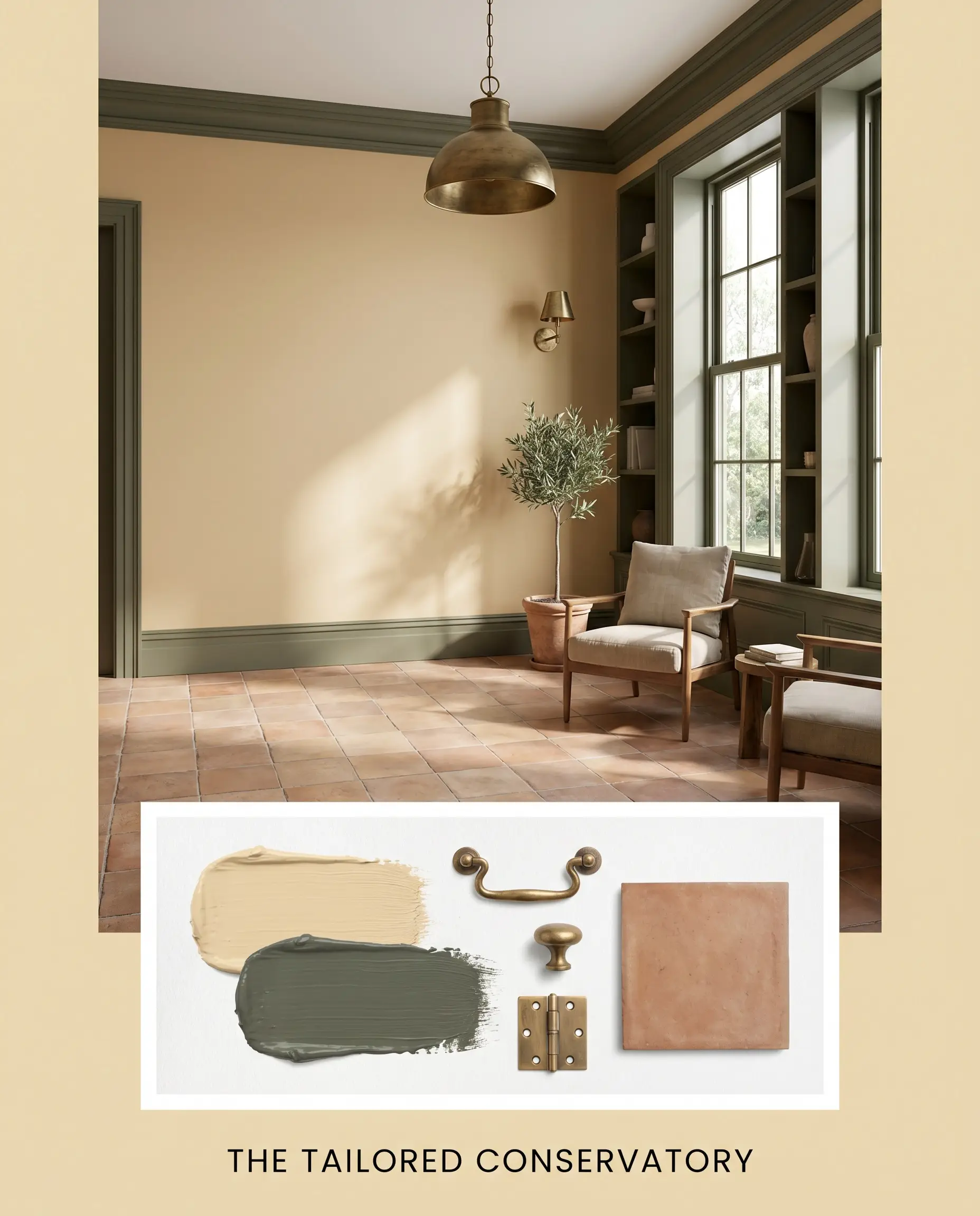
The Tailored Conservatory This aesthetic relies on the lush, organic contrast between the sunlit walls and deep, structural greens. By painting the surrounding millwork in Sherwin-Williams Rosemary, the golden walls are instantly framed by a rich, stabilizing border that feels both historic and vibrant. Ground the space with matte terracotta floor tiles to absorb the natural light, and introduce unlacquered brass lighting fixtures to bounce a warm, metallic glow across the ceiling. The energy here is highly cultivated yet entirely relaxed, offering a warm refuge that feels connected to the outdoors.
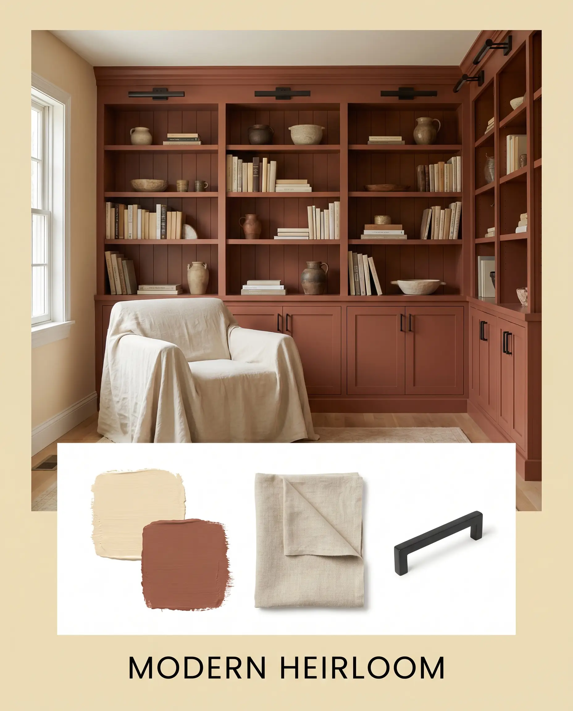
Modern Heirloom To execute a more grounded, deeply saturated vibe, this concept uses sharp metallic contrasts to cut through the buttery softness of the walls. Introduce Benjamin Moore Georgian Brick on a focal architectural feature, like a built-in bookcase or wainscoting, to pull the earthy brown undertones out of the primary wall color. Layer the space with unbleached washed linen textiles to diffuse the brightness, while relying exclusively on blackened steel hardware for all touchpoints. This specific combination establishes a distinguished, collected-over-time atmosphere that feels intentional and firmly rooted in the present.
Benjamin Moore Philadelphia Cream vs. Rival Shades
There are specific architectural scenarios where the earthy undertones of this particular shade might pull too muddy, or its LRV might not provide enough reflective power for a deeply shaded room. When the physical lighting conditions of your home demand a slight pivot, evaluating how rival colors alter the room’s energy is crucial for a successful application.
Benjamin Moore Philadelphia Cream HC-30 vs. Benjamin Moore Windham Cream HC-6
If your room lacks natural light and feels inherently gloomy, Windham Cream is often the stronger candidate. Windham Cream features a much cleaner, more vibrant yellow base and completely drops the earthy brown undertones found in Philadelphia Cream.
Because Windham Cream is noticeably brighter, it physically simulates sunlight in dark spaces, creating a cheerful, highly luminous envelope. However, if you are painting a south-facing room that already receives intense afternoon sun, Windham Cream will quickly escalate into a glaring, neon yellow, making the muted, brown-tinged structure of BM HC-30 the far safer choice.
Benjamin Moore Philadelphia Cream HC-30 vs. Sherwin-Williams Navajo White SW 6126
When a homeowner wants the suggestion of warmth without committing to a distinctly yellow wall, Sherwin-Williams Navajo White provides an excellent alternative. Navajo White is a true cream that leans heavily into a beige-tan foundation, whereas Philadelphia Cream is undeniably a yellow-based hue.
If your home features a lot of cool-toned stone or bright white contemporary furniture, Navajo White will bridge those elements smoothly without causing a severe temperature clash. Conversely, if you are trying to highlight rich wood tones and traditional architectural details, the deeper golden saturation of BM HC-30 establishes a much richer, more historically accurate backdrop.
Exploring Alternative Golden Neutrals
Sometimes a visualizer test reveals that your primary choice is just a fraction too saturated, or perhaps you need a nearly identical match from a different manufacturer due to local availability. Understanding the subtle shifts in these alternative shades ensures your final palette remains perfectly calibrated.
Same-Brand Alternatives
Cross-Brand Matches
Executing Your Paint Strategy
Transitioning from curating a beautiful palette to physically applying the paint requires a strict understanding of how this specific pigment behaves on different surfaces.
Selecting the Right Finish
Prep and Professional Coverage
Because this color sits at a highly reflective 69.12 LRV and contains a strong yellow base, it strictly requires a high-quality, white interior primer to block any existing dark colors from bleeding through and altering its true temperature. Skipping the primer over a dark gray or blue wall will physically neutralize the golden hue, resulting in a sickly, greenish-brown finish.
Yellow-based paints are notoriously susceptible to “flashing”—a failure state where uneven roller pressure leaves highly visible, darker vertical streaks once dry. To avoid this, you must maintain a wet edge while rolling, completely finish one wall before taking a break, and commit to two full, even coats.
Hackrea Pro-Tip (The Roller Warning)
Common Inquiries About This Heritage Hue
Because stucco is heavily textured, it casts thousands of tiny micro-shadows that physically darken the perceived color, pulling the earthy brown undertones forward. On smooth interior drywall, the paint reflects light evenly, allowing the bright, buttery yellow base to remain the dominant visual feature.
No, it actually creates a beautifully rich, cohesive foundation. The warm golden base of the paint harmonizes seamlessly with the natural red and orange undertones inherent in cherry and red oak, establishing a deeply traditional, unified envelope.
Absolutely. By applying this specific hue to the ceiling in a flat finish, the golden base mimics the warmth of a skylight, instantly raising the visual temperature of a windowless space and making the room feel significantly taller and more inviting.
The stark, icy gray veining in Carrara marble severely clashes with the golden warmth of the paint, forcing the earthy brown undertones to look muddy and unintentionally aged. To bridge this temperature gap, it is much safer to pair the paint with a warm-veined stone like Calacatta Gold or a dark, grounding soapstone.
Yes, it is an exceptional choice for heritage projects. Its formulation specifically includes the muted, earthy undertones characteristic of authentic colonial pigments, ensuring the walls look historically accurate and settled rather than overly bright or modern.
The Final Verdict on Benjamin Moore’s Classic Cream
Benjamin Moore Philadelphia Cream HC-30 is a masterful architectural tool for homeowners who want to inject undeniable warmth and historical permanence into their spaces. It performs exceptionally well in north-facing rooms that need a manufactured sunlit lift, and it acts as the perfect foundational layer for traditional, transitional, and heritage design styles. By relying on its earthy brown undertones, this paint provides the luminous joy of a yellow without ever crossing into the chaotic energy of a primary color. It is the ultimate choice for elevating standard millwork, warming up farmhouse kitchens, and wrapping a bedroom in a deeply comforting, golden glow.
However, this paint requires strict environmental awareness to succeed. If your home is heavily outfitted with cool-toned, icy gray luxury vinyl plank flooring or stark white, ultra-modern modular furniture, this golden hue will violently fight those elements. The severe temperature difference will force the walls to look dingy and yellowed, while the cool floors will suddenly appear sterile and blue. You must commit to surrounding this color with equally warm woods, rich organic textiles, or deeply saturated accent colors to ensure the room feels intentional and beautifully resolved.