Van Deusen Blue HC-156
Benjamin MooreBenjamin Moore Van Deusen Blue (HC-156) is a mid-to-dark transitional navy blue with strong gray undertones. With an LRV of 11.97, it offers profound depth without feeling excessively heavy, making it an incredibly versatile choice for cabinetry, wainscoting, and dramatic accent walls.
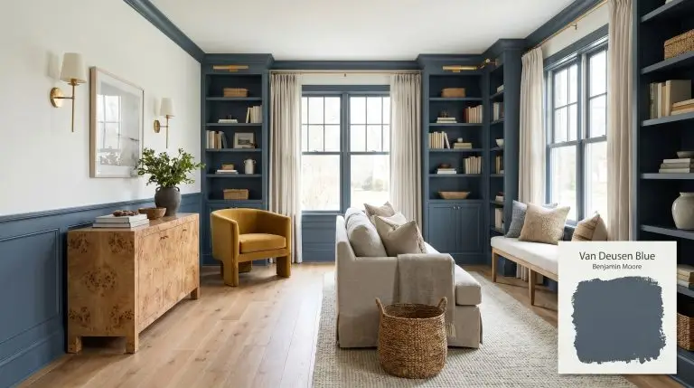
Benjamin Moore Van Deusen Blue: The Slate-Infused Navy That Redefines Transitional Design
Navy paint often carries a reputation for being overly formal or visually demanding. Benjamin Moore’s Van Deusen Blue HC-156 completely dismantles that stereotype. This is a highly adaptable, slate-tinged hue that behaves more like a tailored architectural material than a standard wall color.
By carrying a specific gray-blue chromatic profile, it establishes a room’s boundaries without shrinking the perceived footprint. It offers the richness of a traditional navy but leaves the gloomy, light-draining shadows behind.
Benjamin Moore Van Deusen Blue HC-156: Temperature, Undertones & LRV
Homeowners frequently ask if this specific transitional navy reads warm or cool once it actually hits the wall. Van Deusen Blue is a definitively cool-toned hue, but its complex structure prevents it from feeling icy or unwelcoming in a residential space.
At a light reflectance value of 11.97, this shade absorbs a substantial amount of natural and artificial light. It serves as a solidifying architectural finish, offering profound saturation while avoiding the black-hole effect common in darker alternatives.
You can apply wallpapers, paints, etc. on walls and see how they look in various interiors.

How Lighting Shifts This Historical Color Collection Blue
Because of its prominent slate undertone, this pigment is highly reactive to the shifting temperature of the sun.
Curated Applications for a Transitional Navy
The true value of this mid-dark blue lies in its structural flexibility. Because the slate base tempers the vibrancy, it can shift from a quiet backdrop in a restful retreat to a high-contrast focal point in a bustling family kitchen.
Kitchen Islands and Lower Cabinetry
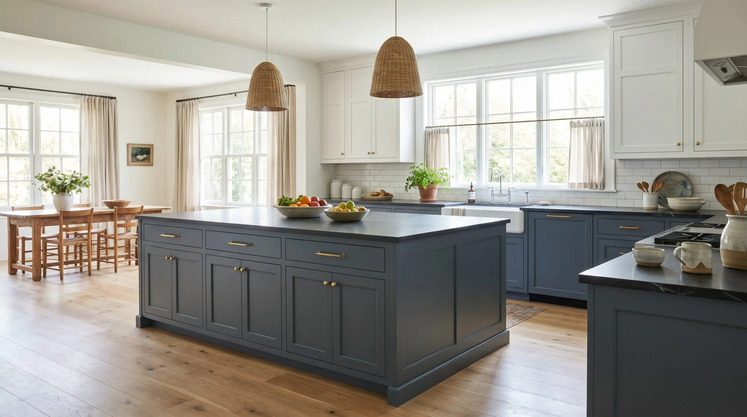
Using a saturated hue on lower sightlines is a brilliant way to stabilize a busy culinary space. This cool-toned hue instantly establishes a focal point without overpowering everyday materials like standard white subway tile or basic quartz.
Pair it with unlacquered brass hardware and a premium honed soapstone countertop for a high-contrast, tactile experience. The slate undertones seamlessly connect with natural white oak flooring, creating a relaxed, coastal-inspired aesthetic that still feels incredibly intentional.
Always opt for a satin or semi-gloss finish on high-traffic lower cabinets. The slight sheen not only protects the wood but also bounces light off the dark pigment, preventing the island from looking like a flat shadow.
Hackrea Pro-Tip (The Cabinetry Finish)
Formal Dining Rooms
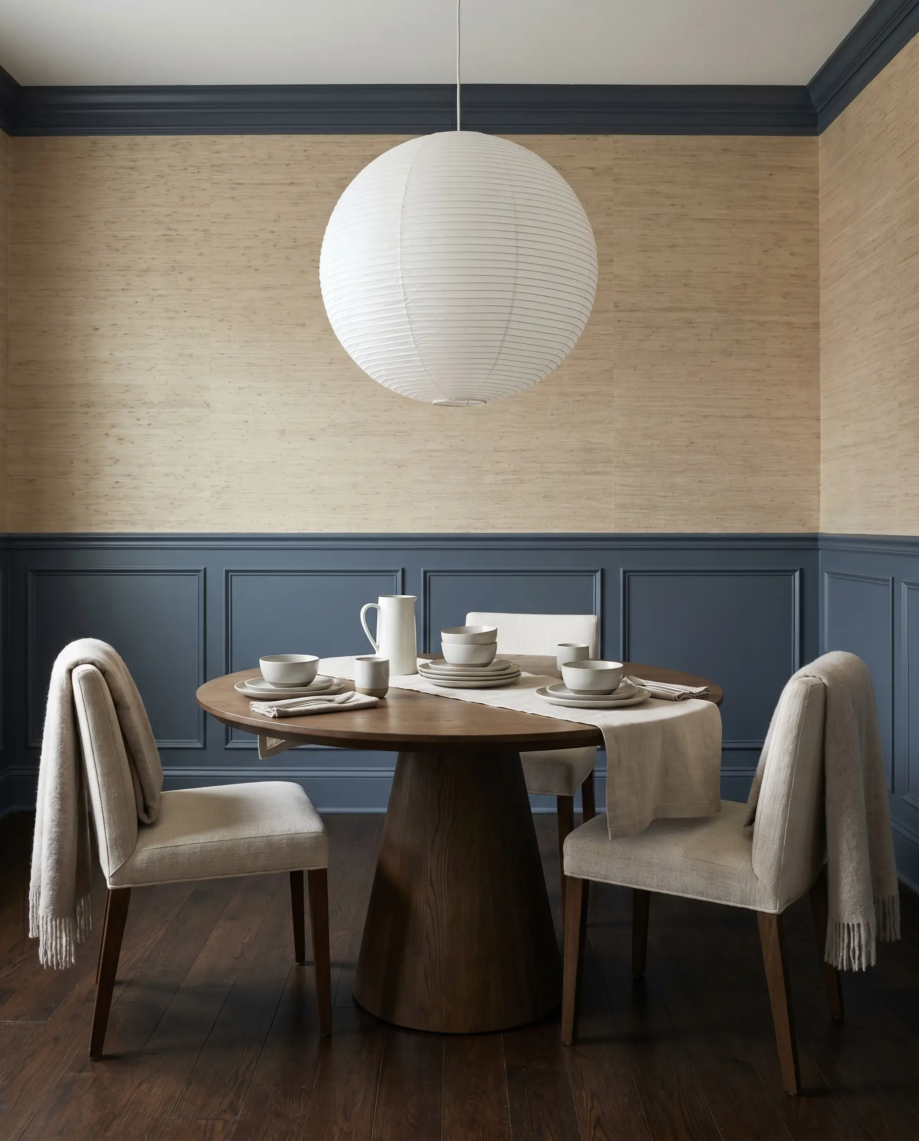
You do not need a sprawling historic estate to execute a beautifully tailored dining space. Applying a classic wainscoting application in this mid-dark blue instantly elevates standard drywall, bringing a sense of architectural permanence to a basic room.
For a modern approach, pair the painted lower paneling with a subtly textured grasscloth wallpaper above the chair rail. Introduce a pedestal dining table and a striking, oversized paper pendant light to soften the crisp lines of the millwork.
Bedroom Accent Walls
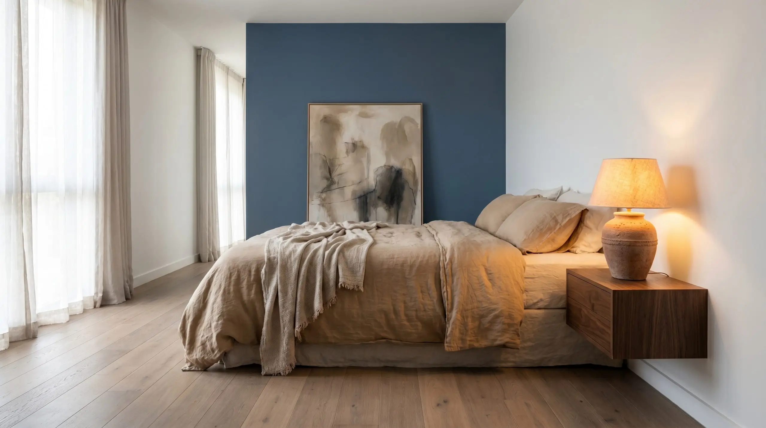
When applied to the wall behind the bed, this shade creates a receding visual effect that actually makes the room feel slightly larger. The moody color structure absorbs the evening light, setting a restful, quiet atmosphere perfect for a working professional’s retreat.
Skip the predictable matching furniture sets. Lean a large, minimalist abstract canvas against the blue wall, and introduce warmth through layers of washed linen bedding and a vintage terracotta table lamp.
Avoid pairing this specific blue with strongly yellow or orange-toned woods, like aged pine. The cool slate base will aggressively contrast with the yellow, making the wood look dated and the paint appear muddy.
Clash Warning (The Wood Tone Rule)
Bathroom Vanities
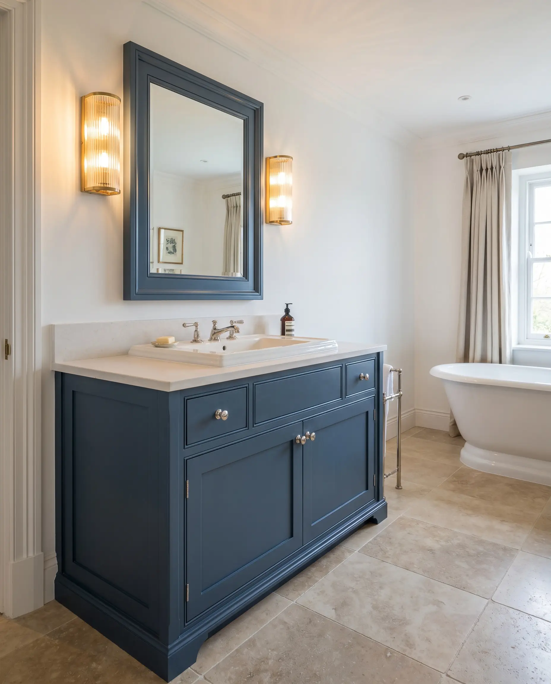
Transforming a standard vanity with this rich pigment is a highly practical way to introduce custom character into a basic bathroom. The color acts as a beautifully saturated neutral that pairs effortlessly with crisp white plumbing fixtures and standard polished nickel hardware.
To elevate the design, install a premium fluted glass sconce above the mirror. The warm glow of the bulb will highlight the subtle green micro-nuance in the paint, giving the vanity a custom, high-end presence.
Exterior Front Doors and Shutters
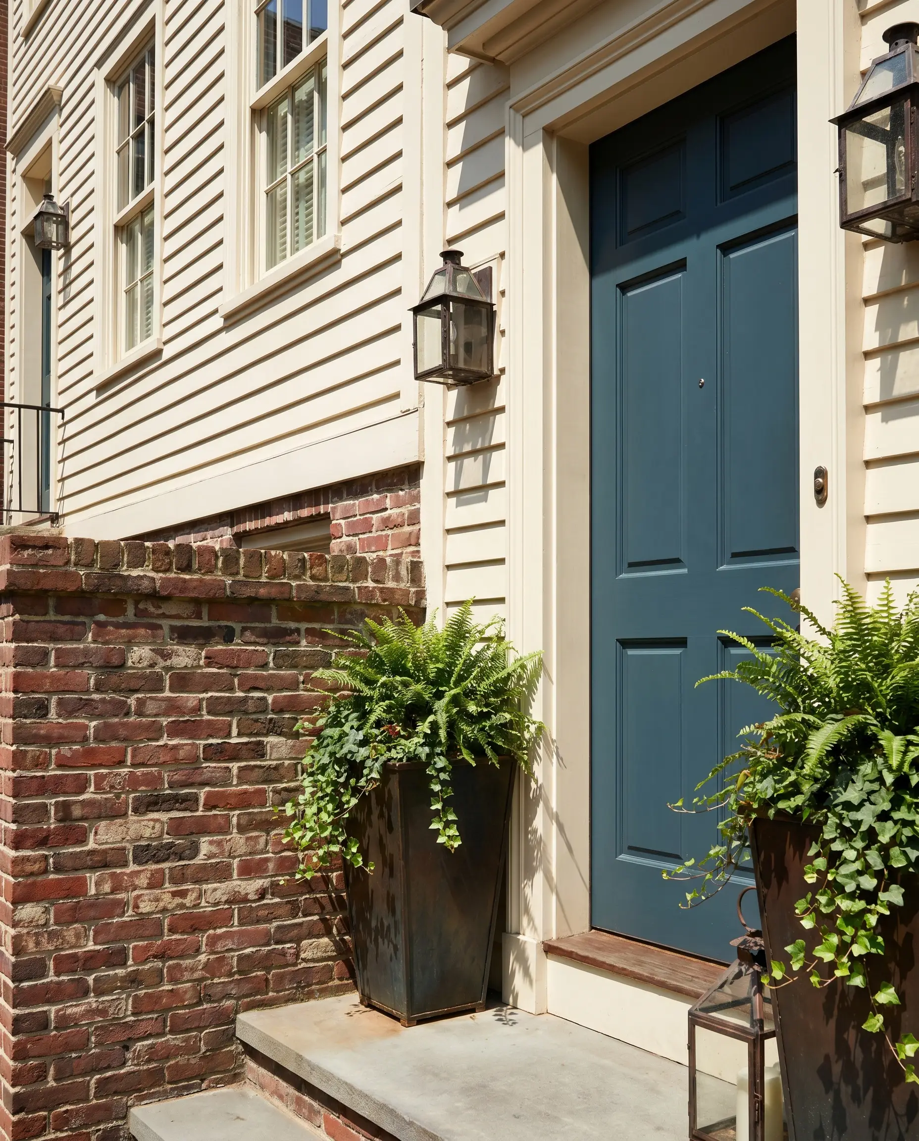
This shade thrives under the harsh glare of direct exterior sunlight. While lighter blues often wash out and lose their identity outside, the 11.97 LRV ensures the color retains its profound saturation and structural presence on a facade.
It serves as a stunning, welcoming contrast against natural brick, creamy white siding, or weathered cedar shingles. Frame the doorway with oversized, blackened steel planters to complete a polished, urban townhouse aesthetic.
Structuring Palettes Around Benjamin Moore Van Deusen Blue
This mid-dark blue requires surrounding elements that either pull its hidden slate undertone forward or provide a crisp, high-contrast boundary to keep the pigment from feeling sluggish. The way this hue interacts with adjoining surfaces entirely dictates the energy of the room.
Tailored Millwork & Baseboard Highlights
Tactile Finishes & Hardware Selections
Secondary Palette Combinations
Curated Aesthetic Concepts
The Tailored Flat
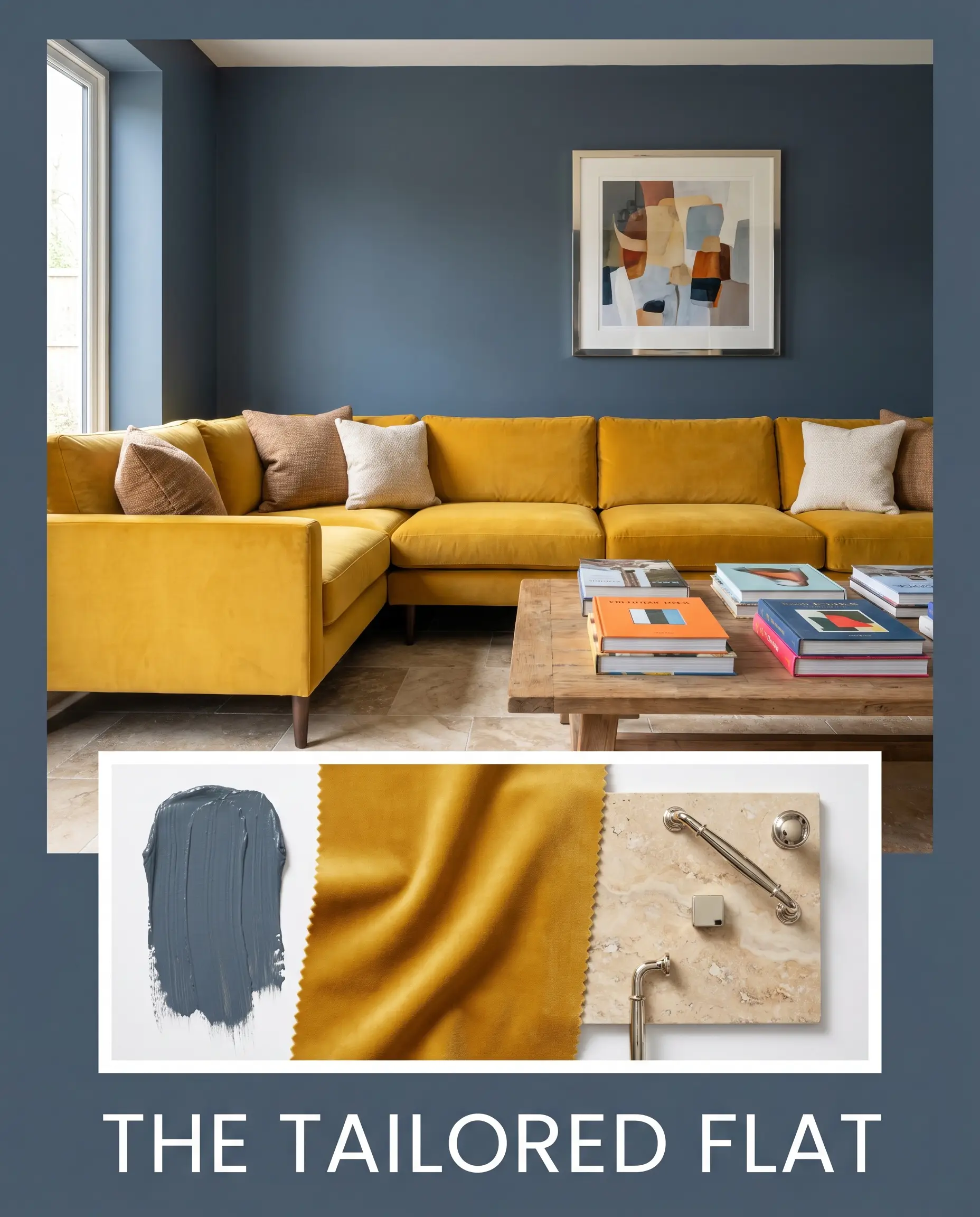
This palette thrives on the tension between strict architectural lines and lush, inviting textures. The walls act as a sharp, masculine backdrop, grounded by the earthy porosity of honed travertine floors. Introduce a mustard yellow velvet track-arm sectional to completely disrupt the seriousness of the dark blue, creating a vibrant, high-energy focal point. Finish the styling with stacked art books and a gallery wall framed in polished nickel to keep the ambient light bouncing.
Nordic Evening
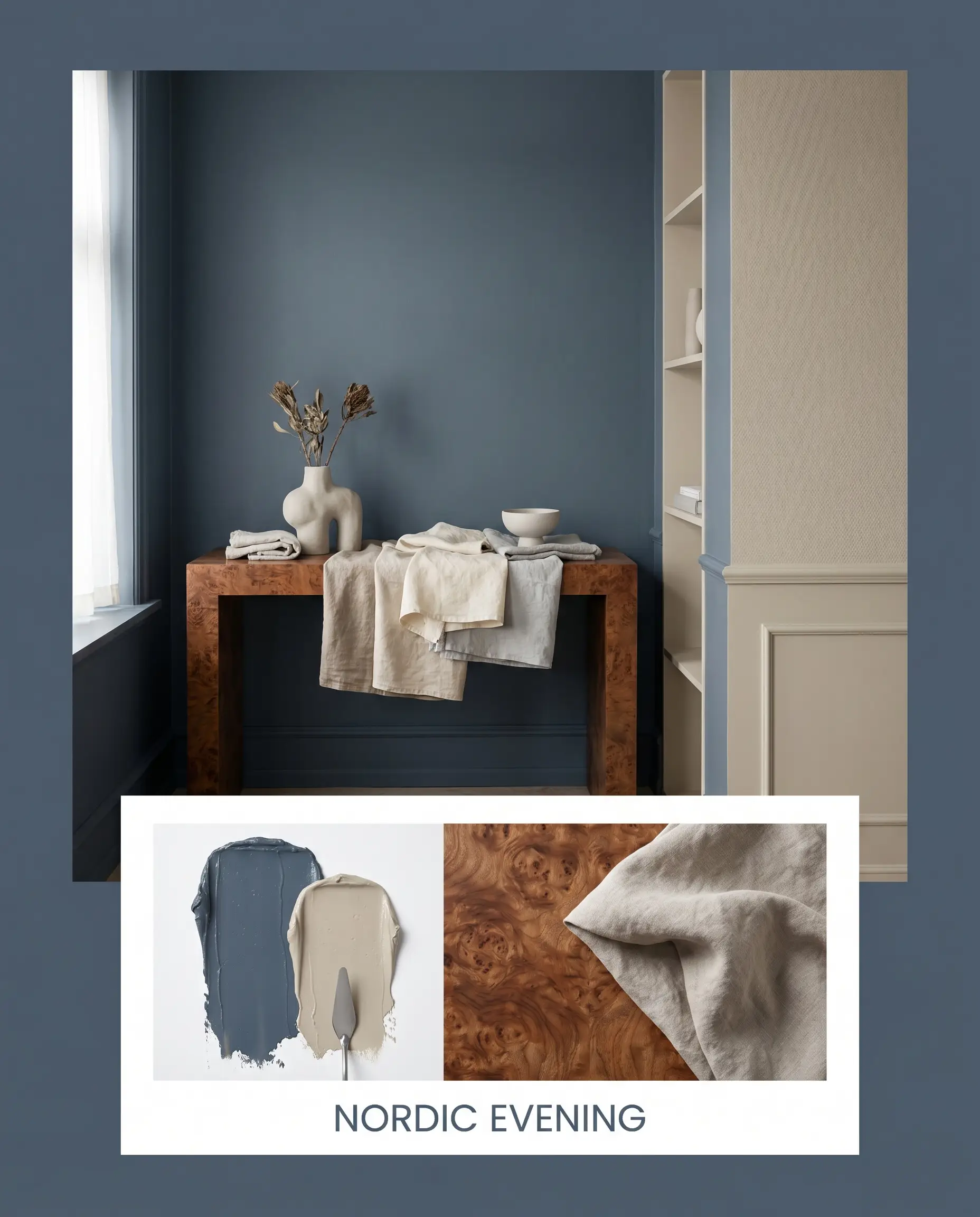
Designed to evoke a quiet, restful atmosphere, this concept focuses entirely on tonal softness rather than stark contrast. Walls painted in the rich navy are softened by adjacent surfaces coated in Farrow & Ball Drop Cloth No. 283, blurring the hard boundaries of the room. Incorporate a burled wood console table to inject organic warmth, while layers of washed linen and sculptural ceramics keep the aesthetic grounded, minimalist, and incredibly serene.
Comparing Van Deusen Blue to Rival Shades
While this mid-dark tone is incredibly versatile, specific lighting conditions or exterior exposures often demand a slight shift in undertone. If your room lacks natural light or you are dealing with conflicting permanent finishes, you may need to pivot to a rival hue to achieve the perfect balance.
Benjamin Moore Van Deusen Blue vs. Benjamin Moore Hale Navy HC-154
If you need a true, undeniable dark navy, then Hale Navy is the better option. Hale Navy carries a significantly lower LRV and a more pronounced charcoal base, making it feel much more formal and traditional. Van Deusen Blue, by contrast, is noticeably lighter and retains far more vibrant blue energy, making it the superior choice for spaces that need color rather than just a dark shadow.
Benjamin Moore Van Deusen Blue vs. Sherwin-Williams Naval SW 6244
If your room receives intense, warm southern light, SW Naval will hold its shape as a classic, deep maritime blue. Naval lacks the prominent slate-gray influence found in its Benjamin Moore counterpart. Because of this, Van Deusen Blue will lean much softer and slightly muddier in lower light, whereas Naval remains crisp and highly saturated.
Benjamin Moore Van Deusen Blue vs. Sherwin-Williams Indigo Batik SW 7602
If you are designing a casual, coastal-inspired space, Indigo Batik offers a beautifully faded, denim-like quality. Indigo Batik has a slightly higher LRV and feels more relaxed, lacking the formal, tailored edge of the Benjamin Moore hue. Choose Van Deusen Blue when you want the room to feel structured and architectural, and pivot to Indigo Batik for a softer, more laid-back aesthetic.
Alternative Tones & Cross-Brand Matches
Homeowners frequently need to adjust their color strategy based on local paint availability or the need for a slightly different undertone to accommodate existing flooring. Here are the most reliable alternatives when you need to pivot.
Same-Brand Variations
Competitor Matches
Executing Van Deusen Blue: Application & Sheen Guide
Translating color theory into a flawless tangible finish requires strict attention to the technical details of the painting process.
Optimal Finish Selections
Undercoat Requirements
Coating & Touch-Up Warnings
Common Queries
Because of its 11.97 LRV, this color actually thrives in small, windowless spaces by leaning into the shadows. Pair it with polished nickel sconces to bounce artificial light and prevent the slate base from feeling flat.
This specific hue performs exceptionally well on textured exteriors because its gray undertone prevents it from turning blindingly blue in direct sunlight. It retains a sophisticated, weathered look much longer than a standard, vibrant navy.
The cool slate base creates a beautiful, intentional contrast with the warmth of red oak, grounding the floor’s orange tones. To bridge the two, introduce an earthy transitional color like Farrow & Ball Drop Cloth No. 283 on the trim.
Unlike many dark blues, this pigment contains a faint micro-nuance of green that actively fights off purple undertones. Under 3000K lighting, it will simply look like a rich, warm charcoal-navy.
The Final Ruling on Benjamin Moore’s Slate Navy
Benjamin Moore Van Deusen Blue is the ultimate architectural chameleon for homeowners who want the gravitas of a dark color without the overwhelming weight of a true black or charcoal. Its absolute best application is on lower visual planes—like wainscoting, lower cabinetry, or interior doors—where its slate undertone can anchor the space while allowing lighter upper walls to breathe. It is perfect for the design enthusiast who is blending modern traditional elements with organic, tactile materials.
While this color is highly adaptable, introducing competing cool tones into the same sightline is a massive mistake. Pairing this specific slate-infused blue with icy gray flooring or cool Carrara marble creates an incredibly sterile, uninviting environment. To avoid a flat, commercial aesthetic, you must introduce the friction of warm, organic materials like burled wood or brass to bring the paint to life.
Hackrea Design Secret (The Temperature Clash)