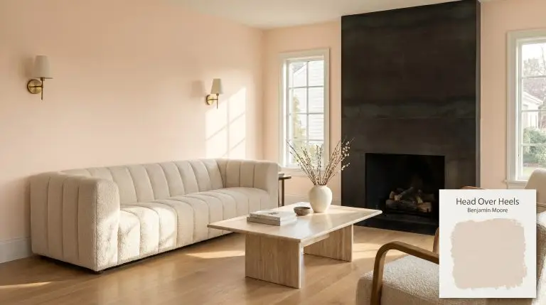
Head Over Heels AF-250
Benjamin MooreBenjamin Moore Head Over Heels AF-250 is a sophisticated, delicate blush pink with subtle beige and peach undertones. Acting as a highly versatile pastel, it brings a warm, elegant chromatic profile to interiors without feeling overly sweet or juvenile.
Beyond Pink: How Benjamin Moore Head Over Heels Redefines Modern Warmth
For decades, pink paint has carried an unfair reputation as a color strictly reserved for juvenile spaces or overtly nostalgic interiors. Benjamin Moore Head Over Heels actively shatters that stereotype by offering a highly structural, mature take on blush. This isn’t a simplistic pastel; it is a nuanced architectural finish that completely alters the tactile experience of a room.
When you roll this shade onto your walls, you are establishing a soft, luminous foundation that begs to be paired with raw, authentic materials. It creates a striking visual tension when placed against the cool touch of honed marble or the industrial edge of blackened steel hardware. The color wraps a space in an undeniable warmth without ever feeling overly sweet.
As a standout within the Affinity Color Collection, this hue is formulated to flow seamlessly alongside other complex shades. It behaves less like a traditional pink and more like a highly saturated neutral. When styled intentionally, Head Over Heels AF-250 brings an effortless, sophisticated pastel energy that modernizes everyday homes.
Benjamin Moore Head Over Heels: Temperature, Undertones & LRV
If you are wondering whether Benjamin Moore Head Over Heels leans warm or cool, it is undeniably a warm paint color. This underlying heat is exactly what gives the shade its inviting, residential appeal. The color structure is meticulously balanced to provide warmth without tipping into an aggressive coral.
To understand how this shade will physically alter your space, we have to look closely at its chromatic profile:
With a light reflectance value (LRV) of 73.32, this shade reflects a generous amount of light back into your room. It sits perfectly in the light-pastel range, meaning it holds its pigment beautifully without washing out on a bright afternoon. This specific LRV ensures the color maintains its integrity, providing a substantial presence that never feels visually oppressive.
You can apply wallpapers, paints, etc. on walls and see how they look in various interiors.

The Chameleon Factor: Lighting Effects of Head Over Heels
Because this shade relies heavily on its beige and peach modifiers, its appearance is highly dependent on the light source. The ambient light absorption of this paint means it will dynamically shift as the sun moves across your home.
Here is exactly how Benjamin Moore Head Over Heels AF-250 reacts to different lighting scenarios:
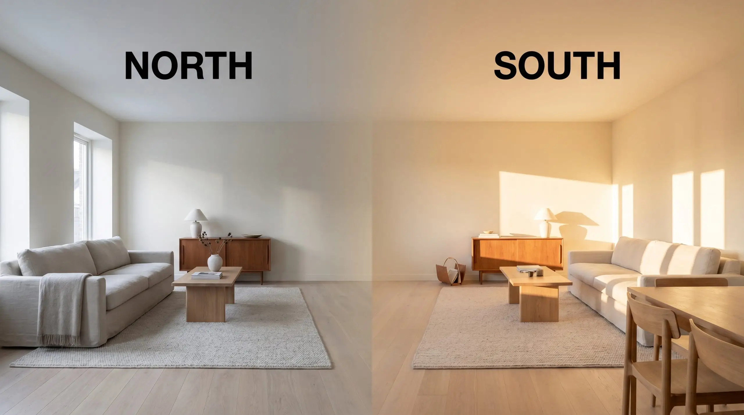
If you are using this color in a room with limited natural light, avoid bulbs cooler than 3500K. Anything higher will strip away the beige warmth, leaving the blush looking flat and sterile rather than sophisticated.
Hackrea Pro-Tip (The Bulb Rule)
Popular Applications for Head Over Heels
This blush is far too dynamic to be confined to a single demographic or a single room in the house. Because of its generous light reflectance and complex undertones, it serves as a brilliant architectural tool across a variety of design styles. Here is how homeowners are successfully integrating this shade into their spaces.
Powder Rooms
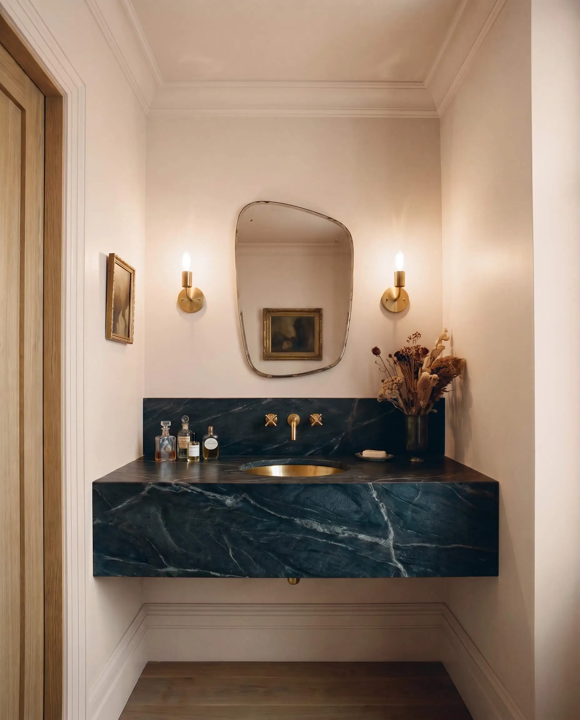
Powder rooms are the perfect environment to push this color into a moody, Parisian chic aesthetic. Instead of playing it safe, wrap the entire space—walls, trim, and the ceiling—in Head Over Heels AF-250. This continuous application creates a seamless, jewel-box effect that feels incredibly intentional.
To elevate the design, introduce materials that provide a sharp, tactile contrast to the soft blush. A floating vanity topped with richly veined, dark soapstone or honed charcoal marble immediately establishes a mature tone. Pair this with unlacquered brass wall sconces and an asymmetrical mirror to reflect the warm, peachy glow around the small space.
Avoid pairing this warm blush with highly polished chrome fixtures. The icy undertones of standard chrome will aggressively fight the peach cast, making the metal look cheap and the paint look muddy. Stick to warm or matte metals like brushed copper, aged brass, or matte black.
Clash Warning (The Fixture Trap)
Nurseries and Children’s Bedrooms
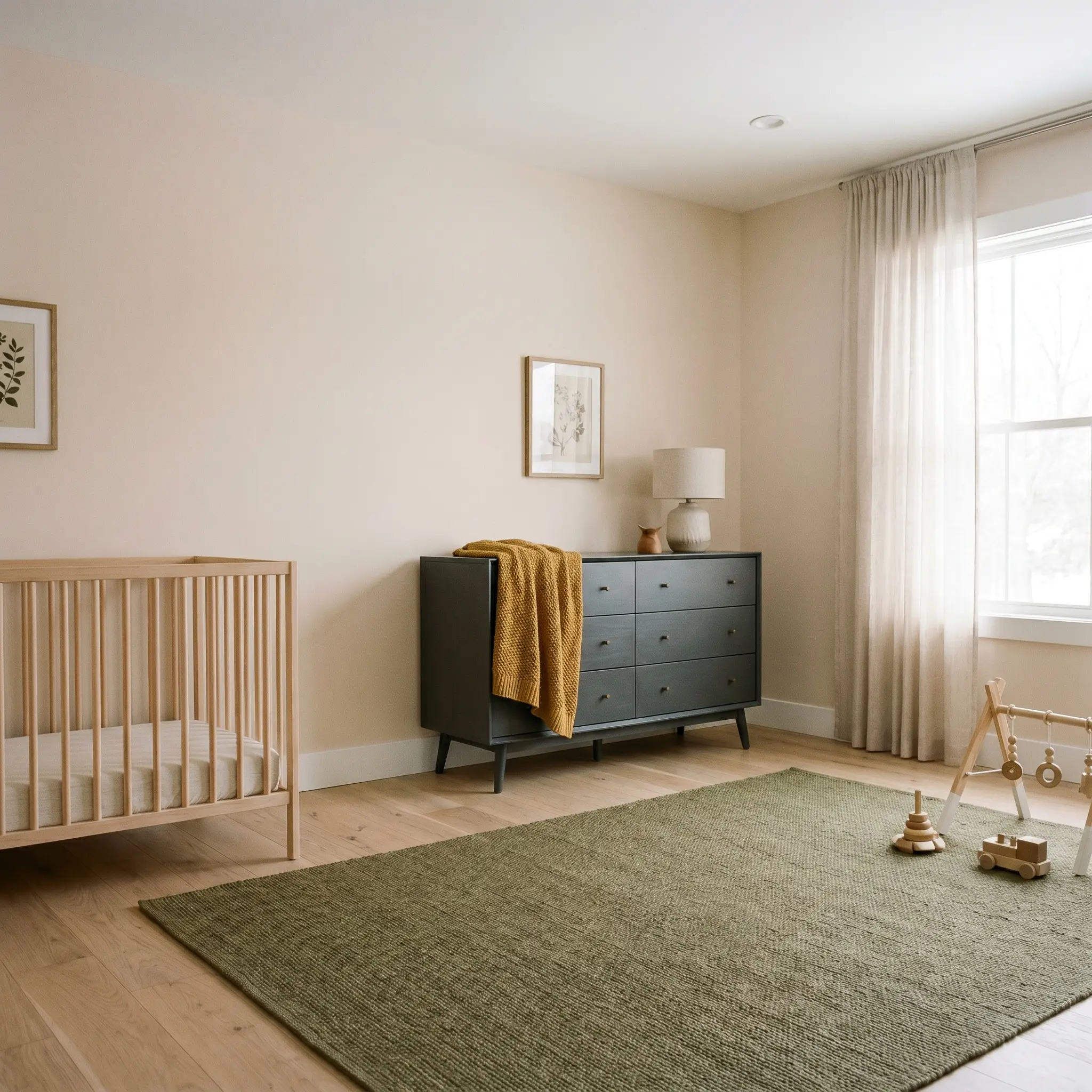
When designing a room for a growing child, you want a color that transitions effortlessly from the toddler years into pre-teen styling. Head Over Heels is the perfect candidate because its beige neutralizers keep it from feeling overly juvenile. For a Scandinavian soft modern approach, pair the painted walls with natural white oak floors and a simple, spindle-style crib or bed frame.
Introduce earthy, unexpected accent colors to break up the pastel foundation. A mustard yellow throw blanket, an olive green woven rug, or a charcoal gray mid-century dresser will instantly modernize the room. This high-contrast styling ensures the space feels curated and stylish, rather than looking like a generic baby catalogue.
Primary Bedrooms
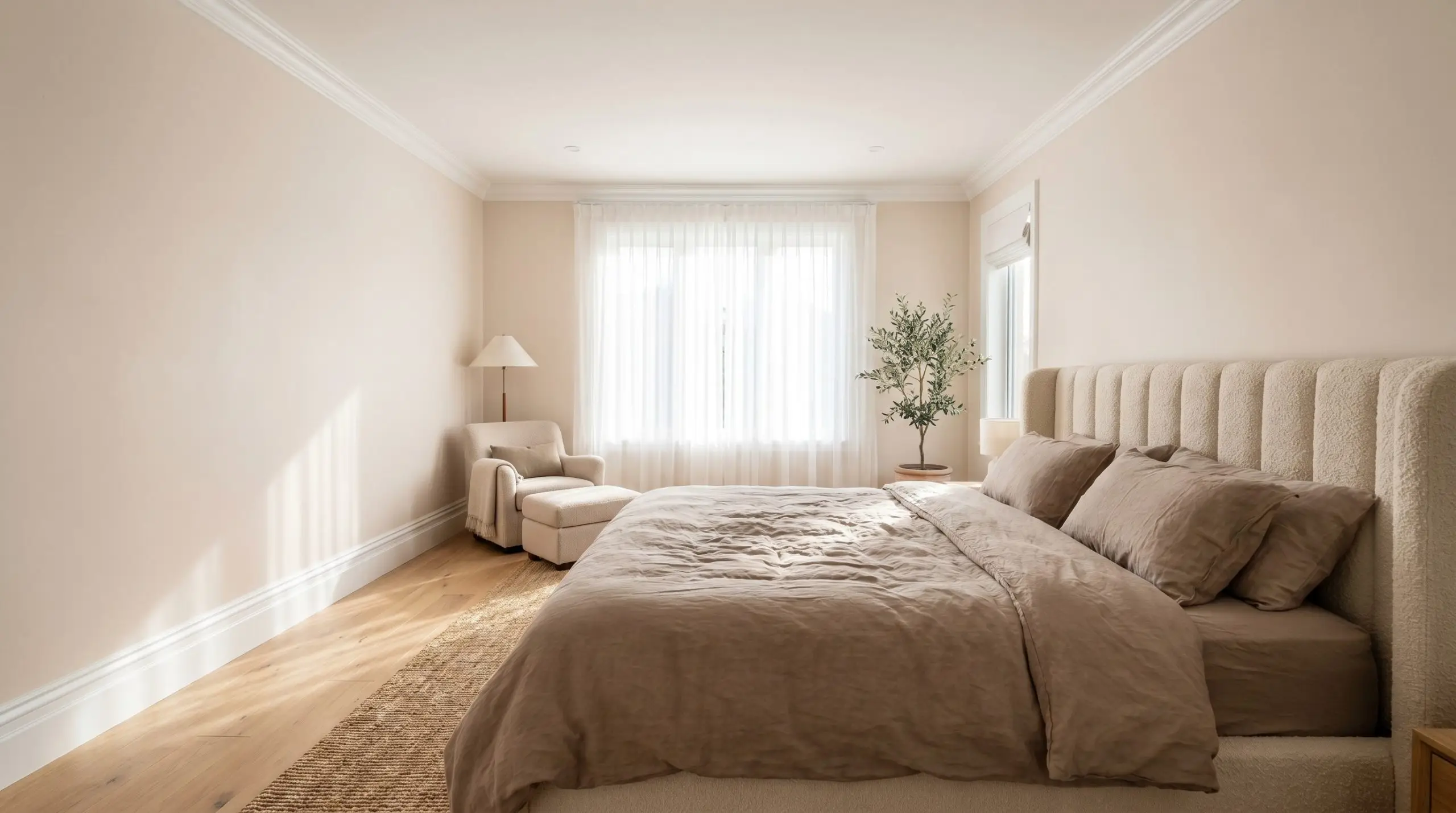
In a primary bedroom, this muted magenta base creates an atmosphere of calm, transitional elegance. Apply the paint to the walls and pair it with crisp, bright white crown molding and baseboards. This classic architectural framing allows the warm blush to sing while keeping the overall room feeling structured and tailored.
Layer the space with highly textural fabrics to enhance the cozy, residential vibe. Think washed linen duvet covers in warm taupe, a channel-stitched headboard upholstered in nubby bouclé, and sheer cotton window treatments that filter the morning light. The Gennex Color Technology ensures the pigment remains rich, providing a comforting backdrop for a relaxing retreat.
Painted Furniture and Cabinetry
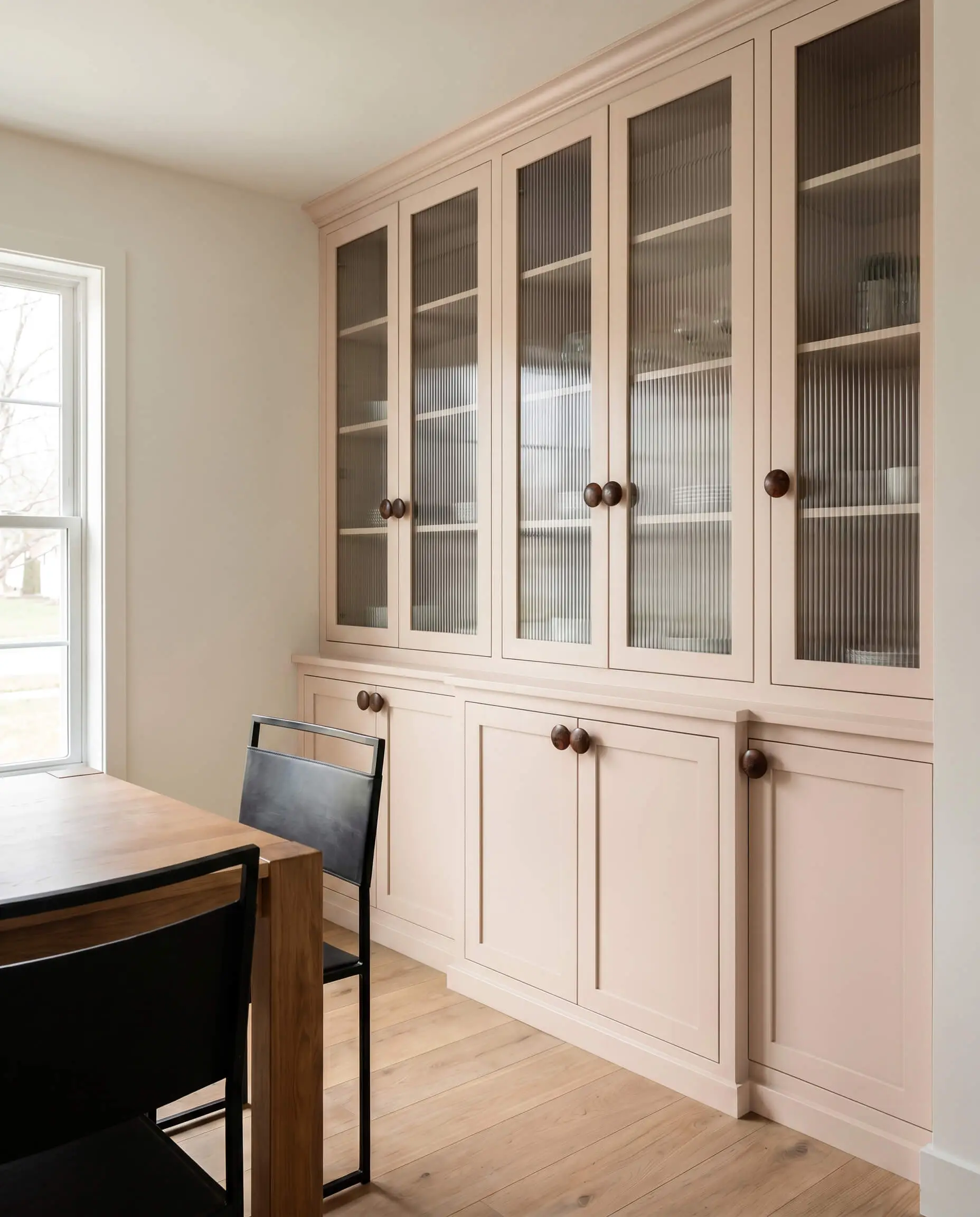
If you are not ready to commit to a full room of blush, this shade is an exceptional choice for reviving tired furniture or built-in cabinetry. It brings a soft, eclectic vintage vibe to standalone pieces like a campaign dresser or a bathroom vanity. The key is to use a high-quality enamel finish to ensure the piece can withstand daily wear and tear.
To make the painted piece feel entirely custom, swap out the standard hardware for something with a bit of history. Try oversized burl wood knobs or brushed copper pulls. If you are painting a dining room hutch, consider replacing the standard glass doors with fluted glass to add a layer of modern texture against the soft pastel finish.
Living Room Accent Ceilings
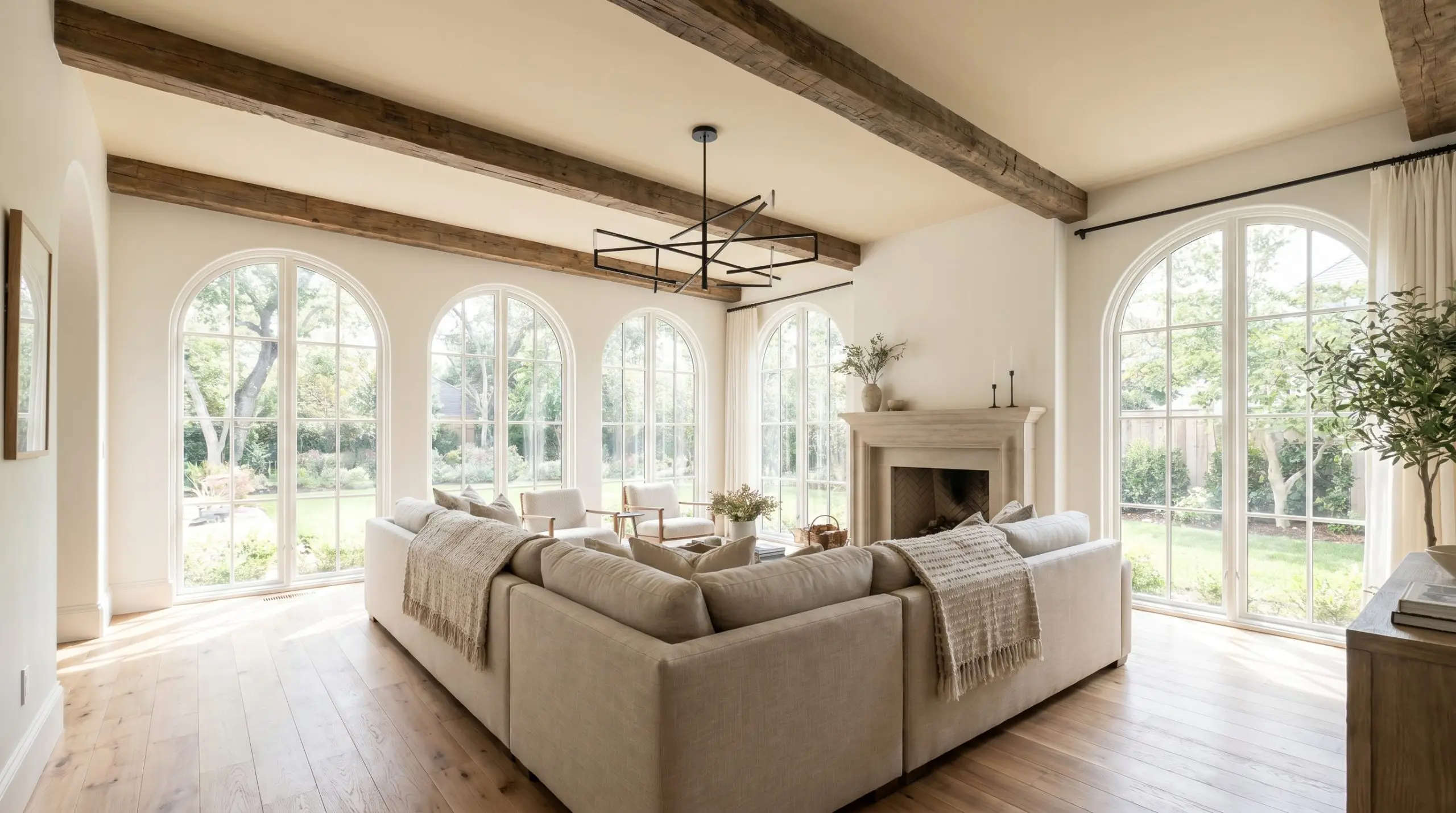
Painting the ceiling is a brilliant way to manipulate the visual boundaries of a living room without overwhelming the space with color. When you apply this sophisticated pastel to the “fifth wall,” it visually lowers the ceiling just enough to make a large, airy room feel intimate and cohesive. Keep the primary walls painted in a warm, creamy white to maintain a crisp, modern edge.
This application is particularly effective in spaces that feature strong architectural details. If your living room has exposed beams, painting the ceiling between them in this warm blush draws the eye upward and highlights the woodwork. Finish the styling with a sculptural, blackened steel chandelier to provide a sharp, industrial contrast to the soft overhead glow.
Selecting Coordinating Colors for Benjamin Moore Head Over Heels
This warm blush requires intentional contrasting elements to prevent it from washing out into a generic pastel. It thrives when placed next to crisp, structural boundaries or deeply saturated counterweights that stabilize its luminous quality.
Ideal White Trim Combinations
Tactile Finishes and Hardware Pairings
Secondary Palette Selections
Curated Design Aesthetics
Tailored Organic This aesthetic leans entirely into the sun-baked warmth of the paint by pairing it directly with honed travertine and accents of India Yellow. The energy here is relaxed yet highly structured, utilizing natural white oak furniture and washed linen textiles to soften the room’s edges. The result is an inviting, earthy atmosphere that feels perpetually bathed in late-afternoon sunlight.
Sculptural Serenity To strip away any lingering traditional expectations, this styling direction pairs the blush with the stark, industrial contrast of blackened steel and crisp Chantilly Lace trim. By incorporating channel-stitched upholstery, nubby bouclé fabrics, and asymmetrical mirrors, the room gains a highly tactile, contemporary edge. The muted magenta base acts as a quiet, luminous backdrop that lets bold, modern silhouettes take center stage.
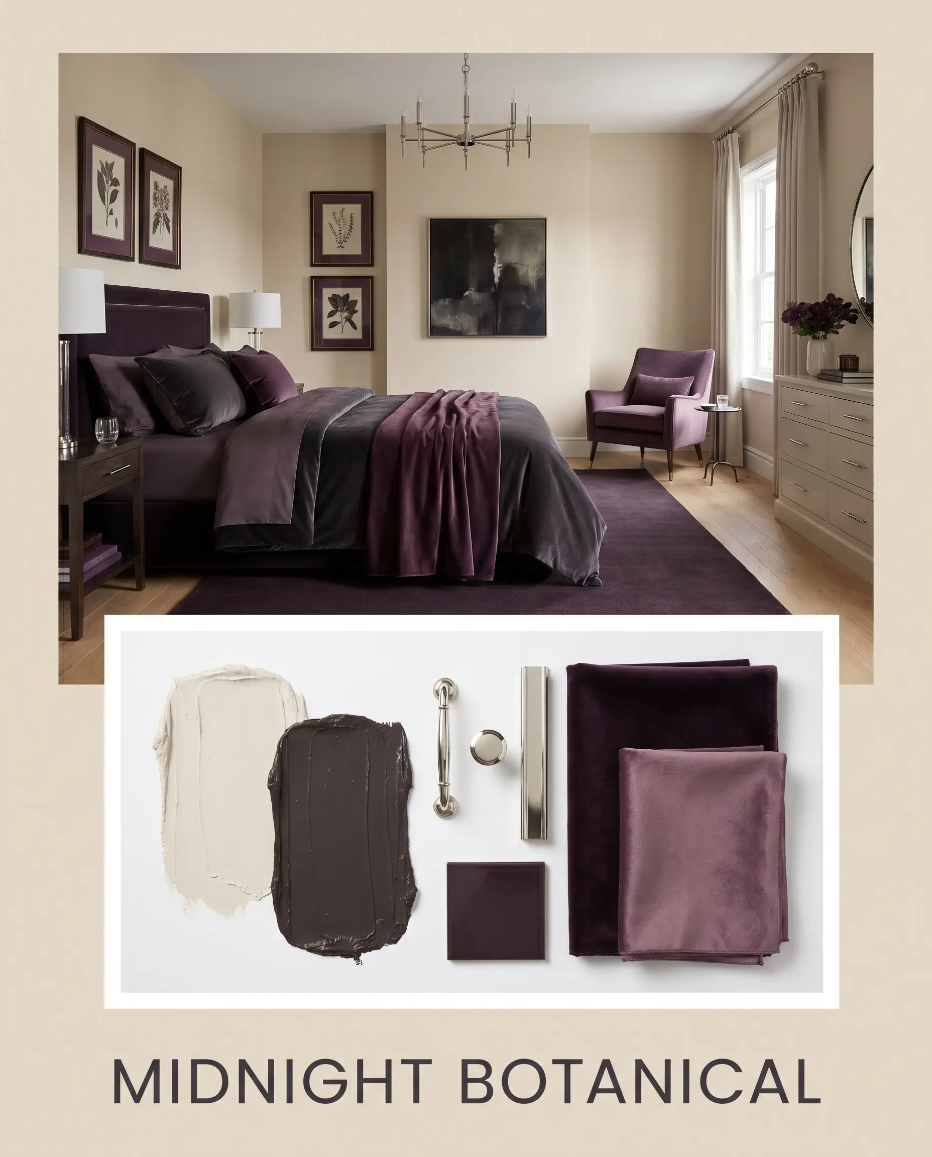
Midnight Botanical This palette thrives on dramatic, cinematic tension by introducing Night Shade as a dominant secondary color. Polished nickel hardware reflects light around the dark, moody accents, while silk velvet textiles add a layer of uncompromising luxury. It creates an enveloping, jewel-box energy that feels intensely rich, mature, and deeply comforting.
Benjamin Moore Head Over Heels vs. Rival Paints
There are specific lighting conditions and architectural exposures where this particular blush might pull too warm or lose its crispness. If your home features predominantly south-facing windows, the intense afternoon sun can sometimes exaggerate the peach cast, making a cooler or cleaner alternative the more successful candidate.
Benjamin Moore Head Over Heels AF-250 vs. Benjamin Moore First Light 2102-70
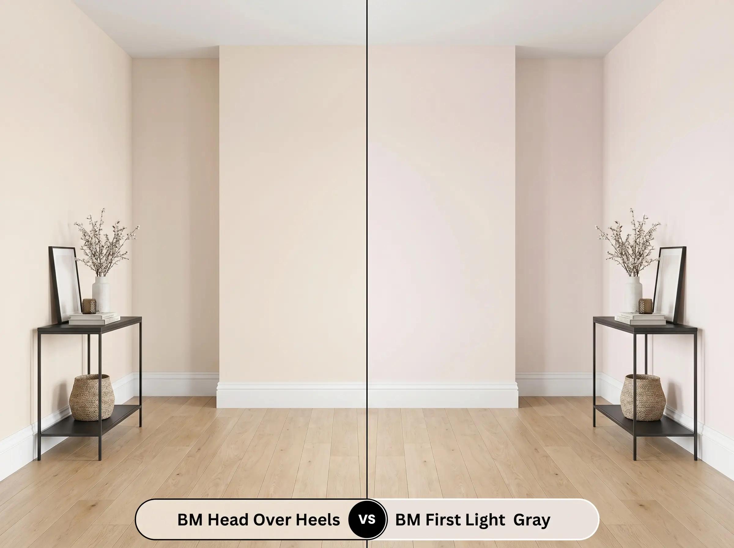
First Light is a significantly cleaner, cooler pink with a slightly higher light reflectance. If your room already has warm-toned wood floors or artificial incandescent lighting, Head Over Heels might pull too much beige, muddying the aesthetic. Choose First Light if you need a crystalline, refreshing blush that maintains its cool composure in warm environments.
Benjamin Moore Head Over Heels AF-250 vs. Sherwin-Williams Intimate White SW 6322
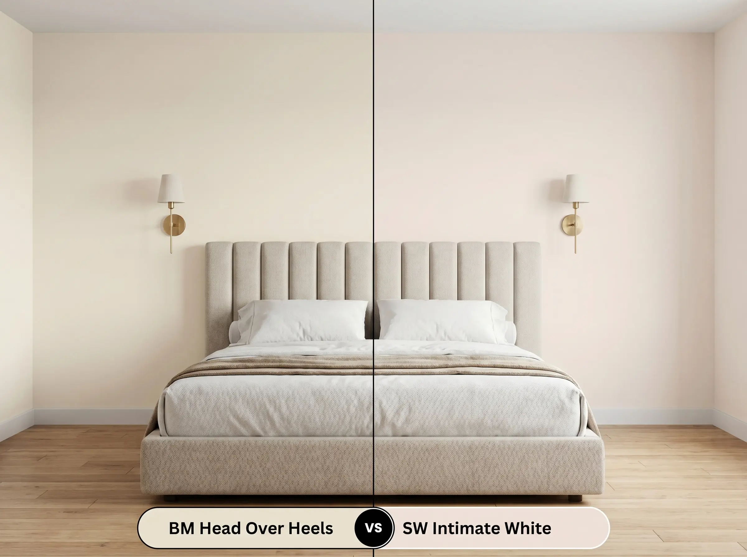
Intimate White offers a slightly more muted, dusty approach to blush, leaning closer to a true pastel with fewer beige modifiers. If you are aiming for a crisp, contemporary contrast against stark black hardware, Intimate White provides a slightly sharper background. However, if you want a color that wraps the room in a cozy, residential glow, the AF-250 formulation remains the superior choice.
Alternative Blush Tones to Consider
Homeowners often realize they need a slightly different undertone once they test a sample against their specific furnishings. You might require a color with a touch more depth to hold its own in a brightly lit space, or a slightly crisper formula to combat shadowed corners.
Same-Brand Alternatives
Cross-Brand Matches
Painting with Head Over Heels AF-250
Transitioning this sophisticated pastel from a design concept to a flawless physical finish requires strict attention to your application strategy.
Optimal Finish Selections
Base Coat Requirements
Because this shade relies on a delicate balance of peach and beige, a high-quality, pure white acrylic primer is absolutely mandatory. Tinted primers or skipping the base coat will allow the underlying drywall or previous paint color to bleed through, instantly muddying the delicate color structure.
Professional Execution Tactics
To achieve the true, luminous depth of this shade, you must plan for two full, even coats over your primed surface. The light reflectance of this color makes it highly susceptible to “flashing,” where uneven roller pressure leaves visible, shiny streaks across the wall. Maintain a wet edge while rolling and avoid going back over semi-dry sections, which will disrupt the uniform finish.
Light, warm pastels are notoriously difficult to touch up seamlessly after they have cured. Always keep a tightly sealed, small jar of the original batch for future nicks, and apply it with a feathering technique using a foam brush rather than a standard roller.
Hackrea Pro-Tip (The Touch-Up Warning)
Common Inquiries About This Shade
Because 3000K is a neutral-to-warm light source, it beautifully enhances the beige and peach undertones of this paint. In a windowless space, this specific lighting ensures the blush reads as a warm, sophisticated neutral rather than a flat, sterile pink.
The warm peach cast actually harmonizes quite well with the natural warmth of red oak. However, to prevent the room from feeling overly warm or visually muddy, you must introduce crisp white trim and cool-toned accents like blackened steel or slate blue to balance the palette.
Direct, brilliant sunlight aggressively washes out high-LRV pastels, stripping away their complex nuances. On an exterior facade, the delicate beige neutralizers vanish, leaving the paint looking like a stark, glaring white with an unintentional pink tint.
The Affinity Collection is specifically formulated to maintain its core hue integrity across various finishes. However, as you move to higher sheens like semi-gloss, the increased light reflection will naturally make the magenta base appear slightly richer and more vibrant than it does in a flat finish.
The Ultimate Ruling on Head Over Heels
Benjamin Moore Head Over Heels is a masterfully balanced, highly versatile architectural finish that completely redefines how blush can operate in a modern home. Its absolute best application is in spaces that crave a soft, luminous foundation but demand a mature, sophisticated aesthetic. It is the perfect choice for accessible luxury enthusiasts looking to update soft modern living rooms, transitional primary bedrooms, or eclectic spaces adorned with raw, tactile materials like travertine and unlacquered brass.
However, this paint requires careful curation to succeed, and it is absolutely not for every home. If your design style leans heavily into cool-toned, stark minimalism featuring bright white LED lighting and an abundance of polished chrome, this warm blush will violently clash with your hard finishes. The icy tones of standard chrome and cool grays will fight the paint’s inherent peach cast, making the walls look dull and the metals look remarkably cheap. To unlock the true potential of this shade, you must fully commit to its warmth, pairing it exclusively with earthy textures, rich counterweights, and warm metallic accents.