Italianate AF-215
Benjamin MooreBenjamin Moore Italianate AF-215 is a warm, mid-tone earthy peach with muted clay and tan undertones. Reminiscent of traditional terracotta, this sophisticated shade offers a grounded, organic aesthetic that brings cozy warmth and Mediterranean-inspired elegance to interior spaces.
The Architectural Warmth of Benjamin Moore Italianate: Harnessing Earthy Clay for Elevated Interiors
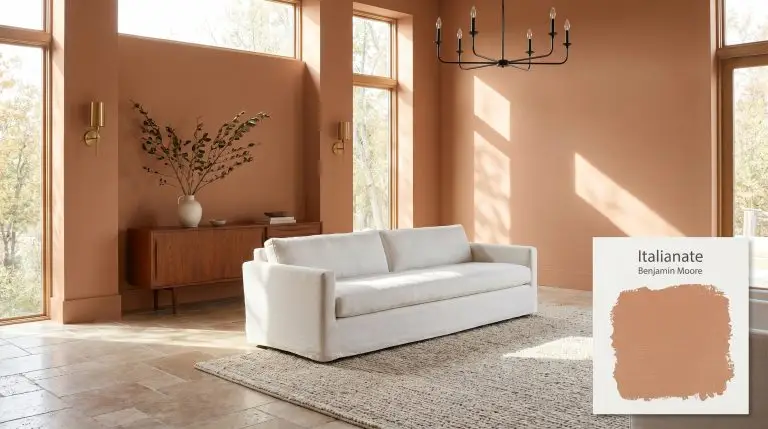
Some colors sit passively in the background, while others actively shape the tactile experience of a room. Benjamin Moore Italianate AF-215 belongs firmly in the latter category.
This specific architectural finish behaves less like a standard paint and more like a raw, organic material applied directly to your walls.
By pulling from the orange-red spectrum, it establishes an immediate sense of mid-tone warmth that completely alters how natural light and layered textiles feel within a space. If you are tired of sterile neutrals and want a color that actively participates in the design, this baked terracotta cast provides a sophisticated, stabilizing foundation.
Pair this high-absorption shade with highly textured, organic elements like raw silk, tumbled travertine, or unlacquered brass. The earthy clay undertones physically react to these materials, making standard rooms feel incredibly custom and intentional.
Hackrea Design Secret (The Material Catalyst)
Benjamin Moore Italianate AF-215: Temperature, Undertones & LRV
Benjamin Moore Italianate is a definitively warm paint color. Positioned firmly in the orange-red spectrum, it completely avoids the icy, sterile qualities of cooler neutrals, radiating a substantial, earthy heat that immediately warms up both interior rooms and exterior facades.
With an LRV (Light Reflectance Value) of 36.46, this shade absorbs a significant amount of light, establishing itself as a weighty mid-tone. This means it will easily hold its color structure without washing out under intense sunlight. However, in heavily shadowed spaces, you must introduce layered lighting to prevent the room from feeling overly enclosed or dense.
You can apply wallpapers, paints, etc. on walls and see how they look in various interiors.

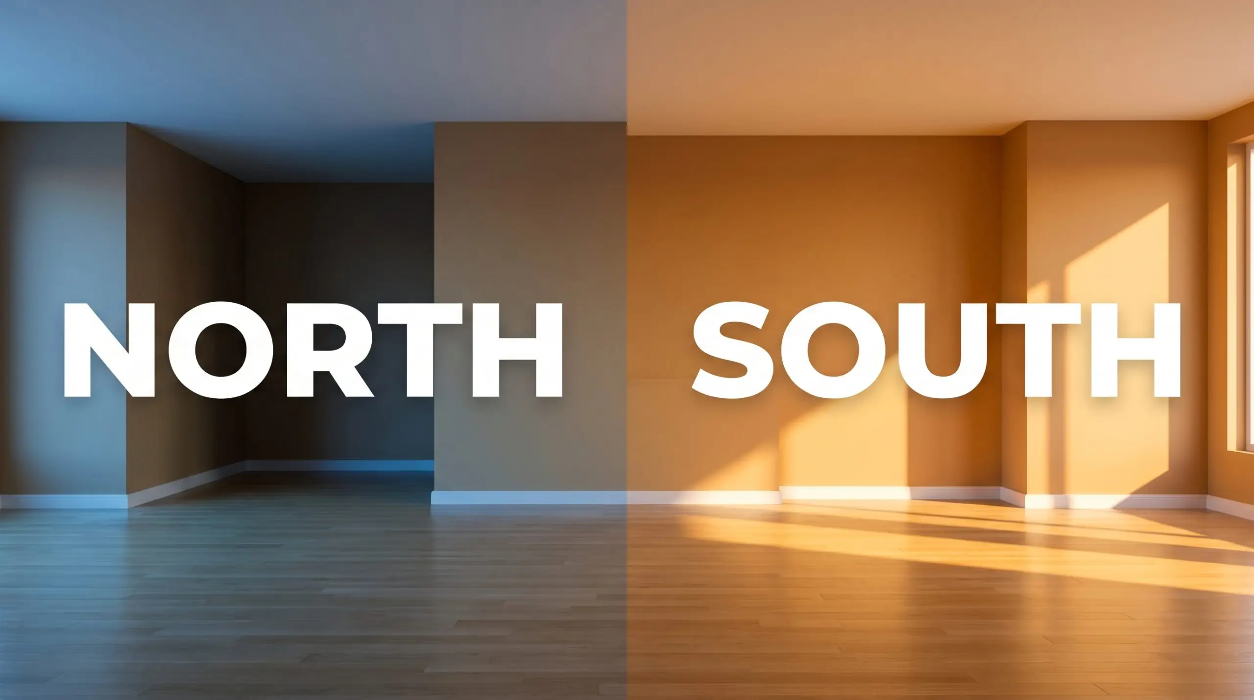
How Lighting Manipulates the Italianate Color Structure
Because of its complex chromatic profile, this earthy clay hue shifts dramatically depending on the angle and temperature of the light hitting it.
Curating the Home with BM AF-215
Because this organic chromatic profile balances warmth with a high-absorption structure, it adapts beautifully to a wide variety of architectural challenges. Here is how to manipulate this specific tint across different spaces to maximize its aesthetic value.
Dining Rooms
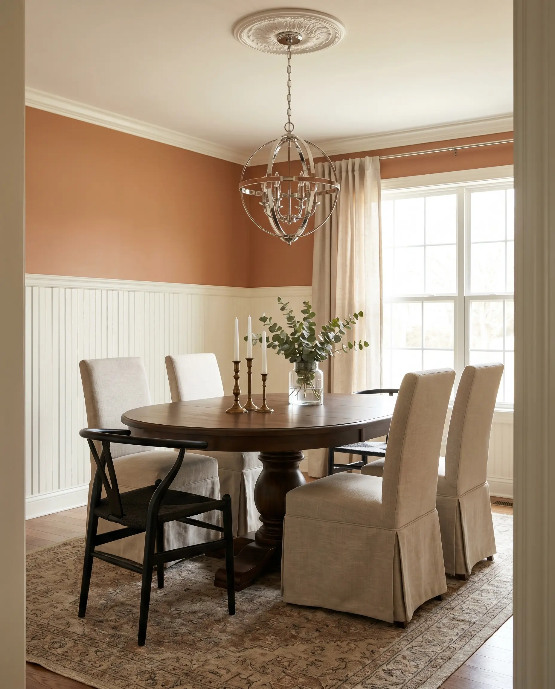
In a dining space, Italianate establishes a sophisticated, stabilizing energy that encourages lingering conversations long after dinner is over. Instead of defaulting to a predictable Mediterranean theme, use this color to build a highly tailored Transitional dining room.
Apply the paint above a crisp, creamy white wainscoting to keep the room feeling expansive while still delivering a rich punch of color at eye level.
To modernize the terracotta base, introduce sharp metallic contrasts. A sleek polished chrome chandelier or matte black iron dining chairs will cut through the warmth of the walls, creating a beautifully balanced visual tension.
Hackrea Pro-Tip (The Metallic Contrast)
To soften the room, surround a standard pedestal table with accessible slipcovered dining chairs in a slub linen. Finish the styling with a few taper candles in unlacquered brass candlesticks to catch the ambient light and highlight the muted peach base during evening meals.
Sunrooms and Conservatories
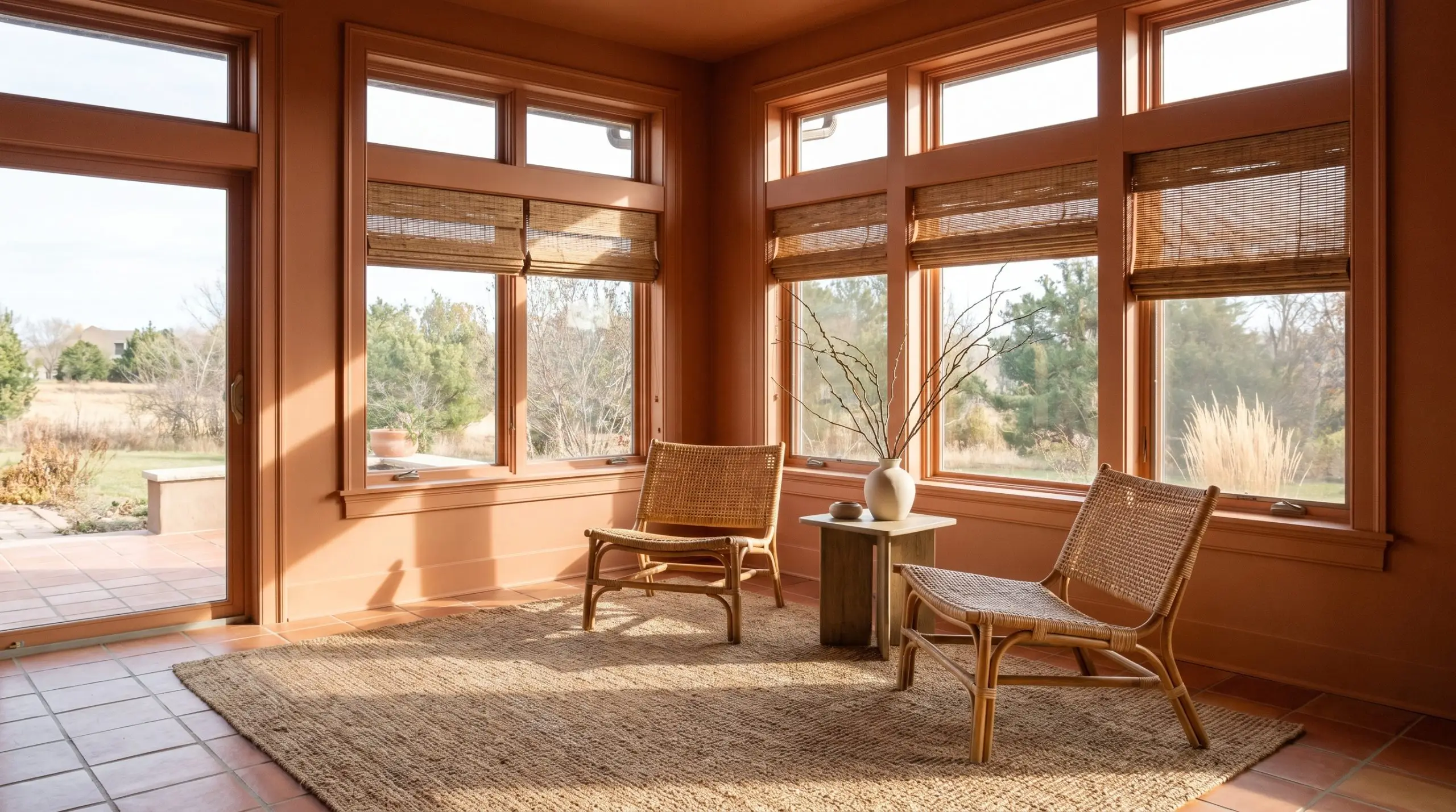
A sunroom flooded with south-facing light will naturally amplify the orange and peach hues of BM AF-215, making the space feel incredibly luminous. This is the perfect environment to execute a Warm Organic Modern aesthetic.
Paint the walls and window casings entirely in this earthy clay hue to blur the lines between the interior architecture and the outdoor landscape. Pair the walls with highly tactile, natural materials like terracotta floor tiles, woven rattan accent chairs, and a jute rug to reinforce the organic vibe.
If the afternoon sun makes the color feel too vibrant, install woven wood shades to filter the light and introduce a layer of stabilizing texture. Add oversized branches in a minimal ceramic vase to complete the morning coffee retreat.
Powder Rooms
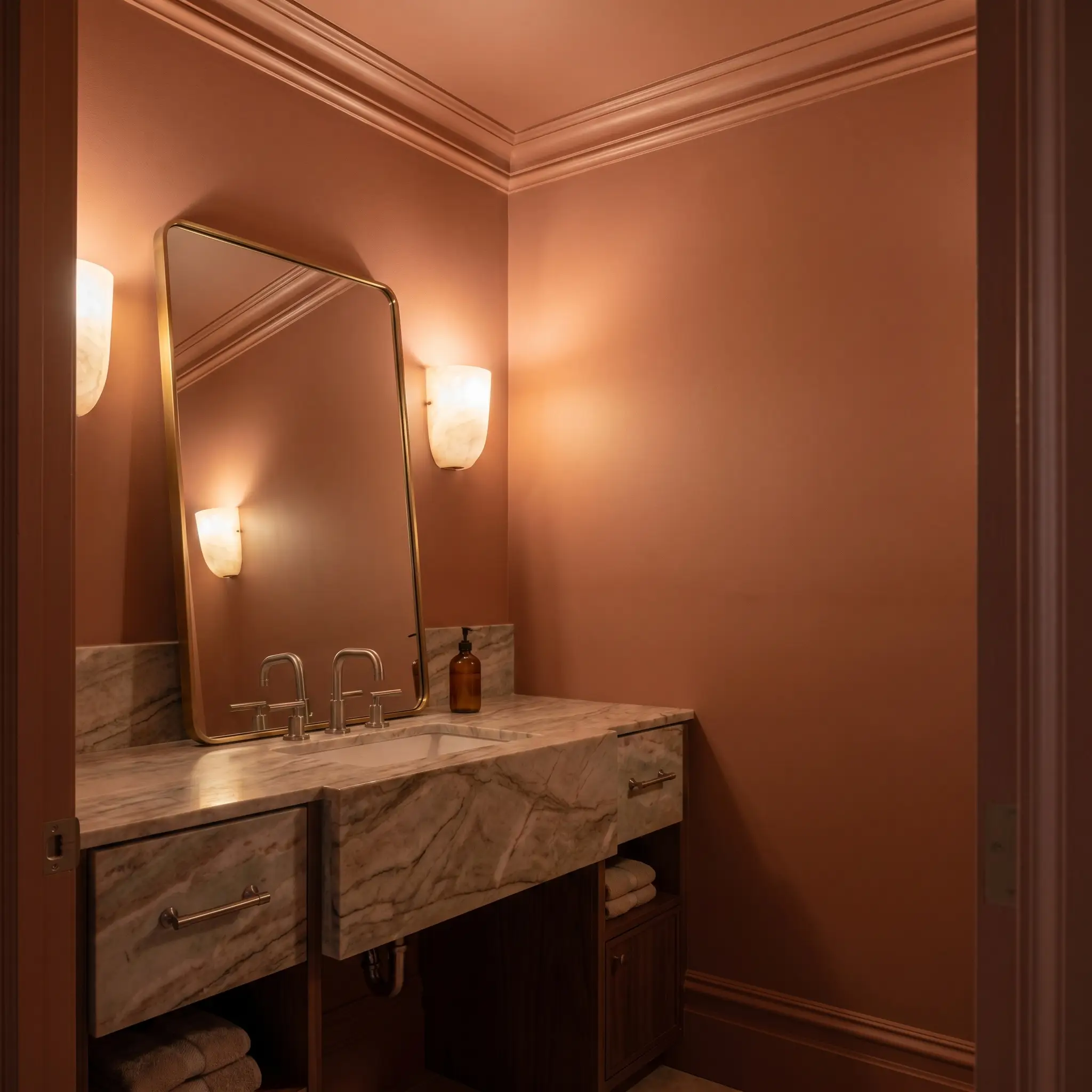
Powder rooms are the ideal architectural canvas for high-impact transformations, and this mid-tone warmth excels in these tight footprints. Treat the small space like a moody jewel box by applying the paint to every surface, including the baseboards, crown molding, and ceiling.
This color-drenching technique eliminates visual boundaries, turning a standard half-bath into a highly intentional, custom-built experience for your guests.
Do not pair this rich terracotta with stark, icy white porcelain sinks or cool-toned LED vanity lights. The jarring temperature difference will make the paint look muddy. Instead, opt for honed marble countertops, warm alabaster sconces, and brushed nickel hardware to maintain a cohesive, premium atmosphere.
Clash Warning (The Sterile Fixture Trap)
To elevate the styling, hang an oversized leaning mirror with a delicate brass frame to bounce light around the room.
Home Libraries
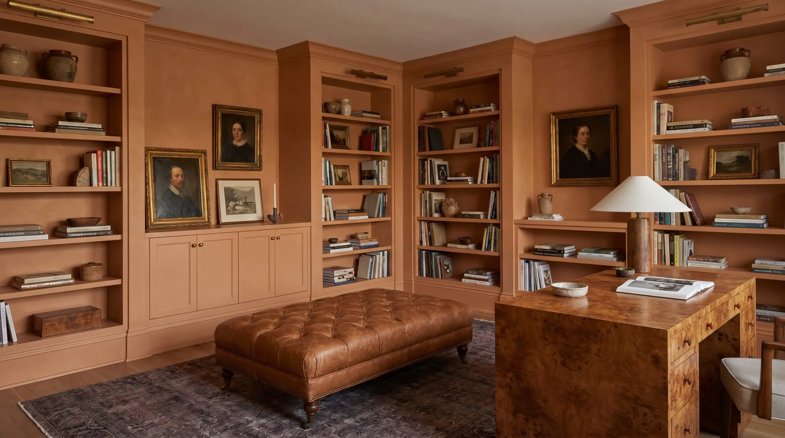
When applied to a home library or study, Italianate strips away the stuffiness of traditional dark academia and replaces it with an inviting, tactile warmth. To maximize the impact, paint both the walls and the built-in bookcases in the exact same finish.
This monolithic application allows your stacked art books, vintage oil portraits, and decorative objects to become the true focal points of the room. Contrast the painted millwork with a mid-century teak credenza or a burl wood desk to introduce a sophisticated wood grain that plays perfectly off the warm tan cast.
For textiles, layer a distressed leather tufted ottoman over a vintage rug with subtle plum and charcoal tones. This combination creates a profoundly quiet, centering retreat perfect for evening reading.
Designing with Benjamin Moore Italianate: Material Pairings and Palettes
This mid-tone terracotta requires intentional material boundaries to prevent its inherent warmth from bleeding uncontrollably across a room. Its muted peach base thrives when physically separated by crisp architectural lines or grounded by highly textured, light-absorbing textiles.
Best Trim and Architectural Boundary Colors
Tactile Materials and Hardware Integrations
Complementary Paint Palettes
Curated Aesthetic Concepts
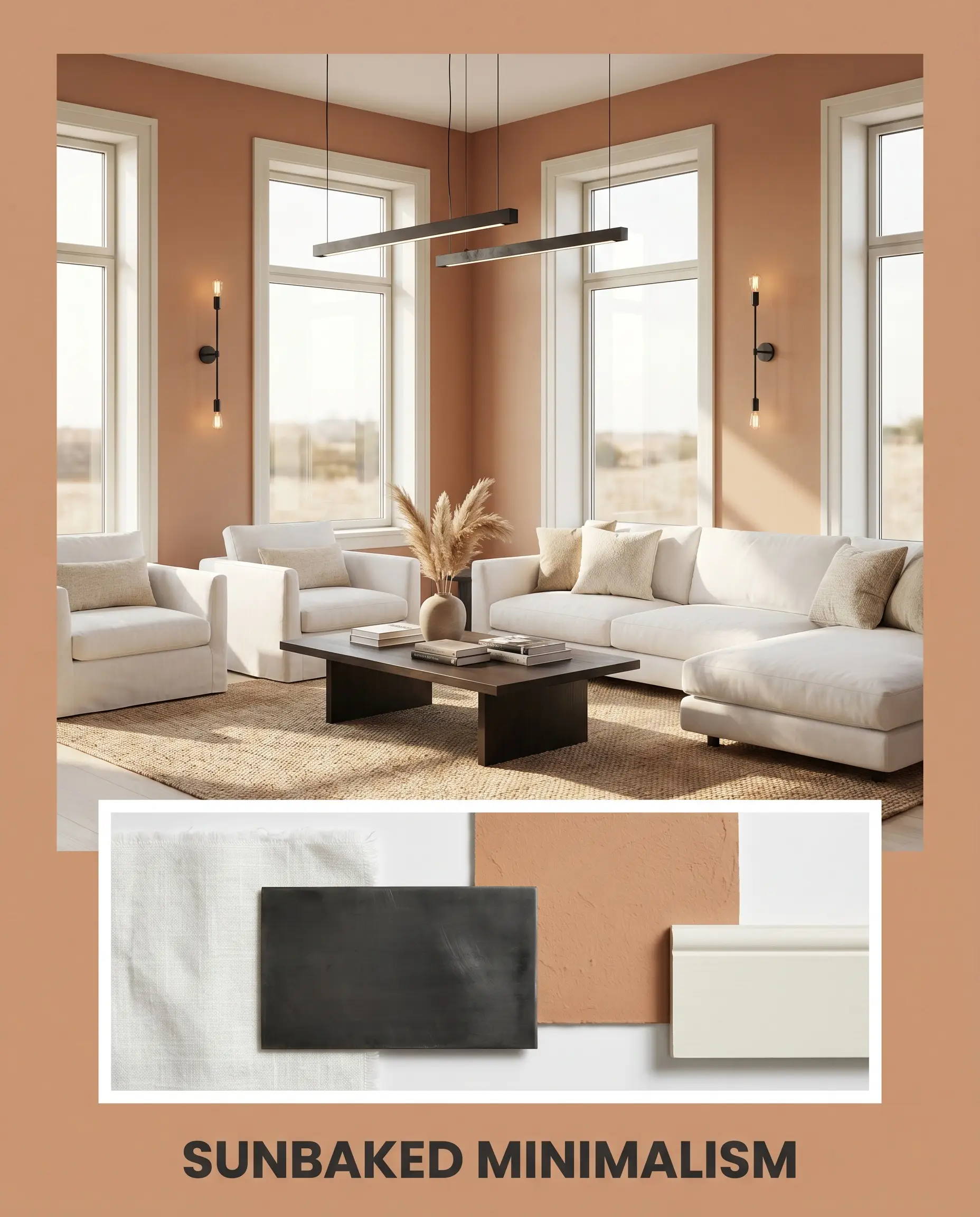
Sunbaked Minimalism This aesthetic relies on stripping away excess decor to let the raw, baked terracotta structure of the walls dictate the energy of the space. Contrast is your greatest tool here. Pair the earthy clay hue with sleek matte black iron lighting fixtures and clean, unadorned window casings painted in White Dove OC-17. Introduce low-profile furniture upholstered in crisp white washed linen to create a sharp, highly intentional visual dialogue that feels effortlessly modern.
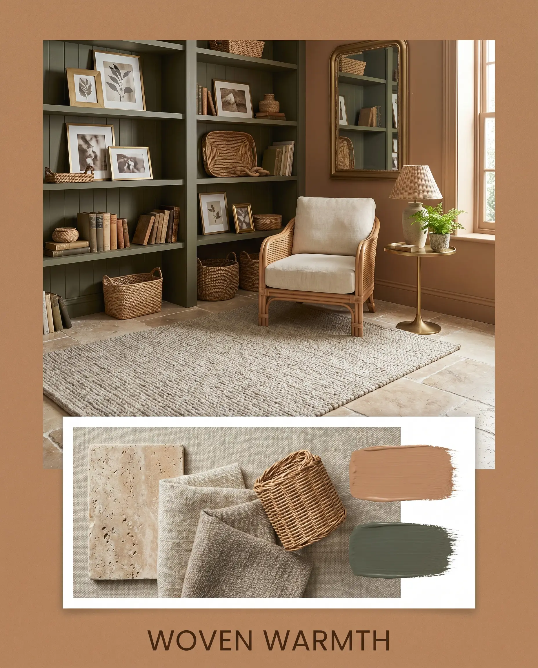
Woven Warmth If you want to amplify the deeply comforting, organic nature of this color, lean into a palette dominated by varied physical textures. Anchor the room with tumbled travertine floors and layer a thick, slub linen rug to absorb the ambient light. Paint secondary accent doors or built-in shelving in Sherwin-Williams Rosemary to introduce a natural, stabilizing forest tone. Finish the styling with unlacquered brass picture frames and woven rattan accents to build an environment that feels profoundly collected and serene.
Comparing the AF-215 Pigment Against Rival Terracotta Tones
There are specific architectural scenarios where the muted peach base of this color might fail to perform as expected. If your room lacks natural light or if you are trying to match existing red-toned brickwork, you may need to pivot your strategy. Understanding how this shade behaves next to its direct competitors will ensure you make a confident final decision.
Benjamin Moore Italianate vs. Benjamin Moore Tuscany 1208
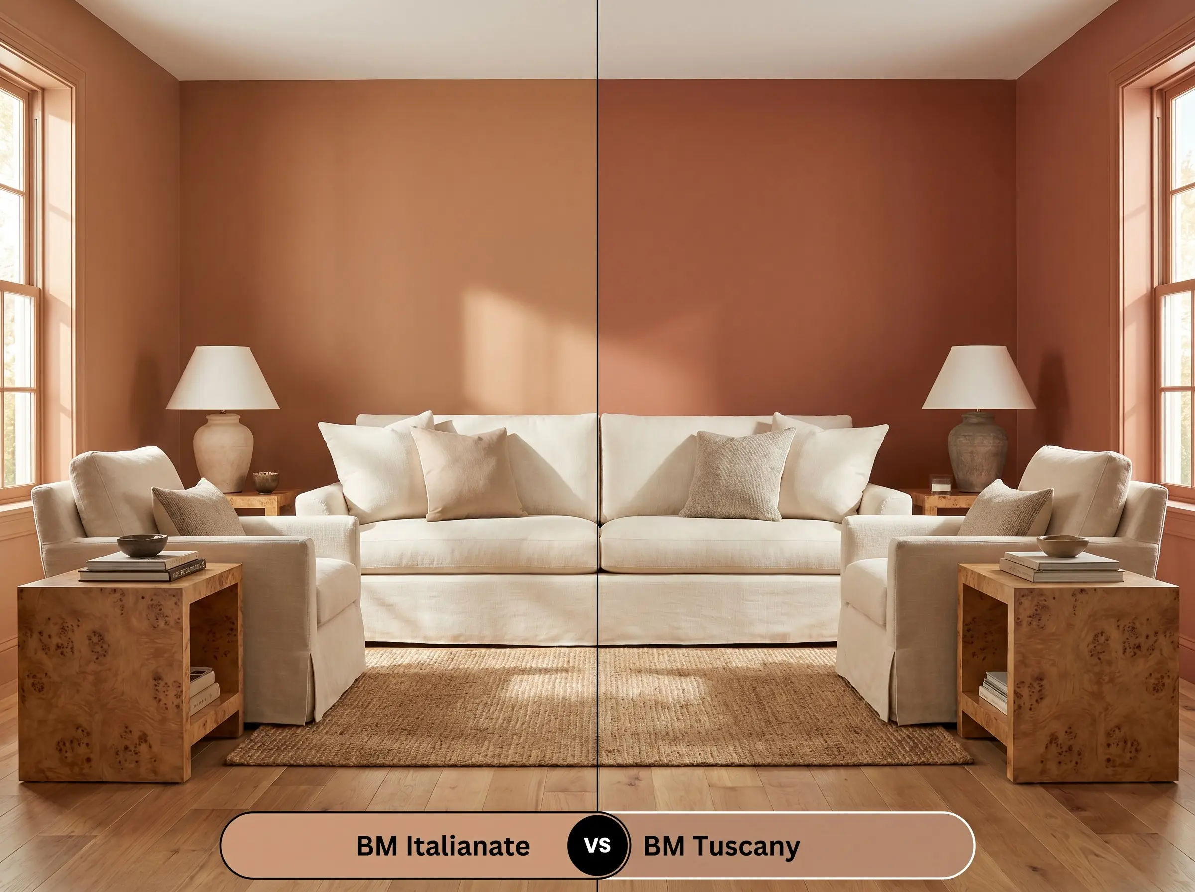
Benjamin Moore Tuscany 1208 carries a much stronger yellow-gold influence in its base compared to the muted peach of our primary color.
If you are designing an exterior facade or a space that requires a brighter, sunnier Mediterranean glow, Tuscany 1208 will reflect more light and feel significantly more vibrant. Conversely, if you want a grounded, subdued clay structure that feels more like natural earth than a bright pigment, stick with Italianate AF-215.
Benjamin Moore Italianate vs. Sherwin-Williams Cavern Clay SW 7701
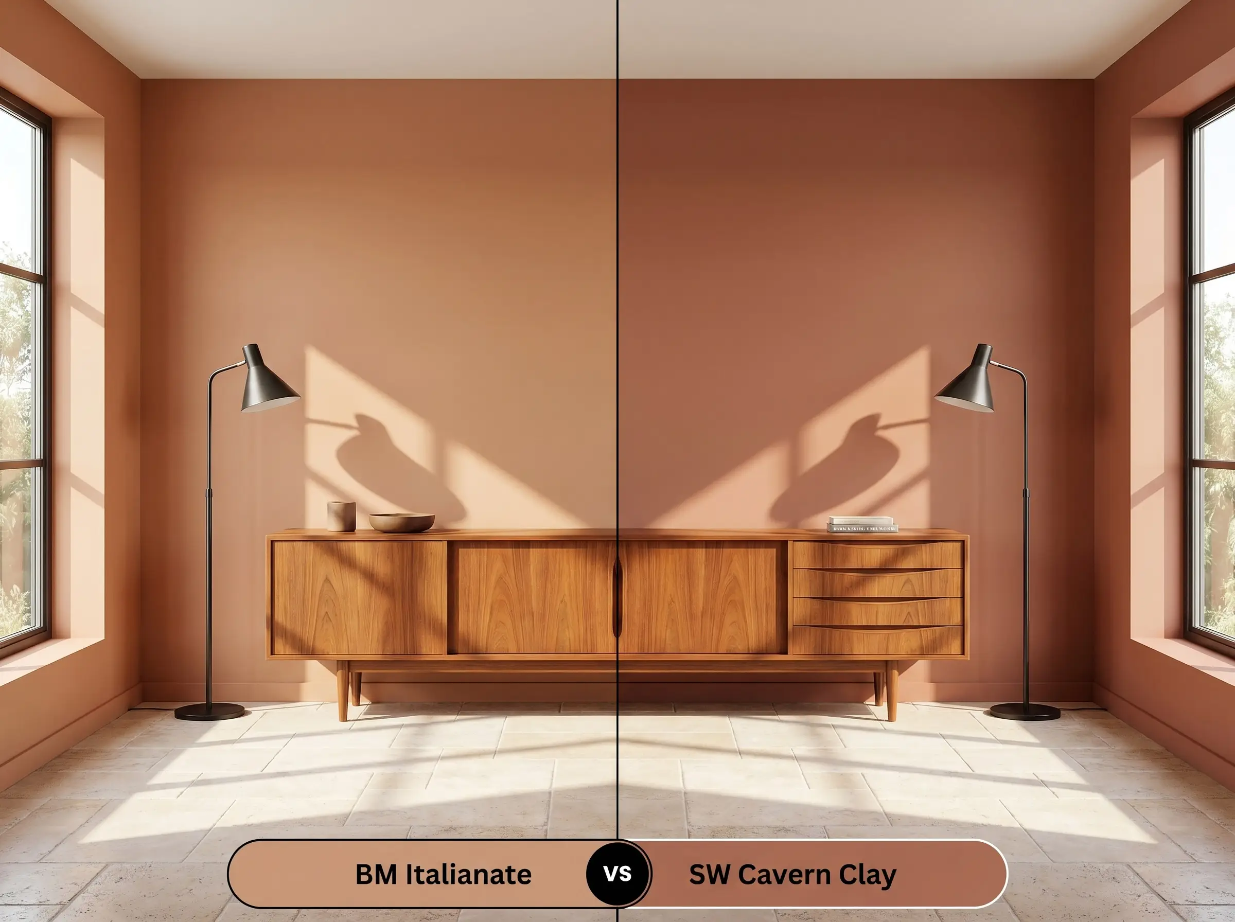
Sherwin-Williams Cavern Clay SW 7701 is a significantly darker, more intense rust-red tone with a noticeably lower LRV.
If you have massive south-facing windows that tend to wash out mid-tone paints, Cavern Clay SW 7701 possesses the sheer pigment density to hold its ground under intense sunlight. However, for standard residential lighting conditions, Italianate provides a far more forgiving, adaptable warmth that will not overpower your everyday furnishings.
Alternative Clay Hues and Exact Brand Matches
Homeowners often finalize their design vision only to realize their chosen paint needs a slight adjustment in depth or a minor shift in undertone to perfectly suit their specific lighting. Whether you need a touch more brown to ground the space or you must switch brands for local availability, these verified alternatives provide immediate solutions.
Same-Brand Alternatives
Cross-Brand Equivalents
Executing Benjamin Moore AF-215 on the Wall
Moving from curatorial design theory to the physical reality of painting requires a strict understanding of how this specific pigment behaves on a roller.
The Sheen and Finish Strategy
Primer Requirements and Coverage Expectations
Frequently Asked Questions
Because stucco is highly textured, it physically deepens the shadows across the facade, making the paint appear richer, darker, and more authentically earthen than it would on a perfectly smooth interior wall.
The crisp, cool gray veins prominent in Calacatta marble will actively fight the warm, earthy clay base of the paint, creating an uncomfortable visual tension. Honed Carrara or warmer stones like Taj Mahal quartzite are far more successful pairings.
Its mid-tone LRV means it will absorb whatever light is available, so relying solely on standard overhead bulbs will make the room feel enclosed. To successfully use it in a basement, you must introduce layered, warm artificial lighting (around 3000K) to activate the luminous peach base.
The intense red tones inherent in cherry wood will compete directly with the terracotta paint, amplifying the heat in the room and making the entire space read as aggressively orange. It performs beautifully alongside neutral white oak or deeply contrasting walnut.
The Final Verdict on Italianate
Benjamin Moore Italianate AF-215 is a masterful, highly intentional architectural color designed for homeowners who want their walls to actively contribute to the warmth of the room. Its absolute best application is within Transitional or Warm Organic Modern spaces where its baked terracotta structure can be balanced by crisp white trim, tactile natural stones, and sleek metallic accents. It is perfect for those looking to infuse a dining room, sunroom, or moody powder room with a sophisticated, stabilizing energy that feels deeply connected to nature.
While this color is highly adaptable, it completely fails when forced into cool-toned, purely gray environments. If your home is currently dominated by icy gray luxury vinyl plank flooring, cool blue-gray cabinetry, or stark white LED lighting, this earthy clay hue will instantly read as muddy and out of place. The paint demands organic warmth to thrive; pairing it with sterile, cool-toned hard finishes creates a jarring temperature clash that undermines the premium aesthetic you are trying to achieve.
Hackrea Pro-Tip (The Undertone Clash)