Heron Plume SW 6070
Sherwin-WilliamsSherwin-Williams Heron Plume (SW 6070) is a feather-light, warm off-white with subtle taupe and violet undertones. Boasting an LRV of 75, it reflects ample light while maintaining a soft, greige-leaning depth, making it an incredibly versatile neutral for both interiors and exteriors.
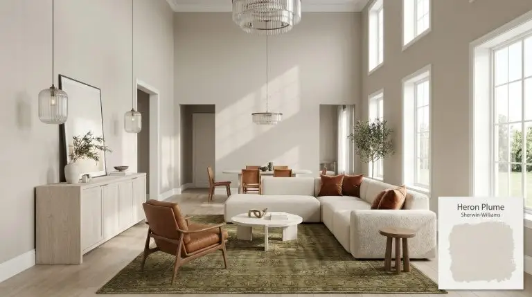
Sherwin-Williams Heron Plume: Sculpting Architecture with a Complex Greige
Most off-whites passively recede into the background, acting as a forgettable backdrop for louder design elements. Sherwin-Williams Heron Plume (SW 6070) actively participates in the room’s visual composition. This nuanced neutral shifts its identity based on the textures and light it touches, functioning more like a foundational building material than a simple coat of paint.
Securing a neutral that feels simultaneously crisp and inviting is a notoriously difficult balancing act. This specific hue solves that tension by suspending a warm, earthy core beneath a highly reactive surface. It provides the necessary visual weight to stabilize soaring ceilings or expansive walls without plunging the space into shadow.
The Core DNA of Sherwin-Williams Heron Plume: Temperature, Undertones & LRV
If you are trying to determine whether this specific shade leans warm or cool, Heron Plume is definitively a neutral-warm hue. It operates as an off-white base that naturally warms up a room without crossing into yellow territory.
Sitting at a Light Reflectance Value of 75, this greige architectural finish strikes a perfect transitional balance. It absorbs enough light to maintain its distinct pigment against bright white trim, yet reflects enough illumination to keep hallways or windowless rooms feeling expansive.
You can apply wallpapers, paints, etc. on walls and see how they look in various interiors.

Navigating Light Shifts and Shadows
Because of its complex undertones, this shade acts as a highly reactive canvas that shifts dramatically as the sun moves across your home.
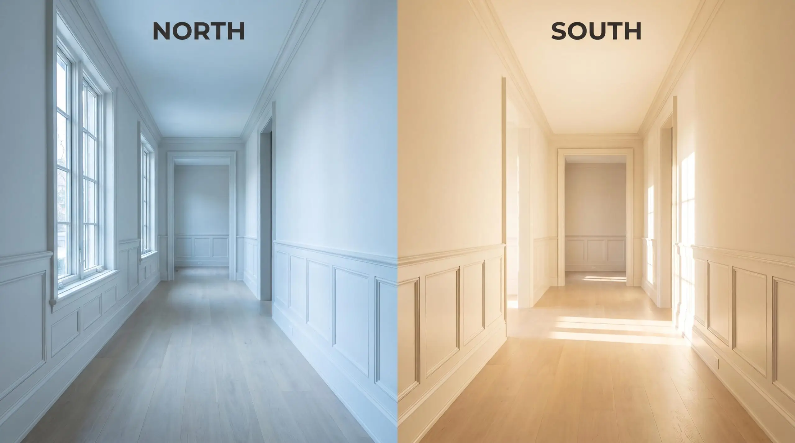
When applying this color to stucco exteriors, remember that direct, unfiltered sunlight will aggressively wash out the nuance. It will often read significantly lighter and closer to a true white outside than it does on an interior paper swatch.
Hackrea Pro-Tip (The Exterior Washout)
Architectural Applications and Styling Pairings
The versatility of this specific neutral allows it to transition effortlessly from expansive architectural walls to highly detailed millwork. Here is how to manipulate its shifting tones across different environments and design styles.
Transitional Kitchen Cabinetry
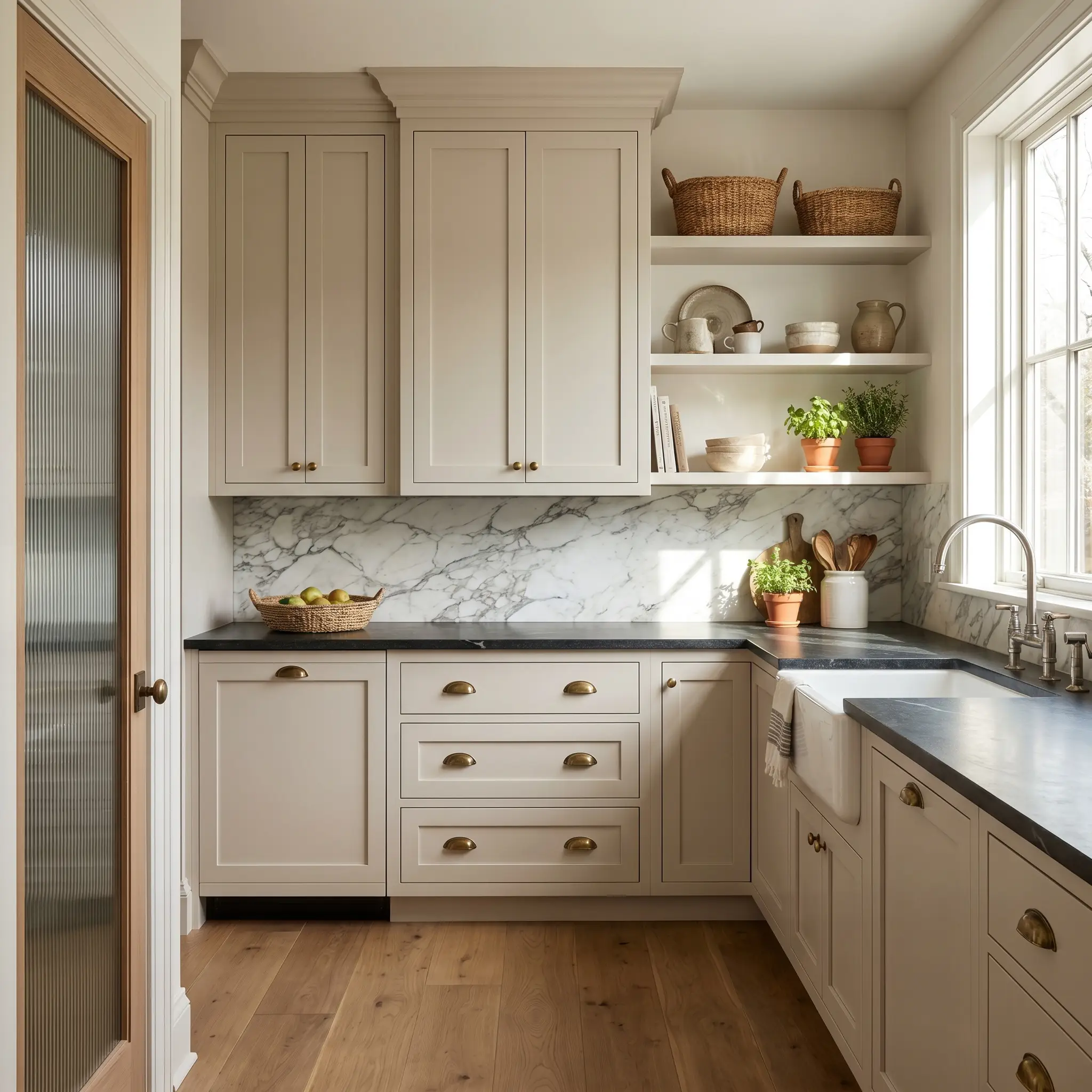
Replacing stark white cabinets with this nuanced off-white instantly injects a sense of heritage into a standard kitchen footprint. Apply it to classic shaker profiles paired with a premium honed soapstone countertop to stabilize the space with organic contrast. Unlacquered brass cup pulls and a heavily veined marble backsplash will draw out the subtle taupe-gray notes, creating an English-inspired, organic modern aesthetic.
For bustling family kitchens, this tone is highly forgiving against daily wear and tear while maintaining a crisp, tailored look. Always test your cabinet paint in a satin or semi-gloss finish, as the higher sheen will reflect light differently than your flat wall samples.
Open-Concept Living Areas
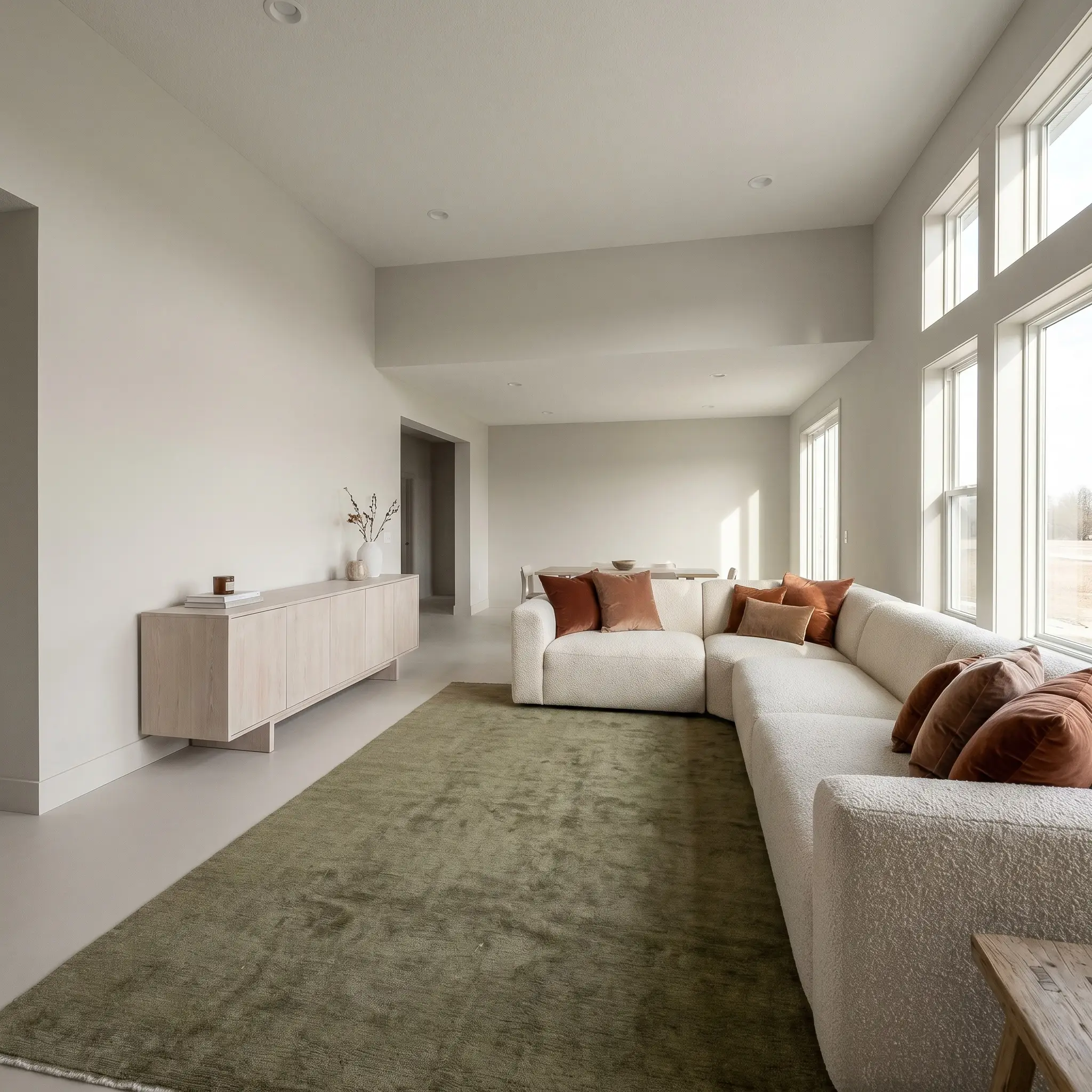
In sprawling, multi-use living spaces, this shade provides a unifying foundation that prevents the room from feeling hollow. Coat both the walls and the baseboards in the same flat finish to blur the architectural boundaries, creating a seamless, soft-minimalist envelope. Anchor this expansive canvas with a bleached white oak credenza and a low-profile boucle sectional to emphasize the color’s inherent warmth.
Layering in rust-toned velvet pillows or an olive green vintage rug will beautifully offset the subtle cool undercurrent hiding in the paint.
Avoid pairing this complex greige with heavily yellow-based creams or stark, blue-toned whites on your trim. The contrast will force the walls to look unexpectedly purple or dingy. Stick to clean, neutral whites like Sherwin-Williams High Reflective White for your ceilings and moldings.
Clash Warning (The Yellow Trap)
Shaded Stucco Exteriors
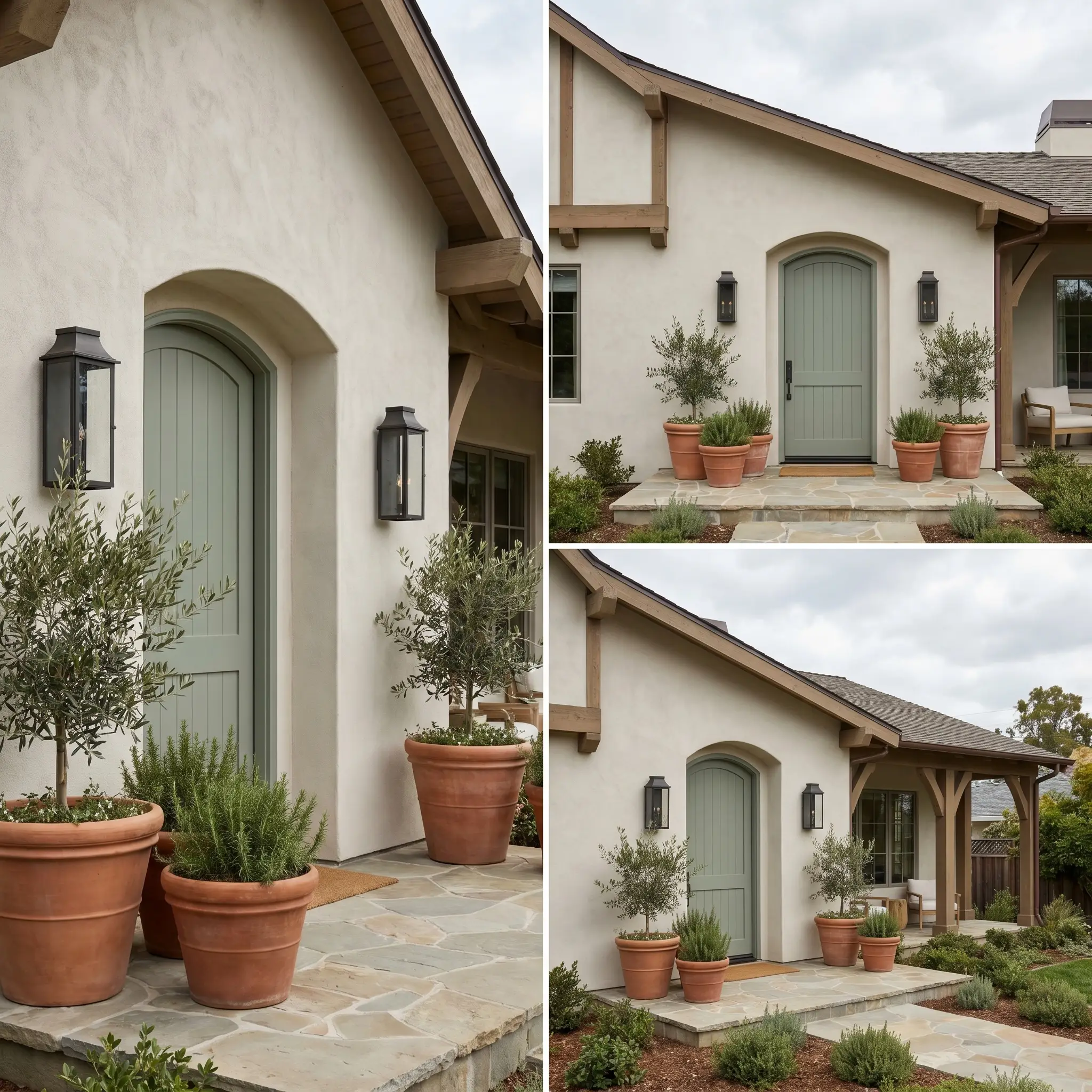
When applied to textured exterior surfaces, this hue completely transforms under changing weather conditions. On shaded stucco exteriors, the lack of direct, blinding sunlight allows the rich taupe undertones to hold their ground, preventing the facade from looking stark or unfinished. Pair it with dark, blackened steel sconces and a muted sage green front door to cultivate a relaxed, coastal Mediterranean or Modern Tudor aesthetic.
Flanking the entryway with oversized terracotta planters will naturally complement the earthy greige base.
Primary Bedrooms
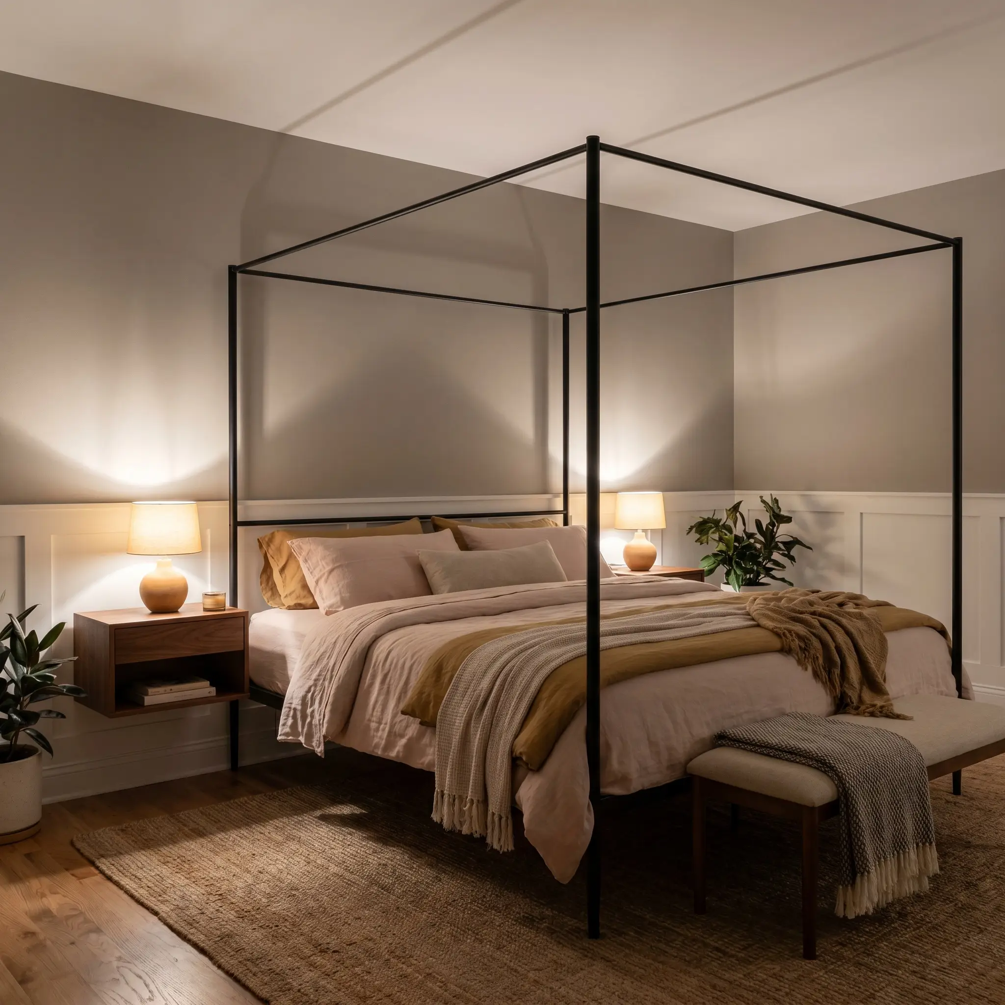
To cultivate a restful, boutique-hotel retreat for busy professionals, utilize this shade to soften the hard architectural angles of the room. Apply it above crisp white wainscoting to create a grounded, elegant horizon line that wraps around the sleeping area. Introduce an iron canopy bed and layer the mattress with washed linen sheets in soft blush or muted mustard to interact dynamically with the shifting evening shadows.
A pair of floating walnut nightstands will inject just enough organic warmth to balance the cooler evening light.
Coordinating Colors for Sherwin-Williams Heron Plume
Heron Plume requires highly intentional material boundaries to prevent its soft violet micro-nuance from bleeding into surrounding surfaces. This off-white base thrives when flanked by contrasting textures that ground its airy Light Reflectance Value rather than tonal matches that blur its edges.
Trim & Baseboards
Hardware, Wood & Material Pairings
Coordinating Colors
Tactile Silence
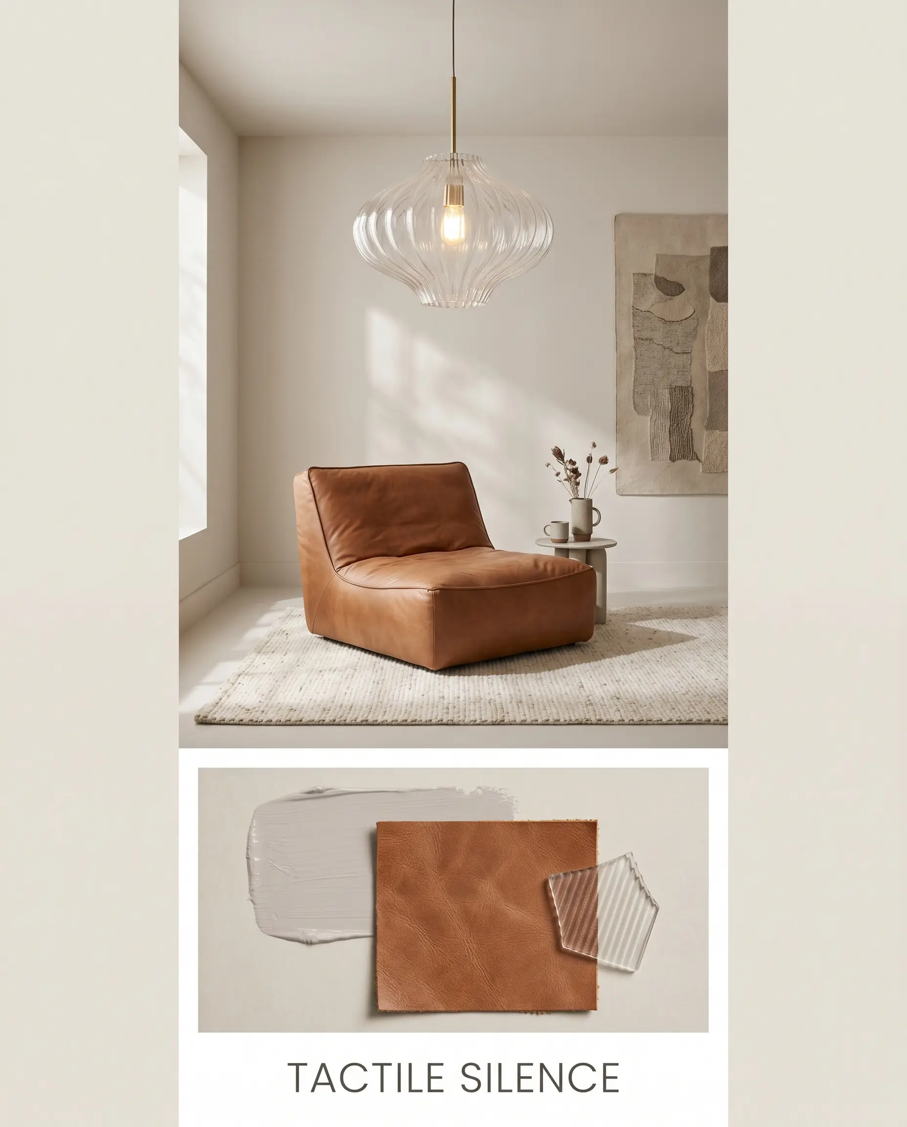
Anchored by the soft, dusty romance of Farrow & Ball Peignoir, this palette relies on quiet textural shifts rather than loud color contrasts. Incorporate warm saddle leather lounge chairs and fluted glass lighting fixtures to build a deeply serene, soft-minimalist atmosphere. The earthy greige walls simply absorb the natural light, allowing the organic materials and low-profile furniture silhouettes to dictate the room’s gentle energy.
Muted Heritage
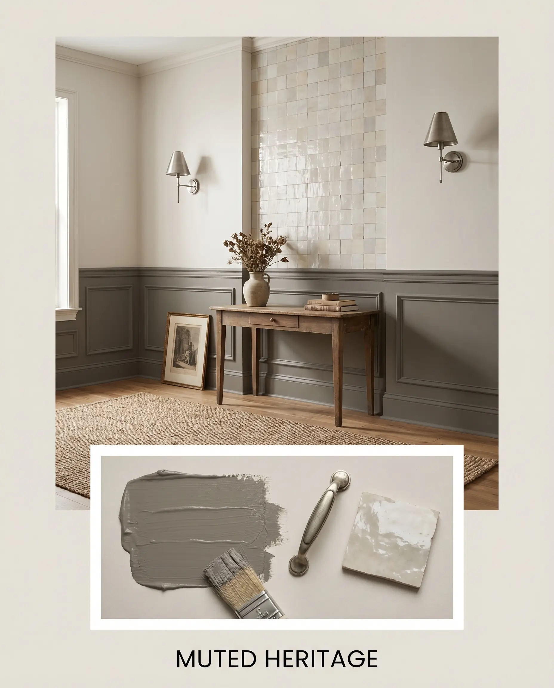
This high-contrast aesthetic utilizes the rich depth of Benjamin Moore Chelsea Gray to forcefully ground the airy off-white walls. Introduce aged brushed nickel hardware and premium hand-glazed zellige tile to bounce light across the tailored, historic-leaning color story. The resulting vibe is highly curated and intentional, balancing traditional architectural weight with a clean, modern edge.
Comparing Greige Architectural Finishes
While this specific taupe-gray hybrid is incredibly versatile, certain architectural exposures demand a different foundational base. If your space features heavily tinted windows or receives exclusively north-facing light, the violet nuance may pull too cold, requiring a shift toward a warmer or cleaner alternative.
Sherwin-Williams Heron Plume vs. Sherwin-Williams Shoji White SW 7042
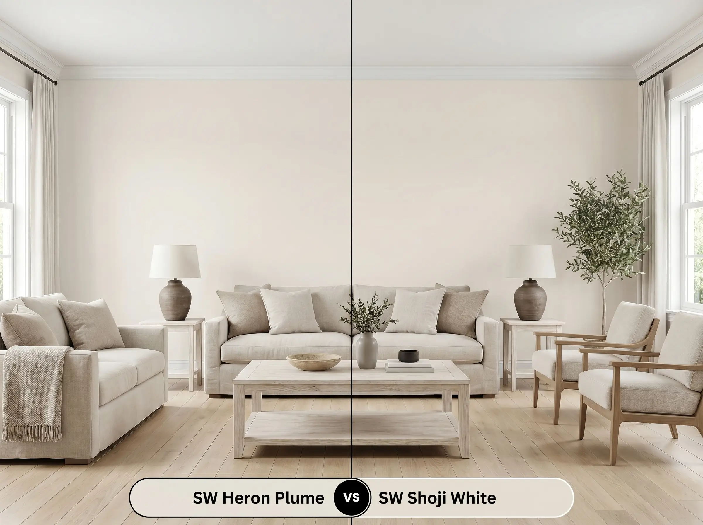
If your room lacks natural light and feels inherently chilly, then Sherwin-Williams Shoji White SW 7042 is the superior choice. Shoji White carries a noticeably warmer, creamier base that actively combats cold shadows. It sacrifices the tailored taupe edge to deliver a cozier, more traditional off-white glow.
Sherwin-Williams Heron Plume vs. Sherwin-Williams White Duck SW 7010
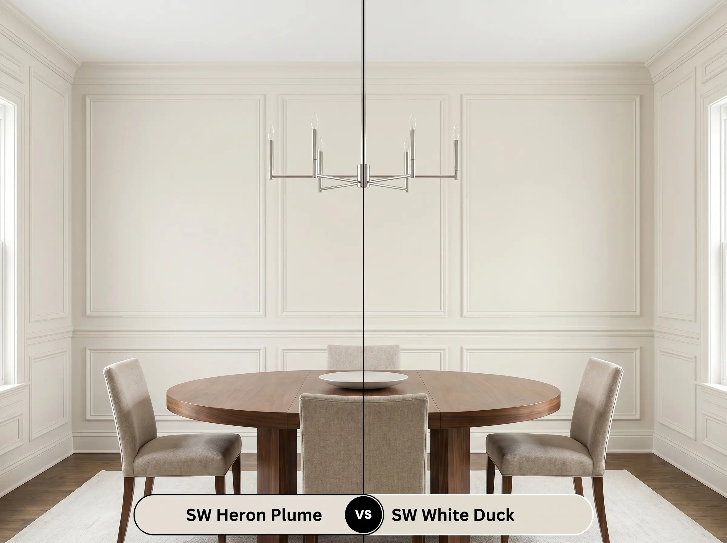
If you need a more straightforward, predictable greige without the risk of purple undertones, then Sherwin-Williams White Duck SW 7010 performs beautifully. White Duck shares a similar depth but leans further into a classic beige-gray structure. This makes it significantly safer for homes with extensive wood trim that might clash with complex, cooler nuances.
Sherwin-Williams Heron Plume vs. Sherwin-Williams Aesthetic White SW 7035
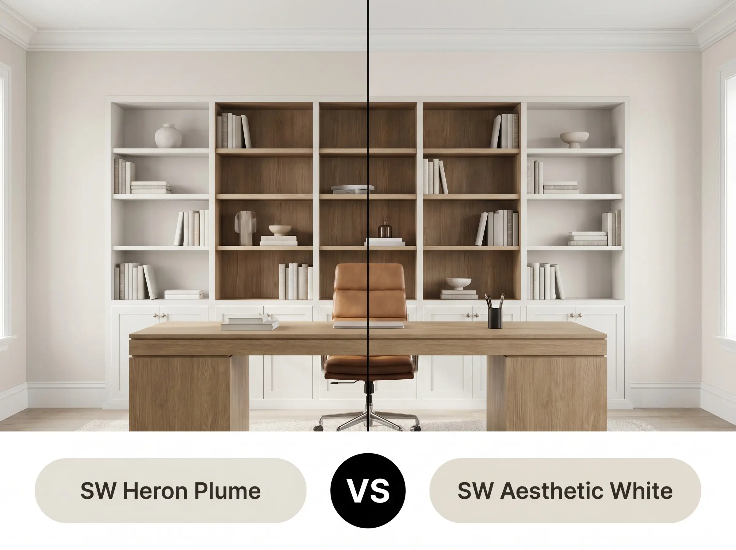
If your design requires a slightly lighter, more luminous finish, then Sherwin-Williams Aesthetic White SW 7035 provides an excellent pivot. Aesthetic White has a slightly higher Light Reflectance Value and a cleaner, less saturated profile. It offers a very similar taupe-leaning aesthetic but feels notably brighter and more expansive on the wall.
Alternative Off-White Bases and Matches
Finding the exact visual equivalent often comes down to minute shifts in depth or navigating local paint availability.
Similar Colors
Cross-Brand Matches
Applying Sherwin-Williams Heron Plume
Transitioning this complex greige from a tiny paper swatch to a fully cured wall requires strict attention to surface preparation and sheen selection.
The Dynamic Sheen Guide
Primer Strategy
A high-quality, bright white acrylic primer is absolutely mandatory. Because this shade relies on a delicate balance of violet and taupe, painting directly over old, warm-toned walls will permanently distort the final color structure.
Coverage & Success Tips
Expect to roll a minimum of two full coats to achieve the true, opaque depth of its 75 LRV. Always maintain a wet edge while rolling. This specific pigment mixture is prone to flashing, meaning any overlapping dry roller marks will be highly visible in direct sunlight.
Frequently Asked Questions
Because intense exterior sunlight washes out subtle undertones, this color rarely reads as purple outdoors. Instead, the bright UV light strips away the taupe, leaving a remarkably clean, soft off-white facade that pairs beautifully with dark architectural accents.
At 3000K, artificial lighting casts a distinctly warm, yellow glow that will amplify the earthy greige base. This prevents the hallway from feeling like a sterile tunnel, though you will lose the crisp, tailored taupe edge seen in natural daylight.
This pairing is highly successful because the subtle violet micro-nuance in the paint naturally speaks to the cool gray veining in the marble. The off-white base provides just enough earthy warmth to prevent the kitchen from feeling like a clinical commercial space.
The strong yellow-orange base of honey oak will actively pull the hidden purple undertones out of this paint, often creating an unintentional, muddy clash. If you cannot refinish the floors, you are better off selecting a warmer, creamier off-white to harmonize with the wood.
The Final Verdict on Heron Plume
Sherwin-Williams Heron Plume is an incredibly sophisticated architectural tool designed for homeowners who want the crispness of a modern white with the grounding comfort of an earthy greige. It excels in organic modern living spaces, tailored transitional kitchens, and serene bedroom retreats where tactile materials can directly interact with its shifting undertones. This hue is perfect for those who understand that true luxury lies in subtlety, offering a dynamic backdrop that shifts beautifully from morning light to evening shadows.
Despite its immense versatility, this specific color profile will actively fight against prominent yellow-pigmented environments. If your home features dominant honey oak trim, Tuscan-style travertine floors, or exclusively warm amber lighting, this paint is not for you. The intense yellow surrounding the paint will immediately agitate its hidden violet micro-nuance, causing the walls to look uncomfortably purple or permanently dingy. In these spaces, you must pivot to a significantly warmer, cream-based neutral to maintain visual harmony.
Hackrea Design Secret (The Undertone Collision)