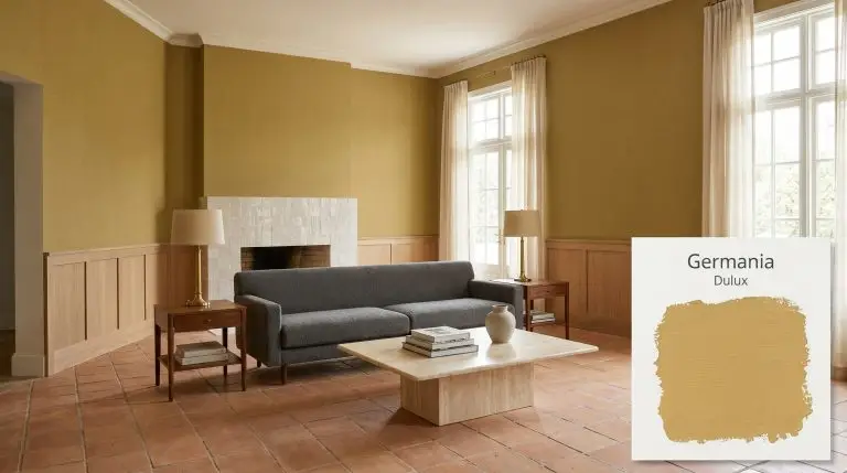
Germania S15F4
DuluxDulux Germania (S15F4) is a vibrant, warm mustard-gold with an LRV of 59. Part of the 2026 Evoke palette, this earthy yellow creates a happy, bright environment, perfect for adding depth and character to living areas, dining spaces, and entryways.
Dulux Germania: How to Master This Earthy Mustard-Gold Architectural Finish
Yellow is often treated as a liability in interior design, frequently dismissed by homeowners as either too juvenile or aggressively bright. Dulux Germania completely dismantles that hesitation. Featured prominently in the Evoke palette 2026, this specific mustard-gold hue behaves more like a baked clay than a primary color.
When you apply this warm yellow architectural finish to your walls, it immediately establishes a sense of history and permanence. It does not shout for attention; rather, it wraps the room in a sophisticated, sun-baked warmth.
To successfully use a color with this much personality, you must treat it as a foundational material rather than just a decorative afterthought. Its success relies entirely on how you pair its complex chromatic profile with your lighting, textiles, and hard finishes.
Dulux Germania: Temperature, Undertones & LRV
Dulux Germania is a definitively warm paint color. It bypasses the sharp, acidic qualities of standard yellows and instead leans entirely into a rich, earthy spectrum.
When you examine its color structure, you will find a highly intentional blend of pigments:
With a Light Reflectance Value (LRV) of 59, Germania operates as a sturdy mid-tone light reflectance option. It absorbs just enough ambient light to make a room feel substantial and cozy, while bouncing enough illumination back into the space to prevent the walls from feeling restrictive or overly shadowed.
You can apply wallpapers, paints, etc. on walls and see how they look in various interiors.

Lighting Effects & The Chameleon Factor
Because of its complex ochre base, this paint is highly reactive to the temperature of the light hitting it.
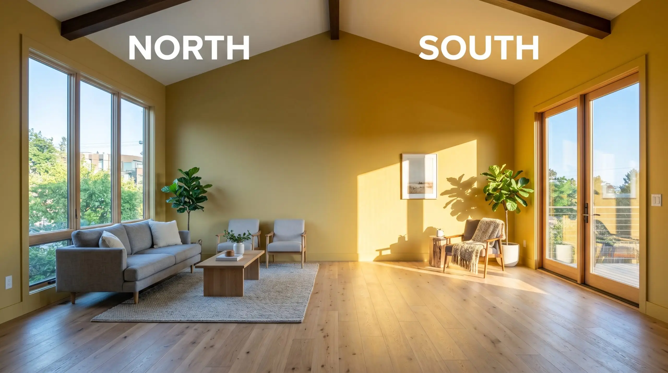
Never use daylight bulbs (4000K+) with this paint. The stark, blue-leaning light will clash aggressively with the caramel undertones, making the walls look sickly and green-tinged rather than warm and inviting.
Hackrea Pro-Tip (The Bulb Rule)
Styling Germania in Everyday Spaces
The true value of this mustard-gold hue lies in its ability to adapt to entirely different design aesthetics based on what you place next to it. By manipulating your textiles and hard finishes, you can push the paint from a retro revival into a highly refined, contemporary space.
Dining Rooms
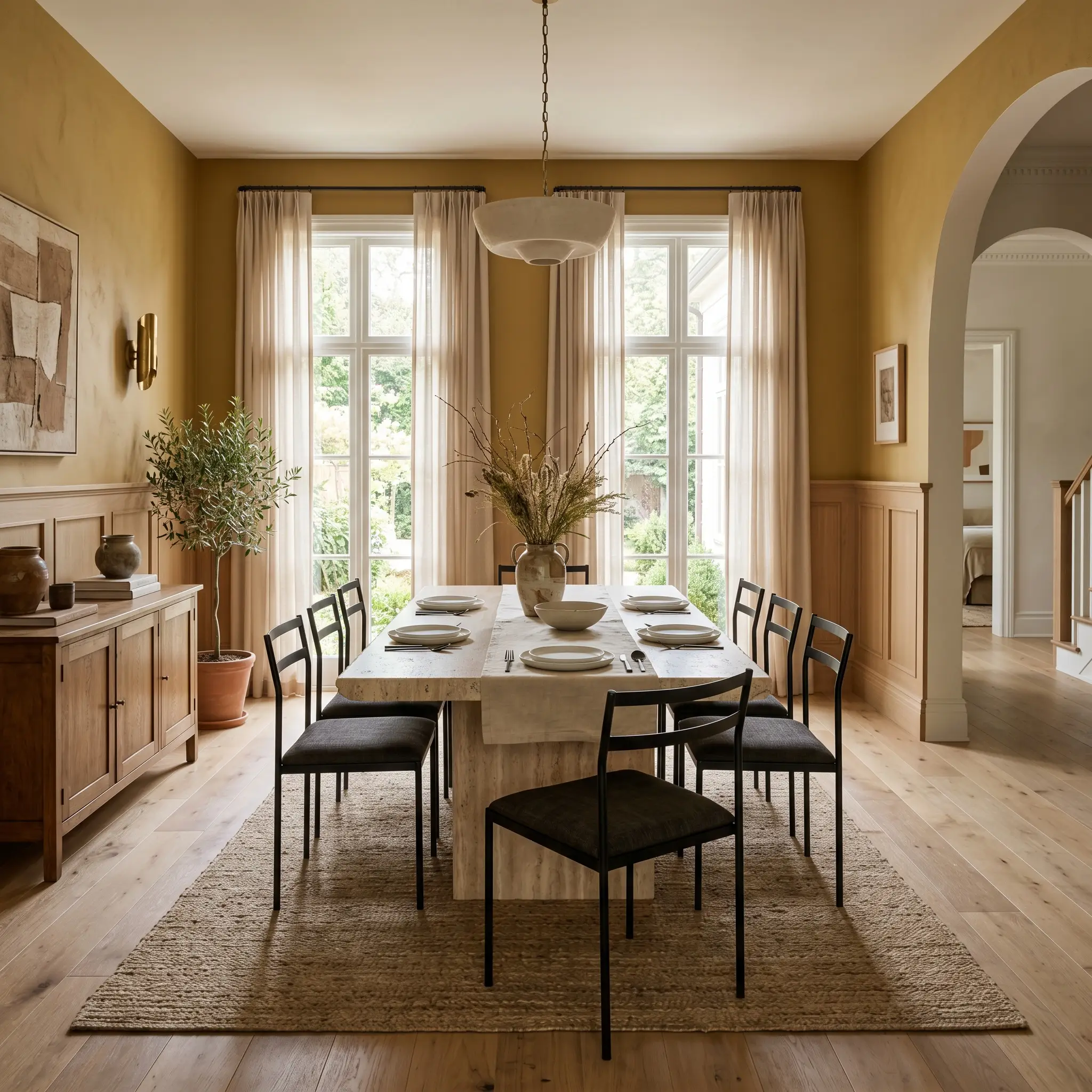
For the avid dinner party host, this color creates an immediate sense of evening intimacy without resorting to standard dark blues or greens. Apply the paint above a crisp, white oak wainscoting to balance the visual weight and keep the room feeling tailored.
To push the room into a Contemporary Artisan aesthetic, pair the golden walls with raw, tactile materials. A honed travertine dining table surrounded by blackened steel chairs creates a beautiful tension against the warm walls. Add a sheer wool window treatment to softly filter the natural light during daytime meals.
Entryways and Hallways
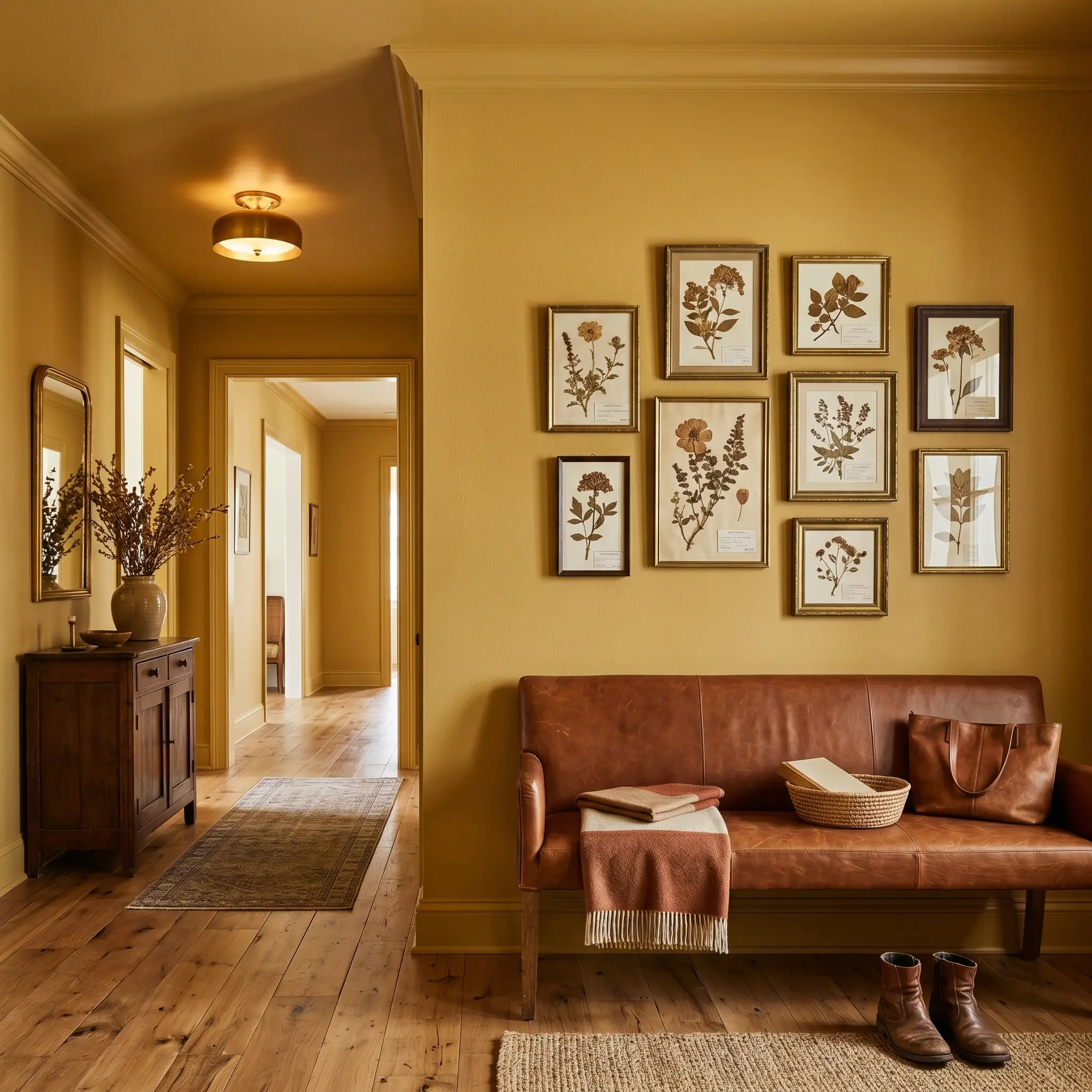
Pass-through spaces are the perfect opportunity to commit to bold, saturated color without overwhelming your daily living areas. Execute a full color drench—painting the walls, trim, and ceiling in the same finish—to turn a basic hallway into a glowing, jewel-box experience.
Because the color structure naturally leans earthy, it pairs beautifully with organic textures. Place a saddle leather bench against the wall and hang an asymmetrical gallery of vintage botanical pressings. The rich leather and muted greens of the artwork will harmonize perfectly with the caramel undertones.
Casual Living Areas
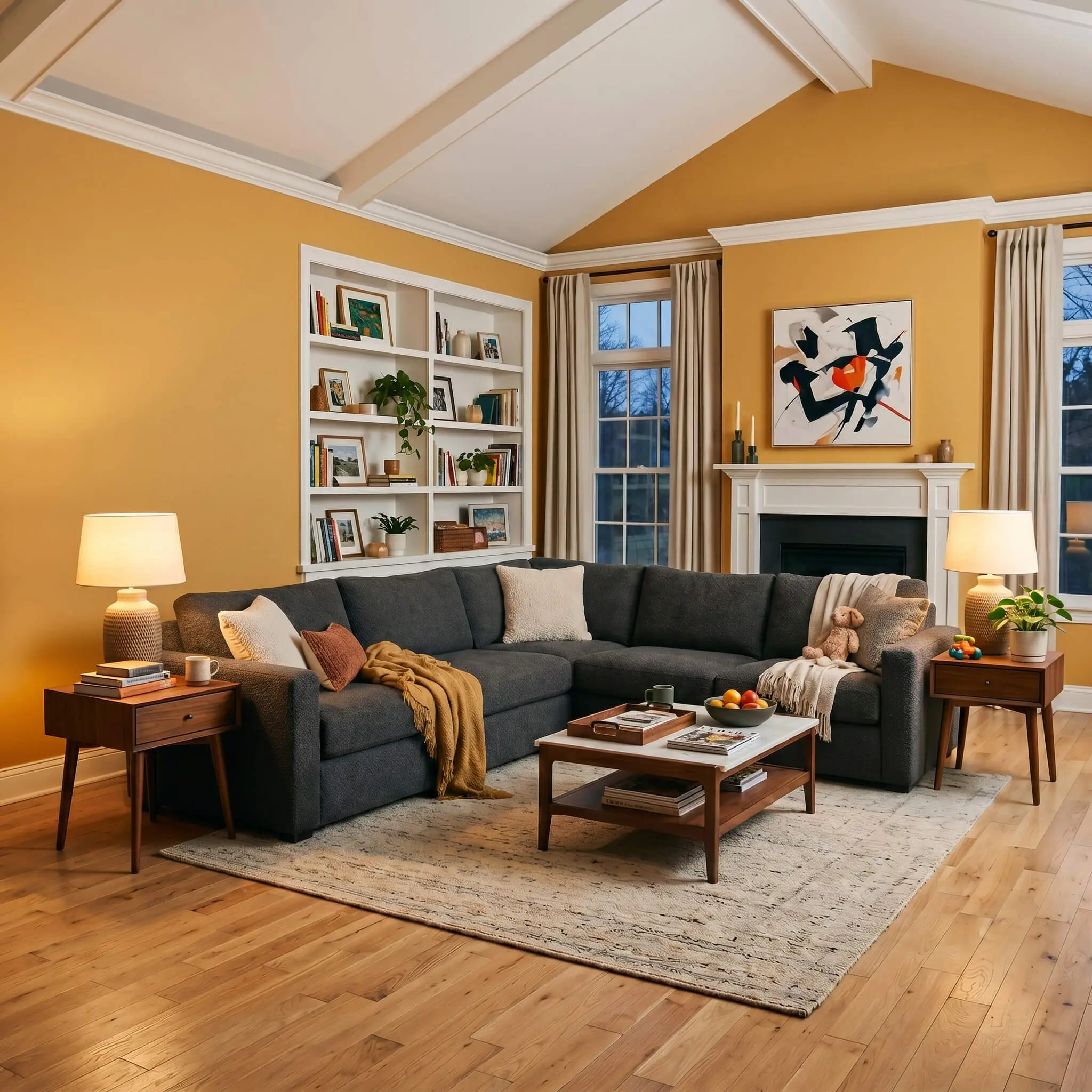
In a busy family living room, this paint provides a durable, forgiving backdrop that hides everyday scuffs far better than stark white. To modernize the look and avoid a stereotypical 1970s theme, contrast the warm walls with cool, highly textured fabrics.
Center the room with a massive, charcoal-gray boucle sectional. The cool gray absorbs the warmth of the walls, creating a perfectly balanced seating area. Flank the sofa with mid-century walnut side tables and top them with ceramic table lamps to cast a warm, 2700K glow across the ochre finish in the evenings.
While a textured charcoal fabric works beautifully, you must avoid cool, blue-toned gray paints on adjacent walls or trim. The icy blue undertones will fight the baked yellow base, making the entire living area feel disjointed and visually jarring.
Clash Warning (The Cool Gray Trap)
Home Offices
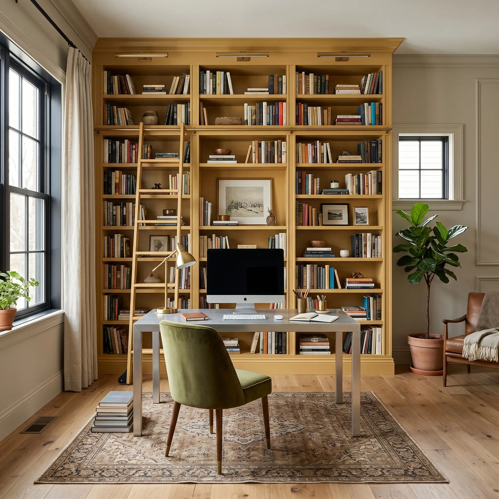
For the remote-working creative, this color fosters an energized but focused atmosphere. Paint your floor-to-ceiling built-in bookcases in this shade, using a durable satin finish to withstand the friction of sliding books and storage boxes.
The mid-tone light reflectance ensures the office feels substantial and academic without requiring massive windows to keep it bright. Pair the golden built-ins with a sleek, brushed aluminum desk and an olive green velvet desk chair. The metallic sheen of the aluminum cuts through the earthy warmth, keeping the workspace feeling sharp and professional.
Kitchen Cabinetry (Accent)
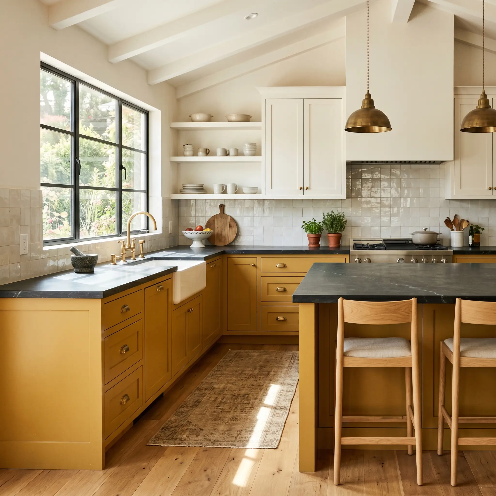
If you want to inject warmth into a kitchen without committing to an entire wall, use this hue on your lower cabinets or a central island. Pair it with warm white upper cabinets to maintain a bright, open feeling in the cooking space.
This application shines when combined with deeply veined, dark stone. Top the mustard cabinets with a matte soapstone countertop and use unlacquered brass hardware to echo the golden tones. Finish the space with a glossy, off-white zellige tile backsplash to bounce natural light around the room and highlight the rich, caramel micro-nuance of the cabinetry.
Coordinating Colors & Best Pairings
When placed next to other materials, this baked yellow pigment requires highly intentional boundaries to maintain its sophisticated edge. It thrives when pushed against crisp, contrasting elements rather than bleeding softly into similar warm tones.
Framing the Mustard Wall
Tactile Materials and Finishes
Secondary Palette Additions
Curated Aesthetic Blueprints
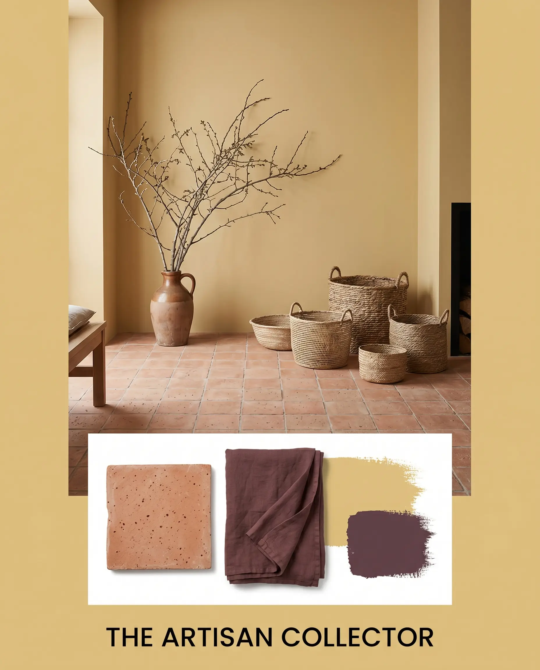
The Artisan Collector This palette feels incredibly grounded and tactile, evoking the relaxed energy of a global traveler’s retreat. The porous terracotta floors absorb the bright energy of the walls, while soft touches of dusty purple textiles, like a Misty Grape linen throw, create a calming, unexpected visual break. Finish the styling with oversized branches in ceramic jugs and woven baskets to emphasize the organic, earthy ochre cast.
Tailored Heritage Here, the atmosphere shifts into a refined, scholarly mood that feels both established and inviting. The crisp Van Deusen Blue contrast on the trim sharpens the warm yellow finish, while the rich walnut furniture and ribbed glass textures add layers of quiet sophistication. Layering stacked art books and unlacquered brass candlesticks on a mid-century credenza completes this highly curated, intellectual vibe.
Dulux Germania vs. The Competition
When evaluating a bold ochre, your room’s natural light exposure will dictate whether you need a deeply saturated pigment or a softer, more muted alternative. If your space lacks natural light, certain rivals will perform significantly better by preventing the walls from feeling heavy.
Dulux Germania vs. Farrow & Ball India Yellow No. 66
India Yellow carries a significantly stronger, moodier brown undertone that feels much older and more historic. If you are styling a dimly lit, moody library, then the Farrow & Ball option provides unparalleled depth. However, if you want a cleaner, more vibrant glow in a sunlit space, the Dulux finish maintains its cheerful energy without turning muddy.
Dulux Germania vs. Sherwin-Williams Bosc Pear SW 6390
Bosc Pear leans noticeably greener and slightly more acidic under artificial lighting. If you are pairing your walls with cool-toned stones or stark white cabinetry, then the Sherwin-Williams alternative bridges that temperature gap beautifully. Conversely, if you are layering warm woods and raw brass, the richer caramel base of the Dulux hue is the superior choice.
Alternative Ochre Selections
Even when you love the foundational concept of a baked yellow, the specific light in your home might require a slight pivot in saturation or brand availability.
Tonal Variations Within the Brand
Cross-Brand Color Matches
Technical Execution for Dulux Germania
Transitioning this complex pigment from a digital concept to a physical wall requires strict attention to your prep work and finish selections.
The Dynamic Sheen Guide
Primer Strategy and Coverage
Because yellow pigments are notoriously translucent, you must use a high-quality, gray-tinted primer. A standard white primer will cause the ochre to look washed out and require three or more coats to achieve true opacity. Expect to apply a minimum of two generous coats for a solid, professional result.
Maintain a strict wet edge while rolling this specific hue. If you let a section dry before overlapping your roller, it will result in severe “flashing” where the overlap marks appear permanently darker and ruin the smooth finish.
Hackrea Pro-Tip (The Roller Warning)
Frequently Asked Questions
Because of its mid-tone light reflectance, this hue looks incredibly rich on smooth drywall, but textured stucco will catch shadows and make the color appear slightly darker and more muted outdoors.
The strong red and orange undertones in natural red oak can actually compete with the baked yellow base, creating a room that feels visually overwhelming. To bridge this gap, lay down a cool-toned vintage runner or select a strongly contrasting, cool-toned trim.
By embracing its ambient light absorption qualities, this color turns a windowless powder room into a moody, jewel-box experience. Pair it with warm 2700K sconces and unlacquered brass hardware to maximize the cozy, enveloping atmosphere.
Low-E glass inherently casts a subtle green or blue tint onto incoming sunlight, which will actively cool down the caramel micro-nuance of the paint. You may notice the walls pulling slightly greener during the brightest parts of the day.
The Final Architectural Ruling
Dulux Germania is a masterful, grounding choice for the homeowner who wants to inject historic warmth and tactile energy into their space without resorting to predictable neutrals. It performs flawlessly in casual living spaces, enveloping dining rooms, and custom cabinetry applications where its baked clay persona can be highlighted by raw metals and natural stones.
If your home features prominent pink-toned beige carpets, rosy travertine tiles, or cool, icy gray countertops, this paint will fail spectacularly. The earthy yellow base will immediately pull the pink tones forward, making your expensive stone look fleshy while the walls take on an unappealing, muddy green cast. Keep your surrounding materials strictly neutral, cool-toned, or deeply organic to let this vibrant hue succeed.
Clash Warning (The Pink Undertone Conflict)