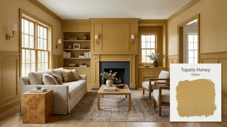
Topelo Honey S15F7
DuluxDulux Topelo Honey is a rich, midtone golden yellow characterized by a subtle, earthy green undertone. With an LRV of 40, this warm architectural finish provides moderate light reflection, making it an ideal choice for vibrant front doors, maximalist dining rooms, and vintage-inspired living spaces.
Dulux Topelo Honey: The Earthy Golden Yellow That Masters the High-Contrast Interior
Yellow paint often carries a reputation for being overly sweet or chaotic, but true architectural golds operate on a completely different wavelength. Dulux Topelo Honey completely sidesteps the nursery-room trap by relying on a highly specific, stabilized pigment structure. This midtone golden yellow acts as a sophisticated foundational layer that responds beautifully to layered, intentional interior design.
Its success lies in a subtle earthy green undertone that pulls the color away from primary brightness and into a more mature, curated territory. We frequently see homeowners shy away from this level of chromatic density, fearing it will overpower their space. However, when paired with the right lighting and tactile materials, this golden cast transforms flat walls into rich, enveloping environments.
Using this shade effectively requires treating it as a dynamic material rather than just a background color. Whether you are coating extensive millwork or highlighting a single architectural feature, understanding its underlying structure is the key to a flawless execution.
Dulux Topelo Honey: Temperature, Undertones & LRV
The immediate read of Dulux Topelo Honey is undeniably warm, radiating a baked, sun-drenched energy that brings instant vitality to a room. Yet, its true complexity reveals itself when you analyze the hidden pigments that keep this warmth from becoming excessively bright or synthetic.
With a light reflectance value of 40, this architectural finish absorbs a moderate amount of light. It possesses strong chromatic density, meaning it holds its saturated character perfectly in direct sun but can feel intensely moody and weighted in dim environments.
You can apply wallpapers, paints, etc. on walls and see how they look in various interiors.

Lighting Effects & The Chameleon Factor
Because of its dual-natured pigment profile, this golden shade reacts dramatically to the temperature of incoming light.
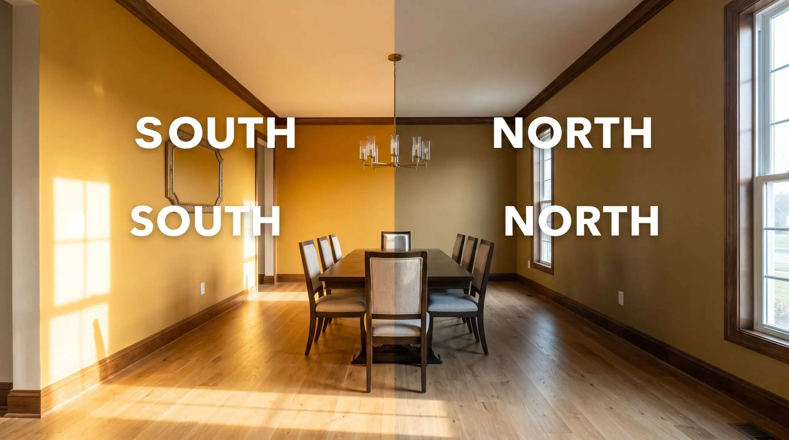
Never evaluate this specific yellow under standard, cool-toned construction lighting. If your LEDs push past 3500K, the green undertone will sharply clash with the yellow, resulting in a sickly, acidic hue rather than a warm gold.
Hackrea Pro-Tip (The Bulb Temperature Trap)
Popular Room Applications for This Golden Shade
The moderate solar absorptance and rich pigmentation of this color dictate exactly where and how it should be applied. To maximize its potential, you must pair it with complementary textures and strategic architectural features.
Front Doors & Exterior Accents
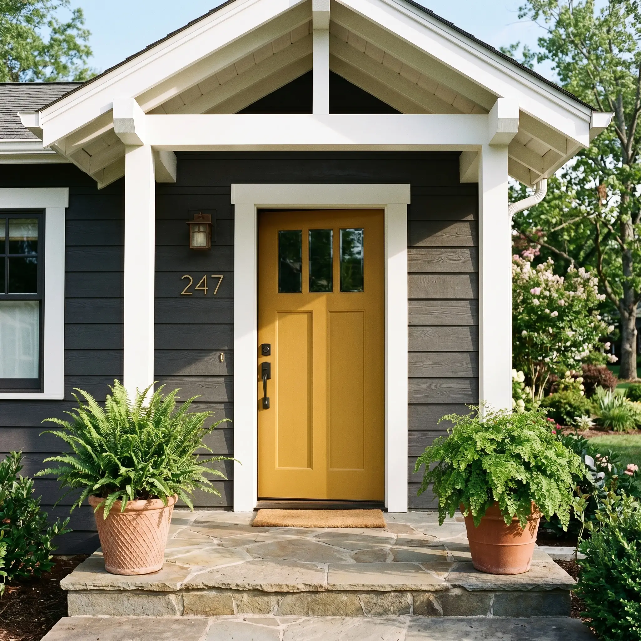
Applying this golden hue to an exterior requires confidence, but the payoff is an incredibly welcoming, custom-looking facade. Because it sits at an LRV of 40, it will not wash out or turn pastel under harsh, direct sunlight. It maintains its structural integrity, providing a brilliant pop of color against charcoal gray siding, classic red brick, or stark white stucco.
To elevate the application, step away from standard brushed nickel hardware. Pair the door with unlacquered brass house numbers and a blackened steel handleset to create a striking, transitional contrast. For families wanting a cheerful but sophisticated entry point, this shade strikes the perfect balance between playful and grounded.
Maximalist Dining Rooms
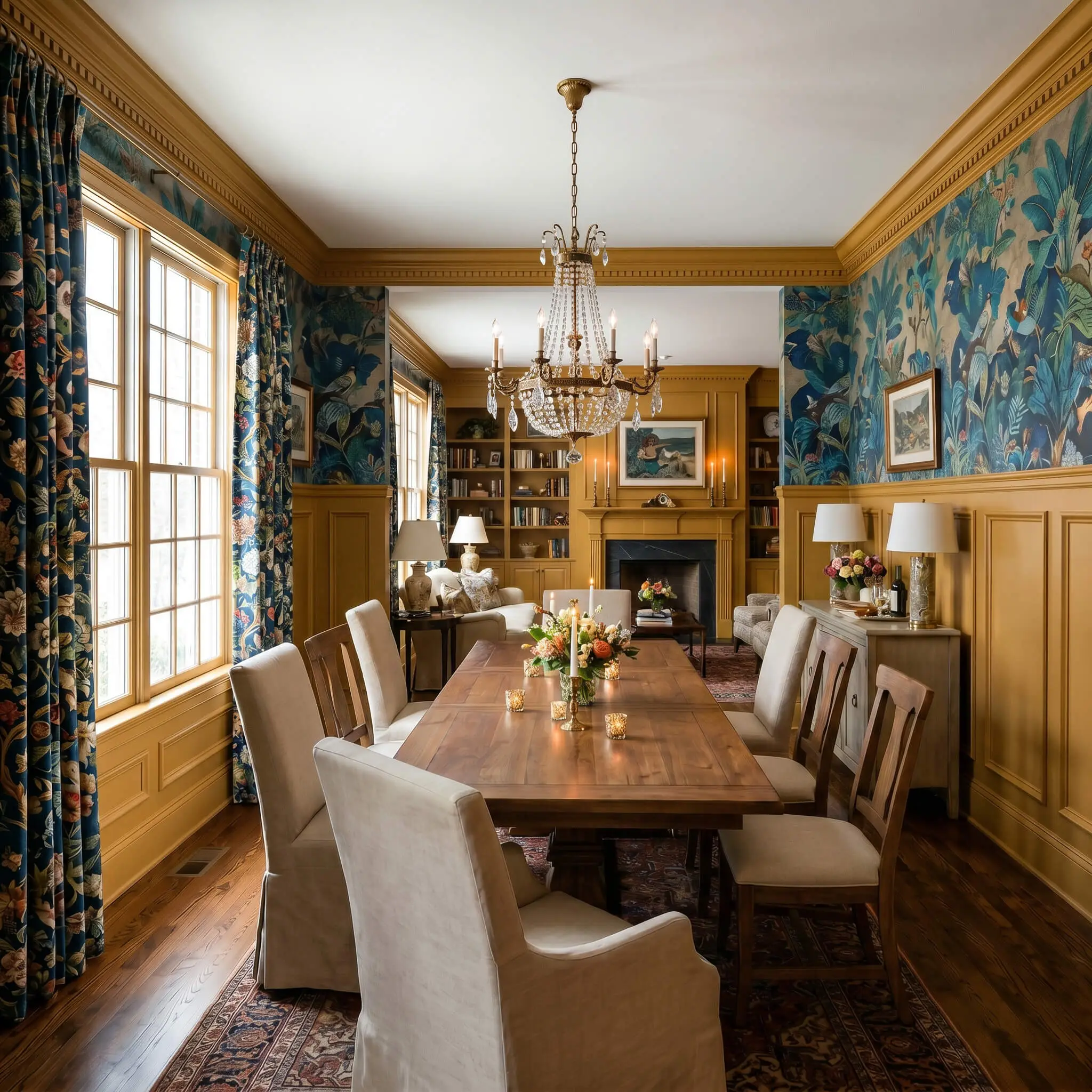
This paint is practically built for the maximalist aesthetic, serving as a vibrant anchor for a room dedicated to entertaining. Instead of relying on standard dark tones for a dining space, use this yellow to inject a sense of lively, curated energy. It pairs exceptionally well with intricate block print textiles, floral chintz drapery, and heavy canvas upholstery.
To execute this look without it feeling chaotic, you need to rely on strong architectural boundaries. Apply the color to extensive wainscoting or picture molding, leaving the upper walls for a dramatic, large-scale mural paper. Finish the space with an oversized rattan pendant light or an aged brass chandelier to highlight the paint’s inherent warmth.
Vintage-Aesthetic Casual Living Areas
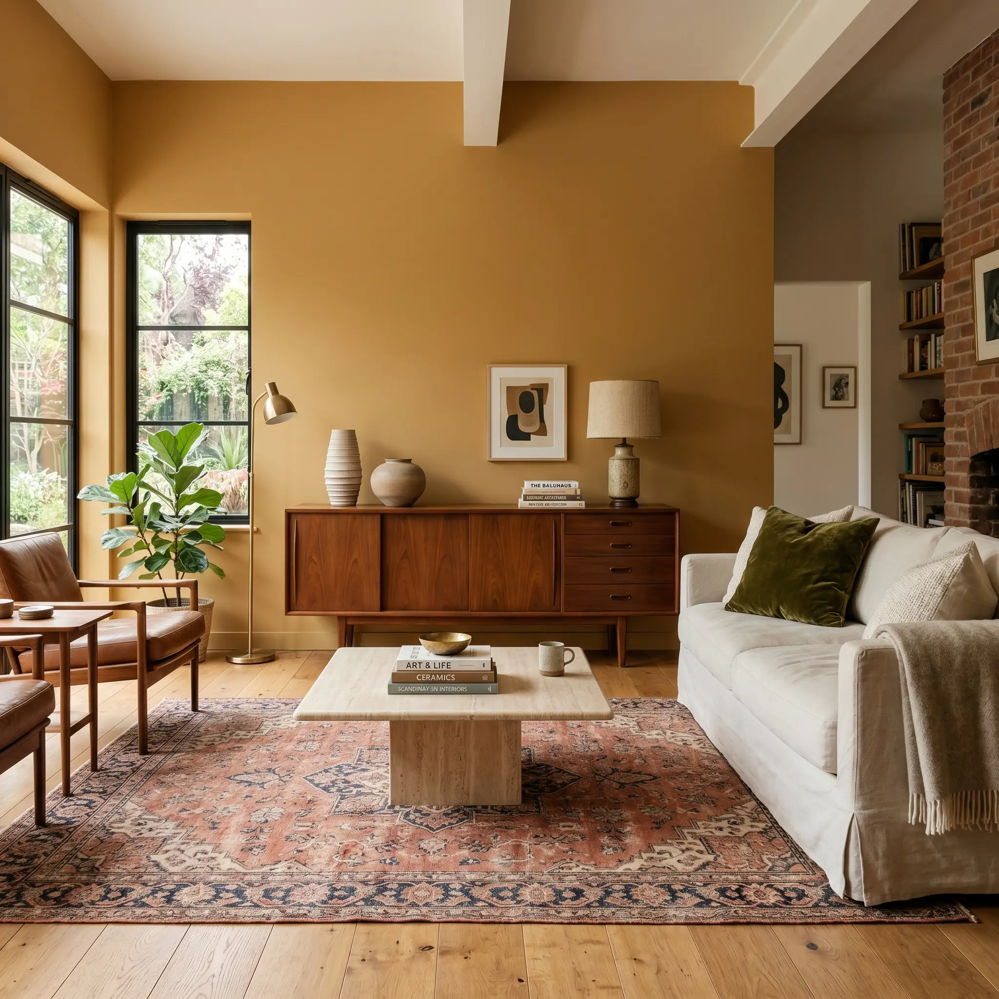
If you are curating a space filled with mid-century credenzas, vintage rugs, and stacked art books, this color provides the ultimate backdrop. The paint’s vintage warmth wraps the room in a cozy, nostalgic atmosphere that feels instantly lived-in. It serves as a brilliant foil for rich textures like crushed velvet throw pillows, worsted wool blankets, and slipcovered sofas.
To keep the vintage aesthetic from feeling dated, introduce contrasting organic materials. A honed travertine coffee table or a sleek burl wood side table will instantly modernize the golden walls.
Hackrea Design Secret (Material Pairing)
Transitional Hallways and Entry Spaces
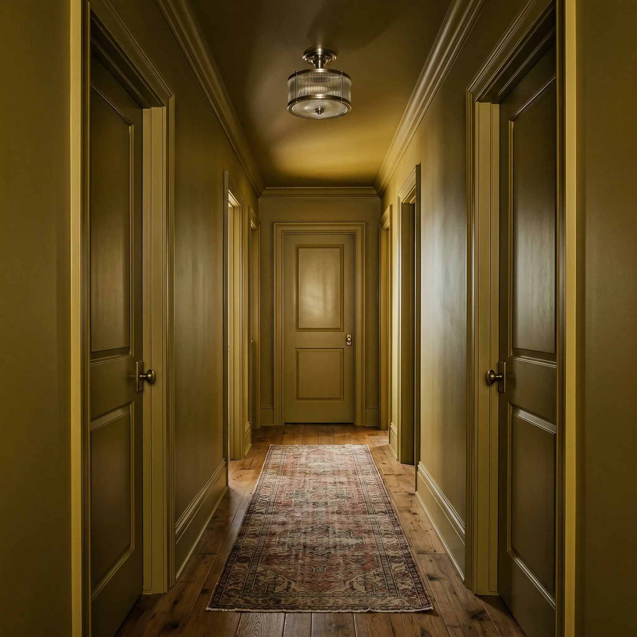
Hallways are often treated as afterthoughts, but they are the perfect testing ground for high-impact color applications. Rather than just painting the drywall, consider color-drenching the entire corridor—including the baseboards, crown molding, and interior doors. This technique blurs the architectural lines, turning a narrow, utilitarian passageway into a striking, jewel-box experience.
For urban apartments or townhouses lacking natural light, this approach embraces the shadows rather than fighting them. The dim environment will pull forward the earthy green base, giving the hallway a moody, sophisticated presence. Contrast the saturated walls with a vintage runner rug and flush-mount reeded glass lighting to complete the transformation.
Coordinating Colors & Material Pairings for Dulux Topelo Honey
This rich, midtone gold requires highly intentional relational boundaries to prevent it from bleeding into surrounding finishes. Its underlying earthy green structure demands either crisp, tailored framing to hold its shape or deeply saturated companion colors to create a seamless, atmospheric glow.
High-Contrast and Seamless Trim Selections
Tactile Materials and Hardware Finishes
Complementary Palette Additions
Whenever you use a saturated yellow, you must introduce at least one dark, contrasting element to the room. Grounding this golden hue with a profound blue or charcoal accent prevents the walls from feeling visually unmoored.
Hackrea Design Secret (The Undertone Anchor)
Curated Aesthetic Concepts
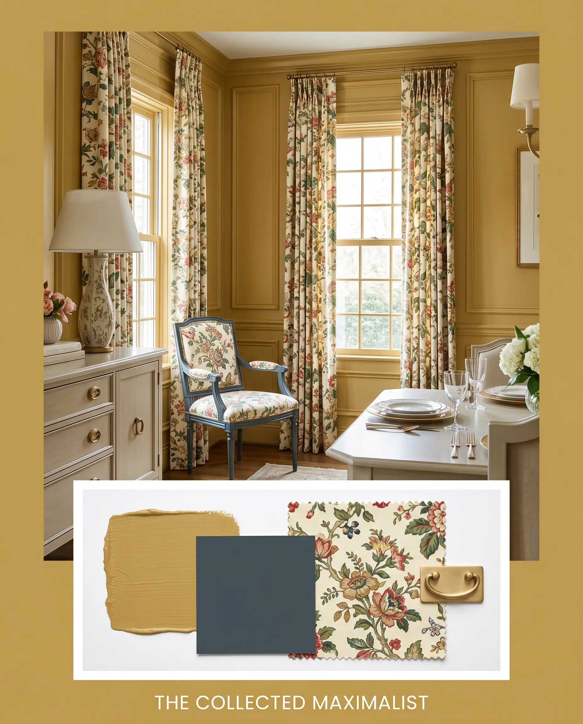
The Collected Maximalist This aesthetic embraces the inherent vintage warmth of the paint by layering contrasting, highly tactile elements. Picture molding coated in this midtone gold frames intricate block print textiles and floral chintz drapery, creating a vibrant, enveloping energy. Grounding the space with a Farrow & Ball Hague Blue No. 30 accent piece prevents the room from feeling chaotic, resulting in a perfectly balanced, deeply curated atmosphere.
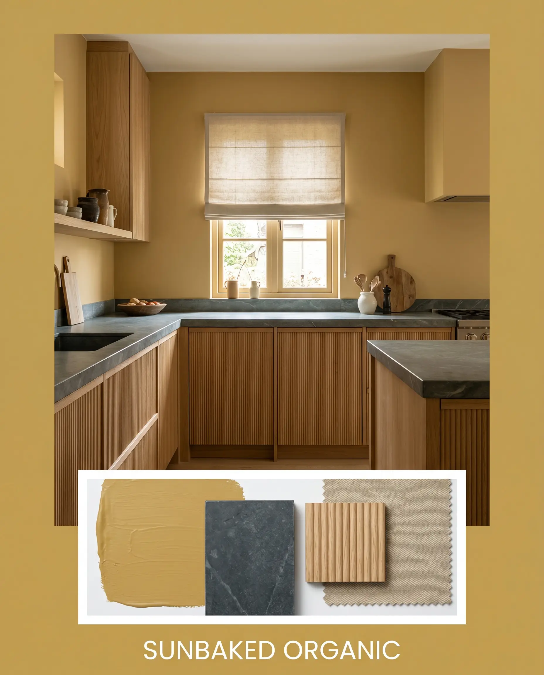
Sunbaked Organic By shifting the focus to natural, unrefined textures, this golden hue transitions seamlessly into a relaxed, earthy environment. Pairing the saturated walls with fluted white oak cabinetry and honed soapstone surfaces pulls forward the subtle green undertones, cooling the overall temperature. Incorporating durable washed canvas upholstery and abstract ceramics ensures the mood remains grounded, tactile, and completely restorative.
Analyzing Dulux Topelo Honey Against Rival Golds
While this specific Dulux shade excels in layered, heavily textured environments, certain exterior exposures or specific architectural goals demand a slightly different pigment structure. If your room receives overwhelming southern light, or if you need a crisper, more refined finish, a rival golden hue might be the superior choice.
Dulux Topelo Honey S15F7 vs. Sherwin-Williams Tarnished Trumpet SW 9026
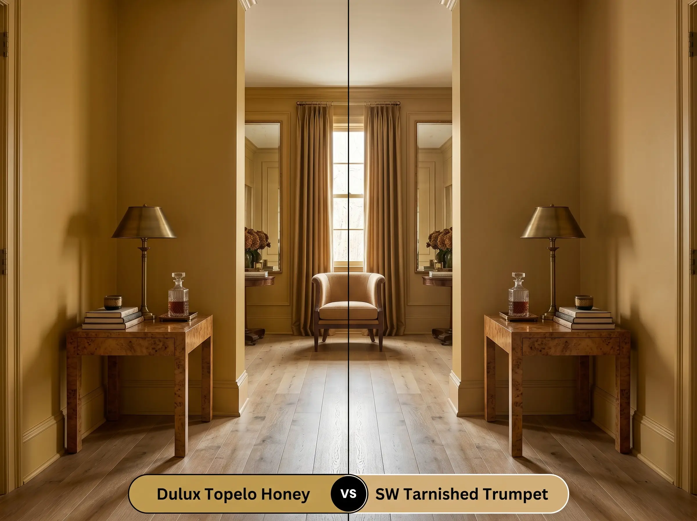
If you are designing a space that lacks natural light and you want to avoid any hint of green, then Sherwin-Williams Tarnished Trumpet is the better candidate. Tarnished Trumpet leans closer to a pure, brassy gold, lacking the earthy stabilization found in the Dulux blend. Topelo Honey will always feel slightly more muted and historic, whereas the Sherwin-Williams option provides a sharper, more illuminated presence in dim corners.
Dulux Topelo Honey S15F7 vs. Benjamin Moore Stuart Gold HC-10
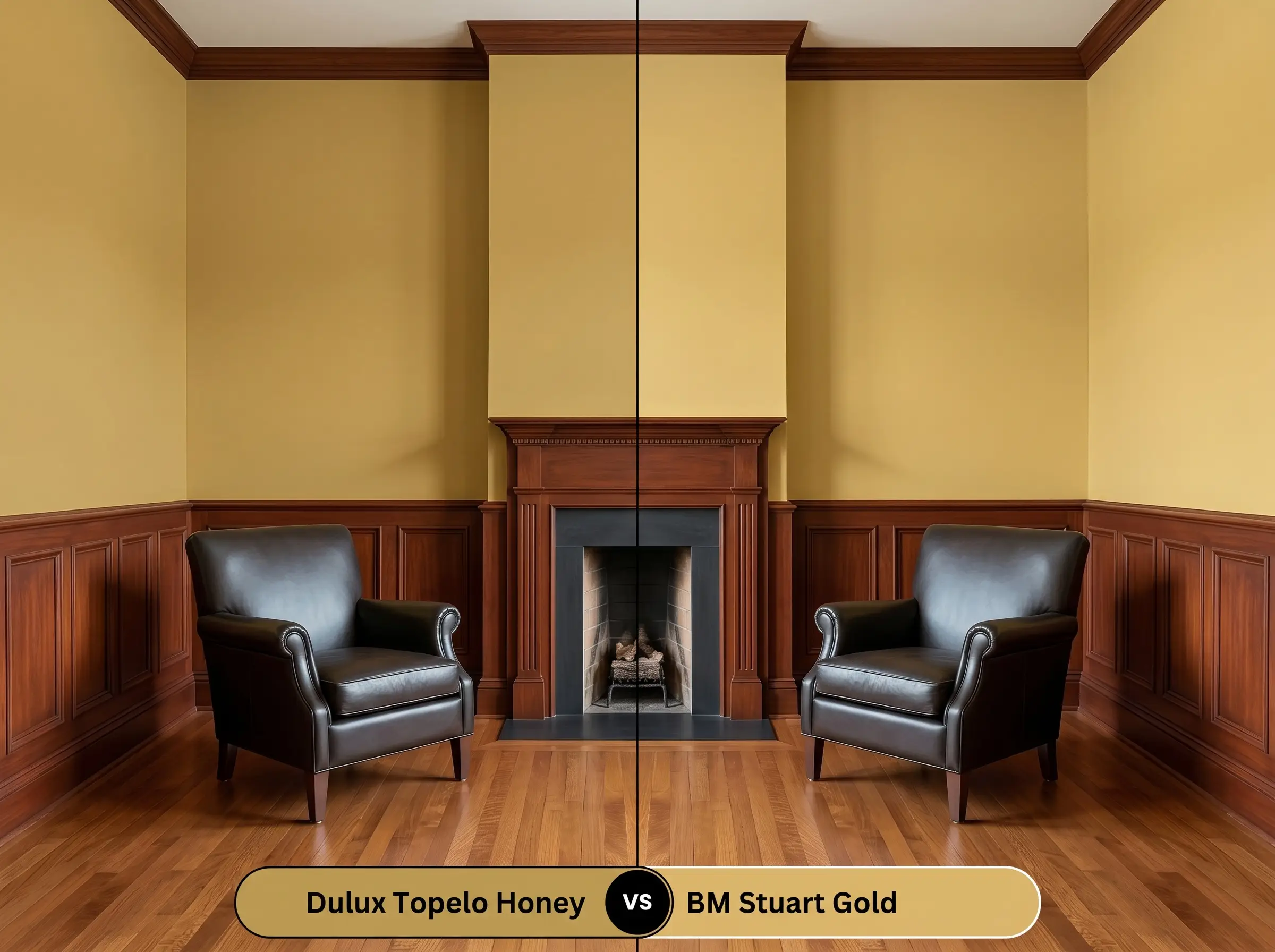
If your design relies on rich, traditional mahogany furniture or dark leather, then Benjamin Moore Stuart Gold offers a slightly more traditional, brown-based warmth. Stuart Gold carries a deeper, more historic weight that pairs effortlessly with classic, formal architecture. In contrast, the S15F7 option retains a touch more vibrancy and organic energy, making it better suited for transitional or eclectic spaces.
Alternative Golden Hues and Brand Matches
Homeowners often test a sample and realize they need a minor adjustment in depth or a slight shift in the underlying warmth to perfectly match their fixed finishes.
Tonal Variations Within the Same Collection
Comparable Cross-Brand Matches
Professional Application Strategies
Transitioning this curated golden aesthetic from a mood board to your actual drywall requires precise execution and a clear understanding of material finishes.
Optimal Sheen Selections
Base Coat Requirements
This specific depth of yellow requires a high-quality, warm gray-tinted primer to achieve true color accuracy. Using a standard stark white primer will force you to apply three or more topcoats to prevent the white from glowing through and diluting the golden richness.
Roller Marks and Coverage Expectations
Yellow pigments are notoriously translucent, making them highly susceptible to visible roller marks, commonly known as flashing. Plan for a strict two-coat minimum, maintaining a wet edge at all times to ensure the pigment dries into a solid, uniform layer.
Frequently Asked Questions
Because low-E glass naturally filters out warm light and casts a subtle blue-green tint into the room, it will immediately amplify the hidden earthy green undertones of this paint. This interaction cools the golden warmth, making the walls appear slightly more muted and aged rather than brilliantly sunny.
Thanks to its moderate light reflectance value of 40 and its stabilizing earthy undertones, this color performs exceptionally well on textured exteriors. The rough surface of the stucco casts micro-shadows that deepen the paint, ensuring it looks like a rich, historic gold rather than a synthetic neon yellow.
Using 2700K lighting will actively pull out the richest, warmest qualities of this pigment, turning a windowless powder room into a deeply cozy, enveloping space. The warm bulbs mask the green undertone, allowing the golden cast to radiate beautifully against dark, contrasting metals and mirrors.
Woods with strong pink or red undertones, such as natural cherry or unstained mahogany, will create an uncomfortable visual friction against the green-yellow base of this paint. To ensure harmony, pair this color with neutral white oak, deep walnut, or dark espresso stains that complement its earthy structure.
Final Verdict on Dulux Topelo Honey
Dulux Topelo Honey is an incredibly sophisticated, architectural gold perfect for homeowners who want to inject curated warmth into their spaces. Its earthy green stabilization makes it the ideal candidate for maximalist dining rooms, vintage-inspired living areas, and high-contrast transitional hallways. It provides a brilliant, grounded backdrop that elevates tactile materials, allowing you to create a deeply intentional, layered home.
Clash Warning (The Cool Gray Conflict): While this midtone yellow is beautifully adaptable, it fiercely rejects cool, blue-toned gray finishes. If your home features stark, ash-gray luxury vinyl plank flooring or predominantly cool Carrara marble countertops, this paint will struggle to perform. The icy undertones of those materials will aggressively pull out the green base in the paint, stripping away its vintage warmth and leaving the walls looking muddy and sickly. To ensure this color thrives, it must be paired with warm, organic woods, rich natural stones, or deeply saturated complementary colors that respect its golden structure.